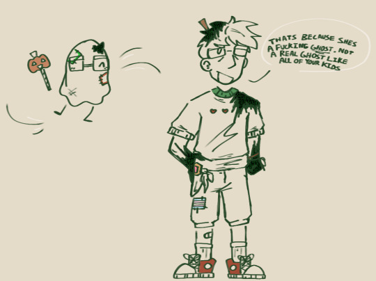
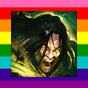
#most inconsistent design ever
Text
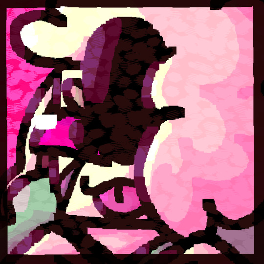
earlier today i told myself id update nb today , didnt do that at all , spent the last 50 minutes of my night drawing him ( derogatory but in a silly way )
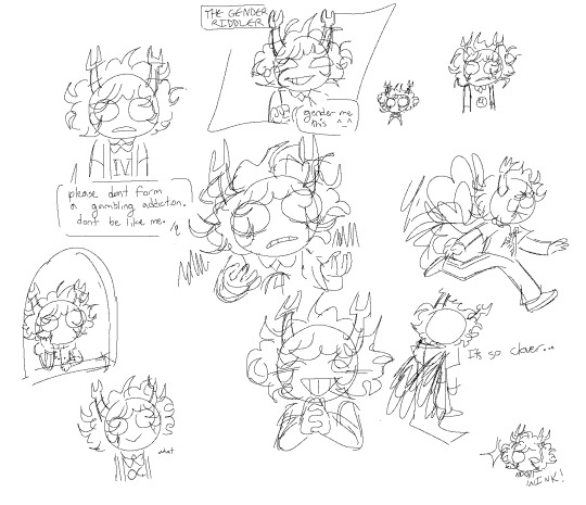
#most inconsistent design ever#somtimes i forget i made his last name samroc#then i remember#ok im gonna go doolde him more now#boy look at my doodles boy#aquared homestuck au where the midnight crew are the kids and there are some other guys too i think#should i make au character specifc tags for this account#would make things less awkward rhan just the one doodle tag#and my resistance to maintagging
20 notes
·
View notes
Text
And I'd hope that if I find the strength to walk out, you'd stay the hell out of my way.
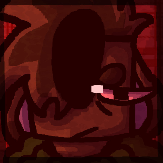
Just finished the fic You Could've Applied Online and it permanantly altered my brain chemistry...
Versions without text:
#ethoslab#smallishbeans#ycao au#trafficblr#ik this was a ethubs centered fic for the most part but boat boys were the highlight of this fic#they're relationship is just so well written I wanna just hdjsjsjwjsjdjsjw tearing them apart and studying them#please please please read ycao i could go on about ycao!boat boys for days#they remind me of No Childrens bu The Mountain Goats so much like that is them#i finally caved and gave etho and white and black hair#also my joel design is the most inconsistent thing ever I haven't drawn him in a while
112 notes
·
View notes
Text
And then Cellbit proceeds to punch Charlie repeatedly
#me when i have the most inconsistent qcharlie design ever#i loved this stream sm i fuckin loved those “scary stories”#scary in parentheses because half of them were about taxes#qsmp juanaflippa#qsmp#qsmp fanart#qsmp slimecicle
31 notes
·
View notes
Text
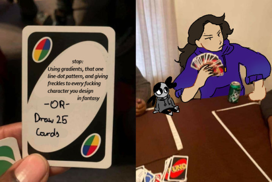
Yeah that checks out, also irl tam hiiiii
#original character#character design#artists on tumblr#I am the most consistent inconsistent person#Ever#Quan Yue and Zhao all-#have gradients and that line-dot pattern in their designs help-#Also Zhao and Yue are freckle stinkies-#Weowerewoeowereeowiwoowowe#idk what to put here#art
16 notes
·
View notes
Text

Some stuff I've drawn semi recently
#keese draws#oc art#oc#ocs#furry#furry oc#furry art#Ive been going thru it recently but Ill survive#on the bright side the pet sitting job for my aunt is coming up soon#so Ill have a house to myself for a bit at least#Im probably still gonna be fairly offline for the foreseeable future unless I somehow manage to fix my sleep schedule anytime soon#not to say I will be on any sorta complete hiatus or anything just that Im not getting any more active most likely#not that I think anyone rly cares at this point since its been the norm for a while now but yknow#Ill still be around to answer asks and stuff just dont freak out if I take a lil bit to see it 👍#anyways enough of being a downer Im actually pretty happy with these even if theyre mostly just doodles#also I havent posted any art of these guys in a While but say hi to them while you can cause theyre back into the void of my brain now#first is keese (the oc™) second is toon and third is clyve#all from different stories but toon and clyve are both from the magic cat universe#their paths never meet tho the closest connection they have has to go through like 4 characters first#you can also tell theyre from different stories because one is anthro and the other isnt lol#generally speaking I consider anthro designs slightly more canon but both are canon depending on the story#not in a shapeshifting way just in a me being an inconsistent bitch sorta way#but yeah keese the oc is much older than either of those two I just dont talk abt them or their story ever#but hey if any of yall remember suckerz those two are besties#suckerz is sort of younger than the other two and sort of much older than all three#shes a sort of updated version of a reallyyyy old sona sort of character I had in like 6th grade I think#back during my lilo and stitch experiment oc era where I had one that was music themed#I also had a digimon variant of her she was called like beatramon or smth like that#she was basically a hypothetical music mascot and shes kind of still that tbh#if I ever get enough into making music that I start posting shit it will be my music mascot
4 notes
·
View notes
Text
barkbarkbark Riichi Book I's writing is like screeching chalkboard to my game designer's, translator's, and writer's ears all at once
it's got great concepts buried in there but it's in like the most anti-comprehension packaging conceivable
#what the hell is wrong with you#folks like you are the BANE of game designers everywhere#and game PLAYERS for that matter#THIS is the best strategy reference the English speaking world's got?#baddabingbaddaboom ladies and gentlemen#im about to make bank writing the West's first riichi primer that actually meets the standards of the modern analogue game industry#(which to be honest is abysmal right now the industry's in an insane 'text free' fad right now where every word is replaced with a symbol)#alright then im gonna set the new standard then#imma bout to do for Riichi Mahjong what i did for Ryuutama Traversées 🫸🤛#and for all the dudes at unpub who know how to design incredible games but dont know how to write instructions#alright sorry I'll calm down#but seriously i am gonna start throwing together an actually quality-controlled guide#cause every english resource ive found so far has been like this... inconsistent and full of holes and omissions in explanations#chiba talks about the game's strategic immaturity in the west... well it's got an even bigger gap of educational immaturity#anyways.... I'll toss a bit of effort that way#we'll see how far i take it#I'll either make a few loose articles or a fully fledged book. no in between#god i dont have the energy to make another book when i dont even know if Traversées is ever gonna see the light of day#100% complete full color layout and everything. publishing limbo is real and it's every bit as stupid and unnecessary as you think.#(my case is much simpler than most though cause im only working with two small publishers rather than a big corp)#but still. damn#anyways im so tempted to throw some of my rulebook magic at riichi while it's got my interest#not like i need to write a strategy tome the game just needs a professional quality introduction#don't make me do it i absolutely will do it#i did it for ryuutama when no one wanted to give a decent publication-quality localization for the supplements#and by garriot i will do it for riichi mahjong too if no one gives me a quality guide. i aint afraid of a global high strategy game#<- manic#(im not manic im just extremely restless having not been able to do any solid design work in a while and this book is getting me riled up)#cause it's like “i could write such a more coherent rulebook and HAVE written a more coherent rulebook. so why don't i do it again?”#the Disease is why. but maybe I'll give it a shot anyways if i get a second wind (i guess im otakaze right now harharharhar)
8 notes
·
View notes
Text
my favorite punching bag
#changed my signature bc i dont rly go by zeph anymore lmao#elliart#tma s3#tma fanart#jon sims#jon sims fanart#jarchivist#magpod#s3 jon#sorry i have the most inconsistent design for jon ever
33 notes
·
View notes
Text
omg uhhhh.. that strongly politely worded email i wrote to hr about how stupid their reason for rescinding their job offer because of *weed* was actually worked?????
#so. three..........jobs....(one's a gig) plus........college.........#miiiight have to cut ****** short if it gets to be too much for me but if i could explain my situation in a certain wayyy..#the library is important to me though and i need to prioritize that above any other job#if it ends up being i can only work one job realistically that's fine because life happens#also somebody bought a blanket off my redbubble hehe#(it's @zzziggy go buy a blanket)#(most of it is ponies and i might take a couple down bc inconsistent quality but likeeee)#(it was the furby design that got sold. it's the most eyestrainy blanket the world has ever seen)
9 notes
·
View notes
Conversation
Me, a while ago: Well, I know this game is a grindy, hot mess, but I feel like fast food for my brain right now, so let's start a new playthrough.
Me, now that I finished the playthrough: I have never seen a clearer case of narrative potential being shot, stabbed and set on fire in every way possible and I am actually kind of mad.
#video game narratives#Ghost Recon: Wildlands#what the actual duck#this must be the most narratively inconsistent game I have ever played#there was such good potential here#and it got completely fucked by the world/mission design#and the technical implementation of the audio#and some questionable character bios#that made me go 'I'm pretty sure this is against SOME section of US Army code of conduct' multiple times
1 note
·
View note
Text

this is the kind of gentleman that would say what the sneef? I’m snorfin’ here!
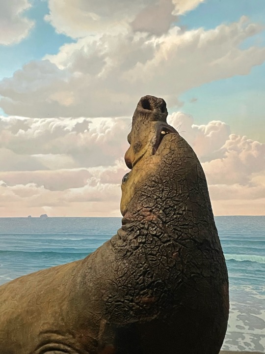
#had to physically restrain myself from saying this to the very nice not terminally online boy I was at the museum w today#he’s just so sneef.. so snorf…..#amnh has the most atrociously inconsistent graphic design I’ve ever seen but my god their dioramas…….
0 notes
Text
.
#my energy levels be so dreadful during the day#and so active during the nights#it boggles me that i still cant keep a consistent sleeping schedule to fix it#LMAO#thats my problem though im the most consistent inconsistent person ever#im so inconsistent i should be the picture for it when you look for a definition#i turn into a home stylist and home chef at night lmao#im out here moving my manga/ figures / and sports memorabilia around#im obsessed with not having empty space on my walls LMAO#its becoming a problem cause then it starts to feel crowded or a cluster of things#then i start moving stuff around LMAO#its literally 4 am and i am watching Canadas worst drivers while re organizing manga LMAO#since i keep hearing creaking from the place i have my shelf i decided to take some load off of it#even if its on a stud the screw i used may not havs been designed to carry the load its carrying#then i have a section of manga i want to and have to catch up on next to my bed#its starting to get a bit much LMAO. im definitely going to be on a binge when i wake up#lmao i really feel like my energy levels are flipped like i should be feeling like this in the day time not the night LMAO#i did this to myself with a horrible sleeping schedule and sleep regimen#i need to start doing 3 2 1 method to really fix my sleeping schedule and then maybe my energy levels flip to normal
0 notes
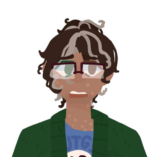
Text
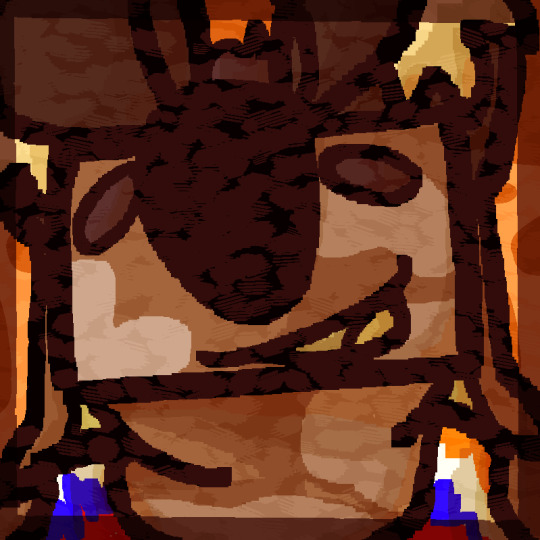
Ok, my Michael design must be one of the most inconsistent things ever, but this is probably my favourite sketch of them that I've ever done
#also I really want to draw something tmagp related but rn I don't really know what#the magnus archives#michael distortion#sketch#tma fanart#tma#drawing
931 notes
·
View notes
Text
Also going to finally make a pinned post for all my stuff:

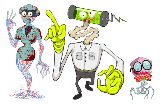
BOGLEECH - my tumblr blog is named after this website I created around 2002 and still update. Thousands of pages worth of content focusing on creature design as well as real biology. My review of the original Legend of Zelda monsters might be the most straightforward example of my articles.
Links to some of the most popular content:

POKEMON REVIEW ARCHIVE: - I rate and review each and every single Pokemon, in Pokedex order, on its merits as a creature design. I also do so as someone whose favorite animals are all parasites.
DIGIMON REVIEW ARCHIVE - same, but more chaotic.
CREEPYPASTA COOKOFF ARCHIVE - for several years I hosted a yearly writing contest before it grew too big for me to keep up with. There are over a thousand user submitted horror, fantasy, sci fi and surrealist stories here emphasizing unconventional, original ideas you seldom see from the "creepypasta" community!
The original "MORTASHEEN" Monster Archive - since the early 2000's I've created and illustrated more than 800 creatures and counting for my own monster-catching world, now set for release as a tabletop RPG setting.
AWFUL HOSPITAL: SERIOUSLY THE WORST EVER (page one): an interactive comedy-horror-sci-fi webcomic I started in 2014 about a medical facility that could maybe be better.
Some of my other internet stuff:
PATREON - constant work makes my patreon updates inconsistent, but the content backlog goes back years with a huge amount of exclusive art and writing. I try to put up new exclusive stuff whenever I can.
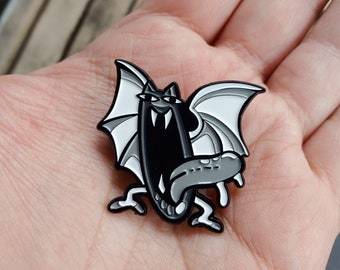
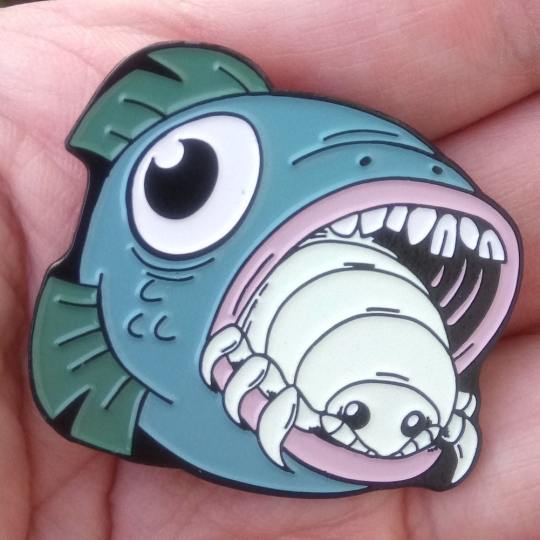
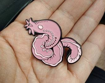
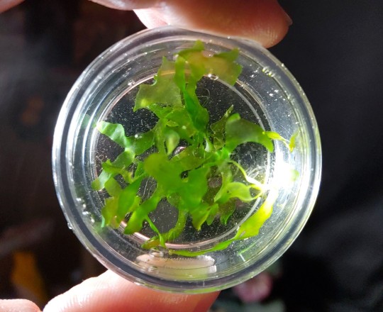
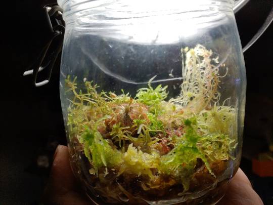
ETSY - I design all sorts of original enamel pins like these, plus I sell zero-maintenance terrarium plants (just leave them in a jar!), original books and other things!
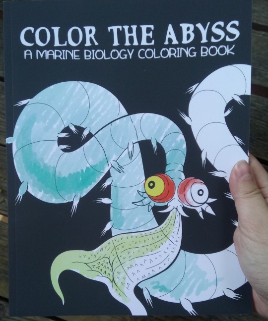
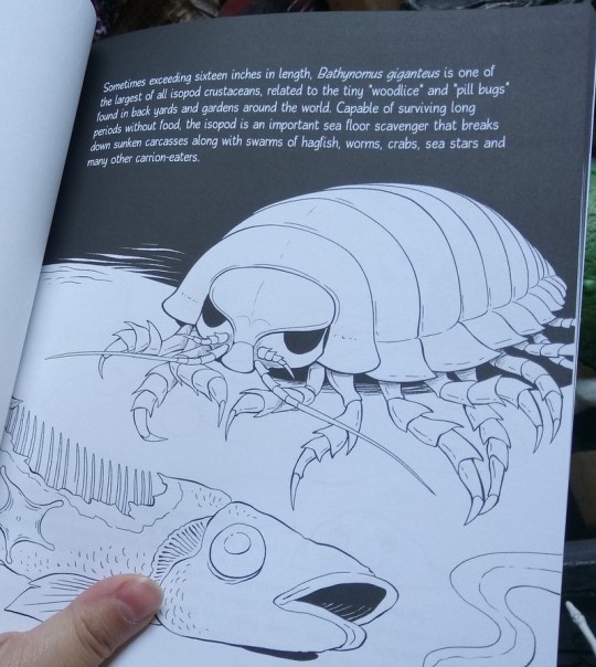
COLOR THE ABYSS (available on the above etsy!) - a 30 page educational deep sea coloring book! Includes a few famous favorites like giant isopods and hagfish, but mostly focuses on less popular, often much weirder animals.
UNBELIEVABLE BUGS - also regularly restocked in the etsy store, 30 of the strangest and most surprising arthropods most people have likely never heard of, illustrated by myself and @revretch, written for even the youngest kids to understand (but will likely teach you something new at any age)
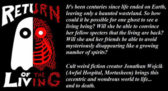
My Itch.io and Ko-fi - both sell digital versions of my books, including some creepypasta collections and my first novel, "Return of the Living," about a world of entirely ghosts suddenly dealing with the appearance of ghost-hunting monsters.
TWITCH CHANNEL - I now try to stream something at least monthly, sometimes weekly when possible, from horror games to books and art.
YOUTUBE CHANNEL - archives my twitch streams and other little things.
INSTAGRAM - look at pictures of my huge weird collection of toys and Halloween collectibles
BLUESKY - I'm going to put mainly just updates to my stuff on here.
SEE ALSO:
HUMANS-B-GONE - a science fiction animated series by my partner @revretch, about a world of kaiju-size, technologically advanced insects and arachnids to whom vertebrates like us are just pesky little "gubs." Also has a tumblr account @humansbgone
443 notes
·
View notes
Note
Genuinely asking—what changes would you make to the adult gaang designs? :)
this is such a fun question thank u for enabling me. i mean i draw them as adults sometimes so also check out my /oldergaang tag if u want visuals (altho i also change my designs a lot because my art is nothing if not inconsistent) but if i was just going with like standard character designs like if i could redesign that hideous “old friends” poster for example…
aang: get rid of that fucking. chinstrap. don’t give him white man features because what the hell is that. and let him wear his off the shoulder monk robes from book 3 because he was slaying with that fit. actually the way aang is drawn in imbalance is basically perfect i would retain that design into adulthood. thank u peter wartman for all that u do….
katara: i don’t mind the older katara design (from the little we see of it) but it’s also not nearly as cunty and slayful as i would like. katara is genuinely interested in fashion and loves experimenting with clothes and hair and makeup, i refuse to believe that as she ages and has more resources to tailor her style to her own personal tastes she wouldn’t get a little funky with it. like she kind of just looks boring and uninspired in her older design, and that’s unacceptable to me because she should be hot. adult katara should be the hottest woman you have ever seen in your life. and she should be buff, also. shredded, even.
toph: any signifiers of copness are obviously unacceptable to me. but even more that than, it’s very important to me that older toph is distinctly butch. i think she would cut her hair the second she realizes that there is no reconciliation to be found with her parents and that there is no reason to adhere to those confucian values. and she would wear a lot of sleeveless outfits (sort of like the shirt korra wears in “korra alone”) to show off her biceps and also space bracelet (spacelet) that is her prized possession forever. and she’s just kind of a hot hippie butch legend . period.
zuko: in the old friends poster he literally looks like a lizard so just like. no. wtf. and i like his long hair in theory but i don’t like that it’s styled after ozai and not ursa, i think his hair would be shwoopier and frame his face more. and his robes should be less spiky and militaristic and more designed for comfort because that’s what makes him feel most like his true authentic self and he deserves that. also weird for a guy who is trying to demilitarize the fire nation to wear an armor-adjacent type of outfit. so mainly he’d just look softer and more like his mom.
sokka: i hate buff goatee whitewashed sokka that is some kind of demon. lok did so little with him and yet said so much (all of it egregiously wrong, ofc). sokka would be fairly tall (although not as tall as aang) and have defined muscle but in a sinewy, lanky way. and despite always having enough to eat he’d still look somewhat malnourished just because he’s constantly overworked and exhausted and never takes care of himself. and his ponytail would be longer but he’d still shave the sides. and the older he gets the darker his clothes get until he basically just wears black all the time because at some point he realizes that it’s more advantageous to remain culturally ambiguous if he’s gonna be a cosmopolitan. and he wears glasses (which were a gift from kuei). and sometimes he uses a cane because he didn’t sufficiently take care of his broken leg after the war ended and now he’s paying the price for it. and his cane has a blade inside too, but he rarely ever even pulls out the blade because he can incapacitate someone with just a wooden stick anyway. so he looks like if a nerd was a shadow was about to collapse at any given moment was secretly ruling the entire world. and he’s not in any sort of front-facing position of power whatsoever but he’s actually pulling all the strings from behind the scenes, and it’s exhausting. his eyebags are visible from outer space.
suki: i don’t even think there is a “canon” adult suki character design besides her in her kyoshi warrior armor and makeup but to me casual suki just starts dressing more like sokka. like the loose baggy sleeveless shirts (except in a lighter shade of blue bc kyoshi island colors) and tight pants and boots. it’s a very dykey look already and they’re basically girlfriend twins so their styles would merge even more than it already has within the show itself. like sometimes people think that sokka and suki are siblings because they dress so similarly and give off such a similar vibe and they’re just like “but we’re literally different ethnicities??? and also we are currently making out????”
okay bonus round bc i can’t just neglect them
azula: she cuts her hair really short and as an adult leaves it to shoulder length for the most part because that’s more comfortable for her. like zuko, she also starts dressing for comfort, and for a period in her late teens stops wearing makeup altogether. she gets back into wearing makeup as an adult, but she stops caring about whether or not she leaves the house with lipstick on, and it becomes more about the process for her than the result. she’s comfy and cute and dykey.
mai: sokka is her lesbian style icon so after her first haircut that was inspired by toph’s haircut to piss off her parents, she gets an undercut and starts wearing her hair in a ponytail like sokka. as she gets older she also gets more confident in her body and doesn’t feel like she needs to wear baggy long-sleeved clothing at all times or she’ll die. and she isn’t rail thin as an adult either because she starts letting herself eat more than a single grain of rice at a time. also, she gets a sword.
ty lee: she becomes a kyoshi warrior so she starts incorporating more blues and greens into her wardrobe, but also more oranges and yellows after she embraces her air nomad heritage. and she just dresses very colorfully and has a vast rotation of different cute little outfits. and i think she’d also experiment with different hairstyles once she has the freedom to define herself outside of the aesthetics expected of her. she looks beautiful always
haru: he finally shaves that thang
160 notes
·
View notes
Text


I’ve been slowly working on making the eternal gales cast new refs and icons, here’s a dump of what I have done so far
#keese draws#eternal gales#oc art#oc#ocs#ignore the inconsistent quality in some of these there’s a lot of them and I only have had so much motivation to draw#I don’t plan on remaking busy and softie’s refs for the time being but everyone else is on the chopping block#I’m not gonna rush it tho this is just for my sake since my art style has changed so much recently#oh wait that’s right butter is also good I made them a new ref a while back I think#that just leaves 11 refs and like 12 or so icons. woo.#and that’s without counting side characters and god forbid I finally get around to designing the au antags#it’s been over five years and none of those bastards have ever gotten even my weak excuse for a reference rip#to be fair I have tried to design them several times it’s just annoying because of color palettes#I hate making color palettes. my most hated part of character design no competition#but yeah the staliens are the easy part it’s the human kids that are gonna make me wanna tear my hands off#it’s not physically hard to draw them but mentally it’s the worst agony#ok no fydd is physically hard to draw. I do not have the beak drawing experience I should have having drawn this kid for five years#like I figured out shoe and sock and they’re my Only snake characters#well ok it’s not like I have many beaked characters either but shhhh#bloom doesn’t rly Need a new ref as technically most of my art style changes don’t effect her design at all#but the anatomy in her current one bugs me so it’s getting remade anyways#I’ll probably do new sprinkles ref first then looser then alpha to finish off the staliens#and after that I should Really do aris first for the human cast she is in desperate need of a new ref#and after that I’ll do the snake triplets then mase and then whoever I feel like doing after that#those three are just in the most intense need after that it doesn’t matter much
0 notes
Text
So anyway, Hazbin Hotel. I watched some of the new series, I have a lot of thoughts, but I'll TL;DR:
In my honest opinion, its biggest weakness is that it feels utterly directionless, scattershot, and inconsistent. It feels like the series hasn't evolved past "I put a bunch of disparate childhood OCs in the same place together" and hasn't figured out any coherent theme or thesis statement to make as a narrative. This applies to both the writing and the art direction. Characters feel like they come from vastly different settings/genres and so do the plot points explored from episode to episode. In general it's really hard to get a read on what the series has to say, overall.
other comments:
this has been the most ineffective use of swearing I have ever seen in writing
genocide as a plot point and handled like that in the show... yeah this was really poorly timed. obviously this wasn't done on purpose, but not a good look at the moment considering irl situations
Adam is highly underwhelming both design and writing wise
I like the TV head corporate magnate, but imo he's not really suited for this setting. He feels more like a sci-fi cartoon villain to me
Alastor supposedly being black and/or creole is not well portrayed. There's also cultural appropriation issues with his character but everyone has talked about that already
the characters supposedly being from different cultures and historical eras is poorly handled, e. g. I can't really believe Angel Dust is an Italian mobster from the 1940s because practically all of the characters strike me as modern and American
overall this show is so SO americentric and I'm kinda not vibing with that
192 notes
·
View notes
Last Seen Blogs
legendary-assassin-stance
The emperor feared my great power—do you?
jbgxxbd21643
보테가레플리카

the-official-account
ya idk how I got this url either
goldendirk
SOBRE AS PERNAS