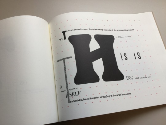
#letterpress printing
Text

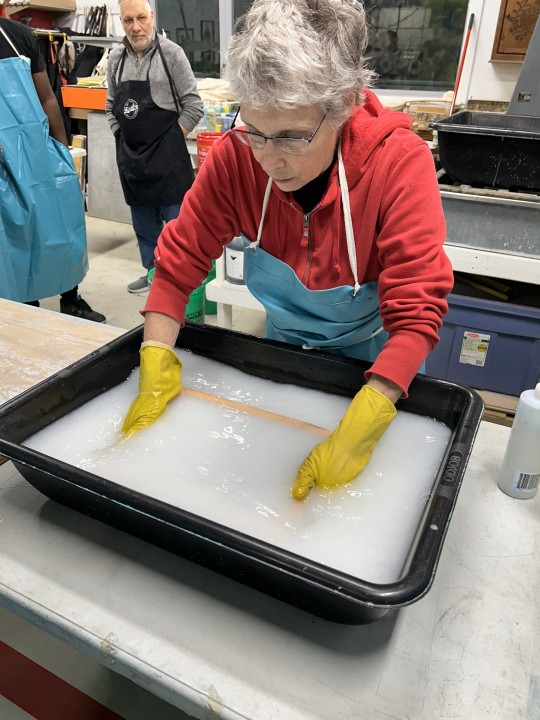


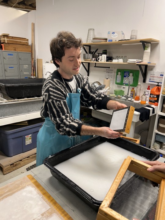
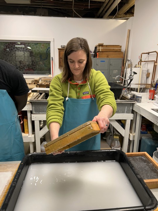

Papermaking at AP3!
A couple weeks ago and even this past Tuesday, we showed you how, after students in my History of Books & Printing class (INFOST 603) read about the invention of type and letterpress in Europe, we went down to Team Nerd Letterpress, set wood type, and printed a poster. Last week, after reading about the history and technique of hand papermaking, we took a field trip to Anchor Press, Paper, and Print (AP3) in the Riverwest section of Milwaukee to engage in some papermaking.
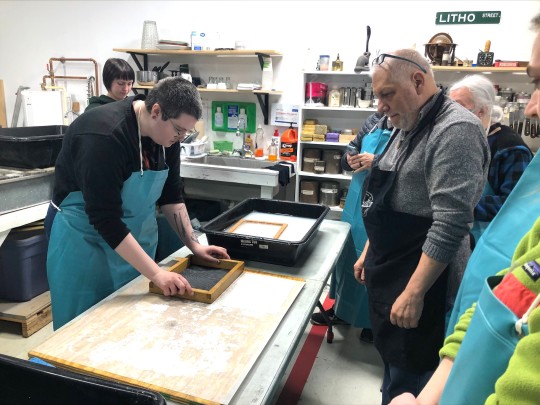
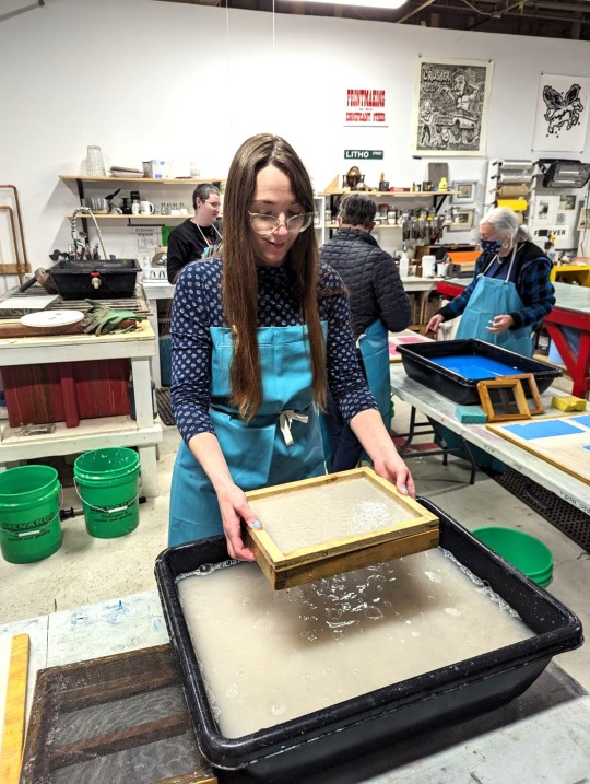
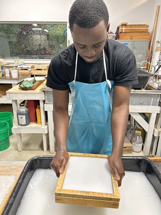
First, AP3 president Marilyn Propp demonstrated hogging the vat, using the deckle, dipping the screen, pulling a form, and couching the paper onto felts (here's a glossary) -- top three images. Then Miria tried their hands at the process, with much success (next three images). Afterwards, it was a free-for-all, with everyone making paper for the next hour and a half; here in succession are Anna, Caring, Adam, Georgia, and Catherine (with Taj in the background).
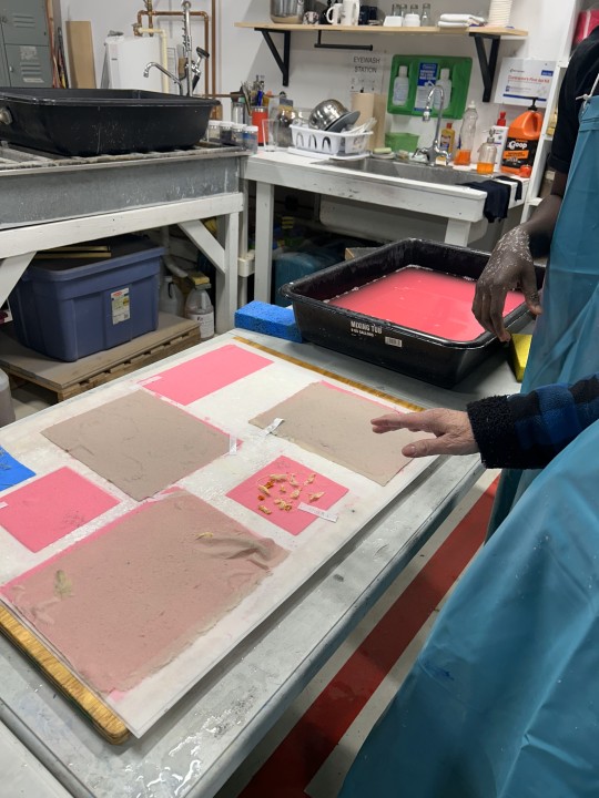
The last image is of some still-wet paper forms on felts (actually, synthetic pellons), with attempts at inclusions and paper lamination. The students were clearly exhilarated, and everyone went home exhausted and happy!
View more posts on papermaking.
-- MAX, Head of Special Collections
#Papermaking#hand papermaking#handmade paper#paper#instructions sessions#students#graduate students#Information Studies#INFOST 603#letterpress printing#Marilyn Propp#Anchor Press Paper and Print#AP3#student work
30 notes
·
View notes
Text
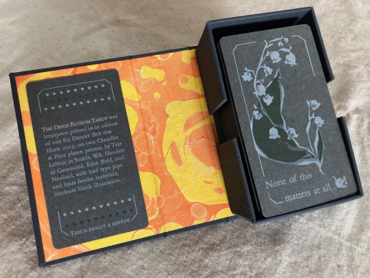
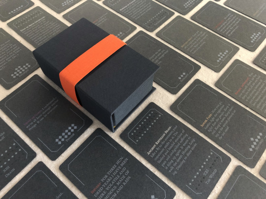


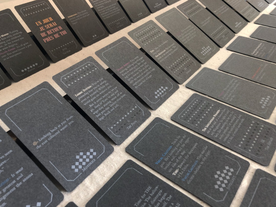

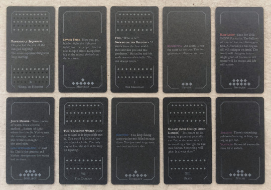
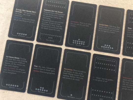
[image description: photos of The Disco Elysium Tarot, printed letterpress in an edition of one from handset lead type and linoleum blocks. It is a complete 78-card tarot deck printed primarily with white text and illustrations on medium grey cardstock, in a custom dark grey hardcase box with a hand-marbled orange and yellow endsheet. The backs of the deck are decorated with an illustration of a sprig of may bells, and a quote from Smallest Church in Saint-Saëns: "None of this matters at all." The interpretive meaning of each card is expressed on its face with a small excerpt of the game's text. The Minor Arcana are divided into four suits of Harry's Attributes—Motorics, Psyche, Physique, Intellect—and each card in that suit is a quote from a skill under that Attribute. The Major Arcana are assigned quotes from other sources like NPC dialogue or Thought Cabinet problems & solutions. Pips for the Minors are counted with diamonds like the game's skill points; each actor or title is printed with their in-game color, but made shiny & metallic with bronzing powder.
each piece of text was set in handset lead type, assembled from individual pieces for each letter and space, and printed relief on a chandler & price clamshell press. end description.]
🎊🎊 Desert Bus for Hope starts for 2023 on nov. 11th and i have made an item this year for the craftalong that will be up for giveaway between 6am-12pm on Monday the 13th! 🎊🎊 It is a full tarot deck based on Disco Elysium and it has several pieces of my heart & soul in it but NOT my blood because i put a bandaid right on that :) donations for this and any other auctions & giveaways for Desert Bus go to Child's Play Charity.
notes: i did not make a whole new interpretive model for this deck, apologies, that was outside of my scope. it's generally compatible with a Rider-Waite model, with Motorics for Wands, Psyche for Cups, Physique for Swords, and Intellect for Disks. (full distribution of text listed by card, linked below. any spelling or transcription errors you find there, i promise i fixed them in print—that's copied from my digital mockup which was copied hastily from screenshots.)
i also do not track hours on these kinds of projects because that way lies madness, but i will say: i knew how much time it would take to print it. it was a lot but i was not worried about it, i know how to print. i was very worried about how much time it would take to absorb the sheer amount of text, and distribute it across the cards, and really get an array i believe in. i was right to worry, and i have absolutely had a few anxious nightmares about discovering the Perfect excerpt that should've gone in and i missed it, and the suit of Intellect made me want to lay on the floor a few times, but still! i believe there's many versions of a deck you could make from this game and this one is a good one.
i think the Minors fit really well with the double-edged sword of Harry's skills, their advice, their priorities. the circular way the Fool-World assignment works out makes me smile every time. The colors on The Star came out so nice. i think Justice fulfills some of my favorite things about Kim's character & purpose in the story. i worried sometimes that editing to such short clips would lose too much of the politics of the game, but of course you can't really take them out and they're especially present in the Majors—the Devil and the Hierophant, The Star and The Sun. i've wanted to design a tarot deck for years and i love this game deeply and i let this idea percolate for a few months and it never stopped making me laugh so here it is, & given a beautiful purpose :)
i also literally could not have done this without xyrilin's Disco Reader and the FAYDE On-Air Playback Experiment to navigate the dialogue and skill checks. Really couldn’t have tied the whole concept & colophon in its final bow without the Disco Reader :)) thank thank thank, they're so fun to investigate that it was honestly very difficult to focus on my task instead of veering off and exploring every branch in an extremely disorganized way.
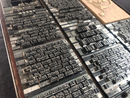
actual printing went well honestly, very few problems! i think that means i'm getting pretty good at planning one of these monstrosities, although perhaps it also means i'm not challenging myself enough. hmm. no that's silly there's 78 ding dang cards in this thing. anyway the drop & replace formes worked well, no registration issues. mum convinced me to overprint another half a deck's worth of cards when I was printing backs & borders and of course she was right :/ there were a handful of cards that actually had better line breaks and fewer lines total in true type than in the digital mockup, so i needed all the spares I had to put those new short quotes into the appropriate border breakage. next time i will not question her.
handset in Garamond, Eden Bold, and secret Neuland.
WIP : full text card assignments
bonus photo of the kind of trash notes i always take to plan things like how many borders were printed with space for short excerpts vs long excerpts, and how many of those are majors vs. minors, because they have a slightly different frame at the bottom edge, etc.
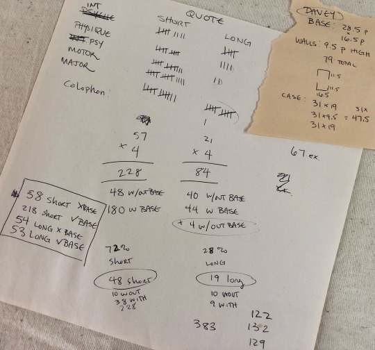
[image description: they are truly garbage notes, i tell you. half of it is written at angles to the other half, many numbers in the math problems are not labeled, mistakes are scribbled over. it gets me there but it doesn't look pretty. end description.]
#desert bus 2023#desert bus for hope#disco elysium#book arts#letterpress#letterpress printing#handset type#printmaking#db2023#finished works#long post
767 notes
·
View notes
Text
I bought some mushroom borders (from typefounder Val Lucas, Bowerbox Press) and what better way to test them than with a legendary Tumblr quote (from user @personsonable, apparently):
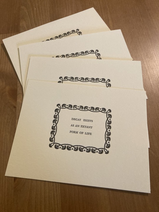
(If we’ve interacted before and you’d like one, and you have an address you’re comfortable sharing, message me! I have 30 of these things!)
#Claire and moki you’re getting one whether you want them or not#letterpress#letterpress printing#typesetting#hand press
46 notes
·
View notes
Text

Since 1978, Bow & Arrow Press has resided in a tiny corner of the Adams House, one of a dozen residential Houses devoted to Harvard undergraduate students. It is located in a building at the intersection of Bow and Arrow Streets, which its name originated. For 45 years, Bow & Arrow Press welcomed everybody in the community--students, faculty, staff, alumni, and the Adams House residents--and taught the art of letterpress to anybody who wanted to learn largely free of charge.
This Monday, the movers came and packed the contents of the studio, including the vintage presses and type cases, for storage while the Adams House renewal project takes place. The renewal plan had included the Bow & Arrow Press until April 16th, when Adams House’s faculty deans informed the community that the studio would not move back into their space after renovations are completed in 2025.
For 45 years, the Bow & Arrow Press has been a true community press. Over the years, thousands came to learn to typeset, get their fingers inky, and joyously run the century old letterpress. The creator of this artist’s book, scholar Johanna Drucker, used the press while she was a Harvard Mellon Faculty Fellow in the Department of Fine Arts. Drucker produced the letterpress edition of “The Word Made Flesh” in the winter of 1988-1989 with the assistance and support of James Barondess and Gino Lee, founders of the Bow & Arrow Press. Last Wednesday, Barondess (A.B.’79, Ph.D. ’93) came to the last Open Press Night and shared the early history of the press with the many younger generation printers who attended the event.
Poet Seamus Heaney also became familiar with the Bow & Arrow during his Harvard years, and theater director Peter Sellars was among the first students to get their hands on the press.
You can read more about the Bow & Arrow Press in an article, “The Eviction of the Bow & Arrow Press” written by Craig Lambert on Harvard Magazine.
The word made flesh
Drucker, Johanna, 1952-
New York, NY : Granary Books, c1996.
"This is a facsimile reprint of copy #50 of the original letterpress edition"--Colophon.
"The Druckwerk edition was produced in winter 1988-89 at the Bow and Arrow Press"--
HOLLIS number: 990072967770203941
#Bow&ArrowPress#BowandArrowPress#LetterPress#Letterpressprinting#JohannaDrucker#AdamsHouse#CommunityPrintingPress#HarvardFineArtsLibrary#Fineartslibrary#Harvard#HarvardLibrary#harvardfineartslibrary#fineartslibrary#harvard#harvardlibrary#letterpress#letterpress printing#artists books
36 notes
·
View notes
Text
Book History with the Library’s Book Arts Studio
Students last semester had the chance to explore the impact of early printing culture on the making and reception of the Bible in the fifteenth and sixteenth centuries through two workshops offered in Special Collections in cooperation with the Book Arts Studio.
In the first workshop, led by Pablo Alvarez, the students had the opportunity to examine early printed Bibles, beginning with a leaf from a copy of the edition of the Bible printed by Johann Gutenberg in Mainz (Germany) in 1454. Next to it were other early-printed Bibles, some displaying the Latin Vulgate, with and without printed annotations, and others containing landmark translations of the New Testament, like the first edition of Erasmus of Rotterdam’s Latin version, which had an extraordinary influence on the Reformation.

The letter by Pope Leo X endorsing the translation was printed as a Preface. Erasmus often mentioned this letter in correspondence with his friends to justify his changes to the Vulgate version. A former owner playfully drew three weasels, which might represent the coat of arms of the Wesel family. Novum Instrumentum omne, diligenter ab Erasmo Roterodamo recognitum & emendatum. Basel: Johann Froben, 1516
In the second workshop, conducted by Kyle Clark, the students learnt about the anatomy of metal type and the technical complexities of moveable-type printing

A type form positioned on the bed of the Library’s Albion printing press.

Kyle shows students how to operate the tympan and frisket of the Albion press.
Read more!
#instruction#book arts#printing#letterpress printing#special collections#special collections libraries#libraries and archives#archives#teaching#learning
31 notes
·
View notes
Photo
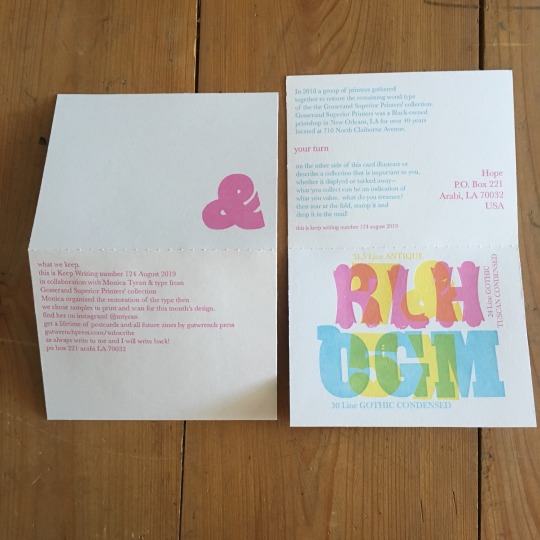
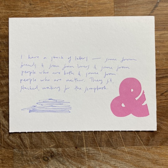
A response to Keep Writing 124 (August 2019) asking you to illustrate or describe a collection that is important to you.
want to get in on the project? subscribe here.
#keep writing#keepwriting#keepwritingpost#keepwritingproject#mail#mail art#postcard#postcard exchange#letterpress#penpal#penpaling#letterpress printing#writing prompt#mail prompt#prompt
10 notes
·
View notes
Text
Celebrate the Art of Newspaper Comics and Support a Great Cause at the North Bay Letterpress Arts -- Saturday, April 22
If you’re a fan of newspaper comics and letterpress printing and live in the North Bay Area, you won’t want to miss a special event hosted by the North Bay Letterpress Arts organization on Saturday, April 22nd. The “Sunday Funnies” event will feature a conversation with Benjamin L. Clark (me), Maia Kobabe, and Andrew Mecum, the Executive Director of NBLA, about the relationship between printing,…

View On WordPress
#artistic printing#comic book design#comic book printing#Comics#graphic novels#handcrafted comics#handmade printing#indie comics#letterpress art#letterpress comics#letterpress printing#printing techniques#printmaking#traditional printing#zine printing
5 notes
·
View notes
Text
We have officially reached a viewership level that has never been obtained by another museum before! All of us at the Sacramento History Museum are in disbelief.
We would have never thought that our institution, a small nonprofit museum in Sacramento, California, could reach this many views, but we are incredibly thankful for all of those who take the time to watch our videos and for your support.
In this video, Howard letterpress printed a headline announcing “Sacramento History Museum Reaches One Billion Video Views On YouTube” while using our Washington hand press, which was manufactured in 1852!
#museum#history#sacramento#old sacramento#art#letterpress#printing#asmr#typography#youtube#printmaking
21K notes
·
View notes
Text
Rollup Standee printing in Chandigarh
Rollup standees and Solvent Flex manufacturer are versatile, portable, and highly effective promotional tools. They are perfect for trade shows, exhibitions, conferences, retail stores, and any other location where you want to showcase your brand or message. Here's why rollup standees are a popular choice:
Sai Advertising Services
Portability and Convenience: Rollup standees are lightweight and easy to transport. They come with a compact carrying case, making them hassle-free to set up and take down. You can effortlessly move them from one location to another, maximizing their impact and visibility.
Space-saving Design: Rollup standees utilize vertical space efficiently. They have a retractable mechanism that allows the banner to be rolled up inside the base when not in use. This compact design saves space and makes storage a breeze.
Eye-Catching Visuals: Our rollup standees are printed with high-quality graphics, vibrant colors, and sharp images that grab attention. Whether you want to showcase your brand logo, product images, or promotional messages, our printing services ensure stunning visual impact that stands out from the crowd.
Durability: We understand the importance of durability, especially for repeated use. Our rollup standees are crafted with sturdy materials and high-quality printing techniques to ensure long-lasting performance. You can confidently use them for multiple events without worrying about wear and tear.
Best Printing & Branding Services in Chandigarh| contact us
#one way vision printing chandigarh#solvent flex manufacturer chandigarh#Rollup Standee printing#instant digital printing services chandigarh#label printing#banner printing#printingpress#screenprint#advertising#letterpress printing#wide format printing#graphicdesign
0 notes
Link
#allied market research#banknote printing machine#offset printing#intaglio printing#letterpress printing
0 notes
Photo
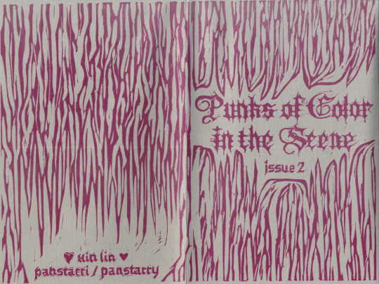


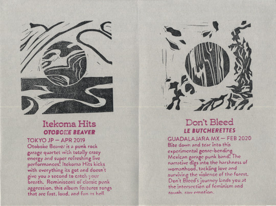
spreads from last semester’s zine 🎇 punks of color in the scene, issue 2
click here to read issue 1
#pan draws#pan designs#zine#zines#this one was very fun even though it killed me a bit <- guy who had too much shit to do#the cover (spread 1) and album covers are linocut. the album/band names + reviews are 3d-printed plates#the whole thing was ran through a letterpress machine in 2 passes—first pass was the black ink and second pass was the pink ink#there r two variants! the one here is on gray ingres paper but theres another version on white masa paper that also has blind deboss#theres like. 22 total in this edition. maybe i'll open shop for these guys. it was fun#i enjoy carving blackletter typefaces looking forward to doing more o7
543 notes
·
View notes
Text


Typography Tuesday
PRINTING WITH WOOD TYPE!
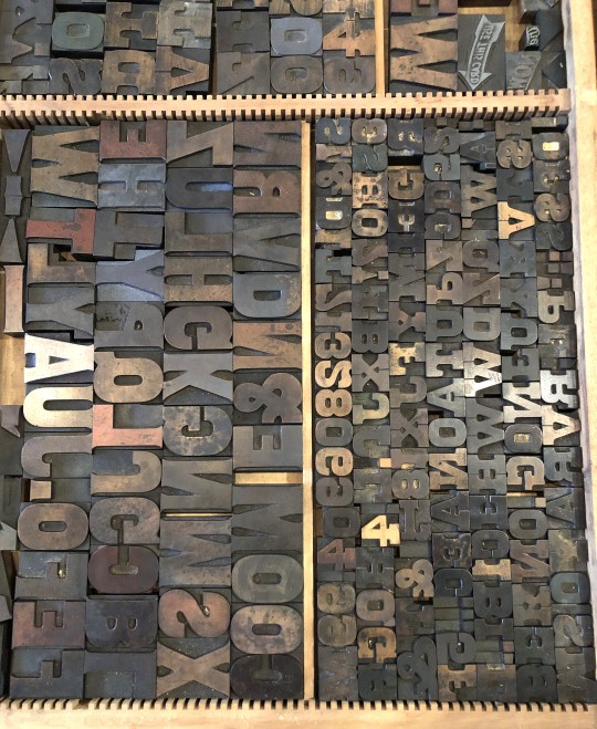
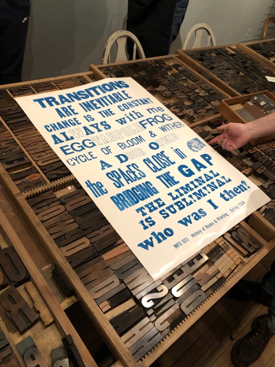
Every semester, when we finally get to the invention of letterpress printing in Europe in my History of Books & Printing course, we all head over to a local print shop to set type and print a collaborative broadside. Last week we did just that and went over to Adam Beadel's Team Nerd Letterpress in the Walker's Point neighborhood of Milwaukee.
Usually, we compose in metal type, as that is what the students just learned about, but Adam recently received a huge influx of foundry type that wasn't set up yet, so we had to use wood type instead. Even though we wouldn't learn about the invention of production wood type for a few weeks, we were game because wood type is the best!
Each student was assigned to come up with a 3-5-word phrase based on the theme of "Transitions." They set their own phrase in wood type, I arranged the phrases into an exquisite corpse poem, we locked up the type on the bed of a poster press, and pulled a proof in blue ink (second to last image). Everyone was satisfied with the results, and with only a couple of adjustments, the students went on a tear, inking up the type in a rainbow of colors (last image), and pulling 15 more prints. Everyone went home exhausted and happy.
There are few things more thrilling than making your own letterpress prints. Thanks Adam!!!
View another letterpress post from a previous book history session.
View other posts on wood type.
View our other Typography Tuesday posts.
-- MAX, Head, Special Collections
#Typography Tuesday#typetuesday#instructions sessions#students#graduate students#Information Studies#INFOST 603#History of Books & Printing#letterpress#letterpress printing#wood type#Adam Beadel#Team Nerd Letterpress#type setting#broadsides#student work#exquisite corpse
111 notes
·
View notes
Text
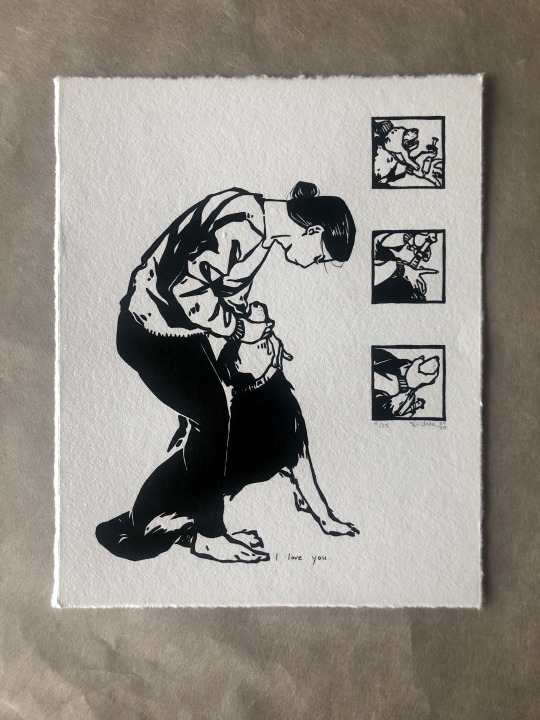

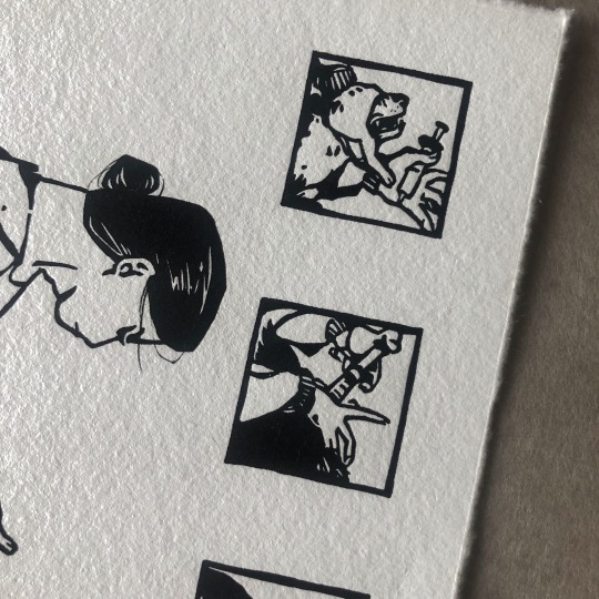
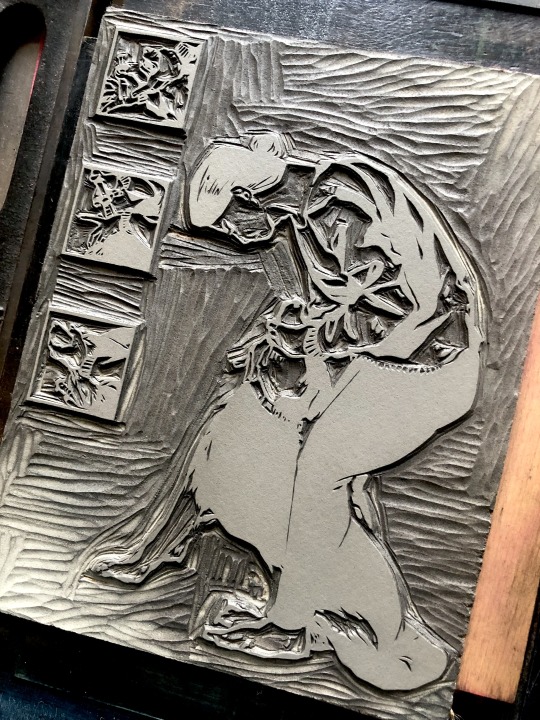
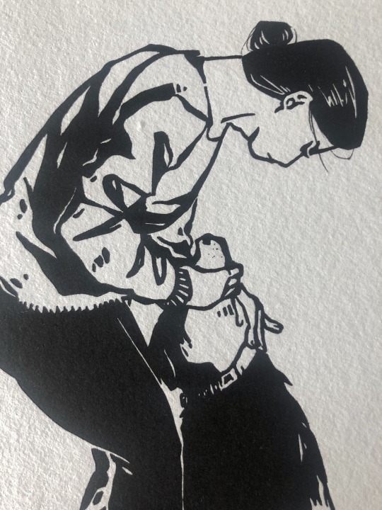
[image description: 5 photos of an illustrative print from a relief linoleum block. the image is a person standing over their dog, stroking their throat to make sure they swallow their medicine. To the side of the figures are three small close-up panels showing other stages of the struggle between human hands and dog mouth to deliver the syringe of medicine. there are a few hand-inked details in the hair and dog whiskers, and a small handwritten title down by everyone's feet: "i love you." end description.]
etsy l wip 1 l wip 2 l wip 3
sort of a companion piece to this one. a nega-verse version of it. a posi-verse version??
continuing tradition of interrupting my friends while they're just trying to live their lives. main photo reference was from a specific instance in this friend's home and she's a truly excellent pet caretaker, i throw no aspersions on her animal handling BUT as a disclaimer, i never showed the finished illustration to a real vet or anything. despite stylistic similarities this is not an instructional pamphlet.
(awagami bamboo, 8x10 inches)
42 notes
·
View notes
Text
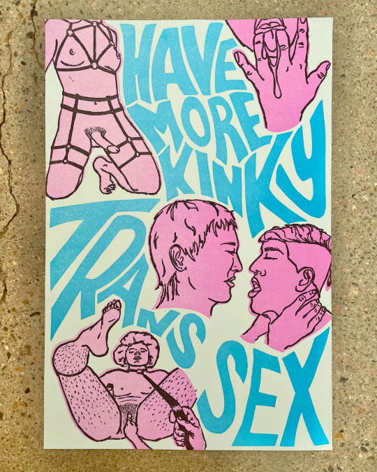
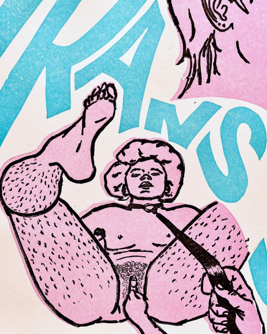
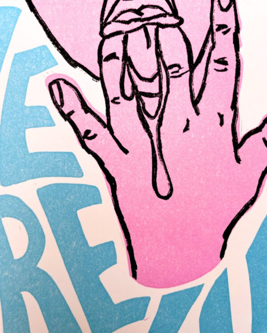
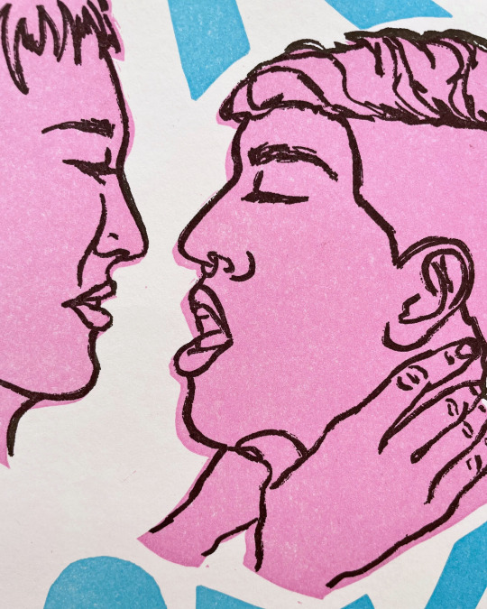
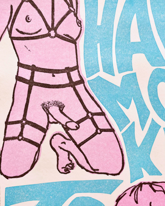
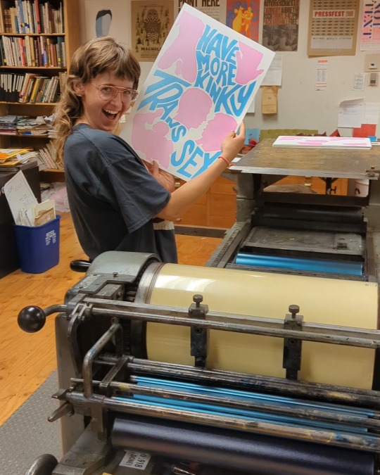
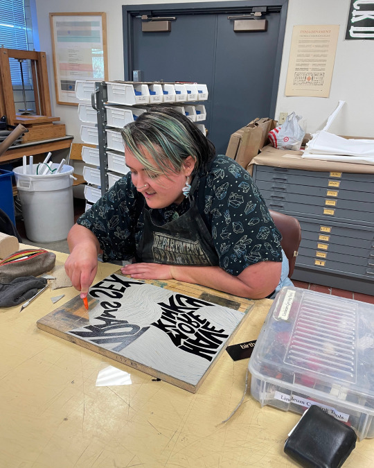
Can't believe this is the only social media site I can post the uncensored version of these prints on, but anyway...
This print is a collaborative project made utilizing linocut and photopolymer plate printing techniques. It emerged out of a conversation one day a few months ago in Nico's living room during a moment of particular grief and fear about the anti-trans hysteria we are living through. It is a straight-forward ode to our love for kinky trans sex and also an expression of our belief in continuing to live full, sexy, love-filled lives in the face of so much violence. You want to get rid of us? Still here, getting freakier.
~~~~
To see the full uncensored version, link in both of our bios!
The illustrations of the bodies were drawn by Celia Palmer and the text and linocut silhouettes were designed and carved by Nico Wilkinson. Nico and Celia printed the posters together on a Vandercook in the Press and Colorado College.
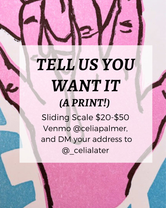
These posters are pay-what-you-can, $20-$50. (Please consider including an additional $5 for shipping!) To purchase your own, Venmo Celia at @celiapalmer with your name and address in the description. Posters will be shipped within two weeks, or are available for local pickup if you live in or near Colorado Springs - for local pickup, please include your phone number in the Venmo description.
The perfect gift for yourself, a friend, or a play partner!
#letterpress#t4t#printmaking#linocut#trans#trans sex#lgbtqia#queer art#queer prints#trans art#vandercook#printing press
163 notes
·
View notes
Text
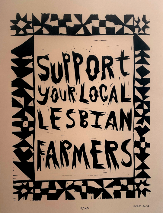
Support your local lesbian farmers!!
11”x15” linocut on paper. Printed on a vandercook #4. Edition of 25.
#butch lesbian#lesbian#they them lesbian#butch#trans artist#lesbian artist#lesbian printmaker#linocut#letterpress#relief print#printmaking#linoprint#block printing#lesbian farmer
42 notes
·
View notes
Text

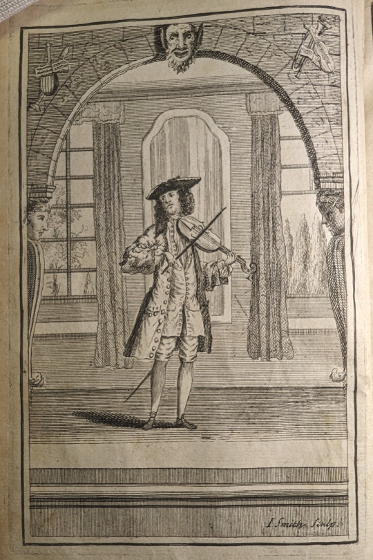
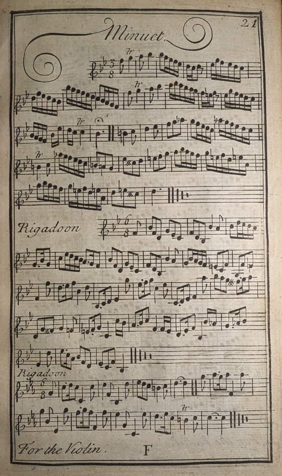
Prelleur, Peter. The Art of Playing on the Violin; : With a New Scale Shewing How to Stop Every Note, Flat or Sharp, Exactly in Tune, and Where the Shifts of the Hand Should Be Made. To Which Is Added a Collection of the Finest Rigadoons, Almands, Sarabands, Courants, & Opera Airs Extant. London: Engrav’d, printed and sold at the Printing-office in Bow Church-yard, 1731.
MT262 .P88 1731
#illustration#violin#music#music instruction#minuet#18th century#scales#libraryofva#specialcollections#rarebooks#printing#letterpress#book art
37 notes
·
View notes
Last Seen Blogs

ang3l-m00n
Untitled


doobledabbadoo
Dillydale’s Most Wanted
pavefactum-blog
MONSTERS;
fantazychai
Look mom I blog now