cyclesprefectpress
cyclesprefect press
etsy : instagram, sort of : ask me anything : view finished works only
488 posts
Don't wanna be here? Send us removal request.
Last Seen Blogs


Text
Oof ouch framing is so spensive
#justifiably. skilled labor & $$ materials.#every time I get framing done tho I’m like right yes.#if I were buying it for me instead of my business#I would not be able to afford my own services either alskdjd#jazz hands the economy emotions yknowhatimean
6 notes
·
View notes
Text
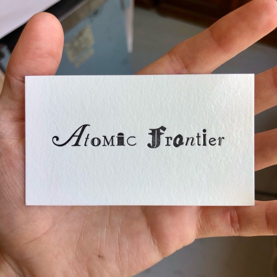

[image description: 2 photos of a letterpress printed business card, and the forme of handset type used to print it. It reads “atomic frontier,” and was set with each of the fourteen letters in a different typeface. In the forme of type, this means various sizes of type were used, and the rectangular body on which a piece of relief type was cast wasn’t designed for mixed usage, so the baselines of each face are misaligned. To compensate, each letter is packed with tiny adjustment spacing on top and bottom sides, in increments down to .5 a point, to force the baselines together. End description.]
I was SO happy to get this project inquiry in my inbox a couple weeks ago :D
Atomic Frontier is making short science documentaries on YouTube and asked if I could put together a small printing project that put the channel name in handset type, with every letter a different face—I said yes of COURSE this a typography crime I will aid & abet, thank you. I do not know when the final video concerning typography will be finished but my personal favorite currently available is Why typing sucks now for perhaps obvious reasons and you should check it out to scratch that language & science itch
In order: Caslon swash; Trafton; Gravure; Garamond small caps; Nubian; Bernhard Fashion; Tudor Black; Melior; Reporter; Bodoni book italic; News Gothic condensed; Albertus; Della Robbia (original); Bernhard Tango.
(I tried but could not find a place in the visual rhythm for the coolest raddest Wilhelm Klingspor Schrift :( but I believe it will make an appearance in the final video)
11 notes
·
View notes
Text

[image description: various messy makeready sheets for letterpress printing notecards. Includes large Ts and Ys printed in several colors, tests for establishing position on the sheet, & draw-downs of colors to test ink mixes. End description.]
Day’s numbers: 1100 impressions, 3 colors, 1 frisket, 2 makereadies
Not so bad on the run time but my brain is tiiiiired :[
4 notes
·
View notes
Text
@anunholymessofagirl replied to your post “[video description: process recording of...”:
What's the fork-y thing that's attached to the front of the platen? Is it used to hold larger sheets of paper in place?
Ah they can be used for that! Technically they're called grippers, although I usually don't because I also use flatbeds a lot and on a flatbed a gripper has a slightly different function. Each arm is held on a rail by a bolt, so they can be repositioned side to side independently, or removed from the rail entirely.
They can hold down a sheet to reduce the sheet sticking to the ink & forme if you've got room for them in the margins—they'll crush anything type-high, and registration pins*—but usually I'm suspending something more delicate between them to do a similar thing to a small sheet. Die cutting when it's just an edge or a corner (not cutting a complete shape out of a sheet) can pull out of the pins a LOT :( so I almost always put rubber bands across the grippers that hold the card in place while the blade is moving away. they're also super useful for holding a mask over the sheet if you're nasty
#*well. they won't crush the squishy plastic pins. but i hate those.#anunholymessofagirl#letterpress#letterpress printing#chandler and price#platen press
4 notes
·
View notes
Text
[video description: process recording of letterpress printed business cards. Each card is fed by hand into clamshell-action presses, which open and close on a hinge. Every time the press opens a card is removed and another is replaced in position inside the press; every time it closes the relief plate comes in contact with the card to transfer ink and impression. The same presses are also used with blades instead of relief printing material, for precise cutting operations. This business card is for Matthew Daniel Jenkins, an animator, illustrator, mixed media artist, etc. The back of the card features a pen illustration portrait. end description.]
been doing a lot of die cutting lately. look at all that oily paper garbage under the big press fsldkfj
11 notes
·
View notes
Text
youtube
HEY this presentation was incredibly fucking cool and if you're interested in the form & intention of books, their mobile position between artistic process and commercial product, contextual lexicons, all of the above, you should watch iiiiiit
also remote book arts guild presentations are freeeeee
9 notes
·
View notes
Text
#aaaaaah so it’s like if your punches were also monotype mats#that makes sense for a writing system with. umpteen more characters.#my mom knew a guy who took ceramic type out backpacking#to print on hikes#much more practical than metal for that.#letterpress printing#handset type#video
40K notes
·
View notes
Text
We have officially reached a viewership level that has never been obtained by another museum before! All of us at the Sacramento History Museum are in disbelief.
We would have never thought that our institution, a small nonprofit museum in Sacramento, California, could reach this many views, but we are incredibly thankful for all of those who take the time to watch our videos and for your support.
In this video, Howard letterpress printed a headline announcing “Sacramento History Museum Reaches One Billion Video Views On YouTube” while using our Washington hand press, which was manufactured in 1852!
#:DDD#wickersham quoinssss#idk i don't use them much but i just love the look of em#letterpress#letterpress printing
21K notes
·
View notes
Text
[video description: process recording of letterpress-printed business cards on a clamshell-action machine. the press opens on a hinge, with a relief surface fixed to one side of the V and the paper placed on the other. as the hinge opens, the rollers pass over the relief surface and distribute ink across the raised parts; as the hinge closes, the plate comes in contact with the paper. each card is placed in register inside the press and removed after printing by hand, as the hinge opens and closes. This business card for Winter Moon Tea House involves three layers of grey, finishing with a pale grey pass that punches a deep circular impression into the card for the moon. end description.]
do love a challenge :)) delicate tones, slim reverse out type, large coverage, tight registration. very satisfying :))
#wip#letterpress#letterpress printing#video#hello. long time no see. wedding season has got my leg in a bear trap and is Chewing.
24 notes
·
View notes
Text
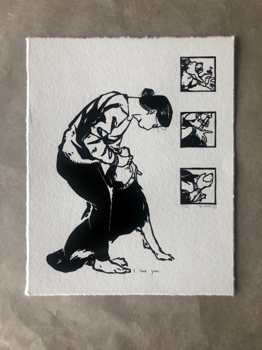

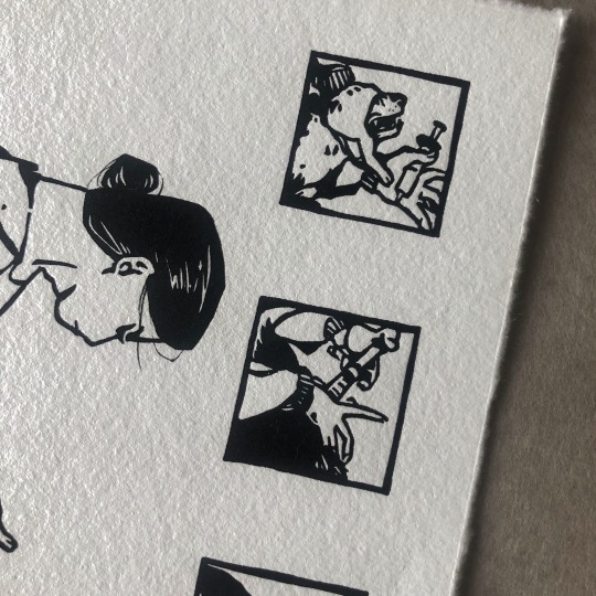
[image description: 5 photos of an illustrative print from a relief linoleum block. the image is a person standing over their dog, stroking their throat to make sure they swallow their medicine. To the side of the figures are three small close-up panels showing other stages of the struggle between human hands and dog mouth to deliver the syringe of medicine. there are a few hand-inked details in the hair and dog whiskers, and a small handwritten title down by everyone's feet: "i love you." end description.]
etsy l wip 1 l wip 2 l wip 3
sort of a companion piece to this one. a nega-verse version of it. a posi-verse version??
continuing tradition of interrupting my friends while they're just trying to live their lives. main photo reference was from a specific instance in this friend's home and she's a truly excellent pet caretaker, i throw no aspersions on her animal handling BUT as a disclaimer, i never showed the finished illustration to a real vet or anything. despite stylistic similarities this is not an instructional pamphlet.
(awagami bamboo, 8x10 inches)
42 notes
·
View notes
Text
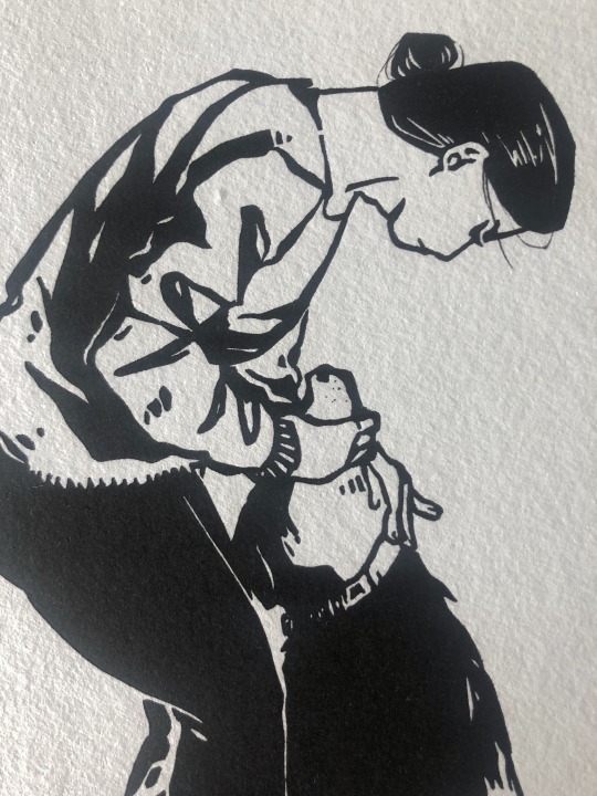
[video description: recording of adding some hand-inked details to a relief print made from a linoleum block. The block illustrates a person standing over their dog, stroking the dog's throat to make sure they swallow medicine. to the side of the main illustration are three small panels that illustrate the hands and head of the dog as a person struggles, understandably, to get the syringe of medicine into the dog's mouth. the hand-inked details are mostly hair details and whisker dots for the dog, and lastly near the feet in small print is written: "i love you." end description.]
wip 1 l wip 2
4 notes
·
View notes
Text
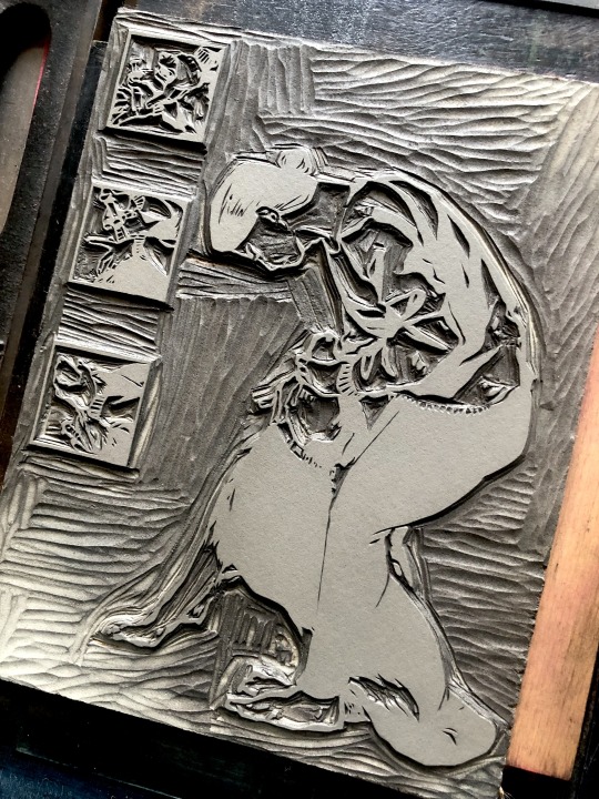
[video description: recording of printing an edition of linoleum block relief prints on a vandercook SP15 flatbed press. this image has both small detail areas and large blocks of color, so the best compromise in ink coverage involves using the press' ink distribution for one pass and then hand-applying an extra touchup to the dense areas with a small brayer. printing the impression on a flatbed press means to grip the sheet into register around the outside of a large cylinder, and then roll the whole cylinder & paper over the top of the relief block. end description.]
wip 1 l wip 3
12 notes
·
View notes
Text
[video description: recording of inking up a relief linoleum cut for first proofing. The block illustrates a person standing over their dog, stroking their throat to make them swallow medicine. To the side are three small panels that illustrate close-ups of the hands and dog's head during other steps in the process of feeding them medicine from a syringe. drawn carefully from reference but not approved by any official animal handling expert. end description.]
new year same weird feelings about teeth
wip 2 l wip 3
12 notes
·
View notes
Text
reblogging for the updated photos—had to restock again after christmas! all those ones in the first photo are sold, just the individual photos are representative.

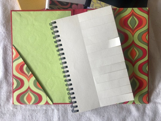

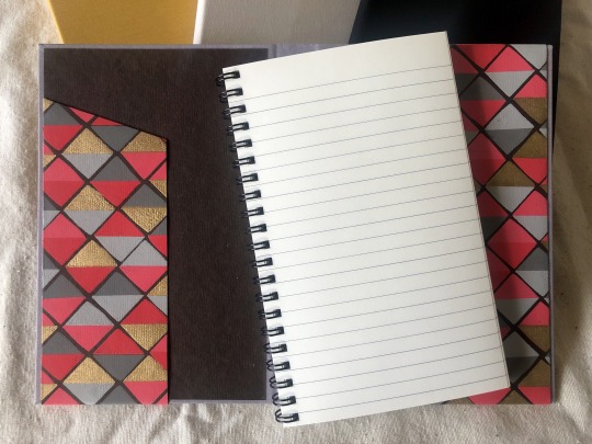

[image description: photos of a set of reloadable hardcase journal covers. The covers are wrapped in bookcloth, and the front and back inside covers each have a pocket folded out of the decorated paper endsheet. The front pocket is asymmetrical, for small papers; the back pocket is the full height of the book. The journal contents are wire-bound sets with a heavier cardstock as the last sheet: the cardstock slips into the back pocket like a checkbook. different kinds of contents can be swapped out, or used contents replaced. One set of contents are lined for writing; another set is perforated and cut so that each page has 12 removable tabs for organization, like a task manager. closed journal: 4.75x7.25 inches. available writing area: 4x7. end description.]
etsy
restocking time!! i got fresh papers & bookcloth but i only had davey board on hand for 8 dflskjf
currently 2/3rds of the way through my latest set of task manager guts and i need to give up on saving every tab in the other pocket until the book is done. it isn't big enough for all of them. but i love so much to take a boxfull of Tasks Completed and toss them at once.
#promise i've been working on like. prints and stuff also. promise!!#nov-dec combined custom & retail schedule just absolutely bodies me every year#realized while i was photographing these that there was a whole set of like 10 in between these two sets#that i never got around to photographing or posting anywhere oOPS#even when i finish personal projects non-essential internet stuff is the first thing i eject from my task list#i forget to take process recordings or anything#gets quiet on the ol blog apologies#journals#book arts#bookbinding
17 notes
·
View notes
Text
[video description: recording of scoring foldover notecards in a clamshell-action press. The press operates on a hinge, and every time the press opens an impressed card is removed and a new one is replaced in the registration pins. to score a sheet, one side of the press holds a thin steel bar with a rounded edge, and the other side has a receiving divot, and the sheet is pressed between them. the finished cards have an illustration and greeting for new years, with paper lanterns of the Chinese zodiac. end description.]
lauren nishizaki designs did the designs and carved the linoleum blocks on this one! i was only the printer & typesetter. keeping a hold of the color depth & yellow balance on both colors involved some kind of death grip but it was worth the fuss :)
#letterpress#letterpress printing#wip#fixed the mcfuckning vid :/#sorry. video editing makes me wanna throw my computer into the sea.
29 notes
·
View notes
Text
[image description: photos of a set of reloadable hardcase journal covers. The covers are wrapped in bookcloth, and the front and back inside covers each have a pocket folded out of the decorated paper endsheet. The front pocket is asymmetrical, for small papers; the back pocket is the full height of the book. The journal contents are wire-bound sets with a heavier cardstock as the last sheet: the cardstock slips into the back pocket like a checkbook. different kinds of contents can be swapped out, or used contents replaced. One set of contents are lined for writing; another set is perforated and cut so that each page has 12 removable tabs for organization, like a task manager. closed journal: 4.75x7.25 inches. available writing area: 4x7. end description.]
etsy
restocking time!! i got fresh papers & bookcloth but i only had davey board on hand for 8 dflskjf
currently 2/3rds of the way through my latest set of task manager guts and i need to give up on saving every tab in the other pocket until the book is done. it isn't big enough for all of them. but i love so much to take a boxfull of Tasks Completed and toss them at once.
#finished works#bookbinding#book arts#journals#I also didn’t have much of a cool/blue range of book cloth colors easily available :(#i want to order. so many colors.#but the quantities are so silly.#aaah to be a full time bookbinder who has cause to have a good range of colors on hand all the time.
17 notes
·
View notes
Text
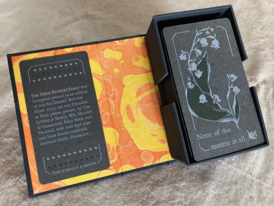


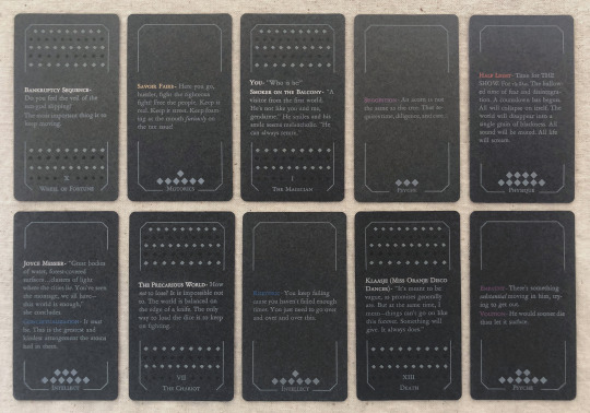
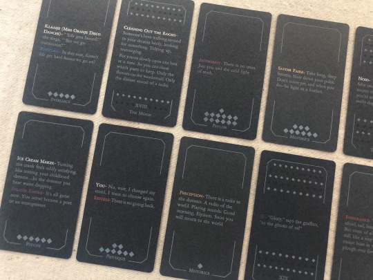
[image description: photos of The Disco Elysium Tarot, printed letterpress in an edition of one from handset lead type and linoleum blocks. It is a complete 78-card tarot deck printed primarily with white text and illustrations on medium grey cardstock, in a custom dark grey hardcase box with a hand-marbled orange and yellow endsheet. The backs of the deck are decorated with an illustration of a sprig of may bells, and a quote from Smallest Church in Saint-Saëns: "None of this matters at all." The interpretive meaning of each card is expressed on its face with a small excerpt of the game's text. The Minor Arcana are divided into four suits of Harry's Attributes—Motorics, Psyche, Physique, Intellect—and each card in that suit is a quote from a skill under that Attribute. The Major Arcana are assigned quotes from other sources like NPC dialogue or Thought Cabinet problems & solutions. Pips for the Minors are counted with diamonds like the game's skill points; each actor or title is printed with their in-game color, but made shiny & metallic with bronzing powder.
each piece of text was set in handset lead type, assembled from individual pieces for each letter and space, and printed relief on a chandler & price clamshell press. end description.]
🎊🎊 Desert Bus for Hope starts for 2023 on nov. 11th and i have made an item this year for the craftalong that will be up for giveaway between 6am-12pm on Monday the 13th! 🎊🎊 It is a full tarot deck based on Disco Elysium and it has several pieces of my heart & soul in it but NOT my blood because i put a bandaid right on that :) donations for this and any other auctions & giveaways for Desert Bus go to Child's Play Charity.
notes: i did not make a whole new interpretive model for this deck, apologies, that was outside of my scope. it's generally compatible with a Rider-Waite model, with Motorics for Wands, Psyche for Cups, Physique for Swords, and Intellect for Disks. (full distribution of text listed by card, linked below. any spelling or transcription errors you find there, i promise i fixed them in print—that's copied from my digital mockup which was copied hastily from screenshots.)
i also do not track hours on these kinds of projects because that way lies madness, but i will say: i knew how much time it would take to print it. it was a lot but i was not worried about it, i know how to print. i was very worried about how much time it would take to absorb the sheer amount of text, and distribute it across the cards, and really get an array i believe in. i was right to worry, and i have absolutely had a few anxious nightmares about discovering the Perfect excerpt that should've gone in and i missed it, and the suit of Intellect made me want to lay on the floor a few times, but still! i believe there's many versions of a deck you could make from this game and this one is a good one.
i think the Minors fit really well with the double-edged sword of Harry's skills, their advice, their priorities. the circular way the Fool-World assignment works out makes me smile every time. The colors on The Star came out so nice. i think Justice fulfills some of my favorite things about Kim's character & purpose in the story. i worried sometimes that editing to such short clips would lose too much of the politics of the game, but of course you can't really take them out and they're especially present in the Majors—the Devil and the Hierophant, The Star and The Sun. i've wanted to design a tarot deck for years and i love this game deeply and i let this idea percolate for a few months and it never stopped making me laugh so here it is, & given a beautiful purpose :)
i also literally could not have done this without xyrilin's Disco Reader and the FAYDE On-Air Playback Experiment to navigate the dialogue and skill checks. Really couldn’t have tied the whole concept & colophon in its final bow without the Disco Reader :)) thank thank thank, they're so fun to investigate that it was honestly very difficult to focus on my task instead of veering off and exploring every branch in an extremely disorganized way.
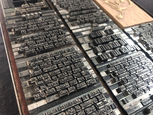
actual printing went well honestly, very few problems! i think that means i'm getting pretty good at planning one of these monstrosities, although perhaps it also means i'm not challenging myself enough. hmm. no that's silly there's 78 ding dang cards in this thing. anyway the drop & replace formes worked well, no registration issues. mum convinced me to overprint another half a deck's worth of cards when I was printing backs & borders and of course she was right :/ there were a handful of cards that actually had better line breaks and fewer lines total in true type than in the digital mockup, so i needed all the spares I had to put those new short quotes into the appropriate border breakage. next time i will not question her.
handset in Garamond, Eden Bold, and secret Neuland.
WIP : full text card assignments
bonus photo of the kind of trash notes i always take to plan things like how many borders were printed with space for short excerpts vs long excerpts, and how many of those are majors vs. minors, because they have a slightly different frame at the bottom edge, etc.
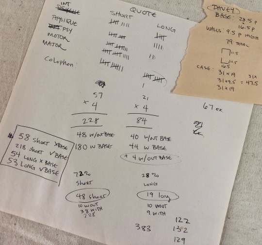
[image description: they are truly garbage notes, i tell you. half of it is written at angles to the other half, many numbers in the math problems are not labeled, mistakes are scribbled over. it gets me there but it doesn't look pretty. end description.]
#desert bus 2023#desert bus for hope#disco elysium#book arts#letterpress#letterpress printing#handset type#printmaking#db2023#finished works#long post
770 notes
·
View notes