#letterpress
Text
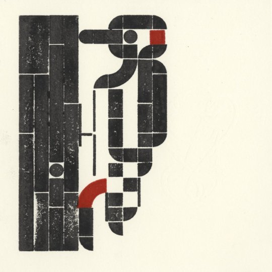
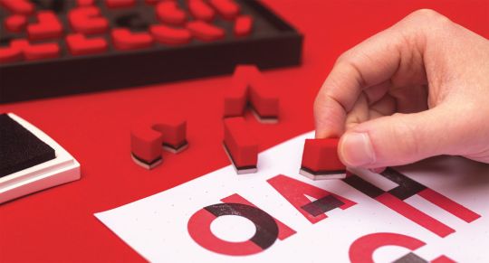
We have officially reached a viewership level that has never been obtained by another museum before! All of us at the Sacramento History Museum are in disbelief.
We would have never thought that our institution, a small nonprofit museum in Sacramento, California, could reach this many views, but we are incredibly thankful for all of those who take the time to watch our videos and for your support.
In this video, Howard letterpress printed a headline announcing “Sacramento History Museum Reaches One Billion Video Views On YouTube” while using our Washington hand press, which was manufactured in 1852!
#museum#history#sacramento#old sacramento#art#letterpress#printing#asmr#typography#youtube#printmaking
21K notes
·
View notes
Text


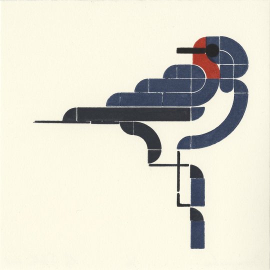


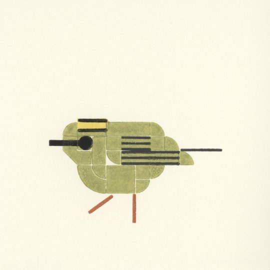
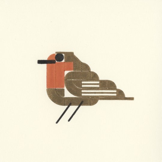
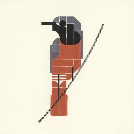

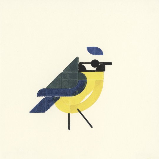
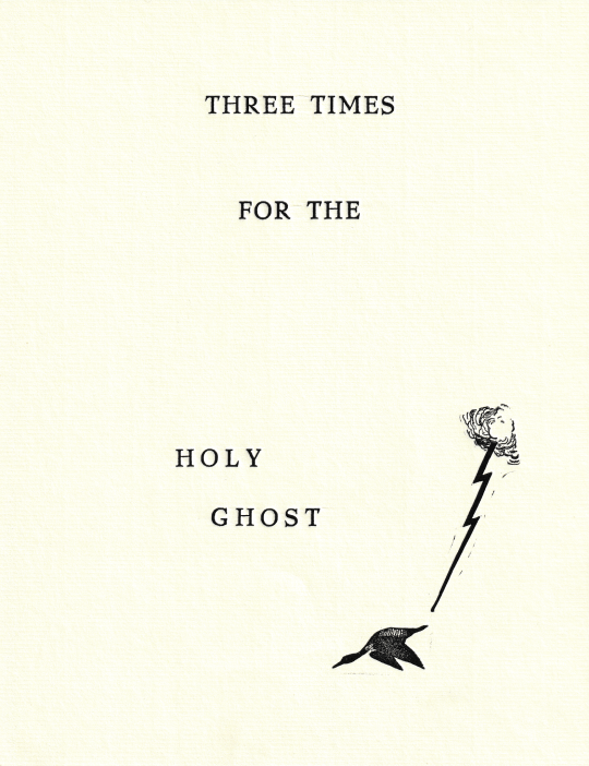
50 vogels – a project to print 50 birds each with 16×16 LEGO pieces. Made by Roy Scholten and Martijn van der Blom, 2018. Prints are available to buy, and a book is coming in October. More info available here.
via printmag
2K notes
·
View notes
Text
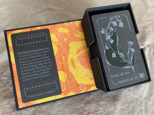


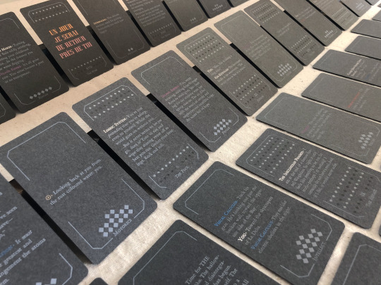

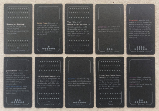
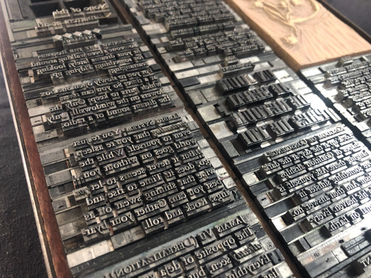
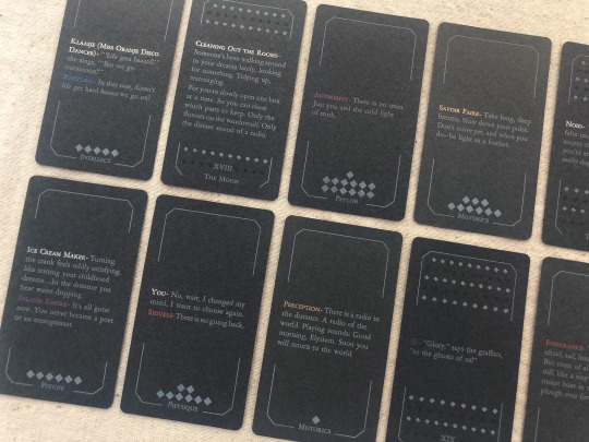
[image description: photos of The Disco Elysium Tarot, printed letterpress in an edition of one from handset lead type and linoleum blocks. It is a complete 78-card tarot deck printed primarily with white text and illustrations on medium grey cardstock, in a custom dark grey hardcase box with a hand-marbled orange and yellow endsheet. The backs of the deck are decorated with an illustration of a sprig of may bells, and a quote from Smallest Church in Saint-Saëns: "None of this matters at all." The interpretive meaning of each card is expressed on its face with a small excerpt of the game's text. The Minor Arcana are divided into four suits of Harry's Attributes—Motorics, Psyche, Physique, Intellect—and each card in that suit is a quote from a skill under that Attribute. The Major Arcana are assigned quotes from other sources like NPC dialogue or Thought Cabinet problems & solutions. Pips for the Minors are counted with diamonds like the game's skill points; each actor or title is printed with their in-game color, but made shiny & metallic with bronzing powder.
each piece of text was set in handset lead type, assembled from individual pieces for each letter and space, and printed relief on a chandler & price clamshell press. end description.]
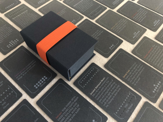
🎊🎊 Desert Bus for Hope starts for 2023 on nov. 11th and i have made an item this year for the craftalong that will be up for giveaway between 6am-12pm on Monday the 13th! 🎊🎊 It is a full tarot deck based on Disco Elysium and it has several pieces of my heart & soul in it but NOT my blood because i put a bandaid right on that :) donations for this and any other auctions & giveaways for Desert Bus go to Child's Play Charity.
notes: i did not make a whole new interpretive model for this deck, apologies, that was outside of my scope. it's generally compatible with a Rider-Waite model, with Motorics for Wands, Psyche for Cups, Physique for Swords, and Intellect for Disks. (full distribution of text listed by card, linked below. any spelling or transcription errors you find there, i promise i fixed them in print—that's copied from my digital mockup which was copied hastily from screenshots.)
i also do not track hours on these kinds of projects because that way lies madness, but i will say: i knew how much time it would take to print it. it was a lot but i was not worried about it, i know how to print. i was very worried about how much time it would take to absorb the sheer amount of text, and distribute it across the cards, and really get an array i believe in. i was right to worry, and i have absolutely had a few anxious nightmares about discovering the Perfect excerpt that should've gone in and i missed it, and the suit of Intellect made me want to lay on the floor a few times, but still! i believe there's many versions of a deck you could make from this game and this one is a good one.
i think the Minors fit really well with the double-edged sword of Harry's skills, their advice, their priorities. the circular way the Fool-World assignment works out makes me smile every time. The colors on The Star came out so nice. i think Justice fulfills some of my favorite things about Kim's character & purpose in the story. i worried sometimes that editing to such short clips would lose too much of the politics of the game, but of course you can't really take them out and they're especially present in the Majors—the Devil and the Hierophant, The Star and The Sun. i've wanted to design a tarot deck for years and i love this game deeply and i let this idea percolate for a few months and it never stopped making me laugh so here it is, & given a beautiful purpose :)
i also literally could not have done this without xyrilin's Disco Reader and the FAYDE On-Air Playback Experiment to navigate the dialogue and skill checks. Really couldn’t have tied the whole concept & colophon in its final bow without the Disco Reader :)) thank thank thank, they're so fun to investigate that it was honestly very difficult to focus on my task instead of veering off and exploring every branch in an extremely disorganized way.
actual printing went well honestly, very few problems! i think that means i'm getting pretty good at planning one of these monstrosities, although perhaps it also means i'm not challenging myself enough. hmm. no that's silly there's 78 ding dang cards in this thing. anyway the drop & replace formes worked well, no registration issues. mum convinced me to overprint another half a deck's worth of cards when I was printing backs & borders and of course she was right :/ there were a handful of cards that actually had better line breaks and fewer lines total in true type than in the digital mockup, so i needed all the spares I had to put those new short quotes into the appropriate border breakage. next time i will not question her.
handset in Garamond, Eden Bold, and secret Neuland.
WIP : full text card assignments
bonus photo of the kind of trash notes i always take to plan things like how many borders were printed with space for short excerpts vs long excerpts, and how many of those are majors vs. minors, because they have a slightly different frame at the bottom edge, etc.
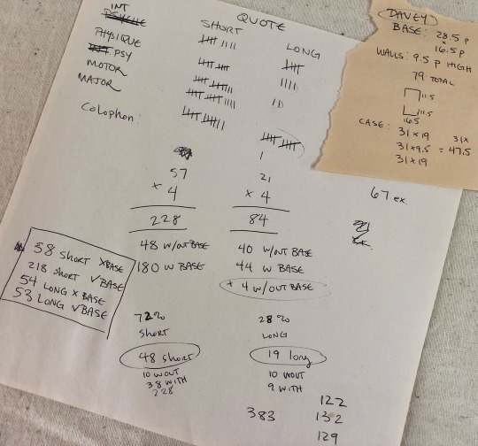
[image description: they are truly garbage notes, i tell you. half of it is written at angles to the other half, many numbers in the math problems are not labeled, mistakes are scribbled over. it gets me there but it doesn't look pretty. end description.]
#desert bus 2023#desert bus for hope#disco elysium#book arts#letterpress#letterpress printing#handset type#printmaking#db2023#finished works#long post
766 notes
·
View notes
Text

I’m only a girl while the testosterone dries on my chest.
#queer#lesbian#butch lesbian#they them lesbian#butch#transgender#transsexual#trans artist#letterpress#transsexual art#lesbian artist
387 notes
·
View notes
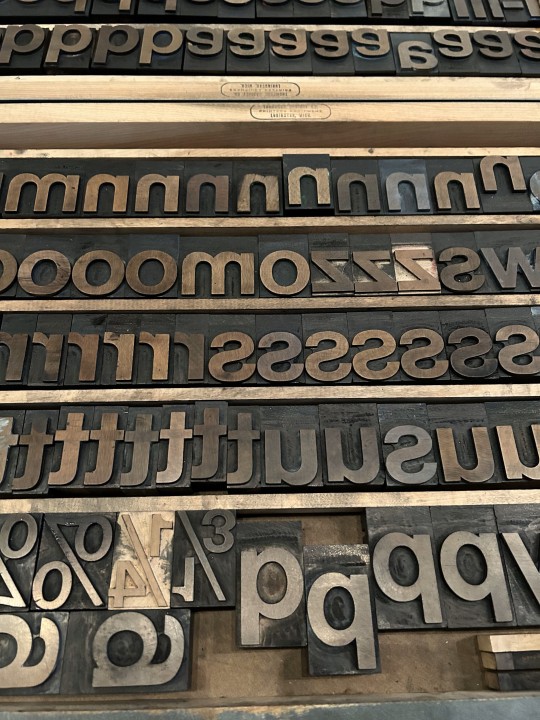
Text


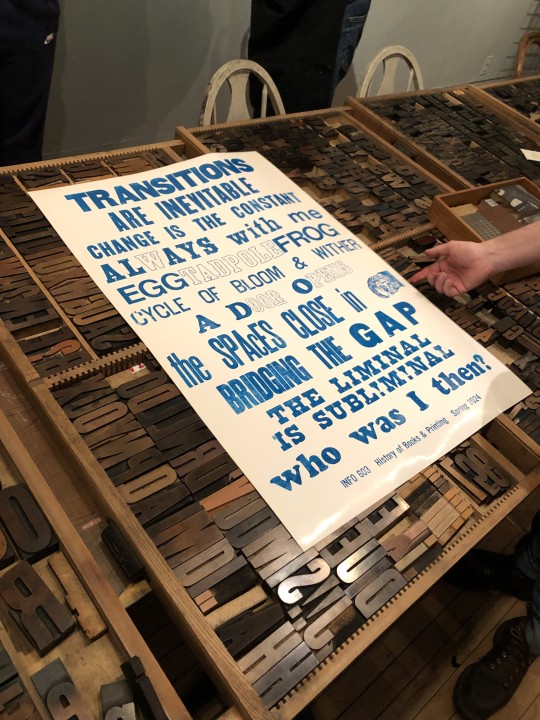

Typography Tuesday
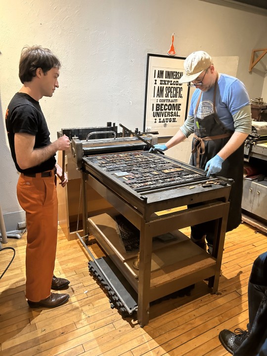
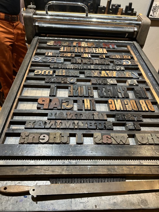
PRINTING WITH WOOD TYPE!
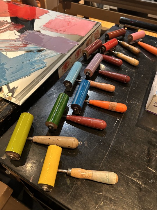
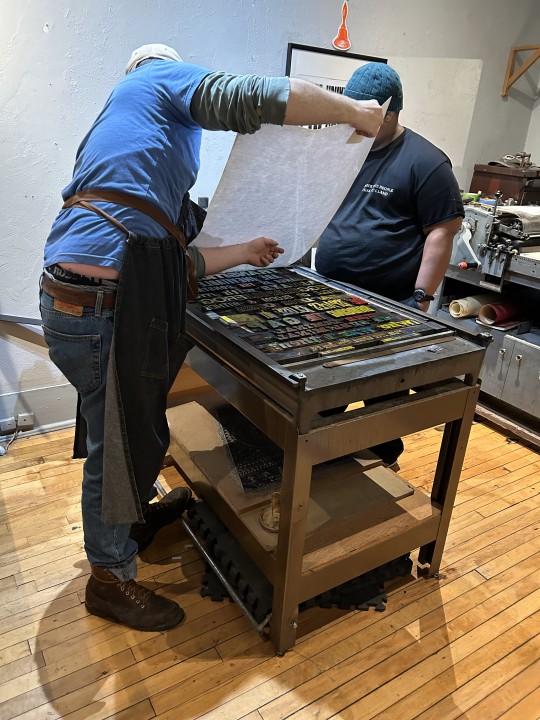
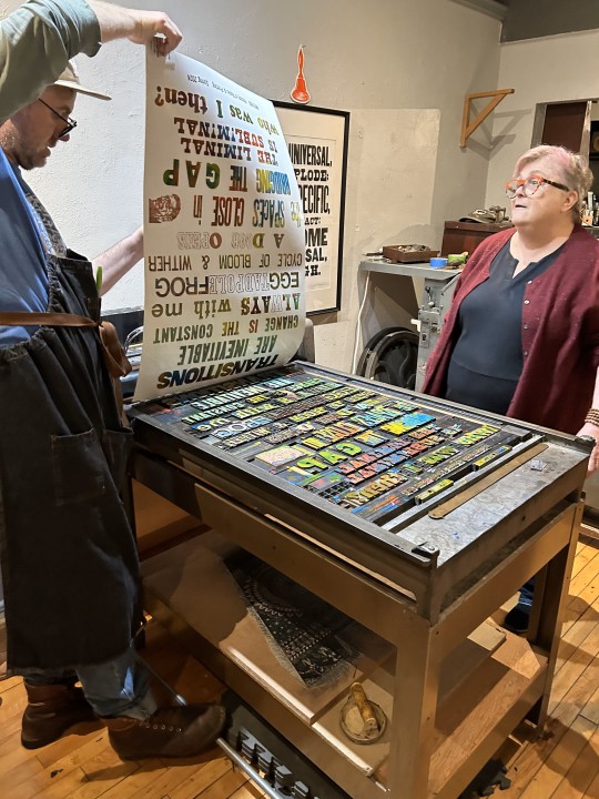
Every semester, when we finally get to the invention of letterpress printing in Europe in my History of Books & Printing course, we all head over to a local print shop to set type and print a collaborative broadside. Last week we did just that and went over to Adam Beadel's Team Nerd Letterpress in the Walker's Point neighborhood of Milwaukee.
Usually, we compose in metal type, as that is what the students just learned about, but Adam recently received a huge influx of foundry type that wasn't set up yet, so we had to use wood type instead. Even though we wouldn't learn about the invention of production wood type for a few weeks, we were game because wood type is the best!
Each student was assigned to come up with a 3-5-word phrase based on the theme of "Transitions." They set their own phrase in wood type, I arranged the phrases into an exquisite corpse poem, we locked up the type on the bed of a poster press, and pulled a proof in blue ink (second to last image). Everyone was satisfied with the results, and with only a couple of adjustments, the students went on a tear, inking up the type in a rainbow of colors (last image), and pulling 15 more prints. Everyone went home exhausted and happy.
There are few things more thrilling than making your own letterpress prints. Thanks Adam!!!
View another letterpress post from a previous book history session.
View other posts on wood type.
View our other Typography Tuesday posts.
-- MAX, Head, Special Collections
#Typography Tuesday#typetuesday#instructions sessions#students#graduate students#Information Studies#INFOST 603#History of Books & Printing#letterpress#letterpress printing#wood type#Adam Beadel#Team Nerd Letterpress#type setting#broadsides#student work#exquisite corpse
111 notes
·
View notes
Text
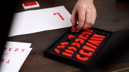

In an Open-Source Stamp Kit, ‘BlockFace’ Gets Tactile With Type
231 notes
·
View notes
Text
got to take a super fun letterpress workshop today & look at the neat lil print i made :)
265 notes
·
View notes
Text
In 2018, artist and printmaker Roy Scholten set himself the task to design and print fifty birds using LEGO bricks as the printing matter. Early 2024, the last bird print came off the press. The complete series will be on show for the first time in Grafisch Atelier Hilversum from April 14.
More here.
78 notes
·
View notes
Text
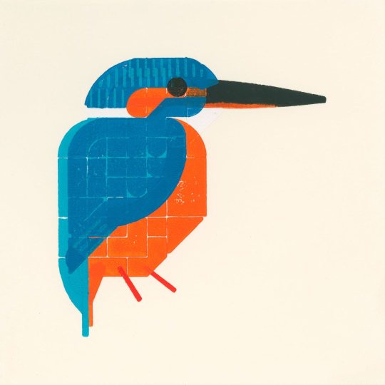
David Bellingham, Solar Eclipse, 20th March 2015, (cardboard, letterpress, 3 parts), WAX366, Glasgow, 2015 [Unoriginal Sins, The Old Primary School, Temple, Midlothian. Peter Foolen, Eindhoven. © David Bellingham]
123 notes
·
View notes
Text
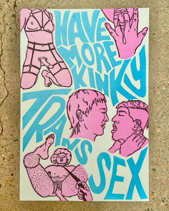
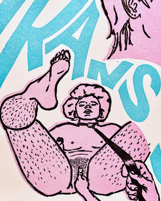
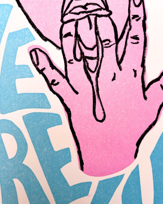
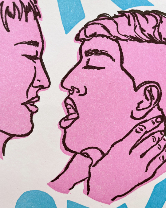
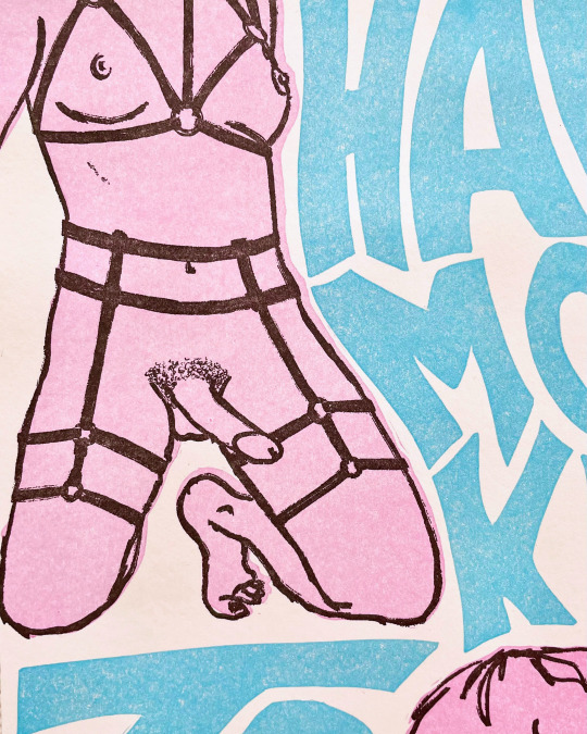
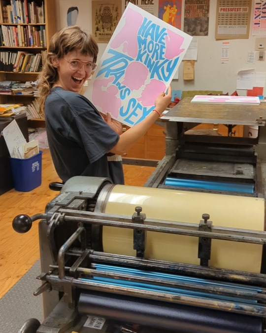
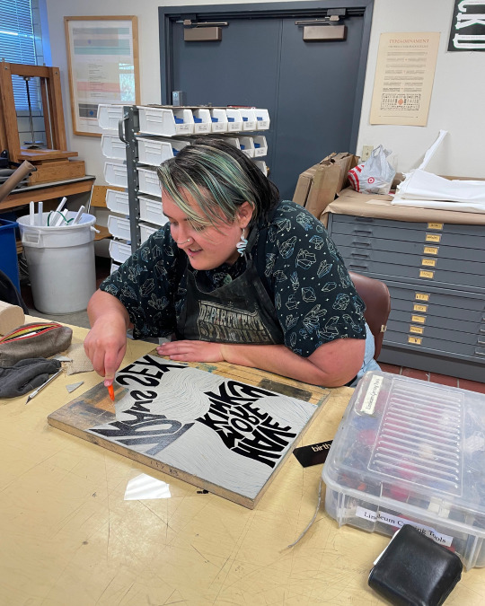
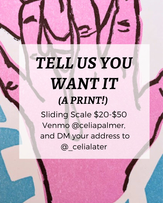
Can't believe this is the only social media site I can post the uncensored version of these prints on, but anyway...
This print is a collaborative project made utilizing linocut and photopolymer plate printing techniques. It emerged out of a conversation one day a few months ago in Nico's living room during a moment of particular grief and fear about the anti-trans hysteria we are living through. It is a straight-forward ode to our love for kinky trans sex and also an expression of our belief in continuing to live full, sexy, love-filled lives in the face of so much violence. You want to get rid of us? Still here, getting freakier.
~~~~
To see the full uncensored version, link in both of our bios!
The illustrations of the bodies were drawn by Celia Palmer and the text and linocut silhouettes were designed and carved by Nico Wilkinson. Nico and Celia printed the posters together on a Vandercook in the Press and Colorado College.
These posters are pay-what-you-can, $20-$50. (Please consider including an additional $5 for shipping!) To purchase your own, Venmo Celia at @celiapalmer with your name and address in the description. Posters will be shipped within two weeks, or are available for local pickup if you live in or near Colorado Springs - for local pickup, please include your phone number in the Venmo description.
The perfect gift for yourself, a friend, or a play partner!
#letterpress#t4t#printmaking#linocut#trans#trans sex#lgbtqia#queer art#queer prints#trans art#vandercook#printing press
163 notes
·
View notes
Text
March 15th is the Ides of March. It is on this day in 44 BC that Julius Caesar, the emperor of Rome, was assassinated.
For today, Jared letterpress printed the last words of Caesar. While we truly don’t know Caesar’s last words, the quote “Et tu, Brute?”appears in Act 3 Scene 1 of William Shakespeare's play Julius Caesar, where it is spoken by Caesar to his friend Marcus Junius Brutus, upon recognizing him as one of the assassins.
The phrase “Et tu, Brute?” was typeset in 30 point Engravers Old English font. This was printed with black rubber base ink using a 3x5 Kelsey Excelsior tabletop printing press.
#julius caesar#ides of march#et tu brute#history#museum#sacramento#art#letterpress#printing#asmr#oddly satisfying#printmaking#old sacramento
547 notes
·
View notes
Text
How to press
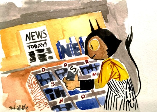
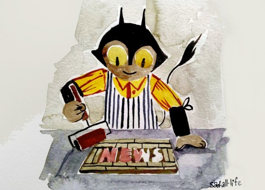


#original character#traditional art#aquarelle#watercolor art#traditional illustration#illustration#letterpress machine#letterpress
59 notes
·
View notes
Text

Maria Espinoza, moon dance, linocut letterpress print, edition 7/7, 2022
566 notes
·
View notes
Text
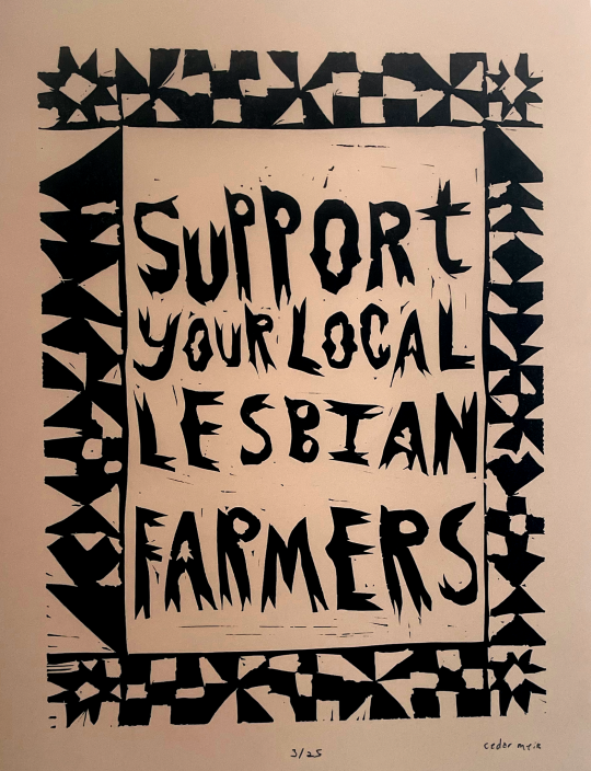
Support your local lesbian farmers!!
11”x15” linocut on paper. Printed on a vandercook #4. Edition of 25.
#butch lesbian#lesbian#they them lesbian#butch#trans artist#lesbian artist#lesbian printmaker#linocut#letterpress#relief print#printmaking#linoprint#block printing#lesbian farmer
42 notes
·
View notes
Text
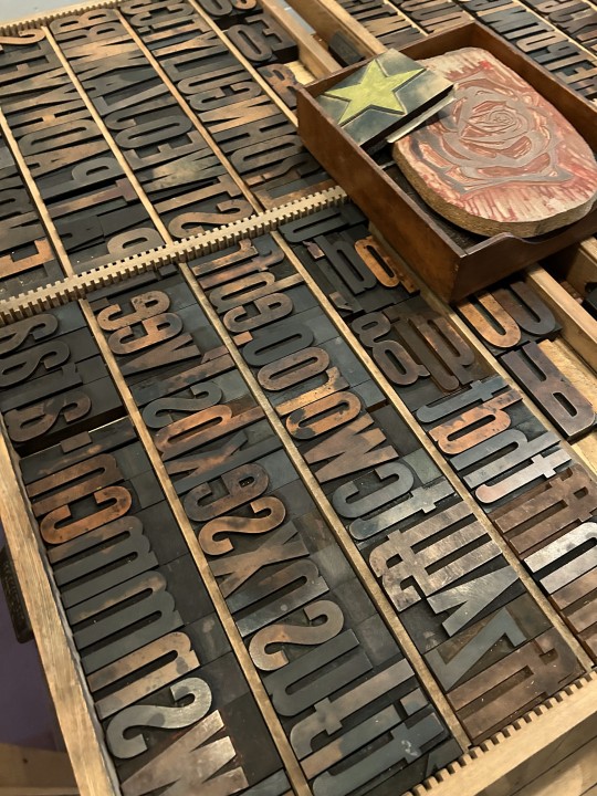
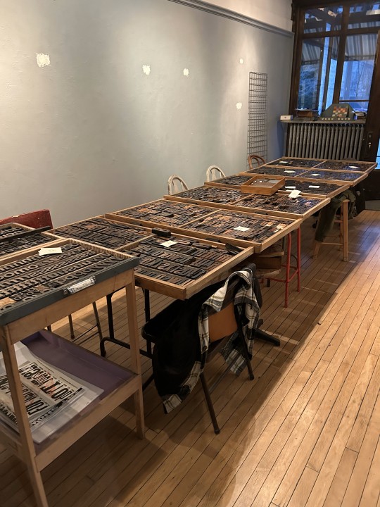


Typography Tuesday
MORE PRINTING WITH WOOD TYPE
One of my students sent me more images today from our letterpress venture at Team Nerd Letterpress for my History of Books & Printing course a couple of weeks ago. You can read more about the excursion in a post we did last week.
Shown here again are the type cases we worked from; setting and locking up the lines of type on the press bed; inking the type in blue and pulling a proof; then inking the type with a crazy kaleidoscope of colors and pulling multiple prints in rainbow colors.
That image of a sideways face after the line "the spaces close in" is a linocut portrait that Team Nerd proprietor Adam Beadel did of me years ago -- when I still had hair.

View more posts with wood type.
View our other Typography Tuesday posts.
– MAX, Head, Special Collections
#Typography Tuesday#typetuesday#instructions sessions#students#graduate students#Information Studies#INFOST 603#History of Books & Printing#letterpress#letterpress printing#wood type#Adam Beadel#Team Nerd Letterpress#type setting#broadsides#student work#exquisite corpse
59 notes
·
View notes
Text

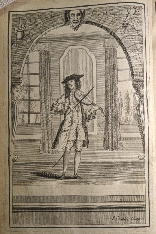
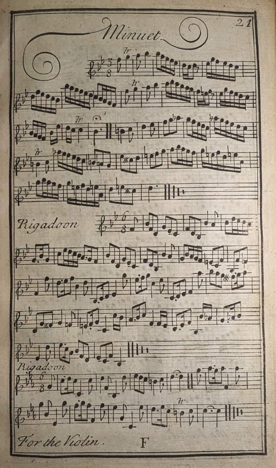
Prelleur, Peter. The Art of Playing on the Violin; : With a New Scale Shewing How to Stop Every Note, Flat or Sharp, Exactly in Tune, and Where the Shifts of the Hand Should Be Made. To Which Is Added a Collection of the Finest Rigadoons, Almands, Sarabands, Courants, & Opera Airs Extant. London: Engrav’d, printed and sold at the Printing-office in Bow Church-yard, 1731.
MT262 .P88 1731
#illustration#violin#music#music instruction#minuet#18th century#scales#libraryofva#specialcollections#rarebooks#printing#letterpress#book art
37 notes
·
View notes
Last Seen Blogs

kolannarea
:)
grouchy-maybe
is today beautiful?

foodisgoooooooooooooooooooo-blog
food is good


h-nomad-blog
NomadTraveler