#INFOST 603
Text


Typography Tuesday
PRINTING WITH WOOD TYPE!
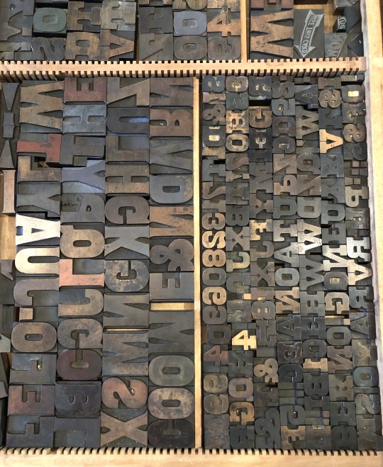
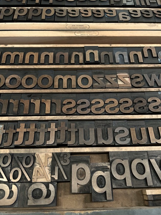
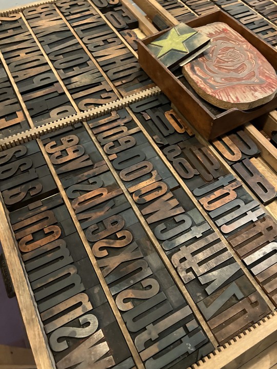
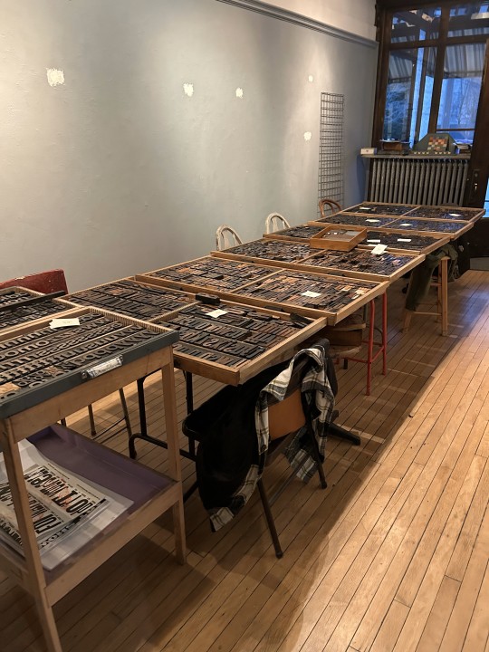
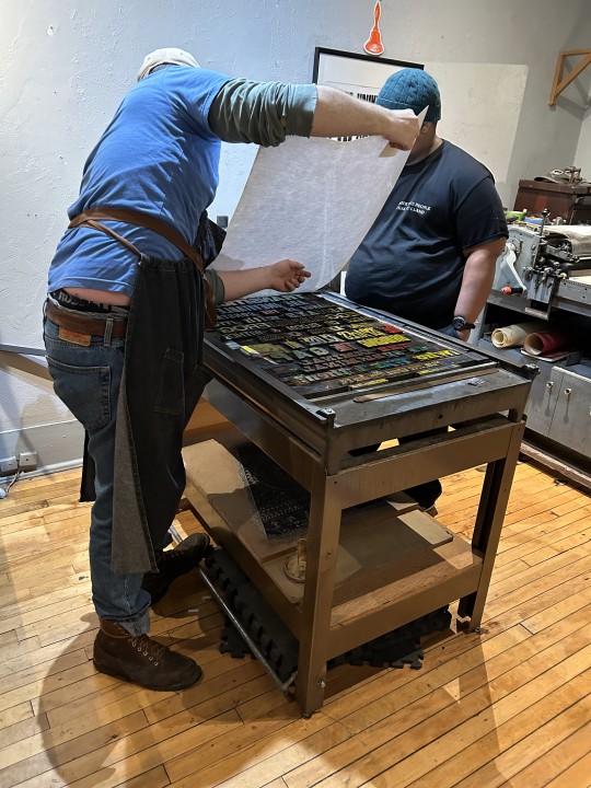
Every semester, when we finally get to the invention of letterpress printing in Europe in my History of Books & Printing course, we all head over to a local print shop to set type and print a collaborative broadside. Last week we did just that and went over to Adam Beadel's Team Nerd Letterpress in the Walker's Point neighborhood of Milwaukee.
Usually, we compose in metal type, as that is what the students just learned about, but Adam recently received a huge influx of foundry type that wasn't set up yet, so we had to use wood type instead. Even though we wouldn't learn about the invention of production wood type for a few weeks, we were game because wood type is the best!
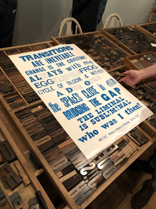
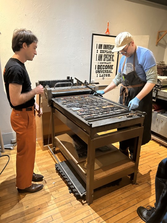
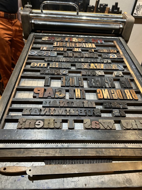
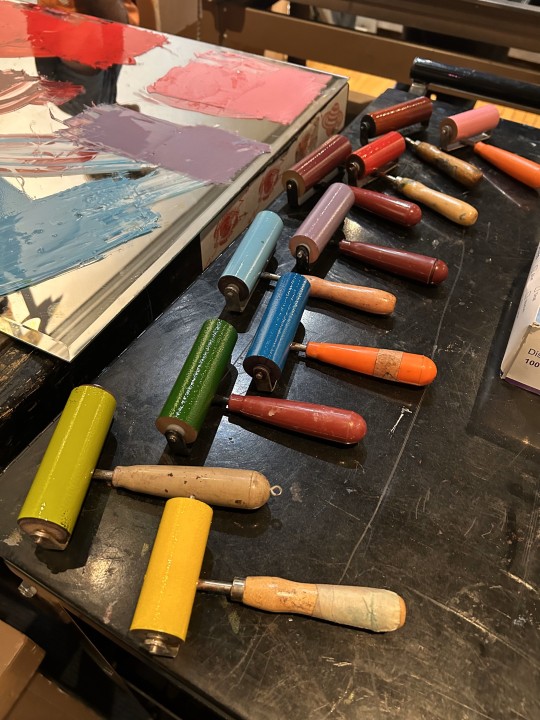
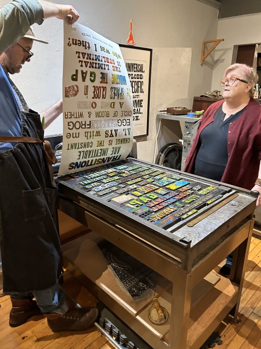
Each student was assigned to come up with a 3-5-word phrase based on the theme of "Transitions." They set their own phrase in wood type, I arranged the phrases into an exquisite corpse poem, we locked up the type on the bed of a poster press, and pulled a proof in blue ink (second to last image). Everyone was satisfied with the results, and with only a couple of adjustments, the students went on a tear, inking up the type in a rainbow of colors (last image), and pulling 15 more prints. Everyone went home exhausted and happy.
There are few things more thrilling than making your own letterpress prints. Thanks Adam!!!
View another letterpress post from a previous book history session.
View other posts on wood type.
View our other Typography Tuesday posts.
-- MAX, Head, Special Collections
#Typography Tuesday#typetuesday#instructions sessions#students#graduate students#Information Studies#INFOST 603#History of Books & Printing#letterpress#letterpress printing#wood type#Adam Beadel#Team Nerd Letterpress#type setting#broadsides#student work#exquisite corpse
110 notes
·
View notes
Text


Typography Tuesday
MORE PRINTING WITH WOOD TYPE
One of my students sent me more images today from our letterpress venture at Team Nerd Letterpress for my History of Books & Printing course a couple of weeks ago. You can read more about the excursion in a post we did last week.
Shown here again are the type cases we worked from; setting and locking up the lines of type on the press bed; inking the type in blue and pulling a proof; then inking the type with a crazy kaleidoscope of colors and pulling multiple prints in rainbow colors.
That image of a sideways face after the line "the spaces close in" is a linocut portrait that Team Nerd proprietor Adam Beadel did of me years ago -- when I still had hair.

View more posts with wood type.
View our other Typography Tuesday posts.
– MAX, Head, Special Collections
#Typography Tuesday#typetuesday#instructions sessions#students#graduate students#Information Studies#INFOST 603#History of Books & Printing#letterpress#letterpress printing#wood type#Adam Beadel#Team Nerd Letterpress#type setting#broadsides#student work#exquisite corpse
60 notes
·
View notes
Text


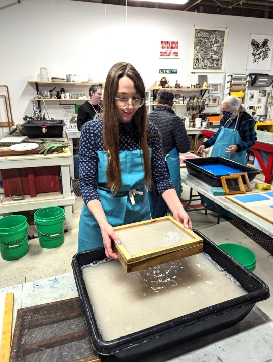
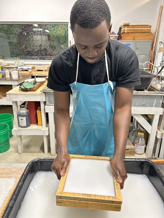
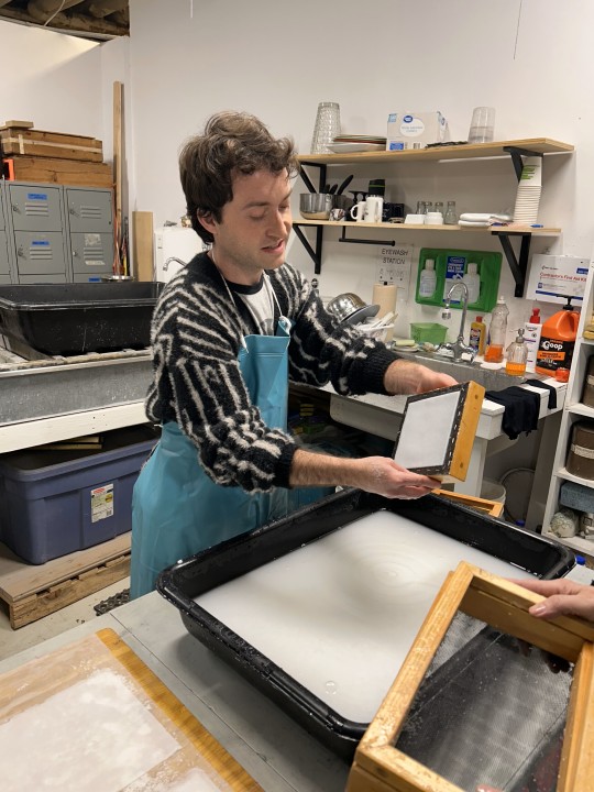
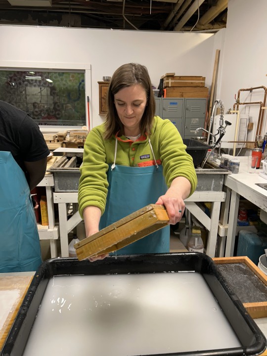

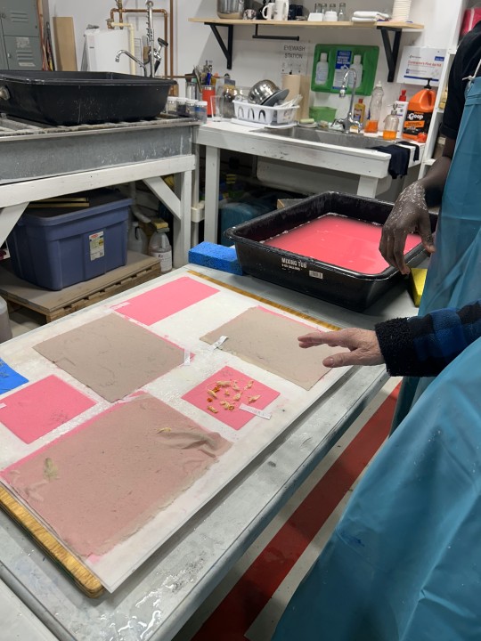
Papermaking at AP3!
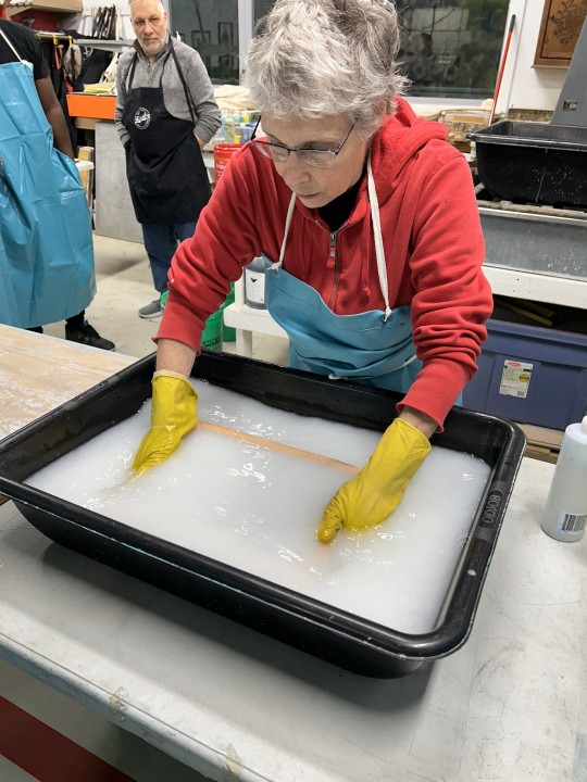
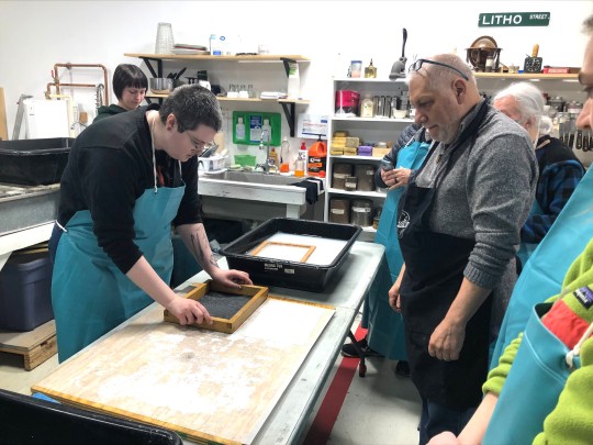
A couple weeks ago and even this past Tuesday, we showed you how, after students in my History of Books & Printing class (INFOST 603) read about the invention of type and letterpress in Europe, we went down to Team Nerd Letterpress, set wood type, and printed a poster. Last week, after reading about the history and technique of hand papermaking, we took a field trip to Anchor Press, Paper, and Print (AP3) in the Riverwest section of Milwaukee to engage in some papermaking.
First, AP3 president Marilyn Propp demonstrated hogging the vat, using the deckle, dipping the screen, pulling a form, and couching the paper onto felts (here's a glossary) -- top three images. Then Miria tried their hands at the process, with much success (next three images). Afterwards, it was a free-for-all, with everyone making paper for the next hour and a half; here in succession are Anna, Caring, Adam, Georgia, and Catherine (with Taj in the background).
The last image is of some still-wet paper forms on felts (actually, synthetic pellons), with attempts at inclusions and paper lamination. The students were clearly exhilarated, and everyone went home exhausted and happy!
View more posts on papermaking.
-- MAX, Head of Special Collections
#Papermaking#hand papermaking#handmade paper#paper#instructions sessions#students#graduate students#Information Studies#INFOST 603#letterpress printing#Marilyn Propp#Anchor Press Paper and Print#AP3#student work
33 notes
·
View notes
Photo
Feathursday: The Avian Avatars of Special Collections
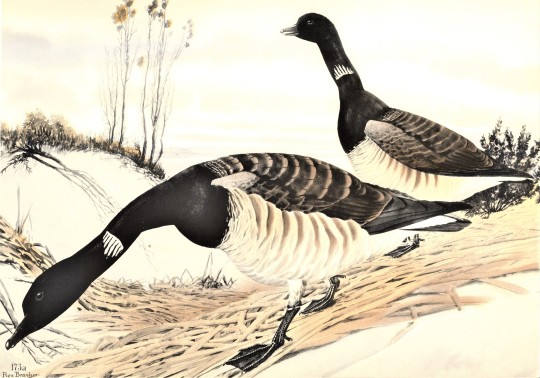
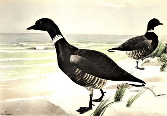
Sarah the Brant
In the past two weeks we bid farewell to our two graduating graduate interns Katie Stollenwerk and Morgan Ellsworth with posts about them and their Avian Avatars, This week we highlight our continuing graduate intern Sarah Finn and her assigned bird, the exquisite Brant or Brent Goose (Branta bernicla).
Much like her namesake, Sarah is relatively quiet, maintains an elegant bearing, and often appears in shades of black, white, and shimmering golden browns. Sarah began her career here in Special Collections in the summer of 2017 after taking Max’s course in the History of Books and Printing. She started as an undergraduate assistant for a year, and after graduating with a degree in History, she enrolled as a graduate student in UWM’s coordinated Master’s programs in History and Information Studies. With her enrollment, her status in Special Collections transitioned into a graduate internship, and she is currently our Senior Graduate Intern and serves on our leadership team.
Besides her academic interests, Sarah maintains very strong interests in art (as both a researcher and a maker), science and scientific illustration, and the decorative arts. Her role here includes patron services, classroom instruction, catalog verification, LibGuides, and collection maintenance, but her most lasting contribution to the department has been in social media. Sarah founded and single-handedly maintains our Instagram account (which is currently the most popular of our social media platforms, with nearly 15,000 followers), and runs many of our most popular Tumblr series. She ably took over our Flora and Sylva and Fine Press Friday series, and founded Science Saturday and perhaps our most popular series, Decorative Sunday.
As a testament to her dedication, despite all student employment being temporarily suspended during the coronavirus pandemic, Sarah continues to volunteer her time to maintain our Instagram account and produce weekly Tumblr posts. Thank you, Sarah!! Of her experience in Special Collections,Sarah writes:
This past May marks my third year working in UWM Special Collections and I cannot emphasize enough what a profound impact it has had on me as a person and the type of librarian I want to be in my career. I was introduced to Special Collections as an undergraduate student in a history research methods course, and was intrigued by the chalk board in the reading room with the words “INFOST 603 History of Books and Printing.” Even though it was a graduate level course I ended up signing up for it the next semester in Spring 2017 (and later took it again as a graduate student in Fall 2019). That class, taught by head of Special Collections Max Yela, taught me to think in “book history” and my life has not been the same since.
Books and printed materials are an amazing source of historical evidence and their meaning goes far beyond their written contents. They are a physical representation of humanity’s relationship to itself. This thinking is fundamental to the way Special Collections approaches outreach and patron services, which is about making meaningful connections with people. Max has always stressed the importance of having fun with your work. This creates an incredibly dynamic work environment, where experimentation and trying new things is encouraged. I have been inspired by Max, department manager Alice, and all my fellow student staff. On a personal level, working in Special Collections has influenced my love for natural history and scientific illustration, as well as fine press printing. It opened me up to opportunities to go to the Hamilton Wood Type & Printing Museum’s annual Wayzgoose celebration, to take a class at the California Rare Book School, and inspired me to pursue many classes in letterpress, bookbinding, and printmaking. My favorite part of working in Special Collections are the class visits and doing everything I can to share these amazing resources with the broader community.
And we are privileged to have you aboard, Sarah! The goose images are hand-painted prints of two subspecies of Brant, the Pale-bellied Brant (B. b. hrota) and the Black Brant (B. b. nigricans), from Rex Brasher’s massive, limited-edition, 12-volume set Birds and Trees of North America, self-published in Kent, Connecticut, between 1929 and 1932, containing thousands of hand-colored reproductions of Brasher’s paintings.
View more UWM Special Collections Avian Avatars!
View more hand-painted prints by Rex Brasher.
View more Feathursday posts.
#Feathursday#Sarah Finn#Brants#graduate interns#library employees#Avian Avatars#Rex Brasher#Birds and Trees of North America#hand colored plates#birds#birbs!
28 notes
·
View notes
Photo
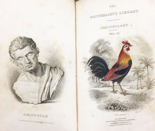

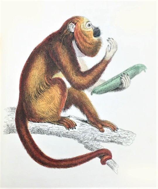
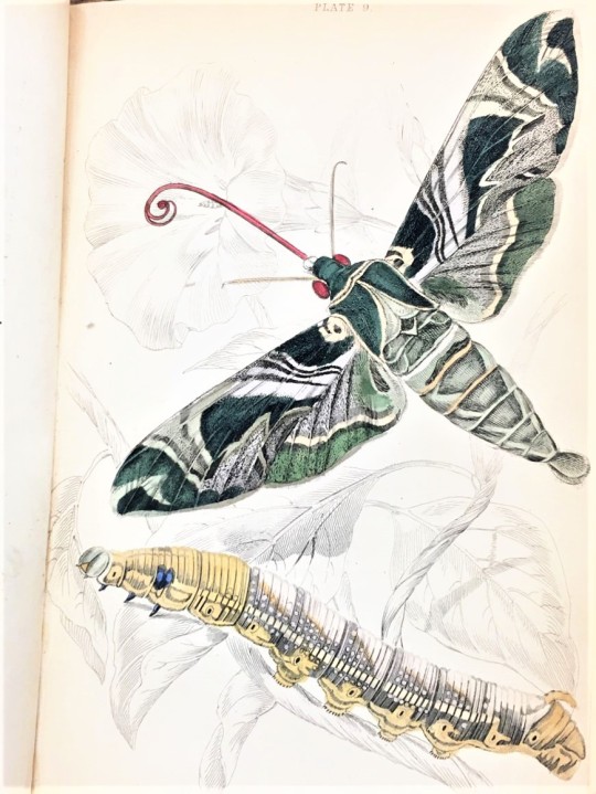
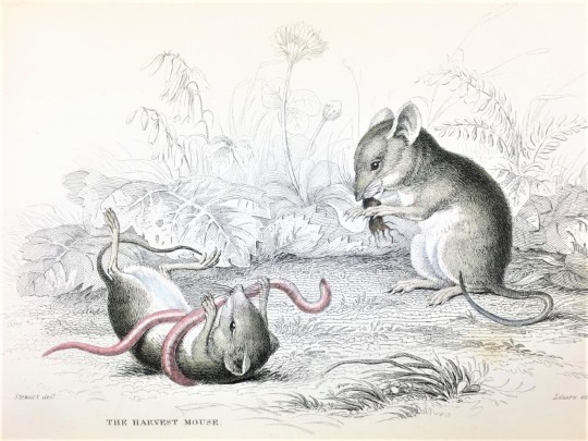
Distinctive Collections Crossover ~~
The Naturalist’s Library in the American Geographical Society Library
UWM Libraries is home to three Distinctive Collections departments: the American Geographical Society Library (AGSL), UWM Archives, and Special Collections. To celebrate the rare and unique materials found in all the Distinctive Collections we are going to do a series of crossover posts featuring items from our sibling departments.
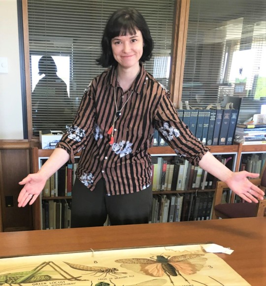
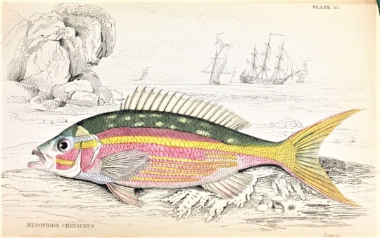
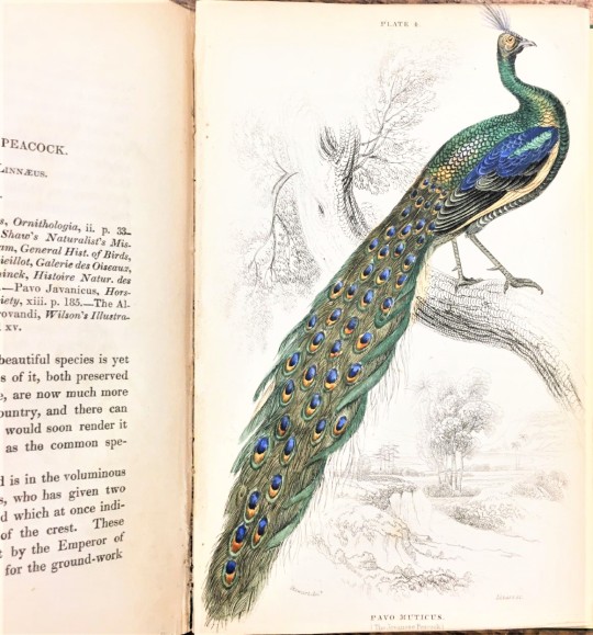
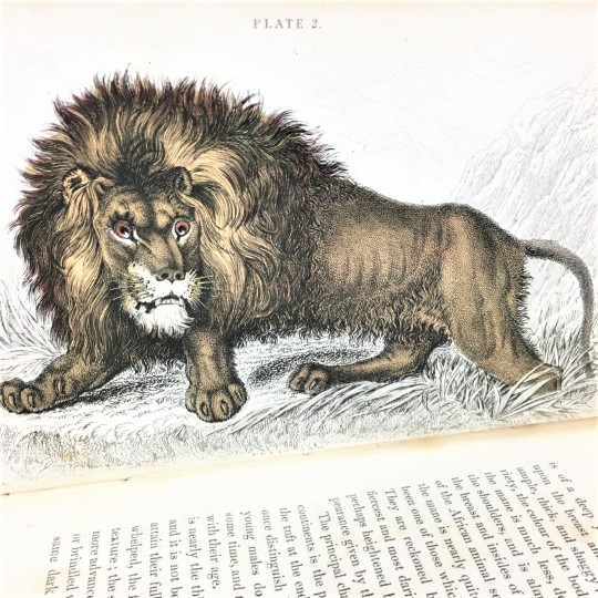
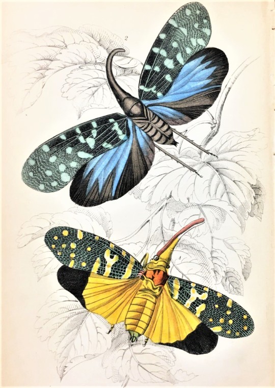
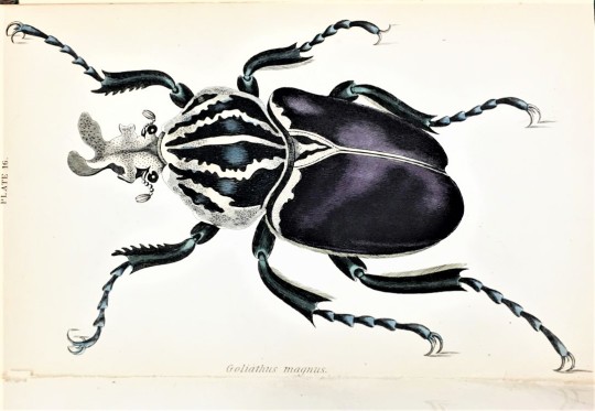
To start, we are going to showcase The Naturalist’s Library found in The American Geographical Society Library, a premier geography research library at UW–Milwaukee. This past semester I took head of UWM Special Collections, Max Yela’s History of Books and Printing class (INFOST 603) and wrote a research paper on The Naturalist’s Library, a 40-volume natural history series published in Edinburgh from 1833-1843 by William Home Lizars and edited by Sir William Jardine. What initially drew me to the series was the size of the books, which are small, measuring about 4 x 6 inches, and that each volume was profusely illustrated with hand-colored steel engravings of many different animals. I love natural history in all forms, but what is truly special about The Naturalist’s Library is that it was meant to appeal to a wide audience because it was affordable for different classes of society. Each volume cost six shillings, a fraction of the price of other natural history books featuring colored illustrations. The publisher William Home Lizars accomplished this through technological advances in printing and cheap labor. Steam powered presses and stereotyping improved the process of printing the text of each book. Illustrations were printed from steel engravings executed by Lizars or his assistant William Banks. Lizars relied on cheap labor to set the type, bind the books, and hand color the engravings.
The Naturalist’s Library was divided into four divisions: ornithology, mammalia, entomology, and ichthyology. A single volume would be a dedicated to a particular species or type of animal within those categories, such as an ornithology volume on hummingbirds or an entomology volume on beetles. It was not meant to be a complete system of the all animals, but a survey of notable species. Animals were chosen for distinct reasons, such as having an unusual structure, notable beauty, or economic value. Foreign birds and insects with flashy exotic colors were of particular interest, but familiar British birds and butterflies were equally as popular with those fond of their local nature. Each volume featured 35-40 hand-colored steel engravings.
Most of the illustrations in the book were done by James Hope Stewart, an artist and farmer who worked for Lizars on a number of natural history projects, including the Magazine of Zoology and Botany, 1837-38. We will do other posts on The Naturalist’s Library, but for today we thought we would feature a sampling of illustrations from several books in the series.
–Sarah, Special Collections Graduate Intern
#The Naturalist’s Library#Distinctive Collections Crossover#Crossover Posts#Distinctive Collections#William Home Lizars#Sir William Jardine#James Hope Stewart#natural history#natural history illustration#naturalist's library#scientific illustration#scientific art#bird illustrations#insect illustration#insect art#Sarah Finn#sarah#engravings#steel engravings#hand-colored plates#hand-colored prints
95 notes
·
View notes
Photo


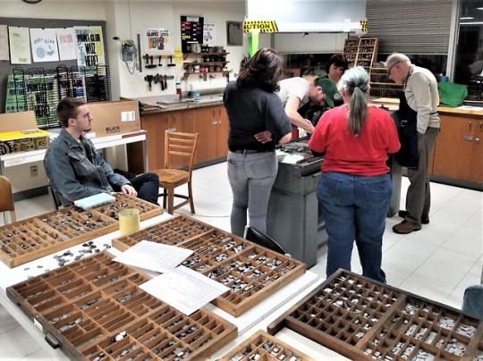
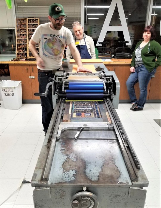


Book History Class in the Letterpress Studio
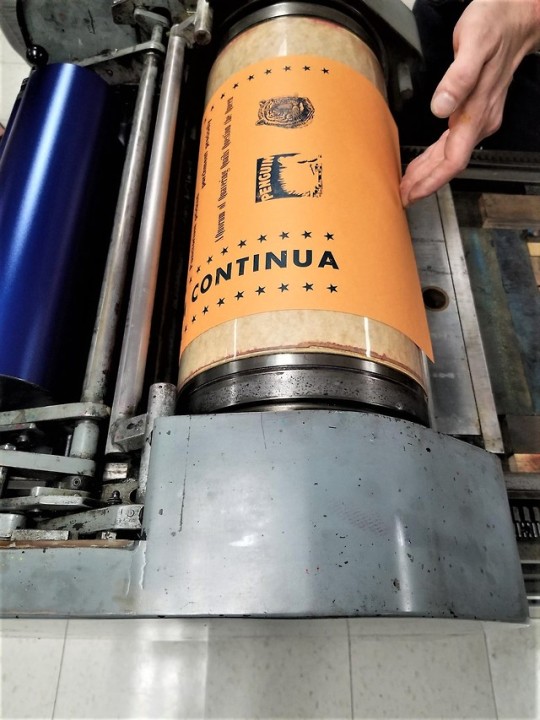
Every semester, when the Information Studies class History of Books & Printing (INFOST 603) begins its segment on early printed books, Max brings his students over to the Letterpress Studio in the UWM Department of Art & Design to handle and set type, get it locked up on a Vandercook Universal 1 flat-bed proofing press, and print up a collaborative broadside. That session took place last night, and our guide, as in previous semesters, was Adam Beadel, former INFOST 603 student, current Art & Design graduate student, and proprietor of Team Nerd Letterpress in Milwaukee’s Walker’s Point neighborhood.
Last semester we began a nonsense abecedarium in which each student, the teacher, and the session leader were assigned a letter for which they were responsible for composing a nonsense phrase in a typeface of their choice. Once the combined lines were locked up on the press bed, ink was applied and they all got to crank the press (which is always the fun part). Last semester we completed a broadside through the letter J (Incipit Abecedarium). Last night we continued the process (Abecedarium Continua), completing a broadside edition through the letter Q (A Quorum of Quavering Quails Quickly Questioned the Queen).
As always, it was a boatload of fun, and very instructive after reviewing incunabula and learning about the invention of the press, and early type founding and letterpress printing. Thanks Adam!!
#instruction sessions#graduate students#students#Information Studies#History of Books & Printing#Adam Beadel#Team Nerd Letterpress#UWM Letterpress Studio#letterpress printing#Vandercook#type setting#broadsides#student work
41 notes
·
View notes
Photo


Staff Pick of the Week
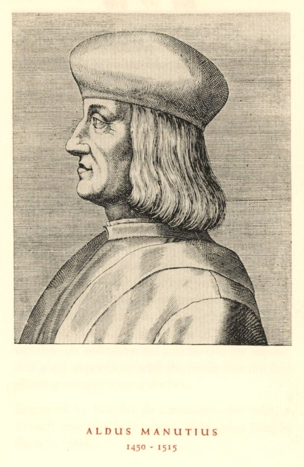
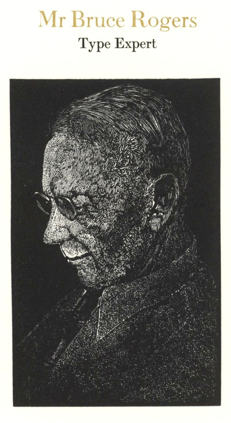
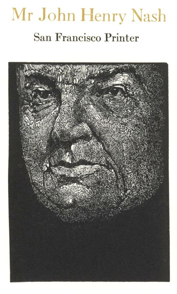
As I teach my UWM Information Studies course “History of Books & Printing” (INFOST 603) this semester, I am put in mind of the many people and personalities who have shaped the Western printed book in the past 560 years -- and we won’t even get to movable type in the West until March 30! Nevertheless, I was inspired by John De Pol’s wood-engraved portrait of Johann Gutenberg from our Fine Press Friday post last week, so I sought out other portraits of important printers, typographers, and publishers. For my pick this week, I present portraits of four early book-printing innovators and six innovators from the late-19th to mid-20th centuries.
Images of the early innovators -- Gutenberg, Aldus, Estienne, and Plantin -- are reproductions of early printed portraits reproduced in Evelyn Harter’s Printers as Men of the World, the 16th in the Typophiles Chapbook Series, designed and printed in 1947 by Peter Beilenson in an edition of 600 copies, with the portraits reproduced by the Meriden Gravure Company.
The portraits of the later innovators -- Morris, Walker, Gill, Rogers, Goudy, and Nash -- are original wood engravings by Barry Moser in John J. Walsdorf’s Men of Printing; Anglo-American Profiles, printed in 1976 by Harold McGrath for Moser’s Pennyroyal Press in an edition of 300 copies. Our copy is signed by Moser and includes the author’s signed presentation inscription to the UWM Library.
Note that the emphasis here is on MEN: so, where are all the WOMEN?!! Well, certainly not in these books, or in many other books we hold. We’ve tried to address this issue with our Women’s History Month blog, Historic Woman Printer/Publisher of the Week. Keep an eye out for new posts next month. While you’re at it, check out our blog on 10 Great Contemporary Women Papermakers.
-- MAX
#Staff Pick of the Week#Max#bookhistory#Typophiles#Pennyroyal Press#Barry Moser#wood engravings#Pioneer Valley School
14 notes
·
View notes
Last Seen Blogs

hyaffiliate
SkinHealthAndWealth
galaxynightsxd
Is This A JoJo Reference?
paperbooart
art blog
barriesausage111-blog
Frank, barrie, troy, and carl

mutanttwinkie
Just Here for the Lols