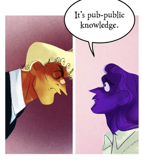
#its still one of the best examples of This is a Piece of Art and there is a Soul Inside of It i've EVER seen
Text
Tangentially related to some of the discussion i posted earlier but quiet literally the first RW Art Month i participated I did it completely on whim like, one day before it started. And I mostly did it because I hadn't drawn a ton of rain world and wanted to draw more. Fandom presence was a lot smaller than and I was one of a handful of artists who did the entire thing. Fast forward and I still do Art Month and I've gotten to work with VC directly.
But it was quite literally something I decided to do completely on whim that set the ball rolling, and for something a lil more niche and certainly with a lot more dev/fandom art involvement than most. It's really random how and why you might get noticed more than usual, especially with the "toss it into the search and hope it pays out' mechanism of Socmed
#t.extpost#and im hardly the fanciest art month artist out there so it wasnt even about being a jaw droppingly talented artist or whatever#and while artmonth for rw is still given a huge focus its also a much much bigger thing now with a much bigger number of participants#which is cool! its awesome how many people i saw do most if not all of last art month! and VC is really good about not just repping the#most popular artists or fanciest pieces#but theres So Much More there now and while its great for finding artists its also impossible to get Everyone in there you know?#Although they absolutely try#And this is like. one of the most fanartist involved devs ive ever seen in terms of both celebrating the art their fans make and actively#bringing those fans in to contribute#and its /still/ hard to get going just because thats how Posting is#i used to be more of a hk artist which is both a huge fandom and riddled with stunning artists but theres So Many#and niche fandoms are niche so youre more likely to connect with people but less likely to see a ton of engagement regularly -#probably best example i have for that was being briefly fixated on patapon.#Its just messy to try and find the hack that sets you up#just have fun and jump around and make what you like#get a sense of feeling for your style and some people will stick around for that vs. strictly the subject matter#others will look up the thing you switched too and some wont engage#you cant really control it#so have fun and draw that thing you randomly thought about at 2 am that doesnt match your blog#draw for that forgotten rpg you liked when you were 15 or draw for the 70 player max steam game you played for this week#you never really know what will happen#but its not really worth worrying about what will happen either
37 notes
·
View notes
Text
i know the oscars are bs and that something like this happens every year but it's not even exaggeration i make because i personally love the movie when i say NOPE was a pure crystal decanter of cinematic elixir and it getting 0 noms for anything in any category at all is not just a insult but -legitimately- baffling
#sporadic warbling#yes i know its a movie about a man eating roomba with a scene where keke palmer throws sour patch kids at a praying mantis#its still one of the best examples of This is a Piece of Art and there is a Soul Inside of It i've EVER seen#and if you can't see that i just don't know what to say to you#every shot is master class#the lighting#the camera work and direction#the cinnamon tography as you might say#the acting#the layers and layers of parallels and homages#the symbolism#the muckfuthering sound design#you can feel the passion oozing out every single damn frame#and NOTHING????#fools fools the lot of you
218 notes
·
View notes
Photo

Oh, Patricia, you’ve always been my north star
2nd part of my little gifts for @ornithic on its 20th birthday!!!!!!!!! i love you soooo much youre the best gothic vampire prince on earth actually <333
#my art#vampire#vampires#???? whatever LOL. this is for u tori#ALSO I RECOMMEND ZOOMING IN A LITTLE TO SEE DETAILS AND STUFF PLS I WORKED HARD ON THIS#the link in the caption is just to the song i took the line from btw! that song makes me think of u so consider it my song 2 u <333#(because i love you so much you see)#your name isnt patricia. but replace that with tori and its perfect#anyway toriiiii youre my best friend forever you are my treasure and my sun and i love you so so much...... auuuohhgh.............#youre one of my oldest friends we met back in 2017 i think and well this is a little embarrassing to say.#but GAH ever since we met i really really loved you so much youre like my favorite person & u always were.#i hope that doesnt sound insincere its a little embarrassing cause it sounds so cheesy but like /gen its true i love you to bits and pieces#anyway! uh! so! some notes abt this drawing!#ive been listening to a lot of f+tm lately so while i drew this with patricia in mind i was actually undecided about the lyrics 4 da caption#i was torn between this and 'you know i still like you the most / youll always be my favorite ghost' from big god#i went with patricia though cause that song as a whole is relevant whereas big god is more of a sad (???) sorta song#HOWEVER!!!!!! i improvised a lot w this drawing in comparison with what i was envisioning in my head#so a lot of things were made up on the spot like the golden rose for example#it was based off of a misheard line from one of the NEW f+tm songs (girls against god)#where she goes 'i met the devil / you know‚ he gave me a choice / a golden heart or a golden voice'#but i misheard voice as rose and that is how i came up with an INCREDIBLY rich fiction about you turning vampire#except. well i dont know but knowing YOU im sure you already have a very romantic and beautiful idea of how you came to be a vampire prince#but in my head i keep thinkin first and foremost that you live alone in an old overgrown mansion in the woods kinda like minecraft pillagers#but like. alone/possibly with the trapped ghosts of people whove died there over the years.#and then based on the misheard lyrics i imagine you were offered a choice by the devil to either die as a martyr but live on as a saint OR#to become immortal (symbolized by the golden rose) but at the cost of losing your humanity and having to Kill and Drink Blood.#and other vampire stuff. and i guess you chose the rose! but then youre stuck with the guilt of insatiable bloodlust and profound loneliness#oh and i guess you were also a prince before you gave up your humanity. so the mansion could also be a castle#annnnnnd (pretend like im not making this up additionally on the spot please) i can imagine your kingdom once worshipped the sun!#UMMM TUMBLR CUT OFF MY TAGS SO UHH TO HEAR THE REST OF THE RICH FICTION YOULL HAVE TO MESSAGE ME TORI. SORYR
34 notes
·
View notes
Note
Do you have any tips for how you draw faces so good? Besides just visual references? Do you ever free draw them? I've been trying to figure it out but it's been frustrating to try to find the write way to start I feel the more I practice the more complicated it gets
Is.... the way I draw faces that good? I feel like a lot of you see the final artwork and think that it looks this good from the very start, when actually my art with only the line art looks goofy af, at least for me.
I am going to bare you my soul anon, because I think all the lighting and shading makes everything look better than it actually is:

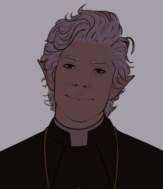

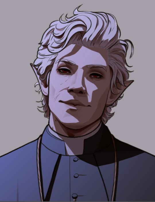
So here it is Mr. Priest himself in various stages of progress, as you can see the face with only the line art is nothing special, the lighting and shadows is what makes it great.
Now for the advice part. For me at least getting the right shape of everything helps. Forget it's a face, it's just pieces that have to fit together. Don't just look at the shape of each part, but also the space between each of them. I wish I had some examples but most of the times I delete that layer once I have a good sketch. But here is a simplified version of what I do:

So I guess this is an advice of how to properly use visual references. I don't draw without references, because I don't trust my brain, some things are fine to draw from memory but faces aren't one of those things. Also this is just me and how I do things, doesn't mean you cant learn and draw from memory.
Maybe your problem is not the same as mine, for me all the individual pieces are easy to draw but it's all of them together what messes with my brain, so with a rough rough sketch I have everything in its place and then I can work on making it "pretty"
This is without getting into perspective, because that's something that I don't know how to teach or explain and it takes some time to get it right. I have been drawing Destiny stuff for 3 years from all kinds of crazy perspective so after all of that practice drawing a face in a 3 point perspective is not that complicated. References help too 😅
I also would like to mention, I am not an expert or professional. I am still learning too, so maybe this is not the best way to approach things. I know that there are multiple more correct ways to draw faces, with all the circles and lines but that never worked for me. I tried to learn it like that, got frustrated and stopped. And then I started treating faces as robot parts that all have it's place and shape, and it worked.
#I hope this helps you anon#I am sorry for the essay but I feel like I need to answer asks like this properly#i never thought i would be in this position#because the way i do things is so unnecessarily complicated that sometimes i am amazed i manage to draw anything#tutorial#???#ask
295 notes
·
View notes
Text
I'm not the best writer when it comes to writing convincing essays or whatever, but I'm going to give this a go because it's something that I've thought for a long time that I've never seen anyone really acknowledge unless I bring it up first. (also I am sick and don't really want to do much editing here, just rambles, so good luck)
I think that when most (not all, but most) people get salty about 'modern art', they are not salty about the things people think they are salty about. When they say "this isn't art", theres an important bit that they're not articulating. What I think most of them mean is "this isn't art that should be in a museum." "this isn't art that should cost this much" "this isn't art that should be getting this kind of recognition". And there is a huge difference between that and just saying "this isn't art"
Firstly, all of the arguments about why modern art is in fact art straight up....don't apply. They don't address the problem, they don't answer the question. This isn't really anyone's fault per se, given that it is addressing the literal statement, it's just I think most people aren't actually thinking that literal statement.
So then what do they really mean? Like I said, I think they're trying to articulate why they're frustrated that this art is in a museum when "they could do it". So when you say "okay then, you do it" that doesn't address the core issue, which is "but why is this getting recognition for it, and I would get none" because yes, unless they are famous, they would get Zero recognition for it. Nobody would be lining up to buy their art, no one would ask to put it in a museum. Best place they can hope to have this displayed is a fridge door.
When you look at a piece of fine art, most can see the amount of effort put into it. They see how much training it took to get there, they see how much time it took to put those strokes on that canvas and they can go "yeah, that took skill, that took effort, not everyone can do that. it deserves recognition". And a lot of modern art does take skill, it's just skill that isn't easily noticeable to the average viewer, such as rothko's color fields, they do take a lot of skill and effort, you just can't see it if you don't know. But a lot of modern art that people complain about isn't something that has skill that's not recognized, it just requires very little technical skill at all (not a condemnation, btw).
When you're talking about something 'anyone can do' that piece's value is often not a recognition of skill, or even of the message, it's a recognition of a name. It's similar to having a gucci bag because it's a gucci bag, not because you care remotely about the bag. Yes, art isn't displayed because of how much effort went into it, but it's a huge industry that many many people are making money through from sheer name recognition alone.
Like that one painting of that one artist's (I forget which artist and my cursory google isnt finding it, but also its just an example) where it got replicated and sold to a bunch of people for a large amount of money so they could all have something that had a small chance of being a genuine painting by the artist, that's an excellent example of the fact that a lot of the gallery-level art world is Entirely about the name, not about the piece itself. If someone just made that painting but didn't say it could be from the artist, then who cares?
If you go to ringo starr's art website (https://www.ringostarrart.com/) then you can see that some of his work, especially his older work, is of that category of stuff that many people would say "I could do that" to. For instance, these two? 1,400 and 6,000 pounds respectively for a PRINT of these from his website


....okay this one I kinda enjoy.
but still. 2,000 pounds for a print.
All of this is possible because he's ringo fucking starr, he can sell his paintings for whatever he wants. If I tried to sell those for that much, I'd be laughed out of the room. All of it is just clout, it's just how big your name is and how much you can use that as leverage.
This is not to say that other forms of art don't also have this issue, they do, especially with people devaluing creative works so much today. But you could probably get a few commissions if you sell realistic art or do commissions of people's characters, while you Cannot get any money trying to sell stuff like ringos art unless you already have an audience who will buy it.
This does somewhat lead into a discussion of how art curators pick which artists are 'good' somewhat arbitrarily, but that's a whole other post.
Doing art for 'yourself' vs for other people or money is also a whole other post, one which I've actually seen quite a lot on here. But suffice to say if your response to all of this is 'just make art for yourself! Why do you need recognition?' then maybe go find some of those posts. It's not bad to want recognition, and it's not bad to question why that guy is getting much more recognition for the exact same thing you're doing just because he has a bunch of rich friends who are able to host fancy parties and go 'hmm. yes this is good art.' (not that all modern artists had rich friends, but they did almost all get Extremely lucky in some shape or another that led to them now being widely accepted as good artists).
You cannot make a living off modern art unless you're well known, and if you happen to be well known already, you could likely make a living off modern art without having any experience, and that's what a lot of people hate about modern art, even if they don't articulate it. While some would, most wouldn't say "my five year old could do that" to someone's personal piece that they made themselves and hung up in their home, or that their friend made and gave to them. They say that about the pieces bought for thousands of dollars or millions of dollars.
And I don't want people to think that I do hate modern art, I don't (though this is tumblr, so I'm pissing on the poor just by writing this). I don't hate any of the famous modern artists, I don't think modern art isn't art. I do hate the industry that says their art is suddenly worth something just because some rich fuckers somewhere decided they should be, and anything I tried to do in a similar vein, original or not, would be better suited to sit in a coffee shop and continuously marked down and never sold.
So next time you say "so why don't you make it", maybe ask yourself if you would buy it.
267 notes
·
View notes
Text

hi @blongus64! thank you for your question. and no apologies necessary; Very Long Posts are kind of my specialty. :B
i really appreciated the comparison you drew between making visual art and making music, and i want to bring your attention first to that piece, because you gave some very interesting examples:
"i want a harsh… almost parasitic implication, so i'll use lurid, sickly colors and haphazard lines."
"i'll use soft, dull blues, because that's what winter looks like."
the question i want you to ask yourself is this: "where did i learn the idea that This emotion looks That way?"
your art comparison reminded me of a conversation i recently had with someone dear to me who illustrates. they brought up an idea they've picked up from various art instructors over the years, which i'll paraphrase to the best of my recollection:
when you try to draw an apple, you're not just thinking about the object that's right in front of you. you're thinking about the idea of An Apple. that idea is shaped by every apple you've ever seen or eaten—the places and people and feelings attached to those experiences. so when you're drawing from a reference, you have to set all those associations aside and learn how to look at what's in front of you so you can recreate it accurately.
as you mention drawing still life in your ask, no doubt you've practiced this skill already. but what about when you draw a scene from your imagination, or paint something wholly abstract? when it comes to representing certain ideas in your art, the reality is that how you depict them is a choice formed by association. you choose soft, dull blues for a melancholy winter, because those are the colors you see when you look with your mind's eye.
but for me, i associate melancholy winter most with dark greys, and rusty pinks from light pollution in the night sky. someone else might picture the dizzying white reflection of sunlight on snow. these can all be "correct" ways of evoking this feeling you've given as an example, so long as it's true to the artist's subjective experience.
my point is this: just as you can choose to represent one idea visually in a myriad of ways depending on how you look, you can choose to represent an emotion through music in a myriad of ways as well. and that means this:
if representing an image requires learning how to look, then representing a sound requires learning how to listen.
the simplest and most immediate way you can start doing this is to critically listen to the music that evokes the feelings you are trying to capture.
say you have a favorite song that really captures the feeling of melancholy for you. listen to it very carefully. what choices does it make musically? consider this an incomplete list of questions you might explore while listening:
what are the tempo and rhythm like? how do they contribute to the song's feel?
is the arrangement sparse or layered, bombastic or subtle?
what kinds of instruments are being played, and when? which ones take the lead and which ones stay in the background?
how would you describe the music's texture and atmosphere? dark, bright? spacious, intimate? electric, acoustic, synthetic? what elements contribute to that?
how does this song relate back to music history and tradition? can you identify any of its musical and cultural influences? does it fit firmly into a genre, or does it blend different genre elements? does it attempt to defy convention altogether? (does it succeed?)
what is notably absent? how does excluding certain elements serve the song's intended feeling? (after all, landslide would be a very different song if it had drums and bass.)
you might notice these questions are generally not rooted in music theory. make no mistake: music theory analysis is useful, and if you wish to build your musical vocabulary, it's worth practicing it when you can. but that kind of practice only gives you colors for your palette. it will not teach you how to paint what you feel.
if you want to learn how to use those colors, first you must really think about the music that embodies the feeling you want your music to embody. what about This song makes you feel That emotion? think about the sounds around you in everyday life. what sounds make you smile? what sounds evoke boredom, fear, anger, sorrow?
idiophones sound tender to me, so i might reach for a kalimba or music box when scoring an emotionally intimate scene. a I major chord followed by a bVII dominant is dripping with wistfulness to me, so i like using it for bittersweet moments. jagged synths and metallic noises make me uneasy, so i employ them liberally when i want to elicit dread or panic.
these are just a few colors from my own palette. just like my idea of An Apple, they are informed by my experiences, my culture, and all the music i've ever heard. these are the associations that the body forms over a lifetime; you've lived a different life, so you may have different associations for these sounds. and that's okay! what matters is that you pay attention to what sounds make you feel, and stay true in your attempts to represent those feelings.
i should also mention that i didn't figure out how to use my palette overnight. i rarely get it right on the first try. music, like any creative endeavor, is equal parts work and play, and it's the lessons learned from play that serve the work later on. with exploration and practice, you will get better.
so listen carefully. figure out which sounds correspond to different emotional responses for you. this will become your palette. as you experiment, you will learn which sounds are your melancholy blues and which are your haphazard lines. it simply takes mindfulness, a careful ear, and time.
i realize this is only a first step, but i hope you find it helpful. if it isn't, let me know, and maybe i'll do better next time. i'm still learning too. :)
with care,
bee 🐦
159 notes
·
View notes
Note
I'm also confused about tracing but is tracing copying a photo? or just tracing it but not copying the photo.
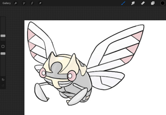
Okay lets use an official Nintendo art piece as an example
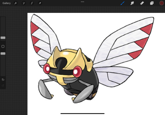
This is Shedinja, a bug and flying type pokemon.
Now if i were to trace, with the intention of practice, it would look like this
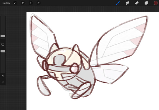
Do you see? I am not aiming for copying it one to one, I’m aiming to get the shape and body right, i have no intention to copy the piece outright. While yes, it’s still tracing, it is not copying.
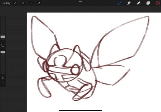
Now this:
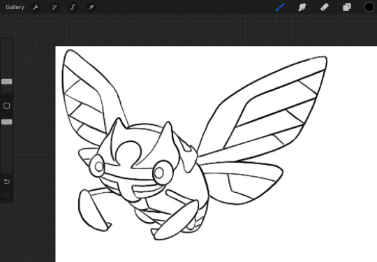
This is Tracing with the intention to copy. I am getting zero useful skills out of it, some of my line-weights are off entirely and the piece is shakey at best. Its not teaching me how to draw a Shedinja, it’s just teaching me how to trace a picture
And just to prove a point, here’s the traced freehand from above
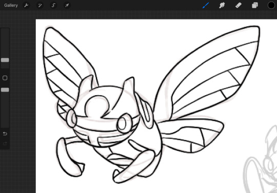
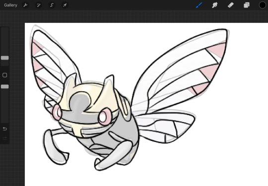
It is not a perfect one to one, you can see where I exaggerated a few points and even where i missed some things such as the bottom legs or that one wing is shorter.
I hope this explains the difference and why Copying and tracing is not the same as tracing to trace
1K notes
·
View notes
Text
Just to emphasize how much of a left turn “Saw X” is for the franchise, you need to consider what “Saw” is to most people. Aside from the first movie which has been mostly re-evaluated as a decent thriller that was more focused on story than gore, the series has been criticized for being an excuse to show off people being mutilated in the worst ways possible. The series has been credited as a “pioneer” in the torture porn label, which you can’t really argue due to it being mostly true for the sequels. The series has also never been a critical darling (all the movies before X have all had negative Rotten Tomatoes scores), which I think contributed to the series’ image as low-grade torture porn.
As the story got more convoluted and frustrating, the more the series seemed to focus on killing people. For me, I started noticing this when the 4th movie featured a trap that didn’t really have a purpose in the story (the mausoleum trap with Art Blank). That trap felt more like the makers wanted to do a really brutal scene and didn’t care if it made sense.
Main characters would only last one movie. It was pretty much useless getting attached to any protagonist since they usually got axed off by the end of the movie. Because protagonists kept getting killed off, further sequels tended to focus on characters who played more minor roles. Rigg is probably the best example of this since I’m pretty sure no one was expecting this character to be a protagonist. Point I’m making here is that character development was essentially useless since protagonists were just glorified cannon fodder.
Then there’s the unfortunate existence of “Saw 3D”, which made the series look like it was just trend-chasing.
The series died for a few years. It then tried to come back with “Jigsaw” and “Spiral”, which the makers claimed to be a reinvention of the series that would renew interest in the franchise. Instead, they were both just sorta lackluster and didn’t really convince people that Saw was worth revisiting.
So, “Saw X” clearly had an uphill battle. But lo and behold, the movie gets released and ends up being:
1) A surprisingly good character piece centered around Jigsaw and Amanda. Yes, there are still death traps and gore, but the focus on story and character development is definitely felt more in this installment.
2) The only “Saw” movie with a positive Rotten Tomatoes score. In general, seeing positive critical reception about a “Saw” movie is crazy to me.
3) An actual, successful reinvention of the franchise since it’s centered around Jigsaw instead of having him be the mastermind in the background. Just by being a straightforward thriller instead of a convoluted horror-mystery is enough to distinguish this from the other 9 movies.
Kudos to “Saw”. This is why in one of my posts last night, I called it one of the greatest redemption arcs I’ve seen in horror. It’s the TENTH installment in a series that’s been critically savaged its entire lifetime, it shouldn’t have succeeded. But here we are.
#saw#saw x#saw spoilers#saw x (2023)#saw x 2023#saw movies#saw franchise#saw films#jigsaw#john kramer#amanda young#mark hoffman#tobin bell#horror#horror movies#horror film#movie stuff#film stuff#saw series#sawposting#saw posting
355 notes
·
View notes
Note
Hey your art is pretty whimsical and radical my gender non specific broseph, per chance would thou be able to enlighten us on how you draw such bodacious fine art? Like how you draw bodies and fave and what have thee. (Fr tho your art really cool and I'd like to see how you make it)
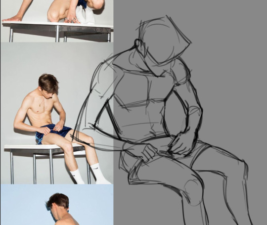
okay i have whipped up a quick little visual of my thought process while drawing!! it might not be the best cause im not the greatest at teaching but if anyones curious ^_^
first lets start with how i draw bodies

a lot of people like to do the "skeleton" method which is where you draw lines and circles to plan out where the limbs should be. honestly i really dislike doing that because i like to always have volume and shape in mind when drawing bodies, but if it works for you thats great.
instead i separate the body into different pieces, kinda like an articulated doll. i think it helps visualize all the moving parts in a 3d space and makes posing and perspective a lot easier. i can also always add the detailed anatomy on top of this basic model like you see on the left. its always important to work from simple -> complex. drawing a pose while being too worried on anatomy will really hinder your drawing process.
to improve doing this it really just takes practice and observation. i could be here all day talking about proportions, and how many heads high a person is, and each specific muscle group, but i reccomend you go and watch videos and study professional artists on your own. as someone who has been drawing and studying these things for so long, i barely think about how many heads high a person is when im drawing a body. its kind of like learning how to play and instrument or driving a car. it becomes second nature eventually, but you have to apply those skills and work through that period of time where youre still trying to program it into your brain.

after you get a hang of the basics you can take this basic model and draw all types of body shapes with it. i say its always important to play around with making your body types diverse. its not only fun to do but helps make all the characters you draw unique and recognizable. (dont be like vivziepop).
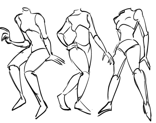
dynamic posing can be the hardest thing to master for a lot of people. the best way to learn how to pose is to not think about it too much and just doing it. for example in my figure drawing class we had to sketch out gesture drawings from a picture in 15 seconds. excercises like that help a ton in making you feel more comfortable when drawing from a reference. you should definitely reference a LOT when it comes to poses, it helps build this visual database so that eventually you can get to the point where you can just draw accurate and dynamic poses from memory. after getting to this point eventually you kind of start thinking of your canvas as this tangible 3d space and considering your characters in 3d space helps make the poses feel a lot more realistic and interesting.
ok now a quick little tour into how i draw different faces yaaaayy!!!1!1!1
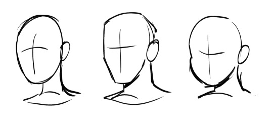
main thing with my art is that i LOVEEE drawing dynamic face shapes i think its so important to avoid drawing the same slim faces over and over. shape language plays a big role into this. like for example the face on the middle is more square, the one on the left is more oval and the one on the right is more circle. shape language helps communicate so much about your character without even saying a word about them and just helps differentiate people from a glance.

facial features also play a huge role into making your faces different. these are all drawn from the same exact face shape but look like entirely different characters by adding variety in the features. different noses, eye shapes, lips, etc. can make such a huge difference
i think before any of that its important to learn the anatomy of the face though. again im not gonna go into how many eyes wide a face it or how far the nose is from the mouth but like its always important to learn the fundamentals before stylizing stuff. again the face is a 3d space and if you dont consider your face a 3d plane the features will kind of just look like theyre floating on your characters face like soup...theres a lot of great resources and tutorials online take advantage of those!!! and reference from artists you like too it helps a ton.
and then you mix that all together and Boom you have cool and interesting faces. you will best that same face syndrome in no time if you take my advice Trust...
anyways yeah thats the soda design philosophy hit that like button if you liked it or douse me with tomatoes and kick me off the stage if you think i give bad advice ill leave the decision up to you
110 notes
·
View notes
Note
Hello! I'm trying to shorten my sketch to good drawing time and I think your lae'zels are good (great) drawings. What does your initial process look like? (If you don't mind sharing your process) Do you have a sketch step or are you going straight in with the outline somehow? I'm trying to find a process that's more comfortable than I what I do now, which is sketchy and messy. And then I hate the inks I do because the sketch always looks better.
Thanks :)
Lucky for both of us I actually still have the sketch layer for my last Lae’zel drawing so I don’t have to make anything new to show the process!
I have no idea how to organize this so I'm just gonna go with my own weird thing and do levels and hope that it makes sense!

Level 1: This level is entirely for working out poses and forms. The sketch is really ugly and has no detail, just the basic building blocks for the pose and anatomy. Most of the time it looks even messier than this example, but I had to mock one up for this because if the pose is simple and I'm familiar with the character I'll just skip right into level 2
Level 2: This is when I start adding in details, not anything clean, still very messy and basic. I try to keep it loose and mostly from memory so I don’t overwork the sketch more than it needs. I usually start with a simple anatomy sketch, add hair and clothing overtop on another layer, erase the underlying anatomy, and then merge it all into one layer
Level 2.5: Sometimes on more complicated areas like the hair, hands, face, and clothes I’ll do another cleaner sketch with reference just in those areas to make the jump to level 3 easier. If I intend to leave it as a sketch ill usually do this with the whole piece and leave it as a "cleaned sketch" something a bit cleaner and more detailed than the level 2 example but not quite at level 3
Level 3: Here is where I really start busting out the references and getting down into the details. Since I don’t do inks and prefer a sketchier style this is basically my line art. I work through it in parts so things like the face, hair, clothing, hands, and skin details are all usually split up into different layers so it’s easier to manipulate and erase bits. Then at the end I merge it all together into one layer and either start on colors or call it done.
In really simplified terms, my drawing process is - draw a sketch, lower the opacity, make a new layer, draw a cleaner sketch, and then keep repeating that process till I get the results I'm looking for. Its definitely probably not the best way to do things but it works for me!
Hope all this makes sense and that the insight on how I do things helps you out!
92 notes
·
View notes
Photo


Edit: Season 2 Lineup HERE
It has taken ages but I finally finished my emperors reference lineup for season one :D I’m sure I’ll tweak some designs as I back watch new povs of the first season (I only actually watched Smajor, then ofc Lizzies musical. I’ve since started Pix) But I’m happy with them right now!
I have Pinterest boards for all of their empires that I created to differentiate the fashion cultures, then I used pieces from the boards to best mimic their og outfits while still have a unique twist! It was a lot of fun but proved varying levels of difficulty. The Ocean Empire for example despite its simplicity was one of the hardest boards to work with, second only to Gilded Helianthia which shouldn’t have been hard but ugh you would not believe lol.
In the future I would love to dress up the various emperors in other empires fashion for fun but y’know, future ideas future projects lol. i hope y’all like the work :] Now that they have proper designs I will maybe be able to stably draw them more hehe :]
ANY INTERACTION IS APPRECITAED | CLICK ON THE ART FOR A BETTER LOOK :]
#empires smp#empires smp 1#esmp#empires season 1#pixlriffs#smallishbeans#ldshadowlady#solidaritygaming#smajor#dangthatsalongname#katherine elizabeth#shubble#shrub berry#joey graceffa#mythicalsausage#pearlescentmoon#fwhip#geminitay#hourspost#hoursart#no id
696 notes
·
View notes
Note
Would it be too much to ask, how do you draw your faces? / avoid same face syndrome ?
etc etc
not too much at all, thanks for the ask !
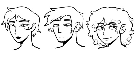
the way i think about faces is like a puzzle - the eyes, nose, lips, ears, chin, etc. being the puzzle pieces. it's a sort of "mix and match" game.


for example, these three characters all have a similar, strong nose and droopy eyes with puffed eyebags (except for azariel in the last pic), but thanks to different face shapes, body builds (how a character is built also reflects in their face) ears, hair and other details the characters can be told apart.
incorporating your character's personality into the face design is a great idea. perhaps the way they express a certain emotion is different to the way other characters do. maybe their resting face is happier-looking than another character's. the face is a big element of character design, because it's a tool of storytelling on its own.

take a look at my lucifer, for example. woah ! what the hell happened to them ? (he's still pretty though)
the face should entice, force the beholder to ask questions about the character and be curious about their story. i'm not saying every face you draw should suggest the oddest of backstories and personalities, but give each of your characters something unique to their face that would spark someone's interest.
now, i haven't exactly checked how well they stand out amongst eachother by removing the hair and the rest of the body, but i did draw a bunch of my characters together without colour on one paper.

my biggest tip is - exaggerate ! find a feature you want to stick out in your character's face and construct the rest of the face to compliment it. matching a face with the character's personality is also something you should know how to do, so i suggest doing research on shape and colour language.
it's important to take note of how faces look as people (or humanoid characters) age and grow older. wrinkles are one of the main ways i add character to ... well, my characters.


as much as i enjoy drawing wrinkles, i usually save them for "wise old" or nurturing characters. but of course, wrinkles appear on all sorts of people, especially if they have a fuller face.
(i am speaking specifically for my stylization which often strives to be somewhat anatomically realistic)
another tip is to reference life when you study ! human people have such a wide array of features you can utilize, it's amazing and beautiful ! just make sure you do research on ethnic features and when they appear on which face (unless you're going for something supernatural/humanoid, then the nose gallery is all yours /j).
also, don't drastically diversify faces all the time. siblings and family members often have similar features and it's okay to repeat them in these cases.

(this artwork is pretty old)
if your character and costume design is good, "same face syndrome" shouldn't worry you at all. avoiding this art community boogeyman is just one way of diversifying your art and adding spice to it. lacking this diversity really is no sin.
at worst, it's just going to look odd. for example, if you're so used to drawing young, wrinkle-less characters and attempt to draw an older character without any exercise prior to that, chances are this character is going to look oddly youthful, resulting in a sort of silly outcome.
but just like with everything, take your time ! changes and improvements don't happen overnight, and it takes time for you to get used to new things. with all that said, i'm wishing you the best of luck and happy drawing !
67 notes
·
View notes
Text
The Review Copy of Eureka: Investigative Urban Fantasy

Guess what is coming soon at the time of writing this? The review copy of Eureka: Investigative Urban Fantasy!
This represents the first official pre-release release of a version of Eureka: Investigative Urban Fantasy that doesn’t look like an unformatted mess!
Don’t get me wrong, the version of Eureka you get for just $5 on our patreon is plenty readable, but in its current unformatted state the page count is hugely bloated, there’s a lot of blank space, and the flavor text is all just shoved under the body text with notes denoting it as such. Plus, it’s all just black text on a white background without much in the way of aesthetic besides the occasional snoop to break things up.
Well not anymore! The copy we are going to be sending to reviewers and rpg news outlets is going to be a test-run of our actual intended aesthetic for the finalized rulebook, that of a bunch of conspiracy and investigation notes pinned to a corkboard with red string connecting them!
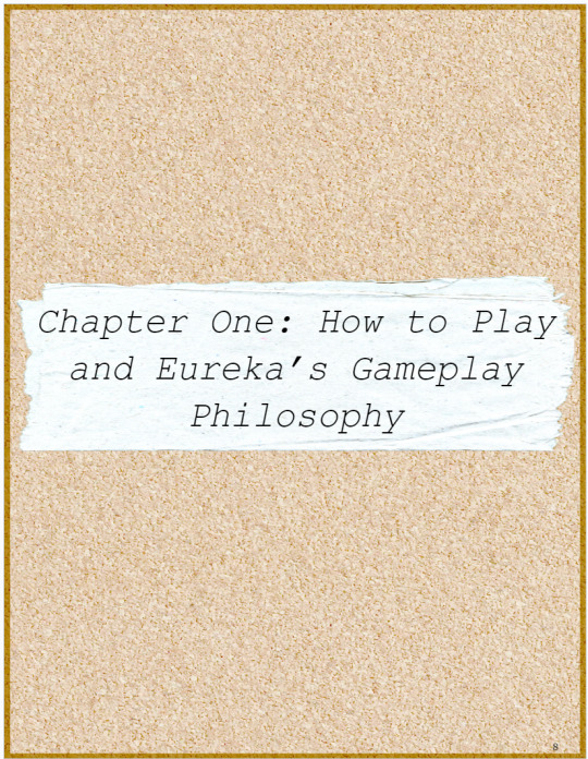


(The text within the images you’re seeing here is slightly outdated because these are just mock-ups, the text in the actual review copy will be much cleaner thanks to some excellent copy-editing help we have been getting.)
Due to time constraints and being behind on deadlines, plus not having the Kickstarter money to pay for additional art yet, this version will not showcase the full scope of the intended aesthetic, but it will at least give you a pretty good idea of what we’re going for.
The final version is going to have a wider variety in the paper scraps so as to more efficiently use the space available, plus a bunch of different “styles” for the side text, which will help denote whether it is a rules clarification, an example, a bit of flavor text, etc—plus a whole Kickstarter campaign worth of art from theblackwarden, qsy, and chaospyromancy! The Kickstarter campaign is launching April 10th, 2024, and we are going to need about $3,000 to meet our base goal and $33,000 to meet all of our many stretch goals, so if you want a more stylish and artistic rulebook, please give what you can to our Kickstarter campaign in April!
We are gonna be sending this version of the rulebook to tons and tons of TTRPG personalities and news outlets within the next couple of weeks in hopes of an honest review or two that will help get Eureka on people's radar beyond the modest following we have here on Tumblr. If you are one such personality or news outlet, and you want to recieve access to the free review copy to read and write about, please do not hesitate to contact us, even if you only have a very small following! You can find our contact info on out website or just contact us right here on tumblr!
Check out our Kickstarter page for the best accumulation of info on what Eureka: investigative Urban Fantasy even is! The Kickstarter campaign launches April 10th 2024!
Check out our Patreon to get the whole prerelease rulebook + multiple adventure modules and pieces of short fiction for a subscription of only $5!
If you wanna try before you buy, check out our website for more information on Eureka as well as a download link to the free demo version!
Interested in actually playing this game, and many others, with the developers? Check out A.N.I.M.'s TTRPG Book Club, a club of nearly 100 members at the time of writing this where we regularly nominate, vote on, and then play indie TTRPGs! At the time of writing this, we are playing Eureka: Investigative Urban Fantasy, and sign-ups are closed for actually playing it, but you can still join in to pick up a PDF club copy of the rulebook to read and follow along with discussion, and sit in on and observe sessions! There is no schedule obligation for joining this club, as we keep things very flexible by assigning multiple GMs with different timeslots each round, to try and accomodate everyone! This round, we had over thirty people sign up, and were able to fit in all but one! Here is the invite link! See you there!

#eureka#eureka: investigative urban fantasy#ttrpg#tag#rpg#monsters#roleplaying#tabletop#coc#ttrpg design#allied forces#ttrpg tumblr#ttrpg art#ttrpg character#indie ttrpg#ttrpg community#ttrpgs#kickstarter#review#review copy#monster girls#monster#monster girl#monstergirl#horror#free rpg#rpgs#supernatural rpg#fantasy rpg#indiegames
81 notes
·
View notes
Note
im super interested in knowing how u get such vibrant colors & draw ur faces,,,, also ur art is super cute and awesome !! :3
-🎀
thank you, and i'll try my best to answer this but !! i dont think i'll be much help in trying to explain either of those 😭
for colors i actually pick them manually (insanity); though i draw fanart most of the time and have refs in hand, i pick out colors close to the originals, then simply match them to a tone i want for the picture (if this makes sense; i often use color palettes too to see how i can match them. if there is an odd color that wouldnt match, what i do is i also simply pick a brush on half or lower opacity and place the general color of reference over; for ex below: asuka's hair was a bit too bright and unfitting, so i picked the pure violet shade the lineart had as well and applied it over on 30?40?50% opacity)

for picking colors, theres tons of color palettes online to pick from, but there's also tons of artists with colorful styles like these i like to look for for examples (my best picks are rourow (one of muse dash's artists), onono imouko* (dohna dohna's lead artist; @ _himehajime on twitter), mochizuki kei (@ key999 on twitter), ohisashiburi* (some of the more colorful works of theirs at least. the colors in majority of theirs even if more dark in tone are still super pretty and you can work around with them too; needy girl overdose's lead artist, @ imlllsn on twitter)
*beware nsfw content. onono has no nsfw in his own media tab but rts it; dd is an eroge ; ohisashiburi may have art with sensitive topics, and nsfw or thinly veiled nsfw in both media tab and rts.
—
for faces i still struggle with them actually ! 😭 not that i cannot draw faces, moreso sometimes struggle to draw them as i want. for piece above i feel like i got it exactly as i'd want to always do them (i.e for years on end i've always wanted to draw eyes larger than i usually tend to do); but most of the time especially on eyes i try to match the face closer to reference even if it goes a bit overboard with the style, and then try to make it match more either by line weight or etc. (i also tend to exaggerate expressions at times because i personally think it either better shows them off or it looks cute) (probably best example below because its a redraw of a figure)


i hope the ... not extensive ramble was helpful in any way. good luck with your art journey!!!!
43 notes
·
View notes
Text
LO Art Analysis (or: A Real Example of Why You Shouldn't Use Multiply for Everything)
I've obviously been spending a lot of time recreating LO art and in that time, I think I've really cracked open some of modern LO's problems with its art. This is a lengthy post so turn on some lo-fi, grab some popcorn and strap in.
One thing in particular that I'm very eager to talk about (and go off about) is Rachel's use of color language and shading.
THERE WILL BE BRIEF FASTPASS PANELS AHEAD IN THIS ANALYSIS. YOU'VE BEEN WARNED!
One of the key things that most people seem to agree on when it comes to LO's current art quality is the lack of color language. Back in S1, we had colors that seemed to jump off the page, with gorgeous rendering that created panels that were vast and beautiful to take in. It didn't matter if the anatomy was wonky or if the backgrounds were translated directly from Google Sketchup, the color and compositions made up for its flaws and created unique vignettes that individually contributed to what we found so special about LO back in those days.


That last one especially is still hands-down one of the most well-known and influential LO panels out of the entire series. Many a phone background its graced (my own included, I've literally had this as my phone background for like 3 years now) and it serves as a beautiful standalone example of the mood and emotions LO used to convey. You don't need to know the context of the scene, you don't need to know the characters, the mere posing and color choice alone is enough to invoke a reaction from the viewer. It doesn't even have a lot of shading or final rendering, the composition and texturing is all it needs.
So why does a simple panel like that work, but panels like these don't?

I have such beef with this panel because it does the complete opposite of what the famous Tower 4 panel achieves - it puts on full display everything wrong with LO's current art style, from its character posing to its color language aaaall the way to its final rendering.
First off, the character posing and framing. I finally figured out what RS' male characters have been suffering from lately, and it's a phenomenon that I'm sure many of you will be able to recognize right away.

Seth Macfarlane Syndrome.
You might not watch Family Guy, you might not watch American Dad, or the Cleveland Show, but you'll know exactly what I mean when I talk about Seth MacFarlane Syndrome. It's the stiffness, the lack of movement or bend in joints, the boring posing of characters standing with their arms flatly at their sides and their entire body facing the same direction, eyes unblinking - and when they speak, heads slightly tilting, mouths always being conformed to the same default shapes, while the arms do something random and unrelated to create the illusion of natural movement.


This has been an issue in LO for a while now, incredibly flat posing that lacks any sort of dynamic curvature to it, but it's best exemplified by that Ares panel above because holy shit does he ever look like Stan Smith in it. Boxy shoulders with arms that appear to be WAY too short hanging off the side, elbows flattened, hands straightened out, no natural shaping whatsoever.
But that's not the crux of the issue I want to touch on today.
No, the worst offense of this panel is that it indirectly proves what I've been suspicious of for a while now.
To explain real quick for context, there's this thing in digital art called Blend Modes. It's essentially a basic function in digital art that allows you to change the properties of layers for the purpose of shading, rendering, whatever have you. Most of these Blend Modes are the same across all digital art programs, things like Multiply, Screen, Color Dodge, etc. are all fairly basic tools in the digital artist's toolkit but all have an INCREDIBLY high ceiling of mastery - meaning, blend modes are easy to use on a basic level, but require a lot of skill and understanding of color language to utilize to their full potential. Using them right can transform a passable piece of work into a great one - on the flipside, using them wrong can take a passable piece of work and piss all over it.
The one I want to focus on in this post is Multiply. I use this blend mode myself quite often, it basically 'multiplies' the properties of the layers below it, taking whatever colors are below and 'doubling' them to create darker tones. This makes it a go-to for shading.
But the issue with Multiply is that it often ends up being used when it's not supposed to be. Or rather, people starting out will often use it as a substitute for shading when you'd be better off using your own hand-picked colors. I've got characters with skin tones that I can shade with the same color set to Multiply, zero issues, because the base tone is one that doubles well, it creates a nice rich tone on top that's perfect for shading.
But do you know the one color that DOESN'T multiply well?
Yellow.
Yellow is NOT a color you can just multiply, not without the final result looking flat and almost putrid. Most people will thus recommend you shade yellow with other colors along the same side of the color wheel, including oranges and reds. This is precisely why knowing color theory is such an important skill even in digital art, because using Blend Modes improperly can create flat tones that can ruin a final composition.
Going back to that Ares panel...
Again, I've had this suspicion for a while, especially when looking at panels of Persephone (*pink is ALSO a color that doesn't multiply well)
So I put it to the test. I took the original panel, sampled the yellow, and overlaid it with Multiply to see what I'd get.
Fam.
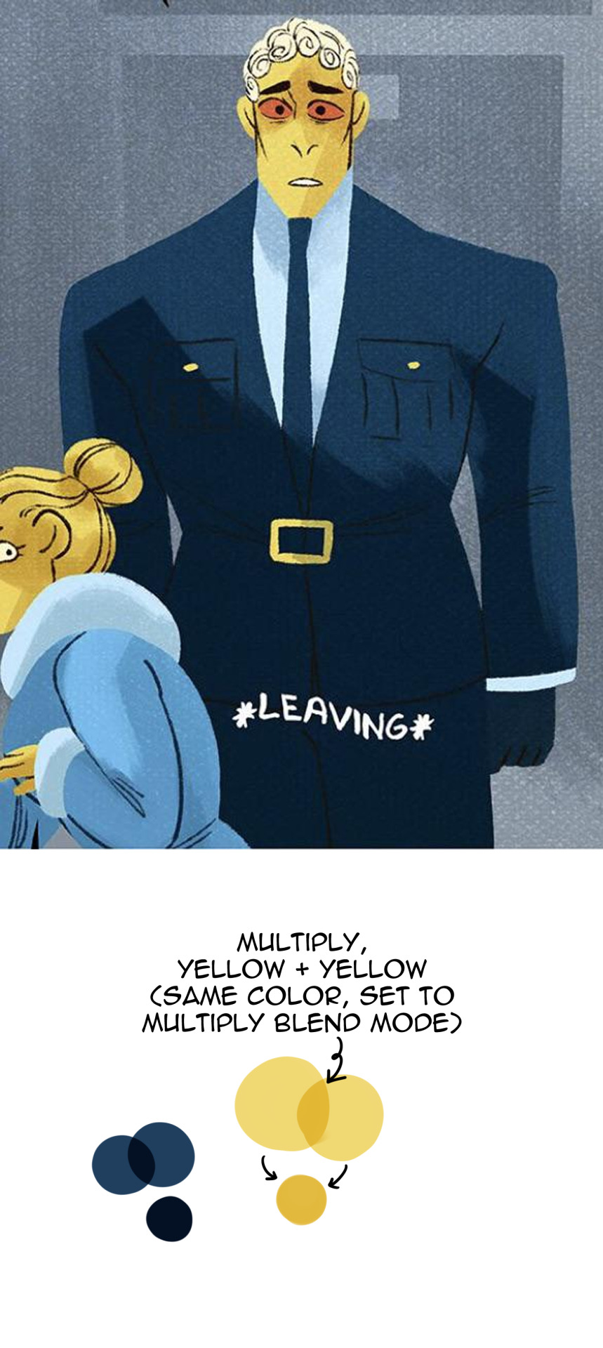
That putrid deep yellow that I mixed above is literally NEXT DOOR NEIGHBORS WITH WHAT I EYEDROPPED FROM THE PANEL. Copy and paste that and eyedrop it yourself if you want to see it with your own eyes. It's pretty obvious she did the same thing with Hera as well, you can tell her skin tone has been set to multiply and repainted with the same color, same as with her jacket.

They are using Multiply layers for everything as the default. This is not how Multiply is intended to be used - it's lazy shortcutting that's resulting in flat, boring, ugly compositions.
RS has stated herself that she 'changed' how LO is drawn to help 'streamline' the process for her assistants. This isn't streamlining. This is cutting corners.
Streamlining would be having color palettes to refer to during the coloring and shading process. I use them myself for characters that I CAN'T multiply-shade, I literally have characters whose skin tones are too light and yellow-toned for it - using Multiply would wash out their tones and make them look flat and sickly so I have to use a separate color from a different part of the color wheel to shade them (usually a darker tone of red/orange).
Rachel, babe, this isn't streamlining, this is just taking shortcuts to the point of sabotaging your own work. You can't sit there and tell me THAT looks good and is worth the 'streamlining' when panels like THESE used to exist:
Turn off the Multiply layers and color your characters for once, please, I'm begging you. This is such a rookie move for someone who claims to be a professional (and regularly brags about the awards she's won); not to mention a tragic fall from grace because we know Rachel can and has produced better work than this in the past. She knows color language, she knows how to paint, so why is she resorting to shortcuts like this? She has an entire team of people and yet she's still consistently behind enough in her buffer - or just doesn't care enough anymore - that she's resorting to lazy amateur tactics like using Multiply for everything.
And on the off chance that she ever sees this, Rachel, it's not even that hard to use proper colors. You've done it before, you should already have the color palettes available to you.

(P.S. One handy-dandy experiment to tell if your Multiply layers are failing you is the desaturation test. You'll notice that drawings being made primarily with Multiply layers will look a lot 'flatter' when desaturated, because the shading is just the same color on top of itself and 'doubled', there isn't any actual value or depth in the shading itself. These are the exact same panels I showed before, RS' on the left and mine on the right, they've just been desaturated to show the difference that proper color choice can make when defining values and tones in shading!)

474 notes
·
View notes
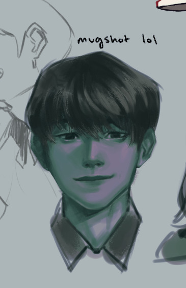
Note
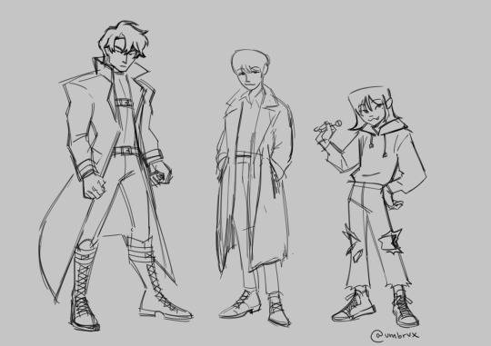
i like ur art. its great and interesting!! i really like your artstyle and i really like the way u draw hsy, yjh, and kdj. you captured them so well in terms of vibes/character. also i was wondering do u have any advice to improve on drawing anatomy/poses/faces?
wahh thank you so much...!! i feel like im still trying to figure them out in a lot of ways but i do really like ironing out my visual interpretations of them so im really happy to hear if people like what im coming up with
also anon you super activated the part of my brain that cant help but yap about art theory... i spent some time writing as many tips as i could think of. unfortunately i dont think i have the time currently to do a fully illustrated guide, but ill still try to include some visual examples:
[incoming wall of text lol]
ANATOMY:
to preface i think that like 100% of the time you should reference a real life photo for anatomy rather than other artwork or drawn references.
the best way to learn the body is by… well, actually looking at the body! but also artwork is informed by a person's own artistic ability/stylization choices/sense of idealism, so while looking at art can help give you an idea on how to break down forms, i think you would be best served observing real life references.
i labor on this point because i do think that having over relied on drawn reference material and avoiding photographic references on the basis of not being interested on realism hindered me as a largely self-taught artist as a kid, so i want to encourage live or photographic reference since anatomy is one of the foundations from which everything else is built on. that being the case, all of my doodles i'm doing for this are going to be for the sake of example rather than to strictly say how you should or should not be drawing something
-> when you are doing a study of a photo, just try copying it as best as you can. pay close attention to the natural lines and shapes of the body -- the S-curve shape of the leg, the triangular shape of the forearm, the trapezoid shape of hips/thighs when they sit, and so on. note where the body folds or squishes or pulls; how mass will shift to accommodate a certain position. if a form is hard to visualize, focus on the negative space and carve that out, rather than strictly drawing the positive space.
don't expect to get it perfect the first time. in fact, iterate on it multiple times to build understanding. try doing it to a timer of 15, then 10, then 5 minutes. doing this will force you to have to prioritize the most important shapes. you can help reinforce this by using a thicker brush or a brush with no pen pressure (no joke ms paint works great for this) to force you to be loose and not become preoccupied with details.
-> pinterest is a great resource for finding and compiling photo reference material
-> organic shapes are curved, so embracing/emphasizing that (particularly for the extremities) can help make your drawings look more natural or fluid
POSES:
-> it all begins & ends with contrapposto… you've probably heard of the line of action, which is related. if you're offsetting the shoulders & hips, it: makes poses more natural, more dynamic, and helps the pose sort of "draw itself" -- the legs will follow the direction of the hips, and you can use the arms to reinforce the angles
-> context is key. don't ask: what pose should i draw? instead ask: what do i want this character to convey? what does happiness, anger, sadness, and so forth look on this particular character? how do they express that? consider these drawings: these are both ostensibly the same pose, but look at how changing just the shape of the spine recontextualizes it.
for more on pose design i recommend watching Tracer & Pose Design 101 - The Animation of Overwatch by New Frame Plus (i promise this is a genuinely super informative video).
to expand on this, in general, all of the components of a piece (background, composition, pose, etc.) are best considered in conjunction rather than separately. it is difficult to choose a pose and then choose a background because they are missing the context that would make a piece cohesive. when you are planning a drawing, try to begin with your general concept/idea/prompt and then do several thumbnails -- small and quick doodles that should take no longer than 5 minutes each -- developing it: you may find that the pose and bg will naturally fall into place.
-> silhouette: the degree to which you need to push this varies by style but generally speaking the pose needs to be readable; i.e. instantly recognizable. try to keep important elements of the gesture outside of the silhouette. for example, if the character is pointing, keep that arm out of the interior of the body. the same pose can be more or less readable or dynamic depending on where the character is pointed in relation to the viewer
-> exaggeration!! goes along with the previous point. push the pose as much as you can (and what makes sense for your style) to communicate your pose as clearly and as intensely as possible.
FACES:
-> i highly recommend the app Handy Art Reference Tool by Belief Engine for all things related to drawing hands/heads/feet. its on both android and ios. it isn't free -- it costs around $3 -- but that is seriously such a small price to pay for the amount of utility you get out of it: the hands models are fully poseable (there's also pose presets), you can rotate the head models however you want, and there is 3-point customizable lighting. it is really helpful for getting those super tricky and hyperspecific head angles that you just can't find a real life reference for. that being said given that there's only a few different head model variants, bear in mind how differences in features can affect what exactly a face will look like in those angles.
-> i still recommend doing studies of real people. as with anything else, learning generalized proportions is important, even if you are going to later on bend or break this depending on style
-> as for my own approach... it kind of depends on the style i'm doing at that particular time. for my paintings (what id consider my main style) i approach a character with a few real-world features in mind and then apply them to the best of my ability. it usually will take a few iterations to land on an interpretation i really like as i try out different things. a lot of the face also gets developed during rendering rather than through my initial sketch too, as i adjust for lighting and correct proportions on the fly
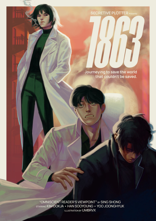
(look how much this image changes between sketch and render lol)
if i were to recommend anything, i think it would be to nail down your most distinct features first -- the ones that will make your character's face recognizable, and could apply regardless of art style.
in my case with kim dokja, i knew when i first started drawing him that i wanted to give him a longer face and down-turned eyes. when i decided to do the disco elysium inspired set, in which i was breaking out of my comfort zone by letting go of any idealizations focusing on conveying characterization/making them feel "real", i landed on some more specific traits (defined lower lids/perpetually tired eyes/eyebags(?) the crease there idk how to describe it) which i continue to try to evoke even if im drawing something much more cartoony
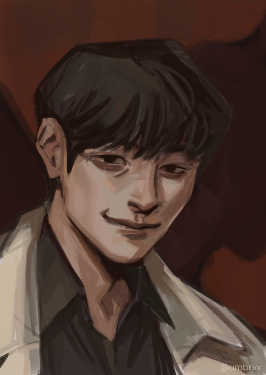

(pictured are my first kdj -> disco elysium style -> my post de-style kdj)
as a side note, this very same process changed yjh much more dramatically

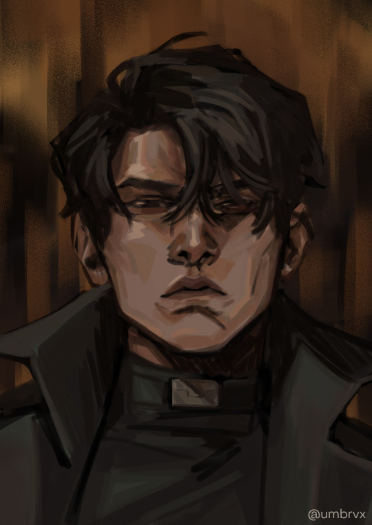
(^ that first guy is mad someone else)
those handful of key features will be the thing that you can then take into a simpler style and simplify or exaggerate to whatever degree suits you. you can also play with shape theory (square = sturdy/solid, circle = natural/smooth/welcoming, triangle = energetic/dangerous). shape theory doesn't necessarily need to be so rigid -- you can combine shapes as you please to convey whatever vibe you're going for -- so please think of it as a tool that may help rather than a rigid law you must abide by.
-> expressions: exaggerate them. thats kind of it!! make it big!!! you wanna be able to really feel those emotions. the principles of squash & stretch help here: think of how the muscles move when you, say, open the eyes or mouth really big. as one side of the face stretches open, the other side squashes to accommodate it

even without changing the position of the jaw here, moving the nose and scrunching the eyes will sell the expression
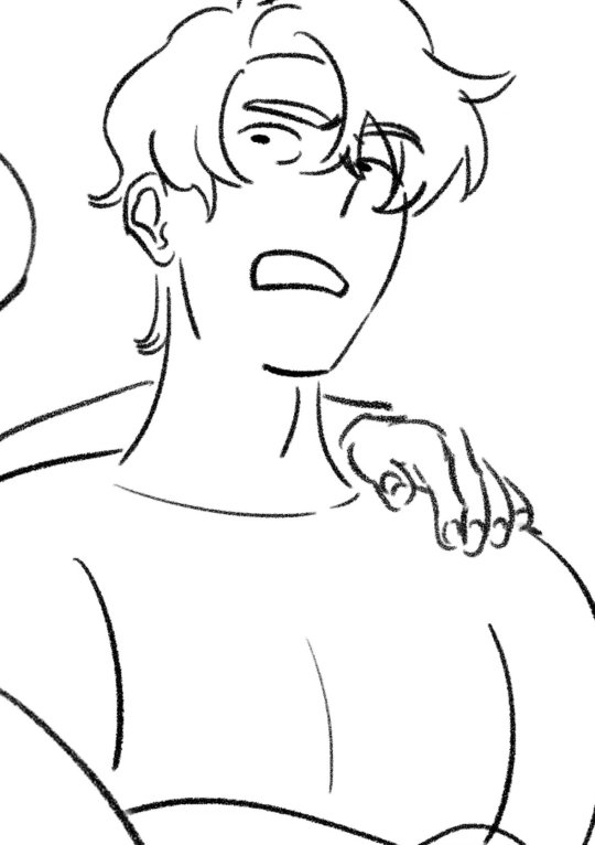
you can also play with squash/stretch to break proportions to sell a feeling more
since expressions are just, well, poses for the face, everything else for poses applies here (and facial expressions & pose should also be considered in tandem). while the term contrapposto itself just refers to the offset of the shoulders & hips, the similar principle of asymmetry also carries here as that will help make the expression a bit more dynamic.
and i think... that's it!! all i can think of at least. i hope it helps anon!!!
#umbrvx.ask#sorry the reply took a minute i have been writing this post since i got the ask im so serious#i tried to determine what advice i could give that would be the most immediately actionable#also sorry its a huge wall of text im a little crazy about learning and discussing art theory . oops (the yapper)
30 notes
·
View notes
Last Seen Blogs

roseshails
hailey

rockstone86
ROCKSTONE86
four-birds-in-a-trenchcoat
Four Birds in a Trenchcoat

sambhavmetal
Sambhav Metal