#its over-simplifying it a bit
Text
Thinking about the fact that in every version of Grease, the Pink Ladies all have personalities and interests that make them individual, while the T-Birds are kind of 'The Leader' and 'The Rest of Them'.
#Grease#Grease 2#Rise of the Pink Ladies#its over-simplifying it a bit#but its basically the truth#Sure Louis was all about trying to get Sharon to put out#And Danny and Kenickie were sort of co-leaders#but none of the others stand out as anything other than minions
242 notes
·
View notes
Text
shaking lawrence gordon round like a bug in a jar
#txt#rewatching saw. again#oghh hes so. hes so.#tightly wound n controlled n losing that control is. mwah#n esp w the details we get from the script like oh man.#i dont like to armchair diagnose esp as a neurotypical but theres smth going on w that man.#isnt there a bit in the script abt his routine (PRINTED) saying shit like. 6am gym. 7am smoothie. etc#n apprentice lawrence adds another layer like oughhhh u lost everything (incl assuming ur marriage bc lack of wedding ring etc) so like#he got out of the bathroom for them but lost them anyway. so turned to apprenticehood (partially bc well. pried over to that thinking)#(during his. recovery)#n like. oughhh lawrence.#hes so. hes soooo.#the movie + the script u rlly do get a sense of how much he values his sense of control. even if its not. what he wants?#eg the cheating stuff ohhh my god#anyway. lawrence im tapping the screen i wanna study u like a bug#n the bit james wan said in the commentary about him n adam switching roles (calming vs stressed etc) throughout the movie oughh#<- extremely simplified but waghh
12 notes
·
View notes
Text
its honestly so funny that my homophobic grandmother says that i should "make use of my talent" when it comes to art and that "if i had that spark glow, it was for something" girl............ i started to draw because i wanted to make gijinkas of the male fn4f animatronics kiss each other
#some security guards too. mostly fritz and jeremy#but yeah. i was 15; very into fn4f; very into fictional boys kissing. that was the magical thing that inspired me to draw my own things#which is funny because to this day i havent done a single kiss. i have something for which i did the pose with csp 3d models#now i need to just... draw it. and even then its not a kiss on the lips like i wanted when i was 15 lol its on the cheek#yes i have been drawing since 2015. no i havent drawn yet a kiss. we exist. also youre talking to the person who avoided drawing profiles#until last year; because i knew it wasnt going to be perfect and brain said 'nope; youre NOT going to do something that isnt perfect'#(wow i wonder why jadon is my favorite sindec character /s)#i still avoid to do things i know wouldnt end up the way i want the first try but also... kinda saying 'fuck it' and practicing anyway.#sometimes.#peak comedy is that the first profile i ever drew didnt actually.... turned out that bad. at least not in my simplified style of that time#and now im a bit more used to drawing them so theyre not THAT difficult to do. not in my current style at the very least#which is also rather simple. not saying theyre easy; theyre just not VEEERY complicated like. fucking hands or something#i sure as hell prefer drawing profiles over drawing hands#lilith whispers
3 notes
·
View notes
Text
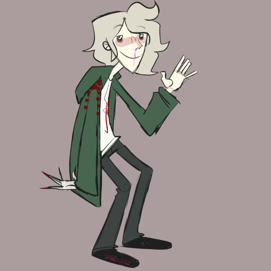
every year i draw komaeda and this year i cartoon network-ified him
(check out my last few komaeda drawings here x x)
#my art#danganronpa#sdr2#komaeda nagito#fun littl sketch. been very lazy lately and am having a hard time finishing art😞#also Yeah my art style has changed quite a bit over the past 6-8 months#im trying rly hard to stylize more and simplify shapes and stuff#its been a massive breakthrough for me creatively but i cant help but feel like my#simplifying my style is making my art worse .#i think i just have it in my head that detail = good simple = lazy#anyways. komaed a am i right? is FIHAS still funny idk i think FIHAS is still funny
4 notes
·
View notes
Text
i feel like the devil came up with this idea not me
#im making a drawing#its HAS TO BE historically accurate for my brain#not even to a later period#just fucking tudor time#which is a paaaiiiiin#but i did find some resources#yay me#but fuck the amount of boningchannels#its litterally all over#so might simplify it a bit
3 notes
·
View notes
Text
found a great gl by chance but the translation takes a long time so i need to be very patient
#kicks over trash can and slams red solo cup on table#maybe i gotta learn chinese simplified just for i can read up to the latest chapter (its on chapter 25 but the translation is on ch22 pt2)#i say that as a joke but i have been wanting to learn chinese#so maybe i will if i can find the resources to start#also gotta learn portuguese too#i will look in a bit#anyone have that one google drive full of language books or whatever it was?
1 note
·
View note
Text
there's probably a headcanon somewhere that ougi is bad at simple comforting. but allow me to produce a possible counterargument:
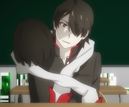
this seems a lot like comforting to me. it's poignant, yknow?
#ougiposting#oshino ougi#monogatari#this is fully knowing what comes next-- that doesnt really change what i'm saying#it also makes me really sad for reasons i can't talk about... bc theyre too spoilery#draped over him....#but also ougi does just straight up comfort nadeko at one point too. so its a bit of a simplified headcanon imo#darkness be damned my ougi can offer comfort#however genuine ougi is while doing so is another and entirely irrelevant story
0 notes
Text
hxh is really like the best anime of all time
#nerd alert#the vast variety of character designs#the personalities....the dynamics.....#we're just about to wrap up the chimera ants arc and like. ok its going excruciatingly slow#the last idk 4 episodes or so have spanned literally like 20 seconds of action. its actually kinda painful#but the narration is actually really well written and valuable i think. knowing what exactly these characters are feeling and thinking#in what would be a very fast-paced and intense situation is really interesting#kinda makes me think that this arc wouldve made a pretty good novel at points#though there are some shots that would be difficult to describe in words with the same impact#thinking of that fight where gon and killua and kite are each fighting ants and killuas ant thinks hes won#so he looks over to watch gon and then suddenly the camera flips upside down bc killua broke his fucking neck#shit like that is so cool tbh. the cinnamon topography#and im glad that they picked it up more in this part bc tbh? we watched a bit of the 2011 version instead of the original#during the auction arc and it felt like such a severe downgrade#the original was so fucking good!! the artstyle felt a lot nicer and the way everything was presented was really cool#so when we watched part of the auction arc in the remake it was like. well. its telling the story but everything feels...#the way i think of it is 'all polish and no soul'#the lines and colors were oh so clean. but design-wise the characters felt...more cookie-cutter and simplified (in a bad way)#the color palettes werent cohesive it felt like everything in a well-lit shot was under bright flourescent lights. too stark and pale#the exposition was lengthier and felt heavy-handed. a lot of telling over showing#but the chimera ant arc has been a LOT better i think#plus no matter what i will always appreciate the massive amount of diversity in character designs#not just in the ants but the humans too#people with different face shapes and eye shapes and styles and different NOSE SHAPES#a few of the designs ... havent aged well. but most of them are pretty cool#(and a couple were fixed a bit in the remake. not all tho! that one girl with kites crew needed some DRASTIC work done that was not!!)
1 note
·
View note
Note
I love signal wizard so much! Would you be willing to show how you did the noise effect? It looks sooooo good and I have no idea where you even started lmao
Sure! It was a pretty messy and experimental process, so there isn't an easy step by step recreation method, but I can go over the tools that I used.
It was largely thanks to the Dissolve blending mode which turns opacity gradients into pixelated ones:

I would first create a solid shape that I liked, then airbrush the edges to be less distinct on a Dissolve layer, and then use a textured brush to carve the airbrushed edges out a bit to make the shape more gritty and rough. Then I put a desaturated noise filter with its brightness levels adjusted to boost the contrast on top of it all. Here's a simplified step through with just one extra tone added at the end to give the shape some volume:
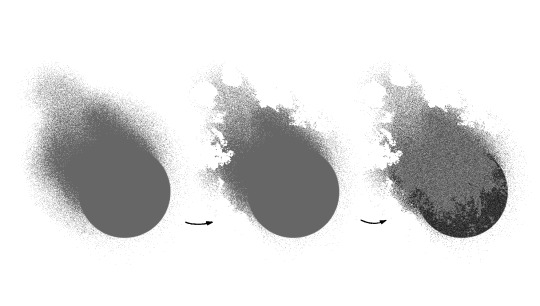
I layered a lot of these in different tones on top of each other with different opacities and blending modes and messed around with differently textured brushes until I was happy with the look. Then I threw in some tidbits of magenta and cyan for a little color and voila! The Noise.
558 notes
·
View notes
Text
Clam's Quick Tips for Starting Your Very First Webcomic
Howdy! Here are the three bits of advice I tend to give people who ask me about getting into webcomic-making. Maybe they can help you jump into the fray with a little less fear.
1) Make Your First Chapter a Pilot Episode
You will be told by webcomic veterans to start with a short, simple comic idea first - which is wise - but if all you can think about is your big magnum opus, then you might as well hop in, right? Otherwise you'll just be glancing back at the other cooler project forever.
But if you can't start with a small simple story, start on a small, simple part of that larger story. Your first chapter should be a snapshot of the main conflict - show us a simple scene with few characters, ease us in slowly, keep things clear and focus on emotion/impact/clarity. Get the audience to care by offering something easily digested, but full of promise.
Once you're done with that 'pilot' chapter, and you're feeling more comfortable with the whole comic process, you can open the gates and show us the larger world. At that point, you'll be way more ready.
2) Simplify Your Art Style For Your Own Sanity
Always try to make your webcomic's art style as simple as possible - the standard rule is to use only 75% of your artistic skill for every comic page you make. Otherwise you will burn out quickly and terribly.
But you also need to be PROUD of your art style. If you're really feeling itchy, add a couple bells and whistles to your style so you can look at the finished page and say "Yeah, looks cool." You'll find the right balance the more you draw.
Also, don't be afraid to change your art style as you go along. Ultimate consistency is often impossible in webcomics anyway - so embrace your desire to try new things, streamline your work, whatever you feel needs to happen to be happiest. Sometimes the coolest part of reading a webcomic is noticing that style change - so don't hesitate to embrace it!
3) Resist the Reboot! RESIST!
The curse/blessing of drawing the same things over and over is that you'll inevitably get better at drawing those things. The trouble comes when you look back at old stuff and start thinking "Damn, I could draw that way better now."
You must recognize that this feeling never goes away. Not after a hundred pages. Not after three hundred. Not after a thousand.
I think everyone should be allowed one soft reboot for their first webcomic. Redraw some panels that bother you. Change up some dialogue if it doesn't make sense with your new story ideas. Do maintenance, basically. One of the beauties of webcomics is that they can be easily edited, without reprinting a whole book or remaking a whole game.
But if the ultimate purpose of a webcomic is to tell a story, then constant reboots will just be retelling the same story - slightly better each time, but the same at its core. We've heard it before. Most audiences would rather you save your strength and just keep going, rather than circling back year after year and going "Wait wait wait! I'll do it better this time."
Reboot early, not often, and only when you absolutely must! You're a storyteller, and you're constantly getting better at telling your story. Don't be ashamed of it - look back how much ground you've covered, and keep walking!
---
That's a good start. Happy webcomicking - don't be afraid to jump in, but be prepared to learn a lot very quickly. And if this advice doesn't work for you or adhere to how you did it, that's absolutely fine - webcomics are diverse by nature, and so are their creation processes. Feel out what works best for you, and good luck!
3K notes
·
View notes
Text
why Aurora's art is genius
It's break for me, and I've been meaning to sit down and read the Aurora webcomic (https://comicaurora.com/, @comicaurora on Tumblr) for quite a bit. So I did that over the last few days.
And… y'know. I can't actually say "I should've read this earlier," because otherwise I would've been up at 2:30-3am when I had responsibilities in the morning and I couldn't have properly enjoyed it, but. Holy shit guys THIS COMIC.
I intended to just do a generalized "hello this is all the things I love about this story," and I wrote a paragraph or two about art style. …and then another. And another. And I realized I needed to actually reference things so I would stop being too vague. I was reading the comic on my tablet or phone, because I wanted to stay curled up in my chair, but I type at a big monitor and so I saw more details… aaaaaand it turned into its own giant-ass post.
SO. Enjoy a few thousand words of me nerding out about this insanely cool art style and how fucking gorgeous this comic is? (There are screenshots, I promise it isn't just a wall of text.) In my defense, I just spent two semesters in graphic design classes focusing on the Adobe Suite, so… I get to be a nerd about pretty things…???
All positive feedback btw! No downers here. <3
---
I cannot emphasize enough how much I love the beautiful, simple stylistic method of drawing characters and figures. It is absolutely stunning and effortless and utterly graceful—it is so hard to capture the sheer beauty and fluidity of the human form in such a fashion. Even a simple outline of a character feels dynamic! It's gorgeous!
Though I do have a love-hate relationship with this, because my artistic side looks at that lovely simplicity, goes "I CAN DO THAT!" and then I sit down and go to the paper and realize that no, in fact, I cannot do that yet, because that simplicity is born of a hell of a lot of practice and understanding of bodies and actually is really hard to do. It's a very developed style that only looks simple because the artist knows what they're doing. The human body is hard to pull off, and this comic does so beautifully and makes it look effortless.
Also: line weight line weight line weight. It's especially important in simplified shapes and figures like this, and hoo boy is it used excellently. It's especially apparent the newer the pages get—I love watching that improvement over time—but with simpler figures and lines, you get nice light lines to emphasize both smaller details, like in the draping of clothing and the curls of hair—which, hello, yes—and thicker lines to emphasize bigger and more important details and silhouettes. It's the sort of thing that's essential to most illustrations, but I wanted to make a note of it because it's so vital to this art style.
THE USE OF LAYER BLENDING MODES OH MY GODS. (...uhhh, apologies to the people who don't know what that means, it's a digital art program thing? This article explains it for beginners.)
Bear with me, I just finished my second Photoshop course, I spent months and months working on projects with this shit so I see the genius use of Screen and/or its siblings (of which there are many—if I say "Screen" here, assume I mean the entire umbrella of Screen blending modes and possibly Overlay) and go nuts, but seriously it's so clever and also fucking gorgeous:
Firstly: the use of screened-on sound effect words over an action? A "CRACK" written over a branch and then put on Screen in glowy green so that it's subtle enough that it doesn't disrupt the visual flow, but still sticks out enough to make itself heard? Little "scritches" that are transparent where they're laid on without outlines to emphasize the sound without disrupting the underlying image? FUCK YES. I haven't seen this done literally anywhere else—granted, I haven't read a massive amount of comics, but I've read enough—and it is so clever and I adore it. Examples:


Secondly: The beautiful lighting effects. The curling leaves, all the magic, the various glowing eyes, the fog, the way it's all so vividly colored but doesn't burn your eyeballs out—a balance that's way harder to achieve than you'd think—and the soft glows around them, eeeee it's so pretty so pretty SO PRETTY. Not sure if some of these are Outer/Inner Glow/Shadow layer effects or if it's entirely hand-drawn, but major kudos either way; I can see the beautiful use of blending modes and I SALUTE YOUR GENIUS.
I keep looking at some of this stuff and go "is that a layer effect or is it done by hand?" Because you can make some similar things with the Satin layer effect in Photoshop (I don't know if other programs have this? I'm gonna have to find out since I won't have access to PS for much longer ;-;) that resembles some of the swirly inner bits on some of the lit effects, but I'm not sure if it is that or not. Or you could mask over textures? There's... many ways to do it.
If done by hand: oh my gods the patience, how. If done with layer effects: really clever work that knows how to stop said effects from looking wonky, because ugh those things get temperamental. If done with a layer of texture that's been masked over: very, very good masking work. No matter the method, pretty shimmers and swirly bits inside the bigger pretty swirls!
Next: The way color contrast is used! I will never be over the glowy green-on-black Primordial Life vibes when Alinua gets dropped into that… unconscious space?? with Life, for example, and the sharp contrast of vines and crack and branches and leaves against pitch black is just visually stunning. The way the roots sink into the ground and the three-dimensional sensation of it is particularly badass here:

Friggin. How does this imply depth like that. HOW. IT'S SO FREAKING COOL.
A huge point here is also color language and use! Everybody has their own particular shade, generally matching their eyes, magic, and personality, and I adore how this is used to make it clear who's talking or who's doing an action. That was especially apparent to me with Dainix and Falst in the caves—their colors are both fairly warm, but quite distinct, and I love how this clarifies who's doing what in panels with a lot of action from both of them. There is a particular bit that stuck out to me, so I dug up the panels (see this page and the following one https://comicaurora.com/aurora/1-20-30/):

(Gods it looks even prettier now that I put it against a plain background. Also, appreciation to Falst for managing a bridal-carry midair, damn.)
The way that their colors MERGE here! And the immense attention to detail in doing so—Dainix is higher up than Falst is in the first panel, so Dainix's orange fades into Falst's orange at the base. The next panel has gold up top and orange on bottom; we can't really tell in that panel where each of them are, but that's carried over to the next panel—
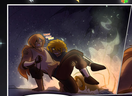
—where we now see that Falst's position is raised above Dainix's due to the way he's carrying him. (Points for continuity!) And, of course, we see the little "huffs" flowing from orange to yellow over their heads (where Dainix's head is higher than Falst's) to merge the sound of their breathing, which is absurdly clever because it emphasizes to the viewer how we hear two sets of huffing overlaying each other, not one. Absolutely brilliant.
(A few other notes of appreciation to that panel: beautiful glows around them, the sparks, the jagged silhouette of the spider legs, the lovely colors that have no right to make the area around a spider corpse that pretty, the excellent texturing on the cave walls plus perspective, the way Falst's movements imply Dainix's hefty weight, the natural posing of the characters, their on-point expressions that convey exactly how fuckin terrifying everything is right now, the slight glows to their eyes, and also they're just handsome boys <3)
Next up: Rain!!!! So well done! It's subtle enough that it never ever disrupts the impact of the focal point, but evident enough you can tell! And more importantly: THE MIST OFF THE CHARACTERS. Rain does this irl, it has that little vapor that comes off you and makes that little misty effect that plays with lighting, it's so cool-looking and here it's used to such pretty effect!
One of the panel captions says something about it blurring out all the injuries on the characters but like THAT AIN'T TOO BIG OF A PROBLEM when it gets across the environmental vibes, and also that'd be how it would look in real life too so like… outside viewer's angle is the same as the characters', mostly? my point is: that's the environment!!! that's the vibes, that's the feel! It gets it across and it does so in the most pretty way possible!
And another thing re: rain, the use of it to establish perspective, particularly in panels like this—

—where we can tell we're looking down at Tynan due to the perspective on the rain and where it's pointing. Excellent. (Also, kudos for looking down and emphasizing how Tynan's losing his advantage—lovely use of visual storytelling.)
Additionally, the misting here:
We see it most heavily in the leftmost panel, where it's quite foggy as you would expect in a rainstorm, especially in an environment with a lot of heat, but it's also lightly powdered on in the following two panels and tends to follow light sources, which makes complete sense given how light bounces off particles in the air.
A major point of strength in these too is a thorough understanding of lighting, like rim lighting, the various hues and shades, and an intricate understanding of how light bounces off surfaces even when they're in shadow (we'll see a faint glow in spots where characters are half in shadow, but that's how it would work in real life, because of how light bounces around).
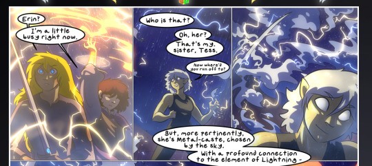
Bringing some of these points together: the fluidity of the lines in magic, and the way simple glowing lines are used to emphasize motion and the magic itself, is deeply clever. I'm basically pulling at random from panels and there's definitely even better examples, but here's one (see this page https://comicaurora.com/aurora/1-16-33/):

First panel, listed in numbers because these build on each other:
The tension of the lines in Tess's magic here. This works on a couple levels: first, the way she's holding her fists, as if she's pulling a rope taut.
The way there's one primary line, emphasizing the rope feeling, accompanied by smaller ones.
The additional lines starbursting around her hands, to indicate the energy crackling in her hands and how she's doing a good bit more than just holding it. (That combined with the fists suggests some tension to the magic, too.) Also the variations in brightness, a feature you'll find in actual lightning. :D Additional kudos for how the lightning sparks and breaks off the metal of the sword.
A handful of miscellaneous notes on the second panel:
The reflection of the flames in Erin's typically dark blue eyes (which bears a remarkable resemblance to Dainix, incidentally—almost a thematic sort of parallel given Erin's using the same magic Dainix specializes in?)
The flowing of fabric in the wind and associated variation in the lineart
The way Erin's tattoos interact with the fire he's pulling to his hand
The way the rain overlays some of the fainter areas of fire (attention! to! detail! hell yeah!)
I could go on. I won't because this is a lot of writing already.
Third panel gets paragraphs, not bullets:
Erin's giant-ass "FWOOM" of fire there, and the way the outline of the word is puffy-edged and gradated to feel almost three-dimensional, plus once again using Screen or a variation on it so that the stars show up in the background. All this against that stunning plume of fire, which ripples and sparks so gorgeously, and the ending "om" of the onomatopoeia is emphasized incredibly brightly against that, adding to the punch of it and making the plume feel even brighter.
Also, once again, rain helping establish perspective, especially in how it's very angular in the left side of the panel and then slowly becomes more like a point to the right to indicate it's falling directly down on the viewer. Add in the bright, beautiful glow effects, fainter but no less important black lines beneath them to emphasize the sky and smoke and the like, and the stunningly beautiful lighting and gradated glows surrounding Erin plus the lightning jagging up at him from below, and you get one hell of an impactful panel right there. (And there is definitely more in there I could break down, this is just a lot already.)
And in general: The colors in this? Incredible. The blues and purples and oranges and golds compliment so well, and it's all so rich.
Like, seriously, just throughout the whole comic, the use of gradients, blending modes, color balance and hues, all the things, all the things, it makes for the most beautiful effects and glows and such a rich environment. There's a very distinct style to this comic in its simplified backgrounds (which I recognize are done partly because it's way easier and also backgrounds are so time-consuming dear gods but lemme say this) and vivid, smoothly drawn characters; the simplicity lets them come to the front and gives room for those beautiful, richly saturated focal points, letting the stylized designs of the magic and characters shine. The use of distinct silhouettes is insanely good. Honestly, complex backgrounds might run the risk of making everything too visually busy in this case. It's just, augh, so GORGEOUS.
Another bit, take a look at this page (https://comicaurora.com/aurora/1-15-28/):
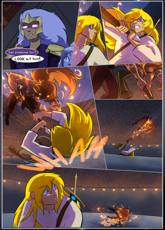
It's not quite as evident here as it is in the next page, but this one does some other fun things so I'm grabbing it. Points:
Once again, using different colors to represent different character actions. The "WHAM" of Kendal hitting the ground is caused by Dainix's force, so it's orange (and kudos for doubling the word over to add a shake effect). But we see blue layered underneath, which could be an environmental choice, but might also be because it's Kendal, whose color is blue.
And speaking off, take a look at the right-most panel on top, where Kendal grabs the spear: his motion is, again, illustrated in bright blue, versus the atmospheric screened-on orange lines that point toward him around the whole panel (I'm sure these have a name, I think they might be more of a manga thing though and the only experience I have in manga is reading a bit of Fullmetal Alchemist). Those lines emphasize the weight of the spear being shoved at him, and their color tells us Dainix is responsible for it.
One of my all-time favorite effects in this comic is the way cracks manifest across Dainix's body to represent when he starts to lose control; it is utterly gorgeous and wonderfully thematic. These are more evident in the page before and after this one, but you get a decent idea here. I love the way they glow softly, the way the fire juuuust flickers through at the start and then becomes more evident over time, and the cracks feel so realistic, like his skin is made of pottery. Additional points for how fire begins to creep into his hair.
A small detail that's generally consistent across the comic, but which I want to make note of here because you can see it pretty well: Kendal's eyes glow about the same as the jewel in his sword, mirroring his connection to said sword and calling back to how the jewel became Vash's eye temporarily and thus was once Kendal's eye. You can always see this connection (though there might be some spots where this also changes in a symbolic manner; I went through it quickly on the first time around, so I'll pay more attention when I inevitably reread this), where Kendal's always got that little shine of blue in his eyes the same as the jewel. It's a beautiful visual parallel that encourages the reader to subconsciously link them together, especially since the lines used to illustrate character movements typically mirror their eye color. It's an extension of Kendal.
Did I mention how ABSOLUTELY BEAUTIFUL the colors in this are?
Also, the mythological/legend-type scenes are illustrated in familiar style often used for that type of story, a simple and heavily symbolic two-dimensional cave-painting-like look. They are absolutely beautiful on many levels, employing simple, lovely gradients, slightly rougher and thicker lineart that is nonetheless smoothly beautiful, and working with clear silhouettes (a major strength of this art style, but also a strength in the comic overall). But in particular, I wanted to call attention to a particular thing (see this page https://comicaurora.com/aurora/1-12-4/):
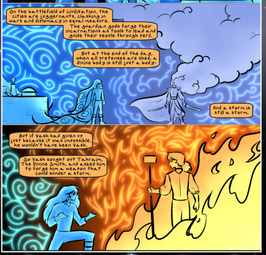
The flowing symbolic lineart surrounding each character. This is actually quite consistent across characters—see also Life's typical lines and how they curl:
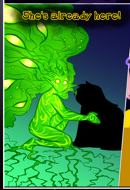
What's particularly interesting here is how these symbols are often similar, but not the same. Vash's lines are always smooth, clean curls, often playing off each other and echoing one another like ripples in a pond. You'd think they'd look too similar to Life's—but they don't. Life's curl like vines, and they remain connected; where one curve might echo another but exist entirely detached from each other in Vash's, Life's lines still remain wound together, because vines are continuous and don't float around. :P
Tahraim's are less continuous, often breaking up with significantly smaller bits and pieces floating around like—of course—sparks, and come to sharper points. These are also constants: we see the vines repeated over and over in Alinua's dreams of Life, and the echoing ripples of Vash are consistent wherever we encounter him. Kendal's dream of the ghost citizens of the city of Vash in the last few chapters is filled with these rippling, echoing patterns, to beautiful effect (https://comicaurora.com/aurora/1-20-14/):
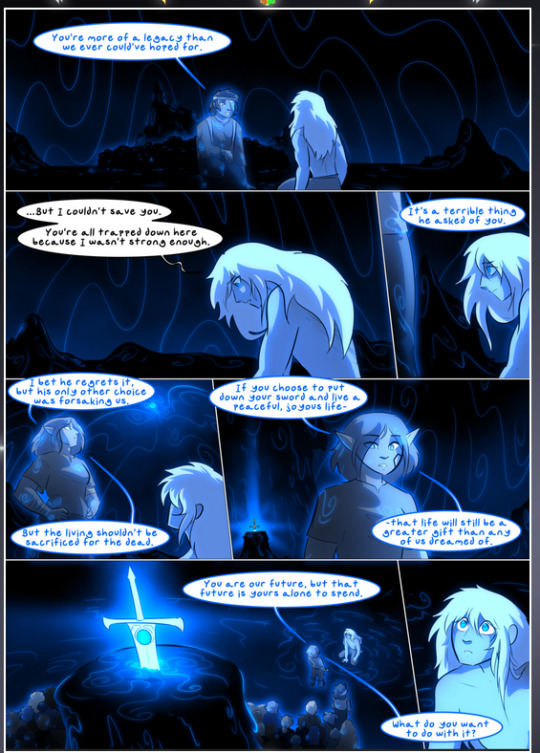
They ripple and spiral, often in long, sinuous curves, with smooth elegance. It reminds me a great deal of images of space and sine waves and the like. This establishes a definite feel to these different characters and their magic. And the thing is, that's not something that had to be done—the colors are good at emphasizing who's who. But it was done, and it adds a whole other dimension to the story. Whenever you're in a deity's domain, you know whose it is no matter the color.
Regarding that shape language, I wanted to make another note, too—Vash is sometimes described as chaotic and doing what he likes, which is interesting to me, because smooth, elegant curves and the color blue aren't generally associated with chaos. So while Vash might behave like that on the surface, I'm guessing he's got a lot more going on underneath; he's probably much more intentional in his actions than you'd think at a glance, and he is certainly quite caring with his city. The other thing is that this suits Kendal perfectly. He's a paragon character; he is kind, virtuous, and self-sacrificing, and often we see him aiming to calm others and keep them safe. Blue is such a good color for him. There is… probably more to this, but I'm not deep enough in yet to say.
And here's the thing: I'm only scratching the surface. There is so much more here I'm not covering (color palettes! outfits! character design! environment! the deities! so much more!) and a lot more I can't cover, because I don't have the experience; this is me as a hobbyist artist who happened to take a couple design classes because I wanted to. The art style to this comic is so clever and creative and beautiful, though, I just had to go off about it. <3
...brownie points for getting all the way down here? Have a cookie.
#aurora comic#aurora webcomic#comicaurora#art analysis#...I hope those are the right tags???#new fandom new tagging practices to learn ig#much thanks for something to read while I try to rest my wrists. carpal tunnel BAD. (ignore that I wrote this I've got braces ok it's fine)#anyway! I HAVE. MANY MORE THOUGHTS. ON THE STORY ITSELF. THIS LOVELY STORY#also a collection of reactions to a chunk of the comic before I hit the point where I was too busy reading to write anything down#idk how to format those tho#...yeet them into one post...???#eh I usually don't go off this much these days but this seems like a smaller tight-knit fandom so... might as well help build it?#and I have a little more time thanks to break so#oh yes also shoutout to my insanely awesome professor for teaching me all the technical stuff from this he is LOVELY#made an incredibly complex program into something comprehensible <3#synapse talks
746 notes
·
View notes
Note
How do you draw inorganic things so well your guns and armor and metal stuff is just so gosh darn good like i need tips i fail hard at inorganic matter every i every draw looks so soft and fleshy
The thing about hard surface items is that you have to be at least a little bit anal about perfect straight lines and ellipses in relation with perspective. I was really bad at descriptive geometry (my teacher sucked ass but that's another thing), and okay at best at drawing still life of objects in high school, but I recommend dabbling in the latter at least, if you can, to strengthen your foundations.
How and where shapes connect to each other, how corners are formed, how a pattern or sticker translates on a flat surface we see in perspective all matter in selling your drawing.
Unless you're going to simplify shapes a lot, don't rush it and just refine the drawing as you go. This is my process. Again, I'm not a perfectionist, I know this final drawing is not a 1-to-1 to the reference, but it's good enough for this practice. If the gun was the main focus of an image, I would make sure the tip of the barrel looked sharper and nicer.

You can see me using this method in this old speeddraw and in a recent twitch stream (footage of which will be in my next youtube vid).
I recommend using rulers even if you trace over images of items. And be mindful about where and how you weather or detail shapes. For example, I could have drawn horizontal lines on the upper receiver here, but the short vertical lines help convey its roundness better.
If you're drawing different materials, you can forego the ruler on soft materials but still use it for the hard ones. (eg. a couch that has a wooden base/legs vs the cushions):
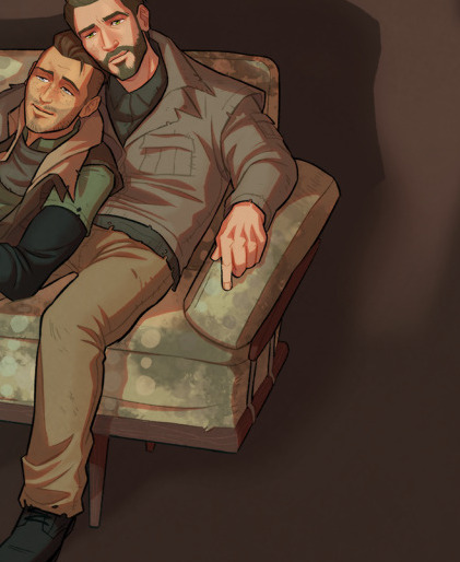
#I made the mag a bit fat haha#art advice#gun#weapon#Cam chose the Tec-9 btw#thanks I hated it#World of Guns is a fucking treasure btw if you ever have to draw guns or figure out how to operate them#also really fun to take them apart and put them back together I'm a big stan#and it's a free game!
389 notes
·
View notes
Text
Dissecting ancient Greek wedding customs (or “How to adapt the clusterfuck they are into something somewhat doable for the 21st century”)
This post is going to be a bit different. I could stick to writing about the customs we know of from a purely historical perspective, and while it would be informative, it wouldn’t reflect what I’ve actually been up to. Some of you might already know, but I’m getting married, so I approached this topic with the intent of seeing what I could do (and get away with).
So this post is going to be more about method and the practical challenges that come with doing the groundwork of adapting very old (and often outdated) traditions in a way that makes sense for our modern times.
I do have some disclaimers to make before I get started:
Most (if not all) of the literature around ancient Greek marriage is hetero-normative. However, this does NOT mean that marriage rites shouldn’t be adapted for queer marriages or that queer marriages can’t be done within Hellenic paganism. It’s our job as reconstructionists and revivalists to rework and adapt to our needs.
Similarly, this post is bound to mention or detail cult practices that are no longer in line with our modern sensibilities. I also want to make it clear that this post is not a tutorial. I’m not saying how things should be done, I’m only exposing elements that I consider reworkable and propose suggestions so that it can help others make their own research and decisions, with the level of historicity that they deem fit.
While the wedding customs from fifth century BC Athens are decently known, the ones from other cities and regions of Greece are much more obscure outside of anecdotal and fragmentary details (with the exception of Sparta). For this reason, the Athenian example is what I’ll be using as foundation. If you reconstruct practices from other areas of the Greek World, you might find something valuable in this article: The Greek Wedding Outside of Athens and Sparta: The Evidence from Ancient Texts by Katia Margariti.
Basic/simplified structure
The typical Athenian wedding would spread over three days, and be marked by several steps, some of which are listed below. Note that the order of these steps is not precisely known and might have been flexible:
Pre-wedding:
Decorating: korythale at the door, decoration of the nuptial bedroom
The Proteleia
Filling of the loutrophoros
Wedding day
Nuptial bath
Adornment of the bride
Wedding Feast
Hymenaios
Anakalypteria
Nymphagogia
Katachysmata
Day after
Epaulia
Gamelia
Final sacrifices
Some of these steps included specific customs and traditions, not all of which are reconstructible for various reasons.
Decorations
The korythale: the korythale was a sprig, usually from an olive tree (or laurel), which was placed at the groom’s door (and perhaps the bride’s too). The word in interpreted as deriving from “koros” and “thallein”, which would translate “youth-blossom”.
The korythale is very reminiscent of the eiresione, which was a similar kind of branch of laurel used during the Thargelia and/or the Pyanepsia that had apotropaic purposes. Athenian weddings included a procession from the bride’s home to the groom’s house, so the presence of the korythale at the doors would indicate that a wedding was taking place involving the decorated homes.
While I haven’t seen any one make this interpretation, I would still be tempted to argue that decorating the thresholds of houses has a similar protective and luck-bringing purpose than the eiresione, which was also hung above the door of Athenian houses.
The thalamos (nuptial bedroom): While there is no doubt the houses were properly decorated for the occasion, we have mention of special care given to the nuptial bedroom.
It’s important to understand that the procession from the bride’s house to the groom’s went up to the bedroom door, it was generally an important location and its preparation is seen represented on ancient pottery. Euripides mentions the adornment of the bed with fine fabrics, while Theocritus mentions the smell of myrrh (sacred to Aphrodite). There is also evidence that, in the Imperial period, the practice of hanging curtains to create a canopy above the bed was adopted, very likely from Egypt.
When it comes to adapting this today, it is pretty straightforward and there is plenty of room for personalization. The korythale could be challenging depending on how easily available olive or laurel are in your area. I would also argue that the custom could be more loosely adapted so that instead of being at the houses’ doors, it could take the form of a floral arrangement at the door of whatever venue you are using.
Proteleia
In short, the proteleia refers to sacrifices and offerings that would be made to various gods before the wedding. The exact timing of these is more or less unknown, but we have reasons to believe they could be done a day or a few days before the wedding, and perhaps also on the day of the wedding. These offerings were made independently by each family.
It is in this context that the offering of a lock of hair and of childhood items is best known for brides. The recipients of the offerings are varied: In Athens the most mentioned are the Nymphs and Artemis, but various sacrifices to Aphrodite, Hera, Athena and Zeus were also performed. In other parts of Greece, pre-nuptial customs often included sacrifices to local heroines. Plutarch, in the 2nd century AD (and therefore way after the focus of this post) mentions the main five nuptial deities to be Zeus Teleios, Hera Teleia, Aphrodite, Peitho and Artemis.
Today, I believe the exact choice of who to offer to and what to offer very much comes down to personal preferences and circumstances. While we assume that both families made prenuptial sacrifices, we know very little of the groom’s side of things, since the focus was on the bride, and the rite of passage aspect was not present for the groom in Ancient times. This is a gap that leaves room for modern innovation eg. including Apollon to either replace or accompany Artemis or choosing a group of deities that is more couple-centric rather than family-centric.
Personally, I have settled on Aphrodite, Hera and Artemis and have integrated a Spartan custom that includes the mother of the bride in the sacrifice to Aphrodite. Hera Teleia will receive a lock of my current hair, while Artemis will receive a lock of hair from my first haircut as a child (that my mother has kept all these years), alongside some other trinkets. The groom will honour Zeus Teleios in a passive way. And I will honour the Nymphs through the the rite I will explain next.
Nuptial baths
Both bride and groom had a ritual bath before the wedding. Its purpose was of cleansing and purificatory nature, and is consistent with other water-based pre-sacrifice purifications. What made the bride and groom's baths distinctive was their preparation. The bath water used to be drawn at a specific spring or river. At Athens, the water for bridal baths came from the Enneakrounos, the fountain house for the spring Kallirrhoe, but each city had its dedicated source. The water was carried in a special vase named the loutrophoros (bathcarrier) and the act of fetching the water and bringing it back to the homes constituted a procession. The loutrophoros was often given as offering to the altar of the Nymphs after the wedding. It was an important symbol of marriage, to the point that, if a woman died before being married, she would often be buried with a loutrophoros.
This will be more or less difficult to adapt depending on circumstances and environment, but the logic of a purifying bath (or shower even) can be kept (though I would discourage bathing in water you are not sure of the cleanliness of). The idea of having a specific vessel can also be kept. Personally, I plan to have a special vessel for some type of purified water, and while I may not bathe in it, I plan to sprinkle it and/or wash my hands with it.

Adornment of the bride (and groom)
Traditionally, the bride would have a nympheutria (which we could equate as a bridesmaid, but seems to have often been a female relative) charged of helping the bride get ready. I won’t get into the details of the clothing we know about, mostly because there seems to be a lot of variation, and because I consider this to be a very personal choice. However, we can note that both groom and bride were adorned with a wreath or a garland of plants that were considered to have powers appropriate for the occasion (sesame, mint, plants that were generally considered fertile or aphrodisiac). Perfume is also something attested for both bride and groom, especially the scent of myrrh. The bride would wear a crown, the stephane, which could be made out of metal or be vegetal (the stephane is now the object of its own crowning ceremony in Greek Orthodox weddings). The bride’s shoes were also particular for the event, and named nymphides. The bride’s veil was placed above the crown.
Hymenaios and Feast
I am grouping these two since they are linked. The feast was more or less the peak of the wedding ceremony and lively with music and dances, as Plutarch indicates (Moralia, [Quaest. conv.] 666f-67a):
But a wedding feast is given away by the loud cries of the Hymenaios and the torch and the pipes, things that Homer says are admired and watched even by women who stand at their doors.
The hymenaios was a sung hymn in honour of the couple and the wedding, and there were other songs that were specifically sung at weddings. However the hymenaios wasn’t only for the feast, these songs would be sung also during the processions. The hymenaios also had the purpose of ritually blessing the couple, a ritual that bore the name of makarismos.
As for the feast, it was obviously abundant with food and the prenuptial sacrifices provided the meat that would be served. There is otherwise very little difference with what a modern wedding feast would be like: food, drink, music and dance around which gathered friends and relatives of the couple. Like today, the wedding cake(s) was an important part of the celebration. It was called sesame and consisted of sesame seeds, ground and mixed with honey and formed into cakes to be shared with the guests.
Anakalypteria
Note that there is a bit of a debate around this step, which is the unveiling of the bride. Some believe the bride kept her face veiled until this part of the wedding, where her face would be uncovered for the groom to see. Others interpret this step the other way around, where the bride is then veiled as a result of being now married. The timing of the unveiling is also up for the debate. It might have been during the feast (at nightfall), or after once the couple was escorted to the bridal chamber. There doesn’t seem to be a clear consensus.
The concept of unveiling the bride is otherwise something that isn’t unknown to us as a modern audience. As with everything else, how to interpret and modernize it is up to personal preference.
Nymphagogia and Katachysmata
The nymphagogia aka the act of “leading the bride to her new home” took place at night, likely after the feast. It is at this point that the groom ritually led the bride to his home by taking her by the wrist in a ritual gesture known as χεῖρ’ ἐπὶ καρπῷ (cheir’ epi karpo). The relatives and friends of the couple formed a festive procession that accompanied them to their new home accompanied by music and songs. The mother of the bride led the procession carrying lit torches, while the groom’s mother awaited for the new couple in their home, also bearing lit torches.
Once there, the rite of the katachysmata would happen. The couple would be sat near the hearth and the guests would pour dried fruits, figs and nuts over the bride and groom as a way to incorporate them into the household and bless the union with prosperity and fertility. As part of this rite, the bride ate a fruit (either an apple, quince or pomegranate). It is only after this step that the couple would be escorted to the bridal chamber.
These two rites are tricky to adapt in a modern context because of how location-specific they are (and that’s not even taking into account the implications of having family escort you to your bedroom etc). My take would be that the katachysmata is not too far off from the custom of throwing rice/flowers at the couple after the ceremony, and could probably be incorporated as such. The torches could also be replaced by any source of light placed in a meaningful location, depending on the where the wedding is being held. The nymphagogia could also do with an update, the easiest of which could simply be holding hands while leaving the wedding ceremony.
The day after (Epaulia, Gamelia & sacrifice)
The epaulia refers to wedding gifts to the couple, which would be given the day following the ceremony. At this point, it is implied that the couple has consummated their marriage and are officially newly-weds. Pausanias informs us that the term “epaulia” (also?) refers to the gifts brought by the bride’s father in particular and included the dowry.
After the epaulia, the bride's incorporation into her husband's house was complete. This might have been when the groom held a feast for his phratria (aka direct family), as a way to conclude the wedding.
As for final sacrifices, the bride herself may have marked the end of her wedding by dedicating her loutrophoros at the sanctuary of Nymphe, south of the Acropolis.
The epaulia could be adapted, in modern terms, with having a registry. Should someone choose to have a specific vessel linked to the ritual bath today, it could very well be kept, dedicated to the Nymphs and used as a small shrine. Considering how symbolic the object is, there is also room for it to become a piece of family heirloom.
Final words
This is really only a small summary of what a wedding could have looked like, sprinkled with a few ideas of how to manage the gaps, discrepancies and limitations. As I said in my introductions, there are details I haven’t mentioned. Some of the customs detailed here have clear modern counterparts, but others don’t. I’d like to conclude by addressing these.
First, the ancient Greek (Athenian) wedding is completely devoid of priestly participation. It was entirely planned, organized and led by the two families. Religious responsibilities were entirely self-managed. I find this point important to remember because it makes it much more accessible than if modern Hellenic pagans had to seek out an external authority.
Some of you might have noticed the absence of wedding vows, at least in a formal form like the one we are used to in our modern days (derived from Christian and Jewish traditions), this is not an oversight, there simply were none that we know of. As a sidenote, I would also advise against turning a wedding vow into a formal oath. I’m still debating on what to do myself, but I’m leaning towards a religiously non-binding vow that won’t curse me should things go wrong.
Adapting the structures and rites of the ancient wedding to today’s framework of ceremony will naturally lead to changing the order of things, on top of sacrificing elements for the sake of simplicity, practicality, personal preferences and, very likely, visibility. Unless you’re lucky enough to do a private elopement, chances are that relatives and friends might be there, and not all might know or even approve of your faith. I hope this post shows that there can be ways to include traditional religious elements that will go unnoticed to the untrained eye, like I hope it showed that the private nature of the ancient Greek wedding rites is a significant advantage for modernization.
#hellenic polytheism#hellenic paganism#hellenic pagan#heradeity#greek history#ancient greece#zeus deity#aphrodite deity#artemis deity#hellenic reconstructionism#wedding rites
753 notes
·
View notes
Text
ᗩᒪᗩᔕTOᖇ ᖇEᗪEᔕIGᑎ

I finally got to the design I hate the most, Alastor.
I'm not a fan of my design simplified to meet the cast's more cartoony style. I tried my best but might draw him some other time with my actual style.
Anyway, my thoughts are under the cut:
My issues with their Original designs:
What can I say that hasn't been already said by so many others?
Red overpowers his entire design and he barely stands out of the background, sometimes he blends with it at times.
Supposedly a mixed person yet the average audience member who watches the show with no context can't tell that he is. I don't want to hear about how mixed people can be pale-skinned because he was never written as a white-passing poc in mind. His Creole background was an excuse to use voodoo in the show and merchandising.
Another Vivzie character that dons a shoulder-padded suit. I believe he's one of the 5 others that has this repeating design trait (Angel Dust, Charlie, Pentious, Lucifer, Valentino, Vox)
His hair bothers me a lot. A 1930s man having a scene kid's haircut? I have a hard time believing that for the sake of the show. Also, not to mention he has that awkward undercut that ends up making him a scuffed Willy Wonka cosplayer.
Twink...
Personal tidbit, but I'm not sure what his staff's design even is? an egg with a microphone in it?
The thought process:
First of all, gave him a darker skin tone, that light grey doesn't cut it for me, unfortunately.
Also heard that his inspiration was Dr. Facilier and with that in mind, I wanted to make him look like him a bit more like him.
The mostly grey and black color palette was inspired by 99monchrome's take on Alastor. Teddy's take is pretty amazing.
If I remember, there was something about him being hunted and shot at like a deer while escaping the authorities. The headshot manifests as a small red X on his forehead.
Gave him a pencil moustache since I wanted him to look like a grown man in the 1930s. Plus, there is a seemingly noticeable lack of facial hair on every male character in this show. (If you're showing me an example of the opposite, please do not give me some background character or any Helluva boss character.)
An extra set of teeth will appear within the slits on his mouth, forming to prevent Alastor from being ever able to frown.
His mouth is also constantly bleeding.
A small detail that would be easy to miss but his eyes are radio dials.
He has a tail and fur on his body because I think it's cute.
Sort of like Velvette in the series, I do want to have Alastor drastically change hairstyles from time to time. Dreads, Twists, Straightened, Buzzed, etc.
A little detail just important to me is that his eyebrows go from thin to thick at its ends.
He does have fur all over his body.
#vivziepop critical#deadbeat motel rewrite#deadbeat motel redesign#hazbin hotel critical#hazbin hotel criticism#hazbin hotel redesign#deadbeat motel alastor
269 notes
·
View notes
Text
Lancer Tactics devlog
I'm gonna try out posting my ~monthly devlog roundup here as well. These suckers are glorified changelogs with anecdotes and gifs galore. Let me know if this is something you like seeing show up on your dash?
Map Editor
Got units able to be placed/deleted/moved in the mission editor
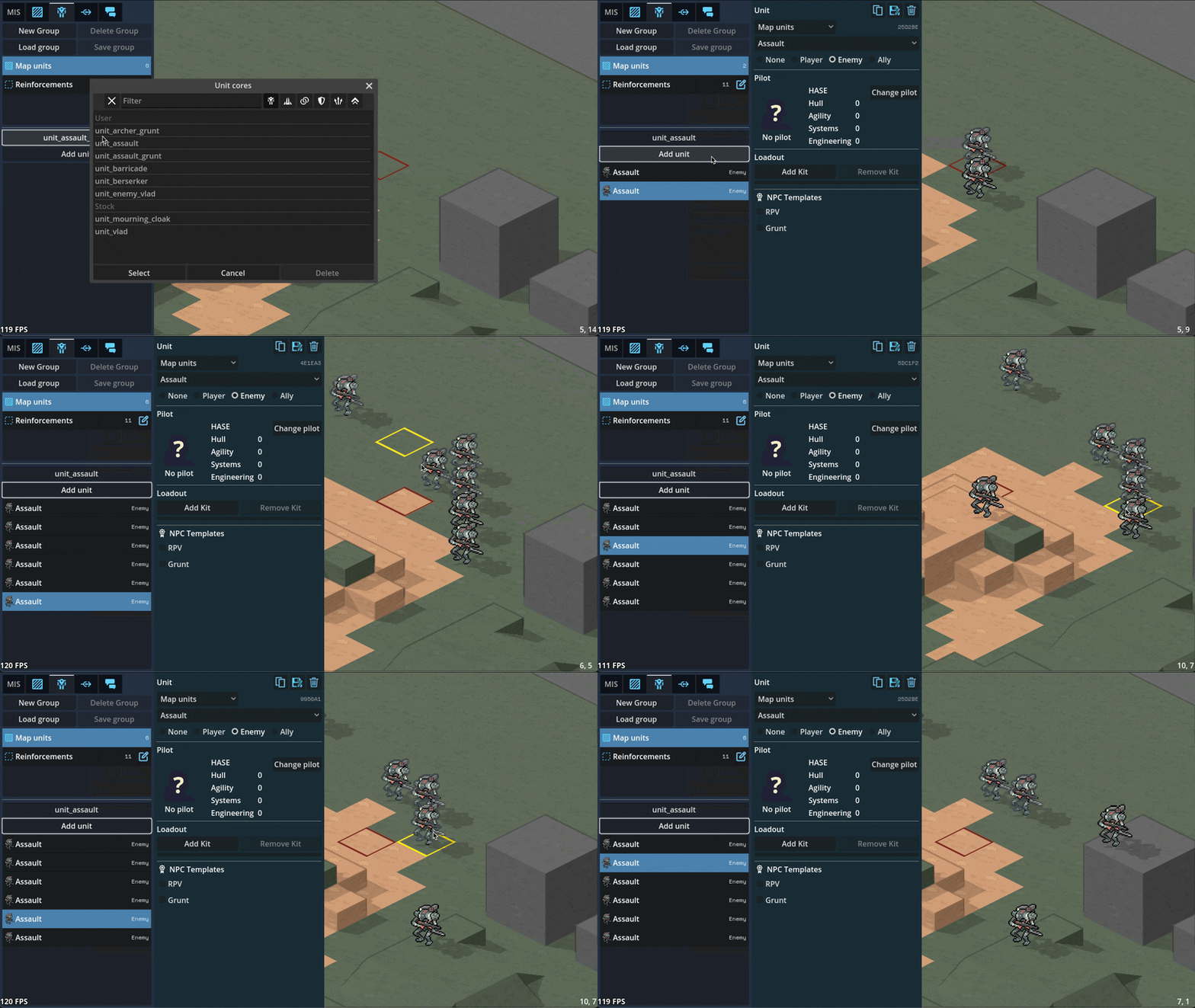
Can paint/remove command zones in the editor
Can paint minecraft-like terrain blocks in the editor

Can paint/rotate multi-tile props in the editor
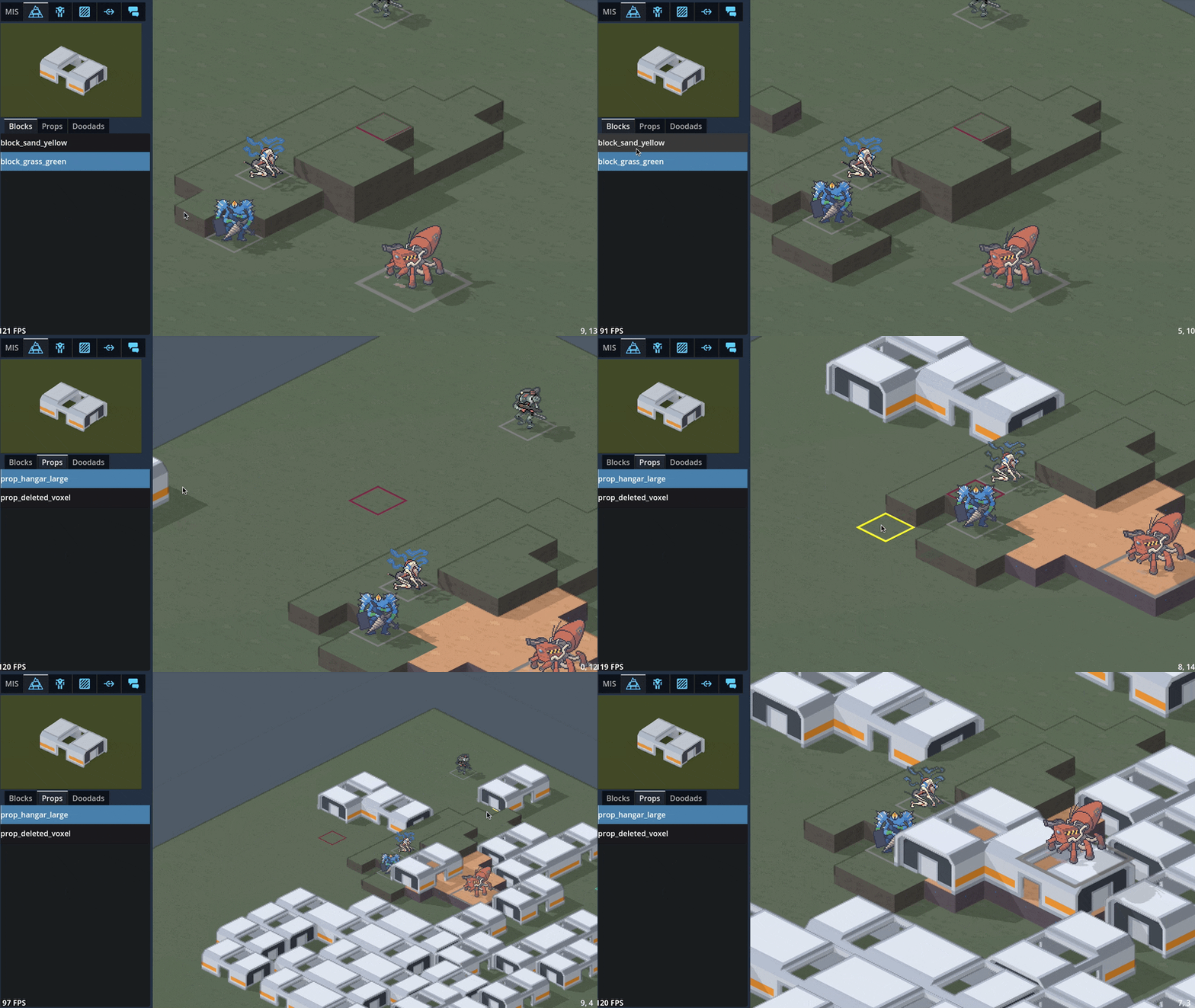
Can edit unit character sheets and portrait via the editor

3D maps
Did a bunch of art tests with 3D mech models, provided by GeneralChaos, which we ended up deciding not to go with to keep things simple.

To avoid the can of worms that is animation, we'd have to lean into a static "tabletop minatures" aesthetic which we decided is not a style we want to be stuck with. By sticking with 2D sprites, we avoid falling into a sort of uncanny valley; it's easier to get away with not animating a 2D sprite than it is for a 3D model.
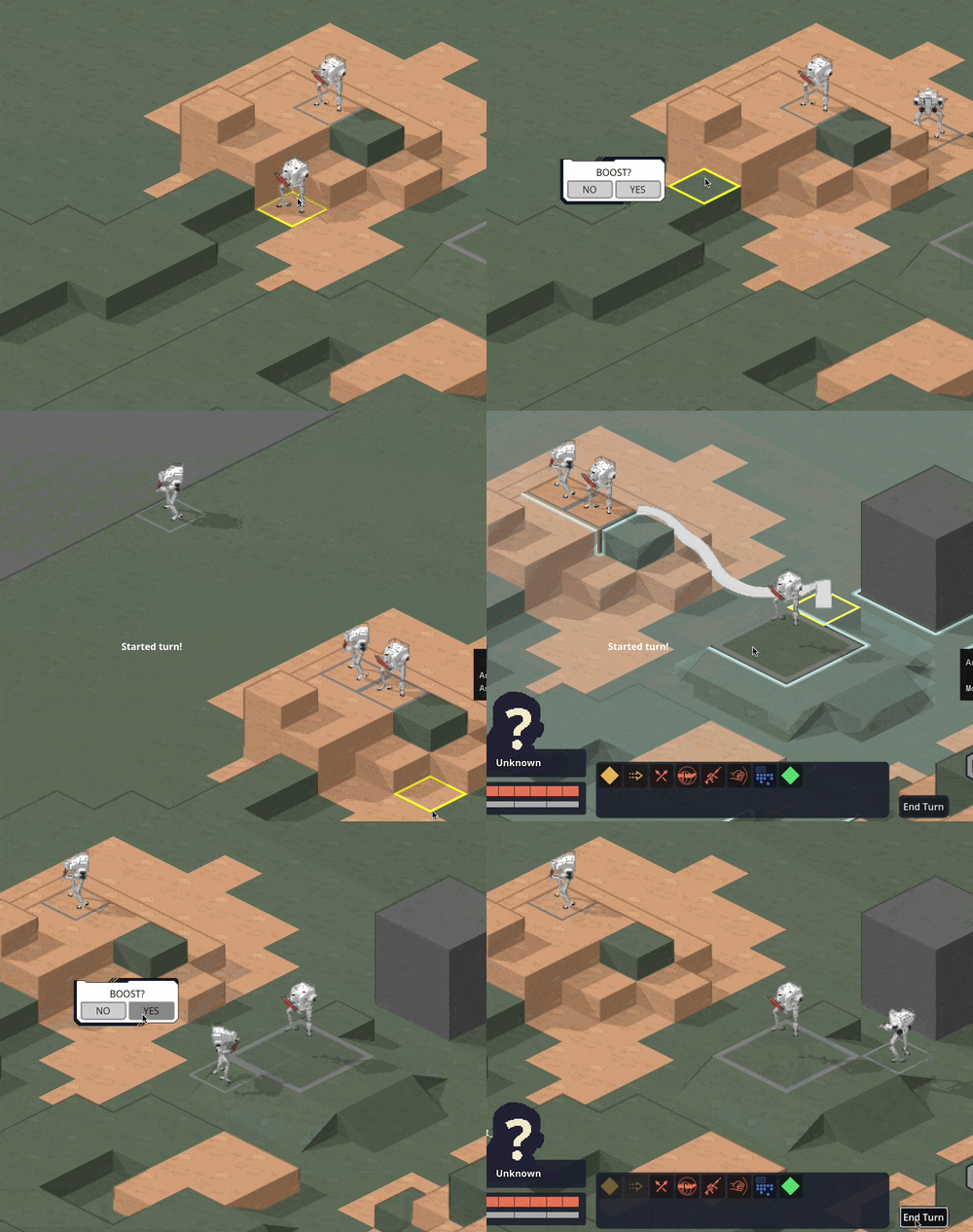
We also experimented with 3D terrain. We decided to make a rule that the visual style for a piece of terrain should match its mechanical effect: obstructing terrain that you can't move through, such as rocks or buildings, will be in 3D, while non-obstructing terrain like trees will stick with 2D sprites.

Hooking up the 3D camera to follow events like movement and attacks did a LOT for making it starting to feel like it's cohering into an Actual Game™
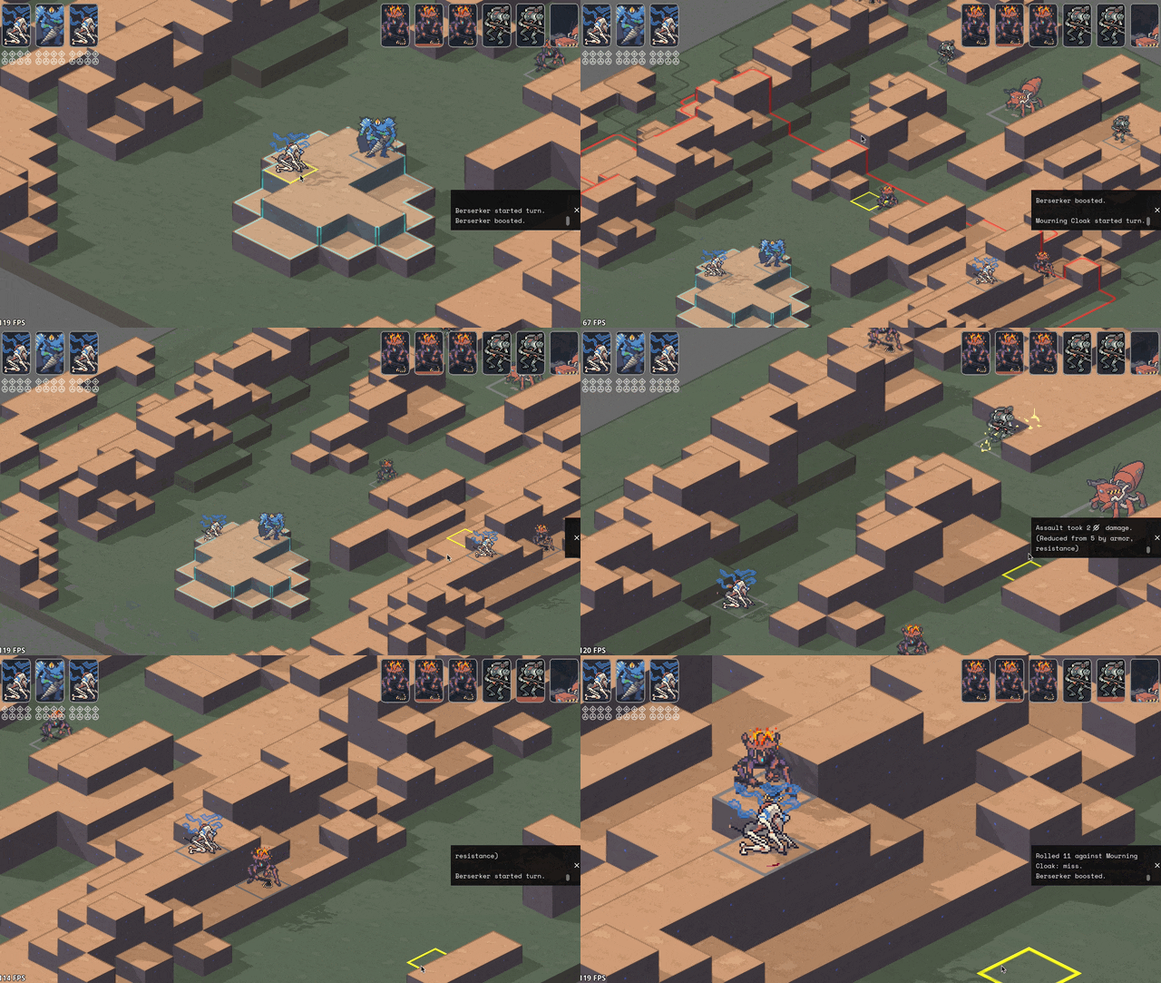
Implemented cover! And an attack preview! Cover works by aiming a ray from the target to the originator (technically to and from each voxel of each, respectively, to handle size 2s shooting above size 1 cover) and tracking all the terrain blocks it hits (how we'll handle non-terrain hard cover TBD). I think I have it working according to Perijove's cover rules manual, but I'm sure there'll be edge cases to work out. This is a case where things are significantly simplified by working in squares instead of hexes; hexes have a lot more possible weird angles you have to deal with.

Re-added what I'm stubbornly calling Combat Popcorn; little bits of text that pop out when you use abilities and attacks.
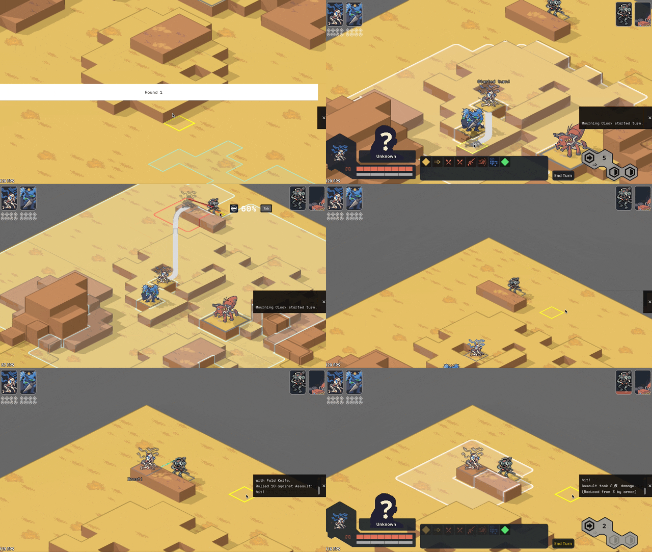
UI & game screens
Added ability for the engine to show UI that's anchored to the game world via a little word bubble line but also stay on screen as the camera moves around.

Got word bubbles working; you can now write dialogue in the mission editor, hit playtest, and see it work in a mission! (it does actually translate correctly now; this gif is just from a bug I thought was funny)

Got ability effects mostly behaving appropriately again, including muzzle flashes. The easiest way to handle them ended up being NOT billboarding them so they always face the camera (like all other 2D sprites in the game); instead, I put them on a plane parallel with the ground and just spin them around the unit to point at wherever their target is.

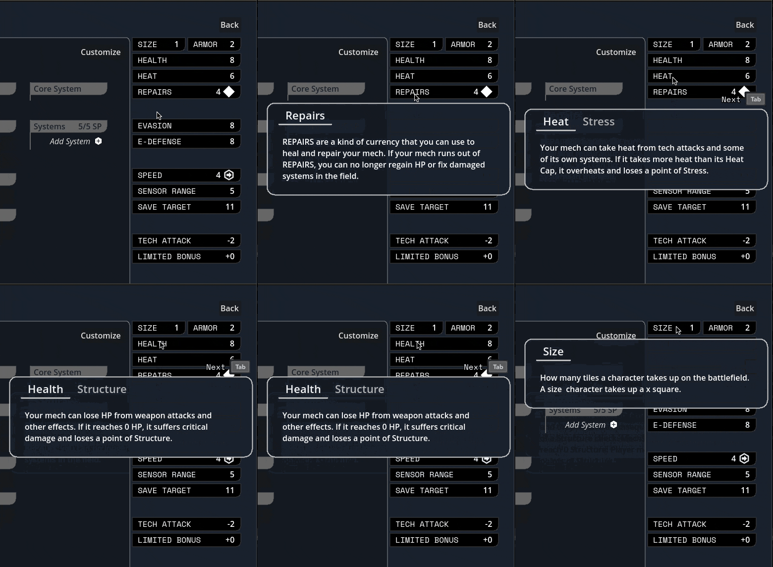
Did some work ironing out our tooltip system. The standard in CRPGs these days is this kind of nested labyrinth of tooltops that you see in Baldur's Gate 3:
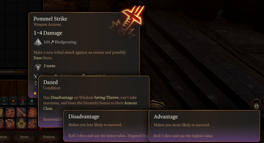
I Did Not Want to try and figure out how to wrangle that much UI, so we're instead opting to cap the nested tooltips at the second layer. You can lock a general tooltip for e.g. an action and then mouseover various items within that tooltip to get glossary definitions...

...and then instead of having those glossary tips be lockable/mouse-overable themselves, I collect all related terms to that glossary definition and let you tab through them.
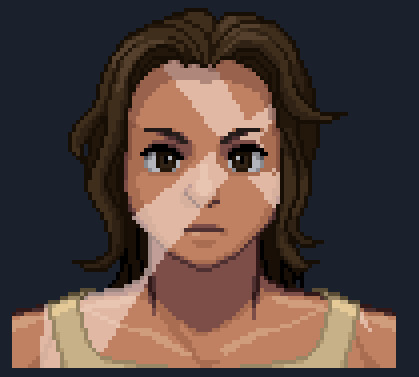
Added skin overlay functionality to the portrait maker, enabling textures like scars, tattoos, stubble, and vitiligo to be applied to just the skin and not extend off into space.
Midway through writing this update, Carpenter sent me this gif of the randomization button working! There's a still a bunch of skintones/assets missing and a few are a bit janky, but it was exciting to start seeing the range of these lil freaks (affectionate) that this editor can create.

Mourning cloak license!
This is the one I'm probably most excited about: I did a bit of a content dive and implemented a basic character sheet + all Mourning Cloak traits and equipment. They don't have fancy graphics yet, but the weapons and systems can be added via the character sheet and used in-game.

It took a little under a day, including adding soon-to-be common mechanisms like bonus damage. This is great news in that it means the engine we've been building for so long in the abstract seems to do a great job in handling comprehensive actual game content, and that it looks like we've set ourselves up for success when it comes time to buckle down on churning that out.
I'm sure other licenses will come with unique difficulties (I fear the day it comes time to do the Mule Harness // Goblin CP) but I'm feeling good about it!
Vertical slice?
Taking a step back, the pressing question on my mind has been "when will we have a playable early access build?"
I was originally hoping for Feb/March, but what we've internally been referring to as the "3D cataclysm" has pushed everything back by at least three months, so the target for the first alpha build is now in May. So, ah, thanks for your patience! Seeing things come together, I've become more and more convinced that moving to 3D was the right call.
#lancer tactics#made with godot#godot 4#indie game dev#game dev#lancer rpg#tactics rpg#indie dev#godot engine
279 notes
·
View notes
Text
Writing Advice: Chapters
A lot of my advice comes down to, having beta readers, and “it’s up to you” which doesn’t sound like good advice but when it comes to writing, everyone writes differently so there are different ways of doing the same thing. So, what’s my advice when I talk about chapters?
To me, a chapter is a section of the book which talks about a certain event. There’s no right or wrong way for how long the event should be, and there’s no right or wrong way of how the event can start or end. Here’s how I write my chapters and what I’ve learned along the way.
Starting the chapter:
Before I start the chapter, I need to figure out what the main event is gonna be. Will this event be informational? Action pact? Suspenseful? It can also be a combination of a few events as well, such as having my characters find information, but something goes wrong and now they have to escape.
After I figure out what the main event is gonna be, I start writing and once I complete that event I end it and move on. I try not to carry on too much after the main event has finished because I feel like my chapters might drag if I do.
Writing the chapter:
When it comes to a chapter, I try to have a beginning, middle, and end section. (Keep in mind this doesn’t work for every chapter.) Let me explain what I meant about those sections. The event in this example is Nix and Dante are tryna get information, but something goes wrong after they get said information. So the chapter starts at the beginning where Nix and Dante enter a secured location. The middle is where they get passed all of the alarms and hacked into the network. The ending is they got the information but an alarm gets triggered anyway.
Expanding the chapter:
So, I wrote the beginning, middle, and end, the event is done, but it was kind of boring. Let’s expand it to them escaping. This is where I think chapters start to become long. Some people combine two events into one chapter and some events are longer than others. Escaping a secured facility sounds more difficult than sneaking in. So, adding an escape attempt can spice up the chapter, but you need to be careful with how you do it.
I think when people complain about long chapters, one of their reasoning is “This feels like it could’ve been split into two chapters”. It might be the fact there are two separate events, both with their beginning, middle, and ends. If you want to expand upon your chapter, I would change how the beginning, middle, and end originally played out so it feels more natural when you go from one event to the next. This will take practice and beta readers can help if a chapter sounds too long or just right.
So instead of sneaking into a place, getting the information and having to escape. I would get rid of the middle part where Nix and Dante were sneaking and just show them entering the building, maybe talk for a few paragraphs before they reach their end goal because I already know escaping is gonna add several more pages. It’s a trial and error, and some readers might prefer the sneaking portion, while others might enjoy the fast pace. The end result is what do you like?
Continuing chapters:
What about chapters that don’t need a beginning, middle and end? Those chapters are what I call, continuing chapters. The most obvious examples of continuing chapters are the final climax of a story, like a big battle. The big battle might take multiple chapters to get through, and starting at the beginning, middle, and end of each chapter where the main event is the final fight, might get a bit tiresome. A simplified way of taking a large event, like a big fight, and breaking it over several continuing chapters is having each chapter be its own thing. Let’s say it takes three chapters to finish the final confrontation. The first chapter is the beginning, so there’s lots of build-up, but nothing too bad. The second chapter is the middle and is normally the longest out of the three. It’s the one with the most fighting and maybe a character dies at the end as a cliffhanger. The third chapter is where the villain is defeated and the fight is over thrust concluding the three sections.
That was a very simplified way of explaining continuing chapters, but yeah, not every event can be told in a single chapter, sometimes you have to space them out a bit. I would recommend letting the readers know that said event will most likely take a long time to complete so they'll be aware it's gonna be a long read.
Length of a chapter:
People often ask, how long should a chapter be, and there’s no real answer to that. Some can be a page, and I’ve seen others that are thirty. (Looking at you DragonFire). I personally don’t try to go for a word count or page limit. Often times when I try to make my chapters reach a certain goal, I find there’s a lot of filler that could’ve been cut. This is why I like to write my chapters as if I were writing an event and just focus on the event itself. If I need to expand or get rid of something, I can do that later.
My chapters are normally three pages in length, whenever I go over that, I try to tell my readers the next upcoming chapters will be long. This kind of tactic will depend on your story of course, but let’s go back to Nix and Dante.
In the example, Nix and Dante went into a secured location, took some information and got caught, now they needed to escape. If I want to add the escape portion in the same chapter because breaking in was kind of short, I might tell the reader before said chapter even began that “This mission won't be an easy one”, or “You’ll need to be real careful stealing the information because if you get caught, guards will come.” So, by the time Nix and Dante do get caught, the reader should be aware, the chapter will continue for a few more pages.
Oh yeah, if you’re gonna write a long chapter, make sure to have at least one smaller chapter to break it up. (DragonFire) Having long chapters, after long chapters, is, at least for me, very tiring. I don’t like to stop reading midway through a chapter, but reading thirty pages in a day is very difficult. So if you know you have some long chapters, throw in a few short ones.
Readers might also hate long chapters because they feel like there’s a bit too much filler in them. (Filler-in chapters aren’t the same thing as filler chapters).
Filler-in chapters might appear in one of two ways, either there’s too much filler to get to the main event, or there’s too much filler and the chapter should’ve ended already. Beta readers are a good way of telling you if there’s filler in a chapter or not. Keep in mind, that you, as the writer know what’s best for your story. Readers can only tell you how they feel. If you feel the “filler” part isn’t filler, but a lot of people say it is. Finding a workaround can be difficult. Unfortunately, I don’t have any advice on this kind of topic because this kind of writing problem is unique for every writer. Writing groups might be able to help as they’ll have your text and can help figure out what's going on.
Filler chapters:
There’s nothing wrong with filler chapters. Not every chapter needs to focus on the main story. I personally like filler chapters. They’re fun chapters which explore the characters and the world. A bit of a refresher after an intense fight is fine. When people complain about filler chapters, it’s often because there’s a bit too much of them. Or they came out of nowhere and killed the pacing. For example, if everything has been dark and gritty, having a chapter that’s more on the upbeat side is strange. Also if the chapter ends with a character's death and the next one ignores it, readers might not like that. This is one of the reasons why I don’t like POV swapping between every chapter. If someone dies in character (A) POV, and the next chapter switches to character (B) POV where they’re on the beach…I might get a bit annoyed. Even if Character (B) POV isn’t filler, I just witnessed someone die, I wanna know what’s going on and not swap to another POV.
Also filler chapters tend to be on the shorter side as well. If a filler chapter goes on a bit too long, then it might feel like the story is losing its focus a bit.
Beta readers can help point out which chapters are filler and where to add in filler if that's something you want to do.
Chapter Endings:
Ending a chapter is always interesting, do you want to end it with a cliffhanger or not? Does your chapter flow smoothly from one to the other? I don’t mind cliffhanger endings but try not to make every chapter a cliffhanger. At some point it becomes a bit much for some readers such as myself, I prefer to stop reading at a good stopping point. Cliffhangers aren’t a stopping point, I need to see what’s gonna happen next. Creating a cliffhanger after a long chapter, for me is a bit much. Long chapters already drain me, and forcing me to continue to get to an actual stopping point will make me enjoy your book less. (I understand no one is forcing me to read a book, but I just really, really hate stopping at cliffhangers). Not to mention if there are multiple cliffhangers in a row, I might put the book down and not pick it up for a long time because I’ll have no idea how many cliffhangers I’ll have to deal with before getting to an actual pause in the story. Personally, as a reader, I feel like there needs to be good stopping points. Places where it’s safe to stop reading and the reader can pick it back up later.
If you end a chapter in a city and the next one starts in a jungle, that kind of scene change might be a bit confusing so again, just send it through a couple of beta readers and see how you did with the transition portion of going from one chapter to the next. The same thing goes for tone as well. If the last chapter ends with a death, and the next one is in a circus, the tone shift might be a bit much. Just pass it along with a beta reader.
That’s about it for chapters. If you want some more detailed advice on certain chapters then let me know, but chapters are one of those things where it comes with practice. The length, the event, the ending, all of this stuff will be determined by your ability to write. Beta readers are a great way of pointing out how they felt while reading a chapter and you can go from there.
#writing#writeblr#writers on tumblr#writers of tumblr#writer#writers#writerscommunity#creative writing#writing advice#write
210 notes
·
View notes