#is this even a tutorial???
Text
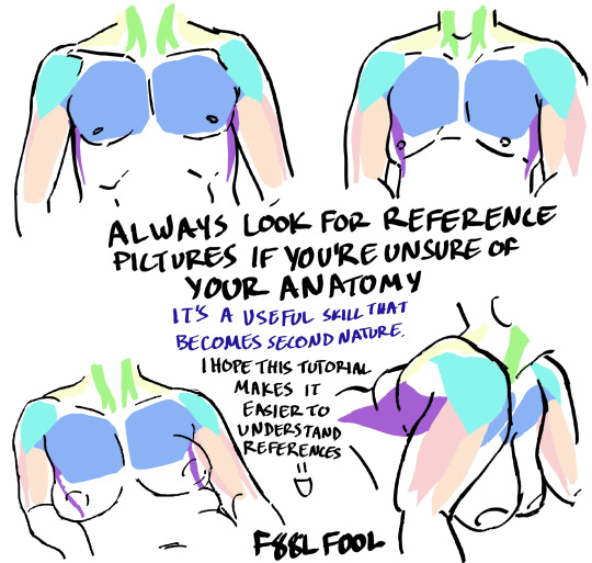
Here's some notes on some of the upper body muscles so you, artist, don't need to look them up

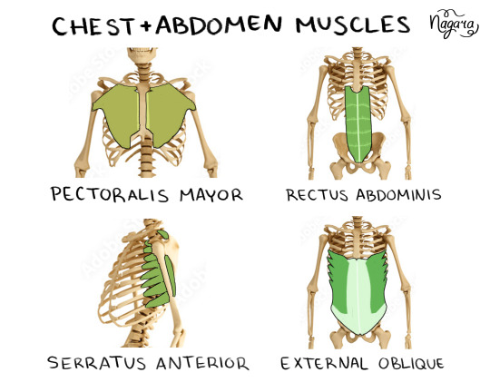


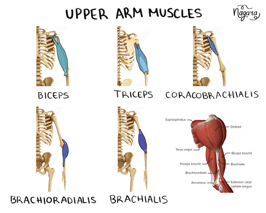

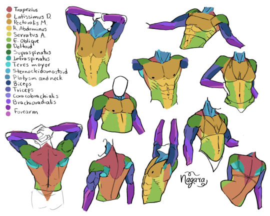
They are not medically accurate, just enough for artists to know the necessary muscles and how they work together
I 100% recommend doing the last exercise I did to be able to actually place the muscles
Here are my notes on the lower body muscles
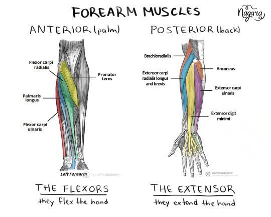
#lower body muscles notes coming in a month#don't even ask about the forearm there's just too many muscles there#art study#muscles study#upper body muscles#art tutorial#anatomy notes#artists help#nagarart#drawing#digital art#my art#art
38K notes
·
View notes
Text
New Mature Content Warning Overlay (And How to Get Rid of It)
More fun community label "features"! Unlike the new mandatory label for #NSFW, this one is a bigger deal to me because it affects my entire blog and it can't be avoided by just using a different tag.
Apparently on custom blog layouts, if you happen to post or reblog even a SINGLE post that's been flagged with the mature content community label, a full-page warning overlay will appear blurring out your entire blog that must be manually clicked through every single time the page is refreshed. At first I thought this was just a bug due to my older layout but I've come to realize it's not. It's a feature (as confirmed by this recent changes post) that affects all custom themes. The formatting will vary based on your own theme but here's what it looks like on my blog:

I don't know about you but I find this is stupid and annoying. If it could be dismissed once and never seen again that might be one thing, but that's not the case. The vast majority of my blog is not "mature" enough to warrant such an aggressive and invasive warning. I also think pop-ups are obnoxious in general and I'll be damned if tumblr's going to force me to have one on MY blog.
After some desperate googling for a known workaround and being unable to find even a single mention of it, I decided to take on the challenge myself. I'm not a theme coder, so apologies if there's a better way to do this, but luckily it only took me like 10 minutes to figure out a simple fix, which I'm now sharing with anyone else who may want it:
.community-label-cover__wrapper {display: none}
Just copypaste that somewhere in your CSS and goodbye pop-up!
If you're not sure how to access your theme code, check out this help article. You can also add the code via the Advanced Options menu, which is actually even better (if you can get it to work, it depends on how your theme was coded), because it will then automatically be reapplied to a lot of themes without having to remember to manually add it every time if you change your theme in the future.
Obviously this will only remove it from your own blog for anyone who may visit it. If you never want to see this warning again on other people's blogs you can also add this custom filter to your ad block:
tumblr.com##.community-label-cover__wrapper
Unfortunately I do not have an easy tutorial on hand for this one as the method will depend on your specific ad block app or extension.
Some additional notes:
After adding the theme code and saving the changes, give it a minute to update as it sometimes takes a little while for the page to refresh.
The warning overlay only seems to appear if a "mature" post is on the FIRST page of your blog, which is still annoying and makes the whole thing even more pointless and stupid because what if someone visits any other page of your blog, and oh no, happens to see "mature" content they weren't warned about?!
The warning also appears on direct links to "mature" posts.
This hack has NOTHING to do with entire blogs that have been flagged as NSFW. It only works for non-flagged blogs with custom themes that happen to have individual "mature" posts.
#I'm not letting my entire blog be penalized for a couple rare singular posts that may or may not even be 'mature' enough to warrant it#tumblr may force us to use community labels#and they may have full control over the new blogview#but MY custom blog layout has always been and always will be MINE to format and present however I want#that's the whole point#tumblr#psa#tutorial#my words#tumblr themes#wendy's help desk
17K notes
·
View notes
Text
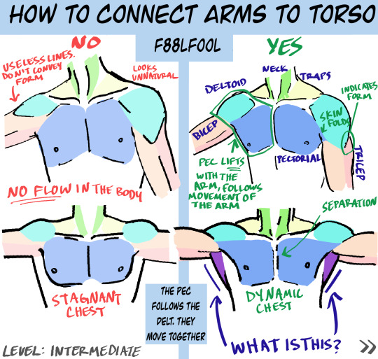
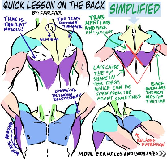
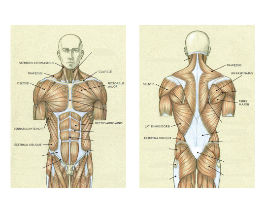
My first anatomy tutorial. How I connect arms to the torso. Simplified the muscles for better comprehension
PS. Pectoral is misspelled as “pectorial” in the picture. Don’t make that mistake haha
And I’d love to see the art made from using these as reference, you can message or tag me.. whatever you want
Edit: The extended names of the muscles:
Neck - Sternocleidomastoideus
Traps - Trapezius
Lats - Latissimus Dorsi
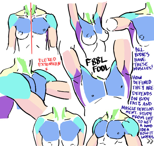
#pec-torial#pec tutorial#there i said it#also keep in mind each body (even the leanest ones) have fat on them#a reblog pointed this out and I thought it was a good reminder#none of these bodies have 0-1% bodyfat#art tutorial#anatomy#anatomy tutorial#drawing tutorial#drawing tips#muscles#muscle tutorial#art study#digital art tips#anatomy tips#art ref#art#reference#tutorial#art references#titorial#f88lfool
27K notes
·
View notes
Text
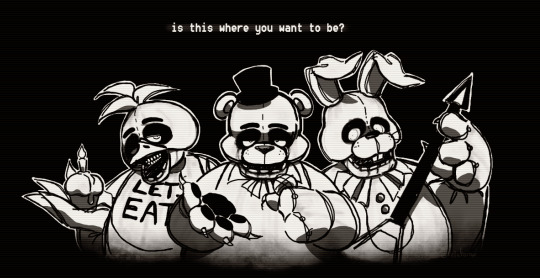
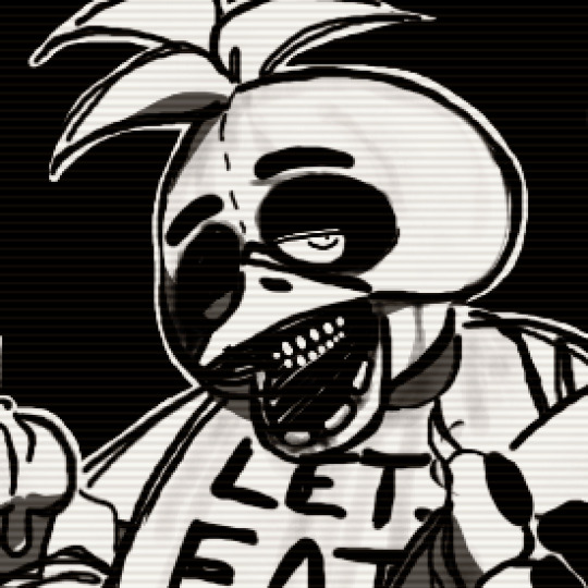
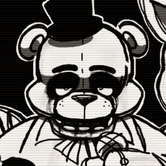
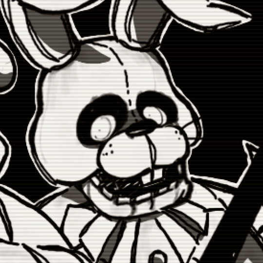
we've waited all 8 years, to fi~na~lly bring true our fears;
newcomers to watch us play, & veterans rejoice - it's our day! 🎉
#uwu art#Five Nights at Freddy's#Five Nights at Freddys#FNaF#Five Nights at Freddy's movie#FNaF movie#Five Nights at Freddys movie#Freddy Fazbear#Chica the Chicken#Bonnie the Bunny#SHOUTOUT TO EVERY BLUE MOON WHERE I DRAW FNAF#& the one time ever ( today ) i actually post it#FNAF MOVIE WAITERS MERRY CHRISTMAS#this was done WAY back before the movie even got finalized iirc but hey today's a good day to polish & post it#artstyle based off of those silly big headed keychains as well as those old dragoart tutorial things#because GOD we don't get fnaf art like that anymore#i WILL be the change i want to see in the world#ANYWAY
2K notes
·
View notes
Note
Hey I was wondering if you would do a post about how you make your feralnette au? I really like how you color it and was curious about your process.
Yes this is absolutely for plagiarism purposes /j
(I want to incorporate something similar on a smaller scale within my artwork, I don’t plan on posting anything but I can run the art past you if your worried about me actually stealing your style)
sure! as a note I'm not a pro or anything, this is just how I render my comic for ease of access
as a general note I draw everything in black and white first

I use a LOT of texture heavy brushes for effects, and specifically because I render with gradient maps a lot. people ask me why I do AU's in different styles - usually anything outside of feralnette is done in color - but that's because the rendering process is different.
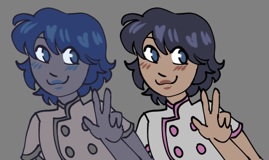
for instance in the dad villain au, I do basic linework and chunky colors. if I was to do Feralnette in the same style, the gradient maps wouldn't nearly have the same effect, as you can see up there ^
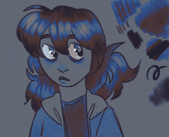
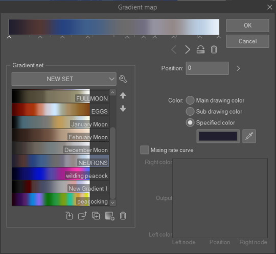
when a gradient map is applied I can fiddle with the color values to set a Tone for the update I'm going for, while also making it really pretty, bc textures can really bloom the subtle colors in a gradient map. I get a lot from the CSP page itself, but I also MAKE a lot too. this specific map I made by color picking off of a neuron map from a brain scan I thought was pretty~
I don't do the feralnette AU in full color because generally, anything IN full color will have significance - either to show that a scene is important character development,
is a flash back,

or to put emphasis on something supernatural happening.
with Feralnette, when something is colored purposefully, its to emphasize it, whether that be to highlight character moments, or to stress that something eldritched and unnatural could be occurring, as its colors that do not exist in the pre-existing gradient map. Color out of space, yknow?
((SOMETIMES I put gradient maps on my colored chunky stuff, but once again, for the purpose of creating a tonal shift, like when papa Tom shows up in the dad villain AU!))
anyway I hope that helped!
#replies#tutorial#sort of#im answering a lot of questions bc im bedridden w/ ms rona herself#my kitty retail sis caught it too (she's a champ so she's beating it like a fuckin pro)) and nudibranch sister remains unscathed!!!!!#we stay winning even if im dying!!
784 notes
·
View notes
Text
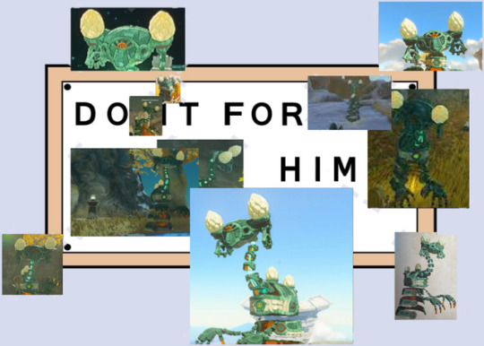
H I M
#tears of the kingdom#totk#sentinel construct#my beloved#new blorbo alert#new hyperfixation just dropped#I'm not even out of the tutorial area yet aldnofaidhohf
2K notes
·
View notes
Text
adamantly anti TLT movie/series adaptation but adamantly pro TLT video game adaptation. it is the only way to recreate the authentic experience of not knowing what the fuck is happening
#think about it it would be so good if you opened your mind#ESPECIALLY htn would be so cool imagine it has insanely different gameplay than the gtn game and it doesnt even bother explaining why#or providing you with a tutorial. you just fuck around and find out like tazmuir intended#the locked tomb#gideon the ninth#harrow the ninth#nona the ninth#alecto the ninth
906 notes
·
View notes
Text
anyway, back to my random zelda thoughts
what if collecting the dragon tears was you collecting pieces of zeldas soul so you can bring her back instead; the image of a blankly staring ghostly zelda floating randomly on the map is so neat, cant talk to her, no flashbacks, just you collecting pieces of your best friend faintly hoping theres a way to return her while you dont even know what had happened
#ganondoodles talks#zelda#totk#this isnt part of the rewrite - that ones very different#also not ghostly zelda as in at the end of the tutorial but a maybe even only partly there staring zelda#also tutorial ghost zelda and the mastersword time bubble annoy me too tbh#anyway back to drawing
504 notes
·
View notes
Text
seo should be a crime. minimum 20 years for this shit. i can't find anything on the internet anymore, and everything that does come up in search results is the same repetitive content-free bullshit that just repeats the search term in different ways. and it's directly proportional to the popularity/monetizability of the thing you're looking for information on. niche questions might still occasionally turn up useful results, but information, on, like, using a specific piece of software to build a website? nothing but garbage as far as the eye can see.
#this is also why your documentation should be up to date and complete#because if i have to watch a third party video or google some jank-ass tutorial#to figure out how to use it#i am simply not going to do that#feels like it was not this bad even just a few years ago
498 notes
·
View notes
Text
learning after effects by. doing whatever this is, apparently
#luo binghe#svsss#scum villian self saving system#scum villains self saving system#incorrect svsss quotes#mxtx#incorrect mxtx#i just did tutorials until i figured out how to edit the curves for keyframes and then was like#'i'll figure the rest out by making a binghe edit'. first of all. you and what content.#and then this took me like. Way too many fucking hours anyway. ...i genuinely don't want to talk about it. learning programs is hard#this was not how i was supposed to be spending my free time this week. oops. learning valuable new tools can be productive.#even if it occurs through creating. this#anwyay i've been thinking about that post + illustration together ever since i saw the image for the first time
246 notes
·
View notes
Text

I'm moving and was going through my books today and found the Book of Mormon script book I bought in like 2016 so I could illustrate Kevin Price's coffee monologue and opened it up to the Spooky Mormon Hell Dream section and this line has no right to be so funny
#bom#book of mormon#spooky mormon hell dream#kevin price#andrew rannells#so THEN I tracked down a bom slime tutorial and my GOODNESS this musical is so nuts#i used to listen to it driving to college and back#2016 me would be so pleased with how I've progressed#i love drawing things that I haven't drawn for 5+ yrs#i was gonna donate the book to the library but now maybe i will keep it lmao#musical#book of mormon fanart#when I drew the coffee monologue ppl asked for prints of it and i got so nervous lol#that tumblr doesn't even exist anymore and it had all traditional stuff#i drew so many broadway musicals#i was in so deep
229 notes
·
View notes
Text
Man, people on marketplace really suck at taking photos of furniture.
#how do you expect to sell a table if you can't even be bothered to get it from more than one angle?#or clear the garage clutter off it? or include measurements? SO MANY DON'T INCLUDE MEASUREMENTS!#at least 85% of marketplace furniture is Mystery Sized#just looked at one that had FIVE photos from the EXACT same angle all at slightly different levels of tilt and blurriness#there was a cat walking by in the background of 3 of them#I still don't have a table for my sewing machine and I can't start filming the sewing portion of my shirt tutorial until I get one >:(#I just need something smallish and sturdy#complaining#(not the lady I bought my desk from though! she was great and had all the measurements and a good set of clear photos)
109 notes
·
View notes
Text
I'm going to fill your feed with genshin impact art. You don't play Genshin impact and all the characters look a little bit the same to you.
#except kaeya#i like him :)#dunno who any of them (I never even finished the tutorial. I didn't beat dvalin i just stopped playing) are but i do like him
230 notes
·
View notes
Text
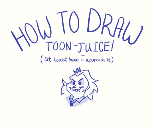
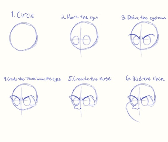
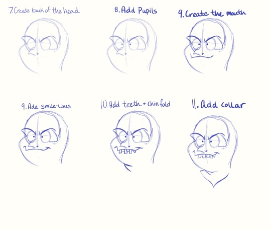
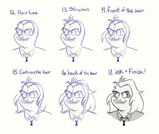
Not sure if anyone needs this, but this is something I really could have used in the past. It’s also my very first tutorial… Hooray!
#What an achievement! I’ve wanted to make something like this for years.#If anyone sees this and happens to be experienced with making tutorials#please give any feedback/tips you can!#Even if you haven’t- let me know how I can make these more useful!#toonjuice#beetlejuice#beetlejuice cartoon#tutorial#art tutorial#beetlejuice fanart#bettyjuice#my art#procreate#drawing tutorial
128 notes
·
View notes
Note
Hello!! First your Tumblr and edits are so gorgeous! Second I was wondering if you were willing to share how you did the second gif of this edit please? Have a great day! (Or night)
https://www.tumblr.com/thereigning-lorelai/713794704750362624/usergif-1-year-celebrationshuffle-challenge?source=share
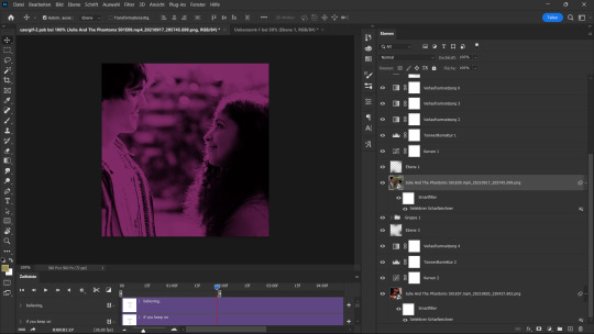
hi nonny, thanks for the nice words! really appreciated. ♥️ so, you're looking for this grid effect:

you're starting off with two gifs. i'd recommend choosing scenes that are not too close up because otherwise they'll overlap too much and you won't be able to delete enough parts to make the most of this effect.
so, here's my base gif that i just did in black and white with some minor purple brush strokes set to screen:

i then chose my second gif and coloured it with a purple gradient map and a purple colour fill set to multiply. the colouring of the gifs is entirely up to you and what you think looks best. so here's my second gif, still without the grid:
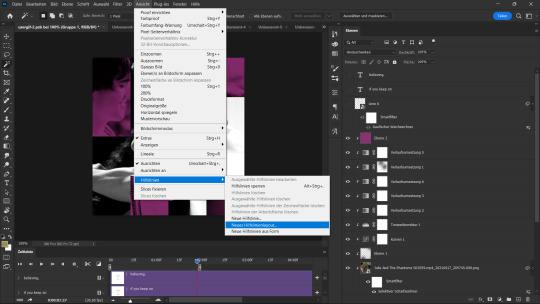
this is where the fun part starts - the grid layout. i created that with a new guide layout. this is a super neat tool in photoshop that helps you align shapes or selections on your image. the guide lines basically float over it and help you set up symmetric shapes or layouts. you can define how many columns and rows you want to have and then photoshop creates the guide layout for you. for this gif i chose 4 columns and 4 rows:

with this set up, i started creating the rectangles to make the purple gif visible on top of the black and white one. this is my final layout for my shapes:
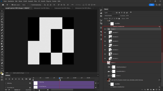
you can move around the shapes to your liking and what works best with your gifs. i didn't want to cover too much of my base gif but also tried to make their faces in the top gif all be in the gif as much as possible.
this step is just a lot of moving around your shapes and seeing what looks good tbh.
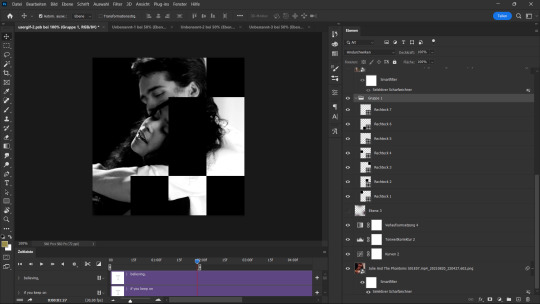
i then grouped my shapes and clipped my top gif (including all layers for the colouring) to my shapes group:

looking good so far. the only thing missing are the lines for the grid. this is where your guide layout comes in again. i just reopened it and then traced the guide lines with my line tool to create the white grid overlay:
(for editing purposes i turned all of the line layers into a single smart object at the end. this is why you only see one layer for all the lines in this screenshot.)
finally, i used a gaussian blur (0,5 px radius, 100% fill for the filter, 40% fill for the overall layer) on the smart layer to make the lines a little bit smoother and softer looking. this is totally optional and again, up to what looks best to you.
added some text et voilà:
#asks#kind nonnies#usergif#*tutorial#hope this helps nonny#if you have any further questions just let me know#i'm not the best at explaining especially because i think my way won't be the most efficient or even logical#but that's how i did it and i think it's fairly easy to achieve
297 notes
·
View notes
Text
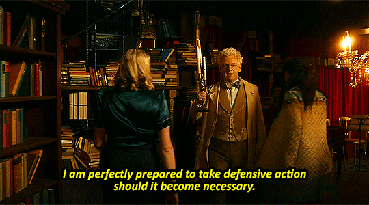


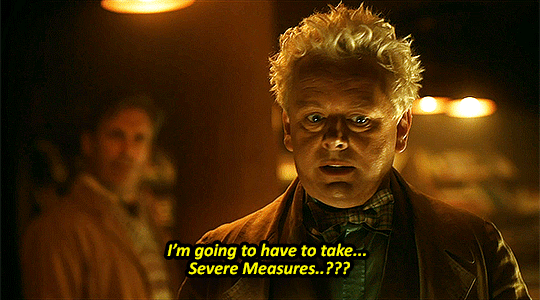

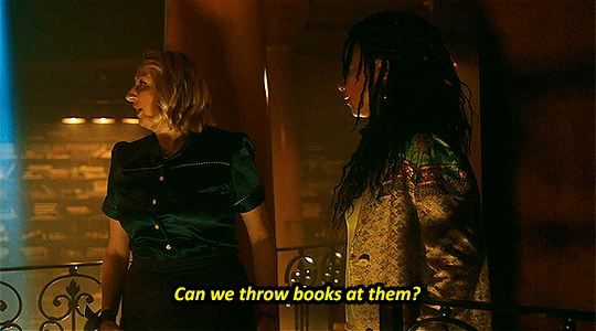
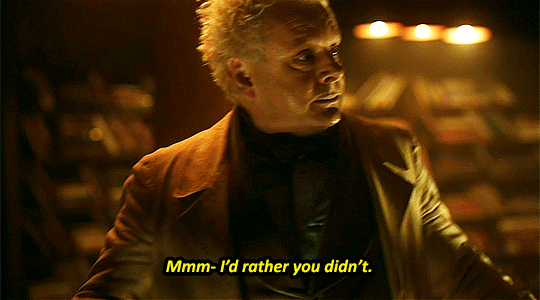
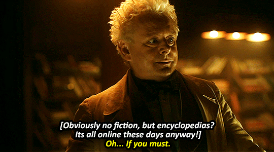

Guardian of the Eastern Gate and the One Entrusted with a Flaming Sword by God: Principality Aziraphale
#good omens spoilers#gos2spoilers#good omens season 2#good omens#good omens 2#aziraphale#goodomensedit#gifs#og post#i can't stop thinking about aziraphale so confident and badass saying “i'm prepared to take defensive measures”#and then just. being so useless#my guy says that and then 10 seconds later is like. well that won't hold forever. whats my plan? that was it.#it didn't even last you thirty goddamned seconds aziraphale???#what were the candles for? nothing. to look threatening i guess#shout out to nina for being like. hey. what the fuck man#but still having the kindness to go. well obviously we won't throw fiction#king couldn't hold off more than 10 lowest level demons on his own without committing a war crime#needed humans to come up with plans for him#anyway. this is my first time making a gifset#sorry if it sucks. i don't know what the standards are for gifsets. i followed a tutorial#and reused the same color adjustments for every gif <- lazy
355 notes
·
View notes
Last Seen Blogs

arslannasir9999
Arslan Nasir
ltwerepire
Azrael's Artimation

steam-beasts
You know what? Fuck you *Gives your engines legs*
saevus-brutalis
brutalis (semi-hiatus)
pq-inactive
I have moved.