#i used the procreate color wheel for this one
Note
Hi! Can I request a user box that says “This system does digital art!” please?
sure!


text: This system does Digital Art
text 2: This plural does Digital Art
text 3: This collective does Digital Art
#i used the procreate color wheel for this one#ꈨ⤷ user-billboards#ꈨ⤷ user-billboard request#ꈨ⤷ requested by: dollysystem#ꈨ⤷ ask the highway#userboxes#system userboxes#custom userboxes#this system#this plural#this collective#digital art#digital artist#white#grey#rainbow
7 notes
·
View notes
Note
Thanks for answering! Could you go into how you paint? It's always the trickiest part for me
Hehe sure thing! I even recorded some of it, bc for me personally, i learn a lot easier when it's visualized like that, aha.
So first off, we'll start off with our base!

Personally, I like a lot of gradients and color variations to start off with, but these can be solid base colors of you prefer :3. From this, ALL layers are gonna be merged down into one, no separate layers here yet :D
Going forward, I have a video done here kinda showing what I do :DD. I'll explain below the video in more detail what I do
First the base shadiws and highlights — for the shadows I'll usually pick from the color wheel (a darker, more saturated tone, plus I'll also shift the hue some) and draw right on the canvas. For the base highlights, i'll almost always use a bright orange on whatever adjustment layer makes your color nice and bright and glowy (for PTS it's Luminosity, and for CSP and Procreate I usually use an Add layer).
THEN I DO SOME MESSY BLENDING OUT, nothing pretty yet, just getting some of the colors blended out hehe
Afterwards, the drawing usually looks like this :0 very messy lol
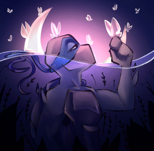
NEXT !!! PAINTING TIME !!! As show in the video, it's allllll about color picking and going over what you've already done. For a lot of it I use a softer brush, letting the colors blend together more softly, and then for other portions I'll use a harder pen for where I want more of the color that I picked to show through. Sometimes I'll draw over the line art all together if I don't think it's needed, or i"ll draw the line art back in after painting over it if I want those lines still :0
And there's just a looooot of drawing over and painting over. The 20 seconds you saw of painting and blending usually goes on for like 3-6 hours, depending on the drawing XD.
After ALLLL of that, I get smth like this

AND this was pretty much just working on leo. Now to work on the background elements >:3c same progress, just for the atmosphere and not the character!

YAY NOW THAT'S DONE !! Now all the paintings done soooooo
Color correction and final touches >:3c no more painting, now there's just a bunch of fun glowy layers we add on top of this heheheeh
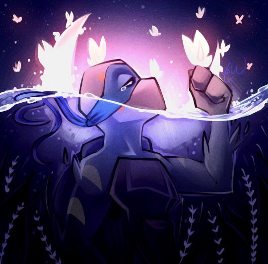
AND WE DONE >:DDD
I hope that helped some djejwjww. Tbh, the way I learn the most is if an artist im trying to learn from straight up just streams what they’re doing, but I don't rlly know anywhere i could stream or who would be interested ;w; but I hope this helps enough anyway!
If there are any other questions, I'll be happy to answer! Ive said before I rlly like playing art teacher heheheheh <33
219 notes
·
View notes
Note
Hi Ari!
I’ve always been a fan of your severitus art and I’ve started to pursue digital art as a hobby, i only have procreate and I struggle to draw without using a reference. I was wondering if you have any tips to help, especially that I will usually be drawing Snape and Harry
Thanks in advance!
Hello!
Thank you! I'm delighted to hear you're picking up on digital art! It's a truly fun medium. I'm familiar with procreate, though I'm trying to stop using it. Nothing against the program(long story).
SO.
I want to address "I struggle to draw without using a reference" .
-clears throat- This is NOT an issue. Using a reference does not make you a lesser artist, or at all symbolize lack of skill. ALWAYS use a reference, even if you're sure you don't need one, you may notice something regardless. I have a bachelors in Illustration with a Concept Art Concentration and I STILL USE REFERENCES. Dreamworks, Disney, Marvel, Star Wars, DC, Wizards of the Coast artists, they all use refs. I know this because they were the ones who TAUGHT me.
Allow me to prove a point->

These are all WIP screen captures I've sent to servers I'm in. I'm using refs. When I'm at my PC?

Please, don't ever feel like using a reference is like wearing training wheels, or CHEATING. IT'S NOT and I know there are people out there saying otherwise and they ARE WRONG.
Do I use a ref for everything? No. But I do for a good 85% of my work. It can be a color ref, a mood ref, a pose ref, doesn't matter.
There is very little I don't need a ref for. Let me put it into perspective.
Darth Vader is the only subject(besides dragons) I 99% of the time don't need a ref for(sometimes I open my Vader model for tough head angles or take photos of my mask replica). I have been drawing Vader, consistently since I was SIXTEEN. I've been drawing him for 13 years. After 13 years, yeah...I don't need a ref. Like with anything, PRACTICE is key. Repetition makes for great xp points.
Do I use a reference for Severus? Yes. With my Sev, I created a face I felt fit my vision of him using Alan Rickman and JK's sketches as a base. After that, I used my OWN work of him as a ref just to ensure I kept him in the same style.
For Harry and Snape. Don't rely on the actors. You don't NEED to. My Snape looks nothing like Alan. You don't have to worry about likeness with these characters unless you are aiming for the actors. All I really grabbed from Alan for my Snape was his hair and robes, which I began altering over time. Have FUN with these characters. Go off what the books say and create your OWN VISSION. I did.
Sorry for the long reply. oops. I'm adamant/passionate about this.
#long post#ask answered#answered ask#darth vader#severus snape#harry potter#professor snape#art#piett#admiral piett#firmus piett
76 notes
·
View notes
Note
Hey there, i love your art very much!! Especially the recent BG3 portraits. As someone who's switching to digital art and works with colour for the first time, could i ask: how do you figure out the right colours for your drawings? Do you premake a pallete, or pick one colour and then work from there or something else? Any tips would be welcome, keep drawing ❤️
Hey! Ah, thank you so much, I really appreciate it!
That’s a tough question to be honest. I find myself struggling with colors almost every time.
As I start an illustration I mostly have a rough idea what I want it to look like colorwise. Basically there’re two ways for me when it comes to coloring.
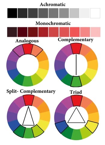
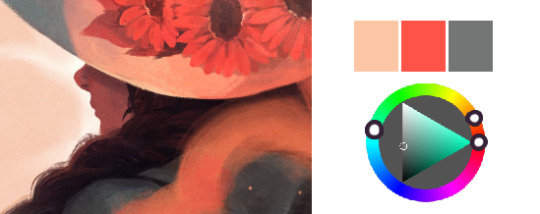
1. If it’s something more simple like a portrait or a character design, I tend to pick one base color and paint the whole object. From there I adjust each separate part such as hair, clothes, etc by moving slightly along the color wheel and changing the darkness and saturation depending on whether for example hair should be darker or lighter. For me personally in that case I prefer using analogous (picture below) colors and maybe add some complimentary (on the opposite side of the wheel) colors for highlights or backgrounds.
2. If I get too lost in the color choices, I scroll through illustrations of other artists I like and choose some that would suit the general mood best. Procreate and, I believe, CSP have a function where you can create a color pallet from a picture. I’m sure you could find some similar web or app, if your software doesn’t have the feature. Then I just use the colors from the pallet and build up on them, adjust according to what seems to work best for me.
Although if I had to give some basic tips based on personal preferences:
1. Never use black, avoid using white. I prefer using dark and saturated blue, purple, red instead of black. Light and less saturated base color instead of white.
2. In general I prefer working with more saturated colors, but got to be careful, not to overdo it, not to create crazy colorful mess. But again that’s my personal preference.
3. Avoid using too much different colors. I mostly try to stick to three, max four colors in one illustration and just use their adjusted versions (darker/lighter, more/less saturated) for shadows and highlights.
4. Contrast is more important than colors.
Guess, that’s what comes to mind first, hope it makes sense at least a little. In general I’m really chaotic when it comes to colors, so I’m probably not the best person to give advices. However, if you have any questions, I’ll be happy to try and help as much as I can.
Good luck on your creative journey!
43 notes
·
View notes
Text
FAQ
I made an FAQ about Commissions, online store, brushes etc here a while ago! I'll do a more informative pinned post for people who access tumblr only from their dash, so please refer to the FAQ here under the cut.
What program do you use?
I use Adobe Photoshop CC and Procreate. Photoshop for painting and colouring, Procreate for sketching and inks.
What brushes do you use?
I can’t share most brushes since I bought them ages ago and don’t have the source for them anymore, sorry. For Photoshop, I use flat or rake brushes, and one flat, calligraphy-like one that tilts with pen sensitivity, and an airbrush that has some kind of grainy paintspray effect.
For Procreate, I most commonly use Max Ulichney brushes for textury brushes, standard procreate pencil brushes and Joe’s Fine Ink Line for inks.
Do you do commissions?
Not right now, no. If I do, I’ll announce it, but on Patreon first.
Do you have a patreon?
Yes, you can find it here. Support is much appreciated. 💛
Do you have an online store?
Yes, thought it’s currently closed. Will reopen hopefully in 2024, for abouth a month. Later half of the year more likely.
What’s Heart of Gold?
Heart of Gold is a mystery/drama webcomic with overarching religious themes that revolves around the tenuous relationship which grows between the main characters Dunant and Ionel.
Is Heart of Gold on Hiatus? Will I be able to purchase volume 1 and 2 in print someday?
Yes, it’s on hiatus. We sell volume 1 at conventions, and will do our best to sell it online as well. There are some plans for volume 2 in print.
What about your Curse of Strahd campaign/CoS art?
I love to share about our campaign! I have an artbook about it, or rather, the relationship between my PC Kasper and the NPC Lydia. I’d like to make a 2nd volume of it, and maybe something more gen too in print.
Feel free to ask… Hoping to do more stuff for it, as always with a big LydiaKasper & Fiona focus haha
How do you color/do you pick your colors?
Honestly, I just experiment a lot. Use the color wheel! Look at how other artists you like use colors! This helps me more than anything. This, and curves sometimes.
I’ve been planning to do a tutorial for patreon for a while now, but haven’t gotten around it yet.
What pronouns do you use?
They/Them and He/Him.
#not art#this is to sum up some of the asks i’ve received regarding the aforementioned topics so apologies if i don’t reply!#one day i’d like to make a newsletter to inform yall what i’m working on next and online store stuff too but… next year… next year…….
82 notes
·
View notes
Note
Can you do a step-by-step process of how you draw Link or Zelda?
i can try my best! hope this will be a good enough explanation😅
1. First sketch

I always start with with just a circle as a guide to create the shape of the head.
I use very simple dots for eyes just to see where to place them, which also helps me figure out the rest of the face.
Then I block in the general shape of the hair, shoulders etc.
2. Second sketch

Once you have those initial guidelines, its pretty easy start adding lineart on top. It can still be messy at this phase since the next step is to refine the lineart and fix any mistakes.
3. Line weight

I consider this the most important stage in my process. Line weight is very important! Its the step that can sometimes take the longest for me because I'm constantly adjusting lines, erasing them, adjusting again etc etc until I feel it looks good. Take your time and figure out where to put more/less line weight until you're satisfied with it!
4. Flat colors

If I'm being completely honest, I don't have a particular process for choosing flat colors other than just eyeballing it 😅 I like to use trial and error to figure out what looks good. I use references to figure out the colors, but I don't like to just use the eyedropper tool to pick the colors from the ref since I feel it never works well with my art. I just try to match as close as I can just by using the color wheel, and try to pick colors that go well together overall in the composition.
5. Cell shading

For shading and lighting I try to use cool colors like purple for the "dark" areas and warm colors like reds and yellows for the "light" areas. It gives this really neat effect where it looks like there's shading, but really its just a bunch of complementary colors working together. Occasionally I use the Harmony color wheel on Procreate to figure out which colors are actually complementary or analogous to one another.
6. Final render
The last step is to color the lineart with a clipping mask and add any final details, then you're done!

I hope that was a satisfactory explanation, I've never done a tutorial like this before 🥲 Thanks for the ask!
23 notes
·
View notes
Text
got a couple questions lately about how I color...
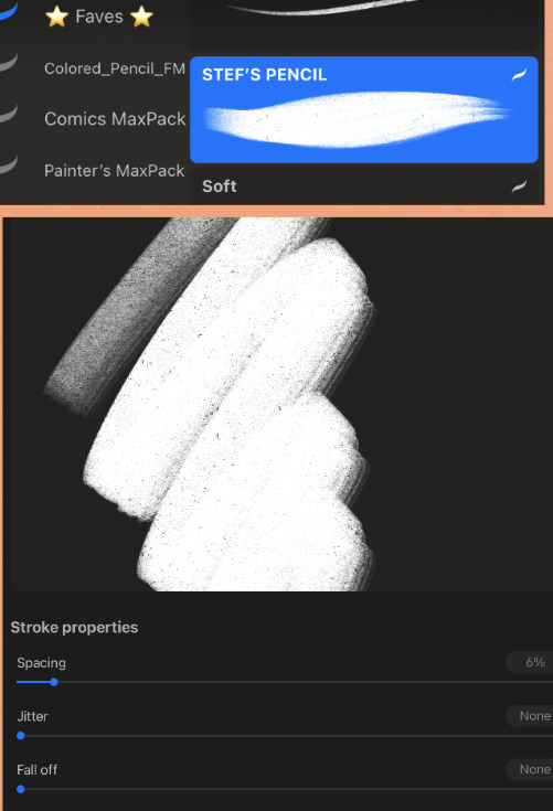
for pretty much everything I draw I use one (1) brush—it was a free download for Procreate with my screen protector, it’s basically just a soft pencil brush that when I size it up a bit reminds me of using soft pastels irl (and I have a lot of experience with those!). I use it for lineart, coloring/painting AND erasing.
for color picking, lately I’ve been playing with transparency as a way to keep all the colors in a palette cohesive without having to mess with the color wheel too much ✌️
17 notes
·
View notes
Note
the way you color things makes me want to commit crimes. any coloring tips for a baby digital artist who doesn’t know how to do the computer things good?
AUGH apologies for taking so long, i was in the middle of writing this answer and the whole thing was deleted as soon as i switched to another tab on my phone, and then the draft didn't save the second time i tried to write it. jfc at least i had it written out in my notes app the second time. anyway, thank you thank you thank you!! this was very nice to recieve, i love getting asks ❤️
i'm not versed in the arts of drawing on a computer, either, so i can't give tips in regards to specific programs (said in chronic procreate user voice) but i can certainly give universal advice keep in mind that i'm not professionally taught in the slightest so i lack much of the vocabulary to describe my methods, and remember that my word is not law!
in case of confusion, everything has been explained. i've added a cut because it got needlessly long. i've also added visual guides for certain tips, and image descriptions for each one
to be honest, much of what i do when picking colors is done with the help of gradient maps (more on that later) but when choosing my base colors i follow these rules:
1. you don't have to cell shade with purple + multiply and an add layer. that's the voice of lavendertowne attempting to take control of your body. stamp it out. (/j i love her)
2. bright, vivid colors!
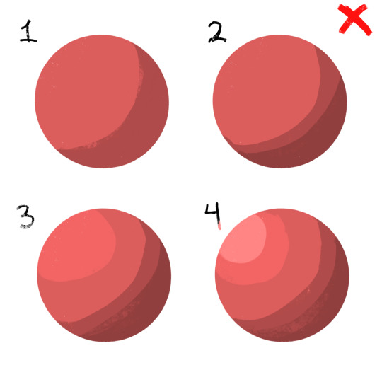
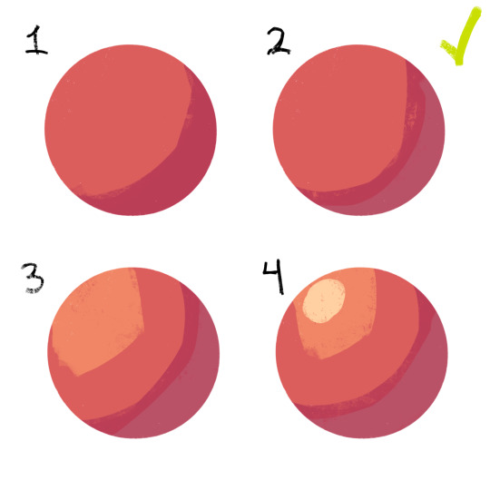
3. instead of shifting just the brightness and saturation when picking colors to shade, shift the hue, too! in the first image, we can see that the circle is dull and boring. in comparison, the second image pops!
4. so, how does this work?
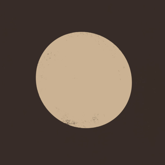
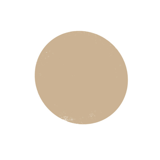
without getting too much into color theory--because while i've studied it before, i don't trust myself to articulate it properly without making a fool of myself--it's all about how colors interact with each other. for example, a beige circle looks lighter when surrounded by a dark background rather than just plain white.
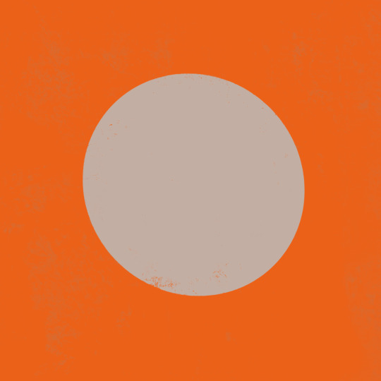
in the same vein, surrounding greys/desaturated colors with warm colors makes them look blue, and vice versa.

5. blue/grey shadows and warm lighting!! or the other way around. actually, you can use any color for shadows and lighting, depending on your light source. is it sunny outside, or are they beneath white light?
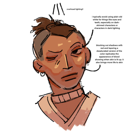
6. for color picking, i reccomend avoiding using the wheel, instead opting for the rgb sliders or the hue saturation brightness sliders if you're dumb like me. this allows for precision in the colors you pick, and accuracy when putting together color palettes.
7. and, finally, the actual computer stuff: gradient maps! i looove gradient maps.
as far as i'm aware, procreate and krita have the gradient map tool. ibispaint does not. i am not sure if firealpaca does.
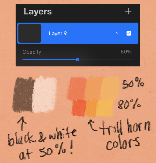
i usually use gradient maps to make my coloring more cohesive, rather than just slapping them on a monochrome drawing (which is also a totally viable method for coloring, but you'll be less precise, as gmaps only recognize values). when using gradient maps, i prefer to duplicate my completed artwork, lower the opacity of the duplicate on top of it (usually between 25 and 50%, depending on how strong i want the effect to be), and use gradient maps on the duplicate.
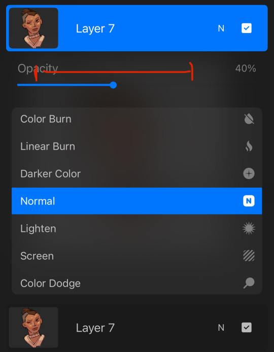
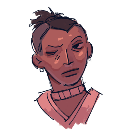
this makes my colors all nice and pretty!
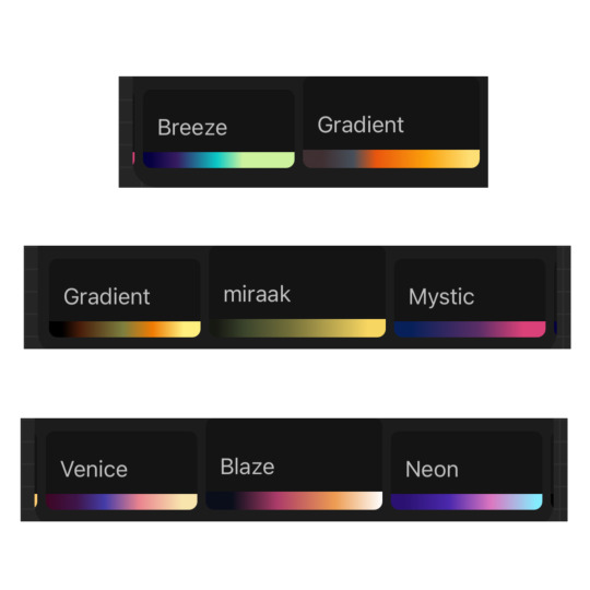
11. if you use krita, it can be hard to find the right colors to use for your gradient maps. never fear! i'm here to give you the default templates from procreate, as well as a couple of the ones i've made.
if you have any more questions, or you want me to get further into a specific topic, feel free to send me another ask
10 notes
·
View notes
Note
i've been following you for a very very long time (the snk askblog days !) and your art still blows me away every time. i just love your colors and painterly style. do you have some art tips, tutorials, brush recommendations etc ? i really want to improve my digital painting skills and i'm curious about your process
Oh no! Not the ask blogs..... but thank you so much for your continued support of my work 🥺♥
I think the most important things I always keep in mind is colour theory though I can't say im always successful each time I do it 😂 Honestly when I see guides it all never makes sense to me?? What do they want me to do even!!

These guys explain things pretty well though and much more professional than me:
Emel's Colour theory notes
Gigi's colour/lighting notes
And also this image right here
Honestly main things are
limit your palette - use a colour fill set to low opacity overlay or 10% opacity normal for the mood you want for the piece, your character might be wildly coloured but this brings it together
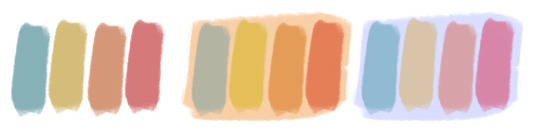
split/complementary palettes are great, saturate one side, desaturate the other for contrast (looks teal but its actually a grey if you swatch it )
don't you dare use white grey or black to shade! dont you dare!!!!
add a slightly more saturated colour in the middle of your shading gradient for some pop
personal taste but i like to dab some colour elsewhere where it might not belong 🤷♀️
my personal pet peeve is that i dont actually like swatching from character sheets im sorry the cat is out of the bag whats the fun if you cant play around with lighting and mood
most important skill is to not be scared to try things that are hard that you think wont work out!! trust in the process!! itll look like ass the whole way through!! use colour balance at the end if you need to!!
also colour theory relies on the ryb wheel rather than rgb which really messes with you in digital settings... thats something i still need to memorise more... awful
Also tosses this out here too: Jing's brushes are my current go to since I work more in procreate now
Anyways half the time I dont even listen to myself and forget the stuff i should be doing and i have to go back and ref my own art style so who knows!!! take this all with a lot of salt
107 notes
·
View notes
Note
I love your art so much! Do you have any of your brushes for sale, or any tutorials, especially on colour?
Hi!! Thank you so much! 💕
Honestly, my go-to brushes are all procreate brushes with slight adjustments (like stabilization, etc.) my personal preference is brushes that kind of mimic graphite pencils. The best thing you can do is find a brush that suits you & get very comfortable using it! Specific brushes won’t necessarily improve your work, it’s all about practice! (But yes, a nice brush does help!)
I do have a video on my favourite brushes:
I’ve never really made any tutorials, but I’m happy to try and relay what I know and what I’ve learned so far!
Colours are a big part of illustration! I could probably ramble on for hours, honestly—in any case, it’s always helpful to know fundamentals of colour theory. Once you learn and apply it, it becomes intuitive! I’m gonna stick to RGB colours because CMYK is it’s own thing (printing!)
There’s a handful of basic terms like hue (pure colours), shade (adding black to a colour), tint (adding white to a colour), tone (adding gray to a colour) and also opacity (transparency) that help us understand and define the complexity of colours.

My colour choices are more often than not a gut feeling—but that does come from practice! There’s loads of colour palettes available online like this one, but if you wanna come up with your own, there’s some neat ways to do that using a colour wheel! Colours can broken down into primary, secondary and tertiary colours. We can also categorize them as warm or cold. With this we can make colour schemes!
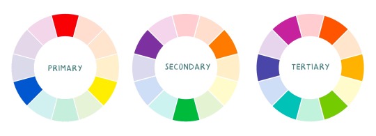
Some basic schemes!
Complimentary: two colours, opposites on the colour wheel
Analogous: three colours side-by-side
Triadic: three colours that form a triangle, evenly spaced
Monochromatic: using one colour (using different shades)
(Bonus) Monochromatic with accent colour : using one colour as a foundation and having an accent colour (similar to analogous, but one colour is used for a majority of the piece while the accent colour is used sparingly)

It’s also important to keep in mind that values (a colour’s range from dark to light) will look different on different colours. Sometimes, you’ll put two colours together and think “huh, something about this feels off” and it turns out, the colours just happen to be very close in value and melt together. Switching your piece to grayscale just to check on your values every so often can help with contrast and muddiness! A light tone on a darker tone will look brighter than it really is. Colours can also influence each other and trick your eyes.

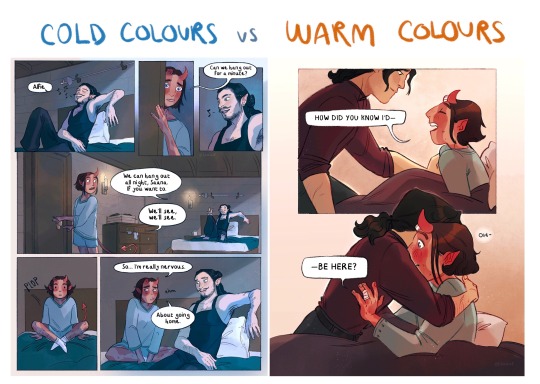
Environment is also a big part of choosing your colours for a piece. Determining what the setting is important! A sunset will make a drawing warmer, while a scene set in the night will usually have colder tones. Using only local colours (true colours, like green grass or blue sky) vs non-local colours (atmospheric perspective, accent colors that give depth, etc) can help enhance your drawing too. Don't be afraid of artistic interpretation!
Also, there’s always the option to use gradient maps (at least on procreate & photoshop but I’m sure it’s available in csp and other programs) where you draw in grayscale & apply a gradient map. The gradient map basically applies a color to every value (e.g all the shadows become blue and the highlights become orange) it can look really nice (and help out if colours just aren’t working that day yk)

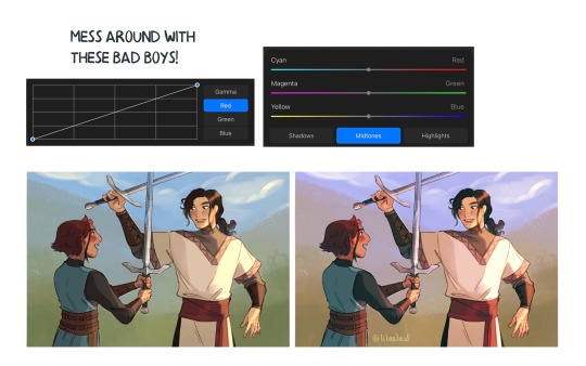
Another thing, when I’m drawing (and this is specific to me!) I tend to start with pretty desaturated colours. Once my illustration is done, I’ll duplicate & merge my layers to do colour edits. Most programs give you the option to play with curves or colour balance—menus that allow you to play around with the hue of the shadows, midtones and highlights. I tend to make my shadows more cyan-blue, my midtones a little warmer and my highlights warmer as well. Of course, this depends on the mood of the piece, whether it’s warm or cold, lighter or darker, etc!
You can always make adjustment layers on top of your work; a low opacity yellow, magenta or blue (or anything your heart desires) overlay to tie all the colours together.
I hope this helps a bit!! Happy to answer more questions to the best of my knowledge :^)
99 notes
·
View notes
Text
18 notes
·
View notes
Note
Your art is so pretty! I was watching your timelapse videos and wondering- how do you lay skintone and colors down over the grayscale like that? I’ve seen other artists do it too but I can’t figure it out, is it some layering thing my art program doesn’t have?
Oh gosh thank you so much for thinking so! Let me see if I can explain my process (please bear with me I’m not the best at explaining anything). To preface, I use Procreate, but I think there are similar layer modes on other art programs.
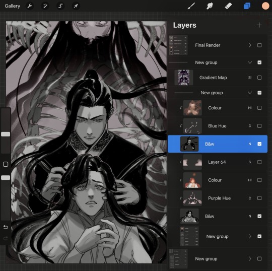
Greyscale is where I set my values, shade, and plan out lighting. To add colour, I clip a layer over the greyscale and set it to “hard light” at 100% opacity. I know other people use the “colour” layer mode to drop their colours in, but I like how vibrant colours can become in the “hard light” layer mode.
Side note: certain colours tend to become distorted in this layer mode, so what you see in your palette may not be the same colour when you drop it into this layer. You’ll have to fiddle around with the colour wheel to get exact colours you’re looking for.
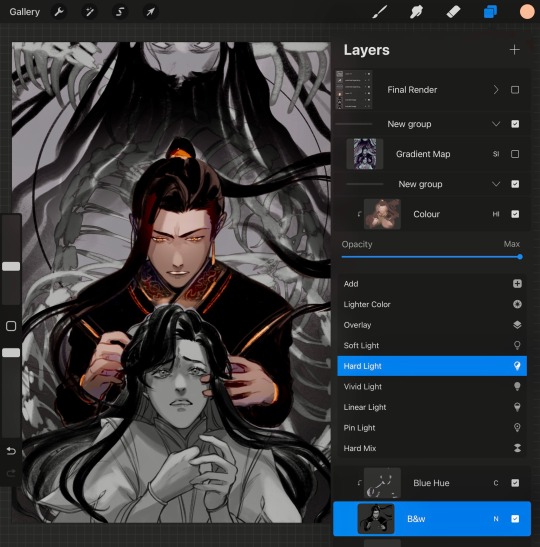
From there, all my base colours stay in this one layer. It tends to be a messy layer anyway, which isn’t a big deal because I stack “normal” layers on top for rendering and clean up.
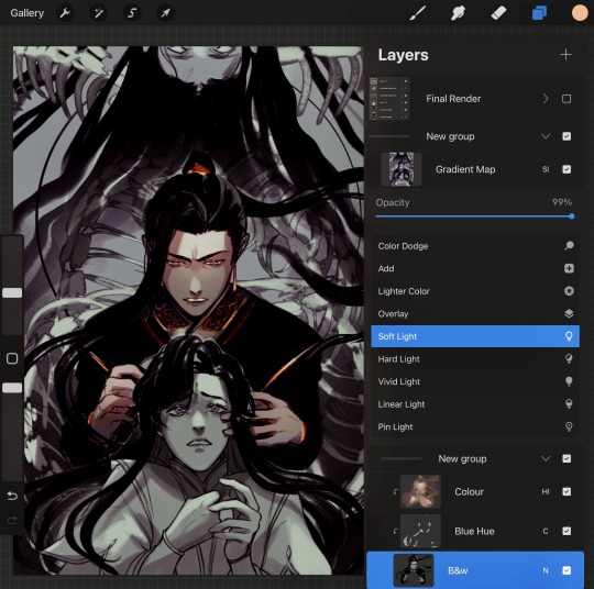
To help with setting the mood and adjusting colours even more, I use gradient maps either on top of the greyscale or under a “hard light” layer.
Gradient maps are fun and they can be a quick way to colour too. For this one, I set the gradient map layer to “Soft Light” at 100% opacity to get a spooky feel.
But there you go! I hope that helps, and I apologize if it’s convoluted. I don’t ever use the same method twice because quite honestly, I tend to forget what I do. 😅 so each new piece is always a fun (or excruciating) experiment.
93 notes
·
View notes
Note
I absolutely adore your art, especially the asheiji painting you did. I am new to painting digitally, so if possible, I would love to learn a bit about your colouring process 🥺
ahhh thank you so much friend!! 😭💗 welcome to the digital art gang! i love getting these kinds of questions, so feel free to send another ask if you want to know anything else in particular ᕕ( ᐛ )ᕗ
here's a speedpaint of that asheiji artwork:
my painting is nothing refined! i get a sketch going on my first layer. the sketch is semi-clean (i erase and clean up guidelines as i go), but i will also write out notes on this layer and more strongly define shapes that i want to emphasize, like those little pouch lines under ash's mouth or the crease on eiji's cheek.
underneath this layer, i lay down my flat colors, and sometimes block in accent coloring (the blue and pink i've shaded with). i eyeball all of my colors from the rgb/cmyk wheel. no hex codes or value sliders, we die like men.
what i'll often do next is something i can only explain with respect to the procreate program: i will duplicate my flats layer > clip it down onto my sketch layer > turn the duplicated flats layer to the "hard light" setting > lower its brightness, increase its saturation, and add gaussian blur > merge it with the sketch. this is just a quick way to color my sketch lines, as one would color line art.
now that i have just one layer, i paint. you can check out how i do this in the timelapse. if you'd like to know what brushes i use, i'm not entirely sure how to upload them here on tumblr, but i'll give it a shot if you'd really like me to (FREE RESOURCES WOO 💪💪🔥💯)! the liquify tool is my best friend for tweaking proportions.
finishing touches are also super important to my painting style. here's where i adjust saturation, hues, contrast, and add details like freckles, eye shine, light source, etc. this process combines a variety of techniques and brushes which i could also break down in a longer, separate post. i definitely think this is what makes or breaks my artwork. (also, never doubt your ipad's gallery effect options!!)
thanks for your time! 🥰
26 notes
·
View notes
Note
i loveee ur art its sooo expressive and it has such a 90s feel to it.. if i may ask, how do u pick ur colours? do u have a specific colour pallete u adhere to? thanks!
thanks so much :DDD im curious what might make it feel 90s 🤔 thats so interesting
anyways stuff abt coloring below
honestly i kinda just fuck around with color, technically i somewhat understand color theory but despite that im bad at choosing the right colors straight from the color wheel so a lot of times i just hsb adjust things until theyre right
ive got two different ways i color things currently:
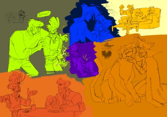
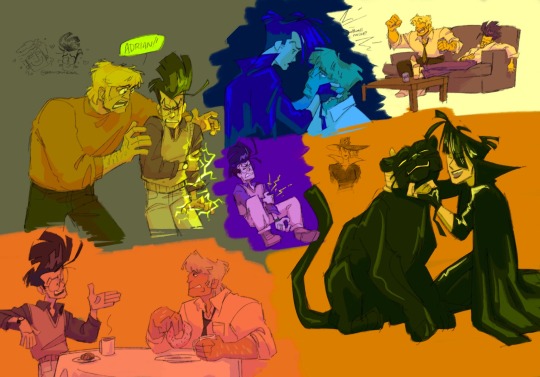
softish shading with a marker brush in greyscale, applying too many color adjustment layers, and then coloring a little on top of the greyscale to make things not monochrome. usually i color on top of a clipping mask bc its a lot easier, which i did in the ace attorney one but not in the merlin one for ?? no reason i guess i just didnt think abt it lmao

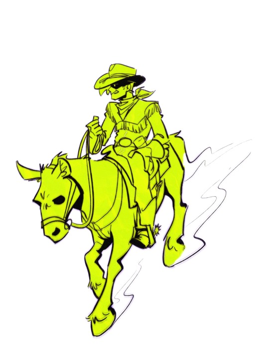
the other way is i decide what color i wanna cast the whole drawing in and i make that the base clipping mask layer (which ive been making like. neon green a lot lately lmao) and then i block in color on top of that, and shadow color on top of that. the cybersix ones a great representation of what im doing there but its a little chaotic since all of the sketches were meant to be cropped oops. the cowboy danny phantom ones a lot cleaner of an example haha
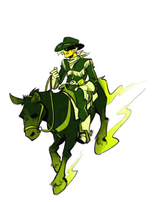
i really like doing the second method because it also works great with lineless and also i really like comparative colors? i know theres a better phrase for it but like. when one color looks like a different color when its put in a different colored space. like when im making things green, id color blue things in the scene green and red things in the scene a muddy orangey color. or when i was really into yellow id make the blues purple. idk usually the “blue” in the scene is first color i like to figure out im not sure if its because its my favorite color or if its because i love drawing jeans but thats just how it goes lmao
oh also putting things on a or neutral bg helps to pick colors a lot easier than keeping the default white bg, i always turn it off and leave it transparent until im finished lmao. i use procreate light mode so its still rather light but not too bad
i dont really have any palettes that i intentionally adhere to, no, but i do get kind of stuck using the same colors for a few months before moving to something different. rn im very stuck on green and need to accept that not everything needs to be the grossest greens ever and ive been stuck on it for about six months? in the past i was really stuck on yellow haha
#coloring method is fuck around and find out#ask#anon#very surprised abt all these questions abt how i do things recently#not in a bad way#its just interesting#how i draw
46 notes
·
View notes
Note
if you're still looking to answer art questions, i've always wondered how you got the textures on your realistic charcoal pieces
Always looking for art questions!
Alright so the big secret to that texture are these film overlay textures that I’ve used for years in my graphic design work and carried over into my charcoal work. I have several more that I use but these are the free ones in my arsenal, the rest were all purchased or given to me by my professor. For charcoal I usually paint on top of these textures and then add more grain on top of the charcoal (will explain below). I also will use paper texture overlays for a softer look cuz sometimes the film grain is too harsh. There are plenty of free ones, here’s a pack to get started with and here’s the paid set that I use. Put them on top of your artwork and set the blending mode to linear burn.
If I need extra grain, I fill a layer with medium gray (double tap with left middle side of the Procreate color wheel) and add 10-20% multi color noise, then set that layer on overlay and adjust the opacity. I also have dozens of grain and texture brushes from Retro Supply Co and True Grit Texture. I prefer True Grit for sure, I use their Distress Press and Fast Grit brushes all the time (as well as many others) and their free sampler comes with some great texture brushes to start with! Always use texture brushes at around 50% opacity to start with and adjust from there. The texture should not be the same amount/value everywhere or it looks unrealistic.
Another thing too is the charcoal brushes themselves. It took me ages to find ones that I like, because so many were too smooth or just did not act like charcoal at all. I found this pack which has absolutely saved my life. I unfortunately don’t know if any free charcoal brushes I like.
Many times it’s a mix of all of these but figuring out the balance takes time! Duplicating layers helps a lot. Hope this helps!
18 notes
·
View notes
Note
Hi ive seen your art while scrolling through the trollhunters tag and i really need to ask because this is kinda weirding me out...
Is your art a result of you drawing so closely to the show it looks like the 3d models or a bad edit of the 3d models..
Because for me it looks like both and i cant tell which one it is and it confuses me each time i see your art
🤔
Honestly, this has kind of thrown me for a loop and I'm still not sure how to take this? But I'm going to take it as a compliment. And, for those interested, y'all are getting a bit if history after the jump.
Short answer: It's the first one. I draw very close to the show. It's all my drawing. I love Jim's design and strive to get as close as possible to how he looks in the show. I'm a technical realist most of the time. I also have years and years of experience in a lot of different types of art and mediums. So for fun I thought I'd do a screen grab from my current WIP while I do a little bit of quick and dirty work. I've clicked through some of the various layers, sketch, lines, finished layers... and then my ugly process for all to see lol. I'm self taught in procreate.... I have no idea what I'm doing. Usually I'd spend way more time on things.... but that would be a long ass video. A lot of my current work takes weeks. The one of Blinky reading to sleeping Jim has over 65 hours in it, and the Masquerade Ball is close to 80.
Long answer!! All of my art is my own (with the exception of one borrowed art work, which was given credit), drawn by me from ugly concept sketch (that sometimes looks vaguely like our characters.... and sometimes just circles and triangles) to polished sketch, to final line work and then color and rendering. I'm self taught, but also have some fine art background... and some in CAD and graphics and when I first started college it was with the goal of automotive design, so I'm more of a technical artist than what most people are used to. I have a background in Copics and my color and blending from those bled over into Procreate. I have medication induced aphantasia, so a lot of times need references. I've been doing sketches of Jim every night for almost a year now. There's a few speed sketch vids on my instagram (same username). I do have photoshop, but the extent of my editing skills is photoshopping aftermarket wheels on my car to find ones I liked, and it's been an ungodly long time since I've done that. I mostly have it because, prior to disability, I spent a lot of time as a photographer shooting landscapes and such, and shooting In infrared.... but I haven't touched a camera or photoshop since...... 2017? I don't even remember how to use it for the most part. Photoshop is not like riding a bike.
Trollhunters and especially Jim, are my comfort show. Helped me through some bad times... and then RotT happened basically right when I had a major surgery, and the combo really messed me up. I started sketching Jim as a way to heal from both... and well, it was all downhill from there 😂
That's probably way more of an answer than you were looking for!
#tales of arcadia#trollhunters#toa#jim lake jr#toa trollhunters#trollhunters tales of arcadia#trollhunters toa#toa fanart#blu answers
25 notes
·
View notes
Last Seen Blogs

dutchantiqueclocks
Dutch Time Pieces
sarahwilsbrah
And... here... we... go!

webreathfandoms
my mind drive
black-berry
Berry S
cinematv
CINEMATV