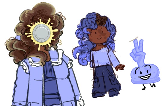
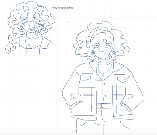
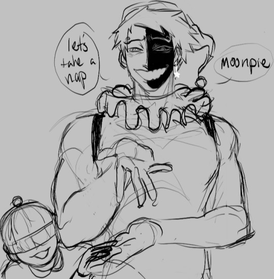
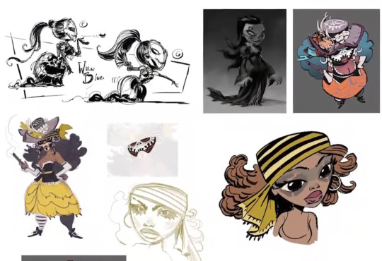
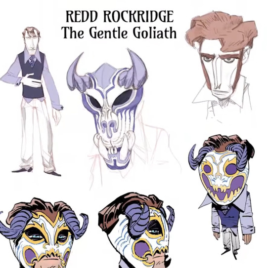
#holy shit why did i draw so many characters
Text
also his drawings. make me insane. im pretty sure ive made a post about this before a while ago but i just love looking at his silly little drawings it adds so much to his character. even after everything he's been through he's still got some humor and lightheartedness in him. and he's really good at drawing too!! so it's likely something he's been doing since he was a kid
#will always believe in closeted art kid michael who became a bully so he wouldnt get bullied himself <- REAL TO ME!#anyways all his drawings are fun but i still cant get over the little hearts he scribbled in the margins of that one page#theyre just so simple and....... human. i dont know ToT#this guy is literally an undead purple zombie and he's doodling little hearts in a book#it just reminds you that michael IS a Real Guy. like canon fnaf kind of sucks ass when it comes to actually attaching any people or real#human emotion to the events of the games (very much focuses more on What Happened over actual character stuff)#(which is fine but not what i rlly look for in media usually lol.... which is why i love stuff like og fnaf vhs#which is much more character-driven)#but anyways. i think his comments and drawings in the logbook work wonders in making michael feel more real#and less like just unseen protagonist who we know about vaguely#thats why i cling so hard onto little things like his habit of chewing gum. or just him liking to draw in general#usually i dont like when fandoms make One Trait of a character super prominent/their whole personality#but with michael we know SO UNFATHOMABLY LITTLE about his character/personality that these little scraps of info are rlly all we have#in terms of his character beyond The Things That Happened To/Around Him#OH also. his love of that stupid fucking vampire show is SOOOO near and dear to my heart#another thing that makes him so painfully human. yes he is serious protagonist guy who goes thru the most unimaginable shit ever#but at the end of the day. he like many of us enjoys a stupid cartoon that he probably takes way too seriously for what it actually is#his comment about it in the logbook still makes me laugh THIS MF IS PROJECTING ONTO A FICTIONAL CHARACTER IN HIS LITTLE SHOW#HE JUST LIKE ME FR#ANYWAYS holy fucking shit i did NOT mean to go on this long of a rant#i just fucking love michael afton so much im sorry#serena.txt
7 notes
·
View notes
Photo


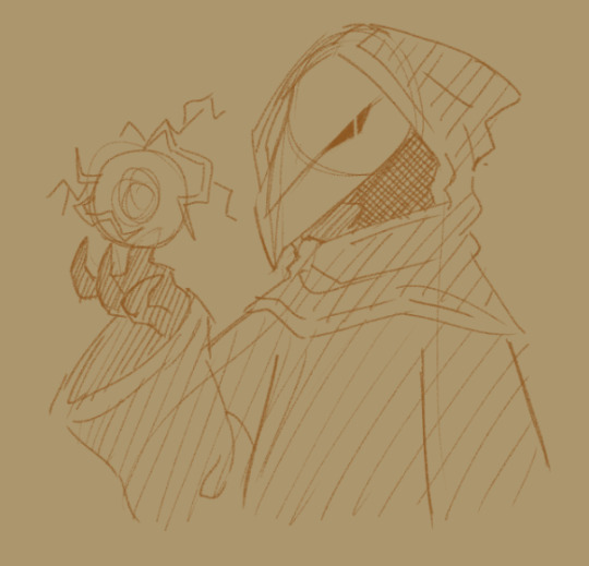


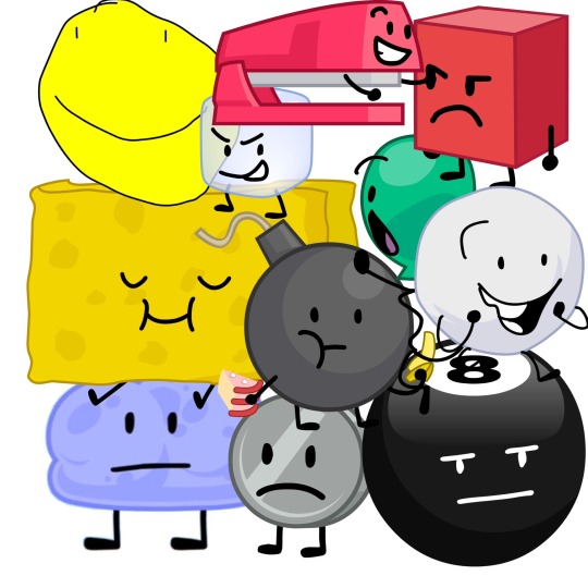
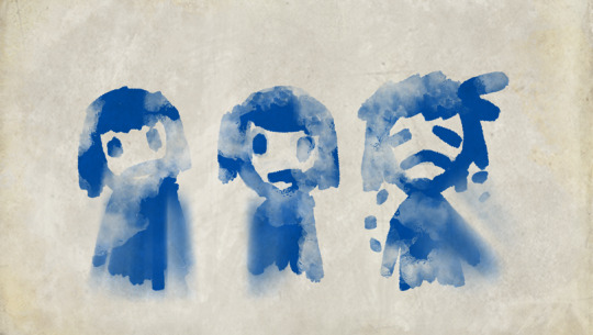
throws u doodles and runs
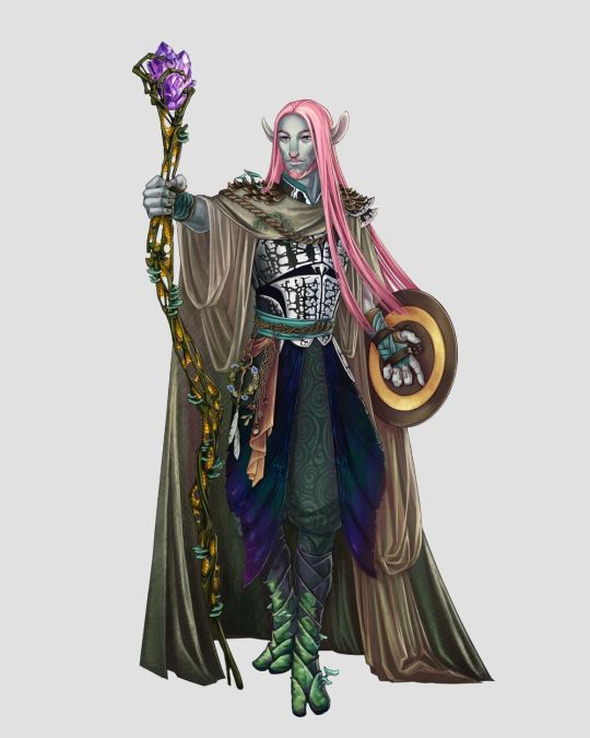
#terraria#terraria witch doctor#terraria nurse#lunatic cultist#(why did i draw all separate characters holy shit)#terraria tavernkeep#terraria demolitionist#empress of light#terraria angler#(good god why did i draw so many of them)#real talk this game's been the goofy shit in the brain for a while#wild that it took an odd 250hr of playing the silly game to finally draw smt#my stuff
44 notes
·
View notes
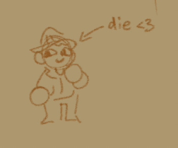
Photo
forgor to post this a while ago but hav stupid bird gang<3
birds include (in order from left to right):
blue jay,
peach faced lovebird,
eagle,
dove,
crow,
and owl!
#art#bird sonas#bird characters#bird#blue jay#peach faced lovebird#eagle#dove#crow#owl#holy shit this took a while to finish#theres so many characters#6 in one drawing???#along with that 12 wings in total? :flushed: sounds like alot#it is#why did i say that?#idk man
5 notes
·
View notes
Text
why Aurora's art is genius
It's break for me, and I've been meaning to sit down and read the Aurora webcomic (https://comicaurora.com/, @comicaurora on Tumblr) for quite a bit. So I did that over the last few days.
And… y'know. I can't actually say "I should've read this earlier," because otherwise I would've been up at 2:30-3am when I had responsibilities in the morning and I couldn't have properly enjoyed it, but. Holy shit guys THIS COMIC.
I intended to just do a generalized "hello this is all the things I love about this story," and I wrote a paragraph or two about art style. …and then another. And another. And I realized I needed to actually reference things so I would stop being too vague. I was reading the comic on my tablet or phone, because I wanted to stay curled up in my chair, but I type at a big monitor and so I saw more details… aaaaaand it turned into its own giant-ass post.
SO. Enjoy a few thousand words of me nerding out about this insanely cool art style and how fucking gorgeous this comic is? (There are screenshots, I promise it isn't just a wall of text.) In my defense, I just spent two semesters in graphic design classes focusing on the Adobe Suite, so… I get to be a nerd about pretty things…???
All positive feedback btw! No downers here. <3
---
I cannot emphasize enough how much I love the beautiful, simple stylistic method of drawing characters and figures. It is absolutely stunning and effortless and utterly graceful—it is so hard to capture the sheer beauty and fluidity of the human form in such a fashion. Even a simple outline of a character feels dynamic! It's gorgeous!
Though I do have a love-hate relationship with this, because my artistic side looks at that lovely simplicity, goes "I CAN DO THAT!" and then I sit down and go to the paper and realize that no, in fact, I cannot do that yet, because that simplicity is born of a hell of a lot of practice and understanding of bodies and actually is really hard to do. It's a very developed style that only looks simple because the artist knows what they're doing. The human body is hard to pull off, and this comic does so beautifully and makes it look effortless.
Also: line weight line weight line weight. It's especially important in simplified shapes and figures like this, and hoo boy is it used excellently. It's especially apparent the newer the pages get—I love watching that improvement over time—but with simpler figures and lines, you get nice light lines to emphasize both smaller details, like in the draping of clothing and the curls of hair—which, hello, yes—and thicker lines to emphasize bigger and more important details and silhouettes. It's the sort of thing that's essential to most illustrations, but I wanted to make a note of it because it's so vital to this art style.
THE USE OF LAYER BLENDING MODES OH MY GODS. (...uhhh, apologies to the people who don't know what that means, it's a digital art program thing? This article explains it for beginners.)
Bear with me, I just finished my second Photoshop course, I spent months and months working on projects with this shit so I see the genius use of Screen and/or its siblings (of which there are many—if I say "Screen" here, assume I mean the entire umbrella of Screen blending modes and possibly Overlay) and go nuts, but seriously it's so clever and also fucking gorgeous:
Firstly: the use of screened-on sound effect words over an action? A "CRACK" written over a branch and then put on Screen in glowy green so that it's subtle enough that it doesn't disrupt the visual flow, but still sticks out enough to make itself heard? Little "scritches" that are transparent where they're laid on without outlines to emphasize the sound without disrupting the underlying image? FUCK YES. I haven't seen this done literally anywhere else—granted, I haven't read a massive amount of comics, but I've read enough—and it is so clever and I adore it. Examples:


Secondly: The beautiful lighting effects. The curling leaves, all the magic, the various glowing eyes, the fog, the way it's all so vividly colored but doesn't burn your eyeballs out—a balance that's way harder to achieve than you'd think—and the soft glows around them, eeeee it's so pretty so pretty SO PRETTY. Not sure if some of these are Outer/Inner Glow/Shadow layer effects or if it's entirely hand-drawn, but major kudos either way; I can see the beautiful use of blending modes and I SALUTE YOUR GENIUS.
I keep looking at some of this stuff and go "is that a layer effect or is it done by hand?" Because you can make some similar things with the Satin layer effect in Photoshop (I don't know if other programs have this? I'm gonna have to find out since I won't have access to PS for much longer ;-;) that resembles some of the swirly inner bits on some of the lit effects, but I'm not sure if it is that or not. Or you could mask over textures? There's... many ways to do it.
If done by hand: oh my gods the patience, how. If done with layer effects: really clever work that knows how to stop said effects from looking wonky, because ugh those things get temperamental. If done with a layer of texture that's been masked over: very, very good masking work. No matter the method, pretty shimmers and swirly bits inside the bigger pretty swirls!
Next: The way color contrast is used! I will never be over the glowy green-on-black Primordial Life vibes when Alinua gets dropped into that… unconscious space?? with Life, for example, and the sharp contrast of vines and crack and branches and leaves against pitch black is just visually stunning. The way the roots sink into the ground and the three-dimensional sensation of it is particularly badass here:

Friggin. How does this imply depth like that. HOW. IT'S SO FREAKING COOL.
A huge point here is also color language and use! Everybody has their own particular shade, generally matching their eyes, magic, and personality, and I adore how this is used to make it clear who's talking or who's doing an action. That was especially apparent to me with Dainix and Falst in the caves—their colors are both fairly warm, but quite distinct, and I love how this clarifies who's doing what in panels with a lot of action from both of them. There is a particular bit that stuck out to me, so I dug up the panels (see this page and the following one https://comicaurora.com/aurora/1-20-30/):

(Gods it looks even prettier now that I put it against a plain background. Also, appreciation to Falst for managing a bridal-carry midair, damn.)
The way that their colors MERGE here! And the immense attention to detail in doing so—Dainix is higher up than Falst is in the first panel, so Dainix's orange fades into Falst's orange at the base. The next panel has gold up top and orange on bottom; we can't really tell in that panel where each of them are, but that's carried over to the next panel—

—where we now see that Falst's position is raised above Dainix's due to the way he's carrying him. (Points for continuity!) And, of course, we see the little "huffs" flowing from orange to yellow over their heads (where Dainix's head is higher than Falst's) to merge the sound of their breathing, which is absurdly clever because it emphasizes to the viewer how we hear two sets of huffing overlaying each other, not one. Absolutely brilliant.
(A few other notes of appreciation to that panel: beautiful glows around them, the sparks, the jagged silhouette of the spider legs, the lovely colors that have no right to make the area around a spider corpse that pretty, the excellent texturing on the cave walls plus perspective, the way Falst's movements imply Dainix's hefty weight, the natural posing of the characters, their on-point expressions that convey exactly how fuckin terrifying everything is right now, the slight glows to their eyes, and also they're just handsome boys <3)
Next up: Rain!!!! So well done! It's subtle enough that it never ever disrupts the impact of the focal point, but evident enough you can tell! And more importantly: THE MIST OFF THE CHARACTERS. Rain does this irl, it has that little vapor that comes off you and makes that little misty effect that plays with lighting, it's so cool-looking and here it's used to such pretty effect!
One of the panel captions says something about it blurring out all the injuries on the characters but like THAT AIN'T TOO BIG OF A PROBLEM when it gets across the environmental vibes, and also that'd be how it would look in real life too so like… outside viewer's angle is the same as the characters', mostly? my point is: that's the environment!!! that's the vibes, that's the feel! It gets it across and it does so in the most pretty way possible!
And another thing re: rain, the use of it to establish perspective, particularly in panels like this—

—where we can tell we're looking down at Tynan due to the perspective on the rain and where it's pointing. Excellent. (Also, kudos for looking down and emphasizing how Tynan's losing his advantage—lovely use of visual storytelling.)
Additionally, the misting here:

We see it most heavily in the leftmost panel, where it's quite foggy as you would expect in a rainstorm, especially in an environment with a lot of heat, but it's also lightly powdered on in the following two panels and tends to follow light sources, which makes complete sense given how light bounces off particles in the air.
A major point of strength in these too is a thorough understanding of lighting, like rim lighting, the various hues and shades, and an intricate understanding of how light bounces off surfaces even when they're in shadow (we'll see a faint glow in spots where characters are half in shadow, but that's how it would work in real life, because of how light bounces around).
Bringing some of these points together: the fluidity of the lines in magic, and the way simple glowing lines are used to emphasize motion and the magic itself, is deeply clever. I'm basically pulling at random from panels and there's definitely even better examples, but here's one (see this page https://comicaurora.com/aurora/1-16-33/):

First panel, listed in numbers because these build on each other:
The tension of the lines in Tess's magic here. This works on a couple levels: first, the way she's holding her fists, as if she's pulling a rope taut.
The way there's one primary line, emphasizing the rope feeling, accompanied by smaller ones.
The additional lines starbursting around her hands, to indicate the energy crackling in her hands and how she's doing a good bit more than just holding it. (That combined with the fists suggests some tension to the magic, too.) Also the variations in brightness, a feature you'll find in actual lightning. :D Additional kudos for how the lightning sparks and breaks off the metal of the sword.
A handful of miscellaneous notes on the second panel:
The reflection of the flames in Erin's typically dark blue eyes (which bears a remarkable resemblance to Dainix, incidentally—almost a thematic sort of parallel given Erin's using the same magic Dainix specializes in?)
The flowing of fabric in the wind and associated variation in the lineart
The way Erin's tattoos interact with the fire he's pulling to his hand
The way the rain overlays some of the fainter areas of fire (attention! to! detail! hell yeah!)
I could go on. I won't because this is a lot of writing already.
Third panel gets paragraphs, not bullets:
Erin's giant-ass "FWOOM" of fire there, and the way the outline of the word is puffy-edged and gradated to feel almost three-dimensional, plus once again using Screen or a variation on it so that the stars show up in the background. All this against that stunning plume of fire, which ripples and sparks so gorgeously, and the ending "om" of the onomatopoeia is emphasized incredibly brightly against that, adding to the punch of it and making the plume feel even brighter.
Also, once again, rain helping establish perspective, especially in how it's very angular in the left side of the panel and then slowly becomes more like a point to the right to indicate it's falling directly down on the viewer. Add in the bright, beautiful glow effects, fainter but no less important black lines beneath them to emphasize the sky and smoke and the like, and the stunningly beautiful lighting and gradated glows surrounding Erin plus the lightning jagging up at him from below, and you get one hell of an impactful panel right there. (And there is definitely more in there I could break down, this is just a lot already.)
And in general: The colors in this? Incredible. The blues and purples and oranges and golds compliment so well, and it's all so rich.
Like, seriously, just throughout the whole comic, the use of gradients, blending modes, color balance and hues, all the things, all the things, it makes for the most beautiful effects and glows and such a rich environment. There's a very distinct style to this comic in its simplified backgrounds (which I recognize are done partly because it's way easier and also backgrounds are so time-consuming dear gods but lemme say this) and vivid, smoothly drawn characters; the simplicity lets them come to the front and gives room for those beautiful, richly saturated focal points, letting the stylized designs of the magic and characters shine. The use of distinct silhouettes is insanely good. Honestly, complex backgrounds might run the risk of making everything too visually busy in this case. It's just, augh, so GORGEOUS.
Another bit, take a look at this page (https://comicaurora.com/aurora/1-15-28/):

It's not quite as evident here as it is in the next page, but this one does some other fun things so I'm grabbing it. Points:
Once again, using different colors to represent different character actions. The "WHAM" of Kendal hitting the ground is caused by Dainix's force, so it's orange (and kudos for doubling the word over to add a shake effect). But we see blue layered underneath, which could be an environmental choice, but might also be because it's Kendal, whose color is blue.
And speaking off, take a look at the right-most panel on top, where Kendal grabs the spear: his motion is, again, illustrated in bright blue, versus the atmospheric screened-on orange lines that point toward him around the whole panel (I'm sure these have a name, I think they might be more of a manga thing though and the only experience I have in manga is reading a bit of Fullmetal Alchemist). Those lines emphasize the weight of the spear being shoved at him, and their color tells us Dainix is responsible for it.
One of my all-time favorite effects in this comic is the way cracks manifest across Dainix's body to represent when he starts to lose control; it is utterly gorgeous and wonderfully thematic. These are more evident in the page before and after this one, but you get a decent idea here. I love the way they glow softly, the way the fire juuuust flickers through at the start and then becomes more evident over time, and the cracks feel so realistic, like his skin is made of pottery. Additional points for how fire begins to creep into his hair.
A small detail that's generally consistent across the comic, but which I want to make note of here because you can see it pretty well: Kendal's eyes glow about the same as the jewel in his sword, mirroring his connection to said sword and calling back to how the jewel became Vash's eye temporarily and thus was once Kendal's eye. You can always see this connection (though there might be some spots where this also changes in a symbolic manner; I went through it quickly on the first time around, so I'll pay more attention when I inevitably reread this), where Kendal's always got that little shine of blue in his eyes the same as the jewel. It's a beautiful visual parallel that encourages the reader to subconsciously link them together, especially since the lines used to illustrate character movements typically mirror their eye color. It's an extension of Kendal.
Did I mention how ABSOLUTELY BEAUTIFUL the colors in this are?
Also, the mythological/legend-type scenes are illustrated in familiar style often used for that type of story, a simple and heavily symbolic two-dimensional cave-painting-like look. They are absolutely beautiful on many levels, employing simple, lovely gradients, slightly rougher and thicker lineart that is nonetheless smoothly beautiful, and working with clear silhouettes (a major strength of this art style, but also a strength in the comic overall). But in particular, I wanted to call attention to a particular thing (see this page https://comicaurora.com/aurora/1-12-4/):

The flowing symbolic lineart surrounding each character. This is actually quite consistent across characters—see also Life's typical lines and how they curl:

What's particularly interesting here is how these symbols are often similar, but not the same. Vash's lines are always smooth, clean curls, often playing off each other and echoing one another like ripples in a pond. You'd think they'd look too similar to Life's—but they don't. Life's curl like vines, and they remain connected; where one curve might echo another but exist entirely detached from each other in Vash's, Life's lines still remain wound together, because vines are continuous and don't float around. :P
Tahraim's are less continuous, often breaking up with significantly smaller bits and pieces floating around like—of course—sparks, and come to sharper points. These are also constants: we see the vines repeated over and over in Alinua's dreams of Life, and the echoing ripples of Vash are consistent wherever we encounter him. Kendal's dream of the ghost citizens of the city of Vash in the last few chapters is filled with these rippling, echoing patterns, to beautiful effect (https://comicaurora.com/aurora/1-20-14/):

They ripple and spiral, often in long, sinuous curves, with smooth elegance. It reminds me a great deal of images of space and sine waves and the like. This establishes a definite feel to these different characters and their magic. And the thing is, that's not something that had to be done—the colors are good at emphasizing who's who. But it was done, and it adds a whole other dimension to the story. Whenever you're in a deity's domain, you know whose it is no matter the color.
Regarding that shape language, I wanted to make another note, too—Vash is sometimes described as chaotic and doing what he likes, which is interesting to me, because smooth, elegant curves and the color blue aren't generally associated with chaos. So while Vash might behave like that on the surface, I'm guessing he's got a lot more going on underneath; he's probably much more intentional in his actions than you'd think at a glance, and he is certainly quite caring with his city. The other thing is that this suits Kendal perfectly. He's a paragon character; he is kind, virtuous, and self-sacrificing, and often we see him aiming to calm others and keep them safe. Blue is such a good color for him. There is… probably more to this, but I'm not deep enough in yet to say.
And here's the thing: I'm only scratching the surface. There is so much more here I'm not covering (color palettes! outfits! character design! environment! the deities! so much more!) and a lot more I can't cover, because I don't have the experience; this is me as a hobbyist artist who happened to take a couple design classes because I wanted to. The art style to this comic is so clever and creative and beautiful, though, I just had to go off about it. <3
...brownie points for getting all the way down here? Have a cookie.
#aurora comic#aurora webcomic#comicaurora#art analysis#...I hope those are the right tags???#new fandom new tagging practices to learn ig#much thanks for something to read while I try to rest my wrists. carpal tunnel BAD. (ignore that I wrote this I've got braces ok it's fine)#anyway! I HAVE. MANY MORE THOUGHTS. ON THE STORY ITSELF. THIS LOVELY STORY#also a collection of reactions to a chunk of the comic before I hit the point where I was too busy reading to write anything down#idk how to format those tho#...yeet them into one post...???#eh I usually don't go off this much these days but this seems like a smaller tight-knit fandom so... might as well help build it?#and I have a little more time thanks to break so#oh yes also shoutout to my insanely awesome professor for teaching me all the technical stuff from this he is LOVELY#made an incredibly complex program into something comprehensible <3#synapse talks
743 notes
·
View notes
Text
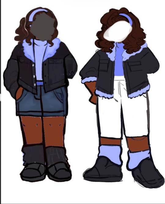
Winner Gijinka redesign! I like to think they swap between the skirt and pants depending on the challenge.
Uh I don’t know why I thought their old design was ever okay to bestow on human eyes!
Cut below the entire design process (it’s gonna be long)
So I knew immediately after finishing my Loser design I wanted Winner to be the opposite of Loser. Which ment no warm colors, no vest sleeveless thing, no sunglasses, esc. I wanted them to be 80s inspired to match my Loser’s 70s Inspiration! I wanted them to parallel Loser by being so different but the same at the same time. So I wanted to do alot.
I think very clearly with the first ever winner draft (on the right) I HAD NO IDEA WHAT I WAS DOING LOL. I really don’t like it now looking back and it really doesn’t feel like Winner to me. I think just to show how old this is, this was before I even made established age headcanons so I also had no idea how older I wanted Winner to be.
That age headcanon list will probably be shown at another time, I think I showed it once on instagram after somebody asked.
The one on the left I did right after I finished my Loser design and oh my god I also really hate it looking back. I had this idea that Winner’s hair could be the opposite of Loser’s hair where instead of being from like brown to blond and lighter blond it would be the opposite and oh it looked horrible to me.😭
I think also at this point Winner was still just black and not biracial
Now here are what I would call my “Stuck in design hell”. Characters I struggle with immensely when creating a design I think fits/I personally also like for them. It doesn’t mean I have no ideas, some of them I know exactly what I want to do with them but can’t figure out how to emulate it. I ended up abandoning Winner for awhile because they were giving me so many problems because I set so many restrictions for myself which weren’t exactly working.
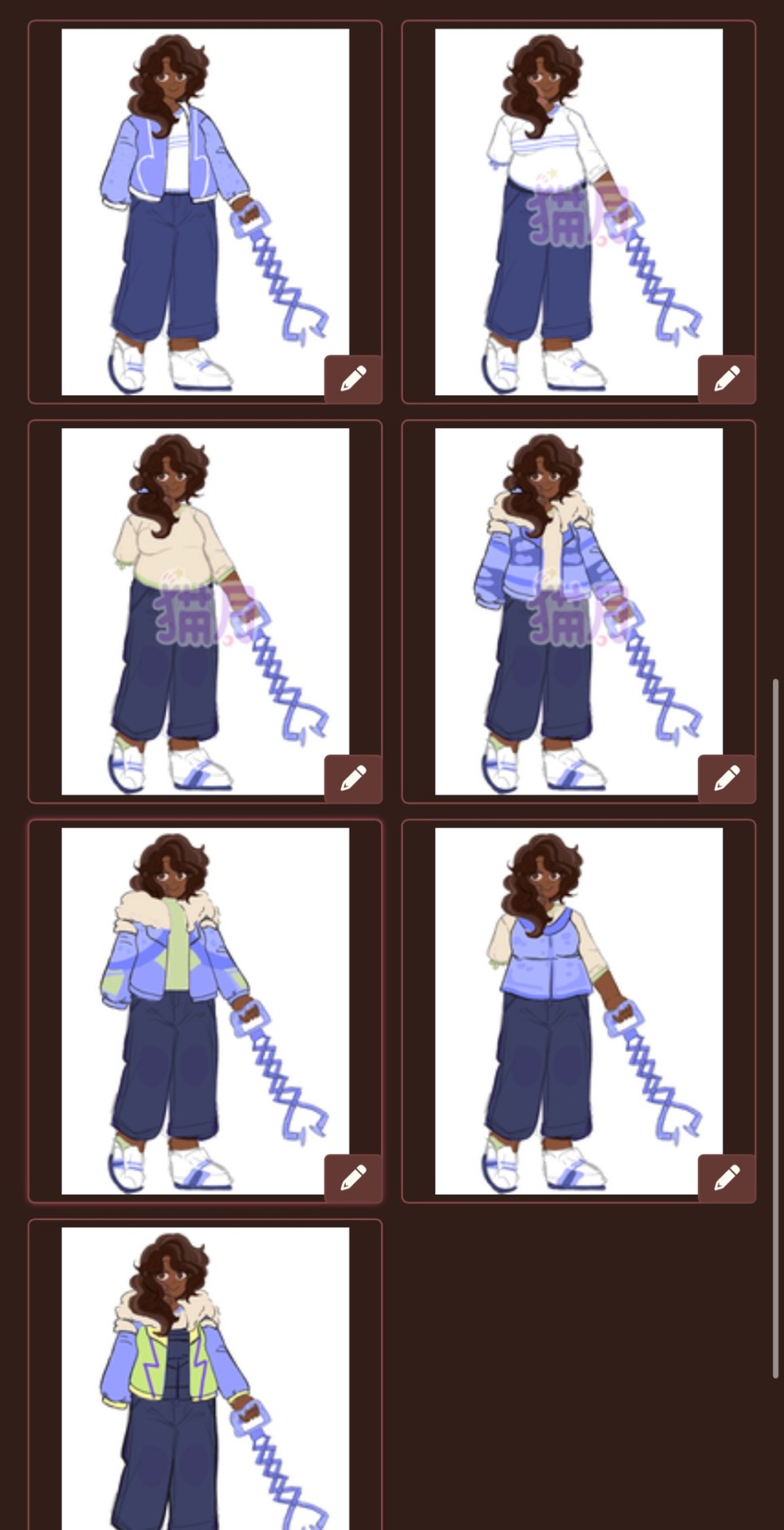
So then we got this.. I tried to force myself to finalize their design on the spot… bad idea.. worse idea I could ever fathom. I don’t like any of these designs and plus the way I draw now has changed since I made these designs. I had an idea that Winner’s arm could also be translated as one of those super cool arm grabber toys from the 80s which I don’t know, maybe I’ll bring back?? Depends on how I feel about it after focusing on writing more Winner central stories and exploring Winner more as a character and talking to people who really like Winner.
I should also note the inspo for Winner in the fluffy coat and overalls came from the fact that when I was in the movie theater, I saw a kid wearing black overalls and periwinkle jacket and went “HOLY SHIT WINNER TPOT.”
Somewhat unrelated but in this design Winner also became Biracial because @/exitstudent was like “Oh Winner feels afro-Latino to me” so I changed my headcanon almost immediately. This is why I probably shouldn’t have put my race hc chart out so early because my opinions get swayed so easily PLUS I changed a few things around. (Nothing to major, Snowball and Spongey are Wasian now, Donut is Dutch, put Bomby back in Blasian, Gaty is Finnish)
I also had the idea that instead of Winner having highlights (because I highly doubt Winner would go out of their way to highlight their hair) their greying really early on due to stress and poor genetics probably. Another cool parallel to Loser about how Loser’s hair is something he essentially paid for Winner in a way earned theirs. Loser also bleaching pretty much all their hair would also be a cool symbolism for how he’s not the truest to himself while Winner’s still having almost all their natural hair color is symbolism for them being way more true to themself. But that’s for another day to explore.
I tried to interpret Winner’s shape as being kind of like fuzzy fleece on their jacket and I tried to make this work so bad but I really shouldn’t have. I was just all over the place with the colors too.
After design a bunch of the other characters and finding and discovering new ways i like drawing i quickly figured out why I was hating Winner so badly.
It was everything 😭
So after actually after researching 80s fashion instead of half assing it to make it obvious. I drew up these two concepts.
My first realization was “Wow that fleece is ugly as shit.” So I realized I had to stop trying making the fleece work, kudos to anyone who can. But away from the negatives, I really did love the big black Jacket and the legwarmers (I am a sucker for leg warmers so once I put them in them, it was over for me) Something about the headband also struck me because previously I out a strict “no head accessories rule” but honestly? It really just had to be not sunglasses so the headband stayed.
With some color rework and some help from my qpp (Shout out to her, she doesn’t use social media.) We were finally able to get the current design shown!
I guess if I learned anything from this, people should make gijinkas also based off people they know and see in day to day life. Some of my favorite gijinkas are based off people I know. Like Match being an Afro-Chilean Jew is because my friend who actually introduced me to BFDI was a huge match fan, and an Afro-Chilean Jew so I was inspired to make Match look almost identical to them. With Winner I pulled inspiration from alot of popular Black celebrities in the 80s and Chile again because of said friend 80s.
Thanks for reading this whole kuffuffle here’s some bonus doodles!


Yes Winner is going to crush Loser and Clock, stop them.
The last winclock one may or may not be a reference to something.
Now who’s next? Honestly just whoever people want a ref of next, I think I’m a little burnt out from doing now 59 characters and drafting more currently I think I need a break. Although I’m definitely gonna redesign Clock’s outfit, I’m really starting to dislike it. Until next time bye bye!!
#bfb#bfdi#tpot#battle for dream island#battle for bfdi#battle for bfb#the power of two#my art#tpot winner#winner tpot#bfdi winner#winner bfdi#neps.pawprints#bfdi gijinka#gijinka#humanization
91 notes
·
View notes
Text
GOOD OMENS FAN ART BE LIKE…
- Historical portraits so good they make me cry (I love these)
- Very horny Korean and Japanese comics with a lot of “ngk”, fluids and screaming. It’s all very well drawn and all, but… Google translate is everyone’s friend. (All good, but it mostly doesn’t quite… feel like them? Don’t know how to explain it, and no - it’s not because it’s not Western, I’ve seen STUNNING GO anime/manga)
- Comics where Aziraphale kisses Crowley or gives him a scarf or something and he’s mean about it (I just don’t think Crowley would be mean about it)
- One of them is pregnant! The reason why varies, but in every single case, you better believe the non-pregnant one will 👉👌 the other one with their big, throbbing 🍆 (I’m not saying I LIKE these, but I’ve scrutinized every single one)
- Crowley crying, Aziraphale promising he won’t leave again (aww)
- Plant shop owner Crowley AU (cute!)
- Figure skating. How did we arrive here? (I love it)
- They are on a date and confess their love and there are a lot of hearts everywhere (these are my antidepressants)
- They are in the sofa, Aziraphale is reading and Crowley sleeps in his lap (for the love of all holy things, do not EVER stop drawing these!)
- Someone’s notebook filled with character studies and they’re all INSANELY GOOD (or very bad)
- Any excuse to draw a snake with 🍆🍆 (Again, not saying I like these, but… I’ve saved every single one on my phone)
- @undeadbetareads mentioned the angsty comics that rip our heart out and stomp us on it. You know, when Crowley is in chains and a fake Aziraphale is torturing him while telling him he’s nothing. (I love hurting myself, so I love these)
- @undeadbetareads also mentioned the silly situations comics, I think of when Aziraphale gets asked on a date and says yes not understanding what’s happening, and Crowley gets jealous or something. (I like these, but I don’t think Aziraphale is that naive, honestly)
- @my-wife-doesnt-approve mentioned stained glass/religious imagery of the ineffable husbands (I LOVE THESE SO MUCH)
- @my-wife-doesnt-approve also mentioned anatomically inaccurate pr0n - like, that opening isn’t there. Them being celestial beings deciding what their corporation looks like is not an excuse here. If you’re gonna draw 🍆 and 🐱, look at PICTURES. I won’t suggest looking at pr0n because so much shit happens behind the scenes and so many actors are underaged or high and so on but… There are ways to make it accurate. You can begin with drawing your own! Haha, but for real tho. It’s a good exercise for both artists and people who need to love their bodies more❤️
Did I forget anything?
#crowley#ineffable husbands#good omens fandom#aziraphale x crowley#good omens 2#crowley x aziraphale#ineffable spouses#innefable husbands#crowley edits#ineffable divorce#good omens fanart#good omens fan art#aziracrovember#aziraphale fanart#good omens aziraphale#aziracrow
115 notes
·
View notes
Text

caduceus lvl.20 redesign i did ages ago but forgot to post
copious amounts of design notes under the cut
tl;dr: my goal with this redesign was to create a coherent design consistent with his previous art, improved enough to hopefully read as lvl.20, but still practical enough to serve as actual adventuring clothes
okay anyways so watch how autistic i can be about caduceus
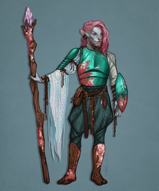
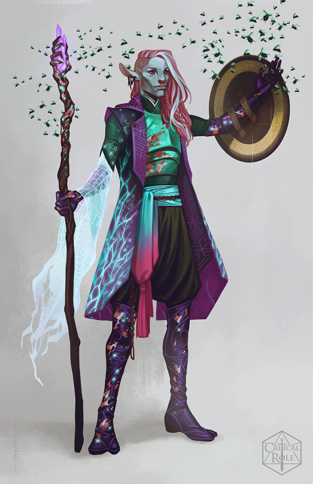
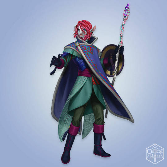
i wasn't satisfied with caduceus's lvl.20 design. i'm not entirely sure how that design happened. to be fair, critrole designs have never been consistent, but lvl.20 cad abandons nearly every key aspects of cad's design. it drives me batty
why is his hair so straight and pale and dead. why is he draped in so much brown. how do those wing-skirt things work. why does his staff... look like that. like its gonna explode into toothpicks at the first use. why is there honey. why is the gold of his shield so bright. what is the rope on his shoulders for
i mean, who knows what goes on in the critrole art development process. my personal theory is that they continue to design these characters as personal ocs and not as official characters in a huge multimedia franchise, and their personal choices trump all, design considerations be damned. like, i cant really judge. i have the privilege to make whatever choices i want when drawing. i answer to no one. i could tell taliesin jaffe to go fuck himself. yknow. if i wanted to die
regardless, i dont hate everything about the lvl.20 design. i appreciate that it brought back his swirl-patterned pants, but the entire core of his design is so busy with shit that it becomes a problem
i tried to preserve cad's key aspects as much as i could in my redesign, as well as incorporate aspects i enjoyed most from each design. for example, i really like the idea of the goliath beetle armour in lvl.20 cad, but i tinted the black shell towards blue to match cad's signature teal green.

I also tried to create a palette consistent with his previous designs. teal should always be his primary colour, with pink being the most prominent accent. after that, anything thats analogous to those two is gravy. for real, i am begging critrole to at least keep consistent palettes, because this is a problem for most of their designs
my choice to include the red cords is inspired by the winter cad design as well as one of fjord's earlier designs (side note: most of fjord's designs are pretty great; he's the most consistently on-par)
i enjoy drawing aesthetic parallels between connected characters. on that note, the swirly jade earring is a gift from beau :3 because they're fun earring buddies
speaking of cad's winter design, the design sheet showed a lot of asian influence (thats mostly covered by the cloak) and i will take any excuse to add asian influence to a design. the first two tunics below were my main reference for my own tunic choice
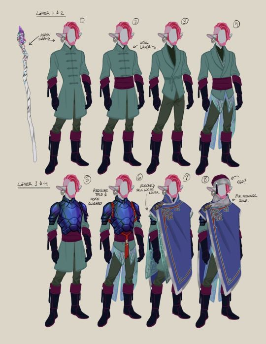
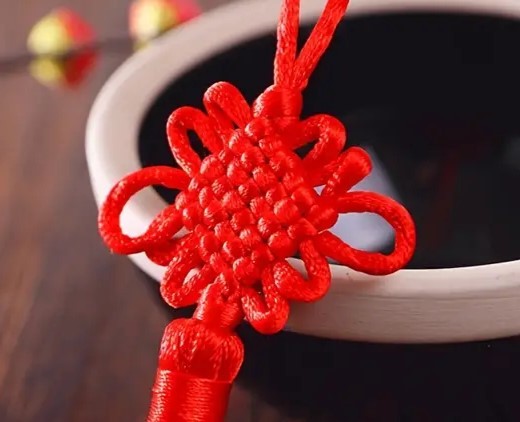
the knots on the cords are specifically chinese knot art. the largest knot at his waist is a plate knot which can symbolize the cyclical nature of life and death, and the knot on his cape is a brocade knot which can symbolize (re)unity. i thought these concepts were in-line with cad's general philosophy and the wildmother's teachings. also, the brocade knot acts as his holy symbol with a crook-shaped pin woven through the cord. i really fuck with holy symbols being integrated into a design rather than just slapped on somewhere
lightning round design notes:
the fraying woven material is witch hair moss, which i imagine could be made very soft and warm. this is my version of the neutral-coloured flynet cape in the fourth design
i brought back the iconic pink lichen
i simplied the staff again. my way of visually portraying a growth in power is that the one wooden hand has transformed into many hands grasping the crystal, which is also a representation of cad widening his social circle and of the nein in general
cad curly hair and beard so important to me
cad wide nose so important to me
final note:
the pose i chose for caduceus was very intentional. while cad looks great in a power pose, i feel like it doesnt suit his character. his power isnt so confrontational. his power is quiet and gentle and humble and inevitable. he doesnt need to show off. he's just chilling. i love this dumb silly man
and for the record, while i consider cad to be the worst lvl.20 design, jester is a guaranteed second place. very tempted to redesign her as well, because mature-but-frilly pirate lolita is right up my alley
23 notes
·
View notes
Text
I hate that people can easily find the stupid and shitty things I said and did over 5 years ago and jump to the conclusion that that's who I am, and there's no easy way for anyone to see all the efforts I've been making since then to NOT be that person. It's hard to find all my apologies and explanations because I didn't tag them all properly. I've tried time and time again to explain that I was mimicking the behavior bad adults gave me when I was growing up and that no one really called me out on that behavior until it was too late. I've tried to explain that since then I've been going through extensive therapy to separate bad learned behavior from who I want to actually be. There's so much more to this whole story than what one small chunk of the internet is making it out to be. People who actually know me know that this has been eating me up constantly and that I am always living in fear of losing everything to this drama.
especially since some of that info takes quotes out of context, jumps to conclusions that aren't true, or flat out lies about what certain artworks are depicting or meaning to convey (Like claiming a grown ass adult is a child even tho I have proof the character looks totally different as an adult than as a child, or claiming that a shock piece meant to make people reel back in horror was a fetish when it was not at all that)
It takes clips of things without the full picture and puts words in my mouth.
Here's a little something about how I used to talk about sore subjects: I would make a controversial sounding statement, but then I would explain myself in a way that would show the statement wasn't as bad as I was making it out to be. A lot of the time they just take that bad statement and paste it for the world to see, without giving any of that context of me explaining why I said that and why it's not what it sounds like.
I wish people were smart enough to spot cherry picking when they see it, but they just aren't. They'll see one sentence, and someone saying "look they're supporting this bad thing" and that's all they need to think that's what it is. People aren't smart enough to really ask questions and try to understand a situation, all they want is face value to tell them how to think and feel.
People aren't going to bother to listen to me because I'm "the bad guy" and I'll "say anything to cover my ass".
Listen, if I was really that horrible of a person, don't you think there would be more evidence out there that is very clear and blunt and not just making assumptions on what a thing means?
I'm never gonna sit here and say what I said and did wasn't wrong, it was, but it was not done because I was trying to be a terrible person or prey on anyone. It was because I was insanely misguided by someone who groomed me for 5 years since childhood and then abused me for another 3 in a really toxic relationship. And then I never got HELP for it, I never got therapy to cope with it, I never even realized until way later that 'holy shit this person was 7 years older than me and was taking advantage of me the whole time'. Like I knew they were abusive but adults being friends with children was so normalized in my head, and throughout my life many adults or older kids exposed me to things I shouldn't have been and it skewed in my head what was appropriate behavior or not. Or what was okay to draw or not. And a lot of my opinions were formed around this adult who convinced me things like loli/shota were fine as long as they were strictly made up, and he fed me a lot of nonsense about what does and doesn't make a predator to cover his own ass. I was seriously fucked up almost beyond repair for a long time.
I have a warning on my blog now that minors shouldn't be following me, I make it a point to not ever work with minors on projects or talk to a minor in any capacity beyond a fan to artist relationship. I understand now that it is my responsibility as a NSFW artist that I simply cannot have minors as friends. And being much older now I don't even want minors as friends anyway. When I was in my early 20s the age gap didn't feel as bad but I'm definitely feeling it now and I just don't want to deal with minors any more.
I'm not a danger to anyone, I'm not spewing apologetics for horrible people, I've been doing my best to be a much better and more informed person
And I have no easy way to prove any of it in a way that will matter
I'm only talking about this now because once again I was kicked out of something because someone found that old info and that was all it took. No one cares about my side of things.
And I don't know if this will ever go away
I don't know if I'll ever find any amount of comfortable success because I can't get rid of this shit and on the internet it doesn't matter how long ago you did something or how much you've changed, you did it and therefor you're bad forever.
I hate this shit so much.
15 notes
·
View notes
Note
Okay HI hello 👋👋
I saw ur art about Sun & Moon through a reblog and I am such a simp for those two omg so here's a rant :33
(Also if you're not comfy with this pls ignore this rant then, and I am so sry if that is the case!! Will stop immediately if you tell me to /srs)
-------------------------------------------------
CAN I JUST SAY I am sosososososo in love with your desgin for the dca cuz holy shit I have never seen anything hotter. O.O LIKEEE THE HUMANOID VERSION??!?!!?? UGH soooo goooodd 🥵🥵 I love the designs and the- the little EARRINGS as well?!??! Omg sooooo cutee aaaaaa 💞💞
and-and omigosh UR ART IS SO GOOD AS WELL!?!? I straight up just wanna munch it. I am eating ur art fr. In LOVE with ur artstyle it's so yummy 😍
Anywhoooo I also scrolled through your dca tag aND *GASP* ECLIPSE?????? 😍😍AND I?? WANNA??? BE ENVELOPED????? BY HIMM??? (I feel like mans would give THE BEST cuddles on the planet!!!)
HOLLLYYYY SHITTTT thE SIZEEEEEEE
Big tall omigoshhhhhhHHH M- my brain- my heart my- mY EVERYThIng is mELTING! ! ! ! ! Literally his size just does something to me I cannot comprehend why omigosh
(*lays in a puddle on the floor*)
I can imagine sosososo many different scenarios where that height could be used aaaaa >~< <333 ;P
-------------------------------------------------
Omg if you have any HCs (and *wanna* share, ofc.) about him (Or about Sun & Moon) I'd love to listen to you ramble about them??? <333
So curious about ur HCs & would absolutely love any crumbs about the dca ksskksskkdkdjdks ❤️😂
Uhm uhm first off, thank you so much I can't rlly put into words how sweet this is and I totally don't mind the rambles because me too. And also because its been YEARS since I last used Tumblr or did anything answering Ask is a bit tough for me.. MmMM
Although I don't have many HC at the moment.. I can however give you a little insight I have regarding my Human DCA :]
Moondrop (Moon) and Sundrop
- when I first designed Moon (after the game came out) he had a much wilder look to him, especially the face because I was really into the idea of him being simply insane hence the red.
- later when i got back to his design and adding colours I thought that it would be fun to make it Blue and white themed, which I actually didn't see a lot back then
- he wasn't supposed to look human even as a Humanoid, I liked to think that Sun & Moon simply had a renovated body. They are just as much Animatronics as they had always been, robotic parts and everything but with a bit of twist
- So then onto Sun.. the thing is its sad to say but I never explored much with Sun's design back then as much as I did with Moon, so I can't provide a good reference
- although I had a rough idea of how sun would look like I never quite liked the way I drew him, so he's always somewhat been stuck in this unfinished stage
- Then there was eclipse, who was my absolute FAVORITE at that time, I don't think I loved a character MORE THAN ECLIPSE EVER when I was drawing him out
- yes!! It was very much inspired by the 3D render shown here as the ref, though I did make some changes of my own to the design as well
- I had a lot in my head when I was drawing him, but the one thing that I loved most about this design still to thisq day is rhe face. The way I him to look back then was sort of a mix between my Sun and Moon designs, only leaning more towards Sun in colours and Moon in appearance with the crazed look in his eyes

The height was just a funny little thing I thought of, cuz imagine this giant fkn ahh robot just comes in here and picks you up 💀 god I would piss myself
Cough..
So in regards to the new design, I did kind of get rid of the animatronic feel to him that I had done with the DCA and his old design, all of them now look a whole lot more Human which is what I intended for
Eclipse has a few scars around his body; right forearm, left side of his torso that leads all the way up to his chest. Plus a bit of his face that is burnt which you can't exactly see because of the Black spots
Overall I like my newer designs quite a lot and has also changed a lot, this is probably the most insight you'll get out of me abt my art 😭😭 cuz I don't usually ramble this much otherwise
I might come up with some head canons at a later date, but they'll be fun thats for sure ;)
#rants n rambles#ruiis art#digital art#fnaf security breach#humanoid#moondrop#sundrop#eclipse#eclipse fnaf#fnaf daycare attendant#DCA
31 notes
·
View notes
Note
Im genuinely really disappointed in Kittycorn for the fact that despite kit's relatively large following, kittycorn has said NOTHING publically about palestine, despite having the power to lead a lot of people to a lot of resources.
“Kit doesn’t have much of an internet presence outside of Sparklecare!!!” Then explain to me why i see so many popular artists who barely share jackshit about their personal lives, not even their pronouns, and yet still reblog and share stuff about Palestine. Kittycorn has literally 0 excuse not to say *anything*.
I'm gonna be so real and say that I'm half-expecting Kittycorn to be like "oh i dont reblog anything about it cuz it makes me sad :-((("
kit could at least like. Draw the Sparklecare characters in support for Palestine. Kit could do the bare fucking minimum here.
Kittycorn has such a large following and a lot of power, whether kit likes it or not. I understand Kittycorn did not want this large following, nor does kit want more of it, but christ can you fucking do something?
I don't know why people aren't talking about this.
holy fucking shit youre right. ive noticed that too but i didnt wanna bring it up because i know that would make me seem "desperate" to "attack kit" or something but yeah. the ONLY thing ive seen kit do to raise awareness is post an announcement with the arab.org link in the comet caring club server. yknow the one that most fans DONT EVEN KNOW ABOUT since its closed off? yeah. no public statement or anything. no tags in any bios, no watermelon emoji, nothing. COMPLETE SILENCE on anything that isnt kits own comic. fucked up, especially since the sparklecare blog is without a doubt kits biggest platform.
there was this fanart of uni holding the palestinian flag and it was really accurate to the official artstyle, i thought it was official when i first saw it. and it had a shit ton of reblogs, including me on my main. i recognized so many names scrolling through the list. but wanna know who i DIDNT see? thats right, the official sparklecare blog. kits either ignoring it completely or actively dancing around the subject, which is NOT GOOD.
i am in no way trying to accuse kneeby or anyone on the sparklecare team of being a zionist, but i would definitely like to highlight the blatant ignorance the official blog has shown. this isnt the only time ive seen kneeby act this way, as kit also has #blm #acab in kits twitter bio but from what ive seen kits done absolutely nothing to actually raise awareness to said causes, which rubs me the wrong way since im black myself. however now kneebys completely avoiding doing anything, not even a hashtag anywhere. just a single announcement in a private discord.
and yes im putting fanart and au tags on this post, people need to notice this. do better.
#free palestine#free gaza#from the river to the sea palestine will be free#sparklecare hospital#sparklecare fanart#sparklecare uni#sparklecare barry#barruni#cometcare au#cometcare oc#cometcare fanart#.txt
19 notes
·
View notes
Text
tsb is on my mind today so im looking through a vid of the concept art and holy shit i forgot how good it is
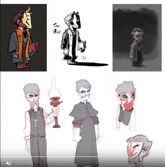
every version of lafcadio looks so done with my shit. im sorry if ive offended you sir i love you
that first one im choosing to accept as what he looked like when he was younger

the owl mask is SO good... full wise old man mode... im not sure what the concept behind that third one is, maybe a piece of glass or a chunk of post-fire rubble? and the middle one is just so fucking angy hes doing the arthur fist
also another instance of concept versions being SO long and spindly. it's a REALLY really fun art style but i am glad they all got a little chunkier, it really helps the readability from afar and the general cartoonishness of the style
concept art reggie is certainly something. his ass can NOT see

this version of clay is killing me who IS this man

oh fuck here he comes
trinity of course serving cunt in any form
her ass also cannot see but for reasons unrelated to outfit choices

godddd we couldve had a willow that kicked ass and took names.... she couldve LOOKED cool in addition to just BEING cool
also sad that she lost the curly hair
i think thats some kind of incense burner shes holding in some of these but for a second i DID think she just had a fucking gun
tequila im so happy with where you ended up you started out as a fucking nerd im sorry
beta grey also Could Not Fucking See and that long skinny version of him haunts me i forgot that existed
also he is in fact labeled "lightfingered locksmith" in this art which made me realize they took off the "ed" because of a character limit. it just wouldn't have fucking fit in the title card.
THERES MY BOY and he is looking BUSTED in that first image holy shit wheres the MEAT wheres the MUSCLE!!!!
that first mask is WILD i kinda love it the second one looks like a silly jack o lantern tho
i like to think lucas gave him a scary spooky mask because hes too nice to actually start shit. gotta max out this sap's intimidation.

love that aurum barely changed aside from mask design. they said first thought best thought and they were right. i love him so damn much

they gave him eye holes out of courtesy, very kind of them
also realizing i'm gonna have to draw this bitch's chair in the near future why did it have to be so intricateeeeee
motherfucker himself. i love the sketches in the corner he's a shitty little bird doing his shitty little jojo poses
glad he got the wing cape back too that is an ESSENTIAL part of the phoenix motif

god ellie is so fucking CUTE
interesting to see how titles changed as well, maybe she and lucas were originally just engaged and not married?
i love how many initial designs were just Long

the portraits are all so gooooood i love all these funny guys :)
13 notes
·
View notes
Text
I’m so sad I won’t be able to watch the Oscars until I’m home from my trip in the third week of March ☠️ the whole world would have seen I’m Just Ken by then and I’ll be left behind 😭😭
And it’s not just “wah im gonna miss a show” bc I don’t rly care about the show itself necessarily. This is my main F/O and I won’t be able to see him but other ppl will. I have felt so disconnected from Ken. I’ve gotten a handful of inbox messages where ppl say “oh i have him call ME his sweet girl now because of your comic” or ppl will tag my ship art with Ken as “oh that’s ME and Ken” and it hurts. I’ve said multiple times I’m not comfortable sharing F/Os but ppl just? Don’t care?? My self insert isn’t somebody for you to project onto, holy shit why is that so hard for some ppl to comprehend
Now when he calls me sweet girl in my fics/drawings I don’t feel anything anymore, I’ve tried making comics and I feel absolutely nothing from him, it doesn’t feel special anymore bc so many people keep self projecting onto my self insert as if she were an “x reader” experience. I’ve felt disconnected from Ken for a couple of weeks now and I’ve been trying so hard to feel good with him again but I can’t. I’m so numb. I don’t want to lose him and the fact that the self shippers who openly project onto my stuff will see him singing live, but I won’t, feels like another major step backwards away from him, if that makes sense. My ship with him doesn’t feel special anymore. I need these characters so badly, I don’t have anybody else if I don’t have my Ryan F/Os and I don’t want to go back to months ago when I had absolutely nothing to hold onto and I was fighting every day just to stay alive. I’ve had special interests completely ripped from me due to abuse and I can’t go back to feeling as bad as I did last year, I had never felt worse and I’m so scared of feeling that way again. I need my F/Os I need Ken and I’m so far away from him now I don’t feel his love for me anymore and it’s terrifying bc last year was the worst year of my entire life and I don’t want to go through my flashbacks and nightmares all by myself, I don’t want to go back to constantly planning my own demise when my trauma was so fresh and I had nothing to comfort me. I jolted awake from more ptsd nightmares today, which has been nearly an everyday ordeal for a year, and I wanted to think of Ken comforting me like I usually do but I didn’t have the heart to do so. I feel so unloved and replaceable the way ppl easily replace my S/I in all of my posts, I don’t believe he’d care for me anymore.
I keep having meltdowns bc the thought of losing F/Os all over again during a time when I’m STILL in such an unsafe situation shakes me up so bad and I don’t know how to solve this problem. I need him with me I need comfort from these characters but I don’t feel connected with them anymore bc I’ve associated them with a dozen other people. At this point I’m not really upset about missing Im Just Ken, im upset about the fact i just feel nothing whatsoever and watching that live could have helped a little but I won’t be able to access it until other people have already seen it, and it won’t feel special anymore. And my ship with him just in general doesn’t feel special anymore, none of them do, and I’m scared and devastated and I don’t know how to fix it
#vent#whatever I’ll just cry about it and delete this later#I don’t want to fucking hard block every self shipper who dumps their tags onto my posts but god. you just don’t do that!!!#it’s common courtesy!!! i can’t share f/os I’m fucking sorry I can’t bc then I’m gonna lose them!!!! and I lost *everything* last year#I can’t lose Ken too but I’m scared I already did#and I want to go offline but I can’t I have to do commissions 😭 because I’m broke asf I can’t afford groceries#I wanna rip my hair out#ppl who didnt follow me last year + didn’t see how bad I was doing May-July have no idea#‘I wanted to die I felt so bad I was unsafe and stalked’ is a fucking understatement and I lost F/Os who were so important to me#and the idea of losing Barbie/Ken scares me to death#I don’t want to go back to feeling as horrible as I was 7 months ago I can’t do it. i can’t do it but I feel him slipping from me#and I wouldn’t if ppl just!!! would stop!!!! tagging my OWN ART as their self ship!!! tagging my stuff as theirs!!!#putting ship tags all over my own posts that are personal to me my god please I’m so tired
11 notes
·
View notes
Text
Thinking about Odin and Magpie...
On some brainrot stuff again so I’m gonna ramble about the Arrow siblings.
A long while ago I saved a translation of the nordic runes in panel 1547, seen below;

I can’t recall who did the translation (whether it was from here or Reddit, so if someone knows I’ll add credits to them!) but it reads:
“I woke up this morning and realised that I could not remember the sound of her voice. Her laugh echoes in my head when I try hard enough to imagine it. But it's nothing more than an empty weightless reflection of reality teetering on the cusp of my memory and it only brings me pain to try and remember it. But my fear of forgetting her is much more powerful and so I must remember and end up at the same question of everybody in the universe. What did we do to deserve this. Why me?"
This, written in Odin’s notebook presumably, was shown directly after Moribund Malediction. There is a level of intense melancholy associated with this writing, exploring a sense of longing to remember those who are no longer with us. If Odin did write this, then there are two characters that this reflection piece could be referring to; either Magpie or Odin’s mother. I’m more inclined to believe it’s Odin’s mother in this sense, as it’s been a longer period of time since she’s been around versus Magpie’s disappearance about 2 and a half years prior to the main story.
Tragically, Odin is forgetting his mother.
It doesn’t help that Pedri (later in the story when Odin is unveiling his “tragic backstoryTM”) was shown to be tormenting Odin through the visage of his mother. Being shown so many illusions, and perhaps turning to the herbs he smokes as a way of deterring Pedri, it would make sense if Odin has begun to forget what his mother was actually like when he was younger. It seems like the only good memory or dream he has of her is from when he was born around Gildhaust and she was showing him around.
It would be really sad if Odin was forgetting Magpie too, but from the clearer shots of her in his memories I do doubt it.
Speaking of Magpie, I went back to check out some panels I knew existed (namely panels 1275-1277, which appear just after Ava is trapped in the Gate to Paradise machine.
Looking back on these...it has to be Magpie! The bow, the blue...it just makes sense!
The first image shows Magpie looking rather happy, holding the hand of a featureless figure. This is likely Magpie with her ‘inbisible friend’, as she told Odin when they were younger. The inclusion of a happy sun (I think it is one on the righthand side?) is interesting, given that Aedinfell hasn’t been with a proper sun for a long time.
The second image shows Magpie looking much more upset and crying, standing alongside two other girls of similar (if not exact) stature. This must be her sisters; Crow and Raven. As the youngest of the triplets, she often was given a lot of grief (in Odin’s words), so this drawing seems to exemplify that! It’s possible she was bullied by her sisters, or teased for being the youngest.
The third image is a bit more confusing in my opinion. There’s 6 vertical lines followed by a faceless girl. It doesn’t appear to be Magpie specifically, since the bow is missing, but it could always be her regardless. My first thought (which could be wrong) was that the lines plus the girl equal to seven, like the seven deadly sins that the Hosts are meant to portray. Ava = Wrath, Odin = Pride, Gil = Envy, Maggie = Lust, Erios = Greed(?) and then three others that have yet to be revealed. What if this signifies that Magpie is the last Host we’ll meet pertaining to these sins? Honestly she’s probably not, but it’d be pretty cool.
If anyone has thoughts on that last image I’d love to hear them.
Anyway, I guess the point of these rambles is that I think the Arrow siblings need a big hug and lots of blankets because holy shit this family is traumatised af, and definitely need the additional care and love that they missed out on getting when they were kids.
#ava's demon#avasdemon#odin arrow#magpie arrow#textpost#long post#kat's ramblings#ava's demon theory
47 notes
·
View notes
Text
Okay I’ve shouted them from the rooftops a few times but I want to make a conducive list so welcome to
June’s writing advice!!
You may be asking, “why are you qualified?” The answer is I’m not. Everyone writes and processes storylines differently. However, I did just graduate with my BA in English, I’ve been a writer for fourteen years, and I’ve been published ten times (and counting). This advice may not work for everyone and that’s okay but this is just a list of things that I’ve done that help me!
1. If you’re having writer’s block, you’ve probably gotten in your head about what an audience would think of your work. Take a break and think about what you think would be the most fun to write and write it. At the end of the day, the pride and joy you get from your craft is the most important.
2. No writing is ever wasted. Did you know gardeners will reuse rotten tomatoes in their compost to make their next batch of tomatoes taste/grow better? The new tomatoes wouldn’t be what they are without the old tomatoes. No “good” piece of writing can ever be what it is without the “bad” writing.
3. Adding onto that: if you wrote it down, it’s worth keeping! Create and keep a “graveyard” doc where all your cut/deleted writing can go. Even if it doesn’t make it into the final draft, it can always end up fitting somewhere else.
4. Everyone is on their own creative journey. Don’t be a dick. Be kind or shut up.
5. Working on multiple wips at the same time is actually great for preventing writer’s block! When you get stuck on one piece, you can always move to work on the other while your plot works itself out in the background. Write anything and everything you want.
6. In my personal opinion, using “said” or “asked” is not a bad thing. So often, we are taught to use other words like “shouted” “whispered” “clamored” “questioned” etc. However, I find that my brain gets taken out of what I’m reading if there’s too many uncommon verbs. Using a “whisper” or a “scream” is fine every once in a while, but normally, using “said” or “asks” is easier on people’s brains. So much so that you don’t even realize it when you’re reading until you’re looking for it!
7. Read your dialogue out loud to make sure it sounds natural. Sometimes you don’t realize how clunky a sentence is until you hear it!
8. Holy shit give your characters flaws. The best characters and plot lines that stick with people for years are the ones where not everything is black or white. People love to debate morals when it comes to characters. For example, one time I wrote an argument between two of my characters in an original work I’m still working on and my creative writing classmates got into a twenty-minute argument during workshop on who was right and who was wrong. When they finally asked me, I said, “they’re both wrong.” But didn’t give them a reason why. They hated and loved it lol. Give your readers something to debate.
9. Make it fun! Create a playlist, draw a storyboard, make a Pinterest board, make a list of people you would cast in the live-action version of your story. I like using Unreal Engine to create a 3D model for my characters to help me visualize them and be able to describe their facial expressions. Basically, do whatever it is that makes you a little more excited to write!
10. Know that it is no small feat to pull out the most divine pieces of yourself for the world to judge. Writing is one of the most intimate things I’ve ever had the opportunity to share and it’s changed my life. People want to hear what you have to say and they want to root for you and your characters. Create community. Support each other. Write whatever you want. Be kind. The world needs more kind writers like you.
#June’s words#writing advice#writing#writeblr#writers on tumblr#female writers#writer things#writers and poets#writerscommunity#queer writers#writing resources#writing resource#writing rambles#june screams on the internet
16 notes
·
View notes
Text


hi i realize i don't talk as much here as much as i do on twitter which. maybe i SHOULD talk here more because there are no character limits. okay so.
first image (aug 2022) i think was like. one of the first times i actually tried to reference and i had to trace bits of it and i didn't know HOW to reference. and i barely understood charlie as a character. did not understand how he would dress had not even settled on his tattoos. could not get the colors to look right so i think i like. put him at 90% opacity to make it work.
between that and the second one (sept 2023) not only has there been SO much character development (future version with a beard now exists. he has been electrocuted. he is now jacked. he is transgender.) but i have done so many anatomy sketches that i didn't have to reference at all. yes i still should / do / will but i didn't feel like i needed to just to get it done.
and i picked all the colors by hand i didn't use any layer modes. the shadows here are actually the base / local colors and the lighting is added in on top and i used actual color knowledge to do that. like how i learned that if you use a desaturated warm tone against a more saturated warm color, it makes the desaturated one look blue and that's how you get 'blue' light on warm colors without it looking weird.
i found a message from last year when i sent the first image as an example of how i "have clothing folds figured out in my style, maybe not realistically but they look good" and looking at the folds on that versus the new one is like...no i did not. i don't know why i thought that.
this obviously isn't like a 100% fair comparison since i didn't bother to shade the first one and i'm pretty sure i was experimenting with a different lineart brush / style (which is why i'm not commenting on that here) and i did actually redraw the chair image one-to-one already but. i was looking through charlie's gallery and this just stuck out to me like WOW. holy shit dude. jesus christ.
i will never ever ever get over how much just becoming deeply obsessed with a character makes you improve. to give you an idea he hit 69 images on toyhouse (lol nice) in october 2022. it is SEPTEMBER just under a year later and he is now at THREE HUNDRED SIXTY (360). I AM NOT JOKING. not all of those are by me but a lot of them are! i did studies SPECIFICALLY so i could draw him better. please note i had literally never done studies before and like i said did not know how to reference. i have never been so obsessed with a character before charlie and it's the best thing that ever could've happened to my art. AND me.
#art improvement#long post#stanley says stuff#stanley does art#charlie grimms#NOT TO MENTION my friends for#1. fueling the insanity making me bonkers over silver city and all the characters there#2. giving me art inspo!!! making me jealous of your art enough that it makes me want to do better!!!#please for the love of god if you want to get better at art 1. become obsessed with one character 2. MAKE SOME ARTIST FRIENDS ON GOD#literally tysm yall know who you are
11 notes
·
View notes
Text
prob gonna organize my posts with tags so things will be easier to find, ima call this one #macks talks because why not, but I need to rant about aiden. i said id use this app more so im gonna
thinking about this old trailer thing makes me sob so hard every single time i remember it. "My Mia. I left her." YOU DID NOTTTTTTTTTTT YOU WERE FIVE
aiden and his savior complex and how he blames HIMSELF when he was quite literally just a little kid. 5 years old. DO YOU KNOW HOW SMALL A 5 YEAR OLD IS??? AND WALTZ PUT SO MUCH ON HIS SHOULDERS WITH MIA. I could rant about Waltz too, geninunely I love him as a character but holy shit it's super fucked up when you think about sure, he cared for Aiden, but he used a kid to save his own, and not just Aiden, SEVERAL kids. he was so obsessed with curing Mia bro fr experimented on literal children to cure her and only to an extent the world, because to him Mia IS his world. Waltz was a father but he wasnt a good one. His love for Mia only ended up hurting not only her and Aiden, but HIMSELF as well. They are such a fucked up little found family and god I love them so much, their dynamic is heartbreaking in the best ways.
just realized this started off as a regular Aiden rant and then delved into all three of them LMFAO WHOOPS but not uncommon for me in the slightest. i have so many thoughts and headcanons because we got way too little of them considering how important both Waltz and Mia are to Aiden's character. Plus you'd think the literal antagonist would have more than 35 minutes of cut scenes but lol guess not. Desperately I need more of them, I know it's highly unlikely for dlc2 considering that part of Aiden's life is pretty much over. So I will make it MYSELF
I have need to draw both of my Mia aus and rant about them too. One of them is a wholesome she lives au, and her and Aiden are happy bc they deserve to be. And another is a very much NOT wholesome au where she's a villain, very much inspired by jinx arcane though in the way she acts rather than backstory fjjgjg. I'm basically stealing her and making her my oc bc she deserves so much better, I hate how we get so little of her, I will forever be salty she quite literally just exists for Aiden's character and DIES in the end. Like I'm fine with her dying because that ending hurt me so bad and I loved how broken it made me but?? the fact that they barely even gave her a personality. we know so little about her and she's supposed to be the protagonist's only reason to keep going. so yeah she deserves better.
at the same time tho, I don't think I'd change what we got. I absolutely adore being able to piece together the story ourselves because the way its told is lowkey confusing and there are things they don't exactly do a good job at explaining, but even with how messy the story can be I LOVE it because what they have is MY SHIT!!! I LOVE A DEPRESSED COCKY PROTAGONIST WITH TRAUMA. I LOVE A FOUND FAMILY. I LOVE THE ANGST. and i LOVE being able to take these characters and add onto them and give them more love because they deserve it.
anyway rant over i think. thanks for reading the word vomit if you did lmfao, literally was just a bit of a barely understandable rant fhhgjg
7 notes
·
View notes
Last Seen Blogs