#design review
Text

«Graphis» 16, Edited by Walter Herdeg, Graphis Press, Zürich, 1946 [Museum für Gestaltung Zürich. Design Reviewed, Bradford. typoswiss]. Cover: Walter Herdeg
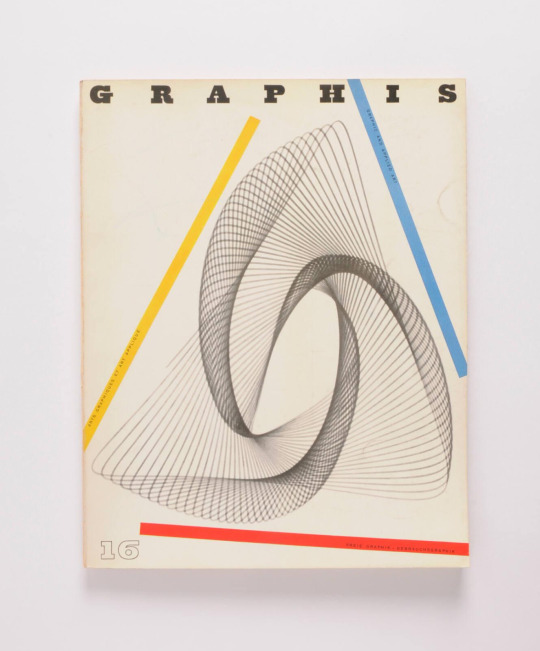
#graphic design#art#geometry#magazine#cover#magazine cover#graphis#walter herdeg#graphis press#museum für gestaltung zürich#design review#1940s
41 notes
·
View notes
Text
Ranking all sonic boom redesigns, worst to best
#5, knuckles
What good is there to say about him? He’s disproportionate looking, his shoes look weird, he has that improperly applied sports tape, his silhouette is horrible. I hate him.
#4, sonic
Key problem: brown. Brown literally muddies Sonic’s color scheme. That sleek RGB color scheme sonic usually has is so charming and characteristic and simple and beautiful, and it works well with neutrals that aren’t brown, but that stupid bandana right front and center ruins everything.
#3, Amy
I think she’s actually pretty solid! The dress looks pretty nice and like something she’d wear, I think making the pico pico hammer pink worked nice with it, the purple accents are cute, I like her shoes, she’s really good!
#2, Shadow
Yes, shadow was in boom. Specifically only the show I’m pretty sure. And he’s like the same other than his gloves and shoes, but they look kinda weird and a bit awkward to me so I’m putting him at 2.
#1, tails
All they did was give him goggles, different gloves that look like they’re protective rubber gloves which makes sense for him, and a tool belt. Well yeah he’s got that sports tape but I can live with it here. Really the only big changes were the goggles, gloves, and tool belt. And well.. he’s an inventor and he flies a plane. It’s pretty obvious and convenient accessories for him.
#sonic#sonic the hedgehog#sonic boom#knuckles the echidna#amy rose#shadow the hedgehog#miles tails prower#tails the fox#sonic boom designs#design review#character design
48 notes
·
View notes
Note
Still doing OC Reviews?
Here's one of my OCs!!
Her name is Alex and she's a Self Insert OC(in a "I wish that were me" type of way). I think she's also one of my oldest OCs as well(that I can remember). She ages up with me as well.
Here's some Picrews of her and a couple of screenshots from Fallout 4 and Skyrim:

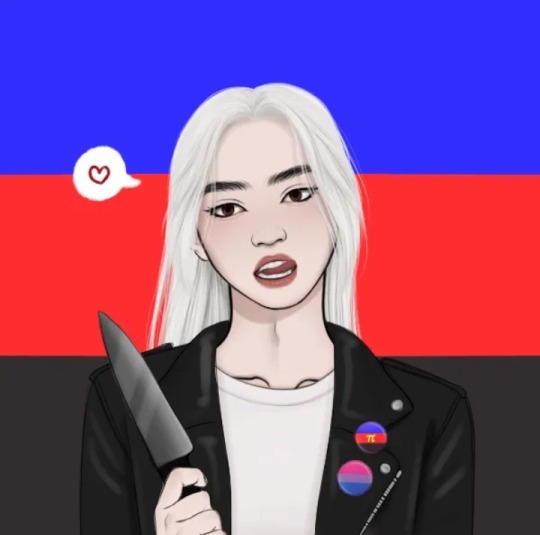


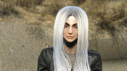

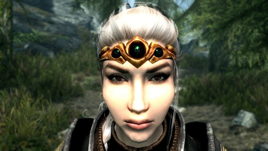
Her Refsheet.net: https://refsheet.net/DarlingLeech/SelfInsertOC
I'm gonna try picking these up and being a little gentler with the work standards I've set for myself so I can get back into the gist of everything!
I hope you're fine having a self insert reviewed? I obviously don't know you personally so I can't comment on any of that, I'll just look at the design on it's own so I hope that's alright with you. There's also the unfortunate limitations of picrews and such. Onto the actual text!
My first impression here is that she seems to have two versions and I'm assuming this is bc she's in two different storyverses, since you included video game screenshots. I wish you'd have included more explanation on that, since it's relevant to the review if a character has different versions! From what I'm seeing in details, I'm getting the impression she has differing personalities in these different universes (ofc to my knowledge the Skyrim and Fallout games take place in DRASTICALLY different settings).
The distinctions in hair styles and even colors between the two versions is a great aspect! I like that the hair, though staying blonde and long, is a more desaturated platinum in one version, while being braided and more warm blonde in the other. It's a good balance of consistency and difference.
(Disclaimer: This will have me doing alot of guesswork since there is no actual drawings of the character, please keep that in mind)
This might just be me but I'm having trouble figuring out what kind of person she's meant to be in the Skyrim(?) version. Some of the jewelry indicates higher status but she's clad in chainlink armor and such, so coupled with the other version having a leather jacket (and knives in the picrew), I'd guess she's meant to be a mercenary/ass kicking type? Assassin? Femme Fatale? Across both versions she clearly has some amount of "fancy" in one way or another, just not in the upper class style (I'd call her modern looking outfit fancy in the fashionable sense - leather jackets are stylish). However there's also some aspect of having an active lifestyle so she's not all focused on fashionability and I think you could probably play this up in the design - as far as I'm seeing, I'm really not getting a sense of who this character is in their story.
The design is nicely put together, however I think you could go for more storytelling details - like personal items (the Pride pins are a nice touch! However most picrews these days offer that as an option so I can't know if it's meant to be a full time part of her design), facial marks or perhaps makeup? Unfortunately I can't comment too much on this since these are limited to their mediums so I'm only getting a sense of the very core of her character; through what traits you've consistently added throughout all pictures.
If the picrews are anything to go by, I love that she has brown eyes! Not enough brown eyes (blonde or otherwise) in human designs imo :]
10 notes
·
View notes
Note
How can I improve my skills for my next interview process if companies won’t give me feedback on my design tests? I don’t want to say i should entitled to their time, but it’s really hard to process a rejection when they don’t even specify what went wrong. Do you have any advice for this situation or improving my design tests?
One large benefit to having a mentor is to help you through times when you find your skills plateauing - when you can tell that you aren't growing, but you aren't sure how to improve. In this situation, you can reach out to your mentor (or just other designers you trust) and ask them for design reviews. It's good to have others whose skill you recognize look over your work and give you constructive criticism. They can provide perspective you're lacking on your work - things that are unclear, things that they don't think are working, edge cases you may have missed, and so on and so forth.
It's important to learn how to parse and absorb this kind of critical feedback - it isn't necessarily about improving the specific design they are offering feedback on, but recognizing the principles at play so you can incorporate them into your approach toward new design problems. Improving the specific design is less important because it is unlikely you'll receive the exact same design test in the future. Learning how to approach design tests and the kind of things to consider is the important part.
If you don't have more senior developers to ask for reviews, you can always reach out on my [discord server] or to me directly via [twitter]. The discord server is a better overall bet - there are a good number of experienced professional developers there with a broad spectrum of game dev expertise who can provide insight and feedback, while reaching out to me directly just gets me. More perspectives is generally better - others will often see things you had not considered. Overall, remember that iron sharpens iron. If you can’t figure it out yourself and need feedback, you need to find a place to obtain that feedback. Do design reviews, preferably with experienced developers who can provide you direction on how to improve.
[Join us on Discord] and/or [Support us on Patreon]
Got a burning question you want answered?
Short questions: Ask a Game Dev on Twitter
Long questions: Ask a Game Dev on Tumblr
Frequent Questions: The FAQ
12 notes
·
View notes
Text
Trailer Breakdown!! Part One?
I'm really not sure how to feel about these two. neither of their designs really jump out to me.
It does seem kind of interesting that they seem to be very different in terms of one looking very modern and the other looking more long time ago. Is that going to be a difference between the two schools? That one wants to adopt modern ideas and practices and technology and the other wishes to remain close to their roots and never change? That could potentially be the driving conflict here, with both of them eventually resolving it in the end and compromising about still participating in their culture while also adopting new ways to make things easier.
Now, on to the designs. Let's start with the violet one first because it seems slightly more interesting to me.
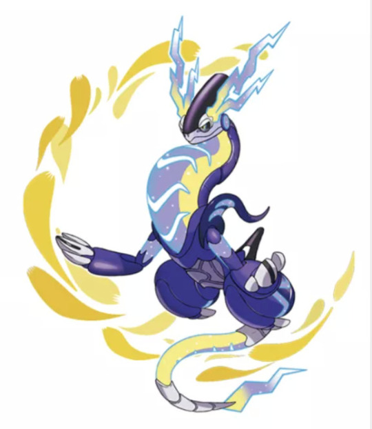
Well first of all, an electric typing seems inevitable. I actually really like this design from the waist up. It's just those jets?? on its legs?? that i'm not really a fan of. I love it's sleek form and I'm always a fan of arms in that shape with those claws. I think it's just a very fun set of proportions. The puff of the chest is kind of fun to me, looks a little silly but i like it. reminds me of a frog croaking. The face is really good. I love the shape of it and it's actually really cute. I also like the little lighting shaped thingys? on its head. They aren't my favorite part of the design but they aren't bad either. What i really enjoy are all the grooves on it that give it look that it's made of metal sections. And the way it appears to be made of metal with the electricity powering it being visible is always a fun design choice. Its stomach area seems like to me that it's glass or some other clear material with again that electricity powering it. I also love the tail. It's so sparkly and pretty and it's got a lil lightning bolt on the end! Also i just checked it's name! Miraidon! Which of course first reminds me of the Japanese word Mirai which translates to future. This seems to fit very well with it's futuristic design! And the -don on the end just seems to invoke the idea of a dinosaur or dragon to me. Which given its reptilian appearance makes sense.
And for the scarlet one, i'm not really sure where to start. It seems to have a lot of details on it.
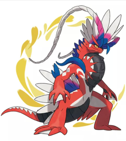
I do like the crest on its head a lot. The feathers? and long tendrils? seem fun and flow-y. I also really like its eye color, the piercing gold color is very fun. The spines running down its back also seem to make sense. I like the triangular pattern on its tail and the diamond shape on its arms. The webbed feet? I'm a little confused? Does he need to swim? Is it based on a real animal i'm not aware of? The feather looking bits on the top of the tail/bottom of the back also confuse me. They look a little awkward. But my two least favorite bits of the design would have to be the weird tentacle things on the shoulders and the thing on its chest. The tentacle things look shiny in a way the rest of the body doesn't and it seems to not mesh well with the rest of the design. As for the thing on its chest it lowkey looks like half a tire got hot glued to him. However, i just noticed the little swirly white design on its chest and i really like those. But back to the chest thing, both designs seem to have this on it and i'm wondering if it's based on an animal or mythological creature i'm not familiar with. Its name is Koraidon! while this doesn't stick out to me in any way other than the -don at the end again pointing towards them being especially close to each other lore wise. I will check if Korai means anything tho. Well apparently it's the plural of Kore which means "an archaic Greek statue of a young woman, standing and clothed in long loose robes." It can also mean early, untimely, or precocious in Hungarian. The definition of early would make the most since given its traditional/prehistoric look. But i'm not sure why one wuld have its name rooted in Japanese and the other in Hungarian unless its just the fact that mirai and korai sound similar.
Now, here's a question i have: why do they look so similar? Now i mean we know sets of legendaries can look similar and they often do. Obviously they are meant to relate to each other in some way just from the way pokemon games work. But what is that relation? Well very obviously they have almost the exact same shape. Just one looks more natural and the other looks more man made. I wonder if that goes back to the different factions having different ways of doing things. Is the more natural one the original legendary pokemon who looks over the area and the man made looking one actually made by the other faction in an attempt to achieve the same results? I mean, the series is no stranger to artificially created or edited pokemon.
Ok, this thing
It's clearly the electric mouse or "pikachu clone" for this generation. It's name is Pawmii and i think while it's cute it doesn't stand out in any way compared to the rest of the electric rodents. I do like its little face and chonky legs tho.
"In addition to the electric sacs in its cheeks, Pawmi has electricity-discharging organs on its forepaws. It generates electricity by rubbing its cheeks, then it shocks its opponents by touching them with the pads on its forepaws."
-The Official Website
So! It can give boops of death!
Now, the thing that seems to be killing most of the internet(myslef included)
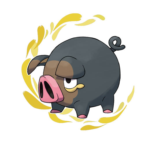
Lechonk! Fist up, I have to mention the name. It's perfect. Next, the design. It seems to be just a fairly general pig. Not my favorite pig design we have but i do love his nose and round body. His cartoon-ish proportions make for such a fun and silly look.
"Lechonk uses its sense of smell to find and eat only the most fragrant wild grasses and the richest Berries. As a result of its dining habits, it has come to radiate an aroma resembling herbs that bug Pokémon dislike."
-The Offical Website
I feel this little quirk of his is almost definitely based on irl pigs hunting for truffles. I also think this would make Lechonk a wonderful addition to any team meant for a chef character.
Now, This little thing
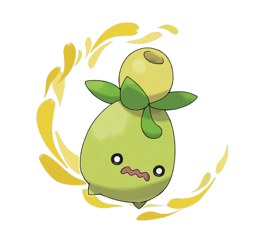
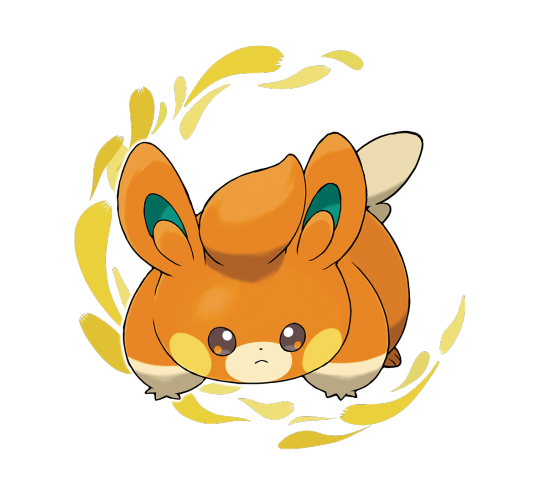
It is absolutely adorable! and i can't wait to see it's evolution. I love seeing what grass pokemon evolve into because so often they are based on a seed or sprout and it can be hard to tell what they will turn into. That being said, dose anyone know if Smoliv seems to be based on a particular seed or sprout? Also, can we talk about that name? First we had one with chonk in the name, now we have one with smol as well. And just look at it. It IS smol.
"The oil that comes out of its head has a very strong bitter taste, and it is not suitable for consumption. When startled or attacked, Smoliv will shoot this oil out, slowing its opponent down. It will then seize that moment to run away."
-Official Website
Well that also seems like it could be a clue towards what plant it's based on! It honestly looks a little like an olive to me just in color and shape, but i've never had olive oil plain?? So i can't really verify if it's bitter. Ah, I just realized its name is a play on olive. I must have been too excited to notice!
OK now the non pokemon designs! The professors are very obviously still continuing the theme of tradition vs technology.
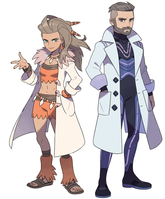
I mean just look at them. Also excuse me for a second but, AAAAAAA TWO PROFESSORS??? T W O? *ahem* I'm fine now.
First up the Scarlet one. I gotta say, i LOVE her hair and her whole look. She looks epic as heck. Ok just checked, her name is Sada, which just seems to roll off the tongue so well. Her outfit doesn't stand out as amazing to me to me but it also isn't bad either. I like her belt, necklace, and hair accessories. But other that that she seems pretty ok to me. I also like her mismatched bracelets. Her face and posture seem to indicate she is more outgoing, confident, and openly happy. I also adore her coat, like yes it's a lab coat which seems so modern and technological and against her design but the little details on it make it work so well.
Next the Violet professor, His outfit feels kind of lacking to me. I've never been a big fan of the futuristic skin tight suit thing and that's pretty much all he has going on. :/ I do like his coat tho. Also his name is Turo apparently. Which the first time i read it my brain autofilled it as Turrón. I like the name Turo less than Sada but i guess it isn't horrible. Just not my tastes. His stance and facial expressions seem to imply he will be more reserved, cold, and not express emotions in as open or extreme of a manner as Sada.
I love that while they both have lab coats on, they're personalized, the fur and tooth or stone clasps on hers and the triangular shaped buttons and more blocky shape to the coat are very fun. I also like that neither of them are exactly white in the art. They are tinged orange and purple respectively. That's less of a design and more of an art thing but i adore when ppl don't use actual white, it adds so much more color and vibe to the picture.
"Each is carrying out research into certain lore passed down in the region."
-Official Website
Ok, well that seems intriguing. So it's not exactly that they have different approaches to things as a tradition/new thing. If both things are lore "passed down" then it seems like both tradition and technology were passed down? Or i guess it could be that they both have the same lore they are working on it's just how they choose to use it that changes things, that would then continue my previous train of thought.
Now!! It seems like we've had our rival revealed!
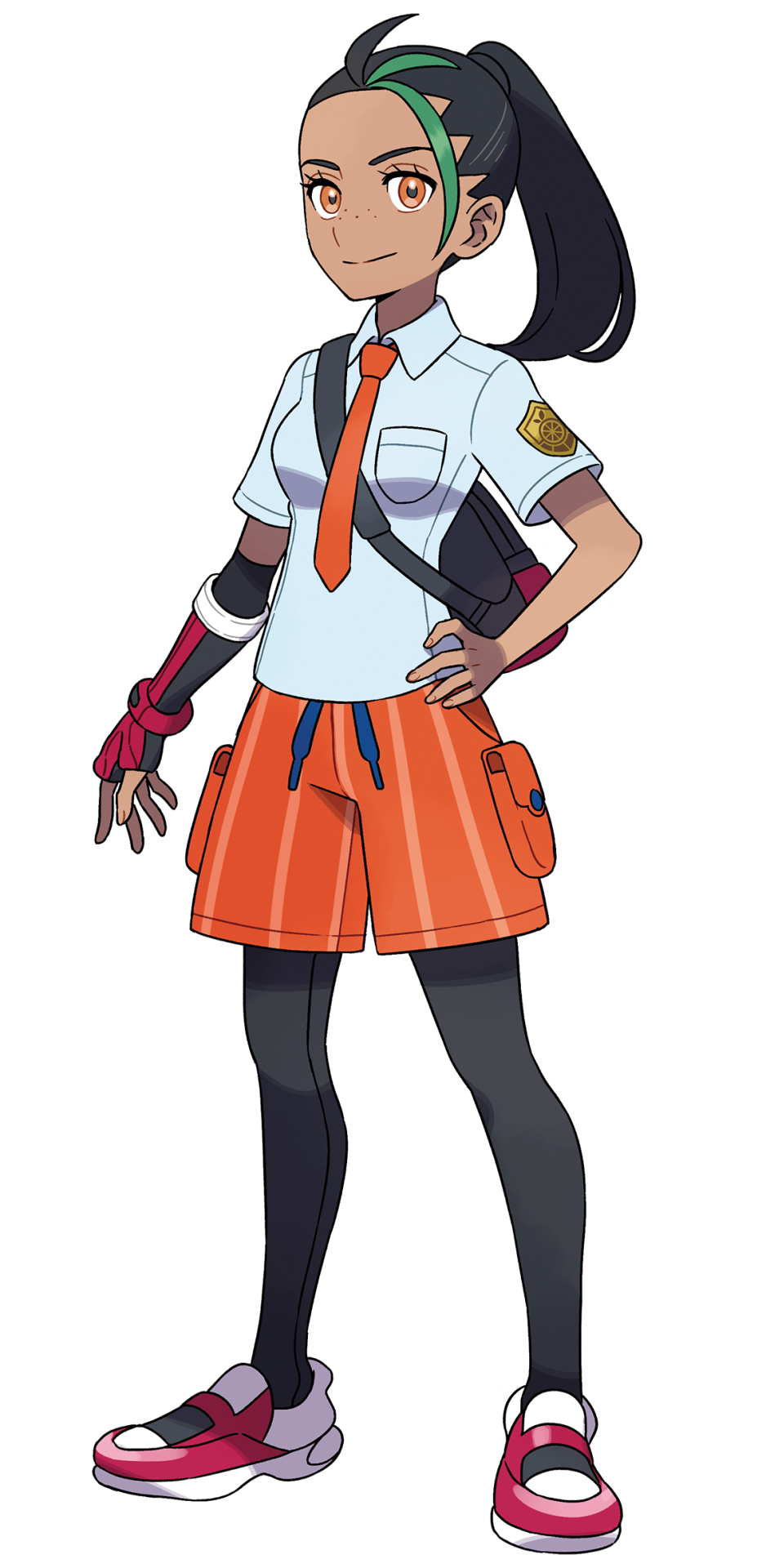
And! Her name is Nemona! Which seems very pretty to me! It also seems like her outfit is different depending on what version of the game you are in. I wonder if she will be a childhood friend who goes to the same school as you or if she's a rival from the other one? I also notice all her accessories that aren't part of her uniform seem to have their own style to them. Her glove, over the shoulder bag, and shoes are all black white and red with a distinct style to them. That makes it seem like that is more her style and if she were to pick her own outfit it would be more in that style. Which i think is great! As a character in a uniform it's important we can see her own style shine through! It may be even pointing towards her having an original outfit later on. I also love her freckles, they're so cute! Her eyes are a wonderful shade of amber and i like her hair and skin color. However, if her design has one negative for me it's the green in her hair. I love dyed hair don't get me wrong but the green with her accessories just reminds me of the stereotypical christmas colors. I've never really preferred green and red together and my personal distaste for christmas really makes it worse. But i'm pretty sure that's just a personal bias affecting it.
"Your friend, Nemona, has a sunny and energetic disposition, and she absolutely loves Pokémon battles. She’s an experienced Pokémon Trainer and serves as a reliable guide for you on your adventures. She has undisputed skill in battle—though it does also seem that she’s not the best at throwing Poké Balls."
-Official Website
So! She's a friend! This may mean she will be in the same school as the player. Or it could be that they are friends despite being in different schools. It also mentions her being an experienced trainer and she looks visibly older than the protagonist. This could place her as an upperclassman helping the player. She can also be seen saying "Are you these three's Trainer?"
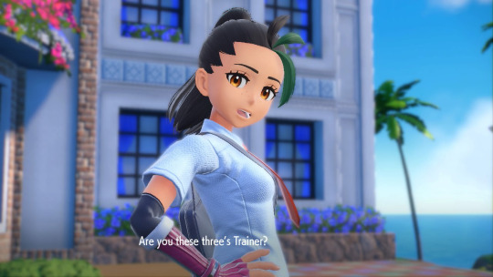
This implies she doesn't even know the players team at the beginning of the game. It could be that's when you first meet her or it's just that she's known the player for a while and since you get your first pokemon as of the start of the game she isn't aware of what your pokemon is yet.
"You can experience a new style of adventure, with a world that you’re free to explore at your leisure and not in an order dictated by the story. You will, of course, journey to hone your skills as a Pokémon Trainer, but many more discoveries and stories await you. Meet a variety of people and Pokémon, and adventure in the world of Pokémon the way you want to."
-From the Official Website
Soooo, i know this probably isn't new info, but i haven't been on there before as i haven't been that interested until this trailer came out. I find this very interesting. Especially the phrase "you’re free to explore at your leisure and not in an order dictated by the story" This is interesting because even though Legends Arceus seemed a lot more open then a standard pokemon game, i definitely wouldn't describe it as open world. You are still stuck in specific areas until you complete a certain part in the story and the constant need to travel back to town to move anywhere else is slightly inconveniencing. But this seems to imply that you can wander anywhere and at any time with no limits from story progression. That is just, perfect. It's pretty much exactly what i've been dreaming of since i was a kid. Just a chance to exist in the pokemon world and run around doing what i want. I also really hope they keep the side quests and minigames from Arceus. I'd love to be able to wander around populated towns and talk to people helping them in different ways. Perhaps even being able to do minigames at establishments in exchange for some money? I know i'm probably getting ahead of myself but man i've just got so many thoughts running through my head.
Anyway, last thoughts. This games looks like it's shaping up to be really fun! I'll probably do another post like this breaking down more of the trailer but for now let's wrap things up. I love the open world feel to it. What I'm really hoping for is the cities to behave just like the wilder areas in some aspects. I'd love to be able to catch pokemon like trubbish, pidove and other pokemon that seem like they would live in cities there!! And of course that leaves me with one final idea. IMAGINE A GEN V REMAKE WITH MECHANICS LIKE THAT!!! :D Unova was based on the USA so seeing the big cities in it full with pokemon everywhere inhabiting it would be SO!! Much!!! Fun!!
Small Note for anyone who actually read this far!: I've only ever played 3 mainline games and i've only ever beaten one! So if something i said doesn't make sense that may be why. I'm also WAY too excited to think correctly so uh... apologies if i'm being stupid. This was mostly just my personal thoughts i needed to put somewhere so i really didn't expect anyone to read all this?
#pokemon#pokemon violet#pokemon scarlet#pokemon trailer#scarlet violet trailer#sv trailer#trailer breakdown#design review#design breakdown#smolive#lechonk#pokemon professor#pokemon spoilers#pawmii#offtopicink
14 notes
·
View notes
Photo

Traditional Patio - Patio
Patio container garden - huge traditional courtyard concrete paver patio container garden idea with a roof extension
0 notes
Text
Traditional Patio - Container Garden

Huge elegant courtyard concrete paver patio container garden photo with no cover
0 notes
Video
youtube
2023 Topps Series 1 Baseball Card Design! 👀 FIRST LOOK and REVIEW!
0 notes
Text
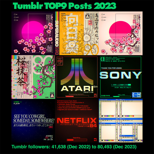


Here are my Top9 posts from 2023.
2023 was a weird year where Instagram desperately wanted to become Tiktok, Tiktok still did Tiktok best and now also is the better platform for artists to post image albums on. Twitter died and Tumblr continued its resurgence. If not for Tumblr doing so well I'd feel pretty bad about the year social media-wise. Art-wise though I'm very happy since I managed to significantly upgrade many of my old favorite designs (to use for merch and finally my own site) but also was able to push forward on new illustrations and test out many new series ideas. My goal for 2024 is to keep the momentum going, since there are a few other longterm plans I want to do. Thanks for following!
If you're curious you can see the last couple of years of Top9 posts here
#top9#best9#year in review#2023#art#digital art#art progress#top9of2023#best 9#vaporwave#cyberpunk#retrowave#photoshop#lofi#pop art#graphic art#neon#artists on tumblr#designers on tumblr#warakami
736 notes
·
View notes
Text
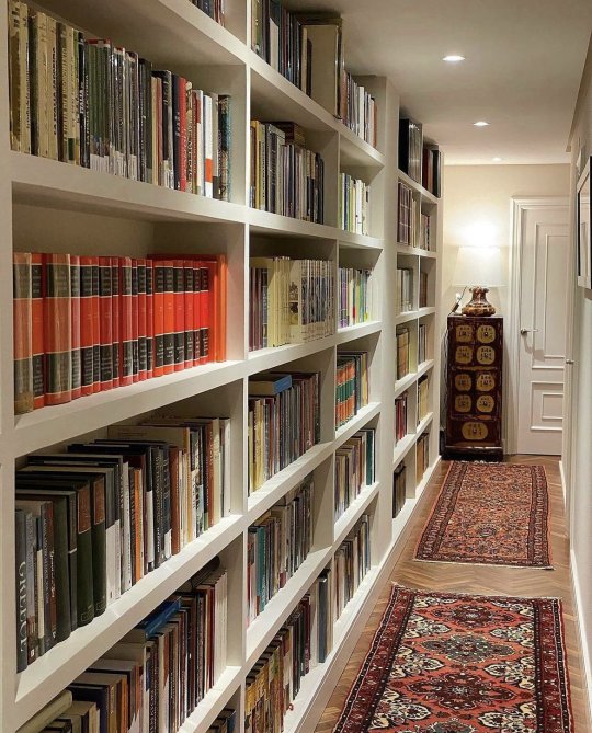

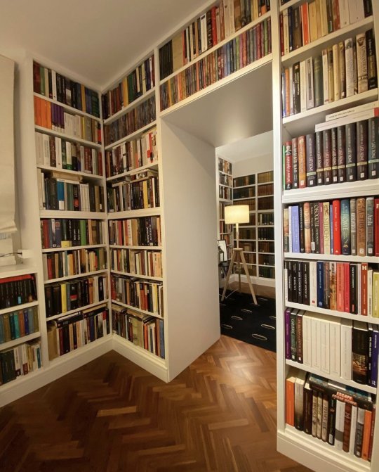
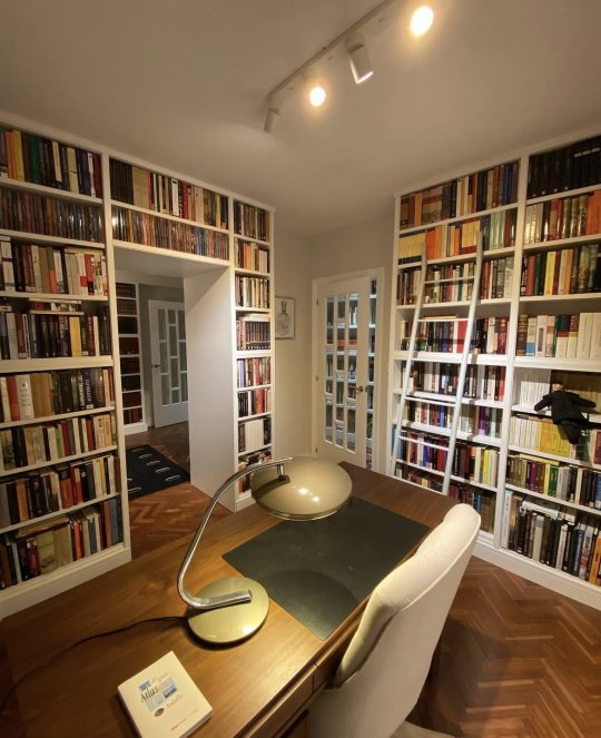
#new books#book review#book#book quotes#books#bookblr#books & libraries#reading#books and reading#booklover#readers#currently reading#long reads#book recommendations#public libraries#librarians#library#interior decorating#interior design#@nomadicspr
699 notes
·
View notes
Text
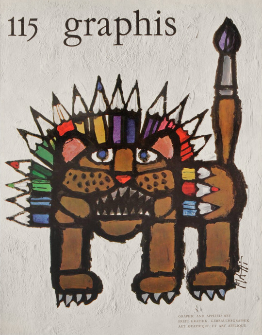
«Graphis» 115, Edited by Walter Herdeg, Graphis Press, Zürich, 1964 [Museum für Gestaltung Zürich. Design Reviewed, Bradford]. Cover: Celestino Piatti

#graphic design#art#illustration#magazine#cover#magazine cover#graphis#walter herdeg#celestino piatti#graphis press#museum für gestaltung zürich#design review#1960s
32 notes
·
View notes
Text
Hm... I'm feeling benevolent...

#every time i use the word 'benevolent' i remember that guy who called me 'sensei'???#because he asked me for a crit and i was basically like 'i really dont like your comic' but obviously constructively#and then he kept messaging me asking for more critique and i had to tell him to stop#and then he made a video review of my last comic and the whole review was like#'yeah so i havent really read this comic. looks pretty sick though. i basically harassed her and she had to say to stop lol'#anyways. that was weird. he used the word benevolent a lot so i always think of him. sending good vibes hope hes still making comics#oh yeah also this is kind of spoilers but not really#sorta like afterword stuff#gotta sketch gotta get into the mindset...#im not sure if that counts as spoilers at all lmfao its just minor design changes#anyways.#time and time again#spoilers#what the hell i typed 'spoilers' and '911 spoilers' was the first option??????#uh#adam and steve#ttawebcomic#sketches#sketch dump#these used to be patreon posts but its been like 5 months so. theyre free noe#the word 'benevolent' is literally an inside joke with myself now LOL
198 notes
·
View notes
Text
Two things I like about Quinns Quest: 1) his preference for vibes-based design over system talk, and 2) his recognition of the power of roleplaying games to play with real world themes and history. That segment on how the Wildsea might represent, in certain senses, a better world, or the segment on language and culture, represent conversations I long for most in our hobby.
180 notes
·
View notes
Text


QUICK haters are asleep, post MOUNDERS YAOI
#trafficblr#pearlescentmoon#mumbo jumbo#fanart#secret life smp#THIS IS YAOI TO ME. anyways im lowkey obsessed w them. in my design pearl's a vampire cuz mumbo bit her. maybeee bdubs too i still need#to review the footage o7 also kind of art spamming today I JUST DREW A LOT TODAY AND AM IMPATIENT LOL#mumbo x pearl#mumbo jumbo x pearlescentmoon#<- do they have a ship name ToT someone please tell me im dying out here
161 notes
·
View notes
Text
my Fincher magazine collection (so far)!!
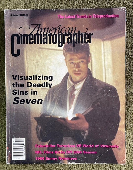

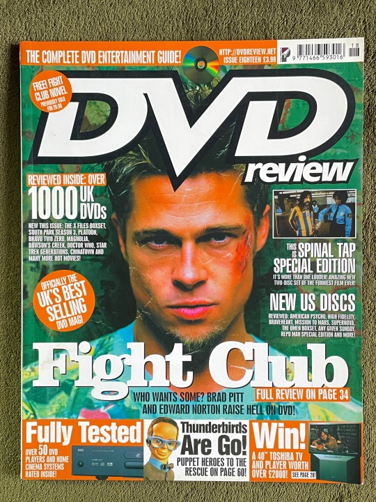


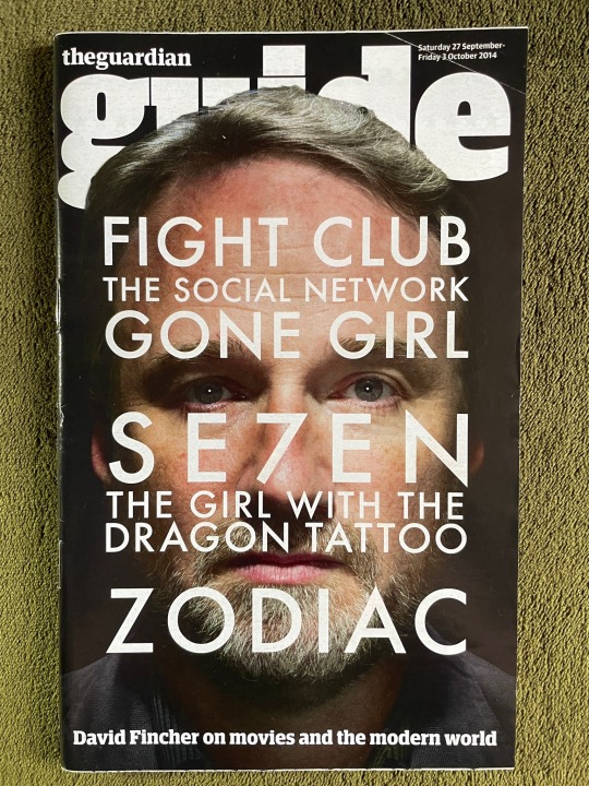

#people always seem to like my posts about my magazines so i thought i’d just show all of them#these are in order from oldest to newest#these are all from ebay btw apart from the killer one because i got that when it came out#my dvd review one is my fav just because i like the design and the colours and it’s also matte on the front#but the Empire for ‘the killer’ is really cool because it’s showcases all of Fincher’s films#and is written by my fav journalist who writes about Fincher Nev Pierce#(he also wrote the article for tgwtdt one)#if anyone wants to see any of these more in detail lmk!! the se7en one is fucking cool#david fincher#se7en#fight club#gone girl#the girl with the dragon tattoo#the killer movie#the killer#magazine
112 notes
·
View notes
Text
Recorded a little review of my monster sketchbook.
I think I showed them here before, but there's a little more now and it's better quality.
Would you guys like to see my other sketchbooks like this?
#art#sketches#sketchbook#sketchbook review#illustration#small artist#my art#creature design#monster#monster design
87 notes
·
View notes
Last Seen Blogs