#and more time writing tags
Text
I decided to go through my drafts and put lots of tags on them so I can queue them. After half an hour I decided that's enough for the day so I checked how many I did.
I. I got to 9.
Holy shit I'm slow
#Maybe I should spend less time looking at the art#and more time writing tags#but hnnng there's such good shit in my drafts!!!#people are talented!!!#I should still pick up the pace because I have 213 more to go through#oughhh that's so much#but there are things I wanted to comment on for MONTHS in there#half a year probably!!!#so#keep on trucking#I'll try to slap some 8 queued things on you guys daily#until I go through it all
5 notes
·
View notes
Text
Female characters who are the sole voice of reason <<<<<<< Female characters who think of themselves as the sole voice of reason but who are actually just as insane as those around them
#meryl stryfe#trigun meryl#trigun#trigun (1998)#I haven’t actually seen tristamp#but based on the gif sets and clips I’ve seen I think it’s still accurate#weiss schnee#yeah I’m a rwby fan so what#there are probably more examples but modern media is sooo bad at writing female characters that I can’t think of any#also old time media#all media is bad at writing female characters#anywho if anyone reblogs this can they put their fav insane lady blorbo in the tags
46K notes
·
View notes
Text
Mr. Fenton is a competent teacher. Almost too competent.
If Mr. Daniel Fenton had any more than a BS (with a minor in education), Tim would’ve flagged his profile as a potential Rogue. That’s the way of most charismatic academics, at least in Gotham. (Got a PhD? Instant watchlist.) Instead, he’s Gotham Academy’s newest celebrity, as a young, passionate, out-of-towner substitute while the chemistry teacher’s on maternity leave.
Tim gets the hype. Fenton seems to genuinely love teaching, and is invested in the welfare of the student body. He hands out bananas during exam week, hosts a “study habits seminar” each month to coach effective learning strategies, and the third time Tim falls asleep in his class, he even pulls Tim aside to ask if he’s doing okay. With all the late work he accepts and the protein bars he sneaks Tim, he’s every teen vigilante’s dream teacher. He could’ve been Tim’s favorite.
In fact, Mr. Fenton was Tim’s favorite. Up until Tim walks into Mr. Fenton’s chemistry classroom for a forgotten textbook, an hour after the final bell.
On the board where tallied scores for today’s review game had been kept, “THE CHEMISTRY BEHIND DR. CRANE’S FEAR GAS: ANXIOGENICS, NERI’S, & YOU,” is now scrawled. A detailed diagram of the human endocrine system projects in front of a small crowd of adoring and attentive students.
Fenton is wrist-deep in the skull cavity of an anatomical model. A short tug, and out pops the brain.
It’s plastic. It’s fake.
Tim identifies the nearest emergency exit.
Fenton turns to the door, and in the dark classroom with the projector illuminating half his face, his eyes almost seem to flash red. “What’s up, Tim?” he asks. His friendly grin is too big for his face. “I didn’t know you wanted to join the Just Science League!”
[OR: Danny’s a science teacher at Tim’s school. Gotham’s a pretty wild place, even for someone who grew up a superhero in a ghost-infested town, so he takes it upon himself to start a club teaching kids how to manage themselves in the event of a crisis. These Gothamites are pretty hardy, but a little extra training never hurt anybody! And he suspects one of his students might be a teen vigilante, like he’d been, back in the day. As a senior super, it's Danny’s duty look out for him! Surely, this is the subtlest and most appropriate way to give the kid pointers.]
[Tim immediately assumes supervillain.]
#Danny can’t help being creepy it’s just the way he’s built!!#I like to think Lancer did these things for Danny when he was in HS#and now Danny's emulating Lancer :)#Passing it on!#Tim is paranoid but also like he is SO CLOSE to graduating so like. Does he even want to report this shit to Batman. What if the next chem#teacher's a jerk and Tim fails the class and he never gets his stupid diploma. Bruce already is insisting he finish out HS and maybe get#an ABA before he's allowed back into the company#and Jesus Christ does Tim hate school. He'll worry about Mr. Fenton's burgeoning army of Science Honor Society Rogues on his own time#dcxdp#dpxdc#prompt#tim drake#danny fenton#in case I write more of this let’s tag it uhhhhh#misunderstood mentor au#kipwrite
6K notes
·
View notes
Text
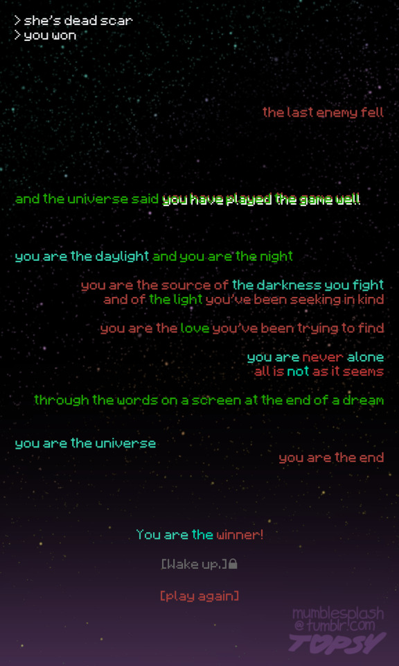
in honor of last season’s poem being called “”end poem”” (all quotes mandatory) this season i made one out of pieces of the actual end poem
#letting me just download the minecraft font? for free? a mistake#if you or a loved one have been suffering from RED TEXT you may be entitled to compensation#my art#god at this point i really do need a writing tag don’t i#<- will continue not addressing this#secret life#goodtimeswithscar#grian#secret life spoilers#sorry tumblr user livvi3love for not making one with all the deaths again#if you (or anyone) did want to illustrate this one as well you’re more than welcome to but i am not expecting anything#i can do an explainer thing again like i did last time but that is for tomorrow#right now i am just. very tired#but for now i will confirm yes the colors Matter#i literally made this on accident against my will#i was trying to DRAW
5K notes
·
View notes
Text
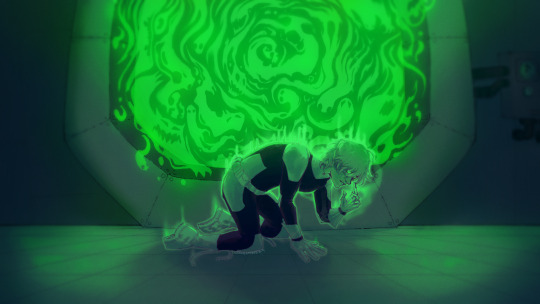

WHAT THE HELL IS LAB SAFETY!!
#my art#danny phantom#dp#danny fenton#danny phantom fanart#heheheh i have more time to do art now!!#reason: i went to therapy for work#tho im also writing my thesis so like dont set this as your standard for me lmao#anyways!! who wants to listen to my insane danny phantom analysis and hcs!!#eye strain#ask to tag!
3K notes
·
View notes
Text
i genuinely don't care how good a piece of ai generated art or writing looks on the surface. i don't care if it emulates brush strokes and metaphor in a way indistinguishable from those created by a person.
it is not the product of thoughtful creation. it offers no insights into the creator's life or viewpoint. it has no connection to a moment in time or a place or an attitude. it has no perspective. it has no value.
it's empty, it's hollow, and it exists only to generate clicks (and by extension, ad revenue.)
it's just another revolting symptom of the disease that is late stage capitalism, and it fucking sucks.
#''but i just want to use it to--'' don't care! it's shit! stop fucking feeding it!#if you need help generating ideas or jumping off points then join an artist or writer group online#talk to people#make connections#that's what art and writing is supposed to be about in the first place#i'm mad as hell etc.#so goddamn sick and tired of seeing ai shit get passed around on here#it's bad enough in general but every time i see more of it showing up#tagged as fan art or as fic#the angrier i get#heartfelt imperfection in art and writing will always ALWAYS be worth more than the most technically ''perfect'' ai generated image or text#fandom problems#ai generation algorithms die in a fire challenge 2k23#just a heads up that i'm muting this post and will no longer see responses to it#because i'm tired of seeing dogshit takes from jackasses who want to ''debate'' me#there's no debate you're in the wrong on literally every level and you can die mad about it
10K notes
·
View notes
Text
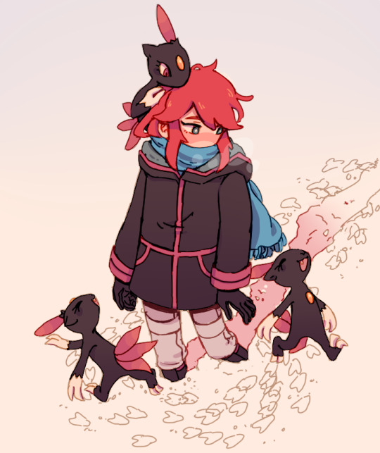
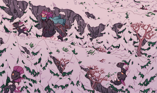
Travelling for Day 4 of SpeSilverWeek! going to Mt. Silver to visit "the extended family"...
#I might just have completely forgotten but we never properly got to see mr silver in the manga right?? a Tragedy it's my fav place#spesilverweek#pokespe#pokespe silver#pokemon#sneasel#my art#I only meant to do that second drawing but then I was feeling the art comfort so much I wanted more...#I wish they looked nicer together as a set but oh well#I might not have time for Day 5 now but I'll see dsfhkud#also everyone's been writing such nice tags the past days and I'm going all ;; over it thank you;;;; like so so much;;;;;;;;#I'm so excited to be back at it hell yeah !!!!
2K notes
·
View notes
Text
eight-episode seasons becoming the norm, shows being cancelled after their first or second season altogether, corporations not spending a single dollar to promote their renewed shows, corporations deciding to renew based on how many people binge it over and over and over again... this is the slow, choking death of media literacy.
#and that's not even TOUCHING the homophobia. I'm not calm enough to talk about that shit right now#warrior nun#also. because people are being annoying in the tags and replies. the death of media literacy as in:#showrunners aren't told in enough time that their show is going to be canceled so they either end with a cliffhanger or have to wrap#everything up in the next season so the writing is rushed#and when the writing is rushed then the morals will be skewed and people will misconstrue them even more and talk badly about the show and#then another show like it will get canceled. it's a vicious cycle#smokey speaks#1k#10k
13K notes
·
View notes
Text

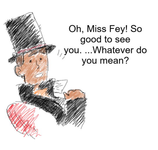
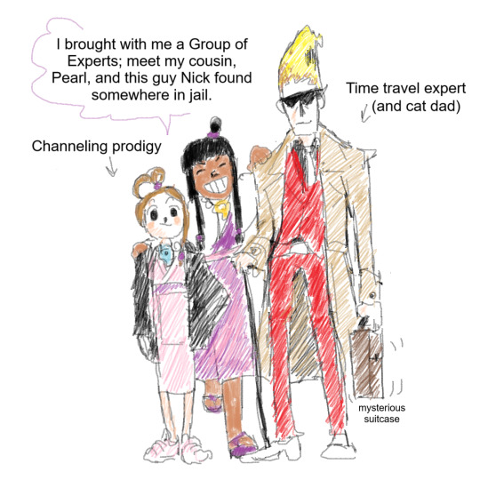
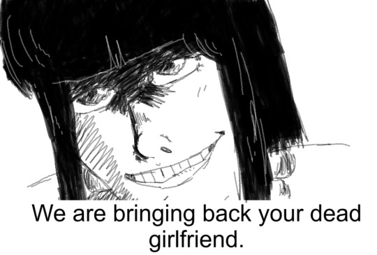
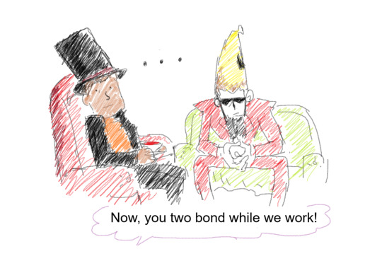
continuing that "maya tries to contact claire" post, i present you the post-Spirit of Justice follow-up
#post that caters to ME specifically#let me first tag#ghost trick spoilers#lost future spoilers#now that that's out of the way. you know who's on that suitcase ;)#also claire is fucked up by time travel shenanigans so it's possible let's just say#also ghost powers grow and change with time sooooo. let's play with canon#layton “i have a dead girlfriend” and yomiel “i had a dead girlfriend” bisexuals#also yes the whole gang traveled to london they're just strolling around#maya had unfinished business and now that she's more powerful she's BACK#this would take place 7-or-so years after lost future/plvspw so layton is in his mid-forties here. i had to look it so correct me if im not#also yes this is a crossover AU i have rotating in my mind i love the source material and layton's and claire whole thing no shade to that#powerful narrative that made me cry#but with aa and gt magic fuckery we have the technology#also about the jail bit. that's a fic i am writing (one sentence every month)#ghost trick#professor layton#ace attorney#my art#ms paint#GOD. that wall of text is surely something
794 notes
·
View notes
Text
I'm a Kai Winn apologist but not because I think she's a good person. She's a compelling tragic character
#Winn is a pawn of the prophets#they purposefully did not talk to her#even quark has an orb experience#but the Kai doesn't get one word#she is holding onto her faith by a string and the wormhole aliens put her in that position for their own gain#the prophets are like lol snip snip bitch#they put her through hell because they needed her to bring the reckoning with the pah wraiths#she's ambitious and calculating yeah but she also lived through the worst of the occupation#plenty of people come out of trauma with negative attributes#it doesn't excuse her behavior but maybe it explains some of it#she really does just want what's best for Bajor#through the worst of it she still believes#the prophets are more ambitious cold and calculating than Kai Winn is#her crisis of faith happens because she finally gets word from her gods that she has been loyal to all this time#and it ends up being the pah wraiths and she still struggles to turn to their side#she was written as a grating character and they write her so well#star trek deep space nine#before ds9 goes off my radar for 3 months#Kai Winn#meta#I could have written that as a cohesive post and not a tag essay...
559 notes
·
View notes
Text

i think you guys are onto smth..

i unironically got invested in this HELP
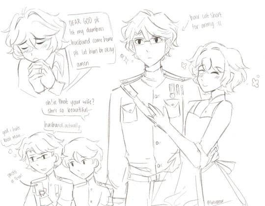
#WHERES THE FIC AT IF SOMEONE WRITES THIS I WILL PAY THEM A HUNDRED DOLLARS😭😭#kunikida serving the country while dazai's serving cunt😔#dazai was born to malewife but forced to manipulate and i think that's the greatest tragedy of bsd#anyway some facts i would like to share abt this au thay i came up w while drawing!!#takes place in 1939 (start of wwii) and there was a mandatory draft that required one male over eighteen from each house to serve#both of them are still twenty two and had been engaged for abt two years before getting married that year#newlyweds! unfortunately kuni had to go fight and they were seperated :(#before the war kunikida was a math teacher at the local high school and dazai obviously managed the household and didn't work#he's hopeless at cooking and meal prep even w recipie books so they either get those prepackaged meals or kuni makes dinner when he gets ba#so like when he's making lunch for kunikida he normally just packs a basic sandwich w raw fruit#kunikida always appreciates the effort even tho hes probably sick of having the same thing everyday but he won't complain abt it#when kunikida joined the army he was relieved that the mess hall had better food than dazai#he was the only one in his platoon that never complained abt the food so his fellow soldiers assumed it was bc he came from a tough bg#when in reality he was just used to being poisoned on a daily basis from his dumbass husbands cooking and was hardly fazed from army ration#they write to each other although its more dazai sending and kuni receiving bc hes off fighting and doesnt have time to write back#dazai talks abt life on the homefront and how he has to grow a victory garden (everything is DYING HE CANT EVEN RAISE TOMATOES)#and kuni writes abt his fellow soldiers and how the war is going and when he thinks he'll be home and how he misses sleeping in a bed#ANYWAY yea thought i'd share sry for infodumping in the tags again#this post is for like the four ppl that care abt this specific flavor of knkdz so hopefully this gets four notes at least#bungou stray dogs#bungo stray dogs#dazai osamu#osamu dazai#kunikida doppo#doppo kunikida#kunikidazai#knkdz#lotus draws#bro sry for posting at two in the morning i couldnt sleep until i got this out of my head they have infested my brain
1K notes
·
View notes
Text
why Aurora's art is genius
It's break for me, and I've been meaning to sit down and read the Aurora webcomic (https://comicaurora.com/, @comicaurora on Tumblr) for quite a bit. So I did that over the last few days.
And… y'know. I can't actually say "I should've read this earlier," because otherwise I would've been up at 2:30-3am when I had responsibilities in the morning and I couldn't have properly enjoyed it, but. Holy shit guys THIS COMIC.
I intended to just do a generalized "hello this is all the things I love about this story," and I wrote a paragraph or two about art style. …and then another. And another. And I realized I needed to actually reference things so I would stop being too vague. I was reading the comic on my tablet or phone, because I wanted to stay curled up in my chair, but I type at a big monitor and so I saw more details… aaaaaand it turned into its own giant-ass post.
SO. Enjoy a few thousand words of me nerding out about this insanely cool art style and how fucking gorgeous this comic is? (There are screenshots, I promise it isn't just a wall of text.) In my defense, I just spent two semesters in graphic design classes focusing on the Adobe Suite, so… I get to be a nerd about pretty things…???
All positive feedback btw! No downers here. <3
---
I cannot emphasize enough how much I love the beautiful, simple stylistic method of drawing characters and figures. It is absolutely stunning and effortless and utterly graceful—it is so hard to capture the sheer beauty and fluidity of the human form in such a fashion. Even a simple outline of a character feels dynamic! It's gorgeous!
Though I do have a love-hate relationship with this, because my artistic side looks at that lovely simplicity, goes "I CAN DO THAT!" and then I sit down and go to the paper and realize that no, in fact, I cannot do that yet, because that simplicity is born of a hell of a lot of practice and understanding of bodies and actually is really hard to do. It's a very developed style that only looks simple because the artist knows what they're doing. The human body is hard to pull off, and this comic does so beautifully and makes it look effortless.
Also: line weight line weight line weight. It's especially important in simplified shapes and figures like this, and hoo boy is it used excellently. It's especially apparent the newer the pages get—I love watching that improvement over time—but with simpler figures and lines, you get nice light lines to emphasize both smaller details, like in the draping of clothing and the curls of hair—which, hello, yes—and thicker lines to emphasize bigger and more important details and silhouettes. It's the sort of thing that's essential to most illustrations, but I wanted to make a note of it because it's so vital to this art style.
THE USE OF LAYER BLENDING MODES OH MY GODS. (...uhhh, apologies to the people who don't know what that means, it's a digital art program thing? This article explains it for beginners.)
Bear with me, I just finished my second Photoshop course, I spent months and months working on projects with this shit so I see the genius use of Screen and/or its siblings (of which there are many—if I say "Screen" here, assume I mean the entire umbrella of Screen blending modes and possibly Overlay) and go nuts, but seriously it's so clever and also fucking gorgeous:
Firstly: the use of screened-on sound effect words over an action? A "CRACK" written over a branch and then put on Screen in glowy green so that it's subtle enough that it doesn't disrupt the visual flow, but still sticks out enough to make itself heard? Little "scritches" that are transparent where they're laid on without outlines to emphasize the sound without disrupting the underlying image? FUCK YES. I haven't seen this done literally anywhere else—granted, I haven't read a massive amount of comics, but I've read enough—and it is so clever and I adore it. Examples:


Secondly: The beautiful lighting effects. The curling leaves, all the magic, the various glowing eyes, the fog, the way it's all so vividly colored but doesn't burn your eyeballs out—a balance that's way harder to achieve than you'd think—and the soft glows around them, eeeee it's so pretty so pretty SO PRETTY. Not sure if some of these are Outer/Inner Glow/Shadow layer effects or if it's entirely hand-drawn, but major kudos either way; I can see the beautiful use of blending modes and I SALUTE YOUR GENIUS.
I keep looking at some of this stuff and go "is that a layer effect or is it done by hand?" Because you can make some similar things with the Satin layer effect in Photoshop (I don't know if other programs have this? I'm gonna have to find out since I won't have access to PS for much longer ;-;) that resembles some of the swirly inner bits on some of the lit effects, but I'm not sure if it is that or not. Or you could mask over textures? There's... many ways to do it.
If done by hand: oh my gods the patience, how. If done with layer effects: really clever work that knows how to stop said effects from looking wonky, because ugh those things get temperamental. If done with a layer of texture that's been masked over: very, very good masking work. No matter the method, pretty shimmers and swirly bits inside the bigger pretty swirls!
Next: The way color contrast is used! I will never be over the glowy green-on-black Primordial Life vibes when Alinua gets dropped into that… unconscious space?? with Life, for example, and the sharp contrast of vines and crack and branches and leaves against pitch black is just visually stunning. The way the roots sink into the ground and the three-dimensional sensation of it is particularly badass here:

Friggin. How does this imply depth like that. HOW. IT'S SO FREAKING COOL.
A huge point here is also color language and use! Everybody has their own particular shade, generally matching their eyes, magic, and personality, and I adore how this is used to make it clear who's talking or who's doing an action. That was especially apparent to me with Dainix and Falst in the caves—their colors are both fairly warm, but quite distinct, and I love how this clarifies who's doing what in panels with a lot of action from both of them. There is a particular bit that stuck out to me, so I dug up the panels (see this page and the following one https://comicaurora.com/aurora/1-20-30/):

(Gods it looks even prettier now that I put it against a plain background. Also, appreciation to Falst for managing a bridal-carry midair, damn.)
The way that their colors MERGE here! And the immense attention to detail in doing so—Dainix is higher up than Falst is in the first panel, so Dainix's orange fades into Falst's orange at the base. The next panel has gold up top and orange on bottom; we can't really tell in that panel where each of them are, but that's carried over to the next panel—

—where we now see that Falst's position is raised above Dainix's due to the way he's carrying him. (Points for continuity!) And, of course, we see the little "huffs" flowing from orange to yellow over their heads (where Dainix's head is higher than Falst's) to merge the sound of their breathing, which is absurdly clever because it emphasizes to the viewer how we hear two sets of huffing overlaying each other, not one. Absolutely brilliant.
(A few other notes of appreciation to that panel: beautiful glows around them, the sparks, the jagged silhouette of the spider legs, the lovely colors that have no right to make the area around a spider corpse that pretty, the excellent texturing on the cave walls plus perspective, the way Falst's movements imply Dainix's hefty weight, the natural posing of the characters, their on-point expressions that convey exactly how fuckin terrifying everything is right now, the slight glows to their eyes, and also they're just handsome boys <3)
Next up: Rain!!!! So well done! It's subtle enough that it never ever disrupts the impact of the focal point, but evident enough you can tell! And more importantly: THE MIST OFF THE CHARACTERS. Rain does this irl, it has that little vapor that comes off you and makes that little misty effect that plays with lighting, it's so cool-looking and here it's used to such pretty effect!
One of the panel captions says something about it blurring out all the injuries on the characters but like THAT AIN'T TOO BIG OF A PROBLEM when it gets across the environmental vibes, and also that'd be how it would look in real life too so like… outside viewer's angle is the same as the characters', mostly? my point is: that's the environment!!! that's the vibes, that's the feel! It gets it across and it does so in the most pretty way possible!
And another thing re: rain, the use of it to establish perspective, particularly in panels like this—

—where we can tell we're looking down at Tynan due to the perspective on the rain and where it's pointing. Excellent. (Also, kudos for looking down and emphasizing how Tynan's losing his advantage—lovely use of visual storytelling.)
Additionally, the misting here:

We see it most heavily in the leftmost panel, where it's quite foggy as you would expect in a rainstorm, especially in an environment with a lot of heat, but it's also lightly powdered on in the following two panels and tends to follow light sources, which makes complete sense given how light bounces off particles in the air.
A major point of strength in these too is a thorough understanding of lighting, like rim lighting, the various hues and shades, and an intricate understanding of how light bounces off surfaces even when they're in shadow (we'll see a faint glow in spots where characters are half in shadow, but that's how it would work in real life, because of how light bounces around).
Bringing some of these points together: the fluidity of the lines in magic, and the way simple glowing lines are used to emphasize motion and the magic itself, is deeply clever. I'm basically pulling at random from panels and there's definitely even better examples, but here's one (see this page https://comicaurora.com/aurora/1-16-33/):

First panel, listed in numbers because these build on each other:
The tension of the lines in Tess's magic here. This works on a couple levels: first, the way she's holding her fists, as if she's pulling a rope taut.
The way there's one primary line, emphasizing the rope feeling, accompanied by smaller ones.
The additional lines starbursting around her hands, to indicate the energy crackling in her hands and how she's doing a good bit more than just holding it. (That combined with the fists suggests some tension to the magic, too.) Also the variations in brightness, a feature you'll find in actual lightning. :D Additional kudos for how the lightning sparks and breaks off the metal of the sword.
A handful of miscellaneous notes on the second panel:
The reflection of the flames in Erin's typically dark blue eyes (which bears a remarkable resemblance to Dainix, incidentally—almost a thematic sort of parallel given Erin's using the same magic Dainix specializes in?)
The flowing of fabric in the wind and associated variation in the lineart
The way Erin's tattoos interact with the fire he's pulling to his hand
The way the rain overlays some of the fainter areas of fire (attention! to! detail! hell yeah!)
I could go on. I won't because this is a lot of writing already.
Third panel gets paragraphs, not bullets:
Erin's giant-ass "FWOOM" of fire there, and the way the outline of the word is puffy-edged and gradated to feel almost three-dimensional, plus once again using Screen or a variation on it so that the stars show up in the background. All this against that stunning plume of fire, which ripples and sparks so gorgeously, and the ending "om" of the onomatopoeia is emphasized incredibly brightly against that, adding to the punch of it and making the plume feel even brighter.
Also, once again, rain helping establish perspective, especially in how it's very angular in the left side of the panel and then slowly becomes more like a point to the right to indicate it's falling directly down on the viewer. Add in the bright, beautiful glow effects, fainter but no less important black lines beneath them to emphasize the sky and smoke and the like, and the stunningly beautiful lighting and gradated glows surrounding Erin plus the lightning jagging up at him from below, and you get one hell of an impactful panel right there. (And there is definitely more in there I could break down, this is just a lot already.)
And in general: The colors in this? Incredible. The blues and purples and oranges and golds compliment so well, and it's all so rich.
Like, seriously, just throughout the whole comic, the use of gradients, blending modes, color balance and hues, all the things, all the things, it makes for the most beautiful effects and glows and such a rich environment. There's a very distinct style to this comic in its simplified backgrounds (which I recognize are done partly because it's way easier and also backgrounds are so time-consuming dear gods but lemme say this) and vivid, smoothly drawn characters; the simplicity lets them come to the front and gives room for those beautiful, richly saturated focal points, letting the stylized designs of the magic and characters shine. The use of distinct silhouettes is insanely good. Honestly, complex backgrounds might run the risk of making everything too visually busy in this case. It's just, augh, so GORGEOUS.
Another bit, take a look at this page (https://comicaurora.com/aurora/1-15-28/):

It's not quite as evident here as it is in the next page, but this one does some other fun things so I'm grabbing it. Points:
Once again, using different colors to represent different character actions. The "WHAM" of Kendal hitting the ground is caused by Dainix's force, so it's orange (and kudos for doubling the word over to add a shake effect). But we see blue layered underneath, which could be an environmental choice, but might also be because it's Kendal, whose color is blue.
And speaking off, take a look at the right-most panel on top, where Kendal grabs the spear: his motion is, again, illustrated in bright blue, versus the atmospheric screened-on orange lines that point toward him around the whole panel (I'm sure these have a name, I think they might be more of a manga thing though and the only experience I have in manga is reading a bit of Fullmetal Alchemist). Those lines emphasize the weight of the spear being shoved at him, and their color tells us Dainix is responsible for it.
One of my all-time favorite effects in this comic is the way cracks manifest across Dainix's body to represent when he starts to lose control; it is utterly gorgeous and wonderfully thematic. These are more evident in the page before and after this one, but you get a decent idea here. I love the way they glow softly, the way the fire juuuust flickers through at the start and then becomes more evident over time, and the cracks feel so realistic, like his skin is made of pottery. Additional points for how fire begins to creep into his hair.
A small detail that's generally consistent across the comic, but which I want to make note of here because you can see it pretty well: Kendal's eyes glow about the same as the jewel in his sword, mirroring his connection to said sword and calling back to how the jewel became Vash's eye temporarily and thus was once Kendal's eye. You can always see this connection (though there might be some spots where this also changes in a symbolic manner; I went through it quickly on the first time around, so I'll pay more attention when I inevitably reread this), where Kendal's always got that little shine of blue in his eyes the same as the jewel. It's a beautiful visual parallel that encourages the reader to subconsciously link them together, especially since the lines used to illustrate character movements typically mirror their eye color. It's an extension of Kendal.
Did I mention how ABSOLUTELY BEAUTIFUL the colors in this are?
Also, the mythological/legend-type scenes are illustrated in familiar style often used for that type of story, a simple and heavily symbolic two-dimensional cave-painting-like look. They are absolutely beautiful on many levels, employing simple, lovely gradients, slightly rougher and thicker lineart that is nonetheless smoothly beautiful, and working with clear silhouettes (a major strength of this art style, but also a strength in the comic overall). But in particular, I wanted to call attention to a particular thing (see this page https://comicaurora.com/aurora/1-12-4/):

The flowing symbolic lineart surrounding each character. This is actually quite consistent across characters—see also Life's typical lines and how they curl:

What's particularly interesting here is how these symbols are often similar, but not the same. Vash's lines are always smooth, clean curls, often playing off each other and echoing one another like ripples in a pond. You'd think they'd look too similar to Life's—but they don't. Life's curl like vines, and they remain connected; where one curve might echo another but exist entirely detached from each other in Vash's, Life's lines still remain wound together, because vines are continuous and don't float around. :P
Tahraim's are less continuous, often breaking up with significantly smaller bits and pieces floating around like—of course—sparks, and come to sharper points. These are also constants: we see the vines repeated over and over in Alinua's dreams of Life, and the echoing ripples of Vash are consistent wherever we encounter him. Kendal's dream of the ghost citizens of the city of Vash in the last few chapters is filled with these rippling, echoing patterns, to beautiful effect (https://comicaurora.com/aurora/1-20-14/):

They ripple and spiral, often in long, sinuous curves, with smooth elegance. It reminds me a great deal of images of space and sine waves and the like. This establishes a definite feel to these different characters and their magic. And the thing is, that's not something that had to be done—the colors are good at emphasizing who's who. But it was done, and it adds a whole other dimension to the story. Whenever you're in a deity's domain, you know whose it is no matter the color.
Regarding that shape language, I wanted to make another note, too—Vash is sometimes described as chaotic and doing what he likes, which is interesting to me, because smooth, elegant curves and the color blue aren't generally associated with chaos. So while Vash might behave like that on the surface, I'm guessing he's got a lot more going on underneath; he's probably much more intentional in his actions than you'd think at a glance, and he is certainly quite caring with his city. The other thing is that this suits Kendal perfectly. He's a paragon character; he is kind, virtuous, and self-sacrificing, and often we see him aiming to calm others and keep them safe. Blue is such a good color for him. There is… probably more to this, but I'm not deep enough in yet to say.
And here's the thing: I'm only scratching the surface. There is so much more here I'm not covering (color palettes! outfits! character design! environment! the deities! so much more!) and a lot more I can't cover, because I don't have the experience; this is me as a hobbyist artist who happened to take a couple design classes because I wanted to. The art style to this comic is so clever and creative and beautiful, though, I just had to go off about it. <3
...brownie points for getting all the way down here? Have a cookie.
#aurora comic#aurora webcomic#comicaurora#art analysis#...I hope those are the right tags???#new fandom new tagging practices to learn ig#much thanks for something to read while I try to rest my wrists. carpal tunnel BAD. (ignore that I wrote this I've got braces ok it's fine)#anyway! I HAVE. MANY MORE THOUGHTS. ON THE STORY ITSELF. THIS LOVELY STORY#also a collection of reactions to a chunk of the comic before I hit the point where I was too busy reading to write anything down#idk how to format those tho#...yeet them into one post...???#eh I usually don't go off this much these days but this seems like a smaller tight-knit fandom so... might as well help build it?#and I have a little more time thanks to break so#oh yes also shoutout to my insanely awesome professor for teaching me all the technical stuff from this he is LOVELY#made an incredibly complex program into something comprehensible <3#synapse talks
746 notes
·
View notes
Text
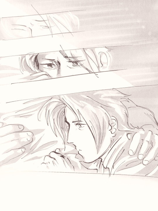
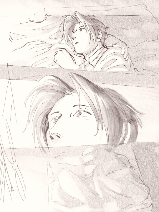

The sensation of waking up next to you ❤️💙
+bonus doodle:
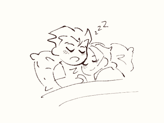
…and they mimir’d happily ever after the end. ❤️
(ID under cut!)
Miles is roused from sleep by sunlight shining on his face. Slowly, his eyes adjust to the light, until finally, his scope of awareness broadens to a body he had been sleeping on.
Page 2
Miles looks up to the figure that holds him, and upon seeing, his eyes widen in recognition.
Miles looks up to the figure that holds him, and upon seeing, his eyes widen in recognition.
The bottom panel of the page shows minimal details of a window shedding light onto the bed and blankets as seen from a higher view in the room.
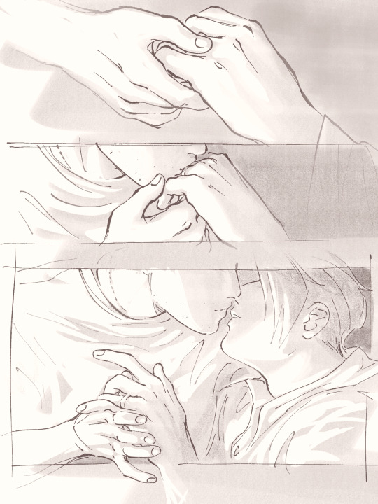
Page 3
On the other side of the bed, Phoenix rests, his head propped by the headboard. His hair is messy from sleep, and his expression is thoughtful. The light of the morning highlights his features.
The sun shines through the blinds of the window.
Phoenix finally notices his observer, and turns to look at him.
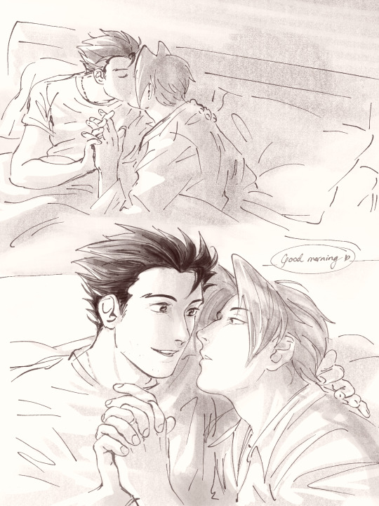
Page 4
Phoenix takes Miles’ hand in his, and lifts it to gently kiss the ring on Miles’ finger. They both move to share a kiss, and their hands shift to hold one another. Miles’ ring sparkles in the sunlight.
Page 5
They link their fingers as they kiss, and the morning creates a quiet atmosphere around them.
They part, but remain close, their fingers fully interlocked. Phoenix greets “Good morning,” with a tender, loving expression as he looks at Miles. Miles’ own expression is soft, unguarded, and fixed on Phoenix.
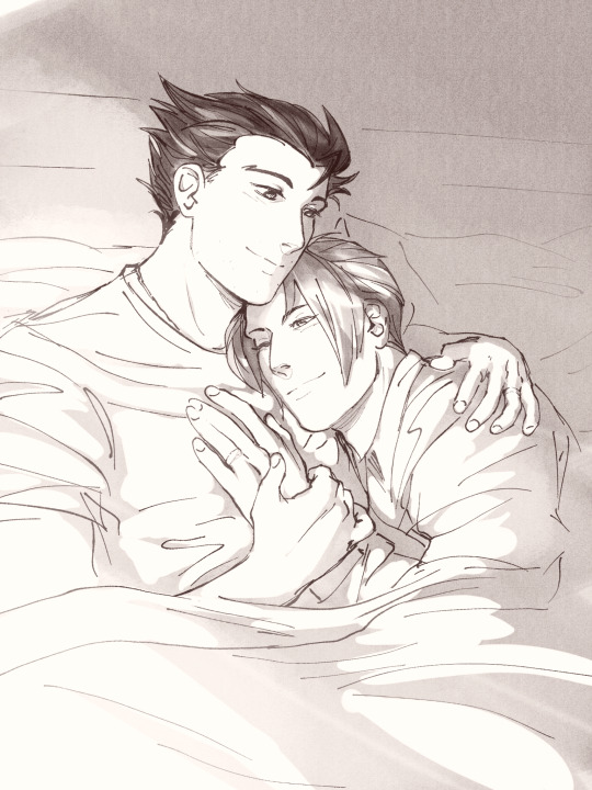
Page 6
Phoenix and Miles settle back into their shared bed; the morning sun illuminates them. They both smile softly, seeming happy and at peace. Miles rests his head under Phoenix’s neck, and his hand on Phoenix’s chest. One of Phoenix’s hands rests over Miles’ own on his chest, while his other hand holds Miles closer, revealing a matching ring of his own. Both rings shine softly in the sunlight.
Bonus image
A small simple drawing of Phoenix and Miles having fallen asleep again while holding each other as in the final page of the comic.
End ID.]
#narumitsu#wrightworth#phoenix wright#miles edgeworth#ace attorney#this is so sappy i nearly choked the entire time i was drawing it#aa#fan art#smooches#ah yes my favorite tag <3#rendevok#this is vaguely set post AA5 but i truly have no timeline in mind i just want them married#like ding DONG bitches get ur shit together aren’t u tired of pining??? it’s time to go apeshitt and furiously makeout#i’m going to start mashing them together like dolls i dont care anymore!!!#NRMTS KISS RIGHT NOW OR IM BITING BOTH OF YOU#(a win win situation for me)#anyway if you can’t tell i am deeply in love with phoenix and projecting onto miles so hard#who doesn’t love making him down horrendous for a little flavor?#image description and alt text are the same because i suck at those still#writing that out was deeply embarrassing for me bc for whatever reason writing it out is something WAY more visceral than drawing it#i wish to evaporate nobody look at me unless you want to talk about them kissiing more then my dms are open
5K notes
·
View notes
Text
the last time I made a post about a character type I really like it went well, so here's another one: I love a character who is a piece of shit loser.
Let me explain: a very specific kind of piece of shit loser. This is a character who is almost never (at least not at first) a major protagonist or a major villain. They might be a mercenary or thief or black-hat hacker or in some other sort of antisocial "bad guy" line of work. They are some sort of henchman, or at least have strong henchman energy: dangerous and/or talented in specific skills perhaps, but also, importantly, undeniably a loser. Their personality sucks. They're uncharismatic and unpleasant. The heroes interact with them only when they must-- and this character deliberately cranks up the cynicism around especially sunny or optimistic heroes. They know the world is a cold, hard place, and the only thing they trust is cold, hard cash (if they're even getting paid for this shit). Things like "hope" and "friendship" are for suckers.
Until... somehow, some incident or confrontation or compounding sequence of events puts a crack in their armor. It's a crack where the light can get in-- and also, alarmingly (to others and to them), shine out. It turns out this piece of shit loser had a little spark of goodness buried deep inside all along, and no matter how much they dig in their heels and insist they don't care, their conscience is steadily pulling them over to the "good" side, and it's winning. And the heroes know it, too: this character might still be a piece of shit loser, but now they're their piece of shit loser, and there's no going back.
#writing#characters#blorbo#catie talks#this character is also almost never a woman but when she is u bet she is my favorite even more#the last time i made a post like this the blorbos people tagged it with were really diverse and good#i hope that happens again this time i want to see who people's favorite shitty little guys are#psychic damage tags - this post is generalized but I did have some specific characters in mind while writing too#and one of them is absolutely Iago from Disney's Aladdin and its sequels
789 notes
·
View notes
Text

the star you've longed for
#PLEASE WATCH REVUE STARLIGHT!!!!!!💥💥💥💥💥#project sekai#revue starlight#pjsk#emu otori#nene kusanagi#emunene#prsk#proseka#yuri win. i make my fav pairing fight tothe death#HAPPY EMUNENE WEEK LOOOOOL#Can i be hinestni think this sucks it took way too long cause i forgot how to draw for a week#im seeing demons and stuff. i feel more normal now. Also you may recall emu has a big hammer for revstar#thats the bottom of it the gem thing all the weapons have hers is sharp#i remember seeing meta post abt how mahiru has a blunt weapon because she never actually aimed for the lead role#rather she only wanted to be by karen's side. so her weapon wasnt capable of cutting anything in the first place#Fastforward to the movie and well LOLLLLL#though i think its funny in the movie her mace is still mostly used for i timidation againstbhikari.. bc again shes not winning for a lead#revue starlight youre neat. maybe i like revstar.#<- has been insane for 4+ years#Needed their pose to be smth where nenes weapon isnt visible because I DONT KNOW WHAT WEAPON TO GIVE HER. OOMFS HELP. I NEED A NENE WEAPON.#i thought some sort of polearm/spear/halberd etc something with range but that can be ambitious#but i feel like smth with that much footwork needed doesnt suit her.. And she cant hsve a sniper i dont think thatwould fucking work#aruru gets pistols in the revue but aruru also is Ummm well shes uhhh. [screaming] [car crash]#throwing knives would be funny wouldnt it. Put that gamer aim to use#idk if the emunene week tag is on here but i'll donit anyways#emuneneweek2024#i remembered to switch which account this pists to for the first time in like 3 pists. so you get to see all my tags this time#rather than accidentally posting it to the wrong account and having to dekete and repost andngoing IM NOT WRITING ALL THAT AGAIN.
325 notes
·
View notes
Text

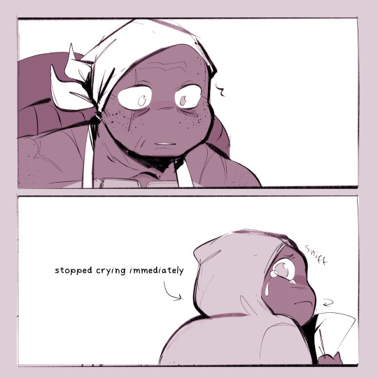
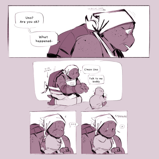
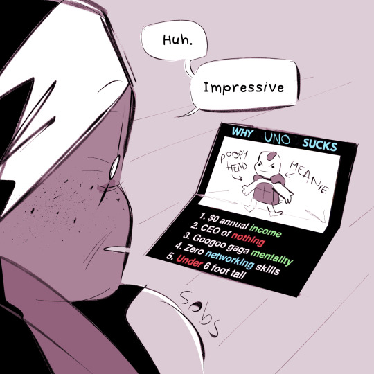
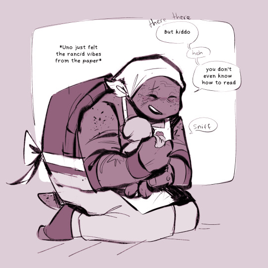
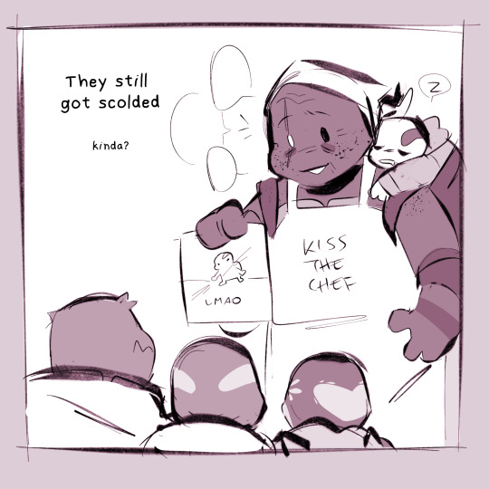
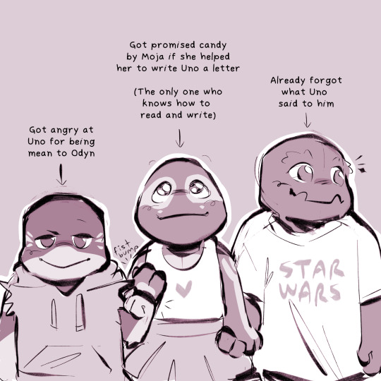
#i SWEAR i will answer the asks i got this just got into my brain and wouldnt leave lmao#yi knows your ip number#i was thinking in here they are around 3 years actually#we still got no canon knowledge on who is the eldest and who is the youngest but i headcanon it like#uno (oldest and will always let everyone know) odyn (second oldest and oldest middle child) moja (youngest middle child) yi (youngest)#yi isvery smart for her age!!!#she already reading and writing and dissing her brother look at her go!!!#im also not putting a read more on this one because the last time i did that so many people were yelling at me in the tags#to not put my stuff under read more#I LISTENED OK#HERE YOU GO#FORCES YOU TO LOOK AT MY SILLY STUFF#peepaw and babies au#tmnt#tmnt the last ronin#the last ronin lost years#tmnt uno#tmnt moja#tmnt yi#tmnt odyn#tmnt mikey#tmnt michelangelo#doodles#my art
2K notes
·
View notes
Last Seen Blogs

merakisphere
MERAKI SPHERE & Co.

dislosancfrontu
Jill

hyweluniverse
The Hywel Universe

waywardstation-reblogs
Now Boarding: Reblog Line!

rain-the-ghost
Devil Kitty Writes