#CSS Height and Width
Text
Learn Online CSS Design Fundamentals: Backgrounds, Borders, Margins, Padding, Height, Width & Box Model

In this blog post, we will delve into the essential aspects of CSS backgrounds, borders, margins, padding, height, width, and the box model. Whether you're a beginner or an experienced web developer, understanding and utilizing these CSS properties effectively can greatly enhance the visual appeal and layout of your webpages. Follow along as we explore each topic with concise explanations and practical examples.
CSS Backgrounds:
CSS backgrounds allow you to style the background of an element. Here's an overview of commonly used background properties:
a. background-color:
The "background-color" property sets the background color of an element. For example, to set a blue background color, use:
.element {
background-color: blue;
}
b. background-image:
With "background-image," you can specify an image as the background of an element. Let's say you have an image called "bg-image.jpg" in the same directory as your CSS file. To set it as the background image, use:
.element {
background-image: url("bg-image.jpg");
}
CSS Borders:
CSS borders enable you to add borders around elements. Here's an overview of relevant properties:
a. border-style:
The "border-style" property determines the style of the border. For example, to create a solid border, use:
.element {
border-style: solid;
}
b. border-color:
To set the color of the border, you can use the "border-color" property. For instance:
.element {
border-color: red;
}
CSS Margins:
CSS Margins allow you to control the space around elements. Here are the key properties to consider:
a. margin-top, margin-right, margin-bottom, margin-left:
You can set individual margin values for each side of an element. For example:
.element {
margin-top: 10px;
margin-right: 20px;
margin-bottom: 10px;
margin-left: 20px;
}
CSS Padding:
CSS Padding is the space between the content of an element and its borders. Consider the following property:
a. padding:
The "padding" property sets the padding for all four sides of an element. For instance:
.element {
padding: 15px;
}
CSS Height and Width:
Controlling the height and width of elements is crucial for achieving desired layouts. Here's what you need to know:
a. height:
To set the height of an element, use the "height" property. For example:
.element {
height: 200px;
}
b. width:
Similarly, the "width" property sets the width of an element. For instance:
.element {
width: 300px;
}
CSS Box Model:
Understanding the CSS box model is fundamental to layout design. It describes how elements are rendered on the page. Here's a brief overview:
The box model consists of four components: content, padding, border, and margin. When you set the width and height of an element, it applies to the content area. The padding adds space around the content, followed by the border, which surrounds both the content and padding. Finally, the margin creates space outside the border, separating it from other elements.
Consider the following example:
.element {
width: 200px;
height: 150px;
padding: 20px;
border: 2px solid black;
margin: 10px;
}
Conclusion:
In this blog post, we covered the fundamental aspects of CSS backgrounds, borders, margins, padding, height, and width. By mastering these properties, you can take your web design skills to the next level. Experiment with different combinations, explore advanced techniques, and create visually stunning webpages. Stay tuned for more informative content at webtutor.dev!
Don’t Miss to Read
Learn Online CSS Background
Learn Online CSS Margins
Learn Online CSS Padding
Learn Online CSS Box Model
#Free CSS Tutorial#Online CSS Tutorial#Online CSS Design Fundamentals#Learn Online CSS#CSS Backgrounds#background-color#background-image#CSS Borders#online CSS Borders#Learn CSS Borders#border-style#CSS Margins#Learn online CSS Margins#online CSS Margins#CSS Padding#Learn CSS Padding#Online CSS Padding#Free tutorial#CSS Padding free learn#CSS Height and Width#CSS Box Model#Learn CSS Box Model
0 notes
Text
As part of what turned yesterday into a six-hour cleanup & touch-up of my tumblr, I polished my character page (now with Inquisitors & Tavs!) & my page of my most commonly used tags. (I used this tool to generate the tag list.) Look at all those ladies! And Astarion! And one random male Hawke!
I've also added a pinned post that has most of the useful links from my sidebar, since my current theme makes those pretty inaccessible on mobile. Let me know if you see anything broken or anything that looks goofy! :D
#quark rambles#i know you probably can't tell how much work i did but SO MUCH#we got into html & css attributes fam!#float! align! 3px auto! max-width & max-height!#i finally fixed 99% that bug on my theme that cropped up after tumblr switched to the new post format#where the images had all the left sides cut off ever-so-slightly#noticeable to anyone else? NO!#noticeable to me? EVERY TIME#now fixed ahahahahahaha#flashbacks to lj theme editing and hoooooow much time i used to spend on customizing those. the good old days
22 notes
·
View notes
Text
css flex attribute my beloved
#im not working with it rn i just saw some of my old code that i never took out when i made the switch and oh god#the amount of calc( *highly convoluted polynomial calculating the padding and height/width of every item* ) is boggling#but instead its just 'display:flex; justify-content:center; align-content:center;' and theyre perfectly spaced even if you change their siz#css my beloved just as a general rule though#am i any closer to figuring out how to style the default music player? no. am i having a great time? yes#you dont care
0 notes
Text

Temperance: About Page #03 by @pneuma-themes
Be still, the dawn is breaking.
Live Preview / Get the code: [Pastebin] [Github]
A simple contained about page. An attempt was made to get out of my slump and back into the groove again before I got busy with real life again.
Features:
A social media links section with icons included
A custom links section. Depending on the width of your screen, you can add more than six links (as seen in the preview).
A short information section above the about body
A sidebar image. The size of the image (w x h) should be 30% of 80% of your screen width and the height should be 300px.
An unlimited space to write your biodata. Can be as long or as short as possible.
Javascript free, so it should be possible to use this page without asking for whitelist from the staff.
This is a page theme, so blog posts will not be displayed. Please install this through the Add new page link instead.
Customizable colors. Colors can be customized from :root section of the CSS.
Credits:
Sidebar image: @xathrid
Font: Rubik @ bunny.net
Icons: Boxicons
The code has been annotated for instructions on changing the icons and adding or removing the sections on the sidebar. Feel free to contact me if you find any difficulties!
Please like and reblog if you like or are using this!
#themehunter#theme hunter#completeresources#chaoticresources#dailyresources#*mine: page#*mine: all#*page: temperance
357 notes
·
View notes
Text
I learnt the 'vw' unit in CSS~!
% and rem/em units weren't working properly for the responsiveness so I search online for other units I could use and I came across vw and now I'm satisfied! Scales semi-smoothly~! 😏
Using vw means the font size is directly proportional to the width of the viewport.
You don't need to worry as much about setting breakpoints for different screen sizes. The font size adjusts automatically based on the viewport.
Hope this helps other people learning CSS and working on making their site responsive! I used the vw unit on the font-size, padding height and width of the elements! Might need to add it to the box-shadow property too? 🤔💭
#codeblr#coding#progblr#programming#studyblr#studying#computer science#tech#css#css tips#comp sci#programmer
83 notes
·
View notes
Text
ao3 dark minimal skin


dark, flat and spacious ao3 skin. made for myself so don’t look at messy CSS too closely.
1. log in and go HERE
2. click button "Create Site Skin"
3. name it whatever
4. copy/paste code from below in "CSS" field
5. "Submit"
6. make sure you clicked button "Use" HERE in the list of skins
CODE:
#outer .region, #footer .group, .post fieldset fieldset, fieldset fieldset {
background: none;
}
body, .group, .group .group, .region, .flash, fieldset, fieldset fieldset ul, form dl, textarea, #main .verbose legend, .verbose fieldset, .notice, ul.notes, input, textarea, table, th, td:hover, tr:hover, .symbol .question:hover, #modal, .ui-sortable li, .required .autocomplete, .autocomplete .notice, .system .intro, .comment_error, .kudos_error, div.dynamic, .dynamic form, #ui-datepicker-div, .ui-datepicker table {
background: #131517;
color: #eee;
border-color: #131517;
outline: #111;
box-shadow: none;
}
form .notice, form ul.notes {
box-shadow: none;
}
#workskin {
font-size: 1.2em;
margin: auto;
padding: 0 0.25em;
max-width: 60em;
overflow-x: auto;
overflow-y: hidden;
position: relative;
}
.actions a, .actions a:link, .action, .action:link, .actions input, input[type="submit"], button, .current, .actions label {
border-radius: 0;
}
#header ul.primary, #outer #footer, .toggled form {
background: #131517;
}
#header .primary {
background: none;
padding: 10px 0;
width: 100%;
box-shadow: none;
}
fieldset, form dl, fieldset dl dl, fieldset fieldset fieldset, fieldset fieldset dl dl, dd.hideme, form blockquote.userstuff {
background: #1a1c1e !important;
}
.user.navigation.actions>li {
margin-top: 0.3em!important;
}
#header .menu, #small_login {
border:1px solid #1f2126;
box-shadow: none;
padding: 0
}
.tags.group, .more.group {
margin-top: 0.6em;
}
#header .actions a:hover, #header .actions a:focus, #header .dropdown:hover a, #header .open a, #header .menu, #small_login, .group.listbox, fieldset fieldset.listbox, form blockquote.userstuff, input:focus, textarea:focus, li.relationships a, .group.listbox .index, .dashboard fieldset fieldset.listbox .index, #dashboard a:hover, th, #dashboard .secondary, .secondary, .thread .even, .system .tweet_list li, .ui-datepicker tr:hover {
background: #131517;
}
.userstuff p {
text-align: justify;
margin: 1.286em auto;
padding: 0;
line-height: 1.5;
}
.tags.commas {
margin: 1.5em auto;
}
.tweets {
display: none;
}
#header .dropdown .menu a:hover, #header .dropdown .menu a:focus, .splash .favorite li:nth-of-type(odd) a, .ui-datepicker td:hover, #tos_prompt .heading, #tos_prompt [disabled] {
background: #22262a;
}
#outer, .javascript, .statistics .index li:nth-of-type(even), #tos_prompt, .announcement input[type="submit"] {
background: #131517;
}
.filters .submit input {
border: 1px solid #131517;
background-color: #131517;
height: 110%;
margin: 1em 0;
min-height: 2.286em;
padding-left: 0;
padding-right: 0;
text-align: center;
white-space: normal;
}
#header ul.primary, #footer, #dashboard ul, dl.meta, .group.listbox, fieldset fieldset.listbox, #main li.blurb, form blockquote.userstuff, div.comment, li.comment, .toggled form, form dl dt, form.single fieldset, #inner .module .heading,
.bookmark .status span, .splash .news li, .filters .group dt.bookmarker {
border-color: #1a1c1e;
background: #1a1c1e;
}
.news, .readings {
display: none;
}
.work.navigation.actions {
width: 100%;
}
dl.meta {
border: none;
}
.splash .news li {
padding: 1em;
}
fieldset, form dl, fieldset dl dl, fieldset fieldset fieldset, fieldset fieldset dl dl, dd.hideme, form blockquote.userstuff {
padding: 1.643em;
}
li.blurb, fieldset, form dl {
border: none;
}
li.blurb, .blurb .blurb {
display: block;
position: relative;
clear: left;
padding: 1em 1.4em;
overflow: visible;
}
.logged-in .splash>.module {
width: 100% !important;
}
dl.meta {
max-width: 75em;
margin: auto;
clear: right;
padding: 2em 1.75em;
position: relative;
overflow: hidden;
}
.group.listbox, fieldset fieldset.listbox, #main li.blurb, .wrapper, #dashboard .secondary, .secondary, form blockquote.userstuff, .thread .comment, .toggled form {
box-shadow: none;
}
#dashboard .current, .actions a:active, #outer .current,a.current, .current a:visited, span.unread, .replied, span.claimed, dl.index dd, .own, .draft, .draft .unread, .child, .unwrangled, .unreviewed, .ui-sortable li:hover {
background: #131517;
border-color: #1f2126;
}
#greeting .menu {
right: 0;
border: 1px solid #1f2126;
box-shadow: none;
}
select {
background-color: #131517;
color: #fff;
border: 1px solid #131517;
min-height: 2.4em;
border-radius: 0;
}
input:focus, select:focus, textarea:focus {
background: #131517;
}
input,
textarea {
min-height: 1.8em;
box-shadow: none;
}
#footer a:hover, #footer a:focus, .autocomplete .dropdown ul li:hover, .autocomplete .dropdown li.selected, a.tag:hover, .listbox .heading a.tag:visited:hover, .symbol .question, .qtip-content {
background: #a7a7a7;
color: #111;
}
.splash .favorite li:nth-of-type(odd) a:hover, .splash .favorite li:nth-of-type(odd) a:focus {
background: #a7a7a7;
color: #111;
}
#header #greeting img, #header .heading a, #header .heading a:visited, #header .user a:hover, #header .user a:focus, #header fieldset, #header form, #header p, #dashboard a:hover, .actions a:hover, .actions input:hover, .delete a, span.delete, span.unread, .replied, span.claimed, .draggable, .droppable, span.requested, a.work, .blurb h4 a:link, .blurb h4 img, .splash .module h3, .splash .browse li a:before, .required, .error, .comment_error, .kudos_error, a.cloud7, a.cloud8, #tos_prompt .heading {
color: #a7a7a7;
}
#header .menu li {
border-bottom: 1px solid #2c2c2c;
margin: 0;
text-align: left;
}
#greeting .icon, #dashboard, #dashboard.own, .error, .comment_error, .kudos_error, .LV_invalid, .LV_invalid_field, input.LV_invalid_field:hover, input.LV_invalid_field:active, textarea.LV_invalid_field:hover, textarea.LV_invalid_field:active, .qtip-content {
border-color: #131517;
}
#dashboard.own {
border: none;
}
form.filters dl {
margin-left: 0;
margin-right: 0;
}
.filters .expander:focus {
outline: none;
}
.filters .expander {
padding: 0.45em 0 0.45em 14px;
}
.filters .group dt.search,
.filters .range dt {
padding: 1.25em 0 0.4em 0;
}
a.tag {
border-bottom: 1px dotted !important;
}
a, a:link, a.tag, #header a, #header a:visited, #header .primary .open a, #header .primary .dropdown:hover a, #header .primary .dropdown a:focus, #header #search input:focus, #header #search input:hover, #dashboard a, #dashboard span, #dashboard .current, .heading, .group .heading, .filters dt a:hover {
color: #fff;
}
#header .dropdown .menu a {
padding: .75em .5em .75em;
}
#header #search .text {
background: #131517 !important;
border-radius: 0;
margin: 0.2857em 0.429em;
}
a:visited, .actions a:visited, .action a:link, .action a:visited, .listbox .heading a:visited, span.series .divider {
color: #999;
}
a:active, a:focus, button:focus {
outline: none;
}
.actions a, .actions a:link, .action, .action:link, .actions input, input[type="submit"], button, .current, .actions label, #header .actions a {
background: #1a1c1e;
border-color: #1a1c1e;
color: #eee;
box-shadow: none;
text-shadow: none;
}
.actions a:hover, .actions input:hover, #dashboard a:hover, .actions a:focus, .actions input:focus, #dashboard a:focus {
color: #fff;
border-color: #101214;
box-shadow: none;
background-color: #101214;
}
.actions a:active, .current, a.current, .current a:visited {
color: #fff;
background: #101214;
border-color: #101214;
box-shadow: none;
}
.delete a, span.delete {
box-shadow: -1px -1px 2px rgba(255,255,255.25);
}
ul.required-tags, .bookmark .status span, .blurb .icon {
opacity: 0.9;
border: 0;
}
#outer .group .heading, #header .actions a, fieldset.listbox .heading, .userstuff .heading, .heading, .userstuff h2 {
text-shadow: none;
color: #fff;
background: none;
}
#header .actions a, fieldset fieldset, .mce-container button, .filters .expander {
box-shadow: none;
}
fieldset fieldset.listbox {
outline: none;
}
form dd.required {
color: #eee;
}
.mce-container input:focus {
background: #F3EFEC;
}
.announcement .userstuff a, .announcement .userstuff a:link, .announcement .userstuff a:visited:hover {
color: #fff;
}
a, a:link, a:visited:hover {
color: #fff;
text-decoration: none;
}
.announcement .userstuff a:visited {
color: #666;
}
.announcement .userstuff a:hover, .announcement .userstuff a:focus {
color: #999;
}
.event.announcement .userstuff a, .filters .expander {
color: #eee;
}
231 notes
·
View notes
Text

Please read this guide carefully before submitting your story - we recommend having this page open at the same time, to follow along with, if you have never submitted a story to an AO3 collection before. Ensure that your accompanying artwork is finished and ready to go before submitting, and ensure all works are added to the collection before 23.59pm October 31st.
Step by step instructions below the cut.
To ensure that the artwork in your fic adapts to the right shape and size, depending on whether users are reading on mobile or desktop, you will need to create a workskin - do this first.
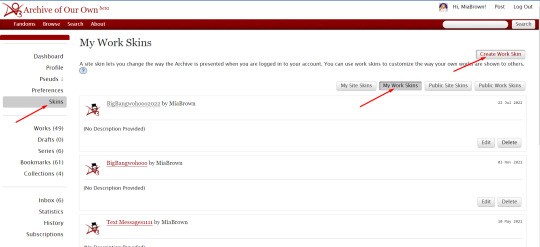
Log into your AO3 account and go from Dashboard to Skins
Go to My Workskins and Create Workskin
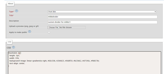
Choose "Work Skin" if it's not the default
Title "HotDBB23"; description is optional
Type in the CSS code shown below exactly the way it is here:
#workskin img { width: auto; max-width: 100%; height: auto; }
(We recommend copying and pasting, so there are no mistakes)
On the bottom right under "Actions" will be the option to Submit for you, tap/click and you're done!
Once you're done, you choose New Post in the top right of your browser. You fill out the Rating, checkmark the right Archive Warnings, choose the Fandom (i.e. House of the Dragon in this case), the Category that applies to your story, the Relationships and Characters. Last but not least, you put in the Additional Tags (i.e. more Warnings, or triggers).
You get to the point where you put in the Title of your story and Co-Creators, where you can put your Artists name/s for example, but you can also gift it to them a bit further down. Important is that they are part of the posted story, since they collaborated with you. Then follows the box to fill in your Summary. If you want to add a note at the beginning or end of a chapter, you checkmark the option and a box will open. Whatever you write in there, please note it will be gone if you uncheck the box.
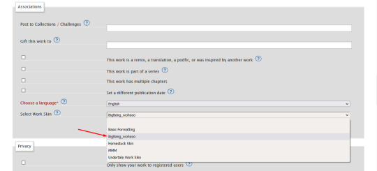
Type in "HotDBigBang" under Post to Collections/Challenges and select the Collection shown in the description.
Under Gift this Work to, you are free to add your Artist and Beta Reader. You can also put your Artist as Co-Creator and gift the work to your Beta Reader as alternative option.
Select the This Work has Multiple Chapters if your story has more than one chapter.
And last but not least, you Select the Work Skin "HotDBB23" before you get to the part where you can past in your story.
Lastly, posting the art to your story within the story:
Choose Rich Text
Tap the image icon
Once you have tapped the image icon, a little box window will open in which you have to insert the Source. Writers, you get the image address to insert from your Artist.
Not all image addresses work, the most effective are from Discord or Tumblr.
Please add an Image Description of the image you are posting, it will be for those who use TTS- text to speech to have someone read the story, that includes visually impaired people, but also those who simply like it to listen to a story. It will be nice for them to hear what they would see in the image. You can be as detailed as you like.
Next is Width and Height, both get automatically generated and even if the image pops up really big when you tap Save, remember you used a Work Skin that will adjust it accordingly for your readers once posted.
Hit submit and you are done! Your fic will remain unrevealed in the collection until your reveal date. We will post the full reveal schedule closer to the deadline.
#hotd big bang#house of the dragon big bang#hotd autumn prompts 23#a reminder#hotd#hotd fan fiction#hotd fandom#house of the dragon#house of the dragon fan fiction#house of the dragon fandom
23 notes
·
View notes
Text
sizing in css
short n sweet list of the more commonly seen units in css for sizing n their differences
pixels
an absolute (unchanged) unit of measurement that is based on the physical size of the screen. one pixel is one dot on your screen. since pixels are an absolute unit, they can cause issues with responsiveness on different screen sizes and resolutions.
i would use pixels for logos and images for exact sizing or if i was working with any design tools, as design tools use pixels as their default
em
a relative unit of measurement based on the font size of the parent element. to elaborate - 1em is the fontsize of the element, meaning if the parent font size is 16px, then 1em would be 16px. em is scalable and responsive to your parent font size, but can be difficult to deal with in layout design
em can help control an area of design, like if i wanted to scale the type in a specific area, i would use em.
rem
another relative unit of measurement based on the font size of the like root or html, but does not change like the complexity of the parent font size. if the font size of the root element is 16px, then 1rem is equal to 16px. rem is also scalable and responsive, but are easier to work with in layout design due to their fixed reference point
i would use rem over em if i'm working on layout design as a whole since you can a global size and space in your root and having that consistent value in your root makes your layout more predictable in regards to size
vw/vh
or viewport width/viewport height. one vh is 1% of the height of the viewport. voh units can help ensure that the design of a page is responsive to different screen sizes, as it scales to the height of the viewport. it's recommended for creating full-height elements such as hero images, sections, and sliders that adapt to the viewport height
--
help me i am so behind
86 notes
·
View notes
Text
How To: Gradient AO3 Divider

Last year we prepared a little something to make the fics written for our event more uniform and look a little more fun. This materialized as a workskin coded by @alto-tenure that contains a colourful gradient divider for AO3 from the colours of our theme.
To learn how to make yourself a colourful divider like this one without any graphic skills, see the tutorial under the read-more.
At first, you'll need to create a Work Skin:
Go to your profile on AO3 and choose the “Skins” option. Click “My Work Skins”, and there “Create Work Skin”.
Name the skin. (This has to be a unique name out of every AO3 user’s personal workskins, so “BigBang” or other straightforward names will most likely be taken, meaning you have to play around a little to find an eligible one.)
To the “CSS” box, copy paste the following html code and insert the HEX code of the colours you want to use (for example, #66c50b for our brightest green). We specified out 6 colours here, but you can use as many as you like.
#workskin .hr {
height: 3px;
width: 35%;
background-image: linear-gradient(to right, #HEXcode, #HEXcode, #HEXcode);
text-align: center;
}
Click “Update” at the bottom of the page.
2. Second, you'll need to start using the Work Skin
Go to publish a new work or chapter like you normally would.
At the “Associations” section, select the previously created Work Skin.
Insert the text like you normally would, then click on the “HTML”view. Here, search for the placeholder(s) you left, where the section break(s) have to be.
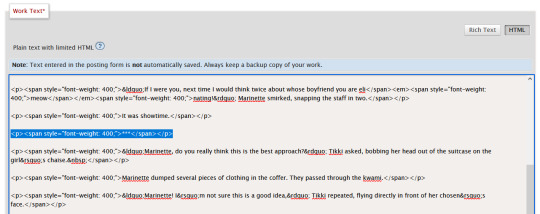
Delete these, replacing them with the following code at every place you want to have a divider:
<div align="center">
<div class="hr"></div></div>
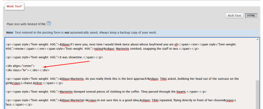
You're done, post your work! 🎉
61 notes
·
View notes
Note
hey quick question about skull css
would it be possible to fill this space with a big skull? cause it'd be funny i think
(also i absolutely love your blog theme. this was the first time i opened your blog from desktop and holy shit i love it. also ill try to steal the music player thing at some point. but til i work on my blog theme i should probably fix my website. anyway im rambling)
oh my god that is an EXCELLENT idea
i couldn't get it to fit to the height of that bottom section, only the width as it is flexible. i'm about to update the firefox addon; if you use the stylish extension then add this in:
.NkkDk {
background-image:url("https://files.catbox.moe/7uqkg5.png");
background-position:bottom;
background-repeat:no-repeat;
background-size:100%;
}
and thank you!! <33 the music player is called scm player, it plays one of my favourite EPs "nisemono" by ginger root :)
#the way tumblr names their divs will forever confuse me#i'm sure it makes sense to someone but that person is not me#skull css saga#love letters
8 notes
·
View notes
Text
Tutorial: Creating a Modal/Popup using <dialog>
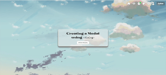
In this tutorial, I'll be sharing with you on how to create a popup/modal (herein states as modal) using <dialog>. Base code shall be provided for you to practise. Also, while it is rather a straightforward tutorial, it is recommended for you to have some knowledge of CSS and HTML as I will assume that you know a little bit about them.
[DEMO] [BASE CODE]
To create a modal, there are five parts that I'll be explaining which are:
The script
The open button
The modal + the close button
The backdrop
The Fade effect [Optional]
1. The Script
To ensure that your modal works, we need to add a script into our code. All you need to do is copy the code below and paste it before </body>:
<script> /// MODAL SCRIPT BY JASMIN @ https://phantasyreign.tumblr.com/ const body = document.querySelector("body"); const popup = document.querySelector("#modal"); const openModal = document.querySelector(".open-modal"); const closeModal = document.querySelector(".close-modal"); openModal.addEventListener("click", () => { modal.showModal(); body.style.overflow = "hidden"; }); modal.addEventListener("keydown", e => { if(e.keyCode === 27){ e.preventDefault() } }) closeModal.addEventListener("click", () => { modal.close(); body.style.overflow = "auto"; }); </script>
This script tells us three things:
When you click the open button, the modal will appear and you cannot scroll down the contents behind the modal;
When you press the esc key, it won't work;*
When you click the close button, the modal will disappear and you can scroll the blog as per usual.
*The reason why I include this part is because in the event if the blog contains a scroll bar, if a person press the esc key instead of clicking the close button, such scroll bar will not appear.
2. The Open Button
HTML
To add an open button, simply add the code below and paste it at the desired placement:
<button class="button open-modal">Open Modal</button>
Tips: If the design of your open and close button are the same, then I recommend if you include another class value of button inside your class attribute so that it'll be easier for you to code.
TAKE NOTE: Do not change the name of the open-modal.
CSS
If you know CSS, there are many ways to code a button. Nevertheless, for the purpose of this tutorial, I have customised the button (both the open and close button) as follows:
.button{ /*BASIC*/ background-color:white; border:1px solid #eee; border-radius:inherit; width:100px; outline:0; padding:.25rem .5rem; /*FONTS*/ font-family:karla; text-transform:uppercase; /*DO NOT TOUCH UNLESS YOU KNOW WHAT YOU'RE DOING*/ cursor:pointer; }
You can also use .open-modal instead of .button if you want to.
3. The Modal + The Close Button
HTML
To create the modal, we will be using <dialog>. To achieve it, we need to add the HTML before </body> and the <script>. Don't worry if you're confused, you can refer back to the base code to understand what I mean by before </body> and the <script>.
<dialog id="modal"> <p>This is your content <button class="button close-modal"> Close Modal </button> </dialog>
Depending on where you want to position your close button, you may need to change the position of your close button's HTML code before or after the content.
CSS
By default, the modal will not be shown without the open button and the script. However, since we have included the script as well as the open button, you can see that once you click the open button, the modal appears! To beautify it a little bit more, you can customise the modal as follow:
/*MODAL CONTENT*/ #modal{ /*BASICS*/ width:50%; background:rgb(238 238 238 / 0.9); border:1px solid lightyellow; border-radius:10px; padding:1rem 2rem; outline:0; /*DO NOT TOUCH UNLESS YOU KNOW WHAT YOU'RE DOING*/ max-height:50vh; overflow:auto; position:absolute; top:50%; left:50%; transform:translate(-50%, -50%); }
For the close button, feel free to use your own creativity to customise it! You can also use the same design as your open button as what you've seen inside the demo. If the position of your close button is the same as what has been shown in the demo, to center it, I added the following code:
.close-modal{ margin:0 auto; display:block; }
4. The Backdrop
We can think of backdrop as something similar as a lightbox in a photoset. By default, you can see that when a modal is opened, everything except for the modal turns darker. To customise the said backdrop, all you need to do is add this code:
/*MODAL BACKGROUND*/ #modal::backdrop{ backdrop-filter:blur(10px); background:rgb(238 238 238 / 0.25); }
Of course, you can also add background image and the likes if you know how to do so.
The Fade Effect [Optional]
In order to create the fade effect, we need to use the animation property. As such simply add the following code inside #modal and #modal::backdrop:
animation:1s fade ease-in-out;
As such, the both codes will look like this:
/*MODAL CONTENT*/ #modal{ /*BASICS*/ width:50%; background:rgb(238 238 238 / 0.9); border:1px solid #eee; border-radius:10px; padding:1rem 2rem; outline:0; /*DO NOT TOUCH UNLESS YOU KNOW WHAT YOU'RE DOING*/ max-height:50vh; overflow:auto; position:absolute; top:50%; left:50%; transform:translate(-50%, -50%); animation:1s fade ease-in-out; } /*MODAL BACKGROUND*/ #modal::backdrop{ backdrop-filter:blur(10px); background:rgb(238 238 238 / 0.25); animation:1s fade ease-in-out; }
After that, add this code after #modal::backdrop :
@keyframes fade{0%{opacity:0;}50%{opacity:1;}}
With that, you're done! Please like and/or reblog this if you found this tutorial helpful! Kindly credit me if you use this tutorial :)
65 notes
·
View notes
Note
hey um how did you code your search bar? sorry to bother ive just been googling around like a headless chicken and have no idea what im doing trying to customize my theme. ty for your time! sorry to bother
No worries! I made it based on the search bar from the theme itself, though by comparing the both of them I realize they hardly resemble eachother. Here's the CSS for mine:
(note that .search-bar-disable and {select:Search bar} are specific to the theme I'm using)
.search-container {
width: 100px;
border-top: 2px
border-radius: 2px;
padding: 0 5px;
padding-left: 2px;
transition: 0.3s width ease-out;
}
.search-container.search-bar-disable {
display: none;
}
.search-container li {
padding: 2px 4px;
width: 100px;
padding-top: 2px;
padding-left: 1px;
transition: 0.3s;
border-radius: 2px;
transition: 0.3s width ease-out;
}
.search-container:hover {
background: transparent;
}
.search-container input {
font-size: 1em;
padding-left: 3px;
height: 20px;
width: 100px;
display: inline-block;
color: #333;
background: #f0e2d9;
transition: 0.3s width ease-out;
}
.search-container input:focus {
outline: 0;
width: 139px;
transition: 0.3s width ease-out;
}
As for the search function itself, here's the html (the only thing I did, iirc, was add the "Search..." text to it)
<div>
<li class="search-container {select:Search bar}">
<form action="/search" method="get" class="search-form"><input type="text" placeholder="Search…" name="q" value="{SearchQuery}"/></form>
</li>
</div>
I hope this ask got formatted correctly, for some reason tumblr didn't wanna let me add the html to it without adding and removing spaces in weird places first. I've also added colours to make it easier to see. Just in case, I've pasted this code here for easier reading/pasting/etc on your end
4 notes
·
View notes
Text

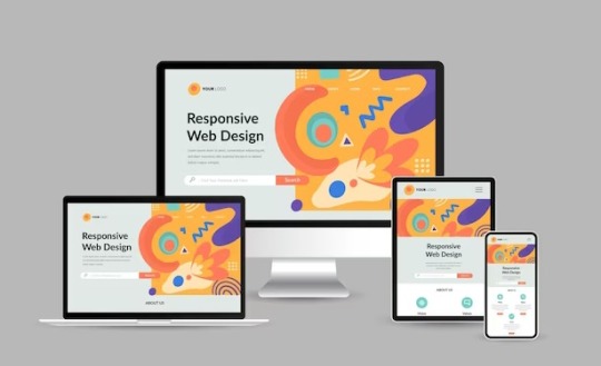
Responsive Web Design: Best Practices for Optimal User Experience and SEO
In today’s digital age, where the majority of internet users access websites through various devices, responsive web design has become paramount. It’s not just about making a website look good; it’s about ensuring seamless functionality and accessibility across all screen sizes and devices. Responsive web design (RWD) is a critical approach that allows websites to adapt to different devices and screen sizes, providing an optimal viewing and interaction experience.
Importance of Responsive Web Design:
Responsive web design is essential for several reasons. Firstly, it improves user experience by ensuring that visitors can easily navigate and interact with the website regardless of the device they’re using. This leads to higher engagement, lower bounce rates, and increased conversion rates. Secondly, with the proliferation of mobile devices, responsive design is crucial for reaching a wider audience. Google also prioritizes mobile-friendly websites in its search results, making responsive design a key factor for SEO success.
Key Principles to Follow:
Fluid Grids: Instead of fixed-width layouts, use fluid grids that can adapt to different screen sizes.
Flexible Images and Media: Ensure that images and media elements can resize proportionally to fit various devices.
Media Queries: Utilize CSS media queries to apply different styles based on screen characteristics such as width, height, and resolution.
Mobile-First Approach: Start designing for mobile devices first, then progressively enhance the layout for larger screens.
Performance Optimization: Optimize website performance by minimizing HTTP requests, reducing file sizes, and leveraging caching techniques.
Tips for Optimization:
Prioritize Content: Display essential content prominently and prioritize functionality for mobile users.
Optimize Touch Targets: Make buttons and links large enough to be easily tapped on touchscreen devices.
Viewport Meta Tag: Use the viewport meta tag to control how the webpage is displayed on different devices.
Testing Across Devices: Regularly test the website across various devices and browsers to ensure consistent performance and appearance.
Progressive Enhancement: Implement features in layers, starting with basic functionality and progressively enhancing it for more capable devices.
Impact on User Experience:
Responsive web design directly impacts user experience by providing a seamless and consistent experience across devices. Users no longer have to pinch and zoom or struggle with tiny buttons on their smartphones. Instead, they can effortlessly navigate through the website, leading to higher satisfaction and engagement. A positive user experience ultimately translates into increased conversions and customer loyalty.
SEO and Responsive Design:
Responsive web design plays a significant role in SEO. Google, the leading search engine, recommends responsive design as the best practice for mobile optimization. Responsive websites have a single URL and HTML code, making it easier for search engines to crawl, index, and rank content. Additionally, responsive design eliminates the need for separate mobile websites, preventing issues such as duplicate content and diluted link equity.
Real-Life Examples:
Apple: Apple’s website seamlessly adapts to different screen sizes, providing an optimal browsing experience on both desktops and mobile devices.
Amazon: Amazon’s responsive design ensures that users can easily shop and navigate through its vast catalog on any device, contributing to its success as a leading e-commerce platform.
HubSpot: HubSpot’s website is a prime example of a responsive design that prioritizes content and functionality, catering to users across various devices.
Conclusion:
In conclusion, responsive web design is not just a trend; it’s a necessity in today’s digital landscape. By adhering to best practices and optimizing for user experience, websites can effectively reach and engage audiences across desktops, smartphones, and tablets. As Google continues to prioritize mobile-friendly websites, investing in responsive design is crucial for maintaining visibility and driving organic traffic. Embrace responsive design to stay ahead in the competitive online ecosystem.
Web Development Services:
Blockverse Infotech Solutions has been a pioneer in providing exceptional web development and design services for the past five years. With a dedicated team of professionals, Blockverse ensures cutting-edge solutions tailored to meet clients’ specific needs. Whether you’re looking to create a responsive website from scratch or revamp your existing platform, Blockverse Infotech Solutions delivers innovative designs and seamless functionality to elevate your online presence. Trust Blockverse for all your web development and design requirements and witness your digital vision come to life.
3 notes
·
View notes
Text
Navigating Responsive Design: Best Practices for Website Builders
In today's digital landscape, where users access websites on a myriad of devices with varying screen sizes and resolutions, responsive design has become an essential aspect of modern website development. Mastering responsive design involves understanding the principles and strategies that ensure a seamless user experience across devices. From flexible layouts to optimized images, implementing responsive design techniques can significantly enhance a website's usability and accessibility. Let's delve into some essential strategies for mastering responsive design in website development.

First and foremost, creating a responsive layout is fundamental to accommodating different screen sizes. Instead of fixed-width layouts, developers utilize fluid grids and proportional sizing to ensure that content adapts dynamically to the user's device. By employing relative units such as percentages and viewport width (vw), elements on the webpage can scale proportionally, maintaining consistency and readability across various screen sizes.
Moreover, adopting a mobile-first approach is pivotal in responsive web design. This methodology involves designing for mobile devices initially and then progressively enhancing the layout for larger screens. By prioritizing mobile optimization, developers ensure that the website delivers a smooth experience on smartphones and tablets, which are increasingly prevalent among users.
Another crucial aspect of responsive design is media queries. These CSS rules allow developers to apply different styles based on the characteristics of the device, such as screen width, orientation, and pixel density. Media queries enable targeted adjustments to typography, layout, and images, optimizing the presentation for each device category. By leveraging media queries effectively, developers can create adaptive designs that seamlessly adjust to the user's viewport.
Furthermore, optimizing images is imperative for responsive web design. Large, high-resolution images can significantly impact page load times, especially on mobile devices with limited bandwidth. Techniques such as responsive images, where multiple image sizes are served based on the device's screen size and resolution, help minimize bandwidth usage and improve loading performance. Additionally, using image formats like WebP or JPEG 2000 can further reduce file sizes without compromising visual quality.
In addition to layout and media optimization, ensuring touch-friendly navigation is essential for responsive design. On touchscreen devices, traditional mouse-centric interactions may not translate well, leading to a frustrating user experience. Implementing touch-friendly elements such as larger buttons, ample spacing between links, and swipe gestures enhances usability on mobile devices, making navigation intuitive and effortless for users.
Moreover, performance optimization plays a crucial role in responsive design. As users expect fast-loading websites regardless of their device, developers must prioritize performance optimization techniques such as minification, caching, and asynchronous loading of resources. By reducing unnecessary HTTP requests and optimizing code and assets, developers can significantly improve the website's loading speed and overall performance on all devices.
By harnessing the latest technologies and best practices in responsive design, VerloopWeb guaranties your website adapts seamlessly to varying screen sizes and resolutions, delivering an exceptional user experience across desktops, tablets, and smartphones. With VerloopWeb, you can confidently navigate the ever-changing digital landscape, knowing that your website will always remain accessible, engaging, and visually stunning, regardless of the device used to access it. Partner with us today and elevate your online presence to new heights with our expertise in responsive website design.
#website development#web design#responsive web design#website designers#front-end development#website maintenance#dedicated web designer
2 notes
·
View notes
Text
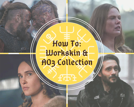
Create a Workskin & post to our Collection
With our deadline of April 30th fast approaching, we're now sharing our fic posting guide with you. We’ll also show you how to add the art your artists made into the fic.
There’s a complete How To under the cut.
How to: create the Workskin
You need to create the Workskin to make sure the images you put into your fic will change size according to whether your readers use mobile or desktop.
-> log into your AO3 account and go from Dashboard to Skins
-> go to My Workskins and Create Workskin
-> choose “Work Skin” if it’s not the default
-> Title can be whatever you choose, in this example it’s “Work_skin”; which won’t be available to you because it is already in use. (You need to give yours a unique title.)
-> type in the CSS code shown in the screenshot below exactly how we typed it out:
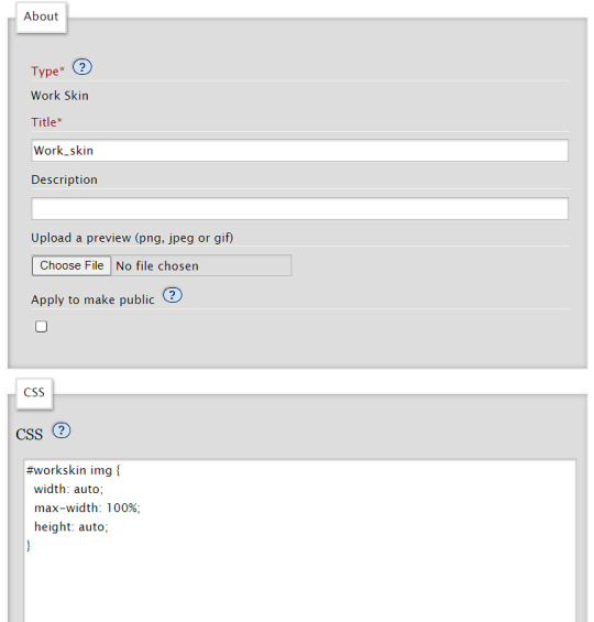
Copy the text below so you can paste it into the CSS section:
#workskin img {
width: auto;
max-width: 100%;
height: auto;
}
On the bottom right under “Actions” will be the option to Submit for you, tap/click and you’re done!
How to: post your Fic
Now that you’ve set the workskin up, you choose New Post in the top right of your browser. You fill out the Rating, checkmark the right Archive Warnings, choose the Fandom (i.e. Vikings or Vikings: Valhalla in this case), the Category that applies to your story, the Relationships, and Characters. Last but not least, you put in the Additional Tags (i.e. more Warnings, or triggers/squicks). If you need help with selecting the right Rating and Tags, this post and this infographic might be helpful to you.
Now fill in the Title of your story and check-mark the little box for Co-Creators. This is where you will add VikingsBigBang as the co-creator of your work. (Your artist and your beta reader will not be co-creators, as a bit further down on the page you have the option to gift your work to someone. That is the place where you will add your artist and have the option to mention your beta reader. It is important that they are a visible part of the posted story, since they collaborated with you!)
Then follows the box to fill in your Summary. It doesn’t have to be the same summary as the one you initially submitted to us months ago. If you want to add a note at the beginning or end of a chapter, you can check-mark the option and a box will open. Whatever you write in there, please note it will be gone if you uncheck the box!
Brilliant, you made it so far! The following screenshot will show you what to put into the Associations section:
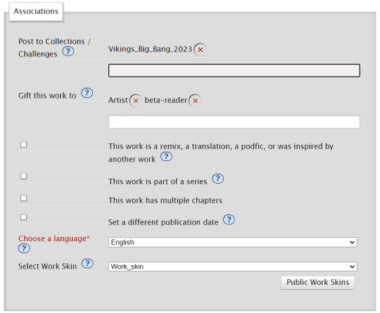
Type in Vikings_Big_Bang_2023 under Post to Collections/Challenges and select the Collection shown in the description. (If it does not show up, simply make sure you typed the name of the collection correctly and press enter on your keyboard. You can ask us to check if the fic was added correctly!)
Under Gift this Work to, you add your Artist and Beta Reader(if you had the latter).
Select This Work has Multiple Chapters if your story has more than one chapter. You can already type in the amount of chapters it will have.
And, last but not least, you Select your newly made Work Skin (in our case, we named it “Work_skin” as shown in the screenshot above) before you get to the part where you can paste in your story.
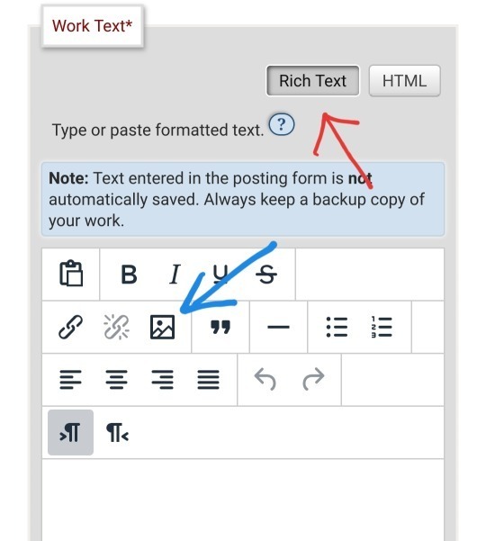
This is how you post the art to your story within the story:
-> choose Rich Text (red arrow top right)
-> tap the image icon (blue arrow to the left)
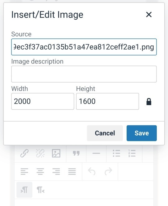
Once you have tapped the image icon, a little box window will open in which you have to insert the Source. Writers, you will receive the image address to insert from your Artist.
Not all image addresses work, the most effective ones are from Discord or Tumblr. Don’t worry, you don’t have to actually upload a post in order to get the image address, a draft works totally fine! (You can also post it privately of course, just in case Tumblr is its usual hot mess)
In the following screenshot you can see we have entered an image address already. Please add an Image Description of the image you are posting, it will be for those who use TTS-text to speech to have someone read the story out loud. This feature accommodates visually impaired people, but also those who simply like to listen to a story. It will be nice for them to hear what they would see in the image. You can be as detailed as you like.
For the same reason, we urge you to not use dividers like “***” or “°°°” to split up your text and rather use AO3’s dividing line or one that your artist made for you. With the latter, you can write “Divider” in the text description of the image.
Next is Width and Height, which are both automatically generated. Even if the image pops up really big when you tap Save, remember that you used a Work Skin which will adjust it accordingly for your readers once it is posted (but you also see the end result of it in the drafts already).
You can Preview your story to check if everything is to your liking or Save To Drafts before the Deadline if you want to have the chance to Edit it again.
Please remember to set yourself a reminder if you put it in Drafts, lest you are under the impression to have submitted your story when in fact it’s still in drafts!!
Since you put VikingsBigBang as Co-Creator, you don’t have to worry about changing the publishing date of your work. We will change it for you, so your work will pop up as a new one on AO3 and your subscribers will get a notification of a new story!
If you have any further questions, feel free to use our Discord server or message us via DM.
#vikings#vikings valhalla#how to: worksheet & ao3 collection#vbb23#vikingsbigbang23#fandom event#mod post
15 notes
·
View notes
Note
hey! i found you thru your neocities site and really really wanted to ask, how did you code your art gallery? it's lovely and perfect and i high-key want to steal it
THANK YOU FIRST OF ALL!
secondly... I wish i could give you a comprehensive answer but truth is since i worked on it for over a year i don't remember everything i did? a lot of the things i achieve with my markup is based on trial and error and testing different solutions. i don't actually know what i'm doing lol. i use a lot of tutorials and old forum posts and such and i wish i could just link those but when so much time has passed i can't remember everything i looked up. HOWEVER i'll try my best to provide some basic guidance to what's what, and what it does in my markup, to make it easier if you want to copy my shoestring bullshit. (and past how embarrassing it is that my markup is so messy and inefficient, i have no problem with anyone referencing my source or even copy pasting whole chunks of it to have a base to work from if they wanna make something similar to me. no credit needed ofc , just don't use any of my assets or style it the exact same, make it your own! )
THIS IS GONNA BE A LONG POST SORRY SO I'M GONNA HAVE TO PUT THE REST OF IT UNDER A "KEEP READING" , ANYTHING ELSE WOULD BE INHUMANE...
here are links to the relevant sources for the page, there's also another stylesheet linked but this is just a very basic one for my website that has my fonts and scrollbar styling so it's not important here.
view-source:https://korsse.neocities.org/gallery view-source:https://korsse.neocities.org/sidebarstyle.css
(no idea if these links will work for you or if its different per browser or what, if they don't just go to my gallery and right-click view source or inspect or smth)
btw before reading further its useful to know that i use https://www.w3schools.com/ a lot (playing around with the tryit editor is really helpful to understand HOW shit works. sometimes i even make the basic structure i want in the w3s editor isolated from the rest of my messy markup to ensure i get the basics of it to work before i integrate. this way i know that if it breaks it's because it's conflicting with other shit on the page and not because i fundamentally fucked up. ) and i'm just going to assume you know the basics of stuff like what a div is and the difference between class and id etc...
my gallery is largely based on 3 main types of thing(?) : modal images, tabs and collapsible.
THUMBNAILS AND MODALS
my thumbnails are also css, (I KNOW the method i used for my thumbs is something i got off some forum post or reddit comment or substack or whatever, i can't find it again though.) HOWEVER I would not recommend doing thumbnails the way i did because you do not get an appealing custom crop (or i guess you probably could in theory but to do that for every image would be more work than its worth) and because considering it's really just the full image sized down and cropped with styling, it takes a long ass time to load. ( the only reason i do it this way is to not have to make, edit and host individual thumbnails for 6 years worth of art. it's a real menial task to do when you'd have to do it for over 400 images ) but if you need uniform sized thumbnails the best way to do it afaik is to make them in whatever graphics editor you have. i'm unsure if this would be compatible with image modals ( as constructed in the w3s tutorial ) but if not you could probably just make a box modal do the same thing and have the thumbnails be buttons styled with inline css like this:
<button id="whatever your id is" style="background-image:url(thumbnail path)">
to make them work as thumbnails though you'd have to make all the dimensions of the actual image file for each thumbnail true to the pixel height/width you'd want them to display as on the page and use css to style all the buttons to be those same dimensions. this will interfere with other buttons on the page but you can probably get around this with making a button class. like for example if your thumbnails are 100x100px you slap this in your css
button.thumb {width:100px; height:100px;}
and add this to the button tag
<button id="whatever your id is" class="thumb" style="background-image:url(thumbnail path)">
HOWEVER... this might mean you'd have to make a new modal (on the html side) for every single image so it's probably not ideal if you're gonna have over 400 images like i do... there should be ways to make multiple modals on the same page not a nightmare but you'd have to keep track of unique ids for each one at the very least.
here are both links to the basic w3s modal image and modal box tutorials for convenience.
wish i could have explained what i did better but the modal was like the first thing i did,
and was kind of a nightmare to figure out because i originally wanted it to display a description using the alt text styled in a very specific way that i ended up scrapping because it was broken as fuck and evil and bad. (cw: gore in the bg of the image below btw)
my memory has been corrupted so that the battle with the alt text is all i remember from making it rather than the useful stuff that survived into the current version lololol.
tabs
ok now we're getting into the layout of the page itself. my gallery consists of a sidebar and the page content
in the sidebar the bottom two boxes have the universal stuff that goes on every page that has the sidebar, and the links are just normal links to individual pages. but the top box with the red "links" is the gallery navigation right? and they are not links at all, they're buttons to designated tabs.
for the BASIC layout of the page, it's split into two divs called "sidenav" and "main". [sidenav] is everything that goes in the sidebar space and [main] is literally everything else. there should be nothing directly in the [main] div except for other divs, it is merely a container for the tabs. each and every "page" is a tab, including the "Art" tab that is open by default (i might be wrong but iirc what tab is open by default is simply decided by which one is first in the html document i am so so wrong, it's determined by id in the javascript.)
tab buttons go inside the sidenav div and tabcontent goes inside the main div. i have my tabs styled as inline-block, i can't remember if it matters that much or not but you know... considering what inline-block is, it probably does?
tabcontent contains everything the visitor will see, for most of my gallery tabs this means thumbnails. my thumbnails are laid out in a grid using div classes called "row" and "column" four [column] divs go inside one [row] with one thumbnail directly inside each [column] div. each new line of thumbnails is a new [row] div with another 4 [columns] and their contents, you get it, it's not complicated, just verbose. there are lots of other less amateur ways you can display shit in a grid layout using html/css but my brain is small so this works for me!! :,D
even though they might seem intimidating with the javascript required, tabs in general are pretty simple if you follow the w3s tutorial (there's even one specifically for vertical tabs) . just make sure to keep all the contents of each tab INSIDE said tab and it shouldn't cause much trouble.
since my gallery is so bloated with image links and such i thought i'd also link this example page ( and the source: view-source:https://korsse.neocities.org/temp/exampleignorethis ) i made on the fly for someone else a long time ago. its just a hodgepodge of copy pasted w3s stuff to quickly show off a navbar with tabs and "accordions" (more or less the same thing as collapsible just called smth different in a menu context?) but it's kind of a simple version of the same stuff i did with my gallery? perhaps it can be useful for you as an example, perhaps not. but i might as well link it just in case lol.
collapsibles
the doodle tab also has collapsibles! idk if you even care about this but it's part of my gallery and one of the more fun features that isn't present in your average neocities gallery page. (talking out my ass, maybe they are super common idk, i haven't checked)
the collapsible aren't any more complicated than tabs, and their integration into my gallery isn't any worse than putting the buttons and collapsible content div inside the tabcontent and putting the thumbnails inside the collapsible content div. style as desired with css to make it look the way you want. i didn't do anything too fancy with it. once again easy-peasy if you use the w3s tutorial
uhhh i think that's it? there is more stuff i could explain but i have very little experience with writing explanations like this so i'll leave it at this to start. but don't hesitate to ask if there's anything specific you found confusing, or anything else about how my gallery works that you want me to go into ! ik i could have been more concise but i'd be here all day retyping stuff so i hope u could bear with my long wall of text, i'm not a writer ^^' (i'm a rambler). good luck on your webpage endeavors!
3 notes
·
View notes
Last Seen Blogs
ilampmta
ilampmta

generoustrashcherryblossom
Todoroki's Waifu
pi-cosplay
PI Cosplay

thegr8catsbey
E C L I P S E

kabukilogical
KABUKILOGICAL