#typgraphie
Photo
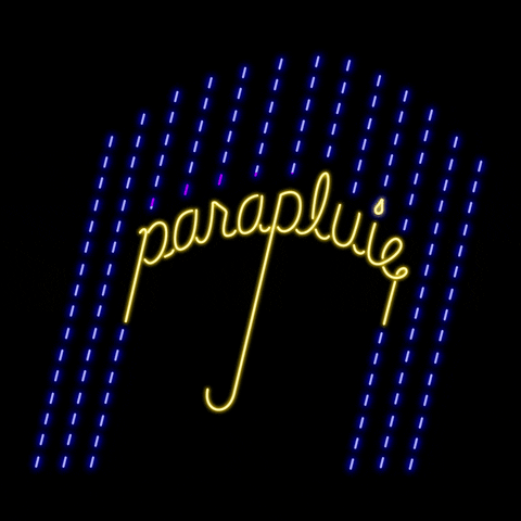
© Kate Widdows
#animatedart#animatedtype#giflettering#animatedtext#umbrella#typgraphie#graphicgif#designtype#infrench
3 notes
·
View notes
Text
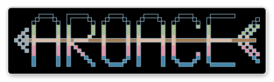
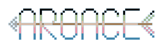
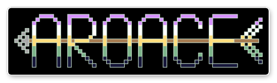


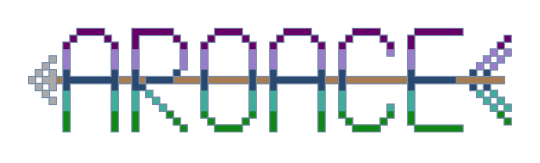
[image description: six elongated pixel-style text reading "aroace" striped in the colours of three pride flags. A brown arrow shaft runs across the centre of the letters, forming the horizontal strokes of the letters "A", "E" and "R". A grey arrowhead sits in front of the text; flag-stripe fletching sits behind it. Each image is available in two versions with black or transparent background.
Stripes are coloured in the following aro-ace pride flags: cass (black/olive/orange/coral-pink/green), thelo (purple/white/yellow/green/navy) and unit (violet/lavender/dark blue/aqua/green).
Aro-Ace (with Arrow) Pixel Art Stickers
Flags: cass, thelo and unit.
This design is created from the cross-stitch patch variant of my freehand embroidery motif (originally designed for doll T-shirts). Both patterns--cross-stitch and freehand embroidery--are available on the Aro Worlds website and Patreon.
All banners/stickers are available for free personal or non-commercial use with credit to one of my accounts.
#cassaroace#thelo aroace#unit aroace#aroace#artwork and visual#original artwork#pride#pixel art#pixel art banners#typgraphy#typographic art#aro symbols#aro symbolism#weapons and sharp edges#flags and banners
4 notes
·
View notes
Photo

Nikolai Kozakov
41 notes
·
View notes
Text

insta: @darichonne
#poetry of mine#new poetry#haiku poetry#dead poets society#poets on poetry#beautiful words#spilled thoughts#spilled ink#spilled words#spilled lust#spilled emotions#text#typgraphy#picture quotes#excerpts from my writing#excerpts from my life#excerpts from my journal#excerpts from my mind#prose writing#spilled prose#prose poem#prose#darichonne#newpoetsociety#poetry#micropoetry#poets on tumblr#poets#spilled poetry#poetsandwriters
2 notes
·
View notes
Photo


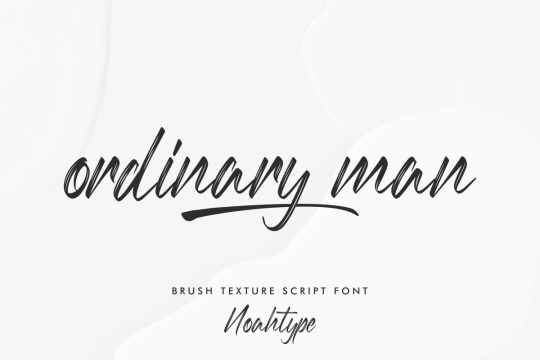

Ordinary Man font designed by Noah Type
#script#brush#fonts#typgraphy#design#web design#webdesign#lettering#brushlettering#font#type#typeface#brand#branding#brand design#branding design#ttf
15 notes
·
View notes
Photo

Movie poster designed for Boris Dolin’s adaptation of Hans Christian Andersen’s fairy tale The Ugly Duckling with wonderful typography collage by Czech fine artist, graphic and textile designer Věra Nováková, 1967.
#movie posters#graphic design#women designers#vintage typgraphy#1960s posters#The Ugly Duckling#Hans Christian Andersen#Věra Nováková
12 notes
·
View notes
Text

#t shirt#typgraphy#typography logo#adobe photoshop#adobe premiere pro#adobe illustrator#t shirt design#tee shirt
1 note
·
View note
Text

typgraphy 1, plate five: script and decorative // 7/27/2022
0 notes
Photo

80 notes
·
View notes
Text
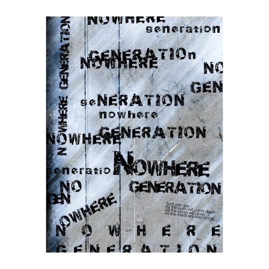
No.3 / Nowhere Generation. // Rise Against - Nowhere Generation. 🎧
#grunge#grunge aesthetic#typographic design#poster design#typographicposter#punk aesthetic#punk rock#rise against#typgraphy#poster#graphic design#typeface#graphic artist#visual art#visual artist#graphic art#typeposter
39 notes
·
View notes
Photo
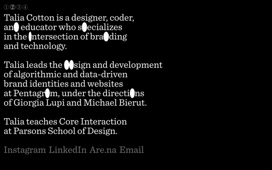
taliacotton.com
#Talia Cotton#designer#coder#design#studio#portfolio#typographic#typgraphy#font#Sentinel#2021#Week 06#website#webdesite#webdesign#inspire#inspiration#happywebdesign
2 notes
·
View notes

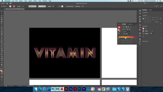
Text
Typography - gradient lines within the letter.
This design was one of the most complicated typography exercices we have done so far. I picked the word VITAMIN and a bold font, created outlines and removed any closed counters.
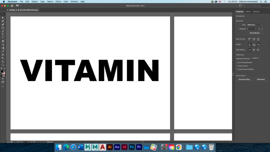

I deleted the fill and set the stroke to black. Then, using the transform effect I created some some lines within each letter. For every letter I used the exact same settings to make it look consistent. The most important thing to remember was to tick "scale strokes and effects" - this way the lines within the later didn't look were getting progressively thinner.


Once I'vepasted the effectto every letter, I changed the stroke to graadient and started ecperimenting with it a little until I was satisfied with it.


I also tried using a different background colour for it and I think that it looks even more interesting on black than it does on a white background.
Below are my final outcomes. They are very similar because I used the exact same technique on them however I slightly changed the settings each time to make it look more interesting.
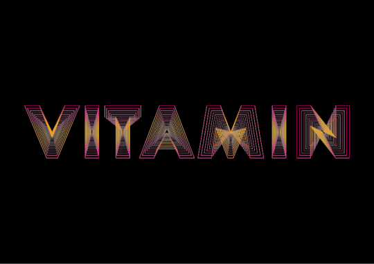


I think it's a very interesting technique. To improve my designs, I could use bolder lines (I would first have to reduce their amount) and add more contrasting colours because if the design is scaled down or someone looks at it from a distance, they struggle to see what it says because of how thin the lines are. It could be used in a poster design. I am not going to use it in my FMP because I'm creating a brand identity - I want my designs to be easily memorable statements and this technique would not help me to achieve it.
1 note
·
View note
Text
insta: @darichonne
#darichonne#newpoetsociety#poetry#micropoetry#poets on tumblr#new poetry#poets#poetsandwriters#poets corner#spilled poetry#text#typgraphy#picture quotes#new pictures#picture#typograpyhy
1 note
·
View note
Photo

Glitter & Gloss by Skott
#britenessart#art#mine#artists on tumblr#typgraphy#lettering#music#song lyrics#skott#colour pencils#sketch
2 notes
·
View notes
Last Seen Blogs

08-jupiter
red girl
doctorxmoose
« ᴛɪᴍᴇʟᴏʀᴅ ᴇxᴛʀᴀᴏʀᴅɪɴᴀɪʀᴇ »

doodles-and-junk
Doodles & junk
evil-little-rodent
vibes: impeccable. meat: huge.