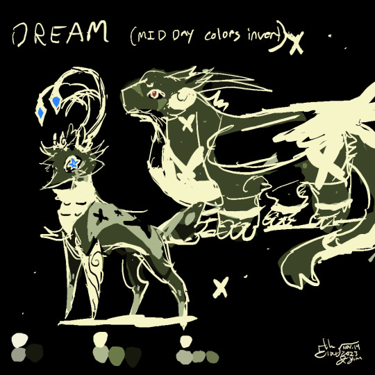
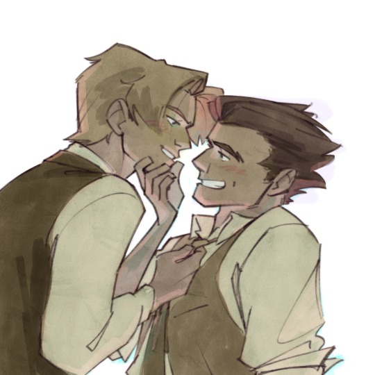
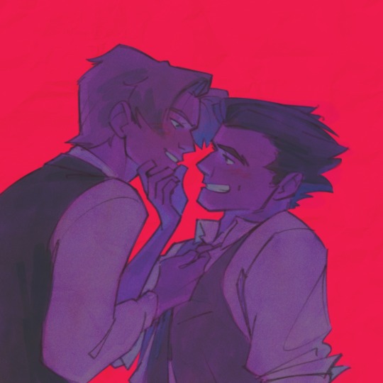
#theyre just. using a different color palette
Text
it's so weird watching cishet women do the whole "get you someone who can do both" thing bc.... i remember when that meme started and it was very much about sapphic women who presented both masc/butch and fem/me.
like i don't think it's a bad thing for Everyone to learn that presentation is a game and you don't owe people consistency, but I do wish ppl would acknowledge what it was about
#☢️.txt#like idk man its just not interesting to see skinny cishet white girl 2598 post an outfit in pink and another in black!#im glad youre embracing experimentation but. please#theres also the fact that a lot of times its not even actually different styles#theyre just. using a different color palette#which again! i think its great ppl feel more comfortable playing with color#but. that being hailed as peak 'i have multiple looks' is. hm
0 notes
Text
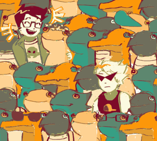
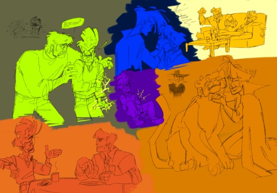
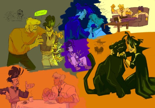
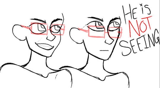
How did they reuse these assets for like 10 years in multiple games without anyone fixing this testament sprite. Dont look at their lil ass im not talking about that right now im talking about the errant green pixels. Just look at the green pixels. Focus
#also the sprites in 1 of their intros arent shaded properly.#i only really notice problems when its with testament i dont think theyre like prone to them or anything#my favorite 1 is a voice line in strive that has WAY too much echo on it they’re incomprehensible#like idk if they applied the effect twice or what but its funny#im kind of curious about how this works tho cuz according to isuka their palette uses like. all available color slots or whatever.#so wheres the green coming from…#maybe that was just their main isuka palette idk. it is a bit different#okay thank you for listening 👍#the kat goes meow#gg
10 notes
·
View notes
Note
How do you make your color palettes?? theyre literally gorgeous, I've been trying to do more bright "clashing" colors but they always clash too much
hi!! i may have posted this before so sorry if i sound like a broken record. i have three different ways i find palettes for my art.
method #1: sample from my own art
is it because im lazy? yes!! a little bit!! but does it also work and give me a jumping off point for my art while keeping my art looking cohesive?? also yes!! i know of 4 recent paintings that all sampled and referenced each other. i'll post them below
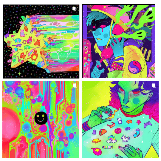
if it aint broke dont fix it! also if youre experimenting with color and things just arent looking great go find an artist you like and sample from them. i dont condone copying or tracing art but drawing inspiration from your favorite artists by eyedropping their paintings so you can learn from them is in the okay zone for me.
method #2: just straight up using my favorite colors CONFIDENTLY
i created this palette and i literally sample from it every time. i think a big part of making color look good is just being confident. if you zoom into some parts of my art there are definitely instances when things clash but i actually try to lean into those instances bc it creates a sort of unique eyestrain look. colors dont have to always play nice for a piece to work
i always use at least three colors from this palette to start (feel free to sample from this if youd like)
method 3 is kind of a last resort but it does the trick in a pinch: i take my reference picture and pump the colors WAYYYY up then sample from that. for this painting in particular i wanted to include a lot of green. admittedly green palettes are my worst enemy so i relied on this method to help me out here:
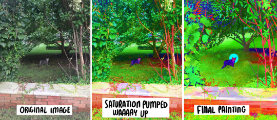
i like this method especially with my ref photos of nature because often i find that natural colors hardly clash and there are many harmonious undertones hidden beneath what at first glance looks like "just green" or "just brown" . pumping up the saturation with a photo editing tool brings all those hidden colors to the surface while keeping them somewhat harmonious
i hope this helps a little bit! ive never taken a color theory class or anything so i wish i could give more technical advice about color relationships and stuff like that but mostly i just.. use the colors that i love most, which may be a good place to start ⚡
249 notes
·
View notes
Text
hi so i posted a drawing just now and heres a long post under the cut on my design choices If you were curious . or you can just look at this image for the basic color motifs
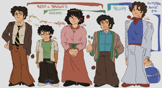
Ok. hi. waves
overall its 100% obc + motf oobc based etcetera If you know me you know this is Always basis for everything marvin trilogy i draw
detailed descriptions + other things linking characters together that arent covered by the Image:
marvin dresses like shit but there's Some cohesion there keeping it together. his family shares his warm colors; mendel uses his browns a little differently, and whizzer doesn't share his pallete at all
trina's favorite color is pink :) there are literal articles of clothing that are tied on her, one is red for marvin and the other is green for mendel. as the story goes on she would probably swap this and have a green tichel instead
trinamarvin have similar shades of pants/skirt, and jason has the mix of their yellow and red as an orange on his arms. travel travel travel from side to side!!!
^ on this note jason has things from his 4 parents and theyre all strangely layered all together
ie both him and whizzer have white over the rest of their clothes
whizdel and whizzvin are the only combinations which don't share at least one color, but:
whizdel have light/dark blue contrast and complementing red-green
whizzvin blue yellow contrast babyyyyyyy yeaaaahh boyyyyy!!!!!!!!! they wont agree
whizzer's got the most unique color palette also the least direct connections to everyone else: only trina, who wears a tichel paralleling his ascot and ties them back to marvin, and jason
trinamarvin's shoes are the same, each their corresponding hair color; mendel wears something most similar to marvin's shoes but he gets silly with it; whizzer gets to have shoes that stand more. he's cool; jason's got sneakers! and theyre whizzer colored because whizzer has his own whole deal with running
^ jason trina and whizzer all have red around their necks; mendel also very specifically doesnt have it
mendel and jason Dont have belts or anything resembling ones. this was deliberate but honestly theres not meaning to it
so yes. marvins setting the base the others generally interact with; trina tries to be plain; mendel is goofiest; jason is still figuring things out; and whizzer outsider themes Save me. whizzer outsider themes. save me whizzer outsider themes
ok That is all thank you. small bow
101 notes
·
View notes
Text
follow up to this ask! this time im just gonna be talking about my coloring process (i also want to let you all know that im not an expert in color theory since im still learning, im quite literally just going random bullshit go on the blending modes 💀 lots of explanation under the cut)
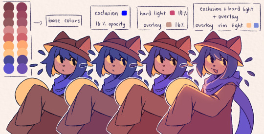
the three blending modes i mainly use are exclusion, hard light, and overlay. from the guide above you could see how the blending modes work on their own, and how they look like combined altogether. the cool thing about blending mode layers is that it really is all about experimentation and finding the best combination for a piece (also to any fellow inabakumori enjoyers GRAHH lagtrain pose jumpscare)
i went through a bunch of blending mode phases before i ended up with those main three, though it's funny how ive been using the same overlay color for about 4 years now (multiply used to be one of them, and i still use it from time to time, just not as much). im gonna be honest the whole reason why i know about blending modes being helpful was because one time i accidentally had the fill bucket on and had a certified eureka moment 😭
the best way i could explain these three modes is:
exclusion - honestly i still dont understand how it works either 💀 when i use a really saturated blue color and lower the opacity, it gives a cooler feeling to the palette. feels like a mix of multiply and overlay with how it adjusts the colors without making it darker
hard light - gives more saturation and color
overlay - gives off a glowy effect, especially if the lineart isnt completely solid (this is why it isnt clipped on the folder as shown in the example below, keeping it above the layers gets that glowy effect)
i still use the same colors for exclusion and overlay (while i do alter them with hue saturation brightness from time to time, i just use the same blue and brown for most of my works) though hard light is what i use to make drawings lean towards a temperature
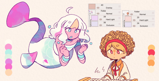
i tend to use warm colors a lot because i think theyre neat and also im biased sorry <3. as a warm palette example, i drew yinu and used this orange color on hard light and lowered the opacity
cold colors have a similar process, it's just the matter of adjusting the hard light layer. i wouldnt really say it's completely cold since i still add warm colors because im still biased </3. as a cold palette example, i drew sayu and used this purple-pink (??) color with the same settings
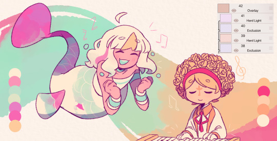
when it comes to drawings that have characters with contrasting palettes, it does take a bit of trial and error but i most of the time i mix both warm and cold methods like the example above. this also helps for art with several characters in general, since the blending modes help make the colors go well together despite the variety
theres also instances where i dont always use the warm + cold combo, since sometimes drawings lean towards a specific temperature instead (like environments with set lighting/shading, so usually i follow that even with characters with different palettes)
tldr; there are lots of palette combos you could make, not necessarily with just the three blending modes i mention. random bullshit go genuinely helps with experimenting with colors!!
#chiimo art shenanigans#uhhhh should i tag the fandoms these characters are from#fanart is fanart ig???#oneshot#oneshot niko#no straight roads#nsr#chiimo ask shenanigans
132 notes
·
View notes
Text
Tips and Tricks for krita (part two electric boogaloo)
Ok so this one is going to be a doozy because im going to include a lot of examples and tips for how to use filters (AKA YOUR NEW BEST FRIEND)
Link to part one.
Ok so filters in krita can be a doozy so ill cover the ones i use in my art the most, these will be adjust, artistic, and enhance dropdowns. I will be using my art pieces to show how i modify my art- colourwise!
Obviously, start off with opening the filter menu up. Color balance brings you to this menu, where you can play around with the colour of your shadows, your midtones, and higlights. Its a lot of trial and error, just messing around to see what fits, and its how i got to this point. through just pushing the dials up and down. Honestly, a lot of this part of the tutorial is going to be me telling you to hit those dials and levers like you dont know nobody.
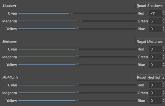

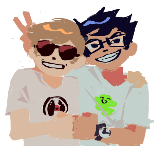
Even just small modifications as you can see can play so much of a difference. For here, i upped the cool tones for john, and upped the warm ones for dave. Colour theory without colour theorising i suppose you could say.
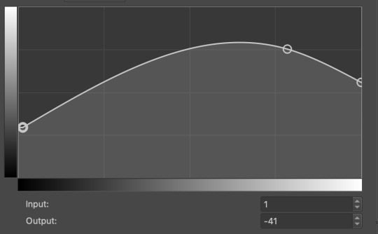
Crosschannel adjustment curves can help with contrast and colour intensity. Usually i have one point which i use to move up and down per my whims to control how bright my work is, and it can really help with really bringing out those colours so it doesnt all fall into one hue.
Colour adjustment curves works similiarly, play around with them to get the desired effect.

Krita also has HSV adjustment, but i usually use just the hue and saturation. Theyre pretty self explanatory, and can switch up your palette in pretty fun ways.
Now we move on to the ARTISTIC part. Again, i recommend you play around with them yourself, but i find index colours works really well for making really pretty art really fast! You just put in a few colours with descending lightest to darkest and you get an awesome art piece! Id say this is useful for pixel artists, but also useful for other parties. I might just start using this more myself. Its so easy wtf.
AND FINALLY THE MOST IMPORTANT THING.
HOW MY ART IS SO CRUNCHY.
If youve been following me for a while you probably noticed theres a slight crunch to my art. It gives it a slight bit of texture and makes it noticable. How do i do it?


You're welcome.
insert image of face on 90% opacity and comedic text for purpose.
Alternatively, if youre looking for a sbahj level of crunchiness, smack that "mean removal"for some fun.
Thats all! Happy drawing.
98 notes
·
View notes
Text
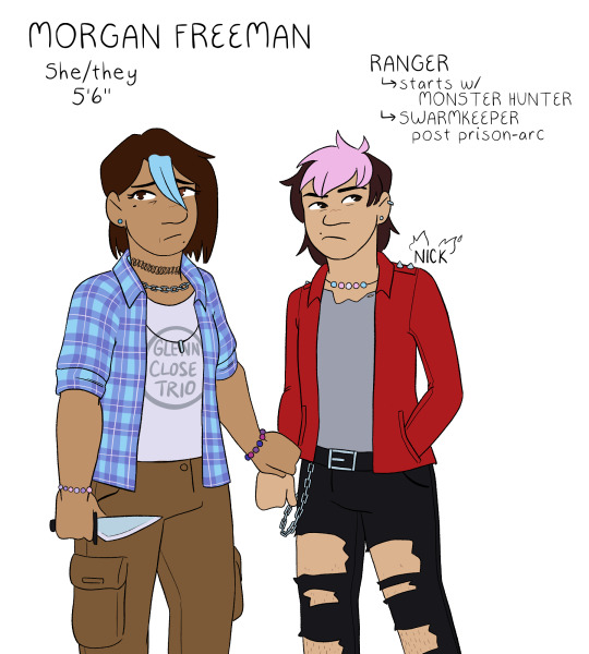

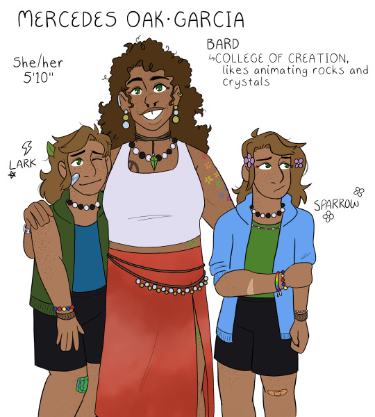
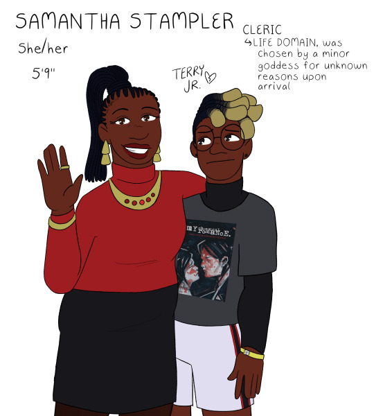
a return to the monsters and mommies au designs, this time properly lined and in color! :D posted in the middle of the night just like last time though because i have problems <3 there are some small changes to these designs, but for the most part i was pretty happy with them so this was mostly just to give myself a color reference for them all lol
gonna ramble about small decisions i made below the cut, but its not necessary at all to understanding the designs! just wanna dump my thoughts somewhere :P
for the most part, the kids' designs are the same as i do them for normal canon, but there are some small differences. i've never really done a proper reference for their kid designs either though, so i guess no one would even notice LOL
freeman family: well, firstly - nick's last name is freeman in this au LOL but its easier to refer to him as nick close so people know who i mean as opposed to nicholas foster. usually, i draw nick close with blue hair (i think he goes through a range of colors, but blue is my default), but i do this because he does it to honor morgan. since she is alive here, instead, his default is pink because thats his favorite color to dye it! morgan and nick both have various bead jewelry because i like to have the headcanon that morgan is really into pony bead jewelry; this is also why all of my nick and nicholas designs have the same trans pride necklace, morgan made it for him :] both nick and morgan wear glenn's old clothes, both of them are wearing his shirts in this piece. aaand morgan has subtle heterochromia as a reference to the split timeline! she always has it, it doesnt just magically happen or anything, but its just a small nod to that.
wilson family: its real important to me that grant got his dad's exact coloration except for his gray eyes, which are all carol. why is this important? i dunno! its just interesting to me. also, carol doesnt usually leave her top buttons undone, but upon entering the forgotten realms, she unbuttons it because otherwise her shirt will pop open while she's doing things (to be honest, as a person with a larger chest myself, her shirt probably still pops open but it does help-!). usually i draw grant with a gay pride necklace, but since he doesnt come out pre-forgotten realms in this au, i tragically had to drop it. i miss my rainbow grant. please come home, baby.
oak-garcia family: i always forget to do mercedes's tattoos in my sketches because tbh i never know exactly what to give her. but! but. this time i just went for it. these tattoos arent necessarily set in stone, but i think theyre cute. the tattoo hidden by her skirt is an oak leaf for henry :] her gem necklace is also the same color as his eyes! her skirt is supposed to be, like, tie-dye or maybe more bleach washed, but i dunno how to draw that so whatever. the twins are, like, 100% the same as usual, i just gave sparrow a pink bead necklace instead of the multi-colored necklace i use for my default canon design lol. also, i think i drew the twins slightly too tall here, which is funny because theyre the only ones who are notably shorter than their mom HDFJKGHK
stampler family: i struggled a lot with what colors to give samantha, because i wanted her to have a bright color palette but not anything garish or patterned. originally she was gonna have a white shirt, but then i realized that would make it so all the moms had white shirts and i just couldn't have that LOL so i ended up landing on red for her! it matches with terry junior, so i thought that'd be cute :] terry's design is probably the most different from my default for him? which still isn't a lot but i swapped his dark blue flannel for a black undershirt instead. i cannot explain why i did this. it just felt right in the moment. i gave him a sweet revenge shirt instead of the usual black parade shirt i give him because... well. if you know, you know. and finally, terry gets a little concert admission bracelet!! i always do that, but i just wanted to point it out because i think continuing to wear an admission bracelet for ages after a concert is a very teen thing to do. i always felt so cool doing that in high school hehe
#monsters and mommies au#dungeons and daddies#dndads#morgan freeman dndads#carol wilson#mercedes oak garcia#samantha stampler#nick close#grant wilson#lark oak garcia#sparrow oak garcia#terry jr stampler
198 notes
·
View notes
Text


lunar | solar
eclipse lesbian flags!!
flags I made exclusively to piss off a specific tiktok user who wont even see this, but ended up putting way too much effort on anyway lmao I love them and will use them for oc and hc stuff >:) free to use by anyone btw!!
the different versions have the same meaning, just with a different palette and order, theyre both heavily inspired by the sun and moon lesbian flag so I thought "what happenes when moon and sun aligns?? boom!! an eclipse" and thats where the names come from
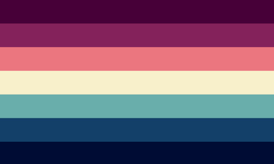
[image ID: two flags of 7 horizontal stripes, the first one's colors are from top to bottom, cherry, deep blue, purple, lavender, off-white, tan, copper. the second one's colors are from top to bottom, deep blue, cherry, dead rose, salmon, off white, teal, dark teal. end ID]
tagging: @mogai-sunflowers because I think youd be interested >:)
color meanings:
for lunar
cherry: femme lesbians, fem presenting lesbians
deep blue: butch lesbians, masc presenting lesbians
purple: transmasc lesbians, pnc lesbians, mspec lesbians
lavender: intersectionality, trust within the rest of the queer community and minorities
off-white: rejecting purism, shame, and guilt within the community, dykes, and futches
tan: family, trust within lesbian communities, acceptance towards eachother
copper: transfem lesbians, multigender lesbians, aspec lesbians
for solar
deep blue: butch lesbians, masc presenting lesbians
cherry: femme lesbians, fem presenting lesbians
dead rose: transfem lesbians, multigender lesbians, aspec lesbians
salmon: family, trust within lesbian communities, acceptance towards eachother
off-white: rejecting purism, shame, and guilt within the community, dykes, and futches
teal: intersectionality, trust within the rest of the queer community and minorities
dark teal: transmasc lesbians, pnc lesbians, mspec lesbians
obligatory (/j) sunset lesbian inspired stripe order versions

too tired to make IDs for these ones rn, sorry!!
also I probably wont make gay man versions for this, only because I have no idea what it would look like, if you have any ideas though feel free to make one and tag me in it!!

[image description: a black banner with a white outline, theres smiley faces with their tongues sticking out in every corner, also in white. theres also a small pink splatter from the bottom right corner. the banner reads "please do not reupload unless credited and informed". end ID]
#kirucoins#if u see this I had to use chrome to edit this bc tumblr glitches like hell on firefox lmao fuck you tumblr#mogai#mogai blog#mogai community#mogai friendly#lgbt#lgbtq community#lgbt representation#lgbtqia#lgbtq#lgbt flag#lesbian#wlw#wlnb#nblw#lesbianism#lesbian community#sun lesbian#moon lesbian#eclipse lesbian#solar eclipse lesbian#lunar eclipse lesbian#sapphic
183 notes
·
View notes
Note
have you ever thought about having different scenes that are tinted different colors for the grayscale/purple stuff? I thought it might be fun for some scenes (esp sad but hopeful ones having yellow lighting)
is very good idea , but we not plan to have that at all , all monochrome will be purple tint
color barely changes and that attentional , only shade . it always tinted purple excepted in dream where it very noticeably have color ,
but thing is that it simply invert of normal color
if scene needs “feel” , itll be done by shade , not color
this world lost lot color after all , color isnt needed to give feel or make feel distinct
—
we chose purple as monochrome as it give extra interest in art and keep similar cold feel pure grey have , is personally feel purple is closest to black / grey than any other color (that why “evil color” and villains often purple)
we want make feel that at first glance , world very clearly still has color in form of purple ,
but if you stare & read long enough , it really does start feel like “truly 100% ‘grey’” because that what people in world feel .
theyre used to this purple as norm for so long brain interprets it as “grey”
only reminder that its not is when morning comes , when grey becomes more clear .
even then , grey in morning is not “true grey” . true grey doesnt exist in WYGN funny enough
—
changing color for different location and scene just for feel will break illusion , and idea of “world lost it color” feel like that simply not true , fake fear that wouldnt make sense . constructed .
where would these different color tints come from ? if different locations had different monochrome , people could just take items from different places and mix match , making rainbow again
if it lights that make color , then why not just take the light ? WYGN would be different story if it follow this path .
this story is about remembering and recording color , not restoring color ,
all this shouldnt happen here in this story or world at current time
—
idea and exercise of story is that color minor , rely on shades , that you cannot hold color , only other living people have color . idea of color is a heavy thing here
using more colored monochrome palettes would kill that
ty for ask :]
#ask answer#lore#development#wish you goodnight#wygn#art#azure sun#scarlet star#ref sheet#oc#rambles#yuma.cafe
24 notes
·
View notes
Note
i loveee ur art its sooo expressive and it has such a 90s feel to it.. if i may ask, how do u pick ur colours? do u have a specific colour pallete u adhere to? thanks!
thanks so much :DDD im curious what might make it feel 90s 🤔 thats so interesting
anyways stuff abt coloring below
honestly i kinda just fuck around with color, technically i somewhat understand color theory but despite that im bad at choosing the right colors straight from the color wheel so a lot of times i just hsb adjust things until theyre right
ive got two different ways i color things currently:
softish shading with a marker brush in greyscale, applying too many color adjustment layers, and then coloring a little on top of the greyscale to make things not monochrome. usually i color on top of a clipping mask bc its a lot easier, which i did in the ace attorney one but not in the merlin one for ?? no reason i guess i just didnt think abt it lmao

the other way is i decide what color i wanna cast the whole drawing in and i make that the base clipping mask layer (which ive been making like. neon green a lot lately lmao) and then i block in color on top of that, and shadow color on top of that. the cybersix ones a great representation of what im doing there but its a little chaotic since all of the sketches were meant to be cropped oops. the cowboy danny phantom ones a lot cleaner of an example haha
i really like doing the second method because it also works great with lineless and also i really like comparative colors? i know theres a better phrase for it but like. when one color looks like a different color when its put in a different colored space. like when im making things green, id color blue things in the scene green and red things in the scene a muddy orangey color. or when i was really into yellow id make the blues purple. idk usually the “blue” in the scene is first color i like to figure out im not sure if its because its my favorite color or if its because i love drawing jeans but thats just how it goes lmao
oh also putting things on a or neutral bg helps to pick colors a lot easier than keeping the default white bg, i always turn it off and leave it transparent until im finished lmao. i use procreate light mode so its still rather light but not too bad
i dont really have any palettes that i intentionally adhere to, no, but i do get kind of stuck using the same colors for a few months before moving to something different. rn im very stuck on green and need to accept that not everything needs to be the grossest greens ever and ive been stuck on it for about six months? in the past i was really stuck on yellow haha
#coloring method is fuck around and find out#ask#anon#very surprised abt all these questions abt how i do things recently#not in a bad way#its just interesting#how i draw
46 notes
·
View notes
Text
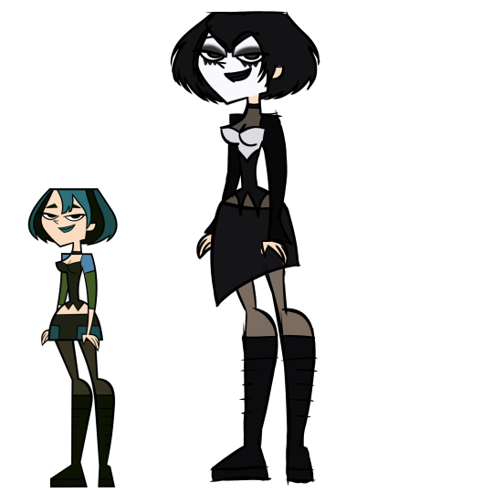
SOME TOTAL DRAMA REDESIGNS BC THEYRE FUCKING UGLY
comments on Duncan: who decided he should have teal piercings should go to fucking hell. AND ALL THE WHITE PARTS OF HIS CLOTHES ARENT EVEN WHITE. NOT EVEN OFF WHITE. THOSE ARE YELLOW AND ITS SO FUCKED UP AND UGLY. ALSO THE LITTLE BLACK THING AT THE BOTTOM OF ONE OF HIS SLEEVES PISSED ME OFF SO HARD SO I MADE IT A SILVER BRACELET. if u wanna make a part of his color palette as ugly as him give him mix matched jewelry. i gave him two different rings, silver and metal, then a black ring, all on the same hand bc those r ugly when put together!!!! also ik my redesign of him isn’t perfect but if u make him and his color palette ugly u at least gotta make his fashion sense ugly in a realistic way
comments on Blaineley: HER COLOR PALETTE IS SO FUCKED. SO FUCKED. YELLOW HAIR, GOLD WRIST BANDS AND RED EARINGS, DRESS AND HEELS?? WHO FUCKING DID THAT. ALSO HER HAIR IS A VIOLATION OF EVERY LAW IN THE FUCKING BOOK!!!! ALSO I HATE THE BLONDE BLUE EYED WHITE GIRL BEING A BITCH TROPE SO HARD, IT MAKES ME FERAL. also the outfit and hair and stuff just redesign things were just for fun not for any reason except for the fact she was really bland and not in the fitting way
comments on Gwen: shes emo. shes caller the goth girl and shes emo. WHICH IS FINE BUT THEY DIDNT CALL HER EMO AND SHE COULDVE LOOKED MORE EMO!!! also they could’ve gone somewhere if they used those blue’s right but the greens are fucking vile. i made her as goth as i could and gave her green eyes bc cute xx
#total drama#total drama duncan#td duncan#total drama blaineley#td blaineley#total drama gwen#td gwen#also fully trad goth gwen x geoff would make me a very happy gal
15 notes
·
View notes
Note
Hello, just wanna start this off by saying that I love your art. I've decided to ask my favourite artists for art tips as I wanna get into it, but no matter what I do it never looks right. So, any tips?
HELLO TYSM!!! ngl i dont think im the best 4 this question im also kinda in a rut rn where im not really satisfied w my art n craving more progress and improvement but im getting there somewhat but very slowly! (ive been this way for a rly long time naow) this might be long but im gna try n throw in the things ik, sorry if my thoughts r messy im not the best in articulating stuff :')
i think a good way to start off is to find out what skill you lack the most or what you want to improve the most on, say for ex: u wna focus on getting better at composition for illustrations, then a good way to improve them is to learn about the composition rules (ex: rule of 3rds, etc), look for any scenes in films/animation or photographies and storybooks , study them and recreate it! go crazy !! ive done a study on a friend's picture before, and have asked my friends if i can use their photographies as practice!
looking for inspiration will also improve ur visual library, they can help u find what u wna put in ur art ! like perhaps certain color palettes or styles, it's best to look at different mediums of art instead of focusing only on one, sometimes u can find techniques meant 4 u! (ex: of this is my friend who used to be a watercolor artist, ive observed them using watercolor techniques when they were still new to digital art! basically mix n match whatever feels good/convenient 4 u :] )
disciplining urself is also good to have more improvement! i have trouble w this the most ever since bc its hard 2 focus if no one is like there to monitor u (in my experience), if u rly wna make progress u have to squeeze in some art practice time in ur schedule, it can be around 15-30 mins or even 3 hrs, completely up to you! (rmb to take breaks!). you can give urself deadlines if that will help n maybe timers too!
my prof always said "Proper practice makes perfect", so it's also best to practice with a clear goal in mind, take notes on the things u lack and if ur watching any art tutorials/speedpaints, take notes of those too! it's good to have something specific in mind so u wont get lost n u wud know what u wna do! it helps u retain info as well so u can look back on stuff, to avoid overwhelming urself u can just focus on small bits first, ex: in anatomy, u can focus on the head area first, break it down to drawing eyes and noses, etc! then u can move onto the torso area!
USE REFS!!!! make use of pinterest or any other refs u can find, cannot stress this enuf go crazyyy w references, make a moodboard full of referencess n go crazzyy w them!! i used to not like doing this bc i just head straight in to drawing bc thats what i was used to but art college trained me 2 use refs bc they help so very much, theyre like ur guideline for what u wna make so u have a clear goal in mind, also photobashing seems like a great practice too never tried it but yes it can help when ur planning an illustration/concept art!
^above also applies to art styles! go crazy n experiment w them!! i think its so very fun to explore diff art styles n not stick to 1, again this depends on u but having a different range of artworks is rly fun, u can go from very pastel soft colors n style, to smth very vibrant n sharp, to smth like dark n chalky-sketchy kind of vibe if im making sense T__T, basically go wild!! go crazy!! dont let urself sit in 1 box! hop into other boxes !! or wear all of them!! or poke holes in the box n add stuff to the box or wear a circle!! trust me it looks so fun if u put different artworks uve made side by side n go wow i did that!!
also create small thumbnails 4 illustration! its really best to plan ahead art too, as i said i used to just head straight in n not plan but ive learned to absolutely enjoy planning making art! collecting refs n seeing what kind of composition goes n what colors wud work is so very fun actually! it rly helps a lot
theres also this one post i lost the link, but basically it shows how much progress u can make if u make loose sketches vs full on rendered illustrations vs a mix of both, again this depends entirely on u bc things r different for everyone! i think that post is really good for teaching abt art progress (if any1 knows where it is pls do link!), i think focusing on sketches n practice is better tho bc it helps u draw more freely n loosely! i think that speeds up ur process more as well n doesnt make u lose interest immediately compared 2 focusing on finishing 1 big rendered illust (talking from experience) but then again its different for every1 so honestly just experiment n see what feels right for u!
i wna say tho that although it is good to make sure ur drawing looks right its also good to just let yourself draw freely, i think what matters is that u understood the structures of something and as long as ur able to apply that in ur own way i think thats gud! i think drawing freely helps u draw more fluidly? like having more expression is what i mean. ive gotten into the "i have 2 make this look right" hole before n i noticed it made my art look stiff, so highlyy recommend doing gesture drawing n life studies! rmb to have fun when practicing n learning,
dont pressure urself too much! enjoy the experience :] ! messy sketches r good!! not everything has to look good or perfect! my sketchbooks from way back were just doodles, pencil sketches no color mostly, theres an occasional lined one w markers , ballpen, n some highlighters, n my drawings were either smth funny that happened w me n frens with our personas or making ocs for my faves or ocs for me in general!
ur sketchbook doesnt have to look pretty its like ur diary but its art ykno! ur thoughts in visual form for the day! (again all up to u as long as u have fun! its all different 4 everyone!)
anw tysm again!! sorry if this was all over the place HAHSAW i tried my best but these r the tips i keep in mind most of the time or the ones i hold closest to me n that i try to apply as much as i cud! if u need anything else clarified just lmk! not the best w words but hopefully it helps :'')! most of the stuff i mentioned here i also need to take into practice HAHWHAW so mb its gud 4 me to write this down so i can finally push myself to do stuff,
#but yeah as ive mentioned go crazy!!#have fun with ur art! thats what matters the most#the bond ull have w ur art will b so precious! pls take care of it!#makes me think of my relationship w my art rahh being in art college kinda ruined it bc of the pressure im trying to rebuild it as much#as i can bc art means sm 2 me!!#i wish u luck on ur art journey anon may we have fun learning art n achieve our goals!#ask tag#anon#this is making me reminisce old times#hope this helps!! i was jumping each part so yea sry again if its messy#art advice#? HAHSHAW i am not the best w this tho im still learning !! always learning anything specific like anatomy help i cannot#but things like these i think i can?? HAHSHDA#also sry if this is like the same things every1 has said before but its true!!!! they r right!#nowadays ppl have a lot of access to knowledge compared 2 before so make use of em!! lots of art tutorials around
2 notes
·
View notes
Note
Do you have any drawing tips?
•When it comes to digital art, if you struggle making lines clean or sharp enough, using a textured brush erases that struggle because the whole point is not being clean or sharp.

^left is obvious where mistakes were made and had to be erased, looks choppy and needs cleaned up. right does not need cleaned up much. saves time and energy!
•if a drawing looks a little too bland or unfinished, but you don't know what else to do about it, adding a texture overlay does a lot, especially for solid backgrounds
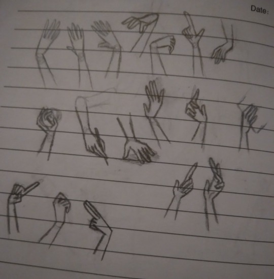
•For both traditional and digital artists, do👏art👏studies👏. No, this doesn't mean sign up for expensive art classes, it means spend a page in a sketchbook just practicing one thing. So instead of drawing say, a character portrait like usual, have a page that's just full of hands in different poses (use references! Very important for studies!)
2016 example, but you can tell which ones had references (hint: only 3 of them did,but they're way better than the rest)
the only recent example I had was an unfinished page of bird skulls :/
Which brings me toooo
Learning to draw realistic skeletons can also really help with anatomy, if your character looks wonky, think "could a skeleton fit in there?"
Thinking abt how their skeleton looks can help notice things like the eyes being too high up or the mouth being too low, or having no room for a brain
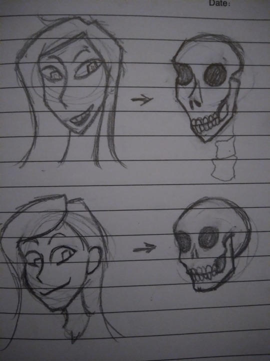
*this is not a dig at people with this style! It's okay to have more exaggerated features and you don't need to draw realism! The skeleton rule does not apply to cartoony characters obviously. Just some advice from someone that used to put the mouth too low all the time
•if you get stuck where you feel like you aren't improving, try different art styles out.
•If you have art block and don't know what to draw, try the 'dtiys' or 'draw this in your style' tags and pick something there, or do screenshot redraws from games or shows
•If you usually listen to music when you draw but it's just not doing it atm, switch to something like long YouTube commentary videos or documentaries, and vise versa. Sometimes the brain wants music, sometimes it wants information or gossip. When you get burned out from one go to the other
•this applies to traditional and digital art too! If you have art block on one medium, switch to another! If digital isn't working, grab a pencil or paintbrush, or play with some clay! Sometimes the brain isn't bored of art, it's just bored of the medium.
•If you're trying realism and struggling, break it down to simple rules.
And I don't mean the shape thing everyone suggests, I mean things like "the inner corner of the eye lines up with the mouth, the outer corner of the eyes lines up with the ears, your nose bridge leans into your eyebrows, feet are the same length as your elbow to your wrist, use the collar bone to guide the shoulder position, the armpit curves into the breast, etc.
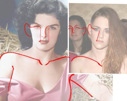
*this doesn't apply to everyone or every expression! Remember the mouth moves around and comes in all shapes, it's a very loose "rule", and people's eyes aren't always the same distance or angle, just keep the ear around that general eye area
Glasses test: can your character wear glasses?
carlos passes glasses test-
a better rule for mouths is to imagine smile lines, even if whoever youre drawing doesnt have wrinkles, theyre a good guide for mouth placement
•doing color palette challenges can help practice composition and shading with abnormal colors, and helps understand color theory
•for digital, you can overlay colors over a drawing to make the palette more uniform. Don't be shy abt messing around with it

•Watch speedpaints! Watch pencil animation clips! It helps
•don't be afraid to use your art supplies. Ik the struggle of "but I don't wanna waste it", but that paint will go bad if you keep it on a shelf for years! Use it already! Doodle in the "fancy" sketchbook! Yolo!!
•use cyan and magenta for mixing paint, not blue and red. The "primary colors" rule doesn't always apply to all mediums.
•keep your old art! Do not tear it up or throw it out just because you're not proud of it, it's cool to reflect or even redraw it years down the line (backup your digital art somewhere, even the ones not posted online because your computer could just die one day for no reason and take everything with it. It sucks)
•IF you sketch on paper and then digitalize it later, you can draw the pieces seperately and photoshop them together. So dont worry if you drew a really good hand but it's at the slightly wrong angle, or too far away from the body. You can put it where it needs to be without having to erase and redraw it
11 notes
·
View notes
Note
hi i love love ur designs ive been following u for probably years now n theyre so good i can and do stare at them for minutes. i picked up drawing early last year n rly enjoy designing characters n i was just wondering if there was anything u did to improve at picking color palettes or if it just naturally happened from designing so many characters. also where do u find inspiration for the outfits ur art is so cool<3
Thank you very much i'm always flattered when people enjoy my designs. Please take everything I say with a grain of salt, ive never been trained formally in designing characters or anything like that and i'm a fully self taught artist for digital art.
I would have to say, a good key part of designs is not JUST in color palettes but in contrast and hue values [darks and lights]
i would suggest you can work on contrast and your values, by working with monochrome palettes of any color of your choosing- working from light and dark from there
Also a lot of color palettes, ill be honest its kind of a hack, its like, complementary/contrasting colors often together either be it in equal terms or using one main color and then using its complementary color for 'accents'. Smaller details to pop. I like to make sure accent colors have more than just one tie into the design so it feels like it fits into the design. Like imagine a wholly green outfit in different shades of green with ONLY a bold red lip. that looks tacky, it would need more accents of red to tie in to balance the design
or analogous color schemes like Pink and Yellow with some orange, or my favorite is "Peacock" Green, Blue and Purple i love those colors together so much and im sure many notice it with the frequency i like to utilize those colors
While working with colors i like to hide my lineart layer to check and see if colors are distinct and readable without just the lineart as well
A lot in designing also has to do with your own style, ive grown and adapted a more simple style and so my clothes are typically more on the simple style but i try to make a good silhoutte shape with them, silhoutte is a great part of character design too but when youre just starting out I don't think it's that highly important.
Of course, references. I enjoy looking through a lot of fashion of many different time periods, i love hanboks, i love hanfus, i love medieval headpieces, i love punk and the best part is you can just make a combination of multiple different facets of a piece and stitch them together to work out .
11 notes
·
View notes
Note
I’m intrigued, you gotta elaborate on that
HELL YEAH OKAY these thoughts are largely unorganized and don't necessarily imply heavy meaning but again pattern recognition makes brain go brrrrr so color theory time! Easy start is Tim and Jay having complimentary color schemes, they are opposites both in Canon and on the color wheel, and yet they go so well together and are always paired (Jay also wears a lot of red and brown((red+green)) in canon). they are different and yet so painfully similar
Hoody and alex were very close to being compliments (yellow and purple/ blue and orange) but just slightly missed the mark with blue and yellow. However they are both needed simultaneously to create green i.e: dragging Jay into this. all of these intermixing colors are surrounded by the threat of the operator, that which is black and white.
tim/masky and hoody are toften referred to as "the twins"(better represented when tim is in the masky jacket matching hoody's yellow) and are also analogous (close by on the color wheel, red orange and yellow are all analogous), however one color stands between them on the wheel/ Brian hiding his identity and Tim's memory issues prevents them from true connection.
jay and alex are also analogous, having been close before and jay still harboring some type of connection towards alex which has been separated by alex going off the deep end. while both alex and hoody have no compliments, alex is the most isolated in his journey, never working with anyone (like hoody teaming up with masky) and only using others as a way to tie up loose ends.
In entry 86, Tim and alex swap colors as Tim wears a blue flannel and alex gets covered in blood lol
I didn't have a way to fit it into the composition but also masky's palette of a black and white mask + yellow jacket (back to the twins bit and also his history with the operator) kinda gives conflicting vibes at first which matches how we perceive them early on, unclear (for both hoody and masky) if theyre working for or against the operator
OH and Tim Alex and hoody are all primary colors (cant mix anything to create them) and have heavy connections to the operator while Jay is a secondary color (still affected but somewhat less involved, makes sense considering how protagonists are often stand-ins for the audience)
#lane speaks#ask the alien#okay i think that's it it for now fghkdjhk#elfgrunge#marble hornets#mh#i lov colors :]
12 notes
·
View notes
Text
i tried to figure out exactly what was bothering me. my new phone stylus is very hard to hold so i had no good grip so the drawings look weird, but i think it conveys the idea for the most part. I PROMISE I DIDN'T TRY TO MISREPRESENT ONE OVER THE OTHER!!! the drawings just accidentally came out goofy 😭 its only to demonstrate the broad strokes anyway
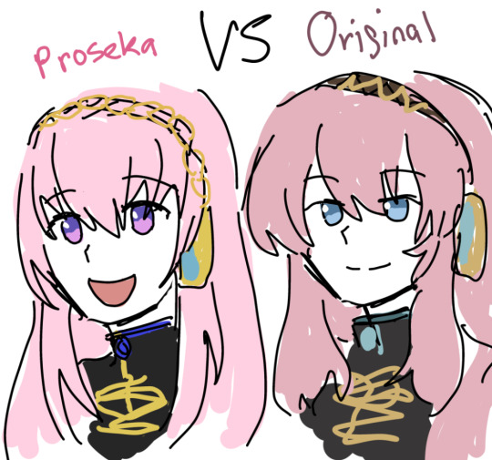
admittedly v4x luka sits in the middle of this scale but they specifically used a """revamped""" version of her v2 design so. v4x doesnt exist and tbh ixima has kept her personality mostly intact in most v4x promotional artwork WHY AM I TALKING ABOUT V4X THIS ISNT ABOUT HER but yes. i think the weirdly saturated color palette is kind of.. i dont wanna say poorly put together but i was surprised by them. theyre quite stark. i think the earthiness of luka's old v2 outfit in comparison contributes a sort of maturity and sophistication. the fluffy hair really helps too. the eye shape is a huge point as well... not to mention the personalities just seem so....different.
the saturation values are surprisingly similar between the two which is sound and correct, its easy to read regardless of which one it is, so i cant continue to nitpick from most technical aspects. itd just be pedantic (tho tbh proseka luka's hair could stand to have more contrast)
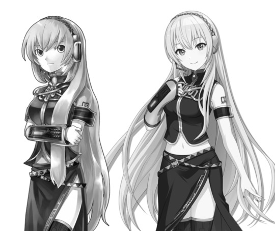
i will say proseka's luka's silhouette is way more ambigious compared to old luka even though its almost the same outfit— i already closed my phone's editing soft of choice and i didn't save the version with the key arts but try for yourself, clip layer and turn both solid, the proseka version of her hair is so shapeless it hurts the overall shape and dynamicism of the design (IMO). i think its closer to ixima's take on it, but i never liked how ixima draws hair, people started making bald miku jokes for a reason.
idk if i have it in me to go blow by blow about why i prefer what and why i dont but im starting to feel grief over how luka is misrepresented.
8 notes
·
View notes
Last Seen Blogs

jspianista-blog
Untitled

mrmichaelchadler
Michael D. Chandler Tumblr

zeitverschwendend
110615
itslanaj
@ItsLanaJ
archessentialism
Archessentialism