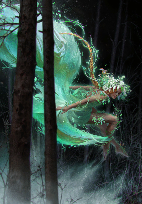
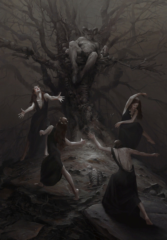
#the characters are a bit wonky but i still like the composition!
Text
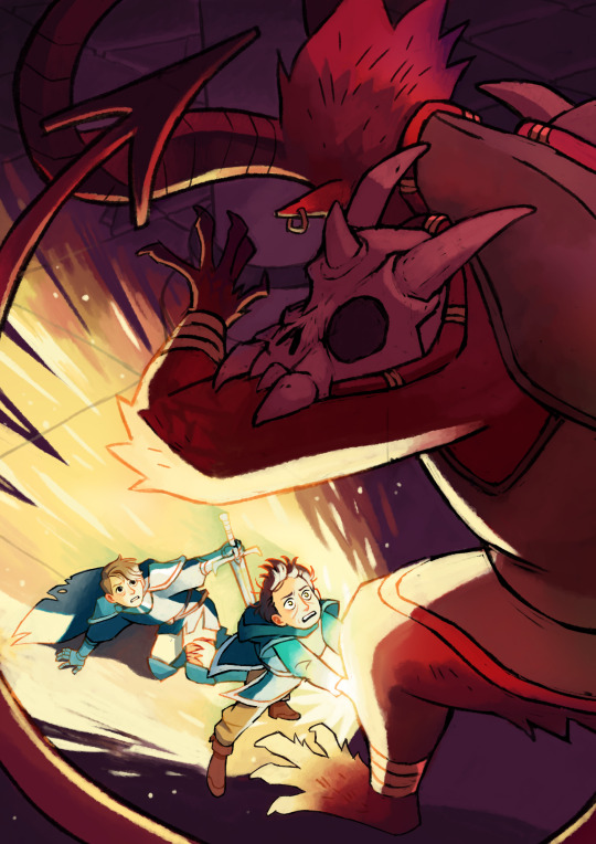
I suddenly remembered a drawing I made for a cherry magic big bang like two years ago, but my drawing was a spoiler and the fic never updated so I never posted it... well here it is!
633 notes
·
View notes
Text
Denoiser wisdom
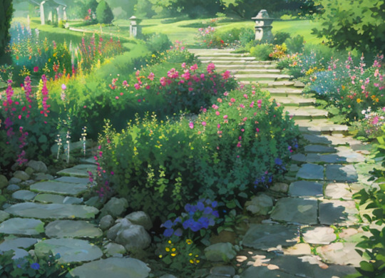
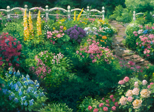
Since a lot of people showed interest in my workflow of using SD like a renderer for existing sketches, I'll be sharing the little tricks I find while exploring the capabilities of SD with Neuroslug. Read the inpainting post to understand this one.
When inpainting, the model takes into consideration what is already in the area it regenerates and in the areas around it. How exactly it'll follow these guidelines is determined by denoising strength. At low values it'll stick closely to the areas of color it sees and won't create anything radically different from the base. At high denoising strength it'll gladly insert colors, shapes and silhouettes that weren't there originally.
Basically the more you trust your sketch the smaller your denoising strength should be. It doesn't mean you won't need the high denoising at some point. Let me explain it using yesterday's artwork.
It all starts with a rough sketch.
Since I have a particular composition in mind and want it to be maintained, I'll be using a low denoising strength to fully regenerate this image.
It means that the algorithm won't have enough freedom to fix my large-scale mistakes, it's simply not allowed to change the areas of color too dramatically. So if you want to do this yourself make sure to set the image to black and white first and check that your values are working and contrast is good.
To make sure the result isn't too cartoony and flat I used brushes with strong color jitter and threw a rather aggressive noise texture over the whole thing. This'll give the denoiser a little wiggle room to sprout details out of thin air.
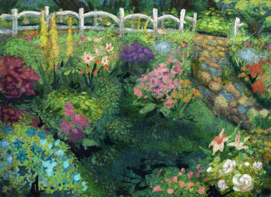
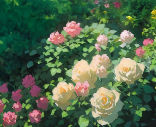
It kept the composition, the suggested lighting and the majority of flowers kept their intended colors too. This was denoising strength 0f 0.4. To contrast that, same base image with denoising at 0.7:
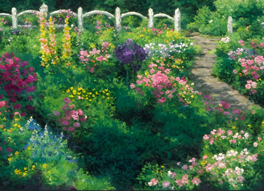
It's pretty, but it's neither the style nor composition I wanted.
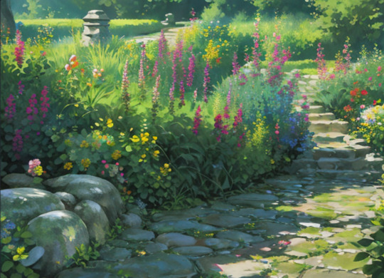
Let's refine the newly redrawn base to include the details that were lost in transition.
These were intended to be roses.

It's here where I learned a little trick. You can mix and match different models to achieve the look you desire.
Neuroslug is good at detailed moths and painterly environments. It's not good at spitting out really detailed flowers, they end up looking very impressionist which is not what I want in foreground.
So, I switched to an anime focused model and let it run wild on this bush with high (0.7) denoising strength.
Nice definition, but it looks too smooth and isn't in line with what I want.
Switching back to Neuroslug with denoising at 0.5 and letting it work over these roses.
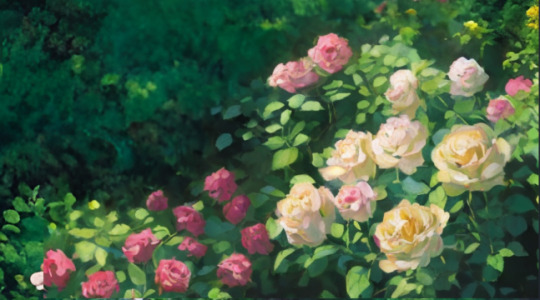
This way, I get both the silhouette and contrast of the anime model (counterfeitV30) and the matching style of Neuroslug. It's also useful in cases where the model doesn't know a particular flower. You can generate an abstract flower cluster with the anime model and use the base model to remind the AI that what you want is in fact a phlox specifically.
So I did this to basically every flower cluster on the image to arrive at this:
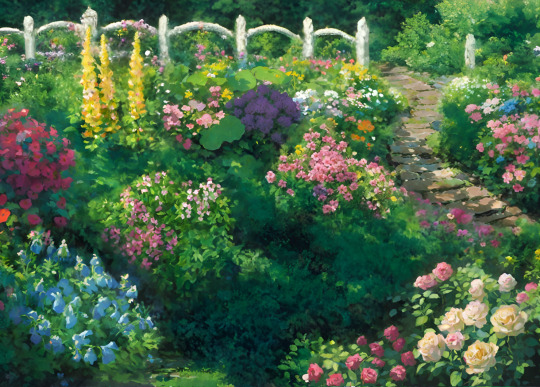
It's still a bit of a mess but it has taken me about 80% of the way there, the rest I'll be fixing up myself.
My "Lazy Foliage" brush set was really helpful for this. I'll release that one once it accumulates enough brushes to be really versatile.
Now we block in the character.
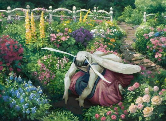
Yes, I left the hands wonky since I intend to be drawing them manually later, same about the foot. There's so much opportunity for the AI to mess them up that I'd rather have all the control on these details.
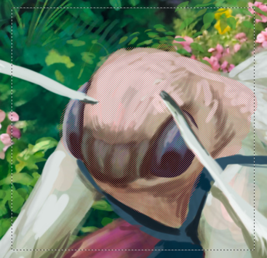
When it renders the face it can really mess up everything, so I do it with low (0.45) denoising strength to discourage new eyes popping up in inappropriate places. Take note that I kept the antennae out of the mask. AI is easily confused when one subject overlaps the other.

Good, good.
Wait. Why are your eyes hairy?
Now, mask out the eyes, remove all mention of fur from the prompt and
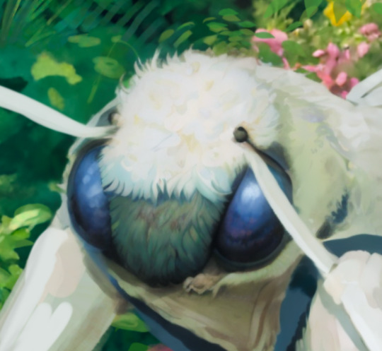
That's about right. Since the eyes are all one color block I can afford to raise the denoising strength for more wild results.
Same for areas of just fluff on the entire body, it's all one texture and having the denoiser at 0.6-0.75 is beneficial because it's going to add locks, stray hairs and other fluffy goodness. Just make sure to not make the mask too tight to the silhouette, it needs some space to add hairs sticking out.
With the skirt it was back to really low denoising. The folds I blocked in make sense with the position oh her legs under it, so I didn't want it to be lost.

Lastly, I drew in a flower that she's planting and ran over it with moderately high denoising to make it match the surrounding style. Ignore the biblically accurate roots there, I'll fix them by hand.

One last pass over the whole thing in Procreate. I draw the hands and add details such as the round pseudopupils, face ridges and wing markings to keep the character consistent with the previous image of her. And a bit of focal blur for a feeling of depth.
Phew, even with generous use of AI this whole thing took an entire day of work. In the end what determines quality isn't the tool you use but the attention you choose to pay to finding inconsistencies and fixing them.
#neuroslug#ai assisted art#stable diffusion#anthro#moth#tutorial#I guess it counts as a tutorial at least#what are these long posts even#slug's experiments
127 notes
·
View notes
Text
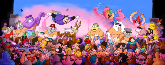
"Crowd Control"
When it comes to large shows, you need to have a large enough of a bouncer crew to deal with it.
If its not the abrasive loudness of the headlining act, its the frenzy they whip the crowd into. The swirling pit of rowdy toons, the occasional surfers who breach just over said pit, the occasional fights, the ones in front who need a splash of water to stay hydrated, the dancers who manage to jump on and off stage, sometimes with some extra assistance. And yet, in spite of all of that, everyone manages have a good time and leave the venue with a musical experience that will stick with them until the end time.
So, this is a project I had been meaning to do for the longest time. Part of the reason I put it off for so long is due the fact that planning out the composition took awhile to figure out, even before I put this setting in a poll on what you all would have liked to see for this picture! Seriously, crowd scenes are not easy to put together!
I initially drew this on two separate sketchbook sheets before splicing them together!
Then there was coloring this in. I decided to keep the shadows soft since I didn't want them competing with the linework. Wanted to have this chaotic and raw!
What spawned the extra inspiration for the pandemonium here is a recent show I actually went to earlier this past September. I saw Death Grips, an experimental hardcore hip hop group, in my hometown. They are always known for putting on an energetic show, and this one was no different. Even though I was up in the nosebleed balcony sections, I still enjoyed myself and consider it one of the best shows Ive ever been to!
This is also a celebration for the eight years I've been on Deviantart! One Thousand Watchers and Counting!
Even though I have my occasional issues with that site, and might have more to come in the future, I will always apricate that this place was the first time I ever decided to share my art outside of just friends and family. Ive met so many people there and here, fellow artists, friends, writers, and simple art enthusiasts.
As always guys, thank you so much for your support over the years! Because without you, I might not have done the work I did.
P.S See how many cartoon characters I managed to sneak in here! Some you might know, others you probably haven't seen in years! You might be able to spot at least thirty here, although I tried to get far more in here with varying success. Some are bit off model and wonky, but they are here!
#crossover fanart#cartoon#pen and ink#deviantart#mixed media#animaniacs#fanart#crowd shot#concert#disney fanart#warner bros#nickelodeon#looney tunes#gravity falls#spongebon squarepants#the simpsons#futurama#ppg#wander over yonder
64 notes
·
View notes
Text
Since there won't be any more expansions (and i'm a chronic procrastinator), i updated my personal top 10 Gwent card arts into a top 20, including the few sets that came since then and shuffling things around a bit.
It's a long one, hence the cut.
Personal top 20 Gwent card arts:
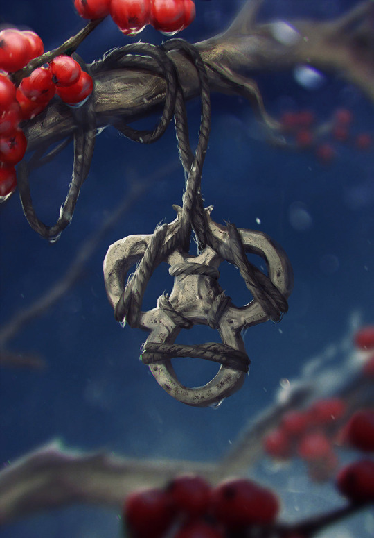
20: Bone Talisman by Bogna Gawrońska
It's still the most festive looking thing i like. My beloved blue-and-bright red fidget spinner. I really can't explain my weird attachment to it any other way; i generally tend to like the item arts, maybe it's the collector brain, maybe it's because after Homecoming and most of the expansion sets since later 2019 onwards, these base set trinket adjacent arts became more prominent to me among a lot of new, more dramatic and bleak character and scenery art.
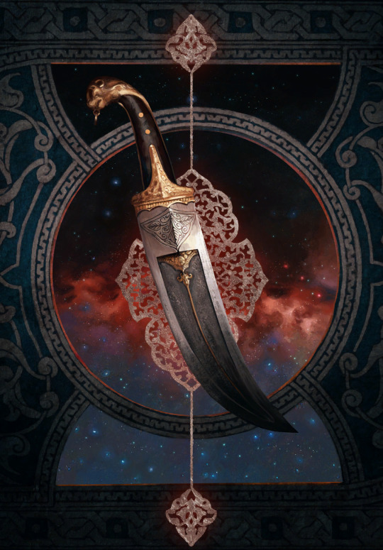
19: Ceremonial Dagger by Katarzyna Bekus
The entire set of strategem arts from Merchants of Ofir is honestly packed, but the dagger is the one i found myself putting in my in-game profile the most. Maybe it's the item hoarder brain again, maybe it's the color scheme i find relatable if that makes sense, most likely it's the premium helping a bunch to make that choice too. The background weirdly fascinates me. Does it have anything to do with The Spiral? I have never attempted to really assign any logical meaning to the strategem arts, they're clearly more symbolic than anything, but it still makes you wonder.
18: Ard Gaeth by Katarzyna Bekus
Somewhat related, here's another piece of wonky multiverse lore. And once again, it's the color that first grabs attention; the contrast of teal and this dusty red. Then one starts realizing the implied size and scope, the birds help with that, apart from being a cute composition detail. The shattery effect makes it look volatile, unstable, dangerous. Ominous. Which ultimately makes it fit with the rest of the Wild Hunt archetype in more than just lore.
17: Coup de Grâce by Lorenzo Mastroianni
There are two wolves in me, one loves bright colors, the other actually enjoys a lot of the bleaker scenes. Although to be fair, Lorenzo Mastroianni is a big contributor to that. And it's no wonder, when he casually drops stuff like this. It's almost symbolic, lot less than strategems but certainly more than other, straightforward "war sucks" Gwent art. How do you visually represent something sad in a way that makes it hard to look away not just because of the tragedy but because of the beauty put into making that image?
You ask Lorenzo Mastroianni, the modern classical artist, to do it.
16: Viper Witcher by Valeriy Vegera
I once described Valeriy's art as "where Lorenzo uses a tight color palette, he uses every pencil in the case". This one is perhaps not as obvious an example, the whole piece has a very unified atmosphere especially from afar, but still, there are so many colors especially in textiles and skin. They're harder to register sometimes but it's how Valeriy does texture and shading. And somehow, he bridges the bleak and the colorful world too. Admittedly, this card also had to be here because mr. Viper is my son, and the voicelines are done by an actor with the nicest, smoothest bass i've heard since Peter Steele.
15: Naglfar's Crew by Anton Nazarenko
I was surprised by how much i ended up liking this one. It's the implications, i think; enchanted to laboriously upkeep this monster of a ship, this 'and if you see it emerge from a breach in the sky, you know you're fucked' symbol of death and decay. It's dark in a way i find compelling, i guess.
14: Serpent Trap by Marta Dettlaff
Back to the bright ones, i liked this art ever since i discovered it as Nature's Gift in post-Midwinter beta. The card saw play in Scoia'tael spell decks, and to me it became linked to Francesca Findabair for their shared spectral snake thing. But that all aside, the art is just so pretty. Vibrant, yet not oversaturated. And like the item arts, needed to balance out the cool and badass and the dramatic and tragic. Looking at it now, another point comes to mind; it's still grounded? The way Gwent art at large is grounded compared to other card games. Like it's not trying so hard (both this piece and the game's art in general). That's refreshing.
13: Chort by Bartłomiej Gaweł
It reminds me of the first game's main menu. The Witcher 1 main menu is, to me, one of the most accurate representations of this universe, its atmosphere. Even if the "you kill cows, you get ambushed by the fucking baphomet" is a meme game mechanic, something about it is...witchery. Superstition, folk legends, and ultimately, monsters. Or that's my takeaway, anyway. But the Chort art, beside being on the more rare side in-game, has always weirdly drawn me in.
12. Oneiromancy by Lorenzo Mastroianni
This was the Novigrad expansion key art before they turned it into a card, and i sure am glad they did. Lorenzo can get a bit weird, as a treat, someone said. Are they Condwiramurs and Corinne? Possibly! But i'll abstain from the schizo theories now. It's a gorgeous, well composed and executed surrealist piece. Inception if it had strong palpable atmosphere.
Denis Villeneuve > Christopher Nolan. but Lorenzo beats both
11: Funeral Boat by, you guessed it, Lorenzo Mastroianni
One final yippee for the last card set. And my god it's beautiful. Tight composition can get surprisingly hard to coordinate and make decisions for, but this is so well-balanced. The left end of the boat is closer to the frame, but right side has the most noticeable color, the character's face, and of course the bird to even it out.
As if to defend the title i gave him earlier, Lorenzo references Isle of the Dead in a way that, even if symbolic, fits into the universe perfectly. Someone stop me before i start rambling about similar concepts in different mythologies.
10: Dana Méadbh (now the token spawned by Call of Harmony) by Anna Podedworna
The most famous Gwent artist enters the list. With a piece made around two, when you think about it very bold choices. The goddess of nature and life, glowing with inhuman light in a black and barren forest. Obscured by thin, bare tree trunks. But to make her emerge and stand out, that was necessary. And it's working wonders. A lot of the Scoia'tael faction is obviously green, all kinds of green, but even a simple choice like making it pop out of black makes the card art stand out among others.
9: Circle of Life by Oleksandr Kozachenko
It has everything i usually look for in Gwent art; nature, color, atmosphere. A certain tranquility, perhaps. A little bit of story - the orange badge is the Kerack coat of arms. It's that environmental storytelling thing gamers keep talking about, complementing the character and faction drama of the rest of its card set.
There's a slightly changed, extended version, too, and somehow it's even better.
8: Gezras of Leyda by Bogdan Rezunenko
As much as i tend to dunk on Bogdan for having played Blasphemous once and making it his entire personality, Gezras is easily the best school founder card art of the set. Once again, the choice to have these prominent arts on the more symbolic side paid off, and the result is a stalking nocturnal animal out for revenge, backed by a giant image of what simultaneously did him irrepairable harm and gave him the means to defend himself. The premium doesn't disappoint either.
7: Rioghan the Undying by Daniel Valaisis
To nobody's surprise, the atmosphere, once again, got me hooked. I love the cold color, the dramatic flow, the big imposing silhouette of a ship in the background. Poor boy is the picture of misery. It's pure melancholy (something not that common in the Skellige faction by the way, which is a point in favor of Funeral Boat too), that i, of course, am inevitably drawn to.
he's just like me fr...
6: Witches' Sabbath by Michal Lisowski
Did i craft this card already or not? The realist's complaint towards near-greyscale card art. I share this sentiment, if only for the comedy of it, but with a few notable exceptions, and this piece is the main one. The Robert Eggers comparisons were made already i'm sure, but it really is a take on the last good Witcher 3 quest with a dramatic, more dreamy, or you could say cinematic quality ramped up to 11. Gone is the fanservice present in the game and the unnecessarily grotesque depictions of fatness of other parts of this card set, and what remains is a beautiful, ominous callback to folklore and classical art.
5: Tinboy by Valeriy Vegera
This is a baroque painting. The drama. Tinboy doesn't take that scarf off, ever. And here this poor soul is, their last will to live dragging it off him. On purpose? On accident? Probably both. The pattern marking Tinboy as a gang member staining with blood of a victim, something something symbolism. All in Valeriy's signature 'which pencil should i pick up next' style. Underrated piece.
4: Lara Dorren by Toni Muntean
They finally got our girl. And once again, despite heartbreak, it's gorgeous. Soft, sweet colors with a necessary hint of melancholy (the lighting suggests it's sunset?), and a pure, painted quality without the need for texture assets. A scene like this is better left a comparatively simple and laid back tribute. Beyond the technicalities, i also really, really applaud Toni for the outfit design. This is the Aen Elle princess, dressed well but for the weather. And the fact her mostly blue clothes with yellow sleeves mirror Cregennan's yellow jerkin with blue details, and her red brooch above the heart might, beside contrasting with the blue, very well reflect his fatal wounds... well.
As much as death on card art isn't always done the best, Lara is represented together with that which mattered to her the most. Despite being categorized among the Wild Hunt, she remains herself.
3: Lydia van Bredervoort by Igor Klymenko
The joy i felt when this was the art of Lydia they managed to get into the game. It's easily one of the best contest pieces and on par with the best Gwent has to offer - it has mood, and that ever present air of groundedness, realism, and in that, unfortunate tragedy. But similarly to Lara, it shows Lydia being her own person; doing what she loved and was good at without sight of Vilgefortz despite her being known as his ever loyal assistant. Likewise, it doesn't sensantionalize her condition, but references it in a subtle, tasteful, and even clever way. I also love her dress and the overall color palette. Igor understood.
2: Eldain by Anna Podedworna
Couldn't help it, this asshole has me in chokehold and he's enjoying it. In my defense, this piece highlights everything Anna is known for, because she's damn good at it. Incredibly sharp main subject of the piece contrasted against a blurry background, which allows for insane details like the strings extending from the top of the lute. To add more fun to it, Eldain isn't even in the absolute foreground, but the piece is still composed smart, so he remains the main focus. His silly red collar on mostly green helps. On top of all that, the art tells a little story, something Anna often does too, and in this case it delightfully sums Eldain up. It's also the best premium in the game.
look at his little red ears from sitting against the sun aww
Honorable mention: Lake Guardian by Anton Nazarenko
Like the following #1, this card has sentimental value to me as my second card reveal and artwork i made my best emote of. It was a perfect match, bird gals and all. It's a Sirin, bringing in a more obscure but not unwelcome mythology reference to the universe. And I love her vibrant, marble-like eyes.
1: Dol Blathanna Sentry by Lorenzo Mastroianni
...remains my favourite card art since that fateful day sometime in January 2018.
I was just discovering what there was to know about Witcher, downloading Gwent in the first place out of need for more content as i was slowly reading through the first book. Gwent has done a lot to explore and build on this universe, and it has helped me contextualize a lot of things early on. I remember scrolling through the deckbuilder, seeing this art, and being struck by its mood, this aura of secret and wonder. "Oh, so this is what Dol Blathanna looks like..."
It's quintessential older Lorenzo. Very much admitted brush work, fog, tight color palette. The little specks of blue in flowers and face paint work just right. Maybe it's a reference to Arthurian myth and Avalon, maybe to Greek myth and Hades, or maybe, as is often the case and was the case later (or earlier in this list), both.
It spoke to me and my sense of wonder back then. It speaks to me when i search for comfort now.
now, time to tear Karol Bem to shreds in the top 20 least favourites xd
#shut up elis#the witcher#gwent: the witcher card game#fingers crossed tungle doesn't obliterate the links
24 notes
·
View notes
Text

I think the difference between these two drawings is really interesting. They’re about 10 months apart, and I think there’s a good bit of improvement 🤔
• The posing/figure of Jack in the new drawing feels a lot more natural and proportional compared to the old one, especially around the waist/legs, and the set of his shoulders/arms
• The outfit of the new drawing feels more probable, like a more probable appearance in this situation (because it is lol, this drawing is inspired by Year 1 Comic 12!). If Jack were being angsty alone in the locker room, he would probably at least have his jersey off by this point. (Even though he still has his skates on for some reason? I figure the skates add interest to the composition idk)
• The background of the old drawing has a lot more extra bits of interest, but overall I feel like they retract from the overall composition rather than improve it. It kinda feels like the objects are added onto the drawing rather than belong and exist within the drawing
• More on that, I feel like the background of the new drawing has a bit more depth and shape, like it doesn’t feel as flat as the older one
• When it comes to the style change, this is a bit more subjective and up to preferences, but for this specific idea and execution, I kinda feel like the new drawing might work better. The drawing isn’t simply a portrait, but instead it’s the composition of a singular character as the focal point within a setting, and I just feel like I was personally able to execute that idea better in the style of the new drawing
• More on the style, the old drawing’s lines and tone/shade changes are way too sharp I think, and not very smooth, and it just distracts the eye instead of welcomes it
• The faces. I personally loathe the way I did Jack’s face in the old drawing. It’s SO wonky, I can’t believe I didn’t catch it before I uploaded it. But oh well, live and learn
• One aspect where I think the older drawing is actually better is in the shadows, specifically the shadows around Jack and underneath his legs. I think that in the new drawing I could’ve made his under-leg shadows a bit darker, so he felt more grounded within the composition
• Another tweak I would make if I could go back, would be to sharpen up the lines and shades of the upper left area of the drawing, around the hooks and back of the cubby, it feels a little flat to me
• Finally, one last change I would make would be to Jack’s head shape. It just seems a tiny bit small, or maybe angled wrong? Maybe it’s his hair, I probably could’ve spent more time on that area. That was the last section I worked on before basically being done, other than touch-ups and corrections, and by that point I was kinda losing steam and wanted to get it done with lol
Anyways, yeah! Those are my thoughts when comparing these two drawings, I figured some of y’all might be interested to hear a little bit about my drawing thought process haha
24 notes
·
View notes
Text
Lyre (Fantasy Romance Visual Novel)
This is going to be a bit critical, but this will still be an overall recommendation. This game has some major problems though.
I've said before of other visual novels that they have poor pacing at first, but Lyre has a glacial pace for most of its playtime. It's not a case of something like Remember the Flowers or Adastra where the natural pace of the author is kind of leisurely, but for Lyre, it just doesn't have stakes for over half the game. In Adastra, it's less than 2 hours in where you get introduced to the basic stakes: Pretend to be a good dumb trophy husband for the alien wolf who kidnapped you and help him become emperor so he can get the power to send you back home. In Lyre, you're a lord sent over from one fantasy kingdom to another to become a royal accountant with some gala coming up. Also you get a wolf bodyguard named Lyall who's got a moderate bubble butt (moderate by furry standards at least). There's just no actual stakes for most of the game. However, by the time the game tries to pick up, it sort of overcompensates and has too many pivotal scenes happen too close to each other in a way that lessens their impact somewhat. It's not too bad, but once it finds its footing, it does start get a good pace going with shifting perspectives, flashbacks, and plenty of narrative momentum. So although it takes a while to see, the game does get very good eventually.
There's a few more nitpicks though. The romance suffers the most from pacing issues. It's extremely gradual, but in a very flat way. Up until the chapter that tries to do way too much at once, there's no obstacles to overcome in their romance, at least none that are apparent at first. The fantasy setting is relatively okay with homosexuality, Lyall and KnotSlut69 (If the game wanted me to name him Richter, it wouldn't have let me name him at all) are of relatively equal status, and their attraction is clearly seen by both of them as mutual. It isn't until the chapter where stakes are actually introduced that any significant roadblocks or insecurities over their romance come into play. As for other nitpicks... there's a human character named Elizabeth with some pretty wonky looking sprites. Am I the only one who finds it weird that Western furry artists often give anime eyes to furry characters but not human characters?
That said, the story does eventually get good. The political drama, the twists, the mysteries, and eventually the romance. It all makes for a pretty good experience. Also while it is finished, it is only the first part of a much longer series of fantasy furry visual novels. I have a lot of faith that things will turn out better for the next novel now that the author seems to have improved quite a bit since then. It's not the best, but it's certainly a pretty good one for anyone who's already done with most of the better VNs in the scene.
Also, I just want to take a moment to appreciate the soundtrack which was partially done by Augustovich. His music is really beautiful, especially because he makes amazingly calm music. A lot of FVN composers tend to struggle with that because they seem more comfortable with shoegaze-y indie rock, but he brings a really great classical sense of composition to his work. A big drawback to the pacing issues is that his atmospheric tracks are very overused, because his other contributions don't get used enough to break up the musical pallette of the game as a whole. It is a shame because all of his contributions are well done. They really help to make the game feel like an RPG, just one where you fiddle around the starting town for four hours trying to figure out how to get the main plot to start, but no one's used that as a knock against Twilight Princess's soundtrack. Anyways, I bring him up here, because he unfortunately passed away due to complications from COVID before Lyre was able to be completed. It is sad to see any creative mind go before they truly get a good chance to shine. Exias, his replacement, shouldn't be discarded though. He brings more of a grand aura to his music that does fit the later parts of the game and he does well at mimicking Augustovich when new compositions can't clash with old ones too much. However, I think he can be a bit extra sometimes, which certainly isn't helped when the game uses his compositions in weird or funny ways (I couldn't help but laugh when the triumphant sounding part of Kjærlighet started playing as Lyall was having his ass groped). They do have a great cinematic feel and they would probably feel more natural in a game where it can be the establishing musical pallette. But I should stop nitpicking. I just really do have a lot of passion for music and I wanted to give some praise to a musician who could have and should have had more time to make many more wonderful songs.
That's all I have to say for now so until next time, keep on yiffing.
Links
Itch.io
1 note
·
View note
Note
hi your art is so freaking cool oh my goodness, the fact that you are using my color palettes makes me very happy!!!! do you have any advice for making cool compositions? i feel like i want to practice that more
oh my GOD hi there!!!!!! wowow i was not expecting this. and here i was almost worried i was clogging your tag?
gosh okay i hardly consider myself the expert on composition. i am still pushing myself to get better at it. but uhHHH let me list a couple tricks ive picked up on!
1. i like to look at my artwork from far away sometimes, especially when im at the stage where im blocking out color, or when ive stared at something for so long its kinda turned to mush in my eyes. detailwork is good! but i find i get a better sense of how the piece as a whole is balanced if i stand back a bit or zoom out.
2.it helps to check how it looks in black and white sometimes? the key with compositions is always contrast, you’re looking for ways to make your subject stand out against the background. sometimes thats making them really bright against a dark background! or even having a highly B&W character against a contrast-less, grey background.
4. alternatively, ive noticed a trend in the eyestrain brigade in picking two highly contrasting colors without changing the values- for example, drawing a blue subject against a red background? this is a cool example of “cheating” while still utilizing contrast! its all about figuring out how to make things pop against eachother.
5. the second piece of advice i have is to go more on.... feeling instead of logic? a strong sense of anatomy is good, and should not be overlooked! but sometimes i find it helpful to, jsjusute, go loose and boneless, and instead of being like "realistically, this is where an arm goes," think more in the realm of "a dark/light shape needs to go here". and i then try and conspire with the elements that are already on the page to see if i can make that work.
6. push your poses! tilt em! go full wonky with it! play! with! motion! some people approach composition as an extension of motion. take your motion lines, and have them dictate where you put everything. a character crashing into the wall? make everything smooth until the hit, and then have as many random bits to help accentuate the impact as possible. let the motion shape the environment
7. finally it is criminally easy to put down a border. if youre more used to drawing characters and dont know where to start on backgrounds or compositions, just try putting down colored borders or adding one (1) shape in the back somewhere. its a good way to get started in thinking with composition! branch out one step at a time, y’all!
#sorry i didnt add any pictures to illustrate my points better#if enough people are interested i might go back and do that??#not sure if anything i said got lost in translation yknow :P#[bugg chitters]#chicken-mc-nuggets
20 notes
·
View notes
Text
Art Progress
Here is a step-by-step of my drawing process. I use Krita on a Microsoft Surface Book 2 and I made myself a template for these illustrations using the same colours and brushes to complete. I feel that settling for a “style” like this helps me to focus on drawing rather than wasting time thinking about HOW I wanna draw. And from there, one can always break the mold. :D
Step 1 - Base Sketch
Doodling the base pose with a pencil brush, just to get the general gist down. This is very small, actually, so I am unable to add details at this point. xD And who cares about anatomy or perspective, curves and balance are all that matter. Unless I have a distinct reference, then I use that as orientation.
In this case I just needed to find a composition that would show the paper dolls closer the viewer but still leave enough room for the two Dreyars to be fully visible, too.
Step 2 - Sketch
Same brush. I just enlarge the base sketch and draw on top (new layer). Ideally perspective and proportions should be considered here, because obviously it just get’s harder and more frustrating trying to correct things later on. But when you hit your limit, proceed rather than dwell on your weaknesses. Nothing against learning and pushing yourself, but before your throw the towel out of frustration, continue. ;)
I had NO references, so the perspective is super wonky. I don’t mind such minor inaccuracies, as long as it’s not super distracting from the content.
Step 3 - Pre-line Sketch
This is the step for references. I often take pictures of my own hand (or draw from life if I can) to get them right or I’d stare at pictures of whatever body part I have trouble with (arms, shoulders, muscles, you name it). I did throw my blanket around and copied from that, I opened some screenshots of young Makarov for his hair, face and clothes, I read up on Shikigami, thought about Ivan’s hair etc...

Step 4 - Lines
The FUN PART. If your pre-line sketch is fine (and it should be as fine as possible), go ahead and line this thing! I don’t like having to make up things at this stage anymore and want to keep adjustments at a minimum but if it really is necessary, one can still play around with head size/angle, eyes, hands etc. But still, the better the pre-lines the easier and more fun the rest of the image!
Step 5 - Shading/Details (lined)
I wanted to imitate Mashima’s way of shading using just fine lines but I am way more messy with it. The lines aren’t parallel and slim down before edges, I have thick and heavy lines, too. Knowing your light source is helpful so the shading is not all over the place, but I like keeping everything as simple as possible and do sometimes just use the shading to show that something isn’t flat. Depending on the complexity of the image, I will add greys in another step to add depth.

Step 6 - Flat Shading
The paper dolls were dark very early on, because it’s a good way to show something is closer to the viewer. But I still needed more focus on them (in hindsight, maybe even a blur would have helped?) so I used a flat coloured layer with opacity turned down to suggest a top light above the characters heads in an otherwise dark room. It sets foreground and background apart a bit better, giving another circle around the floating dolls, like a frame, that draws attention to them.
If needed I can use several such layers, for separate objects or more levels of shading.
And that’s it!
When I find a good way to colour these illustrations, I will share a progress as well. But what I coloured so far did not meet my personal standards at all, so I’d rather not dwell on those and move on. xD
28 notes
·
View notes
Text
Finally watched the first episode of Challenges at Midlife.
Impressions (with spoilers) below:
So, since I don't speak Mandarin Chinese at all, am entirely reliant on the provided English subtitle. The first thing I noticed was that the subtitle can be a bit wonky at times. Thus far, seems like it's mostly "squeezing" Chinese grammar structure into English (this is purely a guess based off awkward sentences and such) as well as putting "your" when contextually it should have been "my". Example:

[Screenshot of Challenges at Midlife episode 01 from YouTube. The character Ning Yu, played by actress Xia Meng, confronts her mother (Ning Hui, played by Yan Xiao Ping) about the murder accusation toward her father. The English subtitle says, "They say your dad is a murderer," when it should have been, "They say my dad is a murderer.]
The "your" instead of "my" translation mistake occured several more times throughout the episode. It's still easy to overlook though, and even with the aforementioned wonky sentences (that happened less than the your/my switcharoo), I was still able to follow the story along without getting too lost (for the most part). Idk if this will be a consistent thing with the subtitles, I just hope it won't get worse. (LOL.)
Next. I went into the drama completely blind. I didn't know the premise much less the plot; I just knew ZYX stars in it as a supporting character and that's about it. (LOL) So I was a bit surprised when I realised the story follows a mixed timeline.
The opening takes place during the early 90s, before jumping ahead to the year 2018. Then it comes back to 1998. Even during the scenes that take place in late 2010s, there's some flashback to the 90s sprinkled throughout — mostly presented as the character(s) thinking about the past.
For me personally, this non-linear storytelling with constant jumping back and forth is a bit hard to keep track of, mainly because am not used to it. Because of my personal lack of experience with this storytelling format, I can't exactly say whether the way they do it is fine or is to the detriment of the story. That being said, now knowing this is the format they chose to go with, am at least more prepared before watching episode 02 onwards.
Third thing I want to comment on is the camera work. More specifically, the way they shoot the scene during the confrontation at Jian family house after the funeral of Jian Zhi Guo (played by Jian Baixuan):

[Standing: Jian Minmin (Zhong Dan Ni). Sitting, second picture L to R: Zhang Lixin (Tie Zheng), Mother Jian (unfortunately I can't find the actress' name), and Jian Hongchen (Li Dianzun)]
Look, am not a technical gal, all right. I know very little about filmmaking or videography, but I know that I like something when I see it. Here are several things I can list that I like about it:
I like the natural lighting. I feel like a lot of live actions (movies and series both) nowadays rely a bit too much on artificial lighting and recolouring. Challenges at Midlife at least seems to be mostly shot with natural lighting, and I really love its usage in this scene in particular because it feels a lot more immersive. It really did feel like being in the same room as them.
I like the way Minmin is standing separated from the rest of her family, even including her husband. It's a pretty basic composition setting am pretty sure. But even without any addition of stark contrast between where she stands and where the others sit, you can just feel the emotional distance she keeps. (God, who knew you can act just by standing? Dan Ni is such a queen for that.)
Additionally, here's something I just noticed as I took the screenshot: Notice how small Lixin, Mother Jian, and Hongchen look when we're seeing the shot from Minmin's side. At this point in the story we're already aware of her ambition to be the legitimate successor of Zhi Guo's business. Also in this scene, it's revealed how much Minmin feels she has contributed and supported her family, yet also feeling like she's underappreciated. Those emotions combined with the shot, makes me feel like Minmin actually not only resent her family (including her husband, Lixin—from whom I get slimy, slimy vibes) but also look down on them. Mwah. Chef's kiss. Character development through visuals alone? Love to see it.
(Wouldn't it be funny, though, if later on in the story everything I've said about Minmin is proven to be entirely incorrect and that I am, in fact, just reaching? LOL.)
The last thing I want to say is I adore the acting from Xia Meng and young Ning Shu (alas, yet another actor whose name I can't find). I got past teary-eyed and went straight to crying when Ning Hui came home and both kids started asking for their father. Absolutely gut wrenching. Everyone's acting in the drama is good! But these two kids—oh, lord, they made me bawl.
Anyway, I think that's all I've got to say about Challenges at Midlife ep01. Funny enough, though I watched it for ZYX I don't think I have too much to say about him or adult Ning Shu, LOL. But I take that as a W for the drama: it's so incredibly good that in its entirety it totally sucked me in instead of just focusing on one actor.
Maybe I'll make this a regular update every time I finished watching an episode. Idk.
Watch Ep01 here.
2 notes
·
View notes
Text
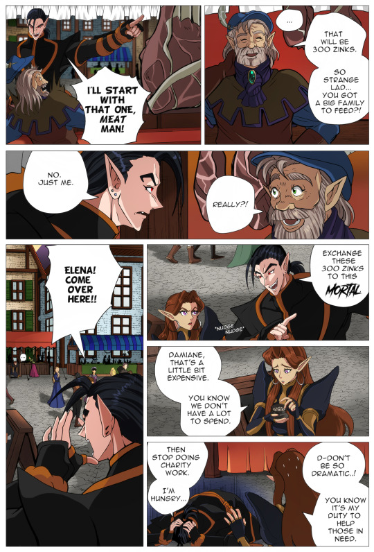
Processing a panel
As I’m in no way a professional comic artist, I still want to share some of my process in drawing a panel. Maybe in the future I’ll change my way of working but for now it works for me.
So whenever I finished designing the page layout, I’ll usually sketch the most crappiest storyboard you’ll ever see and place the speechbubbles. Getting the speechbubbles in right place is important as they take a lot of space. So it’s not about getting the details right but moreso the right idea, setting and character traits for the dialogue.
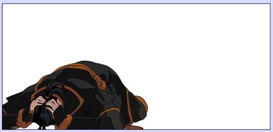
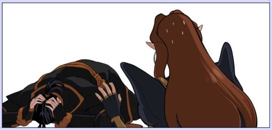
My first storyboard, contained a dissapointed Damiane and Elena having some attitude towards Damiane.
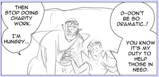
At first it was fitting with the dialogue because the original dialogue contained:
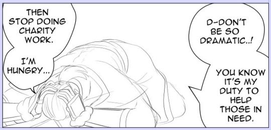
Damiane: Then stop doing charity work.
Elena: Can’t do. That’s basically the purpose of my existence.
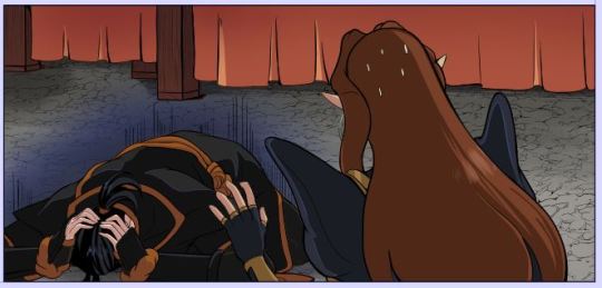
The reason why I changed the dialogue and also the composition/storyboard of the panel was because of their dynamic in the previous pages. The story I wrote before starting this comic is the guideline but within the process of the pages, I’m willing to change the dialogue into something else because I think it fits more natural within the panel or character.
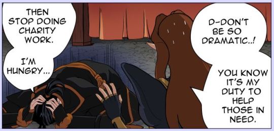
So I changed it into this:
The main reason I changed this panel is because I wanted them to be nicer to each other, while still having a bit of the original dialogue.
I’ve also changed the composition because a composition where two characters are standing next to each other is less interesting than a composition with a different angle.
Something to keep in mind is that after a few pages it’s becoming a bit boring if the characters are constantly having the same pose. So that’s also one of the reasons why I’ve changed their poses.
Last but not least: when making these changes, I always check if the panel still fits with the panel that comes before and the panel that comes afterwards.
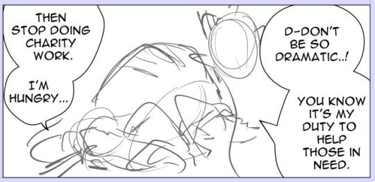
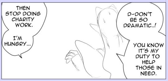
So when the set up is right I’ll focus on the anatomy. I’m going to be honest with you. I think I’ve used 10+ layers to get it in this condition. Each time I just redraw the pose with better adjustments. I usually check references such as Pinterest and the Morpho anatomy books to get the anatomy right. I know a lot of Webcomic artists use 3d-models that come with Clip Studio Paint and sometimes they’re great! But I always have the feeling the anatomy gets either stiff or just wonky when they are traced directly.
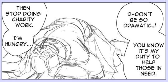
Clean up sketch. This is the process I always do when going towards the final lineart. I usually do this step in 3 or 4 times and when the most important details are right, I’ll start lining it.
I also drew Elena quickly. As her pose is less difficult, I started later with her. But since she’s at the foreground. She needed to be done before Damiane. And yes I draw the characters always seperate from eachother.
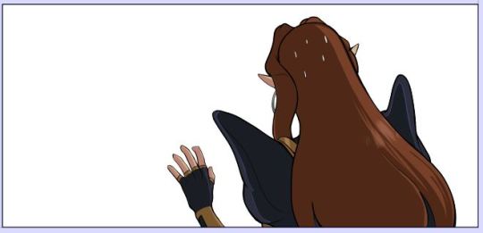
So this is why Elena needed to be finished first. She’ll cover Damiane mostly and I didn’t want to erase his pose because she’s infront of him.
Because I could see how Elena was infront of Damiane, I could also resize him so that it fitted the composition better.
And I was also lazy with his foot because I knew Elena was going to cover that part of his body.
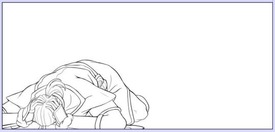
Fully colored. Also when colored drawing can change. So sometimes I need to adjust the final lineart. Which sucks. Especially when it comes to their faces. But this one came out alright. :P No face.
So now you have the two characters together. Last thing I’m going to add is the background. If the background is complexer, I’ll start with the background first and then add the characters. Sometimes I want to move the characters a bit (yay for drawing them seperately) and when I haven’t draw the background first. Well I get an ugly blank space I need to correct.
Since I knew the background was easy, I just drew it later. I always make a grid for the background to get the perspective right.
And done. In the end, I’ll just let it rest. Sometimes I’ll go back and edit minor details like the sizes of their eyes, color or background details. I’ve also completely removed panels and redrew them with a different angle (sigh). Really editors stuff.
Fully page:
Thank you for reading :-D!!
3 notes
·
View notes
Text
NCT 127 helping you study
(a/n: i did my best but i apologize in advance if there are inaccuracies in certain fields of study, i also acknowledge that the lengths of these are hella inconsistent. oops.)
Taeil
He thought it would be a good idea to have music playing in the background while you tried to study. Tried. You kept getting distracted by a particularly good lyric or interesting instrumental arrangement until you were eventually about to crawl out of your skin. He was sitting across from you at the dinner table, your papers scattered everywhere, scrolling through his phone.
“Taeil, turn that off please.” You said it softly.
“No.”
You look up at him now.
“What do you mean ‘no’? Yes. Turn that off,” you laugh it off, but you’re the slightest bit annoyed. This is one of the biggest exams you’ll have this semester, and if you don’t straight up ace it, you’ll be struggling for the next few weeks. He shakes his head.
“Taeil-”
“I read somewhere that if you can associate sounds or music to words, it helps to memorize them. I’m trying to help.”
“Oh.” You pause. “Well, maybe try it again later, for now I don’t even have my definitions down.”
He finally looks at you.
“Fine.” The music stops and you fall back into a peaceful silence.
Johnny
“Alright, who painted ‘Composition with Red, Blue and Yellow’?”
“Mondrian. Come on, at least give me something difficult, I’m trying to pass this final,” you whine, head hanging over the side of your bed. Johnny sits at your desk across the room.
“Okay, how about some added incentive?” Your study sheet falls from his face and you realize you haven’t actually looked at him in about a half hour.
“Yes?” You lean up onto your elbows.
“Every answer you get right now is a kiss you’ll get later.” He cocks his head. You don’t even have to think about it.
“Deal! Come on, next question.” You plop back down. A few minutes later, after a lightning round of names and dates, colours and details, you sit up to find him writing on your notes.
“What are you doing? Those are important.” You frown.
“I’m keeping a tally so I don’t forget one later. We are at...” He smirks without looking up and counts his marks on the page. “Seven, so far.”
“Ah,” you blush, “carry on, then.” You think to yourself there’s no way in hell you’ll ever be able to focus on that particular page of notes again.
Taeyong
You were supposed to memorize the entire periodic table and you were absolutely overwhelmed at the prospect. This was one of those moments you wished you had some superhuman photographic memory that would require minimal effort on your end. Taeyong had you study piece by piece over a long period of time. At first, you hadn’t even noticed he was doing it - he was being sneaky.
“Hey, what’s the first row of the periodic table?”
“That’s a weird question.”
He shrugged.
“I don’t know, I just had a weird flashback to science class in high school, it was up on a wall next to my desk. I think it starts with helium, right?”
“Hydrogen and helium, technically, yeah, but that’s not really how they’re grouped.” You explained.
“Oh? So how are they grouped?”
“Well, you’ve got your metals, halogens, stuff like that.”
“Huh. And what are they?”
That’s when you started to catch on. You cocked your head at him.
“Which ones? There are a few different types of metals.”
“Well, whichever.” He shrugged, still playing his part perfectly.
Yuta
It wasn’t an exam, per se, but you had to put together a final portfolio for an art class, one you hated. It was supposed to be basic drawing techniques, but the professor was all over the place; not all that surprising for an art professor, but still annoying to follow. You were sitting on your living room floor, papers strewn everywhere, barely knowing where to begin. You had a drawing of a flower that was nice and simple, you had gotten the shading right, you liked it enough. One was of a hallway; same deal, the technique was alright, you set it aside, but you had to pick a total of ten drawings. You had dozens, some of the same thing over and over again because you, or the professor, were never satisfied. When Yuta walked into the apartment and found you in that state, he started by sitting quietly beside you on the floor.
“What are we doing?” He murmured after a minute.
“Freaking out.”
“I see. Anything I can help with?”
You didn’t answer, but held up a decent-enough drawing of a hand.
“Do you think the details on this are okay?” You asked. He looked at you and then the drawing. He liked pretty much anything you did, but he knew you needed brutal honesty if you were ever going to be finished with this. He took a long, deep breath.
“So, the index finger on this one looks a little wonky, I think this one,” he reached for another drawing of a hand, “has better lines, better dimensions. All the fingers are good.”
“Oh, I hate the thumb on that one, though…”
He shrugged.
“This one?” He picked a drawing of a desk under a window. “The light looks really cool.”

Doyoung
For your final assignment, you were to make a long, detailed marketing proposal to your class. If it was picked up, you passed, if not, you had an opportunity for a do-over, and a private presentation to the professor alone. You didn’t want the second option, you had other things to do after passing this class that did not include a one-on-one meeting with your middle-aged professor some time after the end of classes. You had been reciting the whole thing to yourself for days, you had prepared a PowerPoint presentation and a ton of visuals to aid you, but you needed a second opinion. You had gone out with Doyoung a handful of times, you both figured it was a matter of time before things between you were made official, so you had him over, sat him down, and launched into your presentation. At the end, you took a breath, then asked:
“How was that?”
He gaped at you.
“Well, hot, we’ll start there.”
“No, Doyoung, I meant would you go for this idea if you were the CEO of something?”
“Honestly, yeah. You made some good points, you had valid, real reasons for what you wanted to do and how you wanted to market this thing. I think it works.” He shrugged.
“You’re a business major, you better not be bullshitting me.”
“You’re a marketing major, you could probably tell if I was.”
Jaehyun
You had given Jaehyun a key to your apartment months ago. He let himself in regularly, and a lot of the time, he was there when you got home from school or work. This time, though, he walked in to you sitting on your living room floor, laptop on the coffee table, facing the couch. There was paper all over the floor, some crumpled, some ripped, some simply abandoned. He had to tiptoe and side-step all the way to you. Your hair was a mess, which he would’ve found endearing if your eyes hadn’t been bloodshot.
“What are you doing?”
You nearly jumped out of skin, startled.
“Fuck, when did you get here?” You asked, eyes wide.
“Just now. You know you have a desk.” He nodded to the wooden furniture in the far corner of the room. You sighed.
“I couldn’t sit there anymore, I was going out of my mind.”
“Well, what are you doing?” He asked again, picking up notes on the couch to sit, facing you.
“My final portfolio for my fiction class is due tomorrow and I haven’t worked on anything in weeks.”
“You’re always writing.”
“Yeah, I’m always writing, but I had two of these stories workshopped months ago and I hadn’t looked at them since. God, they needed so much work, Jaehyun, I can’t believe I actually submitted that. Plus, I was missing a good ten pages for the portfolio, which I’ve written now, thank god, but I have so many drafted versions, I don’t know which one I want. I wrote seven different endings. I’m not even sure about my characters’ names. Or if I want them to be named, nothing’s coming out like I want it, I don’t know what I’m going to do-”
“Okay, slow down, slow down,” he moved to sit on the floor now, facing you at eye level. “How long have you been writing?”
You looked down at the time on your laptop. You frowned, confused.
“That can’t be right.”
“When’s the last time you ate?”
“There’s no way-”
“Alright, go take a nap, I’ll order some food.”

Winwin
“I need you to play judge.” You told Sicheng.
“Judge?”
“Yeah, sit,” you placed him at the center of the couch, and looked around before handing him a spoon. “Tap that on the table if you need to interrupt me.”
He stared at the spoon.
“Isn’t that for weddings?”
“So, I’m basically defending a client accused of theft and-”
“Don’t I get, like, case notes or something?”
“So demanding.” You rolled your eyes but went for your notes. He looked them over for a few minutes before leaning back comfortably.
“Proceed.” He declared, voice loud and clear. You smiled before launching into everything you prepared for your final. He did a fine job of rebutting if possible and interrupting when necessary, though you had to stop him from objecting! about anything he disagreed with.

Jungwoo
As an education major in your first year, your big final assignment was to prepare an elementary-level language class to teach your fellow university-level education major peers. To prepare, you had Jungwoo come over and told him he’d be playing the role of a seven year old, which pleased him.
“I’m a baby, you know that. This is perfect,” he grinned, sitting cross-legged on the floor in front of you.
“Yes, now shut up, we’re learning vowels.” You said in your regular voice before switching to the over-enunciated, slightly higher-pitched voice of a first or second-grade teacher.
Mark
“How’s the essay going?” Mark asked, coming into your dorm room. He plopped down on your bed behind you.
“Well, so… get this,” you swiveled around in your chair to face him, leaving behind you a handful of novels, two different notebooks, and your phone open to pictures of your friends’ notes. “I’m supposed to write a compare-and-contrast essay about James Joyce and Samuel Beckett, of all people.”
“Is that so bad?”
“Mark, have you ever read Beckett? It’s like an acid trip in slow motion. You finish it, you have straight up no clue what you just read, but now you have to write about it.”
He frowns.
“And that other guy?”
“Joyce? He’s okay, I’m just glad writing about Ulysses isn’t a requirement. There are just certain things I’m not willing to put myself through.”
“Well, mind if I keep you company?” He leans back on your bed.
“Go ahead, just try not to distract me too much, I want to get this done today.”
“You won’t even know I’m here.” He puts his headphones in and lies back against your pillow.

Haechan
This boy had arranged a whole game night just for you. He had friends over, set up a whole tournament bracket in which he was, of course, your partner, and he made sure even if you didn’t end up winning, you would end up learning, memorizing, and having fun getting ready for your most dreaded final. Food was ordered, drinks were made, and finally everyone involved in this evening was sat around the dinner table, in a heated trivia competition.
Some days later when your exam came around and you saw the first questions, your mind flashed back to Haechan shouting the answer at the top of his lungs and standing up so fast his chair fell backwards. It had been a ridiculous, slightly stupid idea, but damn if it hadn’t worked like a charm.
#i asked my mom to fact check the periodic table stuff but like i hadnt even looked at it since high school lmao#anyways#nct#nct 127#nct 127 imagine#nct 127 reactions#nct 127 x reader#nct 127 fluff#taeil fluff#taeil imagine#taeil x reader#johnny suh fluff#johnny suh imagine#johnny suh x reader#taeyong fluff#taeyong imagine#taeyong x reader#yuta fluff#yuta imagine#yuta x reader#doyoung fluff#doyoung imagine#doyoung x reader#jaehyun fluff#jaehyun imagine#jaehyun x reader#sicheng fluff#winwin fluff#sicheng imagine#winwin imagine
17 notes
·
View notes
Text
(me: matty is on break
also me: here is a giant matty factfile)
The Basics
Name? Mateo Rosario Hernandez Moreno
Age? 26
Approximate height? 5′9
Hair colour? Dark brown
Eye colour? Brown
Do they speak with an accent? No
Where are they from? Zuzu City
Where are they now? Stardew Valley
Backstory
Who are their parents? Héctor and Jennifer Moreno
What is their earliest memory? Watching campy old superhero cartoons on tv with his dad, back at their old apartment. Matty would stay up late waiting for him to get home from his job bussing tables at their local diner, and would inevitably fall asleep before the show was over.
What did they want to be when they grew up? A costumed crime-fighter, a server at JojaBurger, or Tony Hawk, in that order.
What did/do their parents want them to be? They don’t really see each other enough to get into it on the job front, though Matty supposes it would’ve been nice if he’d’ve been a tech genius like them - carried on the family business or something.
Do they have siblings? Older or younger? Brothers or sisters? None, but he did have an imaginary older brother in the same way most kids have imaginary friends. Bit sad, innit.
Do they have or have they ever had children? How many? No, none, and never!
Do they or have ever had a significant other? Are they still with them? Why? Why not? Not a significant other - he’s dated a little, but his enthusiasm tends to scare people off.
Up until now, what’s the most noteworthy thing they’ve done? To them? To the people around them? Matty doesn’t really think he’s done anything noteworthy. Noteworthy things are for other, cooler people.
Tastes
What’s your character’s favourite colour? Red! No, blue! Wait, no, red!
Do they/would they choose to wear a scent? What would it be? Axe bodyspray, he’s rich but also basic.
Do they care about what things look like? All things, or only some? Not at all. His apartment looks like a college dorm crossed with Comic Con crossed with a dumpster.
What’s their favourite ice cream flavour? Phish Food!
Are they a tea, or coffee drinker? Or soft drinks, or do they drink a lot of alcohol? What kind? Doesn’t really drink tea or coffee because his palette is that of a ten year old. He drinks a lot of JojaCola, and only bothers with alcohol when he has someone to share it with. Which isn’t very often.
What kind of books do they read? What TV shows and movies do they watch? Matty doesn’t read anything except for graphic novels and comic books because focusing on lots of words is haaaard. In terms of TV he likes most popular stuff if it isn’t too cerebral, stuff like the Walking Dead, Game of Thrones, anything from the MCU...
What kind of music do they like? Do they like music at all? He likes pop punk mostly, it’s hype!
If they were about to die, what would they have as their last meal? Mexican feast, next question.
Are they hedonistic? In all cases? Or does practicality sometimes/always/often win out? Yeah, in a way! Matty doesn’t see the point in doing stuff if he’s not excited to do it!
Do they have any philias or phobias? Nah.
Morals, Beliefs, and Faith
Do they have an internal or an external moral code? Both?
To what extent are their actions dictated by this code? Mostly, though some things (mostly grafittiing and trespassing) are worth breaking the law for.
Do they believe in a God or Gods/Goddesses/Higher being of some description? Nah.
Are they superstitious? Not really, but he will call out stuff as being bad luck.
Do they believe in an afterlife? If so, what’s it like? Yeah dude, he believes in like... alternate universes. So you die, and then you start your life over again in another version of reality.
Do they have any specific beliefs that manifest obviously? No.
Are they respectful of the beliefs of others? To what extent? Yeah, but he’d rather not talk about it? He thinks religion is private and therefore awkward to talk about.
Have they ever had to stand up to criticism for being religious? Or not being religious? Nope!
Would they be more likely to act for the good of the one, or the good of the many? The good of the many.
Relationships
Do they make friends easily? Not really, in the past people have tended to find his personality too intense to handle, and he has been told frequently that he’s annoying.
Do they have a best friend? It’s Bartholomew, his butler. Bit sad innit.
Can they get people to do what they want them to? If so, how? No. Even bribery doesn’t really work.
Do they have a lot of romantic relationships? Serious, or short term? Matty hasn’t found anyone to tolerate him long enough for any kind of romantic relationship.
Do they fall in and out of love easily? Yeah, he’s a sucker for a pretty face and a kind word.
Do strangers and acquaintances actually like them when they meet? Historically, no, but he’s hoping that will change!
Do they have a network? Not really... his parents are too often absent to count, and Bartholomew can’t be a network on his own.
What is their relationship like with their family? BIT SAD INNIT. Matty really loves his parents, and he knows they love him too, but the physical distance between them has made a metaphorical distance too.
Are they still in touch with non-family people they were in touch with a year ago? Five years? Ten? More? No.
Do they like children? Do they want children of their own? He likes kids (and frankly they usually have overlapping interests), but Matty is more a fun uncle than a father figure, he thinks.
Physical Appearance
How does this character dress? How would they choose to dress, if all options were open to them? T-shirts, hoodies, jeans, converse, denim jacket, and probably a hat of some description. Matty has enough money to dress how he wants, but his tastes trend on the cheaper side.
Do they have any tattoos? What do they mean? None.
Do they have piercings? How many? None, but maybe he wants his nose pierced.
Do they have scars? Where did they come from? Yes, Matty is extremely accident prone and hurts himself a lot. Luckily, most injuries don’t phase him much.
Do they alter their appearance in some way on a regular basis? Nope!
Is there something they’d choose to change about their appearance if they had the opportunity to? His wonky chin? :(
Is there something about their appearance they’re particularly proud of/happy with? His hair!
Objectively, are they physically attractive? Fairly plain? Unattractive? He’s cute for sure.
Do they have an accurate mental picture and opinion of their physical appearance? Yeah dude, Matty knows what he looks like, and he thinks he looks fine!
How much time do they spend thinking about their physical appearance? It would be a lot less if he wasn’t so obsessed with his hair.
General Knowledge
Can they navigate their own local area without getting lost? To what degree? No, his sense of direction is absolute garbage. Without his phone he’d be lost like 90% of the time.
Do they know who the top politician or monarch is where they live? What about elsewhere? He knows Mayor Lewis, does that count?
Do they know if/where there are any major conflicts going on right now? No.
Do they know the composition of water? ... no...
Do they know how to eat a pomegranate? Carefully?
Are they good with the technology available to them? Average? Completely hopeless? Okay, tech is something Matty is good at.
Could they paint a house? Without making a mess of it? Paint it? Yes. Do it without making a mess? Absolutely not. He’s happy to be invovled though!
Could they bake a cake? Would you eat it if they did? No, and no, he’d try so hard, but he’s literally useless and would definitely give me food poisoning.
Do they know how to perform basic maintenance on the common mode of transportation? He can maintain his skateboard, but that’s it.
Do they know the price of a loaf of bread? How much can a loaf of bread cost? 20G?
Specific Knowledge
Do they have a specific qualification in a narrow area? The only qualification he has is his high school diploma, so no.
Is there something they do or know exceptionally well that most other people don’t? He’s actually a very good artist.
Do people often comment on a particular skill or area of knowledge to this character? Behind their back? Maybe on his lack thereof. Matty doesn’t really give the impression that he has any skills or knowledge.
Is there an area this character could be considered top of their field or a genius in? God no.
Have they deliberately sought to gain knowledge in a specific area? If so, why? No, he’s stupid :(
Do they speak more than one language? More than two? Why? He speaks an embarrassingly small amount of spanish - the white family butler literally speaks more spanish than him.
Does their cultural background effect what they would be expected to know? I mean, maybe his taste in Mexican food should be better than frozen burritos from JojaMart.
Have they ever been publicly acknowledged for being well-versed in something? Never.
Have they ever been bullied for knowing a lot about something? Yeah, he reaaaally loved superheroes as a kid, and got rinsed for talking about them so much.
Do they actively seek new knowledge, or let it come to them naturally? If anything Matty avoids knowledge.
Miscellaneous
What did they have for breakfast this morning? Dry cereal because his milk went bad and he was too lazy to go and buy more.
What ridiculous belief/s did they have as a child? ): I mean, the imaginary older brother was pretty silly.
Do they like marshmallows? Yeah!
Do they sleep on their side, front, or back? On his front, mouth open, snoring.
Do they work better with sound or silence? Sound! Music makes brain work faster.
Do they have a strange obsession with something minor? His hair? Superheroes?
Do they like art? Uhhhhhh, medium? He likes comics and stuff, but he’s not going to a museum anytime soon.
How fast can they run? Fast!
Do they prefer to sit on the floor or on a chair? Floor.
What do they want, right now? A breakfast burrito. Preferably one he didn’t have to microwave himself.
3 notes
·
View notes
Text
I watched the live action Jungle Book! I’d say it was disappointing, but I set appropriate expectations going in. So, imma get into it:
So, the good parts first, in no particular order:
I really like Kaa’s hypnosis effect. The Disney animated movie’s swirling colors always looked really, really goofy to me, but the live-action’s waves of light and dark were very well done and legit alluring.
There are a lot of little jokes here and there that I feel were written in case they wanted to use them in a commercial. “You have never been a more endangered species than you are at this moment” is actually pretty darn funny.
The bodies moved well. King Louie was really the only animal I thought was straining realism too far; the positioning of limbs and torsos and stuff was pretty spot-on. Tails were a bit wonky, but you have to be looking for something like that, as someone with a slight tail fetish might.
This is definitely unintentional, but Mowgli makes an “oof” sound whenever something bowls into him or he leaps roughly against something. It sounds like the Roblox hurt noise. Tone-breaking, but HILARIOUS.
Having Mowgli seem to fear the bonfire was a nice touch.
As was having the final fight seem to take place at the watering hole, this time during wet season. Far from dry, the exact opposite of the Water Truce occurs - everything is in conflict.
Now, the less pleasant bits.
I mentioned the Water Truce callback was neat? Yeah. What a shame they took multiple minutes to repeat over and over that the Water Truce was that there was a truce around the watering hole. I’m glad they used all that time to explain why it was that Shere Khan wouldn’t attack anyone so he could conveniently see the man-cub. Also to set up the schtick where Mowgli has been Inventing Things because he is a Man.
Elephants are now a religion. I don’t like it, especially because it’s used to set up Mowgli rescuing a baby elephant from a hole, so that Baloo and Bagheera can see that Man Is More Powerful Than God.
The wildebeest herd exists only for shakycam purposes. There really isn’t much reason for Mowgli to not go directly into the river and escape Shere Khan on a log that way.
Oh how they ruined Kaa. I do rather like how she has a more cloying, sweet personality (it’s not better or worse than the animation’s rather goofy fellow, just different), but they whole-ass saw a snake character and thought “hey wouldn’t it be cool if she never wove around him or approached him from different angles? Let’s make sure to never show her for more than 8 seconds at a time, too; we MUST cut between her and Mowgli. There’s simply no way to shoot a scene where they’re both in the shot, talking.”
I hope you like snakeless ScarJo voiceover, because that’s literally half of Kaa’s appearance, from first line to last. It’s great that the man who hurt Shere Khan with fire just happened to be Mowgli’s dad, because I guess it’s not enough that Shere Khan wants to kill all humans in the jungle; he must have a Deep Personal Connection with the man-cub.
I can sort of understand coming out of the hypnotic vision to see Mowgli entirely in her coils, from a “this is Mowgli’s perspective” point of view, but wow it’s really unsatisfying. Look, the animated version had Mowgli slide into pre-coiled snek body, but at least we saw them interact. Kaa is pretty much a static prop here. What a waste of a serpentine character.
For someone who is afraid of heights and doesn’t know Mowgli, Baloo sure is eager to climb a big, tall tree and risk his own life against a giant, hypnotic snake.
Minor note: with all the focus on seeing Kaa from Mowgli’s point of view, Disney sure chickens the fuck out when it’s time to be snake chow. C’mon, you stupid mouse, show us what Kaa looks like inside.
It’s kinda weird that Bagheera and Baloo are so familiar with each other, considering that Mowgli has been in close contact with Bagheera all his life and neither met nor heard of the bear.
Shere Khan is almost comically evil to the wolves. Makes it hard to take his “I’m actually justified in my desire to kill you” thing seriously.
I feel like Disney hasn’t grown out of its “haha imagine SONGS in a CHILDREN’S MOVIE. What a stupid fucking idea” phase. Baloo and Mowgli sing off-tempo and off-key, and King Louie does a weird half-speaking thing that lets you know they want to do a song, but haven’t the slightest clue how to transition into one, and they still want to pretend to be a gritty serious realistic movie with no singing because that’s too silly.
King Louie Is Twenty Five Goddamn Feet Tall Because We Watched King Kong The Other Day
They set Louie up to be a mob boss, calm and composed for like a minute or two, and that goes out the window in no time flat. They try to bring back that structured “I help you you help me bada bing bada boom" thing back in the chase scene, but literally nobody cares what the chaser says in the chase scene. If they did, it wouldn’t be a chase scene.
“No, they don’t fear me, they fear you.” Except clearly they fear you because your MO this entire time has been “let’s kill and threaten animals and see if Mowgli comes back faster.”
Baloo, the laziest bear you ever did see who heard the wolf pledge exactly one (1) time and immediately dismissed it as propaganda, can recite it from heart because Shere Khan needs to be directly confronted with The Power Of Friendship
Can’t be a climax without fire. It’s a good thing that Mowgli can always find a safe path through this raging inferno that’s been burning steadily through the forest for the last few minutes or more.
Mowgli’s entire strategy hinges on many things that could go wrong at any moment:
a) the vines don’t catch on fire as he’s running through the burning forest
b) the vines and branch don’t catch on fire after he suspends them in the air in the middle of a huge forest fire
c) the dead tree, notably made of dead wood, which some may know to be extremely flammable, is not on fire nor does it catch on fire as he’s climbing it
d) Shere Khan follows him onto the branch
e) Shere Khan leaps at him on the fragile branch that Shere Khan seems to notice is weak
f) the vines and branch don’t catch on fire while he’s climbing them in the middle of a huge forest fire
g) he finds a way back out of the woods literally filled with fire
h) Shere Khan even follows him all the way in rather than going “nah the little bitch is gonna burn. Let him.”
i) the animals forgive him for setting the trees ablaze
They let ScarJo sing Trust In Me during the credits. Minor suggestion: don’t.
I choose to interpret Mowgli not seeing what happened with Kaa and Baloo to mean Kaa is still alive, and the monkeys trying to dig Louie out of the ruins to mean that he’s dead. This is entirely because of favoritism.
Compared to the animated version, this movie is much more based around Shere Khan, compared to around Mowgli and the jungle. Rather than “Mowgli won’t be safe here; send him to the Man Village so Shere Khan won’t kill him,” it’s “Mowgli won’t be safe here, but Shere Khan is going to threaten and probably kill us until Mowgli returns anyway, which he surely will because Shere Khan said so.”
They tried to do a grey-morality sort of thing by justifying Shere Khan’s fear of fire and hatred towards Men. But it kind of backfires because Shere Khan keeps being incredibly evil for no particular purpose aside from making his death be a good thing for everyone, and the one crime Mowgli commits (big fire) would not have happened if Shere Khan hadn’t announced his plan to kill the man-cub.
I really miss the allegories to different kinds of philosophies towards society from the animated version. The live-action replaces them with examples of different abusive relationships (Baloo is a manipulative fast-talker, Louie is supposed to be a mob boss, Kaa’s comfort is genuine but overshadowed by a desire to do harm), which is... nice, but not really my cup of tea.
Holy shit there is SO MUCH SHAKYCAM. You can barely see some of the scenes from all the shaking around. “Did we inspire adrenaline in you? Don’t you wanna go fast?” Yes, of course, but what am I doing this about? “...SHAKYCAM!! LOUD NOISES!!” It’s overstayed its welcome.
Realistic CGI animals are actually terrible at emoting.
This felt like yet another action film. Every opportunity they had, they threw in another fight scene or chase scene. You could take most of them out, cut off about 15 minutes from the movie, and still not have removed anything important.
All in all, I’m glad I now have 22 seconds of Kaa saying things. They really shouldn’t have given ScarJo so much coverage in the commercials, though. She’s in the movie for about 4 minutes, and she’s a visible snake for much less. I don’t think I’d pay to see this, and really this just gives me more reason to not watch other Disney live-action remakes.
Shakycam should have died eight years ago. Bring back shot composition.
4 notes
·
View notes
Text
I watched this weeks Fire Force right after and episode of Dr Stone that I absolutely adored but that also made me cry so it stands to reason that it tainted my experience. So in a way, looking over all these screencaps with you (and there are many) is a way for me to reset my brain and my interpretation of the episode before I write my review for 100 Word Anime
The very first thing I did when putting this post together is set my gif as a feature image and admire it a bit. I made it yesterday and I just wanted to make sure it was ok. And man, Fire Force is just great looking. That colour palette the forced perspective, the fake fisheye upshot that gives a curve to the skyline of the buildings. Basically this composition rocks. It just does.
The beginning of the episode takes place at dark night (which means fighting is afoot because all action in Fire Force takes place in darkened environments), and…everybody’s fighting.
I like how visually isolated Benimaru is. Every scene is either brimming with people or showing Beni all alone. It really sets the character apart and imbues him with a sense of awe and importance. He’d so grand, no one can even share the screen with him!
And this is probably just me, but I fond the one exposed arm look to seem particularly heroic here. Not sure why. Maybe it’s because the pale colours show up so much better againt the background creating a different silhouette.
I still love the fact that Shinra shows distress through smiling. In fact, throughout Fire Force, smiling has been a sign of trouble. With the exception of the wonderful Maki and delicate Iris, everyone else seems to be more the sadistic smiler types and you’re usually in trouble if you see them cheerful. (Twins included)
What’s with Shinra’s leg bones…He seems to have a rib cage where his calves should be.
I like that the twins are some form of fire kitsune. It’s just adorable. That’s all I have to say about it. I enjoy the visual, I hope we see them again!
We go from a dark cool night to a blood red one but oddly the red signifies that the fighting is over and peace has returned. It’s a rather unusual colour story. This said Fire Force really does use colour in some great ways, and always has.
I hope we get to see some glowing green soon. You know what I mean. Certain characters have glowing red eyes while others have blue. The same blue as the Fire Force uniforms. By keeping to accent glowingt colours very restrained they make them really pop. But I think there’s place to add in green and it would really stand out as it clashes with most of the palette of the show.
This week though, I notice some pretty obvious drop in art quality with distance. Some of the characters looked pretty wonky!
I don’t see it…I think Benimaru’s smiling face looks great. Is it just me? do you guys know what they’re talking about?
Fire Force Episode 14 – The King Asakusa – Gallery I watched this weeks Fire Force right after and episode of Dr Stone that I absolutely adored but that also made me cry so it stands to reason that it tainted my experience.
5 notes
·
View notes
Text
I have once more (and a very long time ago) been challenged by Ian Sales to join him in our un-named war to come up with the best arbitrary list of films within an equally arbitrarily selected category. You can find previous iterations of this absurdity here, here, here, here, and here. We have, alas, not done this in a long while, which we can both blame on being busy with many other things.
But in the interest of rekindling silliness, I have been loosely challenged by Ian to come up with a list of 10 underrated SF/F films from the last 20 years, which is a direct response to this ScreenRant list. Since this list is in response to a link with a remarkably open prompt, I’ve opted to stick to the 10 item list format. Future challenges will go back to our favorite number: 5.
Ian, of course, has already dropped his list. Go check it out!
With that in mind, the following list of 10 films represent my attempt to put together films that I consider to be overrated. My criteria is fairly simple:
It must be a SF/F film released since 1999.
It must be underrated in the sense that it is underappreciated by the SF/F community or has largely been forgotten. Box office numbers may be part of the equation, but mostly I will go on my own interactions with the SF/F community and sadly arbitrary interpretations of what has been “lost” to everyday discourse.
I literally don’t care if the movies I pick are considered “good” by other people, and so I’ve picked films that I think are interesting for some reason or another. This inevitably means that you will hate my list and wish me to fall into a pit of endless fire.
So, without further adieu, here’s my list:
The Place Promised in Our Early Days
(2004)(dir. Makoto Shinkai)
One of my first academic essay publications focused on this film, which should tell you how much I enjoy it. Kumo no Mukō, Yakusoku no Basho is, in my opinion, Makoto Shinkai’s magnum opus. A story of friendship, betrayal, and love. A story of the Cold War, imperial control, and out of control technology. Shinkai’s method of storytelling is remarkable: low key and vibrant, emotionally tense and freeing. In a world where Hayao Miyazaki is considered the King of Japanese Animation, Shinkai’s work has sadly not received the appreciation it deserves — Kumo no Mukō, Yakusoku no Basho especially.
The Chronicles of Riddick (2004)(dir. David Twohy)
I strongly considered putting 2000’s Pitch Black here instead, but I think that film, while perhaps a bit underrated today, has received considerable praise. Its sequel, The Chronicles of Riddick, however, has often been derided for one reason or another. Unfairly, in my opinion. From its Gothic (with a side of emo) aesthetic to its expansion of the Riddick universe into a sprawling space opera to its total commitment to the gritty, morally ambiguous treasure trove of dirty, grungy themes, places, and characters, The Chronicles of Riddick is easily one of my favorite science fiction films of the last 20-ish years. Plus, the cast is fantastic. This is a hill I’m willing to die on. (Also: I look forward to checking out Furya and Merc City in the near future!)
Night Watch and Day Watch
(2004 and 2006)(dir. Timur Bekmambetov)
I’m counting these as one because it’s my list and I can do what I want. This Russian duology is based on Sergey Lukyanenko urban fantasy novels about the conflict between two supernatural factions who monitor the actions of one another as part of an uneasy truce. Part detective thriller and part dark fantasy, the films pack quite a punch. However, outside of the circuit of foreign film lovers within SF/F, they’ve largely flown under the radar, this despite starring well known Russian actor Konstantin Khabensky. If you’ve never seen these films, you owe it to yourself to watch them, even if for no other reason than to watch someone drive a sports car across the face of an apartment complex!
Sunshine (2007)(dir. Danny Boyle)
I considered putting Danny Boyle’s 28 Days Later here instead, but I don’t think that film is actually all that underrated even if it doesn’t get as much play today as it did a decade ago. Sunshine, however, has spent most of its existence floating between general praise for its visuals and premise and general dislike for its second act. And, yes, it is a spectacularly gorgeous film, but that second act is, in my opinion, far more interesting than most people are willing to admit. Turning a space thriller into a horror film as a commentary on the paradoxical frailty and strength of the human spirit is, in my opinion, a gutsy move. For me, that move pays off, and it’s one of the reasons I think this film has remained underrated. It doesn’t follow the pattern these stories usually follow. It’s basically Armageddon if that film took itself seriously and Rockhound actually went insane. And that makes it an infinitely more interesting film.
Upgrade (2018)(dir. Leigh Whannell)
If you didn’t get a chance to see Upgrade, you’re missing out. This sleeper scifi action thriller had some of the most compelling fight choreography and shot compositions of 2018, and yet it flew under the radar. I had the good fortune to see the film in theaters; the experience did not disappoint. Much of the fight choreography relied on some impressive camera trickery to follow the lead actor’s movements, giving the entire film a robotic and wonky feel. It’s truly exciting to watch, and I wish more people had had the opportunity to do so in an actual theater. Because it’s gorgeous on the big screen!
Push (2009)(dir. Paul McGuigan)
I will watch almost anything with Djimon Hounsou in it. Push is one of those forgotten little films that takes a less in-your-face approach to the whole super powers concept. In this world, people with powers are test subjects or hidden in plain sight, monitored by a nefarious organization with equally nefarious intents. By comparison to the typical superhero film we have today, Push is quite restrained, relishing in the quirks and trickery of its list of powers and giving actors like Dakota Fanning the space to place (watching her drunkenly stumble around is kinda fun). It’s an imperfect film to be sure, but one that I still love.
Hulk (2003)(dir. Ang Lee)
I’m going to catch hell for this, but Ang Lee’s Hulk is one of my favorite superhero movies to date. I even prefer it to that other Hulk film by a long mile. Lee does give us some of the stuff you expect from a superhero film (big fight scenes and visual spectacle), but I particularly love the softer focus on Banner and his mental state. It feels more like a film that is trying to say something about human nature than a film stuck in an endless action sequence or caught up in villainy for the sake of villainy. For me, that means the film takes more chances with its performance and themes. And I’m always more compelled by the film that tries to do something interesting and failed than I am by the alternative.
Another Earth (2011)(dir. Mike Cahill)
Independent cinema has a tendency to produce some truly introspective and powerful films. Another Earth is no exception. A film about loss, guilty, love, and second chances, Another Earth‘s science fiction premise (a mirror Earth) is really just background, offering an opportunity in the conclusion and lending weight to the central thematic of loss and guilt as the romance between the protagonists comes head-to-head with a secret that threatens to tear them apart. The narrative is at times quite haunting, but it also commands us to think more deeply about what it means to seek forgiveness, to seek second chances, to live with loss, and so on. And if you like this one, Sound of My Voice (2011) is a far creepier film about cults that also stars Brit Marling!
Dredd (2012)(dir. Pete Travis)
We will never get an adaptation of Judge Dredd that is as good as 2012’s Dredd. A vicious, unrelenting and dark film, Dredd is one of those films that desperately deserves more credit than it has thus far received. Karl Urban’s performance is textbook perfection, and Travis’ direction gives this a brutally honest tone. And unlike its predecessor adaptation, Dredd isn’t endlessly mockable; instead, it is a visually arresting satire that makes most action thrillers look tame. There are few films on this list that I would say are perfect. Dredd is one of them.
The Cat Returns (2002)(dir. Hiroyuki Morita)
Studio Ghibli gets a lot of well-deserved love for its many Hayao Miyazaki films (my favorite Miyazaki is actually Mononoke Hime / Princess Mononoke). But one film the studio doesn’t get enough credit for is the utterly delightful Neko no Ongaeshi / The Cat Returns (or The Cat’s Repayment). It’s an Alice in Wonderland type tale (or tail, heh) about a young girl who gets sucked into the secret world of cats. Calling this film delightful is an understatement. It is downright adorable, and it has been sadly overshadowed by Ghibli’s many other exceptional productions. But if you’re looking for a cute (and sometimes hilarious) fantasy adventure involving talking cats, The Cat Returns is the film for you.
And that’s it. That’s my list. I could add many other films here, but I’ve limited myself to ten.
Now for a challenge to Ian and anyone else who wants to take it: pick your five favorite films featuring talking animals! Go!
It's time for another #FilmChallenge. @ian_sales challenged me to come up with 10 underrated SF/F films released between 1999 and 2019. So here's my list! :D I have once more (and a very long time ago) been challenged by Ian Sales to join him in our un-named war to come up with the best arbitrary list of films within an equally arbitrarily selected category.
1 note
·
View note
Text
Favourite Scrivener Features | part two
Just in case you haven’t seen part one of this series, I talked about layouts, collections, and tabs. Now we get to the smaller mechanics: metadata, keywords, and a neat little tool called the Linguistic Focus.
Before I start, it bears repeating that I set up, but don’t fill out these things before I start writing. My process is all about intuition and letting the story happen—but all these things are important, and I find they’re immensely useful when it comes to editing and checking if everything has its place and does its job. So filling them in after each scene, or as I sit down to reread the last one I wrote and then work on the next one, has become a part of my process.
#1: CUSTOM METADATA
A feature I’m sorely missing in the iOS version, custom metadata allows me to track all sorts of things. If you remember my screen from pt1 of this post, it’s the area all the way to the right, above the keywords. It looks like this:
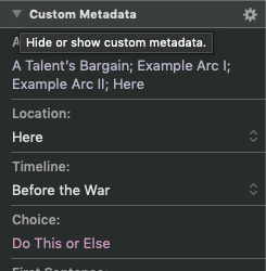
This is for my upmarket fantasy WIP. The novel doesn’t follow all the genre/commercial rules, and its focus is largely on the characters and atmosphere, but I still track a few crucial things:
Arc: I’ll tell you more about what I mean by arcs and how I use them in the keywords section of this post. Here, I note down which core arcs (story threads, both character-wise and plot-wise) the scene touches, affects, and is affected by.
Location & Timeline: In this specific WIP’s case, I have multiples of both, so tracking them here is very useful. In my other WIP, there’s only one timeline but the POVCs aren’t always in sync, so instead of a drop-down like here I have a free text field to write down “Day [number]” so I can easily ensure I didn’t mess up the continuity.
Choice: This is a big one. You might remember my post on character-driven and character-focused stories, where I talked about the importance of choices. They do more than one job: they drive the plot, affect the character’s inner lies, shape their arc, and can be an incredible way of structuring scenes and ensuring they aren’t meandering. Not all scenes require one—and not all choices need to be big one—but having the section in the metadata ensures that I think about it. Then, if a scene’s structure or pacing is wonky, I can check if it’s related to a lack of a choice—or perhaps, if a scene doesn’t have one, I can double-check that it’s truly what the story needs rather than a mistake on my part.
First & Last Sentence: These are among my favourite things to track, I admit. The first sentence of a scene makes a promise of sorts to the reader, and by the time the last one rolls around that promise should be fulfilled. Tracking the first and last sentence helps me easily tell what the scene centres on and what its promise is.
Synopsis Done checkbox: Synopses are the bane of my writerly existence. I can critique them (in fact, I do! shameless plug), but my brain likes treating them as drafts to be changed (even if written after the final draft of the story itself), which complicates things for obvious reasons. I find summing up scenes into a sentence or two as I go very useful, both for my future submission package’s sake and for sharing with my CPs when talking about specific scenes in context.
Query Beat checkbox: This one’s a bit different from the synopsis one, in that the aim is to check fewer of them. A query can only touch upon a few key points and moments. I tend to write my queries before I start writing the story (it’s my way of telling if the story is really ready or if it needs to go back to the mental palace until it sorts itself out), but this helps me see where those key points are and how they match where I had assumed they’d be.
#2: KEYWORDS
This one I’m really proud to have figured out, if I may admit so. I have this WIP to thank: it has so many things to track, I had to get creative with how I use everything from icons to status stamps to labels and—finally—keywords.
What do I use them for? Arcs. The ones I said I’d talk more about back in the metadata section.
First off, keywords are easily addable to the project through the keywords tab in the Inspector. Here’s the pop-up in which I can manage it on project-level, and the section on the side of my editor where I can see which ones I attributed to a scene:

You’ll notice they can be grouped into categories, and I can give them any colours I want, which is all pretty neat.
The arcs themselves are story threads—that includes subplots and arcs that tie together a large cast, as well as core character arcs that really are the roots and the heart of my every story. At some point during the draft, as they come to me, I give them titles that remind me what their central point is, and I write a document like this one (this is for the other WIP) where I add comments that pitch each arc as if it was at the story’s centre and note how it ties in with the other ones.

This is similar to what I suggest doing with side characters to ensure they read like real people, by the way—and much like in their case, my process includes a lot of “letting it just happen”, and frantically typing at a thousand words per second as the story decides to reveal it all to me at once. For the WIP the screenshot comes from, I did it in between of an old draft that felt wrong and the revision—it was my way of figuring out what the story needed to be vs what I had tried to force it into, and it worked wonders.
But here’s the point: making these into keywords means they show up in corkboard mode, as little tags next to the scene cards. It looks like this:


Can you tell already how useful that is? I can keep a lot in my head, and prefer to in fact, but that makes it hard to talk about my projects—this is a fantastic way to visually follow the threads and know exactly which bits are important to mention when talking about which others. I add these after I write each scene, and they also, of course, show me how crucial a scene is and how many things it’s doing at once.
Hovering over each shows the text of the keyword as well, so I don’t need to remember all the colours when I have a whole bunch (like in this WIP’s case—just check the Below the Observatory scene there). And the corkboard allows for any number of keywords to be shown, which is great (if you want to see all the ones you’ve added, be sure to check “all” or a big enough number in corkboard options).
I could gush about this for a while longer, but instead let me tell you about my final pick for today: a handy little tool known as Linguistic Focus.
#3: LINGUISTIC FOCUS
Located under Edit —> Writing Tools on a Mac, this tool highlights specific parts of speech for you (such as all nouns, or all direct speech, or all conjunctions) and fades out the rest. It looks like this:

It’s a small thing, one most may not find much use for until line editing phase, but I find it great for thinking through sentence structure and language, and what each does for voice, rhythm, atmosphere, and a whole lot of other things. Language and grammar are fascinating, and absolutely a tool to keep sharp—and understanding my own style and why some things work and others don’t is a big part of my process.
That concludes part two! One of these days I might go on and talk about composition mode, formatting, how I use icons and status stamps, and a bunch of other cool things—but for now, my list of cool Scrivener features wraps up at six.
If you’re using Scrivener, feel free to comment here or on twitter, or point me to where you talked about the features you use and enjoy!
If you’re not using it, but have stayed with me this long anyway, it’s developed by Literature & Latte, where you can read all about it and more.
#writing#writingtip#writingcommunity#writers on twitter#writetip#amwriting#ontheporch#editing#scrivener#writer#writers#novel#outlining#pantsing#organisation#write#writerscommunity#writing community#nowhereswriterly#clariblog
2 notes
·
View notes
Last Seen Blogs
valsworldofcreativity
VAL•💖✨
morethanwonderful-archive
Find me @morethanwonderful

thegeek1-blog
Untitled

lewemarcus
Das Leben ist Schule genug

herrralf
Señor Ralf