#sorry about my handwriting
Text
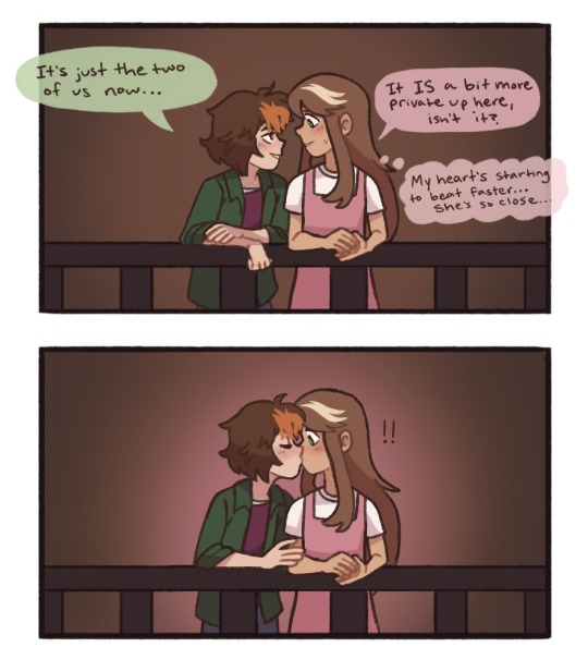
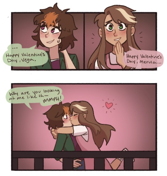

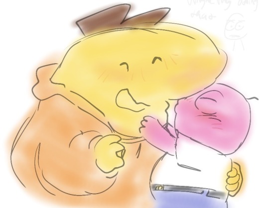
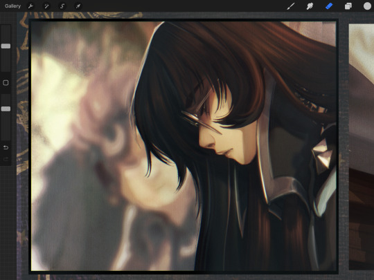
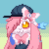
happy valentines day to these two losers
thank you @cursedcrusaders for doing the lineart for me... i wouldn't have finished this if it werent for you 😭
#ill let them kiss since jc says u have to be adults to kiss#how scandalous#the whole time working on this i was just like i love gay ppl#vegasnyde#merula snyde#alex vega#i can never tag the main tag with these kinds of drawings i get too embarassed#mellas art#sorry about my handwriting#merula x mc
166 notes
·
View notes
Note
Hello! I love your art!!I saw that you made a tutorial how to draw sonic and I was wondering if you could do a tutorial how to draw tails as well. Could you please??
Sure! It is the same principles, just slightly different shapes.

#hhwAsk#mybelovedtails#i realised a bit late that the previous ask actually asked for sonic characters not just sonic lol#sorry about my handwriting#my doodles#tutorial
369 notes
·
View notes
Text

would he
#daredevil#matt murdock#marvel comics#daredevil comics#daredevil fanart#marvel fanart#shitpost#would you still love me if i was a worm#sorry about my handwriting#i have dysgraphia
642 notes
·
View notes
Text


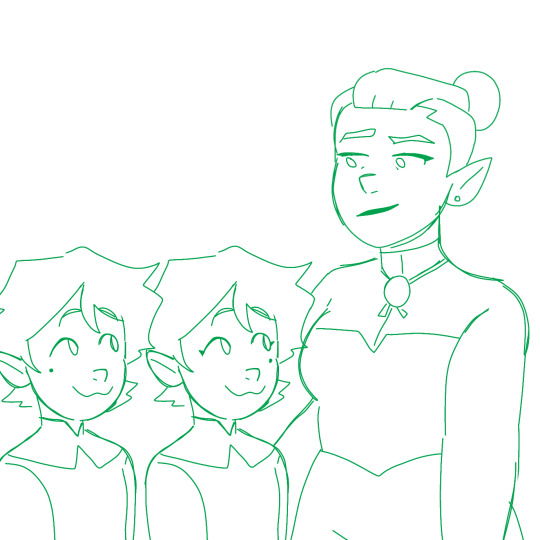
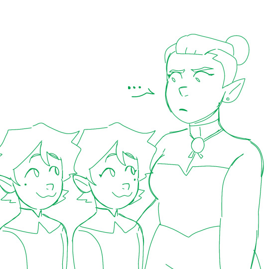
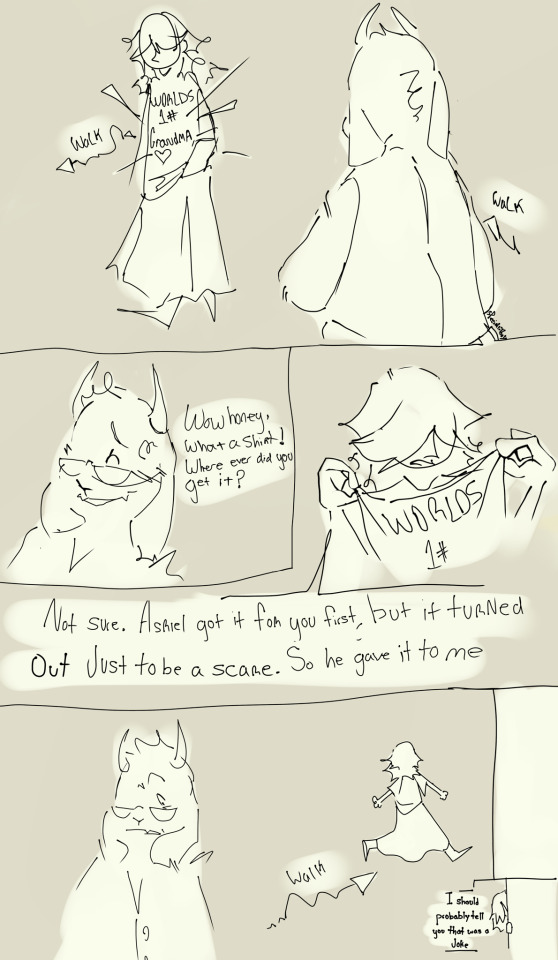
The Twins pull a switcharoonie because it's my all time favorite hc.
#emira blight#edric blight#odalia blight#toh#blight twins#trans emira#trans edric#odalia took a week to notice#uuuhhh#sorry about my handwriting#it was a quick doodle
194 notes
·
View notes
Text

Human!AU Ao'nung and Neteyam for my fic Best Friends Brother!
He's so down bad its not even funny. Well... okay maybe a little funny.
#james cameron avatar#avatar#avatar pandora#avatar way of water#art#snomoscribbles#smitten aonung#aonunete#aonung#aonung x neteyam#neteyam x aonung#neteyam#avatar 2#human au#avatar fanart#fanfiction#fanfic#avatar fanfiction#sorry about my handwriting#i tried my best
78 notes
·
View notes
Text

can I offer u a reed900 in this trying time?
#sorry about my handwriting#Gavin reed#rk900#dbh nines#gavin x nines#reed900#dbh gavin#dbh fanart#nines rk900#detroit become human#my art
139 notes
·
View notes
Text


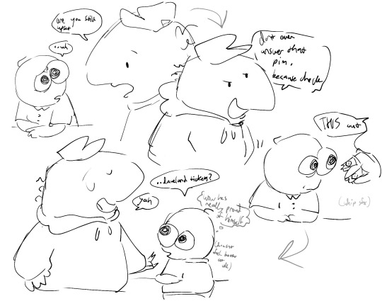
findings
#with the third pic ijust love that they got Kinda put into matching outfits even if its 2 eps apart#thats even better actually that it’s back to back kinda#sorry about my handwriting#smiling friends#odieart
23 notes
·
View notes
Text
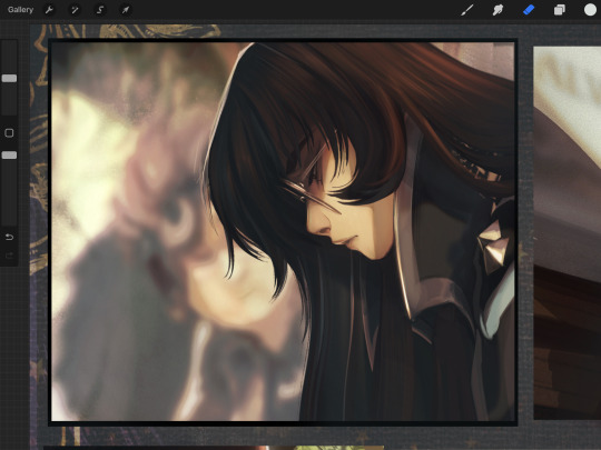
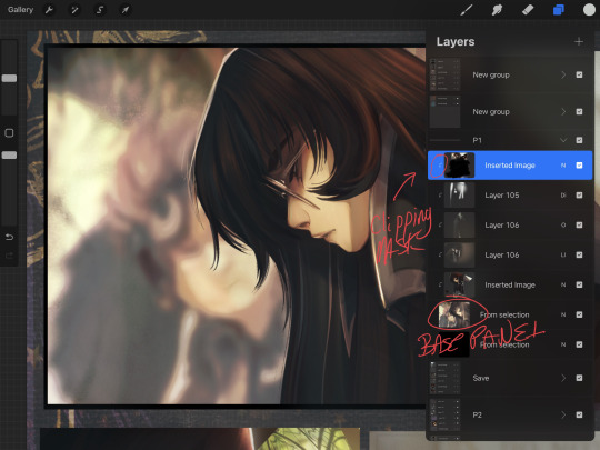
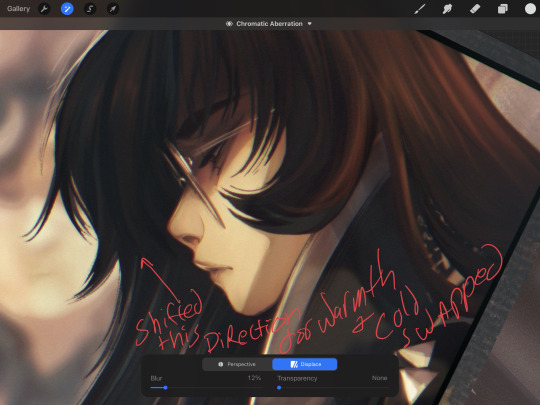
Okay! I said I'd do a quick little tut for the chromatic aberration effect to the anon who asked, so here you go.
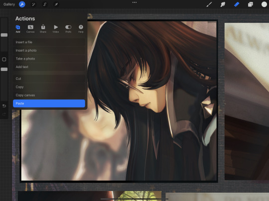
Above is the raw panel, so from here, you'll be duplicating the canvas/panel by choosing "Copy Canvas" from the wrench button.
Once copied, paste it into your folder and select the layer options to turn on Clipping Mask to your base panel. If doing the whole canvas, you can just paste as-is


I prefer to duplicate it once in preparation and then again each time I make a change, that way the effect can be toggled on /off or have its opacity lowered to mix with a previous effect if needed.
From there, select the magic wand/effects and adjustments menu and click on Add Noise. Important: Pretend I took a screenshot of the drop-down menu, because rats must keep up appearances.
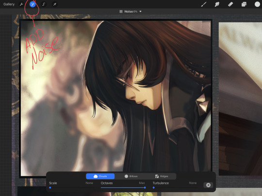
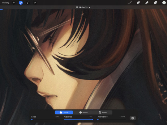
I prefer clouds with maximum octaves and low-no turbulence at a fine scale... however, play with the options and find one you like (or don't use it at all! I like the grain for a mild texture and for harmonizing the art's elements, especially on quick panels or rougher drawings.)
I'm going at about 5% here. Just enough to give the desired effect, but not too much.
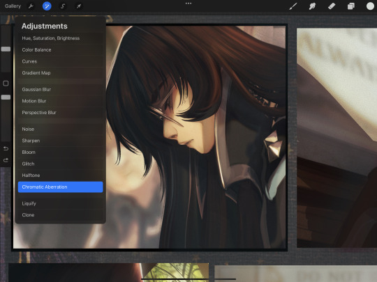
Once it's to your liking, duplicate your canvas/layer and select your new layer to work off of. On the magic wand menu again, select Chromatic Aberration.
We're working with the displace method, so select that instead of Perspective.

In procreate, the tool works by shifting your cursor in the direction you prefer at the distance you want. I never travel far, and I often use the warm/cold to play off of a reverse of my light source colors. I do that just to create a softened edge and a subtle color pop.
Just like with the added noise, I keep the effect on a more subtle side often. Blurring at around 5 - 12 % will give your lines a soft glow and get rid of any (say, hideous pencil lines that you use as inks because you hate inking. Not that I do that. Not me.)
Transparency can be bumped up or left alone, does what it says on the tin and strengthens the effect or subdues it.
Now, you might find some important detail is now too hazy? Too blurry? Too CHROMBERRATED? If so, gently erase what you want to be crisp. For Maia here, I just erased the front hair curls and her eyelashes.
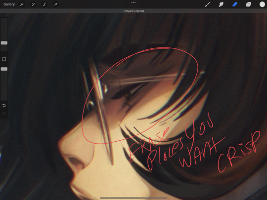
Keep it or erase it, it's up to you. Play around and see what you like.
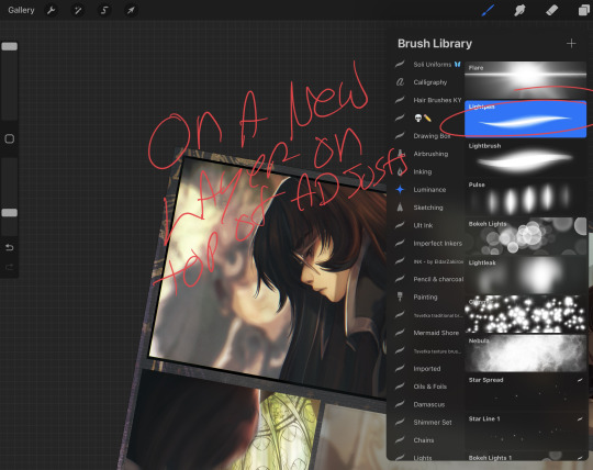
Now, once all is said and done, and you like the effect, adding a few specular pops of light on a new layer can aid with bringing back in some focal points. Eye color, rim lighting, or just a couple of little metallic flecks.
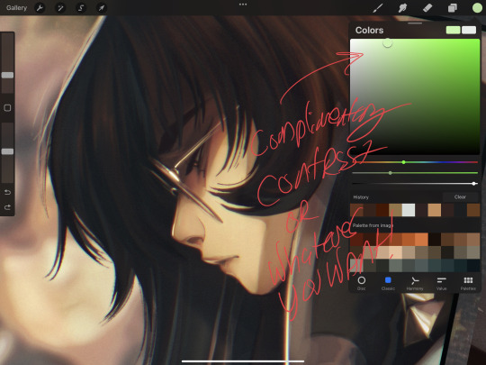
I use the light pen tool for this when feeling lazy, but you can use any brush you like, either on a raw Normal layer or on any of the light adjugement style layers. I chose a pale green to compliment the warm, red hues and balance the bluish shadow in her hair.
Just a tiny little speck on her glasses, lips and on the rim light of her nose just to keep the anchor points of her face clear. Don't over do it (unless you want to, in that case, by all means, the light is yours to command.)
And that's the final. Hidden in the darkest shadows of voidcraft, I applied a textured brush to my canvas on Overlay because I do that for every comic page. Except for those that I forget, may their tears one day dry.
I hope that helps! The effect is subtle on this panel, but the desired effect to soften and marry the art, thus fooling the viewer's eye into thinking I super meticulously rendered this with careful prim and polish, is achieved! Hooray!
#solivaga#pu art#tutorial#art resources#art process#procreate#comic panel#digital art#artists on tumblr#art reference#mmmmmmmmaia#sorry about my handwriting
109 notes
·
View notes
Text

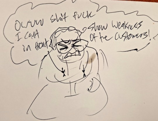
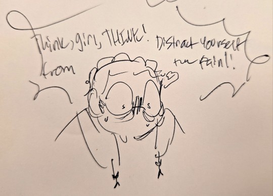

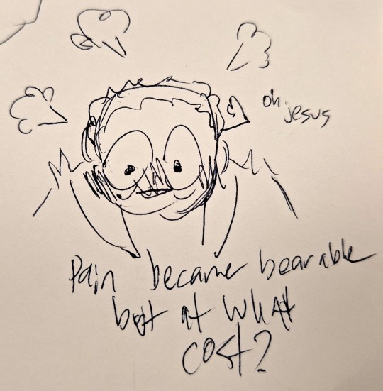
So this just happened to me
#art#my art#traditional art#doodle#angel talks#yeah so i was able to successfully act like a normal human being but i Knew#suggestive#underfell#sans underfell#sorry about my handwriting#i know its super bad#basically tldr i hurt myself at work and then had a panic fantasy where the pain was cuz i got grabbed by a skeleton#then i got flustered the end
8 notes
·
View notes
Text
Wake up dude,
Geometric Sacabambaspis
just dropped
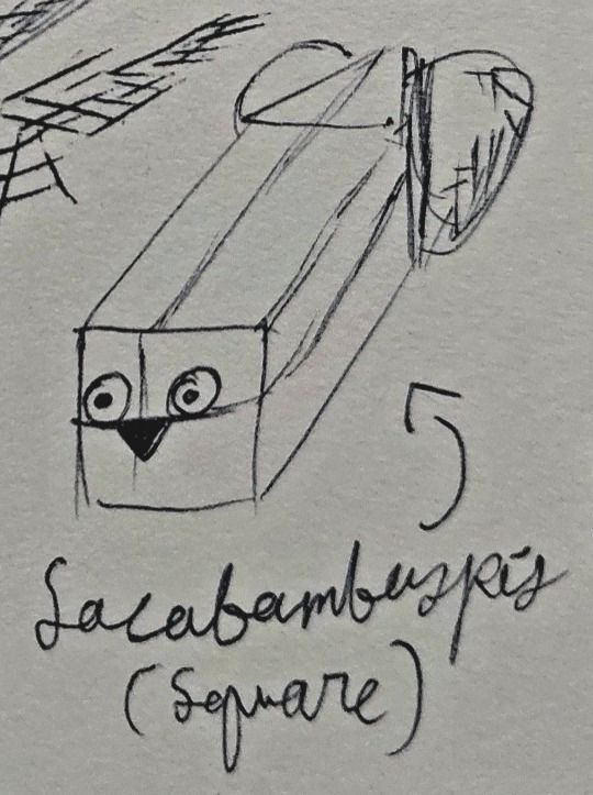
I will now be drawing the Sacabambaspis's silly face everytime I try doing cube perspectives (also hand writing reveal)
#sorry about my handwriting#sacabambaspis#ink#my art#sketch#traditional art#pen#illustration#silly drawing#artists on tumblr#small art blog
8 notes
·
View notes
Text
This is probably better without context

#rayman#he's in jail#hes professing his love to a stick man#sorry about my handwriting#captain laserhawk
7 notes
·
View notes
Text
Scare
#my art#deltarune#kris deltarune#toriel#sorry about my handwriting#pregnancy scare joke#not as funny as it was in my head
40 notes
·
View notes
Photo
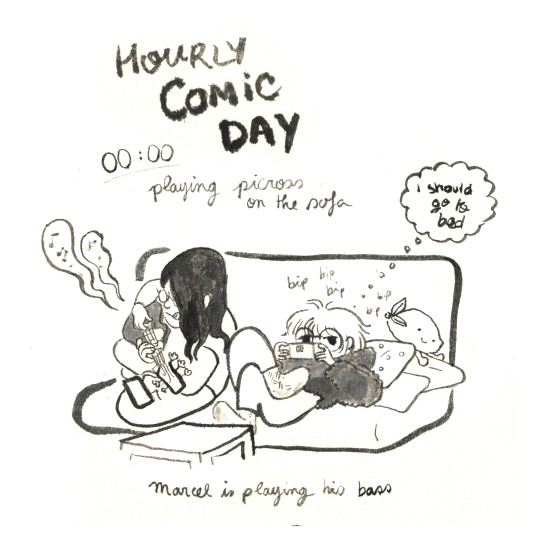


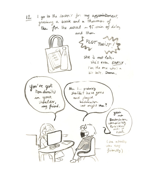

Hourly Comic Day 2023 part 1!
#hourly comic day#this year was fun#and it was a really busy and social day too#which isn't representative of my normal days at all lol#ah well#here it is#enjoy#sorry about my handwriting#part 2 is coming right after
38 notes
·
View notes
Note
Y'know, Tandemaus tend to evolve in battle... Er... will that ever happen, Inari? I.. .do you want me to help train them in combat?

But perhaps I will ask for your help then. A little variety in training never hurt anyone.
#ask#inari sylveon#matcha hybrid#inari#matcha#sylveon#tandemaus#eevee#hybrid#sorry about my handwriting#i wrote this on the train!
25 notes
·
View notes
Text
SINCE SOMEONE POINTED OUT HOW VICTORIA BEING MAD AT HEAVY FOR LOSING HIS KEYS WAS HYPOCRITICAL, I JUST HAD TI DRAW IT LMAO

#sorry about my handwriting#lol jokes#metal family#childhood trauma with guitars#metal family heavy#metal family glam#can repost with credit givrn btw
10 notes
·
View notes
Text
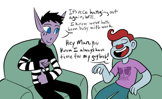


He's a little confused but he's got the spirit
Inspired by that clip of Weird Al and Eminem
youtube
ALLY!

#doodles#will#pascal#silly#this is so dumb#pascal is supposed to be signing 'hangout' in asl in the first image btw#will is an ally#sorry about my handwriting#Youtube
51 notes
·
View notes
Last Seen Blogs