#overlay layer my beloved
Text
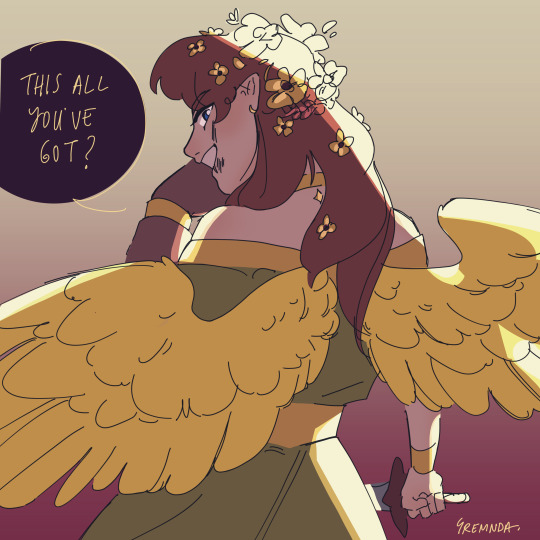
Fight against a demon
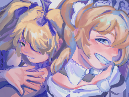
#gremnda art#ooo look at me go using FANCY LIGHTING OOO#it looks good#just dont look too closely-#overlay layer my beloved#anyways yes tags#guys i actually hate tagging it's such a hassle#can i not tag my things and let tumblr hand my art over to yall#like god intended#gosh okay#empires smp#empires s1#empires season 1#empires smp fanart#empires smp season 1#pearlescentmoon fanart#pearlescentmoon#what a girlboss#live love empires pearl
943 notes
·
View notes
Text

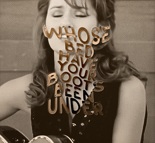
Shiki Misaki should NOT be a lava lamp!
(It’s sure is a pretty lava lamp though…)
#meme#memes#shiki misaki#the world ends with you#twewy#shiki#where is shiki#whereisshiki#funny#where is#whereis#whereis account#lava lamp#overlay layer my beloved
6 notes
·
View notes
Text
autism 2 autism communication
#mine#original#orange overlay pink multiply layer my beloved#what hve i done today.....done some face studies!! very helpful!!#i am . beginning...to find.....a way of drawing that feels comfy to me...ouh#i will hopefully do some portfolio drawing tomorrow hehe#im going to re do my website...how it is now is. ugly. i wouldnt hire me#what else is going on...ive ordered some wool bc i hve learnt how to KNIT#im so alarmed. im going to attempt to make a cardigan i am so deeply alarmed#i need to exercise and have a bath. mmm. i will play vid game and then chores and then exercise and then eat and then bath#hve a good evening my friends
8K notes
·
View notes
Text

theyre on date :)
prints
#akiangel#aki hayakawa#angel devil#csm#chainsaw man#digital art#fanart#csm fanart#akiangel my beloved#fruitgravy#procreate#this has like 50 overlay layers#aki’s burger#take note of angel’s spilt sugar packets#i love they
385 notes
·
View notes
Text
Liked this one so much I wanted to slap some colour on quickly
224 notes
·
View notes
Text

Cyclonus Week, day 1: Home/Journey
#transformers#maccadam#cyclonus#idw cyclonus#cyclonus week#idw#tf fanart#hystdraws#Trying to find literally any reference of what cybertron looks like in the comics is so hard#i've been doing the ones i have ideas for this week out of order and i forgot today was when it started so i highkey rushed this#big black pixel brush my beloved thank you so much and the power of the overlay layer for being able to hide hat 90% of this is scribbles#that and the city brush i got a while ago#cyclonusweek2022
188 notes
·
View notes
Text
Background Production has started for Critical Tail, my UIL short film! I'm happy with how this one turned out, it's got so many little coloring effects!
2 notes
·
View notes
Text


wtf epic artist just said she rlly likedmy stuff -w-
#rex.png#lately my process has been to. sketch terribly. paint underneath. final layer on top when im bored#in order to cut out the middleman of lineart....#but i would like to do lineart........ i just get so frustrated getting past the ugly stage is such a brutal undertaking like girl help#and im unable to use more than 3 layers otherwise i have to die#i hate compositing i hate gradient maps i hate overlays i hate glowy lighting#how is it that whenever i try my stuff looks stupid and overdone but other ppl draw the sickest anime stuff with a million colors#and either high contrast or no contrast or something and it's sick digital art like#but whatever shit i try looks like a bad instagram filter?? sick of liviign like this omfg#and i tried low contrast bc it looks cool... fortiselle my dearly beloved...#but w/o lines?'!?!?#its just with lines how am i meant to change things or keep things coherent with the bg or not have flat lighting
5 notes
·
View notes
Text
i must say doing soft shading on my shitty little defunct phone app with a non-working selection tool is. SOMETHING. but i think that was a success
#emord rambles#my app hasn't updated in over 4 years i don't even think it's still on the app store. it doesn't even have layer folders#it doesn't even have an overlay setting i have to use multiply . it's my beloved and beloathed. no pen pressure <3
4 notes
·
View notes
Text
DERANGED MIKU!!! ♡♡♡
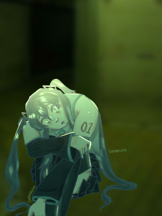
#miku#hatsune miku#vocaloid#liminal photography#liminal spaces#i love her so much#overlay layers my beloved#art#digital art
3 notes
·
View notes
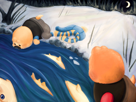
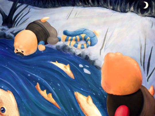
Text

after 30 hours we’re done!!!
I love little pootis so much, a fantastic series. If you haven’t seen it yet I really recommend it!! I bought one of the plushies for my little siblings for Christmas hehe.
I’ve been wanted to make some fanart for it for a while, but I wanted it to be special! Since it means too much to me and my family :3 so I tried my hand at digital painting again! Here’s my process:

First I started out with the sketch and putting in the values, (that image is the scene I was referencing.) and since I have absolutely no idea how perspective works I just guessed and went “eh good enough.” I also used my radical composition skills to give the whole thing some life! (Golden ratio my beloved.) I should have gotten some reference images, first mistake, but I was way too excited lol.

Then I duplicated the layer and started painting over my sketch using some painting and blending brushes. Unfortunately I forgot to capture any in-betweens of this process so it makes it a little hard to explain. But once I got my values down and my painting rendered to point I wanted it to be, we started coloring!

And oh god! This is why the painting took 30 hours! This was my first time painting using this method, so I was so not ready for the coloring part. I’m in a love-hate relationship with gradient maps so the coloring was mostly done with blending modes, I think I used the linear light mode?
After watching a stupid amount of videos by Marc Brunet I finally got it! Used just one overlay layer and adjusted my colors and values as needed for this one. Used a couple gradients and other techniques to get the snow and the water looking how I wanted, and we’re almost done!
My favorite step! Adding a bunch of textures and sparkly stuff! It’s not for everyone but I really like it. And congratulations we finished our first painting yippee! Thanks for reading :3
little pootis by @quazies
#tf2#lil pootis#digital painting#tf2 fanart#creative process#daffys drawings#WOOOOO LETS GO BABEY LITTLE POOTIS FANART#also just gotta say I love Blootis so much he is just like me!!#Can’t wait to see what he does next. Love that guy. Oh and pootis too I guess
593 notes
·
View notes
Text
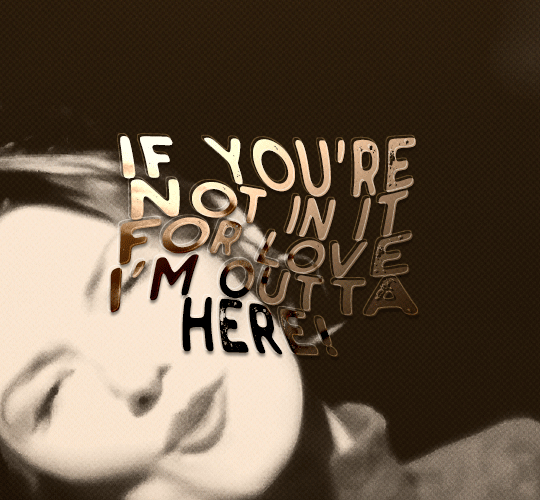
gif tutorial
i was asked to make a tutorial for this set i made, so let's get right into it!
first things first, i downloaded the music videos from youtube in 1080p using 4k video downloader. unfortunately, the quality of youtube videos always seems... not great, to put it simply. plus these music videos are from the 90s, so they've been upscaled to 1080p after the fact. all of this works against us, but i've definitely worked with videos of lesser quality than these, so at least there's that!
when i gif, i import video frames to layers rather than screencapping. this comes down to personal preference. after everything has loaded, i group all my layers together and set the frame delay to 0.05. i then cropped my gif to 540x500.
the next step in my process is sharpening. i did play around with my settings a bit given the quality of the footage and the dimensions of the gif. i compared both @hellboys low-quality video gif tutorial to my regular sharpening action and my vivid sharpening action and in this case, i preferred my normal vivid sharpening action. i used this tutorial to create the action for myself, and you can find other sharpening tutorials here. this action converts my frames to video timeline and applies sharpening.
once my gif is sharpened and i'm in timeline, i begin coloring. i wanted to simplify the amount of colors used in these gifs, again because of the video quality -- i knew it wasn't going to have the crispness i would normally like for my gifs. here are my coloring adjustment layers and their settings (not pictured: my first layer is a brightness/contrast layer set to screen) (explanation in alt text):
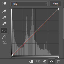

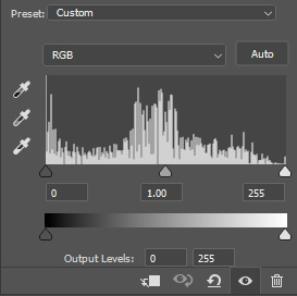
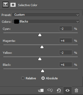
all of these layers and their settings will vary depending on your footage and its coloring (and obviously, feel free to make the gradient map whatever colors you like if you aren't going for this exact look).
pretty basic coloring, especially with just slapping a gradient map on top (my beloved), but at this point, i still didn't like the quality of the gif, so i added a couple textures/overlays.
i put the left one down first and set the blending mode to soft light and the opacity to 8%. depending on what look you're going for, you could increase or decrease the opacity or play around with different blending modes. i like using this texture with lower quality footage because even when it's sized up a bit, it adds some crispness and makes things feel more defined. for the second texture, i set it to overlay and 75% opacity. we love and respect film grain in this house.
now for the typography! sometimes i really enjoy typography and other times it's the bane of my existence for the sole reason of just how many fonts i have installed. anyway, here are the settings i used for this set:
make sure the color of your font is white and then set the blending mode to either difference or exclusion. i can almost never see a difference between the two, but for this set, i used exclusion. below are the blending options (double click on your text layer to bring up this menu or right click and select blending options).
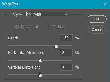
now we have to add the warp effect. with your text tool still selected, click this icon at the top of your screen:

from the dropdown menu, select twist. these were my settings, but feel free to play around with different warp options and their settings. the ones i use most often are flag, fish, and twist.
this last step is completely optional, but it's an effect i use in most of my sets with typography. duplicate your text layer (select the layer and ctrl+j), turn off the layer effects (click the eye icon next to effects), and set the blending mode to normal. right click on the layer and select rasterize type. right click on the layer icon itself and choose select pixels.
at this point, you should see the moving black and white dotted line showing that only your text is selected. then go to edit > stroke. here are the settings i almost exclusively use.
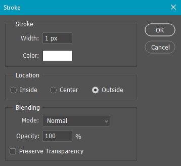
this is what your text should look like now:
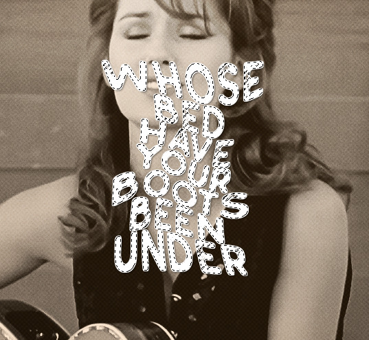
using ctrl+T, move the layer off the canvas so you can't see any of the text anymore. you should be left with only your outline. click anywhere on your canvas to de-select the text we just moved. use ctrl+T again as well as your arrow keys to nudge the outline over to the left 2px and up 2px. this is personal preference as far as the positioning, but i almost never move it any other way. you can leave it like this, which i sometimes do, or you can set the blending mode to soft light like i did for a more subtle effect.
and that's it! rinse and repeat for each gif in your set or use a different warp effect on each gif to switch it up! if you have any questions about this tutorial or would like me to make one for anything else, please feel free to ask any time!
#gif tutorial#my tutorials#gifmakerresource#completeresources#dailyresources#chaoticresources#userdavid#coloring tutorial#typography tutorial#tutorial#photoshop tutorial
170 notes
·
View notes
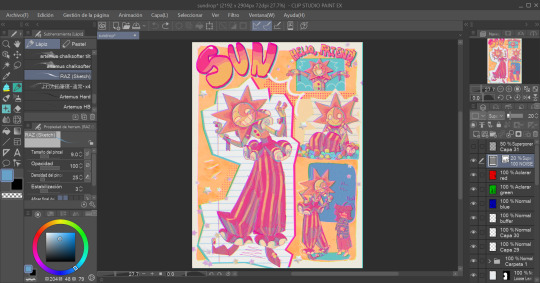
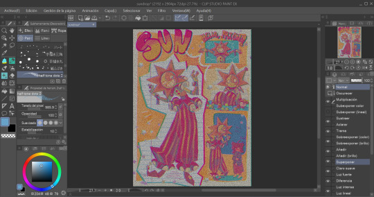
Text
Here's a new experiment! Have you ever heard of vellucent bindings? You should look them up! The basic concept is that a delicate hand-painted cover is drawn on a piece of parchment and used to cover a book. Then a paper-thin translucent layer of vellum is sealed on top, protecting and preserving the art, and adding a gorgeous hazy overlay effect. If I understand properly, the art can also be drawn on the back side of the vellum. And this can also be done to cover inset art panels, but I really wanted to go for that whole-book effect. However, even before I became double extra broke, parchment and animal vellum are exponsive materials. Baby, we're doing this with printer paper and paper vellum.

So here are the goods! The Triumph of Time by @sunderedstar is one of my all-time favorite fics by one of my all-time favorite authors, and is still the idw1 ending that lives in my heart. Plus, the author commissioned a piece of art for each finished longfic, all of which are GORGEOUS and vibrant and just begging for that hazy overlay effect.


This was a major experiment! I cannot overstate how much I was flying blind here, and the only instructions I had were for finicky materials that I wasn't using myself. And then paper vellum turned out to be impressively finicky too! I had to redo my first case from scratch, and I was making notes on tweaks to the process all the way up through this morning. It's a mixed success, but I adore it, and I'm delighted with how well it turned out given what a gamble it was. And it wasn't an expensive experiment at all. I badly need to give my hands a break asap, but I definitely plan to repeat this experiment soon, and that will include at least one more round with this beloved series, now that the typeset is up to my current standards :D

#crafts#bookbinding#vellucent binding#transformers#sunderedstar#the triumph of time#am i freshly emotionally wrecked by how much i love this series? YES???? 😭
234 notes
·
View notes
Note
i don't know if this has been asked before but how do you do the paper effect on your art?? it looks so cool and the way you ad texture to your whole art plus the almost pencil texture if that makes sensse?? just what makes ur art style u!!
Alright, this is gonna be a bit of a tutorial and I've never done one of those, so forgive me if something's amiss
First off, check this other ask here to see what my usual brushes are, including the ones used here!
Now, I'm not sure if you were referring to this, but I do put some sort of print-like effect in my art sometimes (often in the more complex pieces). For that, it's quite simple, really.

Well, here's our finished piece, with some chromatic aberration added for good measure
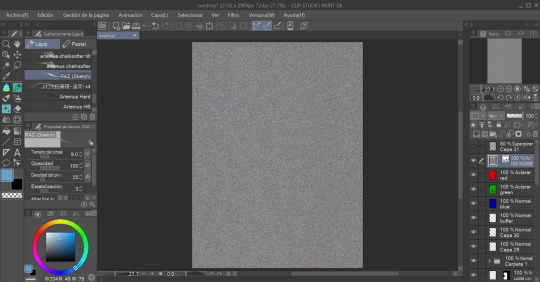

What we do now is add a noise layer and set the layer mode to Overlay (ignore the fact that my Clip Studio Paint's language is set to Spanish, it's the same thing.)
After that, we set the opacity to somewhere over 10 to 30 percent (or, really, whatever you want. I usually do 20.)
Then we add another layer and paint it all with a halftone brush in black and, as well, set it to overlay.

Now all that's left to do is to set the opacity (I usually do betweem 30 and 50 percent) and It Is Done!!! Our Wonderful Piece!!!

Other Paper textures I use while drawing for backgrounds and such are:
This leaf of Paper my beloved
These watercolour textures
These paper textures
If you have any other questions, don't be afraid to ask!
130 notes
·
View notes
Note
your lancer edits are absolutely AMAZING!!! i've done edits for non-lancer stuff, so i'm curious, what is your process usually like?
Thank you!
The process is, admittedly, VERY time consuming. (which is why i haven't done any recently, it's just a massive time investment)
My workflow exists entirely within Photoshop
I start off with an image of the base mech I rip off of Comp/Con, and I spend a few hours meticulously isolating every part of the mech by hand (polygon lasso tool my beloved). I found that the automatic solutions like magic wand tool & such just. aren't very effective when it comes to holding together detail. Too much or too little is lost in the process, and it usually requires manual touchup anyway, so I just decided to do the whole thing by hand to save the tedium.
This usually takes anywhere from 1-3 hours? It's hard to say. But, the catch is, once i've done it once for a mech, I don't have to do it ever again.
Once i'm done with separating the pieces i want to color/reuse individually, I move on to base coloring. I usually have some idea in mind, but sometimes I just freestyle it. I usually use pretty simple color palettes, and I work almost exclusively in Photoshops Blending Options panel to get those colors to work. Having a non-destructive workflow is..vital. Mixing types like Overlay, Hue, Color, and Multiply are my favorite toys during this process. I also make sure to give everything a 2px black stroke, usually internal, to better match with the base art & clean up any of my mistakes.
When i'm ready to go for the more advanced edits (where i need to add stuff instead of just change things), I spend a little while scrolling through C/C like i'm at a shopping mall looking for parts. Anything interesting, I play around with. I like to rip various greebles off of mechs like the Tortuga, Caliban, Kidd & Nelson the most, but every one of em gets time in the spotlight. At this point, I have most of the parts I could need memorized quite well, and if something calls for a certain shape, I'll know where to find it & take it from.
Trying to get each asset to fit the style of the base frame is quite easy, and adding a simple 2px internal stroke does miracles.
When i'm happy with most everything, i'll play around with gradients to highlight the most interesting parts, give it a flashy name stolen from some album i've listened to Twice, and send it on it's way.
I have an upload of all my raw .PSDs available for download if you're curious- do be warned though, my layer organization sucks and i didn't plan for anyone else to be looking over my work.
I hope that helped!
27 notes
·
View notes
Text

'cause I've made some real big mistakes,
but you make the worst one look fine
I should've known it was strange
you only come out at night
have been staying out of the shadow and bone fandom bc im avoiding king of scars and crooked kingdom, so i have no clue what she looks like in fanon. had a lot of fun with lineless and colors and also overlay layers my beloved
god i wish i had the time or energy to make a pmv with her and this style and this song
#shadow and bone#grishaverse#alina starkov#the sun summoner#fun facts most of this was done with lasso tool and fill bucket over a rough sketch#my art#jay scratchings
30 notes
·
View notes
Last Seen Blogs
kyoka-jirou
upside down alice

galxyslut
1999
bzalma
Barry Zalma, Inc.

jiiyawns
what you see is what you get