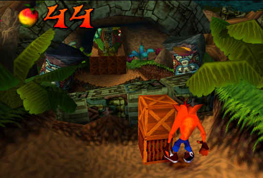
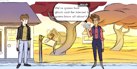
#originally i just wanted to 3d model the gif i made but. this is much cooler conceptually i think
Note
We got the earth and the sky, but has anyone asked about what you think of Abzu?

i love abzu!!! another one i have watched the gdc talk for which you can watch here!!
the two big things in abzu are the fish animations and the overall environment lighting - lets start with fish!! there are a lot of them. and when you want to animate a lot of things, your computer will explode. this is specifically when you animate things with bones, how a lot of computer things are animated
luckily one thing that gpus can be really good at is drawing a tonnnn of the same object really fast, using something called instancing. as long as its the same mesh and material, it can be rendered a ton with just a single draw call (like i am talking hundreds of thousands). so lets make 10 thousand fish. unluckily this doesnt work with skeleton animations. luckily you dont need them! especially with fish
even though all the objects need to be the same mesh and material, doesnt mean they cant have different input. not only that but shaders let you modify individual vertexes, so, what if you just take all 10000 fish and wiggle them along an axis, like this

and give them all slightly different inputs so they arent all doing the exact same animation, maybe by giving them each their own unique number. now you have 10 thousand fish swimming around, wiggling, at almost zero rendering cost

these are all individual 3d models and all their animations are running in the shader !
the other way they animated fish without giving them bones was through something called blendshapes - these are usually used for stuff like facial animations, where you move vertices around to your desired "shape" (so like maybe your default face is :| but you edit the vertices so your character goes :> etc), and keep track of the difference between each vertex's position and its original position so you can move it whenever you want
that doesnt need any bones so they used this for things like fish going CHOMP and fish making sharp turns
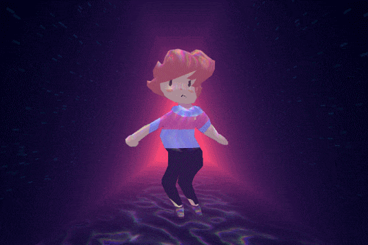
for the actual environment, they experimented with a bunch of things like using actual volumetric lighting, but in the end they found that just using fog worked best!! they did tweak it a bit though - they had a "zone" between where the fog started to get thick and when the fog just ended up being a solid color where they dimmed any lighting - this really helped the background geometry stick out and give that underwater feel (left is without dimming the lights, right is with dimming the lights!! fun to think about how firewatch did something similar but changing the fog color based on depth rather than literally dimming the lighting)


they also let different volumes have their own fog value, so if there was say a cave off in the distance, it could have less fog than the surrounding area for clarity & also made the fog look a bit more volumetric
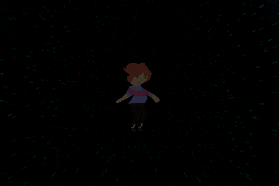
and the other huge thing that helped was "portal cards" - not an official term but its what they called them, basically just quads they could stick in any place where they needed to make something "stick out", like a cave, or a hilltop that blended with the background too much. the card sampled the depth of objects behind it, and used that 0 to 1 value to map a color to it. and then the closer youd get to these cards, the more transparent theyd get, until youre right on top of it and you dont need the objects to stick out of the background anymore!! here you can see a Me, but very dark, and then i slide the card over it. the black and white is the camera depth of all objects behind the card, minus the depth of the card. and mapping that to a color makes me stick out way more than i was initially!! then as you swim closer to me, the card fades away, until you pass the card completely
these portal cards were also used to make the light beams poking out from the surface, theyre just animated a bit!! you can see how the portal cards affect the look of things in this frame breakdown
and one other thing thats pretty prominent that wasnt touched on in the talk is all the caustics on the ground, those little wobbly light things you see underwater. but those were probably? just added to every shader as a "add this caustics texture on top based on the with the texture mapped to the world x and z position and only if the object is facing up"
like this !
anyways thats all from me on abzu..!! really pretty game
#anonymous#ask#potion of answers your question#gamedev stuff#long post#i optimize every gif for you guys even if its already under 10mb
292 notes
·
View notes
Text
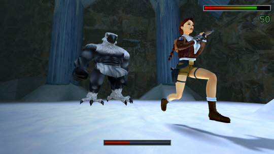
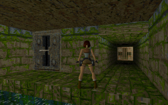
Tomb Raider I-III Remastered Starring Lara Croft

"Within pre-production, we divided the conversation into three buckets: engineering, gameplay, and art. With these categories in mind, we led our conversations in the same order."
"For our modern controller settings, we take inspiration from the Legend, Anniversary, and Underworld era of Tomb Raider. These changes are felt mostly in the way Lara moves – the right stick has full camera control and Lara moves directionally based on camera position.
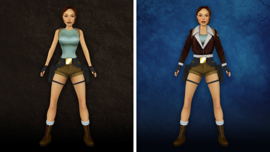
Just like our approach to the graphical presentation, the original tank-style controls are still available to players via a menu toggle."
"One of Tomb Raider’s strengths was the minimal UI. However, this can be frustrating for tougher bosses with massive amounts of health. We added a health bar to let you know if you should swap to the grenade launcher or if you should keep soaking pistol damage."
"While the menus in Tomb Raider used 3D models for the health kit and ammo, the in-game assets were flat 2D sprites. This was a legacy compromise that we’ve adjusted to give a little more umph to item pick-ups."

"This is a big moment for the Tomb Raider community, so we made sure to pack in as much content as possible. We’re excited to say there are over 200 trophies to earn including (my personal favorite) locking the Butler in the freezer. Sorry, Winston! See below for a sneak peak of a few you can look forward to discovering!"
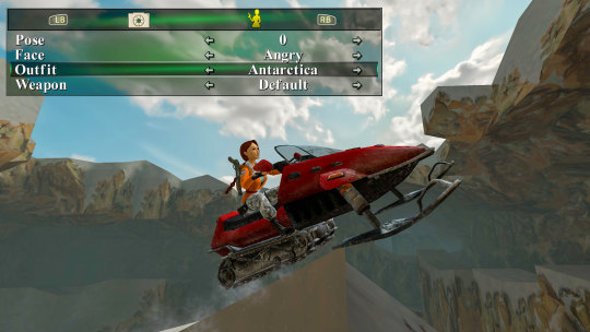
"Exploring environments in Tomb Raider is magical. We want you to be able to share these environments and iconic moments, so we’ve added a robust photo mode to pose Lara, freeze gameplay, toggle between classic and modern graphics, and showcase these environments. We’re super excited to see what the community puts together with these modes."
"And a fews more surprises..." [Full article here]
TOMB RAIDER I-III REMASTERED is gonna be released February 14, 2024 on PC, PS4, PS5, Xbox and Switch!

#tomb raider#tomb raider remastered#tomb raider i#tomb raider ii#tomb raider iii#tomb raider 1996#tomb raider 2#tomb raider 3#lara croft#classic lara croft#classic tomb raider#games#pics#news#links#by ksusha
139 notes
·
View notes
Text
TW: Stalking, suicide, death, death threats, Zoophilia, Pedophilia, etc.
This is a long read. Sorry about that. I have lots of thoughts.
A Little Background for Those Not in the Know Regarding Sims "for profit" Modding Drama.
Okay, so I know I've already kind of talked about the implications of the new policy a little, but I haven't really talked about what I personally think about it. This seems like a good time though. I don't really expect many people to read this all the way through but honestly, I just wanted to say something about it.
As some of you know I was the old head of DHM (Dollhouse Mafia) and original founder. I stepped down a while ago because I was spreading myself too thin on personal projects and also, I didn't like the way things were going. I have nothing but good things to say about the current leadership, but it just personally wasn't worth it to me. ANYWAY, that being said, I wanted to put my thoughts about how the community has changed regarding its stance on pay content and how it used to be
So back in the days of TS2 PMBD acted as a receptacle for all pay custom content to be leaked. TSR, way back, was the biggest pay site in the community with several other smaller pay sites that specialized in hair or clothes. These sites generally had a specific style and very obviously made their own content. I couldn't tell you how much creators made but I know that other than TSR users it wasn't a huge amount.
So, The Sims team has pretty obviously always had a love/hate relationship with pay content. Even though it seems to have cooled they used to be VERY close to TSR. I know that they've always had a policy against pay content but it's never been enforced really. Like I said though, the only people who seemed to be making BIG money from non-passive income was TSR.
The reason that I bring this up is that I think the reason that things went so wrong isn't because of pay CC. I'm against pay CC and I always will be, we can talk about paying artists all we want but at the end of the day this is a hobby and if you're trying to use it as your main source of income you're in the wrong but I digress...
EA's Relationship with for profit CC
Fun fact, Patreon was actually started by the voice actor that played Teen/College aged men in TS2. I suspect that he got the idea from watching The Sims community try and set up their own personal online shopfronts and figured there was a way to do it better. I also suspect that many people who worked within The Sims Studio were pro-paysite because it created a demand that kept The Sims brand in people's minds. If people were making a living off of it then it was always being bought and you had people who basically HAD to buy it because that's how they made a living.
When talking about his new NFT (gross.) project Will Wright actually mentioned that one thing he didn't like was that piracy was taking place when Sims players were creating pay CC and others would pirate it. I suspect that the only reason they kept the policy they did was in case creators would make something that rivaled the studio in terms of quality (which according to Don Hopkins was an actual concern and part of the reason that EA's CC tools weren't super powerful, we couldn't create anything "too good")
Like anything to do with money, I think people who were mostly outsiders to the community realized that they could maximize profits through unsavory means such as flipping meshes quickly and reselling them from 3D modelling websites.
The problem is this created a flood of people who started using The Sims as their SOLE income and they began making good money too. Enough that they wouldn't easily be able to make that amount doing anything else without a serious career change.
Low Quality, Quick Profit, Unruly Community
So remember how EA decided they wanted to reach out and start the Game Changer program for the better by doing outreach to players by trying to interact with the community online. Then very recently they were like... trying to start a "sims social platform"? Yeah EA isn't really crazy about the fact that we're a self-sufficient community.
Most other gaming communities that have player made content tend to try and keep that player made content in an official store of some kind. Both so they can monetize it and use it as a selling point and also so they can control what can be done with it. Roblox is a GOOD example of how companies tend this sort of thing to play out. Communities that exploit creators and allow companies to control the player content, so everything aligns with the "brand".
Now, I'm just a person who REALLY likes The Sims and knows a lot about it so take it with a grain of salt but I suspect that EA is trying to find a way to keep us under better control. They've likely seen the messy fights that the patreon creators have been getting in. They've also definitely heard about the wide-spread availability of not just sex mods but sex mods that allow for pedophilia/zoophilia.
People can act like this has happened before in The Sims community but not like this. Before people were getting legal threats here and there and a few people were doing some bad stuff with the game but now we're talking doxxing, half of 4chan has started using The Sims as a sex playground, and people are making crazy money from it. EA was willing to overlook sex mods but I doubt they want a replay of the Jack Thompson case or to get the bad press that Habbo of Secondlife got for being bastions of pedophilia and perversion. It used to be that TSR was one company that made a lot of money and acted like a company acts to protect their business interests. However, now you have several HUNDRED people who were using The Sims as a get quick rich scheme and they were willing to attack community members to keep themselves living well. Not all of them, mind you, but it is an issue.
I suspect EA is worrying how this will look for the brand. It was okay when we were all creating a few mods and making pocket change from custom content. But now, because we've all been content creators we're getting better at it and it's causing problems (TM) for EA.
Both because their overlooking of pay content has backfired as it became more of a business AND because their players started becoming skilled enough to create things that both rivaled their own content and sullied their brand for outsiders and started attracting more and more unsavory types (cough cough ColonolNutty).
TL;DR: EA did this to themselves. They wanted the community to create for their games but didn't consider the outcomes of monetizing it. Now no matter what they do, some group will be mad at them. No matter what they do it's going to result in bad press... And you know what?

#Patreon drama#Patreon#Simblr#The Sims#The Sims 4#Sims#TS4#ColonolNutty#Colonol Nutty#WickedWhims#Wicked Whims#Roblox#Habbo Hotel#simblr drama#Sim Nostalgia#Simnostalgia#cowbuilt#Mack3030#EA#Electronic Arts#Maxis#sex mod#Jack Thompson#Sims patreon#leosims#PMBD#Paysitesmustbedestoryed#pescado#This is EA's fault when you think about it
376 notes
·
View notes
Text
I haven't done much digital art lately, so I want to do some warm ups by making some 3D models in Paint3D!
I'm taking 3D plushie art requests! Either send me an ask with a picture of your plushie/name of a plushie you like, and if you'd like tell me a bit about your plush friend! I have been in a bit of a stuffed animal phase right now, and I thought it'd be fun to model some stuffed friends!
Here's one I made of Hannimation's Sadie plush! She just arrived on Monday, I was so happy!

These will be relatively simple models, Paint3D is a very simple software so it lacks many essential 3D modeling tools, for instance the reshape tool can only resize model parts, it can't actually adjust the shape. But the part that I love about Paint3D is you can make textures directly in the program just by drawing on the model! While getting fine details is difficult, it's a lot of fun and much simpler than making textures externally and guessing how they'll look on the model and needing to make teeny tiny adjustments over and over again (I speak from experience as a MMD artist)
I look forward to modeling these stuffed animals! I will make a compilation of the models I've made once I make more :)
edit: I said this in a reblog but I'll add it to the original post too, please let me know what your plushie's gender/pronouns are! I want to make sure that I refer to them correctly.
#art request#art requests#taking requests#plush#plushie#stuffed animal#3d#3d art#3d model#3d models#3d modeling#Paint3D#sapphic#hannimations#dog#dog plushie
13 notes
·
View notes
Note
Yo your rigging skills are immaculate! Where did you learn such dark magics, I'm still learning modeling as a baseline. But I figured I might aswell ask then post it for others!
Helloo! Thanks for your compliment 🥹 I'm glad the stuff I do looks cool enough to make you say that.
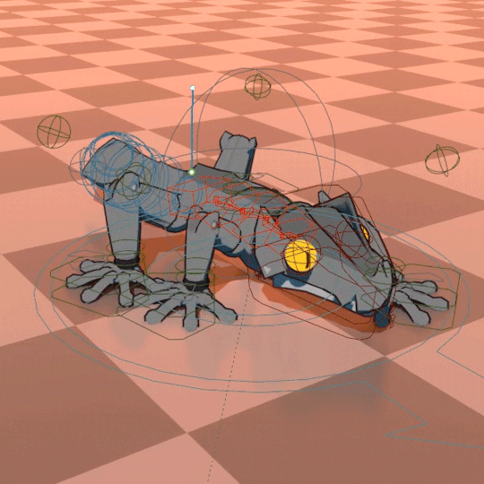
Part 1st - The Inception
When it comes to 3D I still consider myself more on the hobbyist side than the professional one.
I have a weird past in self-taught 3D modeling and game development at the same time so the logic for topology, weights, constraints and such seems to have a dedicated core in my brain that developed through sheer trial, error, tutorials and some actual studying. But I don't think I can exactly pinpoint a linear path that has taught me all of this.
Part 2nd - The Ruse
On the other hand, low poly models are much more manageable than modern high fidelity stuff. That certainly works in favour of hiding my weak spots hahaha.
Part 3rd - The Rigs
When it comes to the rigs I use in my videos, I've been testing different approaches. Thankfully, the extraction tools do preserve the original weights for the most part, but I have had to do weight necromancy to recover missing information sometimes, I made a script to recover missing weights whenever that happens.
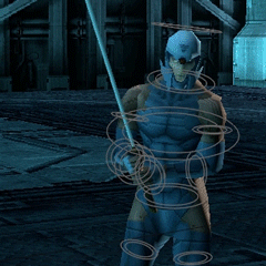
My older MGS animations use just some basic IKs and Drivers on top of the deform bones (I should get fined for those crimes) because they were a ton of characters, I wanted to save time and the extraction workflow was pretty new to me and I didn't know what to expect next.
For the newer ones, I started adding more complex control rigs until I hit a limit where it was not scalable.

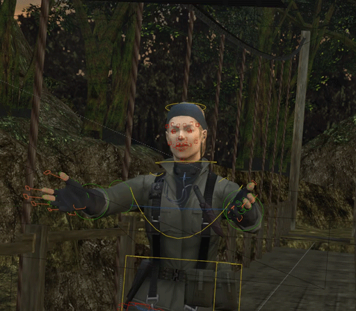
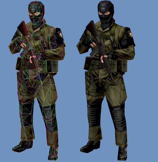
To speed things up, I now have a custom set of tools to quickly name bones and then I map them to a Rigify uh... rig. That's how I rigged The Boss for a recent video.
Part 4th - The Craftpersonship
I do continue to make new rigs for original characters from scratch because I like to learn and improve in that front rather than just rely on tools to make them for me whenever I have the time for that.
49 notes
·
View notes
Text
btw, if you liked my post analysing just the magnet "holsters" in Samurai Rabbit: The Usagi Chronicles, I'm eventually gonna post more outfit description/analysis! just cuz I've already been writing some longer descriptions for a while now - that's one of my fave things to research and write about, since it can be good art reference for my own drawings, and especially since I can go through the episodes looking for anything new to write down or connect :)
Also, thank you so much for the replies on my post! LOVING the reactions I'm seeing on it, I didn't expect this to do numbers at all but I'm pleased people enjoy reading me ramble about details in a show I like haha xD I don't usually get replies on my other fandom posts, so this is very surprising, even here. I'm touched!
Replies below! :)

@ranarenee - I already replied to you on the original post, but I genuinely just wanted to feature this comment cuz I'm glad ppl are having a positive reaction to this post xD
I also think it was probably a bit easier to animate them! in addition, because it provides an interesting change of technology in the world of Usagi Chronicles, it means that it might have become more interesting to design this hypothetical descendant-world. I'm sure they might have also just thought it was an interesting and unique element of what they were making, but from Art Director Khang Le and Stan Sakai's CBCC interview, and the SDCC@ Home 2021 panel I remember it was mentioned a few times how many clever things they found to make the production spending smaller on the more trivial things.... so the magnetic holsters feels like a thing that might have hit many birds with one stone, so-to-speak. You have the easier drawing of boards and maybe a few things made lighter for the 3D crew (no extra models or rope to animate, for example), but you also have a pleasing design element to give the main fighters in the cast - Usagi, Gen and Chizu - as well as other characters who would happen to wear weapons on their person aside from Karasu-Tengu. Like mentioned in the post, Kitsune is an interesting exception here, because of course, she's based on UY Kitsune who is also not a direct fighter or anything, but also, the world of SR appears to be at peace of some sort, and it's mentioned several times that there were wars at some point, so not many ordinary citizens of Neo would even have these unless they wanted to use or carry weapons every day. Kitsune wants to blend in with this ordinary citizenry and does so quite well.
I just thought of this today and I guess my post sort of mentioned it, but this existence of the magnets also seems to imply some hierarchy of income or money flow. Kitsune doesn't have any because she doesn't need them and she wouldn't spend money she doesn't have on them anyway. Chizu is Lady Fuwa's favourite student despite how she treats her - and gets the best undercover gear, so like Gen and Usagi, custom magnets. I suspect also that Chizu deliberately somehow got herself assigned to the temple-job (headcanon for now), or perhaps hoped it would be something like that, because she didn't want to get any of the more victim-heavy missions the Neko Ninja do. Gen obviously has spent his own money on the holsters and they are there out of pure practicality - can't be a bounty-hunter without wepons, can you? So the magnets seem more like they're ordinary but custom for the outfit. And Usagi, as discussed before, possibly inherited them because of the clan mon adorning the inlay of the magnet.
@kinokothere - thank you!! I will probably continue making posts like this even if I have no audience! why I made this blog at first was to collect my SRTUC fandom theories and drawings under a more organized platform compared to twitter, where this specific fan-account started. I now write almost explusively about SRTUC so you can bet I have way fewer notes than if I wrote about shipping or something else popular for example xD
Thank you @0yasumi-0-ya-su-mi! it's a fun little world-building detail that I really liked when I started wtaching and I hope other fans also include it more in their work x3
@umhuhwellthen x3 thank you!! i love seeing reactiong tags like this one!

#usagi chronicles#srtuc#aghhtreplies#ranarenee#kinokothere#0yasumi-0-ya-su-mi#umhuhwellthen#srtuc Kitsune#yuichi usagi#Murakami Gen#srtuc Gen#srtuc Chizu#tag review#that is what i am tagging all responses for now but i guess this is more#reply review#srtuc analysis#gif#Karasu-Tengu#I put my new gif there cuz I haven't edited it yet but it is so funny: commentary soon
30 notes
·
View notes
Text
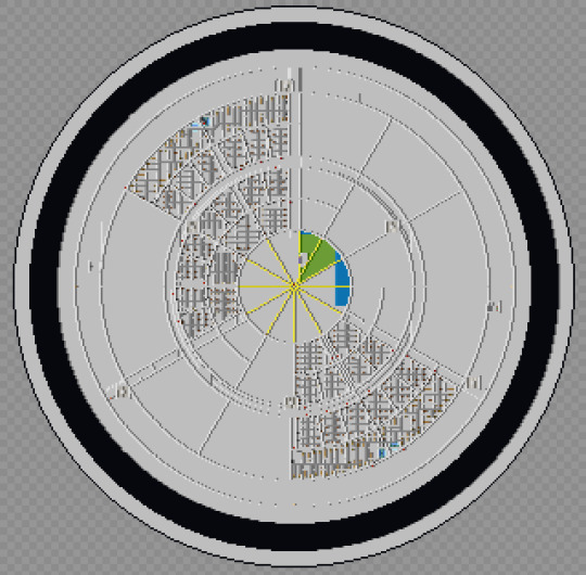
The Scholomance in Minecraft: Final Tour
The build is, for all intense and purposes, done. Now for the final tour.
Okay, let me be blunt, I can't post this here. That tour is 147 images long, not counting the one I'm reusing from the book. So I really insist if you want to see the whole thing, go visit the Imgur post. That said, I did figure out how to do something quite interesting, and I will be sharing it only here, along with some random thoughts and notes. So, who wants to see a map of the Scholomance in Minecraft?
The program is called Mineways, and it lets you extract the data from any Minecraft world, and do all sorts of things, like build import it to 3d modeling software, 3d print it, or just generate some maps. We'll start at the top and work our way down.
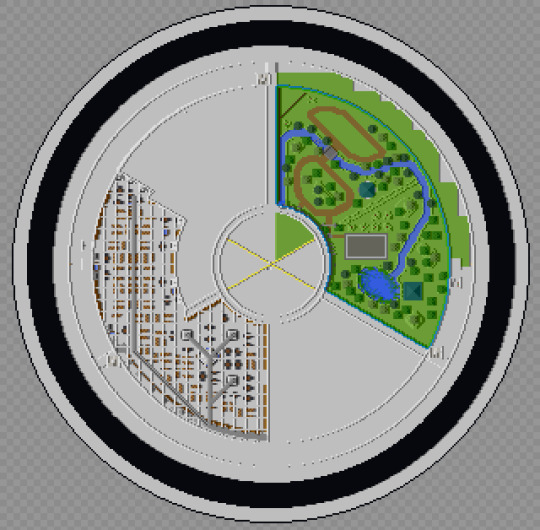
This view was almost standard for much of the build and still how I think of the school as a whole. I never removed much of the access stuff I used for building, so you'll see things like that inside the core throughout.
So the school is roughly 120 blocks tall, which puts it at about 40 stories tall. Minus the library and graduation hall, that means climbing from the Senior dorms to the library is climbing about the equivalent of 27 stories. The seniors had to have one hell of a work out just to get lunch, let alone the gym runs. The only thing holding them back from being full on Olympic athletes is the fact that they were malnourished!
I did some math at one point trying to figure out how many books the library could contain, and surprisingly they have figures for how many books fit in a cubic meter. My math (possibly wrong) came up with 116 million. Google claims there's only 156 million books total. Now this is possibly wrong (I may have messed up my math), but it's still crazy how big the library actually is. I still can't get over it honestly.
Maleficaria Studies got me wondering something: Who made the mural? The only ones who would ever see the Graduation Hall and it's inhabitants would be graduating seniors, and I doubt many took the time to sketch the scene. And even then, how did it get back into the school? And then up on the walls in a way that could be torn down and turned into wire? More than that, what was the original purpose? When they planned for it to be for 800 male enclavers, did they need it to be what it became? Or was it just an auditorium/theater and at one point they had bands or were performing Shakespeare or something?
Speaking of those early days, I think it's pretty clear there had to be some communication from outside the school to inside, if only to the artifice itself. After all, they had to have some way to tell the school to halve the room sizes so it could support more students.
BTW, while writing this, do you notice how there's a couple blanks spaces for the bathrooms along the bottom? Yeah, I missed two sets of bathrooms. I did go back and fill those in, I just didn't redo these maps.
Speaking of bathrooms, I decided to make the interior restrooms unisex while the dorm ones were gendered. Why? My theory is that because the dorms were designed to be re done on a regular basis it wasn't hard to fix but the interior ones couldn't be so easily changed, so instead of separating by gender, they just left them unisex as they couldn't do anything else. So why no urinals? After all it was originally an all boys school. Mostly it was easier to build, but also because I really couldn't find a ratio between urinals and toilets, and only got annoyed me when the one reference I found said that for all male locations there should be more toilets/urinals total than one for all female or even mixed populations. That might explain a lot if that's considered the standard in the building industry.
This image actually shows the grid and vent work in the alchemy labs as it's difficult to see when you're in the school. I really just wanted to point it out. I used this floor to figure out the numbering system for the rooms in the school. As shown here:

I did make an effort to stick to this map, but I'm sure I messed it up somewhere.

I have a theory on the construction of the school. We're told that the doors were meant to be the thing to get people to invest, in the larger project, but was it all in one go? I think maybe not. Sure the grad hall and gates came first, then they suggested maybe we could build another floor, and then another, and then why not just build the whole thing and before the enclaves knew what was happening they were building a world wonder. Feature creep at it's finest.
The vent work in the Workshop is almost impossible to see from inside the school. I managed to find one spot, right over the power hammer for the final tour post and it's only barely visible. Here though, you can see the whole thing. It's the grey line that runs through it.
The labyrinth isn't quite as wild as the images in the books displayed, in fact it's quite regular from this angle, but when you're inside, getting lost is probably the stupidly easiest thing that can happen. It was mostly intentional, of course, but I'm surprised how well it worked and how easily I got turned around.
I will also say I'm so happy with how the gym ultimately turned out. Oh it could be better, but the stark difference between it and the rest of the school is something I really wanted to make clear. Also if you look close to the edges of the gym and workshop, you can see the current and old shafts, I never did remove the old ones.
The Grad Hall has the most leftover bits in the school. The multiple extra shafts, the remains of the lines for the levels of the landing, and square base of the whole thing. I would love to say I left it as an easter egg or something, but really it was one part laziness and one part really freaking dark down there. If I couldn't see it and know it's there, no one else can see it at all.
Of all the parts of the school, we know both a lot about the Graduation Hall, and almost nothing. It's shape is only hinted at, the general arrangement (entry doors on one side, exit on the other) is vague, and we really don't know where the shafts come in at all. My original build actually had the shafts going up toward the middle of the school, making the whole thing quite narrow indeed, but this felt much more likely to be true. This version feels more right, even if it still remains a bit too small. But only a bit.
And now a gif from the top to bottom. No it doesn't have every layer, but it has a lot of them.

Well that's the end. Link to final file below. Please feel free to download and explore it, modify or just play inside. And if someone gets a server of this running let me know. Hell let me know whatever you do with it, I'm straight up curious.
And since there's a chance she's reading this, thank you for the wonderful series and hope my build came at least pretty close to what you imagined, even if was made in Minecraft.
#the scholomance#the golden enclaves#a deadly education#naomi novik#scholomance#the last graduate#minecraft
7 notes
·
View notes
Text
Corrupted Tzen armor - 3D Model
Hi,
It has been a while, once again!
Sometimes, I am not sure what to share on Tumblr.
I will try to keep sharing about my 3D journey.
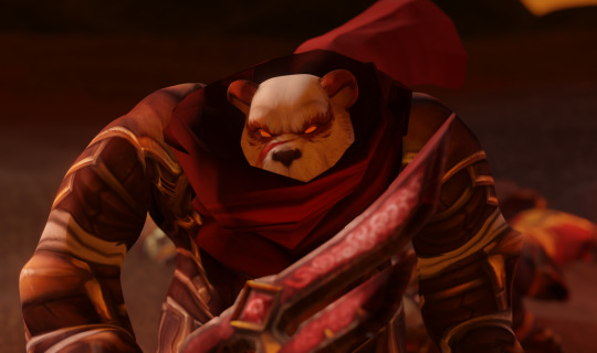
The next episode of Untold Tale of Pandaria (Pandaria Monogatari) is running well. The progress has been a bit slower than expected because of the sleeves that are custom and a nightmare to animate.


Talking about "nightmare", we finally arrived at That part that I wanted to give a try for a long time: a short horrific Japanese ghost movie!
I am a huge fan of the Fatal Frame game series, and I also really enjoy the tones of Asian ghost stories and movies.

(Note: This gif features a yokai, not a yurei or an onryo. But it is the less scary I found)
In the machinima, I feel like I have the unique opportunity to play around with this! The whole scene in this Kaiki eiga style will be released apart to not scare the audience.
Also, from the lesson learned from the prologue, I need to avoid multiple intrigues, to keep the narrative flow clear enough.
So we will briefly see ghosts (many more elaborated and diverse models than below), and see later whom they torment and how they proceed.
This long digression being done...
Let's talk about the new model I made and its lore! (Finally)
I have had the draft idea of this armor for a long time!
In the lore of the machinima, the Tzen armor is a centuries-old artifact of the eponymous clan. It is thought to have been partly destroyed, just like most of the belongings of the disposed clan. The last warrior thought to have owned and worn the armor was Tho's father. Although Mei-Phang claimed that they saw it, altered but complete, in Tho's bedroom, during their teenage years (so about a decade after the execution of all the Tzen patriarchs).
The armor is considered an artifact because it changes with the owner's will and absorbs the chi around, accordingly.
The Tzen identified themselves with the Mountains of the South that can bring prosperity or devastation. The armor thus "embodies" that ambivalence.

In the prologue, we could foresee that Tho chose a path of destruction, realizing way too late the disaster he'd caused.
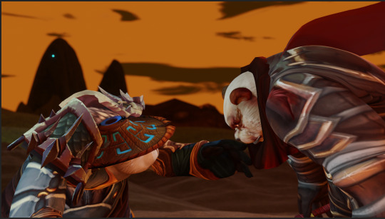
But this had consequences. And notably on the Tzen armor.
In the "Notes about the Untold Tale" (written by one of my lorewalker OC, Wen-Long) states that the Tzen armor got corrupted with so much bad chi that it started wandering by night, more likely seeking for revenge.
Older Mei-Phang would have to relocate their students, when the armor started causing a big safety concern. Yet, the armor never attacked Mei directly, unless they wear the official kimono of the Zhu clan.

The customization work on this armor was pretty simple and straightforward. I started from an existing Huojin sentinel model that I rediscovered while playing (Han-zhu) on the PTR.
(On the screenshot, you can see a hint regarding one of Han-zhu's first names, btw... :D).

The original mesh of the model had few refinements to attenuate the plate-looking style.
I then worked on the main additions:
-add a wakidate on the kabuto (helmet)
-refine the sode (shoulder pads)
- add a kusazuri and a haidate (lower part)
These additions were very simple but they gave a nice silhouette.
I improved my retopology and seam marking, so the work on the kusazuri/haidate was much less painful than on Han-zhu's samurai armor in the prologue!
The main work on this armor was the texturing that was almost completely remade from scratch.
First I wanted Tho's eyes to be visible beyond the menpo (mask), but it looked like he was squinting, like, way too much!
And it really messed up the frightening aura of the armor! XD
So I decided to keep the eyes red-glowing and add Tho's "emblematic" red scarf, instead.

Cannot wait for the next episode (and little Kaiki eiga spinoff) to go live soon!
Hope you enjoy this long post!
Thank you if you read everything!!
P.S. If you don't know yet about this machinima project, here is the trailer.
youtube
1 note
·
View note
Text
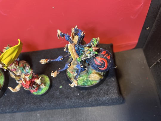
Painting The Tusked Marauders of Gauntwood
So my pile of shame is ever growing, for those outside the hobby, a pile of shame is usually a stack of built or un-built miniatures that sit there, as grey as the day they were manufactured, waiting for their turn to get painted... More often than not, people's pile of shames only ever grow...
I got back into the hobby last year by getting HeroQuest (the original), followed by a 3D Printer, followed by having the 12 year old boy inside me being crushed by the bitter disappointment that no-one in our local Games Workshop or "Friendly Local Gaming Stores" are at all interested...
So I've been doing some printing and doing some painting.
So here's the start of The Tusked Marauders of Gauntwood from Daybreak Miniatures.
So I am still a beginner, I want to be as good as the likes of Sergio Calvo or be able to paint to the unrealistic standard you see on the box art on any Warhammer figure. It maybe an impossible goal, but it is a goal, the only way I can get there is practice. I don't like the idea of sharing my painted miniatures online, but I know we all got to start some where.
So with so much grey on my glass shelves, I've started with The Tusked Marauders of Gauntwood.
I generally start by doing the bases to everything in that faction, this then standardizes what they all look like. I like doing bases, it's either Green grass on Rocks, or Rocks with other Rocks. Bit of a base coat, followed by a wash or two, followed by a base coat & layer, and a clean black rim to make them tidy.
After the bases, I worked on Dongli Smite on Head Runner, (*coughs* Squig), working on the Head-Runner first, then on Dongli Smite. I sort of made my first mistake, I was trying out different reds on the Head-Runner, got it to how I liked it, then by the time I came to do the second model, Krimli Smite on Head Runner, I'd forgotten which paints I'd used. (I guess it makes the models unique, but I would prefer them to look the same).
Problem with these the goblins are tiny, so it's hard to get every detail (or in my case, any detail). It's not a fault, and in hindsight I should of printed them bigger, (although the Head Hunters would of been too big?) just my current painting level isn't quite there yet to get all the details. Luckily, base coat green on the skin, silver on the armour, wash the skin with a green, was the armour with Nuln Oil, and it makes it look a lot better than my skill is actually at. (it also took me a while to notice they are wearing little leather helmets).
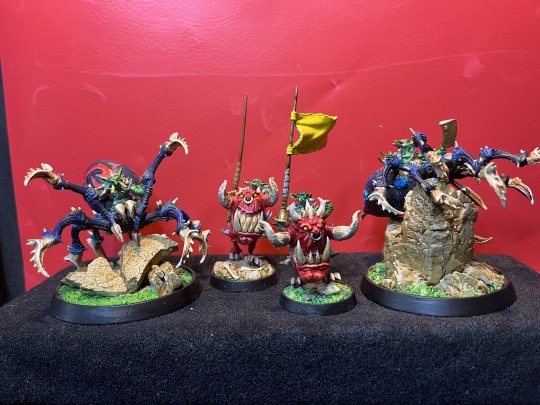
Then onto the Spiders, I was really looking forward to trying out a few new things here.
Learning from my mistake of not painting simular miniatures together in stages, I painted both spiders together. Painted them black, then dry-brushed them up to a dark blue.
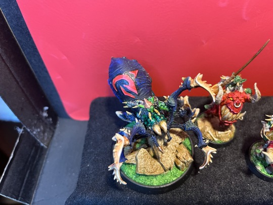
Using a bone colour for it's claws, shaded, re-added base colour of the top, followed by a lighter bone colour, then a very faint brighter cream to highlight the tops.
My favorite part of the spiders were the markings on their torso - painted this area as white as white would go then using Vallejo Blood Red with some Red Ink did a few layers with this to make the red stand out. Then I had the bright idea of doing a thin black line around the outside to try and make the markings stand out even more, this was OK, but not the effect I wanted, then almost ruined the lot by putting a pink line on the edge of the markings... lesson learn't quit whilst you are ahead.
Painted the tiny goblins in the same way. Base coat, wash, drop mini, snap leg, search for leg under the desk, glue leg, get angry as glued leg to hand, repaint broken parts, highlight with original base coat, then highlight again with a lighter green.
I used the Butchers Knife on Havor Split on Black Weaver to practice my wet-blending.
Then to get them on the bases with out gluing myself to the wall.
Out comes the fake-Dremel I got for Christmas that I get moaned I don't use. Drill a long thin hole in the bottom..
Feed a cut up paper-clip in one end and glue, then drill a hole in the base, feed the paper clip in and glue. Sits in there nice and securly.
I also need to spend some more time working out how to take better videos and pictures of the miniatures. Open to any suggestions any one might have.
So there we have it. First and the largest of The Tusked Marauders of Gauntwood done.
Now to move on to the rest of those pointy little goblins.
0 notes
Photo


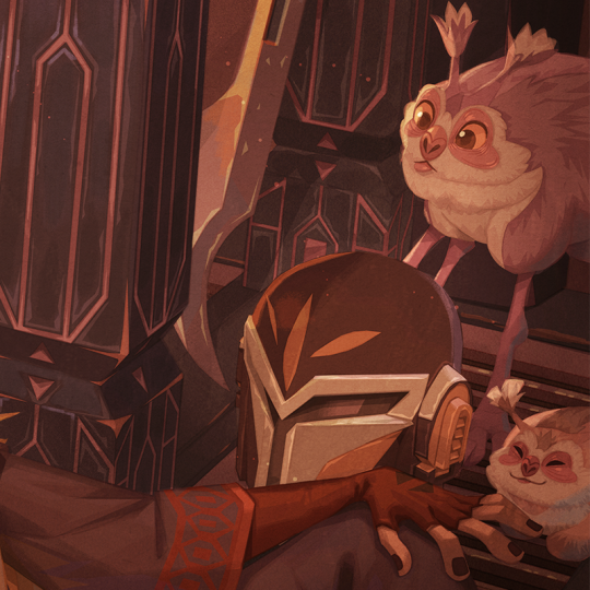

ACON3D reached out to me for a collaboration, and I used it as an excuse to draw my and @eggdrawsthings‘ Star Wars OCs! I’ve been chipping away at this for the better part of a month, and despite the struggles, I’m pretty happy with how it came out! ^_^
Having used SketchUp for both my professional and personal work, I’m a HUGE advocate of using 3D to streamline my workflow. Utilizing pre-made models instead of making them from scratch is a game-changer!
Extensive notes on my process below the cut.
Default 3D Model:
For this collab, I was to use one of the many 3D model resources sold by ACON3D to create an illustration. I chose the Joseon Dynasty - Thatched House by Team Truffle. The render below is just a fragment of the lovingly crafted set design - I recommend searching it up! (I’d provide a link, but Tumblr’s external link policy might nuke this post from search results if I do)

Customizing the Model:
Modified and added some props to make the scene more thematically Star Wars.
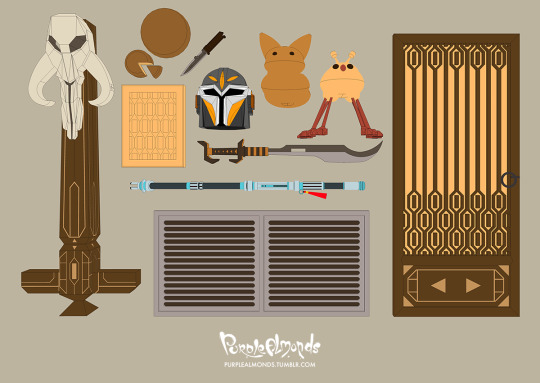
From top left to right:
Building Column - Altered the shape and added motifs inspired by Mandalorian architecture. Mythosaur skull mounted on top is also modeled from scratch!
Uj Cake - Surprisingly few images of this snack despite it being mentioned in many fanworks - I think I used a photo off of Wookiepedia as reference for this.
Cutting Board - Pretty straightforward - a cutting board for the cake to sit on top of. It’s not visible in the final render, but I leveraged the kar’ta motif as a fancy inlaid pattern.
Vibroblade - Basically a replica of Din Djarin’s, though much of its design isn’t visible in the final render.
Buy’ce - This was my first time modeling a helmet in SketchUp, much less a buy’ce. Geometry is a hot mess, but it got the job done.
Xing’s Beskad - Referencing my Mando OC’s weapon of choice. Overall design’s taken straight from the beskad’s blade shape, guard, and grip – though I tried to give it more of a katana-like aesthetic.
Tooka - Or rather, a limb-less and tail-less tooka. By far the most primitive of the models, but I just needed it as a placeholder which I would draw details on top of.
Voorpak - This space chinchilla was...hmm. There were discrepancies between the creature’s original concept in The Wildlife of Star Wars: A field guide (small and 8-legged) and its first appearance in The Bad Batch (dog-sized and 6-legged). Needless to say, I was a tad irritated to find out I modeled and posed two extra legs before realizing they were extraneous.
Phong’s Saber Staff - Probably one of the more complex props in this spread, but Jamie’s detailed reference sheet sped up the modeling process considerably.
Vent Covers - Replacing some of the floor boards in the foreground to give this set a more sci-fi vibe.
Door - Once again, customized the screen design and panel patterning after Mandalorian motifs. This and the column will be the two biggest alterations to the set, so I took extra care to get the designs just right.
And this is what the props look like on set. Colors turned off so the lighting (which I later scrapped) is clearly defined.

Sketch:
Now’s the bit that I finally add the characters and creatures into the composition! For this one, I did have a vague idea of what I wanted out of it story-wise – some kind of low key scene with Phong and Xing hanging out at the latter’s dwelling. To help sell the casual vibes, I had Xing dressed only in his cuirass and blacks. Definitely not because I was struggling to draw his armor. Perish the thought!

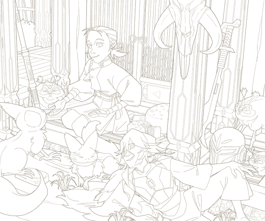
Ink:
Ah yes, the cleanup stage. Arguably the most crucial, time-consuming, boring, yet satisfying part of this process. While much of this work is retracing what’s already been drawn, the concise line art eliminates much guesswork in the next steps. The goal here is to have a clean blueprint, so I don’t have dedicate bandwidth to fixing errors in anatomy, prop position, etc.
I try to keep element of this comp well organized. For instance, Phong’s face alone has layers for their eyelash, iris, bottom eyelid, eyebrow, nose, mouth, bangs, braid, ponytail, hair ties, ear, and face - all clustered into a group, which is then clustered within a bigger group containing the remaining parts of their body. Definitely overkill, but I like running a tight ship for pieces I can take my time with!
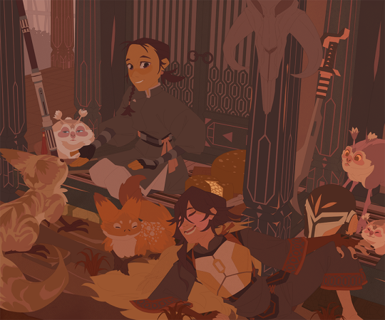
Color Flats:
Full disclosure: the color flats shown here are a lie. I didn’t land on these colors on my first try; it took innumerable rounds of trial and error. Color palette iterations ran the full gamut from monotonously drab to eye-searingly vibrant then back again. Lighting changed from high noon to overcast to night time in quick succession. Certain elements were individually altered to pop out more, then on second viewing, dialed back because they popped out too much. The colors you see below a grudging compromise of all the directions which it was pulled:
This GIF below is a more honest depiction of the utter chaos which was the evolution of this illustration’s identity crisis:

Shading:
I suppose after that GIF showing these next steps is bit of a moot point, but here we are anyways! I used Brightness/Contrast adjustment layers to start lighting the color flats. I start out with the polygonal lasso tool to block out the big shadow shapes, then go back with a textured brush to soften edges where necessary.
At this point, my layer count was going upwards of 900+ and file size at over 1GB. If I so much as turned off a layer, my computer threatens to have a meltdown. So consolidated these lighting layers by making them universal - one layer for darks, another for contact shadows, etc.
Final Render:
I guess this is where the magic happens? Textures, material renders, secondary & tertiary lights, atmosphere, etc. all kind of just happen at once. It’s a lot of stuff to describe in blow-by-blow accounts, and I’ve rewritten this several times already because Tumblr keeps prematurely closing out my unsaved drafts, so I’m gonna leave it at that!
#Xing Feyrin#Nguyễn Chiêu Phong#Star Wars#Star Wars OC#the mandalorian#mando oc#Mandalorian oc#mandosona#mando#voorpak#tooka#loth cat#purplealmonds#eggdrawsthings#acon3d#fan art#personal art#2022
897 notes
·
View notes
Note
hi! have you seen the absolute nonsense that is SonyaBelka's Patreon payment structure? it's absolutely ludicrous and fits on your page imo
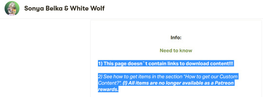
Okay so this is hilarious and 100% deserves to be roasted. ^
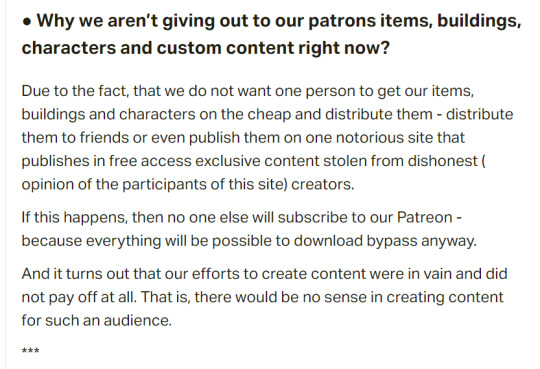
There's no downloads or way to get any sort of rewards? What do you mean? Why are we paying you then? Who really knows?
First, we have the ominous:
The ability to get items, lots, and characters will reappear when this page has 1000 patrons.
Which makes no sense, but okay....
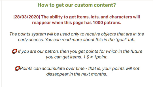
But then...
The "points system" will only be used to receive objects that are in early access...{what early access? You guys aren't releasing anything? Right?}
If you are our patron, you get points for which in the future you can get items $1 = 1 point.
Oh so people are paying you in the hopes that maybe someday in the far off future you'll let them get items from your early access?

How many points will items be? How many months will someone have to "wait" to get something if they just pay $1 a month (which is the only tier right now)...how does this work? I think I need a big pinny-board thing to explain this...

Does this whole statement feel very much like holding something hostage to you? Because it sure does to me.
In addition, when you go down further to figure out why they're holding the content hostage, their reason becomes a bit more clear:
And further down...
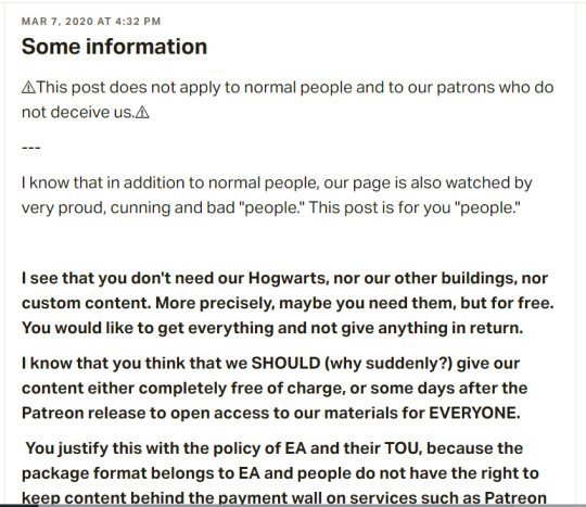
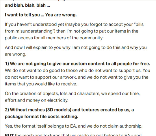
Okay, so I'm going to explain why this person is literally out of their mind.
First and foremost, let's talk about this whole "copyright" issue.
Harry Potter, and the entire cast of characters, the setting of Hogwarts, etc. All of that shit...belongs to J.K Rowling. The only reason movies got made, and posters and all sorts of fan "merch" get sold each year...is because J.K Rowling sold off some of her rights to the characters to specific parties. THIS CREATOR IS NOT ONE OF THEM.
The fucking audacity you must have to try to make money off of HER intellectual property, while also gatekeeping content you've made from your own community is fucking sick. EA DIDN'T EVEN TRY TO BLATENTLY DO THIS, BECAUSE THEY MADE "HARRY PUFFER" TO TRY TO NOT INFRINGE ON HER COPYRIGHT.
Second, let's also talk about the fact that ALL CREATORS are using EA'S PLATFORM to host your content. The sims 4 is EA's platform. Without the sims 4, none of your precious "custom content" would remotely WORK. So unless you just took the 3D models and sold them elsewhere {which I don't know why this creator isn't doing that since you seem to think you're such a damn hotshot}, you need to follow by EA's rules of their platform.
It's the same regardless of where you upload. For example, if you made a youtube video and you posted something that was against their terms of service {ex: child porn, or a pyramid scheme, or a virus within your video}...youtube would have ALL the rights in the world to pull down your video from their platform and delete your account. Because you posted that video on their platform. Even if ALL of the video was "your content" because you put it on their platform as a method of display, you have to abide by their rules.
It's the same idea for if you enter art into a gallery. The gallery owners have a specific theme or a collection they are aiming to display. For example, the Crystal Bridges Museum of American Art would not be interested in a Claude Monet piece, because he wasn't an American artist. Not because his art isn't good, but just because it doesn't fit the guidelines of their collection.
EA has stated it doesn't want people who are creating CC who are going to be permapaywalling using their platform/assets/tuning/files to do so. What is so hard about that to understand? I know that a lot of people want to be like FUCK EA AND FUCK THEIR CORPERATE GREED but at the same time, they have the ability to remove your ability to use their platform (ex: the gallery/your origin account) if you don't comply.
Let's also mention that this creator, while trying to get at least $1000 by promising content and not delivering it in any way...is not even "done" with the big project they are promising. No WONDER they have less than two dozen people fleeced into their scheme?
This is insane and @sonyabelkasgames should 100% be ashamed. Because while they go on and on about their "rights" they are 100% fine with trampling on the rights of others. {Not to mention they literally aren't okay with using patreon for what it was designed and basically want to lead people on with no promise of anything real? That sounds 100% like a "take the money and run" situation to me.}
----
If anyone wants some hogwarts cc, allow me to share with you some nice places to get shit that's FREE.
Pufferhead Stuff
Free Harry Potter "World" file with HP Lots
Tons of Harry Potter stuff from TSR {the ad wall isn't great but eh}
Hogwarts Build
HP Mod Pack
Hogwarts Stuff
Simdertalia's Witchy Finds Blog {for witch/wizard CC}
Plus tons and tons of free hogwarts builds on the gallery
#insanity#sims 4#sims 4 cc#the paywall rants#anti paywalls#paywalls suck#sims4cc#sims4#sims4alpha#sims4mm#sims4maxismatch#anti adfly#the sims 4#fuck paywalls#harry potter
591 notes
·
View notes
Photo

Guide to that elusive “PS1-pixelated-lowpoly”(but not really)
With the videogame playing population growing up we've finally broke from pixel-art nostalgia into the broadly called "low-poly" nostalgia. On closer look this broad categorization gets further described as “PS1 pixelated textures low-poly”, which is a bit better, but still is a really broad and a pretty wrong description of this style that’s so dear to a plenty of game-playing and game making individuals these days. I’ll try to dive into some of the technicalities and examples of this style in the attempt to find it’s characteristics and some actual technical requirements to meet this style.
Let’s start with the obvious, calling it PS1 low-poly is wrong, mostly because the same games were release on Nintendo 64, Dreamcast and PC. More so, games released later can be put into the same category, plenty of NDS or PSP games fit into the same style and adhere to the same economy principles. The only real surface level thing unifying these games is the game size, that is, the games came on CDs. The advent of a DVD format really changed up how the games look, so the graphical style we’re talking about here is called CD-3D in smaller circles.
First let’s look at the games that fit the criteria would give you some information to describe the style, textures are obviously small enough to have visible pixelation (hidden by texture filtering) and models are obviously low-poly (that is around or less than 500 triangles for a character), but let’s see what doesn’t seem so obvious. Here’s Spyro and Crash, fan favorites
Both games check both points we’ve noted before, but what’s not obvious to an untrained eye is that these games both extensively use Vertex Color, the thing you’ll notice more and more in other games we’ll talk about. Vertex Color is absolutely simple, each vertex of a mesh can be assigned a RGBA value and they’re then linearly blended with other vertex colors. Notice how in Spyro the yellow and purple light is placed on places where texture is repeated, following that you can eyeball where the wireframe is and then you’ll see that the vertex color is used to simulate lighting. Crash himself is filled with Vertex Color, it’s a cheap way to avoid using textures, while having some control over the color of the thing, instead of it being a solid chunk. If you search-engine around you can also find some really fascinating notes on the development of the original Crash and the tricks they’ve pulled! The more ingenious way to use Vertex Color is to take a look at Spyro skyboxes:

Notice how the clouds are diamond-like in shape and are linearly gradiented to the next point in the wireframe.
Vertex color was used extensively and fell off with the increasing complexity of the meshes, delegated mostly to technical masking of stuff like foliage, it’s still a powerful tool for lower triangle counts.
Textures
Now, let’s talk about the textures. Pixelated textures look nice and crisp these days, at the age of 1080p being the norm, turning texture filtering really makes the games look crisp and feel right
Quake 1 is a perfect example of CD-3D style, often undeservingly forgot in discussions about this style.
But this makes us forget that the textures were often authored with texture filtering in mind. Careful step gradienting to make textures seem smoother after being filtered is a craft in itself.
Texture filtering is not bad in itself, some games look better without it these days, because of the display resolutions, but it’s still a valid tool to apply, it can help push low-res texture a bit higher and produce a softening effect make those 4 pixels into a round circle or improve a visual effect.
Of course, some games took a deliberate approach of avoiding smudged look, like Megaman Legends, for example.
Via a very deliberate texture economy and unwrapping the developers were able to produce very crisp and pixel perfect textures (slightly warped by the infamous PS1 rendering), that look absolutely astounding when you render the game in a modern resolution. Pixel-aware UV Unwrapping, is being used in most games that are considered the pinnacle of CD-3D style, this technique is so powerful, that it was used to great effect in PS2 era games, PSP games and even modern games like Guilty Gear (for a different effect though). Let’s take a closer look,
As you can see, our character is unwrapped in square pieces in such a way that a straight line on a texture will produce a straight line on a model. While Vagrant Story is an absolutely perfect in execution of this technique, it’s also used in a same way in Megaman Legends
While I couldn’t find a reliable tool that works with modern 3D modeling software to allow pixel perfect alignment, just using a UV Checker will produce great results. This method also requires some thought put into your topology before unwrapping, but it’s strong point is that you can make changes into your unwrapping and geometry easily, making little tugs won’t break the whole thing.
As you can also note, Vagrant Story textures are authored in a single atlas, while Metal Gear Solid separates this atlas into smaller chunks like this:

Allowing for easier unwrapping, since you can unwrap into the full UV space and then change the size of the texture to scale your results. The other important thing is that you probably want your characters in a T-pose when you’re unwrapping, since this allows for easier use of normal based unwrapping, considering your model would be authored with 4 to 8 sides for limbs and torso it could be box unwrapped and then tweaked for optimal results.

Silent Hill 1 used the same technique, and is also regarded as one of the best looking PS1 games.
While this is the best practice for this kind of look, it’s absolutely not required, Quake 1 used a really loose flat unwrap:
But it’s still looks bloody amazing in the end.
While the topic of using UV Unwrapping for crisper result is endless I’d also love to bring your attention to a certain Jet Set game
It also uses the same technique as Megaman Legends, but it tops it off with some cel-shading, producing crisp, stylish and iconic look.
Here’s some technicalities: Character textures are usually 256x256 for main characters, 128x128 for other characters, character usually have ~100-120 colors per full atlas. MGS breaks down the atlas into chunks so each chunks is usually 8 colors. So when authoring textures, make us of Indexed Color image mode or Save for Web.
Now let’s move from character textures to
World textures
Universally regarded as best looking CD-3D games share the same trait, not only the characters look amazing, but the environments too. Despite hard limitations, the environments look very much affected by lighting. A lot of the times this is achieved with this one simple trick that was only improved with modern technology. That is, a lot of the lighting is baked into the textures
While this limits you on the amount of lighting scenarios or makes you produce more same-ish assets this certainly elevates the look. While nowadays baked lighting is not something that exciting, it’s also being done on a separate “layer”, so there’s no need to make a separate texture for every lighting scenario, however the resolution of a lightmap should not be higher than your texture, to not produce a cheap and uncanny effect. You still want to bake some fake lighting into your texture, which contradicts the rules of PBR, but since you’re not using normal maps, rules of PBR should not apply in the same way.
The other important tool to use, is the one we’ve talked about, that is, Vertex Color. Vagrant Story uses to great effect, while it’s environment textures don’t have lights baked, they use vertex color extensively to create a variety of moods and lighting scenarios.

Using best texturing practice, Vertex Color and making sure your lightmaps are matching resolution to your textures will produce the best results.
Now let’s talk why I don’t advise using a lot of normal maps for this style. The simple answer, it’s somewhat difficult to produce a normal map that will work with an unfiltered look, but it’s somewhat manageable to do it if you’re using texture filtering. The issue arises when you try make your normal maps unfiltered, this will make your result either a mess or a bunch of visual noise. If you’re trying to make sharp pixel-perfect textures and then will try to make normal maps to match you’ll get very harsh results. The only way I can see it working somewhat nice is to make a normal map that’s less detailed and then use it texture filtered to give some volume to your objects, while not trying to chase pixel details.
The suggested method is to do a rough sculpt -> bake it down -> use ambient occlusion and other masks to author a texture map with more details. Then use a detailed texture and less detailed normal map for optimal result.
As a closing thought, let’s talk about the
Meshes
A lot of the time you can visually trace the wireframe of things, this makes it easy to pin the style as “low-poly”, but how lowpoly it really is?
Characters in Vagrant story average 500 triangles per character. Characters in MGS go from ~450 for minor characters to ~650 for major characters. So 500-600 triangles is a solid baseline for a main character in a third person game.
This limit brings out some great restriction for every aspiring 3D artist. You have to know your limb deformation techniques (search-engine “Limb Topology” and browse around the polycount wiki to find some great examples and deformation ready examples), but as you might’ve noticed, some games decided to not wrestle with skinning and deformation and straight up detached the limbs or even made their characters out of chunks. This is perfectly noticebla if you compare the OG Grim Fandango and the remaster, where they botched the shading and you can see the bits in all of their glory.
Another easy example is Metal Gear Solid. Characters arms are separate from their torse, but this is covered with other geometry or they’re of the same color and shaded closely.

This way of doing it was used in a number of other games and allows for unlimited range of motion, while not looking weird.
It’s easy to fall into the trap of adding more triangles and loops, but if you’ll follow the rule of “if it doesn’t add to the silhouette, you don’t need it”, you’ll keep to the style. Zoom out often and if an edge doesn’t add anything from the distance and is not critical to the deformation in a character, you really don’t need it.
These principles are so solid they’ve been alive for decades, in fact, one of the best looking PSP games “Peace Walker” sticks to these principles very closely, for example this soldier is just around 1500 triangles
Spilling out of the “low-poly” territory it’s still made with the same economy principles used in CD-3D style, making use of every bit of texture and every triangle available.
Here’s another game of Metal Gear variety, Metal Gear Solid 2 is a direct heir to the design philosophy of MGS1, perfectly pixel-aligned unwraps allow for crisp detailing:
Another honorable mention goes to Animal Crossing on Nintendo 64
Animal Crossing combines meshes and sprites masterfully, uses pixel-aligned UV unwraps and makes up their own trick when creating landscape.
By unwrapping the repeating texture on each triangle of a hexagon they create these smooth patches of sand without the need for big or unique textures. It’s only 64x64 and 9 colors, but the mileage you can get out of it is insane!
And this honestly sums up the CD-3D style perfectly, it’s the style governed by economy. There’s no need for insane textures for sharp lines, and millions of colors for smooth gradients. Now of course all of these are not rules, but recommendations, you can certainly bend the rules and improve on some aspects. Before we go, here’s some more pictures to get you inspired.


#playstation#psx games#psx#nintendo 64#low poly#3d#retro aesthetic#pixelated#gamedev#dreamcast#cd3d#retro
6K notes
·
View notes
Text
Float Like a Butterfly, Sting Like A Bee
What follows is not the way preview posts are generally done, I know, but I’m not really a cc creator. Think of it more as a themed teaser post with the option to download some of the stuff if you so desire.
SBB
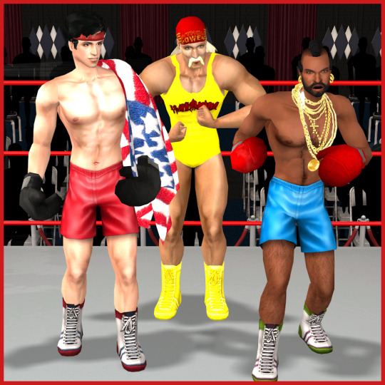
(Hulk Hogan up there for entertainment purposes only. I lengthened the hair, changed the outfit, and made him a 3d ‘stache, but the original base sim is still available on insim. Likewise the Sly Stallone base sim can be found on TSR. It’s actually a much better likeness than it seems here.)
LBB
Nolo contendere. Good, free advice to all comers. So went the smack talk (supplied by his ex-paralegal sister-in-law.) At the height of his powers, the only real challenge for Carlos Contender was himself.
Of course, all the greats must topple...eventually.
Added fat morph to LBB for...reasons. Doesn’t exactly match generic morph because I wanted it to look like someone who doesn’t realise he’s not quite as fit as he once was squeezing into the old trunks.
AM (Maxis)
Thought we’d seen the last of Harry Barnes...but I could not bring myself to just pluck out a random sim with no other relevance. So, before he was the Chestertons’ chauffeur, Harry Barnes was an up-and-coming prizefighter who had won and then lost James (Stella’s father) a fair bit of cash. But never let it be said that James Chesterton holds a grudge. When Harry’s rising star crashed and burned, James gave him a job...driving his kids around.
AND NOW FOR SOMETHING TOTALLY DIFFERENT (as the past inches toward present and future potential)
AF (adult female and all teens only Maxis Shape)
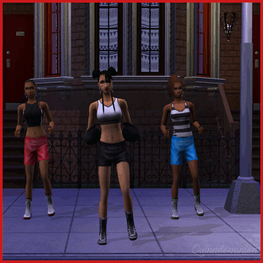
It wasn’t until I decided to go ahead and do the women that I realised separates would work best. And in the process I got a notion to use my Fight The Power sequence, but being my first dance anim it was absolute crap. So I started over from scratch until *ding-dong* I remembered that I still don’t actually need it right now. So this is as far as I got but I’m much more hopeful for the end product by the time I get back to Desiderata.
Also co-opted this outfit by SweetAmberkins and put ‘em on the needlecream boots. Only these 6 of their original 16 colours, though, because they matched pre-existing boot textures. And here you can see the rest of my accessory gloves’ colours.
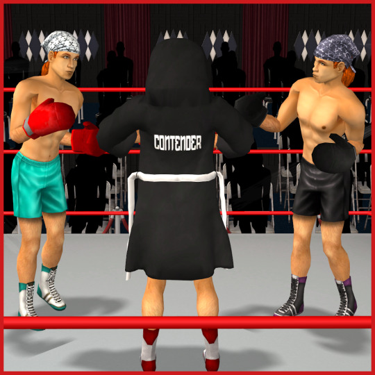
TF, TM
Gavin and Vi were the natural choice for my teen pugilists.
Which meant Ginger and Rick got dragged in and put to use modelling fat morphs.
Speaking of which...
...Jack Bastard rides again. (Along with his ol’ lady from back when he was J.P. Slumlord.)

Dun-dun-dun
__________________
Didn’t occur to me to set up scenarios for the pregmorphs. AF only (I think).
Bodyshapes - BSOK’d (haven’t updated my files since 2011 apparently but I don’t expect the codes for Marvine/Beos shapes have changed); full-body only, categorised Athletic
Oh, and another thing which may render these completely useless to anyone not me: I really can’t stand the way the bodybuilder meshes’ super-thick necks jut up into tiny maxis heads, so my meshes actually match maxis necklines
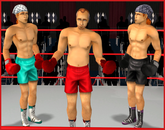
Q_SBB_BoxerTrunks Q_LBB_BoxerTrunks
Maxis Shapes - full-body categorised Athletic; bottoms Everyday & Athletic; tops Everyday, Athletic, & PJs
Q_AM-TM_BoxerTrunks Q_AF-TF_btm_BoxerTrunks
SweetAmberkins’ policy allows reuse of textures so I’ve included that outfit
Q_AF_SweetAmberkinsGymLaceUps
Michelle’s policy does not, so for the top mesh derived from this dance outfit from both FT and AL, I’ve only included the two maxis colours. (All other tops shown just for characterisation purposes.)
Q_AF-TF_top_FTDanceTopFullStraps
And, finally, the boxing gloves are derived from a TS3 object. All male full-body outfits come with and without the gloves meshed on - no chance of hands poking through. Only black and red, alternating on the 4 maxis trunks colours.
The accessory gloves work for all genders, Teen through Elder. The mesh has a natural curve and bone weights to curl more with balled fists - so it looks crazy in Bodyshop & CAS, but the fist overlays on DeeDee’s posebox work well for keeping all digits unseen in play.
Comes in the light maxis red and also blue, yellow, green, & black.
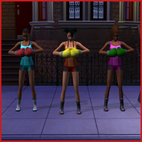
Q_ACC_BoxingGloves
40 notes
·
View notes
Note
Hellooo, your blog is my favorite and I enjoy your tutorials so much!! have you ever considered making video tutorials? Also could you tell how you started in game dev, what are the knowledges you need besides 3d modeling, rigging and animating? Are there some sources that helped you learn that you could share? Biggest thank you in advance for answering🧚♀️
thank you very much! i’ve thought about making video tutorials before, but my recording setup isn’t great so i’ve been putting it off for a while now.
in terms of game development, i actually got into it pretty much just by happenstance; i bought an art software bundle on Humble Bundle back in 2017 that happened to come with Clickteam Fusion, and after reading up on what it was and what it could do, i wanted to try out making my own game! it was a side-scrolling point and click, and i don’t have much footage of it anymore, but it looked like this
all the original files are stuck on a flash drive somewhere, maybe that’s for the best ^^;
i actually got it to a semi-playable state (Clickteam allows for a lot of visual coding, at least for basic stuff like movement and parallax scrolling) before it hit me that… making things is hard. and takes a lot more time and effort than i was willing to put in at that point, so that particular project got shelved indefinitely.
around that time, i downloaded Blender on a whim and started learning about 3D modeling, and then a couple years after i’d gotten comfortable with that, i wanted to do something with what i made, and then it just sort of spiraled from there.
ANYWAY, i’m hobbyist (and a beginner at that), but point being there’s a lot more that goes into making a game than i’d initially thought. Here’s a few resources that might be able to help
Unity Personal Edition is completely free to use, and is super accessible as well; it’s got a really helpful network of forums and a lot (like, a lot) of tutorials on their website and on youtube. Their user manual in particular has a lot of info on what everything is and how everything works.
On the subject of tutorials, i know that a lot of people find Brackeys on youtube really helpful when it comes to learning how to navigate the engine’s ui and implement some “basic” mechanics like camera movement, menu navigation, etc. If you prefer visual & auditory learning as opposed to just reading, he’s got you covered.
Making a game does entail Programming of some sort; Visual Studio is free (mostly, some editions with more features & support cost money) and compatible with a lot of languages & engines. Most tutorials that you’ll find (esp. for Unity) use some form of Visual Studio when writing & compiling code.
Music and sound design is another really important aspect of game design in general (one that i admittedly don’t know much of anything about), and while you could technically make a game without it, it can really enhance the experience! If you wanted to learn to make and implement your own audio, Bosca Ceoil is free & open-source software made by Terry Cavanagh that comes with its own tutorials & info on creating Sounds.
Fonts! That’s something that i’d almost forgotten about, fonts. If your game has a lot of dialogue, or even just a bit of text here and there, font choice is something to consider. Your virtual machine should come with quite a few fonts installed, and most game engines come with their own, but if making your own font is something that you’re interested in, you could give Calligraphr a try! They have pricing plans and account creation to store several fonts at once, but their tutorials and templates are completely free.
Towards the end of House Call’s development, it kind of hit me that i’d vastly underestimated just how many 2D assets i’d need; buttons, dialogue boxes, static images, menu text & backgrounds, etc. Like fonts, most engines will come with default stand-ins for a lot of these, but having a nice, cohesive design all the way through can really affect the game as a whole. You can make these in… pretty much any drawing software. I used Paint Tool Sai, since i’ve had it for years and i like it.
i’m probably forgetting some things, and i’ll edit this later if i recall, but tbh my biggest challenge was actually just… giving myself permission to try and make something! i spent a lot of time worrying about whether or not what i made was “good enough,” like there was someone i had to ask permission from, or some artificial threshold that i had to pass in order to really be able to make a game with the assumption that some people might see it and play it, but that mentality really didn’t do anything but cause me unnecessary anxiety, in the end.
It’s scary trying something new, and even scarier when you’re expecting feedback for it, but the best way to learn is by doing; the first thing that you make probably isn’t gonna be the best thing that you make, after all (see above), so if game development is something that you’re even a little interested in, don’t be afraid to try it out! At the very least, you’ll have learned something new, and i for one would love to see what you can create!
#new game idea: drink a juice every time kc gets an ask and writes a novel in response#ask#asks#resources#anyway i hope this was at least a bit helpful!#long post
59 notes
·
View notes
Text
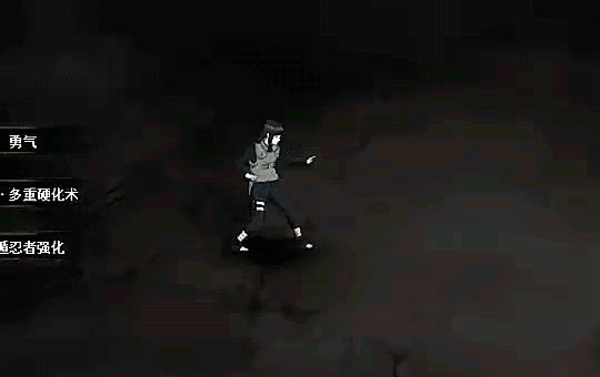
Spicy hot take opinions time: Naruto to Boruto Shinobi Strikers wouldn’t have been as much of a hit had it’s 3D art style not been heavily influenced by the Ninja Storm Series.

No worries, we’ll get into the mess that is Naruto Online/Naruto Online Mobile later in this post, calm your britches.
As soon as I saw the first “Naruto Project” trailer drop a part of me was like “interesting little design differences from the previous Storm games huh? It’s not??? What do you mean this isn’t Naruto Ultimate Ninja Storm 5???” These aren’t they best gifs as two different characters but I’m tired and felt like it had to be said.
There’s just something about it that feels way too much like Ninja Storm, but also not enough like Ninja Storm.
I’m just speculating of course, leave me links to any details you got on this if you do! It’s something I thought of ever since that trailer dropped and we didn’t see the 5 a lot of us waited so long to see. Not saying good or bad, but I do miss the hype and excitement around a new Ninja Storm game.
Seems like the closest thing possible is Naruto Online Mobile (and it’s likely originally planned PC version Naruto Online, the browser and app game) which came out in 2017-2018 and is still getting updates. Does anyone know the artists who made these games both look somewhat (and in the case of Naruto OL, exactly like) “Storm” in appearance?? I want to follow them on social media and see what they’re working on next if it’s even the same 3D artists who worked on Ninja Storm? Might just be fans who became devs and are keeping that style alive.
What did you all think? The mobile version of the Naruto Storm essentially copy game is exclusive to overseas and VPNs sometimes even cant get you through the bs because of this QQ program thing I guess. Then you got Shinobi Strikers and while yes I imagine it’s quite fun to play (I’m broke and socially awkward), I just feel like it holds onto Storm’s looks and just doesn’t feel the same when I’m watching people play it. It feels off putting almost?? The gameplay looks amazing though! Maybe the games look that way because that’s what “everyone expects” so they had the character design be extremely similar to appeal to that mindset of things.
I honestly really want to play both games! Even that third mobile one where it uses an almost 2D fighter system like the original Naruto Ultimate Ninja games, but the 3D models and animations from Ninja Storm! If anyone has an emulator not full of bs that can run that and Naruto Online Mobile, let me know!
Anyway I guess to sum it up, I feel like the Naruto game devs’ higher ups divided up the artists, programmers etc. from the Naruto Storm series and thought that making a bunch of separate games was a good idea and that no one would notice?? Not saying Shinobi Strikers isn’t good, it looks fantastic, but it pulls in the Ninja Storm style that has always been vibrant and colorful and puts it into this more realistic heavy colors type of situation and it just feels so off to me. As for Naruto Mobile, they really thought taking all the assets from Naruto Storm and setting up an RPG style grind mobile game as the next Naruto official game was a good idea (not that I don’t enjoy it though and it is, but they chose both of these paths potentially over more Storm games with memorable cinematic and battle sequences and boss gameplay that hasn’t been able to be replaced anywhere else as far as “same energy” is concerned. The perfect Naruto game would be for all of these devs to get together and create maybe like an optional RPG mode? (I’m Naruto OL, you still somewhat control the fight as it’s happening) but aside from the optional RPG part of it, just to combine their games all into one would be amazing.
And yes, part of me is still salty that Naruto Storm’s assets got turned into a a role playing game that was underfunded by higher ups and then later they saw the money coming in and were like “oh yeah you can make that nostalgic Storm game now the way you want to” to the devs.
Title of post should have been: Why Naruto games vaguely or in some cases extremely resemble the old games, but don’t play or feel like them.
#naruto#boruto#shinobi striker#ninja storm#naruto online#naruto to boruto shinobi striker#gaming#naruto ultimate ninja storm#naruto ultimate ninja#naruto shinobi striker#naruto shippuden: ultimate ninja storm#naruto shippuden ultimate ninja storm#naruto games#naruto OL#Naruto OL mobile#mine#OP#naruto online mobile#cc2#namco bandai#game development#they all look the same#and thats not really bad but does make things cofusing for sure#im rambling#need sleep but just kind of had yhat realization at the end of how this could be a legit thing that happened#this woukd explain why Naruto games are in the state theyre in#writing#my writing#cw rant#game developers
3 notes
·
View notes
Photo

Seeing how it’s almost a brand new decade, I wanted to look back and and see how far I've come as a 3d artist. But seeing how I started with SFM and now work using Blender I'm looking back on both SFM and Blender. I also want to talk about each render mostly because I've always wanted to talk about my work but never did 'cause I know none of you care(When Writescrib was a thing, my uploads there had a short paragraph talking a bit about the render). If you want to read my thoughts and stuff it'll be under the break. Also you can click on the images to see the dates I made them.
#1) This is actually my first uploaded thing that I made in Blender. I love Nuclear Throne and I've made several things in Blender relating to it, this one obviously being the Throne. Every now and then I go back to this to maybe finish it, maybe do something cool with it but I don't think that's every going to really happen. That being said, even though I'll probably never end up doing a final render of it, I'm still really proud of how it looks even back then.
#2) This is the first FINISHED thing I've uploaded. Atlas Reactor was a very important game to me as without it I probably would have never actually started working in Blender fully. The characters are so great and amazing that I felt that I just HAD TO LEARN the program to make art of them. Originally, I wanted to port them to SFM. But when I realized my brain was too small to take on that task I just decided to make art of it in Blender. Making anything with Quark was a nightmare as their face is composed of like 20 different bones. I wasn't, and still not, used to working with face bones as with SFM the high quality models had facial sliders so I didn't have to worry about posing the bones.
#3) This is probably one of the most important things I've made. I was introduced to Ludosity through Slap City, which I learned about from Alpharad. I've heard of Ittle Dew before but I never played it until after playing(and loving) Slap City. In the Ittle Dew extras there's a couple of sketches of Ittle dancing, this is one of the dances in those sketches. Even though this isn't my first peice of Slap art, it's the one that I think gave me enough reach to have a small sembelance of a "fan base" or in a less inflated sense, people who'd reconize my art. I don't know who it was or when they did it but people liked this silly little gif enough for it to become an emote on both the SCO Discord channel and the official Ludosity channel. It was a weird feeling joining a server and seeing a silly thing I made as an emote.
#4) This is the latest thing I've made. Nothing really much to say about this. Goddess' victory quote against Jenny Cat gave me the idea to have her surrounded by mjaus based on the masked mjauby in the story mode extras. It was fun to make and fun to give the mjaus different expressions.
I'm really glad I decided to start making Atlas art in Blender as I probably wouldn't have started using it to make Slap City art. Slap CIty has really changed my life in a way that I didn't expect. I never expected that after making some funny pictures of the game that I would one day be contacted by someone who would go on to work at Ludosity to make art for their community. I never expected that the game with the funny fish man would be the game that I would lead to people asking for commisions. The later parts of the 2010s have taken my life in a way that I never expected it to. Hell, I never even expected to really do this art thing, I just kinda did it for fun every now and then. Hopefully on 2020 I'll actually finish my first BIG animation project in Blender and not put it off for another year. Everything's ready, I don't have an excuse anymore. Here's to 2020.
if you read this far, reply with your favourite TV show of the decade
1 note
·
View note
Last Seen Blogs

tmrasberry
ms. rasberry: the b side

win365app
WIN365 - Nhà cái cá cược thể thao uy tín hàng đầu

iplutoyo
The untitled life of pluto

cupidscrule
CUPID

cargopantsman
A Man That Likes CargoPants