#i tried a new style of line art its more sketchy but i like it
Photo
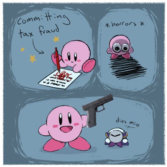
i’ve been really into kirby lately
#my art#kirby#meta knight#The Boy#i love them so much theyre so goofy#expect more silly kirbys in the future#i tried a new style of line art its more sketchy but i like it
2K notes
·
View notes
Note
Hello!
I just saw your new Blasto poster and it's v good!
I was wondering if you would give a quick rundown of your "process"?
I love the style, and I'm trying to get back into digital art, so I think it might benefit me and several others. :-)
Hi there, thanks for waiting! I went ahead and cleared this with Bioware so I could answer your question with some in-depth references from our actual process. So I hope this ends up useful both technically and in terms of approach. And not too much of an overkill!
It's tricky to speak of the process here by starting at style, because the initial pitch was quite varied and it could have really gone anywhere. Ultimately what dictates the most high-level building blocks in something like this is layout and color, and choosing those are essential steps in focusing up the concept and eventually informing the style part as well.
I mention this because that pipeline illustrates a key difference between client work and personal work. I could start with style if this was my passion project, but I had to stay loose to Bioware's pitch and conform to the our iterative process (despite them knowing my work well and even providing very clear north star from my own work as a target).
So, when the idea isn't yours, but you are told to play to your strengths, how do you interpret a pitch to design a mock movie poster for Blasto? My approach: look at the raw pitch and your vision as two ingredients in a soup. And then bust out a number of sketches that each contain different dosages of those ingredients. One will be super close to reference and play to your established work, one will be as literal a translation of the pitch as possible, one will be a loose mix of the two that organically tows that line, etc.
The pitch was for Blasto to have a dirty-harry-style spy movie poster that would feature the infamous tagline without walloping into obscene territory. The reference was my fan poster for Boba Fett. So I came up with these:
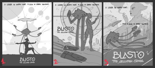
Immediately from the reference I understood what they had in mind; the "tentacle gun tornado" variant came first as a safe bet for a target. Then I went ahead and looked at old spy thriller posters and came up with #2; no loose plot details, just tropes and visual flair from that illustrated poster era. You can tell how different the style would end up being if we'd gone down that route. And then I had a bunch of variations on #3, which by-and-large all involved Blasto in action and a larger framing device shrouding a villain character. That was also in-line with my earlier work but communicated that detective story feel stronger.
I tried not to shoehorn the humor here; playing it straight felt funnier. It's a fucking jellyfish there cocking a gun with two tentacles. You can't crank the knob on that any further. And technically speaking, these weren't ultra-polished thumbnails. I don't push fidelity in my work anyway, but since I like to communicate depth, strong silhouettes, and tight composition, I tried to hit those targets with loose grayscale values and call it a day. Thumbnailing is its own goal-oriented task.
The tools I use here are just basic brushes and flats, with some semblance of a sketchy line layer. Again, no technical craft, but hints at what strengths we'll squeeze out of the layout. Which as I mentioned in the beginning is primary building block #1.
So naturally once we chose an option it was time to get to #2; colors. I did a second pass at the sketch, brought everything out into rough lines, enriched the dynamism with more implied details and quickly blocked it in with colors that I then spent a very, very long time alternating into palettes.

Picking a color palette and sticking to it early on is one of my personal unwritten rules and it's a nice feather in the cap when managing client expectations during the concepting phase. I looked at those same old posters, then some contemporaries, then my own reference points, and pulled all sorts of wacky color combos until I whittled them down to six I really thought would work well for the target. I took care to maintain a sense of depth in values, since this was a center-stage character-action focused piece. And yes, I think this is a good place to start being deliberate with that, and not to go all wishy-washy until the broad strokes are locked in. You can always play with accent pops afterwards, but fundamentals are fundamentals and their service to your thumbnails is invaluable.
Of course, if that was just me, I would have a style and even a color target set much much earlier. But exercises like these are still good to do mid-process; challenge your own vision, discover new ideas, maybe even a trick you can migrate over. It also helps you see a roughly rounded version of what the finished thing will look like; and that's always extra gas in the tank. This is why I always evangelize iterative-holistic processes instead of linear ones; it's exciting to see layout and colors working together into a cohesive, unique thumbnail, even if it's a simplistic doodle. It motivates you to finish the thing. By comparison, spending a day hyper-rendering a leg then zooming out and seeing nothing but that leg is, unsurprisingly, deflating.
Anyway, we went with #2, and that basically meant Boba Fett but make it Blasto. And I was just fine with that :D from there, the process becomes simple; it's a sprint to final that involves as many flexible and mutable parts as you can muster. You have to stay nimble and ready to incorporate comments on very fundamental levels, so you use lots of layers, and you make very deliberate choices in order to serve the high-level goals.

Here is where the "style" of it comes into play as I try to wrangle legibility and effective framing out of the thumb. I use depth-softened colors in linework and spend time building up the main characters so they have that organic pop when the eye wanders over them. It was fun gathering reference for all the iconic guns and designing the asari out of scraps of Blasto lore (and don't even get me started on the hoopla I raised about determining the correct amount of hanar tentacles).
Illium, in terms of visual priority, is a backdrop; a forest of texture, so I use very little lines and mostly focus on breaking up the various "plates" to create, again, a sense of depth. It's vector-based shapes all the way here, dotted with lights representing windows and skycars, softened in values near their base, arranged to fit most of the other elements around them. They also create a nice symbolic "fence" that Blasto rises above of, as if the city itself is the corruption that only he is uniquely equipped to fight. This was all semiotic nonsense that came to me in the process, but was still super informed by the original layout.
And then you just add in all the details and ideas without violating those basic rules of color depth and clean composition that were promised to the client by the very first sketch. All those things like planets and stars and fumes end up being glorified framing devices for centering the focus on our heroes, adhering to some internal math of element relation and action lines, and helping guide the viewer to what matters most and not overwhelm them with visual noise. I don't know how exactly to coach this, but references and study help a LOT.
Ultimately it's that exercise in restraint and concerted effort that ends up becoming a "style", and is subsequently super rewarding because the thing then is both effective and representative of your initial pitch. Style is very seldom the starting point; it's the product of tricks and quirks and discipline that you pick up throughout years of doing this. It's boring and obvious, but yes.
Just start and keep drawing to build those tricks up and be holistic in your approach and challenge your instincts and study contemporaries and iterate and iterate and iterate. Trust me, it's so worth it.
You might even get Blasto to tell you he loves your work.
#soulmate-y#asks#another one of my long-winded rants but hopefully this one's helpful#and a little inside baseball irt to my work process on these bioware gigs#thank you if you read through it!!!#and I had to include that last one for me. as a treat. for my ego. mark is very nice to me on twitter and I dont know why#long post#just in case
98 notes
·
View notes
Text
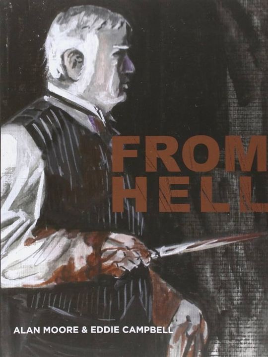
From Hell. By Alan Moore and Eddie Campbell. Top Shelf, 2006 (originally 1989-1998).
Rating: 3/5
Genre: graphic novel, crime noir/horror
Series: N/A
Summary: Having proved himself peerless in the arena of reinterpreting superheroes, Alan Moore turned his ever-incisive eye to the squalid, enigmatic world of Jack the Ripper and the Whitechapel murders of 1888. Weighing in at 576 pages, From Hell is certainly the most epic of Moore's works and remarkably and is possibly his finest effort yet in a career punctuated by such glorious highlights as Watchmen and V for Vendetta. Going beyond the myriad existing theories, which range from the sublime to the ridiculous, Moore presents an ingenious take on the slaughter. His Ripper's brutal activities are the epicentre of a conspiracy involving the very heart of the British Establishment, including the Freemasons and The Royal Family. A popular claim, which is transformed through Moore's exquisite and thoroughly gripping vision, of the Ripper crimes being the womb from which the 20th century, so enmeshed in the celebrity culture of violence, received its shocking, visceral birth.
Bolstered by meticulous research that encompasses a wide spectrum of Ripper studies and myths and coupled with his ability to evoke sympathies in such monstrous characters, Moore has created perhaps the finest examination of the Ripper legacy, observing far beyond society's obsessive need to expose Evil's visage. Ultimately, as Moore observes, Jack's identity and his actions are inconsequential to the manner in which society embraced the Fear: "It's about us. It's about our minds and how they dance. Jack mirrors our hysterias. Faceless, he is the receptacle for each new social panic."
***Full review below.***
CONTENT WARNINGS: misogyny, antisemitism, nudity, blood, gore, violence, graphic sexual content, incest, racism/xenophobia
OVERVIEW: I was a bit disappointed by the last thing I read about a historical serial killer, so I figured I'd finally pick this book up in an attempt to read something more thought-provoking. I have a lot of respect for Alan Moore, so I went into this with high hopes and high expectations. Unfortunately, I can't say this is among my favorites of Moore's work. While the art was quite impressive and I appreciated the supplemental materials included in the Top Shelf 2006 edition, I just wasn't blown away by Moore's Ripper story. So for those reasons, this book only gets 3 stars from me.
WRITING/ART: There isn't much prose, per se, in this graphic novel, so I'll use this space to primarily talk about Campbell's art.
Overall, I was actually quite impressed by the art. Campbell draws with a scratchy, sketchy style with a lot of messy lines. Personally, I was reminded somewhat of Victorian-era engravings, though Campell's art is a lot looser. Campbell's art really shines, I think, when depicting architecture and London scenery. Because the artist uses a lot of straight lines for things like tone and shading, the build environment comes across as more controlled and deliberate than his organic forms, and I very much enjoyed the scenes with a lot of buildings in them.
PLOT: The plot of this graphic novel primarily tells the story of William Gull, Royal Physician to Queen Victoria and her family. When Prince Albert Victor marries a common shop girl and fathers a child on her, Victoria enlists Gull's help to silence those who know about it: namely four women who are looking to use the information to their advantage. Little does Victoria know that Gull is a Freemason with cosmic visions of time and space; Gull also believes that murdering these women will bring about a future in which women's power is suppressed. His fanatic killing leqds the papers to dub him "Jack the Ripper." Meanwhile, Inspector Abberline tries to uncover Jack's identity, all while being undermined by those in Scotland Yard who are in league with Victoria and Gull.
Personally, I was not very impressed by the plot as a whole. Having Jack the Ripper be a Freemason with delusions about time and space wasn't as thought-provoking as I had hoped, and even linking the Royal Family to the killings didn't have quite the punch as I wanted. Perhaps I'm not understanding Moore's intention or else I'm just not all that impressed by conspiracy theories and Freemasons; whatever the reason, I didn't quite think about the Ripper killings in a new way or use them as a lens for reinterpreting other aspects of politics, history, gender, etc. If anything, Moore seems interested in the concept of time, but I'm puzzled by the decision to use the Ripper murders as the vehicle for exploring this.
Also (and this is a minor complaint), the amount of random sexual content in this graphic novel was a little off-putting. While some sexual content is understandable, i felt like some was inserted for edgy shock value, and I got tired of it after a while.
But even though I wasn't a big fan of the story, I very much appreciated the annotations included in the back of the book. The annotations talk extensively about the creative choices and the historical context, and I found them to be a useful tool for analyzing the narrative.
CHARACTERS: There are quite a few characters in this book so I'll only focus on a handful, for brevity.
William Gull (the Royal Physician and Jack the Ripper) was not very interesting, in my opinion. As a doctor who was also a Freemason and a believer in a certain cosmic view of space and time, he's more of an archetype - the crazy mystic who I driven to kill for zealous reasons. Personally, I find most stories that imagine an identity for Jack the Ripper to be difficult, as attaching an identity takes away some of the mystery. Of course, Moore wasn't trying to write a mystery, so perhaps this is a case of me having very particular tastes.
Abberline, the Inspector, was fairly sympathetic in that he seemed honest and down to earth. His kindness towards a woman named Emma made me like him for a while, though I did sour on him when he became angry and misogynistic.
The five victims of the Ripper were also sympathetic and I appreciated that we got to know them and their struggles a little before they were killed. I do wish there was a little more done with the injustice of their killing (and the conspiracy to cover it up), but Moore doesn't seem to be as interested in class and gender dynamics as it pertains to these women.
TL;DR: From Hell contains some impressive art and a very useful section of annotations; overall, though, it was not a particularly memorable reimaging of Jack the Ripper or a compelling commentary on the topics it aims to explore.
1 note
·
View note
Note
Hi lovely 💕 I'm in love with your art for jock Clarke! She looks so good rocking her red highlights and jacket with all her pins. I love the new art style too. What made you decide to change things up?
Doesn't she?? 💕💕💕💕💕 she's so hot 🥰
So the art style isnt really new, it's really the art style i used to use for digital art a lot but i tried to move away a bit from it to try a cleaner art style but turns out, that just stresses me 😅 i really love drawing in a more sketchy way and then clean up the lines instead of trying to make thing super clean. Im gonna try to stick with this style more because its just fun for me ☺️ im glad you like it :DDDD
#letter opened#lovely anon 💕#its the same art style of my clexa and elaina art i did last year and i really enjoy it 😊
1 note
·
View note
Text
Process-Illustrations and Inside of Book
This is some of the process, for making my illustrations and the other bits that I decided to add in the book.
Unfortunately, I forgot to take that many pictures of the process. I know how important it is to back up your process with screenshots but the limited time for the project really made me subconsciously work on all the illustrations without thinking about anything else.
However, I decided to add the timelapse for two of my illustrations. The process for all of them is quite similar anyways so I don't really see this as too big of a problem.
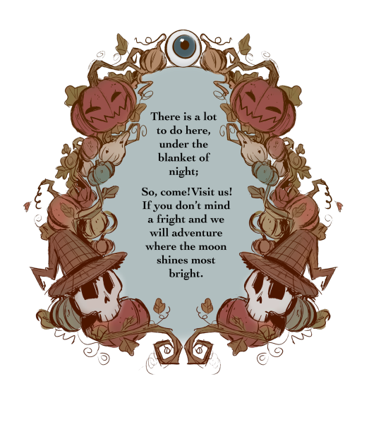
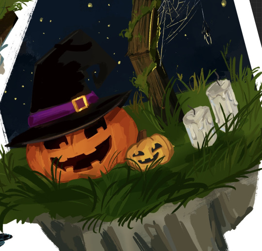
First Page
I wanted something special for the first page. In the show Over The Garden Wall, they sometimes put up images or text in these beautifully ornamented frames. They are usually made of the faces/ silhouettes of a character, a very important object for the story, or just intricate patterns and shapes.

I decided to create my own illustration in this style that would serve as the first page in my book.
Since I wanted to capture that old, folklore-inspired, fairy tale book style, I decided to refine the sketch and use it as line art. I mostly made the frame out of pumpkins, vines and leaves, with only two of my characters in it since I think they fit the best with the aesthetic I was going with. This was very easy and fun to make. I used the symmetry and mirror tools to speed up the process.
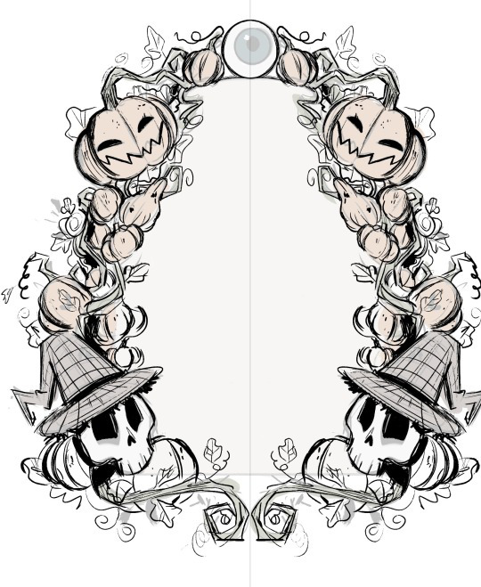
For the colours, I wanted something very soft and earthy that would suggest autumn. I mainly used browns, oranges and dark greens with just a few of blue-ish tones here and there.
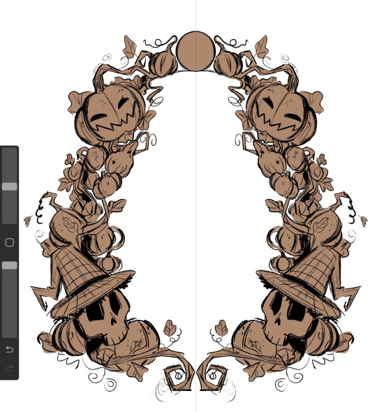
I wanted to make the illustration look like it was made with watercolours so I used a big air brush to fill in all the colours and shading. This made the whole thing look a lot softer, hand-made and as if the colours were mixing together.
I used a desaturated shade of blue for the centre and then put in the first verse of my story.
I absolutely love how it turned out. The only thing I would've added was some more watercolour texture here and there, to further emphasis the traditional aesthetic of it but in the end, I think it looks passable enough for what It is trying to look like.
Illustrations
I decided to make 3 of my illustrations on the same canvas which means I have all the process in the same video. Working on these was an absolute pleasure and I am very grateful for the techniques and useful things I have learned while painting (digitally) in this style.
As I have mentioned before, I wanted to go with a very sketchy, paint-y look for the illustrations. This gave me a lot of freedom and actually made me more confident in my ability of creating interesting shapes and brush strokes.
Up-close, you can really see how rough and unpolished everything is, and I thing this only adds to the charm, originality and character that children's books usually have.

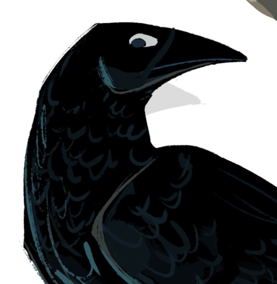
After I finished the 3 illustrations I had that were on the same canvas. I moved each one on it's on page, where I added any finishing details.
For example, I decided to add a nights sky behind the crow and a stone wall covered in ivy to sit on. I also tried to make some kind of animation/sequence by having the crow drawn three times while it took on flying . I added a white line of action to further emphasis the movement .
Since the crow and the background are both very dark, I decided to add some rim light along the edges of all the crow drawing with a muted shade of yellow, to make it look as if the moon was reflecting on its feathers.
This really separated the background from the crow and really added a lot of dimension.

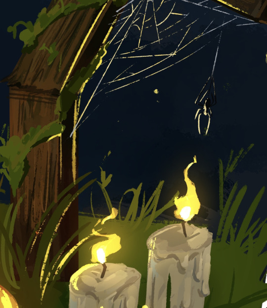
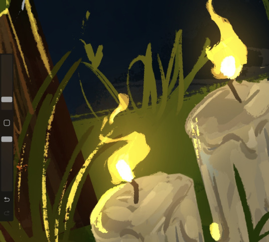
I did something similar for one of the others illustrations as well. Since I had the lit candles in , I had to make them glow and reflect on all the objects around it.
I started by creating a new layer, on which I added a very dark shade of blue-ish purple over the whole drawing. I put the layer on the blending mode ''HARD LIGHT'' which made everything darker and in harmony with the sky.

After that, I added some highlights all over the place with a bright yellow. This is also where I made the flames of the candles. For this, I used the blending mode ''ADD'' which made everything bright . I also erased the edges of the highlights with a textured brush to make them blend better with the objects they were hitting.

After that, I made another layer with the blending mode add and added a very subtle glowing effect with an air brush on all the highlights and the candle flames.
I loved working on the flames. Thinking about how the wind would hit the flames making them move was so fun and it added a nice touch of realism to the piece.
This illustration was made separately from the others. I decided to draw a cake and some dog paw prints in tune with the verse that it was representing.
I took a slightly different approach for drawing the cake. I made the ''sketch'' out of squares and rectangles using the ''rectangle tool''. I decided to go with a very generic design for the cake, I didn't want to spend too much time on the initial sketch.
After that, I started carving into the shapes, adding shading and dimension. This is where I decided to replace the pink icing with chocolate just to have more variation in colour. The wiped cream on top was a bit hard to do since the shapes was not something I have done much of before, but I think I managed to figure it out.

I added a lot of highlights on the icing to make it look shiny.

As a last, slightly gory detail, I decided to add eyes around the bottom of the cake. They were very easy and quick to do and they really accentuated the Halloween theme in the page.

This is a comparison between the ''sketch'' and the finished drawing.

As always, there is a lot of texture everywhere. This technique of adding random lines and strokes everywhere really became a signature element in my style that I have used for my other project was well. It is something I have learnt from movies like Spider-Man Into The Spider Verse and digital artists like Sam Does Art.

Bonus Illustration
I made also made this final illustration as a son of conclusion for my story, with the skeleton siblings having a fun time with the ghosts in the cemetery.
I was really inspired by the show Cuphead to make this illustration. In the show, all the background are made separately from the characters in a soft, hand drawn style, while the characters and the objects they interact with are made to look a lot more crisp and clean.

This is a technique that Disney used for very old animated movies like Snow White and Cinderella, where the background would be done on plastic sheets and the characters would be added on top of them.

Pattern End/Start Pages
While studying the components of a children's book, I have noticed that all of them would have the first and last 2 pages be made completely out of patterns of drawings or shapes on a simple coloured background.

The functional purpose of these pages is to hold the book's interior to its cover and protect the insides of the book. However, this doesn't mean that they have to be blank, The can have little drawings, repetitive shapes, patterns and other visually interesting elements.
I decided to create my own end pages. This only took around 20 minutes to make. I decided to go with this beautiful violet for the background. I thought this colour worked nicely with the blues of the front and back covers.
Then, I started sketching the little drawing pattern. decided to stick to the Halloween-y theme and have a crow, a witches hat, zombie brains, a few potion bottles and a pumpkin.
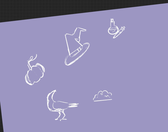
After that, I made the outline for all the objects. I decided against adding any other colours. After that, I simply duplicated the 4 objects and filled the whole page in. I duplicated the whole thing 3 more times after that.

0 notes
Text
Framed
A snippet I wrote based on an ask my friend @halfusek got a little while ago. Hope you like it buddy!
Everything is red.
Joey sets the knife to the side, trying to avoid the ruby of fresh blood dripping onto the floor like spilled paint, working fast before he runs out of time.
Henry had tried to leave him. Henry was going to betray all of their hard work. He had no other choice. He had to, he needed to, there were no other options. He repeats the mantra to himself as he completes the ritual to seal the soul to a substance. A bit of blood in the inkwell, a few lighted candles, a short chant. The process is too easy. Aside from the murder. And even that was easy, trivially so for a man fueled by raw desperation. But he can't lose his best animator. His best friend.
Henry's not allowed to leave him. They put too much into this together.
His hands are shaking. They're so red.
He douses the candles and rushes out of the room, locking the door behind himself. He needs to work fast or else the mind will be lost and this all will have been for nothing.
He has to be careful not to get the blood on the paper he grabs. He grabs the nearest clean pen, dips it in the soul bound ink, and begins to draw. He is careful with his strokes, keeping them as clean as possible as he painstakingly copies Henry's art style.
As the minutes go on, a cartoony looking Henry takes shape on the page, grinning up almost blandly at Joey. Henry was - is a bit of a bland person. It's perfect. With a completed line and a colored in shoe, the drawing is done.
He's out of time. No fixing it if he screwed up.
Anxiously, he drops the pen into the tainted inkwell and sits back to watch and wait.
It takes about thirty seconds, a little longer than it takes for the ink to dry, for the drawing to begin moving as predicted by the ritual. Joey can't help but smile with a toothy, hysterical grin as the little Henry blinks and begins to look around in confusion.
“Where am I?” Henry asks, tinny and thin as if it were playing on the radio. “Joey? Where are-” He cuts himself off with a screechy scream, finally noticing Joey, who giggles with no small amount of madness.
“It worked!” he cheers, spreading his arms in show out of habit.
“What worked, what did you do?!”
“I made it so you can't ever leave me again.”
Henry stares up at Joey almost blankly, hand clutching at his chest. “You… You killed me.” he mumbles, voice almost lost to the crackle of static. Joey shakes his head in lament. “I had to, Henry. It was the only way to make you stay.”
Henry continues to stare accusingly up at Joey, saying nothing more. The red-handed man’s brow crimps a bit as his elation deflates some. “But don't worry! We'll still get work done!”
No response.
“Henry?”
Nothing but a blank glare.
Joey picks up the pen and messily scratches in a rather comfortable armchair. “I gave you a chair. Does that make it better?”
Henry rolls his eyes, prompting Joey to add an animation desk with a matching stool. “How about now?” he probes. Henry turns his back on Joey, who throws his hands in the air. “Oh, stop being so goddamned childish!”
“Says the man that trapped me on a piece of paper for God knows how long!” The cartoon man retorts finally, face turning grey with anger. Joey deadpans.
“Do I need to put you in time out?”
“Fuck you!”
Joey flips the page over with a scoff and gets up to leave his office. He needs to wash his hands. And to think.
He should have expected Henry to be ungrateful at first. After all, he had thought he had wanted to leave.
He'll be grateful eventually. Joey just needs to give him time, is all.
The pink of the water is fascinating to watch, the bloom of color as it drains away almost hypnotic and leaving sickly pale flesh twigs unmarred by the scar of death that was caked on them. He snaps from his reverie to start scrubbing under his fingernails to erase every trace of Henry from his skin.
He was careful to wear a red dress shirt today.
Leaving the bathroom, he runs into the janitor. Wally smiles sheepishly up at Joey. “Heya, Joey! Have ya seen Henry anywhere today? He wasn't at his desk when I swept around it.”
“He quit.” the businessman lies easily. Wally blinks in surprise.
“Really? He did? Even with the next short so far behind?”
“The stress just got to him.” Joey sighs sadly, parroting one of Henry’s excuses for trying to leave. The janitor gives him a sad look.
“Well, that's a shame. I'll miss him!”
With that, Wally is gone along with the unspoken assurance that everyone will know before that Henry has ‘quit’ before the day is up.
Joey straightens his dress shirt with a huff and returns to his office. He sits at his desk with a heavy sigh, resting his head on his hands and his elbows to the sides of Henry's new home.
So… he has Henry forever.
What now?
=♤=
“What are you doing?”
Joey doesn't answer Henry, too busy fiddling with the back of the picture frame and cursing the unintuitiveness of the back fasteners.
“Joey.”
The lanky man makes a small noise of triumph as the back of the frame comes off. With the first task completed, he sets the back to the side and picks up Henry's little slice of living to place it in the frame. He closes up the back again and turns to the wall behind his desk thoughtfully.
Where he wants to hang Henry is already covered in other picture frames of photographs and certificates. And sticking him anywhere else just won't do…
An idea coming to him, he snaps his fingers and reaches up to take down the drawing of Bendy, Boris, and Alice all holding hands that Henry had drawn when they'd started the company, hanging Henry's frame its place and caressing the corner lovingly. Henry gives Joey an incredulous look, but the businessman ignores it with a self-proud little pose. “There we go, much better!” he chirps.
“What are you going to do with that?” Henry asks accusingly, pointing down at the other drawing. Joey shrugs.
“I'll find somewhere else to put it.”
=♤=
Decades have passed. In that office, Henry saw everything. Years of sacrifices, murders, and miracles.
Joey's success with Henry had lead to his dreams running wild, and he had reached out for them with splintered fingers and a greedy heart.
And everyone careened into hell.
Instead of interns, groaning monsters wound through the halls as ink seeped into every crack and board of the building.
And Henry still saw it all.
It's of no surprise he saw the creeping shades of a passing demon entering the room, crawling along the walls like a poisonous rot setting in. A shivering, rattling eternal smile stares at him blankly, an inky hand caressing the corner of the frame.
A pair of weary, unsleeping and unchanging eyes look up at the melting demon with cold, emberous anger and accusation as their owner sits in his sketchy armchair, slightly faded from age.
He's waited years longer than he had any right to, dead and back one too many times. This entire time, he'd had no say, no agency in what his former friend says and does. He's suffered needlessly from the day he'd been put to the page, and he knew he was only the first.
And look where it got them all.
He gets up with a grunting sigh to return to the spot he was first drawn, his stride colored by an atrophied limp on the short trek, laborious and painful. He feels like the old man he'd never live to be. With a hollow, static-marred voice, he creaks out a single sentence.
“I hope you're happy with yourself, Joey.”
#mango muses#rambling road#mango writes#fanfic#cartoon henry#joey drew#henry stein#batim joey#batim henry#made for friends#murder#blood#killing#black magic#tw death#death
66 notes
·
View notes
Photo
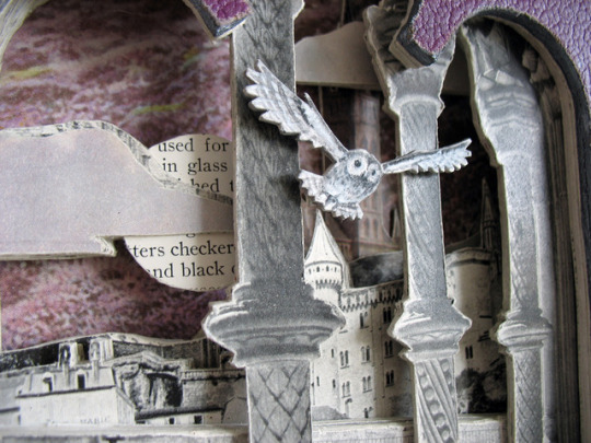

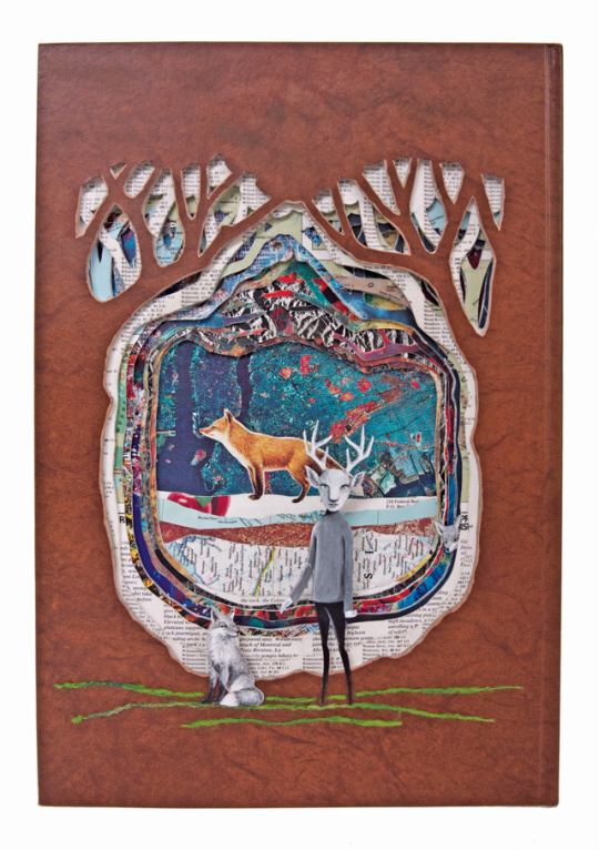


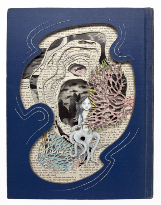

SKETCHY BEHAVIORS | Interview with VALERIE SAVARIE
Denver artist Valerie Savarie creates intricately carved book sculptures that she painstakingly maps out and cuts, forming her own unique narrative creation. Each of her unique sculptures can take her from 40 hours to over 100 hours to complete. Not only one thing, Valerie also runs a collective gallery, Valkarie Gallery in Colorado, where various artists in the community show and share work. We find out more about Valerie’s book sculpture process, what her favorite tome creation is, and the things that inspire her.
Take the leap below!
Photographs courtesy of the artist.
Introduce yourself
Howdy! My name is Valerie Savarie and I create carved book sculptures. I live in the Mile High city of Denver, Co, sharing a house with two cats Meelo and Varuka and my ever loving and supportive husband Matt. As cats are insatiable creatures when it comes to food and attention (which can turn into a zero creativity day), I eventually relocated my studio to Lakewood where it is connected to the collective gallery I run (Valkarie). I believe in lots of vitamin C to keep me healthy and creating (coffee, carrots and chips). Random fact: most of my tattoos are beyond the legal drinking age.
What was your introduction to art like?
I was fortunate that my parents got myself and my sisters into art as kids. During the summers instead of wasting our time in front of the TV, we were enrolled in art programs. The city where I grew up - Madison, WI – also had this (and still does to this day) awesome thing called the Art Cart that would find its way to various parks over the summer and have free art projects – my favorite was the plaster casting of our faces at the beach. My dad also took us to many galleries and lectures. I can remember being in third or fourth grade and attending a Georgia O’Keeffe exhibition.
How did that eventually lead you to creating your own works and specifically your book sculptures?
Honestly, I have an older (not too much older) sister that was always the artist so I shied away from art for years. Sure, I was a professional doodler, yet I wanted to be my own person and struggled with the sibling rivalry a la Jan and Marcia for years. I turned to creative writing in high school and the first go around of college. Finally, I moved away, and moved away again, tried college a second time majoring in interior design and minoring in scenic design (secretly I wanted to be an architect) and ended up having a professor that had an MFA – Robert Work – who I am still friends with (god, it has been over 15 years since graduation). He reignited that artistic spark in me. I even applied to grad school for art and got rejected from every school I applied to yet I still made art.
A few years down the road I met my husband and he really pushed me to get my art out in public, which was frightening. I ended up joining a co-op where I experimented with various mediums and styles. I created some cube sculptures (bartered autocad drawings for them) and I was in love. 3D art took over my heart, unfortunately, I couldn’t afford to buy the cubes out right and my cabinet maker friend didn’t need any more drawings. So I sought out something that I could afford for material, something that was also easy to come by and easy to manipulate. A thrift store junky, I decided to test my hand on carving up books. That was just over 7 years ago.
What is the process for book creations? From start to finish, how long does the entire piece take?
My pieces are formed by three different processes of creation: what it is, what I want it to be and it will be what it will be. What it is means that the story in the book inspires me. What I want it to be means that I have an idea that I need to find a book that fits the visual story I want to create, whereas it will be what it will be means I take a book with no idea in mind as to how it will turn out and intuitively start cutting.
I would say about 67% of the books I create fall into the what I want it to be category so that’s what I will describe.
I will get an image stuck inside my head and think about it quite a bit before I will put pencil to paper, working out basic concepts in my head and then creating a very rudimentary sketch (mainly so I don’t forget the idea). I then head off to the stacks – a very unorganized collection – in search of a book whose story has some of the same elements as mine. This is a daunting task as I have no idea as to what the content of at least 97% of the books I house is.
Sadly the adage “you can’t judge a book by its cover” is all too accurate. Titles can be misleading, the content seems like a good match but the cover has illustrations that are in conflict with the vision, and heaven forbid I can’t find any information on the book on Google and then have to decide if I have the time to invest in reading a few chapters or should just keep looking elsewhere.
After hours and even days of searching, I find the match – the perfect companion to my vision. I leaf through most of the pages, book marking those passages, illustrations, lack of text or unique text layout for me to revisit as I cut layer by layer, page by page. Then a slightly more detailed sketch is created – and then comes the point of no return …
I draw the shape of the cut out on the cover and with book and blade in hand, the transformation begins. All cuts are done with a craft knife – yes, even the cover. It is cut by scoring multiple times and then stab and drag, stab and drag. Sure, there are easier ways to do this - the not so occasional accidental sacrifice of blood still doesn’t deter me - I prefer to use my hands, to be able to pack up to my art, take it anywhere I chose to create and not worry about access to electricity. With the cover hole cut, I take out my file and smooth the opening, refine the curves and lines. Then another sketch of how the piece will be laid out is drawn on the front leaf of the book. This can be especially handy to have in more complex designs where I use the image as a template or stencil when cutting the many layers.
From then on out, it is just a matter of cutting one to three pages at a time. The number of pages is determined by the quality of the paper and over all design. Admittedly, this can become tedious if the depth of the layer is greater than ¼” but it is also important for me NOT to rush through the cutting of pages stage as phrases and images easily hide from view when I first go through the book in search of the elements I want expose.
Accidents do happen – the occasional over cut of a section or completely cutting out a page I meant to keep. I am very rigid in my creative process – if the section has been completely cut through, I just walk away from it – even though it would be quite easy to simply glue that section to the page below. The story can develop plot twists during this time as the layers start taking on a different life and their shadows start telling a story of their own as I cut deeper and deeper.
This, the lengthiest part of the creation process, I mentally start to flesh out what the painted characters – or inhabitants – of the book sculpture will look like (I can easily spend over 40 hours of just cutting the pages and so have a lot of “free creative brain time”) . How will they interact in the environment, what will their facial expression be? I dare not start painting them until all pages that will be cut, are cut, as I want the character - be in human, animal or other worldly - to look as if they had grown up in the book sculpture and has called it home forever. The characters are painted with acryla gouache on sheets of mixed media paper or directly onto the book page. The latter is more of a spirit creature – a ghost that is still very much part of the life force of the book. These little paintings are then mounted to illustration board for rigidity and cut out (again by hand with a craft knife).
Once the book cutting is complete and the character painted, I move on to the last creative piece which ties the story together (literally) - the stitching. Each altered book piece has some thread or string (occasionally wire is substituted) added to help in the visual story telling. It can be very elaborate such as sewing branches and leaves onto the cover or something as simple as a few blades of grass. The drilling to create the needle holes in the cover is (again) done with a hand tool called a jeweler’s drill. This nifty device has interchangeable bits from the diameter of a hair to 7mm lead. I believe the longest recorder amount of time I have spent drilling/stitching a single piece is 15 hours.
Now it’s time to do all the boring stuff that makes the piece ready to hang. All the pages are bound together, I create a little wire coat hanger in which the piece can be hung and sew it onto the back of the book as well as stitch in the publication and rebirth years. Both covers are glued to the bound pages, clamped and by the next day, what was once an orphaned book, now rid of its shell, is a three dimensional sculpted piece of art!
And that is how my book sculptures are born.
How long? On average 40 hours a piece. A few take less time and I have spent over 100 hours on a piece more than once.
Where do the books come from? Are they from collecting or via donation? How are you inspired when creating these intricate piece? Are they inspired by the book or from an idea you jotted down?
My books come fro various sources. Initially I would get them at thrift stores, the rule was that they had to be as old as me. I normally still stick to that rule unless it is a commission or a piece created for a specific themed show. More recently, I have had a lot of books donated to me – some because the thrift stores won’t take them any more and others because the former owners’ had cherished them and hoped that they could find new life in my hands. On rare occasions I do order from Ebay. I prefer the hunt, stalking down the perfect book, taking weeks and even months. Sometimes, I don’t have that luxury due to deadlines.
Normally I have a concept I want to develop, I look through my stacks (which numbers in the 100’s and shelved at random) hoping to find one that has a similar story line. Since I don’t have time to read each one, I go online and do research – reading the synopses – as well as skimming the books. This can be dangerous as sometimes the books I am sorting through pull me in and new inspiration is born from the written word.
I see my pieces as more of a collaboration between myself and the authors and illustrators. I use their art form as an inspiration stream and add my own twist (or chapter) to create the stories anew.
Is there a piece that was directly influenced by a memory or experience you’ve had or story you’ve heard?
It is rare that I remember my dreams but a few years ago I awoke and remembered having a very strange dream about tiny cyclops octopuses and tea cups. Shortly there after I stumbled across a Reader’s Digest collection that contained 20,000 leagues Under the Sea and so I had to create the little cyclopes – sans teacups. I really want to revisit that dream in art form again – with the tea cups – as of yet, I haven’t come across any books that would fit.
What’s the perfect day at the studio like for you? What kinds of things would we find in your creative space?
A perfect day would start around 6pm. I prefer to work at night until the early hours of the morning. I would have a nice cup of endless coffee at hand, a bag of baby carrot and raw nuts available for snacking (separate bags) and some left over Indian food for later in the evening/morning. The original Twin Peaks is playing in the back ground (i pretty much have the dialogue memorized) and my shoes are off and slippers on.
Spread around me on the floor (I work sitting on the floor) is a brand new cutting mat that smells of childhood summer beach toys, an assortment of craft knifes with brand new blades (I rarely use new blades as I have learned to sharpen them) and a vintage book begging me to caress its pages, ogle its inner beauty and then skillfully and slowly start to transform its story from the 2D writing into a 3D world it never knew it could be!
Within my studio I have quite a nice collection of small art (besides my own of course). I use it for inspiration and feed off the remnants of creative energy that the artists left with each piece. There are books, LOTS of books that have no rhyme or reason to their shelving locations or book neighbors. I have quite a few orchids which may or may not be in bloom – all of which were gifts. I have a cool vintage love seat which normally is a place for art to lounge on along with the occasional visitor. A nice collection of coffee mugs – with at least half of them needing to be washed- and of course a coffee maker. I also have an old radio from probably the 30’s that I occasionally plug in and turn on – the sound is great but there aren’t that many am radio stations with strong enough signal that are worth listening to.
What’s one of your favorite creations you’ve made and why?
I created a piece based on Pan’s Labyrinth. It was the first piece of fan art I had ever created.
I rarely actually watch movies or t.v. - I listen to them but my eyes and hands are busy creating art. I don’t like foreign films that have voice overs, there is just something unnerving about them.
So with Pan’s Labyrinth, it is something that I actually had to watch. It is a visual masterpiece – as is everything that Guillermo del Toro does.
Creating art based off of something that is already a magnificent piece of art is quite challenging. I didn’t want it to be obviously fan art it was important I make it my own. I ended up using a book in Spanish about the Spanish Civil war. I also used some techniques that were new to me – removing the decorative fabric only from the cover to create pattern, adding color and even adding the cover of a larger book as a backdrop. Oh yeah, and a drop of blood – my fingers tips are pretty callused from art making it took a little more effort than I liked to get that blood.
It was exciting to use new techniques and to push myself to be precise and exact – an actual labyrinth with tiny stairs down to the portal – and at the same time use my imagination to explore concepts that I could only see (movie) and not read and translate them into my own design.
What’s your main tool for making art? Is there a medium you’re wanting to try?
A craft knife with an Excel blade – the brand REALLY makes a big difference. In a tie would be a good mat – still looking for the perfect one.
I took a class last year on wood block cutting and would really like to do more with that. I think it would work well with the book page scraps I collective (I have many many boxes of them) plus it is another substractive art techniquewhich makes sense in my brain.
Who are some artists that you’re inspired by and have influenced you throughout the years?
Edward Gorey is my main influence. Partially because he was both a visual artist and a writer. I love how dark his images are and the same time laced with humor. His black and white color palette obviously works for me as well. There is a simplicity to it and at the same time it is so masterfully done that the work appears much more expansive than it already is.
As far as artists that are alive and kicking today, my local biggest influences are Aria Fawn and Nicole Grosjean. They are completely different in everything they do and at the same time such masters of detail and story telling.
Aria creates surreal and fantastic worlds in watercolor, largely inspired by the beautiful and violent balance of nature and wild things and the cycle of life, death and rebirth. There is such organic and natural beauty in her style, a freeness that I strive to incorporate into my rigid calculated creation process. I probably own more of Aria’s art than anyone else's - I have multiple pieces by her in my studio and home. She is constantly with me, always inspiring, motivating and energizing my creative spirit.
Nicole on the other hand, creates tiny worlds from hand cut, hand painted paper – which she considers three dimensional illustration. Sometimes there are over a thousand individually cut and painted pieces of paper in one work of art. She is so precise, so CLEAN I have no idea how she does it. I have a very tiny praying mantis in a watch piece from her as well as a larger dragon that I got for my husband as a gift to cover all holidays for several years.
My my top three non locals are Jolene Lai, Jason Limon and Kristen Egan. They all are completely different from one another – Kristen creates magical creatures from gourds. I am dying to get my hands on one as 3D art really needs to be experienced in person to feel the texture, see how the light and shadow changes the mood of the piece. She makes it look so seamless – at first glance I thought the were ceramic.
When I first saw Jason’s work I thought it was the most amazing paper cut art I had ever seen, then I realized it was a painting! His playfulness along with social commentary paired with his insane talent to place highlights and shadows it something I strive for. I feel that my painted characters could be so much more influential – a better actor one could say – in the dioramas I create if they appeared more three dimensional. I am lucky to own one small original that lives with me in my studio.
And then there is Jolene. I would consider her one of the greatest artists of all time. There is so much emotion, energy, story telling in her paintings. Her use of color (and again light and shadow) makes her works hyper realistic to me – I feel sucked in and transformed as an active participant in her paintings. I own two beautiful graphite pieces of hers which live at my house.
What’s your experience been like with the art scene in your area? How is the artist community?
I LOVE the art scene in Denver. We are a “new” city that still has not lost its small town connectivity in the arts. Artists support other artists, galleries support other galleries. It is not an us vs them mentality here and I really think it will stay that way.
I got my start in a traditional co-op gallery that sadly just closed this year after being open for nearly 30 years.
They rejected me the first time around and told me what to change for the next application round and I got in that second time.
Even at Valkarie we host a drop in creative night every Thursday – going on almost five years. All levels of artists come, from doodlers to professionals, painters to jewelry makers. We openly give feedback on what we re working on and share calls for art and discuss booth set ups for conventions – what works and what doesn’t.
How do you stay inspired on those days when you’re feeling uninspired?
To be honest, it has been years since I felt uninspired. I think because of the super supportive art community I always have someone to run ideas off of. Also, the books themselves are full of written and visual inspiration, an unending supply of it. And all that awesome art I collect, for me it’s not a lack of inspiration it’s more a lack of what I want to focus on – too many bees buzzing with ideas in my brain.
When you’re not working in the studio, what are you doing? What do you enjoy?
Truth be told, 83% of my waking time revolves around art. Besides spending time with my own art and running Valkarie Gallery, there isn’t much time for anything else.
In that 17%, I enjoy making pies from scratch with my husband, getting out into the mountains to escape all the compartmentalizing of city life and being servant to the cats – if they had their way, I wouldn’t get any art done at all.
If I ever find “free” time again I would love to get back into creative writing, pick up the violin again and go on more bike rides. Nothing sporty, just peddling around town with no destination in mind.
What advice would you give someone who is thinking of becoming an artist?
Start young – before you get tied down with a house, spouse or kids. It is much easier to get by on less while you are young.
Don’t feel like you have to get a degree in art (I know I will catch flack for this one). Do take art classes, marketing classes, get involved in with meet up art groups and build community. Some of the most successful artists I know have no formal art degree. Their talent, passion and drive have given them much success without a pile of debt and they tend to be the most active in artist groups.
Know that rejection is 90% of the game and don’t get discouraged. It doesn’t mean you aren’t good at what you do, it can mean that you weren’t what they were looking for. If you are really passionate, you will always create no matter what others say about your art.
Develop a style that is unique to you. This can be the most difficult especially with everything being available to anyone with a smartphone, computer or tablet. I think it is one of the reasons I keep creating the book sculptures and expanding what they are.
What are your FAVORITE Vans?
It really depends on the weather and where I am headed. If it is snowy or raining and am headed to the studio, slip-ons are best, so I can easily take them off and on multiple times a day (sitting on wet shoes is a mistake only made once). In good weather, any Vans are comfortable enough to wear evening while squatting on the floor creating art.
Finally, can you tell us about any exciting things you’ve got coming up?
This year I have had my art in five different states and at the beginning of December I will be showing in my sixth. I will have a booth at the Recycled Art Market in Santa Fe, NM. This will be the first time showing my art there and think I will come back with some pretty exciting new ideas on how to incorporate other repurposed items into my books and maybe even find some new resources for creating my sculptures.
I also have two commission coming up that I am really excited to get going on. Will be doing A Clockwork Orange piece and The Lion, The Witch and the Wardrobe(for two different clients). It has been decades since I read either but I think these two both warrant a reread before I start them (I really do my best to avoid watching movies of books for inspiration).
FOLLOW VALERIE SAVARIE | INSTAGRAM | WEBSITE
76 notes
·
View notes
Note
Hey! I was wondering if you had any tips for aspiring artists ((especially in terms of finding their own style))? Thanks c: (ps love love LOVE your art!!)

and I say dun worry about finding a style if because if you’re just starting out I think it’s more important to focus on learning the fundamentals (figure drawing, perspective, etc.) and getting good/comfortable at just drawing and observing in general than trying to find a look/make a nice drawing.
Plus your style will develop naturally and change on its own time as you find new influences/ artists/learn more skills/get better as an artist.
Also it’s not necessarily a bad thing if you don’t really have a set style (I used to always worry that my art wasn’t cohesive enough because my style jumps around a lot).
Since it’s Mermay here’s an example of style shifts haha:
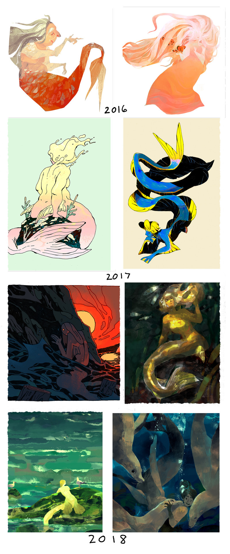
2016 was lasso tooling and more shape/animation style based with lots of brushy textures everywhere.
2017 tried using watercolors and got interested more in lines/ink; merms ended up more ‘realistic’ in terms of proportion (the ribbon eel is 2018 whoops)
2018 continued with the ink thing and tried to stylize more; went back to the textured digital painty look for this year’s Mermay.
BUT SO UH YEAH POINT IS DON’T WORRY ABOUT STYLE. Don’t be afraid of making ugly sketchy drawings/studies because they’re a part of improving and learning and draw stuff you like/don’t like.
I think I read this somewhere before (but I cannot honestly remember where or find it, if anybody knows, please let me know!) but pretty much think of your style like a cooking pot, and you’re putting in different things and maybe taking some stuff out and everything you add or take out will change whatever’s cooking in the pot. Or maybe you see something in someone else’s cooking pot that you kinda want to add to your own.
Ended up kinda answering a lot for style finding mainly but hope that answered your q and have fun artin’ : O
(p.s. thanks so much! ^ ^)
#art ask#anon ask#art style ask#SORRY I JUST REALIZED IT'S LIKE I'M SAYING#DON'T WORRY#ABOUT ART HAHA#I just meant for the art style bit#oof that's probably the most I've ever written for an ask haha#some more asks incoming
369 notes
·
View notes
Photo

Hey! There was some confusion in my Pokemon’s Official Artists -post so here’s some continuation to that.
I probably shouldn’t have used the word “style” in the post since all the artists follow the same stylistic ruleset so that the art of the series is unified. That’s why at first glance you won’t be able to tell the artwork is not made by the same person. So sorry for causing confusion with that.
What I meant to say is the tools these artists use to reach the same style are quite different, and even after their efforts to look the same you can tell the small differences in each.
It was my bad to assume such details are as obvious to everyone as they are to me who stared at these artworks for ages looking for even the most minor features.
My examples above are exaggerated to bring out the differences for even non-artists with less knowledge on digital art and its tools.
More details below the cut:
Sugimori’s lines are precise, but his lineart brush is choppy so the edges can look sketchy at times, especially on some of his pokemon art such as Yveltal. His shading on human characters is laid-back - he places shadows only where they are most needed and takes shortcuts, crossing differently colored areas separated by lineart with a single brush stroke.
For example Lillie’s hat casts a shadow on her head and Sugimori shaded her hair and forehead at the same time. You can also see the distinct low opacity eraser used on the shading on Lillie’s hat and legs. I showcased all these features on my example.
Ohmura’s tools are cleaner and he pays more attention to detail. This is most clear with Archie and Rosa. Every piece of Archie’s metal decorations are shaded individually to bring out their shape. Small light spots on his legs and shoes are also details Sugimori would have never bothered to draw in. Rosa is a bit older example from BW2, but when compared to Sugimori’s Hilda from BW1 you should pay attention to how much cleaner Ohmura’s shading is. Look closely at the arms, hair and shoes.
And if you compare Ohmura’s pokemon to Sugimori’s the differences become even more clear. You can look at Yveltal from earlier, Zekrom or Samurott (by Sugimori) and compare them to Decidueye or Solgaleo (by Ohmura).
Mizutani illustrated all of the gym leader redesigns for ORAS, some of the NPC trainers there too and the Pokebank lady Brigette. She used a more textured brush for lineart and you can see it best on Wally with his fingers, hair and buttons on his shirt. Compare his fingers to Rosa’s and Lillie’s and you see how different the lines are.
Mizutani tried her best to copy Sugimori’s style of shading by using a low opacity eraser to fade the edges of the shadows a bit, but her “mistake” was using a brush that has too sharp edges. On Flannery‘s pants and literally every shadow on Steven you can see how sharp the edges are compared to Sugimori and Ohmura. Mizutani most likely didn’t use a round brush, but a square or rectangle which ended up in this result.
take (with no capital letters supposedly) is a rather new and mysterious artist and so far we only know of them having illustrated the Aether Foundation members - employees, Faba, Wicke and Lusamine.
take is the easiest to tell apart from the rest. Unlike all the other artists, they use 100% opacity round brush for both lineart and shading, and take doesn’t erase tips of lineart or edges of the shading with a lower opacity brush. Their lines have no texture at all whatsoever. Shading is strictly defined, except in areas like Wicke’s hair where take has used a very soft brush, “airbrush” as some like to call it. None of the other artists has soft parts like that.
Some minor things about take’s illustrations is also the eyes that aren’t shaded at all, unlike everyone else’s. take also draws nails on the female characters - yet again something none of the others do unless the character has nail polish like Elesa (by Ohmura) or Olivia (by Sugimori, I think? resolution on this one is a bit too low)
I hope this clarified things, or at least didn’t make it any more confusing. :’) I admit the details are minor since the style looks the same from afar, but because they CAN still be pointed out I believe they should.
738 notes
·
View notes
Text
OC Review: Ida North
Reviewed by: Mod Charle
I’m gonna be completely honest here... This thing took so long to do.
Sorry for the sketchy quality!
This art is pretty nice and it does show a lot of Ida’s physique and the other aliens as well.
Okay, so she is the protagonist of an idea of a dating sim, that I will never do, or hardly ever, who knows, still, I like developing the characters...
The thing that’s so great about dating sims is that you can make them as weird and extravagant as you want and it can still flow because the premise of it is dating. However, the story will still have to be well thought out and the characters need to fit.
How it starts (its an excuse plot) YOU CAN SKIP READING THIS AND GO TO THE PREMISE
: The protagonist (Ida North) doesn’t get the job she wanted (either because she overslept or because she wasn’t accepted for not meeting all the qualifications) on a travel agency, so her best friend Mabel Attar, offers her a job in her workplace, a faraway Space Station,
Well then. So Ida North is shown (so far) to be irresponsible due to oversleeping and she isn’t very organized or mature because she can’t meet the qualifications for her job. Her friend Mabel offers her a job at a space station? You probably need more clarity on what type of society they live in. Is this like an advanced world where aliens and space are both well known to mankind?
Ida NEEDS the money, so she isn’t gonna waste her time questioning her best friends or suspecting anything shady so she accepts immediately, after all, she isn’t going to spend all her life mooching on Mabel and eating College Student food...
I’m a little confused. So Ida basically lives on Earth while Mabel lives on a faraway space station? Long distance is fine but I mean it would be difficult for Ida to mooch on Mabel. And she’s still eating College Student food? Not gonna lie, that’s a pretty sad life.
On the way there, Mabel tells Ida that she will love her job, that is well paid, and she will soon forget about her Travel Agency desired job, and that she also started with that job, however, it turns out that the job is nothing more than being a glorified janitor, having to clean up rooms and collecting things so other’s could study them, work that could be easily done by machinery, but isn’t because Mabel asked for it so Ida could have the job, Ida suspects that Mabel has more power on the Space Station than what she says.
Mabel is either a god-awful friend giving Ida a janitor job, or a dang good one. Mabel is powerful if she has control of jobs on the Space Station and I really wonder how the two became friends at all if their lives are so different. A well paying janitor job is well near impossible to have, but if Mabel is the all powerful front runner of the station, I’ll let this one slide.
One day, when she enters a room, a massive amphibianish alien, also encounters Ida and is enthusiastic about her presence, very enthusiastic in face, he starts playing with her, nuzzling her, however Ida isn’t taking any of this and knocks a pair of his teeth with a metal bar,
Where’d the metal bar come from?
making it clear that she isn’t a helpless damsel in distress, and swings the bar at the alien menacingly, but he just places his claw on her body, holding her and making eye contact, or something, and taking off her uniform to keep it.
The alien strips her? That’s a little erotic, but I mean it is a dating sim.

I find this really confusing, however. You didn’t give a good background on how society is. Are aliens a normal thing? It was made clear that there is advanced extraterrestrial knowledge due to the space station, but are aliens normal? The alien just randomly jumps on Ida so I’m not sure if aliens are seen as friends or dangerous creatures, or if they’re even known to mankind.
** Side note, I would like to know how Ida was allowed to go up to the space station without training. Like, space is dangerous.
The next day, when Ida and Mabel go to a cafe nearby to celebrate Ida’s first week, and Mabel tells Ida that one of the aliens has escaped, but she shouldn’t worry about it too much, because it probably wasn’t her fault but Mabel would have to retrieve the alien back to its room, and a young looking (about late 20′s) guy, approaches Ida and tackles her, the guy despite looking skinny is actually really heavy, and leaves footprints whenever he walks so its really uncomfortable for Ida, who has no idea of this guy, but they guy just enthusiastically tells Ida that he is going to help her with her dream job and everything, because he wants to make her happy, he introduces himself as Keith Gatti and keeps rambling on very enthusiastically...
I would have been super surprised if someone randomly tackled me. Did Ida at least try to fight back? She is strong so I just want to know if she at least fought back against Keith and tried to kick him off of her.
... It turns out, Keith is the alien that has gone missing, and he really has become infatuated with Ida, but since only Ida, Keith and Mabel know about this, Mabel decides to help them both, and tells Ida that she could, introduce the earth to Keith, and eventually a bunch of other aliens, like a tour guide of sorts, while also developing a growing affection...
So Ida is supposed to introduce the aliens to life on earth, orders from Mabel. There’s nothing wrong with this, and in fact I think it’s a pretty good way to get the story flowing into a dating sim. Background information, like I mentioned earlier, is key, however.
Okay that it, now we cut to the important part (there might be fluff):
Premise: The protagonist has to introduce the earth to a bunch of aliens so their plant and earth can form an allyship, while also developing a romance with them.
This is probably the background information I’m looking for, but I feel as if there would be more knowledge about aliens if the society they live in wants to form an allyship with an alien planet.
And now the OC stuff:
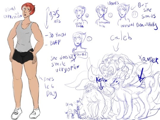
Name: Ida North
Meaning of name: Id: from the Germanic word “id”: Work, labor
Age: 30
D.O.B: March 26th (Aries)
Height: 1 Meter 75 Centimeters, or 5 feet 9 inches
Type of body: Mesomorph
Hair style and color: Celebi/Onion style with antennae like fringe, red with brown streaks (dyed)
Eye shape and color: Deep set, brown
Build: Muscular, beefy
Voice: Orotund, rough
Romantic and Sexual Orientation: Bi for both
She’s a very muscular and strong woman, who is actually already 30. She is really different from your usual dating sim girl. Most girls, I believe would either be in their teens or early 20′s. However, I suppose her age does work out since she is supposed to be helping out aliens, and teens aren’t exactly the type for that.
A resume of her personality: Grumpy, snarky, and a bit sour, Ida seems like your typical jaded person, who has lost all faith in the world, but this couldn’t be further from the truth, since Ida loves the earth and appreciates the beauty of nature and technology, though due to her insecurities and bad experiences she hides her love with layers and layers of jerk.
I could definitely see Ida being the type of person to care for a lot of things, but hide it all behind a facade. Is there a reason for her to hide herself, though? Having insecurities as bad as her don’t usually pop up out of nowhere.
Personality traits:
Snarky: Whether in a good mood or a bad mood, Ida always seems to convey her thoughts in a good dose of irony and sarcasm
Rash: Ida doesn’t usually think about the consequences of her actions, and oftenly acts on a whim, only caring about the now
Strong Willed: She isn’t going to give up on anything
Hardworking: When she has to do something, she does it with whole dedication
Appreciative: She loves the world, and its beauty, and how it stays strong, despite everything
Insecure: She doesn’t think highly of herself
Aggressive: She conveys her insecurity this way
Adventurous: She loves new experiences and challenges, she isn’t afraid of the future, but rather a lack of future
At first I was a little iffy about Ida being insecure and strong willed/hardworking at the same time. There isn’t an easy way to connect these without heavy amounts of character development and such. However, you did mention that Ida conveys her insecurity through aggressiveness, and not the other personalities.
I do have one issue though, and that is her lifestyle compared to her personality. She was previously said to be in a bad position where she oversleeps and has her life in a mess, yet she is hardworking. This doesn’t connect. If she was hardworking, she wouldn’t miss a job interview for anything, especially if it’s a dream job.
Relationships:
With Mabel: They have been best friends since very young, and they often confide each other’s secrets, Mabel also wants to help Ida with her quest. Although she may have a secret crush on her.
I would honestly like to see Mabel be a path for this dating sim. Just me? Ok.

With Keith: He is the first alien she meets and one of the most effusive and enthusiastic about the earth, he often shows a lot of affection towards Ida, though he has toned down the touchy feeliness and tries to keep a reasonable distance. Not that he won’t hug Ida every now and then, in both his alien and human form.
He’s a good depiction for the first route in the dating simulator. Having a bubbly and outgoing character compared to Ida’s tough character is a pretty fun match and would keep the game interesting.
With Drake: Drake is the second alien that meets Ida, they started with a rough fight that Ida barely won, he respects her now, but has drawn lines she is not allowed to cross. Although he is willing to see if she wants to cross those lines and to fight her.
Drake is a tiny little alien, and is smaller than Ida, so I would understand how Ida would be able to beat him in a fight. However, it is a little inaccurate to have Ida beat Drake given that he is an alien. More clarification on the strength of this alien species and their abilities would be more beneficial, just as extra background information.
With Caleb: Despite their initial interactions, being scarce and in the shadows, they have found themselves fond of each other, and having similar yet different tastes, but only think of themselves as friends. Or in the case of Caleb, he sees her as food, but he has another reason, rather than wanting a snack, something having to do with his species and fatherhood, although he is trying not to because he appreciates her company.
Ida’s relationship with Caleb is super confusing not gonna lie. They have a friendship going, but Caleb does see Ida as food? Again, more clarification on the alien species themselves would be beneficial in understanding the different types of aliens we come across. Caleb is also giant and scary as hell.
With Xander: He wants Ida to open a bit up more, and often opts for her security and comfort, wanting others to see them as each other’s protector, and he is willing to hear her most inner desires and insecurities. Although he also feels insecure and has shown a jealous streak.
I actually like the relationship between Xander and Ida. It’s good to have different personalities in dating sims, and you really nailed this.
With Shiro and Kuro: Shiro and Kuro are two eerily coordinated security guards that watch how the relationships develop, and both would love to have Ida as a guinea pig every now and then.
This might be a little unnecessary to have, but if you elaborate on Shiro and Kuro’s significance in the story, it would be better. They are supposed to watch over and guard, but for a dating sim, they aren’t necessary, UNLESS, the society still sees aliens as dangerous. Again, background information is KEY.
Other stuff**
-She is an A cup and wears a pushup bra
-She is not a vegetarian but would rather eat veggie food than hamburgers and hotdogs, she DESPISES them
-She has gardening knowledge
-She has gone camping several times. She LOVES camping
-She had a dog, who died of old age
-She has travelled by air, land, and sea
-She knows English, German, Spanish, and Portuguese, she is currently learning French
-Her favorite flowers are buttercups
She has a flat chest. Wow. But I’m not surprised about this looking at her physique. The second bullet point technically means she is a vegetarian if she despises meats.
I hope you like it, and if you are interested, I might do the profilies of the four main boys, and maybe Mabel and Kuro and Shiro
This was overall, a pretty decent story given the amount of work that needs to go into a good story. There are some good points in this dating sim idea, but there are also a lot of fixes that need to be made; a lot of them being major. However, with these fixes I mentioned, this could potentially be a very good idea.
I wouldn’t mind looking at the other profile characters, but it may take a while to get it back to you since they are fairly long. This took me a while to write just because of the mix of grammar and length.

Thank you for submitting/reading, and I hope this helps! (●´ω`●)
~ Mod Charle
2 notes
·
View notes
Text
1988 Bronco Rescue: Gauges, Dash, Front Drives, and Dyno-Test
Tuning the MegaSquirt port EFI system on Westech Performance’s chassis dyno: The toughest part was perfecting morning cold-start performance. It could only be tweaked once a day, after the vehicle sat overnight. Preventing morning in-gear stalls required adding more air via the IAC motor plus pulling some fuel out of the ECU’s cold-start enrichment table.
Tuning the MegaSquirt port EFI system on Westech Performance’s chassis dyno: The toughest part was perfecting morning cold-start performance. It could only be tweaked once a day, after the vehicle sat overnight. Preventing morning in-gear stalls required adding more air via the IAC motor plus pulling some fuel out of the ECU’s cold-start enrichment table.
The Rescue So Far
Tevete (“T”) Usumalii and his 1998 Ford Bronco have really been put through the wringer. It all started when a missing 25¢ oil-galley plug cost him his 349ci stroker small-block Ford engine. L&R Engines fixed the short-block (June 2018 print edition). In the July 2018 print edition, Mark Sanchez at Advanced Engineering West (AEW) assembled the engine top-end only to discover valvetrain geometry and lifter problems, a wrong distributor gear, and serious issues with the fuel-supply system. Finally home-free? Not on your life! The engine front accessory drives, fuel tank gauge, and custom instrument panel implementation were still screwed up. We’ll fix them this month, then put the Bronco on Westech Performance’s chassis dyno for a quick tune and test.
T wanted a powerful, off-road fun truck. We ended up fixing the engine, the fuel system, the instrument panel, and the front drives.
The Beltdrive Fix
The original builder had butchered the front serpentine drive system. “There wasn’t enough belt-wrap around the water pump and crank pulleys,” Sanchez explains. “I hold to the factory spec: The belt needs to contact ¾ of the pulley grooves’ surface area. I was able to round up the missing parts from the local Pick-A-Part yard, eBay, and AutoZone. The air-conditioning system had been removed, so we also added a Dorman A/C compressor bypass kit to perfect the setup.”
The “street racer” installer never bothered to make the serpentine-drive system work efficiently without an A/C compressor (top). Insufficient “wrap” around the water-pump pulley caused belt slip. Sanchez scored a complete 1988 Bronco front-drive setup from the local Pick-A-Part, but without the A/C compressor, a Dorman compressor bypass kit was also needed (bottom, arrow). AutoZone supplied a new belt and water pump, while the 1987–1992 Bronco tensioner is new from Jeff’s Bronco Graveyard. “Never reuse a high-mileage tensioner,” Sanchez insists.
An inadequately sized electric fan had been installed in place of the Bronco’s original mechanical fan setup. Sanchez found and installed a kick-ass 1994 F-150/F-250 pickup truck 302/351W seven-blade mechanical fan, clutch, and shroud. Also needed was a heater hose fitting to accept the engine coolant temp sensor. Lastly, Sanchez replaced the water pump: “It was full of silicone. At this point I didn’t trust anything on or near this truck.”
In place of the Bronco’s inadequate electric fan, Sanchez put in a 1994 F-250 Super Duty diesel seven-blade mechanical fan, fan-clutch, and shroud. “It’s the most efficient cooling package Ford ever offered, with the heaviest and tightest clutch.” The fan and shroud were wrecking yard parts, but the clutch is new. Used clutches are sketchy, in Sanchez’s opinion.
The Dash Fix
The gauges in the existing custom dash panel didn’t work, plus they weren’t fully visible. The instrument panel wiring was totally borked.
The original builder tried to fab a custom dash with individual AutoMeter gauges. But they were partially blocked by the steering wheel. Worse, they weren’t working and the original instrument panel warning lights and turn-signal indicators had gone MIA.
The Bronco’s OE dash had been replaced by a custom setup with individual AutoMeter gauges. But they didn’t work and weren’t fully visible when installed (top, A). Accessing the speedometer adjustment knob on the new unit was blocked (top, B), while the original factory access hole still uselessly remained over the oil pressure gauge (top, C). Sanchez solved the visibility issues with AutoMeter combo gauges—a dual speedo/tach setup and a quad coolant temp/oil pressure/voltmeter/fuel level unit—that mount in a new panel built with 0.118-inch-thick ABS plastic sheet (bottom).
Unbolting the dash panel revealed the major wiring issue. On a stock Bronco dash, the wiring plugs into a common circuit board that distributes power to the various gauges and warning lights. But aftermarket AutoMeter gauges must be hard-wired—which the original builder lamely tried to do with so-called self-stripping T-taps that invariably cause voltage drops.
The sloppy builder used quick and dirty push-together splice clips that clip over and through existing wires (top). They’re death on 12-volt circuits, causing resistance resulting in a voltage drop. The budget solution: Wire-in the existing individual AutoMeter gauges using its PN 2198 wire harness (center) that support an individual speedo, a tach, and up to four more full-sweep electrical or LED gauges. The high-end method: Sanchez’s custom wiring harness with “plug-and-play” AutoMeter Molex and Ford multipin Wedgelock connectors (bottom). AutoMeter bulbs and sockets (arrows) restored the factory warning lights and turn signal functionality.
The budget approach would be cleaning up the existing wiring, leaving the previous builder’s individual AutoMeter gauges and their layout as-is. AutoMeter offers a wire and connector harness for wiring up most of its individual gauges that makes for a clean, idiot-proof installation that eliminates any possibility of cross-connection. As for the warning, message, and turn-signal lights, AutoMeter’s standard bulb and socket-with-pigtail package just happens to screw right into the original factory dash holes.
But this approach still doesn’t solve the visibility problem. The premium fix as implemented by Sanchez on the Bronco was to build a new custom instrument panel using AutoMeter’s trick combo gauges: one dual speedo/tach gauge plus one quad combo that displays coolant temperature, oil pressure, voltmeter, and fuel level. These two gauges centrally mount in a new Sanchez-fabbed dash panel, right in the driver’s line of vision. The panel itself was cut and shaped from ABS plastic sheet. ABS sheet is sold through art and hobby-shop retailers, custom stereo shops, plastic distributors, and even Amazon.com. Cut it to size with a scribe tool and hole cutters.
Next, Sanchez built a quick-connect custom harness for the two combo gauge units. At the gauge end, he used AutoMeter’s available eight-cavity, Molex-style gauge connectors and terminals instead of error-prone individual blade-and-spade hookups. At the other end, four- and eight-pin Ford OE Wedgelock connectors hookup to the pre-existing main factory harness. You can find the four-pin mating connector bodies used on many Ford O₂ sensors, but scoring both halves of the eight-pin variants is dicey (Sanchez has used ones for sale). Sanchez’s custom harness also uses correct Ford factory wire colors and striping, allowing any Ford tech to troubleshoot the wiring, and (if the original wiring wasn’t butchered) even bolt the original stock panel and its circuit board back into place.
Correct Ford color-coded and striped wires (top) connect to the gauges. Del Mar Wire will stripe 100 feet of any single color it sells for a nominal extra fee; most other wire outfits require 1,000 feet per color and stripe. Ford connector bodies are hard to find, but its 0.062-inch diameter pin-and-socket Wedgelock terminals are widely available (center) and you can install them on the wires using generic crimpers for typical factory-style open-barrel terminals (bottom).
The Fuel Level Fix
After the new wire-up, the fuel level gauge worked but was inaccurate. Like many aftermarket units, AutoMeter’s fuel gauge is designed to work with a sender having a 240- to 33-ohm full-to-empty resistance range. A 1987-and-later Ford in-tank sending unit like the Bronco’s operates in “reverse,” with a 16- to 158-ohm full-to-empty resistance range. AutoMeter offers its own sending units, but they won’t work with late-model in-tank fuel-pump configurations like T’s 1988 Bronco. The fix: a Classic Instruments SN34 Fuel Link interface electronic module designed to correct gauge/sending unit ohm mismatches or fuel-level discrepancies. Problem solved.
Classic Instruments’ USA-made SN34 Fuel Link calibrator corrected the fuel gauge-level error caused by differing resistance ranges between the tank sending unit and AutoMeter’s gauge. The SN34 has eight presets that cover the most common mismatch combos, or set a custom calibration for any oddball resistance-range between 0 and 350 ohms.
The Tune-Up
AEW’s Mark Sanchez fixed the gauges, wiring, and front drives. Westech’s Ismael Candia (shown) and Eric Rhee tuned MegaSquirt’s EFI.
The final “fix” was taking the Bronco over to nearby Westech Performance to dial-in its aftermarket MegaSquirt port fuel-injection system installed by the original builder. “The provided MegaSquirt box is a direct plug-and-play for the Fox-body (Mustang) Ford computer,” reports Westech chassis-dyno manager Eric Rhee, adding, “One thing you have to watch out for is, unlike a stock Ford ECU, you never unplug the spout connector jumper near the distributor to lock the timing. On the MegaSquirt you do that through the computer.”
Installed by the original builder, MegaSquirt’s computer (left) is a “plug-and-play” replacement for 1984–1993 Mustang 5.0L V8 sequential-fire EFI ECUs (right). It uses the same 60-pin mating connector, and even supports Mass-Air metering, but unlike the Ford, it’s end-user programmable. 1988 Broncos originally had batch-fire injection, so some added harness wiring would have been needed if starting from scratch on this conversion.
Rhee adds, “Between the huge 220cc intake runner Air Flow Research heads, the mild hydraulic roller cam, the truck’s 6,000-pound weight, its huge 35-inch tires, 4.56:1 rear gears, and mild converter, under normal operation after warm-up we needed slightly more fuel on the bottom, but less on top.” Some additional cold-start fine-tuning was also needed.
MegaSquirt includes a baseline calibration to get the vehicle up and running, then it was up to Westech’s experts to really fine-tune the system. Eric Rhee says, “We calibrate conservative, so there’s no problems in daily driveability. Full-throttle air/fuel ratio is around 12.5:1, and on 91-octane gas it likes about 35–36 degrees timing between 3,000 and 6,000 rpm.”
The Final Results
Tuned up on Westech Performance’s SuperFlow chassis dyno, the Bronco’s 9.3:1 349ci motor developed a peak 338 lb-ft of torque and 269 hp at the rear wheels. Average numbers between the 3,907 rpm torque and 4,692 rpm hp peak points were 323 lb-ft and 264 hp. It was all done by just 5,000 rpm, likely do to the camshaft running out of steam just when the huge heads really come into their own.
Despite the combo mismatch, on Westech’s chassis dyno the Bronco delivered 338.4 lb-ft at 3,900 rpm, with 269.3 hp on tap at 4,692 rpm. To muscle-car guys, these numbers may seem low, but Rhee insists, “We usually see on 4×4 trucks with huge wheels and tires, the rear-wheel numbers are much lower than the flywheel numbers if the same motor was tested on an engine dyno—mainly due to rolling resistance and tire weight, not necessarily vehicle weight. So, in my experience, you’re really looking at 444 flywheel hp here.”
Finished and installed, Sanchez’s custom ABS dash panel holding AutoMeter’s trick combo gauges is easily visible from the driver seat.
In any event, the no-longer-bucking Bronco now drives smoothly and everything works, including the fuel supply system, the beldrives, and the instrument panel gauges. The engine combo could use a larger cam to match the heads. The truck already has steep gears, but there’s still room for growth with a higher-stall torque converter. For Mr. T, the Bronco is everything he wanted and more: “I’m so grateful! I’m overjoyed to see it running.”
No more bucking Bronco; fixed at last, it now gallops happily down the road. Says T, “I can’t wait to take it home and show it to my family!”
Slipshod mechanics had nearly turned “T” Usumalii’s 1988 Ford Bronco into a dead horse. But after the latest fixes, he’s overjoyed!
Lessons Learned
Any hack can hack a car. Plan ahead with the end goal clearly in mind. “I’ve learned that time is not important,” T says. “Take the time to do it right. Do your research when you’re going to have major work done on your baby! Ask around—check the internet, check the mechanic, check the shop’s track record. It’s a big risk if you go with a guy you don’t know about.”
The post 1988 Bronco Rescue: Gauges, Dash, Front Drives, and Dyno-Test appeared first on Hot Rod Network.
from Hot Rod Network https://www.hotrod.com/articles/1988-bronco-rescue-gauges-dash-front-drives-dyno-test/
via IFTTT
0 notes
Text
In the first part of my 2018 Resolutions post I encouraged you to draw at least 15-30 minutes a day and as a result of this prompt, I received many requests for suggestions on how to get started. Even if you think you can’t draw, think you don’t know how or just stubbornly refuse, these 5 exercises will help. But before I discuss the How, I would like to discuss the What and Why I feel you must draw everyday.
The What…let’s take the word ‘drawing’ out of this article for now because it tends to scare people. When I’m teaching, I use the words drawing and mark-making interchangeably because for my purposes they are the same thing with only very slight differences. Think of it this way…a mark communicates a word and a drawing expands that word into a sentence…a poem…a sonnet. As artists, whatever we do in the course of making work begins as a mark on a surface made by one human to be interpreted by another in an effort to communicate. Mark making is expressive, gestural, emotive and works of art that contain such marks are the ones I will cross the room to view-they literally speak to me without words, they communicate. No matter what kind of work you make or in what medium, understanding your mark, what it is and how to make it, will make you a better communicator through that work.
The Why…Critic Lance Esplund writes, “Line is a rich metaphor for the artist. It denotes not only boundary, edge or contour, but is an agent for location, energy, and growth. It is literally movement and change – life itself.” This quote speaks to lines specifically, but for the purposes of this article, we’ll think of marks and lines as one in the same. The mark adds the lifeblood to the work that sets it apart from anyone else’s. Your personal mark or gesture is literally as unique as your signature and practicing making marks everyday is the only way to find that mark. As I mention in my Resolutions post, when you practice moving those parts of your body and brain required to make a drawing, everything else in your art making process flows much more smoothly. How many times have you entered the studio cold and stiff from not working and end up puttering around wasting time? Or picked up a paintbrush, but just couldn’t make the paint say what you wanted? The more marks you make and the more frequently you make them, they become indelibly written on your brain, your movements in the studio become more practiced and you will approach the work with confidence and knowing. I’m not saying that drawing everyday will rid you of all the struggles us artists face in the studio, but I absolutely guarantee that it will get you moving faster and in the right direction toward your goals.
The How…Now for the fun part. Your daily drawings can be made with any media on any substrate and inspired by any subject. I like to give myself ‘projects’ in which I work on a series of drawings inspired by one thing with the same media for one month. This offers me a chance to work out every angle of a certain subject and/or experiment with new media. At the end of the month, I also have a series of drawings that may be strong enough to show. Visit this post to read about one of these drawing series’ of mine. You can choose to work with monthly projects or you can draw something different everyday, the point is to make marks daily for 15-30 minutes. For those of you who think you’re too busy to spare this time, I suggest in my resolutions post that you always have a sketchbook and drawing tools with you in your bag because you may have more time than you think…on the bus/train, waiting at the doctors office, waiting in line at the food store. It’s almost depressing how much time we spend waiting so why not do something constructive while you’re at it. Last, don’t forget to set that timer! I’m a stickler about setting the timer for daily exercises like this and I explain a bit about why in this post. In a near future post I’ll talk about restrictions and why they are so important in art making. For now, understand that the timer will create a time-space for you to focus only on what you’re doing. For that short time, you don’t have to think about or do anything else but that draw.
The following drawing ideas are tried and true-a few have been used in art schools for centuries and a few I’ve modified and used over and over in my workshops. Once you start, your creative brain will begin to flow with many of your own ideas. At the end of this article I share some drawings from my workshop participants as well as some other artist’s works whose marks and processes I find inspiring. If you see your drawing below, let me know and I’ll add your name!
The Ideas
Blind Contour Drawings If you went to art school, you probably went blind making blind contour drawings-they are used so much as a learning tool and that is because they are so helpful. Start by staring at an object in front of you for one minute. Then close your eyes and imagine the object in your minds eye…try to see its color, its form, its texture, it’s scale. Then open your eyes and look at the object in front of you. How does it look? Try to spend two minutes (or longer) just looking at the object, examining it in great detail. Then close your eyes and draw it continuously, keeping your eyes closed for a full two minutes. Don’t lift the pencil or open your eyes until your full two minutes are up. If you ‘finish’ drawing your object under two minutes just draw it again. If you find you can’t help yourself from cheating, wear a blindfold. Do this with the same object over and over, or try different objects in order to fill your 15-30 minutes. Another variation is to begin with the blind contour and then with your eyes open, ‘connect’ the sketchy lines you drew to make a new drawing.
Opposites Make drawings in pairs which express opposite adjectives. For example, make a drawing which is noisy in as many ways as possible – your pencil should make a lot of noise as it vigorously scribbles and scratches across the page, and the finished drawing should be noisy in the way in which it communicates. Then take a breath and make a very quiet drawing. Your pencil should hardly touch the paper (imagine it’s the tip of a feather). Hold your pencil far away from the drawing end so you cannot apply too much pressure. Hush your pencil as you draw, and let the end result be a very shy drawing. Enjoy the differences between the two drawings – let your ideas bounce off each other. Push yourself to extremes of noisy and quiet.
Words Choose 5 words randomly from the dictionary and either write them at the top of the page or begin with a drawing of the word itself. I use Design Language by Tim McCreight in my workshops because the words in it lend themselves to visual inspiration. Working on the same paper, spend one-2 minutes interpreting each word with marks. Let each word’s marks intertwine and overlap. Take this drawing a step further and add more marks, collage or stitch to make it a cohesive drawing.
Music This idea comes from one of my favorite artists, Wassily Kandinsky, who believed that colors and marks in paintings created visual ‘chords’ which resonated in the viewer. A must read for any artist is Concerning the Spiritual in Art by Kandinsky in which he writes in depth about the essence of expressionism in painting. Create a playlist of 30 seconds of 20 different songs ranging in tempo, style, genre, etc. Using a large piece of paper on the floor or taped to the wall (must be positioned so that you can use your body expressively) and gather 5 different drawing tools near you so you can switch if you’d like. Turn on your playlist so the songs play successively with only 3-5 seconds between each. Respond to each song with marks and allow the marks to overlap and intertwine. At the end of the playlist, the drawing will likely look like a bunch of scribbles, so what you want to do next is isolate certain areas to use for inspiration. Cut a rectangle out of a piece of paper and float this frame over the drawing. As you do this, you’ll find so many great ideas for marks that you can trace and use in paintings. Another variation is cut up your large drawing and scatter the cut outs onto another large piece of paper. Experiment with with creating new distances between the cut outs, turn them upside down or rip them in half. Begin drawing new elements and shapes in between the old ones to create a new drawing. Forget your original drawing and think about new meanings which might be created, think about how the new drawing might be interpreted.
Response This is my personal favorite method to begin a drawing and I have completed many series this way. ‘Response Drawing’ is a term I coined in one of my workshops and it just stuck. Response drawings are basically just as the words describe… it is a response to marks either you or someone else made intentionally, accidentally or found. Responding to marks that are not yours encourages you to expand your mark making vocabulary by making marks you aren’t normally inclined to make. There are many ways to begin a project like this but the basic premise is to begin with some kind of mark on a substrate-it could be a splash, a pour of paint, a burn, a footprint, rust print, transfer print, a mistake. It could be something you found in the trash, a folded or cut piece of paper, crushed pencil shavings, anything! It could be a project between you and a friend in which one of you makes a mark and the other responds. This actually has a name -Exquisite Corpse- a term and game invented by surrealist creatives. I’ll be writing a more in depth post about Exquisite Corpse, but in the meantime you read about and see some examples of them here. However your first mark is generated, the next step is simply to respond to it in any way you want. The image at the top of this page is from a series of drawings from 2005 called ‘Flesh’ in which I started with tracing paper that had been burned and splashed with watercolor and I then responded with organic forms drawn in graphite and colored pencil. See more from this series in the images below.
If this post was helpful to you, please let me know, I invite your comments questions and suggestions in the comments section now located in the upper left sidebar of this post.
In my next post, I’ll share with you my acrylic/gouache series of layered drawings. I’ll discuss my approach and process for these drawings and how this whole series began by drawing only 15 minutes a day.
OLYMPUS DIGITAL CAMERA
OLYMPUS DIGITAL CAMERA
OLYMPUS DIGITAL CAMERA
OLYMPUS DIGITAL CAMERA
OLYMPUS DIGITAL CAMERA
OLYMPUS DIGITAL CAMERA
Image Links (read left to right from top row)
Workshop student exquisite corpse.
Lorraine Glessner Flesh series response drawing.
Jeri Ledbetter, artist, see her work here and here.
Lorraine Glessner, found ledger sketchbook response drawing.
Workshop student exquisite corpse.
Emma McNally makes drawings responding to unlikely sounds like white noise and city sounds. See her work here.
James Watkinson responds to aged paper and stains of old book covers with detailed narrative drawings. See his work here.
Ayanna Jolivet Mccloud’s experiments with a china marker, making as many different marks as she can. See her work here.
Workshop student music response drawing.
Workshop student scattered elements response drawing.
Workshop student music response drawing.
Workshop student music response drawing. I love how the strong shadows and deep wrinkles of the paper contribute to the drama of this drawing.
Lorraine Glessner Flesh series response drawing.
Workshop student found object mark response drawing.
Workshop student music response drawing.
Workshop student architectural sketch response drawing.
Lorraine Glessner Flesh series response drawing.
Workshop student mixed media drawings collage.
Workshop student mixed media drawings collage.
Workshop student found object mark response drawing.
Workshop student mixed media drawings collage.
Workshop student scattered elements response drawing.
Are you an artist who hates to draw? Making daily marks for 15-30 minutes a day will improve your creative work flow not only in the studio, but in all aspects of your life. These 5 easy exercises will help you get that pencil moving! In the first part of my 2018 Resolutions post I encouraged you to draw at least 15-30 minutes a day and as a result of this prompt, I received many requests for suggestions on how to get started.
#art teaching exercises#art workshops#blind contour drawing#drawing#drawing execises#mark making#mentoring#studio tips
0 notes
Photo
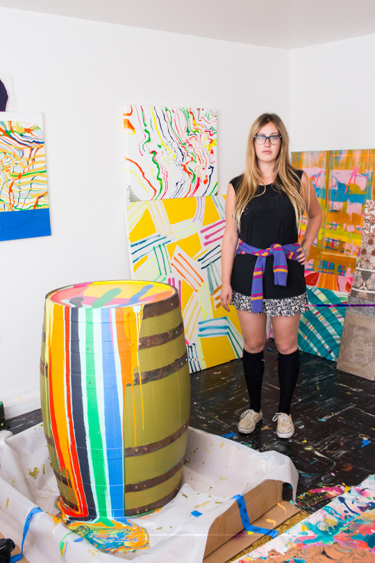
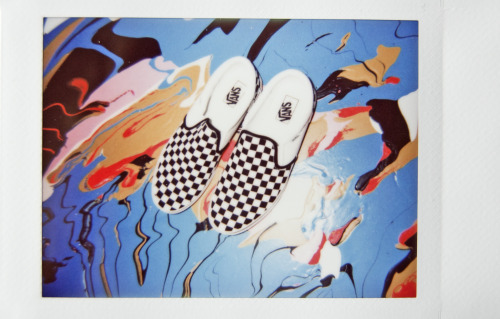
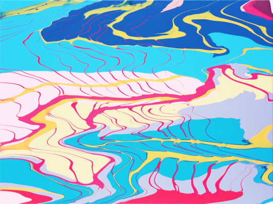
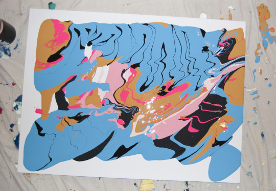

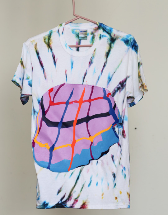
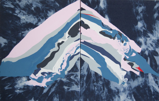
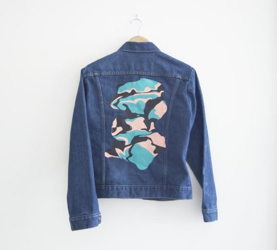
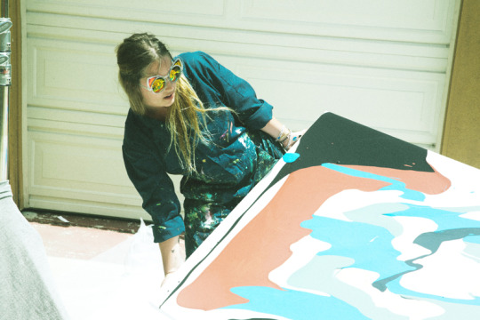
Sketchy Behaviors | Jenny Sharaf (SF)
Never afraid to reinvent herself or her art, San Francisco based artist Jenny Sharaf’s works are fluid and spontaneous; her approach fearless and at times vunerable; and her style cool and comfortably bad-ass. We’ve not only been fans of her visual and abstract creations, but also her passion to work with her community in SF and Oakland to spread art and creativity – from her work with the Lab’s 24-Hour Telethon, The Parking Lot Art Fair to her most recent project- the Public Art Tour. Sharaf shares some insight into her work and process; important issues and themes; and her thoughts on the contemporary arts scene in this installment of Sketchy Behaviors.
Photographs courtesy of the artist
Tell us a bit about yourself and your art background.
My name is Jenny Sharaf and I live with my partner-in-all-things John in San Francisco where we are the parents of an 80lb blue nose pitbull named Lola. Though i live in San Francisco, my wanderlust is at an all time high and if I’m not traveling the world, I’m plotting my next escape.
I grew up in a relatively small beach town in Los Angeles called the Pacific Palisades. Surrounded by salt-licked-waves and girls tanning on smooth beaches, my favorite place growing up was the bluffs; where I could sit above it all and watch it from a distance. I certainly was not your typical California beach babe, but I was wildly inspired by its appeal.
I found myself in San Francisco and went back to school at Mills College to receive my MFA. At Mills my ideas about feminism and California culture collided and my art was heavily influenced because of it.
My life now is a state of constantly making art. Whether it be painting, working on something digital or organizing big public art events in the city, or climbing some construction scaffolding in Paris to smack one of my stickers on the side of a building, I am always finding news ways to reinvent myself and my art.
How did you end up creating art and doing it professionally? And what have you learned along the way?
I’m just doing what I love doing and sometimes people agree to pay me for it. I create new work and new concepts non stop, I contact people that inspire me in hopes of collaborating. Even though I’m afraid at times to be vulnerable, I put myself out there every single day in hopes of new people discovering my art and hopefully falling in love with it. Being an artist can feel very scary, I think maybe I love being scared.
You’ve mentioned “process” as an important aspect of your work. Could you take us through your creative process?
When I’m in the studio or working on a project on site, I always love that intense moment of chance and not having a plan. It takes a serious level of trust in yourself and the materials. Those are the wonderful times that feel one-the-line and frightening, but are always rewarding. In those painting meditative moments, I have no sense of time and space. My best work and most dynamic ideas come out of a period of making and thinking simultaneously.
What important issues and themes do you find yourself and your work drawn too? Why are these important to you and how do they permeate into your works?
Artists are vitally important to our culture, our story and our future. They represent our freedom of speech and expression. The contemporary moment that we are living in feels very historical. Artists are more necessary now than ever and we all should critique the world around us through whatever means possible. As I’m finishing this interview, I’m watching Trump’s first week in office. It doesn’t feel real, but it very much is. This is a call to duty. This is the first president that rose to power on twitter and a tv game show. Currently it’s scary times. I suggest everyone find a great apocalypse outfit.
The colors and abstract drips of your work are some of our favorite things. You recently created a beautiful interior for last year’s Fog Fair and a mural for the Ace Hotel in Palm Springs. How did this come about and how do you approach the design of interiors and exteriors?
Both of these opportunities came through curators & designers following me on instagram. Charles de Lisle and Cultured Magazine invited me to collaborate with them on a “reading room” for the FOG art fair. It was a lot of fun and it was a moment to make something large, inclusive and accessible to an art crowd. For Ace Hotel, their art director at the time; Matt Clark, approached me after seeing an instagram post by artist, Thomas Campbell. The art world is sometimes a really nice place after all! It’s also really wonderful when one project leads to the next.
Whether you’re calling it “placemaking" or whatever new buzz word we’re using, it’s rewarding to create a work of art that people want to include in their own story. I will always love painting on canvas, but it feels much more exciting to do “murals” or large-scale installations, where the audience can insert themselves and interact with the art directly. It’s less egocentric, even though I do always appreciate a @tag :), but mainly just so I can see others enjoying my work!
From painting, murals, videos, installations to paint on paper and digital works, do you have a preferred medium and if so what do you specifically enjoy about it? Is there a medium you’ve have yet to tried and are dying to?
I’m always dying to try new things, new ideas, new materials. I probably have about thirty ideas going in my head at any given moment. As as a preferred medium, I love paint and always have. It’s the most temperamental and if you do the dance, it will talk back in this amazing way. It’s literally fluid (duh), so you have to be a bit go-with-the-flow to fully embrace the stuff. There’s nothing better than a painting session with your headphones blasting and paint just flowing oh-so-naturál. There are a million things I want to try that I haven’t yet. It’s hard to predict where it will go….That’s part of the reason I love being an artist.
What has been some of the best art advice you’ve gotten and some of the worse?
Best art advice– Dream bigger. Don’t be shy. Don’t glass-ceiling-yourself.
Worse art advice– Be practical and realistic.
Not only are you a passionate artist, but you’re really activity in your community with various projects that are focused on community engagement and about promoting the arts. Can you talk specifically about how you founded The Lab’s 24-Hour Telethon and tell us about it and its purpose. What other community based activities are you working on or currently developing?
Throwing big art events in the Bay Area is really important work to me it helps keep the art scene alive for the community and for myself. I was approached to come up with the task to raise money for the The Lab. I grew up on TV and I’ve always been particularly enamored by it because my parents were in the business. They were TV journalists and were always deep diving into the life of some interesting personality. I loved the idea of bringing that to life in a new form and so the The Lab’s 24-Hour Telethon was born. It helped majorly that Cinefamily had been doing a super awesome telethon as well. It was in the zeitgeist. San Francisco needed a version. It ended up being a big success that I am extremely proud of. Since then, I’ve done projects with San Francisco’s Department of Public Works that involves giving new life to public places by highlighting our local contemporary artists.
Most recently, I’m working on a program called Public Art Tour. It’s going to be an online experience and a series of big public events, bringing attention to local artists and San Francisco’s downtown public art. We are scheduled to do a massive party under the Bay Bridge, closing down the Spear Street’s cul-de-sac and making some legally permitted-noise;) Maybe Vans wants to set up a skate ramp? Call me.
The Parking Lot Art Fair that you founded in the Bay Area sounds like a super fun and exciting get-together. How would you describe this event to folks? What has been the best aspect of this for you?
It was a blast. Basically, The Parking Lot Art Fair was a renegade art fair outside of a “legit” art fair at Fort Mason (in San Francisco). All the artists set up very very early morning, as soon as the parking was free and permitted. At that point, the chaos began. The best part was being able to see the Bay Area art scene spread out in oceanside parking lot and realizing how much talent and weirdness this place still has left. San Francisco and Oakland have had many growing pains in the last few years and because of it the art scene has also foregone many changes. In terms of housing costs (studio space, etc) a big portion of our community has had to leave. So to be able to celebrate a more fringe art scene feels insanely gratifying.
How would you describe your personal style? Favorite Vans?
My personal style is all over the place. I like to be comfortable. When I’m not in my painting white or navy onesies and painted Vans (raw canvas pair I’ve probably had for 10 years), I love to play with fashion and try on different looks. Right now my look is very Gloria Steinem plus a sixties-Italian-cyclist inspired; ripped black jeans, my boyfriend’s cashmere sweater and a fringe black suede jacket. I always wear sunglasses - my look never feels complete without them.
My favorite vans are the classic black and white checkered low tops. They always look effortless. OR the high top surfer-girl-chic sneaks.
Name 5 of your favorite artists, followed by some of your top 5 favorite bands / musicians to create too.
Artists: Helen Frankenthaler, Joan Mitchell, John Baldessari, Joan Brown, Alicia McCarthy
Music: Paul Simon, alt-J, Jungle, Ace of Base,Haim
What are your thoughts on the state of contemporary art? The good, the bad, and the ugly.
The good - the art world is accessible than ever because of social media and the internet. You can basically get anyone to see you work these days, which is a big change from ten years ago.
The bad - there’s still a lot of old white guys that seem undeserving of shows, but they know people and they already have money to create massive bigger-the-better machismo art.
The ugly - the art world is huge, and can be incredibly hard to navigate and can be mean. We should all work harder to be nice to each other, especially about something as special as art.
You’ve worked with various clients and done many collaborations. What have been some of the most rewarding projects? What do you like best about collaborations and what are some of the aspect you’d like to see changed or evolved if any?
I love collaborating with cool brands. Working with the Ace Hotel is always awesome. Such great people and a company that really gets the creative experience. I just worked with this handbag line Luana Italy. They really let me do whatever I wanted and honored my voice as an artist, which I always greatly appreciated. I think big brands are finally embracing and empowering the artist's’ voice– allowing the space it takes to achieve that.
What would you tell folks who want to follow in your footsteps? Pitfalls to avoid and/or words of inspiration.
I’d say, don’t follow in anyone’s footsteps. That’s always something to remind yourself. Make your own path and listen to your own visual / conceptual impulses.There is absolutely no rule book or how-to guide to being an artist. It looks different for everyone. I by no means have figured it out, but I do try to practice trusting the inner voice and taking risks.
Lastly, what’s up for 2017? Any exciting projects you can let us in on?
For 2017, I plan on working hard, painting like a madwoman and traveling. I’m doing some fun projects with B&O Play by Bang and Olufsen as a cultural ambassador- public art events, listening parties, contemporary art experiences. Also, I’m curating a weekend at Ace Hotel and Swim Club Palm Springs on March 18th called “What’s Your Name / Who’s Your Daddy” featuring Sahar Khoury, Alicia McCarthy, Francesco Igory Deiana and Jess Meyer. Also, planning some mural projects overseas, but it’s too early to talk about. Don’t want to jinx it! Follow me on instagram to keep up with it all:)
Website | Instagram | Public Art Tour
84 notes
·
View notes
Last Seen Blogs

its-elizabeththegreat
Raelizabeth

badmemcry
* 𝓈𝓊𝓃 / 𝕤𝕙𝕚𝕟𝕖
ofmoonlitmagic
in your eyes awaits the tireless hunger
sleepire
The #1 sleepyhead

poetryandmoon
dark academic