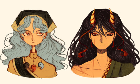
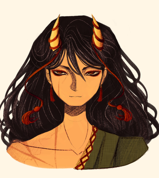
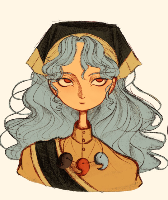
#i really simplified her design because
Text
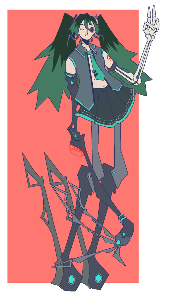
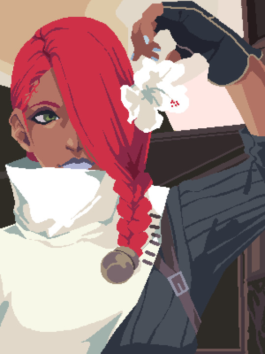
calne ca my absolute beloved
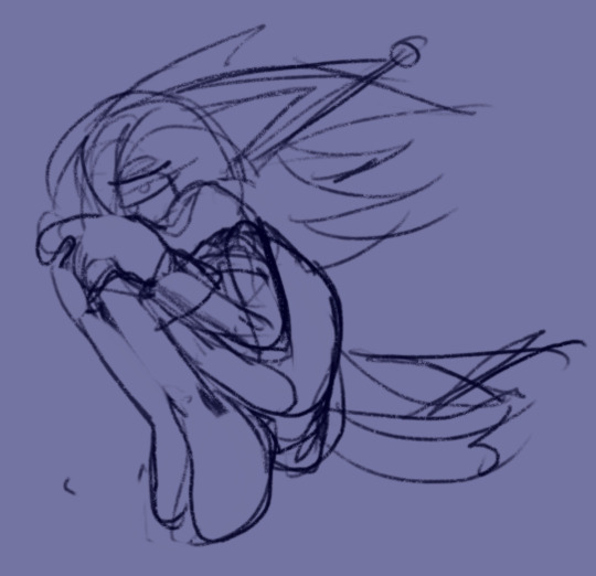
#ever just remember that one thing you were obsessed with as a kid#yeah#im having one of those moments#i really simplified her design because#well.#i dont have the brain power#its so complicated#anyway#calne ca#骸音シーエ#calne ca fanart#vocaloid#deino3330#vocaloid fanart#my art#body horror#< i guess?#eye contact tw
34 notes
·
View notes
Text

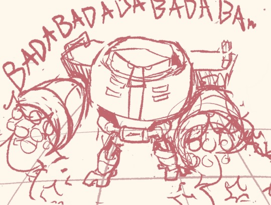
WHO IS THIS 🔥💯💥💥‼️💥‼️❗️❗️💯❗️🔥‼️🔥💯💯💯💥💯💥
#soda draws#this is really fun but i don't think i can draw her hair consistently#also i suppose PIE can't trademark... copyright (?) the simplified design i use because it's literally just the greek letter lol#taleblr#she has a lot of pins on the bag i just didn't feel like drawing it here
21 notes
·
View notes
Note
Uh hi, could you draw Giorno and Fugo in masquerade style?


sorry anon it's not colored but when you said masquerade my three braincells heat up at the spot
#also i'm tired#i like the designs and the idea i thought of..i will start working on it in the morning.i will also work on simplifying giorno's mask 'cuz#i made it way too complicated for noo reason at all. i also thought of like a quick plot#ok there is this masquerade (of course). i want you to imagine a fancier version of the mafia. the don invented almost all the mafia#into this masquerade with the promise that the one that would know his true identity will be the next don#but the catch that anyone getting way too close is probably going to be killed#weather diavolo doing it for shits and giggles or he is showing that he is truly worthy of the title don#is still up in debate in my mind. buccigang goes just because it's a fancy party (also because there is free food but shhhhhh)#giorno still didn't meet the buccigang yet in this au and he WILL become the new don#trish also still didn't meat the buccigang yet. she would go to one group to another dropping hints about her father identity#she really just wants him dead#she can't say his true identity out right or else she would be killed#and yeah#you know the most cliché murder mystery#it's just kyaaaaaa~ i love this plot since i was 6.i love it soo much. it makes me sad people don't do that often anymore#also put my fav kind of fugio. i mean yeah fugo fell but holy giorno is in a well#*fugo says the most strategic plan you could think of* gio:wow you're so smart darling can i kiss you now?#←didn't understand a single word from fugo#also i didn't say this but it's a masquerade no ones knows about the characters real identity#so they just go with there stands name.ok this is enough my mind is shutting down now#jjba#vento aureo#jjba part 5#pannacotta fugo#giorno giovanna#fugio#mine#my art#pt5
81 notes
·
View notes
Text
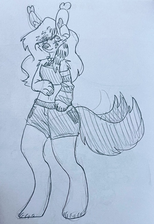

I used to draw her nearly every day, I've barely drawn her at all this year and that just feels sad
#raveartts#fursona#furry art#suicide reference#suicide#<idk how else to warn for this sorry#anyways I'm sort of figuring out anthro legs?#well I'm just stylizing them to pretend I know what I'm doing (I really don't)#it looks cute enough regardless so ig I'm the only one who could care about the technicalities#ARSTGSD I SWITCHED THE ARM THE SLEEVE IS ON#it's actually meant to be on both arms but I didn't feel like drawing that :)#I need to simplify her design omg because whenever I try to color it#especially when I include all the hair clips and accessories#it's such a pain#it used to be so animation friendly and then I redesigned everything to be a nightmare#but it looks so ravecore and scenecore now!!!#rave.characters
1 note
·
View note
Text
Lesson 1: "White Man Painted Black"?
Okay, I recognize that this is a strong foot to step off on! But! If you learn nothing else from this series, if you decide for whatever reason to forsake me: this is the ONE perspective I'd like you to take away!
You may have heard this quote before, when Black fans deride a character design as 'a white man with the brown bucket tool'. On its face, it means exactly what was said. But specifically, what it means is that we recognize that whomever designed the character drew the way they normally draw for a 'default' character in their mind- default usually meaning White/Eurocentric features- and they added a shade of brown within the line art to make that character now 'Black'.
Now if you're feeling defensive, wait just a moment! This discomfort is not inherently a bad thing!
I'm going to use both a 'real world' example first, to show you what your Black fans and peers are seeing, and perhaps you will also understand our discomfort!
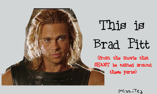
(if anyone was curious, my folder for this lesson is titled 'brad' lmao and you'll see why)
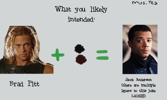
(I'll have y'all know that I actually worked very hard to make Blackface Brad look mildly presentable lmao I'm sorry, I'm wheezing, I can hardly breathe looking at him 🤣)
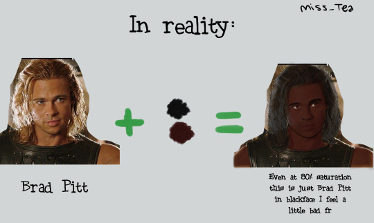
You see how, despite knowing where this was going, and using one of the darkest shades of brown in my Skin Tones arsenal, you still know that that's Brad Pitt? That nothing about his hair texture, his lips, his nose, or really anything other than the palette change... changed? And you can still see that?
It's incredibly hurtful to be told that that's supposed to be you. You know it's not, you know why it's not, but rather than hearing how it makes you feel unseen and what they could do to be better (since they wanted to draw a Black character!), the artist lashes out at you.
And as an artist, you might have worked VERY HARD to do this! That might be a real handsome guy you drew!! But... is he really Black? Did you walk into it with the intention, that you were drawing a Black Character, or did you draw a character that just happened to be Black? It seems like a silly thing, but it matters!
Okay. I just finished laughing over Brad. Now let's get into some more perspective changes:
Now, imagine you drew a character. You want to make her Black, so you change the hair and skin colors. All right! You have your Black character... right?
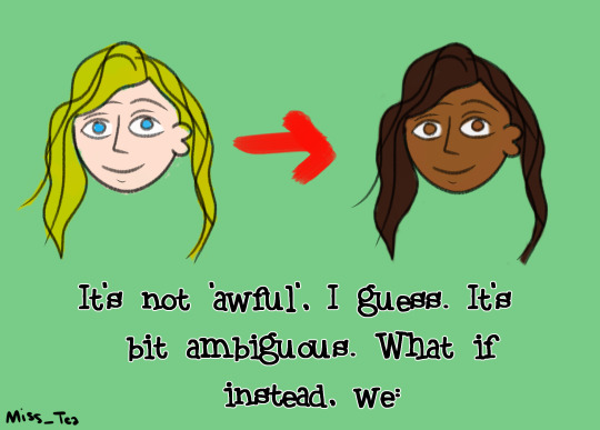
Changed ONE feature about her? (You should obviously change more than one feature, but let's just go with the simplified example.)
What if, instead of just changing her palette, we changed her:
Hair?
There isn't nearly enough time in the world, let alone in this little scribble and blurb, for me to describe the IMPORTANCE of Black hair in Black character design. There are so many ways to do curls, afros, braids, twists, locs, SO MANY HAIRSTYLES!! Get used to searching in the 3C-4C hair textures!!!! I plan on doing an entire lesson or two on hair alone, but suffice it to say, Hair Texture is thee BIGGEST giveaway that you 'painted a white person Black'- from cartoon styles to realistic! It reveals itself in your writing as well- just based on how your character takes care of their hair, how your describe the texture, how other people might perceive it... it lets me know just how much research was done. Because we can have straight hair! But again, that's a conversation for a whole 'nother lesson so- come back later 👀?
Lips?
I love our lips, I really do. There's a long history of shaming Black women in particular for the way our lips look. So when I see them done in all their glory, it makes me very happy. Two-toned lips vary in shade and intensity, so make sure you're using references if you want to be 'realistic', but it doesn't have to be that hard. Even a little subtle shift like this in the design/story description lets me know that a creator was thinking about me.
Nose?
One thing I've noticed ever since I starting drawing is that... people in a lot of mangas/manhwas barely have noses! I admit, out of all the features on the face, the nose isn't the most important. I think they should be, especially when you want to emphasize that your characters look different! People have different types of noses! I especially want to gear this towards those with a goal of drawing realistic portraits and the like- there, the nose is ANOTHER dead giveaway. There are Black people with aquiline and straight noses- we aren't a monolith- but is that why you drew it? Consider why you went for that nose specifically. That's part of the intent, in all this!
Now, you might be looking at me and going "Ice... this is just character design". To which my answer is: Yes! It is! It feels so basic, and yet if you ask your Black friends/peers how often they've come across this feeling of not being properly drawn/written, from fanart to professionally produced works, it's unfortunately common despite how simple of a concept it is.
I hope that you can walk away from my first lil lesson with new eyes. Remember, it's the thought that counts, but the action that delivers!
1K notes
·
View notes
Text
🪐🩷
I write sm of Simon with like super cutie patootie sweet softie gf's and today is not one of those days!!
What about Si with a sassy, snarky spitfire of a partner.
He's kind of always thought that he'd want some soft, gentle, domestic partner to offset the general frustration and struggle of his work life. Some bird in a frilly apron to coo and preen at him like a wounded puppy.
And then he meets her.
She's some intelligence officer brought on by Laswell in hopes of attaining information on targets before missions to keep things running that little bit smoother.
She's had to not only survive, but thrive in a cutthroat mans world industry for years, and she takes not one single ounce of shit from anyone.
Price will occasionally (and very much unintentionally) simplify things for her in mission briefings and she just kind of sits there with arms crossed and a raised eyebrow until he gets the memo that he doesn't need to baby her.
She never has to actually go out into the field, so whilst the guys are all training in the gym, she sits and plays games on her phone or reads some smutty romance novels.
She didn't expect to fall flat on her ass for Simon Riley, but something about how quiet and level headed he is makes her very much metaphorically swoon.
He knows it, obviously. He's observant as fuck. He sees the way she pulls her bottom lip between her teeth when she has to crane her neck in order to look up at him, or when he casually helps her with boxes of files and she shifts bashfully from foot to foot, trying not to ogle his biceps.
When they start dating, she's not even afraid of the others finding out because they're too scared of her to tease the two of them.
They move in together and she designates the guest room for all of his man stuff, only to find out that he has like three personal items and some chargers.
"The fuck you mean you don't have an ugly PC?! You're a guy?"
He's so confused at her confusion until later in their relationships when she tells him that all of her past partners were kind of (major) dicks and that's why she didn't really date anymore, until she met him of course.
She tries really really hard to hide when she cries before he goes off on deployment, and works ten times harder to find useful information that will increase his chance of getting home to her safe.
He buys her really sentimental presents and she tries to hide how touched she is by calling him the softie even though she shamefully piles all of his clothes on the bed with her when he's away because she misses him so much.
She buys him a dog in secret on the same day that he comes home with a cat for her and they just sort of stand there in their front entrance like that Spiderman meme where they all point at each other.
The dog and cat love each other, almost as unlikely a pair as their owners.
She and Simon go into work one day and she's got a unique, delicate little ring on her left ring finger and the guys are like 😦"You got married and didn't invite us?"
"No you fucking plebs we got engaged."
Never did anyone think they'd see the day where Simon Riley got engaged and thought about settling down.
They also thought the two of them hated each other until Simon casually is like "Oh, yeah no she and I went to this great place the other night. Good steaks."
#cod mwii#cod mw2#tf 141#simon ghost riley#simon ghost riley x reader#Simon ghost Riley x f!reader#Simon ghost Riley x yn#Simon Riley x reader#simon riley x f!reader#Simon Riley x yn#Simon riley#ghost x reader#ghost x f!reader#ghost x y/n#ghost mw2#simon riley x you#ghost cod#simon ghost x reader#simon riley x y/n#simon riley cod#ghost call of duty#cod ghost#cod#cod simon riley#ghost#call of duty#ghost riley
651 notes
·
View notes
Text
Ranboo’s instructions for the cast designing their characters was to portray a simplified version of their streamer personas!! We theorized but Niki outright said that was their direction!!!
Her talking about designing her character is so ingenious and heartbreaking, I’ll add the clip as soon as I can <333
Transcript (credit to @ranvwoop):
“Um, when I came up with, like- ‘cause we were, y’know, we came up with the way we acted on screen. We came up with our, like, descriptions and our, um, introductions, and basically what Ranboo gave us was ‘You guys are a portrait of your- like, you guys take- like, take on the roles of the streamers in the real world, like the real universe. Um, so you’re people who take on the streamers*’
“And I’m like ‘okay.’ So I’m going to think about Niki, and I’m gonna think about Nihachu. And the ‘Hi guys! I’m so nice! Oh my god, you guys should really choose me’ was the Nihachu people have always wanted to see, you know. [Thanks subscriber]
“You know, whenever I wanted to cry on stream — or just cry in general —, whenever I wasn’t feeling good, or I was feeling emotional and I would stream, people would make fun of- like, you’ve seen the internet. You know how people were towards me when I- when I cried because of MCC. You guys- you guys remember that.
“So like, I kinda wanted to put that into the thing of like: ‘I am literally locked up on a spinning wheel of death, and of course I will cry, but I will not show it. I will not be able to show it to the audience. I cannot show them that I’m scared, I cannot show them that I’m tired and- and sad and fearing for my life because that is what is expected of me. Because the outcome of what happens if I show what I feel is worse than the fate of death I am fearing right now.’”
* Note that Niki is not a native English speaker. I believe what she is trying to say here is that they’re trying to represent peoples’ takes on streamers, as in their interpretations of them.
3K notes
·
View notes
Text
Here's a digital sketch dump of some pose/anatomy practices and some 2hu doodles, I think from now on if I don't have any big final piece to post, I'll just post sketches I liked that I did digitally (might also reblog some drawings of mine that I want more people to see, maybe idk).
Artist's Notes:
Ok so after the recent Hifuu fanart I did, I've been hoping to experiment more with how I draw faces, how I render, as well as how I stylize things. In some of the earlier sketches I did, I had an idea for a pose that I wanted to try drawing, so I took a ref pic of myself doing said pose (the leaning one btw) and then did a sketch over top of it just to get an idea for the shapes, negative space, and silhouette. After that, I wanted to do some simpler breakdowns of the shapes so I can get better at simplifying the body (these ended up being the bottom right sketches in the post). I also did some experimenting with how to push certain parts of said sketches to create a different body type (via liquify and then a more refined version based on that sketch), as well as figuring out what makes a pose feel natural and not stiff. This was also a bit of a foreshortening practice just so I can get more confident with it, and I ended up using the arms from the liquified version for the coloured Zanmu sketch I did since I liked them so much (dw I'll get to that).
The next thing I wanted to try and draw was Hisami, mainly because.... I am very bad at drawing her in my style. Last time I drew her I made her look really creepy and spindly, and it is my headcanon now that she can switch between a more human, and more creepy look whenever she wants. I'm liking where the face is going a lot, might have to refine a few things about it in the future, but it's cute (I also made the blush purple which I think is what I'm gonna do with her face from now on). I also like how her hair in the sketch turned out a lot, but the outfit..... not as much... Ever since I started changing my style to something less cartoony, I've had a hard time drawing her outfit in my style. Especially the flower veil thing she has on, which, I did try to find a way to draw, but I ended up deleting that sketch because I didn't like it. I'm also not a fan of using the colour purple, like, pure purple, magentas are fine, indigos are fine, but not strict purple. I also have a hard time with drawing all the little pattern details on her dress. I also need to find a way to draw the flower veil in a way that looks good because everytime I try it ends up just looking off (very similar to whenever I try to draw Zanmu's blue spears). I think the only solution to this problem is to do what I normally do and make my own version of the outfit, but with adjustments to suit my style while still trying to keep core elements from the original design intact (like I do with Zanmu and Keiki, and yes I am going to get to that Zanmu drawing just gimme a minute).
Ok next up is Keiki, my favourite Touhou character who I haven't drawn since the beginning of the year. Since my style has changed a lot, I wanted to just do a face sketch of her to get a hang of drawing her again, and I..... really really like how it turned out! When I drew her eyes, I realized that a good way of keeping faces too same facey can be via varying the sizes of their pupils, so that's an idea I'm gonna keep in mind from now on. I had a lot of fun with her hair, I initially was gonna do it like how it is in the official art, but I ended up not liking it, so now I'm gonna draw Keiki with wavy heir like this because it's fun and it looks nice. I also included my base sketch for Keiki's face since I was initially struggling with drawing her bandanna, and in the coloured sketch I added some more detail into her hair.
Now to finally talk about the sketches for Zanmu. Good lord was I having a tough time with her face. I also did this sketch before I figured out how I wanted to draw hair, so that's why the rendering on her hair is different (I did this soon after the Hisami sketch actually). Since I changed my art style a lot, I had to find a way to translate her face from my more cartoony style to my more detailed style, so while the face shape, nose shape and mouth was fine, I was really struggling with the eyes. I did get somewhere eventually though, and I am super happy with how it turned out. I wanted to lean more towards the androgynous side of the gender presentation spectrum, mainly because I think that makes sense for her character. Also made sure to include the silver hairs and some wrinkles just to bring some signs of her aging into her face because those are just staple features of how I draw Zanmu at this point lol. You will also notice that I gave her some scars on the right side of her face, and that's because I am a Zanmu-with-scars truther, I fucking love it whenever I see someone give Zanmu visible scars like that it just adds so much omg (I also tried to put a wolf bite mark on her arm in the full body drawing but idk if it reads well). While you can argue that her not having scars sells the idea of her being this "powerful, untouchable mastermind who is impossible to defeat," I'd say that instead of those scars representing times she got injured, they represent everyone who has failed to defeat her.
As I was drawing Zanmu's face, I referenced my sketch of to help with contrasting their features since I made Keiki's face more traditionally feminine. I also didn't mention this in my commentary on Keiki's face because I wanted to save it for here, but giving Zanmu scars also plays into the fact that she used to be human, wheras Keiki doesn't have any scars because she's a god who doesn't follow the rules of normal human biology. Plus I'm thinking about the two of them interacting again (return of Zan/Keik??? (I'm a multishipper btw) maybe???) so drawing their faces together will definitely help me in the future if I wanna draw them together (again, maybe as a ship? I've kinda been ironing out the kinks in their potential interactions (romantic and non-romantic) for a while now so idk maybe expect that in the future lol).
And now for the full body drawing, when I was doing the face sketch I did this little snippet of an outfit, had a vision, and the made it into a reality. I'll admit, part of me was worried that it would end up looking too much like Yuugi's outfits in the spinoffs and mangas, but I feel like I made enough changes to differentiate them. I tried to keep a few of the major details in Zanmu's design (i.e. the red tassles and yellow lining on her shirt) while putting a new spin on it. I also dialed up the scars to 11 since without them the whole thing kinda looked incomplete. Also, while I could say that the leaves on her kimono are "a nod to the fact that technically she should be a tengu because back then people belived that corrupt monks would turn into tengu but no Zanmu is an oni and they're maple leaves because...tengu...ahahahaha" what really ended up happening was that I looked up clothing patterns from Sengoku era Japan, liked the leaves the most because the red picked up on the red from the rest of her design and just ran with it. I also always had the idea to put Zanmu in men's clothing from Sengoku era Japan and while the accurate thing to do would be to put her in a Buddhist's clothes from that era.... from a character standpoint, I don't think Zanmu is pious enough to strictly wear the proper monk uniform, and also since she's basically the king of Hell, she would probably dress herself like royalty from that era. TBH, I probably could've been a bit more historically accurate, but again, this was mainly for conceptual purposes because I had a vision and I needed to see it through.
If I were to draw her in this sort of outfit again, I should probably try and use more references, although now that I look at it, if she were to wear it properly this would maybe, probably look a bit closer to a Kyūtai sugata (a very huge stretch, but it just kinda reminds me of that) just without the layers under and over the main piece of clothing (In the website that I searched up to try and compare the outfit in my sketch to, they name the outfit pieces but don't label them on the image, so I don't know 100% what everything is called) so I will definitely have to use that style of clothing as a reference going forward.
Also, I was kind of inspired by the ToTK design for Ganondorf since I have finished the game a while ago and I absolutely love what they did with his design (it's just so fucking cool omg) and I thought that sort of look would look good on Zanmu, so yeah got some inspo from that.
And those were all the notes for each of the sketches, I'm motivated to draw rn but kinda art blocked, so doing these little coloured sketches helps a lot.
#touhou project#art#fanart#sketches#sketch dump#zanmu nippaku#keiki haniyasushin#hisami yomotsu#touhou 19#touhou 17#unfinished dream of all living ghost#wily beast and weakest creature
281 notes
·
View notes
Text
Pomme, the french egg
So I did a post about the french streamers (and their characters) and their mischaracterization I could see from time to time (https://www.tumblr.com/odusseus-xvi/724443078442778624/hello-helloooo-friend-hi-i-just-wanted-to-say) But I realised I didn't talk about Pomme, who has arguably the MOST mischaracterization I can find :
Most of the fandom see her only through English or other languages streams (BBH, Philza and Maximus mostly recently) limiting their views of her in general, but because of that a lot of people don't seem to know what her personnality is like, and most of the time in fanarts or fanfics she just feels like Talullah (which people also mischaracterize) but french, a little sweet girl in a little dress, so I decided to do a little summary of what she is like and some of her traits that you may have missed :
What people do get right is that she is most of the time polite and empathetic, that people get, though they tend to simplify her to only that.
She is very intelligent (learned a bit of create with Aypierre) and likes to both theorize and gossip with Baghera.
One of her parents is ETOILES !! She is a good and competent fighter ; just a few days ago she went and did a Nether Dungeon with Phil and Etoiles while Talullah worked on her garden. Her main weapon is a Moonlight GREATsword, a GREATsword, a BIGASS SWORD. She participated in infiltration missions in Federation Buildings alongside BBH, and Aypierre, in which she saved her father (Aypierre) from being caught and interrogated by Cucurucho
She has developped a deep paranoïa when it comes to the eggs' and her own safety ; between the combination of the attack of the code on her a while back, where she lost ten totems in mere seconds, an attack so strong that the admins went "ok my bad, we went a little far" (Draw her with golden scars !!! The tens of totems that saved her !!!), and the explosion at the Wilbur Party where she lagged just enough that she wasn't tped as fast as the other eggs and saw parts of the explosion. She is now scared of explosions, and always on the lookout (She also shows from time to time that her inventory and hotbar is constantly filled with gold apples and splash regeneration potions.) : During Etoiles' solo fight with the codes, when she saw the first "Dapper is down" message, and that she knew Phil was AFK, she went and pressed the OVO button HERSELF immediatly, and she got there faster than Forever !!
She is a really good writer, her diaries are praised by her parents everytime they read it, and she decided it would what would represent her in BBH's Egg Museum : She built a library where she will put her books for everyone to read. She is also a good and patient builder, with particular attention to interior design : While doing that she has shown a bit of maniacal side : She LOVES symmetry, and is irritated very easily when it doesn't go that route : One time Etoiles was teasing her by putting random blocks in her build and she went "PUT THAT GRASS BLOCK DOWN !!!" and when he continued she just left without saying goodbye.
She doesn't like to lie or steal things, she is honest in that way, BUT she often dodges questions either by saying things like "Don't worry about it :)" or by trying to guilt trip the asker by looking sad or drowning herself. She aslo picked up from Baghera the way she buries herself when mocked or shamed.
She can have a very dry and aware humor coming from Antoine's irony and cynicism and Aypierre's teachings.
Also fun fact, because of timezones, her default state on the server is sleep deprived. She is a sleepy egg.
TL;DR : She is a sweet Badass, and I'll stand by that. I need more fanarts of her with scars, her sword, dark circles under her eyes, and LOOKING LIKE THE GENTLE BADASS SHE IS !
#qsmp#qsmp pomme#qsmp etoiles#qsmp antoine daniel#qsmp antoine#qsmp baghera jones#qsmp baghera#qsmp aypierre#qsmp badboyhalo#qsmp bbh
928 notes
·
View notes
Text
DMC week day 3 - underappreciated character!
I will take any chance I have to draw Lucia because honestly she's growing on me more and more (just like dmc2 as a whole). I think her concept and design are really damn cool (AND THAT BEAUTIFUL AND UNIQUE DT GAWD DAMN) and I WIIIIIISH she got another chance to shine QwQ
Sidenote - I really like how this piece came out. I think I'm getting a better hang of anatomy finally (especially hands that I practically don't struggle with anymore >:3) and in general I like how Lucia looks here. Overall - pushed through the ugly phase and we're back in the good zone again lol, my simplified animation style really is working good for those simple illustrations! I can't wait to make something more detailed again though haha
306 notes
·
View notes
Text

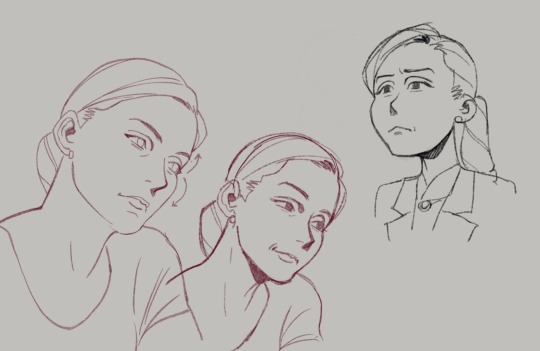
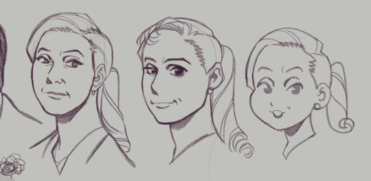
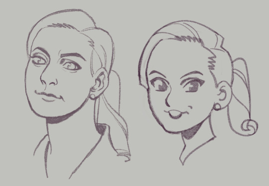
Some studies when I was watching BCS for the first time.
I really enjoy getting a good likeness, not just because it helps with recognizability of the fanart but also because it's a really fun challenge.
Some tips on how I approach this:
You can see how I work through Kim and Jimmy's faces here: First I trace directly over screencaps from the show, focusing on marking the distance of each feature and its placement on their head shapes. How close is the brow to the eye, nose from the middle of the mouth, etc.
After tracing it out, I do some freehand sketches relying more on the shapes and proportions I've mapped out. The little arrows I've drawn next to some of the faces help me remember to keep note of the way certain lines or shapes curve into others. These are great things to exaggerate, because when you keep these things accurate and intact, the illusion of likeness comes through.
Whether you actively recognize it or not, your brain is always making connections to the negative space relationships between features almost as much as the shapes and positions of the features themselves.
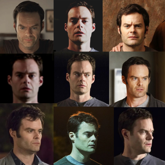

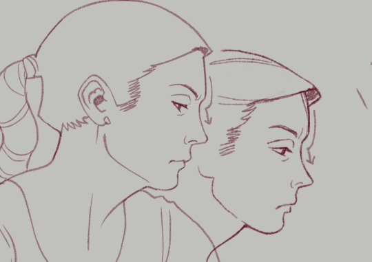
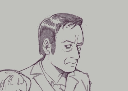
Another thing I like to do is collect much more detailed, organized reference of the character I'm drawing and figure out the harmonies of the face. This is kind of a bastardized and oversimplified Reilly method, where I'll draw straight lines connecting each feature of the face to build landmarks. You can see me working though that here, with Barry.
I started figuring out his head shape, but I also found that the midpoint of his furrowed brow creates a triangle shape with the shape of his nose down to the edges of his mouth. Keeping this shape consistent, even in simplified/stylistic depictions of the character, means he will always be a little recognizable, because the part of your brain that knows what Barry looks like connects with that existing shape.
Playing with those abstractions can help you experiment with how you want a character to look. Don't worry if they don't look perfect. That's the fun of study. Here are a handful of Kimmies, each varying in % of likeness (and degrees of success), but all keeping some key points of her "design". You can see where I start to play with features, removing some things, tinkering with others.
Another little note...since we view these people through cameras, different focal lengths can affect the way their features are proportioned (take a look at the perceived width and height of Hader's enormous fucking head in the upper right corner compared to the adjacent images, for example)–– so this is a good way to keep that in check when you're doing studies.
As always, this isn't drawing law. Draw fanart however you please, and feel free to discard all of this information! This is simply my approach, and it is fun for ME!
Thanks for reading.
This post brought to you by my Patrons, who saw this first on July 4 2023.
623 notes
·
View notes
Text
Frozen: Winter Festival: A new short? | News
Guyyss we might possibly have brand new Frozen content on the horizon!! A new short could be coming out soon!
All credits go to @/girliesandghouls on Instagram. Today, leaks have come out for some Frozen Dolls on Amazon set for release on September 1st. These are the images released.
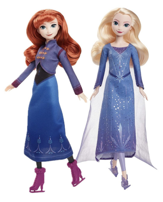
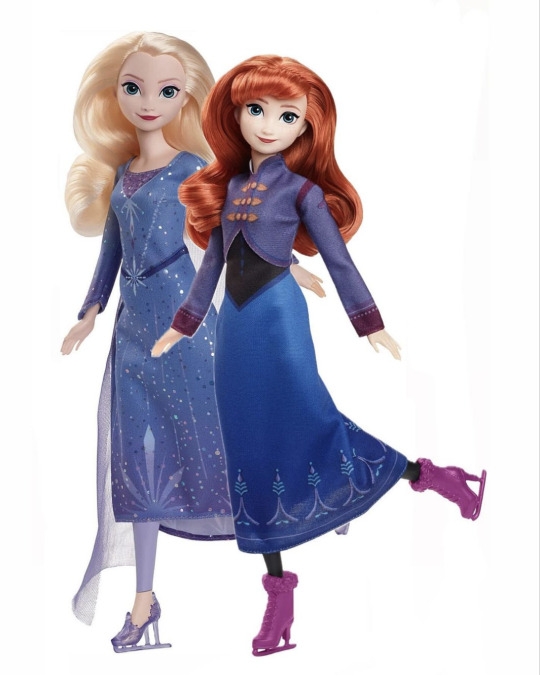
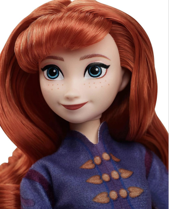
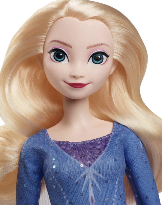
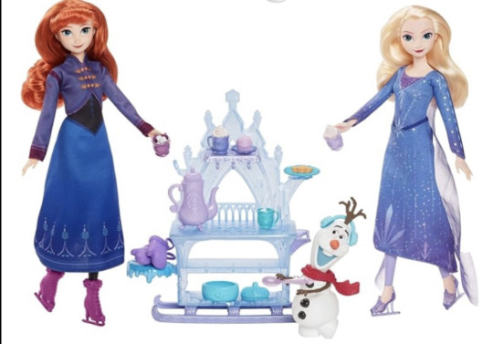
These dolls are titled "Mattel Frozen Fashion Dolls". These specific ones are the "Icy Ice Skating" Elsa and Anna. We also have Olaf with an ice cart, Frozen carriage and doll play set, and Frozen ball gown 2 pack.
The details for the dolls are:
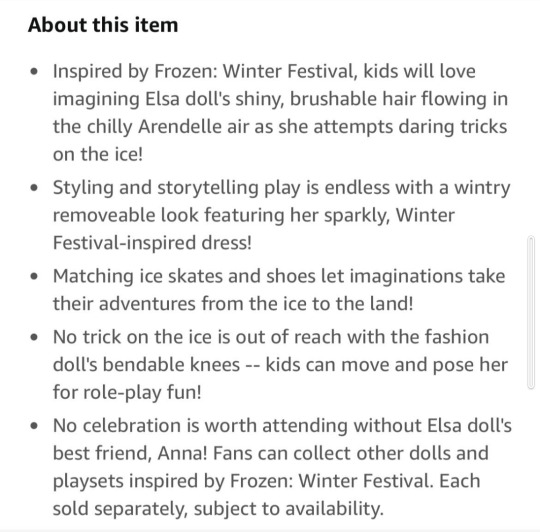
This confirms that Frozen: Winter Festival is some kind of feature, most likely and possibly a short. But more on that in a bit.
The new looks:
They look good but I want to look deeper into what their outfits really look like. These dolls definitely give Olaf's Frozen Adventure vibes with the blues and the winter outfits:
For Anna, her hair seems to be fully done and not in any kind of style unlike Frozen 2 when she had braids at the back of her hair. He jacket has the same structure as her OFA one with the collar, sleeves, the waistline and the buttons. She has a black bodice with the familiar pointed down waistline. Her skirt is the gradient of dark blue. With a similar pattern to her Frozen blue skirt. It could be the same length as that. Her boots however are much shorter than the usual high boots we've seen on her previous looks. They even have a fluffy rim around it and laces too. The boots are a purple pink like her cape in Frozen but because it's a doll, it's probably more detailed in the actual short or feature. I absolutely love her look. I love her OFA look so I'm excited for this one too. Obviously it's going to be more detailed in the short because dolls simplify things.
For Elsa, her hairstyle seems to be the same as her Fifth Spirit look. Elsa's dress is giving me more of her dress under her Frozen 2 coat vibe with the lines, snowflake designs and sparkles and her leggings/ trousers. But I think the purple part of her dress is that sequin type look of that frozen 2 dress under her coat. Her dress has an asymmetrical shape to it being lifted from the front. Her previous longer dresses have a train at the back however this dress could be shorter with no train just to show her leggings and also for ice skating purposes, so the train doesn't get caught. Her dress has a blue to purple gradient to it at the skirt and the sleeves like her classical ice dresses as well as the familiar pointed down sleeve ends. Her ice sandals have been ditched for ice heels again which I love. Elsa's cape is roughly the same length as the back of Elsa's dress and has a white to purple gradient to it. The shape seems to be the same as her previous longer ice dresses being from the back or under arms. Her leggings are also purple. Overall I think I love this look. As I said for Anna it's going to be more detailed in the short because dolls simplify things. And I love how Elsa isn't in white because it's not her main iconic colour unlike blue. And purple as her accent colour makes sense as her cape is a bluish purple in her Fifth Spirit look.
To clarify, these looks are the "Icy Ice Skating" looks, not the ball gown ones. The ball gown looks have not yet been leaked yet.
These are the Frozen and Frozen 2 Mattel dolls for outfit comparison:
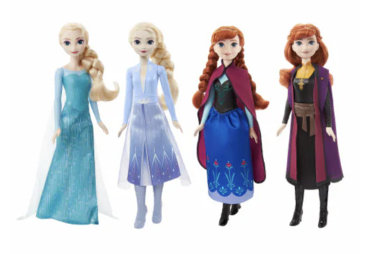

So yeah we can see that the previous Frozen Mattel dolls have simplified some of the details the actual looks have so it's gone these looks from Frozen: Winter Festival is simplified too.
So with these looks analysed briefly, I'm so excited for their ball gown looks. They haven't had a ball gown look since Frozen when Elsa had her coronation. So just imagine their full length dresses stunning again.
The new short?
So most likely this is from a new short in the works. Some of us probably weren't expecting anything new let alone a short before the big two part movies but some of us were hoping. And looks like it's true. It makes sense to have a short now because Frozen 3 isn't coming until 2026! Some of us were expecting they'd keep the 6 year gap and release it next year in 2025 but they have made the gap 7 years from Frozen 2. So it's great to have another short while we wait.
I believe this short could be out this year and be in front of Moana 2 in November. Mostly because that release date is Frozen's usual release month and Moana is highly anticipated so it's a good strategy to get people to see this short if theatrical. And also because if the short is set in winter, it makes sense to release it closer to Winter time. That's obviously just my guess. But to think that this short is set in winter means it'll give that Frozen and OFA vibe that is iconic to the franchise. I say that because I know Frozen 2 is controversial to the fandom for understandable reasons and with the autumn vibe the theme of change really screams out. So it's nice to be back in the winter element again with the sisters together.
And if some of you believe this is a leak of Frozen 3, I would completely deny that because I doubt we'd get a leak so soon, more than 2 years before it's release date. With all we know of Frozen 3 behind the scenes too, the leaks seem to be tightly sealed because the movies sound big and any details given could spoil it for us of course. Besides a Short around this time makes much more sense.
As for the runtime of this short, that's obviously not known but if we were to guess, it would be 20 - 30 minutes because if any shorter they would only have time for one look. Frozen Fever was 7 minutes and Olaf's Frozen Adventure was 22 minutes. OFA had one main look but Anna's look was slightly adapted for the search for the Olaf scene, consisting of a blue snow hat, her two iconic braids and blue mitten gloves similar to that of Frozen. So it's possible that this short is slightly longer than OFA to have a decent amount of time on both outfits.
When the ball gown dolls leak I'll analyse them too. So keep your eyes peeled.
#disney frozen#frozen#frozen 3#ofa#elsa#anna#frozen 4#elsa of arendelle#anna of arendelle#queen elsa#queen anna#new short??#wdas#frozen winter festival
116 notes
·
View notes
Text
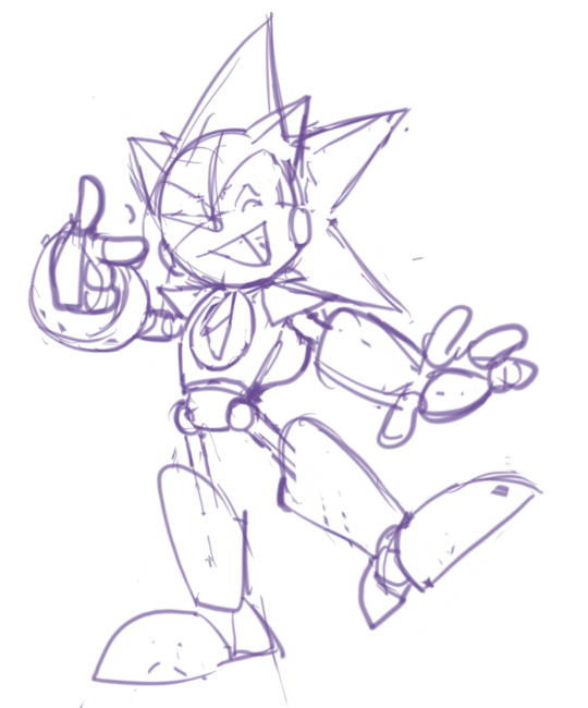


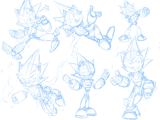
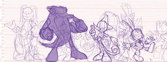
Sonic WIPs and Scribbles from 2023 (Notes Below)
Gave Chaos the Angel Chao ... "Ears" ? So that All Forms (Neutral/Dark/Hero) have some form of Representation. (The two split ... Hair? Things? In the back already resemble the Devil Chao, since the Light Chao only has one.)
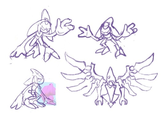
Solaris Exists! ... Crazy. I recall this redesign being bit tricky because it was just so hard to see what the fucking thing looked like Originally, but I did my best. Tried to show the Bird/Eagle Theming, and to simplify the design so People like Me could understand it. I wanted this design to look like a counterpart to Chaos -- because in this AU, Solaris is from, you'll never guess...the Sol Dimension!
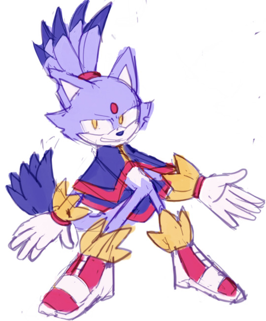
Gave Team Dark a sort of... cohesive color scheme with eachother, so they really look like a Unit. Plus, Rouge wearing Red just... Makes sense, considering her name, even if I enjoy the Purple color scheme as well.
Similar color scheme thing here with the Babylon Rogues -- They all share Red/White/Yellow -- I took the darker colors out of these designs to not be so similar to Team Dark haha. The amount of points on each of their...Chest...Fluffs?? matches the amount of feathers they have on their head Respectively . Changed Storm the most -- I wanted to make his "Hair" Silhouette more Unique from Wave's, and really just wanted an excuse to give a character a Cool Jacket . The Shoes ... I phoned those in a bit, I'll probably change them Later...
Sharddddddd. Throughout my Scribbles (including some here) You might've seen me struggle to decide what Quill Style to give him -- his OG style? Or the Metal Sonic style? Eventually, I decided I didn't need to choose -- I could do both. It's not demonstrated that well in these, but it's basically the same style the Bits have in Sonic Universe: The Silver Age -- just thinner and more Pointy .
Ahhh Faceless Jumpscare! This is what they look like when I'm trying to work on Poses and Colors but don't want to Commit to a Face yet, haha . Nicole, I'm always changing her design it seems -- don't be surprised if it happens again! But I based her handheld off various devices Tails uses -- I wanted it to be compact while being more Modern than the Nokia Flip Phone. Changed her hologram form slightly to resemble her handheld -- her ears are the antenna, and the rings are on her feet like how the ring is plugged in at the bottom. Made her vest longer too! So it looks more like her Reboot Outfit . Just a little.
And that's mostly it! I've been on a quest to draw Every Character in my Sonic Au -- I've sketched about... 35 so far? Here's a Screenshot of a bit of the Madness on that canvas haha.
#sth#shard the metal sonic#blaze the cat#chaos 0#marine the raccoon#storm the albatross#e 123 omega#solaris#nicole the holo lynx#sally acorn#shadow the hedgehog#rouge the bat#jet the hawk#wave the swallow#amy rose#cream the rabbit#silver the hedgehog#sonic au
116 notes
·
View notes
Note
Howdy!
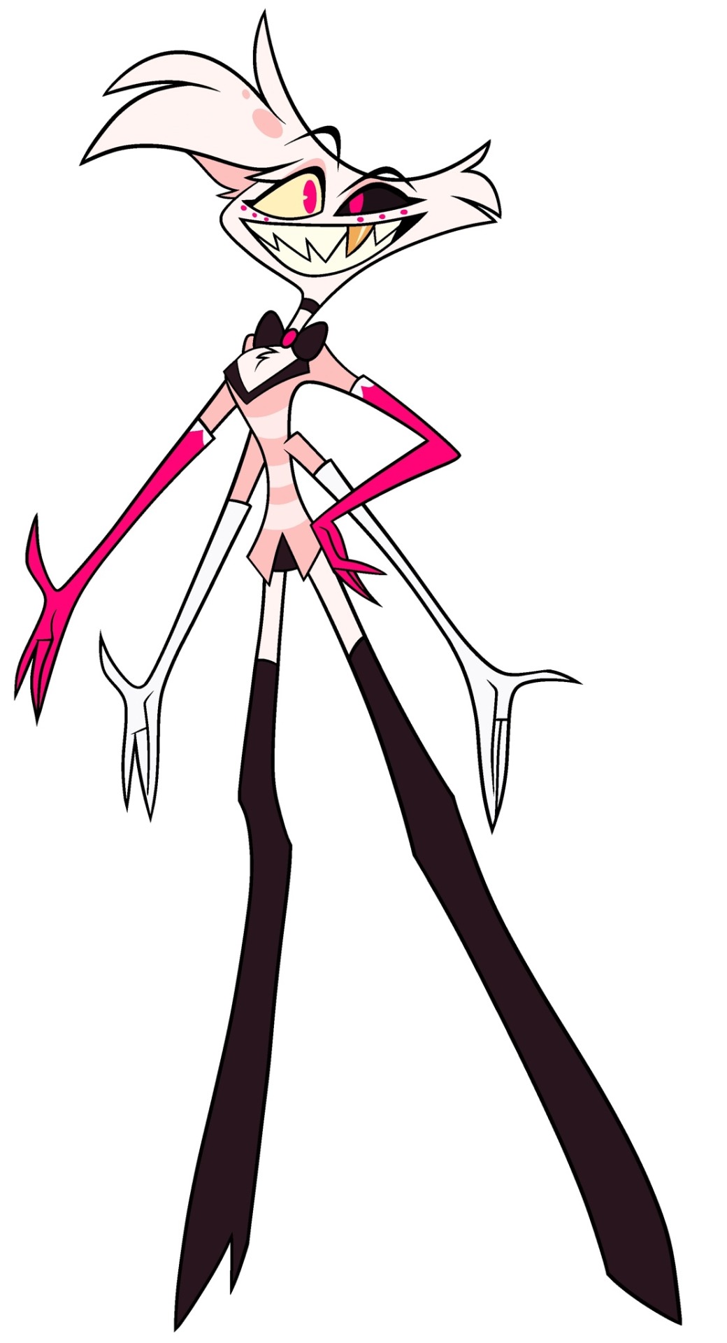
I am here to talk about Viv's horrible character designs.
From an animator perspective, they suck.
Here's why
1. The characters have way too much detail
For animation, more lines equal more work. You're going to be drawing them over and over, and it just creates more stress and work for the animators.
For example, I took one of the most egregious designs in HB (Beelzebub) and simplified it to be animation friendly.
(Can't send it here but I'll probably make a post about it or something.)
2. There's too much of 1 color
WHY IS THERE SO MUCH RED??
Especially since they're in a primarily red background, they don't stand out AT ALL.
Like how am I supposed to see them if they blend in to the background??
3. I have no idea what half of them are supposed to be
Charlie is based off a doll?
Alastor is based off of a deer?
Katie Killjoy is based off of a praying mantis?
Angel Dust is based off of a spider?
Beelzebub is supposed to be well... Beelzebub?
When designing characters, they need to be clear on what they're supposed to be! And no, explaining it on Twitter does not count.
4. The animation reference sheets are garbage
No wonder there's so much animation errors. There's no facial expression sheets, lip sync guide, nothing. It's just a 4 angle turnaround sheet where the character is in complex poses all the time.
If you Google Lackadaisy's animation reference sheets and then look at HB's, it's like night and day.
I'm more than willing to send some examples (along with the edit I did) if you want
So yeah, what are your thoughts?
These are all great points! I think you summed up the main problems very well, but I'll elaborate on each of them. I'm no expert at character design or animation by any means, but I'll do my best to explain my points!
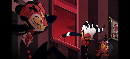
First of all, like you said, the character designs are way too complicated. Anyone who knows even the slightest amount about animation knows you want to simplify and streamline your designs as much as possible to make it easier on the animators. Vivzie is way too obsessed with her Deviantart OC lookin'-ass character designs to actually do this, even though it would seriously help to make the animation process way faster and easier. Beelzebub is seriously the best (or worst?) example of this.
I feel so bad for the poor souls who had to animate this. There are just way too many moving parts here, from her multiple arms, her wings, her markings, to her freaking lava lamp hair and tail?? It's just awful. And so many of Viv's designs suffer this problem, I could go on and on.
Like, I think it actually is a nice looking design, as a still image. Maybe not for the demon Beelzebub, but as a general furry OC, I think she's cute. But that's beside the point. I would love to see your redesign of her!
Next, the RED. So, most of the characters we see in Helluva Boss are red-skinned imps, which has been a common depiction of demons for centuries. One big problem I have is that there's little contrast in these designs. Let's look at our three main imps.
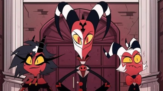
Aside from some white and yellow highlights, they're all mostly red and black. Their color palettes aren't distinct in the slightest! And, I mean, come on. Red accessories against what's almost the exact same shade of red skin? Really? It just doesn't look good. A little contrast here and there goes a long way, like... maybe make Moxxie's bowtie blue? Or Blitz's pendant green? I don't know, anything to help each character stand out, and help give them more visual intrigue.
It doesn't help that most of the backgrounds are primarily shades of red, too. Here's a few screenshots I found that really show this problem.
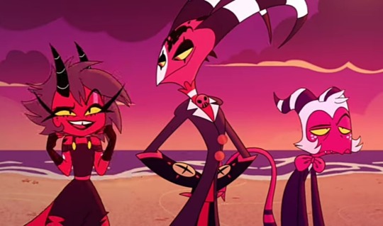
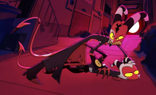
Look at all that fucking red. Like you said, there's such little color variation that the characters blend into the background. Now, to be fair, I did specifically choose these screenshots because I think they really highlight the problem, but this really is what so much of the show looks like. Granted, we do have a bit more variety in the different rings of Hell, each with their own main color, but this is still too much red, considering how much the color comprises the main characters' designs.
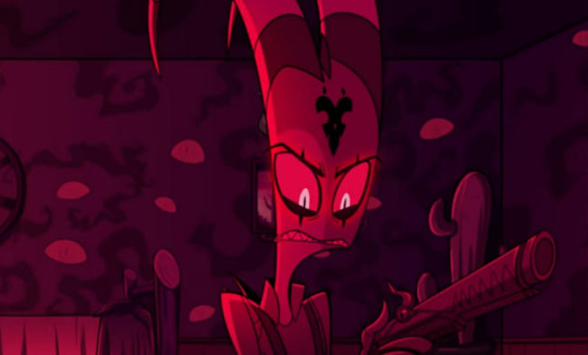
Next, like you said, Vivzie is really bad at making characters actually look like the things they're supposed to look like. Let's take Alastor as an example!
Oh boy! More red and black. So, Alastor here is supposed to be a deer. What's the first physical characteristic that comes to mind when you think of a deer?
Yeah, those big, impressive antlers! So... where are his? Oh, they're those tiny little forks on his head that are almost entirely obscured by his stupid emo hair. Like, come on! Giving him bigger antlers would have made him look so much cooler and more intimidating, and it would have been a great focal point for his design! It's such a missed opportunity. (I know he has bigger antlers in his scarier "demon" form, but you still could have made these a little more impressive.) And don't even get me started on those ears... they look more like fox ears or something. Like you said, a good design shouldn't need to be explained through supplementary material. We should be able to tell what a character is supposed to be just from looking at them!
Another great example is Angel Dust, who, despite being a spider, lacks so many distinct features we associate with spiders! He only has six legs instead of eight, he doesn't have pedipalps or chelicerae, and he also lacks that big old spider booty, which I think is such a missed opportunity, considering he is supposed to be in the sex industry. He isn't even remotely shaped like a spider, he looks more like a fuzzy stick bug or something.
Part of me feels like Viv is too afraid to make her characters look unique, so she just goes with the same, skinny humanoid design for just about everything. It's such a shame, because I really do think she is a talented artist who can make some really interesting designs. But then again, she also gave us Beelzebub, so... maybe not.
As for the reference sheets, maybe I wasn't looking hard enough but I couldn't find any official ones for the main characters, so if you could send those my way I would appreciate it! Though it honestly wouldn't surprise me if they were bad. I did look up Lackadaisy's and found them pretty easily and...
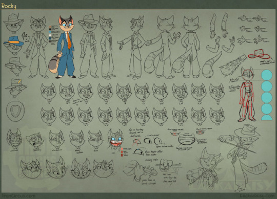
This is so freaking comprehensive and detailed, it's incredible! Look at all those poses and facial expressions!
Comparing Vivzie's works to Tracy's feels kind of unfair, since Tracy has been working on Lackadaisy for 17 years, and it really shows. This is leaps and bounds above Helluva Boss and Hazbin Hotel in quality. Rocky's design is tight; it's detailed, but not overly complicated. There isn't an obnoxious overuse of highly saturated colors, and there's such nice contrast between his fur, his eyes, suit, and tie, making his design very nice to look at. You can also tell so much about his personality and the world he lives in just from his appearance. It's such a good design, and Rocky is just one example from Lackadaisy! All of Tracy's designs are memorable and stand out from one another, unlike so many of Vivzie's characters, whose designs honestly feel interchangable.
So much thought and care has gone into Lackadaisy, and I seriously cannot wait for the full series, as well as all the other amazing indie animated series that have been coming out recently. It's sad that Helluva Boss is seen as the pinnacle of indie animation, when there are so many other series out there that are just.. better! Lackadaisy, obviously, but we've also got Digital Circus, Murder Drones, Monkey Wrench, and so many others that deserve way more appreciation than what Helluva Boss receives. And that's just from an art direction standpoint, we aren't even talking about writing. That's a whole other can of worms.
All of that being said, it's obvious that a ton of love and hard work went into Helluva Boss, and I hold absolutely nothing against the animators and artists at Spindlehorse. These poor design choices are a hallmark of Vivzie's art style, and they're simply working with what they've got. There is such wasted potential here because it feels like Vivzie is too afraid to step outside her comfort zone and design something that isn't a brightly colored, sharp-toothed twink, or skinny anthro wolf girl.
Anyways, that about wraps up my thoughts. Thanks for the ask, this was fun to delve into! And again, I'd be very interested in seeing you post your redesigns! 👀
164 notes
·
View notes
Text
OK, but hear me out
Say Ride the Cyclone were to be adapted into a film; imagine how much fun it would be to see it animated.
Because for the main plot, like the intro song and the mostly dialogue scenes in limbo, you could easily do a stylistic, but still grounded in realism style that a lot of modern animated projects are doing right now (think Arcane or Into the Spider Verse). But once each of the kids go into their respective songs/fantasies for what their life could have been? What if those were done in completely different styles?? Imagine the additional, visual storytelling that would tell about who they are as characters?
Like say, for Ocean's number, WTWN, everything became more simplified, and the characters (especially Ocean herself) turned into a more rounded, chibi-like style to enhance just how cutesy and likeable she's trying to portray herself throughout that number.
Or for Noel's Lament, everything goes black and white, and the characters become even more 2D stylized, and the film scales down to a smaller millimeter frame, more reminiscent of cartoons from the early 20's, when animation was just starting out, to enhance his idealization of "the olden days" (as Ocean puts it).
Mischa's song, This Song is Awesome could be animated with a more choppy frame rate, and the character designs turn a little more jagged around the edges, kind of like animated music videos (I'm thinking a Gorillaz band vibe). But as he transitions into singing about Talia, the colors start to bleed out over their lineart, and become more paint-like and Talia herself moves like a rotoscoped character (think Loving, Vincent that came out a few years ago) to enhance the sense that she's somewhere between a real person and a fantasy Mischa's built in his mind.
Ricky's song would, of course, be stylized after those sci-fi cartoons from the 90's, like X-Men or Captain Planet.
For the Ballad of Jane Doe, I would love to see something like what Wolfwalkers did back in 2020, where most of the characters (in this case, the other kids) are for the most part, animated like traditional, 2D characters with very clean lines and neat movements, whereas Jane herself stands out for having messier, sketchy line art, and looks more and more unfinished in her animation as the song goes on, because she can feel more and more of her own identity being lost.
Constance's Sugar Cloud I could see done in the classic 2D Disney style (i.e., the Renaissance era of Disney, like the Lion King or Little Mermaid days) because not only is it really smooth and colorful and just all around nice to look at, but it reminds the average moviegoer of their childhood growing up with those movies (among others, obviously), which ties in nicely with Constance's preceding monologue about remembering her own life, and the good that came with the bad.
I'm even tempted to envision the first half of the finale song in a different style, when the stage production would show a quick projection of Jane/Penny's life after she returned to the world of the living. Imagine watching this animated film, and for that segment alone, it becomes that really hyper-realistic, almost uncanny valley CGI animation style, to show that she really has joined the world of the living, i.e. our world, among us, the living breathing movie goers watching this, and watching the other kids still in limbo fade back to that main art style for the final number.
I don't know; it just feels like something that would be so engaging to see from an already compelling storyline and characters. Especially with more experimental animation projects on the rise right now
#random rambling#Ride the Cyclone#Ocean O'Connell Rosenberg#Noel Gruber#Mischa Bachinski#Ricky Potts#Jane Doe#Penny Lamb#Constance Blackwood#idk I just really love animation you guys#so naturally I have to bring my latest hyperfixation into that world#might even sketch these different styles#for a better visual idea#but I haven't done any sketches in a hot minute#so who knows
999 notes
·
View notes
Note
Any thoughts on the TOH pitch bible and pilot episode that were leaked? Anything you thought it was better than in the final product, or that the final product improved on?
Here is the pilot episode along with a lot of other Disney shows for those that missed it.
And the pitch bible
There were quite a few things I liked about the pilot better: the biggest being that Luz is actually bullied for her interests instead of pulling dangerous stunts that just make her look bad. Also, there's actual bigotry against humans in the Boiling Isles! Luz has to wear a disguise when sneaking into witch school! Lilith is more of a threat in this pilot than she was in the show! Luz and Eda feel more natural in the pilot; Eda still proclaims herself as the most powerful witch in the isles but it's obviously her ego talking while it's taken more seriously in the show. It feels like it's having more fun with itself instead of having an air of self importance.
A few things the actual show did better: Luz entering the Demon Realm. In the pilot, she just stumbles into it after trying to return Amity's passport (who is still a witch just attending a human high school for some reason). Luz trying to get her book back from Owlbert and being led directly to Eda works better for her character and the themes of the show. Also, in the pilot, Eda could just easily conjure a door to the human realm, which lowers the stakes a bit.
As for the pitch bible, it certainly is ambitious with how its world is set up: beta Belos was called Obron and was a councilor to the real ruler of the world, Emperor Pupa, who is currently in larval form and only its councilor's can understand what it's saying. Naturally, Obron is the real power behind the throne and plans on invading the human realm by possessing the Titan's body and he apparently needs a human soul to do that...
Yeah, I can see why this was simplified in the final version.
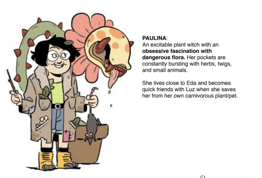
I do like some of the designs in the pitch bible better. For example, here's Willow, a.k.a. Paulina:
Here's Tibbles:

And lastly, even though everyone says this is beta Hunter, look me in the eyes and tell me that's not Baby Philip "Kill All Witches" Wittebane:

Come on, red outfit, blue eyes, hatred of witches, really hundreds of years old, the FREAKIN' DAGGER/SWORD.
That's a proto-Philip who was split into 3 characters, he's not simply beta Hunter.
Overall, both the pitch bible and the pilot are a mixed bag; the pitch bible has some overly ambitious ideas that (thankfully) became more grounded, but it also has more interesting character designs. The pilot has a lot going on in a mere 20 minutes but it's more fun to watch imo simply because it's not taking itself too seriously.
Despite all of these what-ifs, a show is only as good as how well it carries out its ideas. Toh has a lot of creativity and compelling concepts but its biggest struggle was always in its execution.
(P.S. any accusations that Disney made Dana add Hexside are now null and void because both the pitch bible and pilot had Lilith as the Headmaster of Amity's magic school)
#the owl house#luz noceda#eda clawthorne#emperor belos#philip wittebane#toh hunter#toh beta#toh william#toh critical#toh criticism#asks
85 notes
·
View notes
Last Seen Blogs

municipalmusedump-blog
Multimuse Indie RP
municipalmusedump-blog
Multimuse Indie RP

onecalltorecovery
Untitled
whatisthatmae
Strong Heart
teethr0t
FIX FAX FUCK YOU