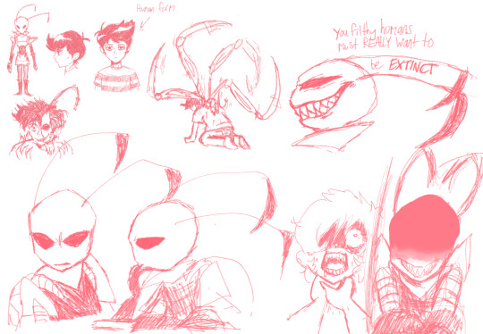
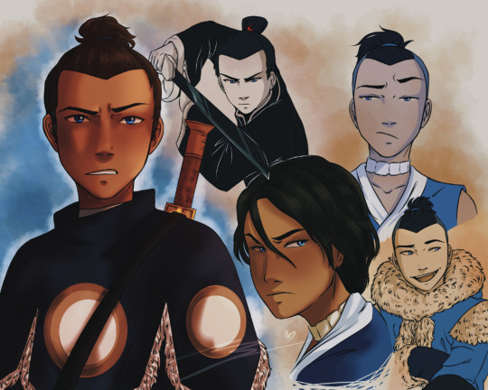
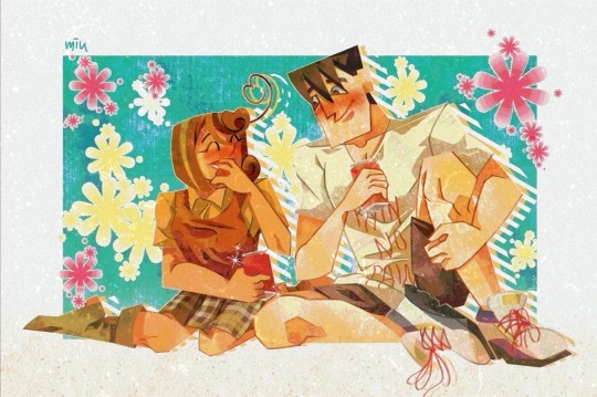
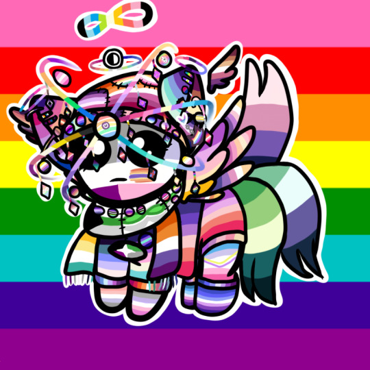
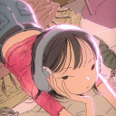
#i like how you can see the artstyle in this change because i drew the first couple a year ago and then picked it up again intermittently
Text
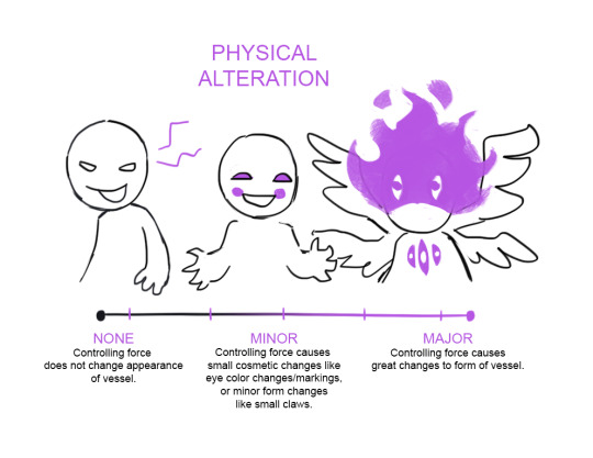
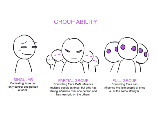
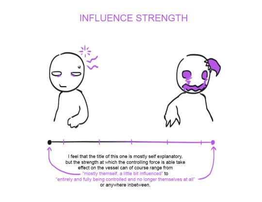
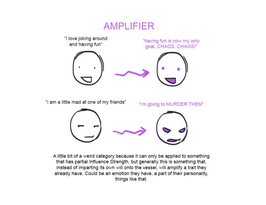
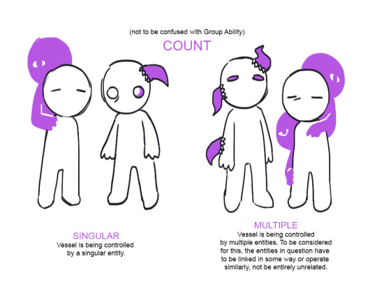
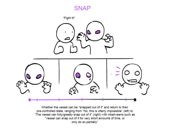
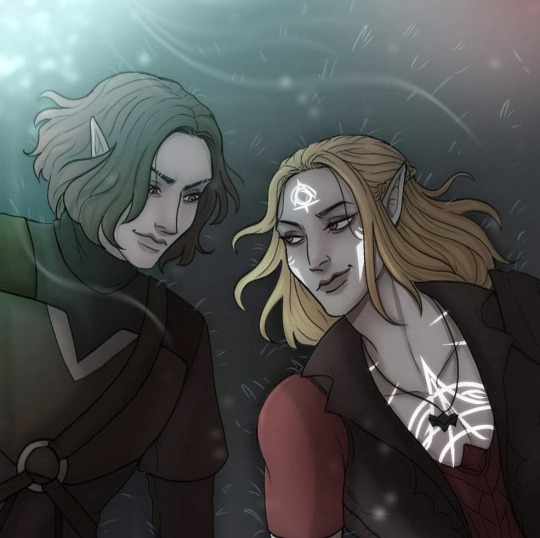
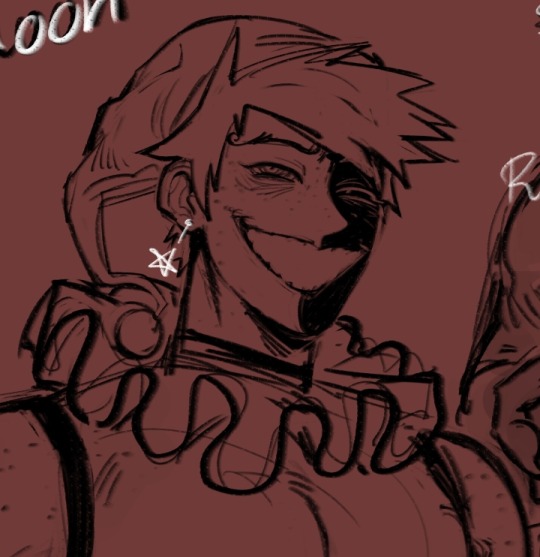
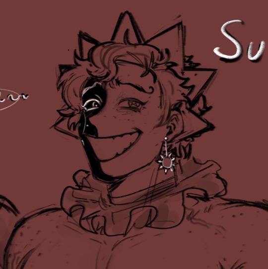
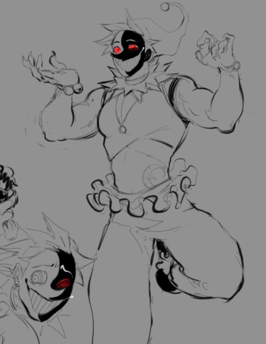
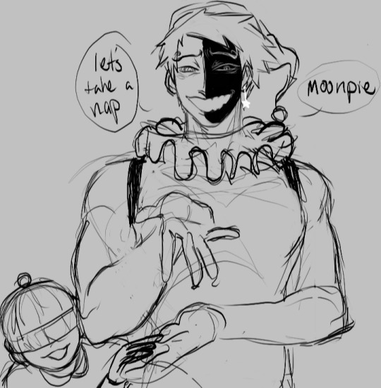
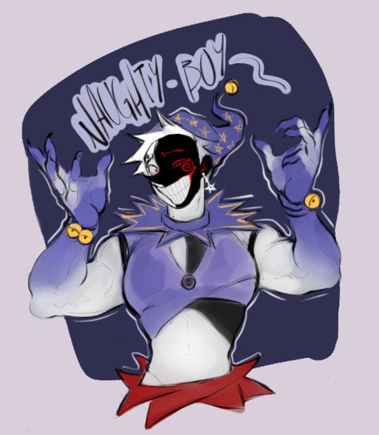
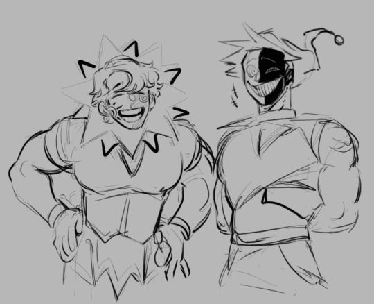
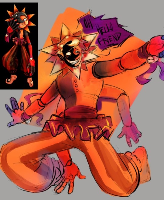
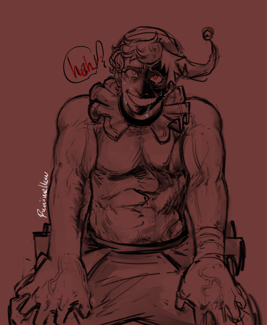
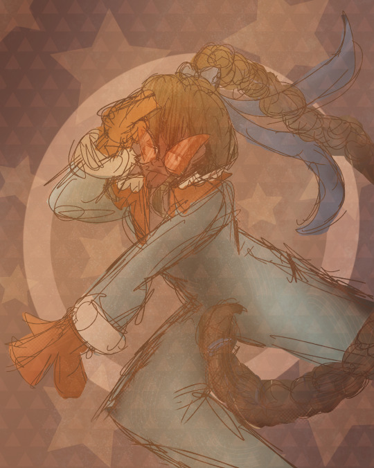
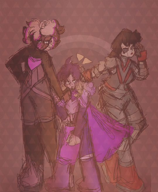
Hello i'm a normal person here's some stuff i drew to illustrate different traits different "person getting controlled" tropes can have
edit: obligatory possession shorthand code link because people seem to be using this like the possession code but just. without the code part
edit: DO NOT BE HORNY ON MY POST 💥💥💥💥💥💥💥💥💥💥💥💥💥
#if you see tumblr flagging this its literally not mature i dont know why it got flagged#i like how you can see the artstyle in this change because i drew the first couple a year ago and then picked it up again intermittently#this aws just an excuse to draw a bunch of tiny possessed guys. ''what am i supposed to do with a possession hyperfixation its not like you#can draw possession fanart'' Yes You Can If you really Believe In yourslef#This isn't even all the traits i can think of there's four more but they seem kind of boring to draw and are mostly self explanatory#Less Unique my Ass#ThePossessionHyperfixationIsNeverEnding
50K notes
·
View notes
Note
How did you find your style? Im still trying to bring my mc to life and im still struggling with the process :( I feel so weak. Im trying to spot the mistakes but im repeating them T.T Pray for me plz
Try something new until you find it! works for me, and in my opinion, art style can be changed based on the fandom you are in.

This is what I drew in 2011, the beginning of my digital art, (I still do not have a digital pen, or tablet drawing at that time so I have to draw with a regular mouse)
As you see, the big anime eyes, the art style was based on an old anime I watched back then. (such a sailor moon, magical girl, Conan, sugar sugar Rune can't remember this one but the mc is only 11 bruh)

Okay but move to the next era of my art style, it's my kpop stan era (2014-2018), my art improved a lot because I have the motivation for those boy groups, I want the best for them, and they're the reason I started drawing men. (they are everything to me back then, I'm so cringe, I turned my bedroom into a little museum of them +i still have a pic lmao💀)


Okay next is my Jojo era (2018-now), I love what Jojo did to me, it turns me 100998% gay I draw nothing but gay men (my blonde men obsessed started from this era, DAMN YOU DIO AND GIORNO), and enjoying it, helps me improve my anatomy a lot. trust me Jojo really turns people gay and quite muscular.
And it turned to looks more western(?) artstyle when I started playing DnD and the franchises game such a The Elder Scrolls, Dragon Age, Fallout, Baldur's gate, Assassin's creed and the Witcher in 2019, with all the materials they had, it made me draw JAWLINE. a lot of jawlines.
I want you to know that Artstyle is very unstable it can change over and over , even you didn't notice— like literally just look at Agatha LMAO it's only 4-5 months apart.
So please don't give up! I'm sure you'll find yours soon!✨💖 it's about times, practice and patient.
#my family is not support this#but they still let me draw lmao#self-taught is real#so please dont give up 🥹#asks#i feel like pro lif—#personal
63 notes
·
View notes
Note
Okay HI hello 👋👋
I saw ur art about Sun & Moon through a reblog and I am such a simp for those two omg so here's a rant :33
(Also if you're not comfy with this pls ignore this rant then, and I am so sry if that is the case!! Will stop immediately if you tell me to /srs)
-------------------------------------------------
CAN I JUST SAY I am sosososososo in love with your desgin for the dca cuz holy shit I have never seen anything hotter. O.O LIKEEE THE HUMANOID VERSION??!?!!?? UGH soooo goooodd 🥵🥵 I love the designs and the- the little EARRINGS as well?!??! Omg sooooo cutee aaaaaa 💞💞
and-and omigosh UR ART IS SO GOOD AS WELL!?!? I straight up just wanna munch it. I am eating ur art fr. In LOVE with ur artstyle it's so yummy 😍
Anywhoooo I also scrolled through your dca tag aND *GASP* ECLIPSE?????? 😍😍AND I?? WANNA??? BE ENVELOPED????? BY HIMM??? (I feel like mans would give THE BEST cuddles on the planet!!!)
HOLLLYYYY SHITTTT thE SIZEEEEEEE
Big tall omigoshhhhhhHHH M- my brain- my heart my- mY EVERYThIng is mELTING! ! ! ! ! Literally his size just does something to me I cannot comprehend why omigosh
(*lays in a puddle on the floor*)
I can imagine sosososo many different scenarios where that height could be used aaaaa >~< <333 ;P
-------------------------------------------------
Omg if you have any HCs (and *wanna* share, ofc.) about him (Or about Sun & Moon) I'd love to listen to you ramble about them??? <333
So curious about ur HCs & would absolutely love any crumbs about the dca ksskksskkdkdjdks ❤️😂
Uhm uhm first off, thank you so much I can't rlly put into words how sweet this is and I totally don't mind the rambles because me too. And also because its been YEARS since I last used Tumblr or did anything answering Ask is a bit tough for me.. MmMM
Although I don't have many HC at the moment.. I can however give you a little insight I have regarding my Human DCA :]
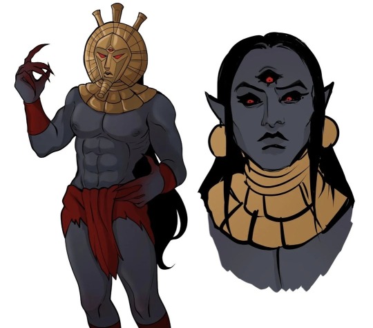
Moondrop (Moon) and Sundrop
- when I first designed Moon (after the game came out) he had a much wilder look to him, especially the face because I was really into the idea of him being simply insane hence the red.
- later when i got back to his design and adding colours I thought that it would be fun to make it Blue and white themed, which I actually didn't see a lot back then
- he wasn't supposed to look human even as a Humanoid, I liked to think that Sun & Moon simply had a renovated body. They are just as much Animatronics as they had always been, robotic parts and everything but with a bit of twist
- So then onto Sun.. the thing is its sad to say but I never explored much with Sun's design back then as much as I did with Moon, so I can't provide a good reference
- although I had a rough idea of how sun would look like I never quite liked the way I drew him, so he's always somewhat been stuck in this unfinished stage
- Then there was eclipse, who was my absolute FAVORITE at that time, I don't think I loved a character MORE THAN ECLIPSE EVER when I was drawing him out
- yes!! It was very much inspired by the 3D render shown here as the ref, though I did make some changes of my own to the design as well
- I had a lot in my head when I was drawing him, but the one thing that I loved most about this design still to thisq day is rhe face. The way I him to look back then was sort of a mix between my Sun and Moon designs, only leaning more towards Sun in colours and Moon in appearance with the crazed look in his eyes

The height was just a funny little thing I thought of, cuz imagine this giant fkn ahh robot just comes in here and picks you up 💀 god I would piss myself
Cough..
So in regards to the new design, I did kind of get rid of the animatronic feel to him that I had done with the DCA and his old design, all of them now look a whole lot more Human which is what I intended for
Eclipse has a few scars around his body; right forearm, left side of his torso that leads all the way up to his chest. Plus a bit of his face that is burnt which you can't exactly see because of the Black spots
Overall I like my newer designs quite a lot and has also changed a lot, this is probably the most insight you'll get out of me abt my art 😭😭 cuz I don't usually ramble this much otherwise
I might come up with some head canons at a later date, but they'll be fun thats for sure ;)
#rants n rambles#ruiis art#digital art#fnaf security breach#humanoid#moondrop#sundrop#eclipse#eclipse fnaf#fnaf daycare attendant#DCA
31 notes
·
View notes
Note
Have you concept art for your comic? Btw I like that pic of Z holding that ball of a smeet. How long was the process of this Timelapse?
I do have concept art! I’ll show you! Also thank you so much! I never drew something like that before, it took me 3 hours. Surprisingly, the Timelapse process was very quick. I’ll post a video of it down below!
Anyway, time for concept art!
I began Project Doomsday early last year in August at work. Back then, I had no interest in Invader Zim like I was when I was little. I would cringe at just the thought of it and all the weird things I did involving Zim. But when I was at work, of all things, Zim just popping up in my head! It was like, “HEY! REMEMBER ME?! HEY HEY HEY” It was pretty annoying. So I did what any rational person would do! I began to draw him but with a twist of my own.
This was the first drawing of Z. You can also see an early version of his human design. It was this exact moment where my whole life changed forever. “Goddammit I’m back into this fandom again.” And I haven’t regretted it since.

These are early designs of Dib and Gaz. Jeeesus, they look terrible. Hell, even I thought it was terrible back then. Originally the AU’s artstyle was going to be very different but I went with a more 90s anime look because it’s my favorite.
Now, this drawing is pretty cool. That look of pure hatred. Aghhh, I love it!! It just screams, “When I see you, I’m going to kill you” I also didn’t know his blood was supposed to be pink so I drew it green.

Yet another good sketch! This is Z getting ready to do one of his experiments. I bet you can tell what’s going to happen to that dog over there.

Hey look it’s Gir, the zombie robot dog thing! This was an early sketch of him. Designing him was very hard.
Here’s Z bein’ silly 😛

And this was Z’s “official” design… I hate it. He looks like a stick bug and his head looks like a booger. I mean, I know I purposely designed Z to be super skinny, but you could at least tell he was strong. This… this just looks like a twig. Twig Zim. Invader Twim. New OC anyone?

And finally, Z’s official design. I have to say I am very proud of this one. He looks super deadly and stuff, I love it! 100/10.
Even though I at first regretted being back into this series, I’m happy I did. I felt like I embraced a part of myself and those silly memories. Believe it or not, Invader Zim saved my life back then and I’ll always be grateful. I love you, you green gremlin fucker.
Okay, enough with the mushy stuff, here’s the Timelapse of my newest Doomsday art! I was listening to Resident Evil: Dead Aim - Save Room. Even though the AU is supposed to be horror, I honestly felt like this song matched with the theme, at least with certain parts of the story.
23 notes
·
View notes
Text
im so scared right now. this is the first time ive posted on here in a WHILE so my artstyle is :skull: completely different. i plan on revamping this whole uhh profile. ill still keep up the artwork though so my growth can be visible :- )
so this is a part of my blue diamond au i was doodling. i dont plan on making any comics or anything just some little silly pictures cause i like that kind of thing.
so i kind of felt like keeping all their previous personalities, i dont like when they take after the one that they were replacing, but thats just a personal preference. im just gonna infodump lmao
yellow - since shes more of an easily aggrivated one and has a superiority complex, i thought instead of controlling gems like white does, she could paralyze them, so the finale keeps its effect while still being in character. her pearl is still the same, likely a different outfit or form though, i havent decided yet.
pink - she's still childish and tempermental, but it's more forgiven due to her rank, and it's less because of her responsibilities. her old pearl, pink pearl, was still given to white, however white also already had a pearl. she just has two now. ( it is not our regular pearl, its a new one with a new design ill give. ), she's probably the one who needs them the most, and they will NOT be controlled, pink pearl will just be rejuvinated and given a new form <3 more on that later. our pearl does not exist in this au, or she does, i guess, but since our pearl is just the "default" settings, i feel like THIS pink would give her a form that actually matches her, and due to the different style of her being raised, she felt less remorse for damaging pink pearl. still remorse, just less so due to her desensitization and her having to shatter gems with her role.
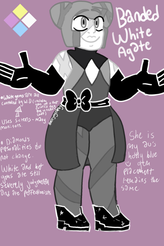
white - this was mentioned in the artwork but my handwriting is sloppy so ill repeat it. she controls all the gems in her court, because she wants perfection. this includes the gems of different colors, for example.. our peridot, our peridot WILL be a different gem, and she'll probably be a light pink naturally, white when controlled. during future all of whites court will be freed. these gems are controlled from screens, like the ones in yellows room in SU:F. most of her gems remain idle until necessary, but her pearls would assist her in controlling them because. That's a lotta work. she likely has a lot of different gadgets to figure this out cause, yeah, the gempire is big but . . i made this up like an hour ago so cut me some slack.
blue - blue will still be emotional, and that's likely a causation of her rebellion. her pearl is the same as hers in the canon, she did not hit her like pink did. their relationship is still toxic, and like rose in canon, she was trying to change. she just failed. while pink affected the gems because she didn't realize the power she held, and never finished what she started ( spinel being abandoned... she's a little freak for that honestly. also commanding pearl to stay silent, (i don't think that was intentional, i think she just felt like it was a normal request, and didn't realize how much power she still held. that could be debated though cause "for my last order to you as a diamond"..)
i think blue affected them emotionally. guilt tripping, self pity, and 2-D thinking. blue was probably more prone to shattering, but would also be very hypocritical. she could not see from the rebel gems perspective EVEN THOUGh she's trying to recruit them. to her, she just wants to win.
anyways that was what i was thinking lmao i kinda just made this up #Sorry
i only drew banded white agate because i did "random steven universe character generator" and it was like "holly blue agate" and i was like Yea Sure im down.
thanks for listening if you did. if not i dont really care i mighjt just add do this IDK WHAT IM DOING!!! this is probably just gonna be a doodle account for my different fixations. (except saw i dont like drawing real people. yet.)
#steven universe#steven universe au#blue diamond au#diamond swap#fanart#original art#draw#character design#character
12 notes
·
View notes
Text
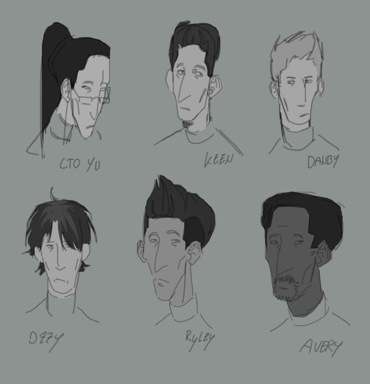
Subnautica headcanon designs part 1. I might make another one with Jochi, Hollister and a couple others. I’m not entirely happy with it but I’m not getting it to look any better so might aswell post it!
Second image was the thumbnail, as you can see, I didn’t capture a lot of likenesses and also decided to scrap doing ryley, but the shading was kinda fun so I guess there’s that. Seems like this page is going to become a dedicated subnautica brainrot page now, I think my OC stuff should stay on insta.
I’m not very happy with how the proportions turned out, I’m sorry lol. But I guess it’s some progress from the usual. I originally wanted to give danby black hair too but I realised that that’s just kinda what I default to and there are already so many characters with dark hair so I changed it to a blonde tone. I also tried to create more variety in face shapes but I’m still relatively new to that so I’m sorry if everybody looks kinda same-y or proportionally off.
Danby and Avery were done on the first day, then I drew Ozzy, then drew Yu on another day with much demotivating wich is why she kinda looks different to the others, then drew Keen and overhauled Yu again.
The artstyle was inspired by the Subnautica character concept art of Ryley!
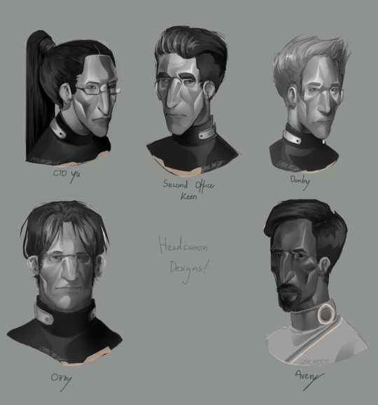
(Headcanon time)
To be honest, I’d imagine most of them know each other (except for Avery ofcourse), I’d like to believe that Danby doesn’t usually talk to people unless it’s for his job, but is still generally known and liked by the others, he finds his job boring but believes it’d be stupid to stop after studying for so many years.
I think they’d all be around 25-60 in age, with danby maybe being the youngest with about 28-31 years of age, matching with ryley who I’d imagine is around the same age.
I think Yu would be very goal oriented, but also trying to find solutions with wich everyone involved would be happy, wich mean that she’d know a bit about everyone, wich is why she feels so attached to the crew and wanted to disobey orders to try and save them after the crash.
I think Keen would really thrive in his job, similar to Yu, but be a lot more reliant on orders, somebody who likes to follow them more than to give them. He puts much trust into his captain and any other sort of authority figure above him, whilst feeling maybe a little too responsible for those under his command.
I believe Ozzy would be a very talkative person, like Yu he knows everybody a little, and everybody knows him. Except for ryley, who at this point has become kind of an outsider for just how much he tries to fit in with everyone else. Most people feel indifferent towards him.
I don’t think avery would be fond of being the captain of a ship, I don’t think he’d mind that much but I think a lot of the legal stuff he has to handle because of it would probably be really frustrating in the long run. He enjoys to talk to people though, and tries to help people in need if alterra doesn’t prevent him from doing so.
#subnautica#subnautica art#subnautica fanart#video game fanart#subnautica aurora#subnautica au#headcanon#fan design#CTO Yu#Second Officer Keen#Danby subnautica#Ozzy from the cafeteria#Avery Quinn subnautica
9 notes
·
View notes
Text
2023 YEAR IN REVIEW!!!


My artstyle changed a lot this year, especially after my shift from ibis paint to procreate after getting my iPad (drawing on an iPad is the BEST btw 100% recommend I love it way more than a phone and it didn’t die after a month like my old wacom 💀💀). I’m relatively happy with where my art is atm and I hope to continue to improve in 2024!
Explanation of all the silly art down below! (Mostly so I can tell y’all who the fanart is for but also cause I like rambling)
January: A drawing of my Rise Leo human design I did to test out a pixel brush I found for Ibis Paint. He’s very fun to draw hehe I need to draw him more-
February: I wanted to learn how to draw the future designs of Leo and Mikey along with CJ so I planned to draw them all together! I struggled with Leo though so I just got rid of him. Sorry Peepaw 😞😞💔💔💔
March: Fanart for @beannary ‘s TLP au! I love it so much so I had to draw smth for it hehe 😈😈💥💥💥 which reminds me I need to draw more at some point- might redraw it at some point cause I’m not super happy with how it turned out but I do like the idea a lot
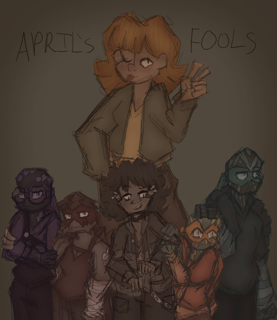
April: The month I created Reticent! April’s Fools was the first episode I came up with so I drew a chapter poster! It ended up being very different to the chapter cover I drew a couple months later but it’s still cool :D Leo is being weirdly affectionate to Mikey though what the heck that isn’t like him smh. Although I guess it was meant to be purposefully exaggerated sooooo 🥰
May: Reticent Casey!!! I don’t have much to say it’s just Reticent Casey HDKSGXKSHD this wasnt a very good art month
June: Krangified Donnie is literally my favourite concept ever thats it that’s all I have to say dbskdbwkh I adore Krangified Donnie and if the Rise brainrot takes over the Reticent brainrot for a while then I will probably be drawing Krangified Donnie during that time sorry not sorry
July: Reticent Chapter 3’s cover yippee!!! Still my favourite Reticent cover although Chapter 8’s is a close second (I can’t wait to post it once it’s been betaread yippee!!!). The scribble over Leo’s eyes is literally just because I was struggling to draw his eyes and i was getting annoyed dbskdbskdb it’s actually a very common issue with him (common Ret!Leo L). Also Mikey being reflected in the mirror is a reference to Mirror Man by Jack Stauber which I’ve basically considered his theme song since @aaronymous999 introduced it to me ebwjcbkwhd thank you Mr. Aaronymous! Also somebody said he was in the barbie box and I still need to draw that to this day because Mikey would’ve killed to go see Barbie.
August: RET DONNIE WOOOOO he’s being bullied again!!! I drew that piece for a colour palette challenge request and realised I got the prompt wrong so I just made it into its own thing 💥💥💥 it’s usually a flickering light gif but I chose to just use the version with the light on for this post. The photos in the background were really fun to draw hehe either April’s or Mikey’s is my favourite.
September: MY 500 FOLLOWER DTIYS YIPPEE (/my 150 follower DTIYS for tumblr). This one took me. Forever to draw and I love it to pieces hehe it was really fun to design Mikey’s room and figure out outfits for the sillies and idk the concept of a sleepover just seemed really fun to me dbskbdkdb- and all the entries I got were so so awesome I loved them all to pieces!!! I still look at them all the time hehe
October: FANART OF @endlesslogo ‘S HUMAN RISE LEO DESIGN WOOOOOO!!! This was the piece I started rendering on hehe it was so much fun to draw!!!! Although I did have a fight with rendering the hair for over an hour svsjegksbdk HOW DO PEOPLE DO IT FR!!!
November: Me and my friends were working on a crossover between our TMNT iterations so I drew all of our Karai’s together!!! Confluence Karai is on the left, created by Salem and Marine, New Stars Karai is in the middle created by Starla, and Reticent Karai is on the right created by me! All our Karais have such cool designs AHHHHH literally dead over them constantly/pos
December: Most of December I spent drawing Christmas presents so this was my present for Salem!!! Confluence!Jonatello my beloved….
10 notes
·
View notes
Note
Hi there! I wanted to ask, what were your impressions/thoughts of Tsurune season 2 episode 1 so far? And the colors symbolism in the opening song with the ribbons? Just curious about your thoughts, thanks and have a great day!! :D
BRUH. I LOVED IT??? FUCK YEAH, THAT WAS AMAZING.
I really wonder how all those annoying Anons who filled my inbox with garbage back in 2019 are feeling right now, because just in this one episode, KyoAni has fixed literally every defect that I had pointed out in S1. The amount of improvement is just surreal.
First of all, the storytelling this season. The freaking storytelling. You can tell the difference between works that a studio actually places their bets on and the ones they don’t by the amount of effort that the animation team puts into the flow of each episode. S1 was an ungodly mix of slow pace that suddenly went too fast at punctual moments without any warning, bad humor, boring tone, missing information, inconsistencies and shit that the animators pulled out of their asses to cover up plot holes. This one, though? Smooth as a feather. Full of well-thought details. Scenes and events connecting properly with one another. Flashbacks very nicely timed. It was entirely an anime-original episode, 90% non-canon content, yet there’s canon info at every single second. I love the little things, such as the way that we’re led to think that the MVP of the sports event is going to be Rika and the show makes use of every possible hint that it’s going to be her, until the very last second, where it turns out that it’s Ryouhei. Awesome screenplay right there. This episode was meticulously planned and it shows.
The changes in visual. The upgrade in the artstyle is the most easily noticeable thing about the animation of this season, but the quality is a million times better too. The characters also have a lot more facial expression now. I once talked about Morimoto Chinatsu’s incredible talent for character design and the way that she goes as far as giving not just different hair and eyes, but also different eyelashes, eyebrows, ears, noses, mouths, chins, jawlines and even fucking wrists to every single character that she drew for the novel. And seeing S1 doing the opposite and giving every character a base face was just... no. So now that there’s been a turnaround and the characters externally show what they’re feeling and thinking, following their journey is a whole new experience. That moment when the team stares at Minato after he answers Masaki’s question is pure character study right there. And it’s probably the most blatant example of this season’s improvement, given that we never had this in the previous one. I also love how the expressions are not just there, they’re on-point. On par with what the novel tells us about them. My biggest peeve with S1 was that I’d look at these kids and a voice at the back of my head would go “who the fuck are you people”. Those weren’t the characters I knew. They didn’t look like them and didn’t act like them. But now I recognize them. These are the kids I read about. They finally feel like themselves.
The symbolism of the series. By God, so many treats in this episode in that regard. The yesterday-today-tomorrow blossom splashed with watercolor in the team’s theme colors. The intimist approach of the shots. The way that Minato and Shuu’s positions oppose each other on-screen. The lighting, the colors, the smear filter… literally everything is more vivid and lively. One of the things I recall commenting about S1 is that it didn’t feel like a KyoAni anime because KyoAni’s works are very immersion-based. You can feel yourself being inside that world, together with the characters. But I couldn’t feel that from Tsurune’s first season at all. With this one, I was able to dive head-first into it. It was absolutely magical. I also love that the leaves that fly out of the targets whenever the characters hit now don’t look so obviously like CGI.
Personality traits. They’re fucking everywhere. Like I said, this was entirely an anime-original episode, yet there’s canon info at every single second. Even better: information that clearly contradicts S1 but that matches the novel. Seiya being a smartass little shit full of wit instead of a Minato-obsessed yandere. Kaito being a team-driven hardworker instead of an obnoxious asshole who wants nothing but victory. Ryouhei actually acting upon his lack of experience in archery to catch up to everyone. Nanao being charismatic and having screen-time of his own instead of being pushed to the background while all his personality and lines are used on Seiya. Minato expressing his thoughts and feelings instead of just being an emotionless doormat who never really does anything. We learned more about the characters in just these 20 minutes than the entirety of the first season. It feels like KyoAni has finally taken a step back to look at the material they had in their hands and truly took in what the novel was about and what each character had going on for them. Even the girls’ team was fleshed out in this one, which was honestly a great surprise. I think we’ve gotten from this episode all the little things we didn’t get from S1, such as the way Noa and Yuuna are fangirls of Rika. The way Nanao shines better as support than as main even though he’s so conspicuous. The fact that Kaito is good at soccer and Seiya loves soccer tactics. The way Ryouhei, who doesn’t know much about archery, is used as the eyes of the viewers, and how unpretentiously the lessons he is taught are presented to us as something that we should also keep in mind (for example, that the target is the archer and the archer is the target, and when you’re at the stage of the draw, you’re aiming at your very own self). And the way that Minato is something in this season. We finally see the inner machinations of his mind here aside from his struggles with target panic.
Lastly (and what I consider to be most important) is that the roles of each character and their relationships with one another seem to be in tune with the novel now. Well, okay, almost. Seiya is still being weird around Masaki, but I guess that’s because it’d be too sudden if Seiya started acting the way he acts in canon (y’know, like a normal fucking person). However, the difference is that the narrative is clearly pushing towards Masaki instead of Seiya now, as it should be. Kaito, Nanao and Ryouhei, who used to be just in the background most of the time in S1 are now set perfectly into their own functions and you can tell that they do exist for reasons other than just fill up the team positions. Nanao also seems to be his own person now instead of living through Kaito. Seiya is being shown looking after the whole club, as the competent club president that he is, instead of just Minato. Minato now has proper reactions to everything and doesn’t just completely ignore when Seiya is being a little shit. Masaki is now acting like a true mentor and already in the first episode we have him giving more advice to the boys than the entirety of the first season. But more than anything else, what caught my attention was Shuu. S1 did him really dirty by giving him scary jealous rival vibes and not expanding at all on his relationship with Minato. As I said before, they’re not your usual sports anime rival duo. They really respect and admire each other, are jealous of each other to some extent, but they’re friends first and foremost. They’re also opposites of one another in every way. We didn’t get any of this in S1, and now we’re getting literally all of it at once. What a fucking blessing.
Honestly, the only things I’m concerned about in this season are 1) Kaito and Seiya’s relationship. It’s probably too late to mend it now and make it the way it is in canon, and it also seems the animators are just not interested in doing that, which kinda hurts, but I guess we can’t have it all. And 2) Minato and Masaki’s relationship. I’m pretty sure that we’re not gonna get the same amount of content for them as there is in the novel, and in the off-chance that we do, it’s just not gonna have the same approach or the same quality. Minato and Masaki are mirrors of each other but the anime vehemently refuses to acknowledge this for some reason. They try to treat Masaki as a completely separate entity that has absolutely nothing in common with Minato despite all of the mystic, supernatural and fate-oriented themes that their connection is centered around and the fact that they’ve gone through very similar experiences and hardships in doing archery. But I’d rather believe that it’s a little too early to make a judgement and wait. Truth remains that the characters and their relationships in the anime will never be nearly as good as they are in the original work no matter how hard they try, so I’m just gonna take what I can get.
Anyway, these are my thoughts on this episode. It was one of the very rare instances where I completely approve of anime-original content in an adaptation.
#tsurune#tsurune kazemai koukou kyuudoubu#tsurune tsunagari no issha#kyoani#narumiya minato#takigawa masaki#takehaya seiya#fujiwara shuu#yamanouchi ryouhei#onogi kaito#kisaragi nanao#kyoto animation#seo rika#shiragiku noa#hanazawa yuuna
55 notes
·
View notes
Note
Okay first of all...your artstyle is AMAZING and the story elements and details are great! But lord the angst is SO good, dude it's no joke giving my daily dose of angst lol. I do have a question...I really want to make my own comic on paper but have no idea on how to do the panels right, any tips??
YES!!!! The first collage course I did in comics and comic design I had to do on paper so i can absolutely help you!!
Use a ruler.
So whatever width you want your boarder to be around the frames, always mark it with a ruler (this is if you're going for a more clean look, but i would also suggest using a ruler for the baseline sketches on a messier panel)
Thumbnail!! Always thumbnail!! It's a good idea with comics to like, lay out the foundation before you start to sketch the actual drawing and go all in, because you wanna see how it flows best. I'll show an example of the last 6 pages for It Runs in The Family (the FA comic)
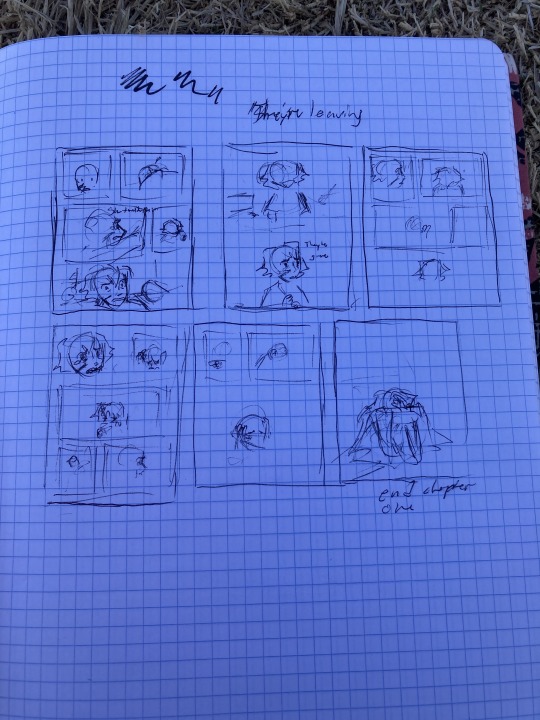
And you can see that I changed some thigs but generally its helpful to go in with a plan, cus you don't want to have sketched out and ruled out all the panels on the actual one and then decide that it looks goofy and you want to change it, its a lot of work lol.
Use whatever pen you like, comic's don't have to look nice to do well. It's more about the story and how you emote lol!! Use the frames to your advantage too. Don't be afraid to go beyond the normal square and rectangle ones.
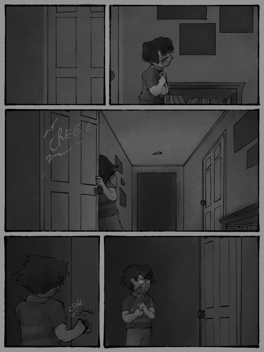
the way you do the boarders is really really important in expressing the urgency or the feel of the page. Don't be afraid to take and place the character outside of the boarder and coming into the gutter (the gutter is the space in-between frames on a comic)
I don't normally like using Onomatopoeias (fancy word for sound descriptors I just like saying haha) but they can really ad a lot to a frame, espessially if you're going for impact. ie WAM, SLAM, BOOM, etc
(these are some of my OCs)
You can colour comic pages you drew traditionally digitally.
One, you want to make sure your lines are clear and dark enough. So mess around with the contrast brightness and make sure there's no saturation when you take a photo of your page lol. Two, put it into your art program, I use CSP but I used to use sketchbook autodesk so I know at least that has the layer mode you're going to need.
You're going to need to take the Photo you put in and change the layer mode to "Linear burn"
Linear burn make's it so that the lighter the shade in your drawing, the less opaque it is So, that means you can use the lineart you did digitally, if you have it edited so that its basically black and your paper is almost white, works just as normal lineart
(now i'm pretty sure there's a way in CSP to take all of one colour and change it to a different one, which means you can take all of white and make it transparent but I am a big dumby and don't know how to do that)
And the final piece of advice I can give you is littarally just start drawing your comic if you want to. Because we all have to start somewhere. Don't go waiting to start it because you want "to be able to do it right" or "you're not good enough yet" because FOOL!! THERES NO RIGHT WAY TO DO IT AND YOU ARE GOOD ENOUGH RIGHT NOW!!
It may not come naturally to you at first, but keep at it and you'll get there. Everything takes time. Have fun!!
#birdieghostalks#ask#answer#gregory fitz afton au#comic#comic page#birdieghostart#my art#doodle#art tips#comic tips#comic pages#hahahha#it runs in the family
199 notes
·
View notes
Note
Hey so I really love your art and your body poses ars always so fluent! I have a very simple style what is your suggestion for artists who want to change from cartoony to a more realistic style like yours? And how do you get your anatomy so good!!!Also if you have time or effort could you give a small showcase of where you started and where you are now and how you developed the style!?!?
-Small side note in Watching and dreaming what sene made you cry the most?
-Personally balled my eyes out when the collector started crying.Sorry for the long thread but what do you think happened to the collecotr?
-KEEP UP THE JAW DROPPING ART!!!❤️
Thank you so, so much!
The time skip made me so happy yet so emotional but I think when the collector started crying after Luz "died", yeah that might be the moment :')
I started developing my own style the way it is now with my entry into the Hamilton fandom. I've had a style before, that I drew Miraculous Ladybug fanart with and it looked something like this
I was 14 when I drew this. I was still heavily influenced by an anime art style despite me never having seen an anime at that point in my life.
With entering the Hamilton fandom, however, I found animatics. Szin was an artist that had an art style I looked at with 15/16 and said "I want that.". So I started copying some things from szin's artstyle that I really liked (the way they drew hair and noses specifically). Over time I discovered other artists that I had art-style envy over. That being caw-chan and ziksua predominantly. I think I adapted more from caw-chan and szin than from ziksua but I would lie if I said her art didn't have an impact on me.
So my art style developed year by year.


There are big time skips between these deawings but if you're interested in my Hamilton era search #hamilton on my tumblr and scroll through it a bit. Or if you go down the rabbit hole on pinterest just enough, you'll find old art to. Search "megpeggs" on pinterest for that.
During Hamilton times of course not only other artists inspired me but I also started looking up tutorials or art commentaries on YouTube. Videos where an artist genuinely critiques their viewers art proved most useful, because they show you how to improve the anatomy, what basic rules you can follow to get anatomy right etc. And of course, references and realistic portraits. (That last drawing was created with a reference.)
If you want a more realistic art style you need to study the realistic anatomy and know how to draw something realistic. For that you need a reference that you look at again and again, basically analyzing it and taking it apart to see how what looks and how you can best copy it on canvas.


Depending on complexity it of course is rather time consuming but it's a huge help. If you know how to draw something pretty damn realistic, you can easily cartoonify or simplify certain features. (Not saying I'm so great at realism but I'd say I'm not that bad at it either)
Enter Avatar era.

A show where you can bend elements and a show that is filled with quite a lot of fight scenes makes you want to do fanart that is as dynamic. So you sit there staring at pose references again. Or you take pictures of yourself doing these things. I can't say how much the ATLA and LOK art style influenced me because there barely is any resemblance between the show and my art but I do ghink it had at least a little impact on my art style.
It involved a lot of referencing and copying (important note: not tracing!) in my case. And that's really the most important tip I can give here. Studying and analyzing the reference picture you chose. How long and thick are limbs? How big are the hands? The torso? The neck? How much smaller or bigger does this limb look due to the perspective? Learn the rules before you break them.
Some examples:
Foreheads are bigger than they seem! Remember that your character needs to fit a brain in there.
You should be able to fit one third eye between the two eyes - that's the usual distance.
Eyes are on one height with where the ears begin.
The nose's end is on one height with the earlobe.
The distance from the outer corner of the left eye to the outer corner of the right eye is the same length as the neck (in thickness)
Remember that the neck supports the head. When drawing a side profile it should start at the back of the head and leave some room for a jaw.
Hands are big enough to cover your entire face.
Your elbow is on one height with your waist.
Your whole arm should reach from shoulders to about the middle of your thigh.
There's space between breasts and the neck. You have a collarbone there!
Natural breasts hang. They have weight to them and get pulled down by gravity.
There's bones and organs everywhere in your body and they need space too
Skin wrinkles Angle your arms or hand. You're not a Barbie, you've got wrinkles there on elbow and wrist.. Furrow your eyebrows. The skin on your forehead wrinkles.
Everything I listed here is something you can go check out on your own body and it should be correct. Of course this is just the usual way anatomy is like - exceptions are found everywhere.
If my art style is something you look up to, as weird as it sounds, study it. Look at the way I draw things and try to copy them and incorporate them into your own style.
It's also important you go out of your comfort zone.
With TDAAC I couldn't name what exactly changed or developed in my art style more but I do know I started to hide hands less and challenge myself to actually draw that hand pose, staring at references from pinterest or my own hands doing that pose.
Art is a matter of learning and studying. It's time consuming, it's nerve-wreking, you may sit there and ask yourself why the hell you decided to do art but it's worth it all.
I'd recommend keeping your old art around somewhere. Over the years you can then always go back to it and compare it to your current art and see just how much you grew as artist. And that is something that definitely comes. The more you draw, the more you learn. It's not witchcraft, even if it might seem like it sometimes.
I'll add some more art of mine in a reblog, since tumblr only allows me to add 10 images.
39 notes
·
View notes
Text


A REDRAW FROM 2021 TO MY ARTSTYLE NOW
I can see how different this changed (since ive never came into my fav for doing anatomy before until now)
Looking back at my own works made me inspire alot from different stuffs ive went.
"Farewell... SpongeBob..."
INCOMING PLOT/LORE:
Its the cover of a comic book I drew, it was somekind of plot where Squidward regrets the things he said now that SpongeBob is gone. Like literally dead gone forever not even realizing about it.
From how obsessed he is to Spongebob in secret which Spongebob doesn't always know. The day that he said something life changing to Spongebob, he was pressured and really stressed that is caused by the lack of trauma, sleep, disturbance, and job overtime.
He began to burst out from his space and pointed out the most 'harshest' things to him. To the point was shown how deeply hurt Spongebob was from Squidwards words, he didnt have a time to process his emotions but just gave him a simple smile and maybe did agreed and accepted whatever Squidward had told him.
3 days later
Squidward is so upset that Spongebob never even came to work after his rants about him.
It's been day 4 now and Spongebob finally came to work again, just a regular and a usual normal act of himself. He didn't know why but thought about it. Even curious because he pointed out the obvious things and after those words Spongebob just showed up to his face like it's all completely dodged.
Now HERES the craziest part. Spongebob doesn't and isn't supposed to exist or appear in day 4 because Squidward is hallucinating about him. And his mind blinded his sense convincing that he's actually there which he's not.
In the horrible truth way possible.
After Spongebob ran away from the krusty krab after whatever Squidward's words spoke up and stabbed right through his heart and got them from his skull. He had a breakdown.
He went back to his pineapple house, locked himself from his room not letting gary inside. And just sat there and thought about those words Squidward said.
"I wish you don't EXIST!"
Then it hit him.
If those were the things Squidward wanted for him so as Spongebob would finish it 'just for Squid'
As he did whatever Squidward wished.
When Patrick checked up on why Spongebob suddenly left the krusty krab after not getting his order. He went to the pineapple house to see his dead friend lying on the floor.
Patrick called for help as the ambulance came in and brought him. Spongebob didn't make it sadly, he was too late.
After the news was shown on the television, 'Spongebob Squarepants committed s!#£%&e'
Squidward didn't know how to respond to that.
The way he thought it was all just some sort of a prank or a way for him to feel bad on. Squidward blinded himself into thinking this was just some sort of prank.
But it wasnt.
When Squidward wondered why Spongebob hasn't shown up from work he was concerned about whatever happened to him by now, but just again abou tthe news reported live. He thought this prank would last by now.
Now it's been day 4 in the present. When Sandy came to the krusty krab telling him about Spongebob, he began to question why this prank is lasting for 4 days now.
Sandy even screamed and yelled at Squidward telling him that Spongebob really is gone. That he died and k#ll3d himself from the room. Squidward was in shock to look to his side knowing that Spongebob is just here.
He wasnt.
This thing came into a big realization that he didnt give a thing about Spongebob after 4 days of his death. Didn't even knew that he did die. Didn't even showed up from his funeral because he thought it would be played as just some sort of joke.
He felt sorry for Spongebob and even got to his knees forgiving about him.
----
Coming over to his house for taking care of it, he sees a box filled with memories of him including Squidward. (Probably some drafted letters for Squidward as a confession but didn't get a chance give those to him)
This also gave him a shocking truth that Spongebob caught himself head over heels deeply inlove with him. The reason why he was so obsessed to him.
Pointing out the obviousness already. Squidward didn't take a hint because of his annoyance, it was hard for him to take it in. Is that what Spongebob has been feeling to him after all this time?
The day that was too late.
And we leave ourselves in this scene where Squidward reads one of his letters as he sits on Spongebob's bed all alone.
BOOM classic ending am I right?
#squidbob#spongebob#spongebob squarepants#squidward#spongeward#squidward tentacles#drawing#art#spongebob au#my art#fandomizer25
15 notes
·
View notes
Note
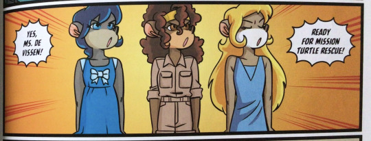
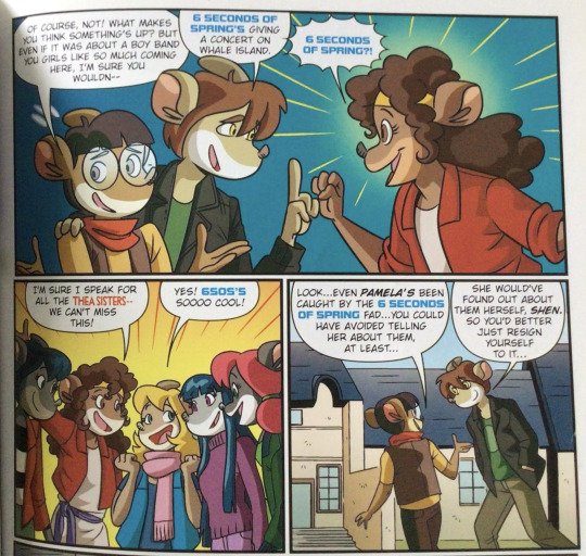
When I asked about whether or not the books became egregious friendship in the later books I was just kidding I didnt expect it to be that bad 😭! Tho, a bit curious, does the graphic novels fell victim to this as well? Does Vi become a friendship god again. I only read the first 3 and I want to continue it but seeing the sudden change of the artstyle makes me not... want to continue it (no offense to the artist but the changes in the comic feels more jarring to me than the main ones)
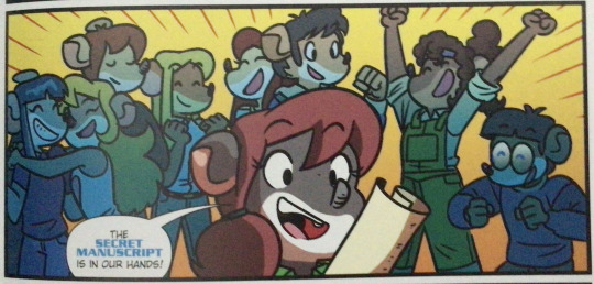
Well thankfully the friendship thing doesn't show up much in the graphic novels since they're more nature-focused than friendship-focused. So all things considered the comics, though they suffer in narrative quality because of Papercutz calling the shots it's still pretty decent all things consi--
........ sigh
I'm not gonna get into that many details about it because I can't be bothered with this one, but good lord what an underwhelming send-off to what was a banger comic series. Its moral/theme is basically the teamwork song from Sponge Out of Water, Ryan Jampole's sketches of the panels look especially sketchy in this one (when they were already kinda sketchy, both in an art sense and in the vibe sense), and the only thing we really get from it is Vanilla getting a bit of a conscience and letting the girls have this victory I guess (even though I'm not sure why).
Oh and Trap plushie in Vi's room. N-not sure why she has it, but cool easter egg, I guess?
Issue 7 is the best of the newer ones I'd say, I genuinely liked it. Issue 5 and 6 though... Eeeeehhhhhh, I have mixed feelings about them. The premise is cute, both books gave me platonic!Vicky moments to revel in, Vi got to dish out a verbal smackdown in issue 5, there was a whole espionage mission thing in book 6....... but at the same time you can sense the dip in narrative thought and quality, and a part of you can't help but grieve what could've been. Especially seeing how well the first half was, and that they got Ryan "Jampolinski" Jampole to do the art of issues 5-8.
Ryan

Jampolinski


Jampole
HOW DO YOU FUMBLE A BAG LIKE RYAN JAMPOLE, PAPERCUTZ???


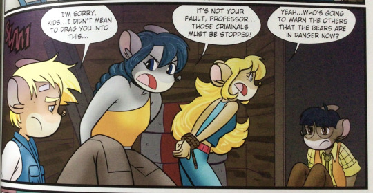


On second glance they don't look as bad as I remember them being, but there are just some panels that look... off. Or not very expressive. Or just...... Issue 5.
Don't clock him for the coloring, he wasn't the colorist in any of these; buuuutttt yeah :/
Even the Trap teddy bear is guaranteed to give you mixed emotions because on one hand it looks cute but on the other hand you look at Vi's proportions which makes you notice the proportions of the room which makes you realize the proportions of Vi compared to the room and-- yeahhh. Kinda understand why this is the forgotten child of the Jampolinski art gallery.
Like take a look at his portfolio on Deviantart and his Twitter (who's X? I don't have an ex) and there's literally no sign of his work for the Thea Stilton comics anywhere. I dunno if it's just a contract thing or something else but regardless it's kinda sad :'D
Anyway uh if you do plan on reading issues 5-8, just bear in mind three things:
The story is directed by Papercutz, so it's going to be screaming "THIS IS A KIDS' BOOK WITH KIDS' MORALS AND KIDS' CHARACTERS TALKING LIKE KID-FRIENDLY HAMLET MONOLOGUING ABOUT THE DAY AHEAD OF HIM, DO YOU UNDERSTAND HIS EMOTIONS AND THE LESSON HE'S EXPLICITLY TEACHING RIGHT NOW" the entire way through
Please don't clap Jampole for this, it's kinda embarrassing to come at him for a thing he drew back in like 2017 at earliest and y'know we dunno what happened behind Papercutz's neon orange doors, and also sometimes the forgotten child ought to remain forgotten sooooooo...... yeah, I don't want any trouble, just stating opinions here,,
There will be nuggets of gold panels there-- it wasn't nearly as bad as I remembered it being (in terms of artstyle), and there are some panels that I genuinely liked! It's just that the emotional range/nuance was just virtually nonexistent, probably because of point 1. There will be nuggets of gold in there, you just gotta sift through a lot of gravel to find it.
Anyway that's what I have to say about issues 5-8, issues 1-4 are goated and 5-8 kinda yeeted the formula of 1-4 out the window and replaced it with.... whatever 5-8 was (minus 7, I gotta reiterate that 7 is the best of the latter four). Aight see ya ^ ^
#thea stilton#thea sisters#questions with e#not my art#book 5 was the worst in terms of artstyle#but I think that that's because it was probably jampole's first time with the style?#you can kinda get the feeling that he wasn't exactly sure how to depict the girls in the panels he drew them in#and he only really kinda got the hang of it in books 7-8 albeit with a few kinks to work out#but then again said getting the hang of it is juxtaposed with the slapdash nature of issue 8's panels#a handful of the panels (especially full bodies) look rushed#das why i said sketchy; there are times where the panels look like actual sketches and also there are times where the panels just look.. of
7 notes
·
View notes
Note
What are your favourite art books? 💕💕love your work
thank you! 🌟 oh artbooks?! that's actually a really interesting question hmm... I don't physically own any (expensive ⚰️) but I've seen them online for some games and artists I like! idk how interesting they'll be if you're not into those specific games but nonetheless i think the art is a treat to see even without context! i'll answer under the cut, this ended up being rly long
Dai Gyakuten Saiban 1 & 2 / The Great Ace Attorney Chronicles (Kazuya Nuri)
- Nuri's soft lilac shading is so beautiful + unique to his art! I also appreciate that this artbook is mainly full of sketches and renders you don't see in game. They're so expressive, I wish other artbooks had more doodles of the characters goofing off, you can tell Nuri loves these characters a lot hehe (how often can you say the lead artist drew april fool's furry designs + canon animal plushie designs for the mcs)

the doodles that really stuck out to me are spoilers so i won't share those, but they really feel like snippets from a slice of life anime which humanizes the characters so well
Fire Emblem Echoes (Hidari)
- Hidari's designs are so classy and elegant, the way his fabrics all have a palpable weight and texture to them, and his coloring is so warm... there's a good reason why his designs keep getting circulated with praise every once in a while hehe. I really hope they bring him back for another game!
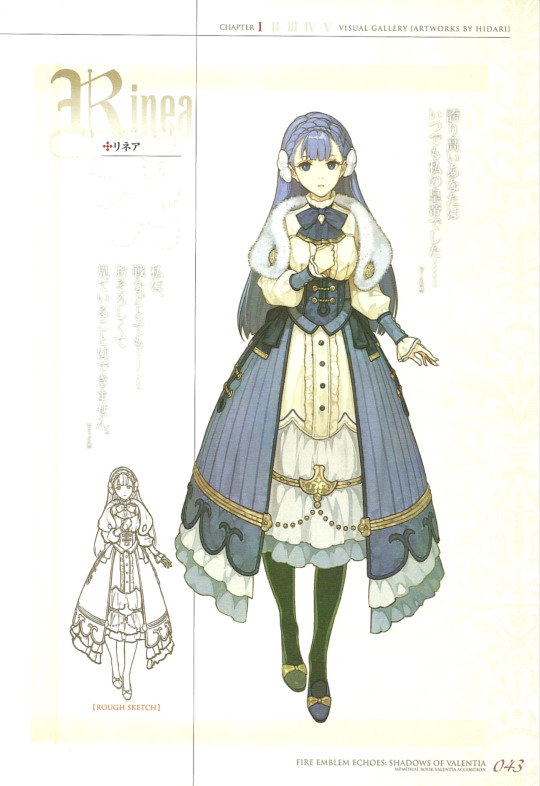
a personal favourite... she's very pretty!!
(on a side note i rly love Nuri and Hidari's female character designs, it's refreshing to see! not to say that modest designs are inherently better than more fanservicey ones, but i find that the female character designs are even more memorable because of it! it's mainly a personal preference)
Fire Emblem Awakening + Fates (Kozaki Yusuke)
- god of drawing armor and anatomy in perspective... his poses are so dynamic because of his mastery of foreshortening. I love seeing his work in Heroes, it only continues to get better over the years! plus he designed Lucina and Inigo so :D

as much as i love his artbooks my favorite art from him comes from fe heroes! his units have the most unique posing in the game, it always makes me excited to see more of his art (i especially love how conscious/deliberate he is with body types in his designs)
Persona 5/ 4/ P4 Arena Ultimax (Shigenori Soejima)
- Soejima's art influenced my artstyle a lot back in 2017(?) and 2021! (I mainly enjoy his b&w rougher style since it's so bold and also a fun style to draw in, although his painted stuff is fantastic as well) I enjoy seeing the Persona designs since they're so different to what I usually draw and it's really hard to capture the grace he draws them with (especially P4's)
this video of Shigenori Soejima drawing live changed me in 2017
youtube
persona 4/arena ultimax have my favorite persona designs out of the modern games!
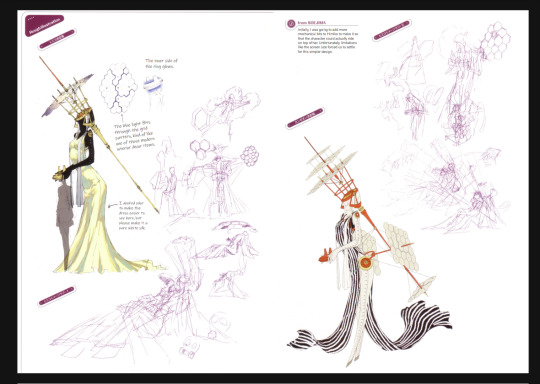
Death Stranding (Yoji Shinkawa)
- It's a shame you don't see Yoji Shinkawa's artwork in the game much (to my knowledge) because it's stunning how vivid, gritty, and yet effortlessly elegant it is. The monster designs are so haunting gahhh it's so cool! The mastery he has with ink and brush is insane he can be so loose with the lines and yet it conveys everything you need to know
the full body ink sketch of die hardman... it's so loose and yet it's very controlled aghh it's so impressive (i saw hunter schafer got her portrait drawn by him and like. imagine yoji shinkawa drawing you. ohmygod)
Okami (Takeyasu Sawaki, Kenichiro Yoshimura, Mari Shimazaki)
- when I was in middle school I didn't even know games could look like this?! The obvious traditional Japanese art influence makes the designs really unique even compared to modern games. The calligraphic brush strokes are so striking and I especially love the subtle ink bleed outside of the outlines, it honors traditional media so well. honestly this game's style in general is one of a kind
love how playful these are! i forgot how much i loved this game
Journey (Matthew Nava)
- (although it is an artbook I've only been able to see a few of the pages! Nava does have an archived GDC talk where he presents the book that I still have to take a look at) I found the color script for the complete story interesting since it shows both the color corresponding with the literal height of the mountain for the hero's journey that the game was so inspired by. Plus the alternate designs for the iconic main character are so cute!
masterfully crafted experience... i think this is the first time i've seen a color script for a game? (although i guess i'm not that familiar with games)
These aren't actual art books but I really like the concept art for them:
Transistor (Jen Zee)
- my favorite Supergiant game! It's a shame there's so little of the concept art out there (I'm pretty sure I saw more years ago but I couldn't find them more recently... link rot grr...) Jen Zee's painterly style is gorgeous and the colors are so warm, so uncharacteristic of the cyberpunk genre we're typically familiar with! her art was also a big inspiration for me when I was younger

Apex Legends
- apex does have an artbook but l mainly enjoy looking at the character designs and the transition screens for compositions (especially the season 4 Revenant's trailer ones, one day I hope my background/environment art can reach a level anywhere close to that). The character designs and overall setting are different from my usual style so it's cool to see the attention to detail in fabric texture, prop design, worldbuilding, etc. and try to apply it to my designs

this transition has such a strong sense of narrative in the illustration, it impressed me so much i drew something inspired by it (i'm not sure who the original artist is, i thiiink it's liam mcdonald...?? i really hope i'm not misattributing it;; out of the concept artists his illustrations look the most similar...?)
I'm interested in Outer Wilds' artbook and Disco Elysium's but I don't think I can look at those without spoilers! both phenomenal games that i really need to finish (i know outer wilds' main story but not echoes of the eye)
hit the limit on pictures 😔 and i've been sitting on this ask for a while... I feel like there are more artbooks that aren't coming to mind ahh I should really keep track of them better! thank you for the ask, it was nice to revisit these again 💞
#my asks#anonymous#this took a while bcs i wanted to hunt down the artbooks + write my thoughts on the art instead of just listing them
6 notes
·
View notes
Text


I can't sleep because i am lowkey nervous about tomorrow but also I just want to show yall basically my art progress (in terms of rendering) in the spam of 1 year contracting Utonium brainrot hhhh it's so surreal to see how different both of them looked like ahaha
(for guide, first pic to last, 1st week july 2021>3rd week july 2021>21st Nov 2021>9th Apr 2022)
Also witness me talking about each journey of my progress undercut lol
I cAN TOTALLY EXPLAIN THE FIRST 2 PICS. The first one is exactly from a year ago when my brainrot just started and I was like "well fuck I guess I have a new f/o now". If you ever see or feel familiar about the first art even though you prooooobably never see it,
its because it was an original picture for this redraw a few months AFTER that pic
Also if you notice, the art style for that one is totally different from others and shhh the reason it was like that is because initially I want to draw them in my actual artstyle around that time and I dont want it to follow the same artstyle like in the show. My friend said Utonium kinda reminds them of that guy from clo.udy wi th a ch.ance of meatb.alls and im like "oH SHITTT". There's more drawings of Utonium pre-brainrot era with this kind of artstyle in my folder but I don't think the world is ready for that yet lol
Anyway as I progresses to the 2nd pic, I changed my mind and was like "wait I actually WANT them to look like they're in PPG and not my own artstyle" so I slowly draw both of them to look more like the ppg style if you understand what I mean??? Althoughhhh in the 2nd pic I still want him to look a bit like my own style with my own touch and despite how much I don't like the reboot, I actually like his gray hair on his sideburns??? So if yall remember that phase and followed me from way way in the early days of this blog, I used to draw Utonium with those streaks before I gradually stopped doing that because of.... actually idk why I stopped??? I should totally add the grays back because I love it actually lol but anywayyyyyy the 2nd pic was also around july too me think? So there's probably like a few weeks gap between the actual totally real not clickbait picture of Chloe and Utonium 'together'.
That was how my render looked like for a few months until november (the 3rd pic).
So in the 3rd pic, I discovered this very magical spectacular magnificent function on CSP called t E xt U r e and holy fuck, let me tell you, I feel like I am a changed person. I was never the cringe person with mediocre render like I was, this legit marked a cultural shift in me, I just feel like I've been blessed by god himself. I spammed the fUCK OUTTA THOSE TEXTURES like it was MY BUSINESS. i pAID CSP FOR FULL PRICE I HAVE EVERY RIGHT TO USE IT TO ITS FULL CAPABILITIES AND SQUEEZE IT OUT OF ALL IT'S WORTH. Although I must say, my render time after that significantly increases. By standard I used to render around 3 hours? Now this bitch took 6 fuckin hours to completely. It wasn't a daijobu era ngl 😔😔😔
And holy fuck do I have a fuckin field day with it. You think I was a changed man back then? I have ascended, I am now r e b o r n. My friends feared my, my peers stared at me, my teachers are baffled by the amount of brainrot I drew at that time. How am I real?
I rendered like that for around 4 months until I discovered something even more cooler:
B L E N D I N G M O D E
Okay jk but hhh anyway for my current render; it's kinda more like an accidental discovery? I wanted to look for ways to cut render time because it was really tiring for me to render with a fuckton of texture layers and I also wanted to emulate my fav artist's render style soooo bad (it was luoman if anyone asked) and I kinda figured out how they did it? I mean they still do it better but like I was really inspired to be like them and lemme tell you, I cried for 3 days 3 nights unpaid vacation time when I figured it out. I wasn't kidding when I say I feel like I am a new person. I am quite pessimistic tbh, I'm insecure about my art but like this is the first time in like 3 years ever I feel like I did a major progress and I feel really good.
Why did I made this post? I actually dont feel good about myself, maybe because I am nervous about my test tomorrow and I just need a quick mood boost from myself. I don't believe I did any progress. But now, after typing all of my thoughts at 3 am, after I just put art phases of my braunrot together, kinda believe I actually did progress and I am proud of myself ;w;
#i didnt do any spell check because its 3 fuckin am#so im going to correct that the next day lol#but also i feel better after writing all of those haha#maybe sometimes I just need to sit down and not make myself feel bad for a second#and acknowledge my own achievement ;w;#asuka speaks#selfshipping community#selfship#selfshipping#selfship art#oc x canon#self insert#self insert oc#ppg professor#professor utonium#asukart
48 notes
·
View notes
Text
As an artist I hate anytime I see artstyle analysis (looking at the artstyle of a piece to identify who made it/if someone really made it) because I can literally change my artstyle for a particular piece on a whim. It's very easy to change how you do proportions, lineart, colors, shading, etc. Look at these, I drew all of these:


It's incredibly easy to change your style around. Like really artstyle analysis is like handwriting analysis, it's proveably not accurate. Yeah 2, 3, and 4 would probably be clocked as the same artist but 1, 5, and 6 are very different. But still, I drew them all!
#cw suggestive#tw suggestive#suggestive art#suggestive#suggestive tags are because of the last one having a little bit up in the top#artstyle analysis#art style analysis#I could find more but I put them all on my dang thumb drive
5 notes
·
View notes
Note
Super excited for all your wips! 👀👀
How do you render your drawings they look so cool!
*SWEATS* Mamser, I literally have no idea what I even do while I make art—
My rendering isn't that grand nor complex (and I don't think there is any rendering. They're mostly all just flats with barely any shading or lightning with this cartoony-anime mixed style), compared to other authors who also draw their character portraits for their IF's.
It's simple and workable, like my artstyle, and I don't think it'll get more complicated than that! If it works for me, then it works.
I don't have any big brain wisdom I can impart on you or for any other budding artists, because I'm no professional and is merely self taught, but I may have some personal ones:
Steal like an artist. Find something in someone else's artstyle that you really like and adapt that to your own! Artstyles are a personal mishmash of the artists you look up to, and not all are the same even if you and someone else may have the same artistic idols. This is different from tracing, however. I DO NOT encourage tracing over someone else's work and claiming it as your own. That is stealing, you utter criminal, and I will dropkick you if you do that.
Practice. Old wisdom, but it works and it's true. You don't become Bob Ross or Leonardo Da Vinci in a day after all. It's a struggle and it'll be frustrating, but I promise once you learn to draw the thing you finally want to draw, the high from reaching that achievement is absolutely real and so, so worth it.
References. If you think you can draw a sitting position freestyle from your brain, you're wrong, because when you look at a reference of that then at your sketch, you're gonna see a lot of mistakes in the anatomy, poses, perspective etc,. So, please, stockpile your references for every possible thing that you'll be drawing, because you'll absolutely need them.
Have fun. As artists we tend to compare our work to those who we think are better in the craft, when in reality we all are just trying to get better in what we do. Look, it doesn't matter if a 3 year old can recreate Mona Lisa in perfect detail, if you enjoy doing your work then that's already enough. I prefer to see "better" artists as inspirations to try and achieve more, not as some unachievable pedestal. You can achieve that too! May not be as quick as the rest, but you will get there in your own pace. Art is a journey, not a race. Take your time, learn what you want to learn, and have fun!
Experiment. You gotta if you wanna find out what stuff sticks with you and what doesn't. It also helps you find out a technique you might like for sketching, lineart, coloring etc., or if you just wanna get the hang of something first! OR if you wanna try out a new artstyle! Art is a science, in a way. A wonderful alchemy of color, wrist pains, and shrimp posture!
Also thank you for showing excitement for my WIPs, anon! I'm trying me best to work on all of them. You get a mwah from me. 😭💙💙💙
Free art from L? How scandalous! This is also just an excuse for me to ramble about my other characters amongst my 200+ bucket of them.
Some of these are old, but I just wanna share 'em for the funsies.
And, yes, the light blue haired, dark blue eyed lady in black and glasses and guy in a green parka with a resting bitch face are Carmen and Everest, Ophelia's older siblings. I also have Weylyn's older siblings, Bleddyn and Riekka, but I plan on reworking their design first. Why do I have so many redesign plans for so many characters.
1. Random character I drew for Religions Class last semester. I loved her design, so I kept her. No name yet, sadly 😭

2. Rival Agent Team in The Company. No names yet, though purple haired gal is named Agent Carrion. All of the designs and colors were from picrews, I just changed whatever was needed to suit my own preferences.
3. Lucian and Louise Dagohoy doing a clothes swap (2020). They're siblings I love dearly. They'll show up in an IF soon. I have big plans for them.

4. Carmen and Everest. Had this for months now, and I had no idea when to show it. Might refine their design a bit when I have the time.

5. Mint. Yes, her name is Mint. Not a Familiar, but a different kind of Fae entirely. Did this on my phone in 2019(?). I was bored at the time, and wanted to do a simple doodle, so I drew Mint about to eat a carrot.

6. - 7. MSPaint doodles from 2021, during a boring class if I remember. First one's Quentin the Monarch Fae king because it's been a while since I drew that man, then Louise. She's usually drawn happy all the time, but I wanted to make her sad, so I did. Not that hard to draw on MSPaint, really. Great for lineless practice because there are no layers.


8. - 10. Raphael, Gabriel and Michael Zealon. A pair of twins and an older brother. They have the old designs of High Court Angels (this was 2021), and their conversation was based on a tweet I saw on Twitter. Don't ask why. I'm too sleep deprived to answer.

And if you're wondering what art program I use, I either use MSPaint (when I'm bored) or FireAlpaca (for most of my works). The drawing tablet I use is a Huion H430p. It's smaller compared to the normal drawing tablet (H640p) of Huion, and it's as big as a standard notebook.
I would add 20 more art if I were on my laptop right now (and also because most of my art is stored there), but that'll be all for now.
4 notes
·
View notes
Last Seen Blogs
manhuagum
GUM
atlasonstandby
the wind is howling
thugbbyk
K

famousninjawhispers
제목 없음
crps-chronicpain-ptsd
Life With Pain 🎗