#honestly i really liked working with a limited color palette for this one i should do that more often
Text
kids kids kids kids kids kids kids!!!!
(dtiys by @spinaroos-47)
#SpinsDTIYS#the owl house#toh hunter#toh luz#toh flapjack#dancy dance#ignore inconsistencies pls i had to keep my artblock in a stranglehold to finish this#honestly i really liked working with a limited color palette for this one i should do that more often#i just now fucking noticed that i forgot hunters gloves l m a o
76 notes
·
View notes
Note
If you are still talking about neopets designs, plz review lutari? I always wanted one of them

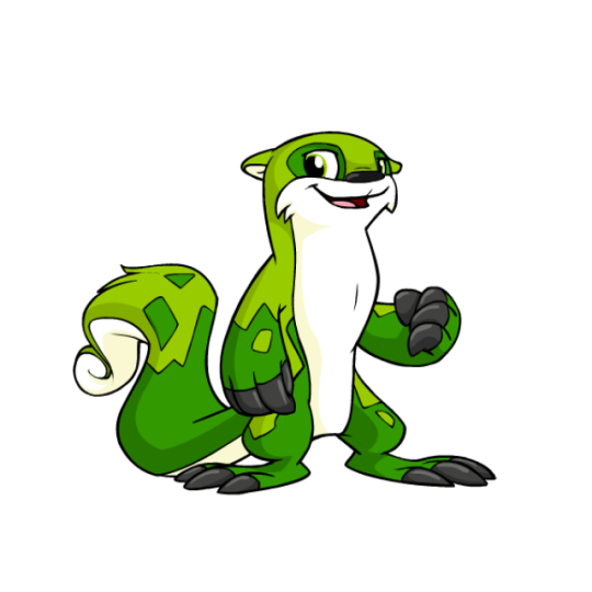


Lutari are probably most well-known for being one of the limited pets on the site, only being able to be made on their pet day and previously connected to the long-defunct Neopets Mobile game from back in the flip phone days. It's to the extreme where you can't even put one up for adoption, with them just running away instead of going to the pound. (Side note: TNT should re-release Lutari Island as a main site feature and make it so you can always create a Lutari while visiting. But I digress.)
Lutari are mostly just otters, but their very distinct, mottled markings, huge claws, and fluffy, curly tails are pretty distinct and make them feel unique, even though they're otherwise pretty straightforward. I like the amount of detail present; they have just the right balance of color, with white underbellies, black claws and noses, and two shades of the main color for their bodies, all of which is carefully balanced as to not be too busy. Overall, they're pretty dang nice... though they do have one drawback.

Considering that Lutari were released only shortly before conversion happened, you would think that they wouldn't have changed much other than losing their swimming pose (which is a shame, but a necessary change for customization). But in actuality, they actually changed quite a bit in various subtle ways, ending up with completely different proportions, markings, facial structure, and more. Here's a really great redraw that's more accurate to the original design, which really highlights the differences between the two:
The eyes are a completely different shape and the pupils are smaller, the mouth is smaller, the ears a completely different shape, the feet are weirdly elongated, the tail is less swirly... and they're such weird changes, because none of them actually have to do with customization.
Another good example of the changes made is Mr. Chipper, who was, weirdly enough, released prior to the Lutari species as a whole. He stands bipedally, and thus shows what a converted Lutari should've looked like. Also of note is the markings, which for some reason became weirdly angular on converted Lutari and less organic than they were originally.

And don't get me wrong, converted Lutaris are still fine, and are by no means ruined or anything like that. It's just a shame that they're less cute than they used to be, and that seemingly little care was put in to convert them properly.
Favorite Colours:

Maraquan: I went over this already in my Maraquan colour review so I won't go into too much detail here, but this design (based off a user submission) is beautiful. I love the use of an axoltle as a base, the pink and cream colors are lovely, and the gill ears are just perfect.


Pirate: While this design is pretty good as a whole, with a nice grey base with a few bright red accents and a properly cutthroat expression, it's the way they managed to seamlessly and subtly work a skull into the tail markings that really earns it a spot on this list. 10/10 no notes.
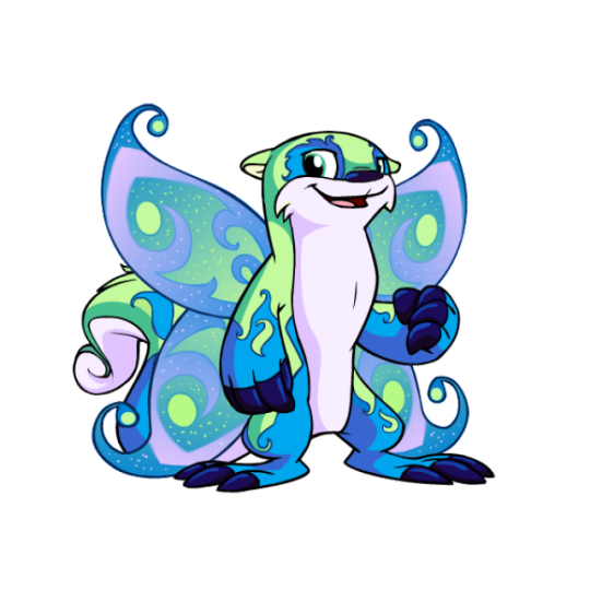
Faerie: While a little on the busy side, the faerie Lutari is quite pretty. The light green, blue and pink color palette works perfectly, and the beautiful swirled body markings work off of the Lutari's default markings perfectly. The wings also compliment it will, matching both the body colors and the intricate designs.
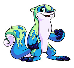
As an added benefit, you can also get a very pretty, less busy design out of this by using wings-be-gone, which arguably looks even better than the full color. I appreciate that kind of versatility.

BONUS: Camouflage isn't anything crazy, and it's not even all that camouflage-ish, but honestly I just really like this design. The use of a neutral palette and gradients creates a lovely and distinct color that's quite appealing for those who want a more realistic otter look or those, like me, who just like subtle and simple designs.
49 notes
·
View notes
Note
During your art challenge stuff like Vivid Shadows, how do you typically keep up motivation to continue doing it every single day? Because it’s been a struggle to keep writing stuff every single day. Granted this is my first time doing this, but I was wondering if you had any way you prevent creative burnout from doing these.
I have thoughts on this lol. There's a few ways.
First a disclaimer, I started working on these Vivid Shadows pieces about a month ago. I have up through day 19 done right now (cough see them early on patreon cough). So I've been spacing these out a bit more than one every other day. I have done the challenge day by day before, and it's doable. But I'm a busy adult that needs to pay bills, and I like to give myself some cushion.
But with that established, here are some thoughts I have.
1. Collaborators and Witnesses
I doubt I could find the motivation to do these kinds of big projects if I didn't have friends and collaborators doing them with me. This is different for everyone, but I find I'm much more productive when I have someone else to bounce ideas off of, send WIPs to, and honestly to judge me when I don't meet my goals. This can be a friend you're working with, or a discord server where you share updates, or any other online community that you're a part of.
2. Effort Budgeting
For big series like Vivid Shadows or longer comics with a lot of panels, I do not put all my effort into every piece. There's just no way. I consciously choose to half ass some things, and tell myself "eh, good enough" even if I know I can spend more time polishing. It is infinitely better to finish a piece at 60% of your full power than to pour all your heart into a project that never sees the light of day. If you feel up to it, you can spend more effort on some select parts that really make you happy. But those should be the exception, not the rule. And the more projects you finish, the better your half-assed work will become.
3. Creative Limitations
You have to define some bounding rules for your project, or you'll get stuck with decision paralysis and scope creep. For Vivid Shadows, the rules I use are pretty simple. Each day has a prompt, one color to use, set dimensions and a hard deadline. I mostly use a limited palette (3 colors + black or white) because I know I can spend hours and hours shading and coloring otherwise. Limitations foster creativity. If you have a tight frame around what you can do, your brain comes up with way more ideas.
4. Keep an eye on the clock
Part of what I like about projects like Vivid Shadows is that they have built in deadlines. I know I have to wrap things up by a certain day and time, and if it isn't perfect then so be it. I've done enough creative work to know roughly how much I can get done in a certain amount of time, which is very helpful for planning. The program I use for drawing has a built-in clock that tracks time spent on each document, which is a godsend.
5. Find your own methods
This is all just stuff that helps me, but everyone's brain works in different ways. It absolutely takes practice to enter creative mode at will, rather than when the stars align and you feel inspired. Start with small projects, and as you train yourself you can eventually finish larger ones. Remember, something small and finished is always better than something grand that never gets done.
Also worth mentioning, find the things that light up your brain. Personally, I've found that making my art horny is a powerful motivator for my creativity. In addition to the obvious neuron activation, I find it very satisfying to explore the boundaries of what I find attractive, like a mad scientist or detective.
6. Keep it fun!
None of this will work if you don't enjoy the project. There may be parts you don't enjoy, but overall the project should bring you joy. If the project isn't fun, change it or drop it and start one that is. You don't owe your past self anything. Even if you abandon a project, the work you put into it is good practice for your next thing. Make work you like, and move on.
Hope this helps! Good luck on your project 🙌
37 notes
·
View notes
Note
Honestly, when I think about it, I kinda find Gothel prettier than Rapunzel. Mainly because she looks more like a real person with real, non-infantilized proportions(with limits, that is, this is a Disney cartoon, after all). While Rapunzel looks like a fucking baby stretched out to be the height of a teenager, not even that, but a preteen! And also because she has curly black hair, which I do too, so I find that really nice. Lastly, I feel like her color palette works better than Rapunzel’s, even though pink and purple are my favorite colors. The wine red looks very nice on her. However, I will admit that I am sort of hesitant to say this stuff because at the end of the day, Gothel is still an anti-Semitic caricature. Her Jewish features are there to remind the audience that she is evil. Not to make her more attractive, as opposed to Rapunzel and her button nose and long, straight, blonde hair(and for that matter, as a curly black-haired girlie, I HATE how the movie used curly black hair as a sign of villainy, deception, and evil and straight blonde hair as a sign of beauty, goodness, innocence, and magic, because holy fucking shit what the HECK were the writers thinking. Oh wait, never mind, I already know.) And in addition, most people who find Mother Gothel attractive sexualize her to hell and back, and that makes me very uncomfortable, whether she is a racist caricature or not. Not a fan. 🤮
I agree. I always thought that gothel looked better than rapunzel. Rapunzel’s design is so ugly to me. Her bug eyes, her very small waist and her big her head compared to the rest of her small body is not appealing to me. I also found the pink and purple color palette of her outfit to be so ugly and all over the place (even though purple is my favorite color). They ripped off Barbie as rapunzel’s dress but made it even more childlike and generic to appeal to young girls. Her design in the movie looks even worse now because the movie aged like milk. Rapunzel’s design looks way better hand drawn imo. At least gothel’s body looks like it belongs to a real life person and I found her to be pretty(even though she looks like and is a antisemitic caricature).
It’s just so depressing to me that they changed her original design from a white woman into a antisemitic caricature. Her original design looks nothing like that and she actually looked scary there. Even the original idea was that she looked like a normal and loving mother who would show her true colors through out the movie or so I heard. Just seeing that concept art of her taking rapunzel by force after rapunzel found out the truth about her looks so good. Then the writers just decided it would be easier to make her a caricature to show the difference between white rapunzel and her. They also thought her design should also be overly sexual to show how “pure and innocent” rapunzel and her mom look in comparison. It’s so disgusting. Whose bright idea was it to put this ageist, sexist and antisemitic shit in a Disney princess movie? I guess the same people who thought it would be best to release this movie one year after their first black princess movie.
What you said was so true. The curly hair being seen as bad to compared to the long blonde magical hair. Hell, even the decision to have rapunzel’s hair turn to brown after it was cut to show it lost its magic were all awful decisions. It’s like this movie was written in the 50s or something.
people who sexualize gothel are so weird. I don’t understand why people are like “she is so hot” towards people who have valid issues with her. It’s like they think it’s a compliment when it’s not.
28 notes
·
View notes
Note
i've been following you for a very very long time (the snk askblog days !) and your art still blows me away every time. i just love your colors and painterly style. do you have some art tips, tutorials, brush recommendations etc ? i really want to improve my digital painting skills and i'm curious about your process
Oh no! Not the ask blogs..... but thank you so much for your continued support of my work 🥺♥
I think the most important things I always keep in mind is colour theory though I can't say im always successful each time I do it 😂 Honestly when I see guides it all never makes sense to me?? What do they want me to do even!!

These guys explain things pretty well though and much more professional than me:
Emel's Colour theory notes
Gigi's colour/lighting notes
And also this image right here
Honestly main things are
limit your palette - use a colour fill set to low opacity overlay or 10% opacity normal for the mood you want for the piece, your character might be wildly coloured but this brings it together
split/complementary palettes are great, saturate one side, desaturate the other for contrast (looks teal but its actually a grey if you swatch it )
don't you dare use white grey or black to shade! dont you dare!!!!
add a slightly more saturated colour in the middle of your shading gradient for some pop
personal taste but i like to dab some colour elsewhere where it might not belong 🤷♀️
my personal pet peeve is that i dont actually like swatching from character sheets im sorry the cat is out of the bag whats the fun if you cant play around with lighting and mood
most important skill is to not be scared to try things that are hard that you think wont work out!! trust in the process!! itll look like ass the whole way through!! use colour balance at the end if you need to!!
also colour theory relies on the ryb wheel rather than rgb which really messes with you in digital settings... thats something i still need to memorise more... awful
Also tosses this out here too: Jing's brushes are my current go to since I work more in procreate now
Anyways half the time I dont even listen to myself and forget the stuff i should be doing and i have to go back and ref my own art style so who knows!!! take this all with a lot of salt
109 notes
·
View notes
Note
I love the way you draw fire though! and your colouring is beautiful, I was wondering if there are any tips you could give for colouring?
OMG THANK YOU SO SO MUCH!!! ;A;
i'm still figuring out how drawing fire works tho and the feedback i got was super helpfull and got me a step closer to it i think!! during my last 2 drawings i've always had some super helpful feedback about the fire so i feel really blessed about that~
as for the colouring tips, well these are some of the tricks and methods i use;
1- instead of using a darker colour for the shading i just use a more saturated colour, kinda like this;

the added saturation makes the colour appear darker when in reality it's not! think about it like colouring traditionally with colour pencils. when you use a colour pencil the places where you added a lot of pressure look much darker than the places where you added only very little pressure - despite it being one and the same colour! done with the same pencil! the reason it appears darker is because it simply just has more pigment.
that's what we're doing here too, we're making the color appear darker by adding more pigment.
BUT
if we just simply stick with the exact same hue then the colouring would look bright and vivid - but still be horribly boring.
so i play around with the hue too!!
the circle determines the hue you're selecting and the colors you see there are all at 0% darkness but 100% saturation
despite them, technically, being equally light/dark according to the software they still look differently dark
rotate the hue in the direction of blue/purple for the shadows and in the direction for yellow to select the colours for the highlights
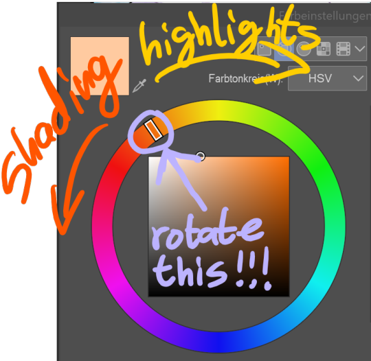
blue, purple and red are the best colours to shade white with, for black however it'd stick to blue or else it stops looking like black and starts looking like a very dark colour instead
2- give each colour it's own layer.
that way, if you notice halfway through that the colours you've chosen don't look so good together you can still make adjustements and edit every single colour without losing any of the progress you've done with the shading (note: do all of the shading on the same!!! layer as the base colour tho!!!)
many artists solve this issue by using predetermined colour palettes, that way they're guaranteed that the colours look good toghether but colour palettes save absolutely no time at all (adjusting the colours of a layer takes only a few seconds) and are extremely limiting when colouring so i just don't see any benefit to them
3- USE THE RIGHT BRUSH!!!! your choice of brushes can honestly make or break the colouring. the impact they have should not be underestimated, it's huge. which brush is best for you depends on your artstyle but personally i think brushes that simulate either watercolours or copic markers are the best ones.
if you use a software where it's possible to use custom brushes made by fellow artists then PLEASE do that. most art software comes with awful default brushes, and even for those that come with decent default brushes (such as photoshop) most free custom brushes made by fellow artists are still so much better than the default brushes that they're worlds apart
Clip Studio Paint (the software i use) has an assets "store" where you can download brushes made by fellow users. for other art software i'd recommend checking out deviantart for user made custom brushes if it's a software that existed before the downfall of deviantart. it's a huge goldmine filled with insanely amazing brushes for many different types of software.
personally i use a brush called froggy pencil for the colouring
4- add overlay layers to your art after finishing with the colouring. they can make a drawing really come to live and it's insane just HOW much they add to a drawing. usually i always either use a gradient, a solid colour or a soft airbrushed colour on the overlays and let them do their magic.
to show just how much of a difference overlay layers make; here's a comparision between my most recent drawing - and a version of the same drawing where i removed all overlay layers. see the difference?

...soo uhhh ... that's all the tips and tricks i have up my sleeve lol
hope it helped a bit?
31 notes
·
View notes
Text
Here's a spontaneous thought
What would it take to make my graphic novel using exclusively shrink plastic? How big would I have to make my pieces to make it functional?
For that matter, why wouldn't I just use a transparent, drag and drop template just in the computer? Why would I print it?
I've really been struggling to color my graphic novel. I think I'm missing the feeling of having a very limited color palette and having to make my own colors. Plus, I just don't understand how to color digitally. I can't just keep switching my coloring medium every hundred or so frames.
Another thing I originally struggled with, with the graphic novel, was scale. How big should I make the frames? 8×11 was waaayyyyy too big! 5×4 still felt a bit big, but it would definitely be good to color in. For the linework, 3.5×2.5 is perfect. I would never color on my original lineworks, so that size also mitigates waste. Plus, these little sketchbooks are fun to make and display and draw in, as well as incredibly easy to carry around.
I just feel like I should be able to fully color a frame in an evening after work, and even with everything I've tried, I'm just not getting that. I've thought about going back to pixel art, but it's still a matter of not feeling connected to the work.
I just don't have money for nice colored pencils. I don't really have money for food. I don't really have money for a mattress. But I need to try to get better sleep than what I'm getting, so sleep is winning this pay period.
Honestly, part of makes working digitally so appealing is that I have the tablet anyway, and one drawing weighs the same as a thousand drawings. Also, I don't need boxes of colored pencils and/or paints etc. Just one stylus, and I replace the nib every few months.
I don't want or need coloring this graphic novel digitally to be a whole alchemical spell that takes a thousand days and a thousand nights to complete. I don't need a million layers and all the fancy masks and crops and lassos. I'm not painting my magnum opus; I'm trying to make a graphic novel. Why does it have to be so complicated.
0 notes
Text
another assignment i wrapped up this past weekend was the first for our model-building class. it’s my first class of the week (10AM on Monday) and the class is meant to teach us how to translate the props we draft into scale models. a perfectly valid question to ask at this point is, wait, what do scene designers do...?
i’m still learning that myself, but (and i’m gonna put this in all caps to emphasize just how deep into this theatre tech cult life i’ve descended) SCENE DESIGNERS CONCEPTUALIZE THE BUILT ENVIRONMENT OF A STORY. THE TOOLS WE USE TO COMMUNICATE OUR APPROACH INCLUDE BUT ARE NOT LIMITED TO: RESEARCH BOARDS, DRAFTS AND BLUEPRINTS, PAINT ELEVATIONS TO EXPRESS COLOR ASSIGNMENTS, AND SCALE (MINIATURE) MODELS OF ENTIRE SETS AND PROPS.
in other words, we make really little things to guide the people that make the big things, and we are present very early on in the process of making a story come to life.
we have much creative power :)
anyway, model-building with E (or shall we call him...Madame T, in honor of his favorite supermodel, Twiggy. i’ll do a full character reveal later). model-building with Madame T has so far consisted of a month-long introduction to the neurotic and intricate hazing that is using an Xacto blade. we were asked to review a draft (blueprint, basically) of a theatre portal for Fiddler on the Roof.
(a portal is something that frames the opening of a stage. check out this one from Wicked. the portal is the dragon and that metal frame surrounding it.)
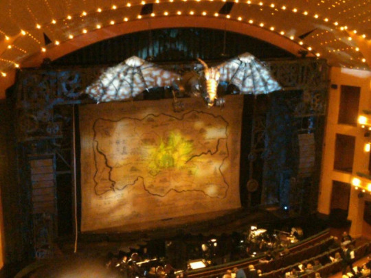
this is a process video of the portal we cut for class:
undefined
youtube
okay so notice all the tiny ass windows we needed to cut. that’s what i mean by hazing. nowadays you can do this kind of work with laser cutters but as first year scene design students, we aren’t allowed to use the laser cutters until later. my school is very into teaching skills the “traditional” way as we fortify our foundations as designers, and i honestly don’t mind it at all since that’s how i prefer to learn, too. but this project...
it’s not even that we had to cut all the tiny scallops on the side or all the windows. it’s that we had to cut everything multiple times because we were ultimately building this three-dimensional theatre portal. keep in mind that portals are usually “flatter” and “thinner” in design since they are meant to be very far downstage (close to the audience) and act as a “frame” for the rest of the stage and set. but just because they are meant to be flatter and thinner, doesn’t mean that they are 2D.
and also, the point of building a model is to express in a comprehensively detailed way what the final product should look like. so we weren’t cutting these lil windows just to see how COOoooL it would be to have a mostly flat thing with slightly elevated sections. we were supposed to be cutting a mini-version of the real thing, which meant that we had to cut as many layers as needed to express the real thing.
so the cutting in the video...imagine that x 5. not every house, window, or roof shingle needed five layers. but many things needed ~3. i’d say this project took at least 25 hours worth of cutting. this is what mine looked after i had crippled myself hunching over my desk for days with an Xacto:

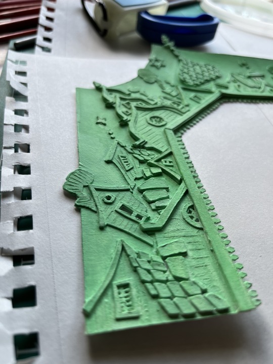
my green paint was inspired by this Nat Geo photojournalist’s accounts of an Arctic village. i’ve never seen Fiddler and opted to just go wild and tap into my own tiny reservoir of cool things i’ve seen over the years. all i know of Fiddler is that there’s Russian architecture so my mind went, what do I know that’s Russian? AH, yes. Evgenia. Look at how stunning:
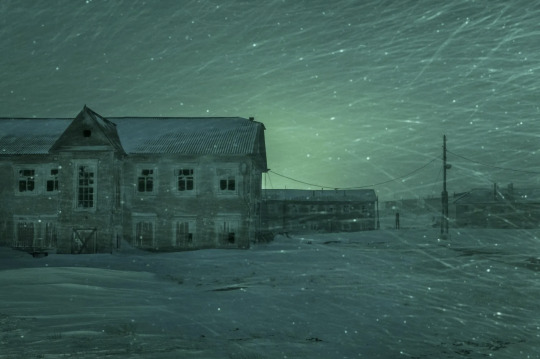

T_T i think the color palette is a bit moody for something like Fiddler, but again, wasn’t really paying too much attention to the actual content lol. not for this one.
this is how my portal turned out:

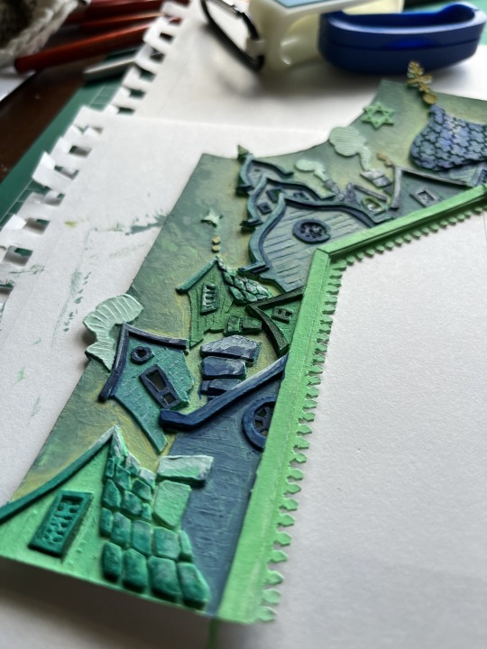
it’s not my favorite thing i’ve done. painting is not my strong suit and in hindsight i would have neutralized the buildings a lot more (thinking more gray tones) so that the sky could pop. i think it could’ve only really been one or the other, but i realized that too late. i also wanted to take some white Pebeo and mix it with glitter to top off a lot of my buildings for that snowy effect. but i didn’t have white Pebeo and ran out of time to get it. i’m considering still doing it though, even with the project being technically over, just cuz i want to hang it up as something i’m proud of. i also finished it with this glossy spray like the glaze you paint onto ceramic pieces but i don’t know if it was the right effect. i also feel like i overdosed on the color green which is a shame cuz it was my favorite color and now i feel like i can’t even look at it >.<
learned a lot though. wish i could do it again minus all the cutting.
here are some other cool takes by my classmates!!
Barbie Fiddler

Addam’s Family Fiddler

Nighttime Fiddler (look at the shadows on the wood T_T)


i feel like i’m learning everything by looking at other people’s work
0 notes
Photo
*sings* Cinderella...you’re as lovely as your name, Cinderella~...
Okay, some quick notes before we start. Despite the beauty of their work, painters’ palettes were actually rather limited on pigments during the Renaissance, only having three pigments more than artists did during the Middle Ages. The Moly is a magical plant that appears in Homer’s The Odyssey. Hermes gives it to Odysseus as a charm to protect him from Circe’s spells. It’s been most commonly compared to the snowdrop flower by scholars. It also is referenced in the canon Potterverse as a powerful herb that can counter enchantments.
The Willow Song appears as a motif at the end of William Shakespeare’s Othello, though it was written at least thirty years earlier. In Othello, Desdemona sings a few stanzas of it in response to her husband’s growing distance and madness -- to the audience watching the play in Shakespeare’s day, which would already know the song, its inclusion foreshadows Othello and Desdemona’s tragic ending. “No One is Alone” is from Stephen Sondheim’s well-regarded musical Into the Woods, which features Cinderella as a semi-major character -- the song is actually even partially sung by Cinderella in the show!
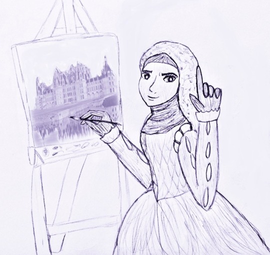
I edited the art for this section, as you can tell. Badeea’s painting is a modified photograph of the Chateau de Chambord in France, overlaid on top of my own drawing. (Thanks, Lunapic!) This is also my very first time drawing Badeea!! GOD, is she pretty!! I think her eyes are my favorite of all the HPHM cast.
Previous part is here -- whole tag is here -- Katriona “KC” Cassiopeia belongs to @kc-needs-coffee -- and I hope you enjoy!
x~x~x~x
When Carewyn followed up with Andre the next morning, he was quite disappointed when he saw Carewyn wasn’t wearing the new shoes he’d made for her with her uniform. He honestly hadn’t even considered that they wouldn’t be comfortable for walking in -- and honestly, Carewyn could sort of understand why. Andre had never been able to leave the palace grounds, so there no doubt were a lot of practical things he’d just never considered...such as how very flashy royal fashion was, compared to that of the common man. He was pleased with the feedback Carewyn “passed along from her cousins” for him, though -- completely unaware of the fact that all three comments were really opinions that Carewyn herself had had about the dress.
“Hmm...that is a good point,” said Andre, his hand resting on his chin. “Red is a beautiful color...but a deep blue would not only bring out your eyes, but it would also perfectly contrast your ginger hair, since blue and orange are on opposite sides of the color wheel...”
His face burst into a bright white smile. “Your cousin Iris really has an eye for colors.”
Carewyn successfully fought back a groan, even as her eyes drifted up off toward the top corner of the room.
“...Well, she has taken up embroidery as a hobby. I suppose when one spends a lot of time doing samplers, one could develop an eye for colors.”
And also create a lot of initialed handkerchiefs to conveniently drop in front of noblemen so they pick it up and return it to you.
Andre, however, reacted with some interest. “Is that so? Hmm...well, maybe when I’m working on your new pair of shoes, I could invite her over for tea so she can give me her second opinion before I give them to you.”
Carewyn had never disliked a thought more in her life that Iris having a say in what she wore -- but knowing that she shouldn’t be the one to sabotage Iris, especially when her cousin would no doubt be able to do it well enough on her own, she put on her best smile.
“...I’m sure Iris would enjoy that very much.”
Sure enough, within a week, Iris had been invited to the palace for tea with the Prince. Carewyn could only imagine how thrilled Iris, her aunt Claire, and Charles were. As for Carewyn herself, she knew it was now time to do as Charles said and stay out of Iris’s way...and so when Iris arrived, she made sure to clean the rooms in her wing of the palace in a different order and not sing so that Andre wouldn’t be able to “check in” on her with Iris in tow. She didn’t think she could stand it if Iris got to look down at her polishing the palace floors.
Her lack of singing, however, did catch Badeea’s attention. When Carewyn collided with the court painter in the hallway, she expressed some concern.
“I missed your accompaniment, while I was painting,” she said. “Is everything all right?”
Carewyn felt guilty as she leaned her broom against the wall for a moment. “Oh...yes, Badeea, I’m fine. I merely...well, my cousin Iris is spending time with the Prince today, so I thought to...well, not draw focus.”
Badeea nodded in understanding. “Mm, yes...some things are meant to be background details, while others are meant to catch the eye straight away.”
Carewyn and Badeea caught the sound of Iris’s twittering, bird-like laughter echoing down the hall toward them. Not wanting to be seen when or if Iris and Andre came out into the hall themselves, Carewyn quickly picked up her broom and went around the corner -- Badeea adjusted her easel under her arm and followed.
“Say, Carewyn,” said the court painter thoughtfully, “why don’t you dress up in that nice yellow and green dress you have and come to the market with me?”
Carewyn blinked.
“I need to pick up some more carbon black and indigo for this painting I’m working on for Andre, but the man who sells those paints loves to price gauge. If you were dressed up all fancy and you slid in a reference to your family, though, he might be less likely to try to rip you off,” Badeea added with a tiny, coy smile.
Carewyn frowned, feeling a bit unsure. “I don’t know, Badeea -- I still have a lot of work to do...”
“You have the whole rest of the day to finish,” Badeea reminded her. “It would only take maybe an hour or two. And it would get you out of the palace while your cousin’s here.”
Carewyn considered the matter. Truthfully she’d been hoping to finish her work quickly so she could stow away back to the library and scan more troop deployment records...but she really did hate the thought of bumping into Andre and Iris, not just because of how much Iris would hate Carewyn getting any attention and therefore delight in tormenting her in front of the Prince in order to puff herself up, but because she didn’t want to provoke Charles’s ire unnecessarily.
“All right,” she said. “I’ll go change.”
Not long later, Carewyn had put on her mother’s old dress, pinned her hair up, and joined Badeea by the front gates, and the two headed into town on foot. The sky was still rather gray -- it had been raining and thundering for the last couple of days, and there was still a lot of mud in places. Carewyn was glad she was wearing her worn brown shoes under her gown rather than the pretty heels Andre had made for her -- particularly since nobody would likely be looking at her feet.
The shopkeeper in question was indeed a bit intimidated when Carewyn offhandedly referred to “her grandfather, Charles Cromwell” -- and soon enough, Badeea had been able to skip most of the haggling she would’ve normally had to make just to get her paints at a decent price. They left the shopkeeper’s stall, several jars of paint in hand.
As fate would have it, as they walked at the market, someone else was also shopping, and at the sight of the familiar dress and mane of ginger hair, he ran up to meet them.
“Carewyn!”
Carewyn and Badeea both looked up, to see Orion striding up to them. He once again wore his slightly-too-clean, but modest white shirt, olive breeches, and boots, and he was carried a basket full of henbane.
Carewyn’s red lips spread into a smile. “Orion...hello.”
Orion brought a hand up to his chest and offered her a short bow.
“It seems the stars favor us after all, my lady,” he said, the corners of his own lips kissed with traces of a wry smile.
Carewyn shot a quick glance at his basket and quirked an eyebrow.
“Purchasing some more incense?” she asked pointedly.
Orion’s black eyes sparkled. “I’m afraid we’ve already used up what I bought previously. Fortunately the gentleman from last time remembered my face and didn’t give me too much grief.”
“That’s fortunate.”
Carewyn glanced at Badeea to Orion and back.
“Orion, this is Badeea Ali -- she’s the Crown’s court painter. Badeea...this is Orion Freeman. He helped me retrieve my horse the other day.”
Badeea’s dark brown eyes were very bright. “Ah, yes -- KC had said that you were thrown off your horse. Thank you for helping Carewyn, sir,” she added to Orion.
“It was my pleasure,” said Orion. “What’s the subject of your next piece, if I may ask?”
“A foreboding sky and a distorted reflection,” Badeea replied.
Orion looked intrigued. “That would explain such dark shades. Who commissioned the piece?”
“The Prince,” said Badeea. “But his request was just of a view of the entire palace, from a distance -- I was simply inspired by the rainstorm that passed through a few days ago, and how the turrets of the palace looked reflected in the castle moat.”
“I wonder how the castle of Royaume would see itself, if it had eyes,” said Orion levelly. “Would it see its beauty, or would it be the type to be critical of its flaws?”
“Hm...or would it see the beauty of its flaws?” asked Badeea.
“True,” granted Orion. “Flaws make us more human -- would that make something more beautiful, by serving as contrast to our strengths?”
“Flaws aren’t something you should simply have to accept,” said Carewyn demurely, her arms crossed. “One should strive to be better than one already is. Even if one is only human, that doesn’t mean they can’t work to be something better.”
Orion turned to her, interested. “And what would be better than being oneself, my lady?”
“Being a better version of oneself, of course,” Carewyn said, sounding matter-of-fact. “One can always be kinder, braver, stronger...more cunning, more passionate. One can always learn more, and do more, and be more.”
“Yes...but it seems like those could be crippling expectations to hold over yourself, to never be enough,” said Orion, and although his expression was very inscrutable, his lips twitched with something of a frown.
“Perfectionism is a disease that affects every artist sooner or later,” said Badeea sympathetically.
Her dark eyes flitted from Orion to Carewyn thoughtfully.
“I must be getting back to work on my painting...would you like to join us at the opposite bank, Mr. Freeman? I would be happy for some feedback on my work, before I present it to his Highness.”
Orion glanced at Carewyn for her approval -- she offered a small smile, and his lips turned up in a full smile of his own.
“I would be honored.”
So the three set about finding a less muddy spot by the castle moat, across from the palace. They found one right by a beautiful willow tree, where Carewyn very carefully lowered herself onto the grass. Badeea fetched her easel and chair, setting it up so that she had a good view of the castle. Orion looked over her incomplete work appreciatively.
“It looks like it could breathe, were it a living thing.”
“Thank you,” said Badeea. “Now then, I’ll need to concentrate while mapping out the sky, so no initiating conversation, please. These paints stay on fabric just as well as my canvas, so they won’t easily wash out. I would appreciate some accompaniment, though, Carewyn.”
Orion glanced at Carewyn curiously. Carewyn avoided his eye.
“Badeea, I don’t think -- ”
“Ah, ah,” said Badeea, holding up a gloved finger quickly, “no conversation. Accompaniment or nothing, please.”
She then set about mixing certain shades and color spotting sections of canvas.
Carewyn frowned. It was one thing to be singing while she was working herself, to pass the time, but Orion’s focus was still largely on her, and it felt weird. Still, she thought to herself, it wasn’t like she was bashful about singing in front of others, exactly -- she knew her voice was more than serviceable. There was really no harm in it. So, glancing up at the willow tree above her head, Carewyn rested her hands in the grass, leaned back, and sang.
“The poor soul sat sighing by a sycamore tree --
Sing willow, willow, willow...willow...
Her hand in her bosom, her head on her knee --
Oh willow, willow, willow...willow...
She sighed in her singing and made a great moan --
Sing willow, willow, willow...willow...
‘I’m dead to all pleasure -- my true love is gone --
Oh willow, willow, willow...shall be my garland...’”
Carewyn felt Orion’s dark eyes on her at the start. Before long, though, his eyes had fluttered closed, and he sat in perfect silence. As he listened, his shoulders loosened and his expression seemed to clear of all tension or pretense, like a child peacefully falling off to sleep. Badeea painted and shaded to the sound of Carewyn’s low, melancholy singing, adding white highlights to the dark gray and black shadows to create a cloudy sky with sunlight poking through.
When Carewyn was finished with the song, Orion slowly opened his eyes, meeting her gaze again at last. His eyes were oddly hesitant, almost shy.
“Y -- ”
He hesitated. Then, his black eyes softening handsomely, he closed his mouth, and it slowly spread into a smile gentler and warmer than Carewyn had ever seen before. He clearly approved.
Carewyn smiled in return and inclined her head in a silent “thank you.”
Carewyn sang some more songs until Badeea had finally finished and Orion and the two women had to part ways so that Badeea and Carewyn could pack up the easel and finished painting and bring them inside.
The following morning, Carewyn was surprised by KC pulling her aside to hand her a packet of what looked like handwritten sheet music.
“Your friend Orion stopped by a little while ago to give this to you,” she explained.
Carewyn was taken aback.
“I reckon he must’ve hopped over the wall,” said KC, unable to fight back a laugh. “I caught him strolling through the southwest gardens. I told him I’d bring it up to you, so that he wouldn’t get himself in trouble.”
Stunned, Carewyn looked down at the sheet music, shifting the pages so she could scan each line. Her blue eyes softened, growing deeper and darker with emotion, as she read the words and notes.
“...This...this is beautiful,” she whispered. She looked up at KC, unable to fully keep the awe from her face. “...You don’t think he wrote this?”
KC shook her head. “No, he said it was a song he learned when he was young, and that he tracked down the sheet music for you since he didn’t think he’d be able to properly sing it for you. I’ve never heard it either, though.”
Carewyn spent her meal times and about an hour before bed that night perusing the sheet music so she could learn the song. The following day, she felt confident enough to sing some of it while she started about cleaning the Queen’s Chambers.
“Mother isn’t here now...who knows what she’d say?
Nothing’s quite so clear now...feel you’ve lost your way?
You decide alone...but no one is alone.
You move just a finger, say the slightest word --
Something’s bound to linger...be heard...
No one acts alone...careful -- no one is alone...
People make mistakes -- fathers, mothers --
People make mistakes,
Holding to their own...thinking they’re alone...
Honor the mistakes everybody makes, one another’s terrible mistakes...
They could still be right -- they could still be good.
You decide what’s right -- you decide what’s good.
Just remember...”
“Carewyn!”
Carewyn stopped sweeping and looked up, to see Andre striding through the opened door of the Queen’s Chambers toward her.
“An -- your Highness,” Carewyn corrected herself very quickly, after noting who’d accompanied Andre.
Just behind him in the door frame was her dark-haired cousin Iris, dressed in her best rose velvet and her own almond-shaped blue eyes narrowed with loathing at Carewyn over Andre’s shoulder.
Andre, perfectly oblivious to the silent tension between the two cousins, gave a laugh.
“Oh, Carewyn, we’re not back to that again, are we? It’s ‘Andre,’ ” he said with an indulgent smile. “I haven’t heard that song before -- did you learn it recently?”
“Ah...yes,” said Carewyn. She could feel Iris’s fierce glare burning a hole in her face over Andre’s shoulder even without looking at either of them.
“It’s really quite lovely,” said Andre. “Please, do sing the rest of it when you’re able.”
“Of course, Prince Henri.”
Carewyn was absolutely not going to call Andre by his nickname in front of Iris -- she knew how Iris would shriek her head off about it to Charles.
Andre sighed and shook his head in something like tired amusement.
“I was hoping we’d catch you on your rounds,” he said conversationally. “I’m just about finished with your new shoes! Iris said your favorite color was ash gray -- I’ve never really worked with that color before, so it’ll be a bit of a challenge -- but I’m sure I’ll find a shade that might suit you...”
Ash gray? Running with the ‘Cinderwyn’ nickname, then, are we, Iris?
Carewyn forced a smile. “...Thank you. That’s...very kind.”
Feeling more uncomfortable by the minute, she quickly rushed over to pick up her full dust pan with her other hand.
“Forgive me, I really should go and empty this -- ”
At that exact moment, Iris had strode forward, bumping Carewyn’s shoulder in just such a way that the pan was knocked backward onto Carewyn, covering her, her orange and tan dress, and the floor with all of the dust, dirt, and grime she’d swept up over the last hour.
“Oh!” said Iris in feigned surprise. “I’m so sorry.”
Her gaze, however, was just as hard and unapologetic as it had been when she’d ripped the sleeve off Carewyn’s dress at home.
“Carewyn!” said Andre, concerned. “Are you all right?”
Carewyn coughed.
“...Yes, of course,” she said, her voice very hard and stoic in the back of her throat. “It was merely an accident.”
She shot Iris a cold look as she looked over her now thoroughly ruined uniform and the dust and dirt all around her feet.
“Please, go on ahead with Iris, your Highness. I’ll clean up this mess.”
Once Iris had successfully steered the reluctant-looking Andre out of the room, Carewyn closed the door, took off her dress, and finished cleaning the room in her undergarments, so as not to spread the dust and ash around any further. Then, very carefully, she darted across the hall from the Queen’s Chambers to Andre’s, so that she could fetch the high-necked, gold-embroidered dress made out of white linen and light blue velvet he’d recently finished for her from his walk-in closet. After all, she told herself, she needed something to wear while she was getting her uniform cleaned -- and well, at least Iris would be less likely to ruin this dress, since Andre had stitched it himself.
Holding her dusty, ashen dress in a folded pile against her chest, Carewyn headed downstairs toward the laundry. On her way through the entrance hall, though, KC -- who’d just come out of the library -- ran up to walk alongside her down the hall.
“Seems your friend is back.”
Carewyn’s messy ponytail flapped over her shoulder when she looked at her in surprise. “Orion?”
KC nodded, her lips curled up in a wry smile. “I thought I saw someone hopping over the wall through the library window, just now. Shall we go investigate?”
Carewyn bit her lip, looking down at the ruined uniform in her arms.
“Let me drop this off at the laundry first,” she said. “I’ll be right back.”
Carewyn ran down the stairs and threw her uniform into one of the tubs to soak, before quickly doing her hair up in a simple, but slightly more presentable braided bun and hurrying back up to join KC. The two women then headed out to the gardens, only to hear something of a scuffle.
“A man with innocent intentions does not hop over castle walls,” said Bill’s voice, though it sounded much lower and harder than Carewyn was used to hearing.
“In this case, sir, I assure you, I do.”
“You will declare your true name and business at once, sir, or I shall see to it that you’re locked in irons and hauled before the King himself -- ”
“Bill!” cried Carewyn.
Bill looked up, startled. The ginger-haired castle guard had slammed Orion back-first against a tree, holding him up off the ground by his collar with one hand, but at the sight of Carewyn and KC running forward, the suspicion and righteous anger in his face dissipated instantly.
“It’s all right, Bill,” Carewyn reassured him. “He’s a friend.”
“Put him down,” said KC.
Bill looked from KC to Carewyn in confusion, before glancing at Orion warily, but he nonetheless did as they said. Once he’d lowered Orion to the ground and let go of his shirt, the dark-haired man calmly adjusted his collar and picked up a satchel that must’ve come off in the struggle off the ground.
“Thank you, Carewyn...Lady Katriona,” he said pleasantly, as if he had not just been in a loose choke hold.
KC grimaced. “Orion, I’ve saved your butt twice now -- we’ve more than gotten to the point of you calling me KC.”
Orion smiled wryly. “I’m glad of it.”
Carewyn, however, still looked a bit harried. “Orion, what were you thinking? Hopping the wall...it’s no wonder Bill thought you were up to no good!”
“Well, the gate was locked, and no one was there to greet me,” said Orion airily.
“Well, of course the palace of Royaume has very strong security,” Carewyn said exasperatedly, “the royal family lives here.”
“I must wonder how the royal family ever receives visitors, then.”
“They don’t,” said Bill rather coolly. “They invite them, and very rarely, at that. And they clearly didn’t invite you to trespass on the grounds.”
Orion was unfazed. “Well, fortunately, I wasn’t looking for such an invitation, to begin with. I merely wanted to give this to Carewyn, as a gift for Madam Ali.”
He reached into his satchel and pulled out a jar of unusually shiny silvery-white paint. Bill, KC and Carewyn’s eyes all were very wide as Orion handed the jar to Carewyn.
“I asked a few people where best to locate materials for paints,” he explained. “One man pointed me to a flower that grows at the border called the Moly. He made this paint himself. I don’t think any colors like this are made and sold at the market, so I thought I would bring along one of his jars for Madam Ali, so she might use it for her next project.”
Carewyn’s light blue eyes were very bright and touched as she looked up at Orion.
“Orion...it’s wonderful,” she said, her soft voice incredibly warm. “Badeea will love it.”
“You said he used the Moly?” asked KC, as she took the jar from Carewyn and looked at it. “Maybe Badeea could mix up some more paint of her own, then.”
Bill glanced at Orion with a raised eyebrow. “Or the Crown could simply buy it from the vendor who sold you that paint.”
Carewyn noticed a strange, almost skittish glint flicker through Orion’s eye.
“...I’m afraid that jar was a favor, not a purchase,” he said softly.
“I think Badeea would be fine with making her own, Bill,” Carewyn said firmly. “The Crown wouldn’t want to set aside extra money for materials anyway. It’d be a lot cheaper to make a paint like that in house than to buy it from someone else.”
Despite his frown, Bill nonetheless sighed and nodded. “...True. Charlie’s needed a new set of scratch awls for ages.”
Orion looked pleased. “I’m glad I could be of assistance.”
“Perhaps the next time you want to see Carewyn, you might figure out a way to do it that doesn’t require you scaling walls like a prowler,” said KC amusedly.
Carewyn shot KC a slightly reproachful look. Orion’s muted smile rather resembled that of a satisfied house cat.
“I’d be happy to arrange more regular meetings outside the palace, if Lady Cromwell would be open to it,” he said, his black eyes sparkling as he glanced at Carewyn.
Carewyn raised her eyebrows coolly at him. “Once again, Mr. Freeman, you seem to have an unusual amount of freedom, if you’re able to consider allocating time just to meet me.”
Her lips then spread in a wry smile.
“Still...I can hardly sit by and let you get arrested for trespassing on my account. I have some time available late tomorrow morning, before noon. I could meet you by the gate then.”
Orion grinned. “I’ll look forward to it, my lady.”
#hphm#hogwarts mystery#cinderella au#my art#my writing#carewyn cromwell#orion amari#katriona cassiopeia#andre egwu#bill weasley#badeea ali#orion you sneaksy bugger#definitely manipulating things to 'learn more about your enemy' and warm them up to you#so as to make connections you could use to do diplomacy later when the ruse is up#but at the same time...you sure are oddly comfortable with putting yourself in risky positions to interact with carey-bear ain't you >3#iris's face claim is a brown-haired devore ledridge#I'll probably be drawing her at some point with andre -- GOD do I feel bad for this guy#as naive as he is about the cromwell family dynamic I think he already prefers carewyn's company to iris's#but honestly who wouldn't *snorts*
25 notes
·
View notes
Note
I genuinely dont understand how is it that your fusion comic doesnt have more notes. I very, genuinely dont get it.
Its impressive how simply using two colours, black and white, you're able to create such amazing illusions by using contrast. Also? The idea in itself? Also amazing. Ive been following each chapter since I discovered it, and its honestly amazing! You dont use many brushes either, it looks like just stick to one and take advantage of what you've got with very little. That's amazing, I actually have tried to take example of your art style before, its simplistically impressive.
I'll be around when the next parts come along, but no pressure, just do it whenever you feel like to. Good work, yeah? You're doing amazing, all your projects are really cool.
Good luck!
Thank you so much!! This made me really happy to read :D I’m honestly surprised it even gets as much attention as it does ^^
I’m glad you like the style of the comic, being black and white and all. It’s a fun sort of puzzle, drawing and then picking what should be black and what should be white in order to keep certain objects separate from each other or make a large amount of lines more cohesive. Crazy coloring is a lot of fun too but limiting palettes makes the design part of drawing interesting when coming up with different ways to solve a visual problem.
I think Haruko Ichikawa was a great influence for that one.
Hopefully you like the next parts too!
29 notes
·
View notes
Note
if you’re reviewing neopets, could you review my favorite color, 8bit?
8-bit gets a lot of slack from some people, on the grounds that none of the 8-bit pets are technically 8-bit. I'm not a pixel artist so I don't feel qualified to talk about the specifics, but basically 8-bit sprites have specific size and color limitations that none of the 8-bit Neopet designs do. Some pets also have other issues, like having half-pixels or uneven pixel sizes, which shouldn't happen for obvious reasons (see: the Kacheek's face below).
Personally, I don't think this is a problem, seeing as it's just a color and most of the issues with it aren't noticeable to non-pixel artists—but I do think the color should have been named "pixel" instead of 8-bit, which would've at least been more accurate.
Another issue with 8-bit pets tends to be inconsistency. Some are forward-facing. Some are in profile. Some don't wear clothes. Some wear clothes but just a t-shirt and pants. Some have clothes but it's an entire fantasy outfit. Some have shading. Some don't. Some have detailed pixel work. Some have very simple pixel work. You get the point. Every color is going to be variable depending on what artist worked on it, but usually there's more of an attempt to have some consistency with the style.
Overall, though, I do like it as a color. It's fun, it's interesting, and it's very unique compared to literally any other pet colour.
Favorite Species:

Uni: I hear a lot of people say that the 8-bit Uni is awful, but I don't care. I love it and its stupid little grin and stupid little pose. It's by no means the best looking 8-bit pet, but it's by far the most charming in my book. My only nitpick is that the perfectly square butt is a bit strange compared to the rest of the body.

Cybunny: While once again not the most technically impressive 8-bit pet, i do really like this one. It's super cute, and while it's obviously not accurate to real 8-bit sprites I do feel like it gives off a really nice retro vibe. All of the pixel sizes seem to be pretty correct as well, and the colors are nice. No clothes, but then again, do you really need them?

Tonu: When I say there are more impressive 8-bit pets out there, this is what I'm referring to. The recently released 8-bit Tonu has an incredible amount of detail in its sprite work, including multiple layers of shading and very small, detailed pixels. It's completely different compared to the Uni and Cybunny above, and while not as charming or half as retro, it is quite beautiful.
The other thing that's really nice about the 8-bit Tonu is that it has a very pretty rainbow palette, with a completely different horn and tail than the species usually sports. I honestly have no clue why, but it's very unique and keeps it from being too "Neopet but slightly pixelated"-ish. As a bonus, the rainbow parts are removable if you really don't vibe with them.


BONUS: hehe clown :)
Least Favorite Species:

Korbat: Why is the shading so weirdly detailed on the face but not on the feet or tail. Why does the dress not match the palette of anything else in the design. Why the colored outlines. Why does it look like Piglet from Winnie the Pooh. These questions and more will not be answered.
25 notes
·
View notes
Note
,, i dont,, know jackshit about naruto,, but,,,,,,, your watercolor pieces are so good??? like???????? SO GOOD?????
Here's the obligatory ask (since I started trying to use watercolors): are you aware of any tips for that particular medium? Like, are the brushes and watercolor quality really important or is that just my imagination? Also, how 2 mix colors and not die-
LMAO thanks!! I’m glad you think so!
I do have a lot of tips for watercolor, but I’ll start with the material questions. I would say that the quality of the tools can be fairly important, but like, it’s not make or break.
Supplies Information:
Disclaimer: None of this is necessary! You can make great art with any material available to you. All materials have different strengths and weaknesses, but you can create things that bring joy with the most rudimentary of supplies.
I tend mostly to use liquid watercolors because I find them easier to control and manage (and I just...like working out of little bottles of liquid with eyedroppers. It’s my ink bias), but they have significant drawbacks. Archival speaking? light will bleed all the color out of what I have created eventually! They aren’t built to last. That doesn’t worry me much because I tend to stack all my drawings up and shove them in a drawer when I’m done, but it’s something to keep in mind. I find them easy to mix and manage in the pallet, and easy to reactivate if they dry out
The brands I use are Dr. PH Martin’s Concentrated/Radiant Watercolor, and Ecoline Watercolor. Between the two, I would recommend Ecoline because they are cheaper, have more consistent texture, and have more in the bottle. Honestly, if the art store near me wasn’t on a huge sale, I never woulda gotten the PH Martins, they’re expensive as hell and just incredibly teeny glass bottles.
BUT, if you want to use watercolor that comes in tubes (which will last longer, give you more options for artistic expression—because the texture ranges from paste to watery, you have all that range to experiment with—and which most watercolor artists prefer in general) there’s a lot more options. The highest quality for the cheapest price I’ve found are the Turner’s watercolor tubes? I don’t always love the texture when I’m wetting the paint because I am picky, but the color is incredibly vibrant, and the prices are incredibly affordable compared to like, schminke or cotman haha. I used these in school and had a great time with them.
Brushes I know a lot less about, like almost nothing honestly, I wish I could give you some concrete advice on brushes but what it really comes down to for me is like, if you like the way it feels in your hand, if you like the way it makes a mark, it’s good. all it exists to do is facilitate You making a mark on the paper with some artistic medium, as long as you are satisfied with it, that’s good.
If you want brush recommendations though, I’ve been told that Princeton’s watercolor brushes (i have a couple from the Heritage and Velvetouch series) are good synthetic brushes for...moderate prices. Brushes are expensive. Usually people recommend you have a #2 and #4 Round, and a smaller detail brush, but again, really, like all things art it all comes down to your preferences, and your needs.
Actual Painting Tips:
Take care of yourself! Treat yourself kindly, forgive yourself for making mistakes. I’m dead serious. It’s impossible to avoid making mistakes, and in watercolor the mistakes are really hard to fix, and usually impossible without the use of gouache or something else opaque, so at some point it’s going to become an exercise in forgiving yourself for making those mistakes, like drawing in pen with no under-sketch.
On a good day, I find this therapeutic. On a bad day, it’s maddening. It’s okay not to make art on a bad day. When it comes to something you do because you enjoy it, and want to continue enjoying it, it’s important not to force yourself to do anything you don’t want to, and to take breaks when you feel yourself getting frustrated.
Paint from Lightest color value to Darkest. If you’re going to paint a character with a bit of a rim-light from some golden sunlight, paint that light light yellow first, top to bottom, and then work your way to the darker colors.
If you’re painting on a tilted surface (I’m guilty of keeping my sketchpad or paper block on my knees) paint from top to bottom. The weight of the water will pull the paint down, so you want to work with gravity, not against it!
Limit yourself. Let yourself only work with one color for a day or so, then only two colors, then only three. When you put yourself in a corner where you don’t have a lot of options, you’ll often find you surprise yourself with what you come up with. Usually, I pick three colors, put them down on my pallet, and leave them there for a week or so, mostly just painting from those colors. It helps me develop a familiarity with how those colors work together, and how they work when I mix them.
Mixing Colors:
another thing I should say about the Dr.PH Martin’s watercolors is that they don’t always mix well. I tried to get a skin tone for Kakashi once out of pink, green, and a little bit of brown, and in the mixture you could see all of the colors that went into it, and it gave a very strange look. I liked it as a color, but it definitely looked weird.
The paint that you use will have properties specific to itself, and you will get more familiar with those properties as you work it. It may mix smoothly on the pallet, it may not, and both of those can be good if you’re willing to work with them.
Because of watercolor’s properties, there’s three main ways to mix it:
One: Mixing in the palette. What it says on the tin—you mix the paint, you put it on the paper. I do this one the most, it just takes a lot of familiarity with your paints to get used to the balances that create the colors you want, just lots and lots of playing around.
Two: Mixing dry. This isn’t really “mixing” per se, but it does the same job, Watercolor is a transparent medium, and one that reactivates when wet, so if you put one color over another, it’s about the same as mixing.
Three: Semi-wet mixing. The combination of the two! You can get some weird effects out of this. I use it sparingly, but I love to use it when I do.
The most useful physical tool for me (just me personally) in mixing is a pallet i have, and while it’s fairly cheap and should last like, idk forever, there are other ways to get a similar effect without it, as long as you give yourself space to mix.
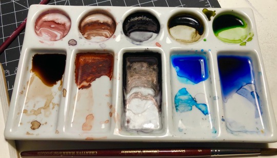
it looks like this, it’s a porcelain pallet (so the cleanup is incredibly easy, unlike my plastic one, which unfortunately wants to hold my color a little) and i use it almost daily. The circular wells are for where you put the bulk of the color you will be using, and the rectangular wells are for mixing either with water, to get more translucent colors, or with other colors. The limited wells but excess of mixing space puts pressure on me not to use too many colors, but to mix them constantly. (but also has enough divided space that I don’t feel anxious about everything getting muddied. i am very particular.)
It’s heavy though, and while its therefore good for sitting on my desk and not getting knocked off by my cat or me, it’s not easily portable, especially as it’s uncovered if that's something that is important to you. Blick’s probably has them, as does...I imagine any other art retailer? They’re fairly popular. Usually around 6-8$ but again, none of these tools are necessary, they are just what suit me personally.
I hope this helps! If I have the energy for it, at some point I’ll post some basic watercolor exercises to help with control and technical skill. You can get very good with any medium just by raw continuous practice, but my teacher last year had us do a lot of exercises that not only gave me a much greater comfort and confidence with watercolor, but that were also just...incredibly meditative to do.
#it wouldnt be basil mokutone if i didnt turn literally every advice post into an excuse to tell people to treat themselves kindly#something something you are your greatest tool and just as you shouldnt leave your brushes in the water you also shouldnt overwork yourself#i got a lot of my supplies very cheap cause the art store near me was closing so lots of it was extremely discounted so i'm very lucky haha#changeside#watercolor#advice#i genuinely hope this helps folks hahaha i dont wanna come off as like idk presumptuous or preachy#long post /
49 notes
·
View notes
Text
♫ Surfing on a soundwave,
Swinging through the stars,
Take a left at your intestine,
Take your second right past mars!
On the Magic School smelly space bus! ♫
SPOILERS for Supergirl: Woman of Tomorrow #2!
This is a comic where, the longer I sit with a particular issue, the more I’m like, ‘yeah. Yeah. YEAH.’
It’s dense in a way that invites the reader to go through it multiple times, and rewards additional readthroughs.
Also, it helps that the art is FREAKING AMAZING.
Seriously. Evely and Lopes should draw and color everything, forever, always.
(I will honestly be shocked if they don’t get an Eisner nom for this book.)
Anyways, all of this to say: Another issue that I enjoyed. It has one of the most genuinely sweet Supergirl moments I’ve seen in the comics in a good long while.
So, if you’re looking for a quick thumbs up/thumbs down rating, thumbs up!
If you’d like some SPECIFICS, though...
THE STORY
King is an evil genius because we don’t pick up where we left off--rather, we start in the midst of the Space Bus journey.
There is technically a Big Action Scene, but I was honestly surprised by how...casually? the story progressed.
Essentially: Kara and Ruthye are forced to travel by bus because 1.) Krem stole Kara’s rocket and 2.) this corner of the universe doesn’t have the right stars, so Kara’s still recovering from being under a red sun for an extended period of time.
The bus makes occasional stops; they encounter a space dragon; Kara takes some Red Kryptonite and saves the day; they eventually arrive on a planet with a yellow sun.
And again, all of this occurs with a kind of...breezy ease that I was not expecting at all.
I assumed that the space dragon fight would make up the final moments of the issue, after having built up the problem to a point where Kara needed to intervene.
But, noooope. The space dragon happens somewhere in the middle, which helps sell the central idea that this is simply Kara’s life. She’s been there, done that. She’s a badass who takes it all in stride.
But! Important to note! Ruthye still marvels at the sight of Kara taking out the space dragon, as well she should, because:
OH MY GOD. THE aRT.
There’s only so many times I can say, ‘it’s phenomenal, it’s gorgeous, it’s stunning’ before sounding like a broken record.
But it is. It truly is. This is the prettiest monthly book on the stands right now.
(Realizing I’ve been spelling Ruthye wrong this entire time, maybe? IDK. Apologies if I have.)
It’s in the final moments of the book that we learn what transpired after Krem shot Kara and Krypto and fled: Kara managed to get Krypto and Ruthye to a healer, and then passed out for a week.
Ruthye and Kara recovered, buuuuut...
Krypto is still very near death because the arrow was poisoned.
The healer can’t treat him until he has a sample of the poison.
Which Krem has.
(See where this is going?)
So! Kara regains her powers! Ruthye has a super on her side! KRYPTO’S LIFE HANGS IN THE BALANCE!
Gimme. Issue. 3. STAT.
THE CHARACTERS
Very much enjoyed Ruthye in this issue!
There’s a really tricky balancing act you gotta pull off when writing child characters; you don’t want to just write them as tiny adults, but you also don’t want to be obnoxious or cloying in trying to write ‘true-to-age.’
King gives himself a bit of a cheat, by setting her up as a rock farmer from a...what would you call it. An old-fashioned planet? And thus the kind of character who had to ‘grow up fast’ and behaves more maturely than your typical pre-teen might.
BUT! IMPORTANTLY! This is tempered by placing Ruthye in situations where her (understandable) ignorance is challenged/put to the test. Like, yes, she is mature, and well-spoken, and utterly tenacious, but she’s also out of her depth, and still in need of help and guidance.
(Which is how we get to The Best Scene which I’ll get to in just a sec.)
TL;DR - this issue has really sold me on Ruthye as our POV character and I am officially Invested in the relationship between her and Kara.
Speaking of...
It’s KARA-CTERIZATION TIME!
So, okay. There’s some ‘eh’ stuff in this one, but, BUT!
We got the goods again.
And by ‘goods’ I mean this:
Whatever other nitpicks I have (and I do! Have one! Which I’ll get to!) THIS. This right here! This is Supergirl. This is Kara.
And what a beautiful line to introduce this moment:
“And it began--as most things begin when you’re dealing with Supergirl--with a moment of kindness.”
It’s the same gentle concern we saw in the previous issue, where Kara knelt down to address Ruthye eye-to-eye.
Here, Kara’s facial expression, and the way she takes Ruthye’s hands and shows her what to do...
It’s just. SO SWEET.
Ahhhhh it’s so good. :D
So good! In fact! That the above scene offsets my one complaint, which is that Kara came off as harsh, IMO, when addressing the bus passengers, looking for Red K.
Other good stuff from this particular portion of the book: we get Kryptonese (maybe? I think?) And a mention of Kara’s mother being strict about certain things, which is in keeping with the 2000s series version of Alura.
Ruthye also asks if Kara ever tried to avenge the death of her family/culture and she says no; Ruthye says that she heard a lifetime of regret in Kara’s response, which I suppose could be read one of two ways:
1.) That she regrets her choice not to avenge them, or 2.) that she regrets not having the option to avenge them, as there was no one person to punch, no single action that could rectify the destruction of the entire planet.
I personally prefer the second reading.
Which I suppose contradicts the recent-ish “Killers of Krypton” arc, but who knows what is and isn’t canon anymore, honestly. XD
As for the rest of the issue! I found myself thinking of a Grant Morrison interview, actually.
Morrison apparently met a Superman cosplayer at a con and that’s when the character clicked for them: “[The superman cosplayer] was so in the character, but what really got me was the way he was sitting. It was this absolutely relaxed pose with one knee up and the arm bent over, and that’s what broke Superman for me. Suddenly I realized that Superman wouldn’t be a poser, he wouldn’t be a Muscle Beach steroid guy; he’d actually be completely relaxed because nothing could hurt him. He could be so open and friendly to everyone because no one can punch him or hurt him. He can’t get a cold, or be damaged by anything you’re carrying or wearing. For me that was the power of that, whether you want to frame it as magical or not, it actually informed the stories I wanted to write. I felt I understood him in a way I hadn’t until that moment.”
That’s always stuck with me, the idea that Clark would be the most at-ease, chill guy you'd ever talk to.
And THAT, I think, is what we’re seeing here with Kara. That at-ease-ness.
But in a way that is distinct from Clark! In the above quote, it’s clear that Morrison thinks it’s Clark’s powers that are the reason he can be so relaxed and at ease.
But Kara is de-powered here. So why is she so chill?
Because Kara is an alien.
Kara’s in her element, here. She’s used to space travel, she knows the ins-and-outs, she’s not shocked by any of the weird stuff they encounter on their journey.
Love it. LOVE. IT.
I am SO GLAD that King decided to go with Kara being the wizened mentor, as opposed to the naïve kid learning to be tough. It’s a much more interesting angle, IMO.
Also NO MENTION OF RIVALRY BETWEEN KARA AND CLARK. WOO. LET’S KEEP THIS ROLLIN’.
Alright, last, but certainly not least:
THE GOOD BOY! KRYPTO!
When I tell you I stress-read this entire comic first thing in the morning...XD
And I am STILL stressed. And a little sad that Krypto doesn’t get to go on another space adventure but! This is MIGHTY PREFERABLE to what I *thought* was going to happen, which is that Krypto would die from his injuries, and Kara would likewise be out for revenge.
Fortunately, that is not the case!
So like, the stakes?!?! Suddenly sky high. Find that dirtbag Krem and GET THAT POISON BACK TO THE HEALER!!
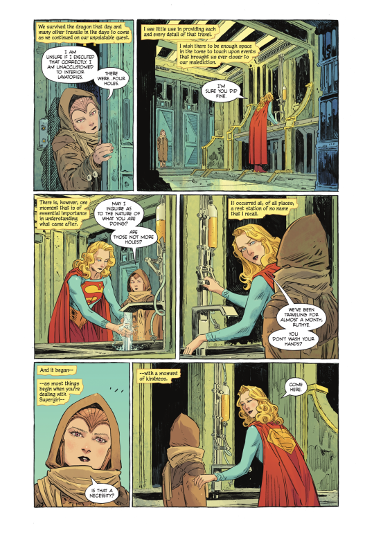
ART and MISC. STUFF THAT I LOVE
I generally don’t like to post entire pages of a comic, or panels without context, but the...reach? of this blog is extremely limited so. I think we’ll be okay. XD
So, alright! Some moments that I particularly enjoyed!
One of the panels that Mat Lopes shared early on!
I want this lettered version on a mug.
(Also she looks very ’Grace Kelly-ish’ here.)
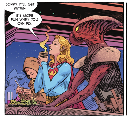
Love Kara’s facial expression and her line about space travel being more fun when you can fly.
From the same portion of the book--such a neat detail that Kara keeps her cash in her sleeve!
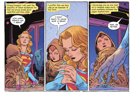
Another set of panels that I think Tom King shared a few months back.
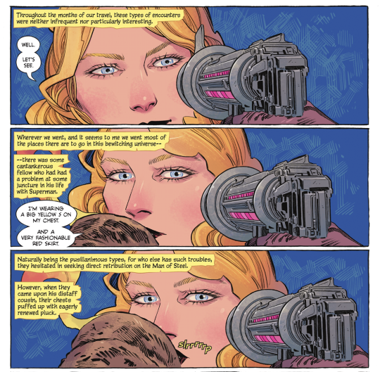
Love Kara’s little smirk, and the, “I’m wearing a big yellow S on my chest, and a very fashionable red skirt.”
It IS fashionable. WE SUPPORT THE SKIRT, IN THIS HOUSE.
Also the slrrrrrrp. XD
It’s good.
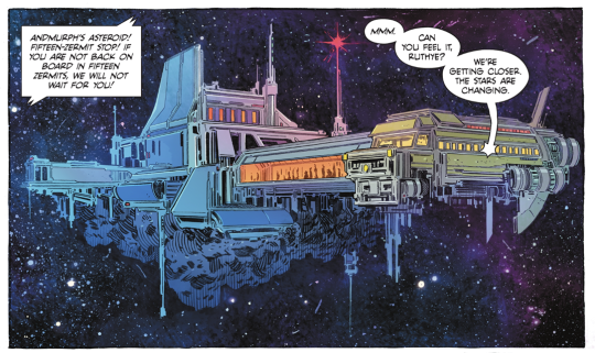
Okay, 1.) VERY COOL SCI-FI DESIGN and 2.) that line is great. “Can you feel it, Ruthye? We’re getting closer. The stars are changing.”
Mmmm, them good cosmic Kara vibes.
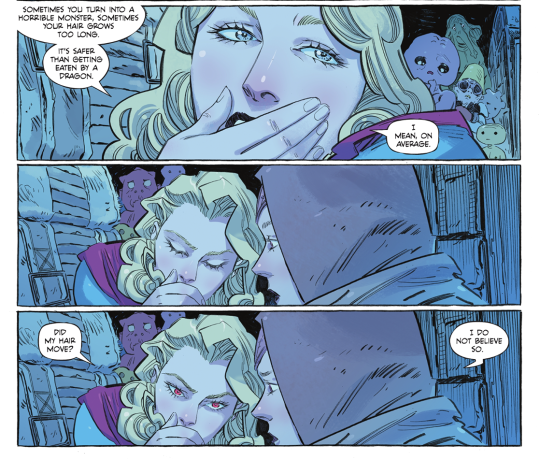
Kara’s attitude about the Red K here is fun, like, ‘WELP, sometimes you turn into a monster, sometimes you don’t!’ but again, the line is what gets me.
“Did my hair move?”
“I do not believe so.”
XD
Honestly? I could post the whole comic here. Evely’s vision of ‘public transit, but space’ is just so immediately...not ‘real’, necessarily, because there’s such a fantastical element to it all, but it is fully realized. I think I used the phrase ‘lived-in’ and that’s it--this world feels like it has always existed; every grimy nook and cranny, every rando space bus traveler.
And Mat Lopes’ colors!
There are like, five distinct color palettes at work in this issue, and Lopes handles them all masterfully.
I think my favorite is the...I’ll call it ‘ethereal space aquarium’ lighting in the bus as they view the space dragon.
The glow and the shadows and the blues and pinks...
GGGGGGGGAAAHHHHHHHHHH so goooooooood
So, yeah. :D
I am very much enjoying this weird, wild ride with small, precocious Ruthye and wizened, crusty Kara. XD There’s some stuff that I don’t *love* but my goodness, it could be a lot worse!
Let us end on the beautiful title page:

#long post#supergirl: woman of tomorrow#supergirl: woman of tomorrow spoilers#dc comics#kara zor el#comic thoughts#comic opinions
4 notes
·
View notes
Note
Piper~ I know you like fashion stuff. Do you also happens to like make-up and stuff like this? If so, do you have any channels to recommend to a 100% noob Missy? xD Also, do you have somewhere you look for fashion inspiration? I really want to put an effort on this but I'm just clueless LOL I really like casual and comfortable stuff, but I'd also like to have some sense so it could at least be called a style SUHAUHSAHUSAUHUHSAUHASUHSAHUASHU [How have you been? It's been a while~]
OMG HEY MISSY I’M SO SORRY I FOUND THIS IN MY DRAFTS VJFKVBKDFJ BUT I’M READY TO GIVE YOU AN ANSWER EVEN IF YOU ALREADY HAVE ONE!! *ahem* here is:
how to pin-point your style (on a budget)
by piper
1. translate your thoughts into pictures
now, to you can either make a mood board, or you can make a pinterest board dedicated to it—how would you like to dress? how do you want to present yourself to others? while aesthetic pictures can help, try to include some parts that are more specific. what trends are you a fan of? do you like to wear rings? sweaters? corsets? it's different for everyone.
having one source of inspiration can be harmful--I like Pinterest because I can see a large array of ideas that I can pick and choose from!
2. take a look at your closet
this part looks very different for everyone—some have a larger selection, some have a smaller one. but don't worry! no matter the size, we'll get you to a better place than you were at the beginning:)
MY closet is 90% hand-me-downs. this means i have a surplus of 2011-2016 clothing, which obviously do not fit the trends at the moment. but i ask that before you throw out anything right away, consider how you could twist it into something you would wear.
for example:
if you have a dress that's too short for your taste, try tucking it into a pair of dress pants or jeans to wear as a top
if you've got a stain on your favorite hoodie, try embroidering over it so you can keep using it:)
old high school hoodies (or just any screen printed piece) you dont wear anymore? try using acetone to remove it! (there are a bunch of tutorials on this, i can link one if you can't find one. also, be careful and always spot-test)
try dying pieces if you aren't in love with the color anymore:)
now, from here, take note of anything you'd like to add to your closet. I recommend the general rule that I follow which is: if you can't picture yourself wearing it at least 20 times, it's not worth it!
because of this, it's a good idea to:
3. determine which essentials you need
this step ties in steps 1 and 2. determine which pieces you still need to fit the theme you’d like.
for example: if you want your outfits to utilize a lot of sweaters and you don’t have any, an essential would be a simple, neutral sweater. (or a bright one! listen to your heart. if you’ll wear it a lot and enjoy your time in it, it’s worth it!)
essentials are different for everyone, but here’s a quick list that I’d use!
fishnet tights
a black long-sleeved shirt
a button up shirt
1-2 jeans (or other pants if jeans aren’t your thing) that fit you really well
a belt
some can be made, and others can be bought! it’s up to you how you do it. and don’t fret if you can’t get everything right away. everyone is in different situations, and this is when prioritizing is really important.
4. putting them together
this part is not as restrictive as a lot of y'all think! if there’s one thing you should take away from this post, it would be that you should always experiment. here are a couple general tips:
1. layer, layer, layer (even if you’re skeptical)
my mom prefers it if I don't wear revealing clothing, so layering is my best friend! wearing t-shirts under tank-tops and sweaters over other sweaters--it’s all worth a shot!
2. don’t limit the palette
don’t feel obligated to keep it to two or three colors! my favorite rule is to limit the colors in an outfit by the tone/shade/tint/hue. let me break it down a little bit:
a tone is made by adding grey to a color
a shade is made by adding black to a color
a tint is made by adding white to a color
a hue is a pure color on the color wheel
this is why outfits with mostly pastels (white added to all the colors) and jewel tones (a darker grey added to all the colors) look so great! sticking to one category for an outfit can’t go wrong.
don’t feel tied down by this, though! colors that break the rule can be included as accents. for example, a pastel top and pastel bag would look really cute with a pair of dark-wash jeans! it all varies:)
3. rethink the word “flattering”
personally, I don’t like thinking of outfits as flattering or unflattering to body types, since they all are just made with the goal of making an hourglass figure. if that’s what you want, then there are tons of tips online for it! but honestly, if it’s preventing you from having a good time with your clothing--remember that your clothings are a tool to express yourself and keep you warm and safe. your body is absolutely gorgeous and perfect for any clothing you want to wear.
4. break the rules.
if you like something, just wear it. just do it. you’ll learn what you like. I started off being told I looked like a farmer by my siblings at the beginning 2019, and since then, I've made a lot of progress! But I still love wearing denim-on-denim and won't stop just because someone else doesn't like it.
thanks for leaving an ask, @missskzbiased ! i hope this helps, even though I'm months late ;-; makeup will be in a separate part! I'm still working on my skills so I'll show you my resources for it lmao:)
#imy missy omg#maybe I should make a side blog for fashion#this was so fun#I feel like I missed smth but whatever#also lmk if you want examples or something idk#fashion#piperxfashion#missskzbiased
4 notes
·
View notes
Note
yes pls post all the tips and tricks for adhd + depression management. literally all of them. pls.
oh shit, ok, let me try
pick and choose depending on your space and your budget, obvs. I have a big room now, thankfully, but these organizing tips are still useful even if you don’t, I think.
(it’s long and I’m full of thoughts so buckle up)
1) Empty space is space you’re gonna fill. Bad clutter is gonna get in all of those empty places. Don’t have too many empty spaces! You want shelves, tables, and drawers.
Chairs, though, are just higher places to pile things that don’t have a designated Spot. (obviously you can have chairs but if you don’t need them don’t keep them around to fill space). If you have a chair/couch/ect. that you don’t use very often, keep a box or a basket underneath it if possible, and plop that thing down on the seat if you feel it in your bones that you’re gonna start piling shit onto that thing soon. Because then that spot is Occupied (sometimes that won’t stop you, but sometimes it will!)
IKEA stuff is the shit. Furinno shelves are surprisingly cute and sturdy. Try to check for furniture sales whenever you’re bored - bonus points for bookmarking certain websites and keeping them in a folder in your bookmarks. The Honey browser extension is also nice for keeping an eye on sales!
2) For the love of everything I know it’s So Hard and it’s daunting, but keep things separate. THAT goes on THIS shelf and THIS shelf ONLY! You’re going to put things in the wrong spot. Obviously. But you’ll know when you do, and that’s what is important! That way, when your brain decides to work, you can look at a shelf and go ‘hey that doesn’t belong there!’ and then you can put it back. I know I get clutter blinders if the boundaries aren’t clear.
Small storage - Boxes are for things you don’t use very often, because they have a lid and a lid is a very dangerous extra step. Baskets? those are for things you need more often. Try to get a bunch of different kinds or colors so you can start associating those containers with the items they contain. Drawers are all the same. A drawer with PINK drawer dividers instead of BLUE ones? Well, that’s the drawer with the pens!
Put decorations near your designated boxes, baskets, ect. It’s an extra marker of recognition when the blue box next to the dragon figurine holds all the tape. You’ll want to leave the tape on the table. You’ll want to. But it belongs in the dragon’s hoard and that’s really where you should put it.
You need to work with your own brain. Your sense of theming and pairing is the most important thing. I have my extra phone charger in the same basket as my dogs’ spare collars. This is something only I can fathom, and even if I cannot put it into words or justify it, I know where both of those things are and where they belong. FUCK logic.
Cubby shelves are literally so nice and are worth the investment if you can, imo. They’re rigid, yet flexible. It’s a designated divider that you can customize. Some of my cubbies have full, color-coded baskets. Some of them have smaller boxes with their decorations.
If you have bookshelves, dedicate the bottom shelf for storage. It’s hard to see stuff on the bottom shelf, and that shelf gets real dusty real quick, so just put boxes there.
3) Have. Extra. Trash cans. Taking the trash out is Difficult. Having extra trash cans might make it seem like you’ll be taking out more trash but you can stagger it differently and not overwhelm yourself or your single trash can. On a good day you can take all the trash bags out. On a bad day you don’t have to take any out, and none of them will be overflowing! I personally have 5 trash cans.
I have a small one near my bed for regular trash, and a big one near my bed for bottles. Yeah, we have a bin for bottles in the garage, but the odds of me walking down there, let alone walking down there and remembering to take the bottle, are slim to none. Special bin, in my room. Yeah, I could put that bin somewhere else, but if I can reach it from my bed, it’s Ultra Convenient because that’s when I’m at my most relaxed/lazy/demotivated and also when I’m most likely to be enjoying my soda
I have a big one near my desk, for desk-related trash, and a small one near my printer for miscellaneous stuff.
My last big one is my favorite. That one is for the big trash. The crap that fill your trash can up almost immediately? Put that in a Special trash can tucked away somewhere. It’ll fill up quickly, but you use it less, and save the space in your regular trash cans.
Bonus points if you break down your boxes and tuck them behind that trash can.
4) Have. Multiple. Hampers. Doing laundry sucks and there’s always SO MUCH. Separating colors from black and white clothes is not viable for me, and maybe it isn’t for you. So separate them in a different way!
I have a big clothes hamper, and two hampers in the corners of my closet. One is for towels and stuff. One is for bedding.
bonus tip: idk how some people only have one set of bedding, because it is impossible for me to imagine a day I would have the kind of consistent energy to strip my bed, wash the shit, and put it back on. Have at least 2 sets of everything. It’s worth it, seriously.
5) Adhesive hooks! Adhesive shelves! Literally it is so nice to have convenience without anxiety. It is hard to commit to putting a piece of furniture somewhere. It’s extremely hard to commit to putting wall shelves somewhere. So just fucking slap something to the wall and call it a day! You can create bonus shelves on anything, and are not limited to the ability to drill, hoorah!
They also make adhesive holders that go underneath tables! My paper towels are hanging neatly under my desk instead of being the bane of my existence by taking up valuable table space.
6) It is important to remember that your space is for you, and not just a place that needs to hold your things. It is SO much easier to keep a room looking nice if you think it looks nice at the beginning. I know that sounds obvious, but honestly, it’s not. The default of your room should not be tidy. The default of your room should be, holy shit I love the way this looks! And not in a way that is minimalist and beautiful and photo-worthy. In a way that is meaningful to you.
I don’t read physical books that much anymore, but I still have a ton of them because they make me happy! Figurines aren’t clutter, they are important items. I have marimos, faux succulents, and faux flowers. Are they useful? No. But they go a long way towards making me smile. Keep the little ‘clutter-y’ shit that makes you happy! It’ll keep you from making more clutter because you don’t want to cover up/take away from the cute stuff.
Vinyl wall decals can go anywhere! Just food for thought! I don’t feel bad about keeping my closet doors open anymore because my shitty drawers look lovely with their decals on them
Keeping a color palette is hard but it feels really nice. Even when my room is a mess it’s a mess that matches in a way that I like, and then I don’t get caught up in feeling like shit. My room has the color profile of a pre-teen girl’s room. But that’s what I like, so I don’t care if it’s tacky or too bright.
If you start to enjoy your room/your space, you’ll start to buy yourselves little “treat yourself” presents that are long-term beneficial! Take that, brain, I’ve schooled you. I can produce short term dopamine by depression-buying that adorable basket, but then I can use that basket forever!
I really hope I was helpful, even though I’m a ramble-y mess. I’ve really been trying to get my room under control, and all the obnoxious “JUST DO IT!” articles on the subject are so unhelpful to me. Finding little things that help me has made me feel so much better day to day, and genuinely seemed impossible a few years ago.
#the ace whiner#organizing tips from a certified mess!#i'll try to add on if i remember more but these are the main ones#grinningprettylikeadevil#sorry if this is impossible to read#walls of text make my head swim too#but i also talk a fucking lot and have no way to control this lol
13 notes
·
View notes
Photo

Notes under the cut!
Having made a lady WoL collection, I decided to do a dude one too. As before I have more, but not all are leveled and I have some I’m more attached to than others.
I do want to push for more range honestly--I’m not sure how I wound up with three midlander dudes and a highlander lol. I should really follow through with a male au ra, hrothgar, and lalafell. I did an odd green/brown hair hybrid that I suppose could qualify for brunette, but otherwise my tendencies toward black and blonde hair came through real strong. Mysteriously absent are redheads. I may also want to experiment more with color palettes and cultural influences a bit.
For the guys, there are spots where I played into job expectations and spots where I defied them. I wanted to try designing some characters in ways I hadn’t seen so much in-game, as well as designing characters who would immediately evoke a specific tone! There are also definitely jobs where I deliberately tried to show some traditional masculinity where it’s less expected, which was fun.
Cenric/Black Mage Midlander: People have criticized hyurs before by calling them “too vanilla”, since they’re the human stand-ins. I figure though, they’re hyurs. Hyurs are imaginary and don’t need to follow real world biology. Play with color palettes and features so you get a more definite fantasy look if you want to. With Cenric, I specifically tried to go super dark and de-saturated to evoke a walking silhouette (sort of like drow) and gave him the palest eyes possible with strategic face paint so they’d look like they glow. This was all in the name of making a character who evoked Final Fantasy’s classic black mage, just going in a more adult and extra spooky-goth direction.
Maerec/Dark Knight Midlander: Maerec, I designed specifically to both be a step off of the default midlander from commercials and to embody the Dark Knight questline as best I could. Giving him some edge visually while still feeling reasonably natural was fun to balance! To this end, I knew dark eyes would be important to helping the black hair fit in. Going with a very dark red I figure it almost seems like he could have brown eyes until you look closely. Making him feel very Ishgardian was also fun, with the horned helmet and Fray-esque glamour. I also designed him to both parallel and contrast with Lahabrea given their stories are intertwined. If there’s scattered angel/demon imagery between them that works even more.
Sublime Tiger/Samurai Hellsguard: I know that my natural inclinations go toward bishonens lmao, so figuring out the angle I wanted to work with the SUPER BEEFY male roegadyns was wild! One thing that gave me inspiration at the time was realizing that, with their black noses, Hellsguard roegadyns can 100% evoke big cats--among other animals. I usually prefer designing Sea Wolves for lacking the black noses because my impulse is for it either to be visually unified with the rest of the face/body or go without--so I often feel a bit more limited with what kind of designs I’ll do for Hellsguard. With Sublime Tiger, originally he had both orange and black striped hair (one of the styles available works it) as well as the black face paint evoking tiger stripes. I found the hair more limiting with helms though so made it pure black instead. Deciding what glamour would look good and play well with proportions was also a process--wanted him to feel like he’s from Othard since there is a big Hellsguard population there, so samurai made some sense to me in building that. After experimenting though, I wound up going with a look that took a bit of inspiration from One Thousand And One Nights. I have additional ideas for what I might try going forward though.
J’mor/Red Mage Miqo’te: This was a combination of a lot of ideas! One was wanting to embrace the physicality of red mage as a job, and explore it as a worldly kind of caster who works well with ease of movement and does a lot of darting around the battlefield. Mages in-general are often seen as kind of ivory tower sorts, and by shedding the usual frills I wanted to show that it’s possible to have a caster’s knowledge while being very connected to the world at large. Also give a strong sense of SWASHBUCKLER where the magic kind of slaps you in the face with additional power. I also noticed I hadn’t seen as many black male miqo’te in-general, along with fandom stereotypes about catboys as soft. So I decided to design J’mor with that in mind--playing him as a very shonen kind of hero while the beard brings an extra bit of hardness to his features.
Asah’zi/White Mage Miqo’te: Asah’zi is another case where I wanted to challenge the idea of male miqo’te as soft, and I added to that challenge by making him a white mage when that is often filled by lady characters. I was also interested, lore-wise, in the tension between Keeper of the Moon tribes and Gridania (where white magic has very strong ties). That Keepers of the Moon are also very matriarchal gave added interest for me making a more rough and traditionally masculine-feeling white mage sort, especially since Keepers often build a lot of their lives around hunting through the Twelveswood. I also wanted to bring some sense of druid into white mage as a job, given the nature ties. With Asah’zi, using skydruid skins, claws, a wooden cane, and on all contributed toward the vibe I wanted to build for him. Using emotes that show off his fangs helps bring a bit of cockiness to him too, which is fun. And stealing Thancred’s hair lets him have a bit of a roguish vibe lol.
Amir/Dancer Highlander: Like I said, I tend to go for bishonen-sorts in designs a lot. HOWEVER! I do love this highlander face type specifically a ton, and think guy highlander proportions are well-balanced overall while being beefy. I knew for a while that I had a specific design I liked a lot for male highlander with Amir, and I definitely wanted to do something with him. The choice to make him a dancer specifically came from a conversation I saw just after the job’s release. An IRL male hip hop dancer mentioned feeling a bit bummed out because a lot of the animations felt like they played more to softness/grace and traditional femininity, and he’d been hoping for the option of a little edge with battle dancing because that’s what he does. Some players said he should just play monk, others were kind of mean to him and acted like what he wanted was somehow shitty. I felt for the dude to be honest since he was coming from a place of feeling frustrated by stereotyping, so I decided to look at the animations and see how much they could be integrated into a design that felt more traditionally masculine. I saw a lot of bright greens (especially with the peacock feathers) so I tried to unify that with a green glamour. The mask reminds me of rave aesthetics a bit, and I’ve seen dudes wear shorts similar to the Nezha ones before. I’m a big fan of the idea that fashion can be a way to create what you want tonally, and I tried to explore that in this design.
Navarre/Paladin Midlander: At some point it hit me that I have been avoiding traditional knight-in-shining-armor looks like the plagues in my tanks lol. This made me think a fair bit. What struck me was that if the only thing a glamour has to say for itself is “this is a knight”, that doesn’t feel so interesting to me. If it’s supposed to be a knight in shining armor specifically though, bringing an almost angelic, elemental feeling to the look is something I’m 500% there for. And weirdly, people don’t seem to do this as much. I’m less used to paladins compared to dark knights, warriors, or even gunbreakers--and since paladins are so associated with that holy knight-vibe I figured it made sense to go that direction. While I was looking into glamours, one thing I found was that a lot of them dyed with unchanging patches of black, had edgy red woven in, or otherwise came across as having been designed with dark knight or warrior in-mind. I decided part of what I’d do in this instance was really make a Warrior of Light who immediately screamed “yes I am the Warrior of Light” when you looked at him, and took inspiration from Cecil Harvey from Final Fantasy IV toward that end too. Every piece in this glamour was carefully picked not just for whether it worked as a silhouette, but also how it would dye.
Cesaire/Dragoon Elezen: Cesaire has gone through a lot of design phases. Initially he was a red elezen, because it’s a direction I don’t see used a lot but has a very doable fantasy feel I think is fun. Then he was a champagne/cream color all over as inspired by a particular breed of horses. Now, having put a lot of thought in, he is deep gold with blue eyes. The underlying concept for him was that I wanted to make a golden dragoon who looks like he should be terribly heroic, but then in practice he’s a kind of blood knight WoL who is about as close to Zenos as a Warrior can get without going outright evil. I played into gold and more general adventuring gear for the reason that I think Cesaire has absolutely left Ishgard behind him, and strongly prefers to be someone defined by what they do rather than where they’re from. Given elezens’ wide shoulders I also had to think about what combinations would work for balancing proportions, and I wanted Cesaire to visually hold his own visual niche within my overall Famfrit lineup so a lot was chosen with that in mind.
5 notes
·
View notes
Last Seen Blogs

bellacouturelecher
Bella Couture-Le Cher

azrabal34
Azra Bal

weidli
tired of the same old blues

sexyhannah99
Tarot Readings & Spiritulal Gifts
kibiski
Kibiski