#blackletter
Text

beverly hills.
august 2023
© tag christof
372 notes
·
View notes
Text

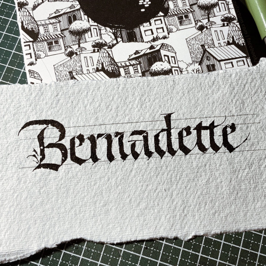
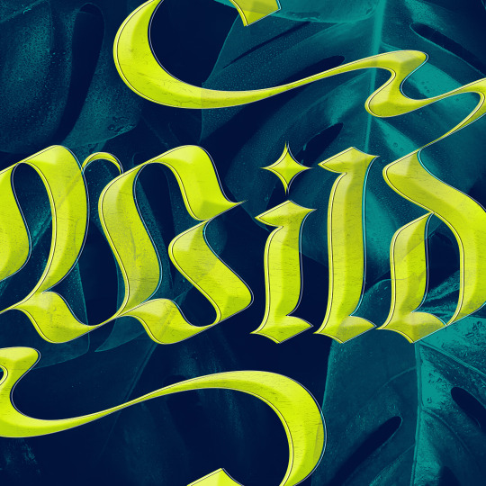
A loving compliment
#mystuffs#artists on tumblr#hand drawn#art#digital art#typography#lettering#Hand lettering#caligraphy#caligrafia#blackletter#Chicago artist#vee lettering
91 notes
·
View notes
Text
ROUND 1 - BLUE GROUP


Propaganda under the cut.
Courier: "The kerning, the round letters are oh so round and the hard edge ones have great lines. It’s also a serif font which makes it immediately gorgeous in my eyes. Also, it has the best capital Q and E in my opinion. And one last piece of propaganda. Is that its my specialest little guy so. Please."
Blackletter: "It is the first printed font ever. It was the one used by Guttenberg."
93 notes
·
View notes
Photo


Typography Tuesday
BLACKLETTER
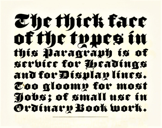
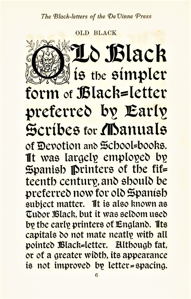
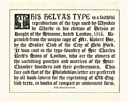
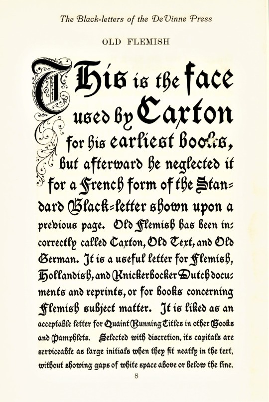
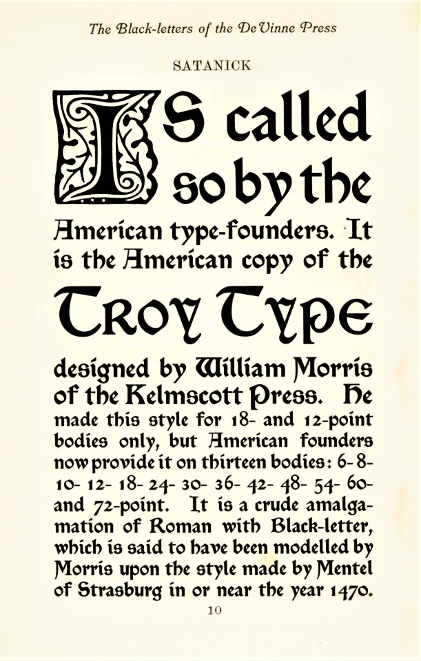
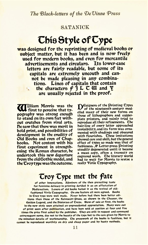
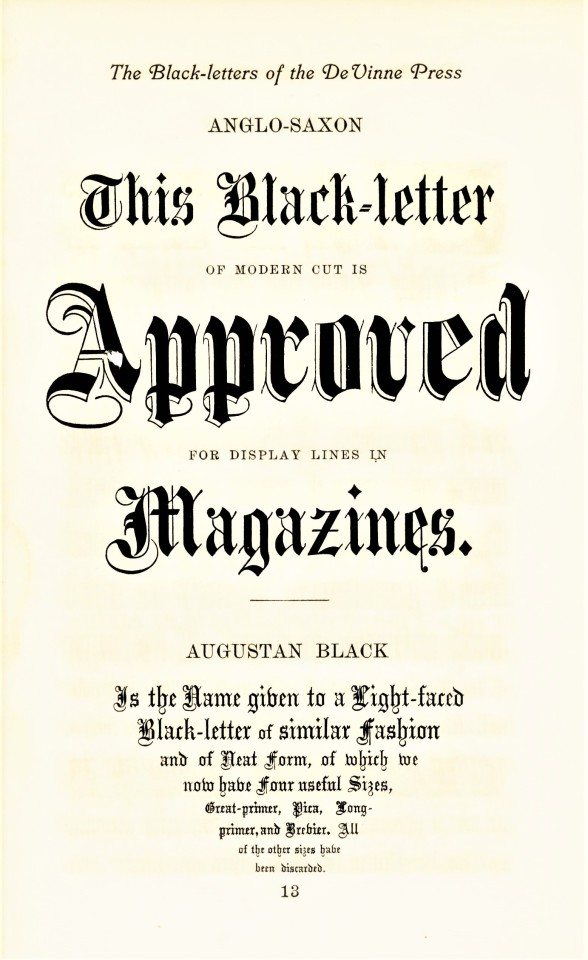
Blackletter, also called Gothic, was the first typographic form to be founded in metal type by Johannes Gutenberg in the mid-fifteenth century. The first book printed in English was in blackletter, as was the first book printed in England (both by William Caxton; the first printed in Bruges in 1473, which was also the very first book printed in Bruges, and the latter in Westminster in 1476). It is called blackletter because its narrow, condensed forms produce a darker appearance on the page than do Roman fonts. By the late 16th century, most Western national printers had dropped blackletter in favor of the arguably more readable Roman-style fonts, except for some Scandinavian countries which held onto blackletter forms until the late 18th century, and Germany being the last holdout until 1941.
Blackletter fonts are still used today, however, as display faces, for ceremonial use, and for certain kinds of emphases. That’s certainly how Theodore Low De Vinne (1828-1914) would have used it at his De Vinne Press in New York. These examples come from Types of the De Vinne Press, published in New York by the De Vinne Press in 1907. Theodore De Vinne founded his press in 1883. He was also a co-founder of the prestigious Grolier Club and one of the leading commercial printers of his day, whose enterprise had a profound influence on American printing and typography. This book was intended as a promotional specimen book “for the use of compositors, proofreaders, and publishers,” to demonstrate the wide variety of typographic possibilities that could be available to their clients.
View more posts from Types of the De Vinne Press.
View more posts on Gothic/Blackletter type faces.
View more Typography Tuesday posts.
#Typography Tuesday#typetuesday#Typography Tuesday#Blackletter#Gothic type#Theodore Low De Vinne#De Vinne Press#Types of the De Vinne Press#book history#20th century type
236 notes
·
View notes
Note
The saddest noise, the sweetest noise,
The maddest noise that grows,—
The birds, they make it in the spring,
At night’s delicious close.
Between the March and April line—
That magical frontier
Beyond which summer hesitates,
Almost too heavenly near.
It makes us think of all the dead
That sauntered with us here,
By separation’s sorcery
Made cruelly more dear.
It makes us think of what we had,
And what we now deplore.
We almost wish those siren throats
Would go and sing no more.
An ear can break a human heart
As quickly as a spear,
We wish the ear had not a heart
So dangerously near.
Thanks for submitting this beautiful poem by Emily Dickinson. It is a bit too long for me to write. Because it worked so well last time, let's turn this into a collaborative calligraphy piece! Every calligrapher writes two verses, then tags another calligrapher to continue it until the poem is finished. I'm tagging @noctuamagna to continue!
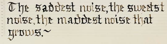
#calligraphy#communal calligraphy#calligraphy practice#poetry#collaboration#poetry collaboration#blackletter#lettering#my calligraphy
44 notes
·
View notes
Text
IAMX
#iamx#calligraphy#каллиграфия#inspiration#music#blackletter#blacklettercalligraphy#gothic#gothicscript#calligraphypractice#calligraphyart#fraktucalligraphy
19 notes
·
View notes
Text

#calligraphy#calligrapher#blackletter#fraktur#dracula#literary quotes#literary quotations#bram stoker#bram stocker's dracula
65 notes
·
View notes
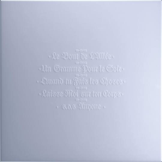
Text

The Lord's Prayer in Biblical Czech (bibličtina), based on spoken Czech of the 16th century. I copied this from my great-great-grandmother's Bible printed in 1863.
17 notes
·
View notes
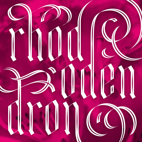
Text
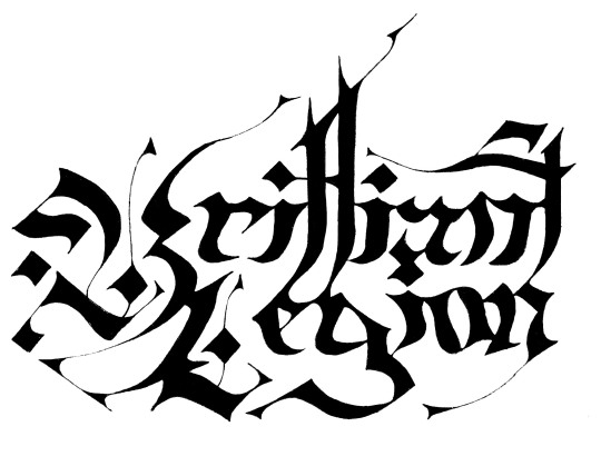
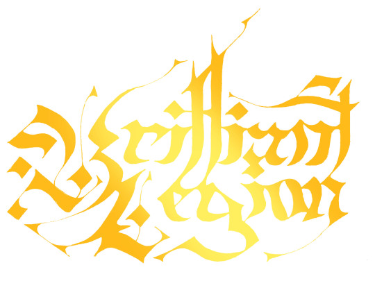


Logo Design Variations for a long-festering personal project
Anyway, very proud of this one. Really different from what I normally draw. I'll probably do at least one more iteration though. I want it to be a little bit goofier and the majiscules are basically ripped off directly from ones I saw online that I don't think are public domain
33 notes
·
View notes
Text
Experimental Blackletter from Metis Foundry
5 notes
·
View notes
Text

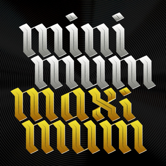
i've been having fun with blackletter this weekend
25 notes
·
View notes
Text
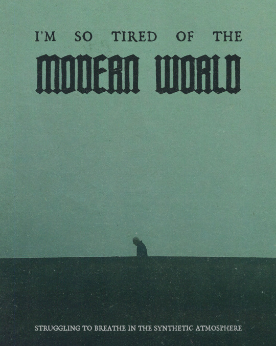
Reject modernity © fvneralivm 2023
Original artwork. Email for commissions: [email protected]
Links
#graphic design#graphic designer#art#dark art#original art#poster art#poster design#poster#artists on tumblr#designers on tumblr#designer#design#dark#dark aesthetic#blackletter#commisions open#digital artist#artwork#original artwork#poster designer#darkness#dark artist
6 notes
·
View notes
Text


Blackletter W development / practice
#design#designer#anti instagram#art#my artwork#my work#my art#original my work#graphic design#art by me#blackletter#calligraphy#gothicletter#fraktur#content creator#unique#artists on tumblr#gabber artist#artist#writing#black and white#writers on tumblr#letter w#handlettering#lettering#influencer#tumblr influencer#letter design#developer
6 notes
·
View notes
Text
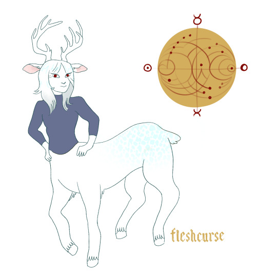
gf told me to draw a cervitaur. Also the blackletter font was really fun to trace!
10 notes
·
View notes
Note
There ain’t no fish in this lake. (From my upcoming book I Drowned In The Summer of 85?)

I am intrigued: Why aren’t there fish in the lake? Very mysterious… I hope you like this piece of calligraphy!
31 notes
·
View notes
Last Seen Blogs
slipknot-sic-0
Big Dumb

atd-sportscars-blog
ATD-Sportscars

crossovershipstournament
Crossover Ships Tournament

got-the-cool-shoeshine
Cakyon!

bubblegumdefect
vaya con dios