#Typography Tuesday
Text


Typography Tuesday
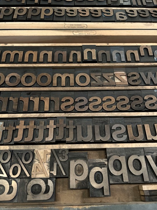
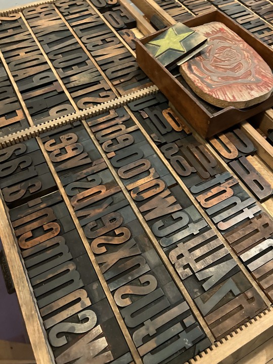
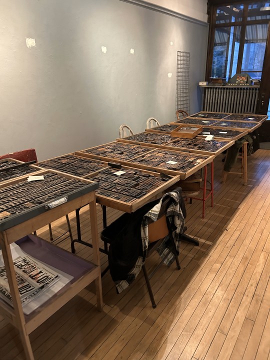
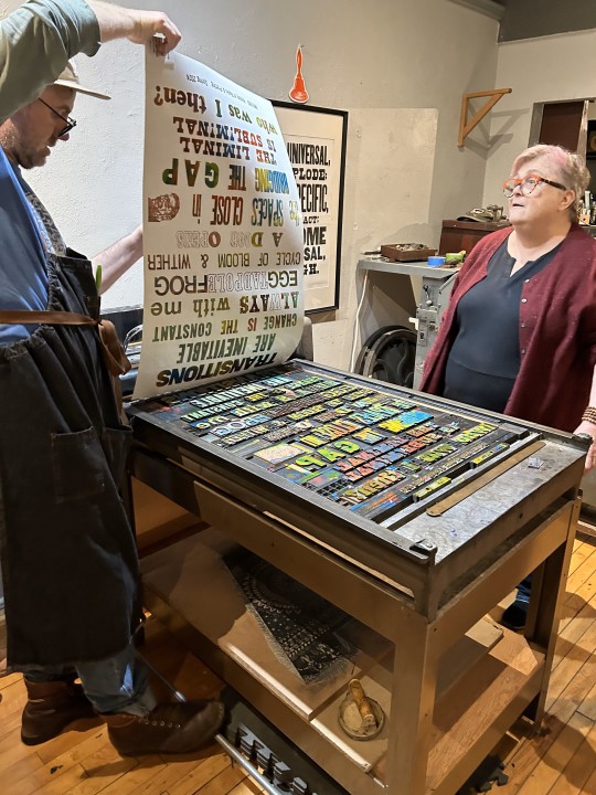
MORE PRINTING WITH WOOD TYPE
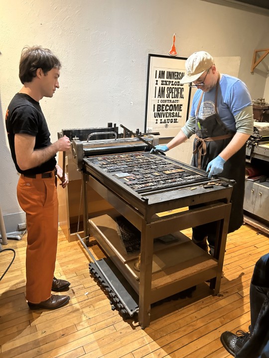
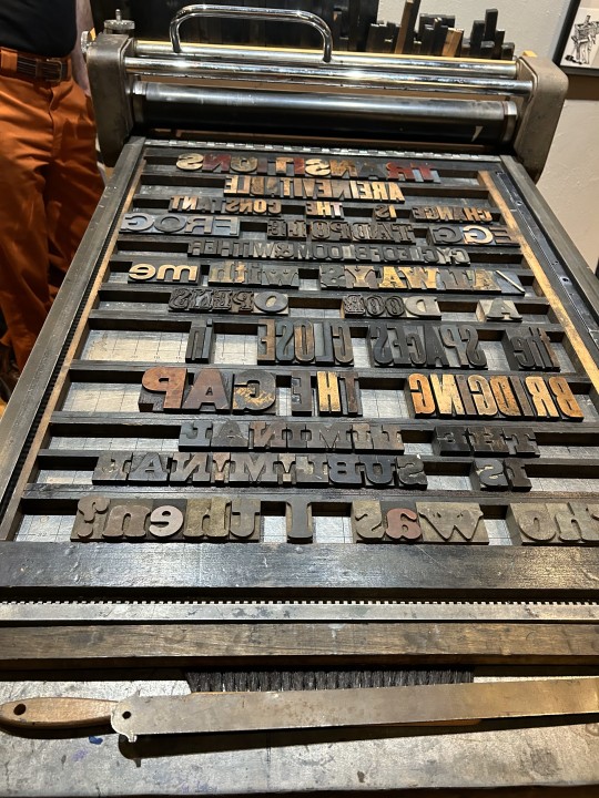
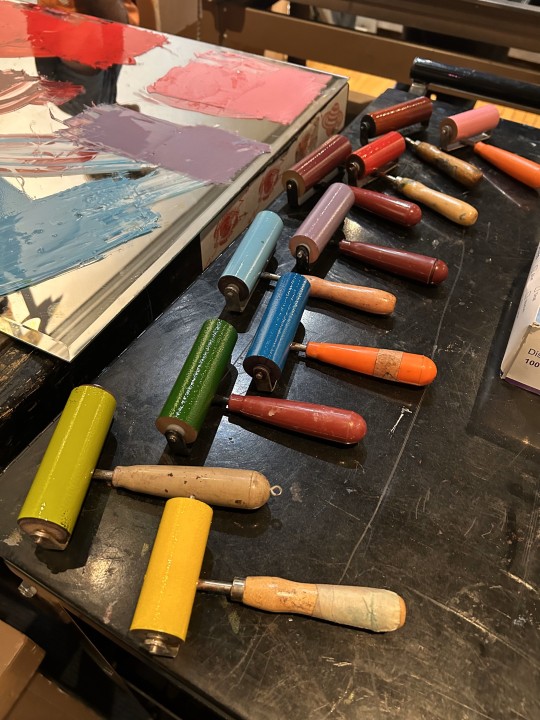
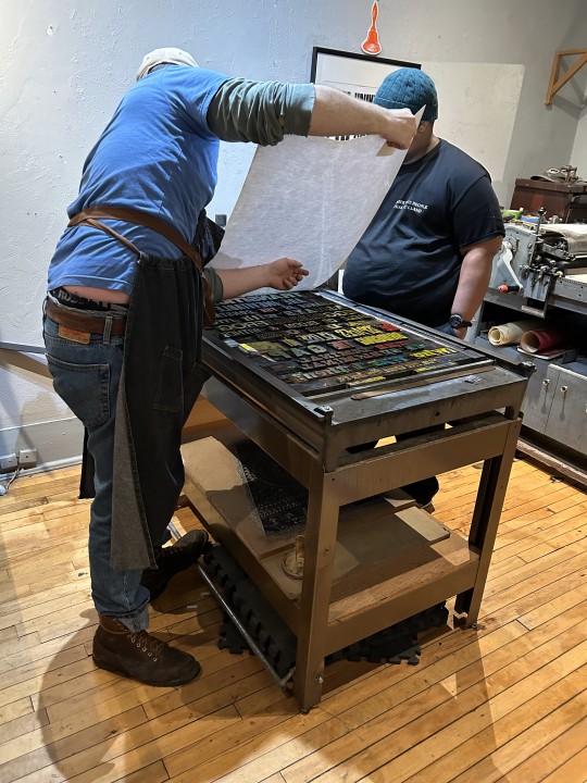
One of my students sent me more images today from our letterpress venture at Team Nerd Letterpress for my History of Books & Printing course a couple of weeks ago. You can read more about the excursion in a post we did last week.
Shown here again are the type cases we worked from; setting and locking up the lines of type on the press bed; inking the type in blue and pulling a proof; then inking the type with a crazy kaleidoscope of colors and pulling multiple prints in rainbow colors.
That image of a sideways face after the line "the spaces close in" is a linocut portrait that Team Nerd proprietor Adam Beadel did of me years ago -- when I still had hair.

View more posts with wood type.
View our other Typography Tuesday posts.
– MAX, Head, Special Collections
#Typography Tuesday#typetuesday#instructions sessions#students#graduate students#Information Studies#INFOST 603#History of Books & Printing#letterpress#letterpress printing#wood type#Adam Beadel#Team Nerd Letterpress#type setting#broadsides#student work#exquisite corpse
50 notes
·
View notes
Text

“Hold me close” was the first of my palette game suggestions from mythra’s fire. She said she was thinking cozy winter thoughts.
Palette 22 “winter in the dark” from this post.
#color palette challenge#handlettering#typography tuesday#drlemurr calligraphy#Thanks mythras even tho you don’t have a tumblr
5 notes
·
View notes
Photo
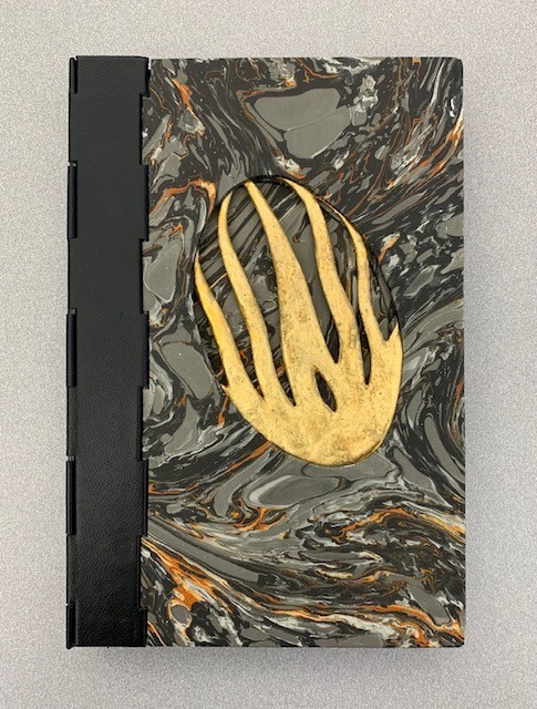
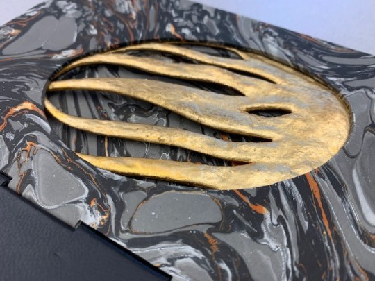

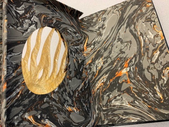


Artist’s Book! Twilight of Orthodoxy in New England (1987)
Lots happening in this gorgeous (and interesting) book designed by D’Ambrosio. The gold cast-paper decoration in the shape of flames (or setting sun) from the cover is reproduced in a cut out on the title page. The name on the title page is a pseudonym.
The sound made by the creaking of the leather spine is intended to evoke the preacher on horseback. (We agree that it does!)
Tanis, Norman E. The Twilight of Orthodoxy in New England. Northridge [Calif.]: Santa Susana Press, 1987.
40 notes
·
View notes
Text

#older daddy#older man younger woman#trans nsft#transfem#transgender#transgirl#tumblr girls#typography#lgbtq#new york#trans pride#trans rights#transgenresworld#trans gender#lgbtqia#lgtbtq#trans are beautiful#trans women are beautiful#happy tuesday#self care#feminine sissy#trans ns/fw#trans ns4t#trans boy#oldermen#mtf trans#transsexual#trans community#trans princess#trans dad
80 notes
·
View notes
Text

#mtf trans#trans beauty#trans nsft#transsexual#transgirl#trans community#trans goddess#trans pride#transgender#lgbtqia#lgbtq#trnsmt#transfem#tumblr girls#tumblr tuesday#new york#usa#older daddy#older man younger woman#typography#feminine sissy#trans ns/fw#oldermen#trans rights#transisbeautiful#sexy titts#trans sex worker#trans nonbinary#trans nfst#transgiri
41 notes
·
View notes
Text
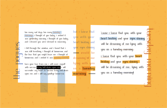
Made a new graphic of this font for my portfolio, since I didn't particularly care about the last one.
The project
#2023#march 2023#designers on tumblr#typography#graphic design#tuesday morning#university#the pogues#illustrator#fontstruct#font#serif
5 notes
·
View notes
Text
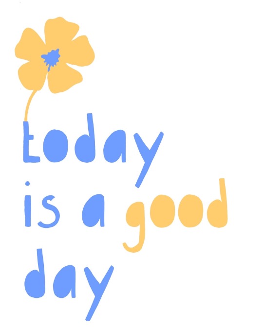
Is today a good day? Buy this in my Etsy shop. Low price and instant download. Link in bio 🌸
#today#quotes and sayings#quotes#home & lifestyle#blue#yellow#flowers#illustration#typography#poster design#poster#etsysmallshop#digital download#today is a day#today is a good day#life#monday#tuesday#wednesday#thursday#friday#saturday#sunday#be kind#buy
5 notes
·
View notes
Text
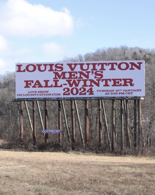
Louis Vuitton Men's Fall-Winter 2024 cartel.
#louis vuitton#menswear#fall winter#2024#live show#tuesday#january#outfront#louis vuitton mens ss24#fall winter 2024#fashion#graphic design#typography#big cartel#cartel#red#red letters#ad campaign#advertisements
1 note
·
View note
Photo

(via "Tuesday is the day of the week" Sticker for Sale by masustore)
#findyourthing#redbubble#tuesday#day of the week#days of the week#daily#weekly#calligraphy#date#typography#font#minimal#day#word
0 notes
Text

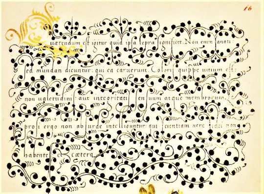

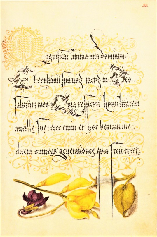


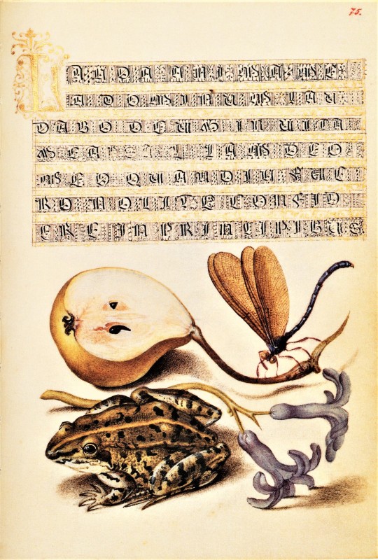


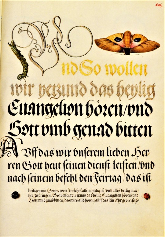

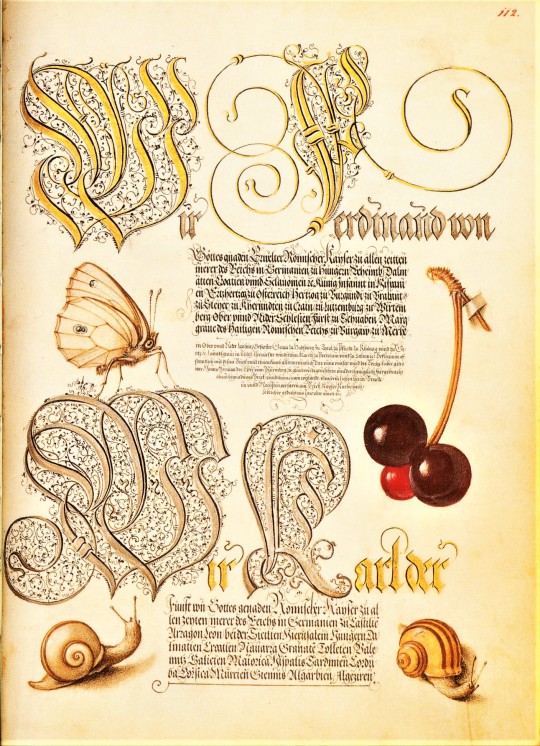
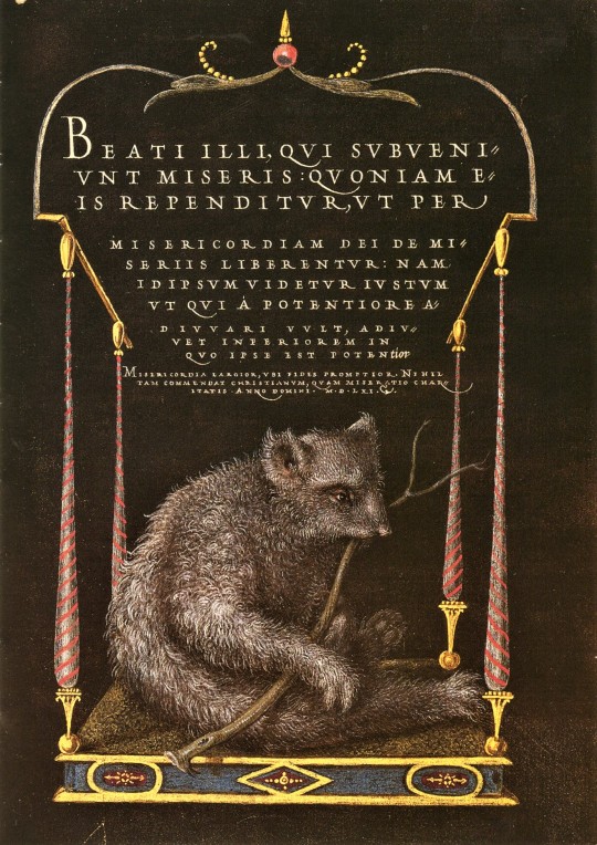
Typography Tuesday
We return to our facsimile of a 16th-cnetury calligraphic manuscript, Mira Calligraphiae Monumenta, or Model Book of Calligraphy, written in 1561/62 by Georg Bocskay, the Croatian-born court secretary to the Holy Roman Emperor Ferdinand I, and illuminated 30 years later by Flemish painter Joris Hoefnagel for the grandson of Ferdinand I, Emperor Rudolph II. The manuscript was produced by Bocskay in Vienna to demonstrate his technical mastery of the immense range of writing styles known to him. To complement and augment Bocskay's calligraphy, Hoefnagel added fruit, flowers, and insects to nearly every page, composing them so as to enhance the unity and balance of the page’s design. Although the two never met, the manuscript has an uncanny quality of collaboration about it.
Our facsimile was the first facsimile produced from the collection at the J. Paul Getty Museum in Los Angeles. It was printed in Lausanne, Switzerland by Imprimeries Reunies and published by Christopher Hudson in 1992.
View another post from Mira Calligraphiae Monumenta,
View more Typography Tuesday posts.
#Typography Tuesday#typetuesday#Mira Calligraphiae Monumenta#or Model Book of Calligraphy#Georg Bocskay#Joris Hoefnagel#illuminated manuscripts#manuscripts#manuscript facsimiles#facsimiles#calligraphy#letter forms#letters#J. Paul Getty Museum#Imprimeries Reunies#Christopher Hudson#Ferdinand I#Rudolph II
828 notes
·
View notes
Text
For @the-wayside
This wound up as brushwork calligraphy because Kinn and Porsche are messy as hell in a delightful sort of way in this story.
Go read the story!
4 notes
·
View notes
Photo


Type Ornament Tuesday: Meta!
We love this type ornament head-piece that features a book. One MUST believe that the tiny ornaments within this decorative book ALSO feature books, and thus it is books all the way down.
This is from a 1755 English work on diseases mentioned in the bible.
Mead, Richard. Medica sacra; or, a commentary on the most remarkable diseases, mentioned in the Holy Scriptures. London: J. Brindley, 1755.
35 notes
·
View notes
Text

Full-page ad in Cashbox magazine, Jan. 14, 1967
#the rolling stones#let's spend the night together#ruby tuesday#60s music#psychedelic pop#typography
0 notes
Text
Top Ten Tuesday - Typographic Book Covers
Top Ten Tuesday – Typographic Book Covers
As a graphic designer, I just had to do this week’s topic from That Artsy Reader Girl – Typographic Book Covers.
They say you shouldn’t judge a book by its cover, but it is after all the first thing you notice. Even when I don’t end up buying a book, it gladdens my heart to see typography that’s beautiful, fun and creative. To make it a bit more challenging, I decided to restrict the covers to…

View On WordPress
#book#book cover#books#design#fantasy#list#reading#sci-fi#science fiction#Top Ten Tuesday#typography
0 notes
Photo

Ok let's boogie. Announcing phase one of our new live show: the FUNK YOURSELF Tour across North America this fall.
Presale begins Tuesday - sign up for presale access here: https://chromeo.komi.io (Click on the ticket button for your city and you'll get a text on Tuesday with your presale code.)
WE CAN'T WAIT TO SEE YOU. More dates soon!
Special guests: Disco Ric, Coco and Breezy, May Rio
Flyer design: Matter Of
Typography: Matter Of
Photos: Julian Dakdouk
269 notes
·
View notes
Last Seen Blogs

overlordraax
Stay safe and keep enjoying SkyStar
santiell
SNTLSL!

brynna
Brynna Campbell

iturnes
iTurnes