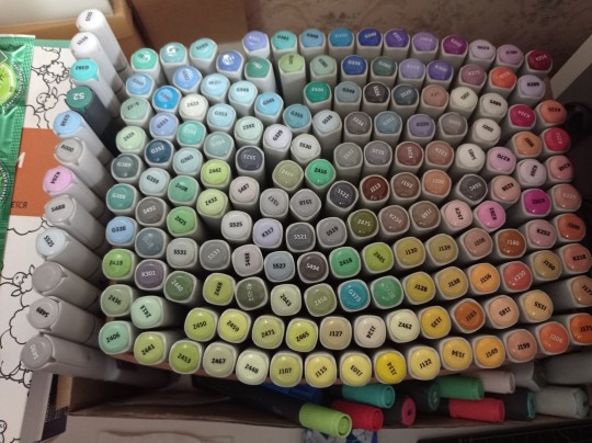
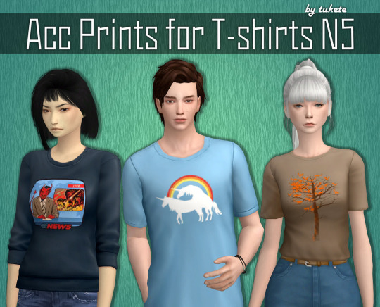
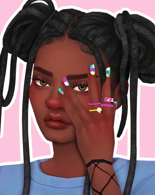
#all those swatches really add up!
Text

It's been a long time since I've wanted to come up with a clothing set for kiddos, the one that is going to match the stuff I convert for adults... And I finally did it!
So, since this set is really simple, some tees + classic jeans, etc, I didn't feel the need to convert these items since some very good examples already existed: so basically it's a re-texture set! 🐛
The list of all the items, swatches, polys is under the cut!
What you need to keep in mind is that the baseball cap and beanie textures are repositoried to AF so you require those! And that they won't really work with every single hairstyle, but I did my best to adjust them. 🦝
Everything's compressed, tool-tipped and organized into folders. Enjoy! ♥
download (sfs) // alt download (mediafire)
What you'll get:
a skirt with rain boots for CF (the skirt mesh I used is base game, the texture is by @adrienpastel-blog here and the boots are the fern wellies by @sforzcc); 6 swatches, some wellies textures are muddy, some are clean; the skirt is 422 polys, the boots are 1,468 polys.
t-shirt v1 for CU (the t-shirt mesh is from here, the textures are by @sforzcc here); 17 swatches, sorry, but all of them were just too good x) 1,288 polys.
t-shirt v2 with Mariner undershirt for CU (both textures are by @sforzcc here and here); 4 swatches, same number of polys as the above.
classic jeans for CU with the slasher sneakers (the jeans mesh is from here, the sneakers and the textures are by @sforzcc from here and here); 9 swatches, jeans 1,002 polys; sneakers 1,804 polys.
corduroy shorts for CU also with the slasher sneakers (the mesh is from here and the shorts textures are from here by @sforzcc); 5 swatches, shorts + socks 1,086 polys; the sneakers 1,804 polys.
grunge revival add-ons plaid shorts for CU with the skater sneakers (mesh here, txtrs also by @sforzcc from here and the sneakers are from here); 4 swatches, shorts + socks 1,086 polys; skater sneakers 802 polys.
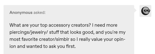
dusty baseball cap for AF-TF-CF (by @sforzcc here); 7 swatches, 758 polys. Both as jewellery (left bracelet) or accessory.
tink beanie for AF-TF-CF (by @sforzcc here); 13 swatches, 488 polys. Both as jewellery (left bracelet) or accessory.
Whew! 🐸 Hopefully all this information wasn't too painful to read. 😭 Forever grateful to the original creators who did the converting ♥
1K notes
·
View notes
Note
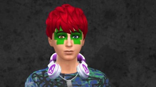
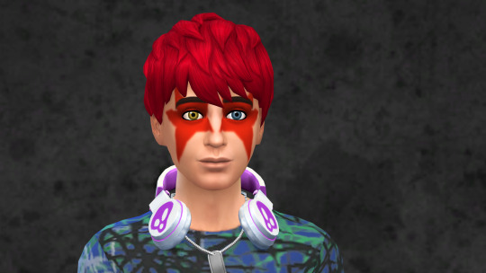
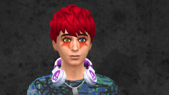
I really like your theory about Spamton basically haunting a mannequin after death. Have you ever touched upon the reaction from Jevil (or anyone, really) upon seeing the new Spamton? Especially considering Spamton isn't even aware he 'died'.
^ how i think jevil's first sight of Spamton would go. i love this ask. this is referring to some headcanons I made a while back, I'll link it here for the one post and the general ghost spamton theory is linked in that one as well. Going to elaborate on it more under the cut for those interested + more art.
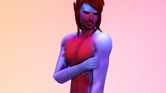
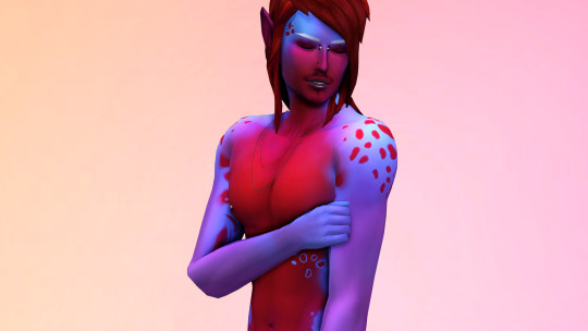
In general I think that people from Spamton's past wouldn't really care if they notice at all, since he wasn't in the business of making close friends with anyone. With the Addisons, in my interpretation he had a "weird co-worker" relationship with them, and while Addisons in general treated each other like potential business competitors that they had to make-nice with, Spamton is especially easy to single out for being visibly and temperamentally different. His altered, current state is something they'd feel at least uncomfortable by, but many wouldn't have been too close with him to begin with for them to talk about it with him directly. Would get whispered about between each other for sure, like we saw with them talking about Spamton after the NEO fight. It moves him from the "disgraced guy I used to know" category to the "actually unpleasant to look at or think about" territory. This goes for Swatch, Queen, and Seam (less so), who seem to buy heavily into the Lightner and Darkner dynamic, with Spamton corrupting the Lightner's dream being a strong taboo against what it means to be a Darkner.
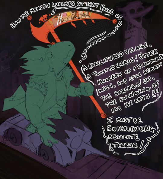
As for what Jevil thinks, Spamton during the NEO fight is both a beautiful and horrifying display. Jevil at this point hasn't seen him in years since his imprisonment, and in their time apart Jevil has grown to find novelty in the cage that everyone else besides him is in since he's created huge emotional distance between him and the reality he lives in. Seeing the fact that Spamton had corrupted an abandoned dream of a Lightner and was causing so much chaos to the established order of the world would be exhilarating, but at the same time seeing that Spamton had accomplished this and still had his strings visible (and changed to a marionette puppet with no symbolic agency), it'd be a painful confirmation of his worldview that even Spamton, who deep down he still cares for, could never have been free.

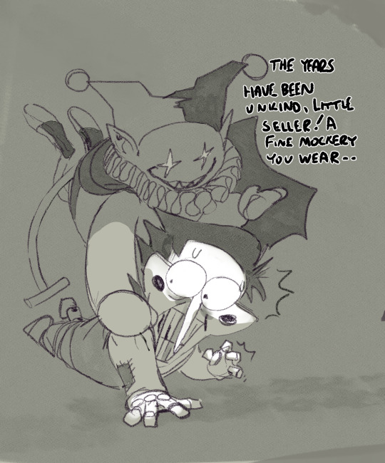

Jevil would think at first he'd just gone through some nebulous situation to change what he looks like, since ofc he himself has toy-like traits (arguable if that happened with Gasterfication or not), Seam is a plushie cat, and other Card Castle Darkners are based on toys, but feeling the lack of life combined with the symbolic body of Spamton would mean to him something bigger had went wrong. He wouldn't dare to bring it up in an empathetic way, stuck in his mindset that it doesn't matter, but it'd still hit a part of him he doesn't like to think still exists. It's something he gets over quickly, almost performatively going back to fucking with him and taking advantage of his fear for entertainment, but it didn't sit well at first.
To me, the fact Spamton "died" isn't really a huge deal, kind of like with the ghosts in Undertale where no one really cares they're just ghosts. They're just doing their thing. To me it'd be fine if neither of them find out what happened for certain, but it's something that adds Flavor to his character.
#asks#deltarune#spamton#jevil#SORRY THIS TOOK SO LONG TO ANSWER ANON LOL. its been a month or something#i asked tumblr user funnywormz for consulation on this for his thoughts as well since he's my accomplice in ghost spamton truthers#my art#ofc this is all just my internal worldview on the thing it's by no means definitive but its just for Fun!#btw as for queen im hardly even joking i think she would have deleted spamton from her memory banks because he was so sucks.#also in the image up top susie cant hear jevil saying this shit it definitely wouldnt have helped.#i think darkners can detect the itemized darkners but lightners cant like with tasque manager and spamneo noticing jevil
296 notes
·
View notes
Text

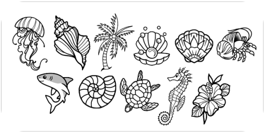
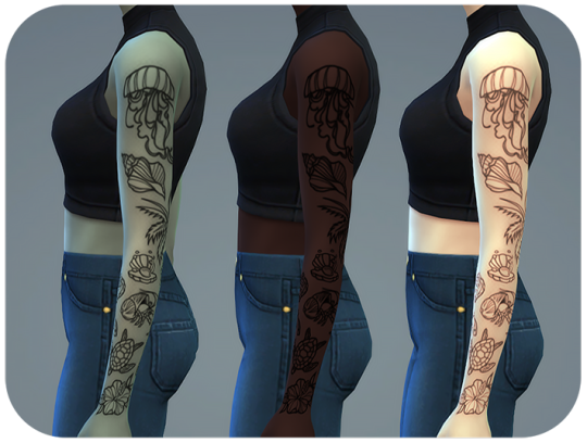
Kehlani Tattoos
This was something I needed for my own gameplay that got a life of its own. I started NSB2 with my hubs and we just got to the part of Sapphire where you need a tat/piercing for each child. My Onyx sim married a custom Sulani townie with an established family, so my Sapphire gen is close to the islands/their cousins/etc. Have you ever realized how few beach/ocean tattoos we have in game? Unacceptable.
BGC
custom thumbnail
left upper arm slot
46 swatches*
created to add tattoos incrementally*
11 tattoo designs (pic below)
all designs redrawn and optimized to show up clearly in game, no barely visible thin lines here
created for feminine frame, but works for masculine with a little distortion (pic below)
works with every skin-tone (also pic below)
DOWNLOAD: SFS | MEDIAFIRE
*Swatches are laid out like this:
1-6 are all the tattoos, in 3 different opacities, one set with linework only, and one set with background shading.
7-17 are each design on their own at the lightest opacity
17-19 is the hibiscus only in all 3 opacities
20-22 are the hibiscus + the turtle in 3 opacities
23-25 are hibiscus, turtle, and hermit crab in 3 opacities
and it continues, adding one additional tattoo up the arm (in 3 opacities) until the conch. To add the final tattoo at the top, circle back to swatches 1-6.

I have two half-sleeves IRL plus some other tats, it really grinds my gears to see the garbage cc passed off as "tattoos". 😒 Do whatever sparks joy in your game, but don't lie to yourself that those little doodley things you see on pinterest would look good as actual ink. That's how you end up paying for a cover-up later.
@mmfinds @sssvitlanz @emilyccfinds @alwaysfreecc @ts4cc-finds @public-ccfinds @s4ccfind
210 notes
·
View notes
Note
hi love!! i was wondering if i could put in a request for a hazel callahan fic where reader is chronically ill and is in a bad flare up so she hasn’t been to school in a few days so hazel comes over to take care of her and there’s just lots of fluff and cuddling <333
pairing: hazel callahan x chronically ill!fem!reader
a/n: I went and did a little research, and I hope I do this justice babe <33 please enjoy!
summary: you’re going through a bad flare up; you haven’t been to school in a while. hazel, your girlfriend, shows up at your doorstep with essential oils and snacks.
word count: 1,047 words / 5,645 characters
~~~~~~~~~~~~~~~~~~~~~~~~~~~~~~~~~~~~~~~~~~~~~~~~~~~~~~~~~~~~~~~
hazel was standing at her locker, pulling books and a backpack out of the long blue storage unit of a closet.
you hadn’t been in school the last few days; she could assume why. she knew of your illness; it wasn’t a secret you kept. you weren’t embarrassed about it, by any means, it was part of what she loved about you so god damn much. your confidence, your positivity.. they were things she didn’t have all the time. she admired you. as both a partner and a friend.
she practically slammed her locker shut, turning away with her backpack hanging on by one strap on her shoulder. she headed outside the school, the frosty wind hitting her face. she sighed, sprinkles of snow dancing on her hair and eyebrows. you always loved the snow; shame you weren’t to see it with her.
an idea pricked her mind.. she wanted to see you so, so bad. but was it right to go to your house, if you weren’t feeling well? she'd texted you, but you hadn’t responded. not that she excepted you to!
yet she still desperately wanted to care for you and love on you as much as she could; if that would make you feel better. she would do anything to make that happen.
hazel headed back to her own house, slipping in the house just to brush right past her mom and go to her room. she tossed her backpack on her desk chair, flopping down on her bed. she stared at the celling for what felt like hours; to which it was really only, tops, maybe thirty minutes.
her head was racing a million miles a minute.
how much pain were you in? was she wasting time just sitting here, when she could be there with you, easing your pain?
she groaned, rubbing her heads over her eyes. she jumped up out of her bed, grabbing her backpack again. she piled lavender essential oils into the bag, turning to a basket full of snacks. your favorite snacks, might she add, that she kept in her room for when you came over.
she piled those into her bag, too, and slung it over her shoulder again. grabbing her phone, she shoved it into her hoodie. which she'd probably have to remove later anyways because she planned to give her hoodie to you.
she sped down the steps, right past her mom again—who attempted to talk to her, but she swiftly ignored her and headed right out the front door.
your house, was luckily, not far from hers. it was maybe a block down; so she just opted to walk rather than waste her cars gas. that shit was getting expensive, anyways.
once at your house, she gazed at your front door for a minute. plain white door with a black circle window; the glass stained with color which she knew was all you.
she walked up to the door, knocking gently.
when a woman who wasn’t you answered the door, she put on her best smile, in case this woman was a doctor or someone who had been checking on you—or worse—your mother.
“ah,” the woman tapped her fingers against the door. “your (y/n)’s girlfriend, right? hazel?”
“uh, yup! o-one and only,” she chuckled nervously, her grip tightening on her bag strap.
“breathe. I’m her older sister,” she laughed, moving aside to let hazel in. “she’s upstairs in her room. not feelin’ too well.”
“yeah… I assumed,” hazel sighed, thanking her and heading up the stairs. a door that was covered in swatches of paint read “(y/n)’s room” painted in glitter rainbows and stars.
she smiled. she knocked with the back of her knuckles on the door, peering inside. the door wasn’t fully shut, cracked open a little—she assumed it was so people could check on you.
you were lying on your bed, your frame curled up against your pillows. your face was scrunched up in pain, your hair tied into a messy bun. your hands were straddling the pillow as if you were holding on for dear life. you had your headphones in, and couldn’t hear her.
“(y/n).. baby..?” she calls out to you, making your eyes open wide. you tug out your headphones, looking so relived to see hazel standing in your doorway.
“hazel!” you smiled as bright as you could, your expression still pained yet very happy to see her.
“hi, honey,” she smiles back, slipping into your room. she closed the door behind her, dropping the bag beside your door. “not feelin’ the best, I guess?”
“y-yeah, not at all,” you flinch, your body squirming in pain, “took some pain meds.. did some exercise, I-it didn’t really help much.”
“would cuddles make you feel better?” she cocked her head a little, raising an eyebrow.
“much better,” you slowly open your arms, making a grabbing motion at hazel.
she laughs at your gesture, tugging her black hoodie over her head. she’s left in a sports bra only; tossing the hoodie to you. you caught it with a smile, slipping it over your head.
she bent down to grab her back, dropping it beside the bed so you could reach it comfortably. she climbed in behind you, wrapping her arms tight around your waist. she held you close, pressing your back into her chest.
you plug your headphones back in, offering one to hazel. she does the same as you; pressing a kiss against your collarbone. she slowly and tenderly took your hand placing kisses from your hand to your arm. you were a beauty to be worshipped; and she would do just that for you.
“your too sweet, actually,” you chuckle, crunching on what looked to be a bag of pretzels. “how did I get so lucky, huh?”
she laughs back, pressing a soft kiss against your jaw.
“how did you get so lucky?” she scoffs, “how did I get so lucky! i mean, look at you, and than look at me. I’m like a lowly peasant and your a fucking goddess.”
you snicker, “your not a peasant!” you pat her head. “if I’m a goddess.. well your a goddesses girlfriend, than. see? not a peasant.”
she nuzzled into your neck, closing her eyes in the warmth, “guess I am, huh…”
~~~~~~~~~~~~~~~~~~~~~~~~~~~~~~~~~~~~~~~~~~~~~~~~~~~~~~~~~~~~~~~
#hazel callahan x reader#hazel callahan#bottoms 2023#bottoms movie#fic#fanfic#request#asked and answered
156 notes
·
View notes
Text
Tutorial for @mimssides
How I draw with alcohol markers. Beginner edition
First off all I want to specify: this is based on my experience only, so take it with caution. This is also my first tutorial ever.
1) Have an underpaper.
Unless you use some really thick paper, markers will bleed on your next page or table ( depending if you're drawing in a sketchbook or not). I recommend to have one list of some decent paper under the page you're drawing on. Decent means thicker than office paper, can be watercolor paper, it usually perfect for it. It's reusable and over the years mine two look like this:
( you can see there's a lot of stuff going on there)
2) Always, and I mean ALWAYS erase your sketch.
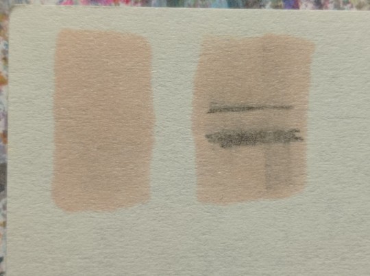
If you're doing a quick try out of color combinations you can skip this step, because you don't need the aesthetic or anything. I'm not sure how useful this tip is for colored pencils ( cuz I never sketch with those), but with regular graphite pencil it's very much important. Graphite smudges your markers, and not only that. It also gets trapped if you go over it with a marker, meaning you wouldn't be able to erase it and it's going to leave you with gray smudges all over. Truly awful.
3) Have your pallets on the same paper you draw on. Or simply - have pallets!
Colors can show differently on different paper, that's why it's important to do color swatches once you buy your markers. They are designed for specific paper, and on your paper they can look a lot darker or really pale. I recommend testing colors before you buy them, it's usually an option in the most craft stores. If you're buying a set just take 30 minutes to do all the swatches and naming them. It also helps visually to see what colors you have.
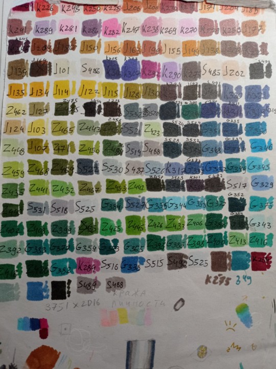
(I have a lot, but you don't need as much, there's like 60 colors I use usually and the rest are on rare occasions. Build a set you're comfortable with)
4) Make sure your materials all work together.
We already talked about graphite swatches, not the worst thing that can happen to you. Mainly you need to make sure how your materials work together, how they lay on top of each other. Make sure your lineart won't react to your markers, there's special waterproof liners and those are the best for markers ( mine are Pigma Micron from Sakura). See how your pens and liners act before and after you apply markers.
Decide which is better to use before and which after markers
5) No black.
I don't use black in any of my drawings. All you see is different shades of gray. It looks much more pleasant with the rest of the colors and it allows for my lineart to be visible underneath. Sometimes even those grays are too dark and I need to add more shades or white lineart to fix it

6) How to shade.
This is a very subjective thing to talk about. You can shade how you want. I will talk about two ways I shade.
1. Same marker. Markers dry. And when they do you can go over them another time. Usually that makes a darker shade of the same color and it's a pretty safe way to do the shading if you don't know which colors can go together. It doesn't work as well on the light colors and difference can be barely noticeable. It's a nice way to get soft shading
2. The pure chaos. Just kidding... Different color marker. It's hard to explain, and yo always need to test what works for you. If you want sharper shade you need to grab a different color, can be from the same hue ( for yellow - orange, for red - burgundy) or something a little more spicy. You can add different hues to your colors with different shades ( your black with red shades is suddenly looks burgundy, or purple, or blue). Experiment! Fail! Find out which combinations work and which don't!
If color seems a little darker than you expect you can go over it with original color, which might lighten it up. This tip doesn't always work

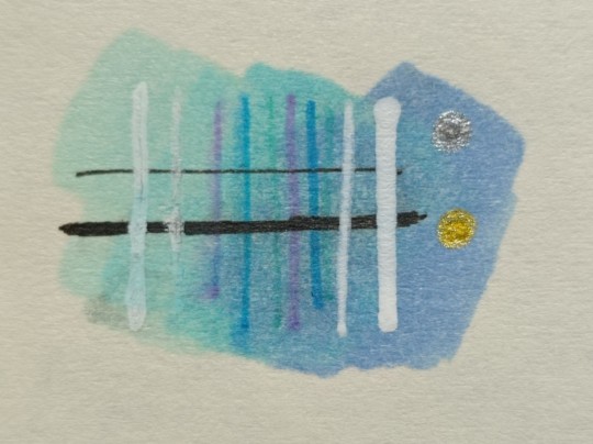
7) How to do gradients.
1. Choose your colors beforehand, see how well they work together. It's easy to do a gradient from red to pink, but not so much from orange to blue. You might need to choose lighter colors, because if you want smooth transition from one color to another you will need to go over them a couple of times and that will darken them.
2. Add a middle color. Not every gradient needs a middle color, but with it you can make your gradient much smoother, it will be more noticeable the bigger aria you cover. The more middle colors you have the more harder gradients you can do

( without and with a middle color)
3. Act quickly. Markers dry relatively quickly so you need to add colors one after the other, you can't go away before you're done.
4. Blend with the lighter color. You can also start with this color as a base but that doesn't work for all color combinations. Lighter color will go in top a darker and flow into it making it lighter and transition smoother. ( example: you go from red to purple to cyan, you will need to start with red, then purple going over red to soften it, and finally the lightest cyan going over purple and maybe even a little red). You always put darkest first and go over it.
There's other methods of doing the gradients. They are very similar actually, but for second one you will need a blender. For the first one grab two markers you want to use ( more if you're feeling risky) turn one of the markers upside down and touch their tips. Now use your understanding of gravity. Color from the top marker will go into the bottom one. The longer you wait the longer the gradient will be. Usually I don't need to wait longer than 3 seconds.
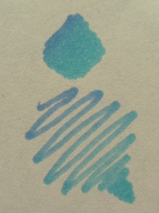
And you can do the same with a blender
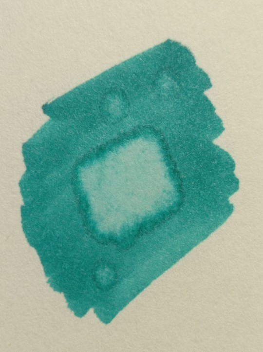
8) How to use a blender.
Blender is a marker with no color. Usually it's named B000 (I recommend buying a blender with brush tip). There are many ways to use it.
Gradients: you can use two markers technique with a blender making gradient fade on one end, or you can mix colors inside the blender.
Fixing mistakes: blender will make a white show through your color, you can use it to get rid of the wrong color. But it doesn't work without some problems. Of course darker colors will likely stay, even if much lighter, and your previous color will try to flee ( likely to other sides, if you're lucky it will go on your underpaper)
That's all I have for you today. Experiment and learn something new. Hope that helps
99 notes
·
View notes
Text
Wig Seller Masterlist
Some people on were asking if I had a post about this and I didn’t, so I thought I’d make a big master post of wig companies I like! It’s in alphabetical order, with information about them listed afterwards. Currently I have fifteen brands on this list, but if I try and am really impressed by another, I’ll add it. I hope maybe one of them has that hard to find wig you’ve been searching for! I have the color samples for Arda, Assist, Classe, Coscraft, Cyperous, Kasou, and Swallowtail and am willing to help you check if a color from them is correct or not.
Airily
Japan only brand, so you’ll need a shopping service. Wide range of colors, including some that are hard to match in other lines, and a lot of base styles that I like more than other brands. Sells both wefts and lace front pieces. Lace hairline wigs are also available. Fit is medium (not particularly large or small). Price is higher. Swatch book not available.
Alice Garden/aiyaya
Amazon wig brand selling lolita/natural looking wigs. The variety is not good but if they have something that looks like what you need to wear with very little styling, you won’t get something as nice for the price! Styles are all very natural looking. Fit is on the smaller end of medium. Price is low. Swatch book not available.
Aoi Wig
Taobao brand doing character wigs, so a shopping service is required. These are hands down the best character wigs I’ve ever worked with. If you don’t want to do a ton of styling and they have the character you want, you literally cannot go wrong here. Fiber isn’t the world’s most durable but will hold up for multiple wears, and the price is good enough to make up for it. Fit is slightly small but larger than most taobao wigs. Price is a bit high for taobao but is still dirt cheap for what you get. Swatch books not available but the photo color is exceedingly accurate.
Arda Wigs
American based. One of the most common brands for a REASON! Wide range of colors in a wide range of styles. If you have a larger head or a lot of hair, this is your new best friend. They sell lace fronts but not individual lace pieces. The big problem with them, however, is the stock issues. Colors run out quickly so sometimes you have to compromise on which style you buy, or place an order from one of their sister sites in another country that actually has the color you need. (OOPS this is no longer an option anymore! Luckily there are a lot of Arda wigs secondhand online.) Nobody has as much hair in their wigs as they do, which can actually be a problem in some styles; be prepared to pluck lace fronts and use thinning shears. Fit is LARGE; they have the largest wigs in the market. Price is a bit high but not exorbitant. Swatch rings are available for both their fiber types
Assist
Japanese brand, ships worldwide but EMS/fedex only so you’ll probably want to group order. Nobody in the market has as many colors as Assist; between their premium and basic lines, they have over 600 colors! DO NOT TRUST THEIR PRODUCT PHOTOGRAPHY TO PICK COLORS; you need to buy their swatch books or ask a friend who has them to help you choose, because those photos can be criminally inaccurate. If you ever order from them, buy a bottle of Face Cover Glue and watch it change your life as “wig sticks away from face and face framing pieces move out of place” become a distant memory, and I adore their contacts! They sell wefts and lace pieces in their premium line but not their basic. Price varies; Premium line is a great price for what you get, but Basic is incredibly cheap (but not quite as good quality). Fit is small; based on how they fit my clients they’re the smallest of the Japanese brands and if you’ve ever found taobao wigs too small, assist will probably also be too small for you. Swatch books or rings are available and also required.
Blue Beard
Taobao character wig brand, so shopping service is required. Blue Beard wigs are all affordable and decent. You won’t ever get a bad wig from them, but I’ve found that their wigs tend to require a lot of maintenance. Wide range of characters! No wefts available. When you find stolen taobao wig photos, more often than not they’re stealing from Blue Beard. The photos are all color accurate, but you’ll typically need to do a lot of styling to make the wig match the photo. Price is great for what you get. Fit is medium to small. No swatches available.
Classe
Japanese brand that requires a shopping service but oh what a brand it is. Classe has a wide range of colors but where it truly excels is in the range of extra styling supply options. You can buy lace front pieces, yes, but you can also buy stand alone skin top pieces in center whorl or long for parts. No brand is as flexible with what you can do with their wigs, not by a long shot. Make sure to check out their styling blog! Even if it’s all in Japanese, the diagrams are clear and the techniques are genuine life savers. The fiber is beautiful and the website’s color suggestion feature where the desktop version tells you a list of characters they’d use this color for makes picking colors a lot easier. You’ll pay a lot for them, but what you get will be worth it. I’ve been using them a lot lately because no other brand’s fiber is as easy to make behave like human hair. Naturalistic wig stylists and cosmetology people, this brand is for you! Fit is up to 59cm (!!) and is roomy in the hairline coverage to the point some people have to trim the ear tabs a bit shorter, although it’s my personal comfiest fit. (Upon further testing: Classe’s fit is going to be perfect for you if you’ve ever tried an Arda lacefront and found it somehow a bit too big in the cap but too skimpy in the ear and hairline coverage at the same time.) Swatch books are available and affordable.
Coscraft
Based in the UK but ships worldwide despite being way too unknown outside Europe. Coscraft is an absolute gem of a site with a wide range of colors (more than 80!) with plenty of unusual color options that aren’t found anywhere else that doesn’t need a shopping service, a decently large variety of base styles to choose from, and wefts and separate lace front pieces and stick on skin tops in every color. Unlike every other cosplay brand on the planet, their lace front pieces come in dark brown lace for darker skinned cosplayers and not just beige! (The skin top pieces are only in beige so far but hopefully they will work on this.) Also for some reason they sell ridiculously inexpensive corset coutil so for all the craftsmanship people, new source acquired! Even if you’re outside of Europe, Coscraft is so nice that it’s hard to believe their prices. When the pound is up vs your currency, they’re shockingly affordable. When the pound is down vs your currency, the quality per money feels straight up illegal. This is my current go to cosplay wig site for a reason. Fit is larger medium; it won’t be too big or too small on most people. Color swatch ring is available.
Cyperous
Japanese cosplay wig source that theoretically ships EMS outside Japan but I haven’t been able to get that to work for years so shopping service it is. Pour one out for Cyperous; they’re clearly in decline but as one of the original heat resist brands, they’re still here and still worth ordering from while you can. Nobody has as beautiful and delicate blondes as Cyperous; their Milky and White Milky are the best blondes I’ve ever used. They have a nice selection of lace wigs and the much rarer lace bang wigs as well as regular wigs, and wefts of course. No other brand I’ve seen has synthetic wigs that photograph as much like real hair as Cyperous. They can tangle a lot as a result but it’s worth the upkeep. I have no idea how long they’ll keep limping along, but look them up before it’s too late. Price is high but reasonable for what it is. Fit is a true medium. Swatches used to be available and no longer seem to be, but the photos are pretty accurate to my ancient swatch ring and newer wigs.
Five Wits Wigs
Five Wits is the most criminally underrated of the American wig companies because most of their stock photos suck. They really, really, really suck. The photos are somehow incredibly color accurate but represent the wigs as pulled directly from bag and plopped onto someone’s head or a mannequin without even combing them in a flattering way. I wrote them off until I got to see their booth at a con and realized quickly that these wigs are wonderfully made with beautiful fiber that typically photographs like a dream (how do they get such bad stock photos?!) and is so easy to style! Five Wits mostly stocks character wigs, but many of them are versatile enough to use for tons of other things and they offer wefts for some of their colors. The owners are friendly, the service is great, the actual wigs are beautiful, the price for what you get is wonderful, but those dang stock photos keep people from noticing why Five Wits is one of my favorite suppliers! Price is great for what you’re getting, especially for an American brand. The fit is larger end of medium (very few people find it too big or too small). They don’t carry swatch books but every single stock photo, despite being terrible, is an incredibly accurate depiction of the color so feel free to judge colors accordingly.
Kasou
I almost hesitate to put Kasou on here considering that one of the problems with them is that their shipping when it’s from their Chinese warehouse is occasionally “good luck getting your wig”, and I disqualified another past favorite of mine for this, but Kasou squeaked onto this list for two reasons: 1) their fiber and wigs really are spectacular and 2) they have the ONLY Jolyne Kujo pre made wig that I don’t hate. Order from them with confidence that whatever you get will be nice, but keep in mind that there are enough people who’ve had issues with wigs from their Chinese warehouse that you want to give yourself months of lead time if you go that route. They have a decent if slightly expensive price range, medium cap fit, and they do offer swatches. I NO LONGER RECOMMEND KASOU. I still stand by their products being nice, but there have been too many extremely expensive packages lost in the mail with them refusing to refund/replace among cosplayers I know for me to put them as a recommendation. If you order from here, do it with caution.
L-Email / wig-supplier
Not everyone needs premium wigs for heavy styling all the time, and that’s where L-Email comes in. This Chinese-based seller that ships internationally will sell you decent character wigs and decent base wigs for an incredibly affordable price. Nothing from here is going to be spectacular, but if your budget is low and you’re willing to put in a bunch of effort to make up for that, what you need is just a plain wig without tons of styling, or you want a character wig that’s a bit easier to upgrade with extra styling work than other brands because the hardest parts are typically done for you, L-Email is a great option for you. They’re just all around decent, and sometimes that’s what you need. Fit is medium, prices are pretty affordable especially if you go in with friends for shipping, and there aren’t swatches but the photos are typically pretty color accurate.
Sepia
One of the absolute oldest wig companies based in America; every cosplayer active before 2007 has bought at least one Sepia wig. They’re still here though, and now they have some heat resist lace fronts! Their range of fantasy colors is pretty atrocious but if you want some beautiful natural colors, you could do worse than shop here, especially considering there’s at least one more expensive brand (that I’m not putting in this list) that sources lace fronts from Sepia and resells! Fit is medium, price is medium, I haven’t bothered to see if they have swatches because I’m an ancient cosplayer and have the typical Sepia color codes memorized.
Swallowtail
If you’ve heard of this Japanese (shopping service required) wig brand before, it’s probably because the canon wigs in My Dress-Up Darling all come from Swallowtail. There’s more reasons than flexing about how you have the canon Shizuku-tan wig to consider Swallowtail, though! They have a massive color range with a lot of colors I’ve seen nowhere else in the world, and while the fiber isn’t the world’s most durable and is a bit shiny for my tastes in some colors, they’re affordable enough to be a competitive option even if you have to use a shopping service from outside Japan. They offer a full range of wefts and lace pieces and clip ons and a wide variety of base styles. The fit seems to be pretty true medium, and they definitely offer swatches (in the most chaotic ring setup I’ve ever seen. You’ll want to resort that one fast.)
Sylvia_Wig
You can get a lot of decent lace fronts perfect for minimal styling on AliExpress, but Sylvia is my hands down favorite. If you need a natural looking lace front and you don’t want to spend tons of money, this seller is where you should be looking first. There aren’t any swatches or wefts, true, but the wigs have so much more lace than any of the American or Japanese cosplay wig brands, the caps run much larger than most taobao/aliexpress brands (comparable to Kasou or Five Wits), and there’s still plenty of hair to do more basic styles. The fiber is a bit thin and shiny, but it still photographs like a dream, and dollar for dollar you won’t find a better balance between quality lace front and budget friendliness than here. The hairlines are so natural that I have a few from here that haven’t required a single hair plucked to just… melt into my skin. There’s a reason this is my go to first source if I want a lace front and it’s not going to be heavily anime styled (like JoJo or Dragon Ball or whatever). Color stock photos are incredibly accurate; you can trust that what you see is what you’ll get!
since people have sent me asks about this: I do not recommend Epic Cosplay at all anymore. Their construction quality has drastically decreased in recent years to the point I keep getting people asking me to help fix Epic wigs that are literally falling apart, which is enough reason to not want to order from them, but they’ve also had a decade plus pattern of labor rights abuse and employee mistreatment including racism, transphobia, homophobia, ableism, and pregnancy discrimination.
#cosplay#cosplay wigs#wigs#cosplay reference#cosplay resources#oh jeez this took forever lmao#wig seller list
507 notes
·
View notes
Text
ok time for an info post about my edited stuff folder and also some new additions to it
a lot of these are pyxis edits, but the others are also creators who dont seem to be active anymore. but if anyone is the original creator of one of the things ive edited and you're mad at me for posting my edit... sowwy. ill take it down if you ask nicely ♥
ssspringrollIntergalacticSpotsM.package
edit of: https://pyxiidis.blogspot.com/2018/02/intergalactic-supernatural-overlays.html
description: so it turns out all these years, the fem frame version of the intergalactic overlay was a little different from the masc frame and i never noticed. so i made a little add on edited version of the fem frame overlay so it fits the masc frame.
before -> after (there's shoulder spots now)
its available in all the original colors. theres 2 versions of each color though, since there were slightly different leg opacities for the masc and fem versions and i couldnt decide which one to go with. they are very minuscule differences, the shoulder spots are really the main event.
feel free to recolor this in other palettes, id appreciate it actually. took a lot of fiddling to get those spots to line up right, please! please use my edit and make recolors!
this shows up in cas (for m frame only, theres no point for f frame, they already have it) as a separate cas part. the thumbnail is the same as the original, except i slapped the word 'EDITED' over top in big red letters. hopefully you will see it.
ssspringrollPrettyVisitorsHeterochromia.package
edit of: http://pyxiidis.blogspot.com/2017/04/pretty-visitors-eyeset.html
description: heterochromia. the meshes are by me (not that i can take much credit for them, its an ea eyeball thats slightly larger than usual. thats it.) but there are L and R meshes for each age (infant to TYAE) feel free to recolor in other eye sets, the mesh follows my usual TOU. the textures, obviously, are not mine. i don't know if i managed to squeeze every swatch from the pretty visitors eyes in there, but i know for a fact all the human colors, the pooklet colors, and some other alien colors are in there. I did not do the vampire colors. sorry. maybe some day.
found in face scar and neck scar (in skin details) but feel free to re slot them to other categories for your convenience. left and right cheek might also be a good spot for them. there are two cas items, L and R, so i wanted them to be sort of close together, thats the only reason i picked the spots i did.
incompatible with glasses.
demondays
edit of: https://pyxiidis.tumblr.com/post/177241795736/demon-days-vampire-stuff-by-pyxis-some-things
description: the original texture of the gradient limb overlays was bleeding out of the leg area a little bit, which clipped into the texture area of some wicked whims body parts, making unexpected splotches. i just trimmed it back a little so it shouldn't do that anymore.
eyes
edit of: https://pyxiidis.blogspot.com/2017/11/arachnophobia-accessory-spider-eyes.html AND https://www.patreon.com/posts/29118520 (v2)
description: converted for all ages. the meshes are addons and should be installed alongside the originals, the arachnophobia overlays (PYXIS_Arachnophobia_SpiderEyes_FaceMarkingDetails_upperRightArmTat.package, etc.) are direct edits of the original package files. Delete the old packages with the same names and replace them with my edits, if you want the overlays to be available for all ages. You don't need the overlays for the meshes to work, though.
An additional slot has been made available for infants -> children in the eye details section. The meshes will not be found in that category for teens and up, just the tots.
Waay'los' folder
this sections formatted a lil different. dont worry about it.
PYXIS_Siren_MermaidGills
edit of: http://pyxiidis.blogspot.com/2018/05/siren-mermaid-accessories.html
description: edited warehouse data so that necklaces can be worn at the same time as the gills. the mesh has not been edited, so compatibility with very close-fitting necklaces like chokers is not likely (gills are bulky and will clip) but i figured thats no reason to close off the option entirely. so necklaces are allowed now. also, i changed the categories. the packages claiming to be necklaces are found in mouth scar and the ones claiming to be rings are found in face scar (skin details section, towards the bottom near acne)
⚠ NSFW [MiniGiles]LoveBelow SkyrimFantasies Reptilia Male
edit of: i dont think this ones available anymore i will be honest. i can't find a link
description: tweaked positioning of the mesh so it lines up a little better with animations. also tweaked the weight painting and uv map. it doesnt animate quite right all the time, but it gets the job done. should still show up in the ww body selector (does for me, anyway)
⚠ NSFW ssspringrollReptiliaOverlays.package
edit of: this ones original content
description: gradient overlays for the reptilia body parts in the same basic rainbow palette as my overlay minipack. found in body scar (right leg). really nothing fancy, just for a little bit of personalization. should be color slider mod compatible
no custom thumbnail
ssspringrollHorns
edit of: https://flapjack-sims.tumblr.com/post/114810983191/horns-for-sims-4-ive-noticed-the-lack-of-horns-in (MESH) https://cherryvanillasims.tumblr.com/post/163956398575/flapjacks-thicc-horns-forehead-in-noodles (RECOLORS)
description: moved the uv map and textures so now the horns are compatible with hats (and any other accessories that use the hat texture space, like lots and lots of the wing cc thats out there)
changed the category to acne. there's two packages of these horns, i think the textures are ever so slightly different between them, but its negligible. I'd recommend the ssspringrollHornsEditedForMyBoy.package version, if you don't want to grab both (which you can, they appear as two separate cas parts)
no custom thumbnail. i dont know if these require the mesh. i dont remember.
Disclaimers:
Just because I've edited these pieces of cc does not mean I'm adopting them. I cannot promise I will offer support if something breaks.
Lots of these are edits of my own personal package files, rather than edits of freshly downloaded versions. They may have been batch fixed, re-slotted, renamed, or otherwise edited over the years I have had them in ways I no longer remember.
Okay looks like thats everything for now.
I will probably add to this pile eventually, but until then, bye bye.
shoutout to @/occultradio for requesting most of the edits that aren't in the Waay'los folder. i straight up did not notice the shoulder spots until they pointed it out and likely wouldnt have done any of the other stuff either if they hadn't asked lol
30 notes
·
View notes
Text
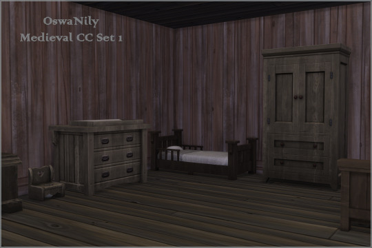


Medieval Recolors of Objects Dump, part 1
There isn't enough maxis match medieval cc, so here is a little set of recolors, making some game items look more appropriate for the era. Not everything is pictured, but apart from the Ye old cookbook oven, everything on the pictures is included. As you can see there is enough to furnish a house (apart from the bathtub: I found enough good cc bathtub options, and the base game wooden one can work fine, so I didn't bother with it).
This set contains 21 items, please read the item description (below the cut) because not everything is base game compatible!
Also, as you can see, this is part 1, there is a part 2 planned, and some CAS items too.
Items list:
Bench: Outdoor Retreat required, recolor
Bunk Bed: Horse Ranch required, retexture, I also tried to up the energy and comfort level but I haven't tested those (but it should work, I have done it before)
Candles: Base Game, recolor and tuning edited so they work as an anti monster under the bed lamp
Chair: Base Game, retexture
Changing Table: Growing Together required, retexture (don't add the safety belt thingy, there wasn't really a way to make that era appropriate so i left it as is)
Chest: Base Game, retexture, works as a dresser
Counter: Base Game, retexture, the angled pieces look a bit weird but I did my best
Double bed 1: Outdoor Retreat required, retexture of the mattress with the original frame wood swatches
Double bed 2: Base Game, retexture
Dresser: Kids Room Stuff, retexture
Fridge: Cottage Living required, recolor, this fridge doesn't work off the grid (for the ultimate decades challenge you can't have a functional fridge, so I made it based on what I needed, if you want a functioning off the grid version just ask!)
High chair: Base Game, retexture
Infant bed: Base Game, retexture
Mission tables: Base Game, retexture, three sizes
Potty: Cottage Living required, retexture
Screen (room divider): Base Game, retexture
Single bed: Cats & Dogs required, retexture
Toddler bed: Base Game, retexture
Toy Box: Cottage Living required, retexture, (don't look in the toy box when it's open, the toys have a wood texture but there's a very anachronistic robot in there)
The swatches don't match on all items, but most have at least 6 swatches in common.
The download is a .rar file, extract it and you can pick and choose which items you want. Remember, only keep items you have the corresponding packs for!
If you have suggestions for objects you want to see in part 2, tell me!
Download: SimFileShare | Dropbox
@allhistoricalcc @ts4medieval @maxismatchccworld @mmoutfitters @mmfinds @sssvitlanz @emilyccfinds @public-ccfinds @alwaysfreecc thanks!
68 notes
·
View notes
Text
A very lovely anon asked for some of my favourite accessory creators, and i really enjoy doing this top cc lists, so here we go!
tbh i don't use that many accessories, but the ones I do use, I really love!
@tamo-sim


okay i'm pretty sure most people know of tamo's amazing cc, but i use their stuff ALL THE TIME so it was essential for me to mention them! Their glasses are some of THE most essential cc items in my game, and I adore all of the swatches and the fact that they're available for multiple ages! As well as their awesome glasses, they also have some great jewellery and other cas items to check out, too!
@liliili-sims4


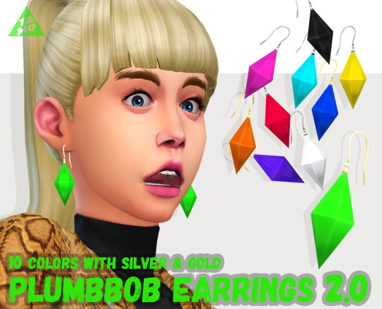
so in general, liliili has some really neat CC - i really love a lot of their clothing items, there's so many fun swatches! But their accessories are really awesome - especially hats! I love giving sims hats but it can be a struggle sometimes to find ones, but liliili has some really cool ones! Plus, a load of great glasses, and their set of accessory tops are SO cool - multiple types of shirts, including collared shirts and zipped up tracksuit ones (pictured above), all with a load of great and versatile swatches!
@tukete


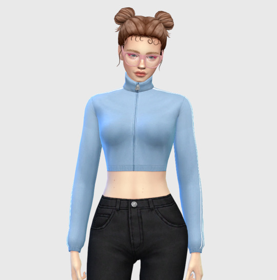
alright i love quirky earrings (more of those after!!), and tukete has some super cool ones! i LOVE the vampire fang ones, and the pumpkins! Their horn rim glasses edit (pictured above) is another MUST HAVE for me, because i LOVE those glasses but always wanted more swatches and non-sunglasses versions! AND! shirt graphic overlays!!! being able to turn any plain top into one with a bunch of fun graphics is SO brilliant, and really helps capture a sims' personality more.
@squasha
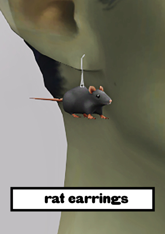


i mentioned quirky earrings, right? because squasha's cc is a GOLD MINE of incredible earrings - they do other awesome CC, too, but the earrings are of course my most beloved. sometimes your sims just need little rat earrings, okay? I'm not sure if they're still active on tumblr or not, but you can find their downloads here!
@kissyck


aaaaaaaand rounding this post off with my FAVOURITE nail cc! i hope that we all know by now that i LOVE lots of colour and patterns, and kissyck's nails? PERFECTION!!!!!! SO many options - not just in terms of the swatches (which are AMAZING, BY THE WAY) but nail shape/length, too! honestly, these are another 'must haves' in my CC folder, and my game would be seriously lacking without them.
I hope this helps! Like I said, I don't use all that much accessory CC, but you could never tear me away from the ones I do use, because they're brilliant and add a lot of joy to my sims and my game!
And thank you so much for your kind words? Honestly, it really made my day! I hope you have a wonderful day, lovely anon!
94 notes
·
View notes
Note
Do you have any tips on drawing the Swatchlings?
frankly i am happy that i have gotten good enough at drawing these bird boys (gender neutral) that someone wants my opinions. anyway
i see a lot of fun ways to draw swatchlings tbh and i don't really know what you want tips on Specifically so i will just make notes on a few of the main things i think about when i draw them, most importantly: just make them bitches broad and fluffy, man. they're all canonically Ripped, but an important thing to remember is that they are likely completely covered in feathers! that's going to smooth out those muscular details, so you wont be able to see them, just the broadness of them.
my style is all based in gesture and shapes, so i use a lot of blocks so they look nice 'n sturdy. it's okay if you don't nail the anatomy on the sketch, i am constantly nudging things around all the way into the coloring phase trying to get the shapes right. frankly i would probably bulk out even this Example Bird if i were drawing them all the way. i usually add more fluff or muscle or chub or whatever when i detail them but the absolute bare bones of them is dedicated to blockie
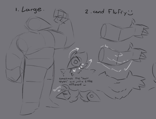
i give mine these sort of vestigial wings on their arms to make them look softer, and i think about how feathers move and stick out on real birds to help inform how they'll sit on these birds, too. and i carry the soft, pointed feather shapes into the fingers so they also look soft.
tip for drawing Soft: don't get caught up making too many individual strands or feathers, soft things tend to come together in big tufts. you want big gentle shapes, not a bunch of little ones. unless you want your bird to look wet or scared in which case you're doing a great job and you've probably just drawn spamton instead

their faces are really tricky so i think of them as these kinda... non-euclidean semi-hollow pentagonal cones. there's five "planes" with the top two dedicated to eyes and the bottom three dedicated to mouth placement. sometimes you can see the far eye even though, in real life, you would not be able to see that "plane" of their face. you don't always have to understand things sometimes they just look cool, especially when characters are cybernetic birds made out of Magical Darkness. there is no rule about when to draw one or two eyes. it's just whatever looks better.

biggest and bestest tip of all about drawing swatchlings! very important! write this one down in your most favorite gel pen and Really Big! give them either tails, or tail coats. i don't care that canon has neither, canon is wrong. you can switch it out, even - my birds have tail coats as part of their standard uniforms but they can wear their real tails out on special occasions.
lastly, if you want to stick closer to a canon interpretation, i would not try to make the birds too unique, when they're on the job anyway - they like being coordinated! tasque manager is very particular about keeping them coordinated as well. but if you just want to have fun then you can make your birds as fun and unique as you want :) even though i draw them all about the same i personally love love love seeing super funky swatchling designs, making them different colors and species and such.
course summary:
make them Large. make them Fluffy. use really broad, blocky shapes and draw big, thick tufts of feathers instead of trying to detail them too much.
their heads are silly magic nonsense. draw a triangle and get funky with it. no rules, only vibes. if it vibes it stays
they always need some kind of tail or tail equivalent and i don't care what Anybody else says
if you want to follow canon, draw all the birds except swatch just about the same. if you're just here for a good time, throw that out completely and have fun with it.
#deltarune#swatch#swatchlings#tutorial#art#ask#anonymous#anon#and now everyone knows about the funny little flap birds have on the back of their pants to fit their tails through#i have explicitly gotten better at broader bodytypes just by drawing birds and i am thankful for it every day#i guess there's some other smaller stuff like i try to make their uniforms more on the fitted side#because the birds apparently like to be Looked At and be Showoffs so fitted uniforms are better for that#but im not sure if my style is detailed enough for that to come through on anybody but swatch#specifically tailored their vest to accentuate the Donbonhonkeros 👌👌👌#aaand it's okay if they lean a little more chubby than tanky sometimes because practical muscle and fat can look a lot alike#but either way those feathers are gonna smooth out those shapes#and they're wearing many layers of clothes on top of that!#once again i am not the Utmost Authority On Birds and this is just some stuff *i* think about when i draw them#if anybody does it differently or You want to do anything differently that's totally okie dokie :)
186 notes
·
View notes
Text

Donut Co. Sticker Extravaganza (Pride Pantone Simlish Pack)
Has 22 swatches
SIMLISH VERSION - ALL SWATCHES ARE SIMLISH
All of our CC can be found by typing " Donut " into the search bar!
Images in game - Most stickers are sized up or down, some using the tool mod! The blue wall background photos were taken of super sized up stickers, so the lines are a bit warbly and a tad off because they're so so super sized! You really can't tell in game at all but if there are any issues please let me know!!
These are meant to be little stickers on the wall. You can size them up and down using the bracket keys. [ ] <- these ones. I personally, use the tool mod to size my items up and down, and specifically with these if you are wanting them to be "perfectly sized" i would recommend you grab tool (and its assistant BBB). THEY ARE LARGE TO START! This is so you can go all the way down to a mini size! Hope this helps!
This item was made using pluto sims posters as a base. I could not figure out how to make them work any other way, and as always pluto saved the day so be sure to check them out!!
Link back to Pluto Sims original object ORIGINAL CREATION
This does include the mesh with it.
(Thanks to pluto for being very generous so please check them out!)
This is just a recolor and all credit goes back to Pluto Sims for this mesh, this item would not be possible if i couldn't use this mesh.
~~~~~~~~~~~~
Name: Donut Co. Sticker Extravaganza
Buy Mode Description: Celebrate pride and expose your technological ancientness! Decorate your favorite rooms with these bold and beautiful Pride Pantone stickers... that is, if you can explain what Pantones are to your confused children. Show your support, foster inclusivity, and decorate like a certified graphic designer from the '90s - while also proving you definitely existed before the internet! These bold and beautiful Pride Pantone stickers are sure to add a splash of nostalgia to any room, meaning you will get to relive those glory days by bringing up that magical thing called 'physical paint' your kids have never seen.
(Works best if you use the bracket keys "[" + "]" to size up and down, or my personal prefrence of the tool mod!)
~~~~~~~~~~~~~~~~~~~~~~~
UPDATE: 2/29/24 - 2 Swatches added - Queer pride and Gay/MLM pride
~~~~~~~~~~~~~~~~~~~~~~~
~~~~~~~~~~~~~~~~~~~~~~~
DOWNLOAD:
Curseforge: https://legacy.curseforge.com/sims4/build-buy/donut-co-sticker-extravaganza-pride-pantone
Patreon: https://www.patreon.com/posts/99033657?pr=true
Google Drive: https://drive.google.com/file/d/1JiZP2G7d0jX-9zY0J1w-lEldZ11I_4OC/view?usp=sharing
Will be releasing more content soon! stay tuned! ❤️
(NOT affiliated with EA or Maxis in any way! We just make CC! )
#sims#sims 4 maxis match#always free cc#sims 4 cc#ts4#patreon#noideabutsims#simblr#buildbuy#sims 4 custom content#ts4 cc free#sims 4 cc free#sims cc free#freecc#free cc#maxis match cc#the sims cc#ts4 cc#cc#cc finds#sims 4#custom content#ts4 build buy#sims 4 build#ts4 build#build buy#ts4 custom content#ts4cc#alwaysfreecc#sims 4 cc mm
11 notes
·
View notes
Note
Here are my own Addison/Spamton headcannons to add on! :]
(buckle up cause I got a lot)
If Spamton tries to talk about personal memories that he tried very hard to bury, (like his puppitfication), he physically cant. If he talks about a memory that overwhelms him his body would spaz out in glitches and error signs. (kinda like a system crash)
I feel like if the Adds were to get the grasp of healing magic, the first one to perfect it would be Clicks. (bc he already makes tea that heals you!)
Sponsor owns a motorcycle! (because they thought it made them look cool) And regularly takes it out for a spin when he's done with work for the day.
Survey is a secret horror fan, and when having movie nights with the other adds, they would always recommend horror movies that they personally like.
I feel like Banner really focused on clothing after Spamton went missing, (he only really did this as a side hustle/hobby beforehand) as it was a good distraction and a way to cope, and he found out he was really good at it! And made it his primary business.
When an addison gives a gift with no underlying intention/price tag attached, it is seen as a sign of a genuine friendship, familial, or courtship relations, (like when they all gifted Spamton the new phone) as all addisons are selfish in nature
Clicks 1000000000% cried at the Barbie movie and has a poster of her in his room lololol
Sponsor absolutely LOVES those shitpost videos on TikTok, like that smurf-cat that's been trending recently? his feed is FULL of videos like that
Its hard for Spamton to open up for a variety of reasons, because he HATES it when people give him pity, he's been dealing with that his whole life, and knows that bigshot's don't get those looks.
Along with fashion, Banner is CRAZY good at makeup, and that's when he and Clicks have most of their gossip sessions when doing Clicks makeup when they're hanging out together
Survey has a soft spot for holiday seasons (not just because of shopping sales and spike and sales, cause all addisons are scrambling when october hits,) but also because it's a time they feel all warm and fuzy with their family :]
To add on to the motorcycle thing, Banner was very against Sponsor getting one, as he heard about horror stories on those "death traps" (his words)
to add on to the one above, Sponsor didn't wear a helmet once, (cause he only needed to go like, a street down to grab something,) and Banner gave him HELL. bro went on a whole rant about Bike saftey and Sponsor always wore a helmet after that incident (a mad banner is very scary! cause i hc that he always keeps his chill) (Banner is not beating mom friend allegations)
Jevil LOVES messing with Clicks the most, as he's the drama queen, and his reactions are hilarious cause he HATES the clown. Jevil will do things like change his wallpaper, take secret selfies, or just flat out jumpscare him because it never gets old...
Sponsor is a BEAST at Just Dance, like, bro is doing breakdancing for every single song, and he WILL make EVERYONE do the dances correctly, (as clicks likes to half-ass it by just moving the controller correctly)
Banner is the strongest physically out of all the addisons. Y'know like, that punching bag game in arcades where the harder you punch the bag the more points you get? Banner DEMOLISHED that, and has one of the highest scores still.
Clicks secretly plays dating sim games as a guilty pleasure
also have you seen eviction day yet? If not, I HIGHLY reccomend! I will add a warning for flashing lights and disturbing imagry though, https://youtu.be/fzzGtz4v3YU?si=6-AD5j8qrGARbdM3
but yea! here are my silly lil headcannons for the silly lil guys :]
i'm incredibly happy with the energy we've created in the studio today
also known as omg i love these headcanons like this is great food hfjdksjdjdks
the first one i also share! and it's a bit of why i headcanon swatch feels distant from spamton out of everybody he talks to. Like they were rlly close at one point and talked a lot, and swatch was his shoulder at high stress points in his job. However when the Horrors happened, he physically couldn't explain anything, leaving swatch to wonder what exactly happened to him and then build up resentment for keeping them in the dark. They even tried to help at first, but help turned to hate real fast when neo got involved.
i love the idea over clicks and spamton maybe bonding over some healing magic, like i had something similar in mind for a future chapter but this rlly has me smiling at the possibilities. spamton would maybe give him some tips- for a price. He IS thinking about trying to capitalize the whole healing gig after all since he's good at it.
banner going into clothing after spamton disappeared makes sense, especially with keeping busy trying to forget about him (it's awful hard to with the mannequins looking the way they do, but maybe that's a good thing in the long run) also i adore the mom friend vibe these headcanons have about him. i'd love to add on to the helmet thing, as I feel Clicks would join him on this (he's protective) but sponsor (and maybe even survey) claims it's fine if it was just once.
i completely agree with surv and the holidays. honestly i feel like they're the most ambitious with holiday sales and are unmatched, kind of peaking during seasonal sales in general (seeing how many survey ads are in place when customer shopping is at an all time high). spamton was indifferent to the holiday craze (cuz even when addisons were at their busiest, he wasn't) but liked when everything settled down after they weren't as busy to talk with him again. I have a picture in mind of survey chilling with spamton and realizing this, how happy he is when they're not busy (and feeling as if he was supposed to be), and being happy in return, if not sympathetic to him.
jevil pranking the adds and being a general nuisance is just so funny to me. gosh i can just imagine the absolute chaos he'd bring to a tea shop, mixing up the names and flavors, upon the other things (especially the wallpaper that has me cracking up with ideas). spamton, at the request (and payment) of clicks, gets jevil to stop (maybe. it's unclear if hes actually stopped completely or if there's smaller pranks here and there) but he secretly finds it hilarious.
overall these headcanons are great and i'm so happy to see them shared
#ALSO i haven't seen eviction day yet! This is the first i'm hearing about it so i'll give it a look :D#there's so many of them and i'm eating each and every one <3#i'd add on to everything if i could but i feel like my add ons are long enough lmao srry#when i get talking about this feral lil beast of a character i cannot stop thinking and thinking#thank you so much for the brain food i love these#i lowkey wanna write a clicks and banner makeup sesh now#maybe as a one shot or something#maybe they rope spamton into it but he's not too excited about anyone touching his face but him (for obvious reasons)#but they like maybe wanna fix the blush on his cheeks since it looks kinda faded/scratched after he's lived in the trash for so long#he'd deny it but after a long look in the mirror thinks about reconsidering it#see im adding on but in the tags there's no hope for me hfjdjsksksk#dr!hc#asks#fanfic#sponsor being on a motorcycle is SO COOL i can't get it outta my head#long post
19 notes
·
View notes
Text
Four Types Of Makeup, Awsten Knight, Zombie Eyes, And More


That title makes it sound more exciting than it really is. Well, multiple things here, some made out of necessity, others for fun. First up and above is what I creatively named 'AwstenMakeup' as that's who it's for and I don't know what else to call it. 4 Swatches, 2 of the green cross things and 2 types of stars. I eyeballed a few pics and made basic shapes in Inkscape and used GIMP to further size and place them and they turned out fine enough for me. Also looks good on Werewolves because, well, he is one. :)
My initial color swatches may not be the best, in fact for ingame I made them darker, but this is makeup and has sliders so you can do that yourself. This isn't the hair he normally has in my game and I made it all myself but I need to revise the files and colors before I share them. Eyeshadow slot.
SimFileShare


Next up is what I call 'DeadEyes' as, well, they're for zombie makeup. I 'needed' something like this as I wanted to copy Alex's zombie getup in this music video, saw nothing like it anywhere, so I just made my own. A bunch of swatches as I couldn't figure out what size and color looked best ingame. I also started with a base of vanilla eye bag texture to get placement correct, and I just kept that in as the first swatch. Eyeshadow slot.
Gotta say, Strangerville Possession is close enough to Zombiism.
SimFileShare

Next one is in the same outfit, I converted a vanilla Face Paint, I think from Get Famous? To the Blush slot as I wanted to combine it and those Face Paint eye contacts to add more dirt look, but all the original swatches are there. Yeah in case you want this too. Blush slot.
SimFileShare


Last one was kind of a spur of the moment thing. I was looking through and cataloging every single CAS category from Sims 4 Studio's list to learn about what eevry slot does, what species use them, etc, and I found 'Skin Overlay', which turned out t be all the stuff like the sickness affects and the weird paint and the new mold. I figured they might be fun as makeup in the rare chance you wanna pretend your sim is sick or something or just wanna cover them in paint idk. I made the paint and mold overlays go over the clothes as I'm pretty sure they're meant to. Well I saw the paint go under and that looked dumb. Sliders make it fun. They are, as they say. Face Paint category.
SimFileShare
#sims 4#sims 4 cc#the sims 4#ts4 cc#the sims cc#ts4#sims 4 cas#ts4 cas#cas#makeup#eyeshadow#face paint#blush#awsten knight#waterparks#all time low#alex gaskarth#It took me all month last month to fix my game from broken mods I don't wanna talk about it#It works now that's the important part#I didn't need that many screenshots of Awsten but look he's HAPPY for once#he's usually miserable or just aggressive#he's more fun as a dumb happy puppy#he also has 7 cats#alex is just fucking crazy as usual#when he was a vampire he bit a possessed sim (an alien at that) and so I made him singlehandedly cure the entire town of Strangerville by#himself while he squatted in the house of said alien as he lives there after all#so while he was cursed from vampirism at this point he was possessed so I had fun with outfits and watching him lose his mind and run aroun#he's now a mermaid in case you care#normally he's just a human but I like designing mermaid forms#Sharing my CC is half an excuse for me to ramble about my game in the tags
6 notes
·
View notes
Text
Fixing mistakes in lace
So you are knitting your first lace project, and you've got the wrong number of stitches and you're stuck and you don't want to frog. I'm here to help. But! My advice depends on you being able to read your stitches on the last patterned row (whether that's every row or every other row depends on the pattern). If you don't know how to do that, try knitting a swatch and putting in some decreases, double decreases, yarn overs, etc and then look at your work to locate those stitches and see how they look.
First advice: if your pattern is repeating, put a stitch marker in between each repeat. It's possible these stitch markers will move, but you need to know which repeat(s) you've made a mistake on and this makes that much easier because you'll realize you made a mistake when you get to the end of the repeat instead of the end of the row. I know not everyone does this, but I've been knitting 15 years and I see no shame in taking all the help you can get. All the advice here assumes you are doing this.
So after you've separated out all your repeats, and you get to the end of a repeat and are missing a stitch! What to do? Missing stitches are usually either 1) forgot a yarn over somewhere 2) dropped a stitch.
Forgotten yarn overs are an easy fix if you can find where the yarn over was SUPPOSED to be. Tink (un-knit, knit spelled backwards, means to undo your stitches one at a time as opposed to just ripping them all out.) back to the stitch before the missing yarn over (YO). If the missing YO is in the row you're knitting, simply add the YO and keep going. If it's in the row before (or second row before if every other row is plain), tink back to right before the missing YO, and insert the left needle into the bar between stitches as if to do a make one increase (there's YouTube tutorials out there). Knit the stitch without twisting it. This is your new Jerry rigged YO.
If your missing stitch is NOT a missing yarn over, it's time to start looking for dropped stitches. Sometimes these are just impossible to find because they rip down to whatever YO they came from and that can be really difficult to spot. If your pattern is symmetrical, look for missing symmetry. If it isn't, look for differences between this repeat and other repeats of the pattern.
Now, finding these missing stitches and then knowing what to do with them are two different things. Ask yourself: if I use a crochet hook and go slowly, can I fix this? If the answer is no, please don't give up. Let me tell you a secret. I make. So. Many. Mistakes. When I knit. And sometimes you just have to fudge. Pick a spot that works best for the pattern and just add another stitch. I prefer knit front and back (kfb) but you can also make 1 left or right (m1L/m1R). I promise it'll be hard for anyone besides you to spot.
But what if we have an extra stitch? These either come from missing decreases, forgetting part of a double double decrease, or an extra yo hanging out where it has no business hanging out.
Go back and read your work. First look for any extra YOs. If you notice an extra YO, tink back to it and just drop it. It'll mess with your tension but that's what blocking is for.
Once that's ruled out, look at any double decreases you have. If you are doing a decrease where you slip stitches and pass them over other stitches and off the needle (pass slipped stitch over or psso), did you remember to do the psso part? I forget this sometimes even tho all I knit is lace.
This is my personal most frequent decrease mistake. If you made that mistake on your current row, tink back and pass the stitch like it's supposed to go. If it was a previous row, tink back to where you made that mistake, and either knit two together (k2tog, right leaning decrease) or slip slip knit (ssk, left leaning decrease), whichever leans the correct way.
So there's no extra YOs and your double decreases are good? Time to look at your normal decreases. Do you have any decreases that you missed? Tink back and do them. If they were missed on the current row, just knit as instructed. If they were a row ago, you might have to do some analyzing to figure out where the right place is, but go back and decrease as close to where it was supposed to be as possible.
I cannot begin to tell you how forgiving lace is of mistakes. Hell. I spent 18 months knitting this
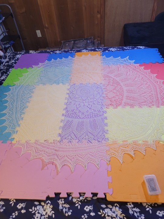
And when I got it all laid out, IT HAD TWO HOLES IN IT. I'm still mad about it but I fixed them well enough that I could block it aggressively. Can you see where I missed stitches, my tension was weird, I had extra stitches for some fucking reason, etc? No! You can't! This is what blocking is for.
Blocking is the heavenly primordial being who wipes away all your mistakes and knitting sins and says "You worked hard on this, and it looks heavenly, good job." You should block everything, not just lace. It evens your tension and can give you a little leeway if something is just a little bit too small. Got a sweater with two slightly different sized sleeves? Blocking.
And if you really don't believe me that blocking fixes almost anything, take a look at this:
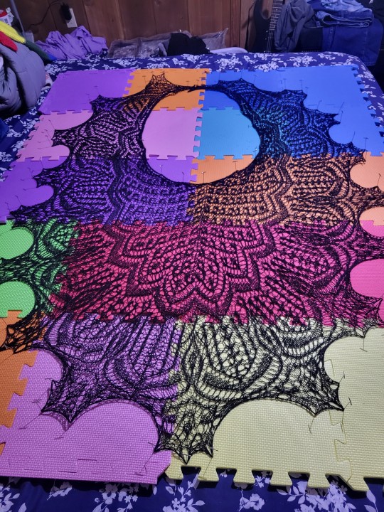
You can't see the beads in this photo, but this shawl has somewhere around 1500 beads. I decided right off the batt I wasn't going to be frogging beads. So this became a YOLO project. I gave myself permission to make mistakes and just fudge the solutions. Can you see my dozens (literally dozens) of mistakes? No!!
So don't be afraid that your lace isn't going to turn out right. Cuz only you can see that spot where you dropped a stitch completely or that double decrease you forgot to do or whatever other mistakes you may have made. Blocking will fix a lot. And even if there's still a glaringly obvious hole somewhere (I have one that drives me nuts in the white shawl but no one else can spot it), I promise it's not glaringly obvious to anyone else and also everyone here on knitblr doesn't care and if someone gives you a hard time tag me and I'll scold them for you.
In conclusion
198 notes
·
View notes
Text
LSAD Seminar 01: Colour Theory with Sylvia Shortall
What is Colour Theory?
In it's most basic form, colour theory is the study of how colours relate to one another and how this, in turn, affects our perception of them. The feeling or emotion evoked by a colour or combination thereof is of particular interest this field of study.
Above: An old RTE test card from 1978 recorded by Andrew Walmsley on Youtube.
The Medium Affects the Message
An important consideration when discussing clour and colour theory is through what medium the colour is being perceived. For instance I have two desktop monitors; A pen display for digital art and an old Dell monitor from a million years ago. Due to differences in technical specifications and calibration they display colour slightly differently. The pen display is marketed toward artists for its colour accuracy, whereas the Dell monitor was basically made to for looking at spreadsheets. If I slide a picture across from one monitor to the other, I can observe the colours change in real time. In this sense, the accuracy of colours is something we can take for granted.
youtube
Above: A video which explains digital colour and how images are projected onto monitors.
Enter PANTONE
So if we can't even trust a colour to look the same between two different monitors, how on earth can brands like Coca-Cola or Starbucks slap their logo on every conceivable product under the sun with one recognisable colour?
Well for better or worse the answer is Pantone LLC and their proprietary Pantone Matching System (PMS). Basically Pantone have a specific formula to render any given colour in any given format. For instance an average computer monitor recreates colour through backlighting hundreds of tiny pixels varying shades of red, green and blue. This is known as the RGB colour model, which is considered "additive" as the colours "add" together to create their intended effect. Print media on the other hand, uses the CMYK colour model. The is a "subtractive" colour model, where the cyan, magenta, yellow, and black (K) mask one another out gradually until the desired tone is created. Pantone somehow they were able to copyright this process and have people pay them for it. If it's not obvious, I hate Pantone and here's a video that should explain why:
youtube
Above: A good video about a bad company.
Janine Antoni - Loving Care, 1993
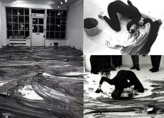
Sylvia actually recommended I research Janine Antoni for my project, so I was happy too see her work show up in this seminar. Personally I feel colour is one of the less important aspects of this particular piece, but all the same, it's roll can't be diminished either.
The use of commercial hair dye, Antoni's long hair and the act of mopping play into stereotypes of women and their gender defined "roles" in life. The gallery floor becoming covered in dye and the audience being gradually forced back out the door they came in can be seen as an act of reclamation. In this sense Antoni is challenging gender roles by using the traditionally feminine to accomplish the traditionally masculine. For me, it brings to mind the contrast between how men and women sit in public spaces, the phenomenon of "Man-spreading". Something that is seen as a faux pas for women but normalised for men. Antoni makes the viewer confront this kind of everyday sexism.
I think she choose a monochrome colour palette here for the contrast. The deep black on the brilliant white. The Yin and Yang of those shades is often said to represent men and women. I'm gonna move on now cause I'm really just rambling about a piece of art I enjoy.
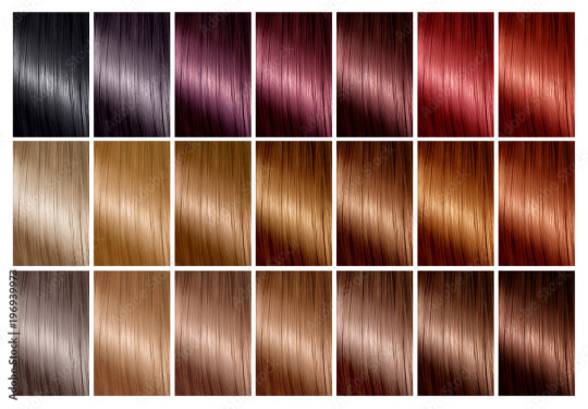
Above: Hair dye charts bear a striking resemblance to Pantone swatch booklets.
Colour for Legibility
Many maps, such as the famous London Underground map designed by Harry Beck, use abstracted visuals and colour to distinguish between and make clear what might otherwise appear as confusing and arbitrary.
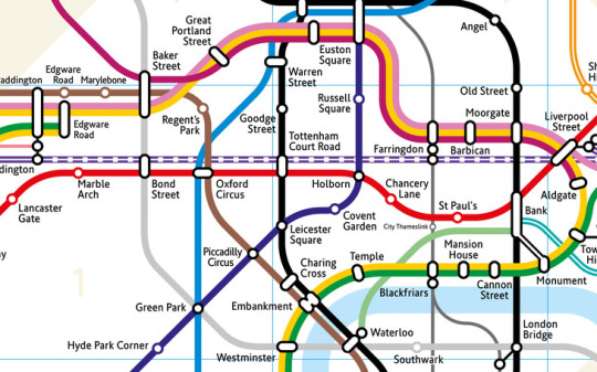
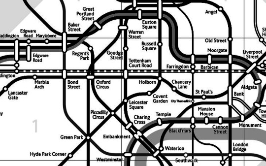
Above: You can tell me which one of these two maps is more legible...
Similarly road signs are specifically engineered in such a way as to be legible under any given time of day or weather condition, regardless of colour.
The Politics of Colour
Colour can mean a lot more than simple aesthetics. As Sylvia points out in the lecture, there can be strong political associations with specific colours. A powerful example of this is how our public post boxes in Ireland were mandated to be painted green after the country achieved independence from British colonial rule. In fact the shade of green was entirely arbitrary, one could argue the act was more about the removal of the distinctly British-associated shade of red, which itself speaks volumes of the power of colour.
A similar example of the political power of colour was the #Blackout campaign to protest against racism and police brutality following the killing of George Floyd.
Copyright and Colour

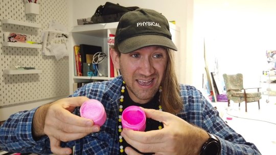
Left: Yves Klein, Center: Anish Kapoor, Right: Stuart Semple
A bit similar to Pantone and their patented method of matching colour, a number of artist have gained infamy for their roles in legal ownership and exclusive use of colour.
Yves Klein, an influential french artist and pioneer of performance art. Klein, in collaboration with Edouard Adam, created a vibrant blue, reminiscent of the lapis lazuli used in medieval paintings of the Virgin Mary. This shade was dubbed International Klein Blue or IKB. Klein registered this process with the French patent institute in 1960 but never formally patented it.
Renowned British-Indian artist Anish Kapoor, known for sculptures such as "The Bean" and Sky Mirror, was granted exclusive artistic use of the super-black coating Vantablack by it's creator Surrey NanoSystems in 2014. This provoked widespread criticism across the art world.
Kapoor drew particular criticism from Biritsh artist Stuart Semple. Semple, in retaliation to Kapoor's exclusive licensing of Vantablack released a shade of pink paint called "PINK – the world's pinkest pink paint" with the specific legal caveat that it could not be purchased by or for Anish Kapoor. This spurred him on toward a movement of democratising colour, creating affordable alternatives to patented shades such as the aforementioned Vantablack but also to Yves Klein's IKB and even an alternative to Pantone's matching system.
If it's not obvious I think artists have legal exclusivity to materials of any kind is an affront to art itself, and I'm happy to see people like Semple challenging the practice.
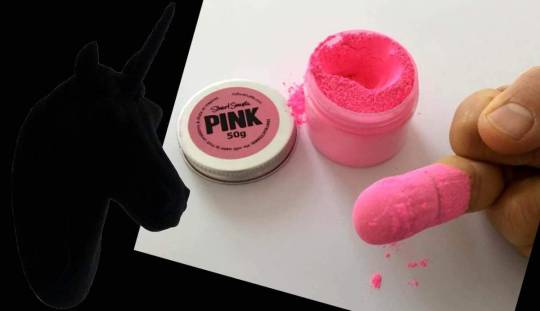
Above: Anish Kapoor's now iconic reply to Stuart Semple after getting his hands on PINK.
Stanley Whitney and Colour
youtube
Stanley Whitney is an American painter known for his use of colour and politically motivated art. I included a video above where he talks both about important political causes like contraceptive rights and also his feelings on colour.
What I admire specifically about Whitney's work is his persistent use of a loose grid as a composition. It highlights just how much emphasis he places on colour. What speaks to the viewer in a Stanley Whitney painting are the colours and their relationships between one another.
7 notes
·
View notes
Text
very normal queenkaard headcanons 2/2
Subservient: prepared to obey others unquestioningly
Less important; subordinate
He has suspicious knowledge of chemicals
He likes cats, and cats like him
He strictly calls those off brand spiders (aka daddy long legs) “harvestmen” and refuses to use their more commonly known nameHe likes the number 34 for no particular reason
He writes 7s like i do, weirdly
He gives very “stick to the question” answers, a lot of people have constantly given him the “i dont care” when he adds extra information about a topic after answering someones question.
He would smell vanilla extract and chug it
The first few times Queen complimented him, Rou took it as a joke and awkwardly laughed it off bcuz he genuinely believed (technically believes) he didnt deserve such a thing from someone so superior to him
If he had sugar tolerance he would love apple pie with vanilla ice cream
He constantly has nightmares about when he almost entirely turned to stone
He likes to ice skate, and he wears very specific figure skate shoes or whatever
Rou, to try and desperately find purpose, makes it so that he can just be used and discarded at Darkners/Lightners leisure, Que tries to get him out of this habit, but occasionally(read: a lot of the time) he slips back into this habit of just being this useless object thats only there for a minimal amount of things
He loves candles, his favorite scents are pumpkin and linen
Hes very bad at typing, bcuz he has long nails
Oh right i forgot to add on this list, that he has long nails, theyre naturally black :)
He can wink but in the unsettling way
He hates the words failure and mistake, theyve been used so often to refer to him he hates the way it comes out of peoples mouth
He ironically likes the word error, not when referring to him but he likes the way its said and spelled
Ok but what if he purred?? Is that too cringe? Well too bad i already have too many headcanons
He uses mint flavored toothpaste cuz hes boring
Im gonna slap a “you tried” star sticker on his big ass fucking forehead
Rou would either have a very flowy silk gown or steal queens clothes to go to bed, no inbetweens
Why do i imagine this senario where swatch gets all up in rous face but bcuz king is a fucking dickhead he has a flight or fight response and punches swatch
He is very starved for positive affection… so when Que complimented him for the first time he put it off and saw it as a joke yes, but he started wanting to hang out with her more because of said compliments (also he had the biggest crush on her, like he still has the feelings too, but theyre just dating now yippee!!)
Yeah he has mommy issues
He immediately got tired of the “trans-parent” joke, in general he just doesnt like puns (skill issue)
He always gets really happy when Queen compliments him
He had this short period of time dating Queen where he would kind of just exist as a yesman to everything
Him and lancer both would like the rainbow slug (if you know you know)
He can draw, if you peaked in his sketchbook itd be entirely bugs and a lot of Queens
He loves iridescent fabric and when he finally decides to sew he likes using the fabric he has to make outfits that fit the iridescent clothing he already has (i hate this wording what the fuck)
He kind of likes, sea salt and vinegar, chips
He hates the fat on meat and has to spit it out or else he will lose his appetite
He sometimes just soaks in a bathtub for too long, i also imagine his weird slime skin is sponge like. Ok maybe ill remove the sponge aspect that was a joke brought on by the question of if he could mold
Child rou gives “mom i frew up” vibes
His voice claim is the vocaloid voicebank Kevin, a good song is UNCANNY by GHOST/Ghost and Pals :)
He probably calls spoiled milk “vintage milk”
Rou probably did that bobbin lacing thing, but he dropped that hobby in his 20s
Que
Queen is very warm at all times,very huggable
She can cook and is very good at it
She loves mistranslated shirts, and has set out to get as many as she can
I do maybe fully believe that she would half ironically half unironically call Rouxls “babygirl”
Queen has. Good posture
Yeah she does his makeup
She gives Rou, forehead kisses, or just in general a lot of positive affection
She makes the best food, ever
She paints Rous nails sometimes
She very much constantly compliments Rou
My biggest flex is unintentionally predicting AI art /hj; i think that Que cant properly create art and can only really copy or take parts of other peoples art and mash it into one, she can also perfectly replicate art. She draws like a printer too
She very easily gets tricked by optical illusions
I feel like she would say “holy fuck, holy fucking fuck, that body of yours is absurd” to Rou at least twice
24 notes
·
View notes
Last Seen Blogs

vicoincipr
Vico
ouchhq
🕊️

mehmetkali
Mehmet Kali

joyeeuxe
Yan-Sui Center
kr-words
Main shayar toh nahi