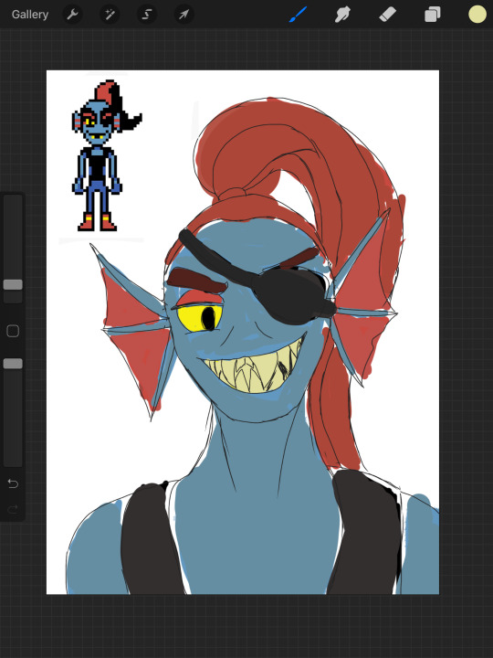
#I hope I don’t change the palette so that they fit into the background
Text


#just what i did#I wanted to make ANOTHER ref only in full growth to use it when drawing a comic#I hope I don’t change the palette so that they fit into the background#AND I STILL CAN'T SAY MUCH ABOUT SOPHIE#HOW I WOULD HAVE A VERY SMALL IMAGE OF HER INTERACTIONS WITH THEM#but i don't want to change otp3 no noooo#I just need to think not only about scyde#but Clyde and Sophie will definitely arguing each other the first time Clyde will be such a nasty little boy with his pick up lines#gah
84 notes
·
View notes
Note
Hi! So i recently had a request for a pastel edit and i just couldn't pastel it. I have made pastel edits in the past but i just. Forgot how??? Soo, if its alright, could i please ask you to make a tutorial on how to pastel edits 😭
Sure thing!
I’m not an expert but here some things I always do when making pastels!
Ps: these are just tips, I’m no expert, and this is my idea of pastel! If you don’t like it it’s ok obv!
Step 1: Prepare
Before getting to the actual editing I like to have things ready to start (like a painter has their colours ready before beginning)
Ready your resources
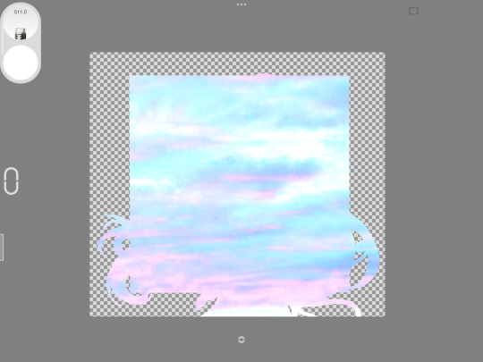
I always like to have some “props” like object transparents and decorations that fit a certain aesthetic ready to use so that I don’t have to look for it while I have my creative juices going. I can like go wild with it. I have like folders for backgrounds, pre-made layers and such.
I’d say it’s a good thing to have like stuff like that in general. I usually associate flowers and like cute stuff with my pastel edits, for example.
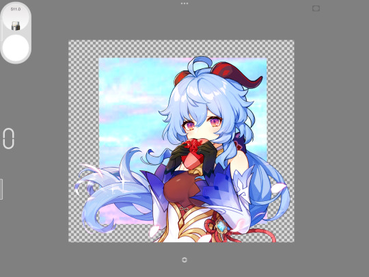
And ofc the transparents of the character. It’s kinda bothersome having to look for them while you’re editing in my opinion and if you’re custom making it I suggest making it in another file, just to be sure.

Choose your palette
Pastel edits usually have one very simple palette or some light gradients so I think you should choose what kind of pastel colours we’re talking about in an edit.
I usually choose the subject and the render I want and start from there, lightening the colours if needed.
Of course, you can also use contrasting colours, although I wouldn’t use them too much in a pastel edit cause the contrast would… idk uhm not fit in with the light pastel feels you want to give?
Tip: if you want to keep consistency try to choose very similar images (from a colour point of view, so like not a super light one and one in the dark)!

Step 2
Edit
Pretty basic, I know.
Like organise things and layers however you want them before turning it into a proper pastel!
Tip: some nice elements to put that kinda give that dreamy pastel vibes (imo) are clouds and flowers and such so yeah! Or whatever you feel like obvs!
Step 3
Make it pastel
There are many ways.
Usually I put a pastel background (just plain colours) and then a foreground (could be a gradient if you’d like) at low transparency (so that it doesn’t cover anything too much.
If you don’t want to lighten the lines of the edit, you can save it and then change it’s colours manually.
Then I usually put some faded foregrounds on (usually I exclude the character to make it clearer).
The from them see if you like it.
I also suggest some glitters, not too much though. But some glitter never hurt nobody, right?
I think it gives the edit a dreamy effect if put strategically.
And… yeah that’s it.
I hope it was useful!
24 notes
·
View notes
Text

AKA a tutorial on color theory and skin tone that you shouldn’t have had to hear from a pasty white guy.
I’m not here to talk about what brought me to do this tutorial. I’m just giving my thoughts on color theory, basically, because most of these examples, WHILE TOTALLY VALID, use other pictures as reference points to pick out color. That’s not even necessary all the time, so I’m showing how I choose skin color from the wheel itself.
We’ll be using this sneak preview of Mammon from Obey Me! with piercings, which will be appearing on my Patreon soon. I am literally willing to give you guys exclusive preview content to make this point.
For simplicity’s sake, I went ahead and gave Mammon a base coloring just to give us an area to paint in. Look at that sad, gray skin. He’s so sad. Why would you do this?

I’ll start with what I think the biggest problem is. Here’s a selection of skin tones I use for white or asian-coded characters. Some of these are color-picks from Belphie and Beel, as they’re in my palette currently, along with the tones I use for Matteo. We can see that those colors tend to be clustered towards the white corner and the top of the color scale.

I theorize that when people want to make a skin tone darker, what they’re doing is either using black and gray as their shaders, or simply dragging the color selection down towards the bottom, the black side of the color picker. But that side is also where colors are their least saturated.
Skin tone is determined by melanin concentration. Melanin isn’t a different color for different people - it’s simply more concentrated in some tones than in others. So when we’re choosing a darker skin tone, what we have to do is move down into more concentrated and saturated colors.
Here I’ve selected a few shades of “pale” skin and concentrated them to show a variety of shades and colors that can appear in normal skin tone. You may want to compare shades with the ethnicity you’re portraying before you select your midtone for that character.
The purple tones I’ve selected at the bottom are uncommon, but can often appear in the skin tones of people with extremely dark coloration, which can sometimes suggest an almost violet hue. I think that’s awesome and I implore people to explore reference pictures and models of all backgrounds to literally broaden your spectrum.
As an aside, I personally don’t even like the tones that are often used in official art of Mammon because he does still appear de-saturated in some, so I knew from the start I was going to be selecting my own color.
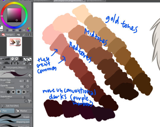
First point to consider: Never choose your highlight or lightest color as the base for your midtone!
What we want to do is play around with the base color for our model, and then select our highlight and lowlight tones from there. Once you’ve selected your midtone, it’s okay to slide a little vertically to get your highs and lows, but make sure you don’t lose the concentration of your pigment or you’ll end up shading your model with an entirely different color.
Below I played around with gold and copper tones for Mammon to determine the best complement to the color of his hair, eyes, and piercings. As he’s a fallen angel and technically has no ethnicity, I had the freedom to do that, but I’ve been trying to lean more towards latinx/hispanic for his overall aesthetic. (I am relying HEAVILY on other tutorials and friends who know better than me to get THAT part right. Once again, this is only about color theory.)
As a side note, #2 is probably the closest to Mammon’s canon coloration among these.

I personally use linear/color burn and color/glow dodge with concentrated colors to achieve my high and low tones. I used mainly a marigold color for this round, but I usually only end up saving the midtone color and using my background to determine the color cast of my highs and lows, so the highlights and shadows might look totally different if Mammon were standing in, say, a dark blue room with a pale light source... but that would not change his base hue.
Here’s the color palette I ended up getting after toying around a bunch. Just from a color perspective, I think this makes his hair and the gold jewelry pop a bit more while also making sure that they don’t drown out his color.

I hope this tutorial was useful, and if my BIPOC followers and friends have issue with anything I’ve said above, please feel free to correct me and add to this post as you see fit! Once again, this is only from the perspective of someone using color theory to determine these factors, and I am not an ethnic or racial minority in any way, shape or form. My opinions and views on this matter are probably flawed and subject to guidance. I suggested doing this tutorial as a passing thing and someone said that I should, so I did.
Look out for the upcoming “Demon Boys with Piercings” post available publicly on my Patreon for patrons AND non-patrons!
#obey me mammon#mammon obey me#color theory#art reference#art tutorial#bipoc#mammon#obey me#obey me shall we date#obey me! swd#obey me!#piercings
4K notes
·
View notes
Note
Said it before but I love your blog and thank you again for the Halloween icon. Have you ever made an icon tutorial for coloring? They’re so crisp and lovely.
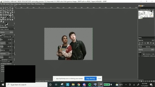
This is so very sweet, thank you! TBH, it’s usually just me fucking around until I get what I want, but I realize that’s not as helpful lol so I recorded my process for an icon set I made (note: I don’t have photoshop, so I just use gimp for coloring).
Every picture is different, of course, but this is the general process I have and I hope it’s useful! :)
These are the icons I’m showing the process for:
Edit: Their skintone will be slightly different from the icons because my laptop isn’t frustrating at all, so I speed redid it, but the process is the same! I apologize for any quality issues, recording + screenshotting is currently hell on my laptop
And here is the video with the process written underneath if that’s preferable!
Screenshots under the cut:
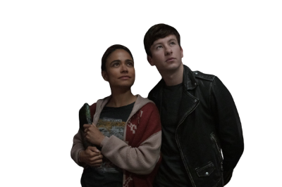
Here’s the original:
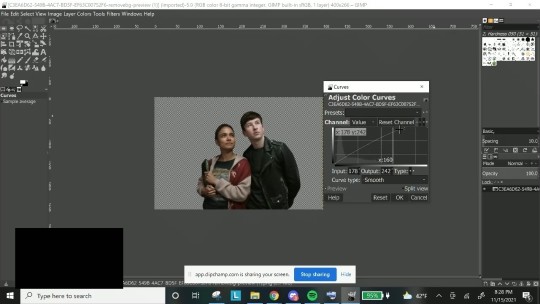
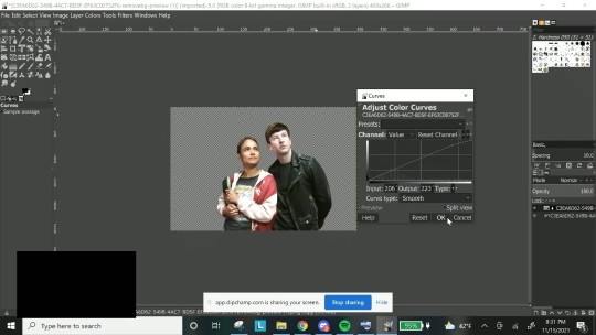
1. I brighten up the layer a little (especially usefull for dark layers) using curves. I don’t do this a big amount, just enough to make it a little brighter:
2. Then I create a duplicate layer + layer mask. I want to work on Makkari and Druig seperately, so I used my brush tool while on the layer mask and erased effects on Makkari, so that only Druig was editable.
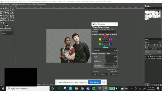
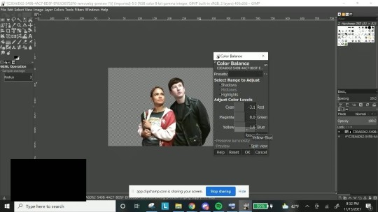
From there, I did a mixture of curves, hue + saturation (made him slightly less saturated and increased the lightness), and color balance (mainly adding a little more cyan and blue to get rid of the red):
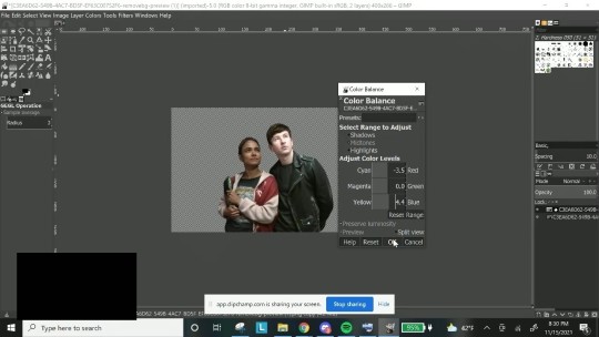
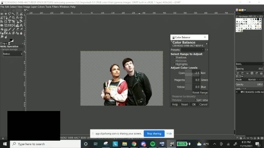
3. I merged down the layer and then duplicated and created another layer mask, and repeated step 2 for Makkari. For this particular layer I didn’t have many edits to make so changes were fairly minute, but there are some really bad lighting on shows sometimes that make color balance my best friend.
Then I merged down, and did any minor edits as I saw fit.
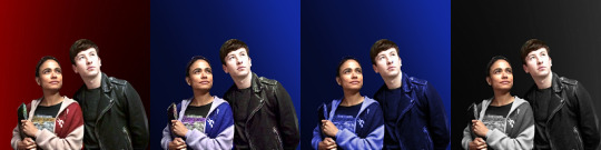
4. Coloring the clothes. I do this in two different ways - either hue/saturation or colorizing. I make my own palettes and background colors so which one I want to do really depends on my mood.
If I want to just color and figure out an icon background that looks best later, I just change hue saturation. As you can see, the entire layer is blue with the hue I chose and I sue my brush tool to erase the effect from their skin.
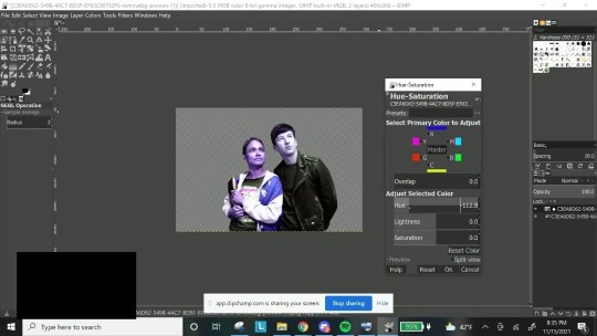
I wanted black & white here, so I took out the saturation and just adjusted the lightness as I saw fit.
If I want to match to a specific icon palette, I colorize, as I can put in the specific hex code, as seen here:
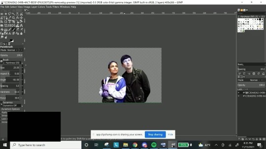
Then I see if there’s anything I need to clean up, double check to make sure the characters look okay, there’s no whitewashing/orangewashing (and if there is, I go back to color balance to straighten it out) and I have my layers saved! I put the layer on top of my background and generally don’t adjust from there on out save for really difficult layers.
I hope that was useful, and I’m sorry if it isn’t lol. It’s honestly a lot of moving those pieces around (for me, at least) until I find something that I think looks nice, and it gets easier the more I’ve done it.
7 notes
·
View notes
Text
So it's a little late but I finally made the extended version of this post
I'm just going to rewatch the trailer and write down all of my thoughts, but actually expand on everything this time (and it'll actually be mostly in order)
Maybe it's just the cut for the trailer, but the lawyer scene feels very rushed. BBC made it comedic in its own right, not just a setup, but here it feels very much like "have some exposition so we can get to the ghosts". The ghosts should not be the only point of comedy - they're important, sure, but "Samantha" and "Jay" should be able to carry a scene by themselves
"Samantha" doesn't think it through. At all. She cuts off the lawyer after his first buyer suggestion, and "Jay" doesn't seem to be on board with the idea. In the OG, they were both into this (admittedly bad) idea, so the responsibility was on both of them. Yes they rushed into it, but it was way more thought out than just hearing the words "bed and breakfast" and deciding that's your new plan
Why did they age down Pat for "Pete". I hate it. He's younger and skinnier and there's no reason. Like yeah, the OG doesn't have AMAZING diversity, but it's better than this - don't take out diversity in a remake. Didn't think I'd have to spell that one out
The sage joke is admittedly funny. However, it gives us some insight into the ghosts that I'm not the biggest fan of, and let's us see a lot of their new designs. Let's go across, shall we?
"Issac" is so much less dignified than Thomas. I understand that Thomas isn't always as poised as he'd like to think, but there's a level of class that's missing from "Issac", right down to the way he stands
"Flower" looks high. How can a ghost be high, you ask? No idea. But here we are.
"Sasappis" (I read in an article that this is a character name and I believe tis the Native American guy) has such a tiny reaction I almost missed it. He barely moves while everyone else freaks out. I'm hoping they didn't create this character out of the 'emotionless Native American' stereotype but... I guess we'll see
"Hetty" is the replacement for Lady B, and she's super expressive, protective of the others, and so much younger. She was supposed to be a grumpy mother/grandmother figure - why is she literally leaping in front of the others to protect them? That should be the Captain's job but they've axed him so I guess it falls to her now. Also, why did they make everyone so young?? Like, none of the ghosts look over 35. Why. This was unnecessary and, quite frankly, stupid. Why is everyone at this house dying so young? Just so they can market them as fuckable???? L o a t h i n g
Viking Man also barely moved. He seems interested in the sage and is basically a "cooler" version of Robin as far as I can tell. They seem to have taken away the joy of Robin's character, leaving only Some Guy which would be bad in any genre, but ESPECIALLY a comedy. He has potential in theory, but I feel they aren't going to utalise it
"Trevor". I have so much loathing for this man. Let's have some overall analysis, shall we? First of all, we'll start with, what I hope is a well known fact: Julian is not a good person. I love him as a character and he is starting to learn and grow, but at no point does the BBC or the other characters try to justify his behaviour. CBS saw this, and made Trevor. Trevor is younger than Julian (because for some reason they AGED EVERYONE DOWN), which also makes people far more likely to excuse his actions. They seem to be trying to make him a 'loveable fuckup' who makes bad choices because of privaledge, and I am. So worried. That they're going to try and excuse his actions. He already feels like a writer's self-insert and that never bodes well, especially in this type of character. Mark my words, they're going to market him as the 'relateable' one while having him spout misogynistic views (probably also homophobic and maybe even mildly racist/xenophobic ones too)
MOVING ON
Why is "Pete" sarcastic? I don't like it. Pat wouldn't be the one yelling aggressive comments while everyone's actually doing something together - he should be happy! Encouraging! He should be trying to catch up to the moving group instead of attempting to draw attention away from it!
Everyone looked so happy for the dead relative when she moved on. Hate that - it was so funny in BBC when they were like 'fuck off why does she get to leave' - having "Pete" be happy is fine, but the rest of them? WHY IS "HETTY" HAPPY.
Oh look, "Travor" actively flicks "Pete's" arrow to cause him pain. Why. That was so unecessary. None of the ghosts should try to hurt each other out of pure malice, and they certainly shouldn't get joy from it. It feels like CBS is trying to turn us against "Pete" and put us on "Trevor's" side, which I called, but am not a fan of.
And here she is. "Alberta". What the FUCK did they do to Kitty. She has Kitty's colour palette and fits the diversity demographic, but that is where the resemblance stops. Kitty is SUCH a wonderful character because she was an upper class black woman who was allowed to be soft and sweet and innocent and the others all protected her and I LOVED IT. Do you want to hear some fun descriptors they gave to "Alberta" in this article?
"In her time, she dated a bootlegger and has “seen it all,” and is a bit of a diva. Though tough and not one to take crap from anyone, she has a maternal streak and often acts as the protective den mother to the “family” of ghosts"
This is not only far closer to so many stereotypes, but it's the polar opposite of Kitty!! Having a flapper was a pretty cool idea but she could have had the same character traits as Kitty! Why change that! There was NO REASON TO RUIN HER. Also is it just me, or does it seem like they've made way too many of them sarcastic? Like, they've taken away Alison's snarky streak but given sarcastic lines to way too many of the characters
Also can I just take a moment to question the sheer amount of ghosts they've included. I understand that technically there's about the same amount. But with so much less of American history to draw on and the questionable character choices they've made, it feels like there are so many undefineable characters. Like, how do we differentiate them?? Even in the trailer there are so many scenes where most of them are just... standing around. In BBC, they're all so distinct and you get so much out of rewatches because they're all always doing something - look in the background of any shot and the ghosts who aren't talking have a reason to be there! But in this they're just... standing around. Do better.
I've just realised I'm only 0:59 seconds into a 2:16 trailer so I'm going to split this into two parts
Part two is here
37 notes
·
View notes
Text
So I just saw the announcement about the EN server shutting down or at least dicontinued (hopefully just for now) and I might just burst into tears 🥲 I want to put my thoughts or rather feelings of the journy up until now on here to come down but maybe also as some form of comfort for anyone who needs it? It's very long and might have some broken english as it's not my first language so do keep it in mind please 😅
Anyways, I started A3! last year on march 7th because I saw a youtube video of people cosplaying Sakuya and Sakyo. At taht point, I already knew of A3! somewhere in my distant memories back when it was JP only. I decided to try out the game since I was getting bored of my current mobile games and the few reviews I could find of it were relatively positive. I had no idea just what a big part of my life this game was about the become 🤧
Btw I'm listening to some A3! songs right now, specifically Sakuya's 2nd character song, and it's not helping me 😢 So at the time, lockdown just started 2 days ago, which left me with a lot of time playing it and, I kid you not, I gulfed the main story down like it was the last slice of cake at home. I have 2 siblings. I think I finished it in a week or so despite it being only unlockable through leveling up, and if my memory serves me right, you need to be around lvl 75 to unlock all 4 episodes. As one can see, I was VERY invested in the story. It was just so....nice? I don't know how to exactly describe it but I was surprised by how likable everyone was. Of course I didn't hold such strong feelings for everyone back then as I do now but I was intrigued enough back then of nearly everyone, which is kind of rather rare in such types of games, no? At least for me it is, although I haven't played terribly a lot (Love Live, MLQC, Mystic Messenger).
I really like how the story actually continues through the events and how it alternated between stories exploring certain characters more (show events) and stories focusing on just them having fun. Getting to know everyone bit by bit and seeing how everyone grows closer to each other, not only within their respective troupes but the whole theater, makes me really all warm and fuzzy and it's found family, what more could you want?
Also, I really like Izumi, our dear MC 🥰 Even though she's supposed to be our self-insert, I found myself really enjoying reading her thoughts, observing her reactions to other characters' shenanigans (like her 'I do not see' to the members plan of faking their identity to bail Citron out lol) and just....her personality. Trying not to digress here but she has a lot more personality than other MCs in these joseimuke games and it makes her interactions with others not only bearable but even enjoyable. I'm not saying that this is what a perfect MC looks like or that she's superior to bland self-inserts. After all, it depends on the story, gameplay and other things. It's just a nice bonus I'm very grateful for. I mean, I got really emotional when Izumi performed with the other staff members all of the plays the actors have put out so far for the first anniversary. Her realizing she gained a new dream for her lost one just really took my heart, broke it in thousand pieces and then mended it again.
I also love A3! songs ❤ I did wonder how they would work in this franchise since it's not about idols but actors, though I guess there was nothing to worry about. I really like the duets because it's always a different duo and hearing them singing together, harmonizing with each other, complimenting each other, just fills me with undescribable joy. Of course the songs also slap pretty much every time. Even by limiting my options to 1 troupe, I still wouldn't be able to pick only one favourite (I like the majority of Winter's song tho, like Shoutai is just 🤌 and my sibling blasted Unmasked non-stop so I can't get it outta my head anymore). Gosh, I was so excited for 'Double Solitaire' since it would complete trilogy of the Hyodosakas singing together. I was really looking forward to getting all the songs and I was even saving up for Summer Troupe's 6th play.
If I had to describe the game A3! in one word, it'd be "charming". Coming to game itself, there are so many little quirks, that on their own aren't anything groundbreaking or big but together give the game its own flair. Live 2D is pretty common to see nowdays in games because it brings the characters to life through movements like 3D models. But I think A3! is able to illustrate it just as well, if not even better with their 2D sprites. Citron moonwalked by flipping the image over and sliding across the screen, Hisoka appeared out of nowhere by coming from above the screen, they do a little jump when they're happy, they go down a bit when they're sad. And that's just things with their whole sprite. The little drops when Tsuzuru finds himself in an awkward situation or is worried, the little note when Sakuya is happy, the hearts when Kazunari is lowkey flirting with Izumi, it's so cute! Or Omi's O.O face, Taichi's crying face (the usual one, not his face when he cried out of guilt of betraying Mankai), Yuki's done expression, H O M A R E AHA! They each have at least one personalized expression and also quote. Can you hear Kazunari's Yoropiko~☆, Citron's humming, Taichi's loud ass whining and scream of terror, Tsumugi's awkawrd laugh? It's brimming with life.
But also the UI (?how it looks) is joyful. The main screen's background cascading shapes changes depending from which Troupe your current character is from, the loading screen has sakura petals and a bird, the colors are very bright and saturated fitting to the overall color palette of the whole game, the little notebook during practice showing all the necessary infomation and a little sketch by the characters. It's just really charming.
As frustrating as it was, not getting halloween Tsuzuru after 110 pulls or Valentine Omi after 120, it was my first time ever understanding why gachas are called hellholes. Through my strong connections to the characters, their cards automatically appealed to me more. But the art is also so good???? Azuma is always looking flawless obviously but Omi's unbloomed Wolf card, where he is standing in the sunset looking at his camera or Kazunari's Shinobi card, unbloomed all concentrated on his panting and bloomed all shiny smiling like the fireworks in the background? Breathtaking everytime. I also appreciate it not needing multiple copies to unlock the whole backstage story.
I think I'm slowly running out of things to say, which might be good for whoever managed to come this far. I have to say though, A3! helped me through the pandemic. Being a perfect distraction to the world's chaos and more importantly my crushing schoolwork and worries for personal future. I'm a very pessimistic person but seeing the characters overcoming their hardships through the help of their to-be "family" and just being happy doing trouble, gave me a little hope and light for a bit every day. I came to cherish everyone, even those I like the least. I haven't felt like this since Mystic Messenger, which was also a game, that helped me through a difficult time. I can only wish to a shooting star, that it's not the end for the EN Server yet. While yes, the JP server is thriving and I could just switch to reading fantranslation, through my experience, my enjoyment considerably sinks playing like that and I wish to fully enjoy A3!.
Anyways thanks for reading (maybe again). Sorry for all the possible errors on the way here. I'm writing everything directly without too much thought. If you want, you can also share your experiences in the comments. It's always nice to share good memories with others.
Edit: I accidentally posted it already but I wasn't actually done 😓 When I said I had a lot to let out, I meant A LOT
7 notes
·
View notes
Text
The Ballad of Songbirds and Snakes by Suzanne Collins
Note: this is the prequel to the Hunger Games series. If you're invested you may not want to read this review before reading the book!
In his last scene before returning to the Capitol, Coriolanus dives into the remote lake. His mother's palette and his photographs are destroyed by the water, but he is surprised to find that his father's compass still works. He trashes the ruined items, meanwhile rejecting the legacy of gentleness his mother's token represented and the relationships represented in the photos. With only his father's inherited (literal and figurative) compass left to guide him, he returns to the Capitol and embraces his father's coldness.
I was really excited for this. I trust Suzanne Collins and I wasn't disappointed! Often a prequel can't compete with the originals, but it didn't feel like she was retconning important details; she added interesting background, and in some ways the sequel seemed planned. Tigris especially was given a background. I had already reread the trilogy earlier this year but had to read them again after this.
Snow is a great unreliable narrator. At first I was disappointed that the contestants in the 10th Hunger Games were not fleshed out. They seemed almost animalistic, dehumanized. But that's because this is Snow's perspective. We know what kind of person he is destined to become; he has to someday be the President Snow we see in the trilogy. Looking back to the trilogy, we can draw comparisons between the protagonists. Katniss empathizes with the other tributes; even when she attempts to dehumanize them so that she call kill them, she describes their traits and backgrounds and feels guilt. The reader of Ballad doesn't know who the the 10th Hunger Games tributes are beyond their violent acts because Snow doesn't care; Katniss identifies with the other 74th and 75th Hunger Games tributes and knows they are not her true enemy. Katniss and Corio both grew up poor and hungry, but Corio is unable to identify with others or see his problems as structural because he views himself as separate from and better than people outside his sociopolitical bubble. His skill as a manipulator is shown immediately, but at times he edges toward the sympathetic. However, the more he interacts with Lucy Gray, the more we see that he dehumanizes her as well. I feared at some points that this book might follow a pattern of blaming a woman who breaks the man's heart for his loss of character. However, it soon became clear that his way of speaking about Lucy Gray was written very intentionally. The first time he refers to her as "his", it's plausible he's speaking only in the terms of the Capitol. Later, he speaks of her being unequivocally his, and of owning her. He does not really like anything about her. I felt dread as the book progressed.
Snow maintains his worthiness above people born into "lesser" families, most especially those of the districts. He can only convince himself of Lucy Gray's worth by believing she is not truly "of the districts". This of course is a farce, as no one is intrinsically district or Capitol, and this belief in her worth deteriorates over time. He essentializes Capitol vs district and Panem citizenship; the Covey is not "really" district 12 because they previously were travellers. However, district is determined by the Capitol, which suppresses human movement and cultural expression. Everyone's ancestors were something before they were Capitol / district. To Snow, "District 12" and "Capitol" are both intrinsic states which indicate different levels of worthiness, rather than incidental circumstance of birth.
At no point does Snow come to respect the Plinths. At no point does he truly care about others. When he realizes what Tigress, only two years his elder, may have sacrificed for him --endured a trauma for him -- he decides he doesn't want to know about it. She can bear to experience it, but he can't even bear to take some of the burden by listening. The presumed murder of Lucy Gray is presented as nothing more than an inevitable tragedy at the hands of a man who could not be satisfied without conplete power and control.
Snow's characterization brings home the political message at the core of the series. A large portion of the book is his internal experience, through which we see a man not unlike powerful men in modern America. His struggle and life experience do not inevitably make him evil; his active decisions and mentality do.
Overall, I enjoyed it. I hope Collins writes more (in other series!). It didn't fully have the pull of the original trilogy but kept me engaged and interested, and appropriately haunted. I read it a few weeks ago and am still thinking about it.
Some miscellaneous thoughts:
• At two separate times, I thought Coriolanus would be left in the arena to teach him and the people a lesson that even the Capitol has to comply. First, I thought the bombs were set by the Capitol and meant to start the Hunger Games with all the contestants and mentors present. Then I thought he and Sejanus would be left to battle it out after sneaking in. I was interested in the development but must've been misreading where the plot was led. Just a sidenote.
• Built into the original trilogy is commentary on sex, class, and race; an analysis of racism is missing from this book. I wanted a deeper analysis of colonization when the Covey was discussed and I was surprised to see racial dynamics that are absolutely an issue in-universe ignored while in the perspective of a man who will once day be responsible for the structural propogation if it; it was so severe by the 74th Hunger Games that the omission seems glaring.
• At what point did Collins decide she would write this, and did she have Snow's background already in mind at the time she wrote the first books?
• What inspired the Covey? Given that racist legacies are written into the original trilogy and the canon is a commentary and representation of issues Collins is concerned about, I wonder about it and its implications but don't know enough. District 12 is settled on mines but the Covey is said to be travelers, considered outsiders. Collins *did* show the suppression of the Covey and the attempt to homogenize the culture, and the absurdity of District citizenship being seen as intrinsic. I just wanted more, I don't know how much of a real criticism this is, I just wanted more.
• If I recall right, neither district 12 Hunger Games victors are discussed by Katniss's time; both histories have been erased. It fits in so well with the originals.
• What specifically is said about the songs sung by the Covey, especially The Hanging Tree? How does context change the song's interpretation?
8 notes
·
View notes
Note
Hella jealous of how you color your art. It always looks so nice!
I’m very flattered but a little confused :-)
But uh hey I know this isn’t part of your ask, but if it would be useful, here’s a look at how I do colors!
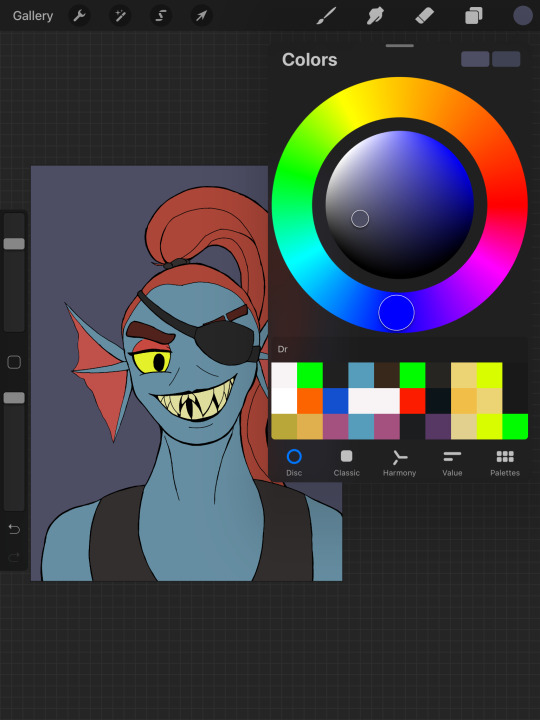
I start with my sketch. Once I have a sketch close to lineart, I make a layer just for messing around with color. I take a ref of whatever character I’m drawing, and sample and drop colors directly from it. I map the colors on the sketch, but just basic shape.
Then I decide how I want the colors to change. I sample each color I want to mess with, adjust it in the pen color, and then color in that part of the sketch again to compare it. Here’s how the color wheel looks on Procreate:

You can see I started to adjust the hair color in this pic. I wanted Undyne’s hair to look a little more natural, and I thought the best way to do that would be to make it darker and less saturated. To make it darker, I moved down on the palette, to make it less saturated I moved left. I just did little adjustments until I found a color I liked.
I did this with every “item” in the drawing until I got these colors:
She started with four colors and ended with nine! I dulled and darkened her skin, lightened up the eyepatch and shirt, made the teeth a normal color, and made the eyebrows more of a dark red/brown!
I have two considerations when deciding colors: How can I make each piece look unique? How can I limit the colors?
I made her eyeshadow, fins, and hair all different colors of red, since skin, makeup, and hair will have a different appearance. But I didn’t alter these too much so that they contrast with each other. The eyepatch and shirt were the same color, but to make the eyepatch look better on the face, I lightened it. I try to make it clear that each “piece” is something different, but the colors stay similar enough to each other that it doesn’t look like lots of things going on.
Then I make my lineart and make new layers for color. I make each color its own layer in case I decide to change it.
After I’ve got everything colored, I do background. Background colors depend on what kind of background I want. If I’m doing a scene, I start with the basic colors, then I adjust those colors and the ones on the character until they look like they fit together. I try to make the character stand out from the background, but not so much the background is jarring.
For simple backgrounds I do a solid color or gradient.
I git this one by starting with Undyne’s skin color, moving it towards the purple segment on the wheel, making it darker and less saturated. I changed this several times before I settled on a color.
Then I adjust all the colors again if I think I need to.
I lightened the eyepatch and darkened the eye and hair here.
A note on shading: I take the base color and make it lighter+less saturated for highlights, or darker+more saturated for shadows. I do highlights and shadows on separate layers too, so I can adjust them individually. I wait until I’ve got the base shape of them filled out and the colors decided on before I merge the shading and base together and blend.
In some of my drawings, I don’t want obvious lineart. In this case, I do one of two things. 1. I have no lines. 2. I do think lineart where the line is a different color depending on what color/”item” it is outlining. I choose these line colors by taking the base colors and making them darker.
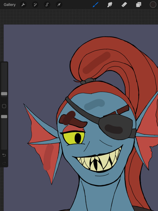
Here are the colors I would use for that type of lineart for this drawing, against the base colors.
It’s a quick look but I hope that’s helpful, or at least interesting to somebody!
Jealousy is not the way bro, I’m sure your own color choices are good. Some people like pastels, or neons, or grayscale, they like dark or vibrant, and it’s all good! It’s just about what you like and what style you’re going for!
3 notes
·
View notes
Text
Seeds
Before I read it, I had this idea I could write a review of Ann Nocenti and David Aja’s The Seeds for the Comics Journal, but the book just sucked too much. It had basically nothing going for it, or even decipherable as an advancing plot. One thing wrong with it is there’s this sort of conspiracy element, or this “no one believes the news” anymore element of it, but Nocenti didn’t want it to be about “fake news.” Donald Trump has rewired the narrative, so now entire types of subject matter feed into this propaganda machine simply by being addressed. Nocenti’s best work does not shy from topicality, addressing the currents in the cultural air, but this time the modern world feels too hot to handle.
I ordered the Daredevil: Typhoid’s Kiss trade paperback, reprinting a bunch of Nocenti’s work with the Typhoid Mary character from the nineties. The longest story in there is a miniseries with art by John Van Fleet. It’s partly about post-Tarantino video-store employees turned filmmakers kidnapping Typhoid Mary to use her as the subject of a documentary about serial killers and violent media. It’s also about Typhoid Mary working as a private detective trying to track down a killer of prostitutes, who the police don’t care about, and are maybe the actual killers of themselves. Storywise, it’s a pretty cool attempt to address real-world issues of the day within a pulp context.
Van Fleet’s art is pretty boring and bad in a way that’s distinctly ahead of its time. While the miniseries itself probably wouldn’t exist without the precedent of Elektra: Assassin a decade before, (a spinoff about a female Daredevil villain created by the writer during their run on Daredevil where that character defined their run) all the photoreference that’s probably actually just photo backgrounds run through filters sets a precedent for the Alex Maleev/Matt Hollingsworth Daredevil stuff to come a decade later. And it’s frequently annoying on a page design/panel background level. Like in terms of how the panel borders sort of default to grid shapes so there ends up being things that “read” as panels but that don’t actually do anything for pacing. It’s just fitting the narrative into regimented design choices.
This maybe only happens the once. But the art is also just super-stiff throughout, with a very chunky line that eliminates any real nuance. There’s a bunch of characters, but a lot of them are indistinguishable from one another, and that’s because the linework is about as muddy as the color palette — It kinda seems like he’s working with models and photo reference but also doesn’t have that many models to work with so he’s having them play multiple roles, but also his work basically seems more like photoshop filters than actual drawing? There’s a bunch of stuff that I think sucks, basically. But you can also draw a direct line from what Van Fleet is doing in Typhoid to what Aja does in The Seeds. All these choices that are meant to be classy and dignifed, a move away from the excess of superhero comics. The covers of Typhoid are just portraits of the main character, interchangeable from one issue to the next, which was a move that again, was ahead of its time: This is what so many Marvel covers in the 2000s looked like, the Tim Bradstreet Punisher covers probably being the go-to example. It’s pretty dull but it’s nice they’re not super-sexualized.
While the choices arguably suit the subject matter in Typhoid, which is at least partly about movies, in The Seeds, the story doesn’t really make any sense because the visuals seem so steeped in unreality. The premise is that a tabloid has photographed an alien, proving aliens are real. There is really nothing within the context of the story that explains why the news outlet would have enough gravitas to be convincing and have this be an actual news story. And the book is drawn in Photoshop, which is itself a photo-editing software, so the “reality” of the book is defined by the very medium that people recognize as why images can’t be trusted. This contributes a level of irony that could maybe be worked with if the book itself wasn’t so ugly and dull. The whole thing looks like some Banksy bullshit. Outside of word balloons, text appears in the large all-caps typeface of image macros. I don’t have scans of The Seeds because I gave my copy away on account of there not being any reason to keep it around.
The book is beyond dated at the time of its release. Partly this is due to the speed the cultural conversation has been moving for the past five years. It’s been a difficult time period to work on a work of fiction about the news, certainly, and not only has the comic been a long time in the making, the writer has also been away from making comics for decades now. If the authors had been able to make this as a serialized monthly comic, it might’ve stumbled into timeliness, or the predictive, but as it is, the reading experience feels like a bunch of different, disparate ideas that do not really cohere into a narrative. Leaving aside how the book seems to emerge from a general cultural gestalt of the the 1990s, when The X-Files and Weekly World News were objects of discussion, every major plot point or news story chosen for thematic resonance is approximately fifteen years old. I believe 2005 was when I started to hear about colony collapse disorder. This bee metaphor has been lapped by a Honey Nut Cheerios campaign at this point. (A few years back, boxes of cereal came with seeds of wildflowers you/children could plant.)
Darin Morgan’s episode of The X-Files revival “The Mengele Effect” ably addresses all the issues with how cynicism and conspiracy theories feel different now, all the issues that Nocenti seems terrified of and hopes the audience doesn’t think of when reading her humorless X-Files throwback comic. That episode’s great. Much of The Seeds seems like it was better done in the decidedly not-great Transmetropolitian. There’s something so dated and sad about this comic’s idea of a cool journalist protagonist: People barely smoke cigarettes anymore! I know no one wants to draw people vaping, but the imagery this book wishes meant “cool, urban, woman” reads as nostalgic affectation in 2021. That so much of the commercial landscapes of our cities has been replaced by vape shops was one of the biggest clues we were already living in a dystopia three years ago.
Nocenti, when she was working regularly, got to be a pretty effective writer for having a monthly deadline wherein she could speak on the issues of the day as they were happening. In the absence of a regular gig, this rare chance to speak her mind gets hampered by how much there is to talk about, and how complicated it all is. If it’s too complicated to address in an ongoing superhero comic, a one-off graphic novel with vaguely commercial ambitions turns out to be a worse space for it. It’s so much sadder than anything in this dream-of-the-nineties comic that the authors were given the grace to make something only under the conditions that doom it to failure. Real people made this work of fiction, and I don’t know what the fuck they’re even talking about, and that’s a more complicated narrative than the journalists in this comic who… stumble upon a story and then need to take to back because it’s too important or something? I don’t understand what this comic is about. It’s clearly gesturing at being about a bunch of different things, but what they get from being in juxtaposition with one another, I don’t know.
In interviews in advance of the release of The Seeds, Nocenti talked about how this was the first time she got to make a comic that didn’t have to have fight scenes or conflict in it. But reading Typhoid it’s clear how conflict ties the story’s disparate threads together. But also while reading Typhoid I kept on thinking about how visually, the Steve Lightle shit that preceded it is so much cooler! Here he is, bifurcating a page so two narrative threads can be told with different approaches to stoytelling:

People sometimes talk about how crazy it is that Nocenti started her Daredevil run immediately following up the Miller/Mazzucchelli Born Again run with a fill-in drawn by Barry Windsor-Smith. But I don’t think anyone has pointed out that, since these Typhoid Mary team-up comics appeared in Marvel Comics Presents, she’s basically following up Barry Windsor-Smith’s Weapon X, and Steve Lightle is totally capable of doing that! Even if these comics are kinda whatever narratively, Nocenti comes up with dense enough narratives to give him shit to do. She’s a good writer within the context of the harsh strictures of early nineties mainstream comics. Which I know seems like a harsh diss! But being a writer that makes work that consistently gives a comics artist something interesting to do is a difficult job that many people are just not interested in doing for various reasons, so it should be recognized when it’s attempted and accomplished.
It’s also interesting that the whole visual approach where both Steve Lightle and Barry Windsor-Smith shine is dependent on flat color. The changes in storytelling made to accommodate the shifts in visual language in full-color mainstream comics didn’t really benefit anyone, and now needs to be outsmarted. In The Seeds, we’ve got this pretty dull reading experience that superficially in its two-color print job and nine-panel grid, looks like it might be influenced by Mazzucchelli’s work in Rubber Blanket and City Of Glass. And we’ve got a black and white Barry Windsor-Smith comic coming out from Fantagraphics in a few weeks that I really hope blows it out of the water.
5 notes
·
View notes
Note
I really care about your opinion, how do you feel about the bbc show and the way it's going?
I feel like before I give my take, I need to say that I understand the show is its own thing, and while I do wish they did a better job adapting certain things, I understand that sometimes there is a need for radical change or cut, especially when your budget is not super high (which HDM does have a lot of money into it, still is not a super big budget production, so they have to worry about these things). And I do enjoy many things about the show, but my overall vibe is mixed, to be honest. I’m stating this now because people often question whether I like the show or not, becaus I do criticise it a lot, and I simply have a critic view of the things I like, which is why I discuss them a lot and it can be overwhelming.
My main issues with the show are these 3 things: (which I’ll put under the cut because this got a bit longer than I wanted to lmao sorry)
Lack of worldbuilding and loose lore: I’ve been talking about this since day one, and this mostly applies to season 1 because I can’t judge season 2 yet because it’s not fully aired yet, but the show suffers from lack of worldbuilding, especially in Lyra’s world, which is the world that sets everything in motion. I still dislike the fact they introduced Will mid-NL, I don’t think he needed all those episodes to establish something that easily could’ve been done in S2 and because they gave TSK a lot of time, other parts of Lyra’s world suffered considerably, mainly the witches and the Magisterium.
The show doesn’t really expand on those two groups, especially, and I think that’s not good, especially the Magisterium (which they have over simplified by making it one big baddie, or so it seems at least, not to mention that implying a single leader for them practically ruins Marcel Delamare’s arc in TBOD and I’m very mad about that lmao). A lot of the Magisterium plot has that infighting aspect, which creates tension on their side as well as against their enemies, but the show doesn’t really explore that or the nuances of the Church, and they also don’t explore how varied the witches are, and I feel like this is a serious mistake. (The portrayal of the witches is by far my least favourite thing in the show, if I’m being honest).
Dull parallel world (and lack of daemons): this ties a bit with the worldbuilding aspect, but this is mainly about design choices. I think the show doesn’t make Lyra’s world as unique as it should be. On its own the world looks pretty and the outfits of most of the cast are great, but when you realise that Will’s world is intertwined with that, you don’t really feel like these two worlds are vastly different.
There is an odd situation in which Marisa’s fashion feels 30s/40s, but most of the men from her social circle (not fair to compare with the gyptians) just wear plain suits and they look much more modern. And while I get that they went for a timeless vibes, with different eras and styles, Lyra’s world feels like a caricature and it doesn’t feel believable. The colour palette is mostly the same for both worlds (even in s2, it’s hard to tell much of the difference because either the scenes are indoors or at night.) This, paired with the lack of daemons (which has been discussed many times in the fandom) kinda bums me out.
Marisa’s oversimplification: I’m mentioning Marisa, specifically, because she is the one that suffers the most due to this writing issues, but other characters like Lord Asriel, MacPhail, the general collective of the Witches, they all suffer from the writing trying to take away the nuances of them and make them flatter than in the book. Marisa is the worst because without her complexity and her flaws, she simply gets dull and boring and flavourless, and it’s kinda what has been happening in the show in my opinion. All she does is weep and she has no strength that doesn’t rely on a random fit of rage that dies out and she gets upset. There’s some great moments, like when she mimics the Monkey, but most of the time she’s just a shadow of who she is supposed to be.
The show tries really hard to make her a Scorned Mother - right from the get go, they try to makes us see how she wants Lyra, how she struggles with her “bad nature” and how that affects their relationship. There is this lingering implication that Lyra was taken from her against her wishes; they make it seem like being a mother to Lyra is her driving force, the only reason why she seeks power and influence. And that is the opposite of Book! Marisa, who is a force of nature, ruthless and ambitious, with not an ounce of maternal instinct.
She does eventually decide to help Lyra, instead of harming her, but even that action comes from a narcisistic place: Lyra is to her a possession, something that belongs to her, and that she wants to preserve. The show just handles her badly, falling into overused, boring tropes that struck far from the book version.
These are usually my main complaints about the show, and they upset me every episode to the point I’m practically ignoring them now lmao The show does a lot of good things too, making Will less of a prick, restoring Lyra’s personality from the first book into S2 Lyra (so far, please keep it that way), Mary is looking great too. They have mostly a great cast, and they did improve the daemons this season (except uh, there are far less daemons to show because of the other worlds - and the Ruta Skadi daemon change pisses me off tbh).
They do have a lot of interest in the show, but the writing (the main issue to me) feels clunky and childish, with the show toning down most of the themes that make His Dark Materials so special, especially to me (which frankly I expected them to do, but it still stings a bit). They make the Magisterium a single bad entity that feels more Authoritarian-Fascist, than a theocracy (even if they sneak in the religious symbols and rituals and garments, it’s just not a good portrayal, it’s very tame and shy); and they try to justify Marisa’s actions (especially in current interviews, there’s lots of talk about how her background will play in the show to “explain why she is the way she is”). The fact the Magisterium is portrayed as pure evil makes it looks less familiar than it should be, and therefore they don’t look scary, they seem like a caricature, a joke.
A lot of the essence of the characters get lost, and the core message of the story too, like when Iorek and the Gyptians tell Lyra she can be one of them, to support her lack of “proper family”, when that is the opposite of the books message. It doesn’t make sense for them to change that, other than maybe Jack Thorne wanted to because it makes the story feels less hopeless, but it’s why he fails to adapt these character - he doesn’t capture the essence, he tries to write these character with gaps in them.
However, the thing that annoys me the most is how they portray Asriel. It’s just... it’s bad. Really bad, which is a shame cause James is talented as fuck, but he had little time to film for season 1, and then they portrayed him very poorly. That scene when he addresses Roger in episode 7 is ridiculous, Asriel would never behave that way; there was relief in him finding Roger was there too, yes, but not to that extent and not in such a cringe way. Asriel is not deranged or irrational, he is a man on a mission, and Roger was a tool (there is no pleasure in Asriel taking his life and no excuses - it needed to be done and he did it); they just needed him to sound creepy in the show for whatever reason.
I hated how they handled the bridge scene for Asriel, Lyra and Marisa, but that’s long and complicated for me to explain here. In S2, there has been some mentions of him so far, including the implication he might have ruined Cittàgazze himself and I frankly don’t understand where did they get that idea. But the cherry on the top was Thorold telling Marisa that Asriel was gonna kill Lyra and that’s just-- that’s so dumb. That’s genuinely dumb writing, because Thorold knows Lyra followed Asriel to the mountain, and while I do believe Asriel would have killed Lyra if Roger wasn’t there, there is no way Thorold should know or consider that Asriel was gonna hurt Lyra, because Roger was there. In fact, Thorold’s interactions with Asriel in episode 8 already disprove this, so either Thorold was lying in S2 for the sake of, I don’t know, chaos or whatever, or the person who wrote this was a five-star, solid gold, fucking moron.
I’m not gonna mention the lost episode because that was no one’s fault, but the fact that they discarded an episode that all information we have on imply that it was important to set up the backstory of the angels and the city, it’s... concerning. It means they wrote something parallel that should’ve been woven into the season.
The truth is, I still watch the show on Sundays, and I still like some stuff they do (especially Mary’s stuff, so far), and despite me slandering the show per your request anon lol (cause unfortunately my honest opinion is mixed, I just don’t try to overfocus on the negative on Tumblr, I mostly talk about it on discord or private), I do think anyone who has read the books should watch the show.
For me, personally, everything I love about HDM is barely on the show - complex characters, the philosophy, the oppression by religion, the interesting world - and the vibe I get is that they’re adapting a coming-of-age love story, which is the last and - being fully honest - the least important message these books give us, but unfortunately they were set to making a family show from the start, and my expectations were high and unmatched, and a family is what we’re getting: toned down, cute, pretty visuals and soulless (heh, pun intended), philosophically speaking. I expect a certain pattern going into S3, but I always like to hold out hope that they will hire better writers (apparently Jack Thorne already wrote 4 scripts, so there you go lmao), and try to give HDM the adaptation it deserves. The truth is, if you’re a picky, canon reliant person like I am, the show might be a struggle, but if you just like the story for the teen romance, or if you don’t care about overthinking a show/book, then most people can have a good time with it.
#asks#effie watches hdm#sorry it took me a while and sorry for the gigantic critique#but i wanted to be honest about my take on the show so far#Anonymous
10 notes
·
View notes
Text
Some thoughts on Veronica Mars, fan service, and noir
I’ve been on winter break and at home with a nasty combo cold-ear infection-stomach virus the past couple of weeks, and as so often happens when I don’t have much going on, my thoughts have turned to ruminating over the steaming pile of excrement that was season 4 of Veronica Mars. Why yes, almost six months and one cancellation notice later and I’m still complaining about it--as I told someone on Twitter, it was so stupid that it’s going to take years to unpack.
This particular rant is brought to you by a common refrain seen in both professional critics’ and S4 supporters’ reviews of S4: the movie was schlocky fan service, while S4 is TRUE NOIR. I’m here to argue that neither of those things are true, and that in the grand scheme of things trying to definitively call Veronica Mars noir or not isn’t the best qualitative judgement of the series.
A note on “fanservice”
Something that’s been very strange to me in the critical discussion around S4 is that the fan-funded movie has been retconned as a fanservicey failure. This is weird because it did get a positive Rotten Tomatoes score, actually turned a profit despite the unorthodox distribution model, and was overall well-received by fans except for maybe the 5 Piz lovers out there (he absolutely did not deserve better you guys; he works at This American Life and lives in Brooklyn, he’ll be fine).
A lot of the things pointed to in the movie as fan service actually weren’t. In every interview about the movie and S4, RT and KB always talk about how they started with the image of Veronica punching Madison at the high school reunion and worked from there. The problem is that almost no one had been asking for that. If they had bothered to read any online discourse about the show (and we know RT definitely does), they would know that fans are actually somewhat sympathetic to Madison--after all, she was the intended recipient of the drugged drink Veronica received at Shelly Pomeroy’s party, plus growing up in a family that she wasn’t meant to be a member of must have negatively impacted her. When the preview scene of Veronica encountering Madison at the reunion welcome table was released, Veronica didn’t come off sympathetically. In a similar vein, as much as I liked Corny as a side character in the original series, I didn’t need him to come back for that random scene at the reunion. Nor was anyone asking for an out-of-nowhere James Franco cameo (which given what we know about him now is super gross in hindsight).
So why was the movie well-received by fans? Veronica was in character after an unevenly written and performed S3, and she was back in Neptune, doing what (and who; Ay-yo!) she was meant to do. So while the mystery was subpar (and what Rob Thomas mystery isn’t?), the character side of the story made sense and was satisfying. I wouldn’t call that fan service so much as good writing. Plus, what is even the point of wasting time, money, and effort on making a tv show or movie if it’s going to actively alienate the audience?
S4: more trauma porn than true noir
Admittedly, I’m not exactly the world’s foremost scholar on film noir (in my opinion, the height of cinema is teen romcoms c. 1995-2005), but I do feel I have enough pop cultural knowledge to have a working understanding of what film noir is, and as internet folk would say, S4 ain’t it chief. Sure, S4 was bleak subject matter wise, but that does not automatically equal noir. HappilyShanghaied, who does have a film studies background, wrote a pretty excellent post about why that is shortly after S4 dropped that I could not improve upon, so I will just leave it here.
In addition to this analysis, I would also point out that S4 was lacking in a unique visual style common to noir films, especially compared to the original television series and the movie. The original series made use of green, blue, and yellow filters to fulfill a high school version of the noir aesthetic (quick shoutout to Cheshirecatstrut’s color theory posts for more on what we thought this meant before it turned out that Rob Thomas did not actually intend to imbue meaning into any of this), while the movie adopted a more mature muted blue-grey palette. S4, however, was more or less shot like a conventional drama and was brightly lit, perhaps signifying Rob Thomas’s apparent plans to turn the show into a conventional procedural.
The movie: more than fan service
If anything, the movie was more noir than S4. Take Gia’s storyline for instance. While Veronica was off obtaining elite degrees, Gia spent 9 years in a virtual cage being forced into a sexual relationship without her total consent (because that’s the only storyline women can have on this show), and then set herself up to be murdered at the very moment she could potentially break free. That’s pretty fucking grim.
Then there is the whole police corruption storyline, which is a hallmark of noir fiction. The glimpses we get of the Neptune sheriff’s department point to a larger conspiracy at play than just crooked cops; Sachs lost his life trying to expose it and Keith was gravely injured. This was the story I was excited for future installments of Veronica Mars to address, especially given its relevance to today’s politics. Unfortunately, this thread was entirely dropped in S4, where the police department (because, as Rob Thomas revealed in interviews but not onscreen, Neptune has incorporated) is merely overwhelmed by the scope of the bombing case rather than outright corrupt. (Side note but Marcia Langdon was also a more complex and morally grey character when introduced in the second book than she was on screen in S4. Another wasted opportunity).
Noir is also marked by a sense of inevitability or doom as a result of greater forces at play. An example of this in the movie is Weevil’s storyline. After building a life and family for himself, he ultimately ends up rejoining the PCHer gang he left as a teenager due to a misunderstanding based on his race and appearance and the assumptions authority figures make about him because of those things. No matter what he does, he is still limited by an unjust and racist society. Contrast this with the final explosion in S4; it’s not inevitable, just based on Veronica’s incompetence. Rob Thomas claims that he tried to create a sense of doom to LoVe’s relationship between the OOC Leo storyline and the last minute barriers before the wedding, but those aspects just served to make the story unnecessarily convoluted.
What is noir anyway? Was Veronica Mars ever noir? Does it matter?
But this is all assuming there is a set template for noir anyway. This New Yorker essay points out that trying to definitively establish a set of rules for noir is difficult and that the classic noir films were more a product of midcentury artistic and political movements than a defined genre. The noir filmmakers working at the time would not have described their work as such. The kicker of this essay is the final sentence: “But the film noir is historically determined by particular circumstances; that’s why latter-day attempts at film noir, or so-called neo-noirs, almost all feel like exercises in nostalgia.” I found this particularly amusing because as Rob Thomas infamously proclaimed in his S4 era interviews, he wanted to completely dispense with nostalgia going forward. Rob Thomas and S4 supporters have said that Logan needed to die because noir protagonists can’t have stable relationships; but, if there isn’t a defined set of rules other than “an element of crime”, then was it strictly necessary? Hell, writing a hardboiled detective who does have a stable relationship and maybe even a family could have been an interesting subversion of genre expectations. Unfortunately, Rob Thomas isn’t that imaginative.
There’s also the issue that noir and hardboiled detective fiction aren’t interchangeable genres. This article lays out that idea that they aren’t the same because noir is ultimately about doomed losers; in contrast, detective fiction, while dark, contains a moral center and has an ending where a sense of justice is achieved. An interview with author Megan Abbott makes a similar argument; she states that in hardboiled detective fiction, “At the end, everything is a mess, people have died, but the hero has done the right thing or close to it, and order has, to a certain extent, been restored.” Based on the descriptions laid out here, I would argue that in its original format Veronica Mars far better fit the detective fiction model; while she wasn’t always right, she was never a loser, and she solved the mystery. S1-3 all had relatively hopeful, if not totally happy, endings, but you never see anyone complaining that they weren’t noir enough; if anything, they were more emotionally complex than the ending of S4, where Logan’s death is essentially meaningless. One could make the argument that S4 did push Veronica towards a more noir characterization by the definition of these articles by making her more incompetent and meaner than she was in previous installments, but that is a fundamental change in character, which is not coherent writing.
And that is ultimately why S4 was so poorly received by longtime fans and why there will be no more installments of Veronica Mars anytime soon (at least on Hulu). Even if S4 had been noir (or at least shot like one), the serious issues with plotting, characterization, and lack of adherence to prior canon that this season exhibited would still exist. Defending the poor writing choices made in S4 with “it’s noir!” does not mask them or automatically heighten the quality of the product. Perhaps ironically, in ineptly trying to be noir in S4, Rob Thomas likely prematurely ended Veronica Mars by failing his creation and fans with lazy storytelling.
#Veronica Mars#Burnt Marshmallow#Yeah I'm still angry what of it#If only RT had put as much effort into writing the show as I did into this post
96 notes
·
View notes
Note
What's the difference between a background, pallette and suggestion?
Hi! I actually have this info listed in my directory, which is located in my bio!
Basically a background is meant to be short and seeet and to the point. Requests should have a minimal word count. When I make them you get three photos that are shaped to fit your phone better. I don’t list the dice used
Palettes typically have a much longer word count. You send in a disxription of your character and review a single photo where I list every set of dice I used (typically only seven sets to mimic a set of dice). I used to do it to where I would place seven individual dice to make one complete set, but my hands are a little too shaky for that now, so I’ve recently changed how I do it. Typically if palettes are closed it’s because I’m not up to doing all the reading required for making them. It’s listed in my FAQ (also in bio) that I’m legally blind so typing a lot (like this) and reading a lot (like that) can be really rough for me
Dice suggestions are where you ask me to suggest (and include links and not photos) of dice that fit an aesthetic you’re going for. These are also typically short and sweet. Like “can you recommend some red dice” “could I get recommendations for Galaxy dice” etc
Also more often than not, anything you need to know will be located in my bio, I have a directory to all my services, to my FAQ, and to anything else.
Also I now have a pinned post at the top of my blog page that will tell you what is and isn’t open!’
Hope this all helped!!!
8 notes
·
View notes
Text
graphics guide
a guide filled with basic info, tips, and answers to common questions that i hope helps people who want to start making graphics
*this was made based on my experiences of making graphics and is what i thought was important to cover but everyone has different ways and approaches so dont feel the need to follow everything on here
what is a graphic?
a graphic (also known as ‘gfx’) is a image edit that incorporates various elements (textures, filters, text, etc) in order to visualize a idea or to create a aesthetic composition
unlike making gifs, there is no right or proper way to make a graphic so dont get too caught up in the idea that a graphic should look a certain way - just stick with your style and what you think looks good
anatomy
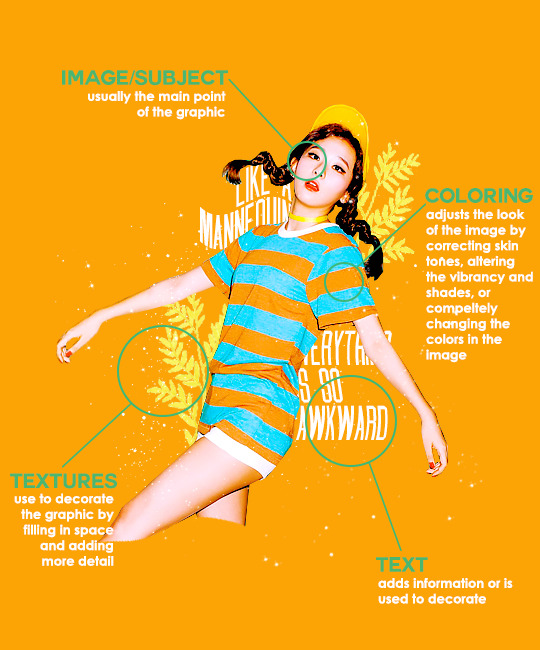
image/subject
usually the main focus of the whole graphic
you should always try to use a sharp hd picture - getting it from the original source is always the best option
make sure the source of the picture allows editing - pictures from public sources like a company or the news can be edited while fansite pics and scans need to have permission asked (and if they give you permission make sure you link them when you post your graphic!)
coloring
often referred as ‘psd’ because that is the format they are in (i.e. pink psd pack)
comprise of multiple layers that can alter the images look
a lot of people make their own colorings since the outcome of the look also depends on the image’s original coloring
textures
smaller cut out images that are often used to decorate the graphic
can also refer to a image that can be use as a background of a graphic
can be found in the form of a png (copy + paste into graphic) or a brush (”painted” on to the graphic)
avoid using any textures that does not state the original poster made them - you could unintentionally be using someone’s work that was not made to be used
[read more about it here + resources that you can actually use]
text
text can be used to tell information or just for decoration
try to choose fonts and colors that are legible
faq
what software can i use to make graphics
most people use some version of photoshop (i currently use photoshop cc 2018) and a lot people have it cracked but if you cant afford photoshop, find a cracked version or a patcher (i used adobe zii 3.0.4 for mac), or are uncomfortable with getting a cracked version then there are other softwares that are just as good!
i can only vouch for gimp since i used it when i first started making gfxs. it is very similar to photoshop and shares most of the same tools and has a similar look to photoshop. it is also probably the most popular photoshop alternative and would totally recommend it if you cant get photoshop!
[visit + download gimp here]
where do you get your pictures from
official sources such as teasers companies release, photos released by press, photos from idol’s instagram - basically photos that are made for the public to see are whats best to use for a gfx. you should download the photos straight from the source so you get it at its highest quality
some phrases you can use to search for pictures on google:
- [group name] photoshoot
- [idol name] press
- [group name] showcase
- [idol name] teaser
remember the more specific you are in your search the better! also when you search through google make sure you check your source!
avoid getting photos from reposting websites like we heart it and pinterest
avoid using fansite pictures and scans unless you are granted permission
i don’t know where to start/i’m overwhelmed and i don’t know what to do/ where should i begin
figure out what you want to make or a theme you want to follow - do you want to make a simple graphic or a infographic? do you want it to center around a certain theme like a comeback or a photoshoot? once you determine what you want to do it becomes easier getting ideas and finding stuff you will need for the gfx
example thought process:
“i want to make a loona graphic” → do you want it to be the whole group or a certain member or unit? will it just be a simple gfx or a AU gfx or based on a event that the group is doing?
“i’ve decided on doing a kim lip one” → do you want it to have a certain theme like kim lip smiling or kim lip with blonde hair? is there a certain frame of time in which you want the graphic to represent like during eclipse era or hi high era?
“i want it to be from max and match era with her teasers” → from here you can start finding pictures to use and thinking of colors and textures that would fit your theme
where do you get ideas/inspiration from
i mean it’s different for everyone but for me i literally just think of stuff and i’m like wow i want to make that happen asdfsdfj but mostly when i see pictures or watch something thats where i suddenly get a idea
but tumblr is full of graphic makers!!! ive seen so many amazing graphics from various fandoms like kpop, anime, marvel, etc.
some amazing graphic editors i know myself include:
primirene, ireone, nctjaemin, celo-mar, 1hyungseo, jeongahn, haechxnie, sonxiumin, syua, lulumelody, dinomite, lovelyeo, joohys, whatchatalkabout, yveu, maerinah, mihyon, lorbits, cherryjennie, thatporcelain, monoka, ifbin, 7ww
some other places you can look at are behance (dont go on behance if you have a cracked ver of ps - it might trigger a ingenue software alert that is a huge pain to deal with), pinterest, deviantart, dribble, and probably any social media platform if you just look up #graphicdesign
remember if you take inspiration from someone’s work then you should cite them in your caption - if you are afraid that you might’ve accidentally copied someone when you were trying to take inspiration from them its best to either try to remake the gfx again or just to ask the creator permission if its fine if certain details are similar/same
my stuff sucks how do i get better
literally just keep on making stuff aka practice. you can’t improve if you don’t bother putting effort.
ways i’ve forced myself into practicing making gfxs is by:
1) starting a gfxs series - its self paced and is based on what you want to make (i.e. introducing my biases gfx series, my favorite outfits gfx series, etc)
2) taking in requests - people who would request from you probably like your stuff so its a win win situation (i.e. send me a idol + era, send me your bias + palette, send me a group and i’ll make a gfx of my fav member, etc)
tips
only sharpen your pictures after you are done resizing them, if you sharpen and then resize it might result in a more blurry or grainy picture
always save your graphic every 5-10 mins in case photoshop crashes
have two copies of your image cutout: one will be the original and the other one will be the one you edit with - in case you mess up like over erasing or over sharpening your image you have a back up you can use
stick with a color palette so you don’t get overwhelmed when having to color everything and it makes all the graphic panels you have look more cohesive
on photoshop you can favorite fonts!!! take advantage of it!!! your computer has a lot of fonts saved on it and it takes forever to look through a whole list of fonts so by favoring fonts you can see all of the fonts that you like to use for graphics
combine a png pack to one psd → when you open a png pack you will probably get a lot of png files and it gets annoying having a lot of tabs open in photoshop when most of them are just textures so by putting all of those pngs into one psd you can cut down the files you open and can easily see all of your options
make folders dedicated to colorings and textures that way you can easily access them instead of looking through your computer for a certain file
name your layers... i dont do it because its easy for me to tell what layer is what but when you are working with a lot of layers its best just to name them it’ll make life easier
lock your main image/subject so that when you play with texts’ and textures’ location you don’t accidentally move your main image
use curves to help get a photo back to its original coloring! like if you have a photo that has a weird filter on it just use curves and it’ll help the picture look more natural! [tutorial]
try warping your text to make it stand out more! you can access it by pressing the icon on the top text bar that has a T with a curved line under it. i use flag and wave the most
alter a particular color by using a selective color layer
rather than changing the actual color of an image/texture you can:
create new layer → select the image/texture and color it on the new layer instead of on top of the image/texture → change the opacity or the mode of the layer so that the color is put on the image/texture while keeping its detailing and not affecting the actual image/texture
resources
colorings: can be found on deviantart or tumblr just look up ‘psd coloring’ or ‘[color] psd’
textures: can be found on deviantart (check to see if its og content or stolen) simply just search what you are trying to find or ‘png pack’ or ‘texture pack’
common textures you can try to find: vintage flowers, memphis shapes, organic shapes, doodles
other wesbites: pngtree, creative market, lost and taken, spoongraphics
fonts: if you are looking for a certain font then you can just do a google search but if you are browsing then dafont and font squirrel are really good websites too
some of my favorite fonts: abril fatface, agfatumc, antonellie calligraphy, arcadeclassic, bebas neue, century gothic, couture, daily news 1915, dark larch, hondurhas, kotori rose, krinkles, risingstar, sant joan despi, studly, zing rust
color palettes: i made one myself which you can find here, color hunt, and honestly a quick google search will give you tons of options
if you have any questions, other stuff you want me to cover, or want to add more resources and tips then please dm or send an ask! i hope this helps!
#i really hope this helps someone and that it makes sense#i literally woudlve been so happy if i saw this when i first started it took me so long to figure things out and im still learning#also i basically told where i got everything so like please dont take advantage of this and end up copying my gfxs... its happened to me a#lot#idk what to properly tag this alfkjasd#ps help
126 notes
·
View notes
Text
First Impressions: Tower of God
Tower of God/Kami no Tou is an action fantasy anime currently airing this season. I was very interested in this anime due to the intense advertising done by Crunchyroll; obviously an anime being highly advertised doesn’t necessarily mean it’s a good show, but it did make me think that this show was expected to be very popular.
So far, I’ve watched the first three episodes of Tower of God. I was impressed by the fact that this was originally a manhwa webtoon; it’s really cool that something that was originally a webtoon received an anime adaptation.
Something about the art style was slightly off-putting to me, and initially I couldn’t figure out why. The designs of many of the different ‘fantasy races’ in this show are actually very unique, and I think the humanoid faces are pretty cute. I also am generally impressed with the animation; the backgrounds are beautifully illustrated and the action, especially during the frequent fight scenes, is done well. But I think my issue is the flat, saturated color palette. There doesn’t appear to be much shading, like, at all, on any of the characters. It’s not horrible to look at, but it does take some getting used to.
I actually really like Bam, the protagonist. One of my favorite anime tropes is the very positive/kind shonen main character (think Deku, or Tanjirou) and Bam fits very neatly into this character trope. It could be argued that he doesn’t have much of an actual personality yet, but it seems like that’s intentional? He’s basically just obsessed with ‘Rachel’ who we know very little about at this point, but again that seems to kind of be the main conflict.
I also like Khun, despite his character design being kind of ridiculous. His personality contrasts very well with Bam’s, and with Rak (crocodile dude) completing their trio, they make a great team. Some of the other characters trying to ‘climb the tower’ seem like they’re supposed to be huge assholes, but we don’t know very much about them yet.
IMO, the worldbuilding in this show is not super great; I know that inundating the audience with information about an entirely new fantasy world is not recommended, but there almost isn’t enough information being given at all to the point where I don’t even kind of know what’s going on. I’m hoping that’ll change soon as more episodes come out, but at this point I’m way more confused than intrigued.
I’ve mentioned that if I lose interest in a show I will stop watching it, but as of right now I don’t see this happening with Tower of God. I wouldn’t say I’m loving it yet, but I’m a sucker for mystery worlds, and as of right now I want to know so much more about this world that I’m willing to suffer through the confusing drip feed of info that’s happening rn. Stay tuned for part 2 of this review once I’ve finished the season!
Thanks for reading,
-threecheersforinking
#tower of god#kami no tou#first impressions#currently airing#crunchyroll#simulcast#simulcasts#anime#manga#manhwa#webtoon#anime adaptation#anime recs#anime 2020#2020 spring anime#spring anime
14 notes
·
View notes
Text
ornaments. [Trixya] - meggie
A/N: It seems only fitting that I sneak a Trixya fic in here considering my very first Drag Race piece was a Trixya Christmas bit I wrote last year.
This drabble comes from a Baker!Trixie/CollegeProfessor!Katya AU that I’m working on and hope to have out sometime in the spring (life permitting). There have been a few snippets for SSS and other things like that, but this is an outtake from way post the end of that story (spoiler alert: it’s a happy ending).
Thank you to beanie (Trixya queen) for being the literal best and reading it over for me (and volunteering to help me with Trixya in general; I’m basically dying of excitement; you don’t even know). You da real MVP and I adore you.
It’s their first tree in their first apartment together.
Of course Trixie just wants to use the three-foot Pepto Bismol pink tinsel tree she’s had since college, but Katya thinks they should buy a new one, a better one, one they can make their own, in a totally gay way.
Katya’s never cared much for Christmas, could honestly take it or leave it most years, but Trixie loves it and she’s been talking about their first Christmas together in their apartment for months, so maybe Katya wants to make it special. She may not feel strongly about Christmas, but she does feel strongly about Trixie and that’s enough to make her want to make it a special holiday.
Katya decides she can live with the pink monstrosity in their bedroom (tucked into the corner where it will make Trixie smile when she wakes up and goes to sleep every night). On the first weekend after Halloween, though, they go to the craft store together and pick out a six-foot, pre-lit white tree and three boxes or ornaments (one box of pink because it’s Trixie’s favorite color; one box of red because it’s Katya’s favorite color; and one box of silver because they feel like it will tie it all together).
It looks a little bit like gay Valentine’s Day threw up on their tree with the multicolored strands of light and all the pink and red, but Katya loves it because it’s something she shares with Trixie, and they sit together on the couch in the glow of the tree every night, pressing kisses into one another’s foreheads.
It’s December 11th and Katya has had just about all she can handle of retail holiday hell when she sees the ornament hanging in the window of the Hallmark store.
She hadn’t even planned to stop at the mall, but there was an amazing sale on Trixie’s favorite makeup brand at Sephora, and Katya knew she could get three times the product if she just sucked it up and stopped by after her last class of the day.
The ornament is blown glass, a delicate pink cupcake base decorate with heaps of even lighter pink icing sparkling with extra fine glitter. It looks almost exactly like the thousands of pink velvet cupcakes that Trixie has placed in the display cases in the year and a half Katya has known (and loved) her. It looks almost good enough to eat.
Katya’s breath catches in her throat and she immediately walks into the store and buys the ornament. She says yes when the clerk asks her if she wants it gift wrapped even though there’s no way she’s waiting until Christmas to give this to Trixie.
*
That night, when they’re snuggled together on the couch, Dolly Parton singing about a “Hard Candy Christmas” in the background, Katya clears her throat and sits up.
“I bought you something today.”
Trixie’s nose crinkles in confusion and she brushes her hair out of her face. “It’s not Christmas for another two weeks.”
“It doesn’t have to be Christmas for me to buy you a present,” Katya says, crossing from her place on the couch and grabbing the small box from her work bag on the entry table.
Trixie blushes a little and smiles as she sits up because Katya knows that she does like being spoiled even though she’ll never admit it.
Katya watches in anticipation as Trixie opens the gift, making short work of the expertly gift wrapped box. She’s gentle, but she’s impatient, so it isn’t long before the box with the ornament placed safely inside is sitting in her palm, and Trixie is gazing at it, her mouth open in a tiny ‘O’ of surprise, her eyes bright.
“Babe…” she whispers in the tree-lit room. “I love it.”
Katya bites back a smile. “I bought myself one too.” She pulls another, unwrapped, box from behind her back. “Yours is a cupcake, mine’s a paint palette. Get it? ‘Cause art. And you’re a baker.”
“I get it.” Trixie nods and looks up from the ornament for the first time. Tears glisten in her wide brown eyes. “Ornaments for the tree that represent us. Because it’s our first Christmas together.”
Katya nods. “I thought we could make sort of a tradition out of it… If you wanted. Like maybe each year we exchange ornaments when we put up the tree? If you want?”
It had seemed like such a good idea in the Hallmark store, with the rows and rows of ornaments spread out in front of her; Katya could have chosen at least ten that perfectly represented Trixie. That’s how she had come up with the idea in the first place. But now that she’s actual said it out loud to her, brought up the idea… She’s doubting everything.
Trixie extends her arms, wraps them tightly around Katya’s neck and pulls her close for a kiss. “That’s the sweetest, most romantic thing I’ve ever heard in my miserable life. I can’t believe a wretched old hag like you thought of something that pure.”
Katya lets out a laugh, chaotic and unbridled, one that only Trixie can bring out of her because she spent so many years hiding that part of herself away.
They kiss again, then Katya takes Trixie’s hand and escorts her to the tree where together they hang their ornaments amidst the amalgamation of red and pink.
“I thought you hated Christmas,” Trixie breathes against Katya’s mouth as they embrace in front of the tree.
Katya shrugs. “I love you. And you know what they say: love changes people. I guess that means even old Grinches like me.”
Trixie smiles. “Did your heart grow three sizes today?”
“Oh, that happened when I met you, baby. Christmas had nothing to do with it. I love you.”
“Love you too.”
#rpdr fanfiction#trixya#trixie mattel#katya zamolodchikova#meggie#lesbian au#fluff#ficmas#day 11: ornaments#submission
42 notes
·
View notes
Note
“You’re in my world now, not your world.”
disney lyrics: villain edition (pt.1) | sentence prompts | selectively accepting
Step 4 out of The 7-Part Contingency Plan for The Heiress’s Retrieval from Operations and Extraction (THRONE): Mitigation. Calculated time spent: Two hours and 12 minutes. Estimated time of completion: Three hours and 32 minutes.
Mental notes were frequently and committedly made throughout the entirety of the Ultimate Hatter’s recline on the lush and long couch belonging in the dormitory’s living space. Her right arm was forked and resting underneath her head. Alas, how voluntary both the position and location of her leisure was, understandably, doubtful when her frame was serving as the Ultimate Princess’s comforter. Whilst being crushed by the existential weight of expectations and dread of her meaningless life, the russet-locked student wasn’t as affected by the actual physiological pressure against her person. This wasn’t an additional burden against her, it was an unspoken comfort. Though, in the confines of her obstinately private mind, such musings were suppressed and to never dare surface.
While inferior to Sonia’s height by 12 centimeters, the difference wasn’t difficult for Sophie’s management; the couch’s length contributed to how much more accommodating the position could be. Brushing the crook of Sophie’s neck had been the small huffs of breath from Sonia’s sleeping body, as the princess was more than happily adjusting herself and nestling herself against the warm contact, arms wrapped around Sophie’s vested torso. Physically affectionate as she ordinarily was, the alcohol in her body amplified her to such an umpteenth degree that Sophie, in past instances, had intervened and redirected any surprise touch from any unsuspecting parties. And, as in the aftermath of these escapades (when Sophie wasn’t as guiltily intoxicated), she found herself tangled by choice.
Though, she was finding herself falling into the habitual stage of nostalgia; her scarred fingertips weave through flaxen locks, almost like the golden threads that Rumpelstiltskin spun himself. From the crown of Novoselic royalty herself, Sonia’s undone hair (from its usual ponytail and bow combination), had always been a particular enjoyment of Sophie’s when younger. Raising two sisters by herself meant that she fitted herself as much as a mother and father to them more than she was their sister. Complicated styles, regal styles, professional styles, cutesy styles -- she spent countless nights going through books and magazines she managed to scrap at the library. It was supplementary work included with her studies delving into her seamstressing, hatmaking, financing, and other necessaries for her position. It became second nature for young Sophie to take to any hair and play with it, as well as style it, and Sonia was often her make-shift mannequin head. But, it seemed Sophie was paying her dues as the young princess’s mattress now.
Hopefully, the vest’s material uncomfortable to be sleeping against, Sophie hopes. A majority of her day and night were spent rushing between corporate meetings, fitting appointments for customers, and other duties that filled her schedule. She’d only gotten back home two hours ago, and at the sound fo the door closing behind her, she was rushed by the ever-aware and ever-active princess, who had spotted her immediately at the doorway. In the midst of shrugging off her charcoal gray jacket, assertive and greedy arms had wrapped around her chest, nestling into her vest, and was greeted by a symphony of giggles, hiccups, and slurred words.
Now, she was spending her time, still in her work clothes, with her wing-tipped shoes undone, both loosely hanging by her toes, which revealed that underneath her punctual garbs had bene mismatched blue-and-white socks. The jacket was folded and on top of a table not too far from the couch. Even if the three-piece suit wrinkled, slacks and all, it wouldn’t be too difficult to maintain -- it’d only be insulting to insinuate the seamstress was short of knowing proper clothing care!
Juxtaposing the slick yet mute palette had been the princess’s nightly wear. Sonia’s elaborate and expensive nightgown was of a lilac shade, the linen material only available for the most affluent, that much Sophie could perceive by pinching the fabric. Luxury always came easy for those who weren’t able to see the bottom of their pockets and Sonia’s wardrobe reflected that. Sophie quietly fixed the gown by its shoulders, ensuring that Sonia was properly covered, in case the temperature had been too cold for her.
Nostalgia waned in her eyes, a glimmer so rare dissipated as her mind wandered once more to despondent contemplation; a troubling habit that grew rampant as the years past, ever apparent by eyes familiar with her originally brighter self -- Hell, even Sonia commented on it, the most careful woman Sophie knew who wouldn’t risk breaking from her regally regulated character in most and any publicly visible area and situation. Yet, Sophie submits into the abyss, copper slowly glaze over with a coldness while her fingers still twirl and brush through golden hair.
( ... )
“You’re in my world now, not your world.” Arms anchored around her neck like a token of repentance as Sonia gleefully whispers such a phrase to her. Crystalline eyes, brighter than any commonly gloomy day back home for Sophie, marveled at her with, what Sophie interpreted, as an underlying message.
It hadn’t been an unusual case for the blonde to reference her royal lineage, privileges, and background whenever she was inebriated and embracing reckless abandon of all those principles. Whatever driven Sonia to take to expensive and hidden bottles must’ve been associated with a private family matter or sidelined discipline from her mother; especially if such particular details were slurred and carelessly thrown around.
“Miss Nevermind, I don’t understand,” Sophie lies. Her jacket was folded over her left forearm as her right hand found itself carefully holding the princess’s waist. With the other teetering slightly, changing her course of tilt whenever she hiccuped, Sophie would rather not risk adding ‘head trauma’ to the list of damages she’d be needing to cover up for Sonia’s sake. How would she explained to Novoselic sovereignty that their only daughter and successor to the throne succumbed to a concussion because her family drove her to drink?
“Let’s get you somewhere away from prying eyes.” The hatter gingerly tucked a loose lock behind Sonia’s ears, now using her right arm as a means to turn around Sonia. “I need to see what you’ve decided to drink tonight...”
( ... )

“May I confess how irrefutably pissed off that makes me?” Copper eyes glanced down to the slumbering Sonia, one eyebrow perked. “Not by the fact of you saying it, but by how awfully true of a statement that is; how unfair of a fact it is for the princess from the Kingdom of Novoselic endures her only life to be almost removed from freedom and personal choice that everyone should have a right for? How fucking unbe--” Sophie strains her breath, pinching the bridge of her nose. Get your shit together and maintain the temper before it overwhelms you. You aren’t fourteen anymore and childish outbursts and retaliation aren’t going to save anyone; it isn’t going to improve anything and it only hurts others. You’re 18 and the time to be a juvenile long since past, do not ruin the facade you’ve built.
“Ah’m goin’ lose it and al end up playin’ pop with yourn mam and faaver,” and slipping out was the northern accent, far too inconceivably angered to use her posh accent. “Tha end up making every’fin n’ they’d take a proper pissin’ on ya. Katered all neet ‘cause yourn mam were mithering ya. Nar then, mi mate’s ain’t roaring, but, aye, ya ain’t th’ faffin’ type.” Sophie’s head rolls back, taking a loud breath. “Ah swear down,” followed with a string of muffled expletives.
After a moment’s reprieve, the Hatter returns to her senses and glances down at Sonia. “You don’t know how much of your world I’d destroy if it meant you could do what you want, like whatever you can, be whoever you want to be, and be with whoever you want to be...” But, she easily interrupts herself, “And I know how selfish that is for me to say, but I wouldn’t ..I couldn’t.. I hate seeing you being so refined with your smiles, but you can tell the pain behind it sometimes, the carefulness in how you express, and the hesitance and denial to approach subjects and people you believe cannot be a part of your life. You deserve the full cloth of your life, you should cut it the way you want it to be cut and wear it the way you want to. No one else should’ve taken the scissors and made a mess out of it.”
Sophie turns the other cheek, her own right hand slapped over her mouth in terrified silence. None of that should’ve come out! No, no, no-- Sophie forced a gulp and felt her body shaking -- anxious eyes looking everywhere around the room as if someone could hear, as if something was recording her. She takes a startled exhale and pulls herself forward, trying to hold herself together. Yet, she pushes on in her original plan.
“Miss Nevermind,” Sophie properly announces as she untangles her fingers from her hair, now using it to push herself up against the couch. As she was seated up straight, with now blonde seated on her lap and still clinging onto her, she was carefully working around the princess. “Come on,” she murmurs, carefully rearranging the princess’s dangling legs that way they were on either side of Sophie’s outer legs, “make like a marsupial.”
“Mmm,” Sonia answered her with several grumbles, now wrapping tighter around Sophie’s neck and her legs around her waist. She fusses a bit to tuck her forearms underneath Sonia’s thighs (still covered). She, as well, slides out of her shoes to avoid future fumbling.
With a quick breath and patience, Sophie rose to her feet. Nestled and held against her chest was still Sonia, who was soundly back to sleep and, most likely, unaware that she’d been sleeping out in the living room in the first place.
“There we are,” Sophie sighs with relief, now beginning the short walk back to Sonia’s bedroom. She hums herself, though, she quietly holds the princess against her, desperate to protect her. But, she knew their futures were futile and there wasn’t anything she could do about it.
#( checkbooks inquiries and much ; answered asks )#( verse: the ultimate ᶠᵃᶦˡᵘʳᵉ hatter | school life )#morethanaprincess#[ this prompt went from childhood memory to sonia dming to now this ]#[ i hope this is alright ; rae ! and tysm for sending this in. ]#alcohol tw#alcohol#intoxication tw#intoxication
2 notes
·
View notes
Last Seen Blogs
chestercompany
Chester's Company

millefleuv
this is our science

happykulakan
Hub Wa : 0821 411 54 266
ineffable-hubbiewubbies
smalltown boy

keto-diets-weight-loss
Keto Diet Weight Loss