#this was a;dsfkals sorry i am bad at explanations
Note
Said it before but I love your blog and thank you again for the Halloween icon. Have you ever made an icon tutorial for coloring? They’re so crisp and lovely.
This is so very sweet, thank you! TBH, it’s usually just me fucking around until I get what I want, but I realize that’s not as helpful lol so I recorded my process for an icon set I made (note: I don’t have photoshop, so I just use gimp for coloring).
Every picture is different, of course, but this is the general process I have and I hope it’s useful! :)
These are the icons I’m showing the process for:
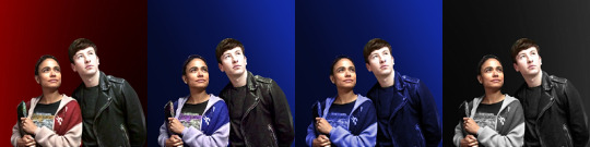
Edit: Their skintone will be slightly different from the icons because my laptop isn’t frustrating at all, so I speed redid it, but the process is the same! I apologize for any quality issues, recording + screenshotting is currently hell on my laptop
And here is the video with the process written underneath if that’s preferable!
Screenshots under the cut:
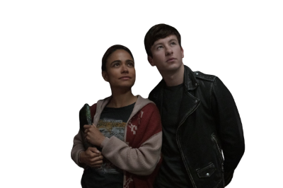
Here’s the original:
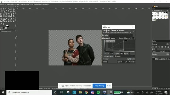
1. I brighten up the layer a little (especially usefull for dark layers) using curves. I don’t do this a big amount, just enough to make it a little brighter:
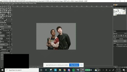
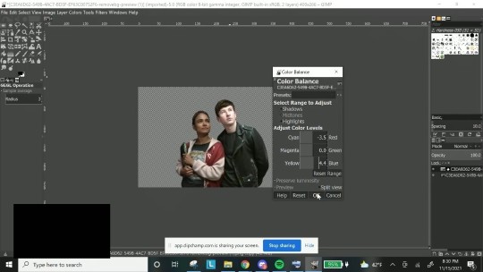
2. Then I create a duplicate layer + layer mask. I want to work on Makkari and Druig seperately, so I used my brush tool while on the layer mask and erased effects on Makkari, so that only Druig was editable.
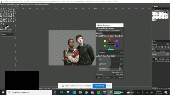
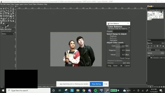
From there, I did a mixture of curves, hue + saturation (made him slightly less saturated and increased the lightness), and color balance (mainly adding a little more cyan and blue to get rid of the red):
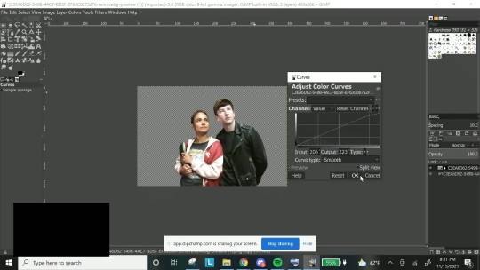
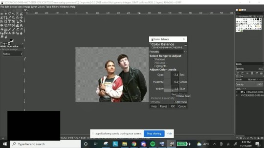
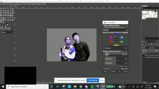
3. I merged down the layer and then duplicated and created another layer mask, and repeated step 2 for Makkari. For this particular layer I didn’t have many edits to make so changes were fairly minute, but there are some really bad lighting on shows sometimes that make color balance my best friend.
Then I merged down, and did any minor edits as I saw fit.
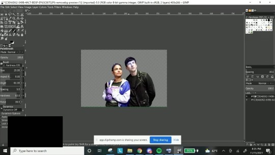
4. Coloring the clothes. I do this in two different ways - either hue/saturation or colorizing. I make my own palettes and background colors so which one I want to do really depends on my mood.
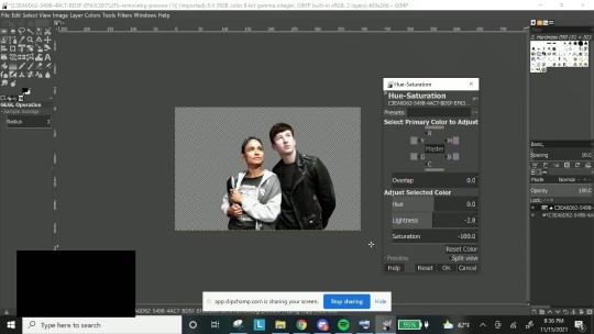
If I want to just color and figure out an icon background that looks best later, I just change hue saturation. As you can see, the entire layer is blue with the hue I chose and I sue my brush tool to erase the effect from their skin.
I wanted black & white here, so I took out the saturation and just adjusted the lightness as I saw fit.
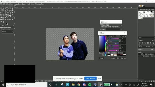
If I want to match to a specific icon palette, I colorize, as I can put in the specific hex code, as seen here:
Then I see if there’s anything I need to clean up, double check to make sure the characters look okay, there’s no whitewashing/orangewashing (and if there is, I go back to color balance to straighten it out) and I have my layers saved! I put the layer on top of my background and generally don’t adjust from there on out save for really difficult layers.
I hope that was useful, and I’m sorry if it isn’t lol. It’s honestly a lot of moving those pieces around (for me, at least) until I find something that I think looks nice, and it gets easier the more I’ve done it.
7 notes
·
View notes
Last Seen Blogs

kaboommagazine
Life of a CEO

moicrunchysillies
the fuckers

watermoldrestorationbossofmiami
Water Mold Restoration Boss of Miami
rubbsub
rubbsub
