#Color Palettes for Designers
Text
UX Design Challenge - UI Coach
Looking for real-world challenges to practice UX Design! In this UX Design Challenge, Our squad have been given the job of creating a UI coach. This is a user interface (UI) which helps users with their daily tasks. Designed in a way even beginner, able to handle multiple users and multiple actions. The user can be able to access it from anywhere and anytime want. Also, design in a way that any new users can easily navigate through its menus and options. Designed a UI Coach that helps our clients make simple-to-use interfaces for their users. Improve your UI/UX Design skills by designing real-world projects.
#UX Design Challenge#UI Design Tools#UX Design Challenge Generator#UI Design Software#Web Design Inspiration#Best Landing Page Design#Color Palettes for Designers#Color Wheel Generator#Best Font Pairings#Font Pairing Generator#Best Font Combinations
2 notes
·
View notes
Text
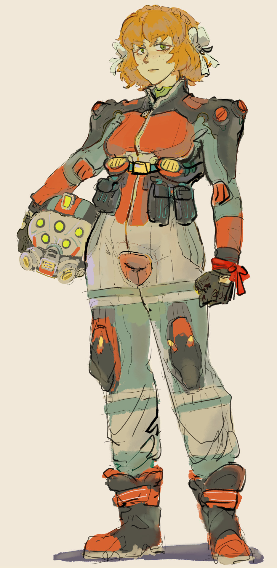
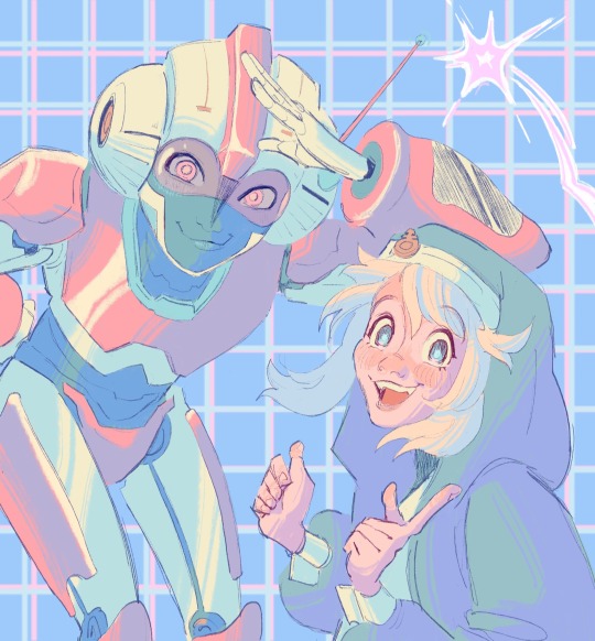
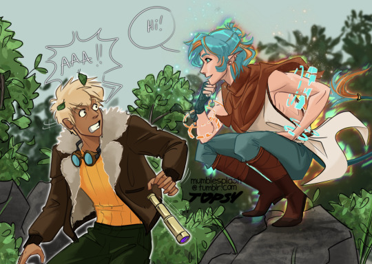
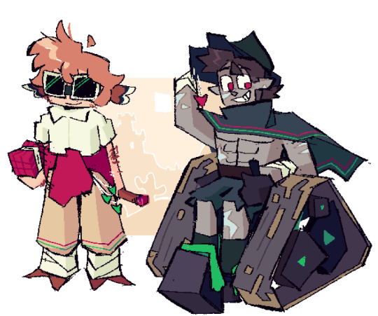
lancer pilot commission for a friend
#art#character art#character design#mech pilot#lancer rpg#accidentally used the same color palette for 3 drawings in a row im so washed
2K notes
·
View notes
Text
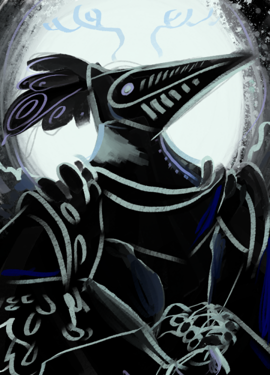
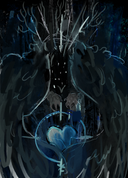
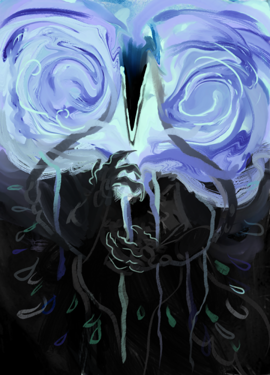
-Voices-
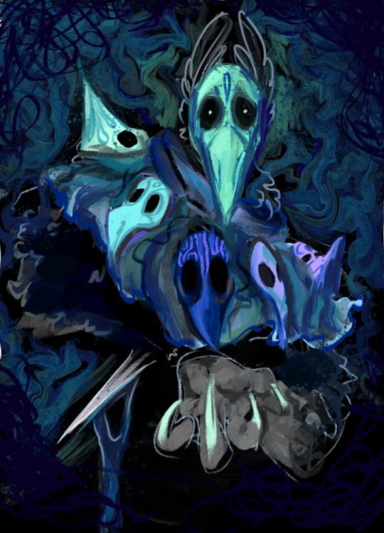
A collection of portraits depicting the voices from Slay the Princess, taking inspiration from the style of the video game Disco Elysium!
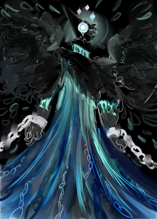
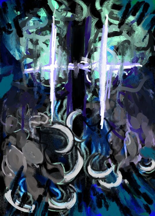
The Voice of the Hero, a knight, an iconic silhouette against a luminant halo. A color palette of black, blue, and teal.
The Voice of the Hunted, a beast trying to protect its heart from danger, represented here as a crosshair.
The Voice of the Smitten, the knife wound letting loose lovely streams of swirling bodily juices into the air.
The Voice of the Cold, dark, and angular. Something completely unafraid to kill.

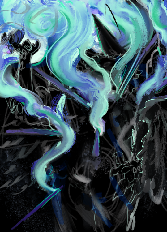
The Voice of the Skeptic, attempting to fly, tearing himself away from chains and what looks like his own body.
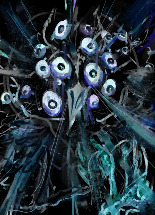
The Voice of the Paranoid, Frantic and multi-eyed, clutching at a wound.
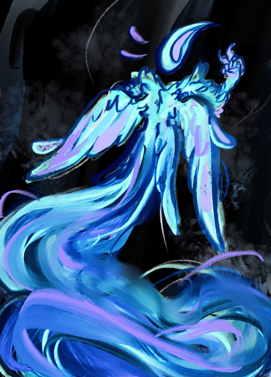
The Voice of the Contrarian, flying in stark contrast to the others, glowing instead of secluded, a mischievous fairy or will o' the wisp, instead of a grotesque figure.
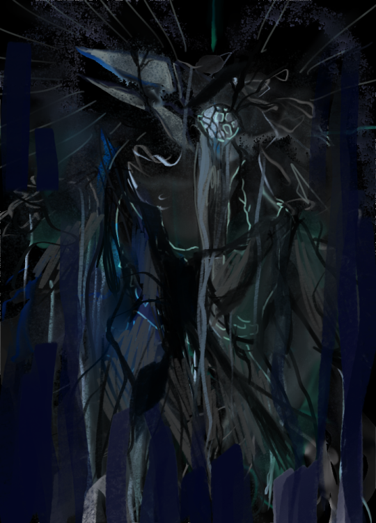
The Voice of the Broken, shattered and leaking. A humanoid figure is no longer recognizable.
The Voice of the Stubborn, Fiery eyes, and big meaty claws. The brushwork is chaotic.
The Voice of the Cheated, smoke leaking from puncture wounds still embedded within him. He's holding a cigar, too; probably where all the smoke is coming from.
The Voice of the Opportunist, carrying multiple masks on his person, and wielding a poorly concealed knife.
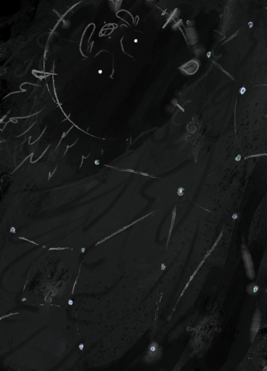
And finally (for now) The Long Quiet itself, the night sky, swirling sigils blurred in the dark.
#artists on tumblr#design#drawing#art#doodle#surrealism#slay the princess#stp voices#eyes#eyeballs#the long quiet#grotesque#macabre art#creepy#scary#dark art#corvid#crow#Corvids#ravens#crows#owls#birbs#disco elysium#painting#expressionism#expressive#Be not afraid to reblog!#color palette#portrait
2K notes
·
View notes
Text
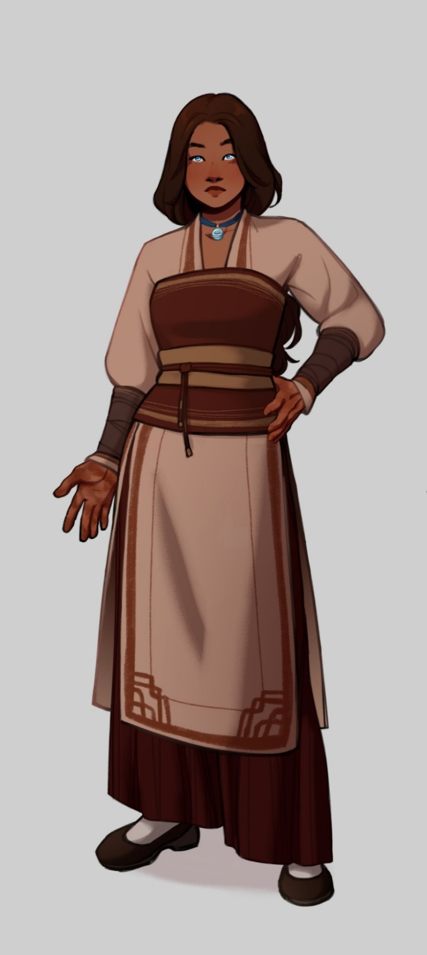
Character design for Katara in Soundless.
#atla#zutara#avatar the last airbender#katara#atla art#atla fanfic#atla fanart#katara of the southern water tribe#katara art#katara fanart#atla katara#Soundless AU#Soundless (Uiscefhuaraithe)#Soundless AU art#zutara fic#zutara au#character design#Designing her was so much fun!!!#I wanted to play with a warmer color palette for Katara#Not much to say tho#I know I've been missing but I've got tests in college and... yeah#The joys of university life#Ugh#Also I've been thinking about a Blue Spirit!Katara and Painted Lady (Lord? Spirit? One? Help) Zuko AU#Another one for my never ending to-do list
1K notes
·
View notes
Text
I think 90% of my gripes with how modern anime looks comes down to flat color design/palettes.
Non-cohesive, washed-out color palettes can destroy lineart quality. I see this all the time when comparing an anime's lineart/layout to its colored/post-processed final product and it's heartbreaking. Compare this pre-color vs. final frame from Dungeon Meshi's OP.


So much sharpness and detail and weight gets washed out and flattened by 'meh' color design. I LOVE the flow and thickness and shadows in the fabrics on the left. The white against pastel really brings it out. Check out all the detail in their hair, the highlights in Rin's, the different hues to denote hair color, the blue tint in the clothes' shadows, and how all of that just gets... lost. It works, but it's not particularly good and does a disservice to the line-artist.
I'm using Dungeon Meshi as an example not because it's bad, I'm just especially disappointed because this is Studio Trigger we're talking about. The character animation is fantastic, but the color design is usually much more exciting. We're not seeing Trigger at their full potential, so I'm focusing on them.
Here's a very quick and messy color correct. Not meant to be taken seriously, just to provide comparison to see why colors can feel "washed out." Top is edit, bottom is original.
You can really see how desaturated and "white fluorescent lighting" the original color palettes are.
[Remember: the easiest way to make your colors more lively is to choose a warm or cool tint. From there, you can play around with bringing out complementary colors for a cohesive palette (I warmed Marcille's skintone and hair but made sure to bring out her deep blue clothes). Avoid using too many blend mode layers; hand-picking colors will really help you build your innate color sense and find a color style. Try using saturated colors in unexpected places! If you're coloring a night scene, try using deep blues or greens or magentas. You see these deep colors used all the time in older anime because they couldn't rely on a lightness scale to make colors darker, they had to use darker paints with specific hues. Don't overthink it, simpler is better!]
#not art#dungeon meshi#rant#i'm someone who can get obsessive over colors in my own art#will stare at the screen adjusting hues/saturation for hours#luckily i've gotten faster at color picking#but yeah modern anime's color design is saddening to me. the general trend leans towards white/grey desaturated palettes#simply because they're easier to pick digitally#this is not the colorists fault mind you. the anime industry's problems are also labor problems. artists are severely underpaid#and overworked. colorists literally aren't paid enough to do their best#there isn't a “creative drought” in the anime industry. this trend is widespread across studios purely BECAUSE it's not up to individuals#until work conditions improve anime will unfortunately continue to miss its fullest potential visually#don't even GET ME STARTED ON THE USE OF POST-PROCESSING FILTERS AND LIGHTING IN ANIME THOUGH#SOMEONE HOLD ME BACK. I HATE LENS FLARES I HATE GRADIENT SHADING I HATE CHROMATIC ABBERATION AND BLUR
2K notes
·
View notes
Note
Hello! I stumbled upon your color palette challenge today and I got to say I absolutely love it!!! It’s so good!!! Like i love all the tiny details and the textures! And your style! If you’re still taking requests I think it would be cool to see 53 and Scar (maybe as HotGuy). Also if you don’t mind me asking, what art program do you use??
Have a good day/night!!

AH THANK YOU FOR YOUR KIND WORDS!! This was actually so fun because I got to lean into the Screentones for the comic book effect :))
And I use Photoshop! I’ve used it so long, I’m just too stubborn to learn a different program. Monitor wise, I use a Huion that I plug into my laptop. Thanks for asking!! :))
#leaf doodles art#asks#color palette challenge#gtwscar#HotGuy#HotGuy Fanart#hermitcraft fanart#hermitcraft#gtwscar fanart#goodtimeswithscar fanart#goodtimeswithscar#I tried doing a more personalized design#but shoutout DDVAU for being so influential
809 notes
·
View notes
Text
Transgirls rule the world!!
#transformers#maccadam#maccadams#arcee#transformers arcee#bridget#guilty gear#my art#im drawing my two favorite girlies together bc they would be best friends and you cant tell me otherwise.#its crazy that arcee and bridget both have the trans flag in their color palettes#this arcee design is mine but i barely changed anything abt her
3K notes
·
View notes
Text
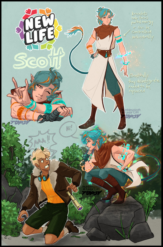
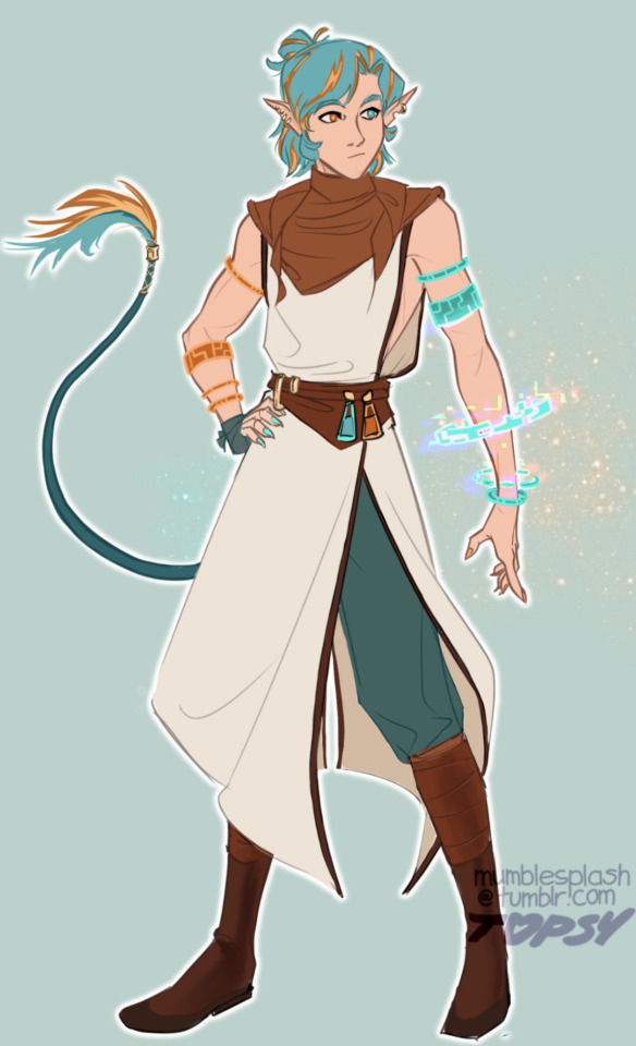
as if he needed more ways to be everywhere at once
#my art#new life smp#scott smajor#new life scott#owengejuicetv#what if nightcrawler had the color palette of portal and the fashion sense of rey star war#actually maybe i do give him the nightcrawler legs next time i’m not sure#depends on how long this origin lasts tbh#also my Lord was it hard to stay skin accurate without laddering his character design#you know like that thing where a chars outfit is blocked into segments w tunic->belt->skirt->boots all being roughly the same distance#i never like how that looks and i am Constantly fighting for my life bc it’s so easy to do on accident#also i didn’t draw this but the thing where he ‘imprints’ on people and can swap places w them#shows up as him snapping one of his bracelets onto someone else’s wrist#+ since he’s the only one who can control them they can’t take it off
2K notes
·
View notes
Note
how would you redesign the ancient hero’s aspect

catboy
#aside from the obvious catboy changes (lol) i removed all the gold from his design bc i think it looks bad#i assume the gold is there to make us think gerudo? but imo the red hair does that on its own anyway#and. well. im a big fan of 3-color palettes and keeping it to red-orange-green just works better here. imo#asks#skribbles#totk
673 notes
·
View notes
Photo

the new girl at school 🛸
4K notes
·
View notes
Text


⚡️BALD FACED HORNET⚡️
[+FUNSIES RAINBOW EDITION. HAPPY PRIDE]
#wasp#yellowjacket#bald faced hornet#insect#bug#design thats been sitting in the back of my brain for years#and that ive finally been chipping away at for a few months#original idea was gonna be a paper wasp but i like the limited palette of bald faced hornet a lot#solid color white is very good for overlaying gradients on to lol
295 notes
·
View notes
Text
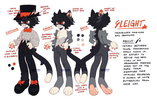
updated Sleight ref!!
#i changed his colors !!#treat this as a suggestion than a solid ref. i spent like 3 hours drawing and redrawing the legs bc i couldnt get the shape right so if u#wanna draw them more planti or digi i do not mind ^_^ get silly with it!! same goes for pelt pattern do whatevr u want with it#the pelt pattern is loosely based on a snowshoe cat which was fun to play with. as u can see they kinda have a butterfly motif going on#if u squint the ear tufts kinda resemble luna moths or swallowtails with the long tail at the end of the wings#i was kinda torn about changing the costume color but it clashed too much with the new color palette so i had to change it#i didnt include the cape here so its easier to see the costume but ill draw it another time if i remember lol#its also a lil hard to see but i put pinstripes on their pants but thats optional. their design is pretty flexible anyway#god im pretty attached to this guy already. hes like semi fan character semi regular character... oc... thing#i should draw more furries. i followed some furry artists for giggles recently and its true what they say. u need furries in your life#btw while i was drawing this i was fooling around while trying to figure out his costume color and colored it as kaito kids suit for fun#and i just stared at it for a solid 5 minutes before saving a picture. maybe ill post it later#my art#myart#my oc#oc#furry art#fur#furry#laika's comet#laika's comet oc#fan character#sleight#ref sheet#oc ref sheet
919 notes
·
View notes
Text
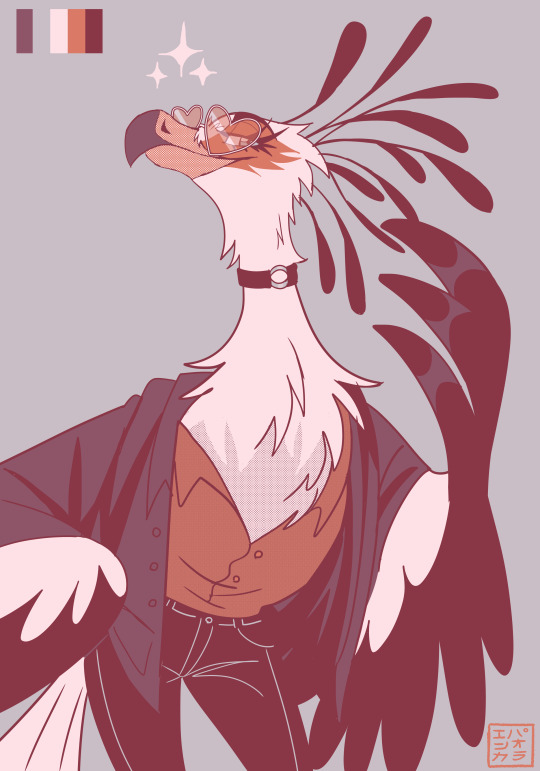
my girl elena bein a fashionista!!! i haven't drawn this oc in months. 💔
another color palette, this time using 'every summer i spent with you'.
#my art#bird ocs#kabukiaku elena#birds#anthro#furry#avian oc#bird oc#secretary bird#digital art#color palete challenge#color palette#original art#oc art#character design#anthro oc#furry art#bird furry#avian furry
1K notes
·
View notes
Text
hi been noodling with designs for block guys have some sandy boys
#mcyt#grian#goodtimeswithscar#gtwscar#scar goodtimes#desert duo#3rd life#third life#trafficblr#what are. the fandom tags (ekplodes)#dragon doodles#id in alt#remembered I wanted to let myself post more messy things here so here's! design passes I got carried away with#rly liked the idea of scar's palette being dark colors and green and grian's pale color's and red but scar's a red life and grian's a green#complimentary character design when I remember to do you my beloved <3#scar's wheelchair is powered and has treads + a front stabilizing wheel for sand purposes (also I referenced minecart wheels hence. cube)#not something I have much practice in but AM wanting to experiment more with wheelchair designs had lots of fun with this one :]#meant to be making these for a bigger piece but I'm actually procrastinating rn so Not saving these for then I Aim to stop procrastinating
758 notes
·
View notes
Text
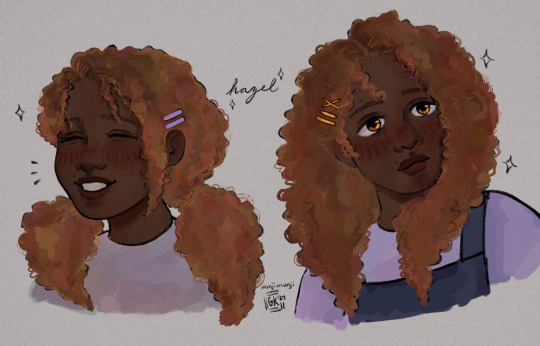
Hazel Levesque 💎✨
Closeups under the cut ⬇️
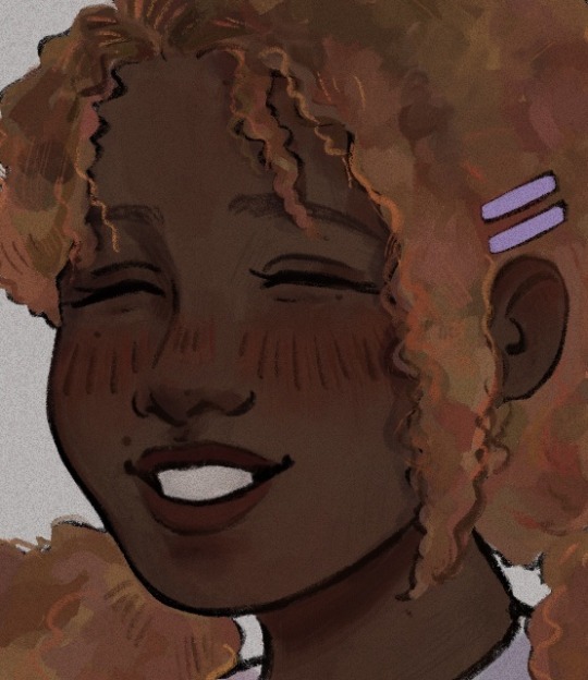
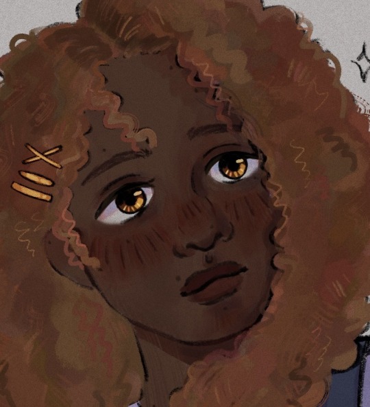
#I’m really happy with this design#her hair is fun to draw#so is her color palette#hazel ily#my art#fan art#artists on tumblr#percy jackson#hoo#heroes of Olympus#hazel levesque#riordanverse#rrverse#character design#pjo hoo toa#Hazel#Hazel fanart#Hazel Levesque fanart#pjo
197 notes
·
View notes
Note
Could I get a scar with 45 or 61 if you're still doing these? 👉👈

He’s catching critters
#leaf doodles art#hermitcraft fanart#color palette challenge#gtwscar fanart#goodtimeswithscar fanart#gtwscar#Stiffyck jumpscare /pos#<<your scar designs are everything
228 notes
·
View notes
Last Seen Blogs

teaandbrujeria
Ariel
dungeonfeasts
Dungeon Meshi Hell
3cute5um9-blog
Stupid Airhead

perfumersclub
Perfumers Club

luxstylestylesl
Luxestyle Blog