#women type designers
Text


Typography Tuesday
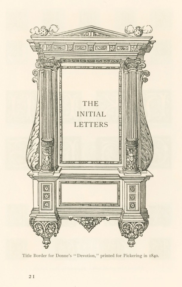
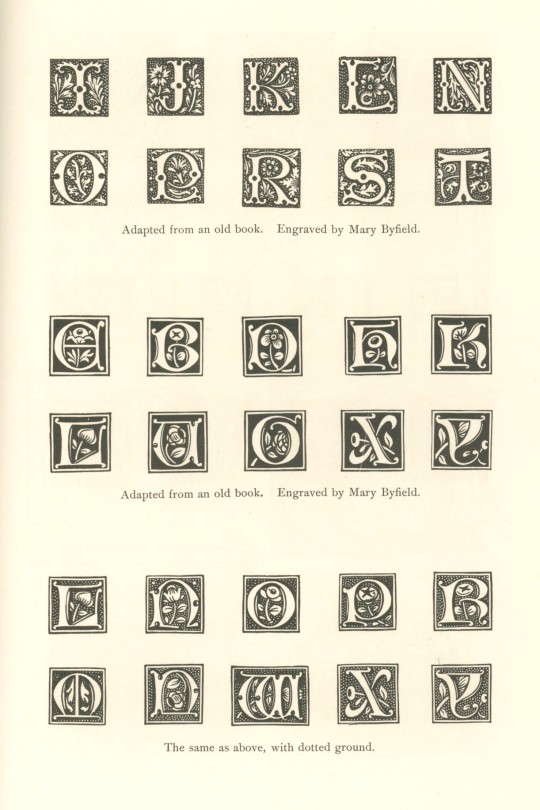
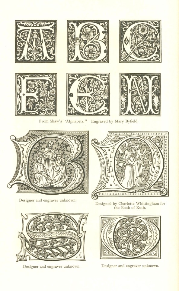
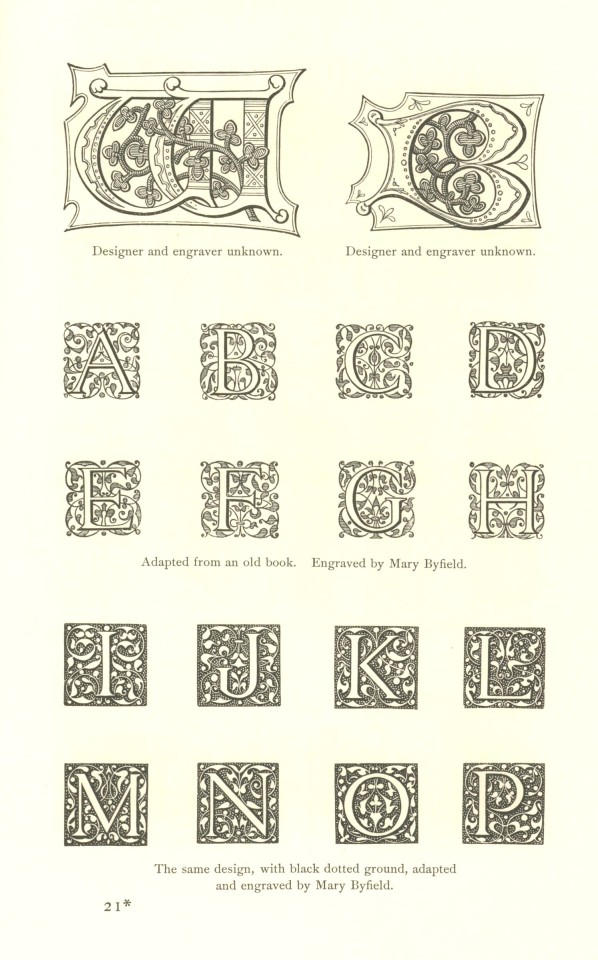
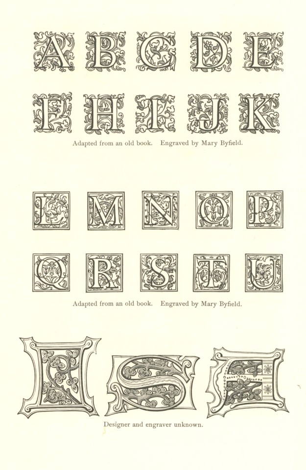
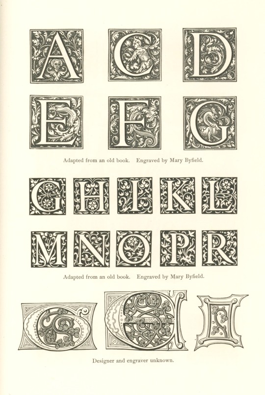
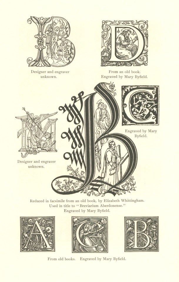
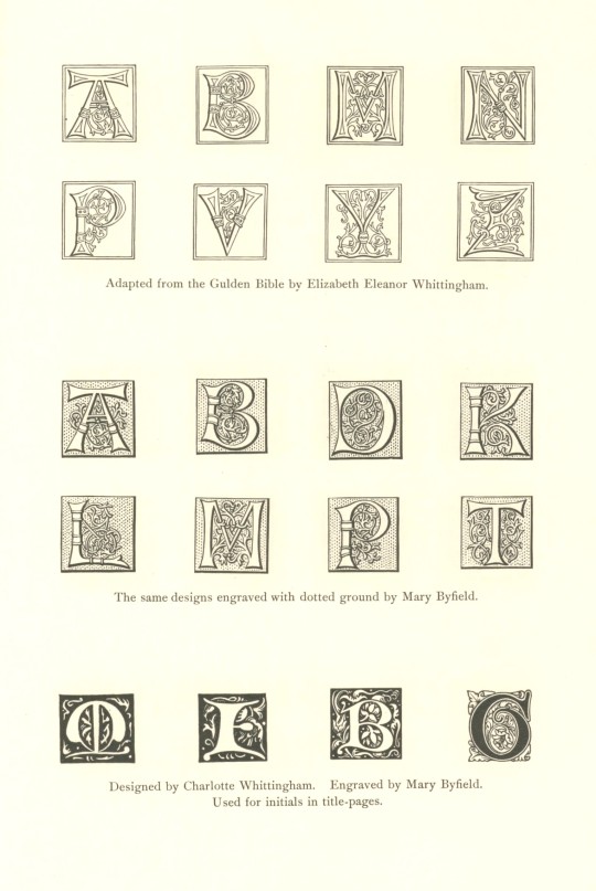
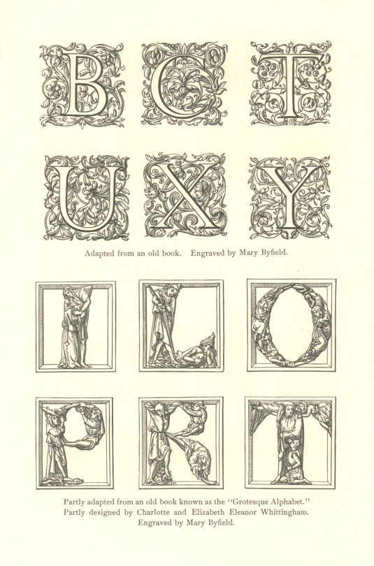
WHITTINGHAM INITIALS
The Whittinghams, Charles the Elder (1767-1840), who founded the Chiswick Press, and his nephew and successor Charles the Younger (1795–1876), were among the finest English printer/publishers of the 19th century, noted especially for the quality of typographic design and evenness of printing. Their firm was also the chief printer for bookseller/publisher William Pickering, whose own devotion to quality was exemplified in his use of Aldus Manutius's anchor & dolphin printer's mark, combined with the motto Aldi Discipulus Anglus (Aldus's English Disciple).
Many of the distinctive, wood-engraved initials the Whittinghams used were designed by Charles II himself along with his artist daughters Charlotte and Elizabeth, almost all of which were engraved by English book illustrator and wood engraver Mary Byfield (1795-1871). The Whittingham initials shown here are from the 1896 Grolier Club publication, The Charles Whittinghams Printers by Arthur Warren (1860-1924), which itself is printed by one of the finest 19th-century American printers, Theodore Low De Vinne (1828-1914), who printed the book on handmade paper in an edition of 185 copies. Our copy is another gift from our friend Jerry Buff, a Grolier Club member.
View our other Typography Tuesday posts.
#Typography Tuesday#typetuesday#Women's History Month#Whittingham Initials#Charles Whittingham#Charlotte Whittingham#Elizabeth Whittingham#William Pickering#Mary Bayfield#wood engravings#initals#The Charles Whittinghams Printers#Grolier Club#Arthur Warren#Theodore Low De Vinne#Jerry Buff#wood engravers#women wood engravers#women type designers#19th century type
108 notes
·
View notes
Text
#freefonts#typography#online resources#free resources#women type designers#typefaces created by womxn
4 notes
·
View notes
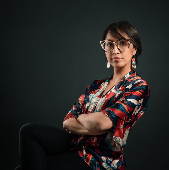
Text
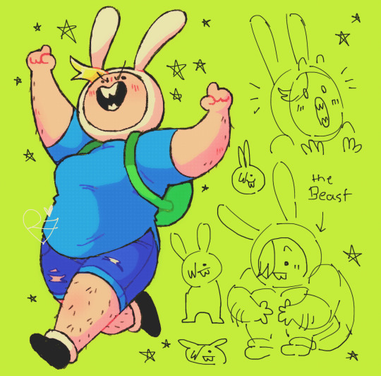
a woman is an animal
[image description: a page of drawings of fionna campbell from adventure time on a lime green background. in this, fionna is drawn fat with jean shorts, ankle socks and boots, and visible body hair on her legs and arms. on the left is a fully rendered drawing of fionna cheering and running with a determined look on her face. to the left are various simple doodles of fionna, including her sitting on the ground with her arms wrapped around her knees and the caption "the Beast", her looking shocked, and various incredibly simplified blob-like fionnas. the drawing is also littered with small drawings of stars. end id]
#yknow i did type out an entire rant about fionnas design and how it reads like one of those annoying men=angles women=curves '''art tips'''#but i deleted all of it bc im finding inner peace <3 love and light#anyways Let Her Actually Look Like Someone Who Grew Up Fighting People In The Woods#doc talks#my art#eyestrain#adventure time#fionna campbell#fionna the human#fionna and cake#adventure time fionna
981 notes
·
View notes
Text
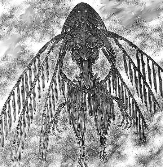
I've never read Claymore or anything, but I think it does monster character design better than most manga, or even just, monster media in general, particularly the female monster designs.
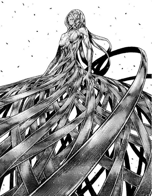

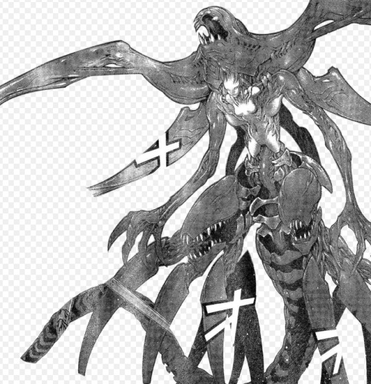


not female, but a girlboss nonetheless
#monsters#monster design#claymore#listen i watched the anime a long long long time ago when i was like 13 and i thought it wasnt bad#then i saw just how pretty the manga was and i was like oh#this is a downgrade#a shame#yes yes yes i know theyre sexualized and they all have the same body type but leave me alone#i like women and i like monsters and i still think this is wayyyyy better than what most men come up with for female monsters#like this isnt those men who draw a monster girl who basically just looks like a normal girl except she has horns#this is ascended#hehehe
112 notes
·
View notes
Text
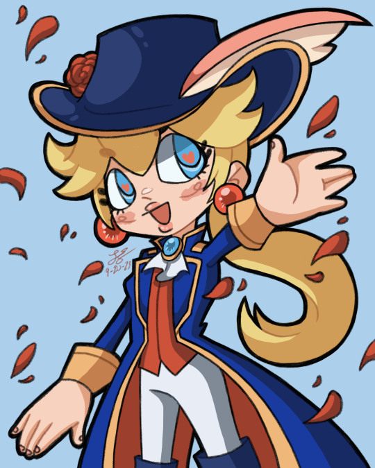
swordfighter peach my beloved
#princess peach#princess peach showtime#leon-art#literally my favorite character type is when women dress masc or in princely outfits#like i cant believe they made a peach design specifically for me#for reference my favorite princess is daisy cuz she is the most masc out of the three princesses#idk it just gives some serotonin to my trans brain
78 notes
·
View notes
Note
the more zeloses you draw the more i willl love them >:3 he’s my favorite <3

I like Zelos too
He got you a cola potion
#tales of#tales of symphonia#zelos wilder#fanart#hes on vacation#i also dont normally like these oh i love all women type of guys but for zelos its different because its so obviously a silly act and hes#more complicated than that and one of the more interesting characters from the cast#plus cute design
229 notes
·
View notes
Text
I hardly keep up with eso stuff but I think every daedra and especially the princes should be freaky and unnerving to some capacity and the new lady looks like an ov*rwatch skin or something :[
#hopefully she gets a cooler form at some point considering the princes can take on specific mortal-looking forms#vena vents#not art#the mmo normies type design for those who are scared of women looking Not Conventionally Attractive in games you feel me
29 notes
·
View notes
Text
O BTW i watched the first ep of the dungeon meshi and I RLY LIKE ITTTT ive been meaning to start the manga for yrs but never got around to it TT... trigger seems to be doing rly well w the adaptation tho from what ive heard manga readers say and well just from watching it blind myself i alr rly love it and cant wait to see more...!!!
#save me dunmeshi yuri and yaoi...#(the white women and kabru & that one eyed elf guy who always looks like hes having the worst time of his life-#cant wait to get to kabru i love his design sm hes so cute....#also very dismayed to find that i lowkey find laios(laius?) attractive... lowkey...#I BLAME MILK COOKIE.... ITS ALL BC OF MILKCOOKIE... I DIDNT CARE ABT HIMBOS BEFORE. DAMMIT#being attracted to (white)men is so embarrassing#he has a similar body type to milk + his face too... the droopy eyes...#and his personality is similar too..... except instead of dark choco cookie he fixates on eating monsters <3#honestly love that its so cute..#FARLYN IS SO FINE THO HIII🥰... UNNI- *gets bonked w a hammer*#both siblings remind me of milk cookie tbh.... laius for what i mentioned and farlyn w her rosy cheeks...#milk cookie is like if u combined them...#also senshi is so instantly likeable...#THE FOOD MADE ME HUNGRY AFFFF LIKE I WAS DROOLING#i want to draw milk cookie again....#ok i swear im not gonna simp for laius tho. hes just some guy (i do think his chara is v endearing so far)#IM JUST ADMITTING HES CUTE BC... I SWEAR I WOULDVE NEVER THOUGJT THIS BEFORE...#LIKE HES NOT MY TYPE... BEFORE THAT DAMNED COOKIE......DAMN IT#its ok theyre fictional men tho <3
29 notes
·
View notes
Text
i miss vi and caitlyn arcane……..season 2 now
#there better not be any dumb lesbian miscommunication or angst#ok there can be angst for them but it cant be between them it has to be like an external force#i want them to make out on screen#sigh. anyways every day i thank the ppl who designed them to Look Like That#theyre just two women#but like in the best way#caitvi#not to be like ‘these two cybergoth women are sooo realistic’#but theyre believable and relatable characters#honestly every woman in the show has something about her that makes her more human#honestly? honestly. every woman in the show is more interesting to me than the men#bc theyre written so well and dont just exist to be looked at#i mean. vi exists for me to Look At but that’s bc shes my type#anyways.
25 notes
·
View notes
Text

Everybody want me to be happy but nobody wanna take me to the water 🙄
#water sign#Scorpio#water baby#black girl#ebony#black women#black model#natural hair#darkskin makeup#blondie#black fashion designer#custom clothing#houseofxaos#swimming#type 4 natural hair
8 notes
·
View notes
Photo


Typography Tuesday
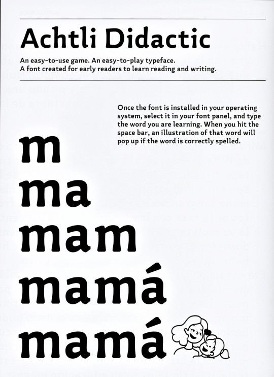
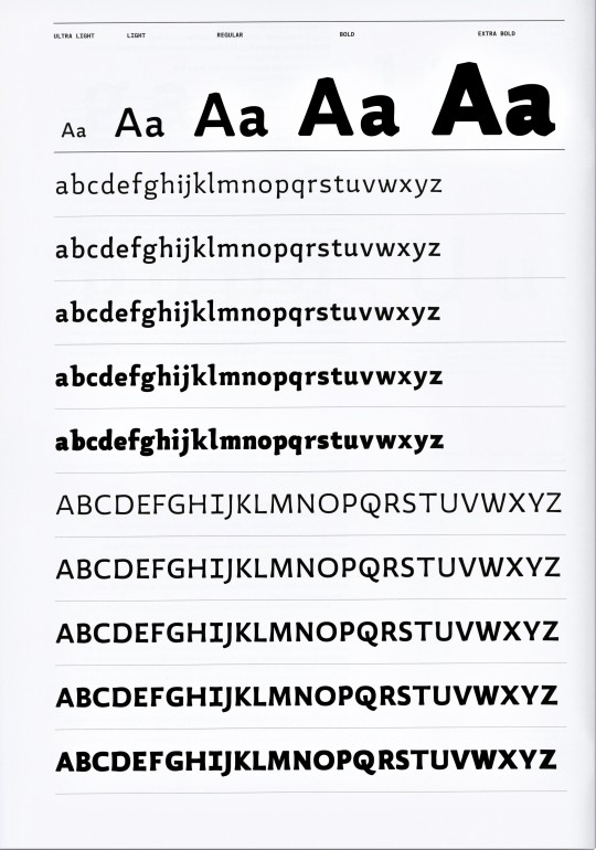
Women Type Designers: SANDRA GARCÍA & DAFNE MARTÍNEZ
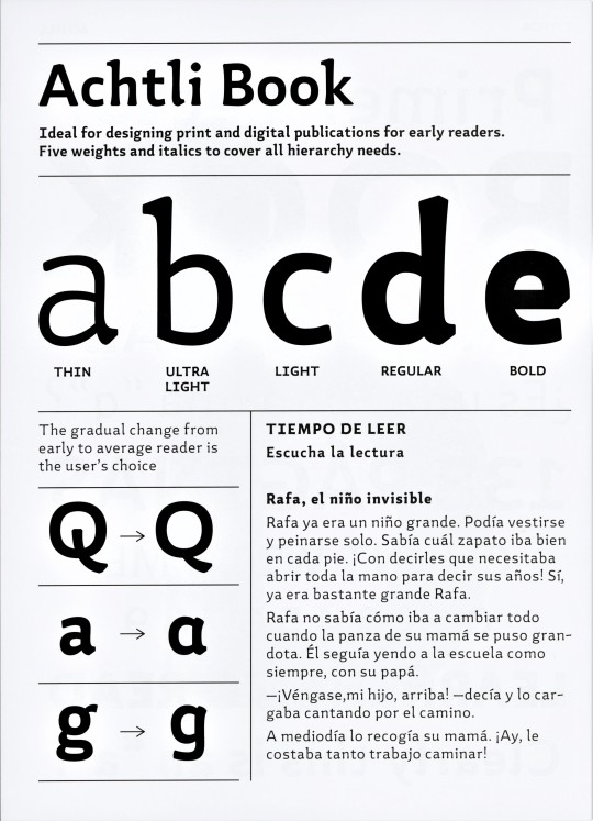
Sandra García, born and raised in Colombia, and Dafne Martínez, born and raised in Mexico, are young designers based in Mexico City. As part of the 2021 Typographer-in-Residence program organized by the Hoffmitz Milken Center for Typography, they designed the typeface Achtli specifically to improve the experience of learning to read in young children. They write:
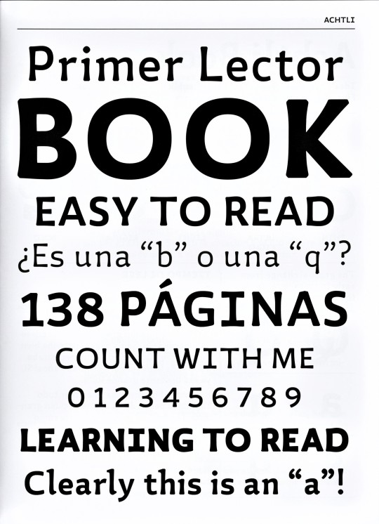
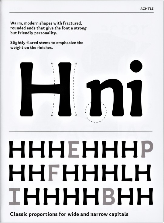
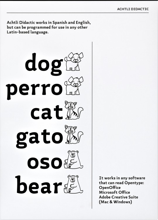
We conducted a field study with primary school students between the ages of five and seven who were in the process of learning to read. . . . We also interviewed teachers to understand what difficulties they encountered in teaching the reading process and the use of typography. . . . After analyzing the results, we reached the following conclusions: Typefaces with similar morphological forms make it difficult for early readers to distinguish some characters from others. A typeface with distinct qualities could assist their memory to identify and differentiate them more efficiently. . . . [The Achtli typefaces has] unique, distinctive properties, with moderate contrast, semi serif endings, and slightly flared stems to emphasize the weight on the endings. The warm, modern shapes with fractured, rounded ends give the typeface a bold yet friendly personality.
The name Achtli is the Nahuatl word for “seed,” a metaphor for reading, as learning to read is like a good seed that grows and flourishes. The examples shown here are from Achtli: A Typeface for Early Readers, one of four volumes in the set Mujeres Hispanas y Tipografía, a program highlighting the talent and creativity of Hispanic women designers, published in Pasadena, California by the Hoffmitz Milken Center for Typography in 2022.

Sandra García
Dafne Martínez

View posts on other Women Type Designers.
View more Women’s History Month posts.
View more Typography Tuesday posts.
#Typography Tuesday#typetuesday#Typography Tuesday#women's history month#Dafne Martínez#Sandra García#type designers#women type designers#women designers#Achtli typeface#early readers#learning to read#type for children#Hoffmitz Milken Center for Typography#Achtli: A Typeface for Early Readers#Mujeres Hispanas y Tipografía#Nahuatl
69 notes
·
View notes
Text
#art#design#fashion#luxury#fyp#legend#model#high fashion#indeedgoodman#hiphop#class#fine#fine as fuck#fine art#fine as hell#fine ass women#so fine#thick#thick and juicy#thick babe#thick legs#thick vibes only#thickwomen#thick hips#curvy#wifey type#black beauty#black is beautiful#WWE#wrestler
8 notes
·
View notes
Text
something specific that ive noticed abt animorphs is that female characters are not only allowed to have enormous, disfiguring injuries, but they commonly do end up with them and are not treated worse for having them. even rachel in the hall and oates future AU book. you never see that anywhere else! in fact im fairly sure the only female characters who don't at some point get half their faces blown off are two of the moms, nora, karen, and cassie.
hold on. why do all the women get half their faces blown off
#it just hit me while typing that i dont think any men get half their faces blown off. whats up with that#i think facial scars are sick as fuck and awesome character design but it does actually feel like most women in animorphs are doomed to have#them#huh#txt#animorphs
55 notes
·
View notes
Text
Me: *describing a villain*
Brain: Here we go again.
Me: What do you mean?
Brain: *vomits description of crazy lady wearing a space themed dress*
Me: ...This is the third time.
Brain:
#writing#writing memes#writing community#writeblr#i have a villain design type apparently#character design#you have to pry evil women doing nasty things from my cold dead hands#but the next one should wear something different lol
8 notes
·
View notes
Text
The Grinch woman from Fake type
Uhhm mans I don't know what the holly is that thing but it appears in the MV of Ryuuseee and with my silly AAA Belphegor woman design.
#Belphegor#fake type#Female design#genderbend#Genderswap#Rule63#I love draw women#Ryuuseee#Ohhh#Scrunkly
13 notes
·
View notes
Text
you know that like "this is the most butch a woman twitter can handle before they start crying" or whatever but it's like. artists who like to draw women in lingerie and the most "masc"/sporty ones always have that like fitted calvin klein bra and panties combo. if you saw what actual butches call lingerie you'd throw up
#i saw an artist who was drawing all the women from pokemon scarlet and violet like this and put both dendra and rika in the klein stuff like#rika would have designer boxers and top surgery scars you're kidding yourself#<- i know rika is already a 'this is the most butch twitter can handle' type of character design but i simply know better than gamefreak
10 notes
·
View notes
Last Seen Blogs

sarafina365
Sara's page
thai994522
Video
toadbreath
pure of heart and dumb of ass

rstlucy-blog
Senza titolo
osossan
✮