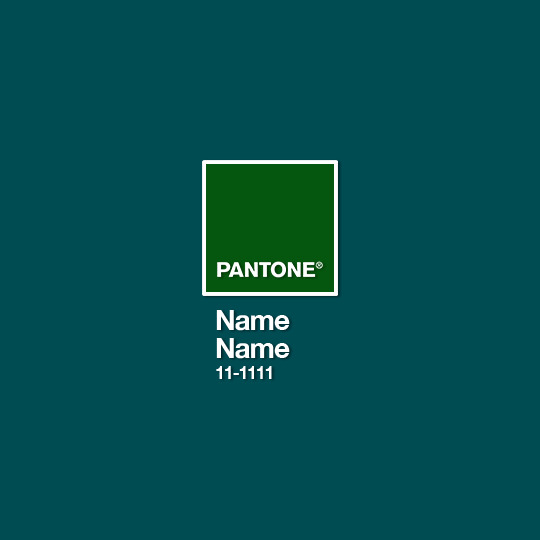
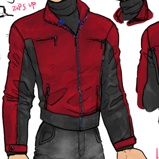
#well more like green mask here lmao
Note
I was wondering have you made Green Lantern Jason Todd?
I haven't yet! Here's a quick, very bullshitty design; maybe I'll do a better one some day:
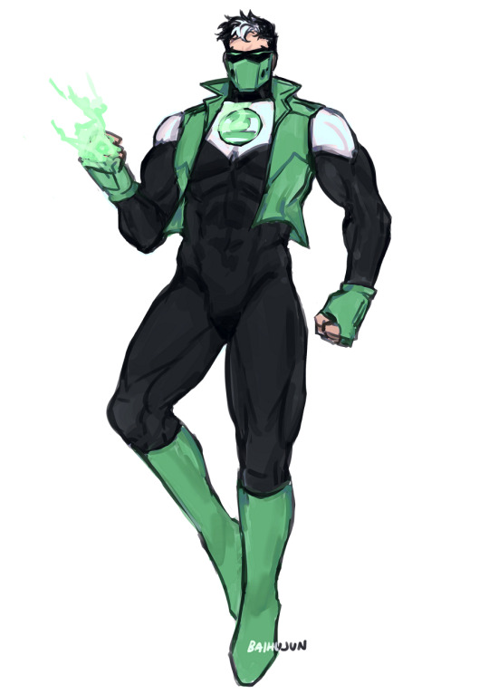
Jason Todd of Earth, you have the ability to overcome great fear...
#jason todd#red hood#well more like green mask here lmao#green lantern#dc comics#my art#bats tag#asks#classic green lantern pose i'm not breaking any boundaries i know
1K notes
·
View notes
Text
we got city and county council primary shit going on!!! don't forget to vote! i mostly agree with the stranger's guide for this, but city council district 6 is rough cause all of the candidates are kind of awful, though i think jon lisbin is like... mostly decent? his stance on cops is definitely... flawed... misguided?
he is a 60-something year old white liberal is what i'm saying. but compared to the other candidates is much less awful, and he has by far the best stance on housing, community sustainability, homelessness etc. so i think he's the actual lesser of six evils here, and not strauss like the stranger claims
(there's a chance they wrote their endorsements before he was added to the ballot though cause they don't even mention 4 of the 6 candidates so i'm thinking it was before most of them were put on)
i agree with their OTHER endorsements for my districts though lmao
#nadia rambles#normally i don't post a lot about local politics on here but the city council race jesus christ#we got The Guy Who Helped Cut Down Trees and doesn't seem to view homeless people as *people*#we got some guy who wants more anti-drug laws and more cops and who is anti multi-family housing#we got the guy who just wants to pump out more cops onto aurora and increase their funding directly#we got an anti-masker self-described moderate who calls herself a civil rights activist because she thinks the mask mandates are evil#we got Mandated Treatment and Rehab guy who thinks that homeless people need rehab INSTEAD OF housing and food#like literally his statement says the homeless ''don't need free meals or shelter'' lmao fuck off kutzera#and then we got lisbin who is like still pro-cop but also much more into alternative community management and redirection of funding#and also crucially has a significantly more progessive policy for housing and homelessness as well as drugs (against added criminalization)#he does have parodic maga (make seattle green again) merch but he is anti-trump so he's just an annoying white guy#but seriously like compared to the others.... he is by far the most actually progressive#and appears to be an environmental activist to some extent as well which isn't unimportant#esp when you consider the way green spaces are denied to marginalized communities so cutting back the trees is going to impact them/us most
0 notes
Text
Ok we all know guild me, build me exists due to my artistic abilities being very lacking in the visual arts, so rather than drawing the crows in the komedie brute, I had to write kaz in. however I had ideas for the others that I couldn't get into a fic, so I've put em down here
Kaz: (description ripped from guild me, build me):
a heavy black cape, sewn with stolen chains and jewels so that it jingled upon every movement (...) It was marked up and slit here and there, on the edges and at the collar, to give the impression of crow’s feathers, and it was made of some kind of shiny, velvety fabric that had the oily shine of crow’s plumage. The gloves were the same material, thinner and more embroidered than Kaz would have ever entertained, and the cane was a plain, inaccurate copy– (...) the mask; a silver crow’s head (...) crooked over the eyes and nose, almost like a Kaelish plague mask. But it left the mouth unblocked; of course it did. Dirtyhands needed to talk.
Inej:
Light and flimsy dark (doesn't have to be black; could be blue or grey) fabric for the veil and cloak. Has an element of spiderwebby fraying to it which is a nod to her being... Well, a spider lmao. But also meant to look ghostly and insubstantial, can sometimes see a metal shiny suggestion of knives underneath it. The veil can be parted just down the side of her face, so you can occasionally see a bit of her face, but never the whole thing. Would not be a practical costume to climb or spy in; too long and bothersome, the same way Kaz's Dirtyhands cloak would not be practical to pickpocket in. Sometimes productions get her a few cheap sheath knives.
Jesper:
Rabbit head mask, short cloak in some batshit colour like green or pink, lined w rabbit's fur and threaded with gambling chips, 'lucky' rabbits feet, coins, and stray bullets. Adornments tied on loosely so they swing everywhere when he moves. This way there's also a real risk of the Kaz and Jesper actors getting tangled together if they interact, which is not symbolic, just funny. This is our get-along Komedie Brute costume :) (we are stuck)
Wylan:
A once-fine red cloak with a high ruffly collar-- now tattered and singed and gone to seed. Little bits of wiring or string or pouches of powders etc sewn into it; sneakily embroidered with the Van Eck laurel around the edges. Mask, while elaborate and matching with the cloak, only covers the top half of his face, as if he's not quite as all-in as the others. For similar reasons, the cloak is half-length.
Matthias:
Wolf's head mask ofc, white fur cape a lot longer and more substantial than Jesper's, with heavy furring around the neck (made to bulk out the actor if they're not the right stature, which most will not be). Likely they also weight his boots to make his tread sound more imposing. Possibly a wig if they can afford one, since Druskelle are known for the long hair.
Nina:
Porcelain-doll Venetian style mask (you know the ones!) with a single black tear-- referential both to that bit in CK when they identified themselves that way in the crowd of Mister Crimsons, and the Queen of Mourning thing. Mask is covered with a very light veil, and she wears a long heavy silk cloak with a bit of a hint of a kefta, but not enough to get the Komedie Brute in shit from Ravkan Grisha lmao. Entrance usually heralded with a blue corpselight.
I imagine dependent on the production and the costumier they could look great and beautifully elaborate, or they could look cheap and shit lmao.
Bonus: I got bored and made a mock-up of a page of a Komedie play. I edited over the first folio for this, yes. Sorry to the Big W.S.
#right I think this is all right now. finally#fuckass blue site so glitchy it posts my shit early.#six of crows#soc duology#my fics#my post#grishaverse
172 notes
·
View notes
Text

I digitized the sketches cause I have been thinking about these guys literally all day-
Also idk what type of turtle Donnie is yet??? Idk I haven't decided. Since Raph and Mikey are both Map turtles maybe he could be a slider of some kind.
also Leo really likes star motifs cause he's sweet and he gave them all a little star keychain so they could all match ( sobbing actually I'm crying over this rn )
Anyway I have lots and lots of comics planned, but they're primarily sad. I'll work on getting some /pos ideas down but we'll see. This IS all about examining my own childhood after all lmao
Anyway here's some things about these guys to start off with ( I will happily ramble about them later as well )
Leo:
-Blunt, but has trained himself to be less so ( its the heavily masked autism )
-love Galaxy Adventures and secretly writes fanfic for it.
-transmasc! Also likes neopronouns but unsure about them
-likes plants, does not have a green thumb
( there is a lot more about him cause he's just me, but uhhh I'm trying to only put the /pos things for now )
Mikey:
-art!!! He's very good at it!!! really likes horror art!!
-favorite brother of all the brothers.
-very messy, Leo gets onto him for it a LOT
-new hobby every week
-undiagnosed audhd baby
Raph:
-also an artist, but hates that he's not as good as Mikey ( :( )
-likes plants even more than Leo, but actually has a green thumb
-L O U D
-somehow a morning person???
-Will wear anything. Not really into any particular style, but likes to wear things that piss Leo off ( ripped jeans mostly )
-likes to piss Leo off
Donnie:
( he's the least figured out tbh)
-IT guy fr fr
-love Galaxy Adventures just as much as Leo, but they fight over who likes it more
-also v blunt but does not hide it.
-v good at tech stuff!
-he cooks for everyone!!
So yeah those are the bare bones of this iteration , I'm not gonna start posting comics for it til after Kid Leo Au but just know that I will be thinking about them <33
268 notes
·
View notes
Photo
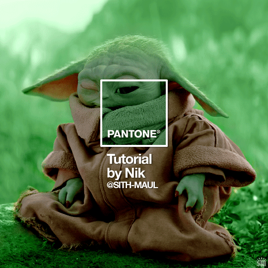
HOW TO: Make a Pantone “Color of the Year” Gif
A few people have asked about my Pantone sets which use the “Color of the Year” swatch design. So, here’s a full tutorial with a downloadable template of my exact overlay! Disclaimer: This tutorial assumes you have a basic understanding of gif-making in Photoshop.
PHASE 1: PICKING A SCENE + PANTONE COLOR(S)
I’m starting with this because it’s crucial for planning your gifset as well as making sure the execution is smooth sailing. The steps in this phase won’t necessarily be literal steps but some tips for how I usually go about making a Pantone set:
1.1 – Picking a scene.
Scene selection is everything. To make things easy on yourself, I suggest choosing scenes where the background is mainly ONE color — for example, a scene where the subject has a clear blue sky behind them. To make things even easier, choose a color that isn’t the same color as the subject of your gif. Like, if your subject is a human, I’d avoid using a gif with a red or yellow background unless you want to do a lot more work to mask their skin.
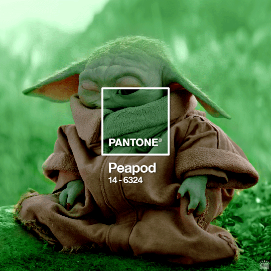
Rip me using a scene of green lil Grogu in green grass lmao. But I guess that goes to show you could really do this with any scene (I just did lots of masking and keyframe animations to perfect this green shade). BUT selecting your scenes wisely = a lot less work.
1.2 – Picking Pantone colors.
People often ask me how I choose my colors and there are a few methods which I’ll go over below.
But note that not all Pantone colors have a cute name, or any name (fun fact: only Pantone textiles have official names and they end with TCX, TPX, or TPG).
METHOD A: Google Search “Pantone [Color]”
Source: Google
Easy but not always fruitful, all you do for this method is open Google and type “Pantone [insert color here].” For example, when searching for teal colors, I searched several things including: Pantone Teal, Pantone Turquoise, Pantone Blue, Pantone Green, Pantone Blue Green, etc. Then, just sift through the Google results and click on whatever comes up from the official Pantone website! Since Pantone’s site blocks some info behind a paywall, you won’t be able to get a hex code from them. But you can just screenshot the swatch from their site, put it in Photoshop, and use the eyedropper tool to figure out the color.
METHOD B: Color-Name Site
Source: https://www.color-name.com/
This handy website lets you search by colors using the upper navigation bar. Or you can just type something like "magenta" or "blue pantone" or even “frog” and see what comes up lol. Color-name can put together palettes too! I like that this site also tells you the hex code of a color, which is really helpful for getting the right code to put in my overlay. Note: Not every color on this site is a Pantone textile, so not all of these names are Pantone-official names. You can tell it’s official if, in the Pantone row of the Color Codes table on the middle of the page, it has a code that’s 2 numbers, a dash, 4 numbers, and either TCX, TPX, or TPG.
METHOD C: User-Made Pantone Colors Archive
Source: https://margaret2.github.io/pantone-colors/
For my Wednesday characters as Pantone colors set, it was all about matching the color name to the character’s vibe. So, before looking at the actual colors themselves, I wanted to find the perfect color names. I stumbled upon this page. The pros = it lists pretty much all of the current official Pantone names. The cons = it’s not convenient since there’s no filtering tool. You can do Command+F and search for keywords, but that’s it. I literally scrolled through this whole page for my Wednesday set and read every single name, which... I think means... something’s wrong with me /lh /hj
METHOD D: Official Pantone Color Finder
Source: https://www.pantone.com/pantone-connect
This is last on my list because I don’t actually recommend it. Unless you already have access to this resource from your school or work or something, I would never pay for it and it is a paid feature only. Boooo 👎 But there is a free trial (which I’ve never used), so if you want to see what it’s about, you can definitely go for it.
PHASE 2: MAKING THE BASE GIF
Again, just some super quick tips for making a gif that, I think, looks best with this kind of set — but if you’re still learning how to gif, I do have a basic gif-making tutorial here for extra guidance!
2.1 – Uncheck “Delete Cropped Pixels” before cropping your gif. When you use the crop tool, this checkbox appears in the top toolbar. Unchecking it allows you to move the positioning of your gif later on, which is handy in this case when you want to choose which part of your gif will be underneath the Pantone swatch. You can read more about this tip in my basic gif-making tutorial (linked above; Step 1.5 – Tip B).

2.2 – Make your gif 540px width. My gifs for these sets are usually 540x540px but I think 540x500px will also look good. I think it’s more impactful though to make a big gif to show off your coloring.
PHASE 3: ADDING THE PANTONE OVERLAY
3.1 – Download my template
I made this template myself, so all I ask is that you don’t claim it as your own and that you give me proper insp or template credit in your caption if you decide to use it! Get the PSD with the transparent background here!
3.2 – Download the font Helvetica Neue Bold
The font I use (and I’m pretty sure it’s the same font Pantone uses) is Helvetica Neue Bold, with some very specific letter spacing (which I determined by studying Pantone’s official Color of the Year Very Peri design). It’s already set in my .psd but here are specs in case: color name spacing = -40, color code spacing = -75 (sometimes I’ll do -25 for the numbers after the dash if I don’t like how tightly they’re packed together).
I uploaded Helvetica Neue Bold to my dropbox here!
3.3 – Import my overlay
You can either drag the whole folder onto your gif from tab to tab or right-click the folder, select Duplicate Group, and select your gif as the destination document. Just make sure this overlay group is above your base gif!
3.4 – Fill the color swatch
In my .psd, on the layer labeled “Pantone Swatch,” just grab the hex code of your chosen Pantone color and fill that layer using the Paint Bucket tool! I’ve already put a layer mask on the layer for you so it fits perfectly inside the square outline.
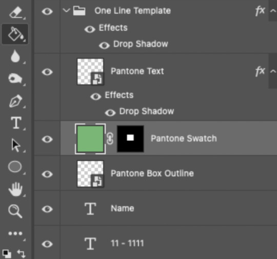
If you’re using my .psd, all the blend mode settings are already in place! I usually set the colored square behind the Pantone logo to the Color blend mode, but sometimes, I prefer the way Hue looks. It’s up to you!
You can also adjust the drop shadow settings to make your text more visible as needed. The layers are arranged in this order so the drop shadows don’t interfere with the semi-transparent part of the colored swatch.
3.5 – Insert the color name and code
My .psd has two versions to choose from: (1) a color name that fits on one line and (2) a color name that requires two lines. Use the one that applies to your color name and simply type that and color code into the corresponding text layers!
Note 1: Pantone doesn’t keep their font size uniform for every color of the year. They’ll sometimes shrink the text to fit longer names, but I like being consistent. So, I use this one font size for all my colors.
Note 2: My template has all the text left-justified and matching the starting point of the P in Pantone. BUT, sometimes the gif looks better if you nudge the text a bit so it looks more centered. Use your discretion when aligning the text!
Note 3: Btw, you definitely don’t have to use the TCX/TPG codes like me. (I’m a nut and there’s no way I’ll ever do a Pantone set and not use those types of codes to maintain uniformity across this series lol.) I’ve seen others do sets inspired by mine using different color codes or even just the hex code itself!
PHASE 4: COLORING THE BASE GIF
The key here is to make a majority of your gif feature your chosen Pantone swatch. If you’re really smart with your scene selections, this should be a breeze! If you’re stubborn like me and want to use specific scenes with the opposite color of your chosen Pantone swatch, there will be a bit more color manipulation involved... However, this isn’t a coloring tutorial, so again, I’m going to give some tips and resources that will hopefully help you out!
4.1 – Color matching.
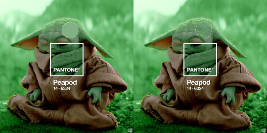
Now that you have the Pantone swatch on your gif, you should be able to reference that center square set to Color/Hue to match the rest of your gif to that color. Feel free to paint a little blob of your color onto another layer anywhere on your gif so you can refer to it closer over a specific part of your gif. For example, I put a little circle over Grogu’s head to see how closely I matched Pantone’s Peapod color, then I tweaked my adjustment layers a bit more until the colors matched near perfectly and I couldn’t tell where that blob begins or ends. The left is the solid color and the right is set to the blending mode Color (like the square):
4.2 – Moving the base gif.
This isn’t really about coloring... but remember when I said to uncheck “Delete Cropped Pixels” in Step 2.1? Well, here’s your chance to adjust your canvas and move the gif around so the exact part you want under the color swatch is in the right position. I personally think these kinds of sets are more impactful when you put a differently colored part of your gif under the swatch so you can see through it and the difference is clearer. In my example, I put Grogu in the center so the green box would cover some of his brown potato sack robe.
4.3 – Color manipulation.
Color manipulation is when you transform your media’s original color grading into a completely different color. The Grogu gif isn’t a great example because the original scene was already a green-yellow color:
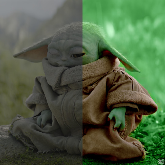
I mean, the difference is still pretty drastic but that’s mostly because my file was HDR and washed out as a result.
So, here’s an example I made using a gif from my first Pantone set for ITSV (I’m not doing this demo to the Grogu gif because it’d be too much work to manipulate a green background with a green subject. This ITSV scene is perfect bc the majority of it is blue while the subjects are mostly red.)
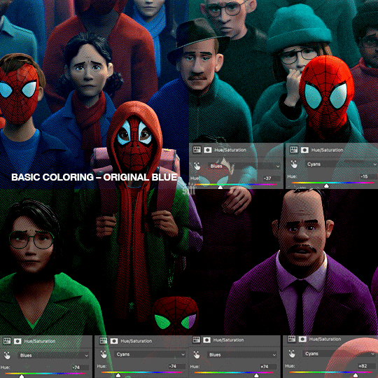
For the “basic coloring,” I did everything as I normally would: mostly levels and selective color layers.
For color manipulation, my fav adjustment layer is Hue/Saturation (those are the screenshots that are on the gif above). When you’re smart with your scene selection, it’s pretty easy to manipulate colors with one Hue/Sat layer because you usually only need to tamper with 1-2 colors and, hopefully, they shouldn’t interfere with skin tones (obviously you’ll do other layers to further enhance your gif’s brightness, contrast, etc. — but I just mean the heavy lifting usually only takes me one layer with a good scene choice).
All you have to do is figure out what color the majority of your gif is, toggle to that color’s channel, and fiddle with the hue slider. In the gif above, you can see that I played with both the Blue and Cyan channels. Here’s why:
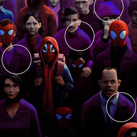
If I only adjust the Blue hue slider, I get those speckles of cyan peaking through in the gif above. Unless you’re working with completely flat colors — like 2D animation with zero shading/highlights — a color is never just one, solid color. Blue isn’t just blue, it may have some cyan. Purple isn’t just purple, I often have to toggle the Blue channel too. So, yeah, be mindful of that!
I’ll sometimes go in with the brush tool and paint over some areas of my gif to really smooth out the color and make it uniform. When I do that, I just set that painted layer to the Color blend mode. Some of the resources below go into that technique a bit more!
4.4 – Coloring resources.
While not all of these tutorials cover the same type of color manipulation I did in my gifs, I think the principles are similar and would be helpful to anyone who’s a beginner:
– color manipulation tutorial by usergif/me: I go a bit more in depth here (I think lol)
– how to change the background of any gif by usergif/fionagallaqher: a great tutorial for using keyframes so you can manipulate the background of a gif with lots of motion
– bea’s color isolation gif tutorial by nina-zcnik: this tutorial has more tips about hue/saturation layers as well as masking your subject
– elio’s colouring tutorial by djarin: this tutorial shows a lot of examples of first manipulating the colors then brushing over the gif with a matching color for extra coverage
And just one last note on coloring, I always try to appreciate gifs with the mentality that “good” coloring is 100% subjective. One of the only things I would classify as “bad” coloring is when you whitewash or [color]wash someone’s skin tone. So, as long as you keep the integrity of your subjects’ natural skin — especially if they’re a POC — you should feel good about your coloring, because it’s yours and you worked hard! <3
PHASE 4: EXPORT
That’s it!! If you work in Video Timeline like me, just convert from Timeline back to Frames, export your gif, and voila!
Easy PEAsy. 🥁
If you have specific questions about this tutorial, my ask box is open <3
Also, check out these other Pantone-inspired sets by my friends @nobodynocrime (Mulan set) and @wakandasforever (Ponyo set)! There are so many ways to use Pantone colors in your set, so I hope this inspires you to create something beautifully colorful <3
#gif tutorial#completeresources#usershreyu#useryoshi#userelio#userannalise#userzaynab#userives#usermarsy#usertreena#usercim#userrobin#userkosmos#usersalty#usermills#userhella#alielook#resource*#gfx*#pantone*
986 notes
·
View notes
Text
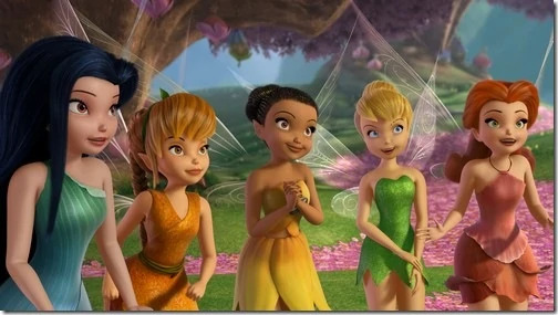
So anyway I was bored and this was fully out of my typical fandom but I found this forest fairy maker by @elequinoa on my old favorite dress up game website from when I was a kid, Doll Divine, and proceeded to brainrot and say hey what if I made all the Disney Fairies in this, except creepy and weird and more my idea of fey? So anyway here's all of the fairies and the goofy redesigns (under the cut because I feel horrible for people who were never in this fandom having to scroll past seven sets of fairies lol)
Tumblr crop is bad so I apologize in advance. (Also disclaimer for minor photoshop on Rosetta and Periwinkle to make their body colors more unearthly, as my intent was None Of These Fairies Should Look Human, and to make Periwinkle's mask an arctic fox instead of a fox; I attempted to look at TOU and it seemed like this should be alright, but if not, I apologize for overstepping!) (Also minor edit for less pixelated banner image)
Fawn - She was the first one I did and wound up more muted in color scheme, but I really like how she turned out. She was meant to look somewhat like a moth or bark, with some faun-ish inspiration, as well.


Iridessa - As a fairy focused on light, there were two ways I could see taking her (the alternate being distinctly holographic), but in the end liked the double entendre of "light" when leaning towards "biblically accurate angel," so there's bird motifs and just general cherub vibes.

Vidia - The opposite of Iridessa, really; the goal here was to lean into lightning motifs and dark or gothic elements to emphasize the opposite elements in comparison to Iridessa's classical elements. Dragonfly wings for speed, of course.


Rosetta - As in her original, meant to resemble a flower, just amped up a bit to where she resembles a rococo/art deco fusion when viewed naturally, but could literally flip upside down and pretend to be a flower if she wanted to.

Silvermist - Yes this picture isn't from the first movie I couldn't find a good one lmao. Anyway, her wings reminded me of that specific type of dragonfly that skims over my uncle's lake, so I riffed on that alongside the almost pseudo-waves of the petal shirt. She is more directly meant to be an embodiment of water, but more lake or even bog-ish water, where she could peek out of the water at the top and an onlooker would only register her as perhaps a frog, as emphasized in the monochrome eyes, or a ripple in the waves.


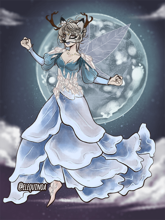
Periwinkle - Where options did really start to limit what I could do, lol. I decided to lean into the mysterious and crystalline vibes of the winter, with her visage taking on the arctic fox and even reindeer-ish antler look of something moving in the snowy woods, but yet draped in a finery like freshly fallen snow. She's also the only one with "normal" fairy wings, but I could see it for her, with them perhaps being made of frost.

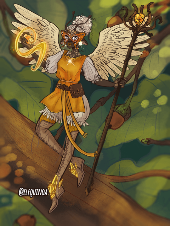
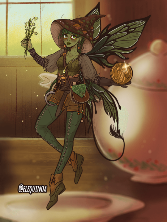
And finally, Tinkerbell - One that I definitely took some more risks with in design, she is nevertheless the most openly friendly-looking of the fey batch, despite her green hue, which is really in character for a fairy best known for hanging out with Peter Pan and being fascinated by humans. For clothing, I leaned heavily into artificer and witch vibes, mirroring a bit more of the human world, with a touch of goblin to temper it. I did shift away from her typical dress in favor of more adventurous wear, more suited for pretending to be a mushroom or even mouse in the corner of someone's eye.

Overall, idk, I just really had fun with this mini-project. I don't intend to do anything with it, ofc; it was just for fun, but I had a fun time with it!
#elequinoa#doll divine#doll maker#fairy#fey#fae#tinkerbell#disney fairies#iridessa#silvermist#fawn#vidia#rosetta#pixie hollow#periwinkle#elemental#magical creatures#fantasy art#dress up#i suppose?#overall an immensely fun game!!! stopped my art block
160 notes
·
View notes
Text
(m!charlie, gn!reader, noncon, DEFINITELY ooc, based on that one bug for walking around the dance studio at night that was eventually patched lmao)
You couldn't help but be a bit anxious.
Even the cool night air hitting your skin did little to calm you, actually. What you thought would be a thrill did nothing but wrack your nerves and now you were here, under the flickering streetlights with not a soul nearby. You carefully follow the sidewalk, as if that'll box you in from any threat coming your way. At least you're on Barb. Not far from home.
Your eyes settle on the dance studio at the other end of the street. You had been going there for a few weeks now. Thoughts of your dreamy dance coach overtake you and you smile. Charlie was so pretty, so kind and dependable... He wasn't like the other people in this town. You feel so lucky that he seems to like you. Thinking about him calms you down a little as you pass the dance studio. His smile, how quickly he'd come to your side if you seemed to be uncertain about something, how gently he adjusts your position if you get something wrong... So, so careful not to touch anything that doesn't need to be touched. Charlie must be a saint. Your thoughts are interrupted by a pressure around your waist and your stomach drops.
You twist around, trying to see who it was that grabbed you. You hear only a hot, shallow breathing in response to your struggling. Adrenaline kicks in and you grip at the hands on your waist, aimlessly kicking, but the person holding you seems to be more than strong enough to keep you pressed against them. You swear you hear a whispered apology, but they seem no less willing, a hardness pressing into your back while their hands roam your body over your clothes, moving down to slip under them. Your breath hitches when you feel their fingers dip into your underwear, holding your voice back as they start to play with your sex. You feel the fabric of the mask brush against your neck as they slowly inhale against it, breathing in your scent as a hand moves to your waist, tugging down your bottoms in the middle of the street. They gently guide your thighs apart in a way that sends faint alarm bells coursing through your already hazy brain and you feel something hot push between them. Your breathing accelerates and your hands shoot to theirs, quickly trying to pry them off again, but they just hold you tighter, quietly shushing you while dragging their hardened cock against your legs, even though you know they know full well nobody is around to hear you. You start to tremble, lightheaded as their hands move down to your sides again, guiding your legs back together around their cock until its flush against the soft flesh, the head poking out from under you. You whimper as they start rutting between your thighs, and they seem pleased by your reaction, holding you tighter and resting their chin on your shoulder.
"So cute..."
It's in a breathy whisper. Their green eyes seem almost reluctant to meet yours, but they're evidently getting very excited if the stickiness against your skin from their leaking tip is anything to go by. They start to move faster, their hips slapping against you. You think you see them start to stare at your mortified expression. Their gaze feels... almost protective and doting, despite everything they're doing to you. It only repulses you more. You're stiff in their arms, though signs of your own unwilling arousal are starting to show. They've noticed. A hand lifts off of your waist and brushes against your heat while they relentlessly fuck your thighs, choking back their own noises of pleasure save for the panting in your ear. They pull down their mask just enough to suck roughly at the back of your neck, their tongue sending shivers down your spine. A lewd noise emanates, your skin slicked from your assailant's needy leaking, helping them chase their high until they finally reach it, pulling back slightly to spill their arousal over your inner thighs and hole. Sticky webs of cum drape across the area between your legs, the sheer volume of it making it fall onto the concrete in heavy drips and your knees tremble, threatening to give out. The figure holds you for a few minutes and you don't realize they're gone until you're shakily pulling your bottoms back up. The feeling of the slick on your skin is hard to push out of your mind after cooling in the night air as you make your way home.
The next day at dance, you break down. You can't help it. Charlie, of course, comforts you with a hand on your shoulder, even wrapping an arm around you and pulling you in for a hug, softly patting your back. Something feels wrong about his frame pressed against you this time, and in the way his eyes linger on the bruise on your neck.
53 notes
·
View notes
Text
My opinions on the Barian Emperors’ designs :3!!!

Nasch — “hehe silly hair, a lot of these big crystals in the same kind of area, the red cape makes him look cooler + brings a colour other than purple that works in abundance, gotta have a cape *^0^*, I love his whole face (look how angry he looks here LMAO), turtle neck :0, plain fr </3 (the trousers, leggings things??), supposed to be an accent colour but it feels too much to be a proper accent, just like his normal shoes :3”
Marin — “she’s so cool <3, the colours go so cool together as well?? - the lighter colours for her body/dress thing contrasting the darker hair??? Just wowie :00, these shoulder plates look cool?? Yippee!!, I love the longer hair they give her, her dress/skirt design is just WOAH!!, the diamond theme again fr (more subtle + nicer than Nasch’s design tbh /nm), HEELS?? /pos)”
Vector — “Gonna be honest I thought more of the frets would be warm tones but turns out they are colder when I colour picked them, I like this multi-coloured skin he has going on, and how the diamonds run along the divide, goddamn I didn’t notice the diamond theme until I did this tbh like Woah :0, not too fond of this yknow? (The yellow thing on his chest) should have added more yellow around (feels like you need to look there instead of where you would usually wanna look (the face)), I love the colour palette for Vector. Like mostly greys/blacks with an accent of the reds in terms of mostly diamonds, I can’t decide whether I like or dislike the wings tbh </3 (I’m leaning more to like), could scratch out someone’s eye with those nails, just as he would want it to be like :3, hehhe Idk I just like his shoes :3, + I love his face ^0^, (btw if Vector has no Fans I’m dead)”
Alito — “sorry I’m not too fond of his design </3, I feel like this would be slightly better (the mask thingy) with that reddish-brown colour but idk??, gotta have the diamonds, this colour (the green one) is a nice contrast to the warmer tones used, this darker colour makes the design better, his shoes are nice though (PROBBALY my favourite thing about his design), maybe using this red more could have been better?? (Just relegated to his hair), these are cool (the arm thingys)”


Girag — “ooooo face shrouded in darkness, silly!! (Horns), silly little Mohawk :3 - random use of that colour though - one off can look good/fit with the design but doesn’t feel like it does here, idk how to feel about this collar </3, his design does not feel derailed enough tbh - especially compared to the better designs imo (Vector + Marin), Woah more diamonds! Who would have guessed!!, how could have I never noticed this before??? (The G on the belt) THIS IS SO STUPIDD /Pos”
Mizar — “The mask is very unique + translates in a fun way to his human design as well, love them being the 2nd tallest fr <3, love it (the face), I’m sorry but his shoulders + his torso?? I just- it basically ruins his design for me /nm (not entirely true but yknow), Just feels REALLY yellow at the torso, good choice to not make his arms too much of one colour (the bandages (same goes with his legs)), I don’t like this belt </3, I love this little additional for the clothes because even though they are aliens it feels weird for them to be completely naked, mandatory crystals fr, don’t know what’s going on here but lacks the nice patterns that Marin had </3”
Dumon — “I’m sorry but I really don’t like Dumon’s design-, hair + face colour mostly blends together like hardly different, these are cute :3 makes me think of a cat, mandatory diamonds fr, the facial markings look cool :3, I’m sorry but this belt is NOT it, shoulder plates look cool, mostly the other barians are wearing SOMETHING but not him”
-
Quick ranking:
7. Dumon - sorry but his design just doesn’t look nice to me. I’m not too attached to his character either so that doesn’t help. He does look WILDLY better in his human form though
6. Girag - orginally gonna put Alito in this place but Girag is much more plain imo like go girl give us nothing!!! /nm (they did do him so dirty in both his forms though </3)
5. Alito - sorry Alito but your design is not much better. Like I like your boots and that reddish-brown colour but idk I’m just not too fond of it (prefer his human design). It is growing on me but I still dislike it </3
4/3. Mizar/Nasch - I couldn’t decide who to put above the other so they are tying. I love their faces like they both look AMAZING looking at just that part of their designs but I feel like as you look further down it’s like “uhmmm-“
2. Vector - I love Vector so much so it’s not surprising that I’m gonna also be fond of his design too. Like when I first starting rewatching Zexal I forgot most stuff so when this silly little guy appeared on my screen I started to LOVE him (and now he’s one of my favourite Yugioh characters) and it 100% helps that I love his design fr
1. Marin - MY GOD DID THEY DO HER SO WELL??? Like just look at her design and try TRY to tell me that she doesn’t look wonderful?? YOU CANT!!! Like she looks just so amazing. It just makes me wish that she had more focus because her design is making me see her in a brighter light than what they gave to here tbh. Like the backstory for her + Nasch is MAINLY focused on Nasch I get how he’s important and everything but I would like to see more of her </3 (the episode of her as Rio showing how cool she is beating all those people who just want her to manage their teams cause she’s pretty is just SO COOL!!)
-
I do love all these characters though (some more than others LMAO) and not trying to insult the character design at all just wanted to look at these designs and point out what I liked and didn’t <3333
(Also I felt like i had to write out all what I put on the actual images CAUSE MY HANDWRITING IS BASICALLY UNREADABLE TO 90% OF PEOPLE </3)
#yourlocalpurplekinnie#yourlocalpurplekinnie info dumps <3#yugioh#ygo#yugioh zexal#barians#I am NOT a Professional character designer or anything#these are just my personal opinions yknow!!!
11 notes
·
View notes
Text
Mushy May Day Ten: Mutual Pining/Staring in Adoration
Paring: Mountain/Swiss
Words: 750
Rating: Gen
Contains: Swiss being Swiss on stage, Mountain being down bad
Mushy May prompts arranged by @forlorn-crows
There’s a gif that inspired this of Prequelle Era!Swiss getting on his knees that I unfortunately could not find again but it’s been burned into my brain.
EDIT: I found the clip!!! (and immediately saved it to my phone bc i cannot lose it again lmao)
***
The new multi-ghoul is, as politely as Mountain can put it, a problem, and he’s only been Up Top for a few months. In the abbey, he’s made himself quite a reputation as a shameless flirt. Siblings and ghouls alike can’t take their eyes off of him, and Mountain is no exception. On stage, they’ve put him right next to Mountain’s drum kit, and it’s a problem.
Mountain’s not blind. The new multi-ghoul, Swiss, is as attractive as they come, and they’ve put him on backing vocals for a reason. He gets along with the new band pack well, barring the bloody fights he and Dew pick with each other. It’s incredibly easy to get him to smile or laugh, and it lights up whatever room he’s in. At first glance, he doesn’t seem like he’s going to be a problem.
However, it’s a problem when Mountain can’t take his eyes off of him during Rituals. He’s grateful that he’s rehearsed every song on the setlist forwards and back until he can play them in his sleep, that he doesn’t need to be looking at his kit when they perform, because Unholy Father, he cannot drag his eyes away from Swiss.
The way he moves is sin, and Mountain watches out of the corner of his eye as he sways his lithe hips to the music. It’s obscene, the way he ruts against his guitar or his mic stand, the chrome of his mask flashing in the multicolored lights.
He catches Mountain watching, sometimes. He says nothing, not willing to risk the mics catching whatever comment he might make. His eyes, glamoured a warm brown instead of their usual gold, flash with an expression Mountain might be able to make out if their masks weren’t on. Mountain lowers his gaze to the snare right in front of him until he can feel the weight of Swiss’s gaze leave the side of his head.
Mountain’s here, Top Side, on stage, to do one thing, and to do it well. He was summoned to help Papa, or, well, in this case, the Cardinale, put on a good show. He’s not here to ogle attractive ghouls.
He’s focusing on his drum kit when he feels Swiss’s gaze return, stronger than normal. Mountain spares a glance out of the corner of his eye and the steady rhythm of the kick drum falters for a moment as he does a double take.
Swiss is turned away from the captive audience, his whole body turned towards him, guitar and tambourine placed on their stands. He sinks down to his knees, a singular, smooth movement, leaning back onto his feet before rocking towards Mountain.
Every thought Mountain has leaves, vaporized, and there’s a spike of want deep in his gut. He shakes his head, hard, turning back to the crowd. Finish the damn ritual, he thinks, willing himself not to turn to his right for the rest of the evening.
They take their final bows not twenty minutes later, and after throwing their picks and drumsticks into the roaring crowd, they slink backstage.
As they walk back to the green room, Mountain grabs Swiss by the upper arm, directing the ghoul into a quiet alcove. Swiss goes without a fight, but with a questioning look in his eye.
“What the hell was that about out there?” He hisses, pressing Swiss into the wall by the shoulders. “What do you want from me, edelweiss?”
The multi-ghoul grins up at Mountain, flashing blunt, human teeth. “You finally notice? I’ve been trying to get your attention for weeks.”
Mountain swallows hard, glancing up and down at Swiss’s face. His grin hasn’t faltered, but it’s not quite as smug, more delighted than anything. “You’re not pulling one on me?” Mountain asks.
Swiss shakes his head, reaching up and taking Mountain’s face by the mask. “Can I show you what I want from you, maple?” he asks, voice surprisingly soft.
Mountain nods, relaxing the tight grip he’s had on Swiss’s shoulders. Swiss hums, guiding Mountain’s face down to his. Their masks clink together as Swiss brings their lips together. It tastes of grease paint and the fruity vape Swiss sneaks hits from on stage. It tastes divine, and Mountain wouldn’t have it any other way.
“Funny, that’s exactly what I wanted from you,” Mountain says as they pull away.
“Well,” Swiss says, “Tonight’s a hotel night. You wanna spend the night with me?”
Mountain laughs. “Of course, edelweiss. I’d like nothing more.”
#mushy may#swiss/mountain#swiss ghoul#mountain ghoul#my writing#i was up so late writing this lmao im gonna take a nap before work
78 notes
·
View notes
Note
digital circus 👀👀 any theories?
I HAVE SO MANY...
specifically about this shot... this shot has a lot to me!
we get this shot of the spinning objects during the "day after day" part of the intro
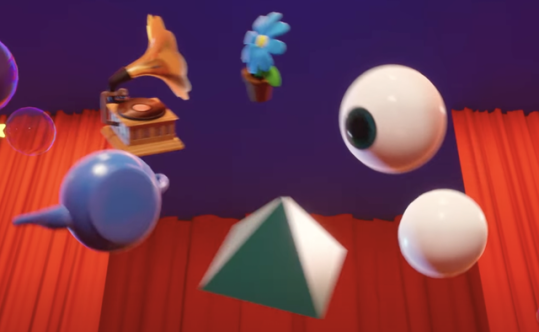
theres a teapot, old record player/gramophone/whatEVER its called, flower pot (which we see start clipping through the stage), an eye, a pure white sphere and a pyramid!
maybe im reaching but i think these items represent each of the cast.. how so you may ask? WELL! (under the cut)
the eye is clearly caines since hes the ONLY guy in the show to have green eyes. also he has hundreds of all seeing eyes (as he himself said) so thats obvious. and yeah the other objects representing the other cast seems a little far fetched but it makes sense to MEE….
as for the teapot... we see those EXACT teapots during the trip both to and back from the funny dev room. now tech wise the teapot actually has a bit of history LMAO.. the teapot model is known as the utah teapot and is one of the first ever models created using bezier curves! it was made in 1975 and is typically considered a test model for rendering/testing how lighting reacts to complex curved models the only character we EVER see interact with the teapots/get tied to the teapots is pomni. so i think its safe to say the utah teapot is representing pomni! ALSO. CAINES EYE IS INTENTLY FOCUSED ON IT. could be because she's causing a whole bunch of glitches in the system…
the gramophone is interesting especially to me. i mean its REALLY detailed. like that would be polygons GALORE. unlike the utah teapot. all the promo for the vinyl record they sell has caine using a normal record player and NOT a gramophone so… its not caines! now whose would it be? im gonna go out on a limb and say its kingers. IT MAKES SENSE TO ME OK. kinger has been in the circus the longest and the other items in the circle are a LOT simpler. like a LOT a lot. it makes me think that as time goes on the computers strength/power is deteriorating which is evident by all the glitches/collision issues in both the pilot/episode 2.
ALSO IN THE TEASER WE SAW FOR THE EPISODE WHERE KINGER HAS A SHOTGUN HE'S IN A DARK ROOM WITH DIM GREEN LIGHTING
WHICH WE ONLY SEE AGAIN FOR THE TAPE RECORDER THING
AND IT KIND OF HAS A CONNECTION WITH RETRO TECHNOLOGY??? man idk LMAO this is probably the most straw grasping ive ever done. like theyre probably not in the same episode if im being realistic….
the gramophone could also be gangles object bc gangle is like. comedy and tragedy mask. and something something theater music gramophone i DONT KNOW ☠️
the flower pot is probably ragathas. she has the most blue on her after all + shes pretty sweet. now thats a very surface level connection BUT WE HAVENT EXACTLY SEEN IT AGAIN YET so… nothing else i can add really…. im trying ok LOL
now the pyramid is obviously representing zooble. i mean. they have triangle head… and pyramid is triangle….. IN THEIR ROOM TEASER WITH THEIR PIN THEY LITERALLY HAVE ONE...
ALSO THE PYRAMID IS ONLY OTHER GREEN THING BESIDES LEAVES OF THE FLOWER POT AND CAINES EYE. AND ZOOBLE IS THE ONLY CHARACTER TO HAVE ANY SORT OF GREEN ON THEM. even if it's more cyan/teal…. listen i can hope 😭😭😭😭
now the white ball is ESPECIALLY INTERESTING TO ME. BECAUSE ITS SO NONDESCRIPT. it could be gangle OR jax or even kinger if i misattributed the gramophone…. personally i think its gangles because her masks are #fffff white like the ball is…
and what if i went feral and said this was fuel for the "one of them is an NPC" theory…. BC LIKE. WHOEVER THE WHITE SPHERE IS. WOULD BE A REAL PERSON. WHILE WHOEVER DOESNT HAVE AN OBJECT IS THE NPC. NOT TO MENTION THE LAST SUPPER IMAGERY AT THE END OF THE PILOT.
and yeah nothing here really represents jax that i can think of though maybe it will more obvious in later episodes... soooo YEAH shoutout to the "jax is an NPC" theorists.
honestly whats most likely is that everyone has an object except for pomni because she just got there LMAO 🤕 i mean caine doesnt acknowledge her arrival until AFTER she fucks up the intro….
not to mention that kaufmo had been abstracted presumably the WHOLE day and wasnt in the intro so maybe his object wasnt there because he wasnt there… yeah this whole shot probably means nothing and im just yapping about nothing xDDD
#vivispeaks#ask#the amazing digital circus#tadc#tadc theory#tadc episode 2#tadc spoilers#IM SO FERALLLLLLL I CANT WAIT FOR EPISODE 3 GRAHHGHHHHHH ZOOBLE EPISODE
15 notes
·
View notes
Note
Hello~ I just wanted to let you know that this is what my doodling-while-i-work sketches look like these days... 👀 I am obsessed with my beautiful blue lady 💙🥺
(ignore the colours, this was done with blue and pink highlighters lmao. they just were in hand at the time)
Not showing you my pinterest board for because it's embarrassingly full lmao. I'll make a nice moodboard for her and post it here though! Also I have been looking at couture dresses and pearls and gems to figure out her dress (because i am OBSESSED with all the layers and details you put, there's so much leeway for beautiful fabrics and ruffles and ways to connect the hood!!!), so thank you for rekindling my fashion designer side 😌✌️


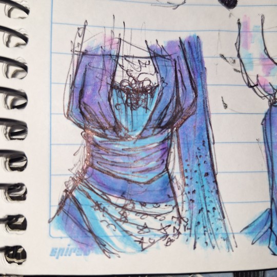
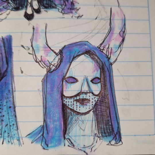
I have been toying with the idea of making the moon into actual horns since we talked about it (like Maleficent?) - you mentioned opals and shell linings, and I think it would look sick if the moon-antlers/horns had that opalescence sheen to them? Maybe it could mirror the mask?
Idk, I haven't quite fleshed her out yet so that may change. She still doesn't have a name; Miss Missy is being very secretive about her life (no surprise there 🙄).
I do wanna show you this! There's this gemstone called Azurite, that has this beautiful shade of deep blue, with purples, and some greens and gold speckles and spots (seriously - look it up, it's fantastic). I like the idea of her being connected to gems and stuff, and I think this one in particular fits her vibe SO well?? So yeah.

Sorry if this is kind of a long, weird ramble, but I just wanted to let you know that our Blue Lady (that's her temporary name) is being well taken care of and cherished 🌙💙✨ Hope you're doing well!!!! 🫂💙🥺
AAAAA sorry for the late(r) response I was about to go to bed and saw this. I just- OMGOMGOMGOMG my face is heating up. Jinefvijneifjvneijfcn 💜🩵💙🩵💙🩷🩷💙🩵💜🩵💖💕💓❣️💘💞💗💕💗💖💕💞💗🐟🔥💕💖🩵💞🩵💞🩵🔥💓💗💙💗❣️💗❣️🐟❣️🐟💙💓💓🔥😱❣️🔥😱💗💓💕💕❣️💕💜🔥❣️🔥🦑🔥

Me staring at my phone rn.
And why she urple?? There’s so many thoughts going on in my head rn.
1. YOU DID THAT WITH HIGHLIGHTERS WHAT??? excuse me??? what In the Bob Ross???? I love the way you blended the pink and blue and the sketchiness of the lines AUGH. It’s so crunchy… good food…….. you captured her whimsical aura perfectly. The fabric for her sleeves is so nice. You drew her so pretty omg omg
2. I love malificent so much :(((( I love sleeping beauty, I love the live action malificent… OPAL MASK AND HORNS HELLO. Blue Lady is killing it over here, my god. She’s got the bling. She’s got the swag. What more could she have.
3. My grandparents are jewelers and they used to keep random geodes and gems around their house and azurite was one of them! I remember because they would try to teach me about rocks and gems and different gem cuts and I just sat there “no thoughts, head empty, I only want to look at pictures of agate and peridot”. their azurite was very very small and I’m not sure where it is anymore. My favorite gem has to be zircon though, love that stuff. I will for sure be reading more on azurite though!
4. (Psst I have a character who’s like a pomegranate goddess and I think her and Blue Lady would get along wonderfully. Her name is Punicae and you can find her og design here.)

them with not accurate coloring cause i be speed drawing. They slay. Together.
I’m going to go to bed. Stay safe, take care of yourself, LOVE yourself. Tysm for this I’m crying. Love you very much and giving you all the azurite your heart could desire 💙🩵💖
9 notes
·
View notes
Note
Writing ask:
Maybe LU modern Au thing? No pressure!
Anyway took a few days but here you go! I took this opportunity to finally write another crack fic with four so it's probably not what you're expecting lmao. Kinda lost what little plot there was halfway through too
---------
"Someone's pulling us over." Green said. Vio sighed, and pulled the car to the side of the road.
"Is it the cops?" Blue twisted around.
Green shoved him back down. "If it is the cops, do you want to get us in more trouble?"
"Anyone do anything illegal lately?"
"Other than how we're harboring a criminal in our house?" Blue asked sarcastically. "No."
"Shadow isn't a criminal anymore." Vio reminded him. "Dot pardoned him."
"Then why does everyone keep calling the cops on us?" He accused. "Wild nearly sets his house on fire at least once a week and even he doesn't see the cops as often as we do."
Vio sniffed and turned away, pointedly refusing to answer his question.
A cop walked up to the window a moment later, knocking on it.
"Hello, officer." Vio said, rolling down the window and plastering on a smile.
"Have you seen this man?" The officer asked. He held up a picture of Legend, and Vio had to hold in a groan. "He was seen in a car matching the description of yours headed this way."
"No, I'm afraid not." He lied.
"What about you?" The officer peered into the car, and Vio hoped he couldn't see the swords they'd shoved under the back seat. It would probably be a bit hard to explain what they were for.
"Nope." Blue said, crossing his arms.
He pulled out another picture, this time of Warriors. "What about him?"
"No." Vio said. "If you don't mind me asking, officer, what did they do?"
"They stole a few bottles of alcohol, but they were covered in blood, so we're treating them as dangerous."
"Well, I'll let you know if we see them."
He nodded, and Vio rolled up his window. Once he had left, he pulled out his phone, bringing up Legend’s number. The call connected within a moment.
"Get out of my damn trunk." He hissed, not even waiting for an acknowledgement.
There was a thump from the back of the car, and an echoing one on Vio's phone.
"I'm not in your trunk." Legend said.
"And pigs fly." Green said, rolling his eyes. "The cops just pulled us over."
"Oh shit, that's what that was?" Warriors whispered, clearly thinking they wouldn't be able to hear.
"Are you drunk?" Red asked, leaning closer to Vio's phone.
"...No."
"Time's gonna get your ass." Blue snorted.
"Pfft, he's like four feet tall. He can't do anything to me."
Vio's eye twitched. As a proud and somewhat reluctant owner of four feet and four inches, he didn't really appreciate that comment.
"I think he's going nuts." Legend said. Now that Vio was paying attention, he could tell that he was drunk. "He keeps calling Time Mask and insisting he's like, really short."
"Are you injured?"
"Uh, no. I don't think this is our blood."
"You're paying to clean my car."
"What? No–"
Vio hung up. He leaned forward, forehead resting on the steering wheel, not even caring that he was pressed against the horn, and sighed. It was so much simpler when he was helping Shadow take over the world.
#linked universe#lu four#lu legend#lu warriors#lu#lu fic#alcohol mention#mb's writing#mb and mothie scream about hats
52 notes
·
View notes
Note
Whos ur favorite spider-man villian?
I love when people ask me who my favorite anything is, but I assume people hate watching me answer them because it is so aggressively clear that I'm an English major lmao
the wonderful amazing things about villains is that they can go from the most boring thing in the world to absolutely fascinating depending on the hero because villains are only as good as who they are fighting and heroes are only as good as their villains. Like my go to example of how excellent this can be is the Spot when from a d-tier spider-man villain to something genuinely terrifying in Waid's daredevil run. It's about the motivation and framing
so when answering the question who's my favorite spider-man villain, what I'm really saying, what villain highlights my favorite aspects of Spider-Man?
And the answer is obviously the Green Goblin. What the Green Goblin shows (when written well) is what Spider-Man could be if he rejected responsibility, if he only used his great power for personal gain. And it's so exquisite because the Green Goblin can punch Spider-Man all he likes, but really he hits the hardest when he takes a swing at Peter Parker. And like hey low hanging fruit, the Green Goblin killed Gwen Stacy and it sent Peter spiralling, he's technically still spiralling from her death. Spider-Man was able to keep being a hero after Gwen, but Peter really never figured out how to keep being a person after Gwen. This was the moment when great power, great responsibility was no longer an encouraging mantra but Sisyphus' fucking boulder. The Green Goblin, that mask, is the ugly side of that no responsibility, the cruelty that comes from it. But Norman Osborn is the tempting power, always whispering in Peter's ear. Which is why it's so important that Spider-Man fights the Green Goblin before Peter Parker fascinates Norman Osborn (No matter how modern comics try to retcon it) because it presents the same dual identity themes of Spider-Man. Which one is actually the mask? The Green Goblin is the perfect Spider-Man villain because he's the perfect mirror both to Spider-Man and Peter.
And like here's the thing Norman isn't the only Green Goblin! My gut reaction was Harry Osborn is my favorite villain even though his time as the Green Goblin was so temporary, but fuck it was so good! If Norman as the goblin represents great power, no responsibility, then Harry represents no power, great responsibility. Now, you might be thinking that Peter was no power, great responsibility before the Spider bite and like yes but no. Because yes, Peter as a kid from a poor family would have to take on a lot of responsibility to help his family to survive so yes in abstract. but in practice, May and Ben were good parents who sheltered Peter from a lot of their hardship and eased him into it slowly and showed him out a sense of responsibility to their family and community actually empowers him. In contrast, Norman was not a good parent. Harry was made incredibly aware of his responsibilities as the Osborn heir very young and that burden made him feel powerless. Harry is not his father's power struggles within the narrative context. Harry presents the question how do we deal with the consequences of people who abused their power, who deferred their responsibility to others. I'm always hesitant to call Harry a villain because first and foremost he is a victim of the Green Goblin and really in Spectacular Spider-Man, he feels more like a co-protagonist than anything else. Harry is not my favorite villain, he's my favorite foil (that happens to be doing super villain shit). Harry acting as the Goblin is not an exercise in power like how Norman did it, it is him trying to get the power his father had, but it doesn't feel as good. He can't bring himself to the same cruelty that his father did because he is still weighed down by the burden of responsibility that Norman tortured him with. IT'S SO GOOD
#asks#wrote this instead of studying for my midterm#i'm screwed#anyway go read spectacular spider-man#some one ask me about the goblin sins currently happening in canon
12 notes
·
View notes
Note
6. do you have a favorite quote?
20. favorite skincare products? (Reverse Uno! lol)
25. what inspires you?
:)
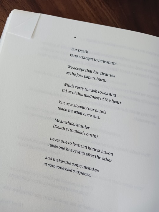
6. do you have a favorite quote?
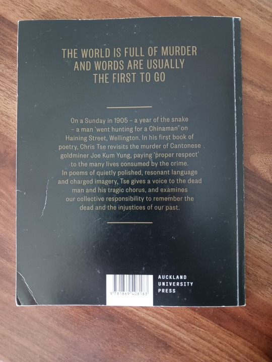
oooh not a quote per se, (and generally I can't settle on a favourite anything lol) but let me share a poem from Chris Tse in his anthology, How to be Dead in a Year of Snakes.
This one is my fav at the moment. I read the whole anthology in one sitting a few years ago and cannot praise it highly enough. [TW: racism, murder] - it discusses racism; murder; the way POC names are reduced to no more than representations of acts of violence done to them; the simultaneous glorification and spectacle of white murderers whose names and lives are remembered in the media for the atrocities they commit, while the voices of those they enact that violence upon are forgotten and buried.
It's so so so well written!! (also really looking forward to getting my hands on his queer anthology, He So Masc, which I haven't read yet, but I'll probably find my next favourite poem in ✨)
20. favorite skincare products?
My skin is super sensitive (she's just like me omg), so I really love things that don't have fragrance, are super hydrating, and work to restore the skin's moisture barrier. KLAIRs as a whole is just *chef's kiss*, I freaking 💖love💖 that brand! But here are some of my personal favs
Cleanser
Wishtrend Green Tea & Enzyme Powder Wash
Toner
KLAIRs - Supple Preparation Unscented Facial Toner
NEOGEN - Real Ferment Micro Toner
SIMPLE - Micellar Cleansing Water
Serum
THE ORDINARY - Niacinamide 10% + Zinc 1% (actual godsend)
KLAIRS - Freshly Juiced Vitamin C Drop (another godsend)
THE PLANT BASE - Quesera Ceramide
NEOGEN - H2 Dermadeca Serum Spray
Moisturiser
SIMPLE - Hydrating Light Moisturiser w Vit B5+E
MISSHA - Super Aqua Cell Renew Essential Moisturiser (WHY is it so expensive though 😭)
KLAIRS - Freshly Juiced Vitamin E Mask (love love love)
Sunscreen
NEUTROGENA - Ultra Sheer Face Lotion SPF50+
I'm still looking for a good sunscreen tbh, the sun is brutal in NZ and I'm white, so... 😬 lmao
25. what inspires you?
omg, everything and anything!! I'm taking this in a "what inspires you in terms of your art/writing" kind of way - most recently, music is inspiring me tons, especially watching the MVs for DPR Ian's songs. He is such a talented artist, and the way he explores mental health through the visual imagery in his self-directed videos is just on another level of artistry. Dude is so cool. Everything he creates is so vulnerable and real while being so pretty, I love it!
7 notes
·
View notes
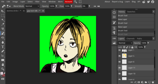
Note
how do you color the manga panels for icons?

Hi Juno ^-^ I'll be walking through this using Kenma (Haikyuu) and the catkintism flag. Also, I'm not going to do like, full detail for manga coloring because these are pride icons and I'm not getting into shading or color theory.
What you will need:
An editing/art software that allows you to change the layer type
A manga panel/icon
A flag, in this example we will be using the catkintism flag
Color reference for the character
Step one: Getting ready the manga panel.
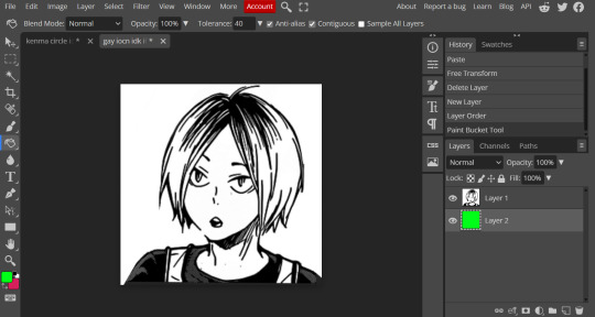
We usually start off with something like this: the manga panel in a square, and with a green layer below it.
Note: At this stage you should remove the background/outlines of your image, I forgot to in this so I did it later but here is the best stage to do it.
Next make sure that the image is selected and head over to the side panel that says 'Normal'
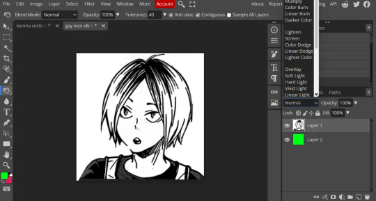
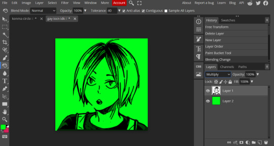
You will then get a long list of image types I can't really explain too well. But you want to select the one that says 'multiply'- this gets rid of the white parts of the image.
It should look like this:
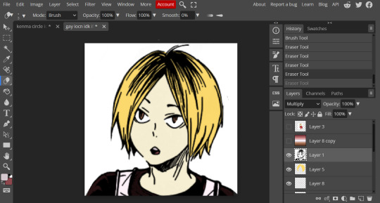
Step two: Ready your colors.
We use a combonation of the original character colors and the flag colors, so for example Kenma's hair is yellow and black but there is no yellow on the flag, I have the option to use the most yellow looking color, but we'll see if that looks okay later.
His shirt is usually red, so again, I'll keep his shirt red.
You can get these colors by pasting the images into the image and using the eyedropper/color drop to select the color.
Next you need to make a new layer under the manga outline and then you just... Color in!
This is the result of our first layer of color!
Tips and tricks for this stage:
Make new layers for every 'object' (ie, undershirt, overshirt, whites of the eyes, the iris, ect)
A lot of manga will have gaps between lines, this is fine, you can work around this with difficulty (at least we find it difficult lmao).
Fuck around with the colors, you can change them later if needed
Keep in mind the manga character will look like Shrek for a while, possibly even with the color they will look... Off. This is normal.
Step four: Refine.
This is what it sounds like, looking over the image, changing things, turning the green background on and off, erasing lines that shouldn't be there and/or color that's fallen out of said lines.
This is how ours looks after:
Step five: Put it into the icon
You need to save it as a PNG (will save the background as a transparent) and imput it into the icon, then do what you need to make it whatever shape you want.
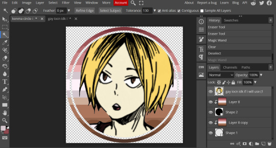
This is it, so you are now free to save this as a transparent and live freely! Your icon is done!
Bonus step: Coloring the black lines
Now I've done my usual icon things and put it into an icon. I don't think the black lines look right, ofc you can keep them but for me they're too harsh.
So I'm going to add a layer, make it a clipping mask (this means it will only effect the layer below it) and then add a whole color, I try to go with one that makes sense (ie white wouldn't make sense but the dark brown might) and then fill the whole layer with this color
Next I change the layer type, usually I'll go for 'screen' or 'lighten', but it depends on what I'm looking for.
The icon will then get a slight coloring to the color and the lines will change from black to the color you want. Of course you can change the layer opacity to mess around with the color some more, but I'm happy with this:
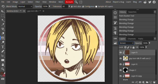
And there you go! Your icon is now done :D
4 notes
·
View notes
Text


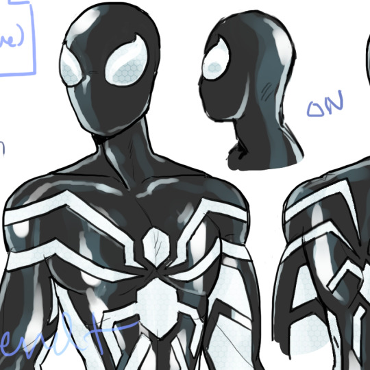
(part one >HERE<)
Part TWO of…. three?
aka: the Unstable Molecule Suit
Once more, as always, I say—
closeups under the cut:
—🕸️—
the unstable molecule suit... i posted the blue one already (f4 suits post) but the rest is new.
context: in 2015 (when peter and co are in their late 20s) johnny will design a special fantastic four suit out of unstable molecules (third gen) for peter, but they didn't get around to giving it to him right away cause life stuff, man-spider, other shit... (which reed uses as an opportunity to test some (stealth) features since no one's wearing this one)
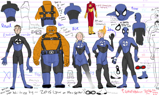
(this was my first concept doodle for this before putting it on my shiny new spidey bod template i made recently)
(updated to lesbian reed version)
"Blue" (all the unstable molecule suits have codenames for voice commands lol)
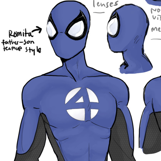
check those milky white lenses... i particularly like that look actually. hard for me to draw but looks good
Peter gets a pop of red on account of being spidey lol (everyone else's soles are black and white) - you can see the blue is smooth and matte but the black is slightly textured.

i decided beside all the white glowing in the dark that they're reflective as well. you know, for safety.
and cause it looks cool
anyway
in 2016 Johnny dies. lol. and it's after that when the family gives peter his suit, after johnny's will and so forth... so peter never wears the blue one in the end (at least not more than once or twice), just the white/black ones... (actually he mostly mains the black version, mourning etc.)
reed designs the FF suits mostly by himself and if johnny weren't dead he would say they're fugly (there's no accounting for taste i guess):
"FF"

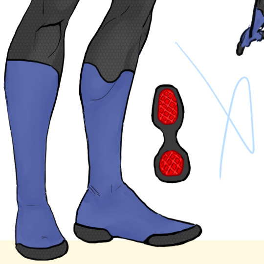
Here's the basic white and black version. Chose to go the glossy latex-look route for the blacks cause I think it looks nice, added a honeycomb texture on the white to make it look Cool and Futuristic (lol) This white version is the "off" version, aka, no stealth whatsoever. It's just the basic suit mode to replace their blue suits after Johnny's death.

shoes… split color soles for fun.
and all the white bits on this reflect too, again, for "safety" aka i just think it looks cool and it makes them hard to photograph.
lmao
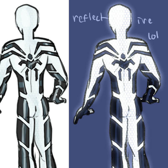
anyway the black version:
"Stealth"
This is this universe's version of the stealth suit, and if anyone knows me they know two things about me: 1) I hate Dan Slott's writing and 2) I think the Big Time neon suit is sexy. So some of the logo design here is inspired by the logos Ramos designed for the Big Time stealth suit, which I think matches the aesthetic well. In the full version you can see one of the major things i took from the big time suit (aside from lighting up) for both black and white versions of my FF suit is extending the spider's legs to the tops of peter's thighs, as well as parts of the back logo.

feeties again.

Aaaand here it is, me 100% on my bullshit: obviously this is drawing directly from the Big Time suit, in being shiny black and lighting the fuck up, but in my case I adjusted the colors' purposes very slightly. So, when unlit, in its most mild stealth mode, it's just regular old reflective white, and it only moderately cloaks the wearer, mostly just making it a tiny bit easier to sneak. ironic considering it is hi-vis reflective but I love irony i guess.
red (...tbh, orange, really) is audio damping/muting which is basically exactly what it was in slott's comic, though it has mild visual cloaking.
green is the opposite and is mostly visual cloaking/invisibility, but has mild audio damping as well...
and the biggest difference here is the blue-white glow. afaict in the comics that just means it's like... off... lol but in this case i'm assigning it a special function which is as a radar/radio/sonar/etc. scrambler and signal jammer, so... signal cloaking.
three kinds of stealth!
also i didn't draw it but, like the big time suit, peter's mask allows himself to hear and see himself (actually not entirely true, he can't hear anything when it's red 90% of the time, reed's still uh... ironing some kinks out) and the suits use contact mics instead of traditional mouthpieces to help w/ comms in this regard... (not that it works when signal jamming is on)

the others also have goggles like the ones felicia has in the big time arc, that can be... materialized via the magic of unstable molecules lol and those do basically the same thing as peter's lenses.
the difference is mostly just that reed designed it instead of peter (but i'm sure peter is poking around in there anyway, and later on pete will be designing and coding his own suits into the unstable suit without reed's assistance no problem) (he took a programming class in college, you know)
(oh i also made a mod of the black one for the PC version of Marvel's Spider-Man Remastered, which is on the nexus: link


(it glows)
(i modified the chest logo slightly for this mod and i think i actually do like that shape better so i might update my timeline drawing to reflect that)
—🕸️—
SO
red and blue.
obvs the furthest left red and blue is just his standard suit, I put that there for comparison, and included the emergency mask w/ aluminized lenses which is also on the first post with his handmade suits of course
But there's also an updated version Johnny designed that's very very similar to Peter's handmade suits:
"Classic"

This updated version coded into the unstable suit is a slightly sleeker and slightly modified design w/ opaque high-tech lenses (w/ an internal HUD) but otherwise almost identical. One major difference is that it's totally seamless, and also the spiders are slightly different as well.
i just used a halftone brush to slap some texture on there, it's not a specific kind of fabric i had in mind or anything...

slightly different boots too. This design is actually basically just my previous/usual design I've used a lot for Peter, which you can see all over in my miscellaneous spidey fanart, with the arms and the boot shape and stuff, and i figured unstable molecules was a great excuse to bust it out again...
Bonus reflectivity:
And then is Civvies.
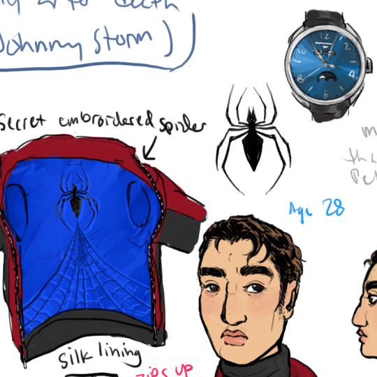
This is just regular civilian clothing for the suit to take the shape of when not in use etc. Johnny designs and coordinates the entire outfit down to the socks and underwear, for Peter, around the time he designs the blue suit for Peter. (aka like 6 months before he dies)
The watch serves essentially the same purpose, being a way to disguise the suit very discreetly in a way that lets Peter wear it at work, walking around etc. with any outfit he wants.
It's a Baume & Mercier Clifton Complete Calendar – starburst blue face (10057) – introduced in 2015 at around $5000 which... for a fancy watch is not too bad but is still $4990 more than Peter would ever willingly spend on a watch. Luckily it's low-key enough that it doesn't scream "I'M WORTH FIVE GRAND"
well technically it's a bootleg anyway since it's a techy fantastic four contraption inside, but it LOOKS like that watch and it's a nice match for peter's sense of style.

Now, anyway, wrt to the lining in the leather jacket, you may be thinking, hang on a second that secret spider and color scheme looks familiar—

No biggie it's just the jacket Peter gets gunned down in (you know, to death)
I would say I'm not doing that plot but technically that would be lying.
It's not the SAME but I'm def drawing some inspiration for later in Peter's life from this—but not until he's 49, and right now he's only 28 lol. So until then it's just a snazzy leather jacket his dead best superhero friend gave him posthumously.
Which brings Peter's leather jacket count up to I think... possibly 4 by his late 20s? 3 or 4, I'm not sure. He had the symbiote able to become a leather jacket at 17/18 but iirc he replaces that with a real moto jacket at some point... he has a shearling coat which is a leather of sorts, and he has flash's ESU letter jacket (wool and leather) by this time for sure, which flash gave him because peter's the one that graduated and flash stopped wearing it after dropping out freshman year like ten years before this lol
anyway
I think it's quite handsome. Normally Peter's not this uhhhh Hip and Fashionable, with the acid wash jeans and whatnot (typically wearing like, slacks, khakis and sweaters) but Johnny is much more stylish than him while still getting into Peter's kind of foxy bad boy underlying aesthetic.
Obviously it's fairly low profile externally since it's meant to be worn as real civilian clothing, so it can't have a bunch of spider-man crap on it if peter's going to wear it with his face exposed.
I drew some inspiration from racing-styled jackets since Johnny is the one who designed this outfit in-universe, so that kind of shape and cut made a lot of sense to me. General color scheme and, as mentioned, the spider embroidered onto the lining. is based off of Spidey's last stand though.

Acid-washed jeans, chelsea boots, more Johnny influence on taste here... well partially. I think Peter would like chelsea boots since they are understated, slip-on, and cover his ankles. Less relevant when it's all unstable molecules cause he doesn't have to worry about things like red tights or quick-changing his shoes after this, but, it's one of those things I think becomes ingrained in his style as he grows up.
Also every piece of the civilian outfit can be worn individually, combined with other real clothes etc., it's just convenient to have a whole outfit on standby.
The red briefs are Calvin Klein. just... fyi.
oh i just noticed i forgot to color in his leg scar on this one lol oops
anyway
"Super Slut"
aka...
the latex thong:
and peter's tits

Johnny thinks this is SO FUNNY and then he DIES before he has a chance to actually laugh about it.
even though it's a dumb joke this whole thing just makes peter kind of emotional lol.
Anyway you can also see that Peter has some remnant fuzz on the nape of his neck and part of his back from The Curse of the Man-Spider which is set almost exactly a year before Peter gets the gen 3 Unstable Molecule suit(s).
The happy trail and chest hair was always like that though.

A fun benefit of including this joke outfit is that I got to draw Peter's gnarly burn scar (which i also tossed onto the lineup w/ peter's fire resistant suit).
He ALSO has scars on both sides of his ribcage from Man-Spider btw

from the auto-amputation.
they look kinda like bellybuttons.
anyway that's it for the basic unstable molecule suit-suite :)
part 3 will show peter's later unstable molecule costumes that he codes into the suit himself, which are mostly black...
it's like. two suits. but i haven't drawn it yet. i'll toss a link into the comments when i do.
post three (Peter's suits after his aunt dies) is >HERE<
#spiderman#peter parker#spider-man#nadiart#fanadiart#arghdesign#well sort of#shiny art#literally lol#peterflash timeline au#came in through the window last night
23 notes
·
View notes
Last Seen Blogs

aspiring-loner-blog
my words fly up

ofsmalldeath
𝐃𝐄𝐀𝑻𝑯'𝑺 𝑩𝑨𝐁𝐘.

wheat-taper
Untitled
nyx12
★ℕ𝕪𝕩☆

louakahaz
Smell