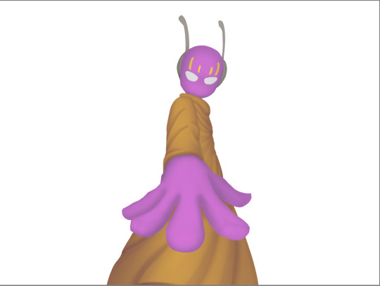
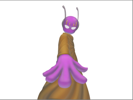
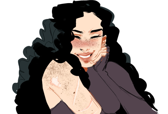
#trying out some slightly different rendering styles
Text


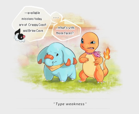

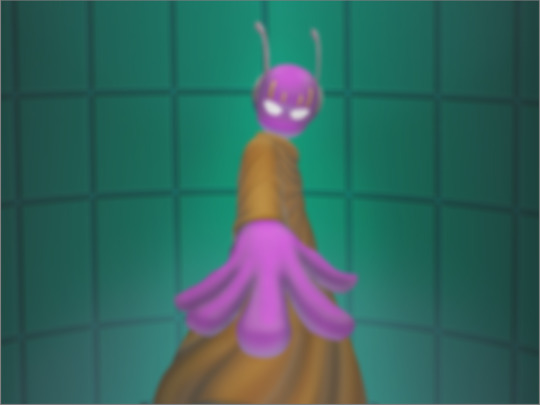
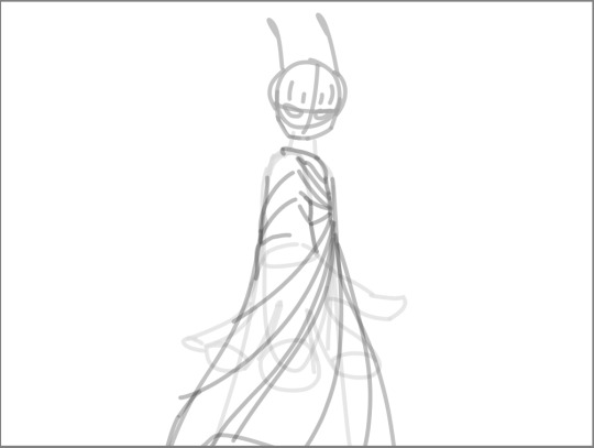
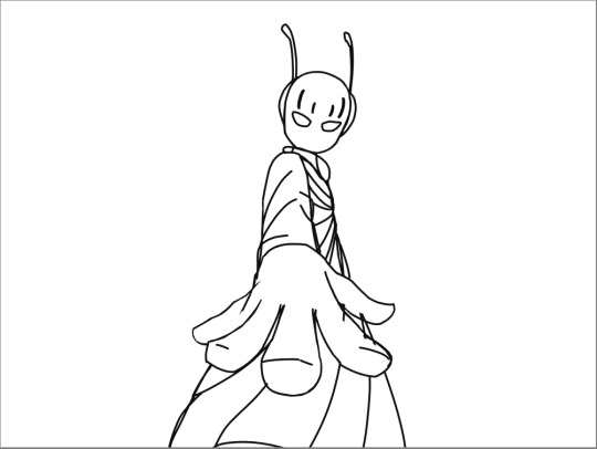
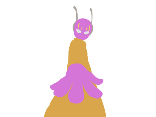
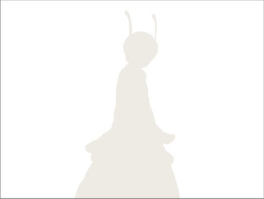
I played Pokémon Mystery Dungeon: Explorers of Sky for the first time a little while ago and was reminded of how very wholesome the PMD series is. So here are some completely self-indulgent drawings of my rescue team. Shout-out to anyone else that has played the game with this specific combo!
#varggarn#pmd#pokémon mystery dungeon#pokémon mystery dungeon: explorers of sky#pmd:eos#charmander#phanpy#pokémon#pokemon#pokémon fanart#trying out some slightly different rendering styles#games#fanart#me? posting art?#well it happens every once in a blue moon#if I can keep this enthusiasm for art a while longer#I might actually render the drawings I made of my PMD: Red Rescue Team duo many years ago#or even make some fanart of other characters in the games
3K notes
·
View notes
Text

A little preview of the piece I did for @destinationunownzine!! I went a bit crazy rendering this one, but it was also incredibly rewarding.
If you'd like to get the zine you can find it on Big Cartel (for US shipping and digital bundles) or on Etsy (for international shipping).
I wonder what (or who) Ingo is looking at (and why) 👀
((a few notes and thumbnails under the cut))
The crossover I was going to work on for the zine was with Animal Crossing (of course) and I had a couple different ideas for the illustration.
I ended up making 5 thumbnails that explored those ideas (the page format ended up slightly taller than the one used here):
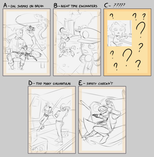
I had some options where the guys are in the DAL roles (like in the comics and sketches I made for my AU), and a couple where they are in their original uniform.
Option B in particular was more about applying the style of Animal Crossing to them as well as to some of their pokémon (chandelure was going to be referencing Wisp), while option E was very much just vibes and me trying out something a bit more dynamic (which ended up not showing the AC setting enough).
In the end C is what I ended up working on. It was really fun to work with the Animal Crossing proportions and style, and I even got to squeeze in my favorite AC character (that would normally be substituted with a pokémon character in my AU) and a little bit of humor.
#submas#subway boss ingo#subway boss emmet#saersketches#I am also working on turning one of the other thumbs in an illustration#here's to hoping it doesn't take me months
413 notes
·
View notes
Text
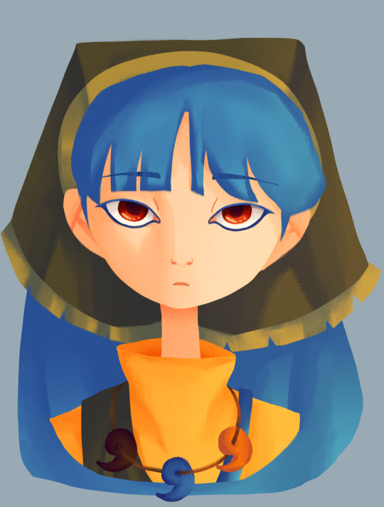
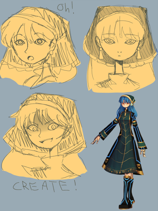
I RETURN BEARING DOODLES OF ZE KEIK!
Hello again! :D I felt like drawing Keiki because I had nothing else to do and I also wanted to draw Keiki again because C R E A T E !
{Artists Note}:
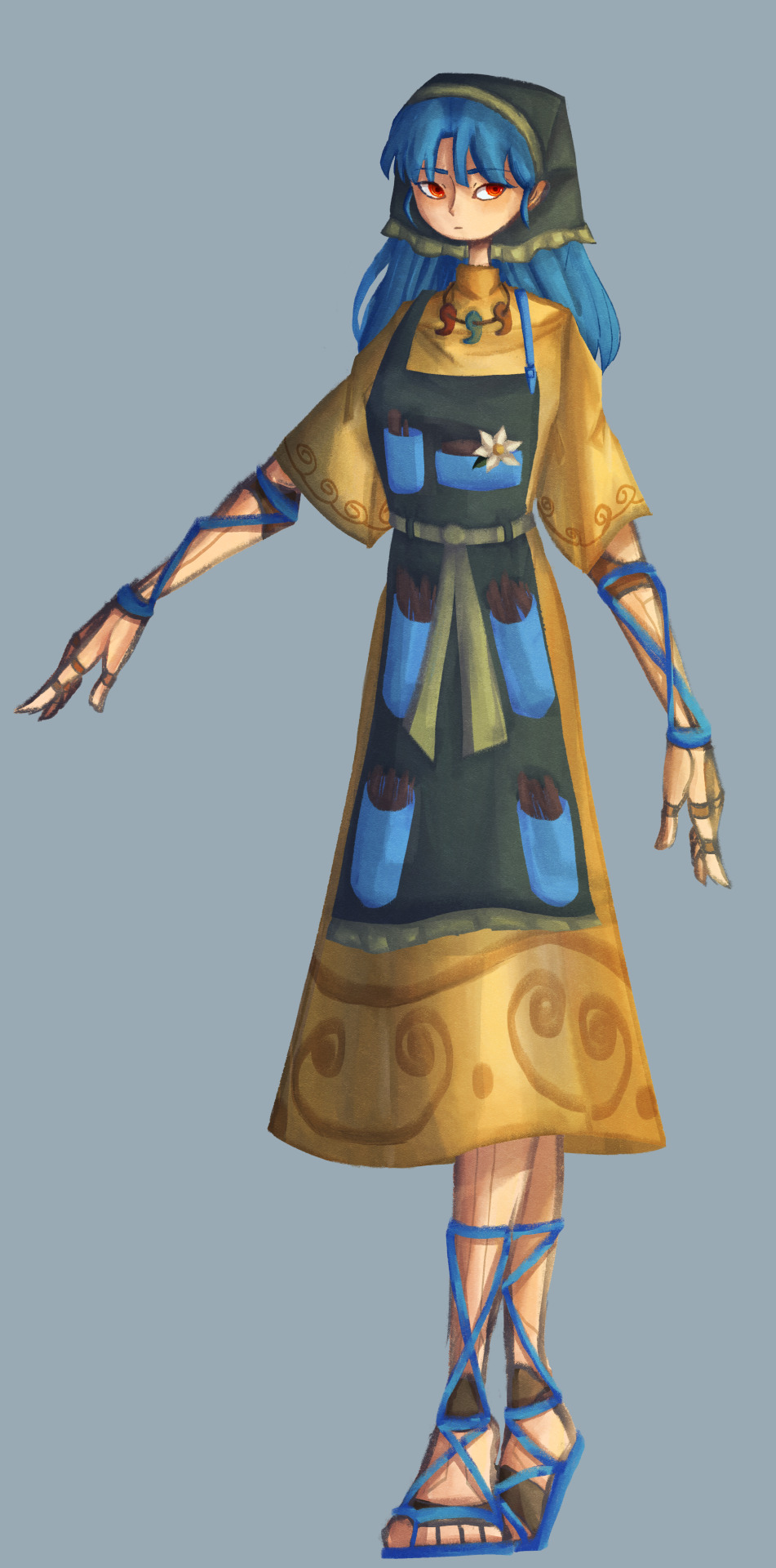
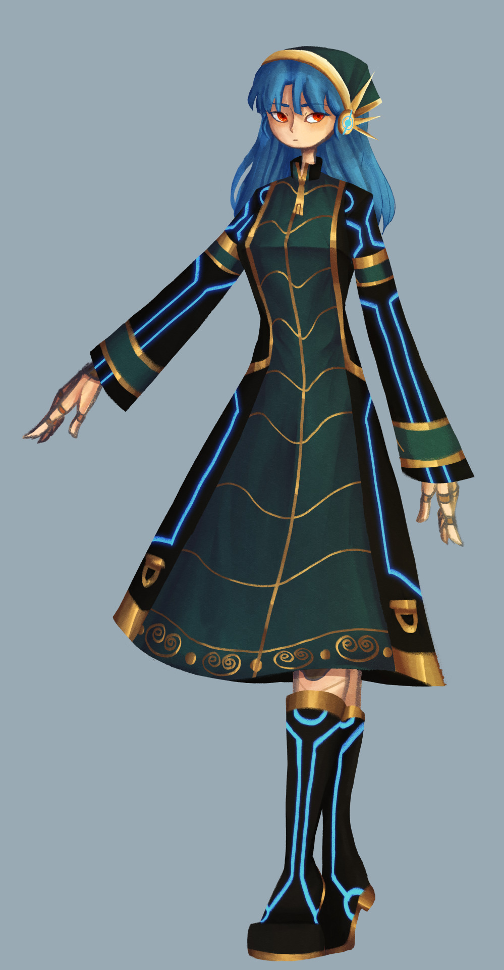
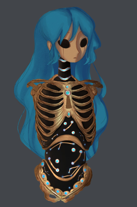
So I had some ideas bouncing around for how I wanted to draw Keiki, and the first time I went with a more robotic look that was inspired by BoTW. I also wanted an excuse to try out some stuff with collages, and so I used an 1800s drawing of a skeleton to put this together. I added a face and a head just for fun, but tbh I wasn't 100% happy with it even though I did like how it looked. I might wanna save the BoTW inspired parts for a future Okina design as I think the constellation motiffe some BoTW Sheikah stuff has fits her more (and I have adopted the headcanon that she has prosthetics, I love it so much).
Like ok, context for this is headcanons. So as I mentioned in my post about Eirin, I wanted to play around with the visual idea of gods in Touhou being very much related to what they're gods of.
So at first with Keiki I tried just making her look like a haniwa herself, but I ended up not going with that as I like the idea of her being distinguishable from the Haniwa she creates. So instead, I ended up going with a more cyberpunk aesthetic for her, inspired in part by Cyberpunk Edgerunners (no spoilers plz, I haven't finished it yet). It's also the reason why I did an alternative cyberpunk outfit for her (inspired by a dress I found on Pinterest).
I feel like the hardest things about drawing Keiki are her dress and hair bandanna. In the image above with her normal outfit, I had a lot of struggle with the sleeves, and I couldn't really get her hair bandanna right. In the faces I drew of her I had a slightly easier time, but still, it's hard to get it to look right. However in the alt design I gave her I somehow managed to make it look right??? Don't know what I did there but I actually like how it looks, so I'll keep what I did there in mind for the next time I draw her.
Speaking of her alt design, it was actually a lot of fun for me to do. I imagine that's her more "official" outfit, don't know what she'd where it for but I mainly drew it on her because i had a cool idea ok?
Also, on the day I drew her initial face render, I had watched Serial Experiments Lain and I think those vibes bled into the sketch version. Upon further inspection of the rendered and coloured version it kinda lost that but it's more to try out a different brush for my style.
Also also, I experimented with giving her earrings! Which didn't make it to the final cut, but still wanted to try it out! This also came as a learning experience on what makes Keiki look like Keiki... it's the hair bandanna, every time she doesn't have it, she doesn't look like herself.
To end it off, I think the unhinged Keiki face I drew for her expressions (since everyone I've been drawing recently has kinda all been lookin like varitations of this face -> (o _ o) gonna need to draw more expressions period actually, need practice on that) is now my favourite unhinged Keiki face I've ever drawn LOL. Expect more Keiki sketches in the future because I do love drawing my beloved blue haired blorbo.
#touhou project#art#fanart#touhou fanart#touhou 17#keiki haniyasushin#doodles#art dump#long post#concept art#alt design
94 notes
·
View notes
Text


i made this spiderman back when the atsv had just come out. german expressionism design infodump under the cut :^) also the name isn’t solid i don’t speak german
so glad i held off my knee jerk instinct which was to just slap spiderman’s face on cesare the somnambulist and looked at other influences.
my rules were these:
exaggerated but alien silhouette, distorting the shapes of the body to create something that is not necessarily attractive, chic, or to modern tastes, but rather is effective. (i think i still didn’t get close enough to an unusual, unappealing silhouette and my modern design sensibilities still snuck in, but i tried to convey the two differently sized body segments of a spider)
realism/practicality is like tenth on the list of priorities. if his universe is a silent film, there will not be long, fast, acrobatic fights like other spidermen have, so you can get weirder and more ornate than a simple bodysuit
top priority is returning to the base concept of A Man with the Qualities of a Spider, prowling the city with unknown intentions, and the emotions that would prompt in a paranoid Weimar-era public. this spiderman is Trying to evoke creeping terror
art style should take influence from Weimar-era film and theater posters as well as other interwar German art
he should fit into a universe which is all stark black and white, with vertigo-inducing angles and bizarre shapes. he and his world should be uncomfortable and disquieting for outsiders.
should seem potentially inhuman - you can’t tell if he’s man, monster, or machine
i’m really pleased with how the design came out! GE has such a fun and bizarre costume design language to tap into. it was hard to render a costume that’s just different materials of black :~) in my head, the lighter grey parts on the torso and limbs are semitransparent black chiffon/stocking material; the black spider on the chest and the stripes on the limbs and the mask and the collar (which is supposed to resemble mandibles) are black velvet; the eyepieces and 6 additional “eyes” are metal and glass; the spiderweb headpiece is plastic; and the poofy shorts are a more rigid material, maybe velvet or taffeta lined with some thick felt. when i was drawing it i was picturing them in vinyl but i think the era i’m targeting would make vinyl slightly anachronistic, even for a theater-type costume. obviously the toe curlies are just velvet over wire.
i’m calling it earth-90125 which is fritz lang’s bday in yy/mm/dd format. it says something else on the drawing i think, cant remember what that number means
also i realize “conrad veidt + peter lorre” is a fairly wild thing to ask someone to picture given that their faces are opposites in most meaningful ways. here’s faceapp’s attempt at combining their faces which i will grant is slightly more skillful than mine and pretty close to how i was picturing peter. just imagine him more quiet and reticent and sweaty and nice than he looks here


70 notes
·
View notes
Note
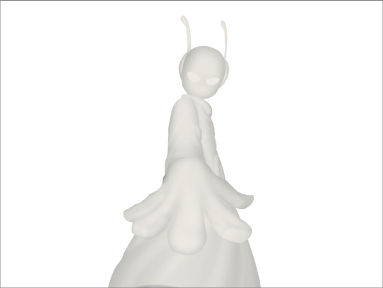
I just found this blog and I noticed that a lot of your stuff seems, well, oddly 3D. I don't mean like in a bad way but it feels like rendered but untextured 3D models? I kinda want to ask what your art process is (sorry for mini-rant)
thanks for checking out my blog! and no need to apologize for anything.
hmm, my art process. honestly i have no idea what to say, i dont know how people normally answer this question so i cant base it off anything either. i'm still kinda new to this whole art thing but i'll try and answer, super sorry if i get this completely wrong and this was all a waste of time.
i guess i'll just talk about how i draw things step by step? for the high effort pieces at least.
ok, so for starters like step 0. when it's a high effort piece, i can already see the image in my mind. i see the pose, i see the general lighting, the layout of stuff, but it's a bit blurry. if i cant see this mental image, the drawing usually comes out extremely poorly.
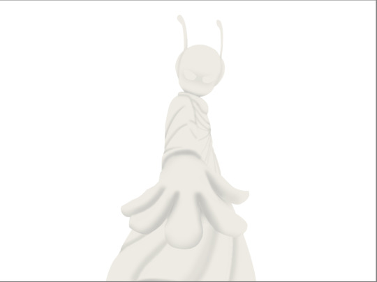
this is kind of an example of what i see in my head? this might be all useless info idk, but this is i guess where i start.
well step 1 is just the sketch and line. i start with just sketching the general shapes, then slowly refining it until it fits close enough to the image in my head. then in the line layer i'll fix any mistakes the sketch had and add more details to it. oh and for brush, it's just a round brush, like default. i dont know how much of a difference using a drawing tablet does, but i dont use one so... yeah.
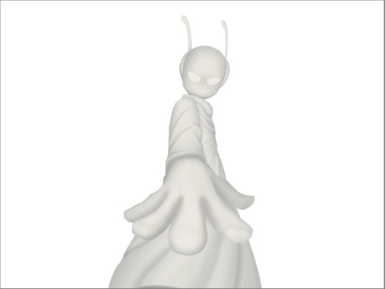
i should've put more effort into the sketch for this drawing, but i did not.
next i do flat colors. pretty simple, i just select the smart select the outside of the line layer, invert the selection and now i can't paint outside the lines. i dont really think about what colors i use, i just use whatever the characters normal colors are.
next i do the shading, but first. i duplicate flat layer and recolor it to like a cream color
like so. for high effort pieces, i was told online to shade in pretty much black and white. now actually onto shading. there's 2 kinda shading i do, 1 from the proper light source, and 1 that's kinda just a shadow because things are close together (like corners and stuff). and i'll shade them on separate layers so i can adjust them individually however i want. oh right, i'll either use a very dark color, pretty much black and the the layer blending mode set to multiply. or i'll use a light kind of gray, tinted slightly yellow or something and set the layer blend mode to difference. then i just use a soft air brush and shade in the ways i described above. shading from regular light source, and the corner stuff thing.
normal lightsource - - - - - corner thing
then toggle both layers on and mess with the opacity of each layer until you get what you want.
then you can toggle the normal flats layer, the one that has color and it should apply the shading decently. you can mess with the opacity again on the shadows.
next i do lighting. i just grab a very light color, usually pretty close to white and set the layer blend mode to overlay. then i use a soft airbrush and "light" it? idk i just do like the opposite of the normal shadows, lighter the closer it is to the light source
mess around with the opacity as usual. then i do pretty much the same thing if there's another light source. in this case there was a blue light kinda coming from underneath, so i did that.
now from here i would go back to the flats layer, make a copy, and mess around with different layer styles and properties and settings. sometimes just messing around is useful. in this case, i felt it was too bright and colorful, so i decreased the brightness and saturation of it.

i think it helped a little bit but who knows.
now i do some kinda highlights and details. i grabbed the colors that were in the background and used those. it was a weird pale blue. i had 2 layers for this, 1 of them was specifically for his antenna things at the top, and one was just for his "skin". anyway, the antenna layer was normal, just kinda gave it an outline with the random reflective circles you see normally in pictures, no thoughts behind them. the skin tho had the layer blend mode set to soft light, i thought it looked best this way. it was just more random things to imply it was slightly reflective.
together the layers looked like this. i think it makes him look glossier which is what i was aiming for.
next, and it pretty much the end for pebbles, i got someone to look at it and let me know if they think anything was missing. they said it looked a little unsaturated. which it does. so i made a new layer, set the blend mode to saturation, grabbed the airbrush and made it pretty inline with the lighting layer.
that's kinda it. the background i didnt really care about, just drew and colored it. blurred it a bunch and added a bunch of shadows. i did add some like, "overshadows" is what i call it, i just draw some big shadows down the screen as the top layer.

but yeah thats literally everything i did to draw this. i would like to apologize if this was not at all what you wanted to know, i'm certain i've screwed this up bigtime. super sorry for wasting your time. if there's anything i can do to help, please ask. i owe you a proper answer to your question, i'm just really dumb. sorry for rambling. sorry. and sorry if the drawing i used for example didnt showcase what you wanted to know.
also, i really like your art! please keep up the great work!
#i think i did this all wrong#i'm so sorry#i feel incredibly stupid#:I#rambling :I#now everyone get's to see how little i know about drawing
25 notes
·
View notes
Note
do you have any tips on how you color? your coloring style is similar to what i’m trying to achieve but i have no idea how you actually pull it off
Hi!
I'm gonna separate this question into rendering vs. coloring. I'm not sure which you mean so hopefully tackling both covers your question, although I'm not really the best at explaining things.
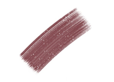
For rendering, I usually paint using some square/textured brush (kind of like the one pictured below and a low opacity circle brush (the standard in photoshop, and most painting software). Lately I like using brushsets from the digitalbrushes account here on tumblr.
I sketch, and then paint underneath the sketch. after i paint for long enough I either delete the sketch layer or I merge the two. I like to add texture where the midtones are. I think a lot of my "rendering style" is probably owed to that.
I like adding texture around midtones. I also like adding limited random variation of color and value to large areas. Like below, you can see that I added a slightly different shade of red to the lit part of the apple in step 3. If you add variation or slight gradation to the large light shapes or shadow shapes you can create the impression of depth. At the very least it looks more fun.
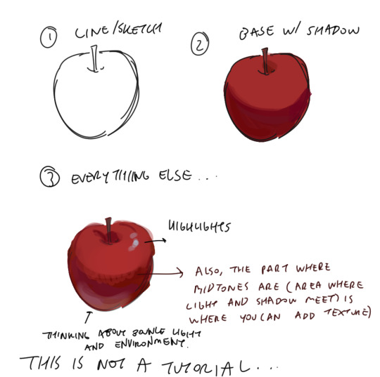
Also a disclaimer, but for the last two drawings I did I've kind of went off kilter. The process is the same but I used some oil paint brushes I downloaded and I pretty much added as much variation to every shape possible, which I would not recommend unless you're sure of what you're doing. But you can see here that even though I added variation (in color, brush stroke, etc) that the shapes are pretty readable and the light is very clearly separated from the shadow.


In terms of choosing color, I had a long stretch of time where nothing would look right to me. Things were colored really literally, with no regard for lighting or ambient color (background/environment surrounding characters). I would often fix things up using a gradient map and using color burn or multiply on 14%. Honestly, this is still a great way to make things look coherent, I really like these gradient maps on the CSP asset store if you want to look into them.
My colors improved a lot after I developed an eye for color/figured out what colors I like to put next to each other. I did this by saving and making a folder of any piece I saw that I liked specifically for color. By doing this I got a clearer sense of what kind of color schemes I tend to like. I suggest doing this as well so that you can figure out what kinds of color schemes and pairings you tend to enjoy most.
Hopefully this answers your question <: ] Apologies if this doesn't make sense, it's a bit of a long post.
#ask#I wish I could help out more anon ... I often feel like I have no style consistency so seeing this ask surprised me#i think unfortunately i do work partially intuitively so its a little hard putting this into words
89 notes
·
View notes
Note
Hey Neyla! I hope it’s ok that I ask but is there a brush setting you prefer on procreate? I’ve been inspired by your art for eons but I can’t comprehend photoshop. You can totally disregard this if you don’t use procreate though!
Hello! I don't know how long this message's been sitting in my inbox because i didnt check in for a while 🥺 I hope you get to see this either way!
I don't use procreate unfortunately, but I can explain the settings I use for my brushes on CSP in general, and if it works like any other art software then you should have similar settings on procreate
for sketches/linework, I will very often use an opaque & slightly textured round brush. the most important for me is for the brush to have that fuzzy sort of texture that gives the impression of using a pen/marker on paper.

note that i am actually terrible when it comes to line weight, it's definitely not something i work on a lot other than in backgrounds, so I don't actually bother too much with pen pressure settings.
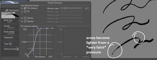
the only rule I abide to is to always set the minimum value above 0 (anywhere between 20-30 is what I use). this is because when I started drawing, I used to be very heavy-handed and would wear out my pens too quickly-- so setting a minimum can help you become more aware of how hard you're pressing on your pen and make gentler strokes.
another fun little setting i use is opacity: like I said, I use opaque brushes for lines, but I like to reduce a tiny bit of opacity when brushing very lightly to give that impression of pen on paper.
There's a couple more brushes I use for coloring or rendering; the major sticking point being that I don't use pen pressure to control brush size that much. If I want to make thinner/smaller strokes, I'll simply reduce the brush size because it's easier for me to control!
(also, opacity is something I'll use a lot more when I'm working on colors)

just know that this is my way of handling it, and it may not suit your style. pen pressure may be another artist's best friend, so please make sure you try out what works best for you :)
finally, some art softwares come with stabilization. I don't use it personally, unless i'm actually trying to do really smooth curves (which is practically never). stabilization can also make CSP lag a lot with higher values and large brushes. the use of stabilization doesn't make you a bad artist or a lazy one, and not using it can make your lines look a tiny bit wobbly if you're not used to doing quick strokes. use stabilization at your own leisure!
on a different note, i know this wasn't part of the question but I'm bringing this up since it's something I tend to hear from people who say they were inspired by my art (thank you by the way🥺💕!!) : don't be misled by artstyles that "make it look easy"! my sketches may look very simple and natural because i'm more adept at bringing out the essential and discarding details in a design. this is not necessarily what you want for your art style; maybe you like drawing details a lot, maybe you prefer the lazy way out going straight to the point. neither are good or bad, only what you like to do matters.
also, if you're frustrated by your work, don't be afraid to draw over it as many times as you want, adjusting things with the lasso tool or deform if something feels off then drawing over again. sometimes you'll be satisfied with your first take, and sometimes you'll need 3 bases before its acceptable (examples below)-- it all depends on your mood, energy, motivation, desired outcome, format, or even just randomness
oh and, sometimes the best way to enjoy drawing..is to find something to obsessively draw (,:
take care!
236 notes
·
View notes
Text
Horror game idea I have.
So Fnaf Security Breach fucking sucks right?
But I thought it could be vastly improved by
- Making the animatronics way more threatening
- Make your visibility / ability to navigate limited shit so you have to use the cameras to navigate
- Remove all your defenses
So here is my idea. You are a repair dude called into some building to do repairs.
Uh oh it's full of monsters.
So your repairs and get out.
Game play takes place in a top down view. Single consistantly sized rooms similar to Legend of Zelda.
Your character has a flashlight that eliminates a cone of light, everything outside of that besides vague outlines are pitch black.
Use security cameras to check for threats in neighboring rooms. Different monsters require different strategies.
No weapons, and no hiding. Your only options are to evade or avoid.
I have some ideas for monsters that require unique strategies. And I have a design concept in mind for the monsters to.
So in fnaf one there is a pretty unique dynamic in night four and five where Freddy is the most threatening but the most predictable. You have to keep watching him otherwise he will move. Now bonnie and chica are more predictable since you can literally just check your lights, but juggling all of them at once creates a unique tension that I want to try to mimic.
I'm shooting for either black and white pixel art or maybe a slightly surreal rpg-maker visual style.
This is also going to be made completely from scratch without a graphics library. Because in my brain all this game really needs for graphics is tile rendering, Sprite rendering, and basic buffer writing. Which I think wont be too hard. Especially with Sokol taking care of the boring stuff.
From scratch is also good because I cant actually think of a way to impliment some of the visuals with SDL or even Raylib.
But I can think of how to do it with shaders.
Anyway that's kinda what I'm working on, well see how it turns out.
20 notes
·
View notes
Text


trying to figure out what kind of lighting and rendering choices it is that makes the two games look so distinctly different by trying to make a pn1 shot look pn2-y.... i would love to try this the opposite way too. i absolutely eat up both styles just as much in different ways.
my findings are less of a fisheye lens, making the eyes appear more focused, more color contrast in that most shadows feel shaded with a darker complimentary color vs. feeling more "shaded with black", brighter environments overall and more light saturated colors, definite soft blur and bloom effect, especially on the backgrounds and brightly lit areas like eye shines and goggle reflections...
smoothed out some of the polygon's on my dude's face bc i was trying to figure out what makes his model look so different across games and i think the answer is he had very thick eyelids in the first game and it changed the look of his face a lot? his eyes only look slightly bigger in pn2 because of that i think. also his mouth shape is a bit different in that the melomental folds (?) seem to extend out further... but honestly there isn't a whole lot of difference between them
94 notes
·
View notes
Text
I'm actually kind of spooked by machine learning. Mostly in a good way.
I asked ChatGPT to translate the Christoffel symbols (mathematical structures from differential geometry used in general relativity to describe how metrics change under parallel transport, which I've been trying to grok) into Coq.
And the code it wrote wasn't correct.
But!
It unpacked the mathematical definitions, mapping them pretty faithfully into Coq in a few seconds, explaining what it was doing lucidly along the way.
It used a bunch of libraries for real analysis, algebra, topology that have maybe been read by a few dozen people combined at a couple of research labs in France and Washington state. It used these, sometimes combining code fragments in ways that didn't type check, but generally in a way that felt idiomatic.
Sometimes it would forget to open modules or use imported syntax. But it knew the syntax it wanted! It decided to Yoneda embed a Riemannian manifold as a kind of real-valued presheaf, which is a very promising strategy. It just...mysteriously forgot to make it real-valued.
Sometimes it would use brackets to index into vectors, which is never done in Coq. But it knew what it was trying to compute!
Sometimes it would pass a tactic along to a proof obligation that the tactic couldn't actually discharge. But it knew how to use the conduit pattern and thread proof automation into definitions to deal with gnarly dependent types! This is really advanced Coq usage. You won't learn it in any undergraduate classes introducing computer proof assistants.
When I pointed out a mistake, or a type error, it would proffer an explanation and try to fix it. It mostly didn't succeed in fixing it, but it mostly did succeed in identifying what had gone wrong.
The mistakes it made had a stupid quality to them. At the same time, in another way, I felt decisively trounced.
Writing Coq is, along some hard-to-characterize verbal axis, the most cognitively demanding programming work I have done. And the kinds of assurance I can give myself about what I write when it typechecks are in a totally different league from my day job software engineering work.
And ChatGPT mastered some important aspects of this art much more thoroughly than I have after years of on-and-off study—especially knowing where to look for related work, how to strategize about building and encoding things—just by scanning a bunch of source code and textbooks. It had a style of a broken-in postdoc, but one somehow familiar with every lab's contributions.
I'm slightly injured, and mostly delighted, that some vital piece of my comparative advantage has been pulled out from under me so suddenly by a computer.
What an astounding cognitive prosthesis this would be if we could just tighten the feedback loops and widen the bandwidth between man and machine. Someday soon, people will do intellectual work the way they move about—that is, with the aid of machines that completely change the game. It will render entire tranches of human difference in ability minute by comparison.
50 notes
·
View notes
Text
Things I found out about Tunnelers in WWI

For all you wonderful writers or just generally curious people here are some things I learnt about tunnelers in WWI that might be interesting or useful
Turns out watching Peaky Blinders with your family is more than just your aunt tearing Cillian Murphy's riding style to shreds, your uncle being disgusted by English beer, your mother thirsting for Campbell and your father, cousin and brother all banding together to tease you - you can actually learn something
DISCLAIMER: This isn't professional at all - these are recollections from things I learnt this from the discussion that came after watching. The most information is from someone who is a military historian HOWEVER also influenced by recollections from family members that served on the Bavarian/German side so there may be differences. If I've made any mistakes, please let me know so I can correct them. I hope you can still find it useful/interesting...
There will be mentions of war and death - please be careful as some things I've written down are absolutely horrid
Summary
They worked for 18 hours a day
Tunnels were upto 20 km long
The largest explosion could be heard in London
Exploding mines would often throw material and men into the air and also bury many alive
Listening for enemy tunnelers was part of the goal
Underground mine warfare stopped a year before the war ended
What follows is a more detailed description, but please take care as it is not a nice read.
1. The Minewar at the West Front ended long before the war
2. Listening to the other side's digging wasn't a terrifying accident- it was literally their job
The mine war at the West Front was from 1914-1917, as opposed to the one in the Alps which was until 1918. Like it was shown in the show, tunnelers from both sides tried to dig under ground to try to plant explosives on the opposite side to either harm military infrastructure, cause explosions under the trenches of the opposing side or prevent advances, but mainly due to the fact that they wanted to stop tunnellers from the other side by making their tunnels collapse.
In 1917 a gentleman's agreement was reached to stop the use of tunnelers, while the fighting above ground continued.
The Tunnelers were then either moved to different fronts or assimilated into the normal trench war. However, British tunnelers weren't involved in the Alps so it is likely they would have stayed at the West Front with other common soldiers.
3. They wouldn't have just been fighting Prussians
To find out where the opposing side was building their own tunnels so that they could locate them, flood them (to destroy the gunpowder) or plant explosives to that they would collapse and kill them, or to face them on a one on one fight, they had to listen constantly, and since the other side was trying to do that too, silence and working as quietly as possible was paramount. Even things like whispering was incredibly dangerous with everyone was constantly afraid of making too much noise.
Each tunneler company had about 500men who worked for 18 hours a day. They would also try to flood the tunnels of enemy forces to render their gunpowder useless.
They tended to draft people already familiar with tunneling and underground words (like in mountains) and so the British didn't just fight Prussian tunnelers but also Bavarians (even if they both fought under the 'unity' of the German Reich) and they wore slightly different uniforms, although I suppose in the tunnels the difference didn't really matter (also: it would be unlikely that an actual Prussian soldier would wear a hat)
4. Important Battles
In the Forest of Argonne (mountain and forest land) there was fighting in late 1914, summer 1915 and late 1918 (when the war ended). In 1914 and 1915, there was mine war.
In 1918, Americans also fought there where they led an offensive right up to the end of the war to pressure the Germans (but it was mostly US and French soldiers). Argonne, just like Vanyuois was a village which was completely destroyed due to the explosions caused by underground mines.
1916 was the Battle of Verdun (early to mid 1916) which was one of the biggest battles and included the use of tunnellers, who were partly responsible for the many explosions that gave it the name "Hell of Verdun" with about 10 000 granades and mines going off hourly which threw material and people into the air, which were partly buried alive and suffocated. It was also called "Bonemill". As many people couldn't be buried as their bodies lay in no-man's land, the stench, especially in the summer was horrible. It was also common that the soldiers went days without food and had to wear their gas masks for hours at a time. They also used a lot of horses but thousands lost their lives (dozens daily).
Mid to late November 1916 was the Battle of the Somme (partly simultaniously to Verdun) and an offensive of the Brits and French against the German troops but didn't achieve anything but killing over a million people. Brits took over because France had been weakened by the Battle of Verdun. It started with a seven-day non stop shooting by the British artillery while the ground of the German forces was to be blewn up by mines. Here was not only Prussian, but Bavarian presence
On one day 19 mines exploded under German troops with with things and dirt being thrown over 1000 meter into the air. These explosions also created the infamous Lochnager- Krater who is over 20 km wide. There was also the explosion of the Hawthorn Ridge Mine near the German command centre called "Schwabenfeste", which despite reinforces from the Bavarian Divisions was lost to the English. Despite that, the Battle of the Somme is regarded as one of the greatest failures in British military history.
Battle of Arras
Arras was a French city, where the allied troops used the already existing tunnel system under the city and expanded on it to prepare for battle. The tunnels of Arras were the largest building project of WWI and were created shortly after the Somme, with tunnels over 20km long. It created almost an entire underground city including a hospital and kitchens. Before the attack, thousands of soldiers waited for days underground.
Battle of Messines
In mid to late 1917 there was the Third Battle of Flanders which included the famous Taking of Passendale.
It began with the Battle of Messines, where British tunnelers caused another gigantic explosion (over 600 t of gunpowder) which killed over 10.000 Bavarian soldiers. Apparently, British, Canadian and Australian tunnellers had dug for nearly a year to plant the mines consisting of over 20 tons of dynamite each, with the tunnels being upto 8 kilometers long. This explosion is regarded as the loudest noise ever created by humans and could apparently be heard in No 10 Downing Street.Messines can be seen as the most successful offence of the Allied Forces. Even today, unexploded mines are still buried that didn't explode although by now nearly all the tunnels must've collapsed or been flooded so that they aren't dangerous anymore.
I'm not going to ask if you enjoyed, because I don't think content like this can be enjoyed, but perhaps it was interesting/useful for some of you.
Take care, Val xx
138 notes
·
View notes
Note
Hello, orokay!! I've adored your art for years now and I was wondering if you have any tips on how to draw and paint/render scars? I can never seem to get them to look right, any help is appreciated! Hope you're having a good year!
Hi anon, thank you so much!
Sorry this took a minute to reply to, I've been trying to figure out how I wanted to respond. For me, a lot of questions about how I do certain things are kind of tricky bc generally the answer is 'idk I just try things and tweak it until it feels right' and I don't really feel qualified to give art advice bc most of the time I'm just making stuff up as I go, but I know that's not really a helpful answer 😭
My art style tends to lean towards simple and stylized, so for scars I try to limit them to three colors at most, less if I feel like I can get away with it. It also depends a lot on the scar since there are different types of scars. Usually how I pick the colors I use is: one color darker than than the skin tone (shading), one slightly lighter than the skin tone for the injured flesh and occasionally an even lighter color for highlights. I'll include some examples under the cut. But please please please keep in mind wrt scars 99.9% of the time I'm just winging it and going off of what I think looks cool, I don't know anything about the science behind how people scar so please do your own research if you want to be accurate.
I'd say when approaching/researching scars you need to consider a few things:
Skin color of the person- Scars look different on different skin colors and different people scar differently. I think this is one of the biggest things to remember! Color pick for the scar based off of the character's skin tone and shade. The color you use for scar tissue on a person w/ light skin is going to look unrealistic and out of place on person with dark skin, doubly so if the undertone of their skin is different (ie. warm vs neutral vs cool undertones). It's so important to look up references because everyone scars differently and skin type can make a huge difference on how a person scars.
Color of the person's blood- same vibe as with blushing/lip color/etc. if your character has blue blood, the scar likely isn't going to be pink. This probably isn't something you're going to have to keep in mind a lot, but just in case. This also kind of ties into the first one because if a character has a non-human skin tone, like blue, and red blood then the scar is probably going to be more of a purple tone, for example.
Type of scar- think about the injury and what kind of scar would result from it. I'm not a doctor so idk how scarring works and generally go off of vibes, but if you want to make it as accurate as possible, I'd suggest looking up images of scars from whatever type of injury you want your character to have. I used to work with dogs and I scar easily so I have a lot of bite/scratch scars. Some of them are lighter than my skin and raised while others that were less deep are darker and on the surface of the skin (aka no texture). My brother has a very deep dog bite scar that's left a dent in his skin and light, pink and shiny scar tissue. Basically, if you know you have the stomach for it, I 100% suggest looking up examples of the type of injury you're thinking of so you can see how that injury tends to scar. Is it hypertrophic? Atrophic? Keloid?
How was it treated and how old is the scar?- is it a burn scar that received skin grafts? is it a surgical scar? stitches? did it heal well or was there infection? All of these things can change how a wound heals and scars. New scars are going to be much more stark, especially if they're still healing, and most scars fade over time.
Examples under the cut...
Some examples from my drawings over the years:
OC w/ healed burn w/ skin graft stylized and very simplified // really simple, sketchy scars on Narci:
This iteration of Blue's blood is green so the scar on her cheek is green (we're going to ignore her lips and the flush on her ears lol):
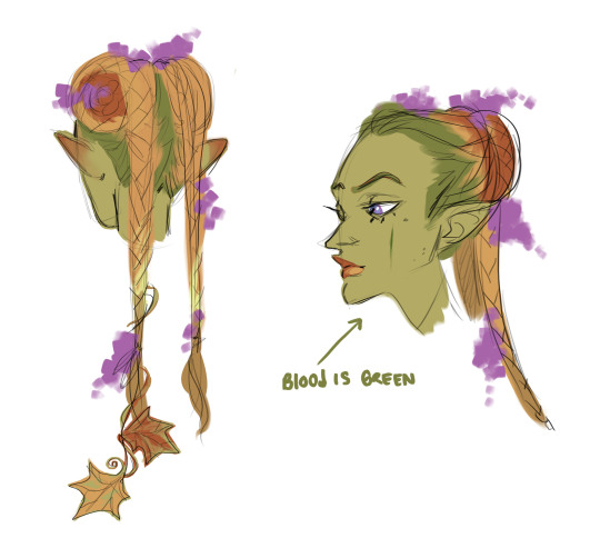
raised scars on nikora and blair's cheeks:
#answered asks#i cannot stress enough i go off of vibes 99.9% of the time im not an expert anything i get right is purely by accident#pleaaaaaaaaaase do research#if anyone else has actual medical knowledge and wants to give tips/point anon towards resources please feel free to add on#i'd like to learn more too ^^
17 notes
·
View notes
Note
Thanks earlier for your advice on drawing Elfilis! If it’s ok to ask this next, what’s a good way to experiment with brushes for an art style? And may I ask how you draw the outline things you do? They’re really cute :)
Long post that got a little rambly. 😅
When I experiment with brushes, I'll generally open up the "all" tab for them and start picking out ones that look interesting. Just start scribbling things on the page!
Generally, when I'm looking through brushes, I have an effect I want to achieve in mind. For example, if I want to make a soft looking sky, I'll check out whatever blending brushes and airbrush type-things I have in stock.
Also, if you haven't already, you can go online and look for brush packs to add to your program. Download whatever looks neat, if you don't end up using it it's no big deal!
Don't be afraid to use brushes in ways they weren't intended for. Right now, my favorite brushes for line art are ones that seem meant for color blocking. (I'm using GDQuest's "Pixel Grunge" and Krita's default "Charcoal Rock Soft".) I like slightly fuzzy, gritty-ish line art, so these work well for that.
You can also try making your own brushes, either from scratch or by playing with existing ones from the program. Last summer, I made a brush out of a normal watercolor brush and a Paint 3D render of Elfilin. Here's something I drew with that. Please, don't be afraid to get silly with brushes!
In addition to experimenting with brushes, I love to play with filters, especially to make backgrounds more interesting. If you use Krita, you can go to Filters > Start G'MIC-Qt to play with a big list of powerful, fun ones. (I also reccomend playing some with Filters > Artistic > Halftone).
In regards to line art, I generally use the two previously mentioned brushes (GDQuest's "Pixel Grunge" and Krita's default "Charcoal Rock Soft" both scaled really small) to get a grungy, textured look. Like most people (I think?) I do my line art over a sketch layer which I've made semi-transparent.
I leave little gaps in my line art, which I've heard can contribute to an "illustrated" feel? Anyways, I color in between the gaps as if there was a continuous line there. (I do my colors on a layer below the lines, which I also think is common practice) Sometimes I'll tint my line dark brown or dark blue to add to the color palette of a drawing. It's also fun to set your lines to "alpha lock" and play with colored line art or airbrushing a gradient onto it.
The most important thing about your art style, though, is that YOU enjoy drawing in it! If drawing things a certain way is too hard or stresses you out, you're always allowed to draw it a different way. You're also always allowed to "cheat". I totally have templates made for things I know will be a pain to do (eg. Sectonia's wings) so that I can trace them when I need to draw them in a piece.
Good luck with your art! Have fun!
10 notes
·
View notes
Note
The question was vague on purpose but let me rephrase it: how and why did you start and what would you consider as your “milestones”?
Milestone as in any “victory” or advancement you hold dear to your heart, in that department
Better?
ok yes this is better thank you 😭 i figured it was vague on purpose, just didn’t know what direction to go with it soo… ANYWHO. i guess this is my first time more comprehensively talking about my art journey and progression lol
i am one of those artists who has been drawing for as long as they can remember. from what i’ve heard from family members, i guess i’ve always sort of had a passion and/or proficiency in art. apparently when i was really little, when coloring, i’d always color exactly in the lines. and i guess after that point, the art thing stuck!
i think most of why i’ve kept drawing, and making various kinds of art, is because it’s something that i like well enough, and can keep me easily entertained for prolonged periods of time. that, and the actual creative outlet that it allows me to have. (and hey, disregarding the fancy art supplies, it’s not super expensive either) growing up, and tbh still, i didn’t really have much of anything to do, so i just kept making art to have fun and keep me occupied.
as far as milestones and art progression goes, i will say that a solid win over the past couple years, has been seeing my art consistently evolve and get better and better. like, looking back at some art from a couple months, to even a year ago, is a little jarring tbh 💀 it’s a good thing though.
i guess the first time as of recent that i had a more solid art milestone was early 2 years ago. i didn’t really do anything super different or monumental, i just made a noticeably better drawing than usual and the skill level steadily progressed from there. i don’t think there’s been a whole lot since then that’s been of note. like i said, it’s mainly just been steady progress as time goes on. but, over the past couple days, i have been pretty proud of my success in trying out a slightly different art style than usual.
as much as i do like doing a more fully rendered, realistic-type art style for drawings, and i will likely keep doing it, i do wanna make different things. branching out is fun and also… helpful for your growth as an artist.
uuuuuhhhh i think this is all i have to say on this rn? feel free to ask questions
4 notes
·
View notes
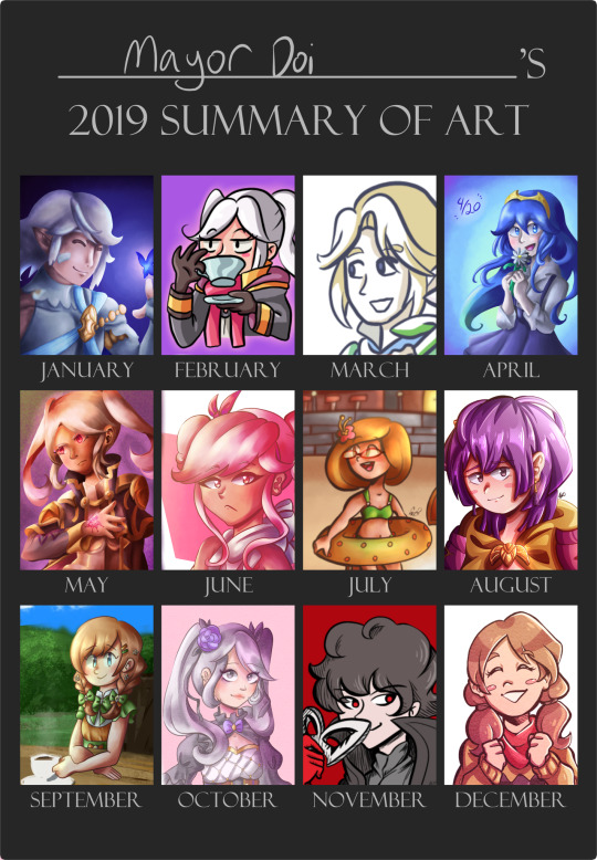
Text
huzzah! 2023 art review!
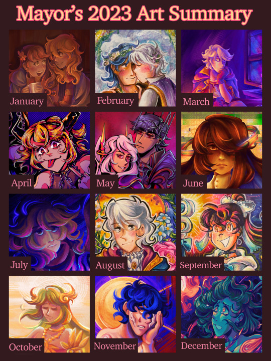
it’s almost the end of the year, wowzers! i always do one of these art review thingies since i always like looking back at the art ive made :> last year i posted the review on my other account and left it at there, but this year i want to actually review each month and notable pieces i made… just for fun!
this post is very much just for me lol, but i hope someone out there enjoys it. month-by-month review + previous year in reviews will be under the cut! 🩷
(also, shoutout to tumblr for going rouge and posting this way way earlier than i had scheduled 😍 luckily tumblr post editor is weirdly based and kept all my embedded links when i pasted it from the old one? hell yeah)
Jan: started off the year with a painting of my beloved ocs after ending last year with one! (and i will be talking about my older year in reviews, rest assured). this was my obligatory cute shared scarf art, and i wanted to try attempting to render something more involved like two characters and draping cloth. i don't think the result was too shabby, though this was before i discovered my favorite rendering brush for procreate, so in hindsight, it looks kinda flat and boring now. where's all the crunch? ah but anyway, starting a whole year with your art in a mid place compared to what you made later on is par for the course.
Feb: probably the month where i had the least art to put here, i remember scraping a little to find one. this was a chrobin piece i made in my sketchbook! nothing too noteworthy... i think i tried doing a slightly different approach to coloring with markers (applying the color before the lineart) and incorporating paint, but i remember this one giving me trouble. first of all, the size i drew this in was really small (it was in a small sketchbook and i decided to mask the margins with comparatively wide masking tape), and second of all the paper was absolutely NOT built for gouache, so it ended up a kind of wrinkly and muddy mess. i mean i'm still not the best with gouache now but still, not my best.
March: a redraw of a robin piece i made back when i was still on amino. i probably won't share the old versions because they're crap, so just trust me on the redraw part. anyway, the last iteration of the concept was in 2019 i think? and while i was proud of it for a while, its luster finally faded and i decided to try doing it again in procreate. this was when i discovered my love for the soft chalk brush in the jingsketch basics brush pack. for a while i've been using the hard render brush in that pack to render, but this one's texture and chalkiness totally changed the game. i was in love!! also tried to be a little more crazy and vibrant with how i applied the base colors, using saturated colors across the board. this process didn't consistently stick, but i think it yielded some neat results here. another hit from this month was my piece of grandmaster robin, since i'm really proud of the detail here!.
Apr: guys, april was MY MONTH! i remember making so much art in just a few weeks, something just clicked in my brain i guess. i chose my drawings of hagane rin and len since this was when i truly began to get comfy in my lineart era (after the grandmaster drawing). this month was full of detailed line drawings at that, but this one was what made me both enjoy the process a lot and do more of it. hell yeah. other hits: vocaloids at mcdonald's (i drew a background omg!!!), alice in ny fanart (just the euphoria of finally nailing a composition for this piece after struggling with it in november was great), and the end-world normopathy fanart (it's a line drawing, and a traditional one at that. i was happy with incorporating gold accents into my typically monochromatic style when it comes to my line-focused drawings as well as getting tamari's mechanical details nailed).
May: hell yeah. evil power couple time. this one was another line-art heavy one since i thought it fit the vibe. the softer colors in the background i feel like could have been executed a little better, but i do like how this came out, especially the armor (good god fe armor is a pain to render, but i think i've gotten better at it this year! middle school me would be so jealous). not much else to say here. Other hit this month would be my alice of human sacrifice fanart, another line-heavy traditional drawing. i think it turned out nice, especially for a crammed composition lol.
Jun: another end-world normopathy-centered fanart. i mentioned it in my og post but i was trying out a slightly different painting style where i did a black-and-white base first and then added colors as an overlay (also in the initial upload of the post i was so fucking meek about posting fanart of mariyam's alternate design teased at the end of the mv?? 😭 sorry about that, i've edited it out but it's still in early reblogs. kind of cringe on my part). i didn't end up committing to this consistently cuz the beginning process was kind of tedious (plus i'm too inept to pay close attention to values anyway), but laying down all the colors after the long rendering process was rewarding! it's a nice alternative with i get bored with my other method to yield basically the same-looking result lol. this month featured some more pieces that tried using this process, like the one with my oc alice, lucina and dark pit hanging out, and f!robin's resplendent design from feh.
Jul: ah yes my typical flavor of "improvised oc art that i invent new symbolism for on the fly that i apply meaning to after i'm finished". kinda just wanted to paint something again because i've been doing a lot of line drawings lately and to go back to my old painting process again. honestly, i mainly picked this one because i wanted more oc art and non-lineart drawings to be in this chart lol. art i made this month that i'm real proud of is this family pic of some young cryptonloids (i really like how the colors came out on this one!) and my birthday drawing for miku's sweet 16, which was originally completed this month. i opted out of considering it for my july art to avoid confusion. also also, this very whack pathological facade fanart (plus some doodles i didn't post) opened my eyes to the beautiful world of NOISE and HALFTONES and just slapping crazy textures onto my art like nobody's business. hell yeah.
Aug: ok this one is kind of another piece i picked to represent this month that isn't quite my favorite but i chose anyway for the sake of variety (in this case, i wanted more traditional pieces and non-vocaloid stuff). for once, i used my bigger sketchbook to make a big n detailed piece for my boy's new brave alt in feh (that game has zero significance to me outside of cool alt costumes for my faves). my actual fave from this month was young miku/meiko/kaito chillin in their house; i'm real proud of the background and lighting! but i still like this robin too ofc, big fan of how the colors came out ;3
Sep: another traditional drawing! felt compelled to draw kandy again, specifically her evil miitopia great sage incarnation :> this one was pretty standard in terms of process, and not much was really done to experiment. just wanted to draw something cool of my girl for my sketchbook. other fave from this month is this sketchy miku i did, i like how loose it came out and how the colors pop.
Oct: pretty palutena!~ i think i went into this trying to do something a little different with my painting process (i think it was to try incorporating more colors in the shading like the blue in the dress or more saturated colors near the focal point, but i can't remember LOL) or try rendering a more detailed character w/ a background (even if the background was pretty vague). i like this one! especially the color cohesion, it's pretty swag imo. other faves from this month was fanart i made for the song "orbit" since i also like how the color cohesion came out for this one, and the maid dress/crossover drawing i made for cringetober. no other words needed to explain why.
Nov: another digital painting! it's yet another ghost song, this time "uncanny". i really loved the aesthetic of this song, especially its bold colors and simplistic shapes, so i wanted to try capturing it in my style. i really love how the colors turned out on this, though i've yet to truly recreate what i like about this particular painting again? regardless, it's one of my faves, deserving of one of my favorite ghost songs. few other highlights from this month would be my obligatory purple robin drawing for the month, my sketchbook drawing of my luka design, and my fanart of utsu-p's song "ga". i like how i was able to do a couple of my different "styles"/processes this month rather than just sticking to just one. they all have their own feel to them that i like to play around with depending on the idea.
Dec: and finally, we're at the end. like july, we have another heavily improvised oc drawing with symbolism i came up with on the spot. that's just how i do things. anyway, this turned out really good in my opinion! i tried to stick to a color palette i saved in procreate a long time ago, and damn is it a fine palette. it helped me get a little loose with the colors and solely focus on creating a strong composition with colors and contrast rather than get hung up on sticking to typical color palettes. i also really like how i did the background by essentially using the liquify tool to swish all the colors around and then polished it a little on top. made for a really cool effect. other notable work would be the companion piece i made with my other oc that had a similar style since i liked the process of this one. there will probably be more as of when i'm drafting this (at the beginning of december) but i just wanna be finished w this post already bro
all around, very satisfied with this year. there was kind of a lot of song fanarts (something that i am somewhat guilty about because it feels like i'm unoriginal or something, but i swear it's cuz i'm really passionate about vocaloid music and need to act on what my braincells do when i listen to certain tracks), but overall i'm happy i was able to maintain some slight variety in the art i made this year through my chosen mediums and "styles" or processes i use.
this was the first year where i really wanted to have a fully rendered piece i'm proud of to represent every month. now, i wouldn't recommend this since forcing yourself to make art is not a good mindset to be in (sometimes, with how early i pushed some pieces out in certain months to get the monthly quota over with makes it seem like i'm getting paid to have a pretty year-in-review LOL). i was pretty lucky to not really have much burnout i guess?
~~~
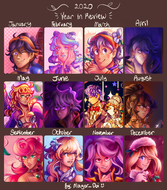
ok now that all that boring stuff is out of the way, here’s my previous years! this is the sixth year i have made an art review chart.


lightning round review time! (probably just gonna be more boring stuff)
2018: ok, so this was the year where my prime art hosting platform was… amino… specifically smash amino. as much as i could rant about how much i hate that place now, i cant deny that it got me creating a lot of stuff. also it was an actual date archive for my traditional art because i never got in the habit of dating my physical art 🙃 uh don’t mind the absolute horrid graphic design on this one. i grabbed a template which was probably saved from a bunch of other places from amino and… didn’t really know how the formatting was supposed to work. first of all, i edited this in picsart on my phone and the chart wasn’t transparent, and second of all i didn’t know you were supposed to crop only the main focus so it could fit and be a little more clear. hence why its such a visual eyesore. i've been meaning to remake it to make it a little less bad (once i get my hands on the traditional pieces again), but i guess its shoddiness adds to its charm, much like amino. but anyway, 2018 was a bit of a turning point year for me in the smash amino art biz. on amino, i mostly made copies of official artwork from smash (character renders and so forth), and this year i actually tried experimenting with my own original ideas and scenes (my copying roots were still around at this time tho, seen in the november drawing which is based on ssbu’s mural art. i mainly moved on to copying artwork from feh). this was also the year i got my ipad and finally got into making digital art. i didn’t have the knowledge of digital art that i have today obviously, so colors and lighting were usually on the plain side. i also hit my stride with making more ambitious traditional art that incorporated backgrounds and such, and they’re pieces i’m still really proud of!
2019: so, i actually made this chart some time in 2021 or 22 because i didnt make an actual chart in 2019 officially (i forgor). which bums me out because i deleted my amino account by then, so a lot of dates for traditional pieces were flushed down the toilet the one time i needed them. so, to compensate, i tried scraping any digital piece i could to fill in some spaces, which is why some are more underwhelming than others. but yeah since this isn’t fully accurate to my art progress that year, 2019 is a bit fuzzy. main thing of note that year is midway through i got really REEAALLY into fire emblem: three houses and drew a lot of art of the characters (not shown much on the chart because they were mostly sketches and whatnot). imo there’s not much improvement or stylistic changes from 2018 in this year to note. 2020 on the other hand…
2020: if it wasn’t clear, this was my jojo phase. i got into jojo at the end of 2019 and my downward spiral into jojo hell bled into 2020 :p as such, i made a lot of jojo art. and because i made a lot of jojo art, this was the year where my style shifted drastically. i feel like it’s a common phenomenon for artists getting a total stylistic makeover after getting into jojo. whether it’s to imitate araki’s style or just trying to accommodate the characters’… features, i ended up facing the same thing. gone were big round heads with tiny mouths and in were tree trunk necks and higher effort placed in learning anatomy, both for the full body and well as the face. it was around may of this year i got procreate and moved on from ibis paint for digital art. while i still have my personal hangups with procreate, im glad i ended up investing in it since it really just works for me!!
2021: around summer 2020 in peak pandemic mood, i decided to indulge in some nostalgia and listened to some old vocaloid tunes from my middle school days. and then i kept rediscovering more stuff, and then i ended up browsing producers' individual discographies, and uh yeah i am still suffering the consequences of my vocaloid renaissance to this day. while it wasn't prominent in the 2020 chart, it really started to leak its way into my art subjects in 2021. however, i still primarily stuck to my roots with fe/"smash"/jojo fanart. this year was mainly trying to find my style again i suppose? i had already learned the ropes of procreate, its limitations, and the options it has to aid with the art making process, so it was just a matter of flinging a bunch attempts at a ~style~ to see which one i liked the most. i did try finding a painting/rendering style a lot by way of copying (mainly guessing based on speedpaints) other artists' styles and process with digital painting which ended up growing into my own thing. i know they all sort of look the same, but march, april, and october of this year all had slightly different ways of doing all the shading n rendering for painting that i liked experimenting w/ in the future.
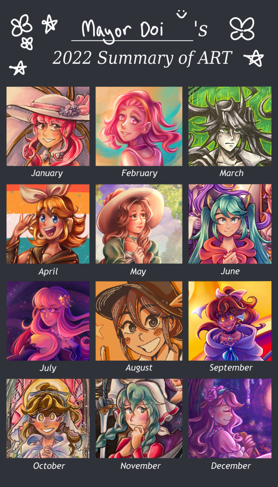
2022: by this point, i had fully gotten used to procreate and the methods i used to make art, and the vocaloid train had no signs of stopping. i think the main thing of note this year was that i was able to break out of the "5 million overlays of pink and purple color vomit" box my digital art was set it. while it used to amuse me when i first began abusing it in my art, i guess i just sort of grew out of it? it ended up making a lot of my art look homogeneous, and it took out the fun trial and error of picking the colors to match the atmosphere myself. i also tried to get more experimental with my compositions, mainly in trying to make them more dense with Stuff as well as finally get a little more comfortable with drawing backgrounds. besides those things however, i remember feeling my art progress was very stagnant this year, with not much noticeable change from january to december. perhaps i've gotten a bit comfortable with the state it's in. regardless, still a good year all around.
~~~
whew. THAT'S finally done with. if you made it to the end of this very me-centered ramble, congrats. i will probably make reblog additions in future years to continue this little saga. idk if i'll be as detailed as i was for the 2023 lineup, but we'll see.
#not art#year in review#year in review 2023#art review#fanart#mayors ocs#traditional art#digital art#long post#art#artists on instagram
6 notes
·
View notes
Photo
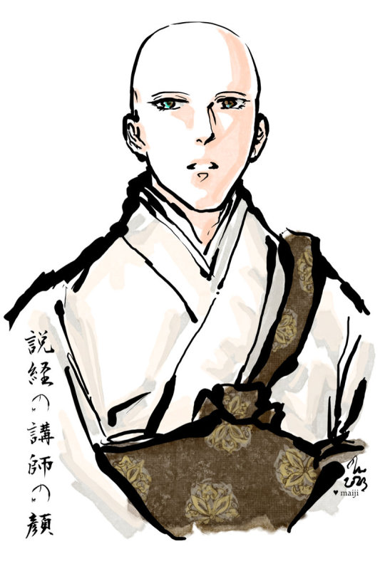
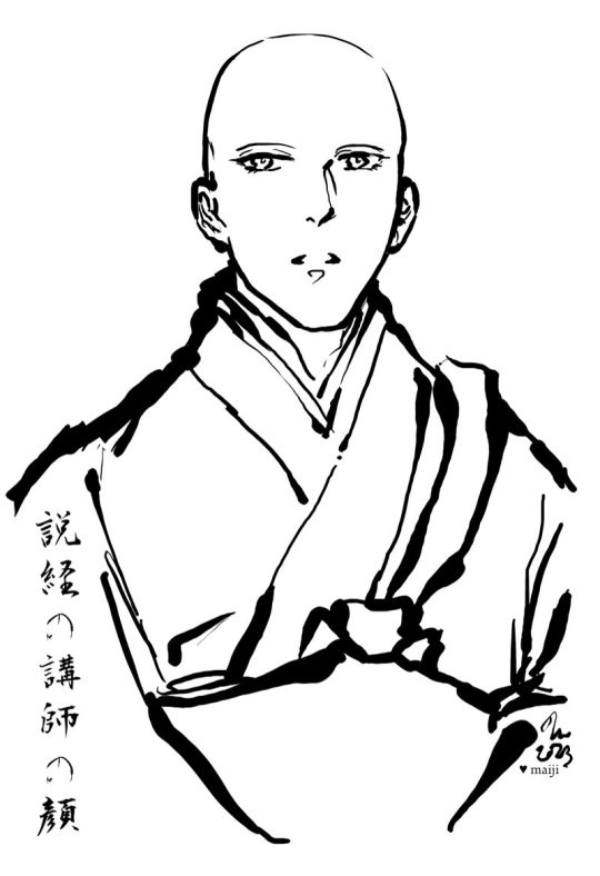
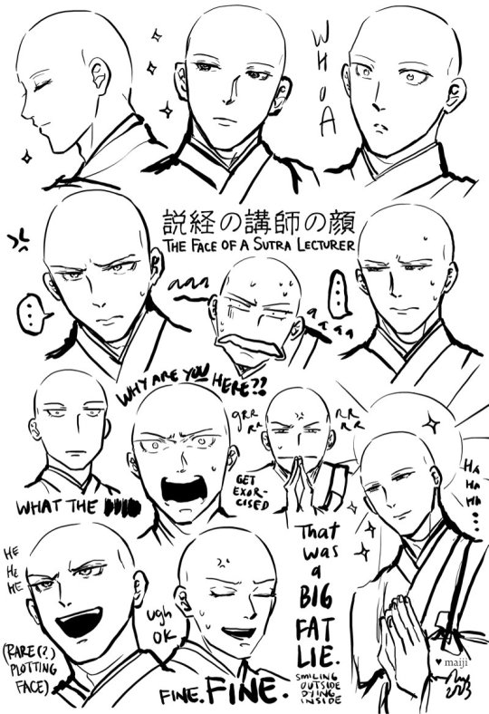
[image set: 1) Digital ink brush-and-watercolour-style illustration of the Buddhist monk Byakken from Nubatama wa Oujou Shinai in ceremonial robes. His lifted head, hooded eyes and slightly open-mouthed expression give the impression that he is in the midst of giving a talk. 2) Same illustration, but with only the lineart. 3) Byakken with a variety of facial expressions, looking serene, shocked, stressed out, annoyed, etc.]
説経の講師は顔よき。講師の顔をつとまもらへたるこそ、その説くことの尊さも覚ゆれ。
- Sei Shonagon, 枕草子 (Makura no Soushi / The Pillow Book)
“A priest who gives a sermon should be handsome. After all, you're most aware of the profundity of his teaching if you're gazing at his face as he speaks.”
[translation by Meredith McKinney (2006)]
"A preacher ought to be good-looking. For, if we are properly to understand his worthy sentiments, we must keep our eyes on him while he speaks [...]”
[translation by Ivan Morris (1967)]
More commentary below the cut!
I chuckled at this quote from The Pillow Book (and the entire story built around it) in Nubatama wa Oujou Shinai. (If you’re unfamiliar with The Pillow Book, it very much is like reading the blog of a thoughtful, witty court lady from the Heian era! Sei Shonagon can be quite tongue-in-cheek, even sarcastic, and in a lot of ways it’s amazing to see how little humanity has changed over a thousand years.) I also thoroughly enjoyed drawing Byakken-sama in ceremonial robes!
On the topic of faces, one of the many reasons I love Byakken is because of his extremely relatable facial expressions. Kuze Banko gives him a lot of these perfectly serene expressions, but also has no problems pulling him in extremely over the top directions too - usually from shock or stress, he seems to get into those kinds of situations very easily lol. I feel his emotions one hundred and ten percent! Because of the well-done range and writing, it really gives you the impression that even his serene expressions have something more behind them (like exasperation, resignation…).
For example, the (very minor early story spoilers!) context for “That was a BIG FAT LIE” (smiling outside, dying inside) is that Nubatama happily tells all the sobbing wailing people in her household that she decided to become a nun because she was so profoundly moved by Byakken-sama’s preaching and decided to leave the material world behind. Which as we know is a complete fabrication especially since Byakken spent most of his time with her arguing with her about why she shouldn’t become a nun. But everyone who hears the story is like hmm yeah!! That makes total sense!!!! And thus The Amazing Tale of How Princess Nubatama Was Inspired To Become A Nun gets around. The panel that cuts to Byakken standing in front of a bunch of people talking about this, with his beatific Mona Lisa smile that somehow manages to be really flat at the same time, captioned with a giant USO (“lie”) kanji, is pitch-perfect. The entire setup and background gives him this impression of “Ah, yes… that familiar feeling… of THE DESIRE TO COMMIT MURDER”. Every time I look at it, I laugh.
It was a good challenge attempting all the different faces while still trying maintain a sense of consistency about the character, especially thinking about how I would render him differently relative to all the other Buddhist monk characters I also draw. I tried to manage that through his eyes - his very expressive eyebrows, heavy lids, and the little lashes at the corners of his eyes and his lower lids, and some of the dips/head shape near his temples. It’s also interesting to click between the colour and the ink/line-only versions and see how the effect of an image can change subtly, yet noticeably once you bring in shading and colour.
#digital art#fanart#nubatama wa oujou shinai#the pillow book#sei shonagon#byakken#art by maiji/mary huang#heian#kuze banko
5 notes
·
View notes
Last Seen Blogs
xlookimataco
Maddie
vessencie-blog
Vessencie
boxofcreampuffs
uh oh spagettios
anime-lover-forever-1127
Anime-Lover-Forever-1127
pins123
Pins