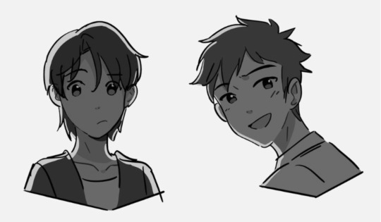
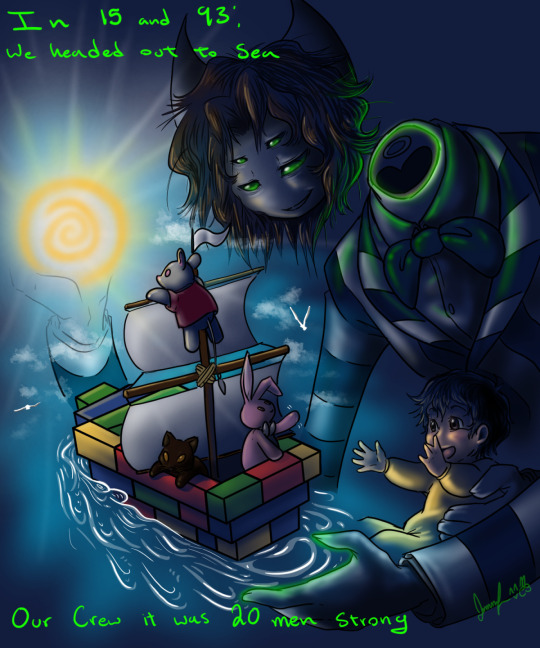
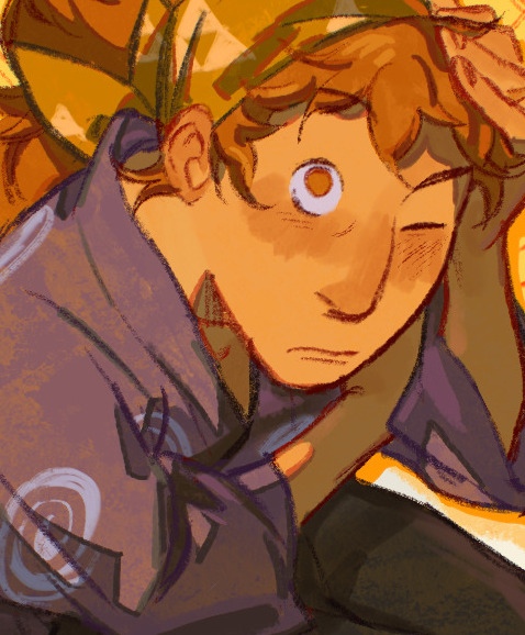
#this is actually a combination of traditional and digital
Text
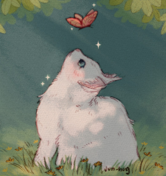
🌼🦋🐈🌼
#jun arts#gwiazdka#my cat oc#cat illustration#gwiazdka and słoneczko#illustration artists#digital art#this is actually a combination of traditional and digital#artwork#cats#cat#artist on tumblr#illustration#illustrators on tumblr
2K notes
·
View notes
Text
HOW TO GLAZE YOUR WORK WITHOUT A GOOD PC(or on mobile)/TIPS TO MAKE IT LESS VISIBLE
Glaze your work online on:
Cara app. It requires you to sign up but it is actually a good place for your portfolio. Glazing takes 3 minutes per image and doesn't require anything but an internet connection compared to 20-30 minutes if your pc doesn't have a good graphic card. There IS a daily limit of 9 pictures tho. Glazed art will be sent to you after it's done, by email. It took me 30 minutes to glaze 9 images on a default setting. Cara app is also a space SPECIFICALLY for human artists and the team does everything in their power to ensure it stays that way.
WebGlaze. This one is a little bit more complicated, as you will need to get approval from the Glaze team themselves, to ensure you're not another AI tech bro(which, go fuck yourself if you are). You can do it through their twitter, through the same Cara app(the easiest way) or send them an email(takes the longest). For more details read on their website.
Unfortunately there are no ways that I know of to use Nightshade YET, as it's quite new. Cara.app definitely works on implementing it into their posting system tho!
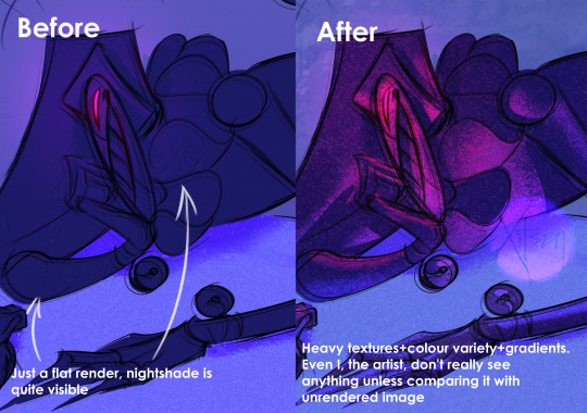
Now for the tips to make it less visible(the examples contain only nightshade's rendering, sorry for that!):
Heavy textures. My biggest tip by far. Noise, textured brushes or just an overlay layer, everything works well. Preferably, choose the ones that are "crispy" and aren't blurred. It won't really help to hide rough edges of glaze/nightshade if you blur it. You can use more traditional textures too, like watercolor, canvas, paper etc. Play with it.

Colour variety. Some brushes and settings allow you to change the colour you use just slightly with every stroke you make(colour jitter I believe?). If you dislike the process of it while drawing, you can clip a new layer to your colour art and just add it on top. Saves from the "rainbow-y" texture that glaze/nightshade overlays.
Gradients(in combination with textures work very well). Glaze/nightshade is more visible on low contrast/very light/very dark artworks. Try implementing a simple routine of adding more contrast to your art, even to the doodles. Just adding a neutral-coloured bg with a darker textured gradient already is going to look better than just plain, sterile digital colour.
And finally, if you dislike how glaze did the job, just try to glaze/shade it again. Sometimes it's more visible, sometimes it's more subtle, it's just luck. Try again, compare, and choose the one you like the most. REMEMBER TO GLAZE/SHADE AFTER YOU MADE ALL THE CHANGES, NOT BEFORE!!
If you have any more info feel free to add to this post!!
7K notes
·
View notes
Photo
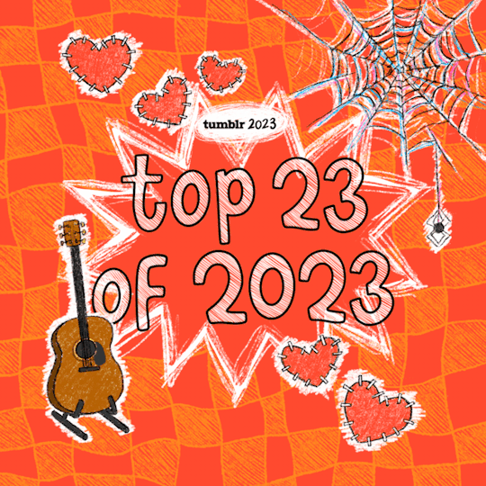
Top 23 of 2023
Have you been aching to get your hot little hands on 52 weeks of data around original posts, likes, reblogs, and searches, all weighted and ranked and tied up into categories with a nice little bow on top? Well, today’s your day! It should come as no surprise that Artists on Tumblr reign supreme: from stunning traditional art, jaw-dropping digital art, fanart, sculptures, textile art—you name it, basically—this year’s list shows that Tumblr truly is the home for art and artists. Thank you, Artists on Tumblr, for enriching our dashboards day after day.
Rounding out the top three, we have two iconic shows: Good Omens is live-action, and The Owl House is animated, but both have a heck of a love story at their core. The second season of Good Omens blessed us with not one but two ineffably exquisite ships, while the final season of The Owl House broke and then healed fans’ hearts in equal measure. Thanks, @danaterrace! Actually, come to think of it, the Good Omens finale kinda did the same in reverse. Thanks to you, too, @neil-gaiman! We can’t wait for season 3.
Speaking of heartbreak and healing, Our Flag Means Death’s second season offered both in droves. The entire cast gave stellar performances, and fans couldn’t have been happier to see the kinds of representation the show displayed. Last year’s #1 topic, Stranger Things, may have dropped a bit, but trust us, you wouldn’t know it from the amount of meta, fanart, and fics in the tag. And did you hear about the live-action adaptations of both The Last of Us and One Piece? They were a preeeetty big deal this year, too. Check ‘em out if you haven’t yet (lol, of course you have). And we’d be remiss not to mention the hugely dedicated fans, fanartists, and fic writers devoting their time to all things Rise of the Teenage Mutant Ninja Turtles. Y’all deserve a little pizza, as a treat.
2023 was also a year for blockbuster movies, which of course hasn’t escaped anybody’s notice here on Tumblr. Barbie smashed box offices worldwide and left us reeling with every re-watch. How can one describe Greta Gerwig’s pink-filled opus? It certainly is one of the movies of all time. Meanwhile, with its incredible animation and soundtrack, Spider-Man: Across the Spider-Verse introduced us to a whole new multiverse of Spider-People, opening the portal to a veritable flood of incredible OCs. And then, of course, we got a fresh perspective on an old classic when cinephiles introduced Martin Scorscese’s cinematic masterpiece, Goncharov (1973), to a new generation of film aficionados who resoundingly agree that it is, in fact, the greatest mafia movie ever made. We’re so glad this underrated film finally got the acclaim it has long deserved.
In the realms of gaming and tech, the long-anticipated Baldur’s Gate 3 has basically become everyone’s new favorite D&D/dating sim combination. Of course, the Pokémon franchise, games, shows, and Hatsune Miku collabs remain perennial favorites. Elon Musk’s purchase of Twitter, sorry, we mean of course X, made waves across the internet. Similarly, the Reddit blackout drove Redditors to new venues, and Tumblr users welcomed the folks from r/196 with open arms—we’re huge fans of your memes, y’all, and you fit right in. Welcome, we’re glad you enjoy the chaos. Here’s a fun fact: if we included post metadata in Year in Review rankings, #polls, introduced in January of 2023, would have been the #5 topic on Tumblr this year. Phenomenal.
And, oh right. Taylor Swift had kind of a big year, what with the albums, the epic global tour, and the movie and stuff. Fantastic work, @taylorswift, the Swifties on Tumblr thank you for everything.
This is Tumblr’s Year in Review.
Artists on Tumblr
Good Omens
The Owl House
Barbie
Pokémon
Spider-Man: Across the Spider-Verse
Critical Role
Goncharov
Taylor Swift
Genshin Impact
Stranger Things
The Last of Us
Rise of the Teenage Mutant Ninja Turtles
Elon Musk
196
Star Wars
Our Flag Means Death
Crowley | Good Omens
LGBTQ
Cottagecore
Baldur's Gate 3
One Piece
Aziraphale | Good Omens
3K notes
·
View notes
Text
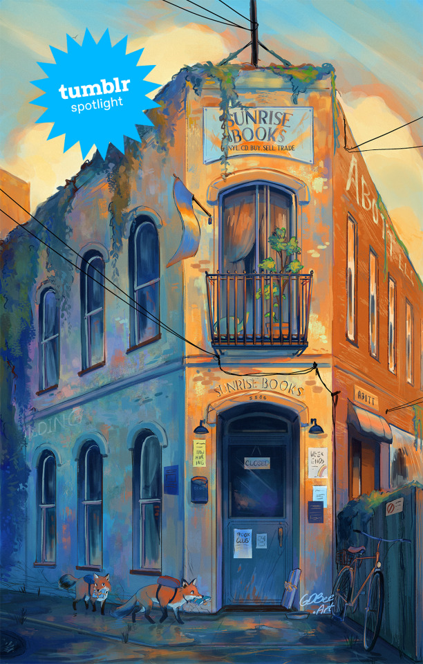
Creator Spotlight: GDBee Art (@prinnay)
Geneva Bowers is inspired by the wonders of the natural world around us, and enjoys manipulating colors to create art full of mood and feelings.
Check out our interview with Geneva below!
How did you get started with art? Did you originally have a background in art?
I’m going to say yes because that’s all I’ve known how to do. It started because I wanted to draw better horses than my sister, and it just spiraled from there. People started asking me to draw things because they saw me drawing horses. I was like, well, I can draw things that aren’t horses, and then it was just kind of all I did.
Have you ever had an art block? If so, how did you overcome it?
I have one right now! Honestly, with time, and I also collect art books; I think I have a couple hundred. If I really want to draw something, then I just flip through those and try to steal some ideas.
Which three famous artists (dead or alive) would you invite to your dinner party?
I mean, of course Van Gogh…I’m really inspired by Impressionism and Post-Impressionism, so I would invite Van Gogh, Monet, and Julie Dillon to a dinner party.
Have you ever wanted to dive into another medium before?
Yeah, actually, I currently am! I’m trying to do more traditional painting. I used to do a lot of acrylics, but I haven’t done it in years, and now I’m kind of bad at it. I’m trying to get into actual impressionistic art with oils and oil pastels. I’m like failing, but you know, you get there. Just fail until it looks presentable.
If there is one thing you want your audience to remember about your work, what would it be?
I guess it’s more of a feeling. I create art because I’m inspired by things around me, like certain video games. For example, I have been inspired by a Japanese RPG called Chrono Cross on PlayStation 1. They make me feel a certain type of inspiration to create something, so that’s kind of like what I’m hoping to leave behind.
Have any of your projects surprised you with their outcome?
Yeah! I did this Weapon Faerie series where I took three prompts: a weapon, a winged insect, and an herb, which I combined to make different characters. So, a faerie with a spiked club or a butterfly faerie with a katana. I made 13 of those, and they kind of took off! I wasn’t expecting that at all.
What is the hardest part of your process?
My whole art style is coloring, like the way it’s colored… but I hate the coloring process, haha. I like doing the color combos, but I don’t like the blending and shading. That takes like one-trillion years. It’s the part where I’m most likely to give up. You know how art kind of looks ugly before it looks good? I’m trying to trust that process.
What do you wish you knew when you started creating art that you know now?
I guess one big thing would be knowing how to use lights and darks. When I do color, it is definitely colorful, but when you switch it to black and white, you see that everything’s the same tone of gray. I’ve learned that if you just use some brighter colors and some darker shades, you create a bigger impact in the end. So, now, when I paint something digital, I make it black and white for a moment to see where all the hues are, and if something is weirdly dark or not dark enough, I can change it.
Who on Tumblr inspires you and why?
Oh, @feefal definitely inspires me. She does a lot of spooky art.
1K notes
·
View notes
Text
#mARTch 2024

text version (with more info!) under the readmore! please check it out if you're confused about anything <3
F.A.Q
do i have to draw every day?
no!!!! there are skippable days built into the event, please use them whenever you need them! i really don't want anyone getting a wrist injury!
can you share my art?
yep! i try to share entries to @bweirdevents daily during the event!! the tags can get busy tho so i might miss some posts OTL sorry
what are the tags?
#mARTch is the main tag, but this year you might find posts in #mARTch2024 too!
wait, i'm confused about a prompt...
full breakdown of all the prompts below ↓ with helpful hints if you're stuck!
_____
INTRO WEEK
this week is all about your artistic identity ... technically, you don't have to draw anything new this week if you have some art that already fits. the starter days are:
1 ⭐ self portrait
who are you? it doesn't have to be you IRL .. if you feel more comfortable drawing a fursona or mascot, that's fine too!
if you don't wanna draw, you can also just share old self portraits today and talk about why you drew yourself that way!
2 🤍 inspirations
see how this day doesn't have a star? that means it's optional and you don't have to do it at all!
but if you really wanna- tell us all about what inspires you to create art!
this could be anything from the people that inspire you, the shows you like, the pins on your big messy pinterest board, or concepts that you're drawn to! you can draw something about it, talk about it, or just post your inspirations! anything is fine
3 ⭐ fav thing to draw
what do you like drawing most? backgrounds? animals? one specific animal? bust of your oc facing left? cars? the same anime boy over and over and over? no judgement!! show us :)
_____
STUDY WEEK
this is the week we actually start drawing from reference!
polished art is not required at all, quick sketch studies are fine! please don't burn yourself out
4 🤍 plant
5 🤍 body
6 ⭐ animal
7 🤍 object
8 🤍 food
9 🤍 face
10 ⭐ hand
these ones are pretty self explanatory!
you can do them as realistic studies, or adapt them into your own art style, it's all fine! you can reference from your own photos or from resources on the web.. have fun!
_____
COLOUR WEEK
this is the week for playing with palettes and working on your colour theory skills!
if you're really struggling with these ones, don't worry about drawing scenes or characters, you can just have fun splashing colours around on an abstract canvas!
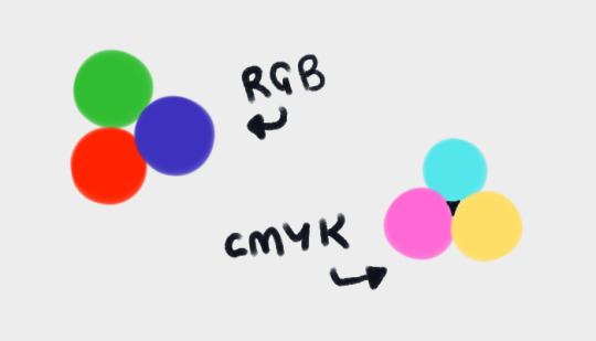
11 🤍 RGB
a set or primary colours typically used in digital/screen art - red, green and blue!
12 🤍 CMYK
a set of primary colours typically used in traditional/print art - cyan, magenta, yellow ... and key (black!)
for both of these days ↑ you can add in black and white.
and feel free to combine the two days into one, if you're struggling with a three-colour palette! use all six!
13 ⭐ WARM COLOURS
the warm side of the colour wheel, reds oranges and yellows!
14 🤍 MONOCHROME
monochrome doesn't mean black and white ... it means one colour! that can be any colour at all- shades of red, shades of purple, shades of green .. or yeah, grey if you really want!
15 🤍 COMPLIMENTARY
complimentary colours are the ones opposite each other on the colour wheel! they're kinda married

16 🤍 YOUR FAV COLOURS
pick any palette that works for you! where's your comfort zone? what looks nice to you? what colour combos do you always go back to?
17 ⭐ COOL COLOURS
the cool side of the colour wheel, purples, blues and greens!
_____
CREATIVITY WEEK
this week is all about vibes! try to create something that matches the mood of the prompt .. they're vague on purpose! don't overthink it, just draw from the heart!
18 🤍 SMALL
you could draw something that's really small, like an ant .. or draw on a canvas that's really small .. or use a really small brush .. get creative with it!
19 🤍 DANGER
try to capture the adrenaline .. the rush .. the fear that you associate with the word danger!
20 ⭐ SOFT
soft colours, soft textures, soft vibes ... whatever makes you comfy!
21 🤍 MIDNIGHT
darkness and secrecy .. spooky witchy vibes .. the tranquility of a forest at night .. the fun of a late-night party .. there's lots of ways you can take this!
22 🤍 POWER
what does this word make you think about? superpowers? control and oppression? literal electrical power? something else?
23 🤍 CHILL
chill as in calm? or chill as in cold? who knows .. it's up to YOU!
24 ⭐ LOUD
try to draw something that feels LOUD! BRASH! IN YOUR FACE! how can you convey sound through art?
_____
FUN + GAMES WEEK
this week is just for enjoying yourself! take it easy and have fun!
also .. another reminder! there are skippable prompts! if you're tired and struggling to get to the finish line, please don't hesitate to skip a day!!! or multiple days!! as many as you need!!!
25 🤍 TRY A NEW ART STYLE
copy the art style of a show you like, ask a friend if you can try their style, draw the eyes a new way, develop a totally new style on the spot... whatever you want!
26 🤍 DRAW WITH YOUR NON-DOMINANT HAND
righties, draw with your left!
lefties, draw with your right!
ambidextrous nation ... our time to show off!
27 ⭐ DRAW WITH YOUR EYES CLOSED
don't peek! try to draw something without looking!
if you really want, you can colour it with your eyes open after you draw the lines/sketch with your eyes closed... but please try not to cheat with the actual drawing part!
28 🤍 RE-DRAW SOMETHING OLD
find some old artwork you like, or something you feel like you can do better on now, and give it another go!
29 🤍 RE-DRAW A MEME
find a silly picture on the internet to redraw .. do you have any in-jokes with your besties?
30 🤍 DRAW A GIFT FOR A FRIEND
create something for someone you love <3
31 ⭐ FREE CHOICE
final day! you can draw anything you want today! show off your skills! draw something you've been meaning to draw! whatever!
_____
please refrain from reblogging this post after march ends - next year's prompts will be different, thank you!
if you have any additional questions, don't hesitate to shoot me an ask!
#🎨#mARTch#mARTch2024#events#art meme#art prompt#art prompts#art challenge#drawing prompt#drawing prompts#drawing challenge#march
873 notes
·
View notes
Text
Astrology Observations #1!!!!

These are all opinions! Take what resonates! Also I'm not a professional, correct me if I got something wrong if necessary idk this my first try
It's been said before, but the Leo + Libra combination is incredible. The planets/placements can tell what they succeed at the best. (Example: Leo Sun - personality, general shine and personality, with Libra Rising - stylish, pretty, youthful, graceful, makes someone who garners a lot of attention naturally)
I've seen 8th House Saturn manifest as actively (I guess rather than lack of trying maybe idk) waiting to get close to people in an intimate relationship. They may not even like the implication they've done anything intimate with their partner. Once they're lock in with their person, they get pretty private. Depending on the sign, they also get very sappy.
Another Saturn note: While it rules over restrictions, delays, and the father, it also rules over tradition. Whenever it is in your chart you may also more of a "transitional" (or whatever traditional means to them) opinion of/take a traditional role in. Saturn's in 5th house Gemini for me, and when it comes to art/hobbies/acting and I was VERY against digital or CGI/not doing everything by hand/not cutting corners. And the want to have twins is STRONG + the 50s aesthetic dresses and style is very appealing.
Taurus in your chart can tell you where you're the most stubborn (I know this is obvious), and it also maybe tell where you're the most simple or easy to understand. I've noticed a lot of people saying earth Mercuries are boring to talk to or dry, but I've noticed that's just Taurus Mercuries. Which isn't bad at all, but they're very to the point, but not in a bad way. A good example is Taurus Sun in 4th house. Probably the most down to earth placement possible. Chill personality, comfortable home/likes to create a good home environment.
Sun conjunct Mercury are so easy to spot. Something how the way they talk just sticks, or they have an extremely distinct way of talking. My close friend who has it in Pisces 7th house strictly talks in metaphors, and is gets the worse the closer you get to him. Whatever the sun sign is is kinda the flavor of how you talk. (Maybe Virgo would be more descriptive/thought out, Aries would be more loud/impulsive etc)
Scorpio stelliums are the easiest to notice imo. When talking 1 on 1, they kinda trigger wherever Scorpio is on your house. My aunt has a stellium with Mercury, Venus, and Mars, and every time time we talk I get the motivation to take care of my public persona/career since Scorpio is my Midheaven.
Venus conjunct Mercury is chefs kiss when it comes to your voice. Whatever house it's in can rule what kinda vibes you have within style of speaking (like 2nd house could sound expensive, may have a talent for singing, 11th is very motivational, would get most of the attention when talking in groups). You could also be good at being vocal about things you love along with having a nice voice. Any writing would also be very beautiful.
Chiron opposite anything can point to something that can hinder healing if you don't think it though. Since (in my opinion) opposite creates tension but the planets can work together, rushing results ends up with the planets/asteroids clashing. An example can be Chiron opposite Saturn: healing would require cutting no corners, hard work, and stability or a routine, but you could have the feeling of acting on impulse, or shaking off a routine that's actually good for you, or even ignoring an authority that could be good for you (Especially if that Chiron is in Capricorn).
Saturn in Cancer individuals may have issues with taking up emotional space. They're the type of people to talk about how bad their day was for 4.5 seconds then apologize. I've never heard someone apologize for even complaining more than them. A lesson they may need to learn is how to be angry. Also they may need a nicer partner.
I've seen degree theories on how the degrees of Pluto can tell when/where you had your tower moment (like the tarot card: a time of the tower falling/everything kinda crumbles), and I gotta say most have been pretty accurate. I have a friend who has their Pluto in 5th house in the 16th degree and that's when they had their first experience with distrust in romantic partners. Mines in 11th house in the 14° degree and that's when I realized all of my friends at the time were bad.
Mars in Leo do really well on social media, especially when they have complete control over their projects. They may also have trouble giving up control to others and can become workaholics if there's heavy earth placements paired with it. (Markiplier is a good example with his Taurus Moon, Leo Mars, and Capricorn stellium)
Ok that's it for now. Let me know if I should do more, and any opinions you may have (please be NICE I'm not GOOD AT THIS) and also have a good day/afternoon/night :D
#astrology#astro notes#astrology observations#astrology aspects#saturn in 8th house#mars in leo#pluto#saturn in cancer#chiron#venus conjunct mercury#scorpio#sun conjunct mercury#taurus#leo sun#libra rising#markiplier#i cant not tag him its funny to me whenever i think about it#helloeverybodymynameismarkiplierandwelcometofivenightsatfreddys
1K notes
·
View notes
Note
Hi! I really love the way you color, and I was wondering If you could make a tutorial about it, I of course completely understand if you Can't/don't want to do it thanks in advance If you decided to do it and have a good day/night.
Hello hello!
Ooooh, a color tutorial! I've never done one before so I'm not sure if I'll be any good at it haha. But I don't mind sharing my thinking process when it comes to coloring my works.
So when it comes to color, I very much have a traditional painter's approach since that's how I learned color in art college. My painting professor never allowed us to use black or white paint, we could only use other colors to create darker colors or new colors altogether. And you're probably thinking, "What the hell? That's insane." And I wouldn't blame you haha. But this approach helped me a lot to not rely on tints (colors mixed with white) and shades (colors mixed with black) when I color. For the most part, I purely thinking about value and hues when I'm coloring.
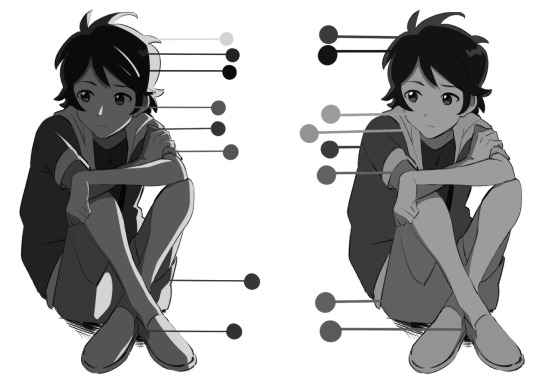
Finding the right values:

So for this drawing, I did two different takes (one with direct harsh lighting and one without). The reason why I'm showing this is because when it comes to color it's very important that your values aren't clashing with each other. When I started out, all my coloring felt flat because I was using colors with the same values so there was little to no depth. A lot of people don't realize this but color does have value!
If we put the primary colors on greyscale, you notice how each color has its own value. Blue tends to be a dark value, red has a mid to dark value , and yellow is a much lighter value. This is why if you ever look at my work, the color I use for shadows lean into blue/purple tones. You can also have warm shadows since red does have a deeper value compared to yellow. But these values are when the primary colors are at the highest saturation. What would happen if we knocked down the saturation levels?
The values start to become more similar. Since we're not always using the most saturated colors, it's important to understand the values behind the colors you'll use. Once you unlock that, you can pretty much do whatever you want with color haha. That's why I hardly ever use black or white in my digital art when mixing (also I don't mix color with a brush, I just pick from the color wheel which might be insane).
While it's not wrong to use white or black to create darker/lighter colors, color in real life doesn't always act that way. Shadows and highlights can have color. For myself, letting go of white and black has opened a world of color combinations that I didn't think of before taking my first ever traditional painting class. Now, I can freely pick colors and experiment with palettes since I've blocked out what values I need (like the image below).
Even if I'm using blending modes like in the next image, I'm always thinking about making clear value separations. If I can't understand the image in black and white, then I'll have a hard time seeing it in color.

And when you get very comfortable, you can start placing characters in different color environments and match them (which essentially is the job of a color designer in TV animation).
The right image is the official color palette for my character which already uses a lot of blue/purple for the shadows. But on the left side, she's in a night-time environment so I leaned even more into the cool colors to the point that the white T-shirt is actually a very very light purple/pink color haha.
Or like this example where the left drawing gives a more sunset/golden hour lighting while the right one is more blue hour/night time lighting. But you can read the colors clearly 'cause the values are clear to begin with.
While that wasn't really a tutorial this is pretty much my thought process when I'm coloring my digital works. ^^; I very much do follow an academic approach to color theory but even then I think it's okay to break the rules. As long as you have understanding of colors' value, I think you'll be able to unlock any color style you want!
I hope that answered your question and was helpful!
#digital art#digital illustartion#color#anon#ask#send me anon#send me asks#color theory#tone and value
229 notes
·
View notes
Text
What I've Learned About Teaching Art
I've had the privilege of teaching art in a variety of environments - from still life oil painting at the college level, to combining art with science and history in a museum setting, to guiding highschool students through creating a comics anthology. Through these very different settings, I've found a list of constants that, when I keep them in mind, help me deliver the most enjoyable and effective art education for my students.
One of my core beliefs is that art is, at the heart of it all, something a student must teach themself, and that a classroom, workshop, or camp that wants to teach art is actually responsible for creating an environment and offering projects that facilitate that self-driven learning.
With that on the table, here is the pantheon of truths that, if I can hold on to all of them, help me create that learning environment:
- Almost no one is inherently unable to draw. Additionally, everyone can improve at drawing. With the wealth of "traditional" media, digital tools, and thousands upon thousands of years of art history with which we can map the possibility space, it seems obvious that if someone wants to make art, then they absolutely can. If they want to draw, then no teacher should ever, EVER tell a student that they "can't." The teacher's role is usually to take a student who already secretly believes they can't draw and help them see both the breadth of possibilities and the potential within themselves to improve whatever skills they start with.
- Drawing is not always about making a beautiful image. The obsession with one kind of "good drawing" creates an artificial limit on who is allowed to draw. Sometimes being an art teacher is about expanding a student's definition of art as opposed to pushing their frustrated and dejected pencil along a path towards a narrow goal. The reality is that even within pop culture we see so many gorgeous kinds of art! Beyond that, aiming superficially as an artist for a particular surface result will almost always create lesser work than creating an understand of underlying processes and theories that helped the "good art" come into existence.
- Drawing can teach new ways of seeing. Observing with the intent of drawing can transform how a person perceives the world. So much of teaching art is teaching visual literacy, the literal act of reading meaning within visual input, whether that's a still image, a film, a building or a natural landscape. When you motivate students to read visuals by providing them with new ways to understand creating visuals, you jump start their investment in visual literacy.
- Drawing can help us think about things differently. Thinking can shift along with modes of seeing - what is a structural way of thought? What is a compositional way of thought? When you teach art, you must teach a student to look at things holistically and in granular elements - besides just enhancing thought processes moving between the two states, you can get much more discovery in the analytical and planning modes of appreciating and creating artwork.
- Drawing from reference is as educational as reading. Learning to examine visual reference closely creates a new kind of literacy - visual literacy. Drawing from reference, especially with guided or motivated questions to be answered, can create an opportunity for modes of analysis that students don't get to otherwise use. Developing visual observation and creating a practice of looking both closely and holistically can create a layered understanding of the subject. Even students resistant to traditional still life drawing processes can find benefit in using drawing to answer self-guided questions.
- Learning by making art is a valid mode of learning. Making art can be a mode of learning that both alternates between input and output and creates a sense of ownership/agency in both modes. The hands on creative process is a kind of guess and check system that can be designed carefully to allow students to make a wide variety of types of decisions, and teaches them to create goals and investigate what processes will best allow them to achieve said goals.
- Competition with each other or with some imagined ideal will deflate artistic potential. An art classroom cannot have winners and losers based on "quality" of final piece. Art education will benefit more students if it is process oriented. Quality, even in straightforward skills based art education, can still be subjective, and unless it's an aggressive battle Royale for some exclusive prize, the intent of any art programming is not to find the single best but to encourage each student to improve. So don't be a dick about it.
- Art is a product of restraints. Material, process, time, subject or conceptual restraints allow for a kind of focused play. Giving students free reign is in itself a huge challenge of self direction, goal setting and prioritization. Making some of those choices for them gives them a chance to focus their own learning.
- Materials change the kind of engagement. Diverse materials allow for diverse engagement. Just as subject matter can affect a student's personal investment in a project, the material or method of art making can change their engagement. Changing between drawing and painting, reductive or additive sculpting, stenciling or stamping, will not only change the tactile experience of art making but will affect the modes of thought used to make creative choices.
- Venue or audience transform art. Pressure to show, and to whom, can change students self imposed limitations. Defining an audience will change and add pressure to art creation. This can help students hold themselves to a higher standard, but can also frighten or overwhelm them. Audience needs can be a useful limit or influence on the direction of an art project, but audience pressure needs to be modulated to the response of each student.
- Art is most interesting when it leaves the comfort zone of its creator. This can only happen in a classroom where students feel safe to take risks. Art, even when the subject matter is utterly anonymous or benign, can be a hugely risky-feeling process. Even the act of making art in a classroom environment can feel frightening; if we want students to fully engage, and to take the artistic risks that allow them to learn, we have to spend class time making the classroom into a safe space for the students. This probably needs to be it's own post so I'll leave it there for now and come back and expand upon it in detail in future.
- Subject engagement transforms art. Students with something to say about their subject may push themselves farther. Caring about the subject can be a blessing or a curse for a student - deep subject investment can drive problem solving around how best to present it in the artwork, while deep subject investment can also overwhelm a student with self imposed pressure and even a large dose of imposter syndrome. Therefore it can always be useful to intersperse self selected subject matter with "boring" or at least not emotionally significant subjects, to relieve some of the pressure and allow students to instead respond to the process alone.
- Ownership of a process will empower students. Whether they've designed a process, built their own materials or set their own goals, agency gives students investment. One of the most exciting things about art is that students have a lot of potential control and thus ownership - they will always be making choices, and those choices are potentially exciting because they directly affect the outcome. You can increase this sense of ownership or investment in the class by facilitating student-made materials, like sketchbooks or mark-making tools; or by facilitating student-led exercises or challenges or projects.
- Demos will guide what others make and must be done carefully. Demoing can empower and at the same time overwhelm or impose limits on the viewers. Demoing must be designed to specific goals of each assignment. Eg: if you want students to use surgical techniques to explore value, or depth, or composition, whole you absolutely have to demo the technique didactically, you need to be careful not to be didactic about the results you want in relationship to the subject of exploration. Showing a wide range of potential approaches can help in classrooms where students can handle large info dumps, but often it's better to demo the technique, get them trying it out without further instruction, and then redirect then to the topic of exploration as stage 2.
- Material potential can power a room. Art supplies can be motivating all on their own. Getting excited about them can make it safe for the students to get excited as well. There are many different supplies available to teach art with, and trying different ones can add a lot of excitement to the room even if your topic of instruction is narrow. Getting excited about materials can change the mood of a classroom entirely.
- Criticism must engage with the student's goals or it will work against you. Setting goals, and then reflecting on them, is key to art education as so much of art is self directed. If you then ignore that setup and approach critique without listening to your students' internal direction and goals and at minimum acknowledging them, they will not find your critique constructive. This goes for young children all the way to adults - you need to be in dialogue with them.
- Open discussion and open ended questions will always help. Once you've found a way to make the classroom a safe space, group discussion powered by open ended questions can open everyone's mind up to broader possibilities. One on one conversation also benefits hugely from open ended questions and encouraging students to reflect and investigate their own process and practice.
- Letting students share their learning is important to help the class grow beyond your own limited experiences. Students will often still feel in competition with each other, so instituting non-competitive collaboration and sharing will be important to minimizing classroom tension. This can be demonstrated first with art games and developed into collaborative processes on more serious projects.
- You can never clarify the instructions enough. Always repeat yourself, be prepared to repeat demos, have a written list of instructions and delegate helpers. Breaking projects up into stages can help with detailed instructions, but always show an overview first. Art is overwhelming and there is no process so simple everyone is automatically good at it. Accurate following of a process will often help students who are unsure of themselves prove themselves to be competent and your job as the teacher is to make sure they have everything they need to do that.
- Techniques are best remembered when students use them to solve specific problems. Show how applicable to different problems a technique is during demos. Be prepared to reteach or to teach new techniques whenever students hit a wall. Encourage them to reflect over the techniques they have at hand to see if there's a new way to use one that could solve their problem.
- Art is mostly learned by doing. Material literacy is gained only through material exploration. If you spend too much time talking/demoing before they get to try the materials the enthusiasm can fade. If you have a student who is frightened of doing it wrong, the most important thing is to make a safe space for them to do it wrong, because that's the only way to eventually do it right.
These are all best case scenario tips - and while I've tested them all to know they work, it's still hard work to keep everything in play in every classroom. I'm hopeful that having this written list will help me, and maybe by sharing I can help others as well.
Art is a privilege to teach, but I believe it is incredibly important for everyone to get to learn it, in a safe environment where the effects of an art practice can be the most beneficial.
Are you teaching a creative subject? What are some techniques or core values you bring to your classroom?
Read the full article
116 notes
·
View notes
Text
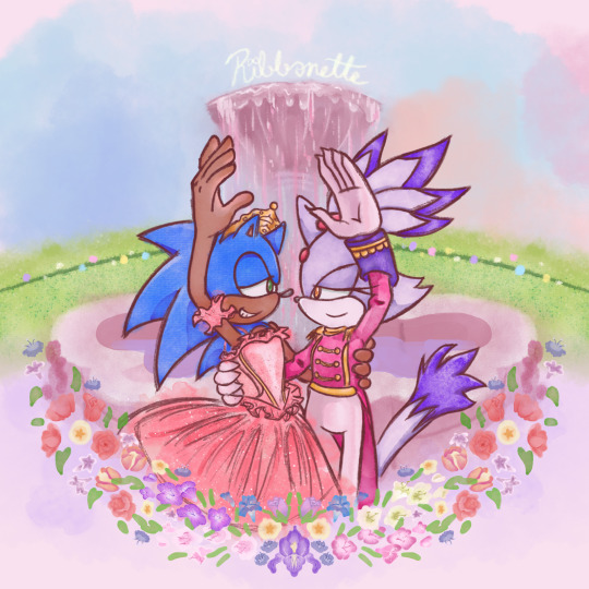
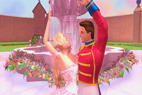
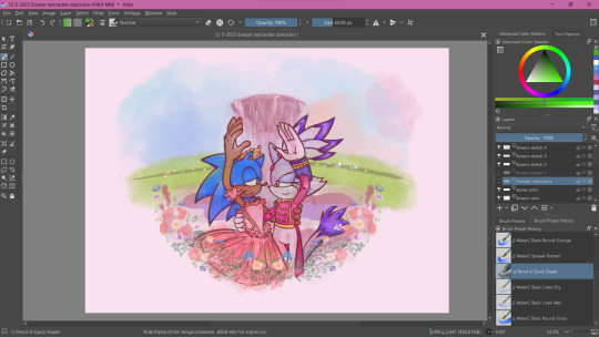
Tribute to one of my favorite movies of all time + the franchise that has me in a death grip 💖
a bit late for Christmas but at least Valentine's day is around the corner ^^;;
Process below if that interests you:
AS I SAID EARLIER, I had been working on this piece as early as December of 2021 😱!!!
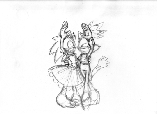
This was the original sketch! I was inspired after learning about Blaze's own design inspiration coming from Takarazuka theater, as well as it being the Nutcracker season so this film was in bouncing around in my head.
and this was allllll the way back in 2021 ^^; I had put the idea to paper to capture the image in my head immediately. But the idea in my head was extravagant and beautiful and would certainly take time to complete, as well as the patience and skill to work with watercolor 😔 I've certainly done my share of watercolor, both physical and digital, but I still feel like my physical watercolor work is a fluke, and I was still a novice digital artist at the time of this sketch.
In short, I was confident my skill could live up to the vision.
So I would put this on the back burner. It wouldn't be ready in time for Christmas, and I could use this as an opportunity to hone that digital art experience so it could be ready next year!
2 Years Later...
It's December 5th. Fuck it. Let's crack this open again, I tell myself.
SO starting with the line art, it's actually 2 different brushes layered over one another.
I also changed Sonic's expression to be more love struck-looking, because I'm a sucker for romance.
The image on the left is a watercolor line brush, while the right is a pencil brush. The reason I wanted a water color look was because I thought it would make the illustration look dreamy and fantastical, and I wanted that to extend to the line art as well. However, my usual lines on traditional usually veer more towards thick and cartoony from years of studying the Sonic art style, so I really felt like I was working against myself here. I had also asked friends for their input and they preferred the lines on the right as well. If my followers actually do read these blog posts, I'd love if you could comment which line art style you prefer drawing or looking at.
The happy medium was to just combine the 2. Here's a better look at that:
I like it! I think it combines the solid line with the rustic water color grain. Best of both worlds :]
For the actual painting, The most notable thing I can say is that getting the right pastel-y color was VERY difficult to achieve for someone like me who often loves to use bright and saturated colors in her art. I feel like I really set myself up to do one of those "evil art style" or "opposite art style" challenges I've been seeing around. I had to repaint Sonic at one paint because the blue of his fur was WAY too saturated for the style I was going for:
I started with painting Sonic and Blaze in first and then working on the background. I think that's probably the backwards way of doing it but one of the perks of digital art is you can do stuff any order you want when you have layers.
The background wasn't actually as difficult as I thought it would be. I wasn't going for any difficult perspective, and I was using a reference so that could be it. I'm usually averse to backgrounds but I really wanna tackle more of my weak points in art. I actually had way more fun than I was expecting, painting the sky and adding texture to the grass. I think I had the most fun rendering the water coming from the fountain (which you can't even see too well anyway, lol).
Funny enough, I had just about finished painting the characters and background by early January. So why am I posting this in February?
The Flowers...
In case you don't know. I love flowers. I love looking at them, I love learning about flower languages, I love drawing them. so seeing that my reference image showed flowers circling the fountain, I was excited! I was already having more fun than I expected to be, working against my usual style, rendering a background, so how could this be a pain in the ass?
Well, I am my own worst enemy 😞I couldn't exactly identify each flower offhand from this screenshot alone. The texture of the flowers is kinda grainy, since I don't think the animators were expecting viewers to look too closely at the set piece to use as reference for my lovingly crafted crossover fanart. If anyone has this in high quality though, please tell me.
(I think I actually got this reference from a tumblr post but I can't find it on my blog for the life of me nor can I find it in the tags I'm so sorry)
I'm a huge stickler for details so I really wanted to be as "accurate" as possible in my illustration. I can hardly identify some of these flowers with confidence. I think there are roses in there? or tulips? I'm not sure if those yellow flowers are roses or some kinda petunia or if I'm way off.
I'm sure these details won't matter to most viewers but it was EATING AWAY AT ME. Eventually I decided to try drawing in flowers that might look similar to the ones in the reference. Or some based on their flower languages. I was certainly overthinking it ;;;; It led me to going "fuck it" and just throwing in whatever I wanted. There are no irises visible in that screenshot but I made it the centerpiece of the flower ring. Who give a shit.

I made some guides for me to follow: The blue ring was so I could make sure the flowers make a half circular border around Sonic and Blaze. I was envisioning how it could look as like an icon or sticker or something, which is why it's framed this way. then the second guide is the sketch of the flowers I made. I always do line art and I'm not great at just improvising with color to paper, or color to screen in this case.
The rest of this process is then just working on each flower piece by piece (with the help of the mirror tool of course) with varying degrees of detail. Some flowers are more abstract than others, and I had debated if that would look jarring and disrupted any kind of harmony I was trying to maintain with the style parameters I set for myself. And then I decided I was overthinking it once again which is why this was taking me nearly 2 months to complete.
At some point during this process, my wifi went out for a whole week! Of course, I could still work on this illustration offline, but I had a lot of tabs open with a bunch of reference images on there (plus I like to listen to music while I draw otherwise I lose focus and I had neglected to download a varied selection on my phone or laptop 😭 Learn from my mistakes).
The most tedious of this process was making each set of gladioluses a unique color.
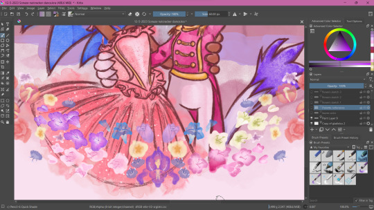
Was it worth it? You tell me! I think they're pretty, at least.
Along the way, I repainted the grass because it wasn't symmetrical (It didn't need to be but I had been using the mirror tool for a lot at this point and it was bugging me). I made other little final adjustments, like color adjusting the leaves on the flowers, lowering the flower ring border, and so on.
Ultimately, I'm extremely satisfied with the final product. I had my heart set on doing something like this for a long time. I had so much fun just experimenting throwing on color or not worrying about technical stuff. Of course, I did do what I usually do and overthink it at some points, but I'm working on it!
I've wanted to do an extremely indulgent AU illustration and other drawings for a Sonic x The Nutcracker story for a long while. I will be totally honest, I'm still a little embarrassed to share stuff like this, even after years of posting fan art online. It feels like the more self indulgent something is, the more people might judge me for it ^^; But I wanna practice what I preach and kill the thing inside me that cringes at my harmless attempts at joy and whimsy.
I would love to do some more drawings for this AU, but maybe post them around December when it would be more seasonally appropriate. I hope you'll stick around for it!
If you read this whole thing to the end, thank you. Whether you follow my blog or not, I hope you have a lovely day :3💝
#Barbie in the Nutcracker#Sonic the Hedgehog#Blaze the Cat#Sonaze#Jess's Digital Odyssey#Sorry for not posting frequently it may happen again
62 notes
·
View notes
Text
art tips:
i know it sounds stupid for someone like me, whos horrible at art, to give tips but these actually help me so i thought id share them and also give do's and dont's with them
trace:
DONT : claim as yours, do all the time, trace it exactly, post
DO : do it occasionally, i use it to try to study a new art style i like; experiment; try to change up a few things, if you do post then credit the creator who made the art
experiment:
DONT : do something out of your comfort zone, make it adjustable to you; not others
DO : make something that you like; it doesnt have to meet others expectations
compare (hear me out on this one):
DONT : compare negatively, compare to often; it will bring down your self-esteem
DO : compare the stuff you like about other art; try to combine everything you like about other artists and that will help!
do art often:
DONT : do it constantly; unless you have the time, then its fine
DO : do it a lot; but only if you have the time
make art that isnt meant to be seen:
DONT : ???
DO : use it as a way to experiment new things; not all art is meant to be seen
art is a way to express yourself, not meet others expectations, you dont have to immediately know how to draw the mona lisa, and there isnt only one art style, make what makes YOU happy, dont worry about what others say about your art, if it makes you happy, then go with it, dont let anybody bring you down
whether you make traditional, digital, pixel, 3D, 2D, any type of art, you will be accepted because its what makes you happy and you want to do it, one day you will meet your dreams, or have a different one
you dont need fancy/expensive tools to make art, all i use is my phone, magma and/or ibis paint (not premium), and my finger, you can make art with anything and everything, art is art
49 notes
·
View notes
Text
Fan Work Friday Saturday
Rules: If you're tagged, MAKE A NEW POST and showcase one fanartist or fanfic you recommend (with links), and tag someone to give their recs next! Don't forget to reblog the rec you were tagged in!
Thank you so much for the tag @dreadfutures! Saving the second for later on in the week.
Listen I have a hard time choosing and I'll do these on repeat if I must.
Fanartist: @salsedinepicta
Starting with her, purely because it's litterally 10 years of me being 👀 at her art, and I do love the way she mixes pictorical techniques with swirly, 2D lines. I am not a fan of pink+green combination, BUT when she does it.
Add a lot of historical references and clothing and an expressive use of colour. I'm an absolute sucker for all artstyles that just looks like three paintstrokes thrown at a paper (digital or traditional) and she does that. And, she's a wonderful human being too, which really helps. <3
(she'd hate the attention but let me Will Smith meme her.)
Fanfic: To The Bone, by @shivunin
Rating: M
Words: 48,373
Pairing: Cullen/Inquisitor Lavellan
Summary: Depending on who you ask, either Sylaise or Andraste set a mark of fire on those who are destined to find each other. No matter how curious each of them is, neither Lavellan nor Cullen are especially eager to actually go looking for this person.
Either luck or fate draws them both to the Inquisition anyway.
I debated high and low what of her fics to start from. I chose To The Bone because it's a soulmate AU.
And I generally don't like Soulmates AU.
But this one?
Mo has a way to turn tropes and clichès around in a way that just makes them relatable, visceral and real. The way she renders human fragility and vulnerability is really heart-clenching. I know I always fangirl over her work but it bears repeating.
To the Bone is played more than a Soulmate AU -it is important, but not the main focus, which tricks me into loving this- as a big story of two hurt people who needs to learn to trust someone with their own vulnerability. It's all about learning that you can trust other people, and exactly how scary a decision it is, how much it feels like a jump in the blue.
It's relatable, it's gritty, it's not the peak angst Mo can reach (for that, get a lot of tissues and click on Wander the Drifting Roads.), but it was the first of her works I read and it has a special place in my heart. For its themes, for its main character (can I hug her?) and also and particularly because it's a trope I generally don't like. And I do like to be stand corrected.
Tags under the cut!
You two whom I mentioned, if you want consider this a tag too! :)
Also: @melisusthewee @dreadfutures @inquisimer @blarrghe @blightbear @star--nymph @pinayelf @dungeons-and-dragon-age @ndostairlyrium @hollytree33 @theluckywizard and YOU
#fic rec#fanwork friday#tag game#salsedinepicta#shivunin#I feel terribly guilty in choosing only one thing so fill me with tags please - I'll tag myself if I have to :"D#(it's a great idea and I'm happily jumping into the bandwagon - but choosing makes me anxious)#I'll start recommending more rarepairs#tagged petrel
18 notes
·
View notes
Text
TOP 5 REASON WE SHOULD BE G/T MUTUALS (ESPECIALLY REGARDING TO PROJECT SEKAI)
(this is mostly a joke if you'd like to then 👉👈)
NUMERO UNO :
I need more friends to talk about pjsk g/t. It's been so long (SINCE LAST I'VE SEEN MY SON-) since i got new friends and i realized how lonely i am-
NUMERO DOS :
I can draw. I will draw your blorbos. I will draw your ocs. I will draw anything.
You can choose between Traditional doodles, Digital doodles or free drawings ehehehe.
As long as we're buddies.
I CAN ALSO DRAW YOUR PERSONA TOO IF YOU HAVE THEM. MAYBE I CAN DRAW US TOGETHER. (BTW @wistie WHEN ARE YOU MAKING A PERSONA SO I CAN DRAW US KISSING/J /J /J /J)
NUMERO TRES :
My brain is never-ending unless i get into a slump which is very rare.
I can get very creative with my ideas, i will take two things and combine them in either the best way possible or the worst way possible, probably making the most horrendous G/t au.
Regardless, i can discuss alot of ideas regarding our blorbos. If your brain is almost like mine, we can talk about ALOT OF STUFF.
NUMERO CUATRO :
Speaking of PJSK, i can discuss alot of hcs with you because i am not biased. (That is a lie, Akito Shinonome rotates in my brain 24/7 but i can discuss others with you <3)
Tell me about your favorite g/t pairs, ships, ANYTHING.
Let me hear yours. You can hear mine. WE'RE ALL STARVED.
WE CAN TALK ABOUT POLY/NEED OR RUINENE OR SHIZUAIRI OR POLYSQUAD OR MAFUENA OR POLYSQUAD OR RUIKASA OR EMUKASA OR HONAKANA OR EMUNENE OR MAFUEMU OR THE HINOMORI SISTERS OR THE TENMAS OR THE SHINONOMES DKSGSHSJEGKSE-
I WILL TALK WITH YOU ABOUT IT ALL.
NUMERO CINCO :
I can be your personal therapist because i know some of y'all are fucked up. As long as you can be mine because i am also fucked up.
I will listen to your problems, i will check up on you daily, i might be annoying sliding into your dms all the time but that means i care about you and that's my anxiety, your secrets will be kept with me, if you are in the US then you will prob also wake up in the morning to a bunch of messages because i am all the way in Asia from across the globe.
bonus numero seis : i am not that well-versed in other parts of the g/t community aside from sonic, mcyt, maybe crk? and ofc pjsk but you wanna talk about them i will gladly listen. maybe i could roleplay with you too.
IN CONCLUSION :
I will gladly be your mutual, it might be tricky cuz this is a side blog and my actual blog is @hshwnevdhss but you can follow that so we can be moots and i will also follow yours.
I have discord so if you are actually considering this request of being mutuals which is actually a helpless cry for friends then you can go into my tumblr dms and we will send eachother our discords so we can talk there :D (cuz tumblr's chatting system is shit)
#pjsk g/t#i will only put that tag since i am mainly a pjsk blog-#project sekai posting#kinda#mutuals#giant/tiny#g/t
46 notes
·
View notes
Note
Alrighty, thank you for letting me share this stuff! Fair warning though, this is a stupid long ramble.
The title of this little rewrite project is currently Halfway Hell. Our star is Reagan Morgenstern, daughter to one of the most powerful and influential men, who lives in the lap of luxury, wealth, and privilege. However, her cozy life is changed forever the morning after her 21st birthday, when she is woken by a group of seven horrific and grotesque beasts. Her father, Solas, reveals to her a dark secret; He is not human, but rather a powerful sorcerer as old as humanity. Long ago, he and a group of wizards and witches were banished from their home world in the stars to be imprisoned in the Earth’s flaming core for the rest of time. Before they were banished however, Solas and his six siblings used their remaining magic to curse the first vestiges of humanity; The more wicked, despicable, and sinful they were when they were alive, the more monstrous, deadly, and magically potent their souls would be reborn as Solas’ unholy army. Utilizing the damned and tortured souls’ as magic replenishes, the Seven Siblings of Sin were able to breach their flaming prison, and now, Solas, The Dark King, believes the time for his forces of darkness to conquer all three realms is growing near, and when that time does, Reagan will be leading the charge alongside him as his Dark Princess. So to prepare, Reagan is shipped off to the many parts of the world where her father’s siblings reside, to learn to weaponize the magical properties of the six souls spiritually chained to her. But as Reagan spends more time with her ensnared entourage, a conflict begins to brew within herself: Should she follow her family destiny of rulership over all that is known? Or will the suffering and maybe-not-so-awful souls enslaved to her convince Reagan to turn a new leaf?
Ok so that’s basically the plot, I’ve also got a design for Reagan, who is my stand in for Charlie. It is a bit old which is why she’s called Piper on it, but I am planning to give her a slight makeover digitally. I’ve also got a bio for her but that’s also old and really long so I’ll be tweaking that. (btw solas is the stand in for Lucifer, he’s not meant to be Stolas, they’re entirely different characters here, I’m just using the name Solas for reasons including it sounds like Soulless and I think that’s good for your main villain)

Basically, I’m making this rewrite mostly out of spite for all the wasted potential of hazbin/helluva, and all the stupid choices that were made that completely butchered what could’ve been two great adult animation shows. I’ll take the characters from both Hazbin and Helluva and change them to suit this new narrative, while sort combining both of their plots into one(a group of morally ambiguous non human entities do some fucked up shit on Earth, while also growing from hating each other into a found family and trying to save themselves and others like them from their eternal suffering) However, instead of directly using actual Christian demonic/religious figures and stories, I’m using those texts, mostly The Testament of Solomon, as inspiration for the characters, story, and world of Halfway Hell (example; Heaven and Hell are not the traditional Heaven and Hell we know in Christianity, though the parallels with fallen angels and the seven deadly sins and Armageddon are there) So no actual names of demons and angels will be dropped, my characters will just resemble them. I don’t want to offend people and their beliefs by using these names in vain because religion is important to a lot of people, and it’s a nuanced topic that has made people do good and bad things in the name religion ever since, well, the beginning. Plus, I feel like it could make room for more diverse creature designs if I don’t make them explicitly demons or other similar concepts from different cultures such as yokai. They’re meant to be moreso ghosts and monsters in a generic sense, just ones that were originally humans and sprout from a burning land. I want this to be fantasy oriented with all the magic and creature designs I’m planning, while also having a core general theme of change, and a more specific theme of how we can make the changes we want to our lives, and why we make those changes, unlike Hazbin where it’s all about redemption for now. The best way I can describe what I want Halfway Hell to feel like is if The Owl House was written like Bojack Horseman, basically a dramedy with fantasy elements. Originally I was gonna make this even more like Bojack Horseman in terms of realism and tone down the religious influences even more, with purely human characters, an ordinary Earth setting, and it was gonna be called Seven Swinging Souls but dammit, I like fantasy stuff and I wanna draw fantasy stuff.
And that’s pretty much what I have so far. I’m thinking once I develop more ideas and make plenty of art for it, I’ll make a new account dedicated to Halfway Hell and maybe one day make a comic series out of it. No promises at all, I’m still suffering through college and this is mostly a creative outlet but who knows. Let me know your thoughts, thank you for reading all of this nonsense!
Honestly, after looking over the whole summary of the rewrite, I think this is a really solid re-imagining of Hazbin. Actually, I think it's more than that.
Now, I will make note of how much it deviates from the original concept in the fact that it takes away from the idea of a traditional Hellish afterlife, as well as the whole thing concepts we've been introduced to since everything's on Earth, I guess, but, it's because of those differences that I think it would work brilliantly as its own piece of written work as I think it would give it more credibility for being an outstandingly well-written, original project without having the association of Hazbin Hotel as I feel that would discredit it both to those who have problems with Hazbin/Helluva Boss' writing and those who are so loyal to it that they may want partial credit for Viv.
Now, for a bit of warning, I am often extremely picky and skeptical of all new shows, stories, written works, and series I first encounter, regardless of how well-recieved they are – and that's not usually a matter of one’s storytelling ability so much as my general pickiness. With that being said, I'm deeply interested in the potential this concept could have and how you can make it your own. Good luck in college! Idk what that's like yet, but I'm sure I will soon enough. And excellent work, here!
#helluva boss critical#ask#asks#hazbin hotel rewrite#vivziepop critical#helluva boss criticism#hazbin hotel critical#helluva boss critique#helluva critical#hazbin hotel critique#vivziepop criticism#helluva boss#hazbin hotel
31 notes
·
View notes
Text
the making of the bottle pic!
^ initial classroom doodle (with bonus fairy far)
[note: i changed the pose bc i wanted both of their faces to be visible]
^ traditional sketch, minish in the bottle
^ traditional sketch, far has been added
[note: far's wings and legs definitely needed to be figured out digitally]
digital layers under the cut:
^ digital trace of just the bottle
[note: this is black lineart combined with a layer of transparent blue

^ 3 more layers (cork, shine, recall + interior line)

^ digital minish closeup
[note: initially multiple layers were needed for their hair, hands, and so on but they were all combined for easy color filling]

^ digital far closeup
[note: i used the same transparent technique for his wings]
^ minish and far together
^ the addition of far's extra arm layer that's actually on top of minish's robe
[note: far's extra arm layer has a weird shape cut out of it for minish's hand]
^ the traditional sketch phased over the final digital version
[note: yes, i retraced the lineart and added all of the details digitally. on my phone. using my finger. i have a stylus that never gets touched]
final piece here, please support it 🥺
[final note: i also made ref sheet collages for minish and far but i am not showing them here because they include art that has not been shared publicly yet]
20 notes
·
View notes
Note
Fanwork creators self rec! When you get this, reply with your five favorite fics/art/podfics/etc. that you've made, then pass on to others. Let’s spread the self-love 🌼
(No pressure if you don't want to though!)
Out of my traditional works this one is probably my #1 favorite~ took a loooong time and careful use of water and ink to get the look I wanted.
Digital wise, this is my #1 for sure. The lighting and all the details were so much fun.
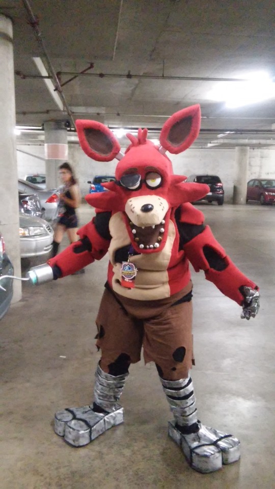
Costume work I'd have to say my Foxy cosplay was #1. The head alone took a solid month and was made back when FNaF2 barely came out, so it's an old costume by today’s standards, but it held very well back then.
While a digital work, I like this one in terms of visual storytelling, tied with lyrics from a song. The gentleness of the scene of nighttime story time is such a huge plus for me.
Lastly: my written works. This story is nice balance of angst, horror and fluff. A nice combination of the 3. Though this is actually tied with another one of my stories titled "The Sin", but I will not be posting a link here due to graphic content since that one is pure angst and horror.
#fullmetaldevil responds#asks#bendy and the ink machine#batim#benny the stitched demon#batim stitched au#fnaf#foxy costume#green eyes au#batim green eyes au#ghost benny#magic ink au#batim magic ink au#demonic harvest au#batim demonic harvest au#scarecrow benny
39 notes
·
View notes
Note
how do you get your colors to look so nice and your lineart so red and vibrant? i love it
omg anon thank you!! 😭 im going 2 be honest I am Not Great with color theory... but i like having my sketch pages look cohesive to me...
BUCKLE UP this is going to need a readmore bc i like talking.
I always sketch in neon colors it's a habit i picked up from an old teacher but I'll think of a color usually on a whim and draw with that. and then if i want to draw something else ill pick another color that i think goes well with the page. usually most of my color schemes r analogous (colors right next to each other on the wheel)

yanked this from recent dunmesh post; i kept most of my colors within the pink/red/orange range.
i wouldn't recommend doing everything in monochrome or analogous palettes though because it's sort of a guilty crutch of mine XD.
sometimes when im coloring ill change the layer mode of the sketch. color burn gets you either very very bright or very very deep colors depending on the color of the flats underneath. multiply and linear burn do the same thing but they're a lot tamer and generally always return darker colors. im sure there's some technical bits behind this though. ill either color my lineart afterward to compliment the color of the flats, leave it as is, or mess with layer modes if i feel like it. my favorite trick is color burn + linear burn + some combination of two lineart layers and just fiddling until i get a nice burn effect.
mithrun was done with crimson red on color burn.
coloring... like 999% of this is relative color which is like. kind of the idea that colors look different when placed next to each other. if you eyeball it a bit it's pretty noticeable.

what i used to do a bit ago was i would fill in the area i wanted to color with one big mask of color, make a new layer that has a clipping mask down to the flat layer of color, and then draw my actual flat colors. the color of the mask helped me pick my flat colors bc if I picked a color i think stood out too much next to the mask i could kind of just adjust it until it looked a little more cohesive.

old ish drawing next 2 a canon reference. i ignore local color a lot...mea culpa....but my overall color palette here was a light pink, so the shirt here is actually a desaturated pink? or violet i believe. if you shift sort of that purple color far enough into the gray area of your color wheel it can take on a blueish or even greenish hue. it being next to a lot of warm pinks/fuschias helps.
a neat thing that kind of helps is that if you desaturate or saturate certain colors they can kind of take on a certain hue? not sure if this makes sense. sort of how orange here turns tealish blue the grayer it gets. so if im drawing something that's predominantly orange and i have a blue color i can just take an orange color and desaturate it until i get a color that sort of looks like blue. and that way it kind of looks more harmonious? at least to me XD
shading. i don't apply serious lighting to a lot of my drawings, but a helpful bit is that the shadows tend to be the opposite of whatever color the lighting is? i try to think first about the "mood" or the main color i want to go for in the drawing and then i pick a shadow color opposite of that. so for here, i wanted the lighting to be a coolish magenta so the shadows r lime green. if there's anything off i fiddle around until i get something i like. the shadows on the skin here were too green initially so i shifted them a little more orange.
there's a "band" of color going on between the transition of the shadows to the light. generally this could be for a lot of reasons and i tend to use it differently (core shadow? overexposure? etc etc). but this is a color post so ill try not to go too off track.
but generally digital doesn't "mix" colors the same way traditional colors do if you use RGB (cmyk is a bit better with this but is kind of a pain to get used to), so to make blending a little less muddy, i sometimes add an intermediate color to smooth things out a little. for example, mixing digitally blue n yellow tends to get you gray, but generally, blue + yellow makes green, so if im making a blue->yellow transition ill slap some green color in the middle so it flows a little better.
I do a lot more cel shading nowadays. if you've been on here for a while earlier this year i have another style of coloring but it's not really accurate to how shadows really work so i wouldn't recommend looking at it. it's mostly to add zest and texture to the underlying flat colors.
coloring your lineart does a TON to helping your colors look vibrant, though its like the garnish on a dish to me (same with shadows). i think it's good to try and play with your flat colors and try to make sure those look in order first before adding flourishes. usually ill leave it a dark, saturated color that again matches my overall palette but sometimes i go in and color them by alpha locking my lineart layer and picking a color that matches the flat colors underneath? not sure how to explain it properly.

i used a darkish purple for shuro's ponytail to match the dull red of the flat colors (more relative color! trying to simulate a black/brown while keeping the pink palette there) but a lighter crimson for laios's blond. the light was this super intense like blush pink so i thought it might be cool to add this neon salmon red in the areas of that light to really give off that vibe of a very bright intense rim light.
sometimes you could also tweak with gradient maps or color balance, which adjusts hue based on how light or dark a color is. these r fun to mess with as a final touch but i need to watch using them because they can become crutches real fast XD but those are also just tools to help you. in the end just developing a good sense of how color works and how you want to use it is the best place to start.
LONGASS ramble but yeah. tldr just kind of train ur eye for color and look at what you like best. which is unhelpful and a little sucky but it really is just observation and practice and maybe some personal zest.
happy drawing!
#SORRY THIS IS THE SIZE OF CANADA I YAP A LOT#i like being thorough when explaining myself a lot XD but i think the easiest way to get good with this is just repeat practice n observing#and figuring out how stuff behaves in certain situations and what you like to do and blahblahblah#if you have artists u like that do this well looking at how they use color might be cool#...i feel this entire post is just putting my entire thought process on blast LOLLL.#“eyeball it out” -> study some actual fundamental stuff and or intake new info or art -> apply it back to just eyeballing it out#i dont think i have a natural sense for some basics#but i dont think im naturally one of those people who grind out studies all the time and breakdowns either#i guess i just kind of like knowing the mechanations behind why to do a certain thing or how stuff works and then figuring out#how that translates into what i know nerd emoji#james gurney has a good book on color and light#if you like reading. but its very informative!#quirinahscreams#ask#anon#this is mostly just me talking about how i draw i dont think this is meant to be educational or informative XD um
10 notes
·
View notes
Last Seen Blogs

davidhawkinsaudio
David Hawkins Audio
si-ds-blog
SiDamarink

wilsons-heart
Jade is
giulssbennington
We don't need no one to tell us who to be.