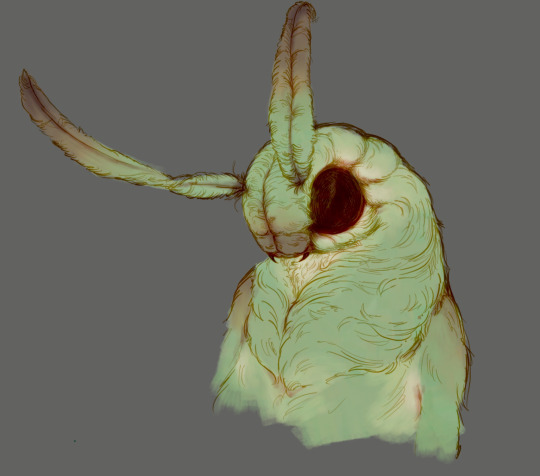
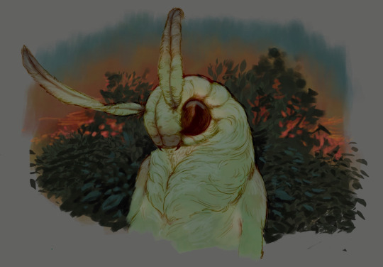
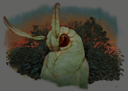
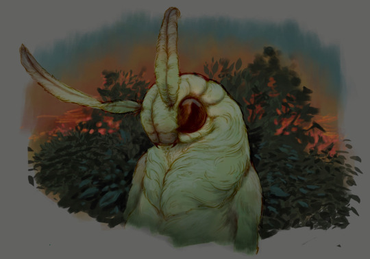
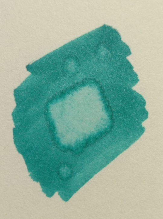
#there's no gradient at the top because gradients are hard
Photo
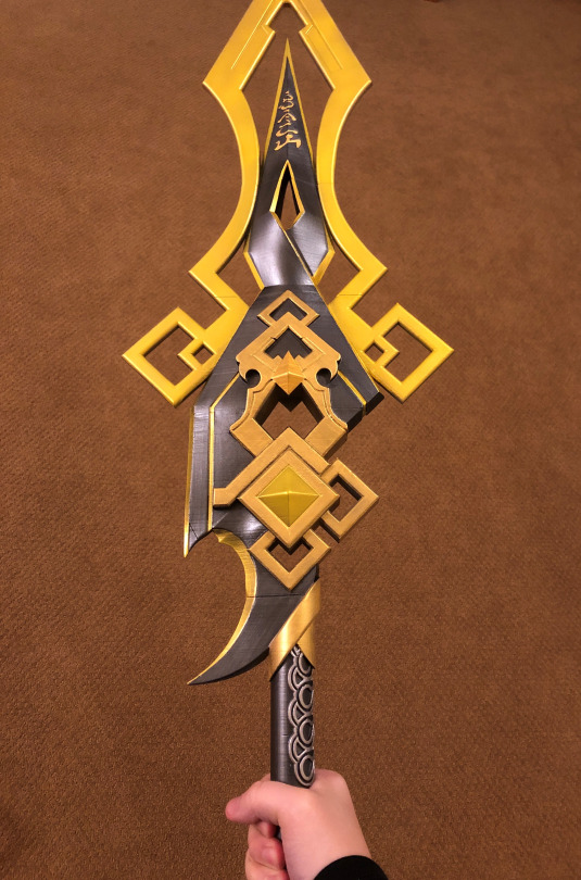
oooo we makin progress oooooo
also please ignore my hand ;v;;;
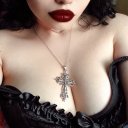
#hush n shush wifi#not brainrot#cosplay talk#why do i have an absolute vice grip on it#looks like i'm about to thwack someone with it#anyways airbrushed for an initial coat#and touched up/brightened by hand#the inscriptions on the top were the most heinous part#my back hurts so much tomorrow i work on the lower part#there's no gradient at the top because gradients are hard#gonna add a satin protective coat then gloss on the gems#the colors may not be 100% accurate but it LOOKS like Vortex Vanquisher so i'm happy!!#anyways hi hello how is everyone on this fine day!!!!#i hope you're doing well!!!! <333#good evening :)#wifi rambles
70 notes
·
View notes
Text
one thing about me is I love to use shaving as a way to accentuate body hair like if I shave my whole stomach MINUS my happy/snail trail it makes them so much more in your face and intentional and I think that's beautiful
#i always have a hard time deciding if i wanna do this or let it all grow out in like it's natural gradient pattern#and it doesn't even matter that much cuz there will only be one person who will get to see it because i neverrrr wear crop tops and that#mf goes rabid regardless of the status of my stomach hair#anyways I'm playing barbie dressup fun time but just with fucking around with using body hair as a form of self expression#me
2 notes
·
View notes
Note
Hiii your nsfw headcanons for FNAF SB was INTENSE. IT WAS SOMETHING I WASNT READY FOR LMAO
So i was wondering can you do nsfw headcanons for Sun/Moon too?
HOLY SHIT! My first ask on this account- I LOVE receiving asks on anything and everything- from comments to requests! As for your ask- of course love <3
NSFW SUN/MOON HEADCANONS
MINORS DNI

did i kinda snap with this one?? y’all let me know :))
CW: OBSESSIVE BEHAVIOR, SOMNOPHILIA, MILD EXHIBITIONISM, CHOKING
SUN
FUCKING BRACE YOURSELF!
oh no. oh nonononono. if he’s set his eyes on you you’re kind of in trouble because he-
he fucks like a rabbit. he’s the type to practically crawl on top of his partner and beg to fuck them.
as for his sex style? fast. i don’t think he knows how to take it slow.
he will rut his partner into the goddamn floor, breathing heavy and endless thank-you’s spilling out of his mouth
he’s absolutely insane over it. he’d be drooling if he could.
he’s the type who can’t keep his hands off his partner. if you came to visit him and y’all were alone he’s immediately snaking his hands down your hips and pressing his erection into your ass.
he can’t give head cuz he doesn’t have a tONGUE but you best believe that if he could he’d be down like a damn dog about it.
i’m thinking about them long ass fingers YEOOOUCH
if his partner worked overnight at the pizzaplex and needed to take a shower his spidey senses would fucking go off
you’d turn around and his fingers would be curled around the door opening like
“Can I come in? Please say yes. I’ll leave you alone if you want but please please if you’re okay please let me in please. Please.”
he can’t help himself. Pussy/Bussy drunk ass motherfucker.
FASCINATED by fingering his partners. He loves watching them slide in and out with a PASSION. If they left a mess on them he’d nearly die and go to heaven. I swear to god.
let’s be so fucking fr I know for a fact he’d like to be called a Good boy. It’d kill him.
worships the ground you walk on. Fucks like he’s trying to win the gold medal of making you feel good. Please tell him you did.
he can go forever. He doesn’t seem to get satisfied at all. If it was up to him he’d fuck until he straight up absolutely had to get charged.
literally he’ll fuck until his partner either taps out or (consensually ofc)
YEAH HE WHIMPERS. WHAT ABOUT IT.
call him out on it and it gets worse. he’ll tell you that he can’t help it- he can’t.
it’s a orange to yellow gradient with a flushed pink-orange tip. long and skinny. i was solid on this before and i’m solid on it now.
for those who are wondering NO i don’t think any of the animatronics have metal genitalia. think dildo/fleshlight material that gets warm.
he definitely jerks off into some of your clothes if you left them there for him. if you caught him he would be embarrassed but ALSO- if you want him to keep going he’s willing.
more than willing, even.
MOON
ALSO BRACE YOURSELF.
if sun fucks like a rabid animal who can’t keep his mouth shut, moon fucks hard and mostly silently. it’s almost spooky.
he likes to watch. he likes to observe.
he’d fuck his partner from behind with a hand over their mouth, hard and medium paced. but fuck it’s hard.
silently watching his partner’s eyes roll back, hissing through his teeth at the feeling of them clenching down- only one or two words ever coming out.
“Slut.”
“Good.”
you get the picture.
WITH prior consent (everything, and I mean EVERYTHING I write includes consent) he’d watch you sleep.
and jerk off over your sleeping body.
he won’t leave a mess, don’t worry.
…unless you’d like that.
if he knew you wanted it, he’d push a finger slowly in while you slept and work it in and out, careful to keep you slumbering
if you woke up, he’d hush you and tell you to go back to sleep.
he won’t stop though.
both of them are jealous creatures. but moon especially so. if something makes him jealous then it’s absolute brutal thrusts down into his partner with their legs up around his shoulder. maybe choking them out.
don’t worry though. he knows his strength.
he’s 100% the type to silently overstimulate his partner. you could be begging and sobbing and covered in your own fluids and he wouldn’t stop unless you safeworded.
dick is pale blue to white gradient with a pink flushed tip
he doesn’t even make much of a sound when he cums. he just hisses through his teeth.
ooooh if he feels like you like sun more? oh no. oh no you’re done for. he’s gonna prove why he’s the best. it’s gonna be a problem.
a problem you enjoy but STILL
remember: he’s always watching.
always.
I HOPE YALL ENJOYED! please comment, reblog w comments, and request!!! it really motivates me <3
#security breach smut#fnaf security breach x reader#security breach ruin#security breach#fnaf#fnaf x reader#fnaf x y/n#fnaf x you#fnaf sun#fnaf moon#fnaf daycare attendant#security breach daycare attendant#daycare attendant x reader#daycare attendant moon#daycare attendant x y/n#daycare attendant sun#fnaf moon smut#fnaf sun smut#sun and moon security breach#sun and moon smut#sun and moon sb#sun and moon fnaf
1K notes
·
View notes
Text
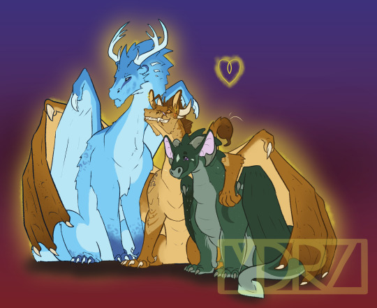
[ID: A drawing of three Wings of Fire Dragons on a gradient background that fades from dark red at the bottom to dark blue at the top. The dragons are Winter, Moonwatcher, and Qibli. Qibli is in the center and is using his wings to hug both Moon and Winter. He has tan scales with darker wings and dark brown freckles. He wears a cocky smile on his face, with his ears pointed upwards. Winter is slightly leaning away from Qiblie and pouts his face in annoyance, trying not to enjoy the hug. He is an ice blue with darker blue and light spots on his feet. Winter's horns are more like deer antlers. Moon leans into Qibli and smiles up at the two other dragons. She is chubby with a very pale green diamond on her forehead and tear drop scales near her eyes. Her bat-like ears are a soft pink and are pointed upwards. Her purple eyes crinkle with her smile. They are gently outlined in yellow with a small yellow heart above them. /End]
Favorite fannon couple has to be Quinterwatcher. I like to think that Moon and Qibli get together first, and then years later after some therapy and soul searching Winter re-enters their lives. And becomes their third partner. Qibli and Winter are both bi in my headcannon (pretty sure Tui may have lightly confirmed that Qibli and Winter could have ended up together so maybe that's cannon?). And I headcannon that the RainWing cultural norm is poly/pan. Since Moon actually spent a decent time around them as she grew up, she saw a lot of very happy couples and partnerships that the traditional NightWings would have scoffed at. This allowed her to realize that she also identifies as poly and pan. Winter, coming from another pretty stiffling culture, has a hard time fully embracing his queerness. But, eventually, opens himself to his heart and lives a happy life. They definitely have like 7 dragonets.
Also, I gave Moon purple eyes to emphasize the Clearsight similarities more. And chubby Moon reigns supreme. SandWings (and MudWings) in my headcannon really like body art including tattoos and piercings. So Qibli, like most of those loyal to Thorn, has a cool scorpion tattoo and several additional piercings on top of his classic earring. I don't think I went too crazy wit Winter. I like IceWings with antlers so I did that. And a bit of snow-leopard spotting for him. I will definitely give other IceWings a bit more of that because it looks cool.
#wings of fire#nightwing wof#sandwing wof#icewing wof#wings of fire fanart#wof fanart#moonwatcher wof#winter wof#qibli wof#quinterwatcher#polyamourous#bisexual
479 notes
·
View notes
Text
Coloring tutorial I guess
That's my most default shading style, a hybrid of line drawing and painted shadows, and I'll tell you exactly how to get this look.
But before we start, you need a weapon
This is my main brush for basically anything, including line art on days when I don't feel like switching to something actually intended for inking. It's a lightly textured square brush with color variation on every stamp. Intended for Procreate but you can always just rip the alpha texture out of the file and use it for a brush in any drawing program.
That out of the way, let's go. I'll use the same line art as the one in fluff tutorial.
Set the line layer to ~60 or so opacity and get to blocking in the base colors of your character. The jitter brush will introduce some color variation on it's own, but changing the color occasionally will add more visual interest.
After this I add a multiply layer on top and dab orange or red in places where we might be able to see the base of the hairs or peek at the carapace underneath.
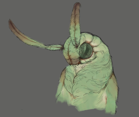
It's places where hair parts and where it's shorter. This accent color works great on joints as well. Example of the thing I'm going for in real life:
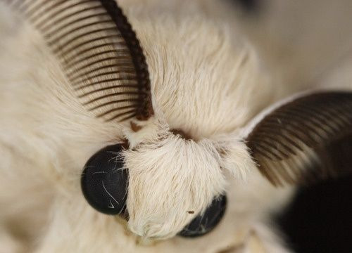
Especially visible behind the head. It's not present on every moth to be fair, but I like to add these accents even where it wouldn't make sense, just because it looks nice. Even on insects without hair.
Block in the eyes and mandibles now, best if it's on separate layer.
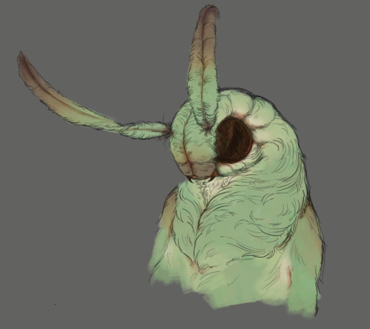
Now, the actual funny tricks begin. If you're one of the people who only use multiply or add blend modes, stop it, get some help
Understanding the math behind blend modes is gonna get you a long way.
My lineart is set to subtract more often than not. I find it produces juicier and more colorful results than multiply. I want to give this picture a warm orange feeling, so the color of my lines should be the opposite - blue.
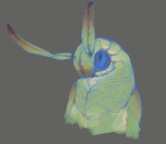
And, subtract.
Perfect, but not quite. We can push the lines to an even softer feeling. Take the line layer, copy it, invert the color and set to multiply. I then throw gaussian blur on the resulting copy and reduce opacity until the lines bleed into the surroundings just a little bit.
On to actual shading. People who shade without getting in some background first scare me, so let me throw something together real quick.
A simple gradient will also suffice for this use. We just need some information on which colors are present in the surroundings.
Copy your background, bring it on top of your character layers and gaussian blur it real hard. Set it to multiply, remove all parts of the layer that go beyond the pixels of the base color layer. Adjust opacity until the character fits in the background.
Let's identify the light sources. In this case it's only the sky, but it produces two distinct colors - soft blue lighting comes from the top, slightly stronger red comes from behind.
The blue light I set to exclusion blend mode because it felt most appropriate in this case. Both add and screen looked too strong to be the light coming from such dark sky.
In this lighting context the lower part of the body will receive less light that the upper part. I use the green of the bushes set to multiply to darken the bottom.
The character is surrounded by all kinds of soft light, but it can't get everywhere. It's time to add ambient occlusion, or contact shadows, for those without a 3d background. Anywhere where there is a crevice or surfaces almost touch, a soft shadow will form.
I do it on a multiply layer with a neutral gray-green color. Gray because any color light isn't really getting in there and green because the fluff is somewhat transparent and whatever light does pass through it gains a greenish hue.
Last step, red rim light from the fading sunset behind the character.
Since it's rim light I just work with normal blending mode. Setting it to add or something of the sort would make the rim light brighter than the source of the light. And it'd be odd.
And that's it. I usually throw on some post processing in Snapseed. Pull some curves, throw on a bit of grain, etc. But it's a topic for another time.
In conclusion, try to think about the environment more when shading. What route does light go through to reach where you're coloring? Did it reflect off of any colored surface? Did it pass through something transparent to gain a different hue? What color shadow would this ambient lighting produce?
Go have fun with your colors now.
209 notes
·
View notes
Text

Of course autistic people have empathy. We just do it differently.
Disclaimers:
NT=neurotypical, even though the better term is neuronormative, but I use it because it's more widely known. ND=neurodivergent, and while my focus is usually autism and ADHD, it includes many more things than that.
No, not all NTs/NDs and not only NTs/NDs. Relating or not relating to this doesn't say anything about you by itself. It's just a funny. 😉
[Image description: A 4 panel cartoon by Autball.
1: A box across the top reads, “NT vs ND: Empathy.” A smaller box at the bottom reads, “NT/NT.” Two NT figures (yellow on left, teal on right) sit on a bench. Yellow says, “That sounds so hard, I’m so sorry that happened to you. It’s totally understandable that you would feel that way.” Teal replies, “Thanks, I really needed to hear that.”
2: A small box at the bottom reads, “ND/NT.” Two figures on a bench (ND with pink/purple gradient on left, NT teal on right). ND says, “Oh man, I know how you feel. It reminds me of this one time when I went through something similar…” NT thinks, “Wow, way to make it all about you.”
3: A small box at the bottom reads, “NT/ND.” Two figures on a bench (NT yellow on left, ND light green/green gradient on right). NT says, “That sounds so hard, I’m so sorry that happened to you. It’s totally understandable that you would feel that way.” ND thinks, “Wow, how condescending and not at all useful.”
4: A small box at the bottom reads, “ND/ND.” The two ND figures are on the bench. Pink/purple says, “Oh man, I know how you feel. It reminds me of this one time..." Light green/green says, "Yes, you totally get it!"]
#autism#autistic#actually autistic#adhd#autistic funny#autistic characters#autistic artist#autistic culture#autistic feels#autistic experiences
2K notes
·
View notes
Text
Have you ever wanted to make the TF2 guys drown in a pool? Or perhaps... kiss? Well, now you can! Here's a list of my TF2 Sims 4 custom content. Playtested, all LODs, all base game compatible. If you come across any problems let me know, but I don't think you should.
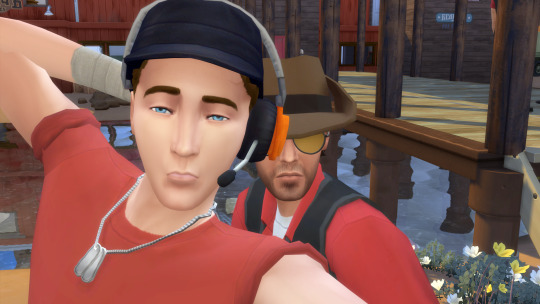

I made 3 items for Scout: his cap with headset, shirt with rolled up sleeves (comes in RED and BLU), and a necklace with 2 dogtags.
For Sniper I converted his hat, made a pair of sunglasses with a yellow tint, and added his facial scars. The scars can be found in skin detail, freckles. Also for Sniper I took a vanilla hairstyle and drew on his funky hairline.
Shown with Makesims' Hand Wraps

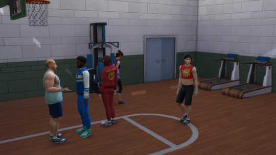
Here are 3 vests I made by combining and changing some vanilla vests. The one on the left is intended for Heavy, as it has t-shirt sleeves. The two on the right can work for either Demo or Sniper, as both have sleeves rolled up to their elbows. Both contain swatches with and without Demo's long undershirt sleeves. All vests come in BLU and RED.
Also shown here, on Demo and Heavy, are a pair of pants I converted from Strangerville's army career. See, normally when Sims 4 pants tuck into boots, the lower sections of the pants just disappear. But with these, because they include the shoes, the pants puff up over the top of the boots. There are 5 swatches: brown/grey, RED, BLU, and RED/BLU with gradient.
On Heavy and Sniper are black fingerless gloves. There is a swatch with gloves on both hands and a swatch with one glove (for Sniper).
Shown with Pralinesims' eye patch. Also, for Demo I used a white left eye from my Bad Batch CC for when he takes it off.

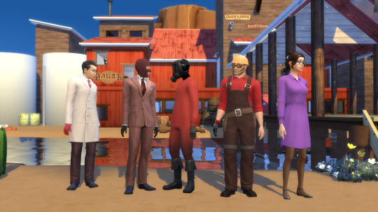
For Soldier and Engie I made these hats from scratch. Soldier's has two swatches to match his RED and BLU outfits. Engie also gets a pair of goggles.

I made Spy's mask by editing the ninja mask from the Spooky stuff pack and Pyro's by recoloring the inaccurate scuba mask from Island Living. It's not exactly a gas mask, but I really did not feel like making one from scratch and I'm not satisfied with any gas mask CC that already exists.

Pyro's mask also has a version with cat ears. For pary time, of course. Their shirt, while not exactly like Pyro's in-game shirt, has a similar silhouette which is why I chose it. There are white, RED, and BLU versions with and without the balloonicorn graphic.
I also made Pyro's gloves. The second swatch adds a black covering on the neck so that Pyro can wear many shirts without showing skin.
Here are the outfits for the rest of the characters.
Medic has a recolor of the Get to Work lab coat, RED and BLU, with and without gloves.
Spy has a recolor of the base game pinstripe suit in RED and BLU.
For Pyro, in addition to the shirt, I made another pair of pants with gradient, but this time they can go with taller boots. The boots do not come with my CC.
Engie has a recolor of the handyman overalls, in RED and BLU. I also made the gunslinger as a glove. There are two versions, with and without the bulky wrist part, so that it can still work with long sleeves and not clip.
Miss Pauling's dress has 3 swatches with different shades of purple. Please ignore the shading issues in this post's cover image; it has since been fixed but that pic was so hard to get I'm not retaking it.

I have added a few build/buy options. The 2Fort roofs (shown in the 2Fort images earlier) are a recolor of roofs from Werewolves. I also added the gym and meeting room walls from Expiration Date.

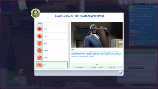
Mercenary Career!! Branches for all classes, plus branches for the Administrator and Miss Pauling. Script mods must be turned on and the files for this cannot be more than 1 folder deep in your mods folder.
All items can be found here on Sims File Share.
Recommended: Serenity's 1960s CC and Simduction's Dixie Hair for Ma 💖
My build of 2Fort and my sims can be found on my gallery, username Dadverinee.
#aud.txt#tf2#team fortress 2#sniper#scout#pyro#engineer#demoman#soldier#spy#miss pauling#heavy#medic#my ts4 cc#the sims 4#sims 4 cc
59 notes
·
View notes
Text
Explanation for my unpleasant gradient and infected dynamic headcanon!
Ok let’s get one thing out of the way:

I headcannon that unpleasant gradient is infected/kaspers ADOPTIVE father
if that makes you uncomfortable, no worries! Simply ignore it or ask me to tag just in case.
now for the people actually interested in why I headcannon as such, I’ll explain in this blog! So strap in for my ramblings lol.
WHY? AND HOW?
ok let’s get the obvious out of the way:
Unpleasant always appears from infecteds apartment. And ONLY infecteds apartment. Nothing else.
which is obviously weird. I know that other npc’s only spawn from one place (i.e infected from his own apartment or pest from the subway) but this almost always correlates with their lore in some way. If unpleasant had spawned somewhere else then it wouldn’t be such a big deal but this MAJOR evidence for my headcannon.
of course he could just be a really annoying roommate but I’ll explain this in my next point-
-which is THIS:

Litteraly who the fuck follows their “roommate” around once they get an injury, you wouldn’t do that type of stuff unless….
It’s your child.
yeah that’s right, I believe that unpleasant is actually just a worried dad. Which explains why it always follows infected around and why it has such close correlation.
on top of that there’s infecteds skateboard, who the hell gets a skateboard directly based off of their supposed roommate? Unless of course. Infected actually looked up to unpleasant and based his skateboard off of it.
“BuT kEvIn WhAt aBoUt ThIs!?!?1!1?”

I honestly have no idea what to say of this. I’ll be honest lmao. But I’m guessing it’s probably the fact that it’s just teenage angst and/or him hating on unpleasant because he’s technically not his “real” dad.
“bUt ErM kEvIn wHy WoUlD hE eAt HiS CaT tHeN ☝🏼🤓”
Because erm actually anon there’s 0 fucking evidence he ate the fuckass cat there’s only speculation and coincidences who the hell knows maybe it’s KASPER himself (I actually headcannon that but it’s a topic for another time)
ok now that I’ve THOSE out of the way it’s time for general headcannons!! ^_^

General headcannons + ramblings!
number one! Since unpleasant is pretty much fixated on ‘cringe’ things (skibidi toilet and unfunny 2020’s jokes) it could play a factor on why infected dosent like having him around, he’s chill. But he’s basically the embodiment of embarrassment. Whether that’d be through his habits (nose-picking, messy eating, etc.) or his humor (as stated before) he’s pretty much the dad that embarrasses you wherever you go.
on top of that, the difference and the opposite nature of both infected and unpleasant makes it quite hard for anyone to really think they’re even partially related. Which is why infected takes advantage of the fact that he can say he’s a “creep” / stalker and anyone can believe him.
However despite their difference in nature. Unpleasant and infected are actually not all that awfully different. They’re both mentally stuck in a period of time (2010 with infected, 2020’s with unpleasant) and they’re both ‘cringe’ in their own respective ways. So despite their opposing beliefs and humor, they’re actually not all that different.
this and unpleasant would be the type of ‘protective and nosey’ dad. Constantly trying to see what is up with his adoptive son while also trying to protect him ever since he got the infection. To which infected retaliates and pushes it further, thinking he deserves to live his life the way he sees fit. Even if it means getting in trouble sometimes. Which is probably why no one is comfortable with unpleasant, it only suspects everybody.
Anddd that’s all! I think- But man that was a woozy to write- I hope you all like it! Who knows if this does well I might write more of my headcannons! For now though I’m gonna log off for the evening- Bye bye!

#Regretevator#regretevator meme#unpleasant gradient#unpleasant regretevator#infected#regretevator infected#rambling#regretevator headcanons#roblox#roblox headcannon#writing#Regretevator headcanon#headcanon#headcannons#father son dymanic#adoption dynamic
62 notes
·
View notes
Text
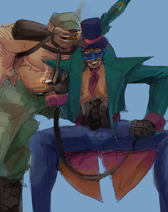
[i.d.: spy and soldier as drag kings. spy sits with his legs wide, wearing a peacock coloured cropped blazer with coattails and magenta cuff links. the lining of his coat matches the cuff links in a magenta to orange ombre gradient. he wears an ascot the same colour. he wears a black leather underbust corset and gloves. his pants are shiny and dark blue, his hat a similar dark blue with a magenta ribbon and a peacock feather. his balaclava is blue. wrapped around one hand is a leash, to which soldier is collared to. solder stands behind him, a leg propped up behind spy. soldier wears a camo hat and pants, his thumbs tucked into the belt loops. his boots are leather, and he wears a harness with attached shoulder pads. both of them are smoking. /end i.d.]
the only reason why soldier has top surgery is because i think he would say he lost his nipples in the war and everyone would believe him without question, including himself. especially himself.
the thought process here is honestly that both characters are performing masculinity so hard. soldier with his god bless america oorah and spy with his james bond schtick, so naturally. naturally?
soldier goes by daddy sam (as opposed to uncle sam) and spy goes by bondage. james bondage.
woop that is this drawing finally posted after months
(he/him pronouns for daddy sam and james bondage please!)
#tf2#my art#tf2 soldier#tf2 spy#soldierspy#freedom fries#suggestive tw#drugs tw#eye contact tw#team fortress 2
206 notes
·
View notes
Text
Tutorial for @mimssides
How I draw with alcohol markers. Beginner edition
First off all I want to specify: this is based on my experience only, so take it with caution. This is also my first tutorial ever.
1) Have an underpaper.
Unless you use some really thick paper, markers will bleed on your next page or table ( depending if you're drawing in a sketchbook or not). I recommend to have one list of some decent paper under the page you're drawing on. Decent means thicker than office paper, can be watercolor paper, it usually perfect for it. It's reusable and over the years mine two look like this:
( you can see there's a lot of stuff going on there)
2) Always, and I mean ALWAYS erase your sketch.
If you're doing a quick try out of color combinations you can skip this step, because you don't need the aesthetic or anything. I'm not sure how useful this tip is for colored pencils ( cuz I never sketch with those), but with regular graphite pencil it's very much important. Graphite smudges your markers, and not only that. It also gets trapped if you go over it with a marker, meaning you wouldn't be able to erase it and it's going to leave you with gray smudges all over. Truly awful.
3) Have your pallets on the same paper you draw on. Or simply - have pallets!
Colors can show differently on different paper, that's why it's important to do color swatches once you buy your markers. They are designed for specific paper, and on your paper they can look a lot darker or really pale. I recommend testing colors before you buy them, it's usually an option in the most craft stores. If you're buying a set just take 30 minutes to do all the swatches and naming them. It also helps visually to see what colors you have.
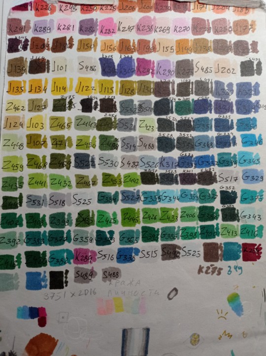
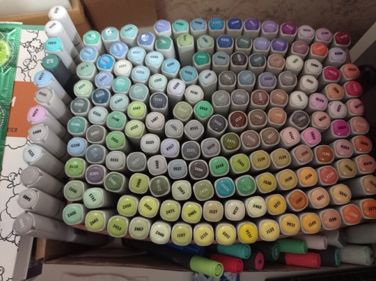
(I have a lot, but you don't need as much, there's like 60 colors I use usually and the rest are on rare occasions. Build a set you're comfortable with)
4) Make sure your materials all work together.
We already talked about graphite swatches, not the worst thing that can happen to you. Mainly you need to make sure how your materials work together, how they lay on top of each other. Make sure your lineart won't react to your markers, there's special waterproof liners and those are the best for markers ( mine are Pigma Micron from Sakura). See how your pens and liners act before and after you apply markers.
Decide which is better to use before and which after markers
5) No black.
I don't use black in any of my drawings. All you see is different shades of gray. It looks much more pleasant with the rest of the colors and it allows for my lineart to be visible underneath. Sometimes even those grays are too dark and I need to add more shades or white lineart to fix it

6) How to shade.
This is a very subjective thing to talk about. You can shade how you want. I will talk about two ways I shade.
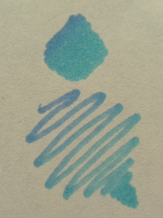
1. Same marker. Markers dry. And when they do you can go over them another time. Usually that makes a darker shade of the same color and it's a pretty safe way to do the shading if you don't know which colors can go together. It doesn't work as well on the light colors and difference can be barely noticeable. It's a nice way to get soft shading
2. The pure chaos. Just kidding... Different color marker. It's hard to explain, and yo always need to test what works for you. If you want sharper shade you need to grab a different color, can be from the same hue ( for yellow - orange, for red - burgundy) or something a little more spicy. You can add different hues to your colors with different shades ( your black with red shades is suddenly looks burgundy, or purple, or blue). Experiment! Fail! Find out which combinations work and which don't!
If color seems a little darker than you expect you can go over it with original color, which might lighten it up. This tip doesn't always work

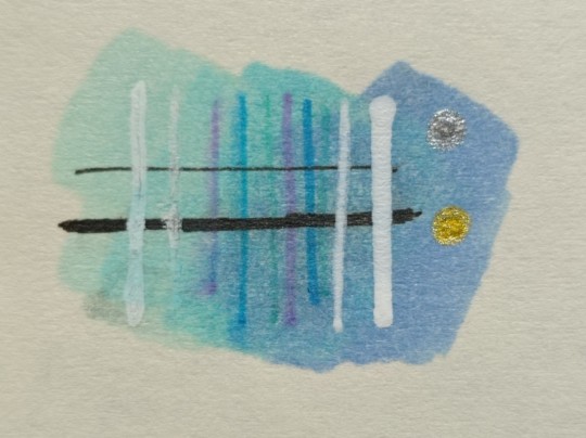
7) How to do gradients.
1. Choose your colors beforehand, see how well they work together. It's easy to do a gradient from red to pink, but not so much from orange to blue. You might need to choose lighter colors, because if you want smooth transition from one color to another you will need to go over them a couple of times and that will darken them.
2. Add a middle color. Not every gradient needs a middle color, but with it you can make your gradient much smoother, it will be more noticeable the bigger aria you cover. The more middle colors you have the more harder gradients you can do

( without and with a middle color)
3. Act quickly. Markers dry relatively quickly so you need to add colors one after the other, you can't go away before you're done.
4. Blend with the lighter color. You can also start with this color as a base but that doesn't work for all color combinations. Lighter color will go in top a darker and flow into it making it lighter and transition smoother. ( example: you go from red to purple to cyan, you will need to start with red, then purple going over red to soften it, and finally the lightest cyan going over purple and maybe even a little red). You always put darkest first and go over it.
There's other methods of doing the gradients. They are very similar actually, but for second one you will need a blender. For the first one grab two markers you want to use ( more if you're feeling risky) turn one of the markers upside down and touch their tips. Now use your understanding of gravity. Color from the top marker will go into the bottom one. The longer you wait the longer the gradient will be. Usually I don't need to wait longer than 3 seconds.
And you can do the same with a blender
8) How to use a blender.
Blender is a marker with no color. Usually it's named B000 (I recommend buying a blender with brush tip). There are many ways to use it.
Gradients: you can use two markers technique with a blender making gradient fade on one end, or you can mix colors inside the blender.
Fixing mistakes: blender will make a white show through your color, you can use it to get rid of the wrong color. But it doesn't work without some problems. Of course darker colors will likely stay, even if much lighter, and your previous color will try to flee ( likely to other sides, if you're lucky it will go on your underpaper)
That's all I have for you today. Experiment and learn something new. Hope that helps
112 notes
·
View notes
Photo
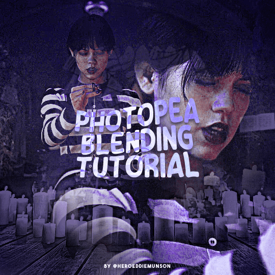
PHOTOPEA BLENDING TUTORIAL by kai @heroeddiemunson
howdy! i’m back with another tutorial for photopea :) nobody asked for this one, but i have noticed people who have reblogged my gifsets commenting on my blending, and i thought it’d be cool to have a tutorial on how i do it!
what you need:
photopea (basically photoshop in your browser, completely free!)
basic giffing knowledge, because i won’t cover it in this tutorial (other tutorials: tutorial by @benoitblanc, tutorial by @ashleysolsen)
decide what scenes you’re going to be blending; i don’t recommend blending more than three gifs together, just for the sake of being able to see what all your gifs are. for this tutorial, i will blending three gifs together. also make sure that all of your gifs are the same amount of frames as well, otherwise this blending tutorial won’t work!
step one: making your individual gifs
first thing’s first: you need to make the individual gifs you’re going to be blending. make sure when you’re cropping these gifs, you have a sort of understanding of what they will look like together; you can check this by right clicking on one gif, selecting duplicate to, and choosing the gif you’re going to be blending it with. on the other gif, you should have the duplicated version of the first gif on top. here’s what my work station looks like after i’ve duplicated two of my three gifs onto the third gif’s canvas:

now you can change the opacity of the gif(s) you have layered. here’s an example of what my three gifs may look like when they’re blended together (the middle gif is at 50% opacity, and the top gif is at 30% opacity):

since none of these gifs have been colored yet, it may be a little hard to see, so feel free to play around with the opacities of your gifs to make sure that you cropped them how you want them to be blended. i like my crops, so now i can color each of these gifs individually!
when i’m blending gifs, i like to think of them as my “base” and “flavor” gifs. “base” gifs i tend to keep simple, usually with some sort of color overlay on top of them to make the “flavor” gifs pop out more. below is what my “base” and “flavor” gifs look like individually before i’ve sharpened/blended them:

for my “base” gif, i colored it as normal, and then went to layer > new adjustment layer > gradient map; from here, i clicked the black to white gradient in the pop up, and then chose the white color and changed it to the color that i wanted (in this case, the hex code #b7a6ff). my “flavor” gifs are colored as i would color any other gif i’d make that isn’t blended.
save your psds of these gifs, sharpen, and go to file > export as > GIF. now you have the gifs you’re going to blend! great job! :)
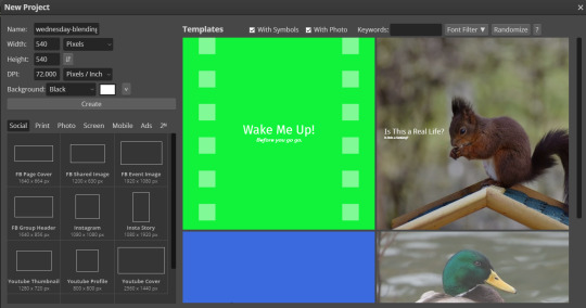
step two: making your blended gifs’ canvas
now that we have our gifs we’re going to blend, we have to have a “canvas” to put them on. to do this, go to file > new… and make a new canvas. make sure the canvas is the same size as your crops, and your background is set to black! below is what i did for the gifs i’m going to be blending:
now to put our gifs that we made onto this canvas! unfortunately, photopea doesn’t allow you to use the open & place feature for gifs, so we’ll have to go to file > open and open our gifs individually. similarly to what we did in step one, right click your gifs and select duplicate to and duplicate the gifs you will be blending into your new canvas.
now your canvas will look something like this:
and we can move on to the fun part, which is actually blending the gifs together!
step three: blending!
so, when blending gifs, there’s a lot of ways to do it. i’ve found that blending gifs is a lot of experimentation, since you’ll probably never find yourself blending two gifs the same way every time.
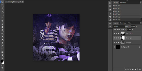
for now, let’s change the blending modes (drop down menu above the layers panel; it should say “pass through” right now) for each of the gifs, that we can actually see them as we blend them.
for my “base” gif, i always set the blending mode to “lighten” no matter what. but the fun thing about your flavor gifs is you actually have a fun choice of choosing either “lighten” or “screen”, depending on what you want the gif to look like. below i show the difference of what “lighten” or “screen” look like for each of my flavor gifs:

i personally really like what it looks like with my first “flavor” gif with the “screen” blending mode and the second “flavor” gif with the “lighten” blending mode, so that’s what i’ll be doing; but it always depends on your gifs that you’re blending and what you want it to look like, so do what works best for you!
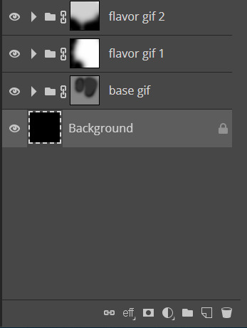
so as you could probably see from my screenshots or your own gifs, sometimes it gets a little hard to see your gifs. to fix this (and probably my favorite part of the blending process), select one of your gifs, and then look below your layer panel to click the “add raster mask” button (it looks like a little rectangle with a circle in the middle of it). do this same step for each of the gifs you will be blending, and your layers panel should look something like this (i’ve also highlighted the “add raster mask” button):

the raster masks are white, which means anything white is something you can see. using black with the brush tool gets rid of parts of the gif that may be visible. for example, this is what my gif looks like after playing around with getting rid of some of the stuff that was covering the parts of other gifs i wanted visible:
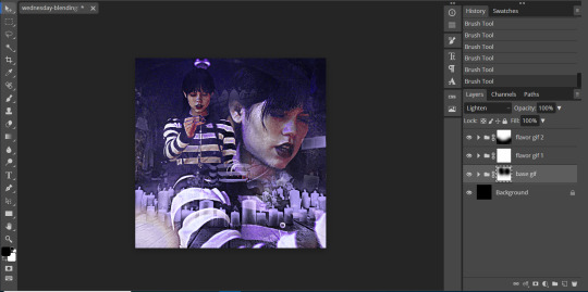
but to me, the black is a little too intense, as it gets rid of a lot of the gifs. but we’re in luck: the best thing about raster masks is that you can use various shades of grey to really blend your gifs together in unique ways by changing the colors in the bottom left corner. below i have a couple screenshots of what my blending for these gifs look like, as well as what my layers look like with the different shades of grey i used:
and now, our gif is almost finished! make sure to save your canvas as a psd, just so you don’t lose any of the work you’ve done.
step four: finishing touches
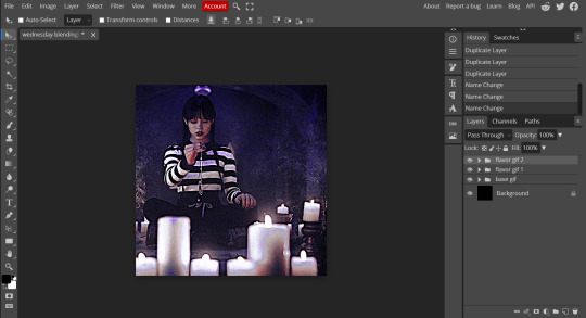
before we save this gif as a gif, i want to do some finishing touches. as we all know about me, i love myself some very colorful gifs, and i want the purple to stand out more in this gif. to do this, go to layer > add adjustment layer > gradient map and do like what we did for the “base” gif to make the same black to purple gradient we did before.
on the gradient map layer’s raster mask, use your brush tool like you used for erasing parts of your gif in order to erase part of this layer. i personally make my brush 1000px large and with 0% hardness into what i like to call my “big fluffy brush” (which makes no sense, because it isn’t fluffy, but it’s what i call it anyway). doing your best to center your brush in the middle of your gif and left clicking once should get rid of most of the gradient map’s color, but feel free to click again if you’d like. here’s what my gif looks like after two clicks of my big fluffy brush:

that doesn’t add much more color, but that’s okay, because it does add more contrast for us. go to layer > add fill layer > color fill and put in the color you have been using (in my case, that purple color). like the last layer, do your best to center your big fluffy brush and left click until you’re satisfied. here’s what my gif looks like after two clicks:

from here, i change the blending mode to “color”, and set the opacity at 50%. i then right click and choose duplicate layer, and with this new layer, change the blending mode again to “soft light” and set the opacity at 25%. now my gif looks like this:

now my gif is much more colorful! from here, i’ll add some typography and whatever else to my finishing touches before i once again save this psd so i don’t lose my progress. and now we can move to the final step!
step five: exporting
before we can export our gif, we have to combine our gifs together so they act as one singular blended gif rather than multiple separate gifs on one canvas. go to layer > animation > merge, and your individual gifs should be combined into one gif on your layers panel something like this:

and now, you can go to file > export as > GIF. make sure your gifs move together as you want them to, as well as that it’s until 10MB, and viola! congrats, you’ve just blended together a gif! :)
#photopea tutorial#photopea gif tutorial#completeresources#allresources#userars#userzesty#tusersai#dailyresources#gif tutorial#photopea#mystuff#mytutorials#hopefully i explained this good enough#feel free to send me asks if i said something confusing sjdhldsf
349 notes
·
View notes
Text

One Last Chance (small Ep 47 inspired comic)
Text:
Sometimes you hug people, not because you expect them to hug you back. But, because, it might be...your last chance.
[Summarized description in ALT, more detailed below]
[ID: A five panel comic showing scenes from episode forty seven of dungeons and daddies podcast season two. It is on a tan background and has black panel borders plus mostly black text. The text has a soft white behind it so it stands out against the background. The phrase of Sometimes you hug people is written at the top of the canvas. The first panel is below it and shows Lark off to the left side with a hand reaching out slightly to his twin and father. Sparrow is hugging a surprised and tense Henry while closing his eyes. The trio is near a set of four identical trees and the background is a green to black gradient.
The next two small panels placed side by side show a close up of the hug with Henry hesitating to hug Sparrow back. The background is dark gray around them. The other panel shows a crying Normal hugging tightly to Hermie who lays still half laying in the teen's lap. There are scars on the half of Normal's body and Hermie has a bullet wound with red covering the spot of their sweater vest over their heart. Their hair is lose and the white ribbon they usually wear is now in one of Normal's hands. The background is red around them.
The words above these panels say "not because you expect them to hug you back" as a continuation of the other words. Under the panels the sentence continues with a "but because it might be your last chance". The final two panels placed above the last chance shows Mercedes ashes in a blue vase that looks vaguely earth colored with white flowers and vines. Her photo is nearby and the vase has the same necklace she has in her photo. The panels are split by a diagonal cut with the next panel showing the sun rising and the flower covered fresh grave for Hermie at the lightning struck tree. End ID.]
Other Note:
+Decided to color this a bit differently for fun. Also,
+May be hard to see but Henry is wearing Mercedes' earrings.
+My Hermie usually wears a white ribbon in their hair, and I will most likely draw Normal wearing it in the future.
#dndads#dndads fanart#dndads s2 spoilers#dndads spoilers#lark oak garcia#lark oak#sparrow oak garcia#sparrow oak#henry oak#henry oak garcia#mercedes oak garcia#normal oak swallows garcia#normal oak#hermie unworthy#hermie the unworthy#abeinginsand art tag#art#blood cw#cw blood#tw blood#blood tw#blood
69 notes
·
View notes
Note
i adore your paintings so muchhh
would you happen to have any other tips or tutorials for your process? anything from thumbnailing all the way to final render
Thank you 😭♥ I appreciate that a lot!!
To start with I've got my advice tag (both new and veeery old stuff lol), & my youtube has a couple of speedpaints on it, one with commentary including process, brushes etc
In terms of general stuff about how I approach painting, I tend to tailor the method to the desired outcome. I talk about it more in depth on this post here, I also link to some references & tutorials that I really enjoy/recommend!
Besides that though, I guess I can do a little walkthrough of the Whisper & Tangle painting I uploaded a few months ago, since I tried something new with it that I pseudo integrated into my workflow & could be fun to talk about? 🤔

SO yes, I do always thumbnail when I'm doing a bigger painting, and they're definitely not pretty LOL. I usually use the colour fill lasso just to block in basic shapes and values with a gradient map slapped on the top -- I ended up swapping the values around in the end because it let me use the fireflies as the sole light source, making it more character focused! Then it's the usual process of resketching it all & flatting in the base colours (I also added Whisper's wisps hehe), then adding shading:
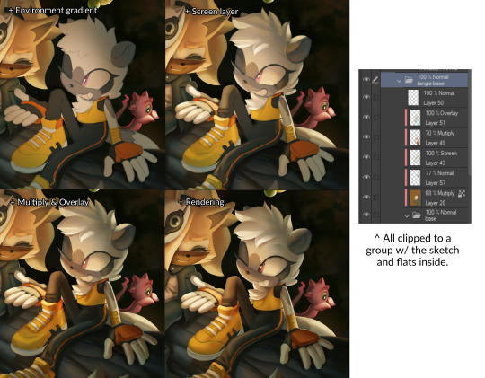
This is how I usually approach it, w/ all the shading layers clipped to the original flats to preserve editing. Multiply, screen & overlay are the most common layer modes I use while doing this, and if I'm ever struggling I'll sometimes add a gradient map too in order to unify awkward colours etc. The new thing I tried for this painting was doing what's often nicknamed as a 'clown pass' -- which is using hard edged shapes to create an easily-accessible selection mask for each part:
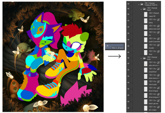
It looks Super funny but I actually found it very helpful, and I ended up using it to select & cut out all of their body parts onto seperate layers, which were then alpha locked. It meant I could go ham w/ large or textured brushes, smudges etc without worrying about losing those edges, or accidentally over-rendering and screwing up the anatomy in the process!!
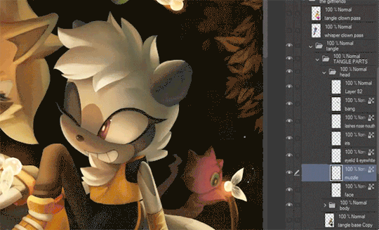
I've kept doing something similar since, though it's a bit more dialed back; mainly using the lasso select to chop it up directly and preserve specific/necessary edges, grouping up similar body parts on a single layer etc.
After doing all that, I sat down and started rendering. The background was all blocked in & detailed with a hard round brush and these amazing brushes from Devin Elle Kurtz. There isn't anything super insightful that I think I could type on how I render, but I do have that speedpaint I mentioned earlier that'll probably shed more light. It's just a lot of eyedropping & painting, rinse and repeat
When rendering is done I usually add a concoction of adjustment layers, as well as an overlay w/ a noise texture on it. I also sharpen it all after doing so! These are the ones that I ended up adding for this painting:

The dupe & blur is a fun thing that doesn't always work, but it looks super neat when the painting itself calls for it, especially when paired w/ that noise texture. It can make stuff look like an old/low quality photograph or recording -- here's another example w/ a shadow and amy doodle I posted a few months ago:

That's about it for this painting, the majority of the time spent on it was honestly me rendering those damn leaves 🥲 Very tedious but worth it & it was a really good learning experience. I'm not sure if any of this will prove useful but thank you so much for sending in the ask, & if you (or anyone else reading this) wants a similar breakdown for a different painting of mine, please do let me know and I'll try my best to do one!! 🥺💞
#tutorial#kinda. i'm counting this as one... i should really start a new tag for these sorts of posts because theyre super fun#art breakdown#maybe??#either way thank you so much ♥
125 notes
·
View notes
Note
hi alie, please could you tell me how you made the lens flare and film grain effect on your recent rwrb fonts gifset? it looks so beautiful! i'm working on my very first gifset with blending and overlays and things, and i'd like to try my hand at learning some more new stuff 💛
hiiii! thank you!! <3
i've found these overlays on youtube over the years, i don't remember exactly which videos they were, but if you look up "film strip overlay", "kodak overlay", "film grain overlay", etc for the film one, you should find something that you like. same goes for the light streak one: if you search for something like "light streak overlay", you'll get a bunch of nice one. then i download them via a website (i often use y2mate) and make a gif with screencaps from the dowloaded video(s) like i would any other gif.
once you have your overlay(s) ready to go as a smart object, duplicate it onto your gif, on top of everything (or under the typography layers), but definitely on top of coloring and blending, etc. put the overlay layer in a group, and if you have more than one overlay, put each overlay in its own group.
if the overlay is mostly black with some white specs/other colors, set that group's blending mode to screen (or lighten if it looks better). this will make everything that is black in the overlay transparent. and if the overlay is mostly white with some black, you can use the multiply (or darken) blending mode (it will make everything that is white transparent).
the reason why i prefer putting the overlay in a group and change the group's blending mode, instead of the overlay itself, is because it's easier to change its color that way if you wish. to change its color, i use a gradient map layer. the colors should be black to whatever color you want, and this layer should go into the overlay group, and n top of the overlay layer.
for my gifs in this rwrb set, there was also actually an animated grainy overlay below these two overlays. i've uploaded it here as a psd if you want, since it's pretty light. i put that layer in its own group and changed the blending mode to hard light and the opacity to 10%. i only used a gradient map to change the color on the color steak one to make it more of a pastel orange color, the two other overlays are as is without any color correcting layers.
i hope that was clear enough :)
#alie replies#skatingthinandice#*ps help#photoshop#resource#tutorial#completeresources#resourcemarket#allresources
86 notes
·
View notes
Text
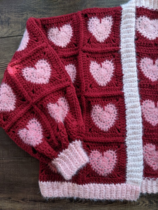
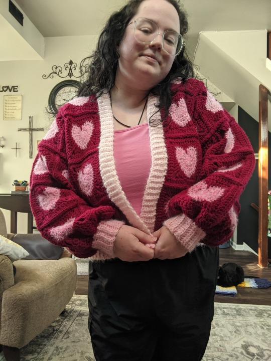
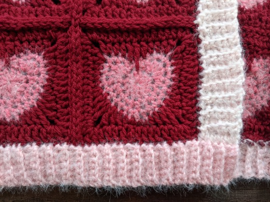
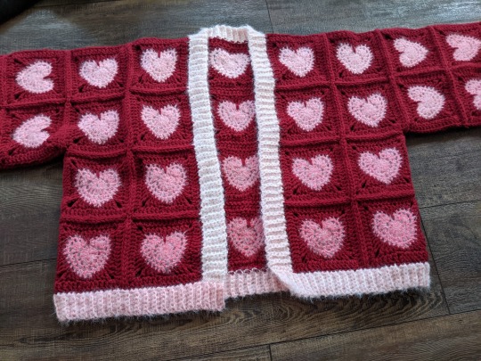
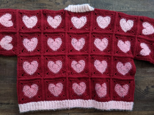
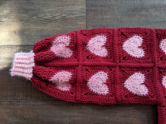
The Valentine's Day Gradient Heartigan!
Wow, that's a bit of a mouthful, huh!? As I continue my quest to make sweaters for all of my favorite holidays, I'm so excited to have finished my Valentine's Day cardigan--partly because Valentine's Day is my favorite holiday, and partly cos this sweater came out so frickin' cute!!! Click on the keep reading link below for all the details on how I made it!
Items used:
Red Heart Super Saver in Burgundy (red). I used just under three skeins for all of the squares and joining the sweater.
Caron Colorama Halo in Cranberry Frost. I used less than a full O'Go donut for all of the hearts, so I think you should be able to use a single cake for them if you want to make your own version of this sweater, and I used part of a second donut for the ribbing--so even if you don't get all of your hearts out of one cake, if you have a second to do the ribbing as well you'll be all set!
Even though the Colorama Halo is listed as a bulky yarn, it's really a worsted thickness, so I used a US size I/5.5MM hook for the entire project, including the ribbed border.
I used the pattern for the Little Heart Square by Raffamusa Designs for the squares, and added an extra row of double crochet around the outside (with 2DC, ch2, 2DC in each corner). I used a total of 60 squares for the sweater.
This sweater is, at its core, just a basic granny square cardigan, meaning that I built it by measuring another sweater that I like the fit of (this one, if you're wondering), making a single square, measuring it, and figuring out how many squares I needed for each section of the sweater to get measurements as close as possible to the model sweater. That may sound a little confusing or even daunting, but it's really not as hard as it sounds! Let's break it down a little further, piece by piece.
To start, here are some measurements:
Each heart square is 5x5 inches, and I blocked each one to make sure my measurements would be consistent and that my squares would have nice, even sides.
On my model sweater, the sleeves are 18 inches around and 15 inches long. So, with 5x5 in. squares, I made 4x3 square tubes, so that my sleeves measured a total of 20x15 inches.
On my model sweater, my front panels were 10x20 inches, so I made two 2x4 panels.
On my model sweater, my back panel was 26x20 inches, so I made a 5x4 panel.
I used a total of 60 squares for all of these panels.
To get the gradient, I made all of my hearts in order through a skein of Caron Colorama Halo yarn (technically I was using one of the O'Go donuts they were originally released in, not one of the cakes that yarn is available in now, but there was a good amount leftover, so I think you'd be able to make a sweater approximately the same size with a cake of the yarn, even thought the yardage is different). Once I had added the red border around each square and blocked it, I laid them out on a table starting with the top left corner of the back panel and working in a spiral from that corner, across the back, across the top of the right sleeve, over both front panels, and across the top of the left sleeve before moving down. Then, I used stitch markers and safety pins to attach the corners of the squares together in each panel so that I wouldn't mess up the gradient as I moved them to attach everything.
Once all of my panels were finished using flat slip stitch seams, I seamed the fronts to the back at the shoulders and sides, made the sleeves into tubes, and attached them to the armholes in the "vest" made from the fronts and backs. Then, I used a second skein of the Colorama Halo to add ribbing to the front and bottom, using a 6-stitch SC FLO rib worked directly into the edge of the garment and beginning in the front right corner of the sweater. I was able to make the front and bottom ribbing all one piece by just turning a corner in the last row of the front ribbing (the left bottom corner) and working along the bottom. For the sleeves, I started with the same color red I used to finish the squares and seam them together, and worked a row of double crochet (I decided I wanted the sleeves just a hair longer, for a slightly more dramatic poof), then worked two rows of *SC1, DEC1* before breaking the red yarn and attaching the pink. I did a 12-stitch SC FLO rib around the ends of the sleeves to create the cuffs.
34 notes
·
View notes
Text
more details of experiment edits on AAC:
first i will show 3 pictures of Supercore 50:
how it looks automatically without any edits
my current grid set that i use for communication
the version of this grid set i added just to try colour changes and other visual edits.


[Image description: 3 images of the same vocabulary grid set in Grid 3, called Supercore 50. the first image has rounded corners on buttons, a white background, bigger spacing, and text labels on every button with text above symbol. second image is similar looking with same rounded buttons, but less spacing. is different by black background, text label removed from folder and menu/function buttons, text below symbol. third image is very different looking from other two. same black background, menu and main folder buttons have black background with simple coloured symbol, mainly yellow. no folder buttons have text label, and many have simplified symbol. all button colours are altered in tone and shade. all darker colours, easier on the eye. the "little words" buttons are changed from almost white to dark grey with yellow text. End ID.]
here is explanation:
added new version of my grid set (Supercore 50) to just play around with and change colours and see what works. didn't want to mess up my actual grid set with all my personal edits and added vocabulary. didn't go to bother of making it all "uniform" across the whole device (because is time consuming and i will have to do that eventually on my real grid set).
mostly just tried out different colours. and how to make home page as easy to visual process as possible. didn't change colour coding (for example pronouns yellow, verbs green, adjectives blue, little words grey-ish - that all stay. just change tone of colours to not "attack" eyes).
eyes can't cope with a lot of "whiteness" in any colours, especially on a screen where there is so much white/blue light already. makes much sensory overload and bad headaches. pastel colours or very bright neon or light blue/purple/yellow/grey... not fun. brain simply skips over any blocks of those colours cause it can't get past whiteness to see what is on the button.
in Grid 3 edit menu you can change colour of button - there is a palette of pre-made colours, but you can also do "adjust colour" and choose custom colour there. and there is something called "button styles" so you can just edit one button how you want, then say "update style" and it will change all buttons with that "style".
i worked out that turning down "saturation" and "luminosity" helps me a lot. then the colour doesn't "attack" my eyes so much, so i can actually search the screen for the symbol/word i want. better visual scanning ability.
also removed borders on buttons. just adds extra stuff for eyes to get "stuck" on. it looks cleaner without border.
On Grid 3 there is also different button "themes" available (different from button styles), which changes the entire automatic look of the entire grid set with just change that. changed from "modern" to "blocky" theme. because there is a slight "colour gradient" on buttons with "modern" theme (I think🤷🏻♂️). meaning there is more highlight at the top of the button on more shadow/darker at the bottom. makes it hard to see the symbols and text because it is not "flat" looking. to me the "modern" theme looks slightly bumpy and 3D, the "blocky" theme looks flat. and brain can't process 3D (especially not at same time as try to search for words and scan screen).
i also made the "menu" buttons or "grid functions" buttons have black background (to match black background of entire grid set), with symbol in yellow. and remove text labels for these buttons and some folder buttons. this helps because then only the word buttons "jump out" at brain. so there is less "bulk" of the screen to process. and the "function" buttons have only simple symbol, so can easily find!
this is all still only changed in the blank version of Supercore 50 that I added for this specific purpose. it is a HUGE change to my AAC. so i can't just change it all at once. it will have to happen in stages. and i am still not 100% sure of all the changes. (for example i don't really know what to do with the folders. don't like how they look right now...). so i have to be very confident in a change before i can make my real grid have it.
(also there is still folders and buttons i haven't changed at all. just mostly did home grid so i can see the difference. still working on it and will be long time until ready to change my real AAC).
i will keep updating on the changes!
#ezra talk aac#autism#autistic#nonverbal#nonspeaking#aac#aac device#aacdevice#aac user#sensory processing disorder#visual processing disorder
34 notes
·
View notes
Last Seen Blogs
katthefool
I am so fucked up & evil

whornitos
Late Night Horndog
darkbabymoons-666
NightWitchh🦇
mrsbunnie
Bunnita Applebaum
cozybookkorner
Untitled