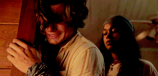
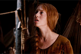
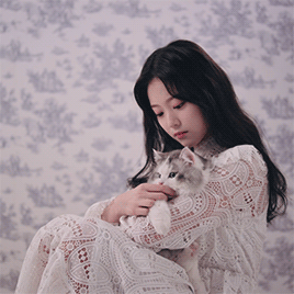
#so i toned down the opacity of the color balance towards the end of the gif
Photo
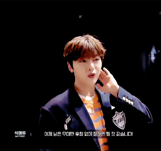
for @seok02
#zerobaseone#zb1#zb1net#seok matthew#seok02#gunwookstan#heyiri#maria.gif#not my usual coloring style#but i had to work some giffing magic to makes this cohesive#the lighting changed halfway#so i toned down the opacity of the color balance towards the end of the gif#never doing that again
23 notes
·
View notes
Note
I love you art!! Do you have any advice for choosing colors that work well together?
thank you! colors mostly just come naturally to me (whether its actually natural or if i've just internalized color theory so strongly that it feels natural i'm not sure lol) so im not very good at actually explaining it. most of it is genuinely just what looks good to you, but looking up some basics of color theory can help a lot to narrow down options so it's easier to pin down what you want.
doing those limited palette challenges (especially when the subject matter doesn't necessarily fit the palette colors) can be good practice and i think at least a small portion of my skill in the area comes from playing those color-sorting phone games like blendoku or i love hue lol. also probably related is the year or so when i was younger where i just refused to use gradients whatsoever for some reason
that aside, here's very bare bones color theory (i wont get into it too deep, there's a billion explanations online that are leagues better than i could explain it) and some tips that might be useful?
|img source|
i tend towards 2-tone palettes when i'm doing full color n they usually end up being complimentary (purple + yellow, green + pink) or close (blue + yellow, green + purple, pink + blue). i like a good strong contrast, which i think is generally what people mean when they say my style pops- having contrast makes the colors seem even brighter and stand-outish.
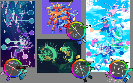
| left || top || bottom || right |
maybe that ^ helps? the ratios are rough estimates of how much of each pic is each color group. some common advice in general design (it's actually used in a lot of stuff- webpages, interiors, etc) is having 60% main color 30% secondary color and 10% accent color (but like i said, i mostly work in 2 colors so i don't have a great example on hand)
as for finding colors, i'll sometimes search for photography that has the kinda vibe i want- for the kindred spirits pic i literally searched "blue and green spooky toxic photography" and i think i ended up referencing a pic of green lights reflecting off of wet pavement on a dark street.
one big thing that i hardly ever see mentioned but i personally utilize an absolute fuck ton- dulling colors makes them lie. use this to your advantage. say you're using bright green; if you use a gray-blue it can look like purple and will blend with the green instead of contrasting like an actual purple would

| right example |
of course there's lots of situations where you do want the purple (or whatever color) to be a contrast, but this is useful when you don't.
a lot of the time lately i'll color everything in a base monotone (or very slightly varying analogous colors ie teal through indigo) and then make the lighting a contrast (complimentary) color on an 'add' or 'vivid light' or other lighting layer, then sometimes color pick the contrast colors shown in the lighting n use them sparingly to fill in a few of the base colors that didn't fit well being the base color. you can see that in the drowning picture (blue is the base color with pink lighting) and the kindred spirits drawing (gray-blue base colors with green lighting).
one last thing: never be afraid to use filters. almost all of the finished art i post has at least one overlay or gradient map or tonal correction layer ontop of it all. i'm quite partial to a low-opacity gradient map layer set to whatever colors i scrolled thru in my list and liked the vibe of, a black and white gradient map layer with the layer set to brightness (also on low opacity), or messing around with a tone curve or color balance layer.
if someone starts shit with you for using filters on your art fucking block them. in general if it looks good it isn't cheating (insert common sense caveat that you aren't stealing other people's art etc etc)
#tiny edit bc once again i used discord text styling outside of discord#this got kind of long woops lol#i hope this maybe helps? i'm never sure if i actually answered the original question when i get long-winded like this#talking#answers#tips
93 notes
·
View notes
Note
hey!! i wanted to ask what coloring do you use in your gifs, it looks so pretty and you’re so talented… if you don’t want to share it’s ok too. hope you’re doing good <3
hey! thank you so much for asking, this is really sweet.
it took me a little while to figure out how to answer this because i don't typically save my psds (or use other people's). i'll try to give you an idea of the steps i use under the cut. you might need a basic understanding of ps for this to make sense but for the most part my process is relatively easy and beginner friendly :)
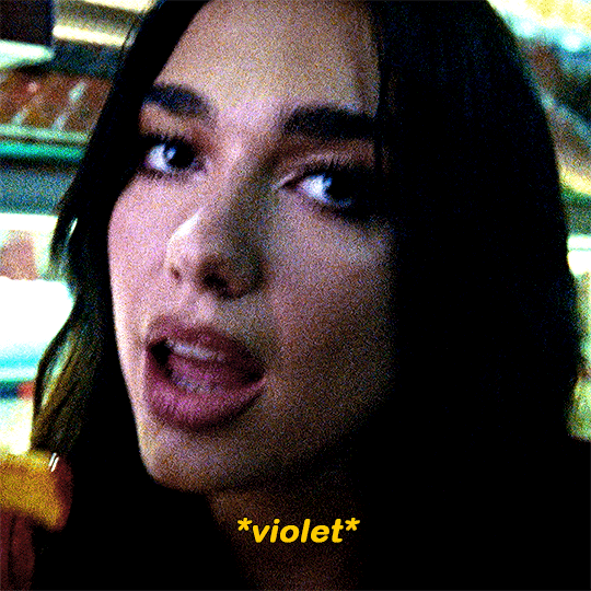
this is kinda gonna be what i’m going for:

so starting with this gif of dua that's almost completely untouched, all i've done is sharpen it.
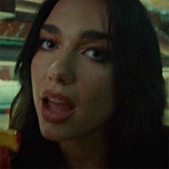
curves layer
this is usually my first step in brightening the image to my liking. it also helps me neutralize the colour. i make it easy on myself by letting photoshop do the work for me.

i start by white balancing using the white eyedropper tool. you can do this by selecting the tool and then clicking on a white point on the image. for this gif you can use the whites of her eyes, her teeth, the lights in the background, the highlights on her nails, etc. it might look vastly different depending on what you pick, so it's really up to personal preference. i'll give you an example of a few:
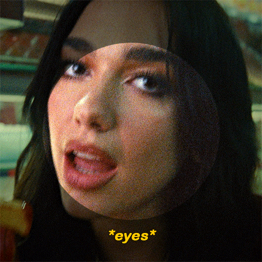
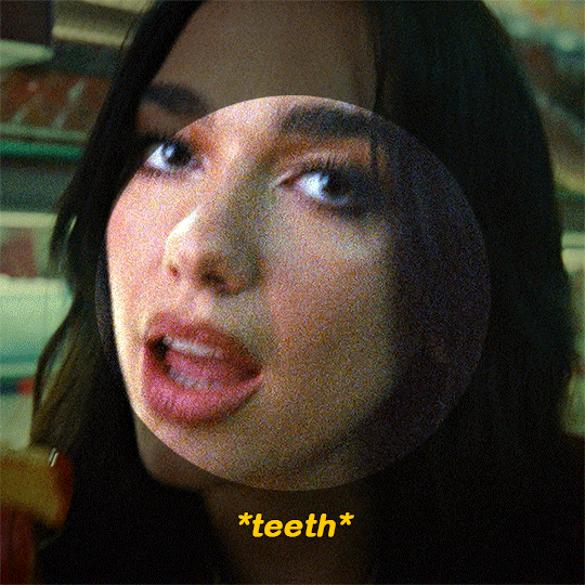


(i went with the teeth option)

at this point i usually add second curves layer to essentially do the opposite. for the black point you can use her eyes (like the iris/pupil), her hair, her eyebrows, etc etc. select the darkest eyedropper tool and click your black point on the image. here are some examples:

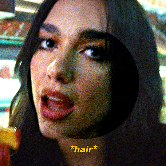

(i went with the eyebrows option)
hue/saturation layer
as you can see, her skin looks really red. i’m going to tone it down a little bit. i usually use this layer to subdue any colours in the gif that i feel are overpowering. you can also use it to do the opposite, which i normally do towards the end.

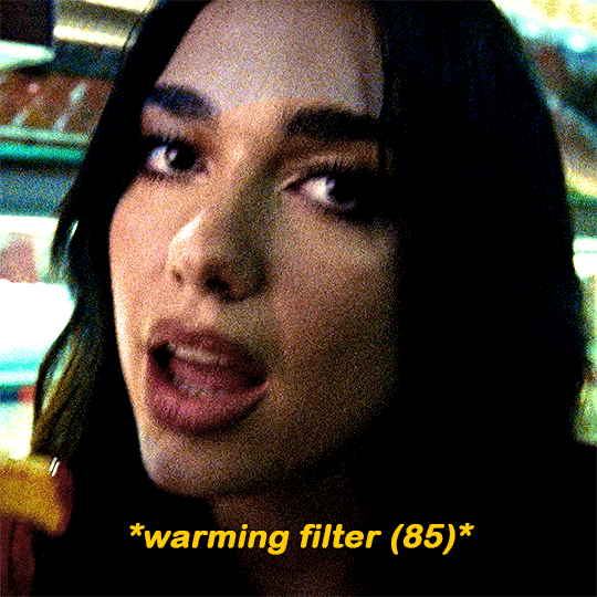
photo filter layer
now that the gif is pretty well neutralized, i like to use photo filter to basically set the temperature of the image. here’s what a warming filter looked like at 65% density:
blue filter at 50% density:

magenta at 35% density:

green at 45% density:

violet at 40% density:
(i went with the violet option)
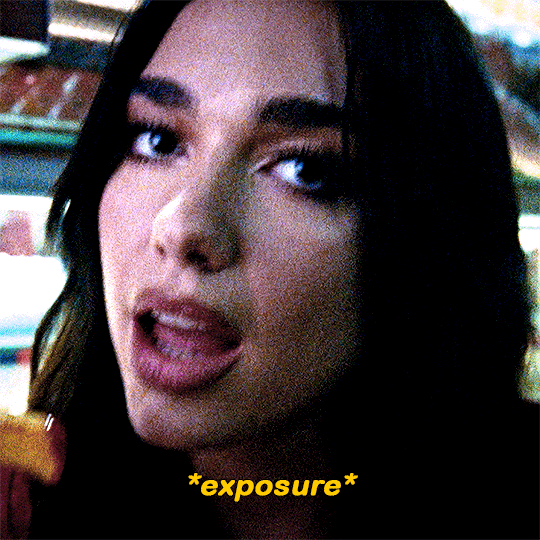
exposure layer
i added an exposure layer to brighten the gif up a little bit. these are my settings:

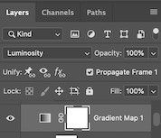
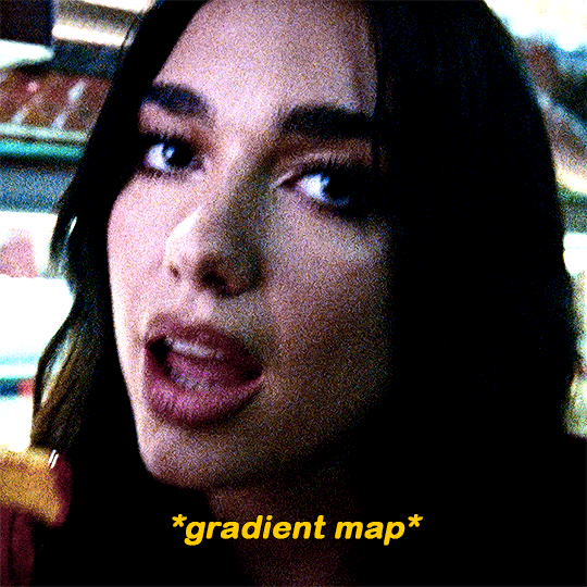
gradient map layer
i added a gradient map layer at this point. the change here is really subtle, so i don’t know if you’ll be able to see it. but these are essential if you want to add some depth to the image. here are my settings:
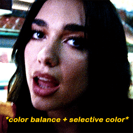
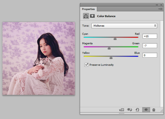
colour balance and selective colour
made some small adjustments with a colour balance layer and a selective colour layer. i usually focus on darkening up the shadows and lightening the highlights
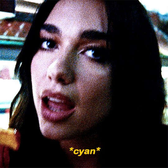
i added a cyan photo filter at 40% density
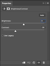
i’ll add a brightness layer to reduce the contrast, here are my settings:

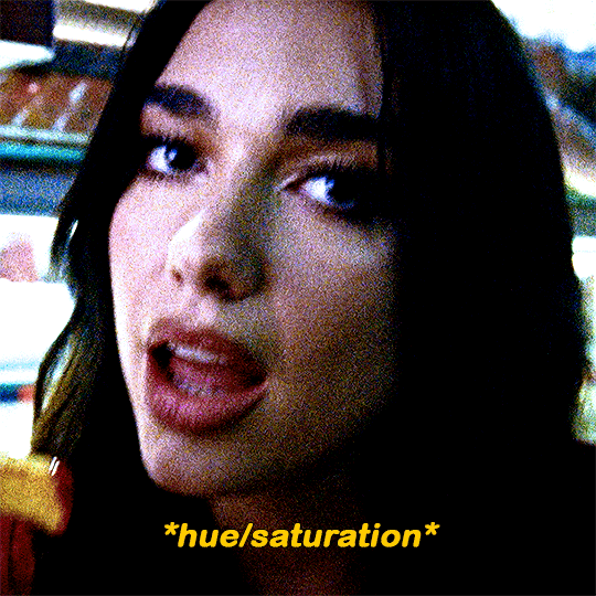
another hue/saturation layer:

i added one more gradient map at 40% opacity and this was the final product:

i never share/post my psds because every gif i make is coloured individually. this ended being a lot more long winded than i expected but i wanted to be as thorough as possible. lmk if you have any other questions 🥰
60 notes
·
View notes
Note
psst share your outer banks coloring secrets
ah, yes, one of the worst shows to color lmaoooo. i'll try to give some tips but im sure as anyone who has tried to color this show knows each scene is diff and has it's own flavor of awful yellow/green/red shading.
some tips on how to go from this to this......


............under the cut! (warning v long and idk if i'm the best at explaining things lmao)
so firstly, i use this psd i made ages ago for everything (alecbaenes was my url many moons ago i just am too lazy to change and reupload). usually i will go into each individual layer of that psd and see how they work with the scene, and will change the opacity or turn off the layer depending on what looks best. generally for obx, i will lower the opacity on the gradient map layer, as well as certain vibrancy/curves/levels layers, ones that make the gif brighter and more vibrant. i will usually bring back some vibrancy and brightness later but when im first getting the base coloring, some layers just heighten the yellow/red and we need to kinda bring that down before we make adjustments to get aspects like skin color more accurate.
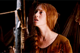
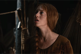
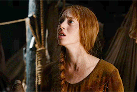
so, just with my psd/adjustments made to the psd layers, the gif may looks something like this: (going to use this gif bc i made it more recently so i remember some of the stuff i did better, and is the most accurate to my current process--plus it sucks to color lmao)
ususally still way to red/yellow for my liking, both for the skin tones and to be able to manipulate the colors for a vibrant coloring! so the next step is to get colors as close to how they are normally. warning, you will have to make 345435354 adjustment layers and just keep tweaking and tweaking... and tweaking. sometimes i will have like 20+ adjustment layers at the end of the process. i usually put all my adjustments under my psd--i also always add a vibrance and brightness layer above. sometimes it helps to do final tweaks above the psd if you just cant get anything right bc of course the psd will change how colors normally look.
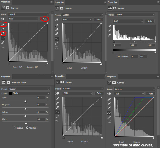
anyways, usually my base fixes will be some sort of combination of curves, levels, color balance, and selective color. so like, if the gif needs more depth/darkness, or is way too bright, i will bring the curve down or up respectively. levels, and also increasing the black selective color layer will also add depth. i will also use auto curve sometimes! the first image i have below i circled some of the extra tools i may use--auto for auto curves, the top black eyedropper you select the darker points in your gif and it will adjust based on that, the bottom one for the lightest--if i use those i will either use the black one only, or the black and then the white. the other three are examples of how my curve layers may look--i already have S curves in my psd, so when i do extra curve adjustments, it's just one single point, and i don't move it that much. same with levels, i dont make a super dramatic change, when it's under the psd it's enough to just move a bit to make a big difference. sometimes i'll also bring these layers to a lower opacity.
generally my first step is color balance though, especially if the gif seems mostly fine lighting wise. for obx, i usually shift it towards cyan and blue to cancel out the red tones. magenta and green depends, if its more green i may move towards magenta and vice versa, but usually i dont shift it that dramatically and often leave it alone. i will usually move the bottom bar towards blue, to soften the yellow tones. color balance helps shift the overall colors of the gif. notice that it's on mid tones in these pictures:
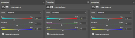
as you can see, i shift the cyan/red one more dramatically than the yellow/blue, and with magenta and green i usually just move it 1-3 points over. in the last one, i actually shifted towards red above my psd layer, because after all my adjustments i lost some of the red/warmth, so i brought back in red.
with color balance/curves, the gif may looks something like this
less of a completely red/yellow filter over everything! but still not great, their skin is too red, and overall still not the best base to try colorings. so next up is selective color, which can really help you fine tune things, but because of that.... SUUUUPER tedious. i will have 3495874 selective color layers and sometimes like 5 of them will be half canceling each other out just to get something okay. but this is a hobby i've chosen so we must suffer LKRGJRG. generally, my realm revolves around red, yellow, and at times magenta or neutral. if you think back to how we fixed some of the colors with color balance, kind of a similar principle, just with the individual colors. and lots of experimenting. so with color balance i would cancel out reds by making them more cyan--on the red selective color, im also gonna turn up the cyan. for yellow, i'm gonna make it more magenta, to make the yellow tones warmer. i will tweak the other tones too, just kinda experiment to see how changing it affects the gif, and then soon you will kind of intuitively know how to change the values based on whats going on in the gif lighting. magenta selective color helps for red values that are more pink, so make them more red or yellow based on what you need--i don't use this as much, hence i didnt have an example in the crop of psds i opened, but it's helpful sometimes. with neutral selective color, it usually affects the whole gif, so again, only minimal changes--usually i will bring the black levels down if it got to bright, or add just a tinge or yellow or cyan or whatever i need. here's some pics to show examples of what mine looked like for this gif:
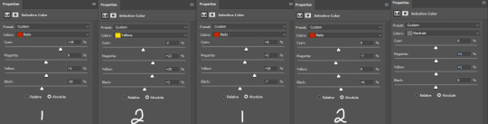
there were many more, but i just chose a few. the '1' and '2' i wrote to demonstrate that these layers were sequential, how they balance each other, and how selective color can be a tedious balancing act-- the second example it's like basically the opposite but it balances it out. also, if you have two characters with different skin tones, or the lighting is different for them, etc, you can use layer masks to erase certain adjustments so it only affects one of the subjects. some of these tweaks will be inbetween me transforming the gif to be colorful, and noticing how the colors interact, etc. so between this i was also making it colorful and it's not exactly the finished product at this stage: but this is kind of what the gif would look like after all the adjustments just to get it looking... normalish:

not totally perfect but MUCH better, and also will look a little different when surrounded by the colors i want to turn it into. i have some stuff about how i color in this tag, i can do a lil other tutorial or smth if needed but bc i have limited photo space on the ask and already wrote so much i wont get super into it here. but for shows like obx, it helps to work with a group of colors that will work with the show--yellows/oranges are easier bc of all the yellow already found in the show. pinks can be harder because there is so much yellow in the show, but doable. greens are good because of all the green in the show, and thus blues are good because its easy to go from green to blue with selective color and stuff. thus, purples are good too because its easy to go from blue to purple! stuff like that makes it easier. some work with selective color, hue and saturation, gradients, and voila!

you can see how maybe some of the issues like it being still a little too yellow/greeny toned balances out with the surrounding colors.
also, a big part of it is just practice! i've been giffing for yeaaaaaars and with media that has just the most god awful lighting so i've gotten good at understanding what to do and sometimes i'm just on auto pilot.
hopefully that helped, i know it was long winded and it can be hard to explain/understand photoshop. if y'all want some more in depth explanation about a part of the process i can try, or with other examples!
8 notes
·
View notes
Note
goddess how do u color your gifs
🥺🥺 i’m touched!!! it’s been a long time since i’ve done a coloring completely from scratch bc at this point in my giffing career i’ve collected a bunch of psds (some from other people, some i made myself years ago) that i just use as bases every time and then make adjustments from there. but i’ll do my best to go into it a little! first i’ll link a psd pack i use quite often, and then i’ll give a small tutorial on my most commonly-used psd of the ones i’ve made myself and will link you to a post where you can download that psd as well.
this psd pack is one of my favorites. out of this pack, i tend to use psd #5 and 7, and occasionally 1 and 4. the thing with all the psds in this pack, though, is that they do some VERY extreme color manipulation, so in almost every case, you’ll want to make a lot of adjustments so that the psd will suit the scene you’re coloring. the way i make these adjustments is going through each individual layer of the psd and toggling it on and off to see how this layer affects the coloring, then either leaving it be if i like its effect, deleting it if i think the gif looks better without, or lowering the opacity if i like the effect but feel that it’s too strong on 100% opacity. then i’ll often add new layers to make additional adjustments as necessary (for example, many of the psds in this pack have a strong green tint that i’m personally not a fan of, so i’ll mess around with color balance to change that)
in general, i use these psds for scenes that look nice with reds and/or greens heavily emphasized and with yellows significantly toned down (so i almost exclusively color francesco gifsets with these psds since that’s his main color palette haha). i generally don’t use them on warmer-toned scenes, except when the original scene is extreme yellow candelighting and i want to turn it into a softer, redder light (like in this gifset)
other examples of gifsets i’ve used this pack on: this set uses psd #5 and is a rare example of one where i had to make very few adjustments to the original psd because it worked nicely as is on these particular scenes. this set uses psd #1 with heavy adjustments. this set uses psd #7 with heavy adjustments.
now i’ll walk you through my own original psd that i use very often. i’m going to upload the psd right after i post this, so i’ll add the link here once i’ve done so! edit: here’s the link! the uploaded psd is a different gif than the example gif we’re using here, but it is essentially the same coloring - i just uploaded the version i use as the base psd rather than the specific adjustments i made for the example gif below.
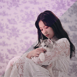
i’m no good at fancy coloring, so the process i’m showing here will give you a pretty basic psd that mostly just brightens up the gif and enhances the colors already present rather than doing anything too tricky with color manipulation. we’ll be making this gif as an example:
so after we’ve made the base gif (tutorial here), it looks like this uncolored:
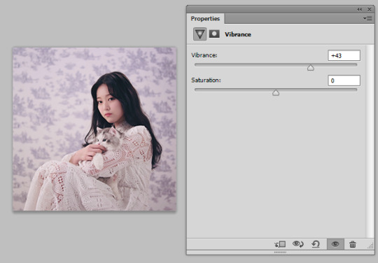
the first thing i do is brighten it up with a curves layer + levels layer + brightness/contrast layer. for the levels layer, i add brightness by moving the middle slider towards the left and also add contrast by moving the left slider towards the right.

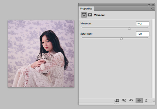
next i add a vibrance layer to bring out the colors more
now i want more contrast, so i add selective color, then go to black in the “colors” option, and within that section, i go to the black slider at the bottom and move it a bit to the right to make the blacks blacker

now, i’m not a fan of the kinda greenish tint we have here, so i’m going to do some color balance. in my first color balance layer, i select “midtones” and slide the cyan-red slider towards the red side

better but still a little green, so i add a second color balance layer where i select “highlights.” here i tend to mess around with all 3 sliders to see what looks best, but in this specific gif i ended up sliding the cyan-red slider very slightly towards red and the magenta-green slider a little towards magenta, and i left the yellow-blue slider untouched

next i add an exposure layer to make the gif a little softer-looking (i moved exposure a little negative, left offset untouched, and moved gamma correction a little positive)
but now the gif is too dark, so i add another curves layer
another levels for more contrast
and finally one last brightness/contrast to make it brighter
and there you have it! a very simple psd, but i’ve found that it works on the majority of scenes i want to gif - unless i’m in the mood for tricky color manipulation, in which case i use the psd pack linked at the beginning of this post.
21 notes
·
View notes
Note
oh okay i'll send my ask again!! so this might make me sound rly dumb but basically i was looking through ur ps help tag and i kept seeing people asking for the psd you use and i was wondering what that means exactly?? like i know psd is the file extension for photoshop files but what exactly does it mean when you use a psd for gifmaking?? i hope that wasn't worded too confusingly jfkljsld
yay okay so!!! (if you view this on desktop i think my theme cuts off the large pics so i recommend checking this post out on mobile haha)
idk how proficient you are already so i tried to be as descriptive as possible + a lot of visual aid!
the first step of giffing is importing a scene from a video, resizing it to tumblrs format and setting it’s timing right? (if u need help with any of these too hmu im always glad to help u can even do it off anon in pms)
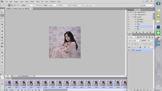
but the thing is that even though the video itself might look good and have nice color grading etc, in gif form it looks kinda boring and bland..
maybe it doesnt Look like that but since ppl edit their gifs so much on here it’s now considered bad taste to gif without any PSDS on top. so it has become a custom in the gifmaker community to add a lot of Adjustment Layers to the gif, which in total are called a PSD.
so you click this button
and it gives u a list of various things you can do to change the look of a gif. The most simple to understand is i guess Brightness/Contrast, where moving the handles adjusts the brightness and contrast of the gif:


so for my first step i slightly raised the brightness and lowered the contrast (it doesnt mean you always have to do that it’s just whatever the gif is, or the look you want to go for!)

and this is the result

Hmm.. Now let’s say that i feel like i want the purples in this gif to me muuuuuch more vibrant, so i make a layer of Vibrance and raise it a bit to make the colors pop more
and maybe raise the saturation just a liiiiiitle bit
I still feel like it doesnt look cool enough.. Like i dont want a subtle soft purple from the original i want it PURPLE with a capital P and capital every other letter lol. There’s a bunch of fun ways to get that effect that you’ll get after playing around with those Adjustment Layers.
I went into Hue/Saturation aka my fav tab, and made the settings for Blue and Magenta just a bit to the right of the spectrum and more saturated (it might not seem like a big diff but those little changes pile up to give the gif a distinct look)

then i went to color balance and changed it towards slightly more red and magenta
this is all the work we have done so far, it’s pretty visible already i would say
Now what i showed so far is i guess the more like bare simple ways of color manipulating ur gif. It’s nothing crazy but it already gives it a distinct and more pleasant look!
There’s so many of them that tbh there is no One tutorial, it’s just about experimenting with each of these options and seeing what kind of results you get! Because there’s sooo many possibilities in adjustment layers that i haven’t even started describing the tip of the iceberg. some examples:
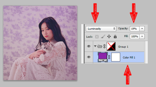
I made a Solid Color layer in a darker purple shade ur seeing in the little box, set its Blending Mode (the lil box next to opacity) to Luminosity and changed the Opacity to a lower one bc it looks crazy on 100%, and achieved this nice toned down effect to the gif if you’re going for this kinda look! i also like it cos it returns some color to her skin shade
another cool feature with like .. endless possibilities is the Gradient Map. With this one you also gotta use Blending Modes and lowering the opacity of that layer so that your gif doesnt end up looking crazy... ooh also play around with Photo Filters, those are really easy to grasp and have already st presets that can make the photo colder/warmer/etc!
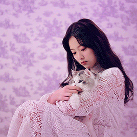
after playing around some more this is my final result lol...
before

after
(i also sharpened the final gif)
So if you take all these adjustment layers and group them in a folder, it’s called a PSD! A lot of people share their psds online as do I! Not every psd works for every video, but some might be more universal than others, and you might just have to tweak it a little bit to look nicer! So to use someone else’s PSD on your gif you just open them in Ps side by side and drag the folder with the PSD on top of your gif!
22 notes
·
View notes
Note
Hi! I love the way you use colors on your drawings! Do you have any tips for choosing colors? I always seem to mess them up ;( (Pd: love your comic! ♡)
Hellooo! Aaaa thanks so much!!! Oh gosh! I’m known to be TRULY wild with my color choice so I’m unsure if I’m qualified..! But, regardless, I’d love to help!
To start, there’s no harm in using references for colors, similarly with how you’d use reference for drawing poses, backgrounds, clothing, etc. Here are some sites:
colourlovers - this is my favorite one! Sometimes I’ll search a random word (like “happy,” “friends,” “sunshine,” “sadness”) and pick what I think would fit the mood of my piece. A lot of times I’ll end up editing the colors to fit more what I want, adding a color that complements the rest, or adjusting the values of the colors so my piece will be more balanced. But overall it gives you great ideas and can be a fun exercise to limit yourself with their palettes 💖
colrd
shutterstock labs / palette / spectrum
pictaculous - upload a photo/pic you like and get a limited color scheme for it!
(anyone please feel free to link other resources in the comments!)
If you’re struggling more with technicalities, I have some tips, too 😁:
1) Don’t rely on local color
This is sort of funny but I didn’t even know what the term “local color” meant until, like, my 3rd year of college? LOL anyway, there’s no reason to use real colors ever! Instead of making your color scheme work around your subject, try stylizing your color choice! Settle on a color scheme and substitute the local color with one that might be similar (or just go wild). For example:
red sand might remind you of brown sand
purple sidewalk might remind you of grey sidewalks (or maybe just sidewalks with a nighttime feeling?)
Landon’s hair is pink instead of red + a pink cactus because I’m Wild
2) Limit your color scheme
It may or may not be obvious that I love to use as few colors as possible… LOL. Doing this is super exciting IMO, because you literally only choose the colors you like!!! DOWN WITH BROWN! I don’t ike brown………… except to eat chocolate
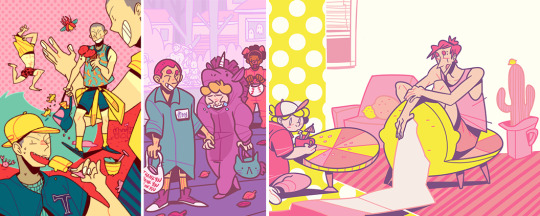
1st img, I used the same red for hair + shirt, the same orange in the jacket details + shoes, and for the jacket + pants I used the same grey but used the color slider and made the pants lighter
2nd img, I used a formula where there’s pink hair/shirt/shorts/shoes (note: that kid is a brunette but I made him have pink hair) + grey hair/shirt/pants/shoes + purple accessories…………….. do you see it, like a zig-zag? Fun, right? 😁
3rd img is where I most obviously used limited colors. I’m sure not every furniture in a house will be blue/purple/green but those are the colors I chose when I started so I just used them! You can do the same with clothing. Nothing has to be real 🎉 WE’RE WILD AND FREE 🎉
3A) Try not to use black or grey
I mean, if it’s part of your color scheme, go for it! But black and 100% grey are pretty heavy and don’t always add to color schemes, especially if you’re trying to be more stylized with them.
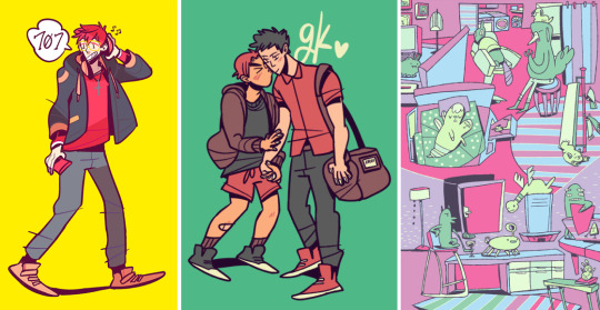
in the first 2 examples, the outfits (including the cat bag) are supposed to be all black–but I used shades of purple instead.
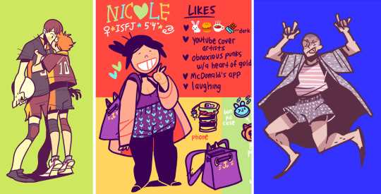
3rd img, rather than using just straight up grey, I gave it a more purple-leaning (RGB color code R: 188, G: 169, B: 188)
3B) DON’T LIMIT YOURSELF WITH BLACK LINEART!
Changing the lineart color makes suuuuch a huge difference. I very rarely use black lines in my colored pieces! I go back-and-forth using a lineart color that:
contrasts most of the colors of the piece ➡️ like using a blue line when most of the colors are oranges/yellows or
complements them ➡️ like using a dark purple line in a piece that’s many shades of purples/blues
4) Experiment with overlays
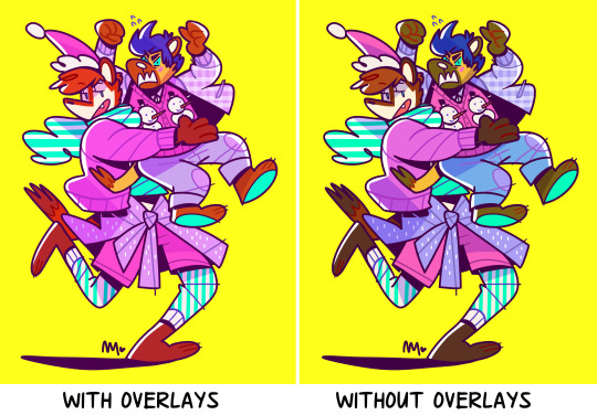
Yeah……… LOLOL.
Add a layer on top of your colors/lines ➡️ fill a color (purple? pink? blue?) ➡️ set the layer style to overlay, screen, color burn, soft light, whatever, anything you like! ➡️ lower the opacity (so it’s not super wild, if you want)! Sometimes this will balance the piece by having the colors all lean towards the one color you filled the layer with.
Don’t be afraid to use fill/adjustment layers in Photoshop and play around with the color balance!
5) Think about and plan your colors
Maybe try thinking about what colors mean? Very basically, as an example:
warm colors, yellows, oranges = feels happier
cool colors, blues, purples = sadder, more somber
like, if your goth kid is sad, maybe you’d use cooler and darker tones
maybe your character is super angry so you’ll use a violent, loud shade of red
I say this but all my works are rainbow, so…… LOLOL 😂
Anyway, those are my ideas! I’m not very fancy… //// in fact, I don’t even like to color LOLOL but those are the sorts of things I go with! If you have more questions, feel free to ask. 😚 Most of all, HAVE FUN! Best wishes!!! 💖💖💖
986 notes
·
View notes
Last Seen Blogs