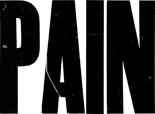
#sans serif
Text


created all of these types this week.
#typography#logodesign#logos#logotype#type design#typeface#fonts#70s#80s#90s#y2k#branding#design#graphic design#corporate#serif font#sans serif#cursive#illustrator
85 notes
·
View notes
Text

memes that won't leave my head until i make them
593 notes
·
View notes
Text
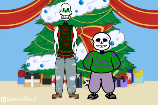
Oof. Okay I had a lot of fun making this. Its My Bois for the Christmas Party AU comic done by @xpau-official
Now a bit of info for the Bois and their AU.
In UnderArchive, despite being able to see and view other AUs, they are usually incapable of leaving their AU. It’s only during occasions such as the Christmas Party that they have the opportunity, let alone option, to leave their home AU. In this instance, they kinda just saw the party and kinda invited themselves. Creator, the papyrus, had been keeping an eyesocket out for the next Christmas Party since the last one and even had his sweater custom made due to the circumstances of the last party. Script, the Sans, had his sweater made afterwards, in hopes to dissuade too many people approaching him at once.
#The UnderArchives#Script Sans#Creator Papyrus#Sans#Papyrus#sans and papyrus#Sans Serif#Papyrus Serif#The Archivists#Creator#Scripts#Creator and Script#The Christmas Party AU#Undertale#Undertale AU#Creator is here for the Booze#Poor Script#Script has Anxiety#He is excited to be there though
33 notes
·
View notes
Text
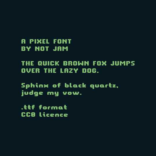
Happy Free Font Friday! This week's font is Not Jam UI 12, a simple, clean sans-serif designed to be legible rendered at small sizes relative to the screen resolution, available in .ttf format under CC0 licence
Also included within this pack is Not Jam UI 15 - a 15px height font using the same letter forms as Not Jam UI 12, but with added support for most Latin-1 Supplemental and Latin Extended A unicode characters.

Find it here:
34 notes
·
View notes
Text
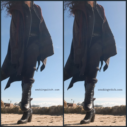
I'm dithering (HA see what I did there?? Sry I'll see myself out) between which font to use. I'm leaning toward the one on the right... But that's mainly bc I'm a sans serif rebel with a specifically anticapitalist cause #serifsarecapitalist
#anti capitalism#anti capitalist#lesbian#black leather#black boots#witchy#witchcore#witchblr#smoking-witch#smoking witch#smokin hot#hot as hell#so hot 🔥🔥🔥#hot as fuck#hot witch#femme sexy#sexy witch#dommymommy#domme mommy#fem domme#step on me#step on my throat#step on me mommy#giantess#serif#sans serif#best fonts#fonts#typeface
9 notes
·
View notes
Text
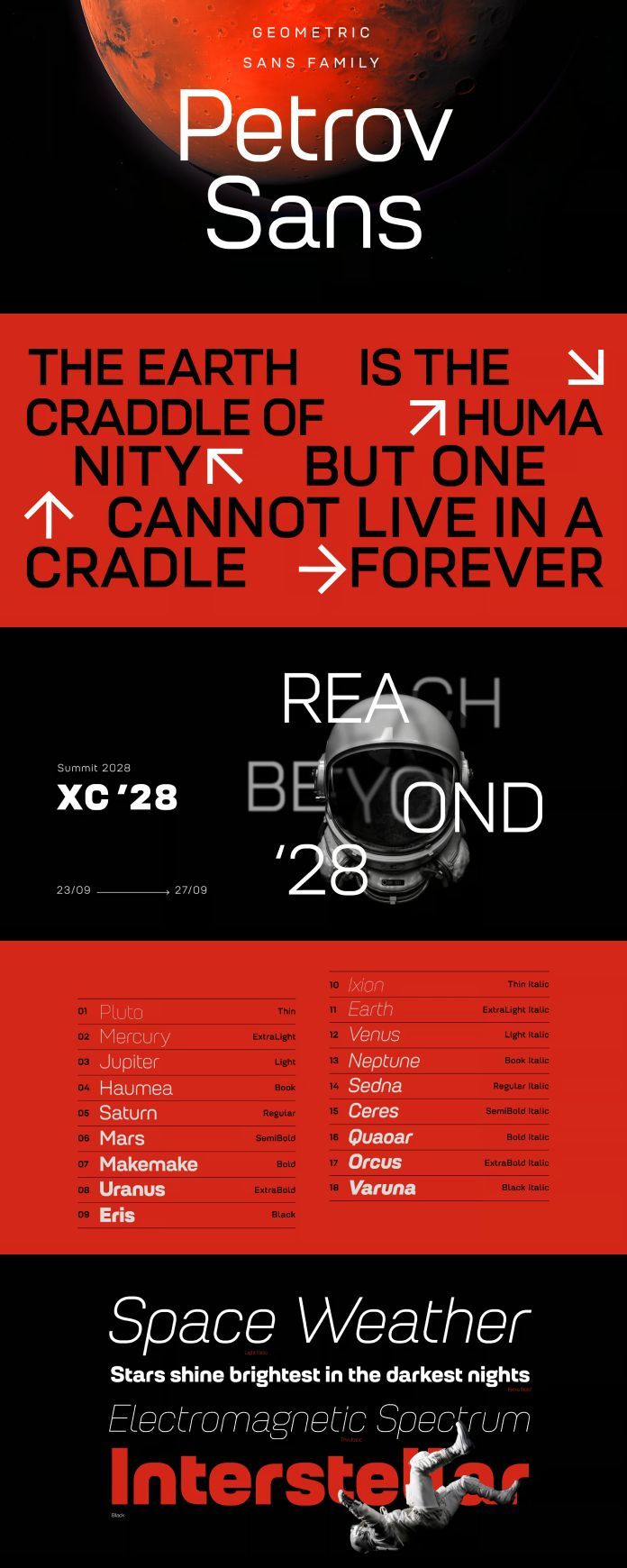
Petrov Sans Font Family by Fontfabric
Download here.
Follow WE AND THE COLOR on:
Facebook I Twitter I Pinterest I YouTube I Instagram I Reddit
17 notes
·
View notes
Text
12 notes
·
View notes
Link

a wild (and tired) Sans appears in your path!
#sans#sans undertale#sans underfell#sans underswap#sans swapfell#papyrus#papyrus undertale#papyrus underfell#papyrus underswap#papyrus swapfell#sans serif#sans skeleton#sans fic#fanfic#ao3 fanfic
7 notes
·
View notes
Photo


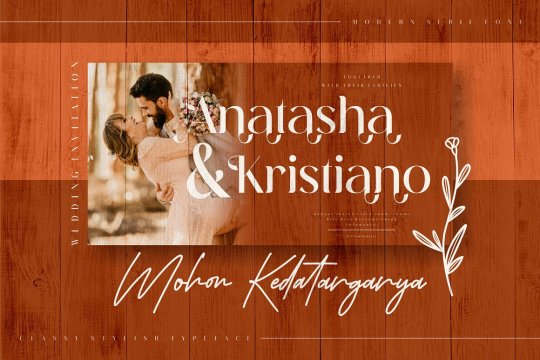
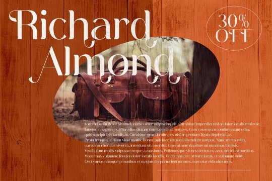


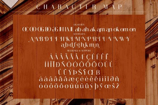
Abigate Desgo font designed by Storytype Studio
#sans serif#sansserif#fonts#typography#design#web design#webdesign#font#lettering#type#typeface#book cover#book cover design#magazine cover#magazine cover design#wedding fonts#wedding invites#wedding invitations#ttf#otf#woff
47 notes
·
View notes
Text
guys Univers is a font

I really don't wanna design a skeleton univer 😭
9 notes
·
View notes
Text

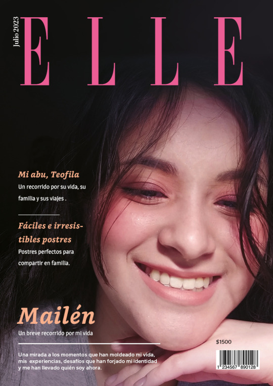
TP Integrador - Computación II | Lic. en Diseño y Comunicación Visual UNLa | 1° cuatrimestre 2023
La consigna consistía en diseñar un cuadernillo/revista de un total de 16 páginas, con el objetivo de ordenar y jerarquizar información en el género gráfico Revista, demostrar pericia en la instrumentación de aplicaciones de maquetación digital, demostrar haber incorporado modos de apropiación de retículas tipográficas, familiarizarse con aspectos funcionales y estilísticos de la tipografía, y experimentar con combinaciones tipográficas en tamaños display y texto.
El objetivo (más personal que de la consigna) fue crear un sistema y estética elegante y chic, intentando ir por colores vivos y llamativos, por lo que para trabajo, opté por una paleta de colores cálida, teniendo como color principal un magenta-rosado y como colores secundarios, y para general mini-sistemas en las dos notas, un naranja (nota personal) y un verde manzana claro (nota en honor a familiar). También, utilicé para los títulos y subtítulos fuentes serif, y para los distintos bloques de texto más extenso opte por distintas sans.


#editorial design#graphic design#magazine#college work#diseño y comunicación visual#UNLa#trabajo practico#university work#college course#julio 2023#warm palette#pink#orange#serif font#serif#sans#sans serif#palo seco#remates
9 notes
·
View notes
Text
5 notes
·
View notes
Text

Geometrica
Typefaces made in Glyphs - Typography assignment
4 notes
·
View notes
Text
The meaning of Valentine’s Day?

Be careful using all caps, especially when you have chosen a geometric typeface with open counters. People might think the uppercase U is made from two components. From Katy Pearce on Mastodon, used with permission.
20 notes
·
View notes
Text
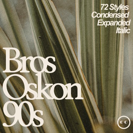
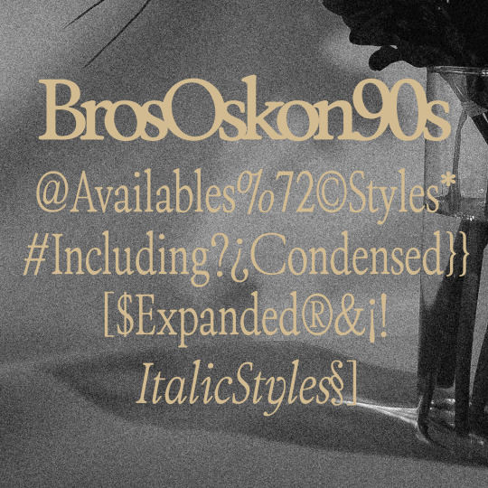
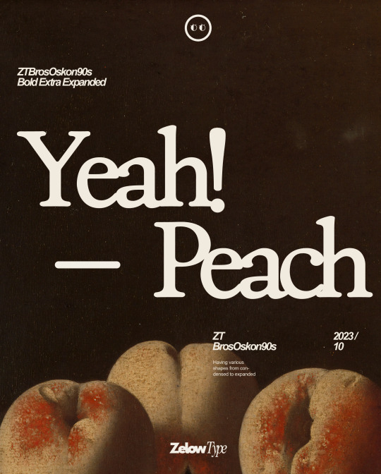

ZT Bros Oskon 90s is a captivating typographic creation that seamlessly blends the aesthetic charm of the 1990s retro era with a modern touch. With unmatched serif elegance and a unique 90s style, this font offers 72 variations, including sharp Condensed forms, graceful Expanded, and captivating italic styles.
5 notes
·
View notes
Photo

Lavender Font by Skdesigns
2 notes
·
View notes
Last Seen Blogs

moving-accounts-yo-blog
moved accounts

prodigalwife-a
everything is just peachy
beetlelandsweek
Beetlelands Week

newera-interactiveif
New Era ( A vampire Story)