#custom fonts
Text
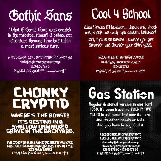
Achievement unlocked: I created my first collection of 12 handmade custom fonts!
Backstory: I’m in desperate need of replacing my 9 year old computer and am offering these as donate-what-you-want for a limited time.
You can get them here: https://mannypdesign.gumroad.com
Thanks to those who've already bought fonts. Every bit helps! ❤️

774 notes
·
View notes
Text

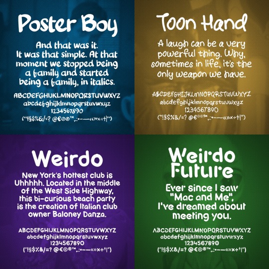
I made some Splatoon fonts for my friend a while ago, so I thought I'd throw them out here, too. I don't play splatoon - all of this comes from Inkipedia. All fonts here are completely free to use.
Mediafire - DaFont (Coming Soon?)
38 notes
·
View notes
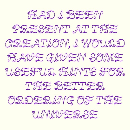
Text

Libretto is a script font modeled after hand-written cursive with hints of Old English typefaces and the aspirations of penmanship worksheets from elementary school
Free to download on gumroad (suggested donation of $8 if you’re able :)
#ian o'hara#art#script font#custom fonts#type design#libretto#gumroad#type#font#cursive#creative commons
30 notes
·
View notes
Text
A week or so ago, I made a post about Yukari's letter from episode 42 of Kamen Rider Agito, asking if anyone had turned the stylized English it was written in into a font. From what I could find, no one had.
So I did.
Say hello to Limitless Evolution, my first (and so far only) custom font, based off what's more or less the catalyst for the entire plot of the 2001 tokusatsu, Kamen Rider Agito. It's available in both OTF and SVG formats, and I've included the .txt save file for the website I used to make it, in case you want to mess around with that.

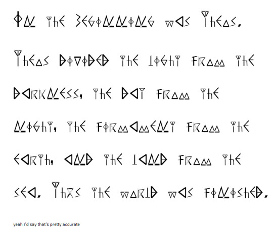
left: the screencap from my original post. right: the first paragraph of the letter, typed up in wordpad using the Limitless Evolution font.
And if you're wondering, here's what it says in readable English:
"In the beginning was Theos.
Theos divided the light from the darkness, the day from the night, the
firmament from the earth, and the land from the sea. Thus the world
was finished."
A list of changes I had to make, for those curious:
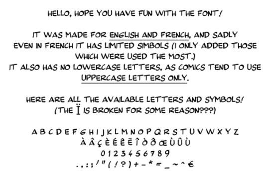
The letter never uses the letters J, Q, X, and Z, so I had to come up with my own designs for them.
There are no parentheses, mainly because by the time I got to those characters, I couldn't think of any way to make them look good and consistent with the rest of the font.
Idk where else I can mention this but I realized partway through making this that, because all of the characters use straight lines, the Unknown (or whatever entity is responsible for this "language") likely used to write on wax or stone, since straight lines are much easier to legibly write with on those surfaces. Of course, this means there are absolutely no curves anywhere in this font (at least in the custom characters).
You might notice a few re-uses of specific characters here and there in other characters. Had I not done that, I 100% would've gotten burnt out halfway thru and never finished this.
The numerals are obviously not Arabic. I took inspiration from the weird "gang signs" the Unknown do before they commit murder and made the signs for numbers look like fingers on hands. I imagine their counting system works exactly like Arabic/base-10 counting, just with different symbols.
I replaced the tilde with a "does not equal" sign. The tilde sometimes signifies "is approximately equal to", and I figured the Unknown probably wouldn't vibe with that kinda thing.
I was gonna make the @ sign the Agito symbol but I forgor. 💀
The dollar sign ($) is also custom. It's the symbol for G with a line thru it. The Unknown strike me as a culture that would use Gold, plus it looks kinda like a crystal, which they might also perhaps use.
The ampersand (&) and plus (+) use the same symbol. I figured they mean basically the same thing, so why not, y'know? Also I couldn't come up with a good design for it.
I literally just realized as I'm writing this that the lowercase M is only slightly smaller than the capital M, and the lowercase and capital Ns are the same size. My bad. When/If I make an updated version of this, I'll be sure to fix that.
I used the comma in like six different characters. It's not laziness, it's resourcefulness.
Lastly, the greater than (>) and less than (<) symbols are meant to represent people bowing/praying, since I figured the Unknown would probably see it as whichever number was more "powerful". Kinda like the alligator thing but with fighting instead of eating.
So yeah. If you want, you can download the font by clicking its name earlier in this post, or here if you'd prefer:
Lemme know if there's any improvements or adjustments I should make in the next version that may or may not come out some time in the near or distant future. ¯\_(ツ)_/¯ idk. Hope you enjoy regardless!
Update: In case you missed it, I released an updated version of the font that adds parentheses, brackets, some diacritics, and other fun things. It, along with the original version are both downloadable from the Google Drive link above (hopefully). I’m still planning on updating it again in the future, so if you have any suggestions or issues you’d like to see fixed in the future, lemme know and I’ll see what I can do.
#kamen rider#kamen rider agito#kr agito#masked rider agito#agito#agito spoilers#font#fonts#custom font#custom fonts#thing i made#sorry if the inconsistent sizes of the letters bothers you#the thing i used to make the font was easy-ish to use in every aspect OTHER than that#and for some odd reason the thing they give you to test the font before downloading it just didn't work for me#but anyway imma go relax#it's 6:30 and i've been working on this since noon#i am so tired
49 notes
·
View notes
Text

Custom typography design ☆☆☆
Need one for your business? PM us! 💌
#custom fonts#typography#letter#calligraphy#logotype#visuals#illustration#artists on tumblr#entrepreneur#branding#startup#company#germany#amsterdam
7 notes
·
View notes
Text

Custom fonts are now possible to be implemented in the game, yippee (this font is only a test)
#kirbywotew#kirby#kirby and the will of the energy wisps#kirby series#ori and the will of the wisps#ori#ori the game#crossover#kirbys return to dreamland#ori and the blind forest#modding#kirby modding#mods#custom fonts#kirby's return to dream land#kirby return to dream land deluxe#switch modding
11 notes
·
View notes
Text
The font i use is not available for free because maybe you too want to write in a font similar to André Franquin's handwriting?
unfold the post for more details, but also that same info is on the drive so you don't have to.
#spirou#spirou et fantasio#comic books#bande dessinée#digital art#artists on tumblr#cartoon characters#drawing#fonts#free fonts#custom fonts#online resources
17 notes
·
View notes
Text
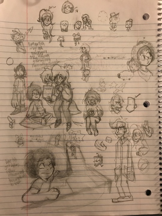


Walked my dog in the afternoon and realized I should start sharing my art here to preserve it rather than using Deviantart lol. Collage of different pencil sketches I’ve done in my spare time.
#pencil art#sketches#professor layton#custom fonts#wow these are old#I don’t know if I still have some of these anymore#sistubes art#object shows#object oc
15 notes
·
View notes
Text
set up a gdrive for my fonts! :D includes a new release that looks good and mostly saves on space.

this new font is called FWFONT2.0 (bigger space)! because i finally figured out how the space feature on yal.cc works 😅
#pixel font#custom fonts#fonts#resource#small font#tiny font#cc by sa#f2u#f2u resources#idk what to tag lol#GOD I LOVE PIXEL ART
3 notes
·
View notes
Text
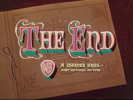
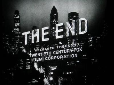

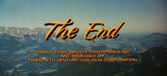
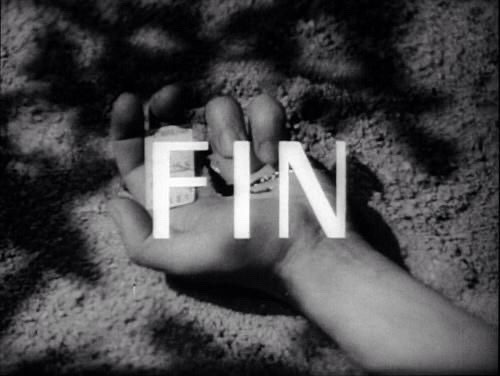


the lost art of the movie title card 🎀
#movie poster#movie title#movie credits#film credits#film titles#film poster#barbie movie#movies#film#this is a girlblog#film photography#cinematography#cinema#posters#film roll#the end#graphics#custom fonts#font#fonts#film moodboard#hollywood#old hollywood#goldenagehoolywood#title cards#movie cards#filmisnotdead#film stills#movie stills#bnwphotography
14 notes
·
View notes
Text

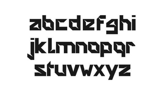
Geometrica
Typefaces made in Glyphs - Typography assignment
4 notes
·
View notes
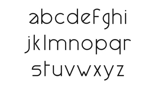
Text

libretto_draft 1
9 notes
·
View notes
Text
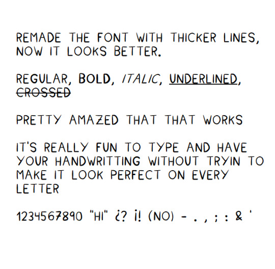
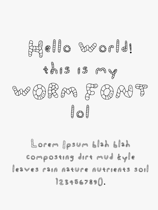
I think I got the font just right
3 notes
·
View notes
Text

Beautiful NSI monogram design ☆☆☆
Get your custom monogram! Contact 💌👇 [email protected]
#monogram#monoline#logotype#typography#typeface#typewriter#fontstyle#vintage font#custom fonts#tattoo#illustration#logo#artists on tumblr#branding#graphic design
21 notes
·
View notes
Text

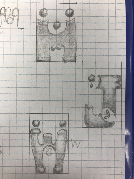
+7 new letters
5 notes
·
View notes
Last Seen Blogs

lickity20
Untitled
freakydreamer94
Без названия
endcommunication
Welcome to Freddy Fazbear's!

universalheatingsolution
Universal Heating Solution
gillionspookstrider
THE HEART OF SHOWFALL MEDIA