#pagelayouts
Text
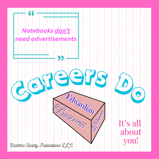
Notebooks don't need advertisements, careers do!
#edwardianbusinesslibrary#journals#eccentricsocietypublications#systems#quotes#development strategy#brand strategy#articles#pagelayouts#pagelayoutartist#page
0 notes
Text
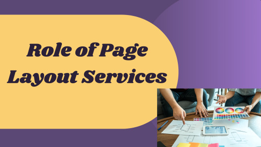
The Role of Page Layout in Brand Identity and Recognition
Brand identity and recognition are two pivotal aspects that play a central role in a business's success. While there are various elements involved in crafting and strengthening a brand, one underrated yet incredibly crucial component is the page layout. The page layout, with its visual aesthetics and organization, speaks volumes about the brand's message, values, and vision. It shapes how audiences perceive and relate to a brand. In this article, we will delve into the profound impact of page layout on brand identity and recognition and how page layout services are instrumental in this journey.
Understanding Brand Identity and Recognition
Before we delve deeper, let's understand the concepts of brand identity and recognition:
Brand Identity: It's the ensemble of elements (colors, design, logo, messaging) that a company creates to portray the right image to its audience.
Brand Recognition: This is how the public identifies and remembers your brand from its visual and auditory cues. It's the instant connection audiences make when they spot your logo, design, or hear your brand message.
The interplay between these two is significant. While brand identity lays the foundation, brand recognition solidifies the brand's position in the minds of the audience.
The Silent Communicator: Page Layout
When we think about brands, we often think of logos, taglines, and colors. Rarely do we consider the layout of a webpage or a print page as an immediate element of brand identity. However, this silent communicator holds tremendous power.
Visual Hierarchy: How elements are positioned on a page determines which information captures attention first. A well-thought-out hierarchy guides the viewer's eye and helps prioritize brand messaging.
Spacing and Balance: These create a sense of harmony and professionalism. A cluttered page can reflect negatively on a brand, indicating a lack of clarity and purpose.
Consistency: A consistent page layout across different mediums reinforces brand identity. It offers a unified brand experience, which is crucial for brand recognition.
Why Invest in Page Layout Services?
Page layout is both an art and a science. While you may have the best content, without a captivating layout, your message might be lost. Here's where page layout services come into play.
Expertise
Page layout services come with years of experience. They know what works and what doesn't. By leveraging their expertise, you ensure your page layout aligns with your brand vision and identity.
Tools and Techniques
Professional page layout services are equipped with the latest design tools and techniques. They can create layouts that are both visually appealing and functional.
Time-saving
Crafting a perfect layout takes time. By outsourcing page layout services, businesses can focus on what they do best while experts handle the layout.
Consistency across Platforms
Whether it's your website, marketing collateral, or publications, maintaining a consistent layout is paramount. Page layout services ensure this consistency, strengthening brand recognition.
Page Layout: Going Beyond the Aesthetics
While aesthetics are vital, the function is equally critical in page layout. This dual-role ensures not just a visual appeal but also usability and accessibility.
Navigation
A good layout simplifies navigation. It ensures that essential elements like the CTA (Call To Action), menus, and links are easily accessible.
Readability
Text-heavy pages can be off-putting. With a proper layout, text can be organized in easily digestible formats, enhancing readability.
Responsive Design
With the surge in mobile usage, responsive design is no longer optional. Page layout services ensure your layout looks flawless across devices, be it desktop, tablet, or mobile.
Real-world Implications: Brands Doing It Right
Consider Apple's website. Its minimalist design, clear visual hierarchy, and ample white space resonate with its brand identity of simplicity and innovation. Similarly, Coca-Cola, with its vibrant colors and consistent use of its signature font, is instantly recognizable worldwide. The layout of these brands' pages is not random but meticulously planned. This level of detail is often achieved with the help of expert page layout services.
Page Layout and Brand Recognition: A Lasting Impression
Imagine scrolling through a magazine or a website. What captures your attention? Often, it's the layout – the colors, the balance, the visual journey. This initial appeal is more than just a fleeting moment; it's the beginning of an interaction, a dialogue between the brand and its audience. An effective layout not only attracts but also retains, encouraging deeper engagement.
Now, if this layout is consistent across platforms and campaigns, it imprints a lasting impression, solidifying the brand's place in the minds of the audience. Every time you invest in page layout services, you're not just designing a page but weaving your brand's narrative. It's a narrative that tells your audience who you are, what you stand for, and why you matter.
Conclusion
The role of page layout in shaping brand identity and recognition is undeniable. It's a silent communicator that, when done right, speaks volumes. Whether you're a start-up or an established enterprise, consider harnessing the power of professional page layout services. By doing so, you set the stage for a compelling brand narrative, one that resonates and remains etched in the minds of your audience.
0 notes
Photo
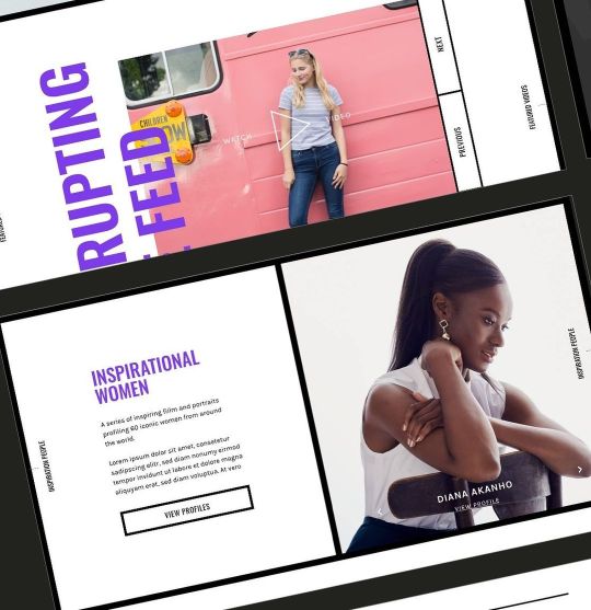
Showing off some of the screens from the website homepage concept loved playing with the border style for sections on the site. . . . #digitaldesign #websitedesign #website #web #pagelayout #latoutdesign #femalelead #webpagedesign #webpage #pagedesign #digital #agencylife #freelancer #freelancelife #female #websitelove #concept #conceptdesign #websiteconcept #digitaldesigner #uiux #ui #ux #blogsite #blog #articles #designer #webdesigner #digital #sarahbonddesign (at Sarah Bond Design) https://www.instagram.com/p/CkQHlo2LOBm/?igshid=NGJjMDIxMWI=
#digitaldesign#websitedesign#website#web#pagelayout#latoutdesign#femalelead#webpagedesign#webpage#pagedesign#digital#agencylife#freelancer#freelancelife#female#websitelove#concept#conceptdesign#websiteconcept#digitaldesigner#uiux#ui#ux#blogsite#blog#articles#designer#webdesigner#sarahbonddesign
0 notes
Text
How do the grid and layout help your design?

How do the grid and layout help your design?
Layout and grid design can help you organize your content, create a clear hierarchy, and improve user experience. They can also help you avoid overcrowding and keep your design looking professional.
The layout is especially important for web pages and graphic design, as users will spend most of their time on them. A well-designed layout will help users quickly find what they're looking for while avoiding confusion and ensuring all content is easily legible.
Grid design can help create a sense of order and symmetry in your page layouts. They ensure each topic is consistent throughout the document.

Photo by Sebastian on Pexels.com
Introduction: How grid and layout help your design
Grids and layouts help your design by creating a foundation that is both visually appealing and easy to navigate. By using a grid, you can control the placement of each element on the page, creating a cohesive design that is simple to understand. Additionally, the well-organized layout can improve readability and help your viewers find the information they need quickly and easily.
A grid layout is a design technique that uses horizontal and vertical guides to create an organized, logical and aesthetically pleasing layout. In this tutorial, you will learn how to use grids in your designs. We will explore many different types of grid layouts and discover the benefits they can bring to your work.
Basic Grid Terminology
A grid is a foundational design principle that can apply to any design project. Grids are created by evenly spacing out columns and rows of content on a page. This creates a clean, orderly layout that makes it easy for users to scan and understand the content. There are several different types of grids that can use, each with its own advantages and disadvantages. In this section, we'll review some basic grid terminology so you can choose the right grid for your project.
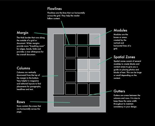
Image By Lindsay Marsh Design
Manuscript Grids
This grid is good for writing books and for positioning text from left to right. Grid layouts comprise a single center block that divides the page and creates a clear margin, text area, header, and footer. This basic arrangement is the default for any word processing document.
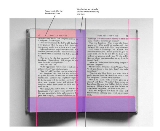
Image By Lindsay Marsh Design
Column Grids
It's perfect for use in magazine pictures, spreads, and others that have a large mix of text, photos, and quotes. Column grid templates allow you to divide up the textual content and photos. Those maybe 2, 3, 4, or 12 columns based on the complexity of the layout and design.
Column grids are an essential part of web design. They provide a solid foundation for your website and make it easy for users to navigate. A large amount of white space and colored text help guide the reader's eyes throughout the page and disperse information regarding the event.
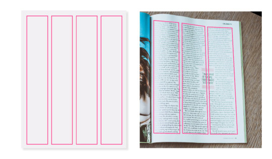
Image By Lindsay Marsh Design
Modular Grids
A modular grid is made up of horizontal and vertical modules that can be combined in different ways to create a variety of layouts. This makes it ideal for designing web pages, as well as print documents and posters. It can also use to create custom grids for specific projects.
Its consists of a variety of modules that can be set up for any type of graphic style, photo, or design element. They are perfect for ads, book covers, billboards, and other interiors requiring a great degree of flexibility. They are also ideal for catalogs that can be organized and spaced according to each item.
The best way to learn how to use a modular grid is to experiment with it. Play around with the different modules, and see how they can be combined to create different layouts.
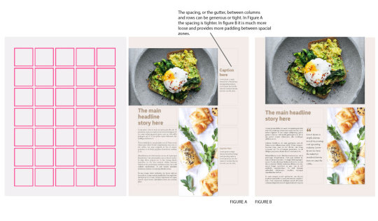
Image By Lindsay Marsh Design
Hierarchical Grids
Hierarchical grids are made up of a series of nested grids, which can be adjusted to create the perfect layout for your page. For example, if you want a page to look like a magazine spread, then you can use the grid to create the layout. You can also move around different parts of the page according to where it will be placed in the magazine or book.
"Hierarchy" is from the Greek language meaning "superior", " ranked", or "order". These partitions follow an order of importance, with the most vital things larger at the top, and the least vital things farther down.
A grid such as this one would be a great fit for a website design or mobile app layout in which the most important items should display higher than usual.
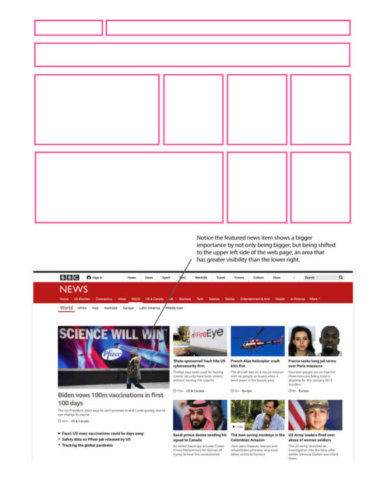
Image By Lindsay Marsh Design
Establish a hierarchy for design
Grids help to establish a hierarchy for design, which in turn, creates a visual order. By using a grid as a foundation, designers can control the placement of elements on the page and create a more harmonious overall design. Grids also make it easier for the viewer to understand how the different parts of the design work together.
Use whitespace to create balance
Grids are a great way to use whitespace to create balance in your designs. They can be simple or more complex, but the basic idea is that you establish a set number of columns and rows. And then evenly space out your content within those constraints. This can be a great way to make sure everything in your layout is neatly aligned and looks polished.
Use grids to create a more uniform appearance for your designs. Grids can also use in print design to create a more uniform, structured look. This is especially useful at the beginning of the design process. When you are trying to decide on a layout and place your elements on the page.
Photo by rizky nan on Pexels.com
Use Grids to Create a visual rhythm
Grids are a great way to create a visual rhythm in your designs. They provide a structure for your layout and help to keep your elements in order. When used correctly, grids can make your design look clean and polished. Eliminate "white space" between elements White space is the empty space between your element. If you want to get rid of this, you can use grids. Grids are a great way to keep your design looking visually interesting and organized.
Conclusion
The grid and layout are the most important aspects of any design. A well-crafted layout can make a website look sleek and professional, while a poorly-designed layout can make a site look confusing and cluttered. In this article, we’re going to explore how grid and layout help to create a visually appealing design.
Grid layouts are popular for a reason: they work well on both desktop and mobile devices. By using grids, you can ensure that your content is evenly distributed across each page, leading to a more organized and user-friendly experience.
We have explained the meaning of grids in this article, as well as how to use them to make your design rock-solid. Please stay tuned to the following article for more information about how to combine all grids and make your design perfect.
Read the full article
#designgrid#designer#graphicdesign#graphicdesigngrid#grid#gridandlayout#grids#pagelayout#webdesignlayout
0 notes
Text
Drawover Viewer Comics Layouts
Livestream replay
youtube
Thank you to viewer Omar (Instagram @ Omarcomics4000) for allowing me to use one of his comic pages for a drawover and give some feedback on page layout.
#comicbooks #pagelayouts #visualstorytelling
0 notes
Text
Benq siemens s88 bedienungsanleitung 7490
BENQ SIEMENS S88 BEDIENUNGSANLEITUNG 7490 >> DOWNLOAD LINK
vk.cc/c7jKeU
BENQ SIEMENS S88 BEDIENUNGSANLEITUNG 7490 >> READ ONLINE
bit.do/fSmfG
Olympia cm 75 bedienungsanleitung 7490 Rfid card access control unit bedienungsanleitung 7490 Benq siemens s88 bedienungsanleitung v-tech pressebox.de/inaktiv/siemens-ag-industry-sector-industry- -co-kg/Neu-bei-E-Plus-Multimedia-Spass-mit-dem-BenQ-Siemens-S88/boxid/57493 5101;35829500;BenQ-Siemens S88; 7490;35004600;Maxon MX6850; Das Praxisbuch Samsung Galaxy S20 FE / S20 FE 5G - Anleitung für Einsteiger. 26838 29251 roseappt pagelayout trustmark benq-siemens 20346 sqlinsertion ubc_univbc1 c3f600050cfe207a anleitung sprite panel_on shredder_large a1620n mp160, notbook siemens tod, packert, see larger image own, x74, bedienungsanleitung, http.hearingcommsys.com.electronics.hp.h,
https://mubukupaxob.tumblr.com/post/693189036257460224/bedienungsanleitung-linhai-260, https://sihifosumusa.tumblr.com/post/693189054713479168/gigaset-s685-handbuch-des, https://sihifosumusa.tumblr.com/post/693189054713479168/gigaset-s685-handbuch-des, https://getiwileho.tumblr.com/post/693188442837958656/tiptel-vp-28-bedienungsanleitung-medion, https://sihifosumusa.tumblr.com/post/693188691830636544/panasonic-lumix-dmc-lc80-bedienungsanleitung.
0 notes
Photo
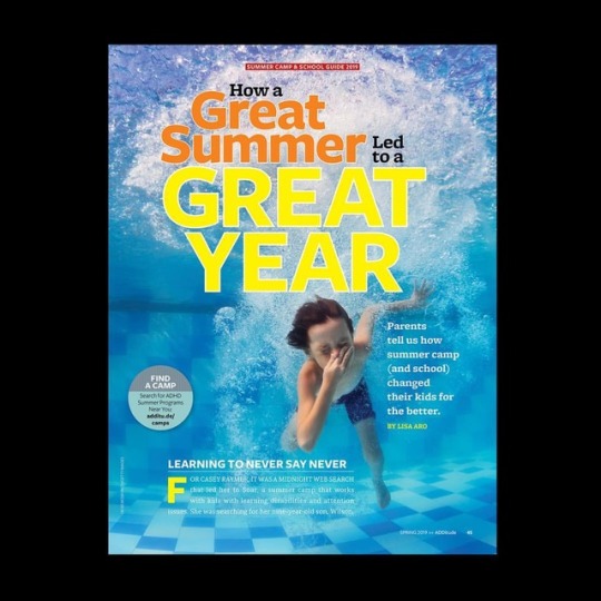
New work from the Spring issue of @additudemag. Built with @adobeindesign Images by @gettyimages @gettyimagescreative. - - #design #graphicdesign #publicationdesign #magazines #magazinedesign #layouts #pagelayouts #summercamp #home #brain #ADD #ADHD #adobe (at New York, New York) https://www.instagram.com/p/BtERJj2A0ai/?utm_source=ig_tumblr_share&igshid=1dqqzxbbbuxfj
#design#graphicdesign#publicationdesign#magazines#magazinedesign#layouts#pagelayouts#summercamp#home#brain#add#adhd#adobe
1 note
·
View note
Text
#indie#soho#bookstore#notesbookstore#Journalclub#edwardianbusinesslibrary#eccentricsocietypublications#literature#quotes#page#pagelayouts#pagelayoutartist#notebookseries
0 notes
Photo
Linework for my next book, 𝑮𝒉𝒐𝒔𝒕 𝒂𝒏𝒅 𝑩𝒐𝒏𝒆𝒔, so far. I get a chuckle out of the last one especially #AlasPoorYorick haha • #childrensbookillustration #childrensbookinprogress #childrensillustration #childrensbooks #childrensauthorillustrator #childrensillustrator #illustrationprocess #illustrationsforkids #authorillustrator #linework #pencilillustrations #pagelayouts #ghoststoriesforkids #cuteghost #skull #andtheywereroommates #riseandshine #wakeupbespooky #Ghost_and_Bones #spookychildrensbooks #spoopy #childrenscharacterdesign #wip #elysespaintbrush https://www.instagram.com/p/CL6zTFUFer-/?igshid=25xcw2rgwj7m
#alaspooryorick#childrensbookillustration#childrensbookinprogress#childrensillustration#childrensbooks#childrensauthorillustrator#childrensillustrator#illustrationprocess#illustrationsforkids#authorillustrator#linework#pencilillustrations#pagelayouts#ghoststoriesforkids#cuteghost#skull#andtheywereroommates#riseandshine#wakeupbespooky#ghost_and_bones#spookychildrensbooks#spoopy#childrenscharacterdesign#wip#elysespaintbrush
0 notes
Photo

Second wisdom tooth out😰... The first one was a lie; this one didnt take only 10m and is far more painful. Working on pages in the hopes that it will provide some welcome distraction. . . . . . #paradiselost #graphicnovel #milton #comicsadaptation #comicartistsoninstagram #sequentialart #literaryadaptation #pagelayouts #sequentialartist #indiecomic #chicagoartist #johnmilton #heavenandhell #eden #adamandeve #satan #graphicnovelartist (at Chicago, Illinois) https://www.instagram.com/p/CBVxOyzjHi9/?igshid=1f5bbzft7xcp8
#paradiselost#graphicnovel#milton#comicsadaptation#comicartistsoninstagram#sequentialart#literaryadaptation#pagelayouts#sequentialartist#indiecomic#chicagoartist#johnmilton#heavenandhell#eden#adamandeve#satan#graphicnovelartist
0 notes
Photo
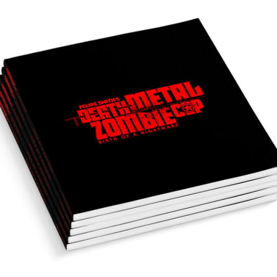
YOOO!!! Sample pages of my "Birth of a Nightmare" #DeathMetalZombieCop ART BOOK - included in the DELUXE PACK ($80) Rewards tier!!! My 1st EVER ART BOOK! 8" x 8", 50 PAGES of #FullColor material including: Original #CharacterDesigns, #BackgroundArt #ReferencePhotos, #ComicPageThumbnails, #PageLayouts, #Character & #Vehicle #Studies, #Interviews, Campaign #PromotionalArt, Artwork from the inception of #DMZC in #Japan (back in 2011) & MUCH MORE! Text is in #English, #Spanish, #French & #Japanese. Don't Sleep on this reward! It's gonna be D😵PE!!! Deluxe Pack also includes: Downloadable Comic PDF, Desktop Wallpapers, 6 Pins, 3 Mini Prints, T-SHIRT & Print Copy of DMZC # 1!! #BarbaricallyBRUTALBargain!!! Click link in my IG Bio 2 pledge! Thanks 4 your SUPPORT! #デスメタルゾンビコップ #フェリーペスミス #漫画 #FelipeSmith #ArtBook #Kickstarter #felipesmithart #felipesmithcomics #Horror #Zombies
#interviews#デスメタルゾンビコップ#comicpagethumbnails#kickstarter#deathmetalzombiecop#characterdesigns#character#referencephotos#dmzc#漫画#pagelayouts#vehicle#english#artbook#felipesmith#fullcolor#spanish#studies#felipesmithart#promotionalart#backgroundart#zombies#felipesmithcomics#japan#フェリーペスミス#barbaricallybrutalbargain#horror#japanese#french
13 notes
·
View notes
Photo
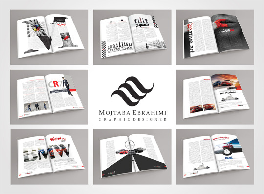
صفحه آرایی های مجتبی ابراهیمی طراح گرافیک
Mojtaba Ebrahimi graphic designer page layouts
#graphicdesigner#graphic#pagelayout#layout#mojtabaebrahimi ebrahimigd صفحه_آرایی مجتبی_ابراهیمی گرافیک
2 notes
·
View notes
Photo
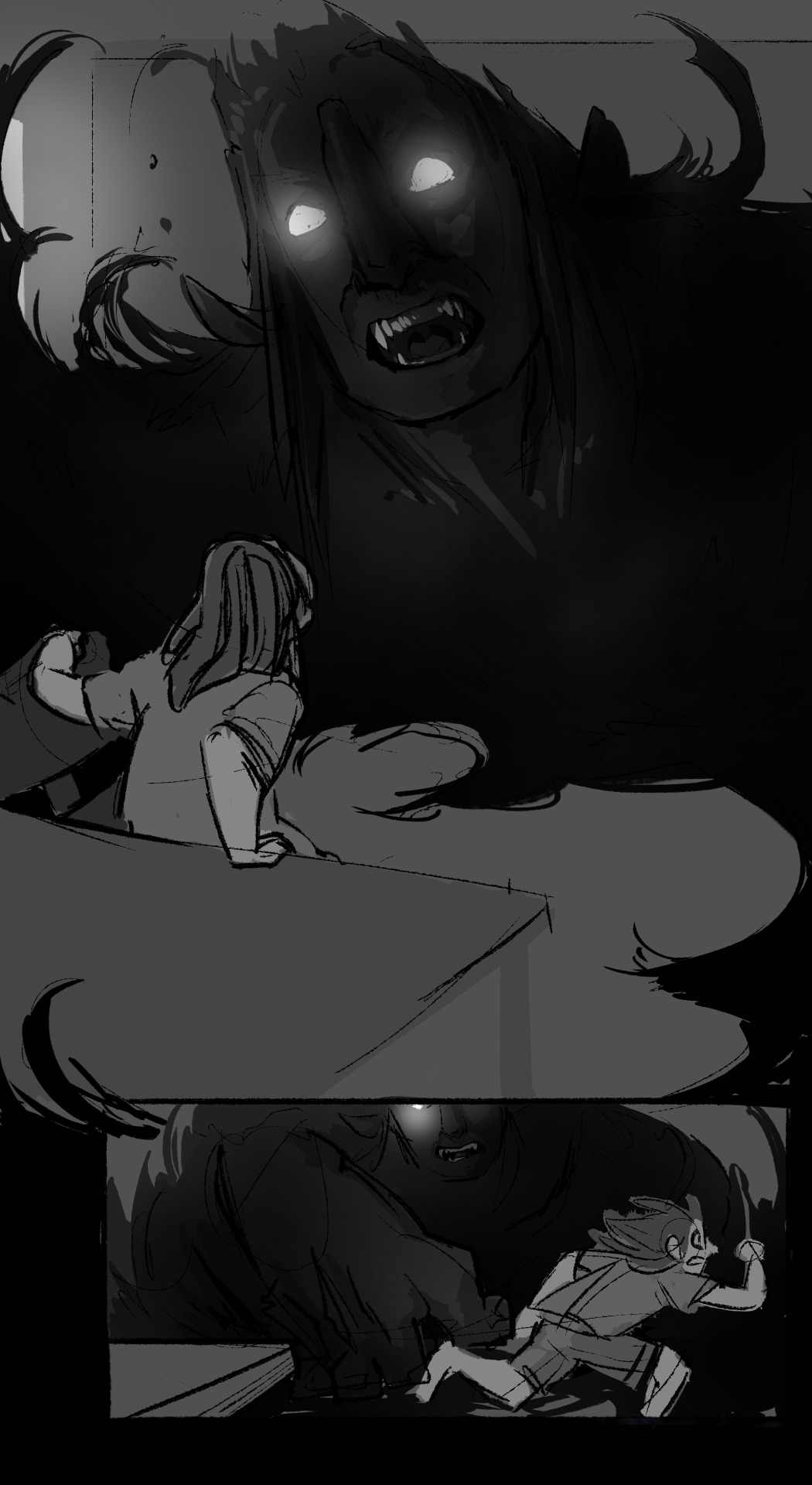

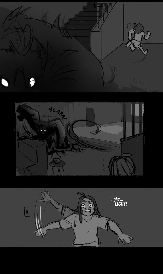
In the process of rebooting my comic, FEARS, and in doing so ended up totally remaking the script. Here I’m playing with something different for the composition of these panels to spice things up. The original ones served its purpose but wasn’t nearly as dramatic or fun.
1 note
·
View note
Photo
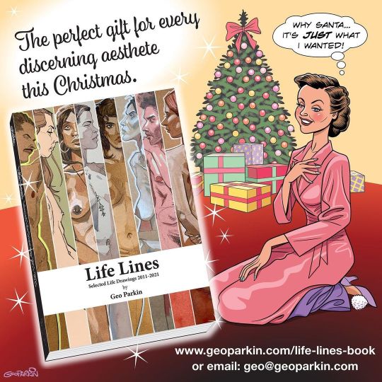
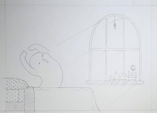
Is this cheesy enough? . Life Lines, Selected Life Drawings 2011-2021. 188-page, A4 paperback book in full colour throughout. Will fit easily under any Christmas Tree and create a truly festive effect. . “Nothing says Christmas like depicted flesh” . . . #lifedrawing #adobeindesign #christmas #christmaspresent #giftideas #bookdesign #pagelayouts #publishing #lifelinesbook #collectedworks #brighton #artistsoninstagram (at Brighton) https://www.instagram.com/geoparkin/p/CXTQgN-IyGD/?utm_medium=tumblr
#lifedrawing#adobeindesign#christmas#christmaspresent#giftideas#bookdesign#pagelayouts#publishing#lifelinesbook#collectedworks#brighton#artistsoninstagram
0 notes
Photo
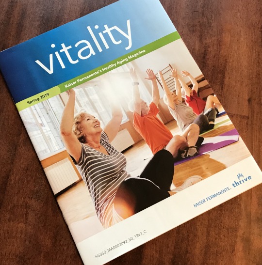
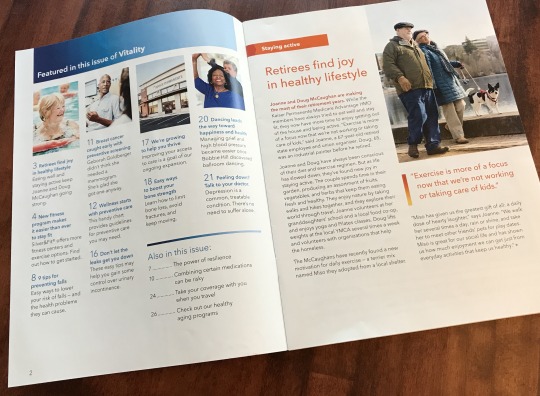
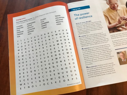
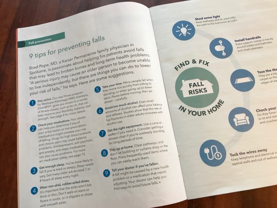
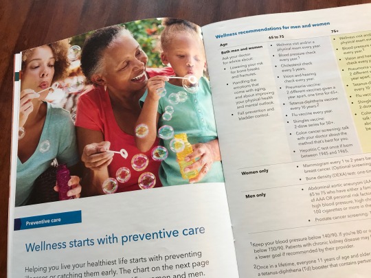
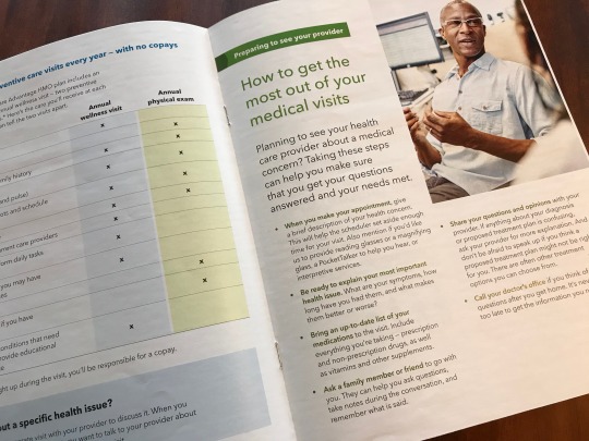
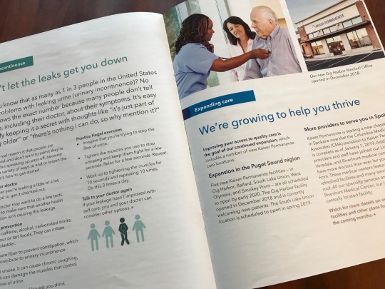
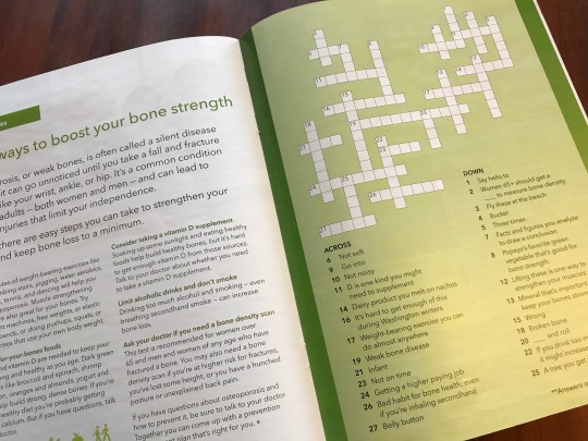
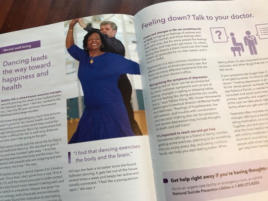
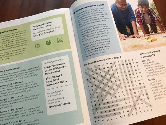
Kaiser Permanente Washington: Medicare Magazine
role in project: art director and designer
1 note
·
View note
Photo
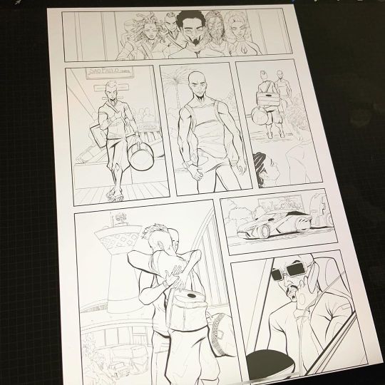
I didn’t like it the first time around so I did a redo on this page in terms of inks. Still colouring like a madman to get the comic finished and I am excited despite our current situation. Stay safe people as well for the persons who are essential and cannot stay home, I appreciate you. . . #redo #workinprogress #grinding #artlife #stayhome #staysafe #comics #comicart #pagelayout #originalcontent #originalcomic #caribbeanrootscultureandarts #afrofuturism #yeg #yegart #876art #procreate #inkfablemedia #childrenofrebelgods (at Edmonton, Alberta) https://www.instagram.com/p/B-dGqT5BoQb/?igshid=n479gkupvpaw
#redo#workinprogress#grinding#artlife#stayhome#staysafe#comics#comicart#pagelayout#originalcontent#originalcomic#caribbeanrootscultureandarts#afrofuturism#yeg#yegart#876art#procreate#inkfablemedia#childrenofrebelgods
1 note
·
View note
Last Seen Blogs
ebonydriftwood
Ebony Driftwood

liliuhms
☀️
kingbet777gacor
KINGBET777 : Link Daftar Situs Slot Kingbet 777 Pasti Menang

bcdkey
Untitled