#modelling technique
Note
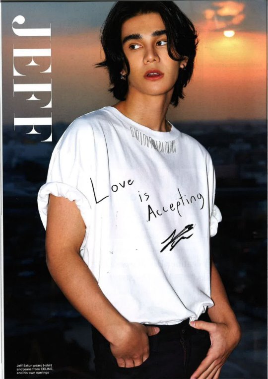
I was scrolling through Twitter and came across Mile, Apo, Bible, and Jeff's photos from Harper's Bazaar SG's Valentines edition, and I know I should be focusing on the their answers (which were simple but amazing), but I cant help but notice that whoever took Bible's pic and did his hair styling did him dirty??
I know you typically talk about MA and occasionally rt Jeff and sometimes Bible — but I recall you making a few posts before on how MA's modeling experience shine through in comparison to Bible who is inexperienced, and I was wondering if you see it too? or if it's just me being biased to MA and Jeff.
Tbf, I don't think that MA's or Jeff's pics were anything world-stopping (though MA's smiles are making me feel things, and I have a new found love for Apo in earth tones and shades of brown like the cardigan he has on that picture), but Bible's stands out in a not-so good way to me, though I don't really dabble in photography so I was wondering what you thought about it.
I looked at these super quickly before bed last night so (1) I was distracted by the fact Apo and Mile look so much like each other I didn't notice that about Bible and (2) are you trying to have people come for me?! 😂


You're right and now I can't unsee it either... 💀
Of everyone involved here, I'm pretty sure the stylist is actually the least responsible for this photo situation. Actually this is an interesting case because now Mile, Apo, and Bible have all worn that cursed hoodie so this gives an opportunity to look at fashion vs. modelling technique vs. the models and photographer collaborating.
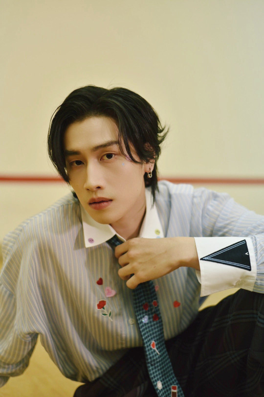
First of all I AM NOT HATING ON BIBLE I think he looks great in the D7 photos from today. I'm not sure who the photog for this one is, but likely May (BOC's staff photographer) or Pond.

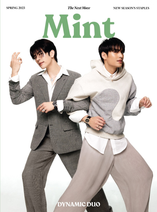
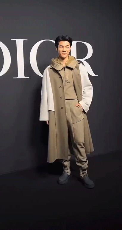
Second of all, this is why I think Dior is awful. Their baggy on baggy situation is so shapeless. They're all wearing the exact same three pieces, so it has to be that Dior told them the outfit should be styled like this. Someone else mentioned that one of actors Apo was with at the Taiwan store opening wore the exact same outfit as Mile had on in the Bangkok popup so Dior seems very much a stickler.
The advantage Mile and Apo have on Bible here is height. Not only in that they're taller, but their limbs are longer so they look less diminutive and dwarfed in the baggy clothes.

Though the keyword is less. This is a perfect example of what these ugly baggy shapeless clothes do your limbs length. When I showed @thislittlekumquat she literally said to me she thought the left one was that someone made a hyperrealistic doll of Mile 💀


So problem #1 is Dior.
The second part is definitely a matter of experience. Here's some other outfits on how Apo and Mile dealt with the baggy Dior situation.

And here's how Dior runway models dealt with it.


The hand in pockets situation definitely helps gives shape to the baggy clothes, but Bible's hand is on the one far from the camera and obscured by him that it makes the silhouette worse. Mile and Apo adjusted for it with lighting (knowing their angles) and the Dior runway models adjusted for it by just giving the clothes more shape.
Also compare this to Mile turning and greeting fans at the Dior show and keeping his hand tucked or Mile and Apo's whack grip on the saddle bags. The fact they make these incredibly unnatural body position look easy, natural, and relaxed is also a skill. Mile's popup outfit isn't as baggy as the hoodie, but you might not even notice he's holding his arm/elbow slightly unnaturally but in a way that give the outfit more shape while showing off the bag too.
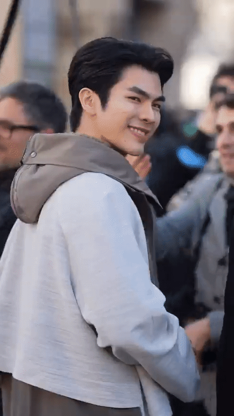

So problem #2 is Bible's lack of experience.
And the third is... it's on the HBSG editors/photographers. They didn't only take one photo of Bible but this is the one they chose...which makes me wonder how the others even look 😱
Here's a reel of them going through the photos at Apo's latest Vogue shoot and you can see them going through the multiple options. I think MileApo fans are aware we're fortunate, but part of the reason we get so many behind the scenes outtakes and cuts that don't make it to print is because their modelling work is at a consistently high level that editors are spoiled with choice.

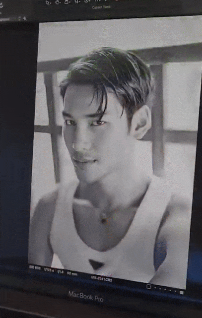

Also a case where you can see Apo is styled the same in the two pictures but the lighting really affects how the photos turn out... the shadows on Bible's photo are flat. So this is a photographer/editorial choice they could have corrected at the time. 🤷🏻♀️ I'm not sure why they didn't correct at least the lighting because I'm pretty sure that would also fix some of the problem.

Lighting patterns from left to right: Flat, Butterfly, Loop, Rembrandt, and Split
Problem #3: HBSG's photographer/editors not adjusting for Bible's lack of experience and giving him more direction.
As for Mile and Apo's not being The Most of all shoot of all time, I agree, but as a model you also have to model to the theme. It's a Valentine's Day shoot and they're talking about love... being a little smiley and cutesy instead of serving at 1000% is probably also appropriate. And we as fans are charmed by that too :)
Anyway, yeah, Bible lacks experience but he's an actor and a celebrity they're featuring. The photog should be adjusting for Bible's level of experience and not expect everyone to be experienced models like Mile, Apo, or Jeff.
#modelling#modelling technique#photography#bible wichapas#mileapo#mileapo as models#mile phakphum#apo nattawin#mileapo x dior#mileapo x harpers bazaar#harper's bazaar#kinnporsche#photography meta
65 notes
·
View notes
Text
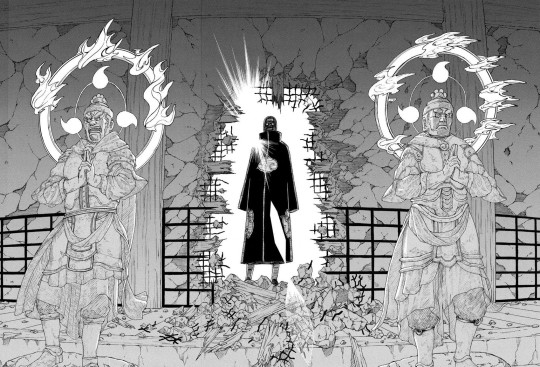
#naruto#uchiha itachi#chapter 359#once again let's give it to itachi and his sense of spectacle#through deidara's eyes too truly a wonderful combo#also those are statues of raijin i believe correct me if i'm wrong#shoutout to the god of thunder for this moment as well as giving his name to the technique that killed izuna#(and also having a cool origami model)
153 notes
·
View notes
Text
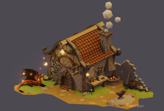
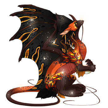
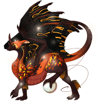
Modelled a little forge for my blacksmith Pearlcatcher, Ember :3
Yes, he has a wooden workbench and a barrel full of coal next to an open flame,, his ass is NOT sornieth osha compliant!
also i may have forgot his pearl and whiskers uhhh just pretend he left the pearl inside and he burnt his whiskers off when he leaned over the fire one time (again... he is not operating a safe business by any means)
plus some wip pics if youre into that sort of thing
and heres what hes gonna look like once i gene him up! still need to save up for a trans scroll and all the genes lol
#fr fanart#flight rising art#flight rising#pearlcatcher#blender 3d#low poly#3d model#flight rising pearlcatcher#flight rising fanart#fr fanart friday#what even is the fr friday art tag anymore asjdhsfdsjh it changed at one point and idk what it is now#anyway this took me like 3ish days? im putting it in wip hell for now but it looks pretty good as is so im happy#i havent messed around in blender for a long time cos i made like 3 attempts and did so terrible each time#but apparently i learned something each time from the failures since it felt a lot easier this time#i can tell im not using the cleanest or most efficient techniques and i know nothing about nodes xD but im slowly improving!!#anyway im taking a break from modelling to work on comms again now! and to look for a job sdkfj#mine#my art#finn.txt
152 notes
·
View notes
Text

Good Morning.
Wanted to be nice and draw Serizawa getting a good night's rest. I imagine Serizawa is really into some classic retro animes/media so I added Space Battleship Yamato and Super Sentai posters.
I could have just decided on a light source like a normal person, instead I did a layout of Serizawa's studio apartment.

#mob psycho 100#mp100#serizawa kastuya#sleepy#comfy#morning#bedhead#give my boy all the comfy blankets#studio#layout#apartment#waking up#I usually try to keep on model#but this is more my natural style#tried to use the white of the paper technique#Space Battleship Yamato#Super Sentai
114 notes
·
View notes
Text
I've been thinking about the Jance photoshoot and oof do I have Thoughts but -- okay, an attempt to explain why this photoshoot really speaks to me.
I've seen a bunch of different takes float across my dash, but to me the core of this photoshoot is the portrayal of a very deep bond between two men without fully specifying what kind of bond it is. The message I get from their pictures, from Jan looking into the camera (almost?) defiantly while Nace looks serious to the two of them looking at each other and only each other, is "This is us. This is our relationship. What kind? Well, none of your business, but we're not hiding it and we won't help you put us into a definitive drawer."
Since this got long, more thoughts under the cut
And, like -- there's so many layers to this shoot? So many ways to read this as an utter fucking power move, and I'm just. Really touched.
So. Layer one is kind of what I pulled from the art earlier, saying, "you may get to see us be intimate and close, barely hidden behind a glass door (= lack of privacy), but at the end of the day, we decide how much we share. And even if you get these intimate glimpses, you do not get all of me (= him half-hidden behind his hair and/or Nace)"
So what do we glimpse? Well, that's where it gets delicious imo. Because it could be read as non-sexual and non-romantic, so just platonic. Non-sexual intimacy is still pretty rarely portrayed, especially between men, and that goes double for non-romantic intimacy. And so as someone on the aroace-spectrum, that speaks to me so so much.
it's also such a fuck you against Toxic Masculinity -- that they can be this vulnerable together, that they don't mind showing -- that they're actually showing off to -- the world that they're this vulnerable with each other. Just. Intimacy and trust and closeness; laughing together and seeing each other and presenting a united front against the world (= the viewer).
I've long-since wondered if Nace is Jan's emotional support bassist -- if they're each other's comfort people, which would track with them doing this shoot together, presenting themselves in front of the camera together. "I'm doing this, putting myself out there, because with you by my side it feels doable."
And just. The fact that it can be read as queer and they clearly don't mind is also stunning regardless of if they are actually queer and/or actually in a relationship. They know what the fandom thinks. They know what this will look like. And yet -- no "no homo", no "bradders"; just unabashed joy in each other's presence and standing together -- and it's not escaped my notice that it's Jan having Nace's back, fixing the camera with a look of, if you touch him, I'll end you.
And if it is an affirmation that they're queer/together? Then holy shit, what a power move.
Just. I think this is a piece of art that's really resonating because I can see myself in so many of these layers and that's just so powerful. Damon is a pretty good photographer, from what I've picked up, and so I think this is not an accident; I think this series of photos confirms exactly as much and as little as he wants it to. And in the gaps in between, which I understand is something art does, we have space to see ourselves and engage with the artwork in our own ways.
Because at the end of the day, as raw and as candid as these shots look, this isn't an unfiltered version of them. It is them, at least in part, but it's art. It's a performance. It's something we can construct narratives out of (which, probably surprising no one, is something I really enjoy), but we're still engaging with the performance, not the real people underneath. But it still takes guts to give yourself over to that performance, and that is what might move me the most, gorgeous and stunning pictures and all.
The fact that they stepped forward and said, "This is us. Make of it what you will."
#joker out#jfc this got long#jan peteh#nace jordan#nace ja jan#jance#damon baker#this shoot is not an accident#but it is an interesting marketing technique#to kill their fanbase just before the release of a new single#model!jan#model!nace#jo model era#jo in london#isz speaks
92 notes
·
View notes
Text
One of my favorite Adrien hcs is that he is chronically online
Not like during the day (because he’s so busy) but like he totally stays up till 2-3am just on his computer
He plays video games (tetris, stardew valley, papa’s donutarria, ect) and I believe with my whole heart he would have a tumblr. Just like. Imagine. He has a normal blog with like 12 followers who are all very concerned about the abundant lack of parenting he references on occasion, the three or four fandom blogs because he so would, and also of course my favorite his Ladybug fan blog where he goes off on how much he loves her all the time and actively defends her to the death
Also he prolly has like a gimmick blog or two
#author is sleep deprived#mlb#miraculous ladybug#mlb fandom#adrien agreste#mlb adrien#chat noir#he also totally has a blog as chat noir where he just responds to other peoples posts with puns#and also insults hawkmoth (with puns) on occasion#the jury is out on weather people actually believe hes chat but either way they think hes funny#anyway at least one of his gimmick blogs would be about photography just because he knows so much as a model#like he lists the techniques used or smth#and REFUSES to do any of Adrien Agreste for some strange unknowable reason#also he would totally translate all of his posts into like four different languages#because he just knows that many#jesus so much language#anyway im tired as shit and up past beddy bop time#night night
34 notes
·
View notes
Text


Painted Catarina Armour, trying to recreate the grey-white in-game render.
#siegmeyer of catarina#siegward of catarina#dark souls#dark souls 3#miniature painting#catarina armor#dark souls 1#dark souls board game#miniature#i will say trying to go for the usual 40k-ish basecoat - recess shade - edge highlight technique has not worked as well with this one#it is 90% because i am a new painter but also i rather suspect the curves of this model make that technique a bit difficult#and also dark souls boardgame tokens have thinner and more delicate details than gw stuff and they are far harder to outline#i've had more luck with drybrush personally. eygon turned out beautifully with mostly drybrush#i should post those photos too haha
69 notes
·
View notes
Text


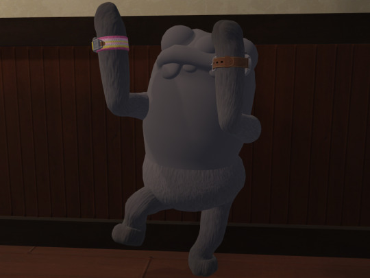

Who wants to see the closest thing the Bugsnax journalist has to a full model, doing various animations?! Well, I did. So I made this in Blender, and put them in Clumby's office because why not. The specific animations:
Orange journalist: Idle
Yellow journalist: Running
Green journalist: Crouching
Black journalist: On fire (fire not pictured)
White journalist: Activating the Lunchpad (Lunchpad also not pictured. Maybe it's just offscreen?)
Purple journalist: Using the Snakgrappler
Only the arms and lower body are textured, because only the arms and lower body actually exist in the game. The upper body is a less-detailed model used to cast the player character's shadow. It's not like you're going to look at their shadow in the game and notice that they don't have eyelids. You can barely even tell that they have an overbite. I've checked. Anyway, I made the shadow-only part the same colour as the top of the legs, but they kind of look like they're made of rubber. With fuzzy pants on.
The arms are actually a separate model to the rest of the body, in both the in-game model and the shadow model, and I'm like 95% sure I attached them correctly. The in-game and shadow versions of the arms have slightly different animations, and the in-game arms seem to attach to the camera, which is behind where the nose would be in the shadow model. I'm using the in-game arms here, since they're more detailed, but I attached them to the top of the spine where it would make more sense for them to be, and had to do some weird stuff with constraints to stop them from sliding all over the place.
Also, the in-game arms have individually animated fingers, which not even the NPC Grumpus models have, allowing me to do this:
"Thanks, Chandlo. You really
'slam-dunked'
my questions."
(I want to make it completely clear that I posed the model like that. The other poses are from the game, but that one's mine, I'm sure someone who knew what they were doing would make it look a lot better)
(They definitely did quotation fingers during that line. Search your feelings. You know it to be true)
There's also a secret to the model's blank expression! Or at least a detail you can't normally see. Since there's no texture, you can't see their pupils, but if you turn on wireframe...
A Grumpus?

Journalist the Grumpus?!
#Bugsnax#Bugsnax journalist#That was all I wanted to do Blender!#I wanted to look at the Journalist's shadow model#But you made me learn Python and certain 3D programming techniques#Yes... 'made me'#Definitely didn't choose to do that on my own or anything#I just... really like the Journalist#I spent much too long on this and now their blank stare will haunt my soul#I called Clumby's hat a fedora in the alt text for the last image and I stand by it. It's not a trilby#I should finish up that import script so I can share it#It seems pretty stable so far#long post#Didn't realise how long until I saw it on my dashboard
302 notes
·
View notes
Text
Oh yeah, Elias’ aethervial has a proper model instead of just pure asset usage, made by @elanorpam and (unfinished, but textured by me). It’s a bit scuffed up it seems.
#solivaga#pu art#paula art#3d artwork#procreate can’t do transparencies yet so even tho i did go back in and made some cool effects modeling for the contents#the textured version in procreate can’t display it#so i did a cheap pseudo 3d painting technique for the opaque glass as a stop gap for quick usage#i’ll finish texturing it sometime#audun’s loci has a 3d model as well lol#lyras does ‘t because her pen is easy and doesnt really need it#artists on tumblr#digital art
36 notes
·
View notes
Text

the heroines of mermaidia 🌊🐚
#you can tag this as ship if u like#barbie fairytopia mermaidia#barbie mermaidia#barbie fairytopia#elina fairytopia#nori mermaidia#my art#magical girl#mermay#mermay 2023#fanart#barbie fanart#mermaid#i drew on elements from both the dolls and their models in the movie#for this drawing#also brought back my old technique of giving characters aptly colored lipstick
39 notes
·
View notes
Note
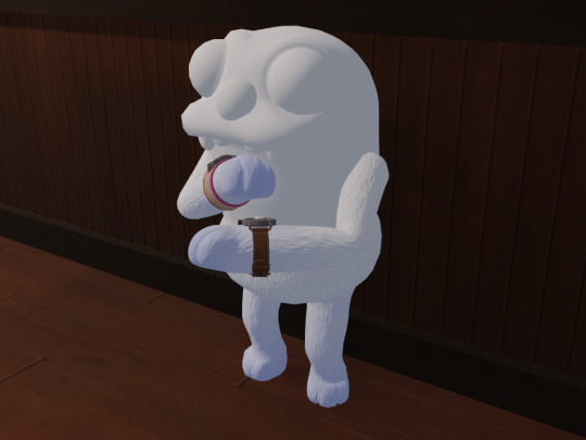
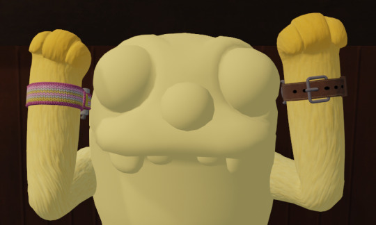
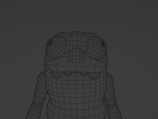
I JUST REALIZED YOU ASKED FOR DRAWING REQUESTS can I ask for a very self-indulgent Grollow pic of the two of them building sand castles for absolutely no reason at all <<
It ended up as a Beach date bc I also wanted to give them silly clothes (ft. Grimmchild)
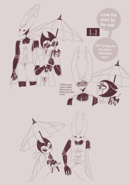
#their sandcastle techniques are questionable but u cant do much with just a big one-armed warrior and two little baby hands#iirc grimm is supposed to be a vampire moth so the joke of him carrying an umbrella to the beach writes itself#me: i wanna draw designs accurate to their in game models#also: haha huhu silly clothes#im sorry all my hollow knight fanart so far is shitposting. it will happen again#grimm#troupe master grimm#hollow knight#pure vessel#grimmchild#bubba doods#the idea of either grimm already owning that shirt or just seeing it on their way to beach amongst many other options and still getting it#its hilarious to me#grollow#grimmhollow
85 notes
·
View notes
Text
speaking of drawing people's faces and lifting any art of [will roland role based] characters overhead when you can tell the artist was actually trying to meaningfully use that inspiration beyond "brown hair. glasses" like wow once in a lifetime unsame as it ever was
not coming up a lot that Professional Illustrators are drawing will roland as [role] or like, in general, but that in fact there Are the examples of professional illustrator justin "squigs" robertson drawing him several times and it's like, doing stylized portraits of people working in theatre that are indeed focusing on distinguishable individuals versus, say, the style being more abstracted
all drawn differently but various gists are there, and none of the people in these group collages look interchangeable or like oh and this person gets thee "generic/default" look
there's also the fact i'm like 99% sure there's a squigs-drawn larger portrait of will roland just as himself that i love to think of / sure further encapsulates that "thank god this artist drawing Features" but i can't find it or remember exactly what context it was in. augh
but also there's this other deh illustration ft. wrol jared i found lol. bonus
#sooo replenishing#and like the issue pointed out that the excuse of [skill issue] is offered like It's Really Not A Skill Issue#someone can be very inexperienced at say; drawing; and still Evidently be actually trying to capture something Actually There in whatever#their model is. me as a like 5 yr old on the level of [yes all faces Are abstracted as =) ] still for example clearly depicting my mom's#usual hairstyle in my crayon portraits there#these examples here the polar opposites of The Nose Issue lol like stylized simplified And Yet still all clearly downturned#even the stylization leaning more convex nose bridge than that concave upturned nose slapped on anyone's face#deh#will roland#bmc#and forever the idea that Stylized Simplified drawing techniques are easy / bad but like it sure af is neither#you can note 'ah i see that this experienced artist's drawings are not photorealistic; formed of what i can tell are simple lil lines even'#but then be thrown off b/c of course it Looks easy but their lines are afforded a Casualness in their execution from their experience#knowing how to form and place them to give it that [Looks Good] without it being a painstaking &/or [9000 tries & errors] process for them#and like sure then anyone can Recreate it but you can throw yourself off thinking you Ought to be able to straightup Create It similarly...#like copying these obviously simplified stylized Faces made up of varying Shapes as seen here? prob a fun & neat & helpful exercise#especially if one's just working on breaking out of the ''i draw a Default Face for Everyone'' kind of situation#the exaggerated swoops and hard angles Geometry of compositions and forms overall is also a v fun element used here
21 notes
·
View notes
Text
the only thing my sister and i have to offer to the rise fandom is theories about how lou jitsu's dna recombined with the turtles
#i think about this a lot. like an embarrassing amount actually#i also think about what sorts of enzymes draxum mustve thrown into the ooze to trigger it all#i think there was probably a mystic factor as well#like a mystic catalyst#the turtles (and now splinter) would be considered transgenic organisms#and i dont have a whole lot of background in transgenic techniques so its a little harder for me#there are a lot of ppl at work who are experts on making humanized mouse models so i should ask them LOL#most of my research is on rna and protein expression and not dna modification#still compels me tho#megan we should try to find if anyone has sequence aligned turtle and human dna#im curious how similar the genomes are#and also what genes and consensus sequences are shared between reptiles and humans
6 notes
·
View notes
Text
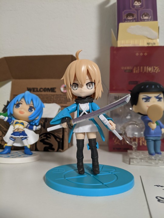
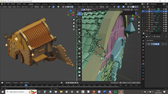
#my dad has been getting into gunpla and Warhammer and other model building+painting things for the last while#he likes watching videos of different painting techniques and comparing the differences in approach from different hobbies#like ohh they don't know how to do this over here... but they have it covered over there#anyway he hasn't actually had much experience making the models & was worried about spending for an expensive 1 and fucking it up#so i was like ok if i buy this inexpensive okita kit will you make it for me and/or we make it together so u can practice#and we're both super happy about it lol i love my dad#POST
12 notes
·
View notes
Text
it's repulsive the amount of criticism ive seen against young or new artists (particularly in the poetry community or in the country music genre) that's just "they're letting anyone call themselves an artist these days. they're not honoring traditions. they're ruining [art form]" & by "tradition" they 100% mean white supremacy, homophobia, ableism, ect. the mindset of "if everyone thinks they're special & worthy, it will dilute the value of art" is soooo often a thinly veiled way of expressing discomfort in seeing diverse voices finally being represented
#i see this directed at ocean vuong in particular. white critics against him don't break his poetry down with valid technique#& in tweets like this the replies are even more bold in straight up saying that vuong is only popular because publishers/readers want#woke points for reading him#& it's soooo infuriating#seen this happen to several trans fem models of color too. they get a big shoot or recognized#& the comments are so fucking vile#or white people applying to college saying that they're BOUND to lose out against a poc because their acceptance#is a threat to them??#ask to tag
167 notes
·
View notes
Text
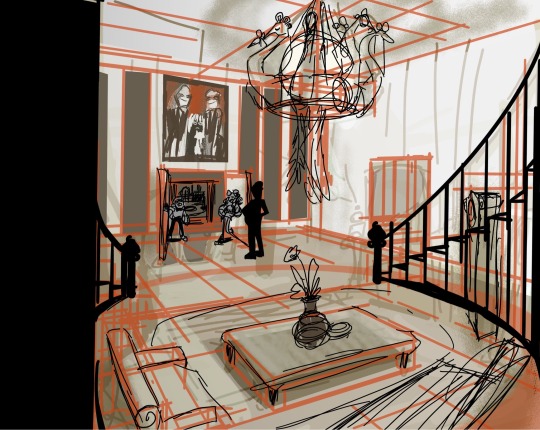
Tryin 2 do portfolio shit…. I’m gonna find a way to make this fun if it kills me ok?
#ignore that the butlers a poorly edited png of the butler from that one shitty episode where Danny gets rich. living large.#could NOT be assed 2 design a guy#also ignore that I cannot draw circular stairs it’s ok <3 I know blender it’s fineeeeee#‘’know blender’’ it’s more accurate 2 say I am capable of brute forcing blender#which is Good Enough for making layouts of shit <3#just redoing gonna model this in blender+paint over it later rn I’m in bed+sleepy+cozy tho so snzzz#wip#my art#also I wanna make the peacock chandelier one of those things u spin and it does a little animation#my brains saying ‘’rotoscope’’ that’s NOT rights but like. it’s close I think#like the word I mean. techniques rn’t related#also wanna add clutter BUT also the house needs 2 be desolate+unused outside of a few rooms#imo#so figuring out clutter that fits the vibe is a must#like marble statues+that kinda thing maybe?
9 notes
·
View notes
Last Seen Blogs

omotaku
Omorashi Otaku

loneinnocence
The King with A Golden Heart

animeboitrash
TOO MANY IDOLS

ghostlypeachturtle
Unbetitelt
ghostlypeachturtle
Unbetitelt