#knitting practice
Text
I learned 3 new things! I knit a border, tried intarsia knitting, and read a pattern 🥳

My floats are a bit tight so the green diamonds came out kinda puffy but this was my first time so I’m not too upset about it
#knitting is so fun#knitknitknit#garter stitch#stockinette#knitblr#intarsia#intarsia knitting#knitting practice#ooze news#diamond pattern
8 notes
·
View notes
Text
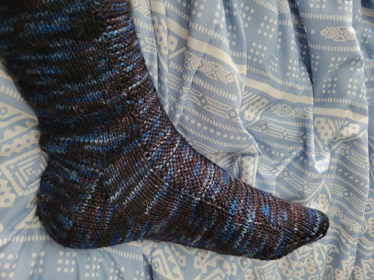
First sock-knitting progress.
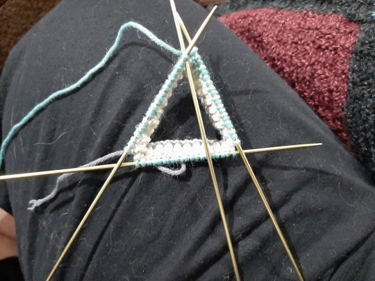
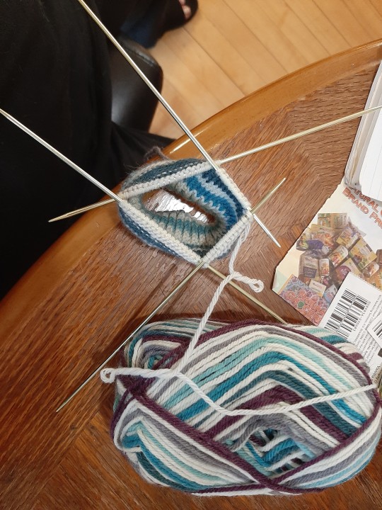
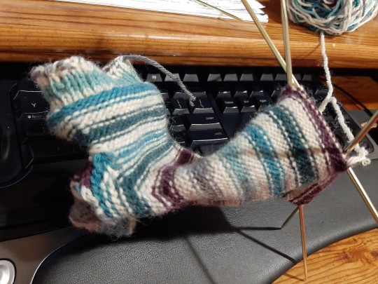
It was my first time knitting a sock, first time using this weight of yarn, and first time using double-pointed needles. Lots of firsts!
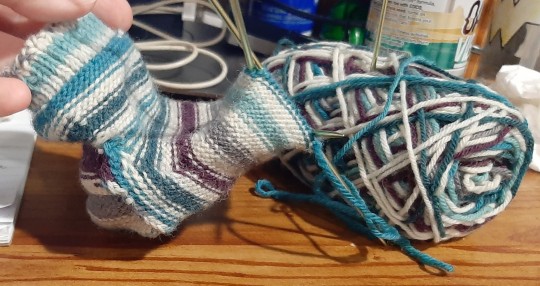
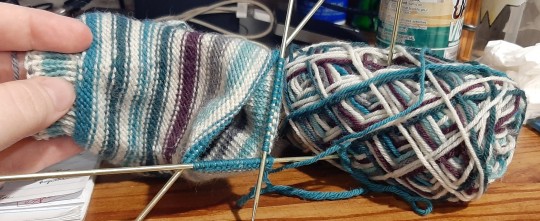
And here's the finished product:
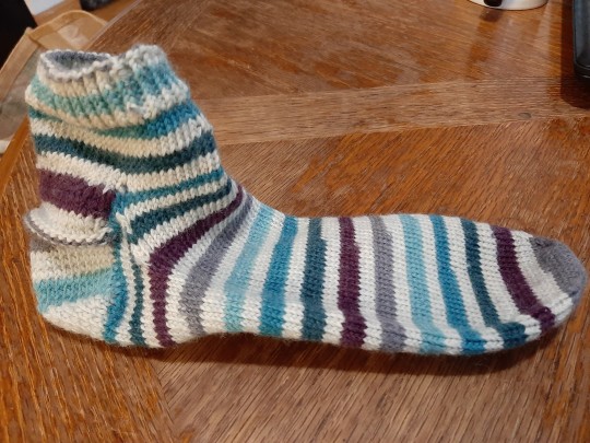
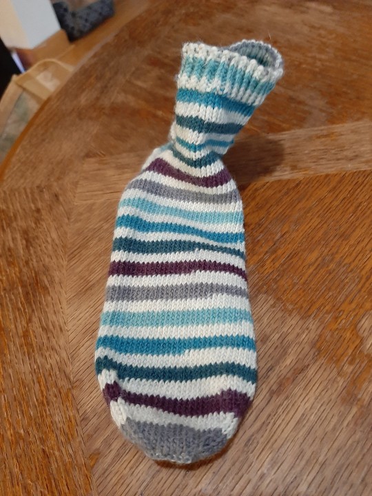
Made a few mistakes and, as I mentioned earlier, somehow accidentally knitted the thing inside out, which was pretty tough, but I got it done.
I need to actually measure one of my sister's "normal" socks before I knit her a "real" pair of socks. She also wants something fluffier/warmer, so a heavier yarn weight will be in order (my fingers will be thankful lol; sock yarn has been rough on them).
It was a learning experience!
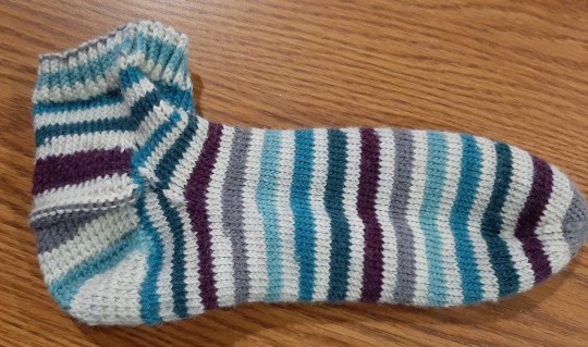
I was hoping to be able to jump into working on the "real" socks right away, but my sister wants to go yarn shopping at some point first, so that'll have to go on the back burner for now. Hopefully I don't forget everything by the time I get around to working on them again lol.
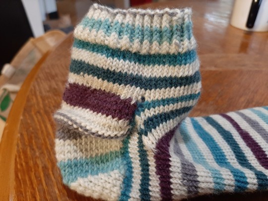
Oh! Almost forgot; my sister suggested I consider stuffing the practice sock with catnip and give it to the cats as a toy. So this might turn into a Christmas present for the cats lol. 😝
#myri speaks#myri knits#hand knitted#knotted sock#knitting practice#i have more sock yarn so i might have to make more socks with this weight of yarn anyway at some point#or use that yarn for something else lol#we'll see
3 notes
·
View notes
Text
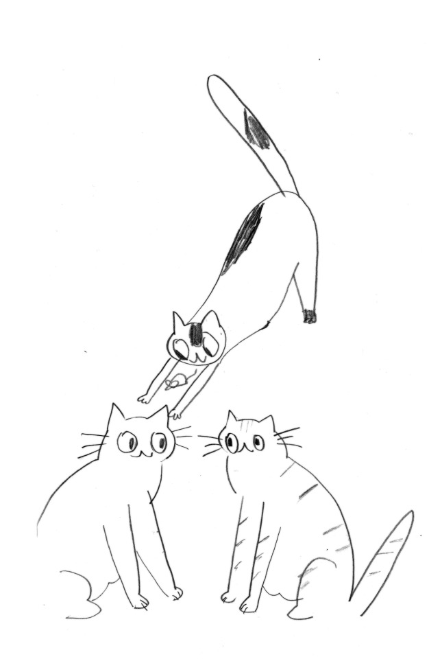
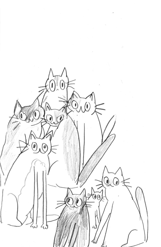
oaugh kitties
#mine#original#my sketchbooks r full of odd cats and bad figure drawing#as life should b#i had an entire breakdown yesterday but now i feel fine !!#bought sm snacks today....am going to practice knitting#i am . not good. but i am having fun
5K notes
·
View notes
Text
why Aurora's art is genius
It's break for me, and I've been meaning to sit down and read the Aurora webcomic (https://comicaurora.com/, @comicaurora on Tumblr) for quite a bit. So I did that over the last few days.
And… y'know. I can't actually say "I should've read this earlier," because otherwise I would've been up at 2:30-3am when I had responsibilities in the morning and I couldn't have properly enjoyed it, but. Holy shit guys THIS COMIC.
I intended to just do a generalized "hello this is all the things I love about this story," and I wrote a paragraph or two about art style. …and then another. And another. And I realized I needed to actually reference things so I would stop being too vague. I was reading the comic on my tablet or phone, because I wanted to stay curled up in my chair, but I type at a big monitor and so I saw more details… aaaaaand it turned into its own giant-ass post.
SO. Enjoy a few thousand words of me nerding out about this insanely cool art style and how fucking gorgeous this comic is? (There are screenshots, I promise it isn't just a wall of text.) In my defense, I just spent two semesters in graphic design classes focusing on the Adobe Suite, so… I get to be a nerd about pretty things…???
All positive feedback btw! No downers here. <3
---
I cannot emphasize enough how much I love the beautiful, simple stylistic method of drawing characters and figures. It is absolutely stunning and effortless and utterly graceful—it is so hard to capture the sheer beauty and fluidity of the human form in such a fashion. Even a simple outline of a character feels dynamic! It's gorgeous!
Though I do have a love-hate relationship with this, because my artistic side looks at that lovely simplicity, goes "I CAN DO THAT!" and then I sit down and go to the paper and realize that no, in fact, I cannot do that yet, because that simplicity is born of a hell of a lot of practice and understanding of bodies and actually is really hard to do. It's a very developed style that only looks simple because the artist knows what they're doing. The human body is hard to pull off, and this comic does so beautifully and makes it look effortless.
Also: line weight line weight line weight. It's especially important in simplified shapes and figures like this, and hoo boy is it used excellently. It's especially apparent the newer the pages get—I love watching that improvement over time—but with simpler figures and lines, you get nice light lines to emphasize both smaller details, like in the draping of clothing and the curls of hair—which, hello, yes—and thicker lines to emphasize bigger and more important details and silhouettes. It's the sort of thing that's essential to most illustrations, but I wanted to make a note of it because it's so vital to this art style.
THE USE OF LAYER BLENDING MODES OH MY GODS. (...uhhh, apologies to the people who don't know what that means, it's a digital art program thing? This article explains it for beginners.)
Bear with me, I just finished my second Photoshop course, I spent months and months working on projects with this shit so I see the genius use of Screen and/or its siblings (of which there are many—if I say "Screen" here, assume I mean the entire umbrella of Screen blending modes and possibly Overlay) and go nuts, but seriously it's so clever and also fucking gorgeous:
Firstly: the use of screened-on sound effect words over an action? A "CRACK" written over a branch and then put on Screen in glowy green so that it's subtle enough that it doesn't disrupt the visual flow, but still sticks out enough to make itself heard? Little "scritches" that are transparent where they're laid on without outlines to emphasize the sound without disrupting the underlying image? FUCK YES. I haven't seen this done literally anywhere else—granted, I haven't read a massive amount of comics, but I've read enough—and it is so clever and I adore it. Examples:


Secondly: The beautiful lighting effects. The curling leaves, all the magic, the various glowing eyes, the fog, the way it's all so vividly colored but doesn't burn your eyeballs out—a balance that's way harder to achieve than you'd think—and the soft glows around them, eeeee it's so pretty so pretty SO PRETTY. Not sure if some of these are Outer/Inner Glow/Shadow layer effects or if it's entirely hand-drawn, but major kudos either way; I can see the beautiful use of blending modes and I SALUTE YOUR GENIUS.
I keep looking at some of this stuff and go "is that a layer effect or is it done by hand?" Because you can make some similar things with the Satin layer effect in Photoshop (I don't know if other programs have this? I'm gonna have to find out since I won't have access to PS for much longer ;-;) that resembles some of the swirly inner bits on some of the lit effects, but I'm not sure if it is that or not. Or you could mask over textures? There's... many ways to do it.
If done by hand: oh my gods the patience, how. If done with layer effects: really clever work that knows how to stop said effects from looking wonky, because ugh those things get temperamental. If done with a layer of texture that's been masked over: very, very good masking work. No matter the method, pretty shimmers and swirly bits inside the bigger pretty swirls!
Next: The way color contrast is used! I will never be over the glowy green-on-black Primordial Life vibes when Alinua gets dropped into that… unconscious space?? with Life, for example, and the sharp contrast of vines and crack and branches and leaves against pitch black is just visually stunning. The way the roots sink into the ground and the three-dimensional sensation of it is particularly badass here:

Friggin. How does this imply depth like that. HOW. IT'S SO FREAKING COOL.
A huge point here is also color language and use! Everybody has their own particular shade, generally matching their eyes, magic, and personality, and I adore how this is used to make it clear who's talking or who's doing an action. That was especially apparent to me with Dainix and Falst in the caves—their colors are both fairly warm, but quite distinct, and I love how this clarifies who's doing what in panels with a lot of action from both of them. There is a particular bit that stuck out to me, so I dug up the panels (see this page and the following one https://comicaurora.com/aurora/1-20-30/):

(Gods it looks even prettier now that I put it against a plain background. Also, appreciation to Falst for managing a bridal-carry midair, damn.)
The way that their colors MERGE here! And the immense attention to detail in doing so—Dainix is higher up than Falst is in the first panel, so Dainix's orange fades into Falst's orange at the base. The next panel has gold up top and orange on bottom; we can't really tell in that panel where each of them are, but that's carried over to the next panel—

—where we now see that Falst's position is raised above Dainix's due to the way he's carrying him. (Points for continuity!) And, of course, we see the little "huffs" flowing from orange to yellow over their heads (where Dainix's head is higher than Falst's) to merge the sound of their breathing, which is absurdly clever because it emphasizes to the viewer how we hear two sets of huffing overlaying each other, not one. Absolutely brilliant.
(A few other notes of appreciation to that panel: beautiful glows around them, the sparks, the jagged silhouette of the spider legs, the lovely colors that have no right to make the area around a spider corpse that pretty, the excellent texturing on the cave walls plus perspective, the way Falst's movements imply Dainix's hefty weight, the natural posing of the characters, their on-point expressions that convey exactly how fuckin terrifying everything is right now, the slight glows to their eyes, and also they're just handsome boys <3)
Next up: Rain!!!! So well done! It's subtle enough that it never ever disrupts the impact of the focal point, but evident enough you can tell! And more importantly: THE MIST OFF THE CHARACTERS. Rain does this irl, it has that little vapor that comes off you and makes that little misty effect that plays with lighting, it's so cool-looking and here it's used to such pretty effect!
One of the panel captions says something about it blurring out all the injuries on the characters but like THAT AIN'T TOO BIG OF A PROBLEM when it gets across the environmental vibes, and also that'd be how it would look in real life too so like… outside viewer's angle is the same as the characters', mostly? my point is: that's the environment!!! that's the vibes, that's the feel! It gets it across and it does so in the most pretty way possible!
And another thing re: rain, the use of it to establish perspective, particularly in panels like this—

—where we can tell we're looking down at Tynan due to the perspective on the rain and where it's pointing. Excellent. (Also, kudos for looking down and emphasizing how Tynan's losing his advantage—lovely use of visual storytelling.)
Additionally, the misting here:

We see it most heavily in the leftmost panel, where it's quite foggy as you would expect in a rainstorm, especially in an environment with a lot of heat, but it's also lightly powdered on in the following two panels and tends to follow light sources, which makes complete sense given how light bounces off particles in the air.
A major point of strength in these too is a thorough understanding of lighting, like rim lighting, the various hues and shades, and an intricate understanding of how light bounces off surfaces even when they're in shadow (we'll see a faint glow in spots where characters are half in shadow, but that's how it would work in real life, because of how light bounces around).
Bringing some of these points together: the fluidity of the lines in magic, and the way simple glowing lines are used to emphasize motion and the magic itself, is deeply clever. I'm basically pulling at random from panels and there's definitely even better examples, but here's one (see this page https://comicaurora.com/aurora/1-16-33/):

First panel, listed in numbers because these build on each other:
The tension of the lines in Tess's magic here. This works on a couple levels: first, the way she's holding her fists, as if she's pulling a rope taut.
The way there's one primary line, emphasizing the rope feeling, accompanied by smaller ones.
The additional lines starbursting around her hands, to indicate the energy crackling in her hands and how she's doing a good bit more than just holding it. (That combined with the fists suggests some tension to the magic, too.) Also the variations in brightness, a feature you'll find in actual lightning. :D Additional kudos for how the lightning sparks and breaks off the metal of the sword.
A handful of miscellaneous notes on the second panel:
The reflection of the flames in Erin's typically dark blue eyes (which bears a remarkable resemblance to Dainix, incidentally—almost a thematic sort of parallel given Erin's using the same magic Dainix specializes in?)
The flowing of fabric in the wind and associated variation in the lineart
The way Erin's tattoos interact with the fire he's pulling to his hand
The way the rain overlays some of the fainter areas of fire (attention! to! detail! hell yeah!)
I could go on. I won't because this is a lot of writing already.
Third panel gets paragraphs, not bullets:
Erin's giant-ass "FWOOM" of fire there, and the way the outline of the word is puffy-edged and gradated to feel almost three-dimensional, plus once again using Screen or a variation on it so that the stars show up in the background. All this against that stunning plume of fire, which ripples and sparks so gorgeously, and the ending "om" of the onomatopoeia is emphasized incredibly brightly against that, adding to the punch of it and making the plume feel even brighter.
Also, once again, rain helping establish perspective, especially in how it's very angular in the left side of the panel and then slowly becomes more like a point to the right to indicate it's falling directly down on the viewer. Add in the bright, beautiful glow effects, fainter but no less important black lines beneath them to emphasize the sky and smoke and the like, and the stunningly beautiful lighting and gradated glows surrounding Erin plus the lightning jagging up at him from below, and you get one hell of an impactful panel right there. (And there is definitely more in there I could break down, this is just a lot already.)
And in general: The colors in this? Incredible. The blues and purples and oranges and golds compliment so well, and it's all so rich.
Like, seriously, just throughout the whole comic, the use of gradients, blending modes, color balance and hues, all the things, all the things, it makes for the most beautiful effects and glows and such a rich environment. There's a very distinct style to this comic in its simplified backgrounds (which I recognize are done partly because it's way easier and also backgrounds are so time-consuming dear gods but lemme say this) and vivid, smoothly drawn characters; the simplicity lets them come to the front and gives room for those beautiful, richly saturated focal points, letting the stylized designs of the magic and characters shine. The use of distinct silhouettes is insanely good. Honestly, complex backgrounds might run the risk of making everything too visually busy in this case. It's just, augh, so GORGEOUS.
Another bit, take a look at this page (https://comicaurora.com/aurora/1-15-28/):

It's not quite as evident here as it is in the next page, but this one does some other fun things so I'm grabbing it. Points:
Once again, using different colors to represent different character actions. The "WHAM" of Kendal hitting the ground is caused by Dainix's force, so it's orange (and kudos for doubling the word over to add a shake effect). But we see blue layered underneath, which could be an environmental choice, but might also be because it's Kendal, whose color is blue.
And speaking off, take a look at the right-most panel on top, where Kendal grabs the spear: his motion is, again, illustrated in bright blue, versus the atmospheric screened-on orange lines that point toward him around the whole panel (I'm sure these have a name, I think they might be more of a manga thing though and the only experience I have in manga is reading a bit of Fullmetal Alchemist). Those lines emphasize the weight of the spear being shoved at him, and their color tells us Dainix is responsible for it.
One of my all-time favorite effects in this comic is the way cracks manifest across Dainix's body to represent when he starts to lose control; it is utterly gorgeous and wonderfully thematic. These are more evident in the page before and after this one, but you get a decent idea here. I love the way they glow softly, the way the fire juuuust flickers through at the start and then becomes more evident over time, and the cracks feel so realistic, like his skin is made of pottery. Additional points for how fire begins to creep into his hair.
A small detail that's generally consistent across the comic, but which I want to make note of here because you can see it pretty well: Kendal's eyes glow about the same as the jewel in his sword, mirroring his connection to said sword and calling back to how the jewel became Vash's eye temporarily and thus was once Kendal's eye. You can always see this connection (though there might be some spots where this also changes in a symbolic manner; I went through it quickly on the first time around, so I'll pay more attention when I inevitably reread this), where Kendal's always got that little shine of blue in his eyes the same as the jewel. It's a beautiful visual parallel that encourages the reader to subconsciously link them together, especially since the lines used to illustrate character movements typically mirror their eye color. It's an extension of Kendal.
Did I mention how ABSOLUTELY BEAUTIFUL the colors in this are?
Also, the mythological/legend-type scenes are illustrated in familiar style often used for that type of story, a simple and heavily symbolic two-dimensional cave-painting-like look. They are absolutely beautiful on many levels, employing simple, lovely gradients, slightly rougher and thicker lineart that is nonetheless smoothly beautiful, and working with clear silhouettes (a major strength of this art style, but also a strength in the comic overall). But in particular, I wanted to call attention to a particular thing (see this page https://comicaurora.com/aurora/1-12-4/):

The flowing symbolic lineart surrounding each character. This is actually quite consistent across characters—see also Life's typical lines and how they curl:

What's particularly interesting here is how these symbols are often similar, but not the same. Vash's lines are always smooth, clean curls, often playing off each other and echoing one another like ripples in a pond. You'd think they'd look too similar to Life's—but they don't. Life's curl like vines, and they remain connected; where one curve might echo another but exist entirely detached from each other in Vash's, Life's lines still remain wound together, because vines are continuous and don't float around. :P
Tahraim's are less continuous, often breaking up with significantly smaller bits and pieces floating around like—of course—sparks, and come to sharper points. These are also constants: we see the vines repeated over and over in Alinua's dreams of Life, and the echoing ripples of Vash are consistent wherever we encounter him. Kendal's dream of the ghost citizens of the city of Vash in the last few chapters is filled with these rippling, echoing patterns, to beautiful effect (https://comicaurora.com/aurora/1-20-14/):

They ripple and spiral, often in long, sinuous curves, with smooth elegance. It reminds me a great deal of images of space and sine waves and the like. This establishes a definite feel to these different characters and their magic. And the thing is, that's not something that had to be done—the colors are good at emphasizing who's who. But it was done, and it adds a whole other dimension to the story. Whenever you're in a deity's domain, you know whose it is no matter the color.
Regarding that shape language, I wanted to make another note, too—Vash is sometimes described as chaotic and doing what he likes, which is interesting to me, because smooth, elegant curves and the color blue aren't generally associated with chaos. So while Vash might behave like that on the surface, I'm guessing he's got a lot more going on underneath; he's probably much more intentional in his actions than you'd think at a glance, and he is certainly quite caring with his city. The other thing is that this suits Kendal perfectly. He's a paragon character; he is kind, virtuous, and self-sacrificing, and often we see him aiming to calm others and keep them safe. Blue is such a good color for him. There is… probably more to this, but I'm not deep enough in yet to say.
And here's the thing: I'm only scratching the surface. There is so much more here I'm not covering (color palettes! outfits! character design! environment! the deities! so much more!) and a lot more I can't cover, because I don't have the experience; this is me as a hobbyist artist who happened to take a couple design classes because I wanted to. The art style to this comic is so clever and creative and beautiful, though, I just had to go off about it. <3
...brownie points for getting all the way down here? Have a cookie.
#aurora comic#aurora webcomic#comicaurora#art analysis#...I hope those are the right tags???#new fandom new tagging practices to learn ig#much thanks for something to read while I try to rest my wrists. carpal tunnel BAD. (ignore that I wrote this I've got braces ok it's fine)#anyway! I HAVE. MANY MORE THOUGHTS. ON THE STORY ITSELF. THIS LOVELY STORY#also a collection of reactions to a chunk of the comic before I hit the point where I was too busy reading to write anything down#idk how to format those tho#...yeet them into one post...???#eh I usually don't go off this much these days but this seems like a smaller tight-knit fandom so... might as well help build it?#and I have a little more time thanks to break so#oh yes also shoutout to my insanely awesome professor for teaching me all the technical stuff from this he is LOVELY#made an incredibly complex program into something comprehensible <3#synapse talks
744 notes
·
View notes
Text
Bought a whole book on how to alter any sock pattern to fit anyone properly and it turns out the big secret is actually forcing yourself to do the gauge swatch and I'm very annoyed
#it's actually a great book it explains all the alterations you might need for non-average proportions and how to do the math for it#and it comes with several really nice patterns to practice on#but what do you mean I can't just jump into a project the second I get my nice yarn home#knitting
246 notes
·
View notes
Text
i hate that every time I have some free time I could do so many things that I end up doing nothing😭
#i could practice drawing#i could write#i could knit#crochet#mosaic#painting#puzzles#reading#baking#SO MANY THINGS AND I SCROLL FUCKING INSTAGRAM#personal
191 notes
·
View notes
Text
So what I got from playing tcoaal is that if there was an incest is not wincest au, Andrew Graves would be the perfect boyfriend :)
He's so datable, help
#Everyday he grows more and more into being a f/o#Ashely said herself he's a true romantic at heart#So many cute pet names 'sweetheart' 'darlin' 'baby' 'dork' <- affectionately#movie dates using his lap as a pillow#cooking together for picnics late at night#forehead kisses is practically his middle name#It's pretty much a given he'd be obsessed + possessive with his SO#You could knit him the ugliest sweater and he will refuse to take it off#andrew graves#tcoaal#the coffin of andy and leyley#andrew graves x reader#andy graves#andy graves x reader
153 notes
·
View notes
Text
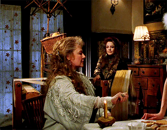
i gasped when i noticed they're using a beautiful wooden loom and yarn swift (and another yarn swift behind them)
#this is reminding me of my post about hawkeye mash knitting and how its just stuff for the actors to do thats not related to the story#this loom and swift disappear after this scene its not related at all theyre just doing it because theyre people outside of the story#practical magic#knitting#knitblr#yarnblr#textile art#*#filmgifs#filmedit
259 notes
·
View notes
Text
If I wanna learn to make sweaters, is it better to learn to knit or to crochet? What about blankets?
#tabby talks#i kinda hope it’s crochet#i tried learning to knit once and i was not great at it#which i mean nobody is great starting out#but i apparently knitted weird#i went to knitting club at school and they were just kinda….. why/how are you holding the needles like that?#and i was like it’s the only way that i can 🥺#it was holding one between my knees btw#maybe i just needed more practice….#knitting#crocheting#fiber craft
70 notes
·
View notes
Text
bart just picking up the most random skills every other week when he happens to be bored (a frequent occurance).


not even a headcanon- he's probably checked out hundreds of "[insert skill here] for dummies!" and he does what he can with them until he defaults to playing video games
#an adhd icon 😁#cooking is probably the hardest for him- he gets impatient and ends up burning or undercooking his food#he enjoys things that he can learn and practice at superspeed! art and crafts guy <333#he knits sweaters for max writes little stories for tim and draws for cassie and writes songs for kon and takes photos for cissie etc etc#bart allen#impulse#impulse dc#impulse comics#dc comics#young justice#young just us#young justice comics#yj 1998#impulse 1995#flashfam
298 notes
·
View notes
Text
I've got writer's block and reader's block, but goddamn if I didn't learn how to knit a sock.
Pattern is Rye Light by Tin Can Knits
Yarn is Rainfall on Oak from Spinning Tales Fiber
#allison rambles#allison knits things#knitting#stitchcraft#can't read can't write thank the gods i can still knit#this is the 2nd practice sock y'all voted i do and as you can see the heel is a million times better#now on to Emerson's gift socks#they picked an absolutely gorgeous yarn so I'm very excited
46 notes
·
View notes
Text


@ leo_jungtw
✌️
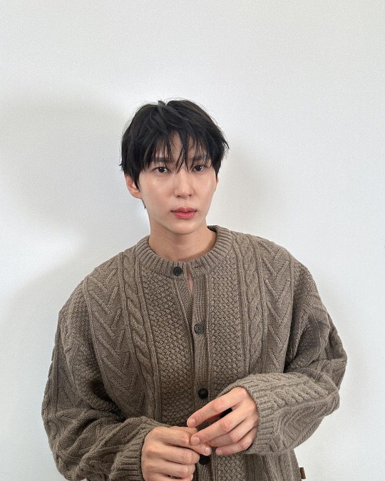
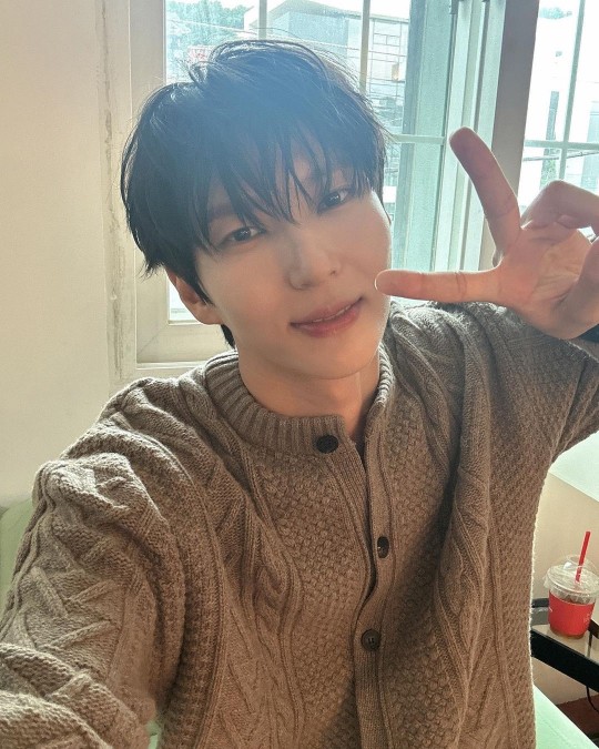
#taekwoon#leo#jung taekwoon#vixx leo#vixx#231002#happy leo day 2023#*leo_jungtw#*v:p#🖤#im so glad he reuploaded these#i LOVE these.. a lot!!#the soft knit with nothing....under....neath#if youve been following me for a while i think youd understand more the fondness i have with him in knitwear 🫠🫠🫠🫠#i left him a comment saying (in kr gotta practice lolll)#im so thankful for him reuploading them i love them a lot!! and that hes wonderful handsome and beautiful 🫥
59 notes
·
View notes
Note
I feel like a lot of Kuai's clothes were just Bi-Han's hand-me-downs when Bi-Han got too big and they just threw it at Kuai since Kuai would be growing into it.
Not all of them were but I imagine a good portion of his clothes used to be Bi-Han's, especially before puberty.
I feel that will depend a lot on the timeline, socio-economic situation of Lin Kuei and how big the age gap is between brothers.
For example, if in the new timeline Sub-Zero and Scorpion’s family is treated like a true Royals, then Kuai Liang as the second-in-line to the “throne” is less likely to wear hand-down clothes, unless the cloth has traditional importance, like it happens with some items passed down from one generation to another. And that could be as much about Grandmaster and his wife’s wish to give only the best to their sons as much as a matter of prestige and upholding their social status.
However, if despite the importance of the Grandmaster's role in leading the clan, Lin Kuei is in fact a large family unit first and foremost, with close personal bonds, I can see the clothes being handed down as a common practice - especially if the clan resources are limited. I mean, we hardly have any idea what Lin Kuei economy is based on in time of peace and there is something to say about Sub-Zero’s delight about spoils of war to which Scorpion did not disagree with the sole idea of spoils, only that they must first win the war.
Like, is Lin Kuei big enough to be a whole nation, with its industry, farming, cities and trade or do they live in isolated, self -sufficient society hidden from everyone else? Because to make clothes in the traditional way, you need specialized workers to hand -woven material in the first place, which takes time and a lot of hard work. The Lin Kuei brothers’ uniforms were most likely individually tailored which makes sense, as they are Grandmaster’s sons but also grown up and skilled men that worked hard to to be recognized as the warriors of the clan, but back in the time when they were children? It would be easier to store Bi-Han’s clothes until younger brothers grow up enough to wear them than to lose the limited material resources, as Kuai and presumably Tomas would outgrow the new clothes in a few months.
(Also, I’m speaking here from my family experiences, in which the clothes for babies and children were passed down between so many people over the course of years. So I’m here for Lin Kuei being the close-knit family that doesn’t mind hand down clothes between all the children as a way of supporting each other and providing the needed items. If Grandmaster’s family is a bigger unit, Bi-Han too could wear the hand down clothes before he grew up enough to get his own sets.)
Additionally, if Bi-Han and Kuai Liang (and Tomas) were close in age, the passing down of clothes feels natural and sensible. However if Bi-Han is older than 6-10 years or more, I don’t think his parents would store his baby/childhood clothes to collect dust and take up space in the closet, unless they planned to have another child at some point.
As for the previous timelines, I think the situation is more complicated, because both Kuai Liang and Bi-Han were children forced into Lin Kuei. And a clan that kidnapped children to turn them into killers doesn’t sound like someone who would care what Bi-Han and Kuai Liang wished to wear or after whom they got their clothes.
The clan definitely provided its adepts with the necessary daily life items, but there is a question how much any of them actually owned anything? If adepts got the second-handed clothes and things were passed down between all children, both Kuai Liang and Bi-Han had a small chance to be given a choice what is given to them (unless the original timeline!father had a say in that regard). Could Bi-Han keep his old clothes, as in, have a place to store them for Kuai Liang when he was big enough to wear it? Could he even hand down his clothes in the first place, or would the clan treat it as mandatory equipment and "losing" anything were punished? I feel that in both original and alternative timelines none of the boys have a control over the clothes provided them by clan and if Lin Kuei practiced passing down clothes from one adept to another, as a cheaper and more pragmatic way in regard to fast growing up children, Kuai Liang may not necessary getting old Bi-Han’s clothes.
#mortal kombat#my replies#kuai liang#bi han#sub zero#scorpion#as the youngest kid for awhile in my family i get the handed down clothes after the older sibling(s) but also i remember how clothes#of my nephews were passed down to another babies to help and support so i can see this practice in lin kuei#especially the old versions and close knit family in mk1#however if the grandmaster's family is treated as royals/ruling class i feel kuai liang would be provided only with new clothes#and so would be tomas
25 notes
·
View notes
Text
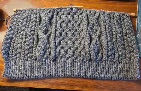
I'm so fucking excited with how this is turning out! Full cable knit is always so gorgeous!
#I probably should've had some practice before jumping into this with no knitting knowledge#but ehh#the mistakes with this are easier to fix than anything crocheted#knitting#sweater
15 notes
·
View notes
Text
Fiber arts (crochet and knit, especially) tip I found helpful: It's great to be a yarn snob, but first, find what you actually like to work with. When you're beginning, you might be working with acrylic, and that's fine. There are plenty of great options for acrylic, and even that one material can be vastly different between brands (honestly, I think people don't recognize this enough! Acrylics are actually a diverse material!). However, you might like working with other materials more as you progress, and it's good to see what you'll like! I've been working with 100% cotton recently, and I really, really like it - much moreso than the acrylic I bought when I first crocheted, and I never knew that I would have liked it more.
It's okay to work with whatever you can, especially when it's your only option. When you get the chance, though, think about some things you like in a material. What textures do you like? What colour options do you prefer (bright/muted/natural)? What is realistic for you when it comes to caring for your projects once they're done? These are all important, and they're things that are specific for you. There is no such thing as a "bad material," only materials you like and want to use. It can be intimidating to feel like you're not at this pristine place of yarn-snobbery, but truthfully: it doesn't matter as long as you make things that you like, and being able to explore what you like can be really helpful.
#art#fiber art#knit#crochet#i think this could apply to other forms of fober crafts but i'm not well-versed enough to make such a sweeping generalization <3#i know sometimes people use 'yarn snob' to say that they are very specific in what they like and that it's not indicating...#...that they think they're somehow 'above' a person with less expertise or experience...#...i just think sometimes beginners can be (understandably) intimidated by all of it...#...and you can start really over-thinking your decisions and if you're Doing Art Right rather than just Doing Art#it's the Doing Art *Right* that will often set you back#it's OKAY to use whatever is both available to you and is of a quality you like#like i don't MIND acrylic - the one i'm using for the fazbeanie is an acrylic...#...in fact the fazbeanie yarn (Big Twist 100% acrylic in chocolate brown) made me learn that acrylic can have really nice softness...#...and it's a very smooth acrylic too. this other skein i got for practice was. very unpleasant for an acrylic#ANYWAY. rant over. for now.
25 notes
·
View notes
Text
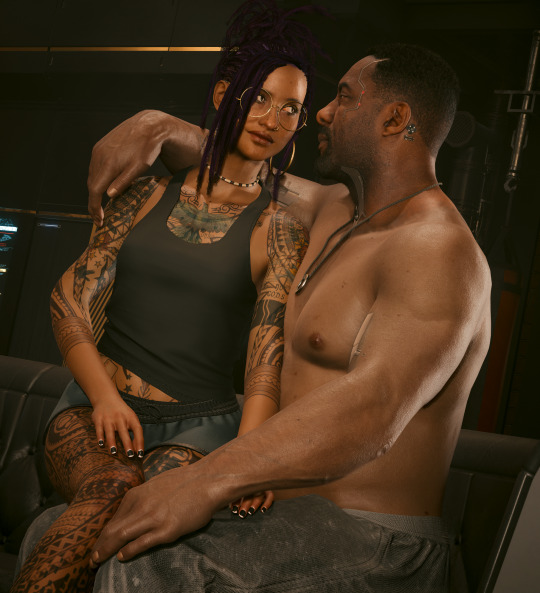
|| cozy night in ||
#cyberpunk 2077#modding shenanigans#baby girl benítez#solomon reed#ship: short change heroes#y'aaaaaaallll i did it. he has a body now.#*ugly sobbing*#i had my hand held by my beloved long-suffering friends#but i did it#next up babyboy is getting a SWEATER#he has his lil pjs#and now he needs a cozy sweater#there's no way this man doesn't own a sweater#just LOOK at him#he practically screams chunky cable knit#*pterodactyl screech*#i am unwell. goodbye.
44 notes
·
View notes
Last Seen Blogs

mybuzzersworld
버즈 BUZZ

victoriawreen
Victoria From St. Louis Living In New York City

jstndstrctn-fan
Justin Destruction
allaboutbus
Untitled
fxiryeon
fairyeon_