#i should do some sprite redraws then to help
Text
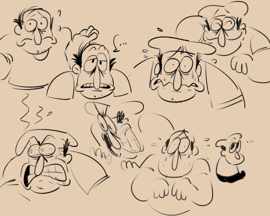
peppino studies...hes got such a cute face and i feel like im straying away from it
#pizza tower#peppino#arts#mine#i have a thing where i make something curved and draw it very fast#and that makes me draw his nose so small compared to his sprite bc im trying to make the nose in one stroke#so i revisited some old concept art n sprites on the wiki#the one where hes in a fancy suit and he looks kinda confused??? i love it so much it lives in my head rent free#i want to capture that in my art for him#i should do some sprite redraws then to help#hes got like#not necessarily a square jaw but hes got a big jaw and chin; lots of space between his mouth and the bottom of his chin#and that just does not mesh well w the way my brain WANTS to draw him#so i think. bigger eyes and nose and more space than i usually allow between his chin and mouth#i SHOULD just sketch in my book to help w making my lines more natural again but weughh#anyway peppino is cute and i wanna go back to the way i drew him back in my pepperman comic bc i can feel myself slackin
521 notes
·
View notes
Text
Special Informal Devlog
Hi-ho, Wudge here! Aaaa. I missed the update last week... as we crawl closer and closer to release, it's become harder for me to write devlogs. I'm making progress every single day, and that makes me so frustrated that it isn't done yet, you know? 😭 Something something curse of perfectionism...
Anyway.
I thought I'd try something a little different with this post by chronicling a specific screen I've worked very hard on, from start to finish!
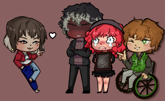
(Pictured: a preview of where we're gonna end up)
It all began on... August 2021?! Yowza, two years ago! When I posted a poll on tumblr and on itch about how I should handle flirt indicators. The votes were split 50/50 between two popular options, and I was able to surmise that yall would really, really love an option to toggle between the two.
It didn't take me long to figure out how to implement the toggle itself.
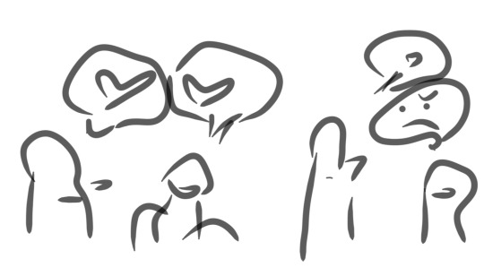
The following year (September 2022), I came up with the idea of putting in an illustrated tutorial on how my flirt indication system works - after all, poll participants had told me that they loved the idea and had never seen it before in other games. I was on a treadmill at the time, so I quickly doodled the idea on my phone. It looks like this:
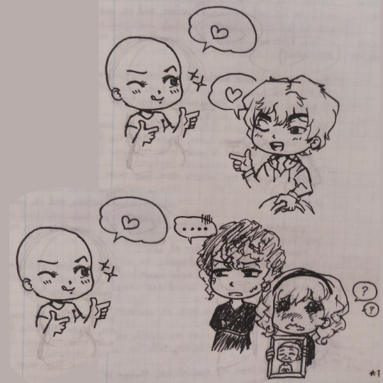
Then when I got home, I did a rough pen draft to solidify the idea...
I worked on the digital version over the next 2-3 weeks, and asked my friends for help with editing the text to ensure clarity.

.... Then I took a looong break from the infographic to, uh.... write, edit, playtest the game, draw expressions for Griffin CG, draw expressions for the landlord, work on a new Clammy Lady sprite, playtest the game again, make all the characters blink, make the first glowing animation for Jade's powers, code in Griffin's CG expressions, stress about paypal making changes in my country, do concept art for upcoming npcs, write some more, playtest some more, draw a birthday picture for Dart, write devlogs every single week, make sure all my files were safely transferred to my new laptop before my old one completely died... etc.
So it was February 2023 by the time I came back around to try implementing the infographic in code :')

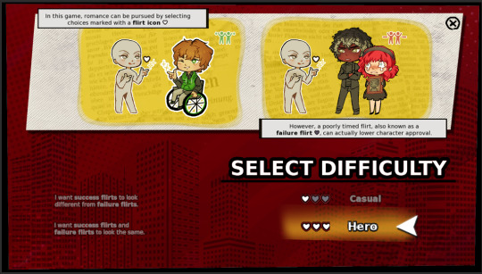
... It was functional, but no matter what I tried, I didn't like how it looked with everything crammed into one page.
... Then I got really sick... but after I recovered and did some more work (drawing, writing, playtesting, etc) I came back to the infographic with the intention to learn how to code pages in renpy.

Still didn't look phenomenal, but there's a whole lot more breathing room! This was in April 2023.
I took another "break" (worked on a million other things) and then... FINALLY... in late August 2023, just a few weeks ago, I had an art breakthrough!
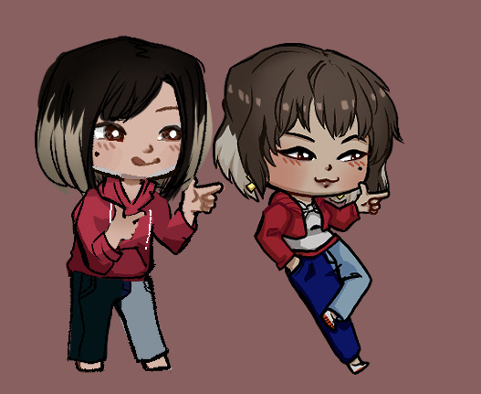
I had garnered a better understanding of color and poses, and as a result my chibis became a LOT cuter! I was able to redraw most of them without too much hassle - whereas when I first started, it would take me all day to draw a single one.
I also drew custom heart icons (a plain heart, a golden heart, and a broken heart), figured out how to make text buttons look more fun and intuitive..
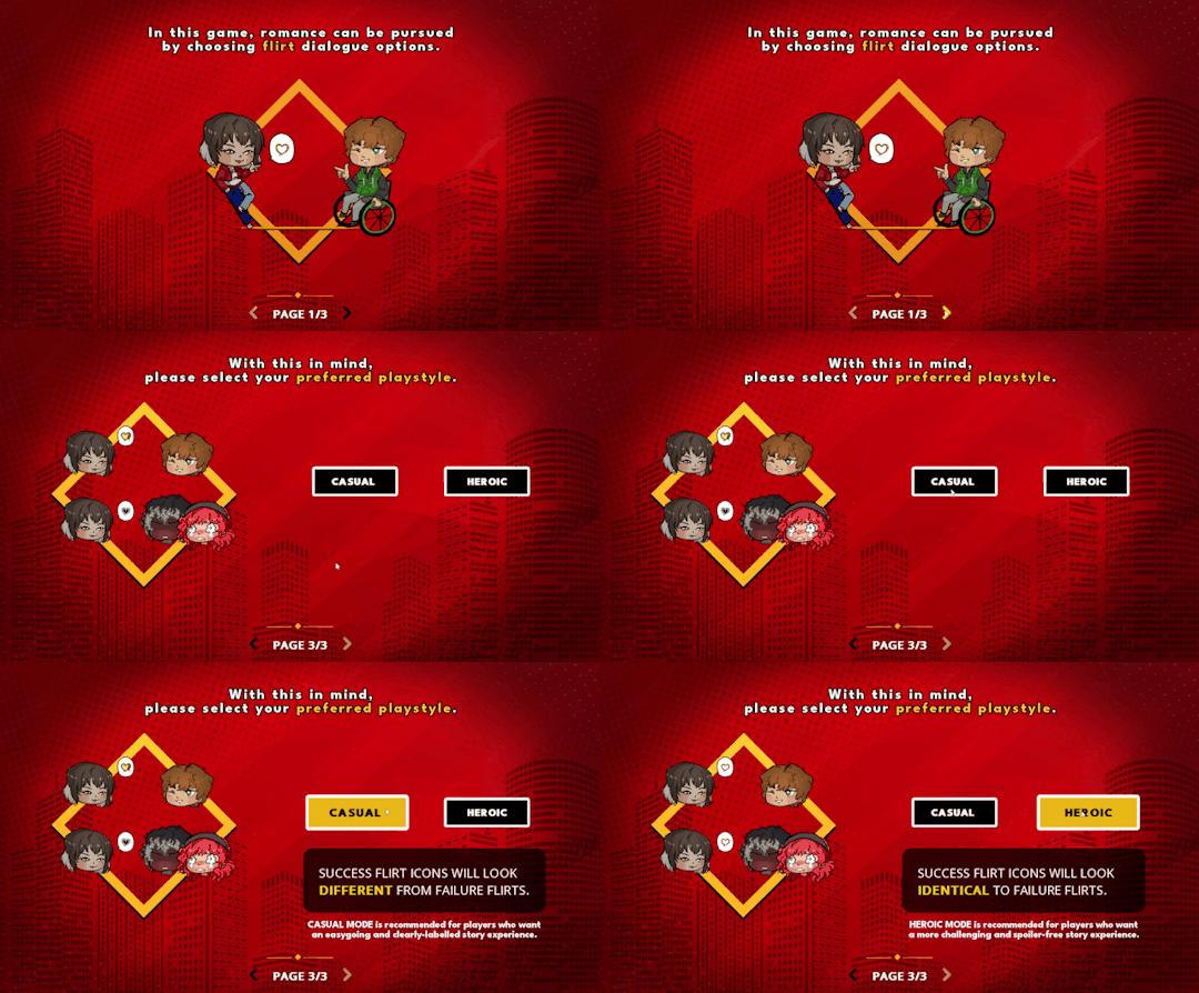
And here's where we're at now!!! I still need to draw eyes for Dart.... but I researched and absorbed a lot about screen compositions, and had a rather late realization that I could re-use backgrounds and assets I already have in the game.
That's it for the special edition. I'll update with more soon!
Stay safe and keep warm,
Wudge.
#herotome update#herotome highlights#interactive fiction#indie game#oelvn#otome#visual novel#otome game#english otome#indie#chibis#anime
48 notes
·
View notes
Text
Another Object Comic Blog 2
Back at it again with another name change! This one’s probably the last one for a bit though.
A good amount of progress has been made on the idea of the comic since my last post in March. That is, I hunkered down with some buds and actually made a kind of rigid outline of how I want the plot to be structured. A good amount of ideas were leftovers from Exclusion Delusion but more fleshed out with a cleaner idea for a possible ending in mind, which makes me happy! Every time I’ve taken a stab at a comic like this I usually drop the idea because I don’t know how I’d end it, so having that in mind has been reassuring.
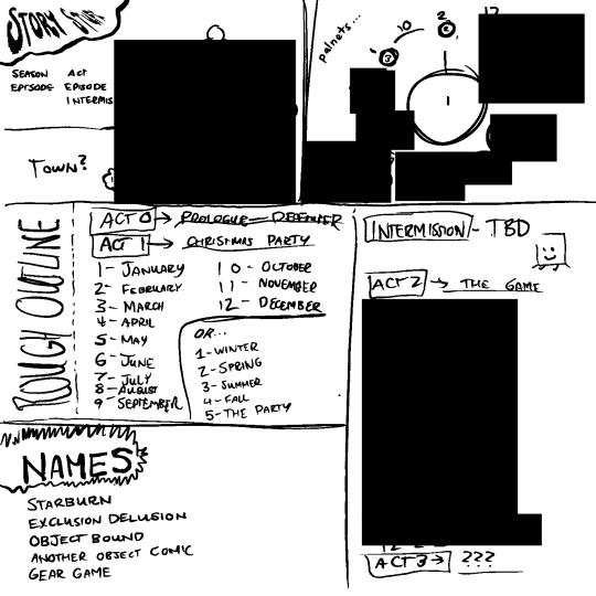
Here’s a mostly redacted look at the outline of the story, mostly for the sake of keeping things a surprise! Who doesn’t like a good surprise? I will leave a synopsis of the beginning of the story though, so here!
Objects of many different locations live on a planet with only them and are all aware of/ friends with each other. Ornament is the main character of the story, who on their (TBD)th birthday travel around the world in search of artifacts warning of an impending doom. After a year, the end of the world takes the form of a competition in which each challenge takes place on a different planet.

Unlike the plot, the biggest point of contention has been the actual characters to appear in the comic! Truth is, there’s been dozens of characters that have had the possibility of appearing in the comic. Some as main characters, and others as more comic relief side characters. Sizing down the original fifty plus characters has been no easy task, and I’ve joined a bunch of calls with some buds trying to decide which characters should stay or go has been a struggle. I’ll probably come to this decision on my own since these are my characters and only my most cherished of children will make it in..
The spreadsheet above was originally where I listed out all of my ocs and we went through them all and talked about how which characters could act and little quirks they could have. I’d be a liar if I said it didn’t help give me an idea on the characters I FOR SURE wanted in.
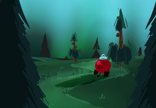
Ornament’s a character I’ve wanted in the comic since day one, they’re GUARUNTEED to be a main character. I used them in this enviornment as a test of how I’d draw backgrounds in the comic.

As another small experiment, I tried to go back to my last comic Sunburn and redraw it with the skills I have now in a style I might’ve liked back then, I’m pretty happy with how it came out!
Below is another character with a similar style. She’s also guaranteed for the comic, her name’s Inkwell!

More onto the look of the comic...
I’ve also been messing around with a potential style for the comic. It’s another one of those things that I’ve been putting a lot of thought into, but at the end of the day I think I have a good idea for what I want to do.
My biggest inspirations for this comic have always been my favorite object shows (ONE, Battle for Dream Island Again) and their saturated colors and simple designs, and Homestuck and the many many MSPFAS out there (Vast Error, A Guy Gets Revenge). Drawing objects in this style consistently has been a bit of a struggle, but I’ve found myself gravitating towards big and round hands, and tiny lil’ feet.
I don’t know if I’ll lean as heavy with the gradients and blurs though, since they’ve given me mixed results. I think I like the look of them when minimally used so I’ll probably stick to that.
Another art related thing I heavily debated on using was sprites. At first, I wanted to completely opt out of using any sprites for the sake of simplicity, but with the help of some really nice people I not only re-sprited old characters, but decided that I might go with this sprite style for the new characters. They’re so silly that it’s been hard for me to say no!
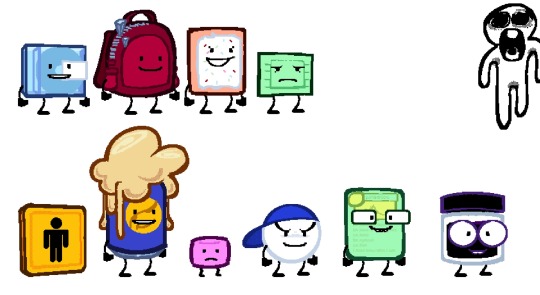
Another thing I want to note before ending this post is that just like all of my other comics, I do not mean for this to be the job of a crew where I’m only a writer.
This is my comic, and something I’ve wanted to make. Chances are that just like Sunburn, I’ll be writing a large part of the comic and drawing a large chunk of the panels. I wanna carry the weight of this because its my story!!! With that being said, anyone’s welcome to help! If you’re interested, feel free to DM me on Discord @sundSlime#2003.
TLDR?
Progress on the comic has been underway, but there’s a lot of stuff left to iron out. Hope you guys like what I have so far! Have a good day :)
11 notes
·
View notes
Text
UNDER CONSTRUCTION!! PROLOG REMAKE
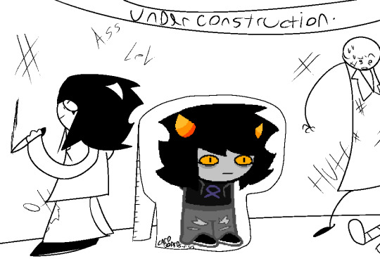
Kept ya waiting huh?
After another unfortunate break due to the fact i unfortunately have a life outside PT, im here to bring you an upgrade to some old stuff!! just before i start working on the new.
TLDR in case you dont want the long reason: PT's prolog is kinda shit so im gonna be updating it so that its pacing is better and also the art meets the standards of my current skills.
IF YOU WANT THE LONG OF IT READ MORE
ok so recently ive been thinking alot about my work on PT so far. Since i havent really been working on it due to collage and junk and also just a lack of motivation which ocasionally hits me, and while looking back on pt's prolog i relised how... fast? the pacing was? Nothing really had time to sit. Things were introduced and had little time to explore them. Half of the things in Veritas Room werent even interacted with. Most stuff in the hidden room wasnt interacted with either. And also the writing just kinda sucked??? and unlike something like Johns introduction from HS you couldnt really gadge Verita as a person from her introduction and interactions in the prolog, She doesnt even really react to the readers sudden preasence.
So. Thinking on these issues i decided, Im going to remake PT's Prolog. I will redraw the panels, Rewrite pages, maybe even add some new ones in the process. Perhaps add more CSS stuff or something. Since while i mostly have issues with pacing most of the early pages in PT kinda suck visually. Just look at Veritas Old Sprite compared to now.
Ultimately, the goal is to improve the Prolog so i can start working more on Act 1. get back into the groove of drawing in HS's style, get back into the writing, and also just make a better story so that newer readers will get more enticed. I want PT to be the best it can be, and while this might take a while this should hopefully help in that goal.
Course as i work on PT in general my art style and writing will get better. So someday i might be compelled to do this again in the future. but for now i think this is a solid way of getting me back in the chair.
Thank you for reading, and i hope to see you guiding our hero soon.
0 notes
Text
Guess who finished this illustration set,,
MEEEEEEE!!!
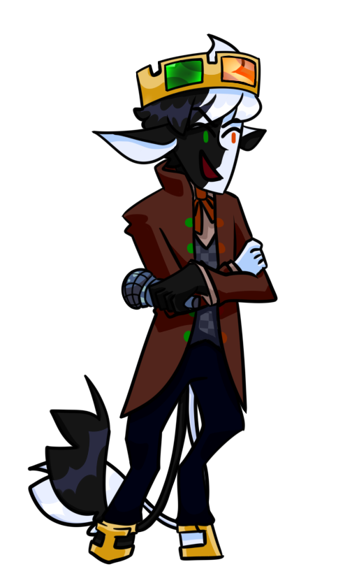
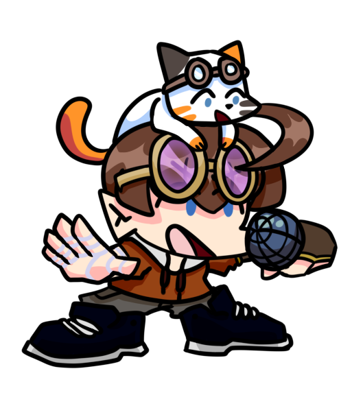
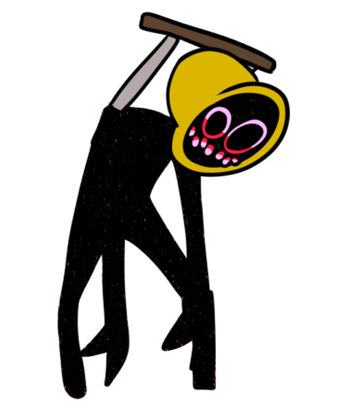
It's Cogchamp fnf sprites!!! I would have made a mod but unfortunately I don't have the right software to do so
Featuring such characters as
Tutorial Fox
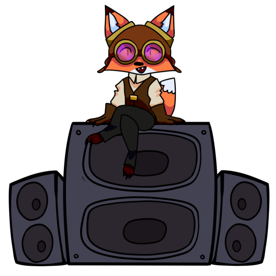
5up.xtml
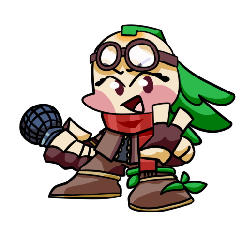
Brother Dearest
Tub and Crumb
Prime Bell
Um sir.
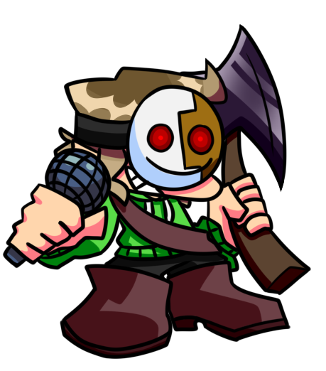
and last but not least, Sammy wants murder

These are weeks 1-4, and week 5 will be in a separate post bc of image limit(derogatory) and I worked really hard on this!! (more thoughts and stuff under the cut, I got kind of rambly haha)
It was super fun to draw in this style and I feel like I learned a lot about shading and shapes (shoes especially) by trying to recreate the style of a professional artist. I think I'll do more exercises like this in the future, just to keep learning!! Also obligatory reminder that these drawings are referenced HEAVILY from the original game sprites. I was trying to draw the cog champers(and dream) like they would be a mod for the game, so the poses and style are extremely similar if not the same. If I were to redo these illustrations I might put more personality and originality into the poses, but I didn't actually study the style at all before creating the first illustration (fundy, the one I posted here is actually a redraw to make him higher quality, the original was too small)
So yeah, over all, this was super fun and I'd definitely do it again. Maybe I'll redraw some of these in the future to be more creative, you can tell which ones I drew later on bc of the variety in poses and expressions, I was a lot more comfortable with the style (tho I did keep my own eyes and mouth style bc expressions are something thats really important to my style and I didn't want to feel like I was just like,, tracing) Sorry for rambling so long, I'll put this under a cut for all the people who just want to see pretty art.
On a more art related note, you may have noticed that Dream is Pico, you may be thinking "but dream isn't on Cogchamp" and you're Right. I didn't know what else to do okay? He's fundy's Ex so it kind of fits??? I dunno man, I gave him a more steam punk mask but kept the majority of his design similar to my normal dream design, so as to keep the Dream vibe. Yknow where he's always just a green blob? It kinda slaps tbh, branding is important.
Also regarding Prime Bell, again, I didn't know what else to do, I was thinking of doing something with the egg, but that's not on cogchamp (thank goodness) so I needed something else. I decided that the only like, tangentially related thing I could do was make an Evil prime bell, based on how Sam steals it idk maybe in this world its always the demon thing and is kinda like the ring from lord of the rings, where once you have it you can't give it up. In any case designing Prime Bell took a while (plus some help from Yipcord and Chaos Crew thx guys ❤ and specifically @valpurgatory who is what inspired me to personify the Prime Bell in the first place with their turn everything into a women philosophy (I @ed him so you can check out his blog he slaps. She's like the go to for saving women from Wilbur Soot's dirty mits)) but drawing it was surprisingly quick, mostly due to the fact that I figured out how to easily recreate the texture on the Lemon Monster's body. I did no shading bc that's what the Lemon monster looks like, and it kind of hurt bc it just looks kind of unfinished to me,,, I had some trouble with the week 5 design for Prime Bell bc I didn't want to abandon my first idea. I probably should have and would have gotten a better result, but I can't be bothered tbh. This is the 3rd day I'm working on this project (these were surprisingly quick the churn out, probably bc I was having a blast) and I simply do not want to alter anything. My idea was good but the execution didn't pan out. What am I saying the week 5 prime bell design isn't even on this post sjjdjsks
Anyway, go check out fnf(Friday Night Funkin) it's a rhythm game, it's free and the OST Slaps. I'd also highly recommend listening to the Whitty mod songs and the Neo mod songs,,,, good good music.
#my art#fanart#oakskull art#mcyt#mcyt fanart#fundy#itsfundy#digital art#dreamwastaken#Dream#awesamdude#5up#5uppp#implied 5undy#crumb#tubbo#tubbo underscore#cogchamp#cogchamp smp#create smp#funboo#fnf#friday night funkin#oak rambles#<- i know this isnt a text post but I RAMBLED#i had so many thoughts#ranboo#ranboolive#the live brothers
635 notes
·
View notes
Photo


Here are two transparents that were supposed to be a part of a bigger thing but then they didn’t. Komaru was meant to be in a series of fullbody UDG sprites but… I never got around to do the rest.
It was meant to be mostly for sprite editors. Keep in mind that it won’t 100% fit - even if you just wanna copy over the official halfbody sprites, you have to scale them down, adjust colours, smooth the fullbody with some denoiser (for the best effect), delete the faint black glow halfbody sprites have, erase unneeded limbs +other stuff like that, re-apply the fabric texture (if denoised) and possibly, even do more complicated edits to the geometry.
Komaru *should* be 557 x 1775, but if Tumblr did its resizing magic again, here’s an alt link. Taichi is too small for it to matter, though (and he’s not even a part of the sprite series).
Here’s an example sprite edit I made to demonstrate my idea.
Also, I figured that the halfbodies have to be scaled down to around 73,4% of the original size for Komaru and 70,5% for Taichi, so I hope that helps lol.
Also Also it may not work well if the character is rotated differently in the fullbody and halfbody unless you’re going to redraw stuff.
#danganronpa#udg#komaru naegi#taichi fujisaki#made by me#-mod firanka#danganronpa transparent#danganronpa transparents#fullbodies
80 notes
·
View notes
Note
Do you have any advice on sprite editing? I want to try it but I don’t know how or when to start 😔
oooh, i do have some advice, actually!
well, first of all - you take your sprites from the danganronpa wiki. the dr1 and dr2 ones are small and bad quality, so when doing a half sprite edit of a dr&dr2 characters use sprites from the ultimate talent development plan instead!
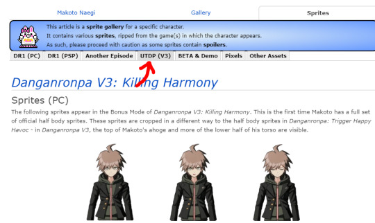
if you want to do a full sprite edit with those characters, you either have to take it from tsumugi’s cosplays of the character (which limites your poses, and the characters have v3 in the eyes and theres white light and blah blah blah) oor you have to scale up the original sprites. both of those include re-drawing the whole sprite, even the things you dont want to change, soo...
actually, speaking of that. second bit of advice!
i personally re-draw the whole sprites. sometimes i could just, let the coloring of the skin stay, because its less work and stuff like that - but coloring the skin yourself is just more fun and it looks better! so, like, if youre for efficiency or dont have much time - you can let parts of the original sprite stay, or if you have time and energy you can redraw it even if you want it to be the same. (also add blush blush is cute)
wow, that whole bit sucked. i cant explain anything for the life of me. sorry ;(
third advice!
go and download some textures. textures help your sprite look more danganronpa-y and pretty and stuff like that. and even tho most danganronpa editors use only one texture for the hair and the clothes, i say that you should download a couple of textures and use them to texture different things! it looks better, creates a bit of variety, yanno....
aaanother one!
when you shade, use a dark color (i usually just go with dark red, pure black or darker version of the color im shading) and then lower its opacity. theres probably a more effective way to do that, but its just what im used to, lol.
ooh, and GRADIENTS!! when i color my sprites, i like doing very subtle gradients. like, on the skin, or on the clothes.... wait lemme show u an example

look at her hair! its darker on the lower part, because theres a subtle gradient yellow-to-kinda orange i guess?? and on the skin!! you can see on her forehead and on the collarbone, its like, darker where the shading is!!! so thats what im talking about. yea. sorry if i made no sense XDD
ALSO DO WRINKLES ON CLOTHES THEY ARE VERY IMPORTANT!!!!! even if u cant draw wrinkles on clothes!!! just do them, you will learn!!!
oh, and you dont need to follow any of these steps!! i bet a lot of people dont do them and theyre finee. its just what i do :p
so yeah thats it i think i guess
48 notes
·
View notes
Text
Sweet Elite - Chapter 7
I reckon I’ve never done one of my big episode review for SE, so here I am, seat tight because there’s lots to unpack. Thus I’m putting everything under a cut.
Episode 6 left us with the meanest cliffhanger ever: we found out that Tadashi’s father has been arrested for colluding with the yakuza. Now we’re waiting in front of Lady Arlington’s office to learn about Tadashi’s destiny at the academy. When he finally comes out, he tells us that Lady A (unwillingly) asked him to start packing because unless he can prove he has no hand in his father’s illegal business, he has to leave.
Now, this part leaves me confused. First of all, no one not even Tadashi suggested that this might be a mistake and that his father is innocent. Aren’t people innocent until proven guilty? There’s been no trial yet. At the end of the episode we find out that there are many proofs against him and he sounds like a total asshole on the phone, so he is (almost certainly but you never know) guilty, still someone should have at least wondered about his innocence.
Also, Tadashi is a minor, fifteen/sixteen years old, he should not be under any scrutiny. Yes we know that he works with his father, but he’s still technically a kid in the eyes of the world. I understand the whispers and damages to his reputation, but I find it kinda absurd that he gets immediately kicked out of school, even if he’s there under “special circumstances”.
Anyway, we spend the whole episode talking with people about what they think about the situation and thinking about a way to help Tadashi. After talking with everyone, we meet Tadashi who shares with scholar about his situation and reveals that his parents are sort of blackmailing him into testify to his father’s behalf (he has pleaded not guilty). Apparently even though there are toooons of proofs including videos and witnesses, somehow Tadashi’s testimony is the key to his father’s freedom (?) Again, I am confused.
By the end of the episode, it seems that we are part of the Save-Tadashi squad which officially includes scholar, Karolina and Alistar, but Raquel also wants to help and Tegan has kinda been thrown into the mix by his sister, who asked him to hack Nakano’s Corp network (🙄 easy peasy right?)
I have to admit, I am not a big fan of this arc, it seems a little illogical from my point of view. But maybe that’s the point? We are normal people who identify with scholar who is a normal person surrounded by extraordinary people in an extraordinary environment. Maybe we are supposed to feel dumbfounded by everything that’s happening? I want to have faith in the team and believe that this story is going to make sense by the end.
I feel that the game is at a crossroad. I know there have been many changes this past year in the team and I really appreciate how they are all juggling life, school, work while at the same time making this amazing game. I bet it’s draining both mentally and physically.
This kinda reflects in the game, because the past two episodes have felt somehow rushed and not at the same level of the previous ones. Episode 7 is basically one objective: find out what people think about Tadashi’s situation. That’s it. Nothing happens in the plot and you spend your whole time just going back and forward trying to talk to people about what just happened. Considering that this is an otome game, you basically have one conversation with your crush and that’s it. I like talking with all the guys, but having one-on-one with everyone made more sense when we were trying to get to know them. I know that technically it has been just around one month or little more of school in-game, but we players wait months between one episode and the next, to just get one short conversation with the crush. Talking as someone who plays loooooooooots of otome games, I would find much more interesting if I could chose with whom to spend time, and spend the whole episode only with those few selected people, 10 LIs are too many to equally divide time with, you end up spending very little with each.
Now, I don’t want to sound like an ass, the game has these few problems that I think could be easily addressed, but it has also lots of potential.
I loved the previous art but I think they are finding their dimension with these new artists, the first look at the new sprites got me excited and the redraw of episode 6 illustrations and the one from episode 7 are really promising. I think they are all moving in the right direction.
Also, the main reason I play this game is neither the plot nor the art, but the writing. I LOVE how each charater is so different and well-characterised and just the way they talk to each other. The dialogues are funny and engaging and even scholar who is supposed to be a blank canvas, is actually a really cool and smart character and a pleasure to identify with.
So, here is the list of my favourite moments of the episode (which I’ve played twice so far, on Axel and Tegan’s routes):
Cheeky Tyler:

Tyler don’t make me fall for you! I already like your new sprite waaaay too much. Also, I’m already playing 4 routes, I can’t add a fifth!
Savage scholar:

The dude deserved it.
Flirty Raquel:
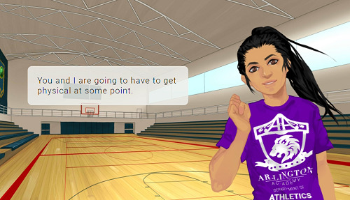
👀👀👀 So much sass... I love this girl!
Axel plagiarizing John Legend:
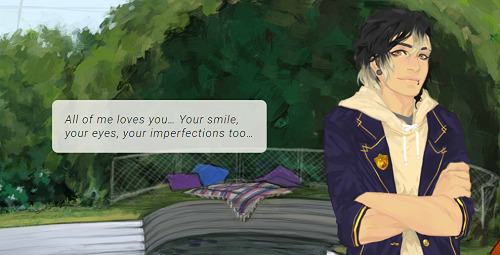
😂😂😂 babe this song already exists, changing a few words is not enough 😂
Scary Ellie:

This girl would be able to stab you with her trusty screwdriver while still sweetly smiling at you. ROLE MODEL.
Holding Alistair’s hands:

You too Alistar... stop acting so swoony, I can’t play anymore routes!
Now, the piece the resistance. What I really loved about this episode, is seeing how the writing changes according to the route you’re on. I love looking for all the little differences and, since I really love this game’s writing, I had a blast during the couple of minutes we got to spend with our crush.
As I said, I played only Axel’s and Tegan’s routes so far (I also play Tadashi’s and Karolina’s but I’m a few episodes behind).
Axel’s scene in the garden is to fall for. First of all, when you correctly guess that he has issues with his family, he simply tells you that he doesn’t have time to talk about it now if you’re not on his route. But if you have high infinity meter he also acts bashful and cute


I LOVE the fact that when he gets embarrassed and shy he also looks mad ❤, it almost seems like he can’t fathom why he’s feeling like this. Too cute! I hope this is going to be preserved in the new sprites.
And then, afterwards, when he complains he has to write a love song (makes me wonder what he’s written about so far) and doesn’t know how, he decide he’s going to look for some couples around the school to stalk/interrogate. But if you have high meter he basically serenades you 💕💕 I’M DEAD! Looks at scholar in the eyes and just starts creating the song on the spot.


I wonder how aware he is about his own feelings. What I would give for a change in POV!
Now... Tegan... my sweet dork... he’s such a sweetheart.
You meet him in the corridor, he’s in a rush and you apologise for being in his way. If you’re not on his route, he simply tells you that he can spare you a few moments. If you have a high meter instead, this is what happens:

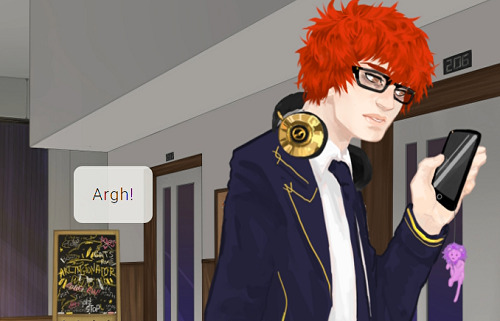
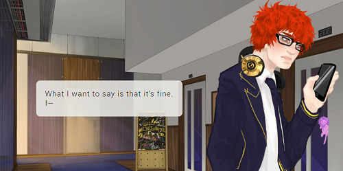
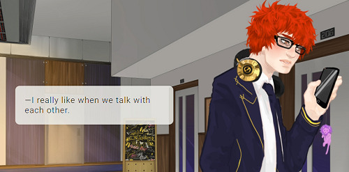
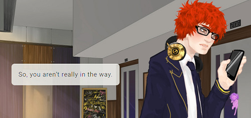

Also, when you afterwards tell him that he is also a great friend, if you have low meter he simply thanks you and leaves. If you have high meter, scholar adds that he is kinda jealous of his friends and he gets flustered.

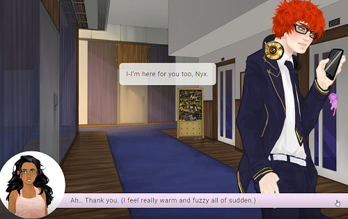

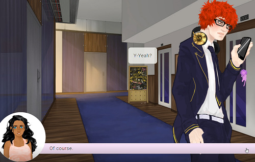
What do I have to do to smooch this cute stupid genius? If scholar doesn’t literally jump on him I bet he’s never going to make a move.
Anyway, these are all my thoughts about the episode. As I said, I have a few issues, but there’s also lots I liked. I trust the team and I’m sure the’re going to do great things in the future.
41 notes
·
View notes
Note
see, thats the thing-- with both of his illustrated cards the main issue is stiff posing, but that shouldnt be an issue considering hes known for action manga, and the series' he works on have no problem with this... its a real headscratcher. ive seen some of his sketches of nightingale on twitter too and theyre up to par with his usual work, it kinda makes me feel like he was almost just crunched for time or something.
Even her reference pic from the mats looks more natural? Wonky hands but hey, who hasn't had wonky hands in a rough piece.

He sounds a little uncertain in his artist comment?
"When the service started and I saw everyone else's characters with awesome weapons and got really anxious, feeling I screwed up for drawing Nightingale-san empty handed, so it was a huge relief to find out she fights by just punching and kicking."
This tells us that 1) Nightingale's design was finalized before launch and 2) he...wasn't even sure if he was supposed to give her a weapon? That's...kind of big from a design standpoint, isn't it?
If they didn't even tell him whether or not she should have a weapon it doesn't seem like he got much direction/instruction. Drawing VN portraits is a specific skillset and a manga artist's skills may not translate well without direction. For VN portraits, you need some specific qualities:
Distinctive silhouette
Posing that has to work with multiple expressions
Face must be clearly visible and able to emote (I suspect FGO even specifies front-facing, because nobody is in profile)
ALL of the above must still read correctly with three different outfits (a couple artists like Hidari or Astraea's do full redraws for different ascensions, but it's definitely not standard)
Can't be interacting with environment
He didn't know what the other characters looked like, which means he didn't know what the standard was going to be. I find it pretty believable that he might have decided to play it safe.
When you're experienced in certain types of illustration, you know where you can and can't push the envelope. Look at Wada's Meltryllis, for example.
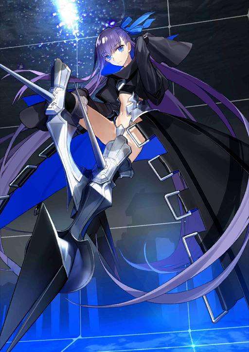
...nobody would have guessed they could draw this based on the above restrictions for a talk sprite. She's floating, it's not really clear whether she's walking or jumping or what, it's partly turned and angled...
--and it works! Wada knew that Melt's huge, complicated costume would need a lot of real estate. It doesn't matter that her motion is unclear. What matters is that all her most characteristic elements are front and center--legs, ribbon, coat. It's unmistakable as anyone but Melt. And hey, if you want to think hard enough, the jumping around fits her ballerina fixation and she's water or whatever anyway. Characteristic, distinctive, shows off design, face visible. All the most important stuff is there even if it's not to-the-letter on VN portrait restrictions.
Wada knew she could do this because she had experience illustrating Extra, CCC, and Extella and experience counts for a hell of a lot; remember how I talked before how her Shuwen portraits leaped up in quality between games? Extra had stiff, boring posing. By Extella she'd advanced a lot, and you see much more natural, varied posing. You play it safe when you don't know how far you're allowed to go. Jing Ke and Nightingale's portraits look more like Wada's Extra work.
(and it also probably helps that Wada is a TM house artist with a history of working with Nasu and Takeuchi. Knowing the boss always helps.)
8 notes
·
View notes
Text
Banging My Head Against A Brick Wall - Roadwarden Devlog
It was a great weekend, a suitable ending for the long, long chapter of Roadwarden’s development. The game’s code is now much cleaner and it allows to add the new content easier and quicker. And I had quite a bit of content to add. New dialogues, new graphics, new activities.
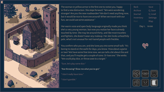
The Clean Spear tavern has a new “chunk” of interactions now - the player can spend some time with the guards to gather new information about the world or other character. It all started with a minor, throw-away NPC added for some color, but once I figured I really like this group of characters, I decided to bring some quests and unique actions to the table.
It increased the amount of conversations for this area for about 30%, but the more I wrote, the happier I was.
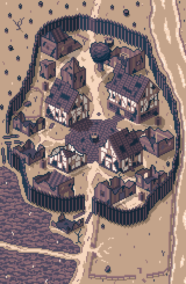
The ruined village, the next area I’m going to write for, has sparked a lot of interest, especially on Facebook and r/worldbuilding. It has a lot of lore behind it and revealing the “true” nature of this place will be one of the side quests, but here’s the general description:
“A ruined village. The Imperial forests are dangerous and unfriendly, forcing the hamlets and villages to grow as slowly, as they can. If humankind affects the nature too much, too fast - the monsters arrive to take back what belongs to them.”
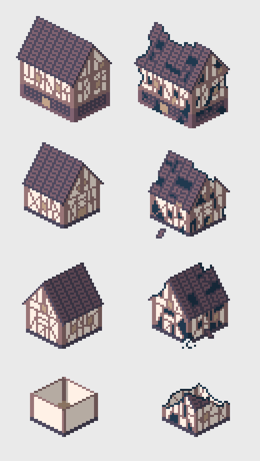
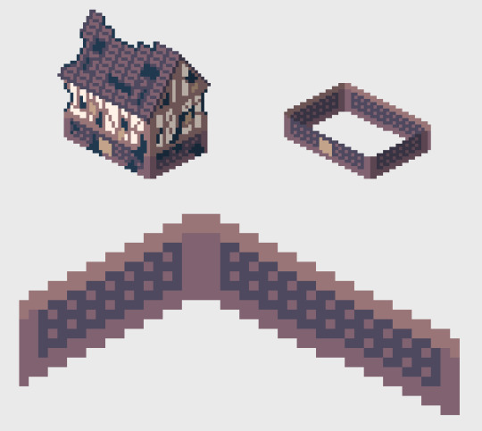
However, working on this area wasn’t easy. The buildings alone took me literally a day. Those of them that are more detailed and larger, were first designed in their “clear” form. After that, I’ve added the damage from fire, time and animal strikes:
What’s more important, however, is that originally I planned to make all of the buildings half of their current size:
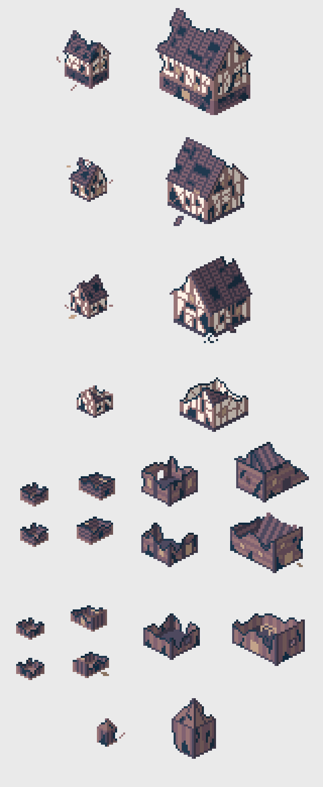
Unfortunately, it was a bit of a mess and I couldn’t portray too many details in such a restricted sprite size. Redraws were necessary, but making tiny structures is generally really fun.
The real problem, however, involved the bottom left corner of the image. My goal was to portray an old field, but people were seeing a dirty body of water, or even a forest. Here you can find a couple of stages that this one corner went through:

With such a limited set of colors, textures are sometimes enough. Adding the road in the middle really helps, a new context comes to mind.
In total, this image took me about 3 days. Yikes.
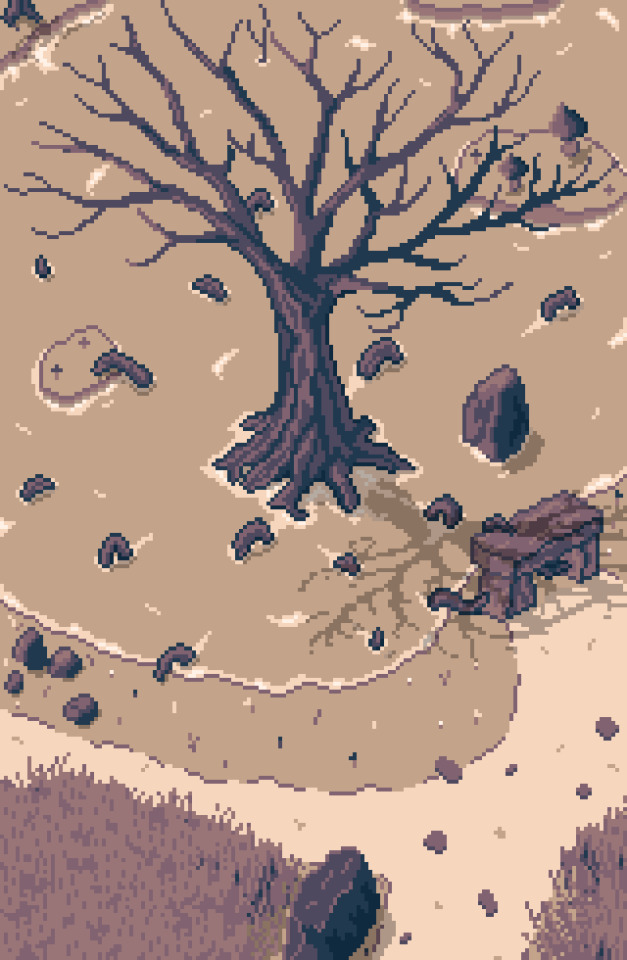
“At the edge of the swamp, a large tree stands for as long as anyone remembers. It has no leaves, yet slowly grows. To stay alive, however, it has to be fed by the locals, who put their offerings on an ancient altar.”
This picture took me just a day and I’m very happy with it. Some details had to be reworked or moved around (and the feedback I’ve gathered was very helpful), but since it repeated a lot of things that I’ve already had figured out, it was much easier to put my experience to use.
That’s why I don’t find the time spent on the houses or field to be a waste. Previously, I’ve spent hours trying to make water that look like water, a road that looks like a road. Now that I know how to do it, it all clicks much faster. Next time I’ll also be able to handle the field much better.
So I’ve decided to make another, small image and have it ready on Monday. A one room that’s placed in the village ruins. A place where an NPC has set a small camp, where he scavenges for scraps of iron and steel. Should be easy, especially since I already had a tent some stairs, barrels, a chest... SHOULD be easy.
Now, join me on my road to madness.
I wanted to place the tent on the “ground floor” (more like an above-ground basement) of the largest building. I’ve reconstructed the basic room structure, and here is what I’ve started with.

The first skeleton of the structure. It’s clear that the texture in the middle won’t work, but the base idea is here. Rocks on the bottom, bricks in the middle, wood on the top and in the corners. Not a practical design, but a pretty one.
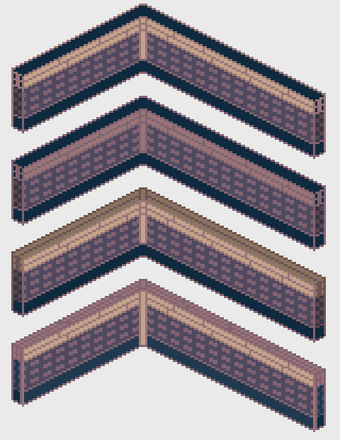
First textures, testing various colors. The wooden pillar in the middle doesn’t work well, but the largest problem is the part in the bottom. I haven’t figured out any good texture for it, so I leave it for last.
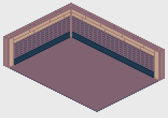
New bricks, floor and decent wooden pillars. At this point I had to decide if I want to start working on the rest of the room, or keep digging into the walls. I’m digging.
I see a potential, even if it looks awful.
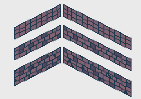
While trying to make the bricks more interesting, I decided they look really good and finally quit my idea to make the bottom part a “rocky” section. Bricks all the way.
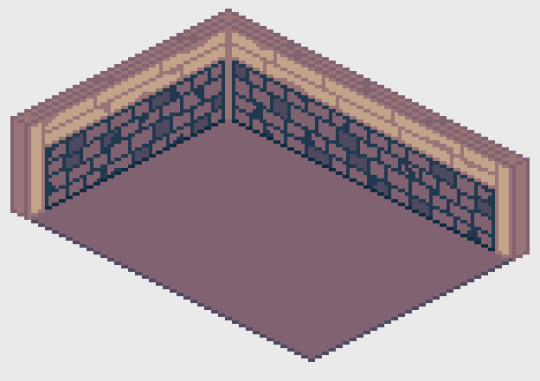
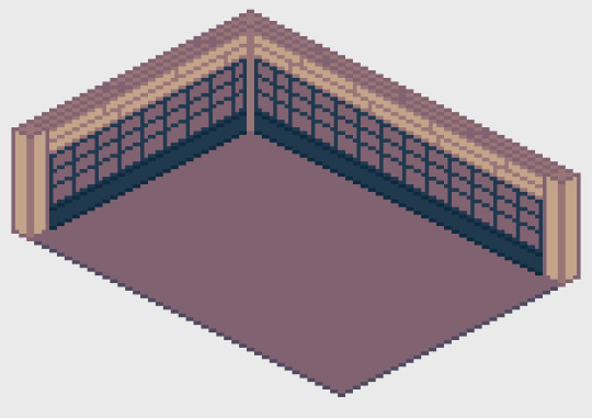
Legit!
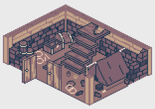
First version of the chamber. It could use some extra light.
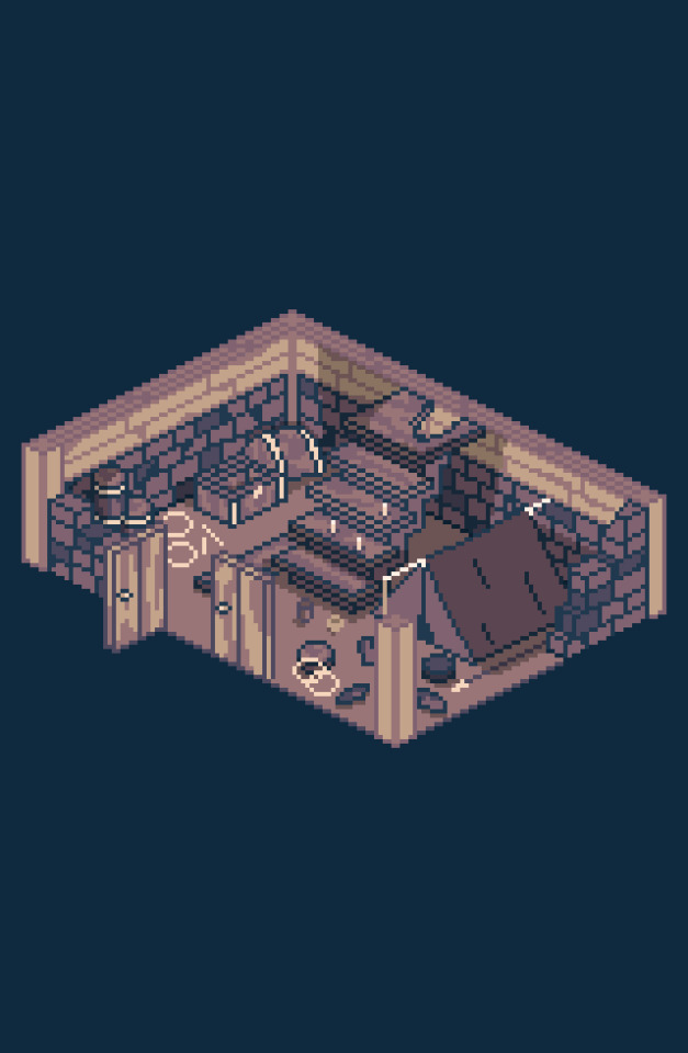
See? Fun!
---------------------------------
I still have a new area to draw in mind that I have to take care of soon, then I can sink into some new dialogues and exploration bits. After writing all of it, I’m going to work for a bit on my code and add / modify some of the features. The diary needs a “characters” section to make it easier to remember all the NPCs.
A lot of things to do, but the support I’ve recently received was huge and I’m getting quite optimistic about this entire endeavor! Remember, you can also find me on Twitter, Facebook and the game’s website!
#devlog#indie game#indiedev#rpg#gaming#pcgaming#video games#gamedev#fantasy#pixel art#pixelart#visual novel#Adventure Game#games
1 note
·
View note
Note
(Hey mun, do you have any tips in sprite making?)
((I’m actually making a sprite right now, so yes! I’m just gonna type some random stuff and hope it helps.
I try to make my sprites look canon, but since the art styles in Friendsim vary by quite a lot, that isn’t super hard to do. As long as you use the canon colors, it should be fine.
I like to use a multiply layer with their blood color as shading, but you could also just use black and it’d be fine. For sprites I try not to be too concerned with shading and highlighting.
If I can, I like to make at least 3 different base poses so they don’t look too stiff. (My dancestors only have one pose because laziness) Then I just redraw the face every time I make a new sprite. When I make a new pose I draw it over the last one to make sure it’s on model.
In order to keep sprites of different characters consistent, I first drew them all side-by-side, then split that file into separate ones for each character.
One thing I wish I knew when I made this blog was to leave lots of transparent background on the sides of each sprite! Because if not they look really big! That’s just a pet peeve of mine.
6 notes
·
View notes
Text
10 months ago, I decided to make a game.
10 months later, I have a bunch of art and a bunch of interface code and a whole pile of design notes, and not much game.
This is my story.
(Now in bullet point form so that I can stop redrafting it >.>)
I have a treatment-resistant anxiety disorder which significantly interferes with my ability to work - both on my own projects and other things that might be called 'gainful employment'. (I still feel some shame at admitting this so bluntly, even though I feel ideologically that there should be no more shame in this than any physical impairment that resulted in the same. Fuck mental health stigma, defining self-worth by employment is toxic capitalist dogma, etc, etc.)
In part because of this, I had been effectively unemployed and living with my mother for a number of years. (I still did my best to hammer out projects, but nothing, y'know, actually PAID anything... >.>)
Then in late 2017, my mother died (somewhat unexpectedly) of cancer, which left me with no home (we'd been sharing an apartment that she had been covering most of the rent on) and literally zero income. Obviously grief and upheaval did not help with any of my prior difficulties managing employment, either.
After some debate, I decided to combine the savings I had left over from my last stint as a network administrator with a (modest) inheritance from my mother and try to actually make a living at making games. This is something I had always theoretically wanted to do, but never put actual money on the line for. (Okay, in a perfect world, I'd happily give all my work away for free and live on some minimum guaranteed income, but we do not yet live in such a world).
One of my historically biggest gamedev weaknesses was a lack of artistic ability, so this seemed a perfect thing to put money towards. I could hire an artist, which would not only allow me to make a more commercially appealing product, but would also free me up to focus on the mechanical and writing aspects of gamedev, which are the areas I most wanted to be working on and also consider myself best at. (Any followers that remember my work on ToK may recall me complaining there about how it seemed I spent my time on nothing but graphics? >.>
This was shortly after Touhou fangames had been given the official blessing to be sold on Steam, and some had already achieved great success there, so this seemed like a good way to create some instant appeal and interest in my game, while working with a franchise that I already loved to death and had written hundreds of thousands of words of fanfiction for (eg: This or that or this other thing)
And so Chronicle of False History was born!
...and yet I somehow still spent most of my time working on art. You see, having never worked with an actual artist before, I underestimated a number of things:
1) I underestimated how much work it would be to find a suitable artist in the first place (though at least this part is done)
2) I gravely underestimated how much of my time would be spent on 'art direction' or 'project management' or whatever you want to call it.
Every sprite that is created, even for canonical character designs, requires making a large number of decisions regarding:
What attack and spell poses it will have (and how to cover the broadest range of signature abilities with just two 'frames', for budget reasons)
Which of enumerable (and sometimes mutually-exclusive) costume details from canon (and fanon) should be selected (and do you have any idea just how many variations there are on things as straightforward as 'the hilt of Miko's sword'?)
Gathering a pile of reference images that clearly detail every element of the character (and action poses) to be drawn (which is also harder than you might think; a lot of art is sufficiently suggestive of details to view without actually being a good reference to reproduce and anything that isn't exactly what I'm looking for risks my artist misunderstanding my request entirely)
Designing alternate-history variants of this character in a way that can be clearly conveyed with minimal costume and color changes alone (as any significant redrawing would cost far more and the cast of the game is so large already) and doing so before the part of the game they would appear in is even written.
Gathering reference images for all of those things
Writing up a detailed description of all the decisions listed above (and often drawing actual diagrams of action poses and projectile overlays that are ambiguous to express with just words) and handing it over to my artist
Waiting a while, then getting sketches back and finding out that there is inevitably a whole pile of things that need changing (either because the artist misunderstood my request entirely - despite all that previous effort - or because an idea of mine looked far better in my own head than it does, or just the usual 'incremental improvements' to something that is on the right track but not quite there - like a sort of collaborative redrafting.)
Spending hours poking at these sketches in an image editor, testing how well individual details resolve at in-game size, how well the action frames snap together, and how I feel about each questionable element. This often extends to (crudely) adjusting and readjusting the position and angle of individual limbs and eyebrows and projectiles that feel 'off' so that I can figure out what I would like her to do with them (and whether it's even worth making her take the effort to do anything with them at all)
Finally, summarizing that feedback into a detailed list of change requests (often with new diagrams to clarify my words) and repeating the last two steps over and over and over again.
Like, she does great work - don't get me wrong. I'm very pleased with the end results and this is just an inevitable part of the process of making something professional. But it does also mean that my original idea that paying an artist would free me up to work on things other than art has been... laughable in retrospect, to say the very least. In fact, it's very possible that a greater percentage of my dev time is spent on art-related tasks than on previous projects where I was doing all the art myself - I just get better art for my trouble (and money....)
This is especially true given that:
3) I underestimated just how much art work I would still need to do completely independently of her
Raven is doing character sprites. These are arguably the most individually important art content in the game, and certainly the ones that give it the most screenshot appeal, but that has left me to do everything else. Which has included:
Figuring out how to make battle backgrounds that passably match the art style of the game (since commissioning enough of these to fill all the locations needed would absolutely blow my budget)
Designing the entire look and feel of the combat screen to mesh well with Raven's sprites while also being something I am personally capable of making (using only cheap/free resources)
Creating all tweened animations and particle effects
Designing every single little UI element that exists in the game:
Elemental symbols
Dialogue boxes
Spellcard icons (and the entire menu design that requires them in the first place)
Combat action menus
Icons to indicate spellcard usability
Spellcard tooltips
Targeting overlays
A turn order bar
Spellcard availability reminders
Font choice for damage/healing numbers, spellcard names,
More cursors that you can shake a stick at
Lots more stuff, I'm sure
And even the completed sprites I get from Raven still need multiple hours of processing each to split them into component parts with sufficient information to re-composite and animate in-game. (If you've ever wondered why my screenshots seem to only involve Nazrin while I've already shown sprites for multiple other characters, this is why)
It never ends!!
...which is a fact that has been extremely draining. Like, it is probably difficult to overstate just how demoralizing it has been to pay this much money and work this hard and long and still somehow be mostly doing art (or visual-related coding) when I naively thought this project would offer some freedom from this after the endless, endless hours I spent doing this for ToK.
And it has also revealed a very tangible (and extremely stressful and troubling) fact about this game's development:
I am going to run out of money before I am remotely close to having a saleable product
When I first laid out plans for this project, I ballparked a modest but realistic budget for the artwork. I chose an art style that could provide pleasing visuals for a very large cast of characters at a cost-effective rate (for a game, at least). I deliberately limited my cast size based upon the agreed-upon cost per character with my artist (and have repeatedly held myself back from various fun ideas because I felt I simply could not afford to make a habit of such things). I studied sales figures for comparable games to aim for a target that had a reasonable probability of sufficient return (or at least breaking even). Game development is always a gamble, of course, but I felt (and still feel) that I made a sensible budget call and it was an amount I was fully able to pay.
But in all this, I neglected to factor in what has been, by far, my most costly development expense: remaining alive.
You see, at the rate my artist is able to produce work, the cost of retaining her is utterly dwarfed by such banal things as food and rent and not freezing to death in the winter. I live about as modest a lifestyle as possible - a one-room apartment, no car, no eating out, nothing in the way of luxuries (I don't even own a cell phone) - but that is still awfully expensive when you have no income and no prospect of it in the immediate future either.
It's a vicious cycle. The less work I get done, the more I feel future financial pressures breathing down my neck, the less work I'm able to get done (due to stress and general demoralization), the more I feel future financial pressures, etc, etc, etc.
And there's a logistical problem even outside of my own stress and anxiety and being damnably human in my need for actual rest: I've spent nearly 10 months working together with my artist and thus have a pretty good sense of how fast she's able to get character art done. And unless something changes dramatically, the time required for her to finish the art assets for the game will be several years longer than I will have any savings left to pay for them - because, as it turns out, hiring an artist is actually a tiny expense compared to merely continuing to exist.
I... don't really have a good answer for this problem and I've spent a lot of time consumed by it at this point. I have faith that Chronicle of False History can be a great game... eventually. But that does no one any good if I can't stay afloat long enough to make it. I've considered pivoting to another smaller-scope game project in the meantime, in the hopes of generating some modest influx of cash that could be used to fund the rest of CoFH's development, but there are a whole slew of reasons this is dicey (not least of which is that small-scope projects have a tendency to not be nearly as small as one anticipates...)
I've also thought about exploring Patreon, but like... I'm fully aware that I don't currently produce nearly enough interesting content for people to just want to throw money at. Tantalizing glimpses of it, perhaps. The promise that in the future I might. But what do I really have to show for this at the moment?
And so, here I am, exhausted by a marathon of work I did not properly anticipate and without the tangible reward I'd expected to have by this point (not a finished game, by any means, but like... much more of one than I actually have). And every month that passes by in which I get less done on my game than anticipated is yet more cash bleeding out of my bank account, like I'm trapped on a badly leaking boat with no shore in sight. I need a rest from all these stressors (and some more personal ones not described here), but when time spent not working has itself become a stressor these days, where can I even find it?
...wow, this sure sounded upbeat, huh?
In any case, I still care a lot about CoFH and have no intention of stopping work on it. I just... need to figure out some way to allow myself to continue to do so without this enormous capitalist behemoth crushing me beneath it.
(I had originally intended to provide more of an overview of the useful work accomplished over these past 10 months here, with mockups showing the evolution of the game's visual design, but clearly that goes into a future post at this point).
#Chronicle of False History#Gamedev#Game Development#CoFH#Personal (Kinda)#What; surely posting a massive wall of text at 5 in the morning is _completely sensible_#And not at all inane#I am... tired#But these sure are words#So many words#I apologize if I drown anyone in them
5 notes
·
View notes
Note
How to start an aesthetic danganronpa account on tumblr?
not sure if i’m the best to ask this but i’ll give my own take on it.
hmm let’s see, i guess aside from the basic introductions and the making of the blog, you should have an app or software to make the aesthetic (i use ps cs6 but some free softwares are gimp and pixlr (it’s a website) and have quite range of where to find aesthetic-like pictures, i personally use weheartit, sometimes pinterest, and if you have very specific types of pics to find, google is your friend. just avoid using low quality pictures, but if you can’t avoid it, then i suggest knowing how to recreate, or edit a pic to heighten its quality.
i would normally play with the sharpness, levels, curves and overlays to fix it’s quality. if you’re feeling generous and don’t mind a bit of stressing, you can fix the picture by redrawing some parts that look low quality but it is a tedious task to do so i don’t recommend it to those who don’t have much time on their hands.
next step would be the nervousness inducing part, promoting - well this was what i felt at the start. you can tag other dr blogs for that, a lot are really nice when it concerns promoting so try and tag them, it might be nerve-wrecking but some networking goes a long way. feel free to tag me in promos if you want i welcome it!
and lastly, don’t worry if you don’t get request right off the bat, i started off my blog with self-indulgent aesthetics and edits. it’s not bad to make things just to kick things off, i honestly recommend it to show examples in a way. if we’re in a game, i guess you need to go through a bit of grinding.
if you’ve got the hang of the aesthetic, then you can add other things if you want to branch out to pendulums, shufflemancies, sprite edits and others. though you can offer these if you want to at the start.
hope this helps anon!
- saishuu
3 notes
·
View notes
Text
Learn Log #1 - Pixel Art Basics 1
So this was the first week of learning pixel art! This week I had a look at some very broad concepts such as Size, Style and Lines. I’ll start with the first two topics because I feel like they’ve got quite a strong connection.
Size & Style
So if you’ve ever looked into pixel art you’ve probably heard of terms like 8-bit, 16-bit and 32-bit but you might not be sure what that exactly means. These were various processing architectures involved in old school video games. I’d say an allure of pixel is the recreation of old video game styles so these terms reflect their respective art styles. Basically, these terms explain ‘Oh I’m going to go for the style of the NES’. Here’s a great Reddit post basically explain it better than I ever could. You could also argue that it connects to the size of the sprite be it 8x8, 16x16 or 32x32 - some people use the terms as such and so will we in this post.
So that’s all well and good but how do you pick a size for pixel art? Well, from my learning this week not only does it depend on the style/complexity you’re aiming for but also your skill level and sprite concept. As we just discussed video game styles play a big role but if you’re not aiming for anyone style then concepts such as colour palette and outlines do too. For example, if you have a limited colour palette or need outlines you might need a slightly bigger sprite to fit in the detail you need - which brings us to concept. If your sprite needs to be expressive, for example your game is story-based, you’re going to need enough size to fit the expression. A trick to figuring this out is making the smallest detail or the facial expressions as small as possible while maintaining your preferred style/level of detail and working out the size of the sprite from there. Of course, this all connects back to skill level. If you’re not that comfortable with pixel art don’t start with big 128x128 sprites. Start with 16x16 or 32x32 first. These larger sprites also make things much more difficult to animate and are a lot easier to mess up.
Going further into style, I want to quickly discuss 1-bit pixel art or minimal colour palettes. 1-bit pixel art is a two-tone style meaning it only uses two colours throughout the piece. This is an interesting style to work in because you have that new level of restriction. For example, how do you convey different materials with only two colours? The use of patterns is really useful for this but they can’t be too confusing or complex also. In general, these minimal colour palettes make animation a lot easier but can make readability a little difficult if you have a lot of things going on.
That’s the last thing I want to touch on - readability. Whenever you make pixel art make sure it can be read - especially if it’s for video games. Making interactable objects outlined or enemies a specific colour is a great way to do this. Readability should be the first priority.
Practice #1 - Resizing Logos


These 16x16 logos are based upon the Barbarian and Warlock class symbols in Xanather’s Guide to Everything. I tried using them to follow TutByKai’s tutorial on sizing symbols from 16x16 to 32x32 but they proved to be to difficult for me to size properly. Here they are for you to check out though! In the end I managed to practice sizing in practice #2 and #3.
Lines
When I was studying about line-work this week I found it funny that rather than learning what to do, I learned what not to do. I think this is because we all have a rough idea of what a pixel art line should look like but not what makes a line look wrong or weird. The main culprits for this are called ‘doubles’ and ‘jaggies’. Note that these are not rules you have to follow and if using doubles or jaggies actually helps convey meaning then you can definitely use them
Doubles are when a line doubles up, usually as it curves or turns an angle. This can make the line weird as it begins to look more blocky or the extent/where the doubles are is inconsistent (for example shifting between inside and outside a circle). A good fix for this is anti-aliasing but that will be discussed shortly.
Jaggies are when pixel don’t within an established patter for example if you had a curve going: 2pxX 1pxY, 2pxX 1pxY,2pxX 1pxY, 3pxX 1pxY, 2pxX 1pxY, 2pxX 1pxY. That 3px line is going to look weird (also sorry couldn’t be bothered to make a quick reference picture online). It may work for irregular terrain such as nature but with man-made objects and more spherical/round objects it just looks strange.
Anti-aliasing (AA) is a pretty useful tool. You can think of it has a half-pixel. However half-pixels don’t exist so it’s really just a pixel roughly the colour between that of the line and the colours next to it. This is useful for fixing up those doubles or making more detailed curves/angles. You’ve got to be careful to not to overuse it as otherwise things will just begin to look messy. Also don’t just stick it across the whole outline - remember this is to be used like a half-pixel for curves. Don’t forget, just like more complex colour palettes you have to animate anti-aliasing too which makes things more difficult.
Finally, I have a few tips for outlines. Firstly, outlines must reflect the nature of the contents (point object = pointy outline). Secondly, fill in any voids within the outline as it can be distracting. Outlines can also play a big role in the way your character is seen by others and how they pick up on the nature of the sprite.
Practice #2 - Robert
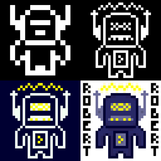
So I made Robert yesterday for my practical this week. I’ve presented him here in stages of the spriting process so I’ll just talk through each stage.
So in this stage I started with a 16x16 canvas. As you can see Robert has very little detail due to the small canvas size and 1-bit colour palette. You can kind of tell he’s a robot from his head, if I were to just have him in 16x16 I might want to make the shoulders or a bit blockier to represent that. I did try to do that on the outer pixel of the hands but they kinda felt like wings. When you do pixel art in this smaller sizes each pixel and colour becomes much more important.
So in this next one, while I had the same colours I resized him digitally to 32x32 and added in a lot more detail which you can clearly see. His antennas are now away from his head to make it clear that his head isn’t just a weird shape. I couldn’t do that in stage 1 because 1px there was about 1/6 (?) of his head width. Now that it’s 1/12 (?) I can separate the objects while making it still feel attached. These antennas had some extra detail thrown in but I really like the details on the face. It starts to portray a personality - I think the mouth looks like a mustache so that with his name makes him feel like some kind of ‘Dad-bot’. Also I was able to make the body feel a little more robotic while still remaining humanoid
This stage I just adjusted the the two colours and chucked yellow into the palette. It definitely gives off a completely different but I feel that maybe I should have used a different yellow colour as it is a bit bright. The addition of yellow does make the waves above Robert’s head look like electricity rather than some sound waves or something else which shows how one colour can change a lot.
Finally, in this stage I dived into the colour palette. This change meant I could directly attach the antennas again and also add some detail with slight colour changes (including some shadows below the head and inside the body). Overall, while I think stage 4 looked nice I am particularly fond of stage 2 and the ‘Dad-bot’ vibe it gives off. Sometimes less is more.
Practice #3 - Joey

So, I loved making Robert so much I wanted to try again with the colours flipped. This time I was inspired by Brandon James Greer’s 1-bit video to make a character portrait.
So since this was going to be a portrait I needed to start with his expression as it was important I had that nailed down. I wanted to go with a confused look with one eyebrow raid and the other furrowed down but when I added the mouth it seemed a little weird. I decided to keep it though because I wanted to see where it’d go. The expression took up quite a bit of space so I didn’t have much room for other stuff in the 16x16 canvas.
When I resized Joey’s expression I didn’t do it digitally like I did Robert’s body. In stage 1 the facial expression took up a large portion of the canvas size and if I resized it then that some issue would exist. Instead I decided to redraw the face slightly sized up. I wanted the mouth to show teeth so it needed to become 5px tall rather than 4px. Based off this I made the eyes 1px higher and wider to a 2x3 size. I decided to keep to keep the eyebrow width but I did lengthen them so they’d retain their expression. I also spread out the elements and added a nose. As I gave Joey a head I realised that his expression gave me a classic ‘Wolfenstein’ or ‘Doom’ portrait feeling so I went off that and gave a similar haircut and armour in the style of the original Doom. It looked pretty good although if I was to leave him in this style I might make the armour less intricate and focus on adding texture to the different components. Additionally, as there it’s 1-bit the teeth did look like giant lips.
The piece really came together when I added colour (I was too excited to do a minimalist palette style). I tried to keep the colour palette down to a minimum so the piece didn’t get too overwhelming. For example, the armour only uses three shades of green - one being the outline which is also used for the eyes and mouth. I actually didn’t choose black for the mouth because it contrasted too heavily with the white which took attention away from the rest of the picture.You’ll also notice I used a double on the left eyebrow. I did this on purpose to make the right eyebrow point seem thinner and more furrowed downwards. I tried a couple of iterations of the eyebrows and I think I liked these the most.
In this stage I just added some more detail including texture, the scars and some shadows. Basically, I chucked out any hope for a minimalist palette. I added the shadows with another layer that had a reduced opacity which worked ok. There’s not much to say about this other than I feel like this stage had a lot more depth and it was definitely my favourite of the four. Sometimes more is more.
Learning Resources
My studying and this blog post wouldn’t have been possible without these amazing resources. Go check them out if you wanna learn some stuff about pixel art!
What makes art 8, 16, 32, 64 bit?
What Size To Make Pixel Art by MortMort
What Size is Pixel Art? by Brandon James Greer
How to Choose Pixel Art Resolutions by TutsByKai
Creating Pixel Art from an Object by Brandon James Greer
Pixel Art 101: ‘Styles’ by Pixel Pete
Pixel Art 101: ‘Game Boy’ by Pixel Pete
1-Bit Pixel Art Techniques by Brandon James Greer
Minimalist Palette in Pixel Art by Luis Zuno
Constructing Lines and Curves in Pixel Art by Brandon James Greer
3 Pixel Art Techniques/Common Mistakes (Doubles, Jaggies & Outlines) by MortMort
Basic Anti-Aliasing for Beginners by MortMort
0 notes
Text
(adm: Hey guys!! Time for a small update :D today I had a free day, so I chose to spend it entirely working on stuff for the sequel!! I managed to get a significant process done, story and graphic-wise! I just need time and a few more graphics to continue the game itself! :D
Here’s a list of the current things I’m working on:
HetaOni
- Bug/typo fixes
- New features [events, interaction, hints to the sequel, new art and art redraws]
- Beta testing
HetaOni sequel
- Story
- Character Design
- Game mechanics and map planning
- Sprites
- Figuring out what the heck I should call it
- Playlist
And here’s a list of things I have to work on after I get at least the HetaOni update:
- Script & Translations
- New walkthrough
- Icons & Scene art for the sequel
- Coding the sequel
And to top it off, I still have more than 40 asks to answer [and will most likely get some more while I’m working all of this out] so please understand if I take too long to answer all of you!! Besides all of this, I still have a lot of things to do in real life too so things can get stressful for me ;w;’
Some people have offered me help, and as much as I really appreciate it, I rather work on these projects alone!! I want this to be as original as possible. Sorry for being so stubborn lmao
Lastly, I want to thank you guys so much for your support!!! I reached 900+ followers recently and WOW oh god, that made me really happy!! I really want to do another special or something for you, but I’m not sure I’ll have time.... if I do find the time though, I’ll be sure to tell you about it!!
And a bit of self promo here again because I need money to pay my uni lmao, I’m still doing commissions, and am on Patreon too! There’s also a donate button on the page if you want to support me through all this game/art making!
That’s it for the update! Thanks for reading, I hope everyone has a great week!! <33)
28 notes
·
View notes
Text
Why should Power8 focus on shedding jobs to save on cost Are there no alternative strategies
Assignment Solutions, Case study Answer sheets
Project Report and Thesis - Contact
www.mbacasestudyanswers.com
ARAVIND – 09901366442 – 09902787224
Human Resource Management
Attempt Any Four Case Study
CASE 1: It is Good News Everywhere for Coca Cola
After fumbling in India for over a decade and losing the top slot to Pepsi, the humbled cola giant is dreaming big again and rejigging its strategy with a fresh and sharper focus.
Why did Cola giant fumble in the first place? Here are some mistakes and learnings that Coca Cola has undergone in the past:
Globalization Holds the Key
Coca Cola was among the bluest of blue MNCs to have entered India in the 1990s. It was and still remains among the top five most powerful brands and the largest beverage company in the world. A lot of that MNC arrogance had a rub-off effect in the way it laid out its India strategy. Snapping up the locally popular brands like Thums Up, Limca, Maaza to competition, its brand-building exercise for the mother-brand was often at the cost of the local ones. It was costly and often didn’t work. Thumps Up remains a very strong brand in southern states like Andhra Pradesh and in fact in the Brand Equity Most Trusted Brands listing, it ranks 34—much higher than Coca Cola’s 42nd ranking. As the company redraws its India plans it promises to be far more rooted to the realities like having more local insights, promoting local drinks like Aam Panna and localised variants like Sprite—Jal Jeera.
Delegate, Empower and Be Patient
Five CEOs in a decade, a high employee turnover of 30%, Coca Cola India was in a chaos as constant churn at the top took its toll. “Every time a new CEO took over, he drew out a new strategy and a fresh game plan to win the market”, recalls a Delhi-based ex-employee. Lack of confidence and patience from the headquarters only made matters worse. “The short-term approach to show quick results was talking its toll,” recalls a Bangalore-based ex-employee who was involved in operations.
Worse, with $1 billion of investments and having written off $450 million assets in 2000, penny conscious Coca Cola headquarters began micromanaging issues like hikes. Recalls a senior HR executive who worked in the eastern region: “No hikes above 10% at any level—we got the message from the US headquarter.” Everything was in a flux—not just in people leaving, in roles too changing frequently. There wasn’t much flexibility that the HR department had in managing people.
Slowly, Mr. Singh (CEO, Coca Cola, India) and his team are helping win back the staff confidence here and getting some freedom from the Atlanta headquarters. “When I came, there were complains of low salaries. We undertook a transparent benchmarking study to fix that,” he says. Multiple channels of dialogues have been opened up. Every month now, there is an open house meeting where all employees at the headquarters can air their concerns and issues. “We are trying to bring down the decision-making process,” says Mr. Singh.
Soften that MNC Arrogance
Being the world’s most powerful brand had its flipside. Every time there was a problem, the company pointed a finger elsewhere. “We were in denial mode,” says a senior company executive. “Earlier, we spent more time defending ourselves,” says a candid Mr. Singh. Despite aggressive efforts it realised that in a sensitive business of food and drinks, scientific data matter, but perceptions matter more. “No matter what you did, it (pesticide issue) was a losing proposition,” says a senior ad industry executive. “You could only side-step it to minimise the damage,” he adds. The company too seems to have figured that out. “Let’s focus on solutions instead of debating if we are part of the issue or not,” says Singh. Coca Cola is trying to move beyond the blame game and has learnt to be more constructive.
Engage Beyond Business
For both Pepsi and Coca Cola the world was small and their attention very focused on each other. Just then CSE, an NGO, expanded and complicated their business playfield in India. Suddenly their MNC tag became a noose as the cola glitz and glamour gave way to pesticide, pollution, groundwater depletion controversies. Having learnt lessons the hard way, Coca Cola is now opening up channels of dialogue and engagement with the community it is operating in. it is setting up a Coca Cola Foundation that will engage in a variety of developmental work. To help create employable talent, it is setting up Coca Cola Retail University that will train sales staff. It organises rural games with a consortium of Indian farmers in the South. Water conservation and recycling have become its pet projects even as it aspires to become a net zero water user by 2009 in India. “We want to build a sustainable business model in India,” says Singh.
Perhaps, the highs of the past may never return. India and Indians’ fascination for the West and MNC brands like Coca Cola today may have more earthy—rather than heady—appeal. Of course, the brand itself has come down from its pedestal. “Coca Cola was an insignificant product delivered spectacularly,” says an ad industry veteran. The celebrity endorsements, ad campaigns and their cricket-connect made them glitzy and desirable. “Soon, they came to be seen as frivolous without being pleasurable,” he adds, just when “cooler” brands like Google and Nokia overtook it. From such lows, a company can only go up. Coca Cola India is already beginning to. Hopefully, Atlanta’s confidence in India's growth story will be strong and long-term. And that the global beverage leader – after a slew of bad publicity and poor business track record—has gained a humble confidence to chalk up a successful business in India. For a company with a such a difficult past in India, this may yet be early days.
But the management is upbeat. Neville Isdell, chairman and CEO of Coca Cola, said its India arm registered a double-digit growth in the first quarter this year after a series of negative growth. Earlier in Atlanta it announced that India will be the No.3 market for the company. The company will invest close to $250 million in the next three years—and this is just the beginning. Today things are working for the company. For the CEO, it is good news everywhere.
This could well be the third awakening in India for the world’s largest beverage company. (Forced out of India in the 1970s, Coca Cola re-entered in 1993 sinking $1 billion in over a decade. It began losing its fizz since 2003 when pesticide allegations first surfaced). But finally, after negative sales growth on the back of public backlash, surging attrition (around 30%) and internal chaos, the company seems to be steadying its feet in the Indian market.
Question:
As HR manager, what role do you carve for yourself in making Coca Cola a number one cola company in India?
CASE 2: Prejudices in Workplace: Real or Perceived?
Manjula Srivastav had been head of marketing for the last four years at Blue Chips, a computer product firm. The company’s turnover had increased by two-and-a-half times during the period and its market share in a number of products had also moved up marginally. What was creditable was that all this had happened in an environment in which computer prices had been crashing.
Although she had a talent for striking an instant rapport with people—particularly with the company’s dealers—Srivastav often found herself battling against odds, as she perceived it, as far as her relationships with her subordinates and peers in the company were concerned. Srivastav had to fight male prejudice all the way. She found it unfair that she had prove herself regularly at work and she used to make her displeasure on that score quite obvious to everyone.
Six months ago, Blue Chips had been taken over by an industrial group of business interests and was, more importantly, flush with funds. The change of ownership had led to a replacement of the managing director, had his priorities clear. “Blue Chips will go international,” he had declared in the first executive committee meeting, “and exports will be our first concern.”
Prakash had also brought in Harish Naik as his executive assistant with special responsibility for exports. Naik had been seconded to Srivastav for five weeks as a part of a familiarisation programme. Much of her surprise, he had been appointed, within two months, as the vice president (exports), with compensation and perks higher than her own. Srivastav had made a formal protest to Prakash who had assured her that he was aware of her good work in the company and that she would have an appropriate role once the restructuring plan he was already working on would be put into effect.
One morning, as she entered the office and switched on her workstation, a message flashed on her screen. It was from Prakash. “Want to see you sometime today regarding restructuring. Will 2.30 be convenient?” It went.
Later at his office, Prakash had come straight to the point. He wanted to create a new post called general manager (public affairs) in the company. “With your excellent background in customer relations and connections with the dealer network, you are the ideal material for the job,” he said, “and I am offering it to you.” Srivastav was quick to react. “There is very little I can contribute in that kind of job,” she said. “I was in fact expecting to be promoted as vice president (home marketing).” Prakash said that the entire gamut of marketing functions would be looked after by Naik who would have boardroom responsibility for both domestic and export sales. “If you continue in marketing , you will have to be reporting to Naik which I thought may not be fair to you. In any case, we need someone who is strong in marketing to handle public affairs. Let me assure you that the new post I am offering will in no way diminish your importance in the company. You will in fact be reporting to me directly.”
“You are being unfair and you are diminishing my importance in the company,” reported Srivastav. “You know that I am a hardcore marketing professional and you also know I am the best. Why then am I being deprived of a rightful promotion in marketing? Tell me,” she asked pointedly, “would you have done this to a male colleague?”
“That is a hypothetical question,” said Prakash. “But I can’t thin of any other slot for you in the restructuring plan I want to implement except what I am offering.”
“If the reason why you are asking me to handle this fancy public affairs business of yours,” said Srivastav, “is that you can’t thin of any other slot for me, then I would have second thoughts about continuing to work for this company.”
“May I reiterate,” said Prakash, “that I value your role and it is precisely because of this that I am delegating to you the work I have been personally handling so far? May I also state that I am upgrading the job not only because it is important but also because it should match your existing stature in the organisation?”
“I need to think about this. I will let you know tomorrow, said Srivastav and left the office.
Question:
What should she do?
CASE 3: Travails of a Training Manager
Ashwin Kumar, who had recently joined Systems, as a training manager, was feeling uneasy at the end of his first meeting with Pesu Shroff, the managing director of the company.
Systems was a ten-year old unit employing 300 people. It had a turnover of Rs 25 crore the previous year. The company traded in several products—both domestic and imported. Nearly 80 per cent of its turnover came from selling electronic component products which were assembled locally from imports of semiknocked-down kits. The landed cost of its imports was about Rs 10 crore last year. The products had an assured demand in the country, with smuggled goods from Taiwan and Korea providing whatever little competition there was. The company had been operating in a seller’s market for years and, as a result, most of its activities were production oriented rather than market oriented.
Early during the current financial year, the Government of India had announced, as a part of its economic liberalisation strategy, several policy measures which made imports costlier. All imports had to be financed by exports – there were restrictions on margin money and interest rates for working capital had shot up at one stroke. With little export income in its account, Systems had no choice but to discontinue importing SKD kits.
The company management had three option before it. First, to build up its domestic trading activity rapidly; second, to assemble at least a few of the component products from raw materials sourced locally and third, pursue after-sales service aggressively both to generate revenue in the short run and to establish an enduring client-base for the company’s products in the long run.
Invariably, this meant that the survival of Systems depended on how quickly it could train its people—beginning from a handful of sales engineers—to become market-centred and customer-friendly in their approach to business.
“The days of easy revenue money are over for us,” Shroff had told Kumar, who had a formal training in HRD and had been an officer in the training cell of a multinational firm before signing up with Systems. “We have to compete now in the marketplace and sell hard to be able to secure orders. Times are changing. We have to change too. And that is where you come in. it will be your responsibility, as the training manager, to ensure that people here acquire marketing skills,” he said, adding, as a clincher, “Frankly, have always felt that a salesman is born, not trained. I have had no belief in non-technical training. In fact, have found no need so far for a training manager at Systems. But I am prepared to do anything to get more sales.”
That punching was what had made Kumar uneasy. But he decided to let it pass. Over the next few days, Kumar got busy evolving specific training packages for workers, shop-floor supervisors, administrative staff and senior functional executives and an intensive module for field salesmen. Deciding to start with the salesmen first, he met the sales manager to ask him to depute 10 salesmen for a training session the next day. The sales manager was skeptical and only half-heartedly consented to release people for the two-day training.
The session was a disaster. No one showed any interest in the proceedings. In fact, one of the salesmen came up to him during the coffee break and said, “You see, all this is a waste of time. Take the client for a drink and you get the sale. It is as simple as that. It has worked in the past and it will work in the future.” Kumar laughed it off but the message had been delivered.
The attendance of the second day session was thin. This lack of interest was again obvious at the session for workers next day. The works manager who had originally agreed to the idea was vague about the absence of so many workers at the training session. “They are sick, I believe,” he said, making no attempts to hide his feeling that to him the whole thing was a big joke.
Kumar had encountered such resistance in the company where he had worked earlier. He also knew that his training capsule was very effective. He was aware that training needs were universal for all companies and so were the training techniques which were also easily transferable from one set of working conditions to another and from one industry to another. He also knew that he had the aptitude and interest to become a professional trainer.
But Kumar began to realise that he had made a few tactical errors in this particular case. He should have perhaps asked Shroff to personally inaugurate the training session to give the whole exercise an air of formality and, more importantly, of authority. He should have perhaps started with the module for senior executives first.
“I must find a way out of this and bring everyone round. There is simply no way I am going to accept failure. Whatever damage there has been must be undone. I must do something,” he said to himself.
Question:
What should he do?
CASE 4: The Resentful Employee
It was a bitterly cold night, and even at the far end of the bus the east wind that raved along the street cut like a knife. The bus stopped, and two women and a man got in together and filled the vacant places. The younger woman was dressed in sealskin, and carried one of those little Pekinese dogs that woman in sealskin like to carry in their laps. The conductor came and took the fare. Then his eye rested with cold malice on the beady-eyed toy dog, I saw trouble brewing. This was the opportunity for which he had been waiting, and he intended to make the most of it. I had marked him as the type of what Mr. Wells has called the Resentful Employee, the man with a general, vague grievance against everything, and in particular, a grievance against passengers who came and sat in his bus while he shivered at the door.
“You must take that dog out”, he said with sour venom.
“I shall certainly do nothing of the kind. You can take my name and address”, said the woman, who had evidently expected the challenge and knew the reply.
“You must take the dog out—that is my order”.
“I won’t go on the top in such weather. It would kill me”, said the woman.
“Certainly not”, said her lady companion. “You have got a cough as it is”.
“It is nonsense”, said her male companion.
The conductor pulled the bell and the bus stopped.
“This bus does not go on until that dog is brought out”. And he stepped on the pavement and waited. It was his moment of triumph. He had the law on his side and a bus-full of angry people under his thumb. His embittered soul was having a real holiday.
The storm inside rose high. “Shameful”, Why is not he in the army?” “Call the police”, “Let us all report him”, “Let us make him give us our fares back”, “Yes, that is it, let us make him give us our fares back”. Everybody was on the side of the lady and the dog.
That little animal sat blinking at the dim lights in happy unconsciousness of the rumpus of which he was the cause.
The conductor came to the door. “What is your number?” Said one taking out a pocket-book, with a gesture of terrible things, “There is my number”, said the conductor unperturbed. “Give us our fares back—you have engaged to carry us—you can not leave us here all night”. “No fares back”, said the conductor.
Two or three of the passengers got out and disappeared into the night. The conductor took another turn on the pavement, then went and had a talk with the driver. Another bus, the last on the road, sailed by, indifferent to the shouts of the passengers to stop. “They stick by each other, the villains”, was the comment.
Some one pulled the bell violently. That brought the driver round to the door. “Who’s conductor of this bus?” He said and paused for a reply. None coming, he returned to his seat and resumed beating his arms across his chest. There was no hope in that quarter. A policeman strolled up and looked in at the door. An avalanche of indignant protests and appeals burst on him. “Well, he has got his rules you know”, he said generally. “Give your name and address”, “That is what is being offered and he won’t take it”. “Oh”, said the policeman, and he went away and took his stand a few yards down the street, where he was joined by two more constables.
And still the little dog blinked at the lights, and the conductor walked to and from on the pavement like a captain on the quarter-deck in the hour of victory. A young woman whose voice had risen high above the gale inside, descended on him with an air of threatening and slaughter. He was immovable as cold as the night and hard as the pavement. She passed on in a fury of importance to the three policemen who stood like a group of statuary up the street watching the drama. Then she came back, imperviously beckoned her “Young man” who had a silent witness of her rage, and vanished. Others followed. The bus was emptying. Even the dashing young fellow who had demanded the number, and who had declared he would see this thing through if he sat there all night, had taken an opportunity to slip away.
Meanwhile the Pekinese party was passing through every stage of resistance to abject surrender. “I will go to the top”, said the sealskin lady at last. “You must not.” “I will”. “You will have pneumonia”. “Let me take it” (This from the man). “Certainly not—she would die with her dog”. When she had disappeared up the stairs the conductor came back, pulled the bell, and the bus went on. He stood sourly triumphant while his conduct was savagely discussed in his face by the remnant of the party.
Then the engine struck work, and the conductor went to the help of the driver. It was a long job, and presently the lady with the dog stole down the stairs and re-entered the bus. When the engine was put right the conductor came back and pulled the bell. Then his eye fell on the dog and his hand went to the bell-rope again. The driver looked around, the conductor pointed to the dog, the bus stopped, and the struggle recommenced with all the original features, the conductor walking the pavement, the driver smacking his arms on the box, the little dog blinking at the lights, the sealskin lady declaring that she would not go on the top and finally going.
Questions:
1. Which theory of motivation do you use to motivate the bus crew? Why?
2. If you were the conductor what would you do?
3. If you were the lady with the pet dog, what would you do?
4. Role play (a) the conversation between the conductor and the lady with sealskin, (b) between policeman and the fellow passengers, and (c) between the conductor and the driver.
CASE 5: Protest Over Job Losses
Bitter it may taste, shrill it may sound, and sleepless nights it may cause, but it is true. In a major shake up, Airbus—the European aircraft manufacturer—has thrown a big shock to its employees. Before coming to the details of the shock, a peep into the company’ resume.
Name: Airbus
Created: 1970
President CEO: Louis Gallois
Employees: 57,000
Turnover (2006): 26 bn (Euro)
Total aircraft sold (Feb.2007): 7187
Delivered: 4598
Headquarters: Toulouse (France)
Facilities: 16
Rival: Boeing
Airbus announced on February 27, 2007, that it would shed 10,000 jobs across four European countries and sell six of its units. On the same day the hapless workers did what was expected of them—downed tools and staged protests. The protesting workers at Airbus’s factory at Meaulte, northern France, were seen picketing outside the factory gate after holding up production a day earlier. To be fair to Airbus, its management entered talks with unions before the job loss and sale was formally announced. But the talks did not mollify the agitated workers.
Job shedding and hiring of units are a part of Power8 restructuring plan unleashed by Airbus to save itself from increasing loss of its grounds to the arch rival, Boeing Co.
Airbus’s Power8 strategy was first mooted in October 2006, but sparked a split between France and Germany over the distribution of job losses, and the placement of future ones. Later, the two countries agreed to share both job losses and new technology.
The Power8 plan, if finalised, would mean a 9 per cent reduction to Airbus’s 55,000 employee strength.
Questions:
1. Why should Power8 focus on shedding jobs to save on cost? Are there no alternative strategies?
2. Will the proposed shedding of jobs and sale of six units help Airbus survive the intense competition from Boeing?
CASE 6: The Office Equipment Company
Office Equipment Company (OEC) must identify a manager to help set up and run a new manufacturing facility located in the Palestinian-controlled Gaza Strip. The position will have minimum duration of three years. OEC manufactures office equipment such as photo copying machines, recording machines, mail scales, and paper shredders in eight different countries. OEC’s products are distributed and sold worldwide.
Currently, OEC has no manufacturing facility in Middle East but has been selling and servicing products in Israel since the early 1970s. OEC sells its products in Israel through independent importers, but is now convinced that it needs to have a local manufacturing facility in order to take full advantage of the new, more peaceful situation in the region. Despite occasional turmoil that interrupts new moves towards peace, OEC’s sales in Israel have been improving, with increase in profitability. OEC has recently been contacted by distributors in Jordan and Egypt about possible sales of OEC products. Incentives for foreign direct investment in Gaza Strip could help OEC develop extensive operations in the region at considerably reduced cost.
OEC hopes to begin constructing a factory in Gaza Strip within the next six months. This factory would import products and assemble them. The construction of the assembly plant would be supervised by an US technical team and a US expatriate would be assigned to direct the production. This expatriate manager would report directly to the headquarters of OEC at US.
The option of filling the position of managing director with someone from outside the firm is alien to OEC’s policy. Otherwise the options are fairly open. OEC uses a combination of home-country, host-country, and third-country nationals in top positions in foreign countries. It is not uncommon for managers to rotate among foreign and domestic locations (in the US). In fact, it is increasingly evident that international experience in an important factor in deciding the persons who will be appointed to top corporate positions. The sales and service operations in Israel have been controlled through OEC’s European regional office located in Podernone, Italy. A committee at the European regional office has quickly narrowed its choice to the following five candidates.
Tom Zimmerman Zimmerman joined the firm 30 years ago and is well-versed in all the technical aspects required for the job. Zimmerman is a specialist in start-up projects, and has supervised the construction of new manufacturing facilities in four countries. He has never been assigned to work abroad permanently. His assignments have usually been in developed countries and for periods of less than six months. He is considered to be extremely competent in the duties he has performed during the years, and will retire in about four-and-a-half years. Neither he nor his wife speaks any language other than English—their children have grown and are living in the US. Zimmerman is currently in charge of an operation about the size that the one in Gaza Strip will be after the factory begins operating. However, as that operation is being merged with another, this present position will become redundant.
Brett Harrison At age forty, Brett has spent 15 years with OEC. He is considered highly competent and capable of moving into upper-level management within the next few years. He has never been based abroad but has frequently travelled to Latin America. Both he and his wife speak Spanish adequately. Their two children, aged fourteen and fifteen, are just beginning to study Spanish. His wife is a professional as well, holding a responsible marketing position with a pharmaceutical company.
Carolyn Moyer Carolyn joined OEC after getting her BS in engineering from Purdue University and an MBA from the prestigious Bond University in Australia. At the age of 37, she has already moved between staff and line positions of growing responsibility. For two years, she was the second-in-command of a manufacturing plant in Texas about the size of the new operation in Gaza Strip. Her performance in that post was considered excellent. Currently, she works as a member of a staff production planning team. When she joined OEC, she had indicated her eventual interest in international responsibilities because of a belief that it would help her advancement in career. She speaks French well and is not married.
Francis Abhrams Francis is currently one of the assistant managing directors in a large Mexican operation, which produces for and sells to the Mexican market. He is a Jewish New Yorker who has worked for OEC in Mexico for five years. He holds an MBA from New York University and is considered to be one of the likely candidates to head a Guatemalan operation when the present managing director retires in four years. He is 35, married with four children (ages two to seven). He speaks Hebrew adequately. His wife does not work outside the home and speaks only English.
Leon Smith At 30, he is assistant to the managing director at the Athens manufacturing facility, a position he assumed when he joined OEC after completing his under-graduate studies in the US seven years ago. He is considered competent, especially in production operations, but lacks in managerial experience. He was successful in increasing OEC’s production output in Athens during his tenure in Athens. Leon travelled extensively in the Middle East. He went to the college with a number of students from Saudi Arabia, Jordan, and Egypt. These individuals came from prominent political and business families in their countries, and Leon has visited them during his travels. He thus has the advantage of being reasonably well-connected with influential families in the region. He is not married.
Questions:
1. Whom should the committee choose for the assignment and why?
2. What problems might each individual encounter in the position?
3. How might OEC go about minimising the problems that the chosen person would have in managing the Gaza Strip operations?
Assignment Solutions, Case study Answer sheets
Project Report and Thesis - Contact
www.mbacasestudyanswers.com
ARAVIND – 09901366442 – 09902787224
H�
0 notes