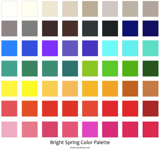
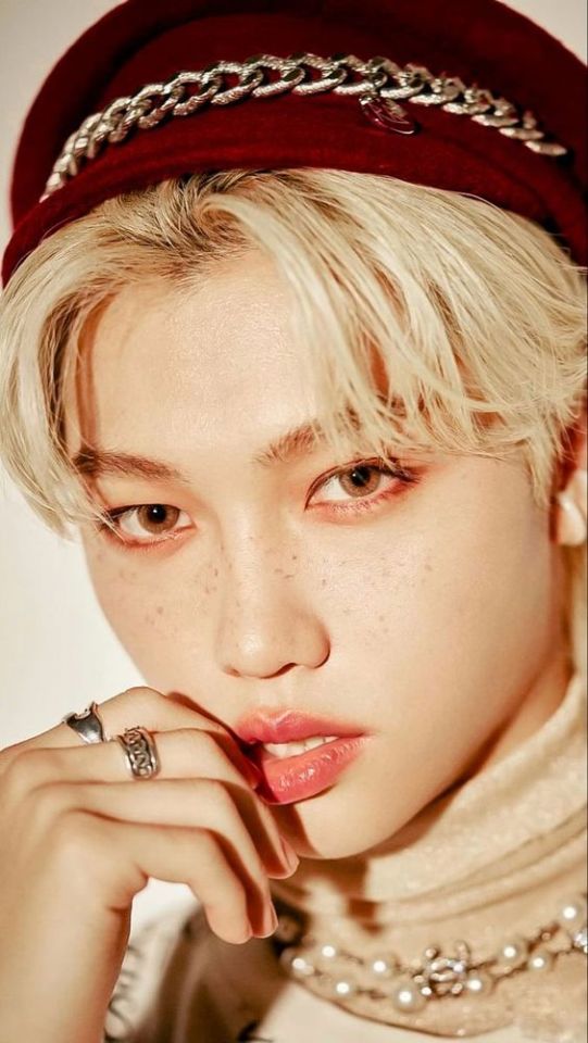
#i love a good primary color palette what can i say
Text
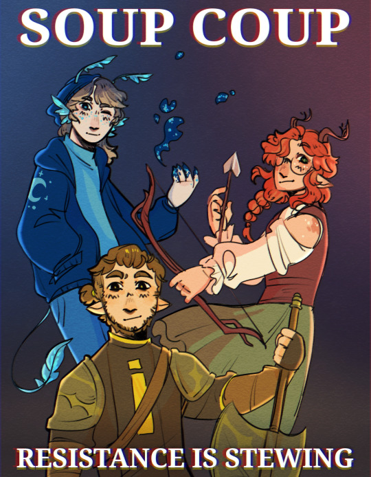
here's my secret september (run by @tangodyke) entry for @dorkymuffinboy !! they requested soup group so. here's some soup propaganda 🍲🍲
#mcyt#hermitcraft#geminitay#pearlescentmoon#impulsesv#soup group#jupiter's art tag#i love a good primary color palette what can i say
2K notes
·
View notes
Text
MASTERPOST: k-pop idols and personal color analysis
↳ with a special masterclass on warm and cool undertones. welcome to the world of seasonal color typing.
this post is for you if:
you want to know what looks great on someone and why.
look for a timeless aesthetic theory that’s universally applicable on anybody.
like to train your eye with image analysis.
enjoy men’s couture, make-up and hair. i specialize in analysing the gentlemen, there’s fewer material on them out there.
want to see why k-pop idols get colors professionally draped to find out their best palette. (like nct’s ten below.)

this post is not for you if:
you want quick & easy information. it takes time to learn and practice color analysis. but: i’ll show you some hacks, too, and give lots of visual examples.
seek to directly find your own best personal color palette. this is more about kpop styling > advice for self-typing.
are familiar with the topic and look for set-in-stone answers: just in advance, i’m not an outstanding typist. i’m better at explaining the system itself.
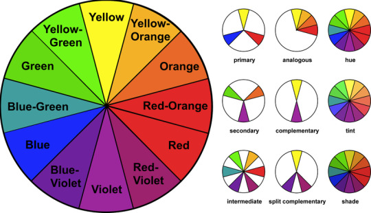
think i’ll hit you with the color wheel. yes, personal color is related to this; hue, tint, and shade. but that’s about it. we won’t use this model 😂
that being said, let’s start without further ado:
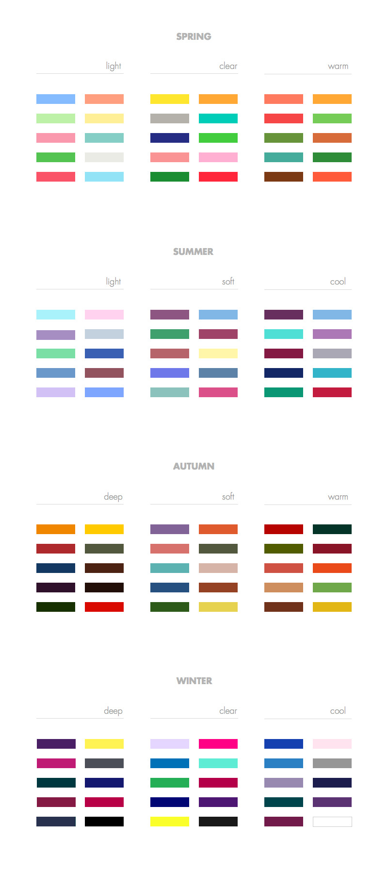
INTRODUCING THE SIX COLOR FAMILIES.
(...if you want to note down any vital key words from this post, this is it)
how do we distinguish color in the most basic ways? with the following dichotomies.
↳ warm VS cool,
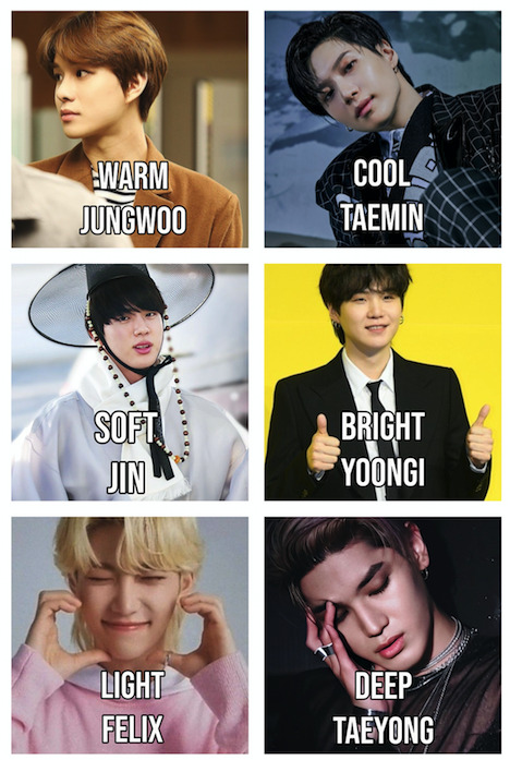
↳ soft VS bright,
↳ light VS deep.
NOTE - for some color analysts, soft is ‘muted’, bright is ‘clear’, and deep is called ‘dark’. it’s the same thing, i use both terms.
so far, so good. it’s pretty intuitive. but let’s understand how these categories come to be:
warm means added yellow. cool: of course, simply more blue.
soft means extra grey. bright has more saturation, strength.
light means more white added. deep means added black.
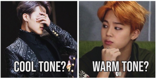
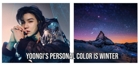
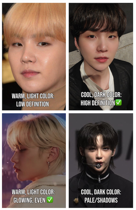
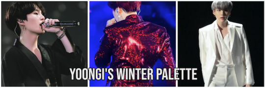
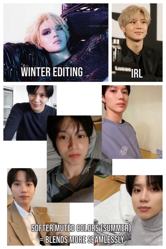
let’s sort some yoongi selfies into the 6 families so you can see what i mean. if you feel like he’s especially rocking the right-hand side, you will see where i’m going.

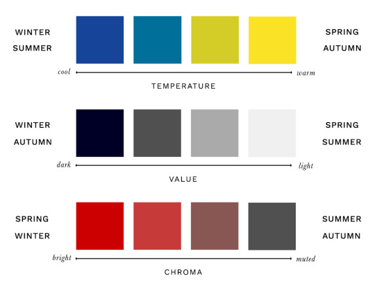
how warm or cool = temperature of color.
how soft or saturated = chroma of color.
how dark or light = value or color.
as in these examples below (tentative, this is just an approximate illustration), every human being falls into one among six tonal color groupings that matches their appearance the very best.
it makes them pop, even if other palettes might be great also it looks the most harmonious. it’s their home, their strongest suit. everybody has a skin undertone (≠ skin color) that’s either on par with cool or warm tones which is the primary distinction, and deep or light, bright or muted color. there are lots of possible options of color palettes for each family.
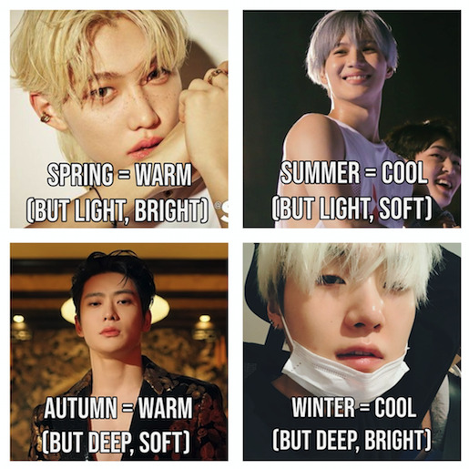
these 6 color families provide the subtypes of the 4 main ‘seasons’ which are the pillars of the whole system. hence, seasonal color analysis. this system has been around since the early last century and is as timeless as the name suggests.


congruently, let’s distribute the subtypes:
two seasons are warm-toned (Spring/Autumn),
two are cool-toned (Summer/Winter),
two light (Spring/Summer),
two deep (Autumn/Winter),
two bright (Spring/Winter),
two soft (Summer/Autumn).
you’ll understand it in a minute. i found this graphic spectrum helpful, take a second to think it through — again we have temperature, value, chroma.
say if the color is warm, it can only be spring or autumn. a light color can only be spring or summer. and so on. it’s that straightforward. there’s always two each. and every person’s best palette is found in one slice of this pie.
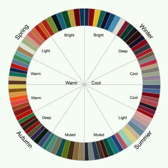
i love the idea of comparing seasons to people. we’re working by exclusion principle/narrowing it down to type someone here. say, if an idol looks dashing in cool colors that are also very bright and deep, they are a winter.
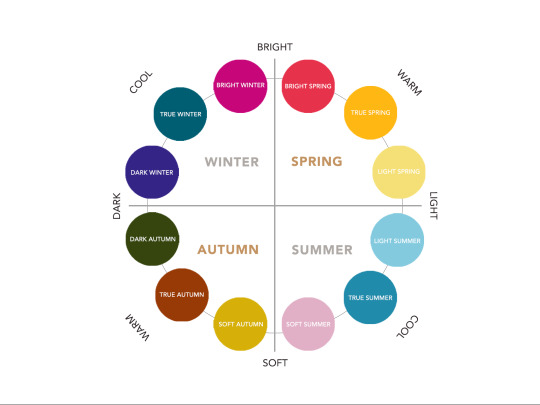
so that’s how the 6 families distribute among the four main categories. i know, it’s a lot to memorize. here’s a representative color each, and an overview that’s simpler.
and yes, it’s quite literally the colors of landscapes during those times of the year. like in nature, all of us are either spring, summer, autumn, or winter (and one of three subcategories, so there are 12 possible types in total).
let’s use some broad examples to summarize:
1. spring colors are warm, bright, light (like a flowerbed or meadow in the morning) — stray kids’ felix
2. summer colors are cool, soft, light (like the beach or city at daytime) — bts’ jimin

3. autumn colors are warm, soft, deep (like falling leaves at dawn or a cozy home) — nct’s jaehyun
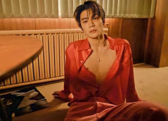
4. winter colors are cool, bright, deep (like a snowy night or crisp barren landscape) — bts’ yoongi

within these four archetypes, we can categorize the 6 color family subtypes as beautiful 12 (non-exhaustive, there are many more options) palettes. example:
notice how:
the early two seasons are less shaded. spring and summer are very subtle.
spring/autumn have a lot of yellow base: they are GOLD.
vivid the later seasons are. autumn and winter are the pretty heavy ammo.
and how blue-base crisp and cool summer/winter look like: they are SILVER.
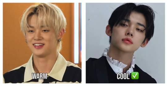
not all golds and silvers are created equal, some are lighter, other shades are deeper. but the general guideline for beginners is: cool season = blue/silver like yoongi and warm season = gold/yellow like namjoon. easy hack:

both can look good on a person, but one either distracts from the face/doesn’t do anything for you while the other makes you glow refreshed. that’s how you differentiate. let’s figure out how we apply all of this when looking at pictures.
/// what the person’s best color palette does for them:
the outfit works together with the face.
a coherent impression is created.
the features are well-defined.
it’s a ‘wow’ moment. nothing is off.
the whites of the eye are emphasized.
you overlook blemishes; the person looks even and radiant.
a healthy, moderate shine appears.
it compliments the natural hair color (which is always your exact season)
your attention is on the face, not the styling.
the color feels modern, appropriate, interesting.
the right amount of contrast, tying everything together.
/// meanwhile, how you know it’s NOT the individual’s personal color:
their skin appears a lot warmer or cooler than it usually is. #1 dead giveaway.
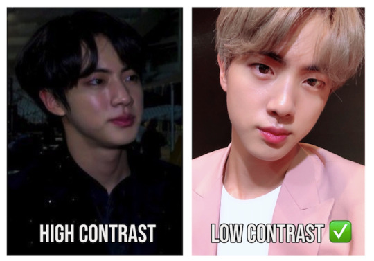
as i’ve heard korean color analysts say, ‘the head floats’: because it feels so separate from the color. (= too high contrast)
the garment casts weird shadows on their chin/cheeks/under the eyes etc. that don’t come from elsewhere.
it all doesn’t feel healthy and smooth.
it makes the skin seem greyed/dull, maybe paler, even blotchy.
it simply kills the vibe of the outfit. something is off, the clothing suspiciously washes them out. (=wrong undertone)
the color is odd, boring, or chaotic on them.
the jawline suddenly loses all previous definition, blends with the neck. or: the features are unusually severe.
this is basically “style yoongi like a spring (=felix) VS style felix like a winter (=yoongi)”: the difference is immense between warm and cool tones. winter coloring craves so much opposing shades while a spring face is best complimented by no contrast at all. remember: spring is subtle, winter is heavy ammo. felix is a believable blonde because his season is very light and yellow-based.
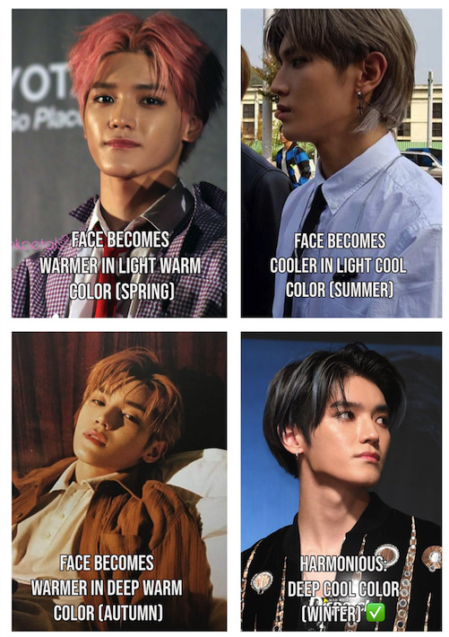
let’s practice even more and go through all 4 seasons with taeyong’s ever-changing hair. little did we know: if it’s too bright, muted, or warm, his complexion also becomes brighter, softer, and warmer accordingly: to compensate/adapt to the surrounding color/pick up the reflection. but when he wears his best palette that is mostly black-based, it shows his face as it is: cool, strong, intense, and contrasting like winter.
if that’s too difficult, let’s go back to do a simple gold VS silver example. that’s how you can tell that shinee’s taemin is cool-toned.
his recent eras have been more geared toward his undertone that is blue-based and sophisticated (silver, white/grey, blue) rather than warm, bold, and expressive (gold, orange, yellow).
the majority of warm colors look a little overstated or draining on him, while cool tones underline his sexy image just right.

(the bottom left example isn’t a summer type outfit because it’s dark and saturated — but he can still pull it off since winter is also blue-based)
cool and warm tones can be applied to all people’s fashion and hair. what matches their complexion seamlessly, what makes them glow. every human being has a distinct palette.
what may look mediocre on a summer might feel hot on an autumn; every color can be interesting: on the right person. a clear white t-shirt (=cool tone) is meh? think again when a winter type wears it (bts’ taehyung).

meanwhile, make no mistake: finding one’s season has nothing to do e.g. with how tan you are, or eye color. if someone has light skin, they are not automatically light spring or light summer. because ‘light’ is a color family in this system, not a name for a skin tone — just like having dark skin won’t make a person a dark winter or dark autumn type, for instance.
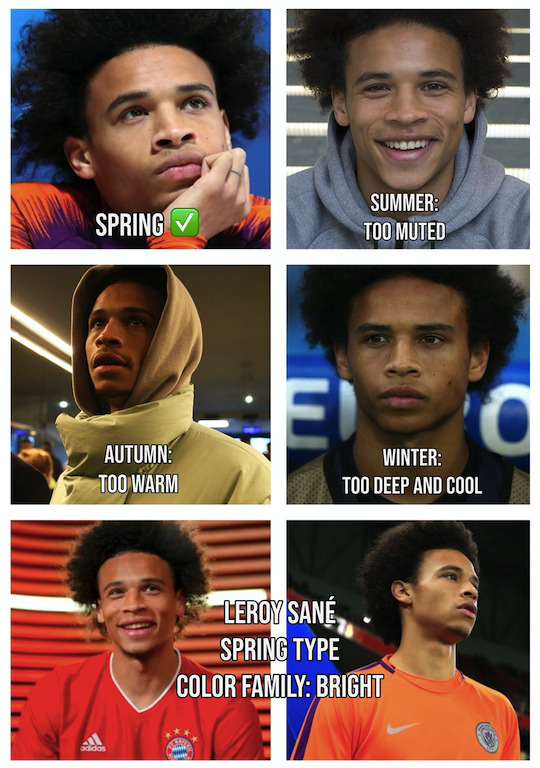
i’ll give an example outside of k-pop. my favorite football player, leroy sané (about time the world learns about this cutie). in his wardrobe, nothing does it like the light and radiant tone of spring. he wears the most extreme warm chroma kits with zero effort: while cool-toned, dark colors could never compete. he glows in bright clothes and exciting warm tones. because... he’s a clear spring type! 😍
or say, if someone is naturally warm blonde: that doesn’t make them a spring or autumn automatically. it’s just that — the other way around! — people who are springs and autumns wear warm hair colors superbly well, e.g. stray kids’ hyunjin.

so this is purely about which patterns of color assimilate the best to you as a holistic impression. the contrast level of your features overall is much more important, and how either cool or warm tones make you come to life. remember, gold or silver, and you need to know how intense they can go.
OVERVIEW
people with a warm skin undertone thrive in colors that are more upbeat, bright and vibrant with less contrast (spring), while others are suited by contrasting golden earth and jewel tones (autumn).
people with a cool skin undertone are flattered by colors that are more light silvery and pastel (summer), while others fit stronger icy tones that feature more extreme black and white contrast (winter).
IMPORTANT CAUTIONARY NOTES:
- that precisely means: some cool/warm tones may not hit home for someone, BUT lighter or darker ones may. trial and error. when analysing, don’t discard something too easily. and: as we saw, some palettes overlap and seemingly share colors. for instance, bright winters can borrow from bright spring types, since they’re both from the bright family. say, jimin can wear some assorted colors of spring AND summer.
still: keep in mind the basic ideas (and how winters always look better in cool shades, while spring is always warm). if he’s a cool tone and his best colors are soft > bright, and light > dark = we can do the math. he’s a summer. taemin is amazingly flattered by hazy, dusky greys — it’s a light muted palette. grey’s not cute and memorable? he can make it so.
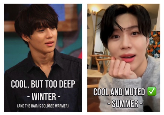
or vice versa. if he’s cool toned and bright > soft, and dark > light = he’s a winter, like changkyun. winters thrive on contrast and can’t handle bleach as easily as summers and springs. their face disappears, almost becomes ghost-like. taemin can pull off blonde like it’s nothing, while changkyun needs the depth of dark winter hair, as it wonderfully contours his face. winters look their most sexy and mysterious in very strong hues.

- color analysis takes so much differenciation as color varies so much. a bright warm red (= spring, even winter) might not be bull’s eye for someone because the saturation/chroma is too much, but a soft warm red (= autumn) can. it’s hard to study at first, so sticking with the 4 seasons concept as a beginner can help, long as you remember the 6 color families.
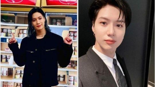
- someone might wear items/hair color from different seasons at the same time. analysis difficulty mode 5000. say, the foundation could be summer, the eye makeup winter, the shirt spring, and the hair autumn. but you can figure out what feels right one by one. bts’ yoongi can wear warm toned orange hair and it’s not in his palette — he’s a cool tone. but depending on the rest of the outfit, the overall impression still works anyway and looks pretty good.
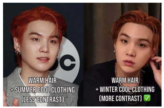
since he’s a winter, he can balance the orange hair with black + silver accessories and pull it off better. too soft grey clothing doesn’t make him pop as much and the hair takes over. there’s a reason why the right-hand version went viral and is hard to forget. yoongi wears his winter palette very often. 💘
- what looks good on someone often resorts to subjective VS objective. what makes someone look radiant and harmonious can be very different to color analyst’s different perspectives and even biases. if you want someone to be season XYZ, you find ways to justify it. that’s why proper analysis means: sifting through dozens and dozens of pictures, and sometimes correcting your typings over and over.
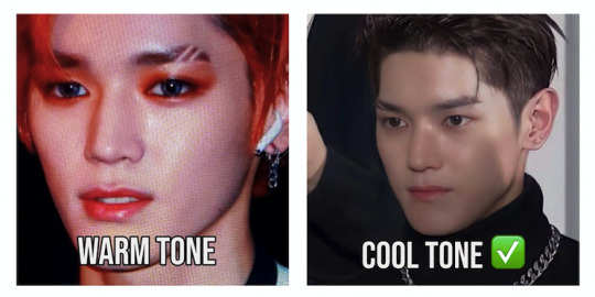
meanwhile, sometimes it’s easy — because the difference is so extreme. consider txt’ yeonjun with warm blonde hair before an orange color background and dark hair before a cool grey backdrop:
- keep in mind that certain seasons will be more prevalent among idols. the colorful spring tone era of kpop has blended into a more cool-tone dominated era in the industry. there’s a trend toward casting winters and summers into agencies, but mostly winter. their range of colors is more flexible and eyecatching, and always ready for a classic black tie event. a bright winter aesthetic is veeery popular for nct’s music videos, for instance (so pretty).
(how do you know it’s not bright spring? it has strong black background contrast and silver in it.)
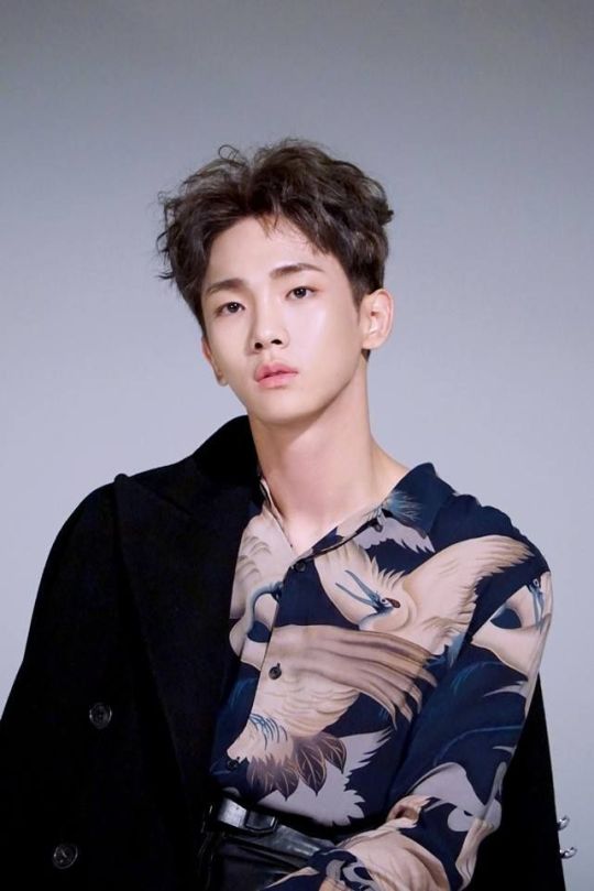
so, styling examples in warm tones are harder to find and analyse if seemingly all men’s fashion is blue-based and you don’t find comparison pictures. spring is already seldom worn, but autumn concepts like shinee’s are especially rare.

- some body types do some color palettes better than others. if you have heard of kibbe body typing, you’ll know what i mean. if your body type says ok, a vertical line of black color works best for you, but your personal color says you’re a soft or light season instead of a high contrast season? meeting halfway and typing well is even more difficult if you consider kibbe and aren’t a versatile gamine or classic type. i mean look at this recommendation table mess:

- often, people can never seem to agree on a typing online, even experts. everyone has their own approach and tweaks to the theory. the debate can get heated and messy; nobody wants to be wrong despite color analysis being so hard to get right. othertimes, i’ve seen color analysts or forumists type things like ‘ew, person XYZ looks the absolute worst in this color it’s horrible!!’ — i encourage everyone to stay civil and not insult the person you’re typing by saying they look terrible, awful, hideous, gross, nasty, et cetera. and even if a color doesn’t look right, say which one does, end on a positive note. color theory is no excuse or shield to hide behind to call someone ugly.
- lighting/editing/filters can also mess with correct analysis. photo backgrounds can reflect. the issue of artificial vs natural lighting — what helps to type more accurately? (...if you ask me, natural. but color harmony shows indoors anyway, and even in bad lighting.) if the person is wearing major cleavage, their own skin will ‘cancel out’/neutralize the effect of the garment’s color cast on the face. it takes time and effort to learn this system so mistakes sneak in, i constantly err myself. the list goes on. online typings can easily be inaccurate; we’re not doing the analysis in person, with clearly labelled color drapes and palettes under the face as the pros are doing it for consultations.

example: his company can edit and photograph taemin as a deep winter, icy lighting, heavy makeup, black clothes. but unwhitewashed pictures will tell you that all black everything isn’t as spot-on as more gentle summer colors.

winter is too strong and deep. summer is just right, being easygoing and subtle enough.
- always remember that all colors can be made more cool or warm (by adding yellow or blue respectively), dark or light (by adding black or white), soft or bright (by adding or subtracting grey). yellow can be made cool or warm, blue can be made cool or warm. white can be crisp or off-white/beige. there are only a few dealbreakers in this system. for instance, cool seasons struggle with wearing either orange, and light seasons don’t pull off any black, and the warm color family is incompatible with very sharp white. but other than that, remember that any color is always able to be manipulated on a spectrum.

but usually, when you type someone into warm or cool, the difference can be quite glaring and you don’t have to go the extra mile and find them in a cool blue vs a warm blue, for instance. let’s look at felix from stray kids and which tone accentuates his face the best in random colors:

the cool and ashy purple of the dye, the blue-based background, and the black jacket don’t do him any justice. it’s a styling for a winter. instead, felix being a spring is best-complimented by warm blonde hair (guess why he wears it so often, it’s in his palette) and citrus pastels, with warm tone makeup like the peachy coral lip on the right. that’s all we need to check.
- seasonal color analysis works best when the person doesn’t wear makeup and you just observe the effect of the surrounding colors on their face, but then again: makeup is also ‘surrounding color’ and will read as either fitting or separate from the person. let’s look at taeyong:
the fiery red hair and orange eye shadow are mostly yellow-based and therefore suited for a warm undertone. on his cool tone skin, it needs deeper and more blue-based colors, or a strong contrast like on the right. a cool brunette tone and silver jewelry are just natural on him. even a very subtle makeup style can help him dress his season, despite taeyong handling tons of makeup on any given day. moral of the story, long as his outfit is deep-toned enough, he can go for anything except too much yellow-base.

THE SIX COLOR FAMILIES IN DEPTH: EXAMPLES.
to end this post, let’s practice again to sort idols into the big 6. because as long as you got these down, you can type someone on your own.
bts’ namjoon’s color family is gently muted. his stylists don’t go for it often, but he wears beigey-peachy soft tones like no other. there’s a reason why he does honey blonde and brunette hair all the time: his undertone is warm. namjoon is a delicate soft autumn.

shinee’s key is very versatile in fashion, but his color family is cool. very breezy and a bit muted, but mostly full of blue-based greys and browns. not too much winter constrast, this is a more subtle palette. his undertone is cool. kibum is a cool summer.
and finally, stray kids felix as we saw belongs to the warm tones, and the light family. that means minimum contrast and lots of subtle chroma, beige and cream are his forte. the more understated the tint of the clothing and accessories, the better. felix is a light spring.
yep, this can go on and on. i hope you picked up some knowledge bombs from this explanation and feel as intrigued by personal color as i am, do ask if you have any questions and need some help.
cheers and happy researching ✍️ - caro
#seasonal color analysis#kpop#seasonal color#typing#long post#kpop thread#kpop analysis#fashion#kpop fashion#i wanted to properly introduce this to you for so long!!
502 notes
·
View notes
Note
say that the pwhl expands westward and adds a team in seattle. you're the new gm. which players are you plucking from other teams in an expansion draft?
(bonus for team colours/name!)
ohhhh what a fantastic question! i have to assume that many of my best girls would be protected in the expansion draft… boston is not parting with megan keller, hilary knight, or sophie jaques; abby roque is staying put in nyc; minnesota is not letting lee stecklein go. however, seattle provided a top-notch welcome for the rivalry series and is generally regarded as a good location for women’s sports, so i think that’s going to give us a leg up on signing a beauty or two when they hit free agency.
maybe the expansion draft rules will be a little bit generous and i can scoop up jesse compher or jessica digiloramo? dominika lásková is probably too much to hope for.
i can definitely snag carly jackson, though! she’s gonna be my joey daccord. i’m also counting on my lil expansion team struggling long enough to get the top pick the year chloe primerano or nela lopušanová enters the draft. but most importantly, i’m pretty sure ZOE BOYD will be available in the expansion draft!!!! my team is already winning!!!!
i think an expansion team would likely stay on theme with the nautical branding and blue palette of seattle’s other pro sports teams, so i would sure love it if we could clear up whatever the trademark issue is and name our new pwhl team the seattle sockeye. boundless blue would be a good primary color to coordinate but not duplicate the kraken.
8 notes
·
View notes
Note
I got you covered! OC/Writing Art Asks, for.... hm... whichever OC has the longest name
pencil, pen, colored pencil, pastels, eraser, and palette
Thank you for sending this in!
Based on how I treat her name, Kanta Syrah is the lovely OC with the longest name! For brevity, I’ll be referring to her as Kanta. Just a quick warning, this may be rather long!
Pencil: Kanta has one “sketchy” habit that she utilizes on a near daily basis. She implants thoughts into her victim’s mind, prompting them to purchase and consume more goods than they want. It tends to be hard to notice unless the person has a good understanding of their inner monologue. In terms of breaking the law, it is a grey area. Kanta uses her mind infiltration to sell baked goods. If it’s not the coercion that breaks the law, it’s the substance in those baked goods. Does she regret any of this? Nope! Not at all! It’s extra income and fun for her!
Pen: Kanta regrets investing in plastic cooking utensils when she first began baking. It’s a small, harmless mistake, but the melted remains of her first spatula plague the bottom of her oven.
Colored Pencil: She would definitely get the more expensive products for the quality. Kanta takes pride in appearing her absolute best to feed her facade. Especially when it comes to self care and hygiene products. Gotta look as presentable and charming as possible!
Pastels: The three colors I believe best represent her are bright yellow, burgundy, and a pale pink. The colors Kanta likes best are pumpkin orange, white, and basically any pastel color you can think of. She likes pastels and softer colors since they remind her of the icing used on cakes.
Eraser: Throwing her into different scenarios has changed her core personality a lot. Kanta was originally just an adorable sweet kiddo, using her natural charm to get people to eat more. She had no other side or malice like she does now. Kanta has definitely come into her own as an Id inspired character in the id ego superego trio. She’s impulsive, headstrong, conniving, and brutally honest under all that cute and innocent behavior she conjures. She’s my unhinged lil gremlin!
Palette: I would say Kanta’s primary skills are mental manipulation, negotiation, acting, and adaptability. All four of these skills blend and overlap easily. For instance, her ability to adapt and act. She’s always putting on a show, whether anyone realizes it or not. If her acting is not getting what she wants, she adjusts accordingly. If she’s working with someone who’s rather timid and anxious, Kanta will cut out the more hyper and excitable parts of her facade. The effects of cutting or replacing different aspects doesn’t destroy or damage her facade since she’s used to doing it. With mental manipulation and negotiation, these two go together extremely well. Kanta has great negotiation skills and doesn’t need to manipulate or invade the other party’s thoughts. However, she does this to ensure everyone gets what they want. Instead of planting thoughts that could benefit her, she tries to figure out what the other person wants and coaxes it out of them.
6 notes
·
View notes
Note
Okay so I have a lot of questions but the main one that's pegging me at the moment is Noah's alt modes and his design like did you completely scrap the police design or is it still going to be in a very later part of the story PS make sure to drink some water and take a very good break
So Noah's design in general is a real hit or miss. He's gone through a LOT of design changes ranging from a mock up of the Black Ghost Challenger with a single alt mode to even going as far as having an idea of a Wyvern Cybertronian Dragon (bc who doesn't love dragons!!??) . Basically I have one design then my brain says "oooh what about this instead" then I change it and see if I like it and if not, I either revert back to the previous or tweakil that one a bit
The whole police car thing came from a private server on Discord as a huge "what if" joke scenario tying in with Mirages love for racing and speeding + breaking rules in general and Noah basically being the complete opposite. Plus the whole blue + white stripes color scheme was just super easy to get down on "paper" without having to do much
However as time went on, I wanted to go back to the previous Dark Green + Dark Red design because
1) the design inspiration was already based in his jacket
2) it fit his character better (I see Noah being related to the color green a lot and wanted to keep that theme
3) seperate color pallets between characters. Mirage is Silver and Blue. The whole fake cop car facade is Blue and White. Too similar of a color palette IMO and it blended too much together. The green and red (and then the addition of deep blue arms provided a nice balance)
So yes, the whole police car disguise is scrapped and will not be returning. Basically I'm pretending it never happened :D
Noah's secondary Alt mode (he's always had the Challenger as a primary so that never changed) kept changing mainly bc I couldny ever decide if I liked a helicopter or a plane better lmao but later I leaned more towards my interest with small aircraft and the Cessna then kept :)
Tbh, over time, he may get a few tweaks in design here and there if I suddenly decide smth needs to be changed or added but so far, I don't personally feel like anything is "wrong" with it
TLDR: I'm super indecisive and can never keep things constant bc my silly brain finds interests with other things :)
Also tysm about the water and break!! 💙
6 notes
·
View notes
Note
color ask game: 1, 5, 7, 10, 13, 17, 24, 26, 27, 35 hehe
Favorite color(s), and why ?
So obviously it's hard because i'm obsessed with colors and i love many colors but if i had to pick one it would be yellow. I've discovered my love of yellow maybe five years ago and since then it's only been growing and growing. It's the happiest color, it legit helps me with depression. Also I like every shade of yellow which is not something i can say about any other colors. I used to not be a fan of light yellow but i'm starting to grow fond of it, and even greenish neon yellow, my least favorite shade of yellow, can work in many contexts i believe.
5. Favorite color combos ?
Yellow & blue, orange & blue, green & blue, red & blue, green & burgundy, black & beige, light blue & bright red
7. What’s your color palette (i.e. pastels, earthy tones, neons, neutrals...) ?
My favorite color palette is bright, primary colors : bright red and yellow, deep bright blue, bright orange, grass green. These are the colors i'm instantly drawn to, and that i consider part of my identity, my core. But I also really like neutrals, especially beige and wood tones in general, and earthy tones (khaki, burnt orange, camel...). I've recently discovered that i love the combination of bright colors with more muted tones actually, like on this picture :

10. Gold, silver, or rose gold ?
I had a long gold phase for a few years but recently i've been tired of it and have rediscovered silver. I'm obsessed with chrome, like on bauhaus style furnitures specifically it's just... so good.
17. What color do you think compliments you best ?
Camel. I've had a camel colored sweater for yeaaars and everytime i wear it i feel like all my features pop.
24. What color makes you feel the strongest feelings, if any ?
Klein blue and similar bright, deep, layered shades of blue. I've talked about how yellow has a strong impact on me but them blues are just on an other level. When I see klein's art in person, especially when he uses pure pigments it's like... It's like something is slashing down my throat to rip me apart. And I can't look at it for too long because i'm afraid i will start crying, i'm afraid i will get lost in the color, go crazy. But, in the best way ? No other color does that to me, needless to say.
26. Tell us about a color-related fact you like ?
Blue is the rarest pigment in nature, most things that appear blue don't contain blue pigment, it's the structure of these things and the way the light reflects on it that make us see them blue. How wild is that. Makes you understand why the indigo pigment was such a big deal.
Here are some fascinating videos about it :
youtube
youtube
27. Is there a color that holds a unique symbolism in your culture ?
Not anymore I don't think. But for example white being associated with royalty and aristocracy was I believe pretty specific to France (but don't quote me on that).
35. Thoughts on yellow ?
Apart from what I already said, it's just such an underrated, overlooked, and even despised color in modern western culture, it's so crazy to me. While as you've pointed out it's literally the color of holyness in many many ancient cultures. I remember seeing a very interesting poll (that i didn't save because i'm dumb) where they were asking people across Europe to associate words with colors, and yellow was one of the least popular colors. Interestingly, the more you went up north, the more positive responses were given, words like "happy" and "sun", for obvious reasons. I also feel that yellow is way more popular amongst people our age, maybe because we're all depressed lmfao. Anyways my final take is, if you like yellow i instantly trust you.
Thank you so much for letting me ramble about one of my favorite topics !! Lots of love to you <3
7 notes
·
View notes
Note
So what would you guys say are your favorite episodes of The Series?
ArtistIssues
My favorites are:
Spooky - Probably some of the best animation in the show is in this episode, plus they nail the Halloween-spooky-fun vibe, it’s fun to see the nervous-scared side of Stitch’s personality, and Spooky’s whole function is so genius! And almost everything Pleakley says in this episode makes me laugh.

Splodyhead - I’ve always loved this episode. I love Splodyhead, too. I particularly like episodes where characters who hate each other are forced to work together on a desert island. That’s a trope I’m here for!
Poxy - I love Poxy. When I was a kid I used to ride around the neighborhood on a scooter pretending to be him and his slick little germ self.

627 - This episode was so so cool when I was a kid. I love 627’s black claws and how all-out they went designing him. Plus, again, an episode where we’re shown how unstoppable Stitch always is, until he isn’t anymore, is such a cool break from the norm.

Bonnie & Clyde - I adore the different musical score in this episode, and I love Bonnie & Clyde’s dynamic together and the fact that they can speak English, but they’re rotten little alien life form stinkers. And I love Pleakley in this episode, too. I could just rate every episode based on Pleakley moments. But then I’d have to add Holio to this list which is already too long!
Doverstar will chime in, too!
Doverstar:
Angel - It's my #1 favorite episode of the show, for sure. It hits all the nostalgic notes for me. Angel is my favorite experiment, and though the animation in this episode is terrible, I'm a huge fan of Angel's color palette in it and the idea behind the episode. The fact that love is what turns Angel from bad to good - and that it's Stitch who names Angel and changes her, instead of Lilo, which was the norm - love that. Plus it's cool there's an experiment in the 600's series that exists whose primary function is literally the opposite of the goal of the series.
Remmy - I like this one because of the emotional plot, and the fact that it focuses on Lilo and her mind and the lasting affects of her parents' death on the family. Any particularly deep Lilo-centric episode is a standout in my book! As a kid, the heavily-decorated "door" in Lilo's dream, which she says always has "bad things" on the other side of it, was super creepy and interesting to me. I remember thinking even at that age that the scene of her parents' actual crash would be behind that door, or maybe their gravestones, or maybe just a flashback of the night they didn't come home. I both did and did not want to see that. But no, instead it was Lilo's hula school and disarmingly-kind classmates, which is also interesting! All in all, it's my second favorite because of the slightly-deeper-than-usual subject matter.
627 - This one is purely nostalgia-based for me. The 627 episode was one of the all-time coolest to us growing up, like Arti said! Lots of her reasons for listing this one are the same as mine. Always cool to see Stitch come to terms with the fact that though he's pretty cool, he's not always the best at everything. And extra wonderful to hear Lilo say something like "So what if you're not king of the block anymore? You're still king of my block." So. Good. So sweet. Love that.
Shoe - Shoe is one of my top 5 favorite experiments. I like the plot in this episode and the animation in it too! I like Pleakley's comedy beats, and the idea of turning the old ship into a B&B was genius for a show about aliens living on Kauai. Perfect. But Shoe's lil emotional journey makes me very happy. His sole purpose is for the gain of other people, and he's at least intelligent enough to understand that people only seem to value him for what he can do for them, and then finding out Lilo specifically likes him even when he's bad luck? 10/10. One of those times where part of the episode isn't just catching the cousin or showcasing the shenanigans its abilities get the cast into, but showing how the experiment goes from bad to good and why.
Dupe - Because Dupe's design delights me, because the writing in this episode is fantastic, because the idea of a slumber party at Lilo's house with the experiments instead of four bratty human girls who'd ruin all the fun anyway is awesome, and because in the end, Lilo gets another reminder that even if she wants lots of friends, having one like Stitch at her side is more than good enough.
Retro - I always wanted this one to air often on TV growing up, specifically because it was later in the show and therefore rarer to see rerunning. I thought Retro's ability was so cool, and I was especially interested in the little glimpses of Nani's life before becoming sole caretaker of Lilo. Plus the setting of a cruise ship is always fun!
Swapper - Lilo gets a human friend Lilo gets a human friend Lilo gets a human friend LILO GETS A HUMAN FRIEND-
Snooty - Victoria gets an experiment of her own, Snooty is precious and Halloween-y, more looks at Victoria/Lilo's friendship, Pleakley driving is hilarious, and the ending gets me every time.
Amnesio - Gantu? An excellent friend for Lilo? Latent protective affection for the cute little Earthling? It's more likely than you think-
Bad Stitch - I like this one because it has some of my favorite Lilo/Stitch moments. It also seems to have unused material from the original movie? Maybe? I don't know, but Chris Sanders seems like the kind of guy who would suggest more of Lilo training Stitch like a "puppy" and squirting him with the stupid water bottle. I especially love the ending, where Lilo tells Stitch she knows he's good, even if he breaks things. And how Stitch wants to behave because Lilo asks him to, and she loves him, and that's why he wants to behave. Love that.
The Asteroid - Jumba recognizing that Earth is his home and that the Pelekais are his family waters my crops and clears my skin. And I love watching the whole Ohana work together on a planet-saving space trip.
#ArtistIssues#asked#answered#favorite Lilo & stitch the series episodes#the series#L&S#Bonnie#Clyde#Splodyhead#627#Poxy#spooky#doverstar#doverstar answers#favorite episodes#lilo and stitch the series#angel#angel 624#lilo and stitch#doverstar and artistissues post#groverman6 2
10 notes
·
View notes
Text
The Black Monday Murders

I finished reading the two available volumes of The Black Monday Murders that collect the first 8 issues (4 issues each), and it was an incredible experience. I totally recommend to pick them up, or... Maybe wait until the third volume is released, which is the last one, so you can have a full story.
Okay, this tells the story of a group of families that control the wealth of the world with black magic which is provided by the god Mamon, and like any Jonathan Hickman work, it was a lot of incredibly intelligent world building.

When I say dark magic you imagine a certain thing, big spells and sacrifices, and while there are sacrifices and big spells, they are used sparely because most of the story is about the systems. Money is the primary source of power, said to be the physical manifestation of power in the world, and that is how these people really control the world.
In this context, we have two points of view, Theodore Dumas, a detective that enters this world by investigating a murder, and Grigoria Rothschild, who joins the board after being exiled because of the murder of his brother. These two points of view are also accompanied by the now standard Hickman Data Page™ that expand this world a lot more.
With this, the reader is not really following a character but a world, which makes you start thinking more than what you read, and you start connecting the dots as you go. This is one of the best aspects of the comic, you get the feeling this is all bigger than everyone, it's incredibly well thought out.
Some people say that Hickman is not a character writer, he's more of a plot writer and a world builder, but I don't totally agree. It's true that you never see the characters in their day-to-day life, the small moments you see only serve to tell the story... But, the characters in here are charming, you get their motivations and that is because of how great of a writer Hickman is, he knows what fragments of their life to show to make you get everything about them.
And my god, Tomm Coker's art is FANTASTIC. All the faces of the characters look like real people, if I had to describe the style, I would say that It's like a sketched photograph. The work with the panes and shots is also incredible, for a book that is mostly people talking it's very dynamic and makes this read itself, because these are double sized issues of 40 pages but I read them faster than I do normal issues.
All this is very well accompanied by Michael Garland's fantastic colors, that bring these drawings even more to life, using a very good palette for this story that gets the dark noir tone of this book. And ofc, the thing you get the most in the data pages, Rus Wooton's letters are very well done, because as any good letterer, you don't see his work because of how well it's integrated in the work.

So yeah, I totally recommend this work, and I can't keep talking about it because I will spoil all the fantastic reveals. Just go, read it, and maybe if you want you can DM me and we can talk about this because I loved it!
#the black Monday murders#black monday murders#jonathan hickman#hickman#Tomm Coker#Michael Garland#image comics#comics#image#review#comic review
2 notes
·
View notes
Photo

he's back! it's luke from three years ago! meaning his original concept was posted six (soon to be seven!) years ago... what a ride it has been! i was in elementary school when i made him, and now i've nearly finished my senior year. crazy how life moves without you noticing, hey?anyways, i'm here to just sort of place him down and see what happens. i don't expect anybody to remember him, but it's fun to see how he's progressed through the history of this blog, right?
First of all: YIPPEE WOOHOO I LOVE OLD OCS SEEING THE LIGHT OF DAY!!!
Mod Bright here, and I wanna take a moment to say ohhhh my god I love tracking how your art style's changed and grown since you first submitted! I love the softer lines you seem to be using now, and your coloring style is…ugh absolutely gorgeous.
As for Luke's redesign, ohhhh I'm in love. Though I think the original designs were nothing bad (in fact, I'm still a little fond of the first design, it's got so much charm!) I do really enjoy how nice on the eyes the color palette is here.
I also enjoy how his antennae-thingies have returned to being right over where his ears would be! It's a good place for them. :)
(And his eyelashes…oouogougoguoguo pretty…)
I also like how, aside from the seams in his body, he seems like he could be mistaken for an everyday employee- I think that's a really fun take for his character concept!
alright, so his name is still luke. he is a humanoid masculine-presenting android located in an establishment known as cam and dolly's, a subsidiary of fun!pizza business. his primary role is that of a caretaker; he is stationed in an area of the main cam and dolly's location known as "luke's corner". he is unique to the main building, as other cam and dolly's chain locations lack his special area.
luke's main function is to provide a safe, calm space for people of all ages who may find themselves overwhelmed or upset by the other attractions. he can draw, tell stories, hold intelligent conversations, play (calmly) with toys, and assist with certain arcade machines.
I am sososo glad you kept this concept because I always thought it was very sweet, and definitely plausible for a FNAF fangame or FNAF-inspired story concept!
Not much to say here, since I've already sung my praises about this in my last review, haha. Him being one-of-a-kind, though, while often implied with characters similar to this, is a really nice touch. :)
luke was purchased from an auction by the owner of cam and dolly's two years before the founding of the actual chain itself, as one of approximately thirty androids salvaged from the rubble of an abandoned warehouse after a fire had destroyed it. his original creator is unknown, as all previous branding (nautilus robotics inc) has no existing record as a real company and the recorded owner of the warehouse had been found deceased in their home shortly after the incident. luke, despite the fire, was in relatively good condition and was easily repaired by the owner herself.
THIS IS KIND OF SICK AS HELL. I like this a lot! Super mysterious, explains well why this android is hanging around a kids pizza chain of all places, and has just enough intrigue to keep people guessing! …And enough that you don't have to have all the details ironed out right away, I'm guessing. :P
I like how you've put detail into the actual incident that happened, too! It's nice to have a little more detail to his backstory than last time. Fond of this funny robot :)
I would love to hear more detail in the future, maybe, about the owner and her history/experience...it'd be really interesting, especially, to hear about her skill level with mechanics/programming respectively and/or lack thereof, and how the repair process actually, like, went.
luke is an artificial intelligence and is far more advanced than he lets on, however he is not without his quirks and.. issues. while luke still has an issue in his code preventing him from properly recognizing after-hours staff, his logic and outside reminders will suffice to keep him acting 'normal'. while i've written his story without much of a legitimate gameplay loop in mind (he's definitely more of a story oc than a game oc at this point lol), i do have some ideas for him.
I'd love to hear some more elaboration on exactly how advanced he is and his actual personality (since "more than he lets on" does sort of imply a fun level of sapience) outside of his job! Some detail on his perspective in particular I feel could be really cool.And ohohohoho gameplay loop ideas…these are always fun, even if you don't get to use 'em! Let's see…
if we are working with a traditional fnaf five nights security guard office style, i figure he'd work something like this:
luke becomes active on the first night and remains active all week, increasing in difficulty and aggression as nights go on (of course).
due to a previous incident involving a nightguard at the establishment, luke insists on trying to come to your office to "supervise" you. if he enters the office during this phase, he will be an obstacle to your control panel/camera panel, as well as an auditory distraction as he talks — luring the sound-sensitive dolly to your office faster than normal.
you can send luke back to his corner via commands sent to the receiver on his head. he has to obey these commands, even if he doesn't want to, leaning in to a frustration/aggression mechanic.
This is a really fun concept and really fitting for what you've said about him thus far!
I like the inclusion of a mechanic to send him back to his corner, and having there be consequences for using this mechanic (maybe so you'd have to weigh the benefits of keeping him around for a little longer than you'd like while dealing with other threats?) sounds like it'd add a very fun layer of complexity to nights.
the more times you send luke back to his station, the more frustrated with you he will become, ticking his aggression up with each use. once his aggression surpasses a certain threshold, he will switch into a more hostile mode, becoming more persistent as well as capable of jumpscaring/killing the player instead of just being an obstacle. he will take multiple paths to the office in an attempt to evade your cameras and commands.
Ohohoho…very cool, I like! The commands still working as Luke is en route in hostile mode (presumably only when he's in view on the cameras?) is fun too, feels like a sort of riff on the audio lure mechanics we've seen in the main series and fangames! Very nice.
the best way to deal with luke is to let him get close to the office before sending him back — this minimizes the amount of times you have to use the commands, therefore avoiding triggering his 'hostile mode' for as long as possible.
Naturally. :P
i have no idea if that's good or even playable and i'm also very sorry for the novel of a submission. i just enjoy my funny little guy and think he's quite silly. thank you for reading and thank you for not deleting this blog so this small piece of my own oc history has remained preserved :,,) i hope you have been having as much fun as i have.
NOOOO THIS WAS FUN TO READ AND REVIEW!!! I enjoy your funny little guy also and I'm glad you've submitted him to the blog :) I am also very glad that the blog is still up…though I don't really agree with its original message and haven't for a long time, I think it's an important artifact of internet history, y'know? And, of course, of individual OC history. :P
As for the hypothetical game mechanics, I think Luke's got some interesting ones that are definitely workable for a game!
The thing I've found is that you can't really predict whether something like this'll be too much/unplayable unless you have the full picture of all the cast's mechanics together, and even then some game devs have had it worked out then figured out some overlooked synergy between antagonist characters that makes stuff impossible!
So…don't sweat it too much, unless sweating it is fun for you.
To conclude…Thank you for submitting, and thank you for sticking with us all this time. Luke is a character that was already genuinely solid in concept, and here I'm only seeing more detail and thought in your writing.
I'd love to see where you go from here, if you work on this group of OCs any more!
Good luck in the future! <3
-Mod Bright
4 notes
·
View notes
Text
I Call This One: Bold & Brash!
The egos x artist! gn! reader
ty @pokemonpunqueen for the request!
A/N: I’ve decided that I’m gonna write for the egos when I can’t think of anything else or I need practice writing lmao. I mean I was doing that before? But I didn’t know it? listen it’s fine it’ll be fine but FOR NOW I thiiiink I’m gonna take requests. Just a few. I’ll stop when I think it gets too much. This is exactly what it says. I focused on like drawing/painting for “artist”, with some references to animation thrown in there. I did Darkiplier, Wilford, Yancy, Illinois, Google, Eric, and a Host thrown in there bc I love him and I miss him
Word count is 1.5k
Enjoy
Egos x artist!reader
Darkiplier
He’ll want to commission art from you
He makes comments about how Mark is a narcissist but also he’s a narcissist.
Oh look, Dark’s asking you for another picture. What does he want? He wants you to draw him? Again? For the fifth time this fucking month? Wonderful.
He likes looking at how you make art of him, be it stylistic or realistic
He will hang them up all over the fucking house so pace yourself
He’s fine if you draw anybody else
Except Mark. Never Mark. How can he tell, you ask? No fucking clue, but he does
Gets a bit worried that you won’t make enough money to live comfortably
Just because not everyone needs a fucking MANSION-
Will always buy things for you if you ask
Likes to be able to support your job or hobby
Sugar daddy? I mean maybe
Makes sure you eat, sleep, drink water, survive--
Leaves snacks for you at your desk for when you don’t want a meal.
Carries you to bed if you fall asleep at a desk
Recommends you wear comfy clothes at all times so you can fall asleep wherever
A bit of an enabler, he’s doing his best tho
If you take commissions don’t be surprised if he threatens to kill someone when they don’t pay or are rude to you
He loves you, that’s all
Wilford
Fucking elated
Draw him!!! Please!!!! Please draw him!!!!! He has coin!!!!! He can pay!!!!!
Ecstatic if you actually draw him like he’ll giggle for an hour straight just looking
Secretly commissions more art from you
So also sugar daddy
It’s always something so obvious so you know it’s him anyways
He likes bright colors and eyestrain for some reason
If you make that, he just. Stares at it. Unblinking. You have to snap him out of it (im not projecting what do you mean)
Gets extremely worried about you not taking care of yourself
Gets someone to fucking babysit you when he’s gone so you take care of yourself
When you get greatly offended by this he settles for texting you reminders
And when you ignore those he texts more
Don’t be surprised if you get spammed by several people and an alarm starts to play from somewhere in the house
You’re gonna be healthy whether you like it or not, asshole
Drags you to bed aggressively
He WILL NOT drug your food with melatonin because that’s illegal. B U T-
He’s a little confused, but he got the spirit
Will advertise your art to anyone and everyone and also on his show and threatens the audience with a gun
AGAIN, a little confused. he just wuvs u so much
Yancy
I mean technically he’s kind of an artist too so he appreciates your skill and creativity
He’s very nosy and likes to look over your shoulder while you work
If you don’t like him doing that, he still does it, just more secretively
Likes to work in the same room as you.
That is if you don’t mind constant singing or tap dancing in the background
He shows off your art to anyone and everyone and gets mad if they don’t immediately say it’s fantastic
May or may not have stabbed someone over it, you’ll never know
If you show him something you’re working on, he’ll show you something he’s working on in return
The law of equivalent exchange
You tell him you can make MONEY from things like art and dancing and he goes apeshit he gets so fucking excited
If you’re like an animator and offer to animate his dancing he might actually cry
He’ll deny it constantly every day until he dies
If you make things traditionally he hangs them on the wall Everywhere
You might run out of room
By which i mean you will run out of room as soon as possible
Will never tell you a drawing is bad ever unless it’s like Really Bad which it never will be in his eyes
He loves anything and everything you do u are so precious
You have a permanent support system within the man
Google
Used to see art as pointless
Then comprehended the chemical release it causes in the brain and thought that was fine
Then saw you get really mad with something you were working on and got confused again?
If art no make good chemical, why art?
He still doesn’t understand, but that’s ok
You tried to get him to make something once
He just. Kinda. Made a buncha ones and zeroes
You still framed it and hung in on the wall and he got embarrassed
If he could blush, he would
If you draw him he looks like he doesn’t care but it’s at that point he decides he would die for you
Primary objective: answer questions as quickly as possible. Secondary objective: make u happy. Tertiary objective is to destroy mankind
If you draw bing that will disappear IMMEDIATELY you have BETRAYED him
If you ask for a color palette recommendation he Always says the google colors. Always.
You might’ve thought he was going for an rgby type of thing. But then you realize.
He is in charge of your financing. He will tell you the most efficient ways to make money as an artist and you follow then
He is also in charge of making sure you FUCKING EAT A MEAL
“But isn’t an objective to destroy mankind?” shut up he’s not happy about it either
Despite his best efforts he loves you and that ain’t gonna change
Illinois
Doesn’t fully understand
He needs to be outside at all times and cannot stay in one place
And you’re like??? Required to stay still???? For prolonged amounts of time????? Disgusting. Anyway, whatcha workin’ on?
He might ask you to try and teach him
If you do try he gives up almost immediately
Sometimes you just get so into it that you forget to do basic things and he gets upset
(i.e. eating, sleeping, living, etc.)
He gets worried about you
He is a hypocrite bc he does the same
He will drag you to bed, motherfucker
Honestly he might lock your shit somewhere until you fucking take care of yourself. it’s like a hostage situation god
“Where the fuck did you put it” “I have no clue what you mean. I might know if you eat your dinner, though”
Asshole (affectionate)
Sometimes you like make faces when you try to draw a person and it’s hilarious and cute to him
He looks at your drawings the moment you walk away but acts like he doesn’t care
He cares a lot
Will support you no matter what but will also tell you without hesitation if he thinks something looks shit
Listen he’s out of line but he’s right
Eric
Loves you a lot and will support anything and everything you choose to do or make
Drawing? Awesome! Painting? Wonderful! Animation? Superb!
He often wants to buy you supplies or something but he does not know what anything is
Fuck is a chalk pencil???? What are gel pens vs normal pens?????? Watercolor????? What the fuck are you saying??????????
Will subtly drop hints that you could,,,, draw him,,,,, maybe,,,,, if u wanna
And by subtly I mean he starts to ask and then starts crying
If you draw him he will cry again he loves u so much
If he ever were to get a tattoo it’d be something u drew. Nothing else is as important to him at the moment
He enjoys photography and film, and likes to try and bond with you over artistic things
I mean. Some things overlap.
You could talk about a single drawing for hours and he’d listen intently the whole time
Don’t ask him for feedback, it’s always some version of “it’s perfect and I love you”
Even if he hates it
Which,,,,, he might hate it sometimes
He’s not a good reviewer. 2/10, very biased
He likes to take photos when you’re in the zone
If you tell him to delete them he will
While secretly making one his home screen
Host
Hey, he gets it
He writes, he understands the hyperfocus
Sometimes he wouldn’t move from his chair for a day because he was busy writing a script
That being said, you probably have to be the one to get him to take care of himself
Or you have to take turns
Otherwise you’re both gonna fucking die
He asks you to describe your art to him and tries to picture it.
He’ll tell you if he thinks it probably looks good or bad
You shouldn’t take it to heart because he can’t see it
He is a bastard sometimes
“Well, what do you think?” “I think it looks fantastic” “Thanks, babe” “...” “... you think you’re fucking funny, don’t you”
He asks if you can draw him sometimes
No, he won’t see it, but he’ll appreciate the sentiment if you do
He will ask for your opinion on his scripts sometimes
If you say it’s bad he gets really defensive
You work in the same room a lot of the time and forget the other is there
One of you has to preemptively order food or like set a timer so you can goddamn Survive
You’ll be fine
#markiplier egos x reader#darkiplier x reader#wilford warfstache x reader#yancy x reader#illinois x reader#googleplier x reader#eric derekson x reader#eric derickson x reader#x gn reader#x gender neutral reader#darkiplier x gn reader#wilford x reader#wilford warfstache x gn reader#yancy x gn reader#illinois x gn reader#googleplier x gn reader#eric derekson x gn reader#i'll be honest i only thought about this bc i saw mark's fucking VIDEO on tiktok and got kind of excited
360 notes
·
View notes
Text
alright i've finally had a coherent thought about why rosinante has so much heart imagery surrounding him
first off, he gave law a heart. literally, in the sense that the op-op fruit was heart shaped (and no doubt cured whatever heart-related side effects that might have come about from the white lead disease), and figuratively in the sense that after watching his entire family die law was understandably an incredibly cynical and ruthless child—but rosinante showed him real compassion. he fought tooth and nail to cure law's disease for no reason other than he felt bad for law. yes of course giving law the op-op fruit gave him the opportunity to undermine doflamingo's plans, but at the root of it all he just wanted to help law. he saved law's life. he sacrificed his own heart for law's, in hopes that law would be free. and by fucking god is he. i mean law literally named his crew the heart pirates, and has a jolly roger that stands in direct defiance of the donquixote pirates’—bearing rosinante’s smile when doflamingo’s is crossed out. (also, if you think about it, the heart tattoos on law’s arms serve the double meaning of “wearing your heart on your sleeve”, despite law’s usually cold nature, and as a continuation of rosinante’s heart motif.)
second, rosinante—whether doflamingo ever recognized it or not—was the last piece of dofie's humanity. to become a warlord of the sea, to do all the horrible things he did in dressrosa, doflamingo had to kill rosinante. of course killing his father was a heartless action, but rosinante was his brother. even when he disappeared for over a decade doflamingo still welcomed him into his crew. there's no way he would've done that at any later point in the series. since the time they were kids dofie was always bitter and ruthless, while rosinante was quiet, clumsy, and full of....goodness. of course doflamingo would want someone like that, especially someone so close to him, dead. i can't imagine things would have gone completely differently had rosinante survived, but i can say that they would certainly be a great deal more complicated.
(side note: i really love that rosinante and doflamingo, at least in the flashbacks, have opposite primary color palettes to their clothing. doflamingo is outfitted in a pink coat and a black shirt, representing his belief that he's doing the right thing while harboring a dark heart. rosinante, however, has a black coat and a pink shirt covered in hearts, representing the fact that he's both masquerading as a villain and made to be one by his brother and the rest of the donquixote pirates for working with the marines, while having an incredibly pure heart (especially compared to his brother).)
i think that law and rosinante's story is a wonderfully crafted use of symbolism and visual storytelling, and a quite beautiful one at that. however heartbreaking it gives us an insight into who (and what) made law the person he is today, and further justifies the viewers' hatred of doflamingo, as well as their belief that he is truly irredeemable and evil. i think that rosinante himself is a wonderfully done character, and an integral part of law's story that without a doubt makes all of law's actions even more meaningful.
#op#one piece#trafalgar d water law#donquixote rosinante#corazon one piece#law one piece#one piece analysis#arsene speaks#i’m coping with rosi’s death by writing theory it’s totally cool
108 notes
·
View notes
Note
Do u have tips for getting into like Clothes and Outfits and stuff? I have exactly one outfit and it's one of several identical pairs of pants and almost identical shirts 😭😭
i like to go to secondhand/vintage stores because it makes looking for clothes feel like an exciting treasure hunt... (plus it tends to be less overpriced, plus i don't buy from fast fashion stores)
ive got a cheapskate brain so i loooooove to buy anything that has a pattern. so i have a lot of patterned blouses. basically i like to buy clothes that have visual interest to them. otherwise my brain goes "this is not worth money". which means i have to force myself to buy solids (so i can wear patterned pants without a competing and probably mismatching shirt pattern) (not that you can't wear two patterns at once. i just think that if one part of my outfit is the star of the show, i don't want to take focus away from it. this is why jeans and black pants go with everything)
i guess my tip is... when i make an outfit, i pick a general vibe or color palette or theme. ms frizzle it. ive got a lot of fun brooches and earrings so i can say "ok i wanna wear a cowboy brooch, what kind of cowboy outfit can i throw together?" and ill throw something that's dusty and orange together. basically accessories (a hat, earrings, a scarf/bandanna, socks, shoes, etc) can help make an outfit feel like it's got a Fun Theme! and that makes it fun to wear the outfit!
so yeah. find pieces of clothes that excite and delight you - maybe it has a fun print on it, maybe it has some cool embroidery, maybe it's your favorite band, maybe it's a color palette you like, maybe it's got an interesting cut... and then pick things to go with it!
there's a primary color... a secondary accent color... and then maybe one more color in small doses. red shirt with embroidery on it... black pants and black scarf... gold earrings
basically fashion goes between "big shirt and tiny pants" and "tiny shirt and big pants". apparently society is currently on the latter. i don't really care.
im not really into shoes - i basically only wear my costco outdoorsy birkenstock sandals, and secondarily my Big Black Boots if the day calls for it. but i know many people are!
as i said in my last outfits post (and a recent catcrumb), going on an outing means that i can wear a fun outfit! it's a big plus if i'm hanging out with somebody, but even if i'm just going out by myself (which i like to do most of the time, ive realized that i enjoy solitude, for better or worse)
i also realized a few years ago that i can never look Cool or Hip or On Top Of The Instagram Trends, but you know what i CAN do? to the hilt? with joy? i can look like a teacher / librarian. and leaning into that idea of my style has made me feel a lot more joyful and free in fashion. i'm not in high school anymore. you look good if you look like you're wearing clothes with intention. also it doesn't matter if people think you look "weird" or "bad" if you aren't going a job interview or a date. so like. whatever. strangers have no impact on my life
i guess that's my advance. but this is just my personal approach to Fashion, which comes from my love of Themes and Visual Interests. someone else would give you different advice! plus i was rambling as per usual. so. hopefully some part of this helps! thanks for asking! i appreciate that you think i have advice to give!
22 notes
·
View notes
Text
garb attempts | color palette
Here’s the thing: I know that medieval and renaissance concept of matching and appropriate colors and what not are not the same as what they are now, and what our modern eye sees. I think that’s great, mix all those colors!
But for creating a capsule wardrobe, and specifically an SCA capsule wardrobe, making specific choices about colors can be important when decided what to bring to an event, or for when you’re buys lengths of pre-dyed fabric to make garb. If you going to make multiple pieces out of, say 10 yards of medium-weight linen, you might want to know what all you can wear with it.
Which is what occurred to me when I started to make garb for the SCA. Or at least, what I thought about after already making my pink Roman dress with light blue palla.
So I thought of the colors I like wearing and the colors I look good in and the colors that would look good with THOSE colors and I created this color palette.
The purpose of this palette is to help focus my creative process. Here’s how the palette works:
The three primary colors are black, forest green, and a berry/wine color.
The two neutrals are sort of a camel color and almost a denim blue.
The four accent colors are light gray/natural, light blue, light pink, and a gold/mustard yellow color.
This is a GUIDELINE, not a hard-and-fast rulebook. If I find myself DYING to make something in, say red, I can totally do that.
Also, this does not preclude me from making an accent color my main fabric color, i.e. the pink tunica I have. Again, this is a guideline, like the pirate’s code.
I’ve already started making this using this concept. And so far it’s working for me. So I guess good job all around!
A weird thing that happened because of this palette
Creating this palette has created in me something that I didn’t think would happen, but totally did: a want for all head gear that I wear, be it hat, veil, palla, whatever to be a gold or yellow in color.
It started with making a nearly 6-yard palla. Then a summer-weight scarf to use as a veil in place of a palla for really hot days. Then making plans to make a medieval coif in a similar color. And finally purchasing a lightweight knit hat to act like a bonnet in a gold color (I already had a wool beret that I’ve been wearing that may have been the original inspiration for this trend).
So what does this mean? If you are at an event in Atlantia, and you see someone with a yellow/gold head SOMETHING, it might be me! Come say hi, I love making friends!
11 notes
·
View notes
Text
After spending over 30 years in the world of makeup design for film and television, Douglas Noe landed in the time-defying, creative playground of Marvel Studios' Loki. Serving as the Disney+ show's makeup department head, Noe not only designed the characters' individual looks, but continued to be Tom Hiddleston's makeup artist. Noe has worked on Hiddleston's Loki since 2012's The Avengers, carefully evolving the God of Mischief's look over time.
Loki isn't the first time Noe has spearheaded a makeup department for a Marvel Cinematic Universe production. Previously, Noe served as the makeup department head for Thor: The Dark World's additional photography -- making up approximately 20% of the film's final looks. He's also no stranger to the magic of prosthetic work and the intricate details needed for Marvel's epic adventures, having a creative hand in bringing both Captain Marvel's Skrulls and Agents of S.H.I.E.L.D.'s Kree to life on-screen. In the industry, Noe is also known for specializing in palettes for actors of color and has worked on stars like Jackie Chan.
In an exclusive interview with CBR, Noe discussed what it was like bringing The Avengers-era God of Mischief into Loki and his approach to doing makeup on a production stuffed with special effects. He also shared which MCU stars have graced his chair and his advice for makeup departments looking for practical ways to de-center whiteness.
Loki's Makeup Evolution
CBR: One thing that I noticed -- which I'm excited to pick your brain about -- when we first see Loki, he has a really pale complexion. His hair is greasy. As he evolves, his skin gets a warmer look. Was that an intentional progression from when we first see him as a villain-ish and how he grows within the MCU?
Douglas Noe: Yes, that's a very astute observation. Of course, at the beginning of The Avengers, he's kind of a wreck, isn't he? And as he settles and normalizes, his pallor then indeed calms down. It was very nuanced. It was only a matter of maybe one or two shades difference, but you definitely caught something most people have not.
That was 10 years ago, but it was a very minor detail we decided would be important as the narrative and the dialogue and the intellect of that character evolved into the storyline. It became important to kind of mainstream and refine his appearance.
Since Loki kicks off from that earlier version of Loki, did you think about bringing any more of that paleness to his look? How did you decide on how you wanted to show him from Loki's time period/first episode?
Oh, that's a good question. The truth is, from the end of The Avengers also shot again in Avengers: Endgame, we change nothing.
We did exactly what we did on Endgame that we did for The Avengers. And in turn, that's how we started the Loki series. It was that that look from Endgame, which, of course, is the look from The Avengers. No alterations were made, other than -- and I can already tell we're not getting anything past you -- we did warm him up. We did bring some more flesh into him... The truth is, that was Tom's idea. I get it because it was an unspoken understanding between us that there's greater accessibility to Loki if he looks more like most people. Now, those are my words. Not his. But, he definitely wanted us to warm it up just a skosh.
How Loki's SFX Affected Its Makeup Design
With Loki, there's a ton of visual effects. With makeup, it's so dependent on lighting -- it can change everything. What was the biggest challenge about working on a show like this that has so many special effects being added in post?
What you just said, it's working on a show like this. Marvel gets it and they do it right. There's almost an aspect where we lean into these kinds of things. And we change nothing to take into account the constantly evolving and changing lighting effects. The approach was to keep everybody natural, or naturally beautiful. Whatever happened happened. [We] knew Marvel is going to give it the once over once it's all done. And if there was anything to address that did happen because of lighting, it would have happened in post.
But, to my knowledge, nothing was addressed. We just accepted that. At certain times, people would be pink because of the light. They would be blue because of the light or purple and we accepted that and didn't try to make any attempts to balance it or right it in any way. We leaned into it and accepted it made it part of the story. It was its own character, if you will.
Sylvie's Makeup Was Always Meant To Be "Natural"
Building off what you said about a natural look for Loki's actors, did you always know you wanted Sylvie's makeup to have a natural look?
Absolutely, absolutely. The approach there was less is more. We didn't want to bury her in beauty makeup. It would have been very easy to do, because Sophia Di Martino is gorgeous, of course. But, the idea was let's do just enough to keep her naturally beautiful.
Practical Ways To De-Center Whiteness In Makeup Rooms
You designed Hunter B-15's look, and you're well known in the industry for specializing in makeup palettes for people of color. Since you've been in the industry for so long, what are some practical things that people within the makeup department, or its heads, can do to make it less white-centered?
That's a great question. Get out of the way. You have room for everybody, especially with today's explosion of content. But I would say to those who are going to hold tightly that they may as well just squeeze it out of their hands, "Just understand color theory." And, have it in your head that if somebody wants someone to do their makeup that closer represents how they look, get out of the way. It really is that simple. As you said, I've made it a specialty, a rite of passage to learn the ins and outs of all color tones. For me, I bring that to the table, so I don't have to get out of the way; but I know enough to know when it is time.
I have an anecdote that relates. I just did the Netflix series [True Story] with Kevin Hart and Wesley Snipes for eight episodes. And Tawny Newsome [who portrays Billie in the upcoming series] was our leading lady, a beautiful African American woman. I could have done a bang-up job, but that wasn't the right decision to make. She needed a female makeup artist because it was a modern beauty glam look we were going to do on her. Now I do get modern beauty glam very well, but I wanted somebody that would do it great. So I got out of the way.
What's one, nitty-gritty thing that helped in expanding your understanding of color theory? Any books or makeup brands?
Oh, well, I could talk about makeup brands all day long. But, again, go back to the color theory. Get a color wheel from an art store. If you don't know how to mix colors, how to make primary and secondary colors to get tertiary colors, get a color wheel and be a sponge. I'm, what, 36 years in this career? 31 in film. I've never stopped learning. I'm never closed off to garnering new info. And when I don't, again, I get out of my way. I'm not up to snuff on this contemporary modern book with the square eyebrows, so I hired somebody that was.
But, getting back to your point, there are so many books. I have countless books on this very topic. I would say, "Be patient, learn color theory. And accept that, especially now, we're in an era where you may just have to get out of the way. And let it be what the person in the chair wants it to be." Because, ultimately, that's who we're there for, the actors.
You've been working in Marvel's world for a long time. What's one Marvel character that you would love to do their makeup or prosthetics?
I've never thought about it because, to be honest with you, I feel like I won the lottery. When we started with doing Loki on The Avengers, we didn't know what was gonna happen. I'm trying to think, hmm. On Captain Marvel, I was doing Skrulls -- that was fun. I did some work on Agents of S.H.I.E.L.D. when they had a couple of episodes with Kree.
They were so cool.
Right? I'm trying to think -- I did mention to somebody before that on The Avengers I was given the choice: [Jeremy] Renner or [Mark] Ruffalo or this new guy called Tom Hiddleston. The makeup was described to me and I was told that Hulk was going to beat him up a little bit and we were going to do a little something-something and they asked, "What do you want to do?" And I said, "I want to do a little something-something." So, I landed with Tom.
I'd have to really think, "Who would I like?" I've done Lizzie Olsen's makeup for the Tom Hiddleston film I Saw the Light. I've done Idris Elba's makeup a couple of times for a couple of Marvel films, but also for a movie called Takers. And I worked with him on a movie called The Reaping. He's a gem, of course... I'm really happy with who sits in my chair at the beginning of every day on these things. I've never thought past that. I garner so much pleasure and we have so much joy together. I'm happy where I'm at... I'm happy with Loki. I love Loki.
Well, Loki is coming back for Season 2, so you never know who will pop in the chair.
I've heard we're coming back, but that's all I've heard. That's all I know. And that's truly wonderful for me because ignorance is bliss. Whatever they dream up, I'm always eager to jump in and be a part of it.
Buffy The Vampire Slayer's "Hush" Monsters Were Hand-Painted
Digging way back into your history, you were once a makeup designer on Buffy the Vampire Slayer, which is one of my favorite shows! What's one thing about that era of monster-makeup that you don't think gets enough credit for doing?
I always refer to Buffy the Vampire Slayer as Buffy the Weekend Slayer because we would get off on Saturday morning as the sun was coming up and have to be back to work a couple of hours before the sun came up on Monday... What you see is what you get. You had to be on your game. We were real craftspeople back then and there was no margin for error. The words that go with CGI simply didn't exist in 1999. You really had to be on point with makeup.
I would say what's lost now is the notion that makeup always has to be perfect. We know now it doesn't have to be perfect because we can fix it in post. I think a lot of people would say that helps us, but I think it handicaps those of us that are able to deliver the product without a computer's touch.
I remember I did one of the gentlemen on Buffy's episode, "Hush." My boss, Todd McIntosh, was saying, "You got to do the back of the neck... You never know what's gonna happen. You have to make sure that the back of the neck has makeup on." And, sure enough, the camera goes by and they were supposed to leave the frame, but the camera follows them. We just had to be on point and I think now many artists who came into the business with CGI, don't understand what it's like to be grinding your teeth and clenching your fists on set, hoping it looks okay because there's nothing left to fix it for you.
70 notes
·
View notes
Text
The Critique of Manners Part VI
~Or~
An Attempt at an Objective Review of Emma (2009)... VOLUME TWO
Haha, bitches you didn't think I could wait a whole week did you? Nah, not me. and guys, I added to it--all total, it's 9,023 words now. this half of the review is 5,214. HOW DO I HAVE SO MANY WORDS FOR THIS THING? I'm not gonna split it into a third part, because I don't need to for picture limit purposes, but buckle in.
If you didn't catch it, read part 1 here
Here it is, the stunning conclusion to my Emma Adaptation Review series (but this isn't really the end because I plan on doing some rankings later). In this half of my review of BBC'S Emma (2009) we'll discuss Costumes and all the very specific things that I love about this version, and some things I don't like, and some things I'm here to defend.
Let's dive in!
Costumes
Generally I liked these costumes pretty well. They were designed and facilitated by Rosalind Ebbutt, also known for her work on PBS’s Victoria and Vanity Fair (1998). And her work is, as her filmography would suggest, by turns, great and so-so.
These costumes are definitely in line with the adaptation’s general aesthetic: warm pinks and golds, with mints emeralds and blues to cool it off a little, are the order of the day. I really appreciate that every character has a definite color palette. The tradeoff is that this adaptation is the WORST EVER offender for the Jane Fairfax Blue™ trope.
Daywear
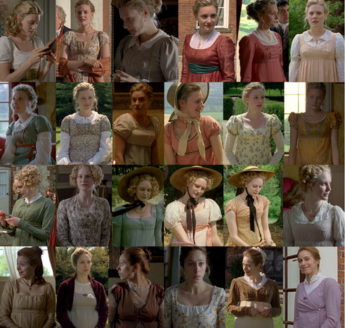
Emma’s daywear is full of warm and muted colors. Salmon and magenta are commonly seen. I love that most of Emma’s daywear consists of sleeveless or short-sleeved gowns with wide-sleeved linen blouses underneath. It’s not a commonly seen aesthetic so it feels light and fresh. My favorite of Emma’s daywear dresses is the pale yellow with purple floral print.
There’s one other in particular that I love.
Emma’s blue, sleeveless dress. I love this because of HOW OBVIOUSLY it’s a reference to this portrait of Charlotte, Princess of Wales. I mean...
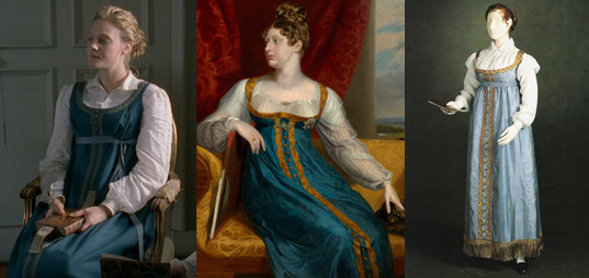
I’M NOT IMAGINING THIS, RIGHT? WHY DOES NO ONE TALK ABOUT THIS? This is a REAL dress. They still have this exact gown of Princess Charlotte’s. It’s on display. It’s faded, but it’s the same dress.
Harriet has a fresh and innocent green, white and purple color scheme with healthy doses of peach and pink showing. I particularly like her white and purple floral print dress.
Mrs. Weston’s color palette varies, but leans heavily on tans and purples, which is very flattering, I must say, to Johdi May’s coloring and is really refreshing for Mrs. Weston who seems to get stuck in pinks and yellows a lot. No idea what’s going on with the laced-front dress though? This doesn’t quite read as authentic to me, but I do like that her first dress seems to be an apron-front.
I know I already said that this is the worst Jane Fairfax Blue™ offender, but guys I can’t stress it enough. WE ARE 5/5 ON DAYWEAR HERE. LOOK AT THAT. (Also of note, Jane 5 is one of Gwyneth Paltrow’s dresses from the '96 Emma.)
Mrs. Elton seems, at all times, to be wearing some form of pink, but I think I’m right in saying that the white day dress with the rose patterned bodice under the yellow and pink spencer is one of Jane’s dresses from P&P ’80. Can anyone confirm that? They did sneak in some Mrs. Elton Orange™ though, for Box Hill, and it’s worth noting that Mrs. Elton is the only lady who’s appropriately dressed on that occasion.
Isabella gets some understated day gowns that are very nice and also VERY “Jane Austen” in the sense that I feel like Jane Austen herself might have worn them.
Miss Bates, unfortunately is slapped with brown at just about every turn, but at least her “Nice” day outfit has some subtle leaf patterns, which is refreshing. Also Mrs. Goddard has a slappin’ cap. Love that.
Also, Harriet’s Grecian costume for the painting (upper right hand corner). What can I say, but that I love it. I love that it hints at the neoclassical influences on Regency fashion too. This is my favorite interpretation of the painting too.
Evening Wear

You know what I love about this version? It’s the first version of Emma where her gown for the Crown in Ball isn’t WHITE. I know, I know white was fashionable, but it’s just… it’s nice for not EVERY gown in a ball scene to be plain white friggin muslin and also, it’s not one she’s ever worn before, which is great.
Harriet does have only white evening gowns but that’s okay. My only complaint is that, specifically on her Crown Inn dress and in a lot of her costumes in general, the waistline seems just a little low. Hmm. I really like the pale blue pattern on her first evening dress though.
Mrs. Weston though. Woo. Look at those. She has a dark chartreuse gown with black lace trim that any other version would have put on Mrs. Elton, so you know from the dark tones that she’s a bitch. Not so with Emma '09, and that’s good. And her teal dinner number is a favorite of mine. I never paid much attention to her green and gold ball gown but it has some really beautiful, subtle leaf or maybe peacock feather patterns on it and I love that. My only problem is that there seem to be some fit issues. She’s got muffin top way too often. Her orange evening dress is a bit of a dud though, firstly, because it has long sleeves (which is an evening gown no-no) and the fabric slaps a bit too much of sari fabric for my tastes.
Jane, not only is put in blue with both of her evening gowns (although one is so pale it borders on white), ONE of them is another Emma ’96 repeat and not only that, it’s one of Jane Fairfax’s dresses in that film! Perhaps that’s enough to make it an homage, and I have to say, I think Laura Pyper wore it better.
Miss Bates only has one evening wear ensemble, but at least it’s cream and not brown.
Mrs. Elton’s gowns are surprisingly understated, and yet still seem to be annoyingly fussy and, what’s better? They’re not sickly green. One of them is actually a very pleasant mint.
Outerwear
Outerwear is roundly pretty great here. Emma’s primary choice of color for spencers is emerald/evergreen and one of them is Elizabeth’s Bennet’s from the 1995 P&P (though to be honest, I think Jennifer Ehle filled it out better.) I do love Mrs. Elton’s pink and yellow number with the slashed sleeves. Jane Fairfax’s only spencer is, you guessed it, blue, but her friend Miss Campbell has a rather fun mauve one.
There’s no shortage of pelisses and redingotes either. Harriet can be seen in one borrowed from Elinor Dashwood in the '08 S&S, Mrs. Weston has a rather fabulous purple one which she wears with the most delicious looking hat I’ve ever seen.
Emma has two. The first one is a great magenta number with military braiding (and I think she wears with it one of the brown slouch hats that Kate Beckinsale wore in the same role) and while the other pelisse is brown, they had the sense not to make her wear a hat with it that was also brown. Instead, they gave her a contrasting color. Good on ya, Rosalind!
Speaking of hats, I don't often single them out for commentary, but I want to here because… the hat authenticity is… kinda spotty. Let me show you.
Okay first of all, Emma may be a teenager in this pic on the upper left, but she is not dressed formally enough for her sister’s wedding (which is what’s going on in this scene) but at least her hat is pretty good. You can see the ribbons are on the inside of the hat here, which is as it should be… but she never wears this hat again. At any point in the series. Instead, we next see her in the one on the upper right and ye gads this is atrocious. WHY IS HER HAT NOT PINNED ON? IT’S SLIDING DOWN THE BACK OF HER HEAD. SOMONE FIX IT. PLEASE. But wait, there’s more. This kills me because these bottom two are so similar to the one she wore earlier (the correct one) but crappier looking. Jeez.
This is not a hat. It’s a peanut. You know who doesn’t have this problem? Harriet. She only has one sun hat but at least it’s correct.
I also wanna touch briefly on this ^ costume continuity issue.
WTF is this? She’s in the hall, her ribbon is contoured to the line of her dress; she goes into the drawing room and… it isn’t anymore? Wha happun?
I took more menswear screencaps for this version than any other version. And that’s because the men just have more outfits that are, y’know, different from each other.
Mr. Knightley is as understated as ever, but I wanna highlight the first pic there and why I love it. This is Knightley’s first appearance in the series and it’s the perfect establishing shot that shows the viewer everything they need to know about Emma and Knightley’s relationship and how it has always been. He sort of materializes, out of focus in the background, but Emma immediately knows he’s there. And to accentuate how much Knightley is part of her home and scenery, his clothes (similar shades of pale tan, white and minty green to the wall behind him) almost camouflage him and make him seem at one with the moulding.
He also has a rather lovely blue evening waistcoat that I WISH I could have gotten better shot of (although I do believe it’s also worn by Henry Crawford in the '07 Mansfield Park, so for further reading…)
Mr. Weston finally gets to wear clothes that aren’t all brown! He only has ONE brown outfit. He gets PATTERNED waistcoats, one of them a rather spiffing blue and brown striped number. And he wears TROUSERS! Because he’s a gentleman, and he’s not that old and trousers are worn by fashionable gentlemen in this period!
You know who else gets to wear trousers and at least one fun waistcoat? Mr. Woodhouse. Check out that lovely Sunday Best™ waistcoat. The red striped one. That’s delightful.
John Knightley’s evening wear intrigues me. That’s a double-breasted jacket, and you know I’m not totally sure that’s very authentic for evening-wear of this period, but it is different. Unfortunately he also has a flared top hat and that is definitely not on for this period.
One of my favorite things about this version is that they don’t dress Mr. Elton as a clergyman all the time. Yes, he may be the vicar, but he’s also allowed to dress like a fashionable, handsome young man. So I’m really happy that he gets to flex his fashion muscles here.
And speaking of fashionable young men, FINALLY frank gets to be COLORFUL and his trousers are even tight enough. Both he AND Elton are often seen wearing TWO waistcoats, as I would expect them to, and even though Frank’s a dandy, he knows that flashiness is gauche so his pops of color are bright, but not in your face. His green and red waistcoats are always worn under more muted colors, and I just love it.
The only problems are… what’s with the turned-down waistcoat collars? There’s no precedent for this, in fact I think it’s directly contradictory to the style at the time, and also it makes the cravats look a bit unruly.
A Critique of Manners
A lot has been said about the manners in this adaption. Like, the actual manners, body language and facial expressions, specifically vis-à-vis Romola Garai.
And, oh yeah, there’s a lot to pick at here, but first I’d like to talk about the facial expressions.
I'm mostly gonna be talking out of my ass here, but this is my take, so if anyone can make a better argument against my points, I am listening, because I don't really like talking out of my ass and I like to be informed. That said...
I tend to be lenient on the… exaggerated facial expressions because, something I’ve noticed reading Austen’s works through the last several months is that Austen is very descriptive when it comes to facial expressions and I just find it hard to believe that people in the Regency Era never made exaggerated expressions like this.
I’ve heard a lot about how Garai’s Emma is not dignified or lady-like. But let’s think about the context of Emma Woodhouse – she’s never been in society. She’s only had a governess to teach her, and we know Emma’s always been sort of averse to being told what she can and can’t do. Emma is the highest ranking woman in her social circle (barring Isabella’s occasional presence). Emma doesn’t have to be ladylike. At 21, she’s already her local Lady Catherine. She puts a lot of stock in her position in society but, as Mrs. Elton will be the first to hypocritically point out, she’s very poorly behaved. I'd be very curious to see what would happen if Emma went to London for the season. Probably, she'd be seen, comparatively, as a country bumpkin. Can you imagine how she might get on in a sea of accomplished young ladies? She can barely handle having ONE rival with any kind of grace.
Austen never describes bodily movements of the kind we’re looking at when we watch adaptations, so why not have Emma’s body-language be un-ladylike in the conventional sense of the time? I’m not saying this to excuse the absolutely inexcusable (Frank’s head in her lap, kneeling on the sofa backwards etc.), but while Emma’s mannerisms aren’t exactly ladylike for her time, they’re not overtly masculine either (which was one of my biggest problem with Death Comes to Pemberly for example.)
Yes, there’s an ideal for manners. But we know real people didn’t always follow those ideals. In dancing for example, many dancing guidebooks of the day were full of repeated instructions not to be too loud or rambunctious when dancing. What this tells us is that people were doing just that, and probably quite a bit, too. I think that, while taking societal strictures into account, we shouldn’t totally discount the idea that people in the Regency weren’t really that different from us, and young people especially.
Now I’ve already mentioned some of the inexcusable aspects of interaction in this adaptation and they’re so notorious at this point, I don’t think that I really need to go over them much here. Although I will say: is it ridiculous to have Frank Churchill put his head in Emma’s lap? Yes. Did it make me more viscerally uncomfortable with the situation on Box Hill than any other version? Yes.
I was like, 14 when I watched this the first time. This was an effective way to telegraph to young people like me that Emma is being extremely inappropriate here in a way that no other version really managed to, even when I watched them when I was older and understood the period more. I’m far more acquainted with Regency manners than I was then, but to be honest – if they had been accurate with the manners here, when I was 14 I would not have understood what the big deal was. Is there merit in circumventing historical accuracy in favor of reaching a less-informed but still-interested audience? Yes, I think so. There were three other versions of this, at that point, that did this scene with more or less pristine manners. Not every version has to follow the manners of the time to-the-letter to be good. That’s my feeling on the matter.
There are things that do really bother me though. Like the idea that Harriet Smith doesn’t know how to spoon soup, for instance. As I said in my review for the Miramax version, table manners are pretty basic, there’s no reason Mrs. Goddard wouldn’t have taught Harriet this. It does provide a good moment to show Emma tacitly coaching Harriet and showing the trajectory in which this relationship will go, but personally I don’t think it was necessary—there are plenty of other ways that could be done.
Also: kids at the dinner table? I know this is part of building the familial atmosphere but it really does annoy me, because apart from building the familial atmosphere (which they do very well and frequently in other ways) it really didn’t need to happen, and it doesn’t add anything.
The Heart of Highbury
So, as I’ve hinted at throughout this review, the bread and butter of this adaptation of Emma is emotion. This version goes hard and heavy on showingthe relationships – Emma’s relationships with Mrs. Weston, Mr. Knightley, her father, her sister, her brother-in-law, Miss Bates; Jane’s relationship with Frank; Frank’s relationship with his father; The John Knightleys’ home life – and it illustrates things that can be surmised from just reading the story, but really draws your attention to them in ways that other adaptations just don’t.
It does this from the very beginning with the prologue which explains in detail (not just in quick exposition between characters) how Jane and Frank were separated from their families at young ages. We know now, from psychological study, that being taken away from their primary caretakers during their formative years is one of the most psychologically traumatizing things for a child. This is deeply important context which is explained in detail by the narrator in 2-3 large pages (in my Barnes & Noble anthology) in the book.
In the featurette on the houses, they talk particularly about Hartfield and the Woodhouses being the heart of Highbury and how they particularly wanted it to feel homey because Hartfield is Emma’s house and they wanted the audience to feel why everyone is so drawn to it, and to Emma; to me that is what they did with the whole adaptation in microcosm.
I usually talk a bit about the dancing and I'm going to here as well because this is maybe the most special dance scene in any Austen for me. Of course I'm going to link to Tea with Cassiane as usual because she knows what she's talking about and I don't. But I wanna add some comments. She gives this a pretty low rating in spite of a generally favorable commentary because of two big oopsies, the circle dance formation is one, and the other is I believe, an issue with the style of dance not matching the tune in Emma's dance with Knightley. Throwing out any objective technical analysis though, this is my favorite Ball in any Austen and it all comes down to the cornerstone of this adaptation--emotion.
All of the songs and dances were original compositions and choreography made for this adaptation. So they're not period per se, but the tunes at least are representative of how Regency dance music should sound. These dances are upbeat, and lively and, damn they look like fun. Everyone is excited here and it makes me understand why dancing was such a big thing. Best of all that excitement adds to the emotional charge of the scene. "The Ship's Cook" is the most fast paced dance and I'm glad they made this the dance where Elton snubs Harriet because it really hits for me just what Harriet would be missing out on if Knightley wasn't so fucking aptly named. In all other versions you get the insult, but the dance that's taking place is usually a Baroque walker so it doesn't seem terribly like she's missing out on much. Here, this is like not getting picked for kickball-- not only is it a slight that no one wants you on their team, but you miss out on even playing the game. Harriet looks so lonely, and her feeling of being out of place rolls off of Louise Dylan so forcefully it chokes me up just thinking about it because I've been there, man. I feel this shit. *dabs eyes*. Ahem. So, yes, when Knightley engages her for the dance the excitement the viewer feels is that much more forceful and Harriet's exuberantly starting to jump in when the timing is off and Knightley gently pulling her back, it just hits me in the feels center, guys. (I wanna take a moment to give a shout out to every camp counselor who ever partnered with me for any game at summer camp.) Emma's reaction too, is gold. Her genuine relief at Knightley swooping in is one of those great reminders that Emma is Harriet's friend, and she does care about her.
Finally on the dancing front, I wanna talk about Emma's dance with Knightley and why I prefer it to the one in the 2020 version. I already talked about this a bit in the 2020 review, so I'm gonna try and keep it brief. That shouldn't be too hard, because I'm probably mostly going to repeat a lot of what I've already said about Emma and Knightley in this version as a whole.
The big thing everyone loves about the Crown Inn dance in the 2020 is the yearning, the sexual tension, the quivering touches etc. Don't get me wrong, I LOVE all of those things but... not all the time. Not in everything, and definitely not in Emma. Because Emma, to me, isn't about repressed sexuality or heated tension or seething passion. Emma and Knightley are the opposite of that, to me, really. One of my mutuals put it best, I think: "Emma and Knightley are more suited to stolen glances than hot touches."
In Part 1 I talked about how Knightley is Emma's comfort object. When Emma is out of sorts, Knightley re-centers her. It helps set up, and puts emphasis on, the crisis of the story in the last act--Emma not knowing what she has until [she thinks] she's lost it. Emma and Knightley are Friends to Lovers done as it should be. She is already so comfortable with him she doesn't even realize her own feelings. She just feels right with Knightley and that's what this dance is here to show you--a foreshadowing of matrimonial harmony.
The dance itself, of course, is always up to interpretation, because Austen never describes how it goes, just that Knightley asks Emma to dance and Knightley doesn't dance (barring charitable causes). If you prefer the sexual tension take, if that, to you is an improvement on Austen's story and gives you what you've always felt was missing, I'm glad that there is a version now that gives you what you've been looking for, but for me, I think the 09 approach hits closer their dynamic in the book.
Now do I do think the Emphasis on emotion maybe went a little too earnest in some places in this adaptation? Maybe. Just a little.
In my last review (1972) I went on a rather lengthy tirade about the scene where they turn Emma’s appeals to Harriet to exert herself and move on following Mr. Elton’s marriage into Emma guilting Harriet into thinking she’s a bad friend for being heartbroken and then throwing her into the situation most likely to rub salt in that particular wound.
In this version, while I love the emphasis they put on the stress Emma puts on her own guilt for being the reason for Harriet’s situation in the first place, I think it’s maybe a little too… much.
That’s the only way I can put it. I know I’ve just said that I think there should be a bit more expressiveness in period drama, but this doesn’t quite match the way I read it (Emma’s a bit less desperate in Austen’s prose. Very dedicated to helping Harriet feel better, but just a skosh more composed). I think she’s even crying in this scene.
While we’re here let’s go over to Box Hill ONE. MORE. TIME.
First of all, this is where this screenplay shines, in my opinion. This is the big turning point in the story and as such, should be a touchstone for the judgment of any adaptation. This sequence in the 2009 version is a perfect crystallization of everything I love about this version—namely that this is the version that, to me, most feels like someone read the book thoroughly, paid attention to what Austen was describing and then actually tried to convey it on screen. A lot of other versions sort of feel (to me), like the director glanced at the page and said “here’s what I want to convey in my version”. Insofar as making a piece of art goes, that’s good. Directors are artists as much as painters are and movies are their canvass, but it’s seldom that you find a director who honestly wants to hit as close to the author intent as possible and this Box Hill sequence makes me feel like that’s what Jim O’Hanlon was going for. I have the book open next to me as I write this and it’s shocking to me how minutely the atmosphere described in the book is conveyed here. Most of all, the fact that Emma’s insulting Miss Bates is not the only thing faux pas she makes here. Box Hill as a whole is a disaster, and it’s largely because of Frank.
“When they all sat down it was better; to [Emma’s] taste, a great deal better, for Frank Churchill grew talkative and gay, making her his first object. To amuse her, and to be agreeable in her eyes, seemed to be all that he cared for—and Emma, glad to be enlivened, and not sorry to be flattered, was gay and easy too, and gave him all the friendly encouragement, the admission to be gallant, which she had ever given in the first and most animating period of their acquaintance; but which now, in her own estimation, meant nothing, though in the judgment of most people looking on it must have had such an appearance as no English word but flirtation could very well describe. “Mr. Frank Churchill and Miss Woodhouse flirted excessively.” They were laying themselves open to that very phrase—and to having it sent off in a letter to Maple Grove by one lady, to Ireland by another. Not that Emma was gay and thoughtless from any real felicity; it was rather because she felt less happy than she expected. She laughed because she was disappointed…” --Emma, Chapter 43
Most other versions rush through Frank’s “excessive” flirting with Emma (Right in front of Jane) to get to “Three Things Very Dull Indeed” as fast as possible, and yes that’s the crowning horror of Box Hill, but there’s a very intricate setting here, too, and this version has the time to lay back and let it all unfold in the oppressive discomfort of an English summer day.
Even better than all of that though is Knightley confronting Emma after it all goes down. This treatment is neither plaintive, nor aggressive as it was in ‘96 and ‘97 respectively. I’ve already extolled the virtues of Johnny Flynn’s Box Hill rebuke, but for a change I’m not going to zero in on Miller’s performance which is, at least as good as Flynn’s, but on Romola Garai’s, which I find superior to Anya Taylor Joy’s. Specifically, her reaction once she’s alone.
ATJ in the 2020 version immediately breaks down sobbing and it’s hard for me to feel that she’s sobbing for “anger against herself, mortification, and deep concern” or that there’s much self-reflection going on there. To me it rather just feels like she’s crying because she got shouted at. The theatrics of it, to me, feel childish and self-centered.
I don’t feel that with Garai’s performance.
“She was vexed beyond what could have been expressed—almost beyond what she could conceal. Never had she felt so agitated, mortified, grieved, at any circumstance in her life. She was most forcibly struck . . . How could she have exposed herself to such ill opinion in anyone she valued! And how to suffer him to leave her without saying one word of gratitude, of concurrence, of common kindness!
Time did not compose her…” --Emma, Chapter 43
Of course one can make the case that Emma's reaction should be a bit childish because Emma is an immature character, but that's the thing--I can agree with you anywhere else in this story but this is Emma's maturing moment. This is her turning point as a character. It's where we should see her reactions shift from the same childish denial we're used to seeing when Knightley scolds her, because this is different. It's not the usual brushing off of big brother Knightley, this is a young woman reacting to an esteemed friend pointing out how abhorrently inappropriate she's been and her having to admit that to herself.
I didn't really want to drag comparisons to the 2020 film into this, not on this scale at least, but this just jumped out at me the last time I watched the new film and I have to express it somewhere.
What I see in Garai’s performance is desolation and mortification. That shocked tearfulness of knowing you’ve been justly reproached for wrongdoing, but being too frozen in a pretense of composure to actually cry about it until you’re quite sure that no one will see you. And especially when it’s someone you esteem rebuking you, the horror of them leaving before you can admit that they’re right. There’s so much more depth here, I think, and I can’t even quite express what it makes me feel.
The aspect of time not composing her is another thing that they decided to put stress on in this version. Emma looks fucked up in the following scenes. When she goes to see Miss Bates, she clearly either hasn’t slept or has slept very badly. I feel like this is maybe an anticlimactic conclusion to this section but I’m afraid I’m very close to reaching incoherence, so I’m just gonna leave it here.
My absolute favoritest thing about this version though—something that sets it apart from ALL other versions and even adaptations of other Austen stories—is the inclusion of the post-confession conversation.
This is something of a trope in Austen books but it very rarely finds its way into adaptations: confessions of love are out of the way, the hero and heroine settle into an easy an comfortable conversation, glowing with happiness as they explain and laugh over their actions and misinterpretations of each other’s choices. It happens in Pride and Prejudice, in Persuasion, and yes, in Emma. This is the only Austen adaptation, that I've seen, to include this kind of conversation in any kind of detail. The 1995 Pride and Prejudice alludes to the corresponding scene in it its source material, but the lines pulled from it get tossed into the confession scene itself and then it flies through to get to the obligatory wedding—a side effect of rushing through endings, a convention I’m rather tired of.
Emma (2009) takes its time with this, as with all other aspects of this adaptation. For a version that’s so full of energy, its pacing is extremely laid back and comfortable, without dragging. When you hear the gentle musical swell and Emma and Knightley have their kiss (this whole confession sequence is so sweet and wonderful in its own right), you expect that to be it. But no, we cut to them, the picture of contented happiness, sitting together on a bench overlooking Hartfield’s garden, just talking and enjoying being together, with no teasing, no pretense. If Jane Austen stories emphasize anything, it’s the importance of communication in relationships, and I think that’s maybe why she made it a point in almost every story to show her characters communicating their feelings in words, even after all the conflict has been resolved. This is my favorite scene in the whole series (In case it being my header image didn’t make that obvious.)
This is followed rather promptly by a cut to the next day, with Emma bursting in to Donwell in hysterics about how they can’t be married because she won’t leave her father alone.
This is one of those maybe over-the-top choices that a lot of people don’t like, but guys, it was so funny to me when I was fourteen and it still makes me laugh. It might seem outlandish, but to me it’s just the emphasis on personal relationships and emotion coming through again and it always makes me smile.
Final Thoughts
It’s hard for me to give a proper round up of my feelings for this section because I think I’ve poured just about all of my feelings on each aspect into its dedicated sections.
At the end of the day, the only thing that really disappoints me about this version is the number of missed opportunities there are here. One of my favorite parts of reading Austen is when I run across a line in dialogue or narrative that just… slaps. But they never make it into the adaptations. Emma is full of them and I just wish that Sandy Welch could have taken an opportunity to slip a few of them in.
In summary, I think this is a wonderful, heartfelt adaptation aimed at getting to the emotional heart of a story that often gets caught up in the Mean Girl-ness of its main character than the coming of age story that it is. It's one of my favorite period dramas because it's one of the few that really captures the spirit of the source material as it's always felt to me. There's really only two other period dramas that I esteem on the same level as this, and they're North & South (2004) and Jane Eyre (2011) and it's for the same reasons; because they impact me deeply on an emotional level--which is what art is supposed to do--because of how well it captures the essence of the story that I know and love.
So did I succeed in a more objective review of Emma 2009? I' feel like probably not. But I tried my best. It’s so hard to be objective about something that makes you as happy as this adaptation makes me.
Ribbon Rating: Most Agreeable (83 Ribbons)
Tone: 10
Casting: 9
Acting: 9
Scripting: 7
Pacing: 10
Cinematography: 7
Setting: 9
Costumes: 6
Music: 8
Book Accuracy: 8
#emma 2009#emma woodhouse#mr. knightley#jane austen#jane austen emma#romola garai#jonny lee miller#period dramas#regency
40 notes
·
View notes
Note
Hey I can't find this in your FAQ so sorry if it's been asked before! Your traditional art is so stunning and vibrant, would you happen to have any brand recommendations for people trying to get into painting? Maybe specific gouche paint, brushes, papers etc. Thank you so much and have a nice day!
no one has ever asked me this before because this is like the first time ive started putting traditional art on my blog! LOL umm to be honest I’m very far from pro on this front, most of my knowledge comes from a handful of classes I didn’t pay a lot of attention to and lots of youtube videos but here’s my recommendations:
Paint

A lot of my paints are winsor newton designer’s gouache because this is what my teachers made me buy when I was a freshman at art school LOL. it’s definitely kind of pricey, I think it’s like $10.99 for a tube which I was NOT a fan of as a college student and is still not my favorite thing now. But they’re overall worth the price if you really want solid, high quality opaque paints. Though I’ve heard their student grade winton paints are decent as well?
I’ve heard less good things about brands like reeves and artist loft... but I think turner is alright? m.graham is supposedly great.
I also bought a set of holbein acryla gouache when it was discounted on amazon a while ago and have found it very solid. One thing you have to know about acryla gouache is that it uses a binder more like acrylic paint (hence the name acryla). Paints are made out of pigment + binder and most gouache is essentially watercolor but with extra pigment/chalk to make it opaque - the binder is water soluble so these paints can be reactivated with water. Acryla gouache is NOT water soluble when dry and it dries pretty fast so it’s overall less flexible. But other than that you can pretty much treat it like any other gouache and I find they keep a little better too, less likely to get gunky or stiff.
All paint brands have a handful of starter packs which are slightly discounted but if you want to build your own starting palette I’d say get a warm and cool tint of all the primaries, get a lot of white (working with gouache somehow involves a lot of mixing with white lol), and get a brown, maybe like burnt sienna or raw umber for underpaintings. No need to get a black, mixing darks builds character, looks better, and having one out of the tube can become a crutch. If you find a white watercolor paint tube that’s cheaper you can buy that instead of a gouache white. Again, they have pretty much the same make-up. And white paints are generally opaque enough that the composition between gouache/watercolor shouldn’t matter too much.
I’ve never used a block tray of gouache. Like those paints that come in little blocks in a tray? I know there's a bunch out there but I’ve never used them and I don’t know anyone else who does so I have no opinion on them.
Brushes
I’ve been kind of exploring this myself. I recently bought a cheap set of flat brushes off amazon LOL and I like them a lot?
Theyre probably not The Best or anything but I found flat brushes suit gouache plein air painting really well because its suits the kind of color blocking shapes I want to make. Also these had the right handle length to fit in my painting bag. That’s like the main reason I chose them tbh.
Honestly a lot of my art supplies philosophy is “give it a whirl with whatever you have lying around and when it feels like you're missing something specific keep an eye out for when that stuff goes on sale”
Paper
GOTTA BE HONEST I’m using cheapo paper. Because I’m making these paintings half for study and half to give my parents something to hang in the living room.
You can actually see some of them curling in on themselves here lol. If you’ve seen the sketchbook I’m holding in any of my pics of paintings it’s one of the canson mixed media books.

and its FINE... I wouldn’t necessarily recommend it lol.. I like that the texture is very fine but it doesn’t hold a lot of water and definitely distorts. Also I keep ripping off the surface with painters tape but that might just be on me. Oh buy artist tape. Just because its so satisfying to have clean edges.
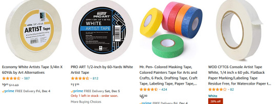
I’m using painters tape instead of artist tape because I found it in the basement but if youre buying supplies buy artist tape because it’ll be kinder to your paper.
SPEAKING OF PAPER.
I guess anything heavyweight for watercolor/mixed media will be fine? some people like a lot of texture but if you’re painting small you might want to avoid it and pick hot press over cold press. Honestly I feel like a lot of this is going to depend on what your specific needs are.. how big do you want the paper to be.. do you want a sketchbook or would you rather carry around loose paper... etc. Maybe go to an art store and touch all their paper. I feel like its easier to understand sizes and texture when you’re seeing it physically.
When I go on a trip, I normally bring a softcover heavyweight stillman & birn sketchbook because I tend to obliterate metal spiral books in my bag LOL. Also I don’t rip any pages out of my travel sketchbooks so I don’t need perforation or anything. Also they go on sale a lot in the art store I go to haha. I havent used gouache extensively in it but it takes inkwash/maker pretty well.

On the higher end, I personally haven’t used it that much but my friends who do traditional illustration professionally swear by arches watercolor paper. It comes in lots of different sizes.
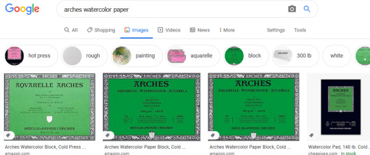
Whatever you use, if you really want it to lie flat you’re gonna want to soak and stretch it on a board but I don’t bother with that because I am lazy.
Palette
You didn’t ask about palette but I’m taking the opportunity to be a shill because I personally use a sta-wet palette and I LOVE it.

One of the biggest frustrations about gouache for me was how quickly it dries after it leaves the tube. And even if you can reawaken it with water its not quite the same? and consistency is SO important when it comes to applying gouache so I don’t want to be over-watering my paint.. ugh. Anyways, I don’t have to worry about that with the sta-wet palette and really its been a game changer for me. sta-wet is a brand name but there are a bunch of other wet palettes not by masterson that I’m sure are just as good. I mean, it’s just a box with a sponge basically, that can’t be hard to replicate.
The only thing - and I personally have not had this issue but I have friends who have - is that if you leave it wet for too long it could grow mold? or a mouldy smell? Just wash your palette with soap and don’t leave it for weeks on end and it should be fine.
If you’re not feeling a palette that’s always moist, the best palette I used in school was a simple glass palette. you can buy one I guess but it’s so easy to DIY, I think the way we did it in school is getting a piece of glass and mdf from the hardware store cut the same size and then duct taped them together on the sides so it wouldn’t be sharp.
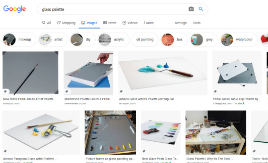
costs like nothing.
what else...get a palette knife if you like to mix paints? and like to save paints... mixing with the brush means you lose paint in your brush in the mixing process so a knife is a good way to maximize that process. I don’t use it much but sometime if I have to mix a lot of one color I’ll pull it out of my bag.
I don’t know anything about easels, I sit on the dirty ground like a gremlin when I paint.
Ok yeah that’s all the supplies tips I have. hope some of it was helpful! always try to save money with art supplies, I think. Especially if you’re just starting out - it’s less stressful to use cheap supplies too lol. Good luck! Happy painting!
89 notes
·
View notes
Last Seen Blogs
yaoi-life2021
Wicked Readings

kira-new-world
Kira Nigthmare

chaotic-archaeologist
Diggin' Them Holes
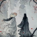
staring-at-a-burning-river
안녕, 낯선 사람

just--wanky
Come Around To Me