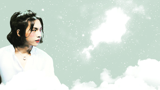
#i found a texture brush i like and a way to import reference photos
Text

"Can you be my Buir too?"
A very late happy birthday to Twitch. Still can't really draw but I'm getting there. From the fic We're a Family Now
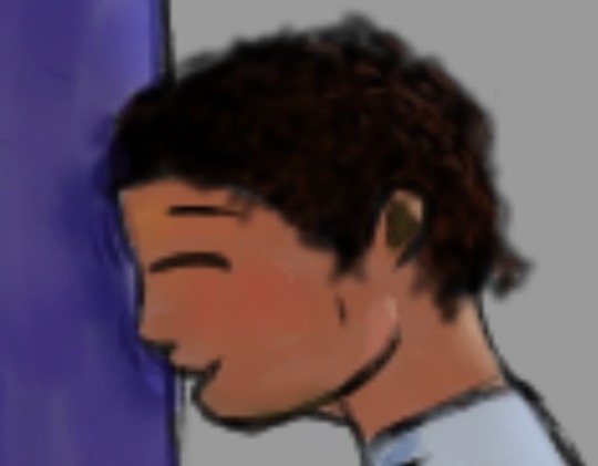
#twitch my beloved#captain rex#in this au Twitch is five#and yes Rex does become his buir :)#i found a texture brush i like and a way to import reference photos#so i might be doing a bit more drawing#art? art#very happy with Twitchs hair
28 notes
·
View notes
Text
Art Advice #4 - A Beginner’s Guide to Digital Art
Hi all!
This weeks entry into my Art Advice tag, where I offer various advice for artists of any skill level, is about digital art! Now, I am by no means an expert at digital (I’ve been doing it for nearly 8 years at this point and that is almost entirely self taught), but I have picked up a few pointers in that time which will hopefully help anyone just starting out!
(this blogpost is a little over 2000 words long btw)
A Beginner’s Guide to Digital Art
I know that the world of digital art has changed drastically in the 8 odd years since I started, but I’d still say that some of the options I started out with will be just as good for anyone who’s starting out now!
As always, I’ll be splitting this into sections to make it easier for you to navigate this post!
Part 1 - Equipment/Hardware
There are a lot of drawing tablet options on the market at the moment, and I’m not going to pretend that I know anything about half of them lol. But I think for a beginner, don’t worry about going for the most expensive option, even if the reviews are really good or your favourite artist uses it, especially if it is way above your budget!
An important thing to know is that there are two types of tablet. One is the plug-in kind. These are essentially a pad which you plug into your laptop or computer and draw on that whilst looking at the screen (they basically work the same way as a plug in mouse works). The other kind is the screen variety, which is a lot more like what most of us know as ‘tablets’ nowadays. And you draw directly onto the screen.
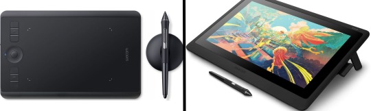
(a plug-in vs on screen tablet, both from Wacom)
Now, as for choosing between these, it is honestly a personal choice. But I’d say if you’re just wanting to try digital and you’re on a budget, a plug-in tablet can be really useful since it gets you used to the mechanics of what digital is like, and they are often significantly cheaper than the screen alternatives. I would say that plug-in tablets are a big learning curve, especially if you’re used to doing traditional stuff, but I do know a lot of professional artists who still use this kind of tablet when doing their work, so if it’s something you can get used to I would definitely consider it! Also, they’re often a lot more portable than some screen tablets! The first one I had was a Huion (a model so old that I can’t even find a link to it now lol), and I also know that Wacom are a well known brand that do some decent plug-in tablet. I’d recommend you do your own research on other brands and options, though!
Screen tablets are often a lot more expensive, but if you’re used to traditional art, they are a lot easier to get a handle of! But I know if you already have something like an iPad, or other general use tablets, then they offer apps that you can use to draw on (as well as things like the Apple pen, or other stylus’). The big difference between using these general tablets and ones specifically designed for drawing is pretty much purely a personal choice. I personally prefer the bigger screen of my XP-Pen tablet, along with a special screen protector that removes the shininess of the tablet screen and makes it feel more like ‘paper’ over when I used a general use tablet it draw. But if you already have an iPad, or something similar, then it’s honestly a really great starting point!
I think it’s important for me to mention that you don’t need fancy equipment to be an artist. The incredible Elicia Donze has revealed countless times how she has very basic equipment but still manages to produce the most stunning artworks! All you really need is some kind of drawing apparatus and a lot of patience lol! Getting good at any kind of art takes a lot of time and effort, but I would definitely say it’s worth it when you’re able to look back at your progress!
Part 2 - Software/Drawing Programs
Much like with the hardware discussion, choosing which program to use is entirely down to personal preference. I personally have never really liked Photoshop purely because it’s really complicated, but I know so many artists swear by it.
I think the main aspect to consider when you’re starting out is whether you want to pay for a program. Software like Photoshop, Clip Studio Paint and Procreate are some of the popular ones I hear about a lot of people using, but all require you to purchase or subscribe to them. So if you’re young or on a very tight budget, I’d honestly recommend the free alternative versions of these, such as Krita (Krita is quite a large program, but it has a lot of really awesome features and is very similar to Photoshop!), Gimp (this one is similar to Krita, but has slightly less options, I’d honestly recommend Gimp for anyone who does photo editing though!) or FireAlpaca (this is the one I use, by the way and it’s a pretty simple program, but has a lot of fantastic features and is perfect for how I work!). These don’t have as many features as some of the paid alternatives, but I honestly think all you really need to start digital art is some kind of ‘canvas’ and set of brushes!
Another great free program for beginners I’d recommend is MyPaint, which is great for doodling and just getting used to how digital art feels in comparison to traditional! It also has a bunch of ‘traditional style’ brushes, to make it look like charcoal or watercolour (which I’m sure the paid alternatives have too, but it’s always better when it’s free, I find lol...)

(this is an example of a drawing I did on MyPaint using the ‘charcoal’ effect brush!)
Most of the sites are pretty self explanatory, with sections dedicated to different brushes (I’ll go into the types of brushes later on in this post btw!), adjusting brush size, shape and opacity, a colour wheel, etc. You also have a section dedicated to ‘layers’ (another thing I’ll go into more detail later), and various ‘filters’ and editing options and effects you can add to your work to make it more interesting!
I’d really just recommend playing around with programs until you find your one!
Part 3 - The Pros of Digital Art!
I realise this section should probably earlier in this blog post lol, but I kinda wanted to go into what digital art can achieve in comparison to traditional art, and how beginner artists can utilise this!
I definitely didn’t take advantage of certain aspects of digital art when I first got into it, and they’re things that would have definitely made my life a whole lot easier lol!
Digital art allows you to tweak drawings as you do them. So if you accidentally drew the eye too far to the right, then you can easily move it to the right place. (I usually do this by selecting whichever area is wrong, cutting it out and then pasting it into a new area... And yes, there is probably a better and quick way of doing this but...I haven’t found that way yet lol...). And I honestly think that this has allowed me to look a lot more at a reference image in order to figure out where I’ve gone wrong with a drawing! Whereas with traditional art, I usually spend so long trying to get an eye right, that even if it’s slightly in the wrong place, I don’t want to completely redo that section. Digital allows you to completely rub out sections without leaving indents, which is honestly such a saving grace!
Another pro of digital is the Undo/Ctrl Z function! This means you can easily go back to before you made a major mistake with just a click of Ctrl Z... Though I have to say that this function has honestly ruined traditional art for me... Oh what wouldn’t I give for a real life Ctrl Z... But yeah, this is a great part of digital art and definitely something you will grow to love lol!
Another great thing about digital is that it allows you to flip and turn a canvas as you’re drawing on it. I spent a lot of time trying to turn my tablet around in order to draw certain parts of a piece before I realised you can turn the canvas itself without having to move yourself or your tablet!
Layers are another part of digital that can be super useful, and I have to be honest but I don’t really use them a lot. I know a lot of artists create layers for every section of their artworks (so, one for the linework, one for colouring, a separate one for the background, etc etc...). And there’s something really great about being able to paint without worrying about smudging into a previous section of the painting. This works well for my work since I do a lot of bright backgrounds. I also often create a lot of ‘versions’ of my works, so it’s useful to be able to change the background without affecting the main figure of the piece! (I have to say that I often work in one big layer when I’m doing paintings, just because I like how it feels more like ‘traditional’ art that way, but layers are such a brilliant tool, and definitely something you should play around with!)
The eyedropper tool is another one that is really useful! Although I never colour pick from my reference photos, I know some artists find this useful when they were just starting out (especially if you’re not sure what colour to make shadows or how to mix skin tones, etc etc). The eyedropper basically means you don’t need to mix your colours every time
Part 4 - Just some other things I wish I had known about when I was starting out lol...
This last section is just dedicated to a few things that I would have liked to have known when I was just starting out all those years ago.
First one is fluffy/textured brushes!
I spent most of my art life from 2013 until 2016 using ‘round’ brushes which are notoriously hard to blend with, so I’d recommend either downloading some fluffy/textured brushes (DeviantArt was where I got mine from a few years back, but there are probably other places you can get them for free too!) to your program of choice, since most of the programs I’ve used haven’t had fluffy/textured brushes as pre-set.
I may make another post about how I blend in my artworks if that’s something people would be interested in?
(this is an example of textured brush blending vs round brush blending... I usually opt for round brushes for rougher blending styles and the textured brushes for more smooth and ‘realistic’ blending... for a lot of pieces, though, I use both brushes (the round brushes are good for details!) in the same way that you use different sized brushes for real paintings!)
The next thing I wish I’d discovered earlier is the Brush Stabiliser option. Some programs may do this automatically, but the one I use (FireAlpaca) requires you to manually change the amount of stabilising you have on your brush. This is particularly useful if you want to draw neat lines or straight lines (the stabiliser essentially slows down the ‘ink’ as you’re drawing). I only recently started using the stabiliser, and although I still like having it mostly turned ‘off’ for doing sketchy work, it does make doing line work a lot easier, and also gives pieces a more polished look!
Next advice is to explore all the options you can in whatever program you use!
I feel like with certain programs, you can get overwhelmed by choice and you end up just using a few of the functions. But I’d really recommend just playing around with these programs, trying all the filters and editing options to get used to how the program works. You can often find interesting ways to adjust your artworks this way! In a way I’d recommend this way of working more than finding tutorials made by other people... Unless there’s a specific function you want to learn how to do, just having fun with digital art is a major part of it’s appeal to me!
~
There are probably a lot of other options I could go into, but this is already over 2000 words long, so I’ll leave it here for now lol! (I may do a part 2 though so... keep a look out for that!)
As always, if you have any questions to things I’ve said here, or are just looking for more advice, don’t hesitate to message me!
And if you like my work on here (art & blog posts) feel free to support me on my Ko-Fi! <3
#art advice#digital art#art advice for beginners#digital art for beginners#artist advice#digital art tips#artists on tumblr#just want to say again that i am not an expert at this at ALL lol#i just want to offer some really basic advice to anyone interested in starting out with digital!
92 notes
·
View notes
Text
[CN] Lucien’s Warm Morning Date (Eng Translation)
🍒 Warning: This post contains detailed spoilers for a date which has not been released in English servers! 🍒
There is a call BEFORE this date which is important in establishing context: here

Valentine’s 2020 Collection: Gavin // Kiro // Victor
The date begins with MC waking up in Lucien’s bed 👀
She starts recalling the events of the night before...
Turns out the drainage pipe in her house suddenly broke, and the person responsible for maintenance can only make it the next day.
Lucien: What do you plan to do tonight? If you don’t mind, you can spend the night here.
MC: No need, no need. I’ll feel even worse like this…
Lucien: What if I say that this is my form of gratitude for the cherries you gave me?
MC: I…
I look at Lucien’s smiling eyes and can’t seem to find a reason to refuse. I give him a light nod.
MC: Lucien, thank you! I’ll temporarily borrow your sofa for a night then!
Following the direction of my finger, Lucien looks at the long sofa in the living room and furrows his brows slightly.
Lucien: You should sleep in the bedroom.
MC: How could I do that! It’s unreasonable for the owner of the house to sleep in the living room.
Lucien: Who said that I was going to sleep in the living room?
Lucien leans over, a hint of slyness flashing across his eyes. Light laughter enters my ears.
Lucien: I always can’t help but tease you. Did you forget that my house has other guest rooms?
Back in the present, MC leaves the bedroom to find Lucien sleeping on the living room sofa
There’s a cup of cold coffee next to him, so MC guesses that he woke up in the middle of the night to work
She takes a look at one of the books on the table:
MC: “...tactile sensibility is located throughout the body. The level of responsiveness differs... this could be due to the differing distribution of nerves...” Response? Nerves? ...is this referring to the causal relationship between the two?
I speak softly, trying to continue exploring this uncharted territory.
“Every part of the skin has incredibly rich and keen sensitivity, and will cause...”
MC: Rich and keen sensitivity?
I lower my head and look at my own fingers. With a gentle rub, the smooth touch of the paper lingers on my fingertips.
I nod thoughtfully, and then touch Lucien’s sofa.
This time, the touch feels different from the book - it has a soft, suede texture.
As though conducting my own tiny experiment, I reach out to carefully feel the items in my surroundings.
The feeling of items which are usually taken for granted becomes interesting with my deliberate effort.
MC: What else can I test...
My eyes unconsciously drift over to Lucien. His breathing is as steady and even as always.
MC: As long as I don't wake him up...
Enraptured by an unknown emotion, I reach out to touch Lucien’s cheek lightly with a finger.
What travels from my fingertips is a soft touch different from all the other items.
My finger lingers a while longer before I carefully draw it back.
MC: ...Lucien?
I try calling him, but his eyes remain shut, and there are no signs of him waking up.
At that moment, an even bolder idea bubbles from my heart.
I bend down and lean closer to him, doing my best to control my increasingly nervous breathing. It’s as though every cell in my body is trembling from this small “adventure”.
Lucien’s eyelashes cast a faint shadow, and it moves in a regular pattern along with his breathing.
I purse my lips nervously. Even though I haven’t done anything yet, my cheeks heat up involuntarily.
It’s as though there are two contending voices in my head. I remain in this position, staring at him.
Lucien: Are you going to keep looking at me like that?
MC: ...!?
Lucien’s voice breaks my train of thought. My body has no time to react, and I remain in this posture, looking at him dazedly with wide eyes.
His eyes are clear and bright, without the slightest trace of tiredness or drowsiness.
The signal in my brain is finally restored. I snap out of my daze and stare at him, at a loss.
MC: When... when did you wake up!
Lucien: Hmm... from around the time you sat beside me.
MC: ...then why did you pretend to be asleep!
Lucien: I was too curious about what this inquisitive student wanted to do, so I chose to observe.
Lucien turns over, using both hands to prop himself up. He smiles and looks at me.
Lucien: What are you going to do next?

My pounding heartbeat renders me unable to calmly find a reasonable excuse.
MC: I... I just wanted to use this chance to take pictures of your sleeping face!
The hand I retracted digs into my pocket, and I realise that I had left my phone in the bedroom. In my panic, I can only extend both hands to form a picture frame pose.
Lucien nods his head thoughtfully, and the silhouette from the backlight casts him in a faint golden rim.
Lucien: Is that so? This is the first time I know that the photographer has to lean so close to observe the model.
MC: ...a detailed and comprehensive understanding of the model is necessary to produce good work!
Lucien: When you’re the one being photographed next time, I’ll definitely apply what I’ve learnt.
The corners of his lips lift, and his narrow eyes curve upwards.
MC: There wouldn’t be a next time!
Pretending to be annoyed, I reach to cover his mouth, but he breaks free with ease, and encases me in his arms.
The arms embrace me unhurriedly, forming a gentle, soft, and inescapable shackle.
The breath around my forehead tickles, and I don’t dare to lift my head to meet his eyes.
Lucien: It seems I should pretend to be asleep for a while longer, so I wouldn’t spoil this photographer’s plan of taking secret photos.
I lower my head, not knowing if the heat on my cheeks is a result of the sunlight from outside the window, or the warm breaths from his nose.
Lucien: However, this kind of morning is not bad.
His low voice enters my ears. Lucien lifts his hand and helps me tuck stray hair behind my ear.
Lucien: Good morning, MC.
After freshening up in the bathroom, MC heads to the kitchen to wash cherries
She's still blushing from earlier
The cooling touch of the cherries makes her think about how she almost touched Lucien’s lips just now
Lucien comes in to check on her
Lucien: So these are the “extremely sweet cherries” you mentioned yesterday?
Lucien mimics my tone, and his breath falls onto my ears, setting off a touch of warmth.
I clumsily pick out a cherry from the bowl, shake off water droplets gently, and lift my hand to bring it to Lucien’s mouth.
MC: If you don’t believe me, give it a try.
Lucien lowers his head, his hair brushing against my cheek. He opens his mouth slightly, and bites the cherry from my hand.
The tender touch is fleeting on my fingertips.
MC: ...how is it?
Lucien nods, but doesn’t give me an answer. There is a narrow light in his eyes.
Lucien: There is one thing I’m curious about. You’ve been touching different things since just now. Could you tell me why?
Following Lucien’s gaze, I lower my head to look at the cherry I have 'ravaged’ in my palm, and I react immediately.
MC: This... this is because...
Thinking back to what I did just now, my tone turns hesitant.
MC: Just now, I saw one of your reference books on how tactile sensibility is everywhere, so I got a little curious. I’ve never taken notice of the tactility of different objects, so I just... found myself wanting to give it a try.
Lucien: Are you very interested in this area of research?
MC: ...mm, you’re right! I might even find inspiration for a program from it.
Seeing me nod vigorously, the smile in Lucien’s eyes deepens. He asks me in a joking manner:
Lucien: Do you require any assistance from me? I might have a lot of reference books you may be interested in.
MC: I’ll have to trouble Professor Lucien then!
Lucien smiles while nodding, and doesn’t continue with his questions.
They sit together on the sofa and Lucien explains science stuff to her using the book she was reading just now
Brace yourself for Lucien’s science rant:
Lucien: The topic this time is the effects that physical contact via different parts of the body have on dopamine secretions in the brain. Also, whether dopamine can be used in reverse - to become feelings experienced by the body.
MC: Dopamine... feelings...?
Lucien: Mm. In our brain, there is a substance called dopamine. It is related to excitement, pleasure, and similar positive emotions.
The combination of unfamiliar and academic vocabulary leaves me wandering around in a cloudy mist.
Lucien smiles, unconsciously smoothening my furrowed brows. His voice softens.
Lucien: Just listening to the subject can be quite difficult for one to grapple with, but the concept itself is very easy to understand. Let me give you an example.
He takes up the blanket on the sofa, signalling me to give it a touch.
Perhaps due to the concentration of my senses, both my hands are covered with warm velvet, bringing with it more obvious comfort than ever before.
Lucien: Do you feel anything special?
MC: It’s very comfortable and makes me feel relaxed.
Lucien nods, reaching out to rub my hair out of habit. Then, following the curve of the back of my head, he strokes my neck.
The hand pausing on my neck is warm. The heat travels past my hair and onto my skin.
MC: This is even more comfortable...
The words are blurted out before I realise it.
Lucien is stunned for a moment, and there seems to be a different kind of light in his eyes.
His actions do not stop, and he continues caressing my neck, as though smoothening the hair of a cat.
Afraid that the topic would continue digressing to other places, I hurriedly pull us back to the academic problem we were discussing earlier.
MC: So these feelings are evoked because of dopamine secretions?
Lucien: You could understand it that way. Physical contact is one reason for dopamine secretions, so...
MC: It will cause people to feel pleasure!
Like a student rushing to answer questions in class, I complete Lucien’s sentence before he can finish.
It wasn’t so that I could be praised. It is only through this way that I can ignore our closing distance, and force myself to melt into the logic Lucien has combed through for me.
Lucien: Exactly. You learn very quickly.
Lucien looks at me, smiling and yet not smiling, and suddenly stops his movements.
Instead, he exerts more pressure and holds my hand.
Lucien: However, making contact with different areas channels different feelings. For instance, right now.
Sensing the pressure and warmth from his palm, my heart rate speeds up.
Perhaps due to the concentration of my senses, every action from Lucien makes me feel different from usual.
In contrast to how his touch made me feel relaxed earlier, his fingertips now render me unable to suppress my rapid heartbeat.
MC: It does feel different...
I cough lightly, and try my hardest to gather my messy thoughts.
MC: When there’s a different feeling, the brain would also release different feedback, right?
Lucien: Such an understanding is not wrong. Which is why I’m very curious - what are you feeling now?
I bite my tongue and look around, wanting to divert the topic.
MC: If dopamine secretions are unquantifiable, then what are these charts?
Lucien lowers his head, and the corner of his lips turn up with an almost undetectable smile.
As though nothing happened just now, his fingers casually point at the book.
Lucien: These charts record body temperature, breathing rates, and brain activity. This is done to turn subjective feelings into data. With such an explanation, do you find it less difficult to understand?
After saying this, Lucien taps my forehead lightly.
I unconsciously rub the areas he has touched, and I feel as though my senses have doubled in my brain.
Even this normal action leaves a strange warmth on my skin.
Perhaps due to extraordinary strong dopamine secretions, I hide this atypical feeling in my heart, and relish its aftertaste.
After this, MC reads books while Lucien works on his computer
She starts inching towards him because she finds him more attractive than usual under the sunlight
Lucien notices and asks if she’s bored, but MC tells him to continue with his work and not mind her
Lucien asks if she’s hungry
But she isn’t because she has eaten half of the cherries that she bought for Lucien
She feeds him a cherry and starts blushing because d o p a m i n e
Lucien: Only little children like grabbing things and sending them to their mouths.
Hearing the joke in his meaning, I follow up with a question, unconvinced.
MC: Why is that so?
Lucien: As compared to the hand, the most primitive way that humans perceive the outside world is...
Lucien pauses, handing me a cherry naturally.
Not knowing what to do, I give it a bite. Before I can swallow it, his thumb gently touches my lips.

Lucien: Here.
MC: [blushing] ...
The sudden intimate touch leaves me at a loss, and my breathing begins to speed up.
His finger is in no rush to move away. A delicate sensation follows the warmth of his fingertips, slowly turning into a sweetness that I've never tasted before.
His gaze carries with it a warmth even more heated than the sunlight as it enters my eyes, and is sparkling.
The shadow and breathing continue to approach, descending on my eyelids, and I am unable to move.
Lucien: Among all the different body parts, lips are the most sensitive.
He lowers his head and smiles slyly, exerting more pressure on the finger pressed against my lips.
The touch brings with it strong colours, as though vowing to its existence, engraving itself directly into my memory.
My ability to think rationally disappears in an instant.
The sap from the cherry spreads between my lips and teeth, and an unclear affection circles in my heart.
I seem to have lost my sense of touch and taste. My entire heart and vision are occupied by Lucien.
...I want to feel even more of his unique flavour.
I straighten my back, giving him a light peck on the lips.
The noise that has been clamouring since this morning finally settles into a calm.
The pair of dark coloured eyes looking at me are stunned for a moment, before ripples of waves start flashing across his eyes.
The satisfaction of having my wish fulfilled leaves a dazzling dizziness in my heart.
I put some distance between us, and speak softly.
MC: Today, you’ve been asking me about how I feel - touch, taste... then... what do you feel now?
Lucien’s breathing halts for a few seconds.
His eyes, which always swallow me up when I’m not careful, are filled with complex emotions.
Seeing that he’s not giving me an answer, I summon my courage and draw closer to him.
In the next second, he suddenly grabs my wrist and pulls me towards him.
Lucien: Do you want to know my answer?
His low voice descends from the top of my head, like a soft yet inescapable net capturing me.
MC: I...
Before I can respond, my lips are dyed in warmth.
The most tender touch carries with it a temperature, and makes one want to submerge into it even more than any other feeling before.
Lucien: Is this answer sufficiently clear enough?
I can’t help but place my index finger on his ear, feeling a body temperature that is higher than normal.
MC: This is also the influence of dopamine, right?
Turbulent emotions surface in those deep, deep eyes.
Lucien: ...mm, you learn very quickly.
Even though this is a sentence that I’ve heard not long ago, his low voice stains it with a different colour this time.
The hand that had lightly lit a cluster of flames on my skin earlier finally lands on the back of my head with certainty, causing me to lift my head slightly.
This time, I cooperate and close my eyes.
An undisguised possessiveness spreads to the adjacent skin. In the midst of our entangled breaths, every suck and tender bite are his branded markings.
Soothed by each other’s temperatures, our hearts beat at the same frequency.
MC: Lucien...
I mumble his name.
MC: Actually, whether it’s because of dopamine or not, I feel very happy whenever I touch you. Right now, aside from you... I don’t want to think about anything else.
Lucien: ...
Lucien looks straight at me. His undulating emotions return to a calm, and carries a smile that I can’t quite understand.
Lucien: This time, I should be the one calling you 'teacher’.
MC: What...!
He clasps the back of my neck tightly. I have no way to escape, and can only gradually sink into this vortex.
The next kiss is unrestrained, frank, and telling.
It conveys the heart without the need for words.
When Lucien finally decides to let me go, letting me lean on his shoulder to catch my breath, he presses the side of his face onto mine, which feels extremely hot.
His fond voice burrows into my heart, not allowing me to be distracted.
Lucien: Because when it comes to this, only you can teach me.
The translucent curtains hang in front of the French windows, and there are a few clouds floating in the blue sky.
The sunshine is really nice.
🍒
🌸 MOMEMTS 🌸
Lucien’s Post: Resting time in the afternoon needs to be shared with the right people.
MC: Is this afternoon’s tea black tea?
Lucien: You’ve guessed correctly. Do you still like it?
-
Lucien’s Post: Resting time in the afternoon needs to be shared with the right people.
MC: Rest day is truly meant for a complete relaxation of the body and mind!
Lucien: Is this the reason why you’ve chosen to look for me for afternoon tea?
-
Lucien’s Post: Resting time in the afternoon needs to be shared with the right people.
MC: If we have the chance in future, we can make our own refreshments!
Lucien: I’m thinking there’s no need to wait. The kitchen and I are ready.
-
Call after the date: here
A translated comic based on this date (NSFW): here
235 notes
·
View notes
Text
graphics guide
a guide filled with basic info, tips, and answers to common questions that i hope helps people who want to start making graphics
*this was made based on my experiences of making graphics and is what i thought was important to cover but everyone has different ways and approaches so dont feel the need to follow everything on here
what is a graphic?
a graphic (also known as ‘gfx’) is a image edit that incorporates various elements (textures, filters, text, etc) in order to visualize a idea or to create a aesthetic composition
unlike making gifs, there is no right or proper way to make a graphic so dont get too caught up in the idea that a graphic should look a certain way - just stick with your style and what you think looks good
anatomy
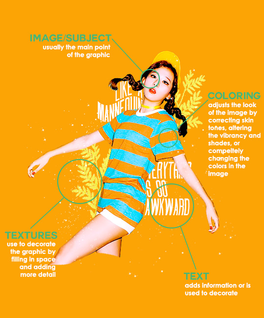
image/subject
usually the main focus of the whole graphic
you should always try to use a sharp hd picture - getting it from the original source is always the best option
make sure the source of the picture allows editing - pictures from public sources like a company or the news can be edited while fansite pics and scans need to have permission asked (and if they give you permission make sure you link them when you post your graphic!)
coloring
often referred as ‘psd’ because that is the format they are in (i.e. pink psd pack)
comprise of multiple layers that can alter the images look
a lot of people make their own colorings since the outcome of the look also depends on the image’s original coloring
textures
smaller cut out images that are often used to decorate the graphic
can also refer to a image that can be use as a background of a graphic
can be found in the form of a png (copy + paste into graphic) or a brush (”painted” on to the graphic)
avoid using any textures that does not state the original poster made them - you could unintentionally be using someone’s work that was not made to be used
[read more about it here + resources that you can actually use]
text
text can be used to tell information or just for decoration
try to choose fonts and colors that are legible
faq
what software can i use to make graphics
most people use some version of photoshop (i currently use photoshop cc 2018) and a lot people have it cracked but if you cant afford photoshop, find a cracked version or a patcher (i used adobe zii 3.0.4 for mac), or are uncomfortable with getting a cracked version then there are other softwares that are just as good!
i can only vouch for gimp since i used it when i first started making gfxs. it is very similar to photoshop and shares most of the same tools and has a similar look to photoshop. it is also probably the most popular photoshop alternative and would totally recommend it if you cant get photoshop!
[visit + download gimp here]
where do you get your pictures from
official sources such as teasers companies release, photos released by press, photos from idol’s instagram - basically photos that are made for the public to see are whats best to use for a gfx. you should download the photos straight from the source so you get it at its highest quality
some phrases you can use to search for pictures on google:
- [group name] photoshoot
- [idol name] press
- [group name] showcase
- [idol name] teaser
remember the more specific you are in your search the better! also when you search through google make sure you check your source!
avoid getting photos from reposting websites like we heart it and pinterest
avoid using fansite pictures and scans unless you are granted permission
i don’t know where to start/i’m overwhelmed and i don’t know what to do/ where should i begin
figure out what you want to make or a theme you want to follow - do you want to make a simple graphic or a infographic? do you want it to center around a certain theme like a comeback or a photoshoot? once you determine what you want to do it becomes easier getting ideas and finding stuff you will need for the gfx
example thought process:
“i want to make a loona graphic” → do you want it to be the whole group or a certain member or unit? will it just be a simple gfx or a AU gfx or based on a event that the group is doing?
“i’ve decided on doing a kim lip one” → do you want it to have a certain theme like kim lip smiling or kim lip with blonde hair? is there a certain frame of time in which you want the graphic to represent like during eclipse era or hi high era?
“i want it to be from max and match era with her teasers” → from here you can start finding pictures to use and thinking of colors and textures that would fit your theme
where do you get ideas/inspiration from
i mean it’s different for everyone but for me i literally just think of stuff and i’m like wow i want to make that happen asdfsdfj but mostly when i see pictures or watch something thats where i suddenly get a idea
but tumblr is full of graphic makers!!! ive seen so many amazing graphics from various fandoms like kpop, anime, marvel, etc.
some amazing graphic editors i know myself include:
primirene, ireone, nctjaemin, celo-mar, 1hyungseo, jeongahn, haechxnie, sonxiumin, syua, lulumelody, dinomite, lovelyeo, joohys, whatchatalkabout, yveu, maerinah, mihyon, lorbits, cherryjennie, thatporcelain, monoka, ifbin, 7ww
some other places you can look at are behance (dont go on behance if you have a cracked ver of ps - it might trigger a ingenue software alert that is a huge pain to deal with), pinterest, deviantart, dribble, and probably any social media platform if you just look up #graphicdesign
remember if you take inspiration from someone’s work then you should cite them in your caption - if you are afraid that you might’ve accidentally copied someone when you were trying to take inspiration from them its best to either try to remake the gfx again or just to ask the creator permission if its fine if certain details are similar/same
my stuff sucks how do i get better
literally just keep on making stuff aka practice. you can’t improve if you don’t bother putting effort.
ways i’ve forced myself into practicing making gfxs is by:
1) starting a gfxs series - its self paced and is based on what you want to make (i.e. introducing my biases gfx series, my favorite outfits gfx series, etc)
2) taking in requests - people who would request from you probably like your stuff so its a win win situation (i.e. send me a idol + era, send me your bias + palette, send me a group and i’ll make a gfx of my fav member, etc)
tips
only sharpen your pictures after you are done resizing them, if you sharpen and then resize it might result in a more blurry or grainy picture
always save your graphic every 5-10 mins in case photoshop crashes
have two copies of your image cutout: one will be the original and the other one will be the one you edit with - in case you mess up like over erasing or over sharpening your image you have a back up you can use
stick with a color palette so you don’t get overwhelmed when having to color everything and it makes all the graphic panels you have look more cohesive
on photoshop you can favorite fonts!!! take advantage of it!!! your computer has a lot of fonts saved on it and it takes forever to look through a whole list of fonts so by favoring fonts you can see all of the fonts that you like to use for graphics
combine a png pack to one psd → when you open a png pack you will probably get a lot of png files and it gets annoying having a lot of tabs open in photoshop when most of them are just textures so by putting all of those pngs into one psd you can cut down the files you open and can easily see all of your options
make folders dedicated to colorings and textures that way you can easily access them instead of looking through your computer for a certain file
name your layers... i dont do it because its easy for me to tell what layer is what but when you are working with a lot of layers its best just to name them it’ll make life easier
lock your main image/subject so that when you play with texts’ and textures’ location you don’t accidentally move your main image
use curves to help get a photo back to its original coloring! like if you have a photo that has a weird filter on it just use curves and it’ll help the picture look more natural! [tutorial]
try warping your text to make it stand out more! you can access it by pressing the icon on the top text bar that has a T with a curved line under it. i use flag and wave the most
alter a particular color by using a selective color layer
rather than changing the actual color of an image/texture you can:
create new layer → select the image/texture and color it on the new layer instead of on top of the image/texture → change the opacity or the mode of the layer so that the color is put on the image/texture while keeping its detailing and not affecting the actual image/texture
resources
colorings: can be found on deviantart or tumblr just look up ‘psd coloring’ or ‘[color] psd’
textures: can be found on deviantart (check to see if its og content or stolen) simply just search what you are trying to find or ‘png pack’ or ‘texture pack’
common textures you can try to find: vintage flowers, memphis shapes, organic shapes, doodles
other wesbites: pngtree, creative market, lost and taken, spoongraphics
fonts: if you are looking for a certain font then you can just do a google search but if you are browsing then dafont and font squirrel are really good websites too
some of my favorite fonts: abril fatface, agfatumc, antonellie calligraphy, arcadeclassic, bebas neue, century gothic, couture, daily news 1915, dark larch, hondurhas, kotori rose, krinkles, risingstar, sant joan despi, studly, zing rust
color palettes: i made one myself which you can find here, color hunt, and honestly a quick google search will give you tons of options
if you have any questions, other stuff you want me to cover, or want to add more resources and tips then please dm or send an ask! i hope this helps!
#i really hope this helps someone and that it makes sense#i literally woudlve been so happy if i saw this when i first started it took me so long to figure things out and im still learning#also i basically told where i got everything so like please dont take advantage of this and end up copying my gfxs... its happened to me a#lot#idk what to properly tag this alfkjasd#ps help
125 notes
·
View notes
Note
Can you share any art tips? I wanna learn.
Now imma keep it real w you… I am not the best person to ask this lol I don’t do art professionally. I did study traditional art at GCSE and A level though, but my digital drawing skills are all self taught over the course of the two years that I’ve owned a stylus and wacom pad. But I’m very flattered and happy that you’ve asked and I’ve done my best to answer this!
Plus there’s a lotta aspects of art and I have many thoughts and tips for each.. And I work in a lotta different styles and each one has different stuff you need to consider… So if you want more specific tips from me you will have to ask a more specific question.
w that said
Charlie’s general tips (also obvi these all have a time and a place and aren’t unbreakable rules you HAVE to follow or you’re a bad artist. These are just things I personally try to keep in mind):
-When you pick colours while colour theory can be impt focus more on the mood. Like… muted, blue tinted colours for angsty art, warm gentle colours for more light hearted stuff. If you find choosing colour palettes hard, just colour how you want and then do another layer over the colouring, colour it in yellow/orange/pink/blue etc and lower the opacity to tint your art.
-shade by choosing a different colour, not a different shade. E.g. shade blue with purple, shade red with purple or reddish brown. And shade yellow with orange or green not by shading yellow with… greyish yellow.
-Use black as a lineart colour only if necessary, generally I use brown lineart though for stuff like clothes I make the lines the colour of the fabric. Like for jeans I use blue lineart. IDK why but unless you’re going for a comic book style or you feel like black lineart is super important to the picture, coloured lines tend to just feel better.
-also for lineart… u do not have to but experimenting w varying ur line length can be good. Thicker lines make things look closer while thinner lines make things look further away, and having a mixture of thick and thin lines makes ur art more dynamic.
-Also try out lineless art if you want! It changes how you colour and shade and I personally found it really helpful to try for a while.
-draw backgrounds lol. Even simple shitty ones add so much. (I am guilty of not doing this for most of my art but all my favourite pieces had carefully constructed backgrounds so I personally am a bit of a sucker for a sexy background)
-If you are drawing backgrounds… try not to do that thing I always do where I draw a person and then have to cobble a background together around them. Try to preplan and sketch stuff out, even a little bit.
-use a reference for poses! I honestly sometimes trace over photos lol. Even if you’re drawing super stylised and cartoony having an example of what the pose you’re drawing looks like on a regular human body can be v helpful. Especially if you’re drawing stuff like hands, shoes, clothes folds or anything that looks the same on a human and cartoon then I recommend like… googling hands lol. I personally use pinterest to find references. I especially like using older photos and vintage illustrations.
-Use the stabiliser lol… I didn’t know this tool even existed until like… several months after I’d started drawing digitally and it has saved my life. If you look at my older art and think “wow… this lineart is fucking shit…” that’s bc it was all done freehand babyy!!
-ALSO try out different brushes… learn how to make custom brushes on ur program (most of the textured brushes I use are ones I made myself or downloaded) and go buck wild.
-In terms of drawing drawing (as in what to include) think about lighting and don’t be afraid to mess around w shadows and dramatic lighting. Also think about composition. Having stuff in the foreground and background creates a cool illusion of depth.
-Also just think about what you love about your favourite artist’s styles - is it their brushes? Colouring? What the drawing is of? And think about incorporating that in ur own stuff.
-Also... I’m gonna say it. If you caption all your art with shit like “here’s another bad piece of art from me” or “here’s something I threw together I don’t like it” “this is shit but you guys can have it” then...
stop.
That’s all I have to say. Get some help for your low self esteem. It’s just as important to pinpoint what you like about your art and work on that as it is to acknowledge what could be better. It especially saddens me when people post pictures they’ve clearly spent a long time on and they caption it with nasty things. Like... why are you insulting your hard work? It’s okay to let yourself be proud of what you can do right now, even if you wish you were better. The art police will not break down your door and kill you for being proud of the work you’ve done so far, even if you have a long way to go.
That’s all I can think of off the top of my head! If you have any more questions about the process behind specific pieces go ahead and ask!!!
1 note
·
View note
Note
Hey I sent an ask before but I guess it got swallowed? I was wondering if you had any advice on editing headers for fics? I’ve loved the ones you’ve done in the past and I’d really like to do something like that for my own fics too! Hopefully this one gets to you💓—🦋 anon
Hi!!!
I actually design things and work in printing for my main job so I have access to things like Adobe photoshop and Adobe illustrator (I do my painting/retouching in photoshop and everything else in illustrator). But it’s hella expensive so I try to look at free alternatives.
I have a bunch of asset/resource sites I use for photos and fonts. Sorry I tend to ramble so here we go.
Firstly I have a lot of free resource sites that I can get high-res assets from. I often am using things for commercial purposes because I get paid to do what I do. But for most people, they don’t have to worry so much about it bc they’re making it for themselves, but it’s always nice to have high-res assets still.
When I get a concept, I look for imagery that inspires me from sites like these and I can usually find what I’m looking for. The amount of beautiful, free, high-res images out there is amazing.
Good rule of thumb is that you can always make a big image smaller, but never make a small image bigger, so always download the biggest size you can and size to your needs. -holding SHIFT when resizing keeps things in proportion when scaling-
I usually use pexels and freepik as my default. There are sooo many image sites I could list but here are the ones I use.
https://www.pexels.com/
https://www.freepik.com/search?dates=any&format=search&page=1&selection=1&sort=popular&type=photo
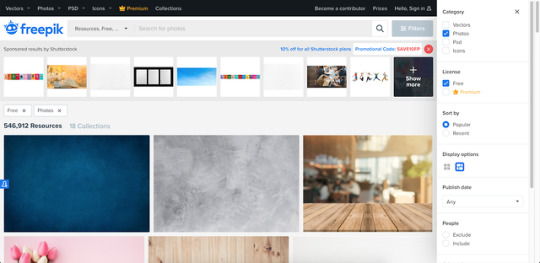
https://pixabay.com/
https://unsplash.com/
https://www.rawpixel.com/free-images (There’s free and premium images, but you can download 5 images per day are labeled free)
https://lostandtaken.com (textures that you can tile!)
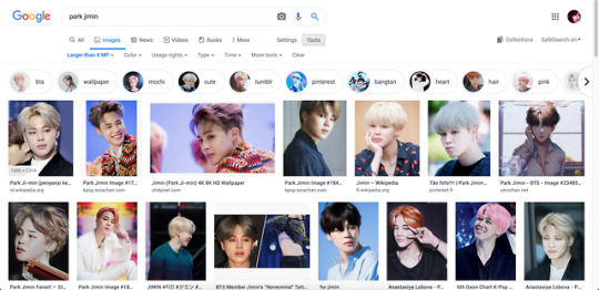
For BTS photos I look via google for images over 4MP (usually dispatch or official photos are my go-to).
I use photoshop to cut them out and retouch, but there is another editing tool I’ve been experimenting with called Photopea, which is a FREE online editing tool that’s just as powerful. It even looks like photoshop so it’s pretty comfortable to use.
https://www.photopea.com/
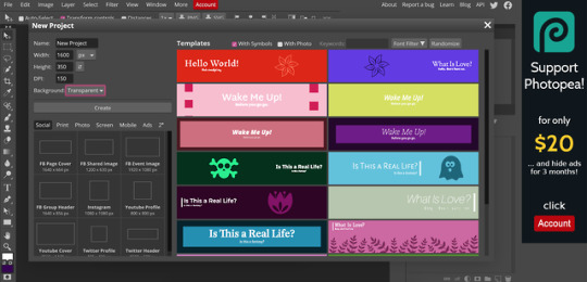
I make my banners at 1600px x 350px, but i realized tumblr auto resizes anyway [LIKE A BITCHASS PUNK IM MAD ABT IT AND FOUND A WORKAROUND thats for another post tho]. I keep my DPI higher in case I want to use it for printing at some point, but that’s optional -72 is perfect for what you’re doing.
Reference:
300DPI= GREAT PRINT QUALITY - (work brain loves this but it’s useless for what we’re doing)150DPI=GOOD PRINT QUALITY 72=OPTIMIZED FOR DIGITAL USE ONLY (standard screen resolution)
_
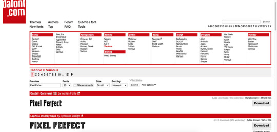
Custom fonts can be your friend or the enemy. If you’re using a scripty one, try to make sure it’s legible with your title (there are some really terrible ones out there, but there are so many good ones too).
The easiest and quickest font place I use is dafont bc you can choose fonts based on the style you’re going for and you can test your text before you decide to download. They can be loaded into photopea! Also they’re free:
https://www.dafont.com/

As far as editing goes, I tend to choose a color theme based on feelings and adobe has a site that can help you by showing you palettes based on search terms. ( you can even search for things like happy, sad, angry, etc)
https://color.adobe.com/explore
I tend to use fuzzy edge brushes on everything to make it look soft, especially in lighting. The trick is just layers upon layers with different blending modes
I use “Color”, “Saturation” and “Overlay” modes a lot.

Ignore my layer names: I’m a mess.
This is what it looks like in reality. I just blob brush everything.

So in steps you can see 1)original cutout
2) adding effects like busted lip (a brush i downloaded for PS–I don’t think these import to photopea unfortunately), bruising (textures set to overlay/multiply using different colors), earrings (hand-painted over the originals for a cleaner edge), and EYES (eyes i tend to cut from the main layer, copy above, lighten/contrast the shit out of them and change the color using “replace color” or “hue/sat” or blob color on a new layer and set it to “color” blending mode and then paint over –there’s a lot of ways to do it– but then blend them back into the photo in a natural-ish way)

3) lighting overlays give color to the skin and you can use colors from your background to create interesting pop effects (in this case i used purple)

I hope this helps??? But if you want more like in depth help with editing and stuff, let me know!!! It can get overwhelming, but it can also be really fun!
3 notes
·
View notes
Text
My name is Abey Zoul, and I spent a memorable childhood in a beautiful small town called Bachok, Kelantan, one of the states on the east coast of Peninsular Malaysia. Full of sandy white beaches, Kelantan is also rich in unique cultural heritage that are still practised today by the current generation. For example, the mystical performances, namely wayang kulit, a traditional shadow puppet play and, Menora, a type of dance drama.
After graduating from an architectural school in 1999, I spent most of my life working in a few architectural firms in Kuala Lumpur. Every evening after work and during weekends, I used to find joy in riding big bikes. In 2012, I shelved my bike and started on my journey in watercolour painting.
In Malaysia, watercolour has always been considered as an inferior painting alternative to other mediums. Hence, my friends and I decided to set up a watercolor group called Gangstawatakala. Our vision is to bring back the glorious days of watercolour.
My love towards everything that relates to heritage and culture, traditional houses, quaint old shops and wooden fishing boats, becomes the setting in most of my watercolour works. Fishing boats, primarily Perahu Kolek, is a wooden fishing boat which can only be found in my hometown and in southern Thailand. Its long history of craftsmanship is my main interest.
Kampung Baru, the one and only village amidst the crowded city of Kuala Lumpur, is where my friends and I regularly spend our weekends together painting and sketching. The old wooden village houses give a rural vibe in spite of the modern and iconic steel cladding of KLCC and other modern buildings. My paintings try to capture the stories of people whose wooden houses are surrounded by Kuala Lumpur’s skyscrapers.
Painting is not just about producing a beautiful artwork on a piece of paper, it is about telling the story behind every image produced from the eyes of the artist. It is also about digging deeper through history. The more you see things to be painted, the more stories you know behind it. Hence, painters are, in a way, also storytellers.
Tools & Materials
Mistakes in choosing tools and materials often occur in watercolour. Being a fragile medium, choosing the right tools is of utmost importance. From the choice of paper, brushes, pigments as well as the surrounding temperature, all these affect the result in watercolour painting. I believe in the concept that the best tools will yield the best result in the right hands. If the best results cannot be achieved, it is you who have to improve in terms of technical skills, keen observation, level of taste and patience.
Pigments
I have proudly been appointed as Malaysia’s first independent brand ambassador for QOR Watercolor by Golden Paint USA, endorsed by a leading Malaysian arts and craft store, Scrap’n’Crop. This endorsement to QOR however does not prohibit me from exploring other brands and pigments as an artist. My palette consist of a majority of QOR pigments which I find to be very transparent. QOR’s vivid colours perfectly matches the colour tones on my mind. QOR’s Raw Sienna for example produces a very clear golden light brown tone on paper, not the muddy golden tones of some other brands.
My Skies – I now use Manganese Blue as a base colour for skies, replacing Cerulean Blue. It is a luminous and transparent blue as opposed to cerulean which is opaque with a greenish tinge.
My Greens – My favourites are Daniel Smith Undersea Green (Dark Green) and Olive Green. Avoid Viridian when painting foliage. I often come across students’ palettes with stains of Viridian. It has an artificial green tone. However, Viridian when mixed with Gamboge or Indian Yellow will produce a very cool greenish yellow tone suitable for the painting of paddy fields.
My Water – I used to mix Viridian with Cobalt Blue when painting water. Now, I use Cobalt Turquoise mixed with Viridian. For boats and other reflections, I mix Cobalt Turquoise with Raw Umber.
My Shadows – Shadows are not black so do not use any black, Ivory or Lamp Black. My advice is do not buy or keep black pigments. Instead mix Mauve, Magenta and Ultramarine in different proportions for the shadows. The next time you go shopping, opt for Daniel Smith’s Moonglow which has been specially blended to create shadow tones.
My Earth Tones – When I was younger, Yellow Ochre was the colour of choice for the earth tones. It proved to be my folly as it is an opaque pigment and can easily cause muddy colours. Now the wiser, I replaced Yellow Ochre with Raw Sienna, a pigment similar in tone that gives a transparent golden earth colour.
My Glazing – As I have always wanted my paintings to have a classic look, Aureolin (Cobalt Yellow) is a must for my glazes. It is a transparent and cool yellow.
My Jewelries – Opaque Cobalt Teal, Cobalt Violet, and Cadmium Red are used for clothings, signages, traffic lights and car lamps. These tiny but important final touch-ups make the paintings “pop”.
Watercolour Brushes
Brushes are more subjective than paper. Different brush shapes are made for different tasks. For example, you cannot make a broad sky wash with a small size 3 round brush. The best brushes are made of natural hairs and notably for watercolour, sable and squirrel hair brushes are strongly recommended.
I am against advising you to buy a whole range of these expensive brushes which can sometimes be more than the price of gold, ounce for ounce! Choose appropriately within your budget. As for me, yes, I do have a stable of sables, but I rarely use all of them. If you are an Edward Seago fan, where bold strokes and simple shapes are the order, then sable may be your perfect choice.
My impressionistic style incorporates a certain level of structural detail that requires me to go deeper. Synthetic round brushes with a sharp, stiff point work better for my style but I initially stayed away from them as I considered the nylon based synthetics to be inferior. It was not until I discovered Escoda Perla, used by the Master watercolourist Joseph Zbukvic, that I started using synthetics. Perla is the best synthetic with an excellent point. Personally I use Perla size 2, 4, 8, and 12.
For pre-wetting paper, I have a round handle Frank Clarke Goat Hair “Hake” brush. A large Proarte and Mary Whyte’s cat’s tongue squirrel hair brush helps me with painting the skies and impressionistic trees. My jewel in the crown and most precious brush is surely the Leonard extra long sable hair scripture brush. This brush works well for irregular shapes such as branches, leaves and foliage. It was bought during a trip to Paris in 2015 at the Sennelier Art shop, a few miles from the Lourve.
Last but not least, is my Rekab reservoir brush bought on eBay. A perfect size 4, I can freely paint wires, cables and masts with just a stroke from the brush. What a life!
Watercolour Paper
As a watercolour impressionist, I normally use Canson, Arches and Saunders Waterford 300gsm watercolour paper with a rough texture. Both are artist grade 100% cotton rag, mold made paper and acid free. Arches is in my opinion the best and most expensive paper today with Saunders Waterford a close runner up. Saunders is more forgiving than Arches whereby you are able to make more mistakes on it due to its better lifting qualities.
Additionally I use student grade 25% cotton Bockingford and Canson Montval paper for light works such as line and wash, watercolour sketches and thumbnail studies. Both are excellent cellulose-based paper and usually cost about half or less as compared to Arches and Saunders Waterford. My advice is do not use drawing paper unsuitable for watercolour painting. You will go nowhere.
Plein Air vs. Studio Work
Plein air in simple terms is open air or outdoor painting whereas studio work is the process of producing art works based on photo references or imagination inside the studio. Normally at the start of the season, I will work in the studio from subjects gathered from the previous season. On a daily basis, I will task myself to complete works based on specific themes or series.
If, for example, the series I am working on is fishing boats, all other subjects like buildings, flora or portraits will not be intermingled. Upon completion of each series and when I am out of ideas or subjects to paint in the studio, I will take a “break” for three to four months without producing any new work. During that period, I will gather ideas, think, sketch, read and do research on new subjects for the next part of the season.
Plein air activities commence and fill up the rest of the season with the break providing a fresh and dynamic mood whether to join in an urban sketching activity or going on a painting trip with friends to exotic places that I have not painted before in watercolour.
Plein air gives you the energy, mood, freshness, and also live interaction with what we are painting. In contrast to studio painting which is more relaxed and organised, plein air provides more challenges to the painter. A painter must quickly observe the mood of the subject, arrange the composition, light direction and the need to make oneself comfortable in whatever condition one is in with the tools available. We must also be strong-willed and confident when plein airing.
We need to interact with the surroundings and curious locals and onlookers that crowd around us while we are painting.
There will be those who will ask questions and others who are ever too willing to indulge with us through the long history of the subject in focus. We need to treat them nicely and become friends with them. A great painter has to be one who Plein airs!
Thank you, Let’s paint.
Abey Zoul
Website
Facebook
Instagram
Books
GUEST ARTIST: "Painters As Storytellers" by Abey Zoul - #doodlewash #WorldWatercolorGroup #watercolour #watercolor My name is Abey Zoul, and I spent a memorable childhood in a beautiful small town called Bachok, Kelantan, one of the states on the east coast of Peninsular Malaysia.
#watercolour painting#WorldWatercolorGroup#art studio#art supplies#artist#doodlewash#featured#Malaysia#painting#plein air#watercolor#watercolor painting#watercolour
1 note
·
View note
Note
Omg yes I would love to know how to make one myself!
alright here we go!! i’m gonna use my current header as an example for the steps, but pls don’t directly steal the header from me!!! thank u!!!!! (that’s not directed at u specifically anon, just at people in general)
here’s how to make a header the way i made mine! :)

(this got,, quite long,,, so i’m gonna put everything under a read more)
so first, we’re gonna need photoshop. if you do not already have ps and do not want to pay for it, there are plenty of sources online that will teach you how to torrent it and crack it and all that jazz. (aka i’m not gonna go through this step myself, this explanation is long enough lmao)
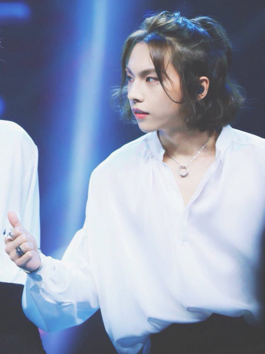
then, pick who/what you want to put in the header and find a picture you want. for example, i used this lovely photo of zhou rui.
after you’ve got your photo, you’re gonna want to crop it to the size you want and cut out the part of the photo you want. there are many, many ways to cut out photos in photoshop and you can find so many different tutorials online for this! i personally prefer to take the polygonal lasso tool and zoom all the way in to 500% to manually select every pixel i want, but that’s just me being a perfectionist and it’s really not necessary to do that lol. i also scale the photo down at this stage because i’m lazy and the smaller the photo, the less pixels to deal with lmao,, just make sure you don’t make it so small your header ends up pixelated
after doing that, you’ll end up with something like this:

the edges on the hair are far from perfect, but this is okay because we’ll be using a fairly solid background and i can use selective color to make the color of the light that hits his hair match the background. it’ll make everything look much smoother.
after this, i like to select the transparent area, make a new layer, and color it whatever color i want my background to end up being. (the magic wand tool will do for this; we won’t be keeping this layer later on so it doesn’t need to be the most precise, we just want to be able to reference the color when editing the coloring of the original photo without the coloring of the background to be effected as well)

(you can deselect after this stage, i’m just trying to show the area that i selected to color lol)
after this, click back on the layer you cut out the picture on (this is important if you don’t want to change the solid color along with everything!!) and go to layer > new adjustment layer > brightness/contrast in the top menu bar. this should open up a new layer for you and you should see a little window with slidey bars for brightness and contrast. adjust these bars as you see fit. here’s what my options were set to, but it really all depends on how the original photo was lit so these options may not work for you.

repeat these steps, except instead of brightness/contrast use curves, vibrance (optional, depends on the photo), color balance, and selective color. edit each adjustment layer as you see fit. here’s what i did with the curves and color balance layers (i’ll talk about selective color on its own in a second):

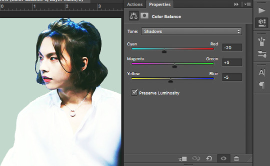
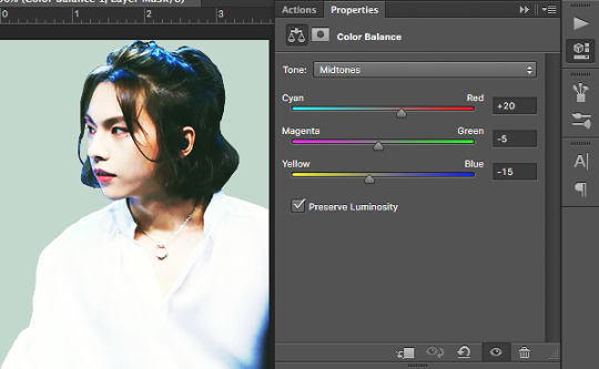

note how with color balance i made things a little more green/yellow/orange than i would’ve had it been just the image on its own. this is because i’m trying to match what i’ve cut out to my background color and the color scheme i’m going for.
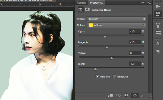
now we’re gonna work with selective color. what selective color does is it isolates the specific color ranges (eg. reds, yellows, blues, etc.) of the image and it adjusts them separately. selective color is where i really try to match everything to the best of my ability; if there’s any light hitting any part of the image i try to make sure it matches the background, if i want a certain color to stand out to bring out anything i turn it up, if i want a certain color muted i turn it down. i also use the whites, neutrals, and blacks to play with what kind of contrast i want and whether i want the highlights/midtones/shadows of the images to be darker or lighter. here are my options; what yours end up being depends on what the original lighting of your image is and what color you’re trying to match:


now, simply delete the solid color layer and flatten your image! congrats, you’ve got a color adjusted cutout of whatever you want to put in your header! save this, but don’t close this tab quite yet.

now we move on to the background gif! first, pick a gif you’d like to use. any gif is fine, we’ll be desaturating it and turning the contrast way up anyway, so it really doesn’t matter. i chose this shooting star gif and played around with the frame durations a little (totally unnecessary, but you can do it if you’d like):

luckily for me, this gif is already black and white and pretty high contrast, so i don’t need to do much to it. to fully explain this step, i’ll substitute in the gif i used for the header of my main blog @kinovate
after you’ve opened up your gif in photoshop, click on the top layer (this is important! you want to make sure you apply the adjustments you’re making to every layer!) and go to layer > new adjustment layer > hue/saturation. turn the saturation all the way down to -100. you should end up with something like this:
once it’s black and white, you can add a new layer above everything else and fill it with the color you want. change the blending option from normal to screen. you should get something like this:

notice how the flowers are kind of faint? we’re gonna have to turn up the contrast. click on the hue/saturation layer you made earlier (you want the solid color layer to stay as the top layer!) and go to layer > new adjustment layer > brightness/contrast. turn the contrast all the way up to 100 and adjust the brightness as you see fit. you should get something like this:
now that we’ve got the gif where we want it, let’s move on! i’ll go back to using my current header as an example, so this is the gif i have at this point:

now go back to the tab with the color adjusted cutout you did earlier, drag the tab out to a separate window, and drag the layer onto the gif. this should put your cutout on top of the gif. make size/placement/rotation adjustments as you see fit. you should now have something like this:
i’ve upped the brightness/contrast on my gif a little more just to make it stand out, and i’ve left some space at the bottom because this cutout of zhou rui is a little short for my liking. we’ll also be adding some effects to the bottom so that it fades to white anyway, so the extra space doesn’t really matter.
now we pick how we want this header to fade to white. you can use a simple gradient, a wavy line, circles, ripped paper textures, brushstrokes, etc. anything you want, really. get creative! i picked some clouds for our lovely fairy zhou rui, but i’m not really sure where i saved the picture i actually used so i’ll just show you guys what to do with another cloud image:

using hue/saturation, brightness/contrast, and curves adjustment layers, turn this into a photo of high contrast black and white clouds, like so:

drag this onto what you’ve got for your header, change the blending option to screen, and move/rotate the image until you like its placement. if it’s too faint and you feel like it’s not covering enough, duplicate the layer to make the white bolder. fill in any space you don’t want with a soft white brush. you should end up with something like this:

(i personally like the clouds i found before better, i just couldn’t find the full image of them. i do have the psd file for my header saved though, so i’m gonna use those clouds from here on out.)
after all this, add whatever details you want. for example, i drew on some blush:
and voila! you’re done! :)
hope this was helpful!! i tried to go through every step thoroughly, but if something’s confusing or not explained well hmu with questions and i’ll try to help out to the best of my ability!!!
159 notes
·
View notes
Text
tension, seeking redemption (yonic stone).

One metal experiment that I didn't end up sharing since I didn't think it was good, was this TIG-welded metal sculpture. Something was off, I didn't see it as finished or it looked too different from the others so I kept it behind to see what I could do with it.
- This resembles the 'yonic stone' which is a natural form which I keep referring back into throughout my practice. It closely resembles female genitalia which interested me, but I knew I wanted to take this form further. Despite this visual reference, it appeared aggressive and violent to the touch, harking back to Mark Fisher's "montage" of "two... things that do not belong together" due to the juxtaposition of delicate genitalia and a violent toothy bite.
- This toothy-ness is heightened by the TIG welded bronze in the centre of the piece. I mentioned before that welded stainless steel and bronze have a textural bite, and visuals that are reminiscent of tooth fillings. Vagina dentata perhaps?
Time passes, and I left it for a while... and as is the nature of steel, it rusted.
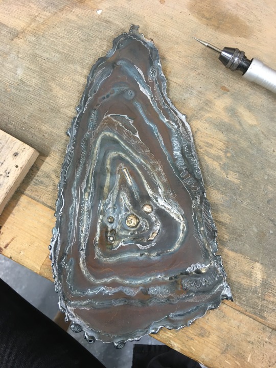
I quite liked this degradation.
It made the piece appear more 'lived-in'; rather than a brand new creation, it seemed dirtier and seemingly more uncanny. Furthermore, the red rust added warmth to the piece, mimicking the hues of the body which I'm trying to emulate.
I also found that since rusted, the piece was easier to work back into. I used the Dremel to engrave and draw lines back into the work, to create more definition as the rust had covered it over. As well as this, I also used a wire brush. It had the same job as the engraver, but the bronze brush uncovered what was already underneath the rust, whereas the engraver created new lines.
- I think that creating larger sculptures, sometimes makes you lose detail. At least, this is the case for me. I have found that detail creates more character in smaller sculpture, they appear more polished. when form and overall shape isn't the main focus, it's important that there's another focus.
Keeping in with Fisher's idea of "montage", I wanted to build upon this form by adding more materials, tights!
I have previously discussed why black tights seem more ominous, although innately connected with the female. I wanted to carry this idea onwards from experimenting with "Gap" earlier on in this project.
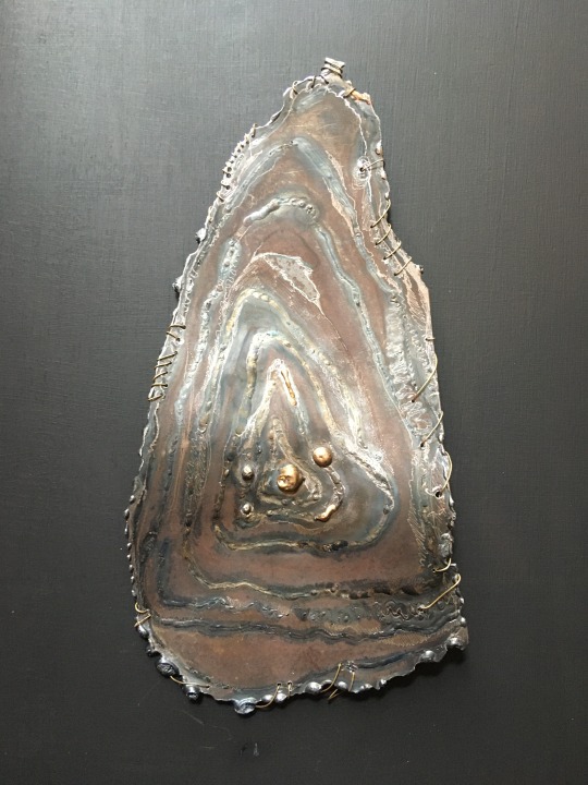
For cohesion, I created stitch holes and made metal thread out of more bronze. I did this because I wanted to bring a sense of cohesion with the tights, as I could not stitch them onto metal, they just ripped.

Here is the finalised piece. I definitely need to take better photos, however I'm very happy with the overall outcome of the work. The tights creating tension with the initial metal sculpture, creating a web pulling the creature backwards.
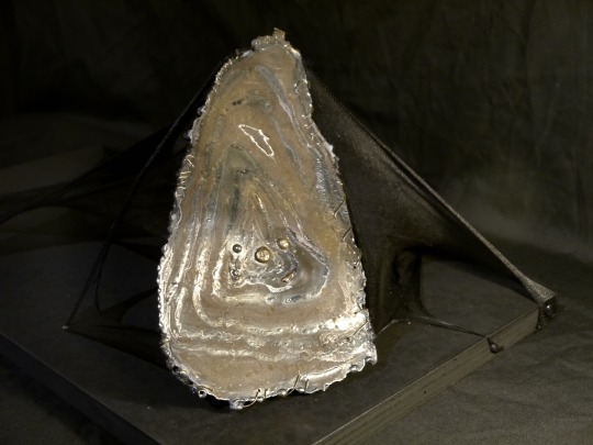
There's definitely something alien about this piece - from the arrangement of the tights to them taking the sculpture backwards. However, I want to argue that rather than solely alien, this is an abstraction of the human body. Tights act as a second skin, they cling to our body and when we take them off, we always leave part of us behind with them in the form of dead skin. Hence, an abstraction of the human body, using the visceral abject. Its 3D nature juts out at you, making aggressive gains towards us as it creeps along, with its web pulling it back...
Weirdly, the aura of this piece seems slightly coy. Although uncanny, it doesn't appear domineering, but in fact shy and cowering as the metal piece looks up towards you in a gentle manner... perhaps it's seeking forgiveness in a way...
I like this idea of tension using tights. A bodily abstraction, skin appears much more visceral when taken out of context. It's not wrapped around anything, its original purpose, it's contorted, abjected from what it's supposed to do.
0 notes
Text
Adobe Capture One

Adobe Color Capture One
Adobe Vs Capture One
Adobe Vs Capture One
Capture one is better, as imaging software, for Fuji GFX and provides better results after editing for the Fuji XT2. Capture one pro efficiently processes RAW images captured through Fuji XT3 digital camera and cameras that use the Fujifilm x-trans sensor, than Adobe Lightroom does. Some Fuji cameras supported by Capture One include: Fujifilm X-T2.
Design is all around us and inspiration can be found everywhere in the world from nature to cityscapes. Transform digital images of physical objects that inspire your imagination directly on your desktop. Turn the coarse texture of tree bark or sweeping wisps of grass to the symmetry of a brick face or patterns of metal work into captivating digital assets. Designers can trigger the in-app Adobe Capture extension from the Libraries panel in Photoshop (desktop version only) to create patterns, vector shapes, color themes, and gradients extracted from images. The ability to capture workflows is no longer limited to the mobile experience. Designers can use the Capture desktop extension to access powerful mobile workflows via the desktop to avoid distractions and save time when creating a variety of digital assets.
Adobe Color Capture One
Capture One + Adobe Bridge (1/1) neilcolton: Hello All-Full disclosure, I'm quite new to the DAM digital workflow, but I'm generally sold on Peter's approach After years of shooting film, I'm finally getting my arms around Peter's way for digital shooters. The more I learn about the digital world of images, the more sense Peter's method makes.
Capture One Pro lets you edit files from all major camera brands. Or save with a Capture One version that's just for Fujifilm, Sony or Nikon cameras. Plus, get solutions for business and multi-user teams. Products & Plans. Scroll to explore. DK-2000 Frederiksberg.
Adblock plus for edge. Capture in action. Use your mobile device as a vector converter to turn photos into color themes, patterns, type, materials, brushes, and shapes. Then bring those assets into your favorite desktop and mobile apps — including Adobe Photoshop, Illustrator, Dimension, XD, and Photoshop Sketch — to use in all your creative projects. Last Published: October 19, 2020 Adobe Capture gives you the power to create production-ready color themes, patterns, vector-based shapes, 3D materials, type, and custom brushes—all from a single photo.
Adobe Capture Color Themes Module.
Use your existing Library creative elements to create unique digital assets that can be imported into your Creative Cloud desktop applications via Creative Cloud Libraries. Adobe Capture allows you to use photographs and transform the physical world around you into creative library assets and elements that can be incorporated into your creative design work. Simply open an image or project file, edit, and add to your Library, which can be accessed directly on your desktop and in mobile apps. With the Adobe Capture in-app extension, you’ll find a new level of ease when it comes to creating and editing creative assets. Batch process multiple assets at once, or quickly extract multiple assets from a single image, and streamline your workflow by reducing steps and saving time on task.
Adobe Capture Shapes Module.
With Adobe Capture, you can create and vectorize shapes on the fly without scanning or using live trace. Vectorize directly in Photoshop within the extension panel and avoid a long manual process using the pen tool. Use the slider to select the level of detail and invert the image to vectorize it. You can modify and apply smoothing to reduce path points. To turn the vectorized images into actionable assets, just add them to your Creative Cloud Libraries and bring in the vector shapes as layers in Photoshop.
You can also do vectorize images while you’re on the move, thanks to the new Photoshop for iPad. Adobe Capture lets you use these assets for masks and adjustments in your .PSDs whether you’re at your desktop or on the road. To use your shape, drag the element from the Library panel and place it onto your Photoshop project. From Photoshop, you can use the shape in Illustrator, Indesign, XD, Premiere Pro, Animate, and After Effects. This workflow is powered by the new Cloud PSD file format (PSDC – the “C” is for cloud), which allows you to move .PSD files seamlessly between your desktop and the cloud. The new PSDC file format for Photoshop with iPad will also autosave changes and allow you to store files in your CC Libraries or other cloud storage.
Using Capture to create color swatches and gradients
You can easily create color palettes using Adobe Capture. Open an existing image or project file to start creating your new color theme with harmony rules. Edit swatches by changing the color levels, selecting a color harmony, and moving the color drops in the original image. Save swatches in a variety of color spaces including LAB, CMYK, HSB, and RGB formats to your CC Libraries. Add swatches directly to Adobe Color to create Pantone color themes for your real world creative output projects.
Adobe Capture allows you to create custom gradients using images and photographs from your Creative Cloud Library. Switch to gradient capture mode to view and edit gradients with Capture’s organic creative process, replacing the tedious and time consuming non-creative method of gradient production. You have full control to add or remove stops (drops) to create gradients from two to fifteen unique color swatches within the Capture panel.
BitPay and Coinbase are major points of entry known to every crypto enthusiast in the world. Even though BitPay is only a bitcoin payment processor while Coinbase is primarily a crypto exchange, the two of them have been making a lot of changes and constantly adding new features to cater to the needs of the evergrowing number of customers. Select to Send on Coinbase (off-chain) or Send on the blockchain and follow the remaining prompts. Note: All sends to crypto addresses are irreversible. Coinbase mobile app. Tap at the bottom. Tap Send; Tap your selected asset and enter the amount of crypto you'd like to send. You can toggle between the fiat value or crypto amount you’d like. Users can also buy crypto from Coinbase or Wyre directly in the BitPay app. If you prefer to buy cryptocurrency through an exchange, the process in most cases will be: Create an account on the exchange. Register a payment method. Buy cryptocurrency. Send the funds to your BitPay Wallet. Learn more about purchasing cryptocurrency. Bitcoin wallet vs coinbase. James from BitPay here. Right now Coinbase accounts aren't suitable for paying BitPay invoices. We go into the details for that here. You will need to send some of your spending bitcoin to one of the bitcoin wallets which are compatible with the Bitcoin Payment Protocol. Learn more about getting a. After Coinbase approves your account, you can link your BitPay app to your Coinbase account. This allows you to buy and sell bitcoin from Coinbase with your BitPay app directly. Below is the process for connecting your Coinbase account to the BitPay app: Step 1: Open the BitPay app. Step 2: Click the gear icon near the bottom right corner of.
Adobe Capture Gradient Module.
Adobe Vs Capture One
Create patterns
From your collected images you can create seamless tiling patterns within the Capture panel in Photoshop, something that wasn’t previously possible without spending a lot of time and effort compositing images. Creating patterns in Capture is as simple as opening an existing image in the pattern module. Bartender for wedding near me. Any image can be used to create kaleidoscopic patterns. Change the reference shape to create different repeating vector patterns that you can save to your library and use in your design work.
Adobe Capture Patterns Module.
Adobe Vs Capture One
The Adobe Capture extension panel tool set allows you to find inspiration and create creative elements on the fly from your Library images. Seamlessly sync your files and elements across platforms with the expanded Creative Cloud integration to manage your files and bring new creativity to your projects with Photoshop.
0 notes
Text
Congratulations to Monique Castellani-Kraan for winning Best in Show at the UKCPS Keswick Exhibition 2021.
Monique has kindly share some background information on her wonderful piece Kisses in Blue.
I drew my first hyacinth macaw back in 2015, and it was wonderful being able to revisit the same subject again with “Kisses in Blue”. Parrots are honestly such a delight to draw. Their colours are bright and happy, and they have so much character. I will also always jump at the chance to get out my blue coloured pencils!
I started work on this piece back in January. After a long spate of only making miniature pet commissions over the Christmas period, which was slowly sending me into a spiral of madness, I decided to overcompensate by starting my largest drawing to date, at 40 x 50cm (16 x 20 inches approx).
As someone with a background in digital painting, I like to do all of my sketches and compositions digitally nowadays to transfer to paper. That way my expensive watercolour paper stays free of eraser marks and errant sketch lines. It saves a lot of time in the long run, and if I mess up I can very easily just print out the sketch again to start over. I don't know what I'd do without my iPad!
This drawing proved to be a little intimidating because of the size I was working at. I ended up setting it aside for a few months. You know that famous "fear of the blank canvas" we've all experienced? This one hit me hard. I got a tiny section of the eye and surrounding feathers done and then proceeded to swiftly run away, back to the safety of drawing miniatures! A few months later, I finally decided to stop hiding and to give this piece a proper go. As I got into the rhythm of it I quickly felt myself being sucked into that "zone" of intense focus - where time just slips away until it's suddenly dark outside and you've skipped a meal!
Now that I had finally got my toes wet, I was gaining confidence. Art is a bit like exercise - it takes effort and routine to get into the swing of it - but once I do, I feel like I'm flying! With every new drawing I'm reminded of just how much I adore coloured pencils and how fun the process is.
Translating the reference photo’s feathers on the left macaw’s cheek was proving to be a bit of a challenge. I could only stare for so long at the complicated mess of shadows without going cross-eyed - so I decided to treat myself to tackling the beak first instead. If ever you find yourself in a rut with a painting, look for the deepest, darkest shadows in your reference, and block those in first. You will have a much easier time once they're there. Here, the darkest shadows were the inside of the macaws' mouths, so I put my much-loved Polychromos black to work, blending with paint thinner in between each layer and tinting it with Luminance Dark Indigo to get it nice and deep. Now that the darkest shadows were blocked in, I would have a much easier time in the areas surrounding it. That shadow became my reference point for judging the values for the beak, skin and feathers nearby.
I used Daler Rowney Low Odour Thinner to blend my pencils in between layers, with a flat taklon brush. I primarily used it in the first few layers of the underpainting. The yellow skin on the beak was a tricky customer with this - my blending brushes had to be impeccably clean, or else I would end up turning it green with the blues being so close by. In addition, I didn't want the very pale yellows getting contaminated by the oranges that are in the shadows. I made sure to carefully wipe my brush off thoroughly on some paper towel before blending in small areas at a time.
Beaks are so much fun to draw! They have a lot going on, from subtle colour shifts, to chips and cracks and ridges. The texture is a treat for the eyes! Here, I started by creating a gradient of soft earthy purples, greys and creams in the underpainting. At this stage I used mostly a mix of Luminance and Polychromos pencils. For underpaintings, I like to go darker than what the final result will be - though some would say I go a little TOO dark (coloured pencil is technically a light to dark workflow because they are mostly transparent).
After blending it with OMS, and making sure it's still a little damp, I go in with my pale tones from the Derwent Lightfast, Caran d'Ache Luminance and Holbein lines. These brands are soft and have more wax than oil in them, making them very creamy and more opaque than brands like Polychromos. Because the paper is still saturated with paint thinner, the pencil melts as it makes contact with the paper, making it go on super thick, even though I'm only pressing gently. This is my dirty little secret for how I work from dark to light in all of my coloured pencil pieces. The paper you're using, of course, is paramount for this technique too. If you're not using a good paper, you're going to run out of tooth extremely quickly using this technique. This piece was drawn on Saunders Waterford Hot Pressed 300gsm- and I wholeheartedly recommend it!
However, I just want to add that if you have an area or texture you want to keep REALLY light, for example a large white crack in the beak, you should draw that in first before doing anything else. That way, when you put your underpainting over it and blend with paint thinner, the white detail you added first will show through, clear as day! (This is great for whiskers on cats and dogs for example) You can also use a ceramic cutter to do this afterwards instead, though personally I have yet to use one myself.
After finishing the beaks, it was time to face the feathers on the birds’ bodies head-on. As always, I block in my darkest shadows first and then my underpainting, giving it a good blend out with plenty of OMS. This is so that I don't get lost in a sea of repeating shapes. Without doing this, I find it's very easy for your artwork to end up all the same value with not enough contrast between the highlights and shadows. I also rough in where I want each contour feather to be on the bird’s chest with a dark blue, though I only very gently line them in with my pencil so I can still move things around if needed while I build on the textures and detail.
Once the underpainting is done I am free to start pulling out those details. I went feather-by-feather, preferring to go in with my lighter coloured pencils first, gently pulling out each feather’s barbs. After that, staying mindful of how the lighting is hitting each feather, I used my mid tone and darker pencils to work in between each barb, gradually building up shadows. I also glazed in shadows over this with a very gentle hand to give the overall shape of the feather form and depth.
It can be tempting to rush through areas like this where there is lots of uniform texture, but it’s important to stay patient and take your time. Body feathers especially can become indecipherable after a certain point, because they all overlap and merge into each other. Sometimes even though the reference photo is sharp as a tack and super clear, there is just so much going on that it wouldn't 'read' well as an artwork. So I used my reference to help me with the general structure and composition, and to inform me on how the shapes and textures should look. But I didn’t stress about getting it exact.
Once you have good knowledge of a subject, after doing study sketches and looking at lots of different references, you can be a lot freer with how you approach your final artwork. A lot of the colours, textures and feather placement in ‘Kisses in Blue’ were not there in the reference. I opted to go for a much warmer, cheerful blue. The reference I was using was also fairly flat as it was taken on an overcast day, meaning the lighting was quite diffused. I made my artwork brighter than my reference material, pushing the overall contrast between the midtones and the deepest shadows. I also found myself intermingling soft lilac hues and subtle teal with my Polychromos and Luminance pencils, almost over-exaggerating the birds’ vibrancy. I tried not to stress too much about feathers either - while getting the shape and placement of feathers right on wings can be paramount to a realistic piece, the same does not apply for contour feathers and down feathers. As long as you stick to the right shapes and sizes, paying attention to the bird’s form, you don’t need to get it looking exactly like your reference.
I try my best to bring myself out of my comfort zone with each new drawing. This piece was my biggest challenge yet – quite literally. I’m glad I pushed myself to draw larger than I am used to and I can see why a lot of coloured pencil artists like working at this size – while it is more time-consuming, you have much more room to breathe and fit details in, that would normally get lost in a smaller piece. With my choice of composition and lighting, I wanted to convey a feeling of intimacy and closeness with the birds that I don’t think I would have been able to achieve were this drawing smaller.
1 note
·
View note
Text
Visual scrapbook - mediums, techniques, styles
Practical skills and mediums: screen printing, risograph, painting, drawing, letterpress. The risograph and letterpress is something that I am not familiar with so if I was use this in my work I need to attend a workshop. I feel that the texture and appearance will work well with my message and audience.
Practical skills and techniques: line drawing, motion video, animation, colour, hand rendered and digital techniques, scanning, softwares like Indesign and After effects. Experimental and practicality skills - typefaces, lettering, kerning, type, space, size etc.
Practical skills and styles: glitch, distortion, rule breaking, contemporary art, digital art, abstract, patterns, collage, South American, Mexican, mix media, image and text
Subjects: mental health, stigma, young people, opinions, design and concepts, visual communication, book binding, zine, awareness, social issue, speaking up, video
Improve and develop: I want to improve my skills in Indesign and feel much more confident when I use the software. I want to develop in using new techniques and just exploring this through my brief.
Hendrik Werkman - is an experimental Dutch artist, typographer and printer. The artist set up a clandestine printing house during the Nazi occupation and this period of time influenced the work he created. The techniques used are seen by contemporary letterpress printers today. For example, masking type, printing pictures, printing the back of wood types etc.
The whole design turns into a image. Werkman uses ink as if it was paint. I really like how this creates texture within the design, especially when the ink goes lighter. It is playful, bold, experimental and can be used to voice out the voices of mental health. I added this example because I like the movement in the design; it navigates you around the page creating tension and excitement.
Linking this back to my work I can use typography to create tension and communicate how mental health can feel when there is a build of feelings.
Ruben Montero - is an Spanish graphic designer who has created these glitchy posters. The technique the designer used was to scanning them and the digitally manipulating it. I really like how these distorted photocopies suggest a story to me or a idea. The monochrome colour scheme means that there is no distraction and the viewer can focus on the type. By stretching, moving, blurring and adding ripple across the pages it is fascinating and a style that never gets boring.
Linking this back to my work I want to revisit the technique of scanning type and just to see what I can create.
Craig Ward - I have looked at the work of Craig Ward in the mini tasks that was given to me. I used his inspiration of NYC bacteria typography to create type that was distorted. Here is an another example of this work ‘error’.
Other - this is another piece of worked I found on Behance. This was created using hand rendered techniques.
Nevan Doyle - is an designer who creates a lot of digital art. Doyle pays attention to detail and efficiency and create pieces of work that are bold, powerful and different. I really like this approach from the designer who is constantly challenging himself by pushing skill further. This is similar to my design approach as I am always experimenting and coming up with something that I do not expect.
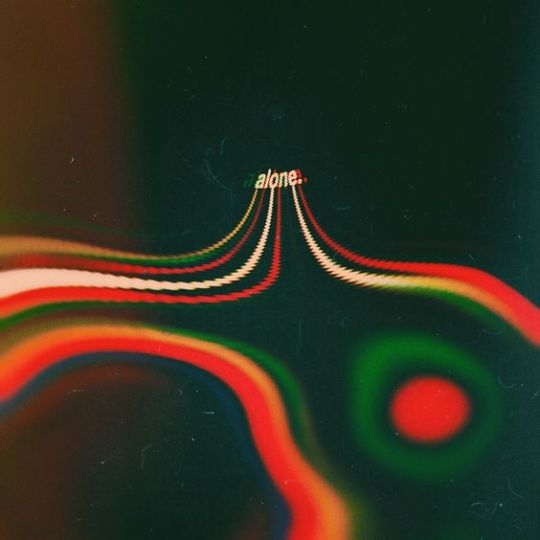
Ran Park - is an designer who has a wide perspective that allows her to balance concept with aesthetics. I believe this is very important to balance as work needs meaning and a purpose otherwise it can be useless to us. The designers relies on her life experience and observations of the world to create fresh, original work.
In this piece of work, the designer explores the chaos of Konglish.
Konglish is Korean and English words that derived from the English language, but the meaning or pronunciation has been altered.
The artist is lost In konglish and has experience this around her.
This zine shows the words that are pronounced the same alongside the Korean and English letterforms. I like how the layouts are chaotic and abstract, however the publication is aimed at foreign people. I feel that the artist needs to create another publication aimed for non foreigners.
Cristiana Couceiro - is an illustrator and graphic designer. The designer focuses her work on making collages using newspaper, tiles, vintage photos and pieces of paper in a simplistic way and retro way. The style of this motivates me to add shape, line and images together as another way of communication.
Neal C Gallagher - is an art director and designer. I like how this designer brings together elements of design by exploring printed matter, prints, drawings, paintings, and images.
I decided to put this into the scrapbook because I feel that I need some visual references that are express the issues and messages.

Éliot B.Lafrenière - this can be achieved digitally, paint, screen printing and inks.
Other - I like the black and white cut ups because it creates contrast and will attract my target audience.
Isabel Reitemeyer - is well known for the collages she makes. I like how there isn’t a lot going on. I feel that if I found images that relate to my topic I can then make it my own by adding shapes, movement and colour. The artist states: ‘’Less is (almost) always more’’. The reason why Reitemeyer keeps her work simple is because using less material tells you something or create a mood.
Leslie David - is a French designer, illustrator and art director. Her work focuses on visual thinking and design in the fields - fashion, beauty, art, music and culture.
I added Leslie David to my scrapbook because this reminds me of the work I have created and used in the magazine. Looking at this for inspiration I want to add depth and mix materials together to make my digital art visually stronger.
MY WORK
Other - inspiration of bright colours. This effect could be created by using paint, inks and using a screen print, brushes or squeegee.
Zine ideas
Risograph machine can be used to create some graphical outcomes.
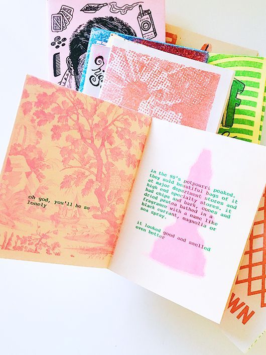
Tractorbeam - is a studio that creates designs that powerful. Their mottos is to get brands to connect, inspire, and drive real results.
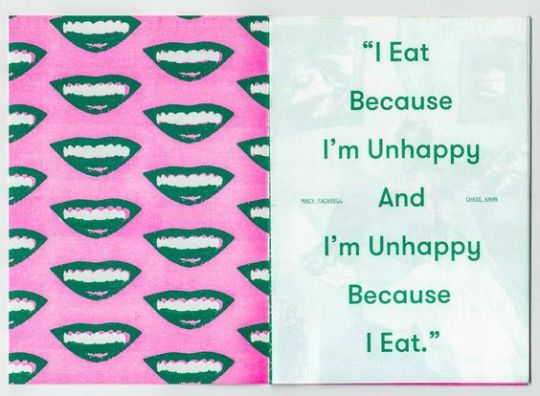
Phoebe Lovatt - the working woman’s handbook that offers advice by addressing the importance of maintaining physical and mental health.
This book is very handy to look at to see what is currently on the market. It seems to be targeted at women and who are in there 20-30s.
I like the idea behind it, but wish there was more visual references. This is how I am going to make my zine different.
Swirl project put together by Andy Walton ( mental health nurse), website, book and logo designed by Studio Moross and illustrations created by Nate Kitch - I think the masthead for this project is smart. Swirl is a good word to describe mental health. The imagery reflects what the project is all about and offers some simple tips to stop overthinking.
Aims - Creating a ‘’offline project’’ that is explored through a booklet. It’s aims is to practise positive ways of managing worry. It is a guide that is accessible, straightforward, but gives people comfort and power. This is similar to my project as I wanted to create a relaxed situation where my user can look through the book in their own time. My idea differs from this as my aim is to stop the stigma of mental health and to get people to understand how many young people.
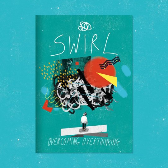
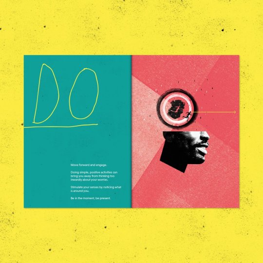
Other - what if I can use actual texture to create movement?
Outcomes - the parameters of my project tell me that I won’t really have time to print and put my outcome together to present. If there was more time for my project, I would create several mini booklets, leaflets that share information about mental health; like a kit.
I started to look at what other materials I could print onto - plastic, tracing paper, different types of textured paper etc.
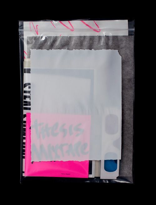
I found a website where you can order sheets of materials.
Here is the free samples I received:
https://www.studiomoross.com/projects/dj-tour-visuals-2016/ - visual video that I really like. I think that this looks cool and I love to learn more about this technique and apply it to graphic design.
#studio moross#Hendrik Werkman#dutch#dutch design#graphic design#visual art#makeup#glitter#digital art#inspo#ruben montero#plastic#pink#green#zine#book#zine book#postivechange#body postive#Typography#contemporary#postive mental attitude#polybags#swirl#prints#phoebe lovatt#tractorbeam#leslie david#artist#designers
1 note
·
View note
Text
How I Made: Victorian Gothic
1. A new/old start
Before I start I spend a lot of time gathering reference. For this piece I wanted to move away from using 3D models (which I had been using previously) and go for a more loose and painterly finish. I found a royalty-free image to base the composition on.
2. Tone down distractions
I used a combination of Levels adjustments, Desaturation and also a Smart Blur to get the feel of the buildings down into a narrow muddy value range. We don’t want detail (or people) to stand out at this stage and distract our eye. I also painted loosely over the top to further simplify and further reduce contrast. I added a new road that has more texture and some puddles to give a damp feel.
3. Force to fit
When you’re putting other architectural pieces into your image, they don’t have to fit your perspective perfectly, you can get away with quite a lot of distorting and skewing to force them to conform to your perspective grid. I always place vanishing points in a piece like this so that any additional images I add will adhere to a consistent perspective.
4. Bring on the night
I added three adjustment layers on top of the piece; a Levels just to further reduce contrast, a layer filled with blue and set to Hard Light and a Hue/Saturation adjustment just to take down the overall saturation. I stretched the mansion quite considerably and the result was that it looked really spiky and gothic. The light in the doorway was just an experiment to see how warm light could affect the scene.
5. Paint over the pieces
I started to ‘destroy’ the photos to make way for the painterly finish. It’s important to not rely too much on the photographic base when you want to make a digital painting, especially where architecture is concerned. For atmosphere, I added dense smoke and fog using custom brushes and some distant lights. The addition of chimneys adds a reason for the smoke as well as nice silhouettes.
6. Architectural adjustments
I found an image of an old house and placed it on the corner. The perspective was totally out so I had to hack it up and skew the front face and the side face separately, then paint over the left-over holes and gaps. Then I started to add paint to the rest of the street so I could add the details back in a more painterly fashion.
7. Bringing the detail back
This stage was all about painting in the details by hand and being careful about where the eye is getting drawn. It’s often about experimenting, putting something in, stepping back, seeing if it works. In Step 6 things looked messy but here, the overall direction of verticals and perspective lines are reinforced to add a bit more order.
8. Light it up
I brought the street to life with lights and people. It’s a good idea to make them seem like they’re not just placed in, but are part of some kind of motion or mini story. It may not be apparent at first, but there’s a guy looking up at the candle-lit lady on the balcony, and the running figure to help pull us through the street. Finally I adjusted the contrast of the overall image and added a layer of noise just to make it look a little grainy and film-like.
1 note
·
View note
Note
Hello! You have amazing editing skills. Do you have any advice for beginner graphic designers? Thank you in advance :)
okay, this is really unexpected for me and wow, thank you so much!
that’s one hell of a question tbh, but i’d assume you are referring to design in terms of tumblr graphic making? anyway, the tips i have are pretty much universal, so i would like to think you could apply them in a lot of situations hehe
so, in my opinion, there’s a lot of really important things that shape the way you create and do something but there’re three points of utmost importance.
1. know your tools
by that i mean that you should have a very throughout knowledge of the things you’re working with simply because that gives you a wide variety of variants of how to do smth. the more you know, the more ideas will start to shift from the point of ‘impossible’ to the ‘hard task’ and the more your creative process will unwind therefore helping you to process your feelings and create something of your own.
there’s a lot of editing programs for different purposes, but photoshop is one if not the best alternative for raster graphic (if you prefer vector graphic, you should search for illustrator, corel draw and other specified for this task editors). it’s unimaginably powerful instrument and till this days on i still discover something new about it.
how to acquire that knowledge? back in my days, 7-8 years ago i started with learning tutorials about everything, like A LOT of tutorials and ABOUT EVERYTHING - most of them were about photo editing and color correction but it had helped me to learn the most important tools on the adjustments panel. nowadays there’s a lot of photoshop tumblr blogs that provide quite a good sum of tutorials, for example on yeahps. yet still more complex and imaginative tutorials i find outside of tumblr so i’d really like to recommend not to be afraid to google some and try them out. also, practice as many of those as possible, even if you’re not liking some - it helps you to learn how to use different tools.
if talk more about tumblr graphics, there’re things that might help you - texture packs, brushes, actions, etc. all of this could be found in the link i mentioned previously.
2. train your eye
well, that sounds weird but i’ll explain - i don’t believe in talented people, at least not to the extend everyone seems to think about it. i believe in hard-working people and that very much apply to any kind of art understanding. first of all, basically, you need to look, look throughout on the things and ask yourself ‘why does this look so appealing to me, why do i like this’ cause there’s no ‘just because’ answer. it might be proportions, coloring, perspective, usage of negative space, specific typography, shapes the objects create and lots of other things, but in most cases it’s a mix of a few if not every of the aforementioned variables. therefore try to start to analyze all kinds of art around you - whether it’s tumblr gfx, advertisements in subway or pieces of work of legendary artists - this makes you notice the rules and constants which work on pleasuring the viewer’s eye.
when you look at specific art piece, especially gfx, ask yourself ‘how the author did this?’ - a very good exercise to provide the link between your toolset and your creative thoughts. this will make you more upfront toward new experiences and, once again, help to practice the way you perceive art.
3. practice
last but not the least - don’t be afraid to trying things out, changing your style and never think ‘ah, i could never do the things like this’ cause not god but man makes pot and pan. practice hard then practice even harder and the results won’t disappoint you. any good work is 1 percent talent and 99 percent hard work. honestly, this is probably the most important part of all of this list because i hate when people interpret work in terms of talent - no one wants to think that you’ve spent countless days and nights trying to achieve good results, easier to say that you have some god-given gift and life is easy as 2+2. no, only practice, practice and once again practice will give you the expected outcome.
p.s. critique is important, but learn to distinguish the difference between constructive criticism and utter bullshit, not everyone who has an opinion is actually having a needed amount of knowledge or any knowledge at all.
#i'm really not the best expert in this category#but that my set of rules i set in stone#hope this'll be a great help for you!#ask#bornfreonekiss
31 notes
·
View notes
Text
[SketchBook] Draw a mountain reflected in the lake

TUTORIAL by @aristina.z
Draw a mountain reflected in the lake
with SketchBook
Hey friends this is aristina.z!
I am here to present Part I of my tutorial.
From the time I joined PENUP I have learnt so much from each and everyone of you!
Have seen your wonderful art and unique styles of art out here...have enjoyed great support and lovely feedback from you all, so this my way to thank you all Pen.ple for being there for me!
Difficulty level : pretty easy
Style: Most of us have our own style of drawing.
And those who haven’t found their style yet but are reading this means they are motivated enough...and will soon be making great art too!
I for one am still learning and developing my style and skills.

STEP 1: My first step is choosing a nice color.
depends upon my mood, a suggestion, or seeing a striking color even!
I thought of choosing blue today!!!!
lots of shades...lots of possibilities.
Hence the color gives me an idea of what to draw.
As I love drawing landscapes I decided to draw a landscape with mountains.
TIP ALERT: To get good results do MORE of what makes you happy....it can be doing more of Landscapes, cityscapes or portraits.
The trick is to love what you do and do what you love.

Step 2: I browse through several photos and paintings on google of the subject (in this case mountains)
I am going to draw.
So now there are a lot of reference pictures for inspiration which I can draw digitally in my own style.
TIP ALERT: Always try do something with digital art that a photograph CANNOT do ...or traditional art cannot do....so don’t copy a picture just study it :
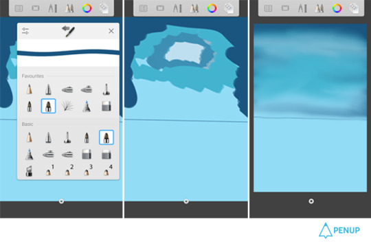
STEP 3: On the first layer divide the canvas into 2 halves and on the upper half use the paint brush to put in several shades of blue for the sky.
I will limit the color use to shades of blue here but we can easily use 2 or more different hues.
Use smudge to get an evened out appearance.
TIP ALERT: Limit color use and blend colors and shades to make landscapes look natural.
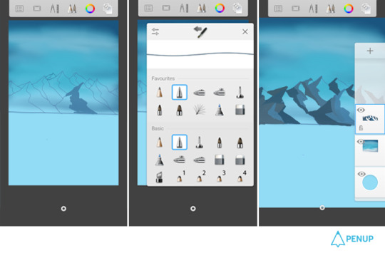
Step 4: On the second layer pen the mountain range on the upper part and color in the dark shades of blue on left half of each mountains. (as though light is coming from the right side)
TIP ALERT: keep in mind the direction of light and how it bounces off objects.

Step 5: Add a third layer.
On this color the lighter side of the mountains and also add texture by using different brushes.
Add some vegetation (shades of blue green) near the base of the mountains.
Use the different texture brushes e.g. the crayon brush for the mountains.
TIP ALERT: Why use 3 or 4 brushes when you can use more than 80 brushes on sketchbook...try all the brushes.
Reset them...explore and experiment to get great texures.

Step 6: Add layer number 4.
we can easily do it in 2 layers but its time to get comfortable with more layers!
On this layer add snow (greyish white) to the upper half of the mountains with more snow near the mountain peaks and also draw some clouds in the sky.
Add definition to your artwork in this layer if its your final layer.
TIP ALERT: Take one risk(at least)with every new artwork.
Try out something new on a different layer so if it goes wrong you can delete the layer without scrapping the whole artwork.
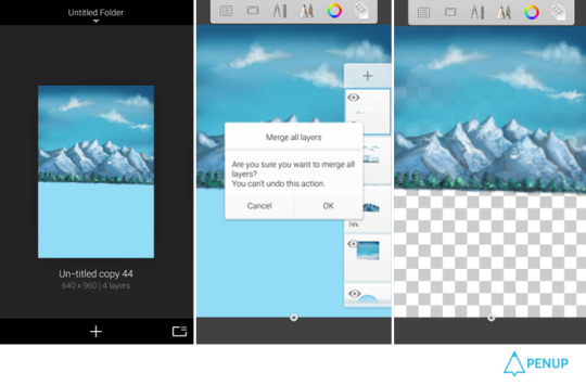
STEP 6: Time to add the reflection.
Make a copy (duplicate )of the artwork in the gallery section of your sketchbook.
In this duplicate copy use the “merge all” option to merge the layers of the artwork and hide the base color (in this case blue usually its the white layer)
TIP ALERT: Always keep the opacity of every layer below 100 (90 -95%)to give your landscape a better finish.
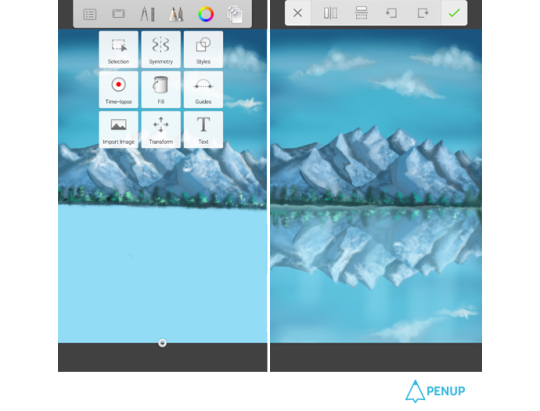
Step 7: Come back to our original artwork with the 4 layers.
Use the “import image” option to bring the duplicate layer here and then the “flip vertical “option to get it as a mirror image in the lower part.
The gap between the actual image and reflection should be filled by smudging the edge of the imported image.
TIP ALERT: Perseverance, practice and patience are vital.
Its easy to abandon an artwork but much more satisfying to finish it.
Step 8: This duplicate layer will be the layer number 5.
Reduce the opacity of this layer to 70% to make it look like a reflection.
Swap the position of the 4th and 5th layer so that the 4th layer becomes the final layer.
TIP ALERT: Trust your instincts, if while looking at the artwork at this point (by holding it at a distance) something doesn’t feel right probably it isn’t ...change it...

Step 9: On the new final layer the edge of the lake can be drawn too.
Give the final touches to your artwork and don’t forget to give it a nice title!
TIP ALERT: Try to give interesting names to your artworks...it helps the viewer to relate better.
Step 10: Time to Post it on PENUP!
TIP ALERT: And while you are on PENUP don’t forget to appreciate the original artworks of other artists.
Your ♡s is the support and encouragement every hardworking artist needs!
My first tutorial ends here!
You can leave your comments on my fan book page on PENUP.
Will be doing a tutorial on light effects next.
Just wanted to say that consistency, honest effort and hard work is always rewarded(sooner or later).
Like on PENUP where the winners for challenges are NOT always the artworks with popular votes or many reposts but the ones done with honest effort, original and creative ideas.
Looking forward to seeing some great art from you all!
How was it?
We were able to draw the landscape reflected on water in easy and natural manner with drawing features on the app.
Even a beginner will be able to draw beautiful landscape just in 10 steps.
Also, as what the artist said, the attitude is as important as the skills.
Don’t forget that you need consistency, genuine efforts and diligence.
Please send thank you notes to @aristina.z who has taught us very useful tips.


Artwork Sharing Social Network, PEN.UP!
http://www.penup.com - The PEN.UP Team
0 notes
Text
Painting Strategies For three Shades Of Color On One Wall
I've heard when painting walls a darker colour you need to paint the ceiling a lighter shade of the identical colour. Some providers could require primer in order that it retains the shade of the paint that you selected, particularly on darker walls. Updated on Might 6, 2012 Elsie Nelson moreContact Author Source Painting your partitions is one in all the most cost effective and easiest methods to improve the look of your private home. On ceilings, stairwells and excessive partitions, single strokes may be not possible. Once you've got properly prepped your partitions, the actual painting is straightforward. It also is very clean, covers very properly, so you do not have to use a couple of coat (except you have got very porous partitions, as with new construction). If you have painted the brand new construction, or when you have partitions that have been painted over a number of times, the smartest thing to do is to make use of a tinted primer as a base coat. Don't attempt to blend over a finished portion, as the paint, having set, will elevate clean off, or upon drying will depart a shiny spot which can mar the finish. Properly, painting your ceiling a darkish purple additionally, will make the area look larger. And when spray painting molerski krecenje i drugi radovi Beograd always persist with Rustoleum or Krylon (industrial only), depending on the coloration and protection wanted.
Jupiterimages/Pictures.com/Getty Photos Step 4Choose another base shade if desired. It may also help energize any room with colour and texture. Now, I've by no means had paint soak via my drop cloth, but you can buy plastic-lined canvas drop cloths that provide better soak-by protection. The large one, if in case you have children, they see them as an enormous clean canvas and begin their first attempts at artwork class one zero one. I am certain most of us have been there, proper! All it's a must to do is select the correct paint for the job and get the surface into pretty much as good a condition as possible. Danny Lipford: In case you have a small hole in your wall, like this, from where an image was hanging it’s fairly simple to repair utilizing a lightweight spackling or joint compound. However, what do you do with something like this, a hanging gentle fixture? Accentuate the texture to give your walls depth and curiosity, making them seem like sun-washed plaster or weathered stucco. You should use your imagination to attempt painting your walls with completely different material like crumpled plastic bags, spatulas, twine dipped in numerous colored paint o even bottle caps.
When you are painting an entire room, the ceiling is one of the best place to begin. This text is a brief summary of greatest practices for wall painting focusing on slicing-in and normal brush utilization. Not to mention, manufacturers consider one hundred% acrylics to be their best merchandise. The materials and choices out there in the marketplace ca give life to your imagination and creativity. Now we have heaps ofstencil ideas to inspire your creativity. If that's the case, read up on some simple decorating tips together with some ideas not commonly taken advantages of. Begin by filling the bucket about halfway with paint, then dangle the grid in the bucket. Purple paint, nonetheless, is a complete other world. When I’m painting furniture with latex paint, I typically don't use the dearer manufacturers of paint since I don’t want a whole gallon. The approach you choose to make the most of should depend on your confidence in your own painting and drawing skills, the look you’re going for, the materials it's a must to work with and your finances size.
Allen Lyle: Prime-down. You’re not attempting to do a again and forth movement on this. Earlier than replacing the light-switch covers and electrical-outlet covers in a newly painted room, I write the important data (model title, paint colour, paint number) onto a bit of masking tape and stick it to the again of a swap plate. Paint every coloration on a chunk of poster board and tape them up using painter's tape. Paint the top portion of the room one colour and the bottom portion one other coloration. Its the color I chose and painted them. In the event you take a look at a paint card, most firms have already found out what you are looking for. Go to home depot, and go to the paint section, and purchase a spray can referred to as ''Killz''. Subsequently, the home improvement retailer will mark it all the way down to about 25% of the original sale price. This final quantity will provide you with the exact area of wall space you'll paint. Why not brighten their day and gipsani radovi beograd (www.palermo-decor.rs) personalize it with an excellent wall mural? The decision to paint your basis wall is a permanent one.
Some decorators encourage folks to look at this sort of wall art to create the illusion of an extra play-house for youngsters who can use it as a backdrop. When making use of paint with a brush it can be arduous to get a straight line, however there are just a few tips to help you alongside the way. Make the interior yourself mirror on the partitions by depicting it all with a fine stroke of the paint brush! They make a room look unfinished. Some services similar to concrete require an additional product to make the walls obtain paint more simply. Ensure that each the transfer paper and picture are mendacity flat against the wall, somewhat taught and clean. Discover or design a picture on paper. It’s the Handy Paint Cup. Milk and chalk paint are additionally about 30 days. There are 4 approaches you can take to creating murals, each with its personal pros and cons.
0 notes
Last Seen Blogs
leefl00f
Hello Fellow fans of (insert fandom here)
theeangelego
serendipity
vomitjuulpodz
(they/them)
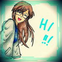
zerochan98
TokyoUniverse

lailymaharani
@Lailymaharani