#design is my passion
Text

iconic hamburger cheeseburger
+ halfmoonjoe`s reaction 💀
56 notes
·
View notes
Text
I heard that young people only like two things: tumblr and youtube shorts.
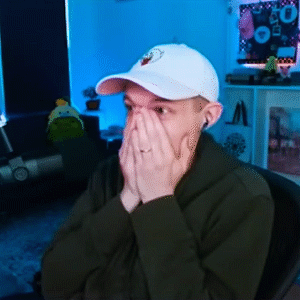
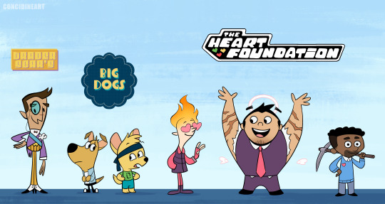
Submitted for the approval of the midnight society… Royal Court Audition tape for King Ren!
https://youtube.com/shorts/ZB8r5r9V5uE?feature=share
#hermitcraft#youtube shorts#green hat#typography#design is my passion#minecraft#rendiggitydog#king ren#joehills#joehillstsd#joe hills#hermitcraft 9#house industries
744 notes
·
View notes
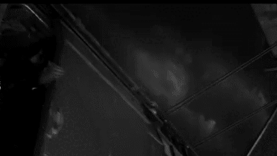
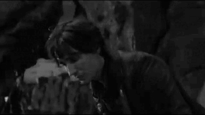
Photo
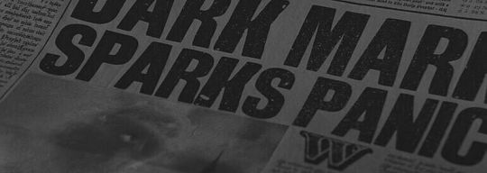

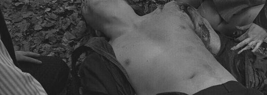


that's when we fell in love, but not the first time
prongsfoot + first wizarding war
7 notes
·
View notes
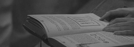
Text
they should make pride flag planner books with the label “the gay agenda” on them
5 notes
·
View notes
Text
with my awesome photo editing skills I recreated the shirt I wore in my dream

#dreamcore#last night i dreamt#meme#sillyposting#cat#satanism#satan#dream#dreams#design#design is my passion
1 note
·
View note
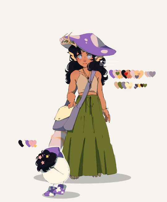
Text
Was encouraged by Tulli to post some of my original work here today for portfolio day. Besides GG20s, I'm also developing a cyberpunk story about a rookie cyborg boxer in an alternate 2001 Los Angeles in the style of late-90s anime.


I also have a side project, developing a video game idea on exploring the Pacific ocean and speculative marine sciences.

Also some posters I've done, including a piece I made for The Lovers.


#personal#my art#ocs#ko crisis#project pacifica#character design#illustration#i think most people know me for gg20s which is a soft historical fantasy#when my real passion is in futuristic scifi
6K notes
·
View notes
Text
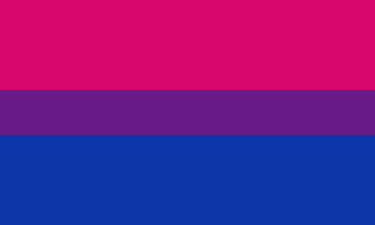
as a bi person, the bisexual flag brings me infinite joy and always puts a smile on my face, however as a person who has a Passion for Graphic Design, that undersaturated shade of purple infuriates me when it's used digitally
like, on an actual flag - which was its original purpose - it looks great!

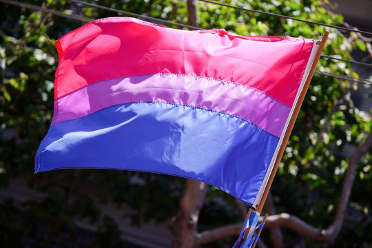
those look fine! lovely, even! with the semi-transparent fabric, the way it catches the sunlight, it looks beautiful!
but now look at how it looks digitally

the pink and blue are so vibrant compared to the sad, lonely lavender!
and let's look at this statement from Michael Page, the creator of the bi flag:

(sidenote: he created this flag in 1998, so if his takes on bisexuality is different from yours, it's okay to notice that! a lot has changed since the 90s when it comes to lived experiences and the way we describe them. but, it's also important to respect his thoughts about this and the way he presented them, even if today, we'd probably not say that bi people "blend unnoticeably into both the gay/lesbian and straight communities.")
so in pantone colors, the pink is 226 C, the blue is 286 C, and the purple of the flag is 258 C.
but...here's the deal
Michael talks here about how the key to understanding the symbolism is to know that the purple blends into both the pink and blue. and on a physical flag, I think you can see that!
but digitally, it absolutely does not blend. it clashes badly, and looks oddly separate from the other two colors.
which got me wondering...what purple do you get if you actually blend 226 C and 286 C?
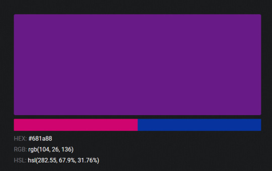
oh! oh, my god.
look at that! look at how nicely it fits between those colors!
look at it next to the original color scheme! look at how much more vibrant the purple is!
and friends. this is just blending through rgb! you get even more purple variations when you use other color spaces!
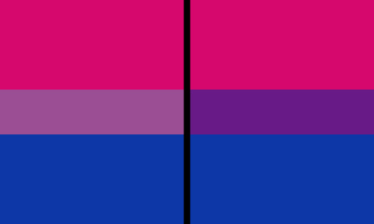
let's compare all of them:


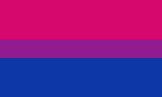
(top: original, lab. middle: lrgb, lch. bottom: rgb, hsl)
look at all of the different purple options you can get just by combining these two colors!
if you want almost too-vibrant saturation, you can go hsl, if you want something more relaxed that's closer to the original, you can go lab or lrgb. and if you want to split the difference, lch is bright and violet, while rgb is there with its saturated but darker purple.
anyway, I guess I don't really have a point here? this isn't so much an informational post as it is Me Getting Weird About Colors, but I think it is a useful lesson about how colors look very different on screens compared to how they look on objects in real life.
and sometimes, I think it's okay to compensate for that.
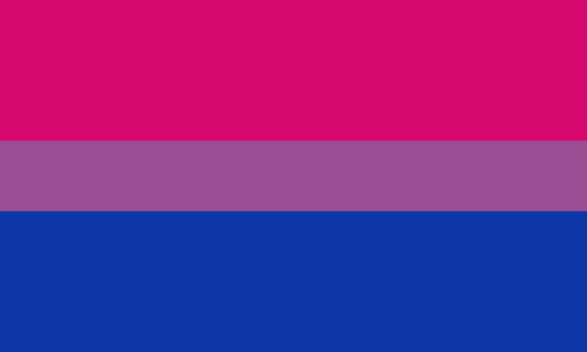
out of all of these, this is my favorite bi flag:

it's the one where the colors were blended in lab color space. for me, the lighter, softer purple is close enough to the original bi flag purple, while also feeling like a smoother blend of the blue and pink
but that's just me! and it might not even look the same to you, since every screen is different, because technology is a nightmare!
anyway, thank you for coming with me on this colorful journey! I will now retreat back to inkscape and make pained sounds about inkstitch gradients until something tangible pulls me back into reality
#bi#bisexual#bisexuality#bi flag#bisexual flag#sbs rambles#graphic design is my passion#id in alt text#but#the ids are probably deeply unhelpful for the different variations of flags#in the alt text of the six flags all grouped together#I just put what method the purples were blended with#and then tried to describe them more in the paragraph below#but this is an inherently visual post#so if you're reading it with a screen reader I am sorry :(
19K notes
·
View notes
Text
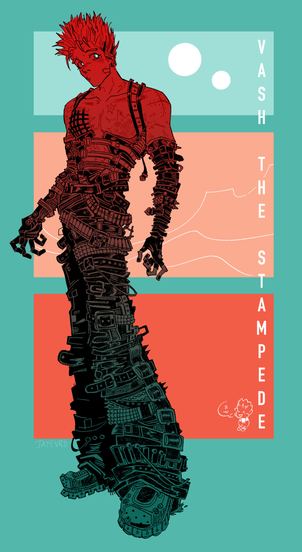
do you guys think he has enough belts yet
#trigun#vash the stampede#trigun maximum#trimax#trigun stampede#trigun vash#vash fanart#vash#idk how to tag anything girl help#trigun fanart#fanart#art#my art#jayevrd#graphic design is my passion#also ik alot of his design elements r flipped i drew him mostly yhe other way but decided i wanted to be able to see his gay earring#his fucking prosthetic is on the wrong side . pretend its not OKAY. OKAY PLEASE#also the fit is insp by stunt harness +those belt pants thst everyones circulating saying its vashcore (i agree)
14K notes
·
View notes
Text
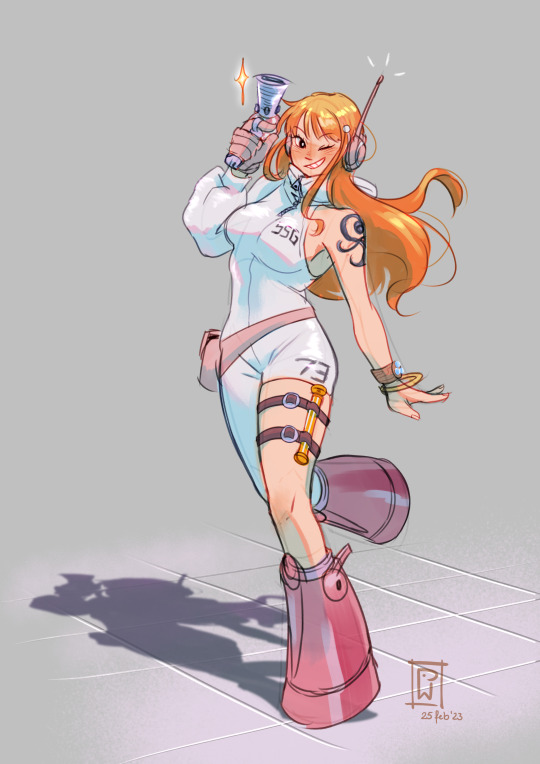

Nami on the brain!
#it has been a hot minute since I did fanart#an OP one on top of that#my recent art studies really influenced this piece#I'm not even doing lineart anymore#which might be my best skill#anyway egghead nami#some outfit design changes just cause#design is not my passion so don't flame me LOL#one piece#o0kawaii0o
3K notes
·
View notes
Text

Messing around with design ideas
#secret life smp#slsmp#mcyt#trafficblr#traffic smp#life series#I was aiming for ppg and fhfif style designs#and was reminded that scar's mayor outfit is literally just the ppg mayor outfit#struggled with the typography for way too long#graphic design is not my passion
5K notes
·
View notes
Text


chilling in nancy drew games:
deception island
#aes#nancy drew#cluecrewplaythru#design is my passion#clue2023#ddi#ddiedit#danger on deception island#mygif#chilling-series#idle animation
84 notes
·
View notes
Text

4K notes
·
View notes
Photo
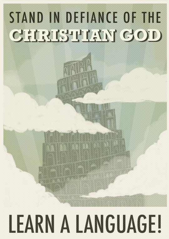
new favourite mbmbam bit just dropped
#the tower of babel#poster#lettering#mbmbam#sort of#that’s my new mantra#graphic design is my passion#mbmbam episode 624
31K notes
·
View notes
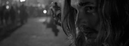
Photo


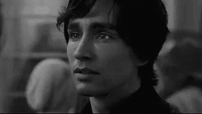

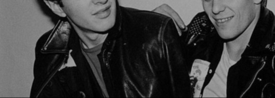
Marauders Era fancast: Robert Sheehan as Regulus Black
#fancast#regulus black#low quality#design is my passion#sorry if you wanted normal posts#i have not seen mortal engines only trailer#karma bonus to those who will guess how i came up with this fancast#good luck and good vibes to everyone
6 notes
·
View notes
Text


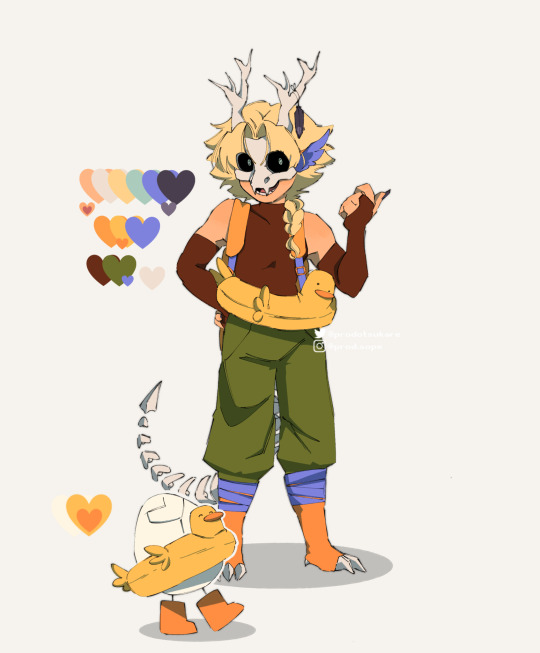
Gotta post my Deathfamily designs real quick ☝😌
#qsmp#qsmp philza#qsmp fanart#philza#qsmp missa#missa#missa fanart#philza fanart#deathduo#qsmp eggs#qsmp chayanne#qsmp tallulah#qsmp death family#character design is my passion#pissa#heck yeah
3K notes
·
View notes
Text

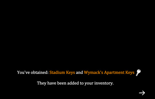


AFTG but make it a game!
#aftg#all for the game#all for the game fanart#neil josten#andrew minyard#aftg fanart#can you tell graphic design is not my passion#lol
3K notes
·
View notes
Last Seen Blogs

fny-s
Fny Art

cakemaster3000
cakemaster
patsatshit
Pat Sat Shit

briannnn90
No comments
fallenight
stella