#cambria font
Text

A&W - Lana Del Rey
#a&w lana#lana del rey#pink#white outline#gif warning#glitter text#lana lyrics#bloggif.com#cambria font#cambria bold italic#42px#album: Did You Know That There's A Tunnel Under Ocean Blvd#light pink#flashing lights#princess
472 notes
·
View notes
Text

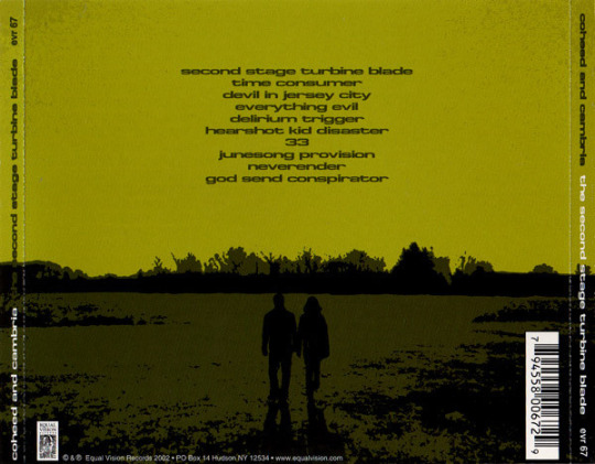
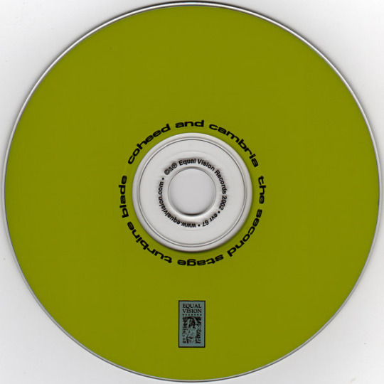


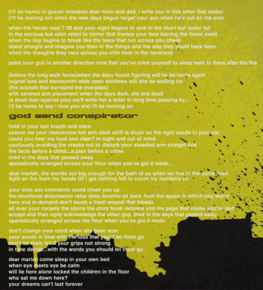

Coheed and Cambria — The Second Stage Turbine Blade
#coheed and cambria#sstb#second stage turbine blade#coheed#just some appreciation for my favorite album#this aesthetic is so fucking unmatched like. i want to live in this#that font.. the green.. ough#hehe. turbibe#the second stage turbine blade
50 notes
·
View notes
Text
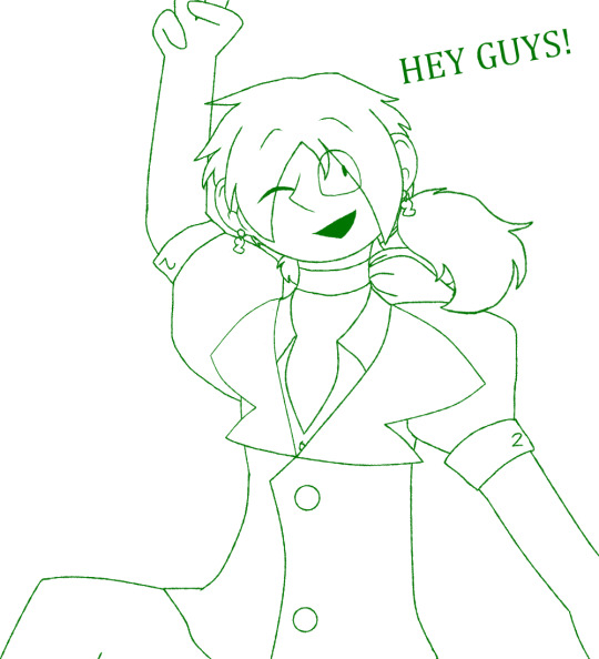
Sneak peek
#ladies & gentlemen & non-binary friends i present you#them#you can tell this was made in a program i dont have a lot of experience with#i booted up firealpaca for the first time in the while to make this#cause im like super excited to finally draw them in color#ill show you more later so stay tuned#fun fact: this type font is called cambria math
2 notes
·
View notes
Text
Reblog with yours and your reasoning, if you have one!
8K notes
·
View notes
Text
For reference:
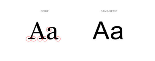
Serif fonts have the hooks on the end (called serifs)
popular fonts include: Garamond, Cambria, Times New Roman, etc.
Sans-serif fonts don't have serifs
popular fonts include: Helvetica, Open Sans, Roboto, etc.
(please RB if you vote!)
976 notes
·
View notes
Text
Industrial Automation In Life Sciences Market Size 2022 by Key Players, Types, Applications, Countries & Forecast to 2028
0 notes
Note
coming from one of those "born in mid 2000s and is now suddenly an adult, making everyone feel old," people, do you have any resources to learn how to bullshit your way through getting a job with zero experience. cause i cant even put like "babysitting" or anything since covid prevented literally any teenage-typical jobs and i kinda dont know what to put on a resume beyond the university im currently attending and the high school i graduated from. and they still dont teach you this in school even though we've complained for years 😭
Okay my chilluns, listen up. This is how to bullshit your way into a basic 1-page resume even if you think you have absolutely dum-dum-diddlysquat to put on it. I completely feel you, as it's hard as hell to get a job even in the ordinary course of things, and especially when everything seems to want 10 years of experience and a bachelor's degree (and still pays like shit). But you gotta be persistent anyway. So here follows the step-by-step guide of How To Resume:
Open a new Word (or other word-processing software of your choice) document.
Pick a nice, professional-looking font (for the love of God, no Comic Sans). Times New Roman is fine; you don't have to overthink it. My own CV is currently in Perpetua, because it's a nice serif that looks crisp and a little different, but it is still clean and readable. Garamond or Cambria or other starter typefaces are fine too. Make sure it is the right size, usually around 12pt.
Put your full name at the top, centered, in BOLD CAPITALS. Increase the typeface size a few more points on this, to make it stand out and to make it take up space.
Underneath this, in regular-sized text, put your contact information: mailing address if you're comfortable sharing it, or if not, at least your phone number and email address. Use a school email if you have it, and not some weird/in-jokey personal email.
Start a new paragraph. In a slightly smaller font (italic if you want to make it look classy) write a few words about yourself. This should be something like I am a [Major] student at [University] looking for a part-time, entry-level position in [sales, retail, office, etc]. A [year] graduate of [High School] in [City, State], I am [prompt, reliable, detail-oriented, mature, friendly, etc] and a hard worker who is eager to gain experience and positively contribute to your business.
Start a new paragraph. Change the alignment from Center to Left. Create a new heading in bold underline labeled Education.
Under this, fill in your education (college first, followed by high school). Include the institution name, city, and state, the year you graduated or expect to graduate, any honors or awards, any extracurriculars, any grade-point averages if they're good (i.e. 3.0 and above), and your expected major in college.
Start a new paragraph. Create another heading: Experience.
This is where you put absolutely anything you can think of (in chronological order, most recent first and counting backward). Did you volunteer for something ever in your life? Put it down! (Title of work, dates, location, brief description of work). Did you do yard work for someone for a weekend? Put it down! Were you (or are you) part of a student club or organization in high school or university? Have you organized or taken part in any local initiatives in your community or neighborhood? Put it down! Basically, absolutely any kind of work, paid or unpaid, that might be relevant, regardless of how long it was or when it took place.
Under that, put the new heading/paragraph Skills and Interests.
Have you worked with Microsoft Word, Outlook, PowerPoint, Adobe, Photoshop? Put it down! People love that shit! Do you use social media and/or know how to work it better than the average grandma? Put 'er down! You get the idea. Think of anything in your daily life that can be put in Job Language and then see if you can do that. You are in university; do you have any projects, papers, or other things that you're proud of? Have you successfully managed a (gasp) group project? Do you make any kind of art? Are you a registered voter who has taken part in civic/political organizations, drives, or events? (If not, REGISTER TO VOTE! This is your angry grandmother speaking). All of that can go down. Even if it's not job experience per se, it's life experience and shows that you are someone who is engaged with the world and working to gain more.
Last paragraph and heading: References. Ask a few trusted adults who know you well and aren't related to you, such as a favorite high school teacher or a university faculty member/degree advisor, if they'd be willing to serve as referees. Put down their full names, titles/place of work, email addresses, and phone numbers.
Voila! You have a full page resume, probably even a little more if you're lucky. Proofread, make sure the spacing is even and the alignment is right, it doesn't look weird, the text is a consistent size, it's all the same color, there are no glaring typos or grammatical errors, etc. etc. Save it as a PDF.
Boom. Done. You are now a Job Hunting Maestro.
If you get an interview, you don't need to pretend that you have tons of experience or that you're something you're not, but you can present what you ARE in a positive light anyway. Don't apologize for yourself or play yourself down pre-emptively; be confident about yourself and what you can offer. You're a college kid looking for your first part-time job, COVID prevented you from a lot of normal teenage work experience, you're willing to work hard and learn new things. Here's your resume. What would be a good time to talk again.
Good luck! I believe in you.
192 notes
·
View notes
Text
109 notes
·
View notes
Text
ROUND 1 - RED GROUP
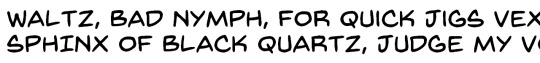
Propaganda under the cut.
Cambria: "Simple but refined, stylish and understated, evergreen, timeless, it's the little black dress, the classic tux, the cool cousin you always want to hang out with of the serif family. Your profs like it, it looks good whenever you use it, the italics are gorgeous, it has a wonderfully full set of characters, what! can't! Cambria! do! Also the Greek letters slap so hard, it is the only serif font I use for Greek typing."
Back Issues: "It's the font in comics that is usually done by letterers, now able to be used as a font by random shmucks like yourself!"
46 notes
·
View notes
Text
I have a vague memory of someone asking me for this bio code at one point, and since I'm redoing my bios and won't be using this anymore myself, here it is as free-use for everyone <3
Graphics are from Osiem's gorgeous bio resources
yes you can edit it as much as you like
no I don't need to be credited for the coding or anything, it's fine ^^
Coding can be found under the cut! It works both with or without vistas ^^
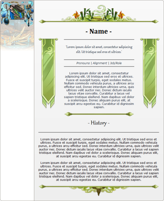
[center][img]https://dl.dropboxusercontent.com/s/kk5kaag52acu28a/windtop.png[/img]
[font=Cambria][size=7][b]- Name -[/b][/size][/font]
[columns]
[img]https://dl.dropboxusercontent.com/s/2623e2f92xw1s9r/windv2.png[/img]
[nextcol]
[center]-----
[font=Gabriola][size=5]'Lorem ipsum dolor sit amet, consectetur adipiscing elit. Ut tristique sed eros et ultrices.'[/size][/font]
-----
[i]Pronouns | Alignment | Job/Role[/i]
-----
Lorem ipsum dolor sit amet, consectetur adipiscing elit. Ut tristique sed eros et ultrices. Fusce et suscipit turpis, eget sodales metus. Nullam commodo vehicula purus, a ultrices arcu efficitur sed. Donec interdum ultricies urna, quis ultrices velit auctor nec. Donec dictum iaculis lacus vitae convallis. Curabitur a lacus vel sapien tristique eleifend. Nam dapibus vel dolor a scelerisque. Donec aliquam purus elit, at suscipit arcu egestas eu. Curabitur id dignissim sapien.
[img]https://dl.dropboxusercontent.com/s/k1b4ynhewlhqjdz/windmidsmall.png[/img][/center]
[nextcol]
[img]https://dl.dropboxusercontent.com/s/2623e2f92xw1s9r/windv2.png[/img]
[/columns]
[font=Gabriola][size=7]- History -[/size][/font]
-----
Lorem ipsum dolor sit amet, consectetur adipiscing elit. Ut tristique sed eros et ultrices. Fusce et suscipit turpis, eget sodales metus. Nullam commodo vehicula purus, a ultrices arcu efficitur sed. Donec interdum ultricies urna, quis ultrices velit auctor nec. Donec dictum iaculis lacus vitae convallis. Curabitur a lacus vel sapien tristique eleifend. Nam dapibus vel dolor a scelerisque. Donec aliquam purus elit, at suscipit arcu egestas eu. Curabitur id dignissim sapien.
Lorem ipsum dolor sit amet, consectetur adipiscing elit. Ut tristique sed eros et ultrices. Fusce et suscipit turpis, eget sodales metus. Nullam commodo vehicula purus, a ultrices arcu efficitur sed. Donec interdum ultricies urna, quis ultrices velit auctor nec. Donec dictum iaculis lacus vitae convallis. Curabitur a lacus vel sapien tristique eleifend. Nam dapibus vel dolor a scelerisque. Donec aliquam purus elit, at suscipit arcu egestas eu. Curabitur id dignissim sapien.
[img]https://dl.dropboxusercontent.com/s/x70o1tgtwji443a/windbottom.png[/img][/center]
73 notes
·
View notes
Text

#lana del rey#lana lyrics#Mariners Apartment Complex#album: norman fucking rockwell!#they mistook my kindness for weakness#bloggif.com#45px#cambria font#cambria bold italic#gif warning#glitter text#pink#no outline#lyrics
131 notes
·
View notes
Text
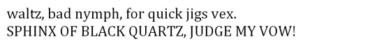
Common serif fonts: Times New Roman, Baskerville, Garamond, Goudy Old Style, Georgia, Didot, Cambria. There are also slab serifs like Rockwell, American Typewriter and Courier.
Common sans serif fonts: Arial, Helvetica, Franklin Gothic, Avenir, Verdana, Trebuchet MS, Futura, Gill Sans, Comic Sans, Calibri.
I read this article to find out what classed as serifs or sans serifs - there are also several subcategories of both but perhaps that's a poll for another day, lol
If you pick the 'something else' option, please feel free to elaborate in the tags or comments, I'm curious!
#writeblr#ficblr#wips#writing#fonts#serif fonts#sans serif fonts#typography#tumblr polls#polls#my polls
33 notes
·
View notes
Text
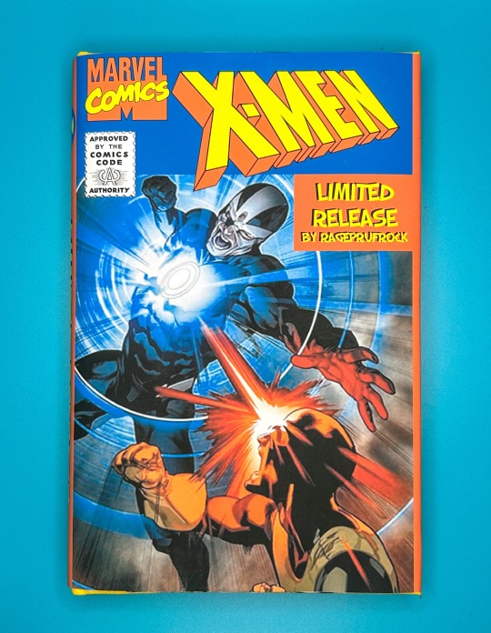

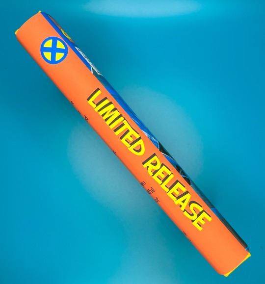

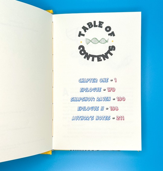
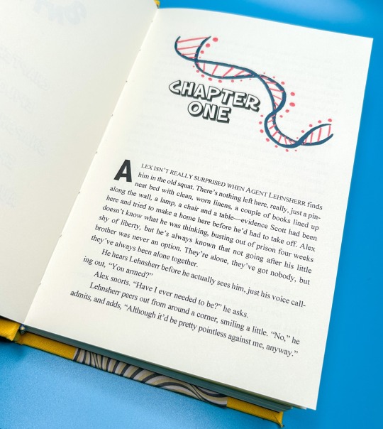
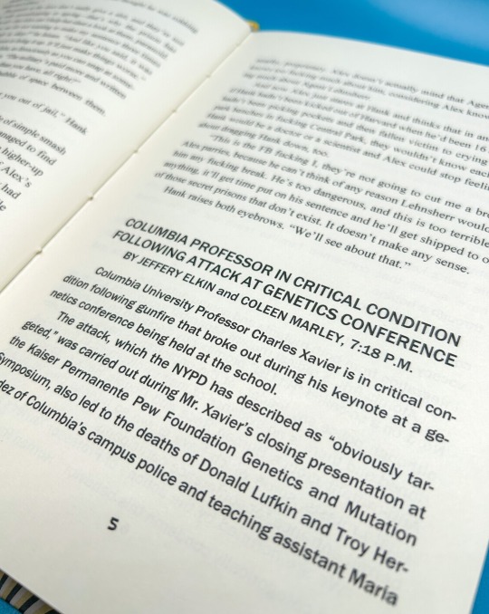


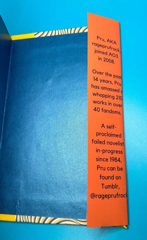
Limited Release by @rageprufrock
When Alex Summers broke out of supermax to rescue his stupid kid brother, he had no idea it was going to be so fucking complicated.
fic by @rageprufrock
224 pages / 63,456 words
Title Font: Octin Spraypaint, SF Slapstick Comic Shaded
Body Fonts: Bembo, SF Slapstick Comic, Franklin Gothic, Cambria, Arial, Space Mono, Permanent Marker, Space Comics
More on the process below the cut!
WHAT A JOURNEY THIS WAS! I completed this fic as a gift for @runawaymarbles during Renegade's Bound Fic Exchange, and it was such a fun one to design! I went for a comic book inspired theme, using bright, saturated colors; comic book yellow (which is a real shade!), bright blues, and rich reds (it came out a little more orange, but that's easier on the eyes anyway xD).
The dust jacket was new territory for me, but after crowd-sourcing assistance from the Renegade group, I was finally able to print it at the Octavia Lab! It was an awesome meetup, and a fantastic resource for us (the dust jacket printing was FREE, no $40 Staples trip needed!)
This whole project was a blast, and I was able to gift the author a copy as well. Thank you for all the fun!
#fanficbinding#fanfiction#fanfic#fanfic bookbinding#fanfic binding#fanbinding#fanfiction bookbinding#ficbinding#fic binding#fanficbookbinding#renegadepublishing#me myself and i#marvel#xmen#alex summers
133 notes
·
View notes
Text


"The personal is the pattern is the political.” The artist Mary Tremonte writes.
In this colorful swatch book, you’ll find repeated patterns on fabric exploring themes on queer ecology, feminism, and biological exuberance in my@font-face {font-family:"Cambria Math"; panose-1:2 4 5 3 5 4 6 3 2 4; mso-font-charset:0; mso-generic-font-family:roman; mso-font-pitch:variable; mso-font-signature:-536870145 1107305727 0 0 415 0;}@font-face {font-family:Calibri; panose-1:2 15 5 2 2 2 4 3 2 4; mso-font-charset:0; mso-generic-font-family:swiss; mso-font-pitch:variable; mso-font-signature:-469750017 -1040178053 9 0 511 0;}p.MsoNormal, li.MsoNormal, div.MsoNormal {mso-style-unhide:no; mso-style-qformat:yes; mso-style-parent:""; margin:0in; mso-pagination:widow-orphan; font-size:12.0pt; font-family:"Calibri",sans-serif; mso-ascii-font-family:Calibri; mso-ascii-theme-font:minor-latin; mso-fareast-font-family:Calibri; mso-fareast-theme-font:minor-latin; mso-hansi-font-family:Calibri; mso-hansi-theme-font:minor-latin; mso-bidi-font-family:"Times New Roman"; mso-bidi-theme-font:minor-bidi; mso-fareast-language:EN-US;}.MsoChpDefault {mso-style-type:export-only; mso-default-props:yes; font-family:"Calibri",sans-serif; mso-ascii-font-family:Calibri; mso-ascii-theme-font:minor-latin; mso-fareast-font-family:Calibri; mso-fareast-theme-font:minor-latin; mso-hansi-font-family:Calibri; mso-hansi-theme-font:minor-latin; mso-bidi-font-family:"Times New Roman"; mso-bidi-theme-font:minor-bidi; mso-font-kerning:0pt; mso-ligatures:none; mso-fareast-language:EN-US;}div.WordSection1 {page:WordSection1;}celium, birds, and mammals. Together, they form new symbols for resilience and world-making.
“Embrace the power within each of us to create the world anew.”
Exuberant resilience : a swatch book
Tremonte, Mary [artist]
Rosendale, NY, 2019
Women's Studio Workshop
HOLLIS number: 99155658917303941
#ArtistsBooks#Ecology#EcoFeminism#QueerEcology#MaryTremonte#WomensStudioWorkshop#HarvardFineArtsLibrary#Fineartslibrary#Harvard#HarvardLibrary#WomenArtist
13 notes
·
View notes
Photo
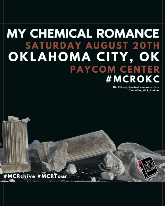
Today is the day ✨ My Chemical Romance kick off the long awaited North American leg of #MCRTour with #MCROKC, at the Paycom Center with openers Coheed & Cambria and Dilly Dally 🪰
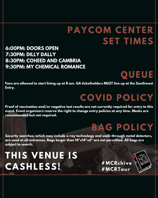
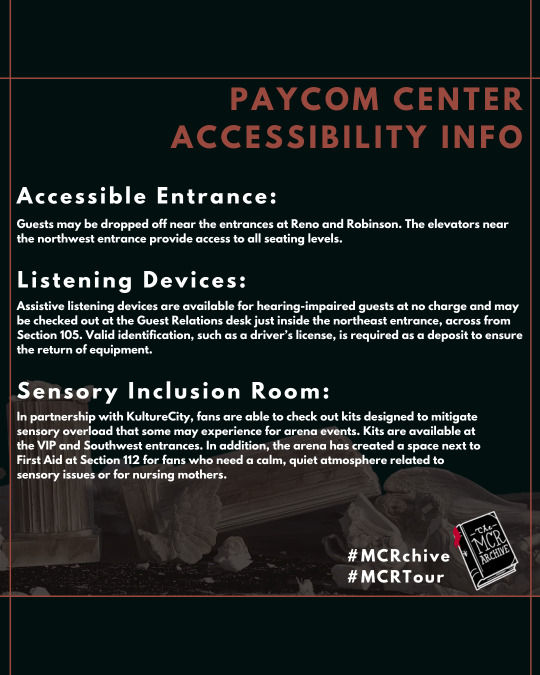
See set times (approximate), venue info, and accessibility info. We will be updating with any changes!
[Image descriptions can be found under the read more]
[image description]: this graphic has a black background and red borderlines. the text on this graphic is white. the text is a non serif font. the text reads: [my chemical romance saturday august 20th oklahoma city, ok paycom center #mcrokc #mcrchive #mcrtour] there is an image in the background of broken statues. there is a graphic on the bottom right. the graphic is the logo for the mcr archive. the logo is a drawing of a book with "the mcr archive" on the front in a serif font. the book is black with white text and has a red bookmark.
///////////
[image description]: this graphic has a black background and red borderlines. the text on this graphic is white. the text is a non serif font. the text reads: [paycom center set times 6:00PM: DOORS OPEN
7:30PM: DILLY DALLY
8:30PM: COHEED AND CAMBRIA
9:30PM: MY CHEMICAL ROMANCE
queue: Fans are allowed to start lining up at 8 am. GA ticketholders MUST line up at the Southwest Entry. covid policy: Proof of vaccination and/or negative test results are not currently required for entry to this event. Event organizers reserve the right to change entry policies at any time. Masks are recommended but not required. bag policy: Security searches, which may include x-ray technology and walk-through metal detectors, are used at all entrances. Bags larger than 14"x14"x6" are not permitted. All bags are subject to search. this venue is cashless #mcrparis #mcrchive #mcrtour] there is an image in the background of broken statues. there is a graphic on the bottom right. the graphic is the logo for the mcr archive. the logo is a drawing of a book with "the mcr archive" on the front in a serif font. the book is black with white text and has a red bookmark.
///////////
[image description]: this graphic has a black background and red borderlines. the text on this graphic is white. the text is a non serif font. the text reads: [paycom center accessibility info
acessibile entrance: Guests may be dropped off near the entrances at Reno and Robinson. The elevators near the northwest entrance provide access to all seating levels. listening devices: Assistive listening devices are available for hearing-impaired guests at no charge and may be checked out at the Guest Relations desk just inside the northeast entrance, across from Section 105. Valid identification, such as a driver’s license, is required as a deposit to ensure the return of equipment. sensory inclusion room: In partnership with KultureCity, fans are able to check out kits designed to mitigate sensory overload that some may experience for arena events. Kits are available at the VIP and Southwest entrances. In addition, the arena has created a space next to First Aid at Section 112 for fans who need a calm, quiet atmosphere related to sensory issues or for nursing mothers. #mcrparis #mcrchive #mcrtour] there is an image in the background of broken statues. there is a graphic on the bottom right. the graphic is the logo for the mcr archive. the logo is a drawing of a book with "the mcr archive" on the front in a serif font. the book is black with white text and has a red bookmark.
[end image description]
105 notes
·
View notes
Note
favorite font?
Cambria, I use it since I’m seven or so.
What about you?
#ask#thanks for the ask#leta blows my inbox up#font#interesting question#the strange blackthorn siblings#<- hope I spelled it right#still no smiley
6 notes
·
View notes
Last Seen Blogs

smalldickcuckandstuff
Cuck Hotwife Stuff Erotic Horror Stuff
tsukikumagai
Untitled
yetanothervisarun-blog
YET ANOTHER VISA RUN (Nate & Adriana)
ulquhime
Ulquiorra & Orihime

deadwclking
NOW @TOLEAD