#but trying to evoke iconic parts of the design while still making it make sense
Text

Inspired by @ovegakart 's kick ass twilight princess and skyward sword robos. I couldn't get the idea of a mass shifting robo hero of the minish out of my head so I had to draw.
Ezlo, a tiny techno-organic being turned into his current form by his former apprentice, merges with the hero. This unlocks the ability to mass shift down to sizes thought too energy intensive to be possible. Link learns that wheels aren't much use at such a small scale and adopts a mulldozer alt mode.
Concept doodle drawn on a post-it note. kept most of it more or less the same with a handful of obvious changes.
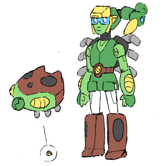
#legend of zelda#minish cap#link#ezlo#transformers#Been a hot minute since I've designed a transformer#Normally I start with alt mode and figure out what goes where#but trying to evoke iconic parts of the design while still making it make sense#kind of make sense#some SS86 dinobot panel bs going on with the legs
445 notes
·
View notes
Text
The Goonies: Facets of Film
A film isn’t ready for shooting the minute the script has been written and the parts have been cast.
This is pretty obvious: there’s a lot of steps to go through before a project can fully become a film: cameras, lighting, music, sets, special effects, costumes, and tons more that have to go into piecing together a coherent narrative in a way that makes sense using editing and other filmmaking tricks, turning filmed sequences into scenes that tell a story. This is a usage of the production design of the film: using the elements at the filmmaker’s disposal in order to build the ‘film world’ and make it realistic enough that the audience buys it for a while.

This is where the production team comes in.
The job of the behind-the-scenes crew, everyone from the director to the production assistants, is to create this ‘film world’, in any way they can, using cinematography, costuming, special effects, lighting, and everything else at their disposal to convince the audience for a brief period that what they’re seeing is real. These elements, when used well, can capture the attention of an audience and turn a ‘good’ film with a solid story and characters and turn it into a cinematic classic, all through the clever use of movie magic.
And, of course, aside from looking good and being believable, these ‘facets of film’ are also used to tell the story.

These elements, cinematography, sets, etc., are used to highlight the plot and characters to the audience in the most efficient way possible. Although it’s true that some films accomplish this better than others, the best films use these ‘facets of film’ wisely, conveying information to the viewers in ways that make sense, making a film more understandable and enjoyable.
In other words: today, we’re going to talk about what makes The Goonies a movie instead of just a story, and asking ourselves one simple question:
Does The Goonies use its ‘movie magic’ well, or not?
Let’s take a look, starting with something that can seem kind of simple: cinematography.
The Goonies isn’t exactly an ‘arthouse’ film. By that, I mean that to the average movie-goer, there’s not much in artistic shots: the movie is focused on getting to the point. But that doesn’t mean it can’t look good while doing it.
Cinematography is a hugely important feature of film, one that is often overlooked. Audiences tend to underestimate the value that a camera, the ‘eyes’ into the film world, actually has: how the camera ‘looks’, and therefore allows us to look at a scene can be hugely impactful. Such is the case for The Goonies.
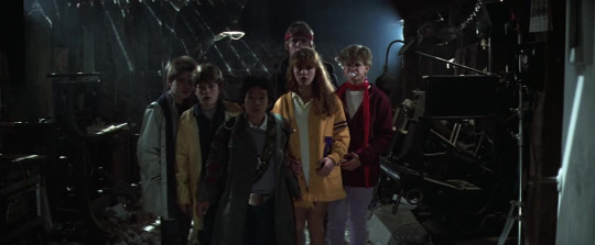
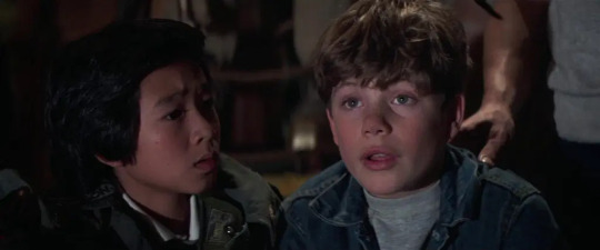
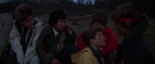
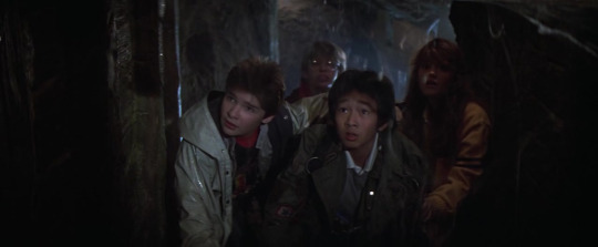
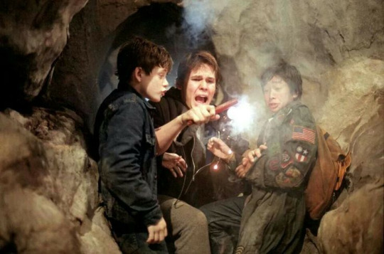
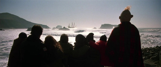
There are a few shots within The Goonies that everyone just remembers. The first time the kids lay eyes on the pirate ship, their final goal, is a hugely memorable moment, when the camera switches from the open-mouthed, awed expressions of the Goonies to the hugely impressive pirate ship, entirely built as a set for the film. Other shots, like the reveal of the bone-organ, or the first shot of Sloth from behind, his chained hands held up against the light, stick in people’s minds: or the simple but effective shot moving to focus on Mikey leaning over his porch railing.
These shots are certainly strong and memorable, but they also convey a lot of interesting information to the audience all at once, which is very important. In one split second, the viewers understand the magnitude of the discovery of One-Eyed Willy’s pirate ship, the terror of the dead body in the freezer, the miraculous recovery of the jewels to save the Goondocks, the relief of Mr. Walsh tearing up the contract and throwing it into the air.
These shots are designed to evoke emotions in their audience, giving us a perfect viewing point into the film’s world, allowing us to ride alongside these characters and experience what they’re experiencing: the fear, the joy, the laughter and the excitement, and the camerawork more than achieves its goal. The cinematography is effective without being showy, showing off when it needs to, and being simple and small when it fits the tone better.

A big portion of the film’s appearance is for sure in the cinematography, but honestly, there’s not much point to good camerawork if there’s nothing to shoot. Thankfully, the production design of The Goonies doesn’t disappoint.
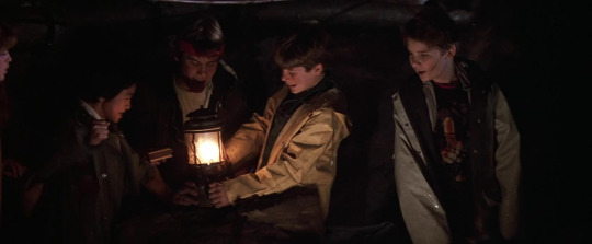
Every setting in this film feels solid and lived in, from Mikey’s house to the beat-up old restaurant, to the caves, and, of course, the pirate ship. Richard Donner and Steven Spielberg (Director and producer of The Goonies, respectively) had, at this point, a bit of experience with the special effects department, and it shows in the film’s final look. Spielberg’s iconic Indiana Jones style sets and effects are echoed here in the cave sequences, with booby traps, skeletons, and the claustrophobic, dirty caverns convincing the audience effortlessly of their authenticity.
The entire film is a visual delight, with the production design clearly putting forth a lot of effort into making the movie look good, from the pirate ship to the prosthetics on John Matuszak to bring Sloth to life.
Despite the magnificent sets, there isn’t actually much in ‘visual effects’ in the film itself (especially once the octopus scene was cut), besides the prosthetic effects used for Sloth (very impressive in their own right). There are a few notable scenes: the floor dropping out from underneath Mouth (achieved by attaching a cable to Corey Feldman’s belt and collapsing the set floor underneath) being one of the more impressive of the various Rube Goldberg booby-trap setups throughout the entire film, and the cave collapsing prove to be a few of the most visually impressive effects in the entire film, furthering the story along and making it look believable.
There are other important visual things too: the costumes on the characters (Brand’s exercise wear, Data’s big, baggy trench coat with his inventions underneath, Mikey’s jean-jacket, Mouth’s Purple Rain t-shirt and Chunk’s Hawaiian shirt) all serve as legitimately distinct clues to tell kids apart in clumped together shots, but also works well as character building, coding in different outfits that match personalities, and even the props that kids have with them are hugely telling. These include Mikey’s inhaler, Mouth’s comb, and, of course, Data’s inventions, all elements that immediately tell the audience something about their personality without having to come out and say it in words.
In short, the visual storytelling of The Goonies is pretty darn competent.

But the visuals can only do so much.
The score of The Goonies (by Dave Grusin) works perfectly to form the backbone of every scene, from the merry tune that plays over Data’s inventions to the thrilling soundtrack that plays over the Fratellis’ escape at the beginning of the film. Every scene hits its mark thanks in no small part to the music in the background: reflecting character emotions and putting the audience right in with them, emphasizing huge moments like One-Eyed Willy’s pirate ship and playing up to smaller scenes, like the wishing well.
It also serves perfectly to underline what’s really important: the performances.
There’s more to a great movie production than sets, special effects and music. In the end, no matter how impressive, the production of a film doesn’t really amount to anything if the characters aren’t believable. The movie really rests on the shoulders of the performers: it’s on the actors to try to sell not only their surroundings and story, but the characters themselves, making an audience buy into the fact that they are real, and going through these experiences.
In The Goonies?
The entire cast steps up to the plate.
Sean Astin’s performance as Mikey is 100% wholehearted and earnest, genuine and inspiring. He is believable as the leader, and as a child with big dreams and big ideas, without being so wide-eyed as to be unrealistic, with a realistic way of talking that siblings around the world recognize. Jeff Cohen as Chunk is larger than life, over-the-top for every moment of screen time, constantly energetic in both terror and excitement, convincingly portraying a kid who’s scared out of his mind, but sticks it through for the sake of his friends. Ke Huy Quan easily persuades an audience of Data’s intelligence and charm, quirky behavior lining up with a ‘boy genius gadgeteer’ personality that is tempered with moments of irritation and frustration, as well as a gutsy streak that gets a little overshadowed by the antics of the others around him. Corey Feldman as Mouth is similarly believable as a snarky kid with too much attitude. Despite every character’s flaws, each actor manages to make each performance overall likeable and charming. Thankfully, this doesn’t stop with the kids.
Josh Brolin is believably exhausted and somewhere between childish and grown-up as Mikey’s older brother, Brand, pulling off an even mix that makes him believably grounded, but still able to be swept up in the adventure. Kerri Green as Andy isn’t given a lot to do, but she’s still entertaining and charming with the material given to her, much like Martha Plimpton as Stef, who delivers her snarky, sarcastic dialogue extremely well.
The heroes aren’t the only ones turning in great performances. Anne Ramsey is incredibly, and memorably, threatening as Mama Fratelli, and Robert Davi and Joe Pantoliano are entertainingly intimidating as Jake and Francis Fratelli, bickering amongst each other and getting smacked around with utmost believability, despite the ridiculousness of the situation. John Matuszak is wonderful underneath the prosthetics as Sloth, who, while never a villain, doesn’t officially become a hero until further into the film. Aside from these, the movie is full of little performances from other players, and everyone fills their part remarkably well.
Every character in The Goonies comes across exactly as they should: as characters in a kid’s adventure story. Each performance is perfectly suited to each character: not at all subtle, but energetic and entertaining. They are kids on a mission, with complete sincerity and consistency in their performances that help the audience to pretend that this is all real.
These performances are the cincher, the final step, the part that people remember and the element that solidifies this film as a family classic, continuing to entertain people over thirty years later.
In short? With people like Richard Donner and Steven Spieberg working behind the scenes, it’s not much of a surprise that The Goonies was an example of efficient filmmaking and visual storytelling. It’s a fast paced adventure story, a roller-coaster on film designed to take the audience along for the ride without asking any questions, and in that, it greatly succeeds.
The Goonies seemed destined for greatness from the moment it first released, with all of its ‘facets of filmmaking’ falling into place to create the perfect family adventure film, but, of course, that wasn’t an accident. Every movie is the result of a lot of hard work from a lot of different people, and The Goonies is no exception.
Thank you guys so much for reading! Join us next time where we’re going to be discussing the behind-the-scenes story of The Goonies in ‘Facets of Filmmaking’. I hope to see you there!
#The Goonies#The Goonies 1985#1985#80s#Film#Movies#PG#Adventure#Comedy#Family#Sean Astin#Josh Brolin#Jeff Cohen#Corey Feldman#Kerri Green#Martha Plimpton#Ke Huy Quan#Richard Donner
3 notes
·
View notes
Text
Forgotten Past, Hidden Future (Legend of Korra fic)
Chapter 1: Looking In The Wrong Places
Chapter 2: Lucky To Have You
Chapter 3: A Lot To Learn
Chapter 4: Kya’s Story
Chapter 5: A Tale of Miazu
Chapter 6: The Avatar’s Love
Final Chapter: The Mural
The dining hall was alive with chatter, but this time it wasn’t just the Air Nomads. The room was filled to the brim with familiar faces. Friends, family, teachers, all together. A jovial feeling was permeating from every corner of the room. This was all after a very important day and a very important decision. Tenzin stood up, ready to make a speech like he usually does (though his speeches are usually for the other Air Nomads).
“Before we get the night started, I wanted to give my greatest gratitude to Korra. Because today she has helped shape the Earth Kingdom in a way that will affect its people for generations to come. Not only has she helped bring a proper restoration to decades of Earth Kingdom history, but now the Earth Kingdom has abolished its laws against open sexuality. We still have a long way to go before it's whole again, but these changes are getting them on the right track to a society that cares for its people rather than upholding the status quo. To Avatar Korra…… we are all truly thankful.”
The room roared with applause. Korra saw all the smiling faces turn her way, she even noticed Bolin trying his best not to be a blubbering mess. Mako and Opal were trying their best to keep him together. Korra also saw Kya, who she noticed was tearing up. She knew she was proud of her. It dawned on her that all that work she put into what was, at first, a simple curiosity was going to change things for the better.
------------------------------------------------------------------------------------------
The celebration found its way out to the courtyard, it was later in the day and the dusk was coming over the city.
“I can’t believe you were out there changing the world AGAIN and you didn’t bring us along!” Bolin sounded surprised but in reality, he was just disappointed he didn’t get to go on another adventure.
Korra tried to contain her laughter. Asami, right by her side, was trying to do the same. “Believe me, you didn’t miss much,” said Korra through chuckles. “It was just a bunch of meetings and negotiations with Wu.”
“I mean, yeah….but still we could have been there to support you or something!”
“It's ok, I had Asami there with me. Sometimes it feels shes a better diplomat then I am.”
Asami nudged her on the side. “Hey don’t sell yourself short.”
“She's right.” Tenzin brought himself into the group. “After today, I remembered when you first came to Republic City.”
Korra winced at the thought of that first speech she made, it feels like an embarrassing memory from ages ago.
“But now, your helping settle civil issues for an entire nation, that's something worth celebrating.”
“Exactly!” Bolin added.
Korra laughed again, it was hard to comprehend how much she actually has done in such a short amount of time. Even with her three-year absence the reality of her impact on the world was starting to set in.
Kya also joined in on the group conversation. “Yeah, you kids did pretty well out there.”
“Well, I couldn’t have done it without your meditation techniques.”
Kya had a prideful but joking smirk on her face. Tenzin gave Kya a confused look, considering he was the one always trying to get Korra to meditate. He sighed and shrugged his shoulders. She was trying not to giggle at Tenzin’s slow realization.
Korra glanced at Kya, darting her eyes to the side. It felt she was giving her a silent signal. Kya gave her a knowing smile. “By the way Tenzin, I think Varrick got his hands on one of the glider suits. Said something about flying off the tower?”
“Again!?” Tenzin raced off, Bolin went with him just in case he needed help. Kya stayed behind, she looked at Korra and gave her an approving nod. Then she followed Tenzin and the others.
Korra took Asami’s hand as they made their way over to a private spot, the balcony overlooking the spirit portal. There were fond memories associated with this spot, like that day they agreed to take a vacation to the Spirit World. It meant something special to both of them.
“Did you just want to get some alone time?” Asami asked.
“Well, yes but there was something I wanted to tell you.” Korra’s face became serious but still affectionate.
“While I was talking to Kyoshi, I learned a lot more than just Earth Kingdom history. She told me a lot, like how Avatars aren’t the only people in the Spirit World. Apparently, everyone goes there after they die.”
“Everyone?”
Korra nodded. This little bit of information had some massive implications. Then Asami began to realize something.
“So, does that mean my mom and dad are in the Spirit World?”
Korra nodded again, she could sense a feeling of surprise and relief come over Asami.
“But that wasn’t the only thing Kyoshi told me. While I was there, she said that it was important to appreciate the ones I cared for, the ones I loved, while they were still with me. She said that while I have a responsibility as the Avatar, I should take the time to be with others. And I’ve been thinking about that a lot lately, now that all this Earth Kingdom diplomacy stuff is over.”
“Korra,” Asami said softly. She felt breathless.
Korra looked off to the side. “Gosh, I feel so silly. I haven’t even thought this through. I was only thinking about it this morning….but I know I can’t wait any longer.”
Korra got down on one knee. Asami’s eyes widened. Korra held her hand with a great deal of tenderness.
“I love you Asami, and I want to be a part of your life. I know this is all so sudden but I’ve had this feeling for quite some time now. It's hard to think about what life will be like years from now, but I want to be there with you for every step of the way.”
There was a long pause. Korra began to hear sniffling and laughing.
“Well, I guess it's my turn to cry today.”
Korra slowly got back up, still holding on to Asami’s hand. She waited patiently for a response. “So…...what do you say?”
“Honestly,” Asami reached for something in her left pocket, still trying to wipe away tears. “I was thinking the same thing.”
She pulls out a small black jewelry case. Korra’s eyes widen, it feels like her heart has stopped.
“I’ve had it with me for two weeks now. I just wasn’t sure when the time would be right.”
Korra could feel tears welling up, but they would finally release when she saw what was inside. It wasn’t an ordinary ring. The designs around showed many different Water Tribe symbols, but at the center was a metallic drawing of Naga. It was meticulous, like it was handcrafted. She could feel her tears dripping onto her hands.
“Wow,” Korra was at a loss for words. Korra began to laugh softly, but it was overpowered by her weakening voice. “I guess it's my turn to cry as well.”
They both laughed, trying to keep themselves collected. Korra buried her face in her hands. “Gosh, I feel so stupid. You made me this absolutely beautiful ring and I don’t even have anything to show for-”
Asami moved Korra’s hands away from her face and kissed her deeply. They held onto each other as they simmered in the moment. As their lips parted, they stared into each other's eyes. After a moment, Asami was the first to speak.
“You don’t need to get me anything. Being with you is a great enough gift as it is. Oh, and to answer your question…… my answer is yes. I want to be a part of your life too. And I promise I will always be there for you.”
They held onto each other for a long time, both red in the face and smiling almost non stop. No matter what doubts the future might bring, at that moment it felt like everything was right in the world. The only sounds now were the wind, Korra and Asami’s soft breathing as they embraced, and Bolin weeping tears of joy in the background as he and Tenzin returned in the middle of their proposal.
-----------------------------------------------------------------------------------------
The Maizu Memorial Site wasn’t on the grounds of the village since it was still converted into a mining town. But there was still a mostly untouched part of the woods in the Earth Kingdom that became the Memorial Site. It showed the history of Maizu while also promoting the traditions and culture of the original villagers. During this time, many who used to live in Maizu were making their way back, not just to see the site but to celebrate the abolishing of the old laws.
Korra and Asami took a vacation to see the site, along with Kya who felt like going down memory lane. It was early in the day, just the time before the crowds would get bigger. Korra and Asami were taking a trail that leads to a part of the Memorial Site that was dedicated to Avatar Kyoshi. Kya decided to stay behind to meet with old friends from her first visit to Maizu.
They held hands while they traveled down the trail, smiling the same way that they did when they first proposed to one another. When they finally arrived, they found a mural painted onto the smoothed side of a mountain. The left side showed Kyoshi in her iconic Avatar appearance, protecting the villagers of Maizu. It was grandiose, evoking the struggle to keep the village alive during its hardest times. And on the right side, it showed Kyoshi as she was. Without the makeup and headpiece, without the stoic appearance. She was accompanied by Rangi and Koko as a young girl.
Asami and Korra looked at the mural fondly, they felt the warmth of each other but also a relieving sense that this history can finally be known to everyone in the Earth Kingdom. They knew it couldn't be erased anymore. In front of the mural was a wooden board, that read:
“This mural is dedicated to Kyoshi, the Earth Avatar, and the Sacred Protector of Maizu. But this mural is also dedicated to the ones she loved. To her daughter Koko, and to Rangi, her bodyguard, teacher, and wife.”
Korra and Asami kept their grip on to one another. Just like Kyoshi and Rangi, they began to realize that they were inseparable. Korra knew that, no matter what happens next, Asami would always be there. And Asami knew that Korra would be there for her.
“I don’t think I want to go back yet,” Asami said playfully. “Let's stay here for a little bit.”
Korra gave her a little nod. They decided to sit down, in the same way that they did when they were meditating with Kya. But there was one difference. They were still holding onto each other.
#atla#avatar the last airbender#legend of korra#rise of kyoshi#lok#trok#atla fanfic#legend of korra fanfic#rise of kyoshi fanfic#korra#asami#kya#tenzin#bolin#kyoshi#rangi#earth kingdom#maizu#first fanfic#forgotten past hidden future part 7#forgotten past hidden future chapter 7
23 notes
·
View notes
Photo
@trespassers-will ok here we go
i also watched the various videos hidden inside each photo and the videos that were posted today as well and took notes too hjfhk
1. hobi’s room

okay so i thought i would rank jin’s room first but then i saw hobi’s room and i saw that couch nd went OMG okay thats no.1!! i love this interior so so much, like i normally hate orange and blue as a combination but this seems almost more like red and blue and it really reminds me of hopeworld. there’s many pop art-like graphic design posters adorning the walls, showing lines like ‘hope‘, ‘sweet’ and ‘my way‘. the shoes on the closet(?) behind him were disaplayed bc those are the colours we wears the most in his fashion. and then there’s this iconic inflatable clear pink couch and him wearing a pink robe and just GOD what a mood, i want a room like this!! the chair reminds me a lot of the type of fun quirky furniture i fantasized about and incorporated into my drawings as a kid when i was around 8-11, probably because i got inspired by stuff like totally spies and polly pocket, which had all these designs clearly inspired by 60s and 70s space age design but more in pink and purple i guess.
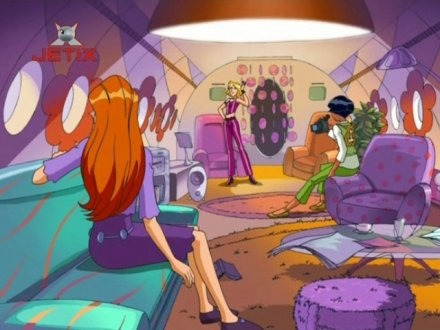
also i hate the search for such stills bc even w safe search on, you still have godawful f3tish drawings depicting those kids from totally spies ending up in search results and it’s disgusting. but yeah it reminded me of that
youtube
when i say polly pocket, i particularly mean this quik-clik (magnetic clothes and hair) era in 2005 which was what i had some stuff from. i had that couch / movie night! set and the pool and that
also i just really like hobi’s room because with all the posters and cabinets and clothing items laid out and a carpet and fun colours and whatnot, it really feels like an actual room you could live in, unlike any of the other rooms which feel very empty or too minimalist to me. but YEAH hobi’s room is my fav, i love the way a fuller room feels more cozy and habitable and floaties and inflatable floaties are AMAZING
2. jin’s room
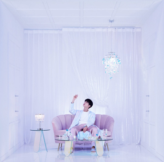
jin’s room is so prettyyyy!! jins explanation of the room was very uhm confident and funny but i love that. the couch looks like a lilac shell, which makes sense as everything else looks very pearlescent. i really love cool-toned pastels like lilac, powder / baby blue, periwinkle and everything just looks like it’s part of a waiting hall for mermaids or something. there’s also gems in it which took me a while to realize bc i only noticed the glass chandelier and lamp but then i saw them in his hand nd on the table. i dont rly care abt gems / jewels but overall i just love how this whole room speaks ‘pretty‘ to me. robes are always a plus. as i was writing this, i was also reminded of hair extension mullet jin with iridescent clothing and all and that is actually my all time fav photoshoot / look of him. him saying he’s the gem of the room makes sense too as he’s sitting in the shell like a pearl. jin pretty pretty mermaid

ok from here on its getting harder bc place 3-8 is not so much abt which is nicer but which one actually makes me feel any emotion bc i just feel too exhausted for excitement over comebacks or anything really. also minimalism doesnt make me feel anything either. but ill try
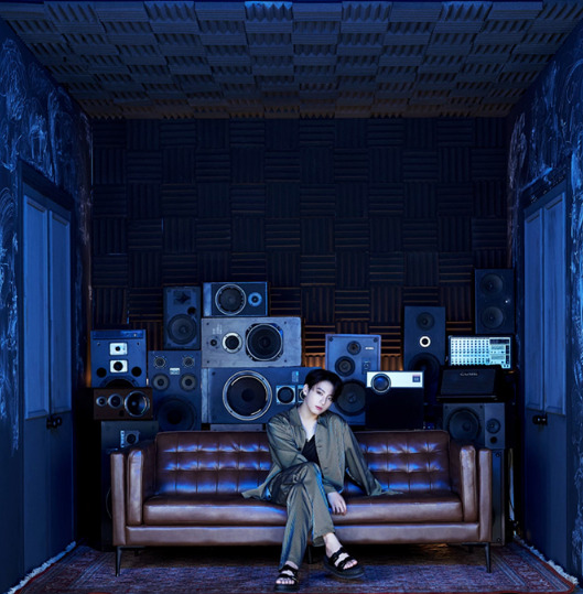
3. jungkook’s room
ok ive been staring at a screen w few sleep for too long so ill try to go through my ranking faster bc ive been working on this post for too long, also partially bc i cant focus nd partially bc theres some i just rly dont feel much for but i feel bad for ranking one lower than the other or ranking smth higher when ive talked to someone who dislikes a room i like dghkfdf
but yeah i like jungkooks room! its a very intense blue tht might make you depressed if youre in it too long but again i love how theres multiple items stacked in the bg and intense blue lights, and the ceiling looks like it has soundproof padding. its like youre in a recording studio or at some vaguely nostalgic party of a friend of my mom, who had plants in her home nd rock music nd the tv on and was smoking nd it was a bit dark and mysterious. i like it, it intrigues me a bit nd makes me miss going to concerts. also this pic rly just reminds me of 2008-2010 pop music videos where theres always a party and dj and people are wearing sunglasses or something and theres a dance break at the end
4. yoongi’s room
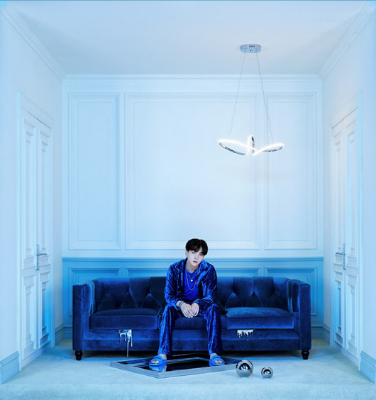
also blue!! the first time i saw this pic it was bc someone sent it to me to say how ugly they thought the decoration / editing looked w the metallic dripping stuff from the couch and whatnot but i kinda like it :( i like his velvety clothing and the light blue in the rest of the room is really pretty. i like mirror themes when done well nd i like how the reflectiveness shows also in the metallic dripping nd metallic spheres and the mirror hes standing on nd the way light reflects on his clothes and from the lamp. only the lamp feels a bit too much like a contemporary art installation for me nd his room already is a bit too empty for my liking nd i had the feeling when i watched the vid of him walking through the room that there was not much to interact w in the room like it was a bit dull. his voice in the explanation videos made it feel more like a place of peace / solitude rather than boredom or loneliness though.
5. namjoon’s room

ehh i think place 5, 6 and 7 are interchangable at this point. namjoon woulve ranked lowest but i listened to his explanation videos and saw him goof around in today’s video and appreciated it a bit more. the room still looks quite minimalist and not super comfortable, like youre not allowed to touch anything there (which is the same for jin i guess but i dont view that as smth meant to look like a living room). i do like how the wood theme is present throughout each wall nd in various items and w the windows nd use of space it feels a bit inspired by japanese interior design and that that is inspired by his bonsai tree nd love for woodwork, but im not sure. i was actually quite shocked some of his explanations were so short. so yeah i place this 5th bc i like how coherent the theme is but it doesnt feel cozy or inviting nd still very cold to me, maybe bc it looks too expensive or minimalistic in terms of colours.
6. jimin’s room
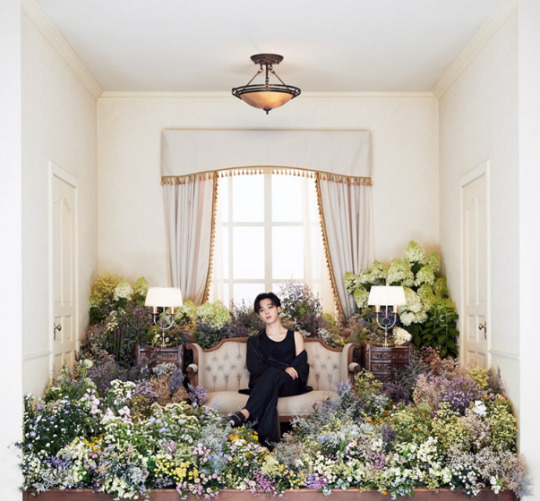
i like the flowers but also i dont like tiny flowers nd they tend to be the stinkier ones. i kind of like how jimins room feels the most like a grandma one w all the flowers nd offwhite and the lamp and beige i think? but the colours are so muted and if anything it feels like a place for a bridal photoshoot nd im just so bored. i love jimin nd feel bad for ranking a room he curated so low but it rly creates no serotonine in my brain, just melatonine bc im sleepy. i like how the room i obviously quite packed w stuff, but then the washed out colours make everything still look very bleak. hmm. i do like how the flowers reach outside the borders unlike w any of the others’ photos. im about to fall asleep so let me quickly finish this post
7. tae’s room
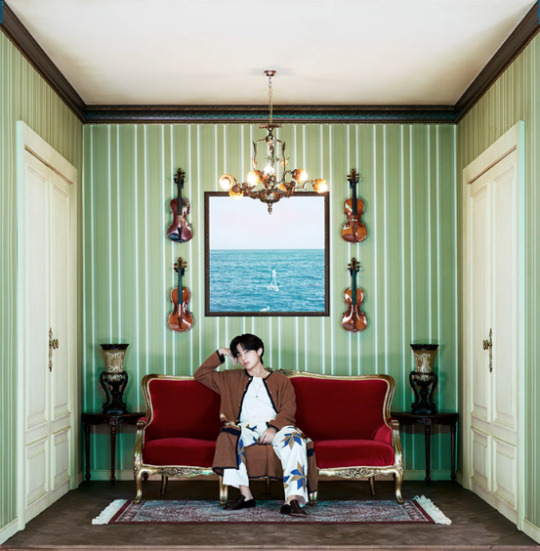
the picture in the middle behind him is interesting nd i dont know how he made that, nd i do like how he described his room as a place where there would always be enough food for visitors. i know it’s meant to communicate some highbrow, artsy vibe but w the weird editing and lightning nothing looks real in the room he’s in (including himself, like it doesnt even look like hes in the room) and it just looks kitschy instead of artsy. yeah i dont gravitate towards this one, it’s like deep-fried and desaturated at the same time nd i tend to avoid looking at it subconsciously
8. the first room photo

i first posted a long description here why but it disappeared but in short. this photo evokes no emotional response to me other than think of kind of crappy hotel rooms i was in w my parents while on vacation nd we slept in the same room or something nd the beds were awful nd made my moms chronic pain worse. the clothing is very boring and so r the colours of the room. i know bangtan curated stuff but its still the least interesting photo to me, maybe im too depressed to feel anything idk
im sorry this was prob very boring TT_TT i tried my best to make a ranking but i rly dont know nor care as much as i would want to
8 notes
·
View notes
Text
UX vs. UI Design – Everything You Need to Know

Oftentimes, people use the terms UX and UI interchangeably, but in reality, these two have very different meanings.
At one point in time or another, we all must have overheard discussions regarding the excellent UX of a product and the lousy UI of a site. But what exactly are these two terms? What are their actual meanings? Is it some secret language that we’ll never know? Or do people just use these terms to sound cool?
Well, perhaps yes to the last question but a big NO to the rest of them. In this blog, we will discuss the difference between UX and UI. Keep reading this blog till the end to know everything about it.
UNDERSTANDING UX VS. UI
Before we start talking about anything, we must make sure that we are clear on the basics. So what are UX and UI? Let’s see.
UX design stands for “User Experience Design,” and UI designs stands for “User Interface Design.”
Both of them are crucial components of a product, and they work closely together. However, notwithstanding their connection, they play very different roles and deal with entirely different facets of the product development process and the design discipline.
Prior to diving into the difference between the two elements, first, let’s go through what the terms UX and UI individually mean.
WHAT IS USER EXPERIENCE (UX) DESIGN?
UX Design can be understood as a ‘human-first’ process that teams use to design digital and physical products.
Donald Norman, a cognitive scientist who coined the term “User Experience,” defines it as a term that circumscribes each and every facet of the interaction between the end-user and the brand and its products and services.
Sounds pretty much clear, isn’t it?
But you might have noticed that unlike what we discussed earlier, this definition does not tell much about what a UX designer does. But then again, similar to any other profession in this world, this too cannot be explained in just a line or two.
Nevertheless, this definition does imply that no matter what the medium, User Experience Design circumscribes all interactions that take place between an active or potential consumer and a business. Being a scientific method, this can be applied to anything ranging from street lamps to vehicles. But, despite being a scientific process, ever since its rise, it has been almost entirely used within the digital fields. One of the primary reasons behind this is the fact that the tech industry began exploding around the period of this term’s inception. UX Design has a fascinating history, and in case you want to know all about its origin and rise, you can always look it up on Google.
Virtually, UX applies to everything that can be experienced – whether it is a website or a coffee/tea maker or even a visit to the mall. As stated earlier, user experience is nothing but all the user interactions with a company, its product, or service. Therefore, UX design refers to all the various components that shape this user experience. A UX designer considers the feelings that the experience evokes in the user and how easily users can accomplish their desired tasks. For instance, in the case of an eCommerce website, the designer may think how easy it is for the users to complete the checkout process while shopping online? Or how easily customers can grasp that vegetable peeler? Or does our company’s mobile banking app allow the users to manage their money well? The end goal of UX design is to build easy, streamlined, coherent, and overall delightful experiences for the users.
Now we will talk about what precisely a UX designer does later in this blog. For now, let’s take a quick peek into everything you should know about UX design in short.
UX design is the way to develop and enhance the quality of all aspects of user interactions with a brand and its products or services.
Even though, in theory, UX design is a non-digital (cognitive science) process, it has been used and defined for the most part by digital fields.
One of the most widespread misconceptions about UX design is that it is about “visuals.” User experience design focuses on the overall feel of the experience.
WHAT IS A USER INTERFACE (UI) DESIGN?
Regardless of the fact that user interface design is an older and more practiced discipline, answering the question “What is UI design” seems like a bit of a challenge due to the wide range of misconceptions surrounding this field.
While the UX design is a cluster of tasks focusing on optimizing a product to make it more efficient and enjoyable for the users, UI design complements or adds the finishing touch to the product. User Interface design focuses on the look and feel as well as demonstration and interactivity of a product.
However, just like in the case of UX, here, too, the company hiring UI designers often and most commonly confuse it with other professions. This misinterpretation is to the extent that entirely different job posts will usually refer to the profession.
Take a look at the job openings for UI designers and go through their descriptions. You will most likely observe interpretations of the profession similar to graphic designing, and sometimes even front end development and branding design.
Meanwhile, if you go through the ‘expert’ definitions of UI design, you’ll predominantly spot descriptions that are partially akin to UX design.
Perhaps you are now wondering which one of them is actually right? – Sadly, none.
First things first, let’s clear this up for good. To begin with, unlike user experience design, UI design is purely a digital practice. A User Interface is a POI (point of interaction) between a user and a digital product or device. For example, your smartphone’s touchscreen, the trackpad you tap on to choose the type of beverage you want from the hot drinks vending machine, or the fingerprint sensor on your devices, all are points of interaction. In regards to websites and applications, user interface design focuses on the look and feel, and interactivity of the product. This process is all about ensuring that the UI of the given product is as intuitive as possible. This means cautiously taking all visual, interactive components into account that the users may come across. A UI designer will consider everything – from imagery, spacing, icons, and buttons to responsive design, color schemes, and typography.
Similar to UX design, UI design is a many-sided and challenging task. It accounts for the transformation of a product’s research, development, layout, and content into an appealing, navigating, and responsive experience for the users.
We will be discussing the whole UI design process and particular tasks that UI designers can expect later in this blog. For now, before proceeding forward, let’s take a quick recap on UI design.
UI design is strictly a digital process that thinks about each and every visual, interactive component of a product interface, such as color scheme, imagery, typography, icons, buttons, responsive design, and spacing.
The ultimate purpose of user interface design is to navigate the users visually through the interface of a product. UI design is all about developing an intuitive experience that does not make the users think a lot.
User interface design transfers the strengths and visual assets of a company to the interface of its products, ensuring that the design is harmonious, relevant, and visually appealing.
Having said that, with these crystal-clear definitions of both user experience and user interface, we are clear on the basics. This brings us to the difference between UX and UI.
Let’s dive in!
KEY DIFFERENCES BETWEEN USER EXPERIENCE (UX) AND USER INTERFACE (UI)
We will try and explain the various parts of a digital product using a metaphor:
Think of a product as the human body – here, the bones of the body portray the code which gives structure to the product. Likewise, the organs depict the user experience design – assessing and optimizing against input to support functions of life. Finally, the user interface design portrays body cosmetics: its demonstration, senses, and responses.
Still, confused? No need to stress out because you are not the only one.
UX and UI are the two most mistaken and abused terms in the digital field. User interface without user experience is like an artist throwing paint onto a canvas without thinking or having any idea. Similarly, user experience without a user interface is like a sculpture’s frame without any papier-mache on it. In order to offer an excellent product experience, UX and UI need to work together closely. They are both equally vital to the success of a product.
In case you have got some space for another metaphor, we would like to clarify the relationship between the UX and UI better:
Suppose you are on a vacation trip and you went to a restaurant to try out the local cuisine. As you step inside, you notice the lavish ambiance – the chairs, tables, glasses, plates, etc. Everything you are seeing is UI. Meanwhile, UX includes everything from delicious food, lighting, service, background music, parking lights, etc. Now, if you exit the restaurant in a happy mood, you experienced a great UX.
We hope you realize the difference between these two now.
Moving forward, keep in mind that UI and UX go hand in hand – you cannot just have “one” of them. Another crucial point to understand is that one does not need to have UX design skills to become a UI designer, and vice versa. UI and UX make up distinct roles with distinct processes and tasks.
In a nutshell, the primary difference that you should remember is that user experience design is all about the overall feel of the experience. While user interface design is all about how the interface of a product looks and functions.
A UX designer thinks about the whole journey of the user to resolve a specific issue: what measures do they take? What tasks do they have to accomplish? How simple and easy is the overall experience? A vast part of their work includes focusing on the types of issues as well as pain points that users encounter and how a particular product may fix them. UX designers carry out comprehensive user research to identify their target users and their needs regarding a specific product. Next, they will map out the entire user journey across the given product, taking into account things, such as IA (information architecture), i.e., the way content is organized and labeled across the product and the types of features a user might require. Ultimately, they will build a wireframe that lays out the skeleton blueprints for the particular product.

Once they have mapped out the bare bones of the product, that’s when the UI designer comes into play to bring it into existence. A UI designer thinks about every visual facet of the user journey, such as all the separate screens and touchpoints that a user may come up against – for example, clicking on a button or scrolling down a web page, or browsing through a picture gallery. Therefore, the UX designer outlines the user journey, and the UI designer focuses on every detail that will facilitate this journey. However, this no way implies that UI is all about looks either. UI designers significantly influence whether a product is accessible and all-encompassing or not. They will ask questions such as how various color combinations can be employed to create contrast and improve readability? Or, what color combinations contribute to color blindness?
Expectantly, you must have now begun grasping the difference between UX and UI design and how they both are indeed two different practices. To sum it up:
User experience design focuses on finding out and resolving the problems users face, while user interface design focuses on developing intuitive, appealing, and interactive product interfaces.
Typically, in the product development process, UX design comes first and is followed by UI design. First, the UX designer outlines the skeleton of the user journey; then, the UI designer completes it with visual, interactive elements.
While user experience can be applied to any type of product, service, or experience, a user interface is firmly limited to digital products and experiences only.
HOW DO UX AND UI DESIGN GO HAND IN HAND?
By now, we have looked at UX and UI as individual terms as well as discussed their differences. Let’s move on to how these two work together. You may be wondering if one of them carries more weight than the other. But the truth is that both of them are equally essential.
A product that looks very pleasing but is too hard to use is an excellent example of good UI but bad UX. In contrast, a product that is very easy to use but looks awful is a perfect example of good UX but lousy UI.
As you must have realized, UX and UI strictly work together. Having one of them work without the other would still make it feel like something is missing. Even though there are hundreds of thousands of examples of excellent products that have only one of them without the other, just envisage how incredibly successful they could have been if they had kept a firm grip on both the practices.
User interface design is like the frosting on the user experience cake. Suppose you think of a fascinating idea for an application that is evidently missing from the market, and its presence could truly change the lives of many. Therefore, to proceed, you recruit a UX designer to carry out inclusive user research and help you ascertain the different features your app must have and how you should map out the complete user journey. Finally, you develop and launch the app. The word is out now that your app provides something that people have been longing for since forever. But as soon as users install the app and open it, they observe that the text on all screens is hardly visible (imagine peach text on a white background). However, that’s not it. Furthermore, the buttons are placed too close to each other, resulting in users accidentally tapping the wrong button repeatedly. This is a perfect example of a poor UI ruining what could’ve been a great UX.
In contrast, have you ever landed on an aesthetically pleasing website and found that besides the fascinating animations and apt color scheme, it is an actual pain to use it? Great UI can never compensate for a poor UX; think of buying an eye-pleasing, delicious-looking cake that actually tastes horrible as soon as you take a bite.
Hence, when it comes to product design and development, UX and UI go hand in hand, complementing one another. Moreover, it is an absolute necessity to get both these facets right with the rising market competition. Thus, whether you decide to become a UX designer or a UI designer, it is beneficial to know both aspects because, at the end of the day, you will be essentially working together.
WRAPPING IT UP
The sole reason why we chose to write this blog is that the two fields – User Experience (UX) Design and User Interface (UI) Design have been repeatedly and unnecessarily mistaken. While these two do work together closely and complement each other in the product development process, they are not the same at all. And hopefully, we have set this straight once and for all through this blog.
When there is something wrong existing in our industries for so long, it is our responsibility to help clear things up. To wrap up, bear in mind that you need to be strong in both these fields in order to help make your product successful in this competitive marketplace. Once you get them right, there is no stopping you.
With this valuable information available at your disposal, we are sure you will be able to get the most out of both practices. So go ahead and implement this knowledge. Make sure to share this information with others who are still using the terms UX and UI interchangeably and not bothering to correct themselves. Happy designing!
Hariom Balhara is an inventive person who has been doing intensive research in particular topics and writing blogs and articles for Tireless IT Services. Tireless IT Services is a Digital Marketing, SEO, SMO, PPC, and Web Development company that comes with massive experiences. We specialize in digital marketing, Web Designing and development, graphic design, and a lot more.
SOURCE : UX vs. UI Design – Everything You Need to Know
#UI Design#UX Design#ui ux design#designer#Tireless IT Services#website#Design#Web Designing#web development#SEO
2 notes
·
View notes
Photo

Doomer Boards Project 17: Alone
By the Doomer Boards Community
2019
https://www.doomworld.com/idgames/levels/doom2/Ports/d-f/dbp17_alone

MAP01: "Derelict" by vertigo
We started things off with a modest but incredibly environmental map that works perfectly well for establishing the overall mood. A great tribute to the obviously classic Alien, but also inspired by the classic Aliens TC. An empty, medium sized level that implores us to explore and makes us keep our nerves tight. Despite having enemies, we will realize that the real joke of this map is to create the environment. Nice introduction.

MAP02: "They Mostly Come At Night" by Phobus
If with the previous map we introduce the environment, with this the environment explodes and the action makes its scene. A short map with a good modest presentation that manages to establish good tribute to its source material. Here we welcome the new enemies of this map-set: the aliens (xenomorphs) and the facehuggers, both iconic aliens that need no further introduction.
MAP03: "Come Get Your Asses Kicked" by jawsinspace
We go deeper and deeper into this base contaminated by the aliens, going deep into the depths as we battle on this medium sized map that takes us on a simple path of progress through different combats. Nice, simple and solid.
MAP04: "A_TT__P26" by gaspe
Fantastic medium size map with an expansive and well varied layou that takes us through a gallery of scenarios and entertaining, balanced and fun meetings. All this under a solid visual that evokes a great feeling of loneliness and aliens.

MAP05: "The Goddamned Walls" by dmdr
The first large map and does not disappoint. With a quite expansive layout that allows a well adjusted progression but with a bit out of balance (the air dmg zones are a bit irritating) but that manages to maintain a solid quality thanks to its complex and adventurous layout as well as a great level design that promotes numerous combat through different areas that go from tight interiors to rocky exteriors. Fun, though a bit challenging.

MAP06: "Anywhere But Here Again" by Joe-Ilya
A simple semi-linear map with an entertaining and simple development that offers enough minutes of entertainment through a map without real problems but also with remarkable features but a good sense of progression and a well-done layout
MAP07: "Alone In The Shadows" by hardcore_gamer
Alone in the shadows manages to encapsulate quite well the general theme of this brilliant little map. A medium level with quite low brightness levels that are accompanied by flashing lights and metal corridors. The design is mostly focused on the ambiance, but also offers some nice well-constructed encounters thanks to the tension and suspense.

MAP08: "Game Over Man" by vertigo
Contrary to what the title says, we still have a few games to give! MAP09 is a big-medium map with a design that I could describe as semi-industrial with a touch of prison, mostly because of the gloomy atmosphere. The real gist of the map concentrates more on a heavy and constant action under different combat arenas, giving it a welcome touch of eighties action. All pulse rifles blazing. That MIDI rocks great too.
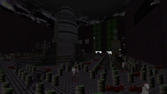
MAP09: "Alien Resurrection" by Big Ol' Billy & Glenzinho
If you thought that everything was finished with Game Over, think again because here we have the finisher of this set. A brilliant, complex and glorious map of great dimensions that takes us through a complicated battlefield where we will have to fight against the last alien/demonic forces of the planet. This is the end and here we have our piece of cake. Satisfying, fast, brutal and with a unique style that is difficult to replicate. Excellent way to bring this DBP to an end.
MAP10: "Cryosleep" by vertigo & Glenzinho
As usual, a small credit map!

The end.
Overall:
DBP17: Alone (2019)
By the Doomer Boards Community
By this point, we can all agree that the Doomer Boards Project really stand out for the originality and creativity. Each month a new map-set with a different visual theme that can be as fun and simple as some well-known trend and also as unique and imaginative as, well, a Cyberdemon colonoscopy. Yet in the very rare occasions, you can find some projects that may look-alike quite a bit. Not a bad thing of course, but it is something that actually brings something interesting that brings some nice retrospective in the general panorama of the entire series. Well, personally, Alone is, I think, that kind of a project and also something more, quite dark, quite… alone.
Alone is one special 10 maps-set with quite the interesting yet already used theme, that being the Alien/HR Giger inspiration for the creation of it and the overall visual theme. Aliens are bound to appear, yet the actual gist of it lies on the simplistic yet enthralling level design and linear layouts that allow for some fast yet tense action. Now, why do I say already used? Well, I believe, and I’m quite sure, the DBP already had one Aliens themed map-set, the DBP04: Xenomorph Base. Which is also part of the original 5, so one of the OG DBPs. Yet, the first one failed a little bit in some points, leaving me with a less favorable but still decent opinion about the overall project. On the other hand, almost a year later, DBP17: Alone is another story, and this one ends quite better.
As you might expect from an Aliens themed project, atmosphere and presentation are on priority list for the general design of the visual style in each single fantastical set, all creating together quite the moody set, and for that we also have to thank MAP01 by @Vertigo, also leader of this project and his leading debut in the DBP! Quite the success. MAP02 by prolific mapper @Phobus is where all the tension breaks down and the action burns up, introducing two new main enemies: The xenomorph, which you can imagine like a Pinky but more athletic and probably even more dangerous. On the other corner we have the face hugger, another classic Alien, uh, alien, that works like a mini-Pinky demon. Notice that I say Pinky because the Pinky is pretty much the only melee-only demon in Doom. Well, now thanks to these fantastic new assets we have two new demons/aliens that are actually very fun to encounter. But alright! Moving on. MAP03 by @jawisnspace is a more mechanical, almost tech-base like map with some dark encounters and interesting scenery that introduces a well-done presentation. MAP04 by @gaspe takes us into an adventure of interiors and exteriors, along some really solid visuals. Our first true big map comes from the hands of @dmdr in MAP05, a big, tight and dark level that brings a nice challenge. MAP06 by @Joe-Ilya works as a good intermission allowing for some rest while exploring a simple yet solid map. MAP07 is where things get quite creepy. A fantastical moody map by @Hardcore_gamer, delivering quite the darkly alleys of pure alien blood and some humans bodies here and there. @Vertigo comes back again and gift us MAP08, a big, broad and explorative map full of adventure and xenomorphs. Lots of those. Finally, if you thing the DBP sage wasn’t going to make and appearance, well think again cause @Big Ol Billy makes a comeback by co-authoring alongside @Glenzinho MAP09, the finalizer of this beautiful dark plate. A fully fledged adventure map that follows a complex combat system and quite the deep layout. Beautiful way to end a map-set! Well, of course we also have MAP10, a tiny credits maps that always brings nice feelings to my heart in each single DBP.
While Xenomorph Base felt like a good example that seemed to mimic the inspirations of Aliens TC or, obviously, Giger; Alone feels more like a complete tribute to the work of the people who strove to develop the fantastic dark art of Aliens. What we have here is a beautiful example of atmospheric maps that manage to capture a fantastic cinematic essence thanks to a good use of tracking and leadership. The maps are simple, mostly, but each one evokes the feeling of playing an official Alien game. Part of that is due, obviously to the moody level design, but also thanks to the introduction of the new enemies, skins, sounds and a MIDI that kicks ass. Meeting the first Xenomorphs is a fun, intense and exhilarating experience. But we take the rest of the new assets and we have a fantastic work that gives us a solid presentation along about 9 decent to great maps that try to give as much atmosphere as fun. Not only are these maps made simply to have that sci-fi horror movie look of the eighties/seventies, but they are also a clear Doom WAD that is as much fun to play with as it is to admire. A kind of futuristic visualization of what Aliens TC would have been if it was made during modern times, and also a path of redemption for the original DBP04.
The interesting object of the gameplay also lies in the introduction of the two new enemies mentioned above: The Alien (or Xenomorph) and the Face Hugger, or, well, hand-walker-with-strange-colors-and-terrible-appearance, as I like to call it. Seriously, look at him, that comes straight from hell. These two enemies are implemented in a very natural and dynamic way that manages to make a good set with the rest of the Doom's generic offspring (which also bring new skins) creating a good example of adjustment between difficulty and implementation. These new enemies stand out mainly for their method of attack: speed and high damage. Their HP is extremely low, but the high speed can take some time to get used to. They move like Pinkies in NM! which is quite an adrenaline rush. Lovely! Although, I do have to admit, while the overall enemy positioning is simple and solid enough to feel balanced, every once in a while we might get our assess kicked by these guys. These aliens.
Overall, all I can say is that Alone feels like a worthy Aliens-inspired theme; the new weapons, the new enemies, the level design, the sound, the atmosphere, the kick-ass combat and the frenetic gameplay. All these factors work together to deliver what is quite the enjoyable experience in this alone adventure.
3 notes
·
View notes
Note
I may have asked you this before, but what's your favorite Sonic game?
Oh gosh this is actually a hard choice bc as a kid my favorite was Sonic Unleashed for a long time, but after going back recently to replay a bunch of Sonic games I think SA2B is by far my favorite (tho to be fair, I didn’t replay Unleashed).
That’s kind of a boring answer but I think the gameplay style of the adventure games is sonic at its best, the speed elements are good and even tho sometimes the Knuckles/Rouge and Tails/Eggman levels ca be frustrating, I really like what they’re going for. It really stands out as a game that tried to establish a unique playstyle for every character, as opposed to say, Sonic Heroes, where everyone is basically the same save for a situational special ability.
Sonic and Shadow levels are by far the best gameplay, they’re fast-paced but they feature varied methods of movement and obstacles that are easy enough to navigate that you don’t lose your momentum but also provide a challenge. You never really feel, for the most part, like the game has just stopped you from running forward to throw a random challenge at you- most obstacles in the levels still involve moving ahead relatively quickly. Things like sliding through a gate, lightspeed dashing, or homing attacking a bunch of airborne enemies to get across a gap maintain your momentum and let you just really feel cool when you’re trying to get through a level as fast as possible. The gameplay just FEELS good. Even the hourglasses in the pyramid level that always hold me up still work well for this purpose. It feels like the designers, for these levels, really knew what made the levels engaging and it shows.
It also features the Chao Garden which is extremely nostalgic for me, and as weird as the concept of the Garden is, I really find myself wishing modern Sonic games would bring it back?? There’s something so calming about just, raising Chao and trying to make cool ones and bringing them animals and buying random little items or teaching them little behaviors that you later see them doing. It evokes the same kind of chill vibes as Animal Crossing to me, the sort of thing where I’d sit back for an afternoon and binge a podcast while just casually raising Chao. It’s great.
I also appreciate the absolutely amount of work they put into it, the Neutral and Light and Dark system, Chaos Chao, the different styles they can adapt, Reincarnation, being capable of evolving for different skills and the races and karate minigames that let you use those Chao to get additional prizes and emblems. Like. There’s SO MUCH to the Garden it’s WILD.
In addition, there’s a layer of replayability for the game’s levels, in various ways. First there’s the multiple missions, which you’re incentivized to do if you want to access stuff in the Chao Garden (more items unlock based on your number of emblems). The same is true for rings, which are the Garden’s currency, and collecting the animals and uh, whatever the light tube things are called, which increase the Chao’s abilities in various areas. So if you’re invested in the Garden, like me, you’ll actually be more invested in playing more of the regular game. So as weird as the Garden is compared to most of the game, it has a built-in connection to playing the levels.
The story is also very simple, but it’s a classic and it’s iconic and it works. The introduction of one of the most beloved and parodied characters in Shadow is so memorable, as are moments like Eggman blowing up the moon, bc of how perfectly they work. Sonic games don’t need to take themselves TOO seriously, but I also don’t like when they’re a parody of themselves, as they’ve become in recent years. The story is good, it makes sense and it has the appropriate level of drama and tension and character development while also being fittingly campy and over-the-top. It’s great.
3 notes
·
View notes
Text
How Can We Convince Big Companies to Leave Iconic Websites Online?
A version of this article originally appeared on Tedium, a twice-weekly newsletter that hunts for the end of the long tail.
Look, I’m not going to tell you that Yahoo Answers was the height of cultural artifacts.
But the thing is, it had value. And the reason it did was because of the amount of time that it was online, the sheer number of its answers, and its public-facing nature. But sites do not stay stationary, encased in amber, and there is significant financial motivation for large companies to only play the hits. After all, it’s why Top 40 radio isn’t all Dishwalla, all the time.
But after seeing yet another situation where a longstanding Yahoo-owned website is shutting down, I’m left to wonder if the problem is that the motivations for maintaining sites built around user-generated content simply do not favor preservation, and never will without outside influence.
How can we change that motivation? In a follow-up to an argument I made about historic preservation as Yahoo Groups was getting shut down, here’s my attempt to see the issue of preservation from the corporate perspective.
“I understand your usage of groups is different from the majority of our users, and we understand your frustration. However, the resources needed to maintain historical content from Yahoo Groups pages is cost-prohibitive, as they’re largely unused.”
— A statement sent to an archivist in 2019 as Verizon took steps to shut down the vast majority of the existing Yahoo Groups, the last major element of Yahoo’s user-generated content apparatus that was dismantled, with Groups meeting its maker a little over a year ago. It’s worth keeping in mind that at the scale Verizon works—making billions of dollars per year, on average—the costs of continuing to host such content would have been relatively minimal—especially given the fact that, uh, it owns a big chunk of the network through which that content is distributed.
The problem with corporate motivations is that they aren’t the same as the user’s, even when the user made the content.
Whether Google, Verizon, Disney, Nintendo, or Sony, the corporate motivations for keeping content available online for long periods differ greatly from the motivations that drive external visitors.
Users very much have an expectation of permanence just as they did with physical media, but in the context of online distribution, these companies have competing interests driving their decision-making that discourage them from not taking steps to protect historic or vintage content.
And in the case of user-generated content, there might be outside considerations at play. Perhaps they are concerned that something within an old user agreement might come to bite them if they leave a website online past its sell-by date, opening up to liabilities. Perhaps the concern is old, outdated code that may look novel on the outside but is effectively a potential attack surface in the wrong hands. After all, if they’re not keeping an eye on it, who’s to say someone can’t take advantage of that?
And then there are reasons that are a little more consumer-hostile. Nintendo recently ended sales for a bunch of old Mario content in both digital and physical form. It evokes the old gating of home video releases that Disney used to do in an effort to keep its old content fresh and make more money from that old content.
When it comes to websites, though, much of that content is user-generated, even if a technology company technically maintains it. I have to imagine that there’s an expectation that a company only has limited capability for maintenance costs, and the motivation for doing so is limited.
But on the other hand, as digital preservationist David Rosenthal has pointed out, in the grand scheme, preservation is not really all that expensive. The Internet Archive has a budget—soup to nuts—of around $20 million or less per year, around half of which goes to pay for the salaries of the staff. And while they don’t get all of it (in part because they can’t!), they cover a significant portion of the entire internet, literally millions of websites. They have a fairly complex infrastructure, with some of its 750 servers online for as long as nine years and petabyte capacity in the hundreds, but given that they are trying to store decades worth of digitized content—including entire websites that were long-ago forgotten—it’s pretty impressive!
So the case that it costs too much to continue to simply publicly host a site that contains years of historically relevant user-generated content is bunk to me. It feels like a way of saying “we don’t want to shoulder the maintenance costs of this old machine,” as if content generated by users can be upgraded in the same way as a decade-old computer.
One thought I have is that this issue repeatedly comes up because the motivations for corporations naturally lean in favor of closure when the financial motivation has dried up. Legislation could be one way to manage this to sort of right the axis in favor of preservation—but legislation could be difficult to pass. (This was the crux of my case for trying to make the existing legislation for the National Register of Historic Places apply to websites.)
In my frustration about this issue recently on Twitter, I found myself arguing for legislation that balances liability in favor of preservation of public-facing content. But I’m a realist—a law like that would have many moving parts and may be a tough sell. So, if we can’t encourage a law, maybe we need to build strategies to make maintaining a historic website easier to lift.
2012
was the year that the genealogy platform Ancestry.com launched a new site, Newspapers.com, to offer paid archives of newspapers to interested parties. The company, which charges about $150 per year for access to the archive, has helped maintain access to the historic record for researchers who need it. (I’m a subscriber and it is worth it.) With the exception of paid services for Usenet like Giganews, this model has not really been tried for vintage digital-only content, which seems like a major missed opportunity for companies raising concerns about financial costs for maintaining old platforms, like Yahoo/Verizon. Certainly I would prefer it to be free, but if I had to have a choice between free and non-existent, I’d pay money to access old content. Just throwing that out there.

Image: Ethan Hoover/Unsplash
A middle ground: An “analog nightlight” mode for websites
In some ways, I think that part of the motivation for taking down old or outdated websites is the expectation that the internal systems must also stay online.
But I think archivists and historians would be more than happy if public-facing content—that is, content that appeared on search engines, or was a part of the main experience when logged in at a basic level—was prioritized and protected in some way, which would at least keep the information alive even if its value was limited.
There’s something of a comparison here that I’d make: When the U.S. dropped the vast majority of its analog signals in favor of digital tuning, it led to something called the “analog nightlight,” in which very minimal, basic information was presented on analog stations was presented during the period before it was turned off. A TV host parlayed basic information to viewers about the transition, and told them what to do next. It didn’t entirely work—TV stations in smaller markets didn’t actually air the analog nightlight—but it helped give a sense of continuity as a new medium found its footing.
This approach, to me, feels like a path forward that could minimize the crushing pain of a loss of historic content while taking away much of the risks that come with continuing to host a site that may no longer be popular in the modern day but still continues to have value in a long-tail sense.
In the case of an “analog nightlight” equivalent for websites, the goal would be to essentially shut down any sort of attack surface through good design and planning. Before the site is taken offline in its original form, users are given the chance to download their old content or remove it from the website over a period of, say, 60 days. This is not too dissimilar to the warnings that site operators offer when they shut down currently—and looks like what Yahoo Answers is doing.
But once the deadline is hit, the site operators launch a minimal version of the original platform, with no way to log in or comment. The information is static, and there’s no directly accessible backend. That’s actually the important part of this—the site needs to be untethered from its original content-management system so no new content can be added. Instead, the content would be served up as a barebones static site (perhaps with advertising, if they roll that way), so as to minimize the “attack surface” left by a site that is not actively being maintained.
This reflects relatively recent best practice in the content-management space. Platforms like Netlify have gained popularity in recent years because they actively separate the form of distribution from the means of production, meaning that security risks are minimized. This is a great approach for live-production sites, but for sites that are intentionally meant to stay static, it removes one of the biggest risk factors that might discourage a content owner from continuing to maintain the work.
As far as liability concerns go, language could be included on the page to allow for users to remove old content if they so choose, along the lines of the “right to be forgotten” measure of the European Union’s General Data Protection Regulation (GDPR), though that measure includes a carve-out for purposes of historical research, which an archived version of a website would presumably cover. But the thing is, sites that are driven by user-generated content are generally protected by Section 230 in the United States anyway, so the onus for liability for the content itself falls onto the end user.
And if, even after these steps, a company still feels uncomfortable about hosting a dead website, they should reach out to librarians and archivists to donate the collection for maintenance purposes—perhaps with a corresponding donation to said nonprofit so they can cover the hosting costs. The Internet Archive actually offers a service like this!
The one site that makes me think that a model like this could work is Gawker. The news and gossip site, which was taken offline by the combination of a lawsuit and a corporate asset sale that specifically excluded it, remains online nearly five years after its closure in a mode very similar to this. Comments are closed and not visible to end users, which is a true shame as those comments often fed into the writing. But the content—the part that was truly valuable and important—is still out there, accessible and readable, even if you can’t do anything with it other than read it.
There are no ads. It’s a shrine to a platform that a lot of people cared about, even if others found it controversial. And there’s no reason what Gawker did couldn’t work in an equivalent way for Yahoo Answers.
Look, I’m going to be the first to fully admit that the motivations for protecting publicly accessible user-generated content simply remain only if the owner of that content feels “nice” about it.
And even then it feels like a bit of a surprise.

It’s still online, but it moved.
Recently, Warner Bros. got a little bit of flak for replacing its long-online Space Jam website, which dated back a quarter-century in its original form, with a site for the sequel. But I think what the company did was actually shockingly noble. They not only left the old site online, but they made it accessible from the new one. The work done to maintain this was not perfect—I think they should do archivists a solid by putting in 301 redirects on the old URLs of the vintage site, so they go to the new place—but the fact that they showed the initiative at all is incredibly impressive given what we’ve seen of corporate motivations when it comes to preservation.
Honestly, part of this was a result of people who were associated with the website’s creation still being at the company years later and being willing to speak up for preserving it—a 2015 Rolling Stone article explains that the site actually briefly was taken down after it went viral in 2010, only for employees involved in the creation of the site (now with leadership roles in the company) to swoop in and save it after some executive made the call to shut it down.
“If we had left the company, the site probably would not exist today,” said Andrew Stachler, one of the employees involved with saving the effort. “It would’ve gone down for good at that time.”
But imagine if they weren’t there. We’d be telling a different story right now.
And perhaps that’s what many companies need—someone who is willing to go to bat for the purposes of archival and protection of historic content.
In the digital age, preservation is the act of doing nothing but minimal upkeep and being comfortable with that fact. As proven time and time again, companies are more than comfortable with killing services entirely rather than leaving well enough alone.
Perhaps the way to save user-generated content is by making it as painless as possible to keep the status quo.
How Can We Convince Big Companies to Leave Iconic Websites Online? syndicated from https://triviaqaweb.wordpress.com/feed/
0 notes
Text
Promotion
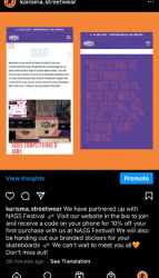
Elle has researched into the promotion for our brand.
She created the instagram page, which we will use to promote our brand. Our survey showed us that our target market finds their fashion inspiration from social media, and they also find out about new brands through social media, therefore, we felt that this is a very important means of promotion for our brand.
On our instagram account, we will post updates, new arrivals, events and stories.

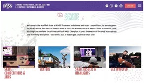
We decided that it would be good to promote our brand through a festival or event that closely relates to out target market.
We decided to partner with NASS Festival.
Customers can visit the website and receive a code on their phone, for 10% off their first purchase from our brand, at NASS Festival.
We will also hand our free stickers at the event, for skateboarders to stick to their skateboards.
People involved in the event will wear and promote our products.
Promoting at this kind of event will mean that people who are our target audience will become familiar with our brand. Other skaters that have not been to the event will see the stickers and will want to shop at our brand. This will help to attract new customers and build up a new customer base.
Here is some information that Elle found about pop-up shops.
Pop-up retail, also known as pop-up store or flash retailing, is a trend of opening short-term sales spaces that last for days to weeks before closing down, often to catch onto a fad or scheduled event.
Advantages:
It can become another brand contact point with your audience.
It can increase overall brand awareness.
Thanks to an unexpected placement, it will make the contact memorable.
Due to the non-standard format and design, it will evoke vivid emotions.
It will increase interest, thanks to a limited assortment offer and duration. The opening and closing dates are known in advance so that a certain buzz of exclusivity is created.
You can test bricks-and-mortar sales without too much investment. You can pull off a short-term pop-up for as little as £1,082.
Many large stores are closing due to being considered unprofitable against high rent and tax rates. Pop-ups are a chance to continue a physical presence in such cases.
The majority of consumers want to see and touch a product before they buy it, even if they’re purchasing online. Temporary stores are good for that purpose.
It is an excellent way to build a network of loyal, engaged shoppers by offering face-to-face service and immersive in-person shopping experiences.
Despite the stronger online presence, consumers spent most of their money in stores whether they are permanent or temporary.
It can drive more sales during busy seasons such as Black Friday, Cyber Monday, Christmas time and any other peak sales periods.
It can validate demand for new products before starting mass sales.
Pop-up shops are a great way to give new life to ageing inventory — especially seasonal merchandise with a short shelf life.
A store creates memorable brand experiences. For many business owners, a pop- up store sets out as an opportunity to immerse customers in the world of their brand. In the real world, you can engage all five senses to create an experiential store; whereas online, you can only use one. By creating a real-life experience, you also have the potential to generate a real social media moment. And, with the flexibility of temporary retail space, you can put on a show without having to worry about how it will be sustained in the long term.
You can build stronger relationships with your customers. Without the anonymity of the internet, your retail store is a chance to get to know your customers. These meaningful interactions won’t just help you to understand your demographic and get feedback on your brand; but will also make you a part of the community. By building these relationships, you will also drive loyalty for your brand. In fact, this is a new trend known as ‘emotional loyalty’: industry analytics firm Gallup found that customers who had emotional loyalty to a brand visited that store 32% more often.
Your store can be a marketing tool. Your storefront can be an advert for your brand. Securing a space on one of the world’s busiest high streets is a smart way of getting your business in front of thousands, for the fraction of the price of a big billboard. Therefore, it’s no wonder why brands like IKEA and Virgil Abloh, Netflix and MATCHESFASHION.com have used temporary retail space as a marketing tool to drive awareness for their latest launch.
Disadvantages:
The location must be perfect. A place for a pop-up has to be in an important, well-known, and accessible street or building with lots of passers-by and pedestrians. Even temporary placement in the most exciting areas will be costly.
In addition, many commercial landlords and agents don’t support the idea, preferring more regular, longer-term arrangements.
You also should, at the very least, have funds to cover; possibly needed licences, insurance, security measures, work of additional staff, POS instalment, and any other additional expenses such as audio system, security cameras, cleaning services, etc. Temporary or not, compliance with health and safety regulations is non-negotiable.
The pop-up nature of your retail outlet may put some customers off. People cannot easily get in touch with you or return an item once the pop-up has gone.
Similarly, the lack of space available will limit your ability to carry a wide range and a large amount of stock. Make sure you have continuation strategies prepared.
Mounting the pop-up store requires as much work as creating a regular storefront or even more as it has to be unique and eye-catching. A team of designers, merchandisers, and logistic specialists is needed to develop and decorate the space, transport and display the products properly, advertise it, etc.
§ You can only appear in one place at a time. One drawback of a pop-up shop is that you can only pop up in one specific place at a time. While this may not be the route for a brand looking for rapid global expansion, focusing your efforts on just one place at a time can allow you to foster meaningful relationships and really develop brand awareness in a new area. And, if the area doesn’t quite work for you, you can move on to the next neighbourhood quickly and easily with flexible leasing.
§ It can be difficult to find the right space. Do you go for a store on an iconic high street or a neighbourhood shop? Do you want a white box or something a little more unique? When scouting out your location for a pop-up space, the selection can feel overwhelming.
§ It’s thought to be a big upfront cost. Something that prevents many brands from making a move into physical retail is the misconception that it’s a costly process. Previously, lengthy legal processes and long-term high-risk commitments were the norm. However, now, things are different. Through flexible leasing, independent businesses are able to book temporary retail space for just a few weeks – eliminating the time-consuming contracts and empowering them to open their very own store.
How much does a pop-up shop cost UK?
The typical pop-up retail unit available in the UK is 1,186 ft2 (110 m2) and costs just 29p per ft2 (£3.10 per m2) per day to rent.
Open a pop-up shop: 6 things you should know
Pop-up shops are temporary retail spaces. This short-term approach to running a business may be a good way to let you test a business idea or try your skills as a business owner. If you are already in business, a pop-up shop may help you to build your brand and increase sales. The following tips outline how you can successfully set up a pop-up shop.
1. Research your market: Make sure you're fully aware of the marketplace that you plan to operate your pop-up shop in. Research significant trends, drivers and potential competitors. See market research and market reports.
2. Find the right premises: Location is a key element to pop-up shop success. Take time to find quality premises in a good location and negotiate the right deal for a short-term let. See renting business premises.
3. Get the finance right: Every new business needs money when starting up and pop-up shops require good levels of stock to start-up. Create realistic financial forecasts and research finance options that are right for your business needs. See business financing options - an overview.
4. Market your pop-up: The short-term nature of a pop-up shop means your marketing should be innovative and targeted to provide the greatest impact. Access local networks to create a buzz for your pop-up and use social media to generate interest and engage with potential customers. See create your marketing strategy.
5. Protect your business: A pop-up shop may find difficulties in stock storage and business security. Theft of stock could cripple a short-term business. Assess your risks and make security plans to ensure your business remains safe. See business insurance: the basics.
6. Employ short term staff: Employment law still applies to short term businesses so you must know about the steps you need to take when employing people in your pop-up shop. See recruiting staff.
Browns
Farfetch-owned Browns Fashion opened an experimental pop-up in Berlin in November. The pop-up opened in an abandoned supermarket and was used as a space to test new retail concepts and partnerships across fashion, music and art. Browns Berlin is potentially the first of many ‘roaming retail’ spaces that the brand calls ‘Browns Nomad’ – built on the idea that temporary spaces allow brands to really connect with the neighbourhoods and communities they operate within.
Depop Live
E-commerce fashion app Depop invited 50 of its best sellers to set up shop in its temporary space on Broadway in New York. The two-day event was a physical version of the online marketplace. The event was targeted at its Gen Z community of fashion entrepreneurs, with two days of immersive experiences including music, art installations, panels and workshops. There was even a talk on transparency, sustainability and activism with a panel that included designers and sustainability experts.
Glossier
Cosmetics retailer Glossier opened a pop-up on Floral Street in Covent Garden that was a must-see for fans of the brand. Inspired by British architecture and interiors, the store was decorated in colourful floral wallpaper and carpets which were hand drawn by the in-house creative team. Each room followed a different colour scheme and in true Glossier style they included positive affirmations like ‘you look good’ on the mirrors. There were also lots of fun playful elements such as secret doors taking you from one room to another, adding some theatre to the experience.
0 notes
Text

HAL Laboratory
イシダHAL_Laboratory
12/02/2016 4:16 AM
Good to see everyone again! The time has finally come to reveal the winners of the drawing category of the "Kirby: Planet Robobot Drawing and Screenshot Challenge"!
We'll get to revealing the artwork soon, but first, the director of the game, Mr Kumazaki, would like to say something!
クマザキ 12/02/2016 4:19 AM
Hello everyone, Shinya Kumazaki here. I just want to say that it was a really enjoyable experience to look through all of your wonderful entries. It was obvious how much effort and enthusiasm went into each one. Thank you for sending in your work!
イシダ 12/02/2016 4:21 AM
Then let's begin from the Platinum Prize. Take it away, Mr Kumazaki!
クマザキ 12/02/2016 4:24 AM
Our Platinum Prize goes to… Kowal!
Meta Knight plays a big part in this game, so we received a lot of entries featuring him, but Kowal's work really showcases his speed. It's also very well executed at a difficult angle. That white mask with the black cross cut into it looks particularly cool.
Speaking of Galacta Knight, we came up with him back when we were working on Kirby Super Star Ultra because we wanted to create an ultimate enemy for Meta Knight. We gave him an angelic, godlike look to contrast with Meta Knight's bat-like wings. That was a while ago!
Congratulations, Kowal!

イシダ 12/02/2016 4:26 AM
Wow, what an intense image. It really makes you want to see how that showdown went!
Next up is our Gold Prize.
クマザキ 12/02/2016 4:29 AM
I'm happy to say that kirby! has earned our Gold Prize!
All of the submissions kirby! made showed a high level of quality with their use of clean lines. And they all featured Labotories having fun, so I could see kirby! has a lot of affection for this character!
Incidentally, Labotories are in charge of researching and developing weapons and such in the Haltmann Works Co.'s laboratory towers. They're the hardworking citizens of another planet, hired by the Haltmann Works Co. and every morning they sing the company song from the bottom of their hearts.
Congratulations, kirby!

イシダ 12/02/2016 4:31 AM
Wow, I didn't know they had that much backstory! They always seem so happily busy, don't they? Oh, Kirby's in there too! I hope they all get along.
Well, now it's time for the Silver Prize winners - and there are two of these.
クマザキ 12/02/2016 4:34 AM
The first Silver Prize goes to ななし!
This drawing features some incredible background work - even though it's all in black and white, you can really feel the blue sky and white clouds.
The sunlight on the Robobot Armour in Jet Mode is fantastic, too.

クマザキ 12/02/2016 4:36 AM
Silver Prize number 2 goes to アンテラ!
アンテラ's work gives us a unique perspective. Lots of entries focused on the final boss and iconic scenes, so to see Circus Kirby reflected in one of the giant balls of Resolution Road was a really nice idea.
Congratulations, ななし and アンテラ!
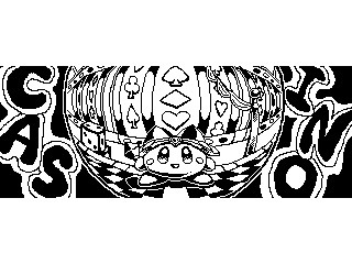
イシダ 12/02/2016 4:38 AM
Both of those entries were drawn so nicely - I especially like Kirby's expressions in them!
Next we have the Bronze Prize, with five winners.
クマザキ 12/02/2016 4:40 AM
The first Bronze Prize winner is yucky♪!
At a glance, this looks like a fairly ordinary picture of Kirby, but look closer and you'll see it seems to be from the perspective of the Robobot Armour. Could this be one of the last pieces of data left in the Robobot Armour's fading memory banks as it floats in space after everything is over? If you think about it like that, it brings a tear to your eye... Just heartbreaking!

クマザキ 12/02/2016 4:42 AM
Our second Bronze Prize goes to てるや!
This is a particularly dynamic Robobot Armour, and what puts it over the top is the screen-shattering punch! It also sparked my imagination - is the Robobot Armour punching the camera itself, or maybe the monitor of an enemy robot?
クマザキ 12/02/2016 4:45 AM
Our third Bronze Prize goes to key!
This might look like a normal picture of Mirror Kirby, but it's actually showing off the old and new hat designs, which I thought was a unique touch. About that hat design - in older titles, due to issues with things like storage capacity, we often had to use the same hat design for multiple Copy Abilities, only changing the colour. So the original Mirror hat was a colour variation of the Beam hat. But when we brought it back for this game after a long absence, we gave it a big makeover to make it more unique and easier to differentiate.

クマザキ 12/02/2016 4:47 AM
The fourth Bronze Prize goes to rH!
This is Dark Matter's true form, that you only get to glimpse for an instant in this game. This was a submission from outside Japan but the artist's use of Japanese characters really draws the eye. You can tell that rH is a real fan of the character.

クマザキ 12/02/2016 4:48 AM
Our fifth Bronze Prize goes to Shira!
These Dedede Clones have such rich expressions. Their faces really give you a sense that they were formed from pure innocent destructiveness extracted from King Dedede's heart.
Congratulations, yucky♪, てるや, key, rH and Shira!

イシダ 12/02/2016 4:50 AM
Right, last up in the drawing category is a set of special awards we're calling the Secret Kumazaki Faves! We have three to give out.
Mr Kumazaki, if you'll do the honours?
クマザキ 12/02/2016 4:52 AM
I chose these entries based on ideas that made me go "Wow!"
The first Secret Kumazaki Fave goes to Lady!
Lady's picture really captures the goings-on "behind the scenes" of the game! After the Haltmann Works Co. destroys King Dedede's castle, the repair works get underway in this refreshing picture. And King Dedede has even taken off his crown! I never expected someone to try depicting that... Together with his clothes, it all makes for a very original image. As for his true hairstyle, maybe you'll get to see that one day...

クマザキ 12/02/2016 4:54 AM
Secret Kumazaki Fave number 2 goes to クリームロール!
All of クリームロール's entries were very technically accomplished, but this was the one where I felt the concept really shone through.
The pixel art in the centre seems to evoke a simpler time when Meta Knight was still himself. And the lines and dots at the bottom of the image are actually a message in Morse code!
It says S, O... Ah, but I shouldn't spoil the fun. I'm sure you can work it out for yourselves!
There are plenty of fun little things like this hidden in Planet Robobot as well, so if you want, you can go back and try to find them all.

クマザキ 12/02/2016 4:57 AM
The final Secret Kumazaki Fave goes to ラリアット!
ラリアット's entry shows Meta Knight, ready for battle, reflected in Dark Matter's sword, and it's a really fantastic image. The heavy use of black gives it a chic look, and the portrayal of the characters is very nicely done.
Incidentally, you may have noticed that in this game, Dark Matter's sword shines with a rainbow light. This light is materialised from Dark Matter's memories of the Rainbow Sword that he faced in Kirby's Dream Land 2. Those memories must have been included in the original data used to create the clone.
Just like how in Kirby: Triple Deluxe, King Dedede faced Dark Meta Knight for the first time ever, in this game Meta Knight faces off against a version of Dark Matter for the first time.
So Dark Matter must have sensed that Meta Knight's powers were truly formidable, and materialised the power of the Rainbow Sword to counter him.
Seeing two expert swordsmen face off against each other is always a thrilling experience!
Congratulations, Lady, クリームロール and ラリアット!
イシダ 12/02/2016 4:59 AM
And that's the end of the drawing category of our "Kirby: Planet Robobot Drawing and Screenshot Challenge". We'd like to thank everyone who entered!
Don't forget, though, we still have the screenshot category of the contest to go! We received a lot of entries worldwide for this contest, so it'll take us some time to select our favourites. We know a lot of people are excited, but please wait a little longer for the results!
3 notes
·
View notes
Note
Hey, talk somewhat on Superman's B-list villains? Livewire, Atomic Skull, Silver Banshee, Terra Man, Prankster, and any other low-level but recurring ones. Any ones have potential or cool powers there?
With minor Superman villains, I’ve already touched on Silver Banshee, Prankster, Riot, the Galactic Golem, and J. Wilbur Wolfingham. Delving into some others who maybe don’t have that much name recognition, both B-listers of some degree of note and not-quites who I have some fondness for:
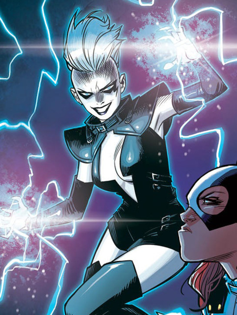
Livewire has always felt like she should be a bigger deal among the Superman villains, but at the same time I get to a certain extent why she hasn’t been. She’s got a great design, and Lori Petty’s voice did as much to define her as Arleen Sorkin did for Harley Quinn, but the more I think about her, the more she runs into problems. She’s not especially meant to be taken seriously - her ‘criticisms’ of Superman are deliberately framed as petty and shallow, to an extent that changing them would essentially rewrite her already pretty well-defined personality. So what you’ve got is a villain who won’t really hurt Superman (given one of his most iconic covers is taking a lightning bolt to the chest with a reply of “It tickles!”, electricity isn’t much of a plausible threat to him) who can still avoid him while causing a ruckus throughout Metropolis, mocking him all the while…and, well, that’s Mxyzptlk. Plus, while Mxy while might bring a vague air of sleaze with him in a way that can leave Superman a touch out of his depth, he’s still deliberately ridiculous, while Leslie Willis is typically much more straightforward and pointed in how she tries to take him down a peg or two in a way that can too easily slide into showing him as stodgy and boring by comparison.
The solution then I think is to bend her away from being a character who has direct confrontations with him all that often. One of her big shticks is that she can manipulate media broadcasts, usually just to make fun of Superman before they throw down. But what if that got pushed further? Make her instead a ghost in the machine riling up idiots on message boards who find the idea of tearing down Superman simply for the sake of it a riot; she could be a one-woman Anonymous, the Bad Media to the Daily Planet’s Good Media, drawing a line under how much of Metropolis hasn’t been hearing Superman’s message at all, needing both to be stopped, and to themselves be saved from far more than a meteor or robot (which would also do a lot to counter the image of Metropolis as a generically perfect city). Ironic, detached cynicism vs. unapologetic sincerity. In short, 4chan vs. Superman, winner take all.
Atomic Skull is, what, an actor with amnesia who thinks he’s a movie villain or something? Meh. I guess there’s something to play with in the idea of his powers as inherently dangerous, evoking Superman’s own fears of losing control, but that seems kinda shallow. I know Superwoman has shown him as somewhat reforming, which seems like a good hook (some of his villains really should), but that’s a whole other angle that hasn’t really been developed yet. The one time I have really liked him was in a set of stories immediately after Electric Superman where each of the four Superman titles briefly told stories set in different eras, with a version of the Skull in the first Golden Age story. A movie star who parlayed his fame as an American Nazi propagandist, he tried to attach himself to Superman’s own increasing public recognition - given he too wore a caped uniform in the serial Curse of the Atomic Skull - claiming they were both examples of the emergence of ubermenschen to reclaim the world. Mesh that with his traditional powerset and contemporary context, and I have an idea of him as some kind of hyper-reactionary, ‘realpolitk’-espousing nihilistic superman of skinheads, alt-righters, and crazed survivalists, who see him as the firey atomic nu-human of an apocalyptic tomorrow. He could even hook up with the Supremacists from Greg Pak and Aaron Kuder’s time on Action Comics for some easy recruits and henchmen.
Subjekt-17; now here’s a guy who I wish had popped up again. Largely forgotten as a consequence of Kurt Busiek’s time on Superman being criminally overlooked, Subjekt-17 was a worst-case scenario: not able to pass for human in the same way as Kal-El, he was taken in by the Soviets as an infant and experimented on his entire life, only to be confronted by Superman when freed and trying to cut a swathe of blood through humanity as payment for his suffering. There was an interesting, painful dynamic in play there - he saw Superman as something like a brother, but in spite of his telepathy couldn’t understand why he would protect the humans who coldly tormented Subjekt his entire life, ultimately seeing Superman as so desperate to assimilate that he would fight an innocent to protect the guilty. I feel like there’s a lot more stories in him, and when it comes to the perennial question of “Are you sure you’re really doing the right thing, Superman?”, I feel like he as a victim of the establishment would have a much more consistent batting average for good stories than yet another edgy new antihero lecturing Superman about the Real Issues.
Magog doesn’t even feel like he should break C-list in the natural order of things, but he was in probably the most widely-read Superman-centric comic ever other than I suppose Death of Superman, so yeah, he counts as notable. The idea presented later on in The Kingdom with Gog as a worshiper of Superman whose shattered faith drove him to madness feels like it has almost a kernel of something interesting at the heart of it, but it feels much more so like a vehicle for semi-talented creators to write dumb comics with him that think of themselves as much more important than they are. A friend did have a decent take on what to do with him narratively though in a way that works with how he’s existed up until now: he’s not a threat himself, he’s not even a consistent or on his own necessarily important figure, but he’s a multiversal constant in that his arrival is always the prelude to a cosmic upheaval or an end of an age of heroes, and specifically catastrophe for Superman. His appearances even back it up: his time in Chuck Austen’s Action Comics was shortly before Infinite Crisis, he came on the scene in the New 52 shortly before Truth and the resulting death of that version of Superman, and now another seemingly new version of him is in Supergirl in the build-up to Doomsday Clock. There’s a lot you can play with there: he doesn’t even have to be the same character twice, but he always emerges to try and take Superman to task on some profound level as a harbinger to a greater doom for the DCU. Maybe over time he could have the same kind of narrative “him showing up means something” cache as Doomsday, but in the sense that seeing him means Superman’s going to have to ask some big questions about himself and what he does as preparation for a larger reckoning for him and his kind, rather than meaning Superman’s gonna have to punch a bone monster again.
I wanna love Terra-Man. He’s a cowboy who was abducted by aliens and got a winged horse to fly around the universe, who calls himself Terra-Man because he a spaceman from Earth! That’s great! But I can’t say the execution has ever much interested me; he’s so over-the-top without ever especially being played as a gag that I just can’t get into it. Luckily though, the solution has already been reached with him: Tom Strong’s Coleman Grey, the Weird Rider, is straight-up Terra-Man, played with the melancholy, cold competency and swagger of a killer out of time, and some fantastic stone-cold badass moments that sell the hell out of him. Just apply that personality to this guy - fearsome but not unreasonable in the right circumstances, out of time but comfortable with his new life even if it means sometimes running up against the Man of Tomorrow - and we have an instant winner; maybe not one of the greats, but not every Superman opponent needs to bring major thematic concerns to the table so long as they can pull their weight in entertaining storytelling opportunities.
And now for a few rapid-fire takes:
Kryptonite Man was one of those characters who just had to exist sooner or later, but there’s really nothing about him that Metallo doesn’t make redundant.
To my knowledge Blackrock has never particularly worked, but I like the idea of him as a reality show hero who gets in Superman’s way sometimes. It doesn’t even need to be that specifically if those trappings are passe at this point; so long as he’s another vigilante opposed to Superman, you can probably pull something out of Blackrock.
Mindlessones convinced me that Nick O’Teen has a place in the background of Superman’s world.
Paragon is a comically awful human being with the powers to back up his inane egotism and cruelty in a way that actually quite worked for me under Kurt Busiek; I think he hits on the same “oh god dammit, this guy” response from Superman that Mxyzptlk elicits, but of a different enough flavor to make him worth keeping around as a separate figure.
And finally, while Tempus would probably lose a lot of his charm if up against a more straight-laced version of Superman, in the context of how silly Lois and Clark got he was my favorite part of that show, and I think he’d work fantastically in any other tongue-in-cheek Silver Age revival treatment of Superman’s world as a way to poke fun at the foundations, hilariously enough so it doesn’t grate but so over-the-top villainously we know we’re not supposed to agree with him.
#Superman#Livewire#Atomic Skull#Kingdom Come#Terra Man#Magog#Subjekt 17#Kryptonite Man#Blackrock#Nick O'Teen#Paragon#Tempus#Lois & Clark: The New Adventures of Superman#fanfic#Opinion
74 notes
·
View notes
Text
Design Systems Are About Relationships
Design Systems Are About Relationships
Ryan DeBeasi
2019-10-07T12:30:59+02:002019-10-07T10:45:05+00:00
Design systems can be incredibly helpful. They provide reusable elements and guidelines for building a consistent “look and feel” across products. As a result, users can take what they learned from one product and apply it to another. Similarly, teams can roll out well-tested patterns for navigation or reviews, making products more trustworthy. Effective design systems solve boring problems in a repeatable way so that developers and designers can focus on solving novel problems.
Yet when someone uses the term “design system” in a meeting, I’m never quite sure what reaction to expect. I’ve seen curiosity and excitement about trying a new way of working, but I’ve also seen frustration and concern at the idea of a system limiting designers’ creativity. Some designers argue that design systems sap creativity, or that they are solutions in search of a problem. Design systems can fragment over time, causing teams to stop using them.
Design systems aren’t going away, though. Just 15% of organizations lacked a design system in 2018, according to one survey. That’s down from 28% the previous year. Some teams use large, general-purpose design systems such as Google’s Material Design, while others use smaller, more bespoke systems such as REI’s Cedar and Mozilla’s Protocol.
Design systems should empower teams, not limit them. For that to happen, we need to start thinking more holistically. A design system isn’t just code, or designs, or documentation. It’s all of these things, plus relationships between the people who make the system and the people who use it. It includes not just CSS files and Sketch documents, but also trust, communication, and shared ownership. As it turns out, there’s a whole field of study dedicated to exploring systems like these.

In REI’s Cedar Design System, icons are tailored to the company’s outdoor gear business. The snowflake icon indicates ski and snowboard services, and the ruler icon indicates a size chart. (Large preview)
The Big Picture
A 1960 paper titled “Socio-technical systems” explored the interactions among technology, humans, and the larger environment in which they exist. Enid Mumford explained that researchers began by investigating how to build better relationships between managers and employees, but by the 1980s, they were focused on making work more efficient and cost-effective. In 2011, Gordon Baxter and Ian Sommerville wrote that this research helped inspire user-centered design, and that there’s a lot of work left to do.
Baxter and Sommerville argued that today, there is still a tension between “humanistic” research, which focuses on employees’ quality of life, and “managerial” research, which focuses on their productivity. They also explained that it’s important to consider both technology and human interactions: “system performance relies on the joint optimization of the technical and social subsystems.”
I’d argue that design systems are socio-technical systems. They involve interactions between the people who create the system, the people who create products using the system, and the end users who interact with these products. They also evoke the same tension between efficiency and humanism that Baxter and Sommerville saw.
Design systems aren’t composed just of images and code; they involve conversations among designers, developers, product managers, CEOs, and random people on GitHub. These interactions occur in various contexts — a company, an open-source community, a home — and they happen across cultures and organizational boundaries. Building a team can mean bringing together people from disciplines such as animation, sound design, data visualization, haptics, and copywriting. Creating a successful design system requires equal parts of technical expertise and soft skills.
And yet, peruse design or engineering news aggregators and you’re likely to see a distinct focus on that “technical subsystem” — code and tools, rather than people and conversations. Which creative tool is the best at keeping track of design tokens? What JavaScript technologies should be used for building reusable components — React, web components, or something else? Which build tool is best?
The answer to these questions is, of course, “it depends!” Who will design, build, and use the system? What are their needs? What constraints are they operating under? What tools and technologies are they comfortable with? What do they want to learn?
To answer these sorts of questions, Baxter and Sommerville recommend two types of activities:
Sensitisation and awareness activities
Learning about the varied people who will create and participate in the system, and sharing that information far and wide.
Constructive engagement
Communicating across roles, building prototypes, and considering both the technical and social parts of the system.
Digging In
In early 2019, I was part of a team — let’s call them “team blue” — that was building a design system for a large organization. I facilitated informal chats with this team and “team green”, which was using the design system to build a web application. Every couple of weeks, we got all the developers and designers together around a table and talked about what we were building and what problems we were trying to solve. These chats were our “sensitization and awareness activities.”
We didn’t have permission to make our design system public, so we did the next best thing: we treated it like a small open-source project within the organization. We put the code in a repository that both teams could access and asked for contributions. Team blue was responsible for reviewing and approving these contributions, but anyone on either team could contribute. Team blue was also building an application of their own, so in a sense, they were both users and custodians of the design system.
These interactions helped the teams build better products, but just as importantly, they established trust between the teams. Team blue learned that folks were using the system thoughtfully and building clever new ideas on top of it. Team green learned that the system really was tailored to their needs, so they could work with it instead of against it. Baxter and Sommerville might call this work “constructive engagement.”
We found that both teams were under pressure to learn new technologies and deliver a complete product quickly. In other words, they were already operating under a pretty considerable cognitive load. As a result, the two teams agreed to focus on making the system easy to use. That meant sidestepping the whole web components debate, focusing mostly on CSS, and ensuring that our documentation was clear and friendly.

Microsoft’s Fluent Design System targets four very different platforms. (Large preview)
Putting It All Together
Organizations of all sizes create reusable design elements to help teams build more consistent, elegant applications. Different organizations’ needs and dynamics are expressed in their design systems. Here are just a few examples:
Google’s Material Design has several implementations in different frameworks and languages. It’s used by a variety of people inside and outside of Google, so it has comprehensive documentation and a variety of toolkits for design apps.
Microsoft’s Fluent Design System targets four very different platforms. Like Material, it includes toolkits for UX designers and comprehensive documentation.
Mozilla’s Protocol is implemented in Sass and vanilla JavaScript. It has a strong focus on internationalization. Alex Gibson says that this system helps Mozilla “create on-brand web pages at a faster pace with less repetitive manual work.”
REI’s Cedar is built with Vue.js components and can’t be used with other JavaScript frameworks. Cedar is used primarily by REI’s internal developers and is closely tied to the company’s brand. The design system’s code is open source, but its fonts are not.
Salesforce’s Lightning Design System is a JavaScript-agnostic CSS framework. It can optionally be used alongside the Lightning Component Framework, which includes two JavaScript implementations: one using web components and another using Salesforce’s proprietary Aura framework.
Red Hat’s PatternFly was created to provide a consistent user experience across the company’s cloud platform products, so it has a relatively high information density and includes a variety of data visualization components. The PatternFly team recently switched from Angular to React after some experimentation with web components. PatternFly also includes a JavaScript-agnostic implementation using HTML and CSS. (Full disclosure: I’m a former Red Hatter.)
IBM’s Carbon Design System offers implementations in React, Vue, Angular, and vanilla JavaScript as well as a design toolkit for Sketch. The Carbon team is experimenting with web components. (Hat tip to Jonathan Speek for tracking down that repository.)
Systems like these are consistent and reliable because people from different teams and roles worked together to build them. These systems solve real problems. They’re not the result of developers trying to impose their will upon designers or vice-versa.
Josh Mateo and Brendon Manwaring explain that Spotify’s designers “see their role as core contributors and co-authors of a shared system — one that they have ownership of.” Mina Markham describes herself as “the translator between engineering and design” on the Pantsuit design system. Jina Anne digs into the team dynamics and user research behind design systems: “Spoiler alert! You’re going to need more than just designers.”
Let’s Build Some Stuff!
Now that we’ve gone through research and some examples, let’s talk about how to build a new design system. Start by talking to people. Figure out who will be using and contributing to your design system. These people will probably span a variety of disciplines — design, development, product management, business, and the like. Learn about people’s needs and goals, and ask them to share what they’re working on. Consider planning an informal meeting with snacks, coffee, or tea to create a welcoming atmosphere. Establish regular communication with these folks. That might mean joining a shared chat room or scheduling regular meetings. Keep the tone casual and friendly, and focus on listening.
As you talk about what you’re working on, look for common problems and goals. You might find that teams need to display large amounts of data, so they’re investigating tools for displaying tables and generating reports. Prioritize solutions for these problems.
Look also for repeated patterns and variations on similar themes. You might find that buttons and login forms look a bit different across teams. What’s the significance of these variations? What variations are intentional — for example, a primary button versus a secondary button — and what variations have happened by accident? Your design system can name and catalog the intentional patterns and variations, and it can eliminate the “accidental” variations.
IBM’s Carbon Design System lists all the variations of its components. (Large preview)
The goal here is to establish a rapid feedback loop with people who are using the design system. Faster feedback and smaller iterations can help avoid going too far in the wrong direction and having to dramatically change course. P.J. Onori calls these sudden, large changes “thrash.” He says that some thrash is good — it’s a sign that you’re learning and responding to change — but that too much can be disruptive. “You shouldn’t fear thrash,” he says, “but you need to know when it’s useful and how to help mitigate its downsides. One of the best [ways] to mitigate the downsides of thrash is to start small — with everything.”
Consider starting small by setting up a few basic elements:
A version control system to store your code. GitHub, GitLab, and Bitbucket are all great options here. Make sure that everyone who uses the system can access the code and propose changes. If possible, consider making the code open source to reach the widest possible audience.
CSS code to implement the system. Use Sass variables or CSS custom properties to store “design tokens” — common values such as widths and colors.
A package.json file that defines how applications can build and install the design system.
HTML documentation that demonstrates how to use the design system, ideally using the system’s own CSS.
The node-sass documentation for the CSS framework Bulma describes these steps in a bit more detail. You can skip installing and importing Bulma if you’d like to start from scratch, or you can include it if you’d like to start off with some of the basics in place.
You might have noticed that I didn’t mention anything about JavaScript here. You might want to add this element eventually, but you don’t need it to get started. It’s easy to go down a rabbit hole researching the best and newest JavaScript tools, and getting lost in this research can make it harder to get started. For example, “5 Reasons Web Components Are Perfect For Design Systems” and “Why I Don’t Use Web Components” both make valid points, but only you can decide what tools are right for your system. Starting with just CSS and HTML lets you gather real-world feedback that will help you make this decision when the time comes.
As you release new versions of the system, update your system’s version number to indicate what has changed. Use semantic versioning to indicate what’s changed with a number like “1.4.0.” Increment the last number for bug fixes, the middle number for new features, and the first number for big, disruptive changes. Keep communicating with the folks who use the design system, invite feedback and contributions, and make small improvements as you go. This collaborative, iterative way of working can help minimize “thrash” and establish a sense of shared ownership.
Finally, consider publishing your design system as a package on npm so that developers can use it by running the command npm install your-design-system. By default, npm packages are public, but you can also publish a private package, publish the package to a private registry, or ask developers to install the package directly from a version control system. Using a package repository will make it easier to discover and install updates, but installing directly from version control can be an easy short-term solution to help teams get started.
If you’re interested in learning more about the engineering side of things, Katie Sylor-Miller’s Building Your Design System provides a fantastic deep dive. (Full disclosure: I’ve worked with Katie.)
Wrapping Up
Design systems are made up of code, designs, and documentation as well as relationships, communication, and mutual trust. In other words, they’re socio-technical systems. To build a design system, don’t start by writing code and choosing tools; start by talking to the people who will use the system. Learn about their needs and constraints, and help them solve problems. When making technical, design, or strategy decisions, consider these people’s needs over the theoretically “best” way to do things. Start small, iterate, and communicate as you go. Keep your system as simple as possible to minimize thrash, and invite feedback and contributions to establish a sense of shared ownership.
By giving equal weight to engineering and interpersonal considerations, we can get the benefits of design systems while avoiding the pitfalls. We can work in a way that’s efficient and humane; we don’t have to choose one over the other. We can empower teams rather than limiting them. Empowered teams ultimately help us better serve our users — which, after all, is why we’re here in the first place.
Further Reading on SmashingMag:
Tips For Managing Design Systems
Including Animation In Your Design System
Beyond Tools: How Building A Design System Can Improve How You Work
Building A Large-Scale Design System For The U.S. Government (Case Study)

(ah, il)
0 notes
Text
[Fan Account] Da-iCE’s NEXT PHASE Live in Saitama!
Da-iCE hasn’t listed a tour date for Tokyo yet (which makes me think another performance might be added to the end of the tour, but of course this is just me guessing), so for my very first Da-iCE tour performance, I made the trip to nearby Saitama to see them perform during their second day of the tour at Misato Cultural Center. It was about an hour and a half from my apartment, but as I’ve mentioned before, Japanese performances don’t require you to line up early-- if it’s a seated venue, like this one was, you’ll have the same seat no matter how early you get there, and standing venues still have entrance order numbers written on the ticket.

Once inside, there were several vendors. One to encourage people to sign up for the fan club, one selling Da-iCE albums, one passing along info for signing up for a credit card with Da-iCE's image on it, and lastly the standard merch table. I'd already purchased the light stick, but this time I also grabbed a tote bag since my normal purse isn't big enough to carry around the giant novels I'm always reading >_<
For this tour, I finally broke my bad streak of lotto numbers and snagged a seat in the third row. Each row was divided into left stage, middle stage, and right stage. I was the leftmost seat in the left stage area, and based on the dance formations, we got a lot of visits from Yudai and Taiki in particular throughout the night.

Before the show, the staff asked us to take out our light sticks, and we were all surprised to find out that they have a special function! When they're in range of the current concert venue, they can be controlled to change colors from their standard purplish-blue shade. Throughout the night, they were frequently moved from red to green to yellow to aqua blue and so on. The staff did a really good job of matching them to the tone of the songs and stage lights.
After demonstrating the light sticks' magic power, there was a short, futuristic intro video, and then the boys stepped out of this cool, dice shaped construction made out of the video screens and the show began!
Breaking down the night by song:
NEXT PHASE: When the album came out, Da-iCE claimed this would be their new show opener to replace FIGHT BACK, and it really fills the role well! The boys were wearing different costumes than their Tonikaku HEY gear, but their looks had a similar theme-- bright colors paired with retro style jackets. They all looked amazing (Sota’s back to 100% red hair!) and kicked off the show with some very strong dancing.
Watch Out: Even though this song came out last year, it's really grown as one of my favorites, so I was psyched that this was their follow up. Once again, it was a great pick to bring up the energy, and the vocals were as on point as ever. I love the bouncy parts of the dance during the “Won’t you try it?” section of the chorus.
Step Back: This was our first use of prop/special stage design of the night, and let's just say CHAINS WERE INVOLVED. I'm not joking. The set design featured prison-esque bars and the boys danced with prop chains binding their wrists. And yes, it was as good as it sounds. This was my first time seeing this song live, and I have to say that the dance was stellar!
Noise: After Step Back, the boys had a short introductory MC (trolling Sota ensues) where they also asked everyone how many "Phase" concerts they've been to ever since Phase 0 kicked off. They transitioned into Noise, one of my fave songs from Fight Back, using headphone props. Every time one of the boys put on the headphones, a certain kind of music would play and they would dance to it. For example, when Taiki put his on, it was a really upbeat techno track, so he did an almost seizure-like dance to it, then close with one of his trademark funny faces when he pulled the headphones off. When it was Yudai's turn, the intro to Noise started, and the boys began the performance with the headphones on. Every time they pulled them off, the music would change to tinny and muted, in the radio-esque style the original song evokes. It was really well done! But as Yudai mentioned on Twitter yesterday, he did make a few mistakes in his timing of pulling of the headphones, but I wish he wouldn't worry too much since it was a really complex performance and overall they did a good job with it!
Free Falling: This was our second set design on the night. A table with several chairs and a round of shot glasses (and I think some Jack Daniels as well?) were brought out, and the boys delivered this more rock-based number with a smoky bar room theme. They made good use of the chairs and table in the dance routine as well, and the performance came across like a cool, movie-like moment.
Chocolate Sympathy: Since the chairs were out, it was time for Da-iCE's famous chair dance routine paired with one of their sexiest songs. Chocolate Sympathy should be illegal, that song paired with that dance is too much all at once T^T. As I was watching, I kept on thinking how badly I want a CS instrumental because that beat is jamming, and in a sense I got my wish, because after the performance was over, it was time for performance solos from the dance line to the tune of the CS instrumental (remixed slightly, naturally). They played a quick game of Musical Chairs to determine who would go first. Hayate lost (after Toru took his chair, causing Hayate to dramatically fall over), so he led off. His dancing, unsurprisingly, WAS DOPE. Following his solo, he dashed offstage, and it was Taiki's turn. After, Taiki and Toru did a bit of a duo dance together, then Toru wrapped up, and both he and Taiki left the stage.
Koigokoro: Immediately Koigokoro kicked off with a costume change, since Yudai and Sota had been backstage during the dance solos. They were now wearing dark pants paired with a white dress shirt with a simple design in black down the front paired with a black bow tie. VERY sharp. The two vocals started off, and since Hayate had also had enough time to change costumes, he led off the dancing solo. Taiki and then Toru appeared later in the song. This is by far one of my fave Da-iCE songs and one of my faves to watch live. The vocal line absolutely kills it, and the dance is beautiful and emotional. One of my faves of the night.
Reason: Since we were in slow song mode, they transitioned into Reason, paired with a background video of the boys walking through the streets of Japan. This is one of the most beautiful songs off the new album but I keep forgetting that, so this was a good reminder to have it on rotation more often.
Sugar High: While the Reason videos were playing, the staff had set up coat racks with blue velvet suit jackets behind the screens. When I saw them, I thought next up would be Kirenai Mama no Coat, but it was actually our new OT5 track from Tonikaku HEY, Sugar High! Dressed in their daper jackets, all five members participated in the harmonies in the track, and they did a FANTASTIC job. I really do hope Da-iCE continues this trend in the future. Taiki is already at a great level of vocal ability, and Toru and Hayate’s confidence in their abilities seems to have skyrocketed.
Setsunakute (acoustic): And continue the trend they did! As a B-side to a pre-debut single, this song doesn't get much play at concerts, but Da-iCE brought it back with all 5 members on vocals! Not only did the dance line sing, but they actually sang the majority of the song! I'm praying Da-iCE will release this in some form, because it was glorious. Taiki did the first chorus on Toru did the second, and both of them delivered beautiful.
Yudai darted off stage following this performance, leaving the other four members to handle the MC while he changed costumes. The members speculated what Yudai would talk about for a solo MC and decided on 'protein'. Sure enough, when Yudai emerged in the new costume (black, white, and red-- Da-iCE's colors!), he chose to talk about protein while the other members changed. Unfortunately, I have a very limited knowledge of protein vocab, so I didn't quite follow >_<
[at this point, I can't remember for sure which of the next two songs was performed first, but I'm making an educated guess here lol]
Into You: All the boys were now in their Da-iCE colors after the costume change. They looked great, but Taiki's black piece, a button down, had the misfortune of sporting Guy Fieri-like flames... Taiki, I thought you were the fashionista!
I wasn't expecting Into You to be performed, so I was pleasantly surprised when it was! This is Da-iCE’s killer cover, and they SLAYED it live. And the Hayate jump kick move from the music video was there as well. And Sota's iconic "A little dangerous my boy" :D
I'll be back: Since we got Setsunakute, we also got I'll be back! This will also slightly edited, so instead of the Sota rap(ish?) bits on the second verse, we got a dance break. I'm personally a huge fan of Da-iCE dance breaks, so even though the performance was a little shorter than the original track, it was an amazing watch.
Fantasy: Another track I've never seen performed before, and another track improved by adding a dance break to the live performance. It makes me wish the dance break instrumental was part of the original track, I think it really enhanced it!
Five: Our first pre-debut mini album classic! This is one of my personal favorites from the pre-debut era because I love how the lyrics represent their bond as five members. I'm hoping for them to turn this into an OT5 vocal song one day, but as for now, I was thrilled to see this live finally! Also, our section finally got a much needed dose of Hayate fan service when he visited left stage.
Tonikaku HEY: Before performing their latest single, Da-iCE did a mini competition to see who could get the loudest audience "HEY"... of course, it was Sota vs. the rest of the members :D All a-i are winners, so the boys didn't choose favorites in the end. This song is kind of like the new "Hush Hush" where the audience participates in the dance since the moves during the chorus are simple hand movements the audience can follow. It's such a fun live track and you can tell the group really loves performing it.
BOND: This is a pretty light hearted song, so the boys were mainly paling around during the performance. For the set design, three sets of big white steps (the symbol for NEXT PHASE) on wheels were brought out, and the members played around on the steps and wheeled each other around. As the audience, we were in charge of the "pa-pa-party party" vocals
Stand: Another pre-debut mini-classic! The boys had stashed autographed balls under their stairs, so spent a portion of this track pitching them to the audience. None came close to me, but a girl at the other end of my row caught TWO. Guess my luck could have been a little better, even though I got third row.
Kimiiro: After all their fun with the last song, the boys calmed down and directed our attention to the screens, which flashed the release date for the new single. They than had a full performance of the new single, which I LOVE. It's not quite in the same vein as their previous summer singles, though it is uptempo. If anything, I think its vibe is half way between those songs and Sora, which is a really good sound for them. Can't wait for the release!
TWO AS ONE: I saw this performed live at Tokyo Swish and their vocals and choreo combination was really moving moment at the time, so it was beautiful to see it again. I love the MV, but I really wish more of the choreo was featured so you all could see it. I really think the story it tells is beautiful, especially since it's a thank you song to the fans.
ENCORE TIME!
Everybody: We heard the opening words of Everybody, but Da-iCE was nowhere to be found onstage...we whirled around...and there they were, in the audience! The five members walked around the aisles and shook hands with fans as they passed, much to everyone's delight! A lot of areas were reached by all five members, but the staff kept blocking the group from coming to my area because it was a tight squeeze between the edge of the rows and the side stage. Toru didn't care and broke through anyways. I made good use of having two hands and got a double handshake from Toru as he passed. YES!
Osaka Lover: I love this cover from the new single and think it's perfect for summer, so I'm glad they included it in their encore line up. The dance was great, so I'm extra psyched that we're getting an MV for this on the upcoming single!
Paradive: Da-iCE's most famous single closed out the night in upbeat, towel waving style. It's such a fun song, and Hayate's dance part during the instrumental has become so beloved that the members shout out "HAYATE" before he starts it. It's a great way to close on a happy and exciting note!
The two girls sitting next to me had talked to me before the encore and found out my favorite member was Sota. I'm not sure what I did to deserve such generosity, but one girl gave me a Sota NEXT PHASE wristband, and the other gave me Sota postcards. I was really so touched! At every Da-iCE I've been to, people have come up to me and asked me about how I got into the group, which is really so amazing for me! I feel a little awkward sometimes being a foreigner who stands out a lot since I'm the kind of person who prefers people (members of Da-iCE excepted) not to focus on me, but everyone has really shown me kindness and helped me to become more comfortable. My first Da-iCE tour performance was a total blast!!!


29 notes
·
View notes
Text
Another Last Chance to See
by Sonia Mitchell
Monday, 30 November 2009Sonia finds out whether learning about conservation can work as light entertainment.
Oooh! This is in the Axis of Awesome!~
In the nineteen-eighties Douglas Adams and Mark Carwardine went on a trip to Madagascar to search for the aye-aye. This one-off trip led to Last Chance to See, a radio series that sent them all over the world looking for rare, amazing and often bizarre creatures. Adams then wrote a book of the same name about the experience, which brought the project to a slightly different audience to most conservation books, given that his Hitchhiker's Guide to the Galaxy series had made him a best-selling humorous science fiction author.

Apparently Adams and Carwardine had discussed doing a reunion tour before Adams's unexpected death appeared to put a stop to such thoughts. However, last year Carwardine began to retrace his steps, accompanied by another Footlights veteran - Stephen Fry. The series aired in the UK in late Autumn on Sunday evenings, and I was able to catch quite a lot of it.
One of the striking things separating the series from standard nature documentaries is the excellent graphic design work. There's a good feel for it on
the website
, but it excels in the programmes themselves. In particular the animation at the beginning of each episode is extremely good, with a 3-dimensional earth made of metal opening a door in the appropriate spot, and a metal animal coming out of the earth, cuckoo-clock style. It manages to evoke an appropriate clockwork 'running out of time' image, but at the same time use genuinely attractive design. There's a rustic steampunk (or clockpunk, if you must) atmosphere that diffuses what could have been a very heavy-handed metaphor. The fusion of the old metal and antique map imagery really sets the series apart from the usual fashion in natural history programming of favouring only photography.

The series doesn't fall entirely into the natural history category, though, being presented as more of a travelogue. The book functioned in a similar way, being more about the experience of going to see animals that the scientific facts about them. The book was more entertaining about it, being narrated entirely by Adams in contrast to the TV series which, being a different medium, tells the story mostly visually. Also Fry moans a bit, and while Adams may have complained a fair amount, his complaints were wrapped in wit ('I didn't notice I was being set upon by a pickpocket, which I am glad of, because I like to work only with professionals') while Fry gets less funny the more irritated he is. His narration is generally enjoyable, but on screen - though mostly likeable - he's sometimes a little eye-rolling.
Fry is also less convincing than Adams in his enthusiasm for nature. Both men occupy a role of being the ignorant one to Mark Carwardine's expert, the one who asks the questions about the animals and sees them for the first time. However the experience moved Adams and gave him a real interest in conservation that shines through in his non-fiction post-Last Chance, and even saw him climb Mount Kilimanjaro in aid of the rhinoceros. Expecting a conversion so remarkable a second time is pushing it a bit, and it isn't all that surprising that Fry, although interested in the species they find, is obviously not about the dive into that world. But it makes him fade in comparison with Adams.
Fortunately we have Mark Carwardine to save us, who is obsessed enough to carry the programme. And in the interests of declaring a bias, I'll mention that I have a huge crush on him and then move swiftly on. Although he came across as knowledgeable and interesting (if grumpy) in the book, he was depicted very much as the straight man. In the TV series he demonstrates consistent good humour and a very likeable warmth towards his subjects. He's also able to gently mock Fry's ridiculous moments, and do a lot of the explaining about nature in a very accessible way.
I guess I should probably mention the animals at some point, too. In comparison with a traditional nature documentary one could argue that the animal footage is disappointing, but that would be missing the point somewhat. The focus of the series is on how difficult the animals are to find, and therefore how difficult it is to obtain any shots at all. When the footage comes, it's all the more meaningful because there's a real chance each time that they won't get it. Showing the difficulties brings home how endangered these animals really are.
A memorable moment from the kakapo episode was when one of the project leaders mentioned that they still get occasional donations from people who've read Adam's book and put a little money in an envelope for them. I found that oddly moving, because it's not at all surprising. The kakapo chapter is one of the best and most heartbreaking, and like a lot of other people I fell in love with the odd little birds when I read it. I have to admit that I wasn't expecting to see a kakapo doing it's best to shag Mark Carwardine when I watched the episode, but apparently donations to the foundation have since rocketed so it's probably worth it (and I don't blame the kakapo one bit).
I think the best episode was the Madagascar one, which combined lots of awesome lemurs with a really good explanation of why Madagascar is in trouble and what people are doing to fight it. The guy heading up the tree planting project was inspiring, with his long term plan to once again reconnect areas of forest with vital passages of trees. It was also really good coverage of the disaster that sisal is, and the damage that a Green Agenda can do if wielded by people who don't care enough to find out exactly what they're demanding. At the same time, it didn't feel preachy - it was interesting. And lemurs are fun little creatures with an astonishing variety of sub-species that make for varied footage, especially the sifaka that went leaping across the ground. Not to mention that any explorer-type series should have a jungle episode.
To have a bit of a Scrooge McDuck moment, I was less keen on the final episode. They were unable to return to China to search for the Yangtze River Dolphin because it's sadly probably extinct. This is an entirely reasonable excuse for not going. However in lieu of the dolphin they instead went searching for the Blue Whale, which I was less happy about. Partly this is personal preference, but partly I think making the blue whale the finale somewhat contradicts the original point of the series. To my mind, it was about the realities of conservation. The first trip wasn't about searching only for the iconic creatures - many of them were ones people wouldn't have heard of, and they certainly weren't all pretty or even emotionally appealing. It wasn't a Big Five of Africa or anything so gauche.
The Yangtze Rive Dolphin is a good example, actually. As dolphins go, it was pretty ugly and hardly in the book at all. The chapter was well-told, but full of frustration as Adams and Carwardine tried to make sense of what was going on in the dolphins' world. The blue whale, on the other hand, is world famous, and seeing a whale's tale poking up from the sea is no doubt magnificent if you're there, and you like whales, but on TV it was nothing new. It wasn't a
bad
episode, but they were clearly trying to end with a magnificent icon and ended up delivering something rather mundane (and, I felt, self-indulgent). I preferred it when they focused on something more obscure and told a story I wouldn't get from anyone else.
However, to go back to praising the series, I still thought it was a lot more enjoyable than most conservation-slanted programmes. I definitely think there's a need for serious documentaries which keep the narrator in the background, but something lighter which shows them struggling with the terrain, or their wetsuits, also gives a valuable insight into how the world of pristine footage connects to the world of the viewer. It didn't move and inspire me in the way Adams's book did, but it was interesting, entertaining and educational. There's a good chance I'll be buying it on DVD when it comes out, and I'd happily recommend it to anyone with even a vague interest in animals.
Themes:
TV & Movies
,
Non-Fiction
~
bookmark this with - facebook - delicious - digg - stumbleupon - reddit
~Comments (
go to latest
)
Arthur B
at 14:34 on 2009-11-30
I have to admit that I wasn't expecting to see a kakapo doing it's best to shag Mark Carwardine when I watched the episode, but apparently donations to the foundation have since rocketed so it's probably worth it (and I don't blame the kakapo one bit).
It's pretty much the only part of the show I caught thanks to the BBC
plugging it shamelessly on their site
. I'm sorry to say I avoided watching the programme itself, probably because I'm undergoing an adverse reaction to Stephen Fry's omnipresence. Don't get me wrong, he's a charming and intelligent man with a uniquely soothing voice, but the man's
everywhere
these days... I may have to catch this on the repeats (or if it's still on iPlayer) though, it does sound fantastic.
permalink
-
go to top
Sonia Mitchell
at 19:46 on 2009-12-01Yes, do take a look if you get the chance. BBC plugging aside, the show itself balanced the serious and the silly very well. Definitely not in the make-a-lot-of-noise-and-try-to-grab-the-animal category of wildlife film-making.
permalink
-
go to top
http://opheliastorn.livejournal.com/
at 09:43 on 2009-12-03Ooh, yes, Mark Cawardine is a darling. My friend's house is now plus one plush kakapo thanks to his adventures (it's a puppet. It does horrible things).
I enjoyed the series, though I had the same reservations about the Blue Whale as you did, and each episode left me a bit D: for the animals and the Douglaslessness. And thanks for the reminder to send some money to the kakapo folks next payday!
permalink
-
go to top
Sonia Mitchell
at 13:45 on 2012-05-03As an addendum to this article, I've since been to a couple of Carwardine's lectures, and I thoroughly recommend them. He's a very likeable speaker and his talks are completely accessible to non-experts. Plus his photography really is world class (he just stepped down but previously he chaired the Wildlife Photographer of the Year Panel).
Also he's not usually particularly expensive to see.
0 notes
Text
343 Explains How Halo Infinite is a Spiritual Reboot
July 24, 2020 10:35 AM EST
343 went into some excruciating detail on the development of Halo Infinite in this interview and how they are trying to be evocative of the classic games.
Yesterday we got our first look at gameplay for Halo Infinite and the game sure is Halo. From the crash landing on an alien ringworld to leaving the ship to an open environment filled with color and grunts to kill, 343 has made it very clear that they are trying to evoke that same feeling we got from Combat Evolved.
In an interview with the Video Games Chronicle, 343 went into detail on their upcoming launch title for the Xbox Series X and how they are treating this title. Associate Creative Director Paul Crockers stated: “We really approached this whole thing as a love letter to Halo. We want people to feel the way they did when they first played Halo: Combat Evolved and got into the universe. That has been our goal and our direction ever since we started this, so I really hope everyone likes it when they play.”
Crocker alongside Studio Head Chris Lee and Head of Design Jerry Hook answered some questions from different journalists across different media outlets. There was a whole lot of questions asked, both big and small, so I will fill you in on some of the more major ones on Halo Infinite.
When asked about the size of the title and if it is a true open-world game, Chris Lee responded: “The campaign in Halo Infinite is several times larger than the last two campaigns we’ve created put together. It’s this new open, expansive experience and I think maybe Paul should talk more about what that means for players.”
Paul Crocker then chimed in: “We wanted to present an amazing ring for players to explore and bring back all those memories they had when they first played Halo all those years ago. We wanted to really focus on the wonder, mystery and the beauty of that space, and then drop in Chief as the universe’s greatest soldier going up against this dangerous enemy in the form of The Banished, and just allow that to flow over the player and give them this great experience.”
Many viewers have expressed their opinions online stating that the visual looks a little dated and washed out. The team was asked what version of the game was shown off for the demo and if the visual will improve. Lee stated: “Halo Infinite is still very much in development. The team is very focussed on bringing the best experience possible to fans and we still have a ways to go. So this is definitely a pre-release version of the game that folks are seeing today.”
The setting definitely felt familiar if you are a longtime Halo fan. The team was asked if they were trying to be evocative of the previous Halo games and if they are trying to target those lapes players. Chris Lee stated: “We really started this game with the concept of the spiritual reboot, which you heard in the narrated version of the campaign demo. That spiritual reboot was really about thinking through what we’ve learned from building Halo 4 and 5 and really looking across the whole history of Halo to grab the most iconic parts. That was an important thing that we wanted to capture, to embrace those elements and bring them forward for gamers today, so that when they’re playing there’s something that’s really exciting for folks that have been around for a while.”
Jerry Hook also chimed in: “One of the greatest things that we tried to do with this pillar of ours for a ‘spiritual reboot’ is to take a look at every system that we have in the game from weapons, to characters, to the art and story, and to bring back that sense of wonder and gameplay experience that our sandbox has traditionally brought to fans. And that’s where it becomes really, really critical where the players grab a battle rifle or these weapons that they’ve loved in the past and they can feel it. As Chris said, there’s a bunch of new things there as well and we’re all trying to stay within how the tradition has moved forward, while still respecting the great things that we know Halo has brought to our fans title after title. One of the greatest things that we tried to do with this pillar of ours for a ‘spiritual reboot’ is to take a look at every system that we have in the game from weapons, to characters, to the art and story, and to bring back that sense of wonder and gameplay experience that our sandbox has traditionally brought to fans. And that’s where it becomes really, really critical where the players grab a battle rifle or these weapons that they’ve loved in the past and they can feel it. As Chris said, there’s a bunch of new things there as well and we’re all trying to stay within how the tradition has moved forward, while still respecting the great things that we know Halo has brought to our fans title after title.”
The team was also asked if there will be new weapons and ablities in the game. One would expect a new game to contain new stuff, but it is still a fair question since this game is trying to be so evocative to the original. Hook responded by stating: “Yeah. One of the things that I hope everybody was able to see in the demo was the different abilities and equipment that Chief is able to bring into the sandbox, and that’s going to be all under the player’s control. That’s something that I think the sandbox is really trying to bring: when you enter an encounter you have a lot of options. Do you use the grapple hook to move? Or do you use it to grab the power coil? Do you use it to sling yourself at an enemy? Do you throw down a Shield Wall to block off a whole bunch of combatants while you take down another set? We haven’t exposed it all, but as you get your hands on the game you’ll see more equipment come into play for the player.”
Halo has always been known for its excellent AI system. The team was asked how next-gen technology has advanced the AI system and if it’s still a priority in Infinite. Lee stated: “Bringing the different characters to life has always been such an important part of Halo, with the Elites, the Grunts… I think bringing the Brutes back into the mix was something we were really excited about, and we’ve invested heavily in really bringing these characters to life and making sure we maintained that strong core of what these characters were, while bringing them a lot of new elements along the way. The Grunt toss is one very fun example of that, but there’s a lot of great stuff in there. The AI is definitely one of the things that I think is really core to Halo and important for our gameplay experience.”
Hook expanded upon that: “The Grunt toss is one of the key elements where you see the AI starting to take advantage of the sandbox that you haven’t seen before. So you still have that great feeling of the AI taking advantage of shields and cover that was pretty critical to the Halo experience that we’ve had in the past, but we wanted to give them more. We wanted to give them more awareness of the sandbox itself and be able to use it. Don’t be surprised if you see an AI go grab a different weapon to take you out.”
There are plenty of other interesting questions answered in the interview such as the confirmation of Master Chief being the only protagonist in the game as well as the game including split-screen co-op at launch. You can follow the link above to explore those other questions.
Halo Infinite is set to launch later this holiday alongside the release of the Xbox Series X.
July 24, 2020 10:35 AM EST
from EnterGamingXP https://entergamingxp.com/2020/07/343-explains-how-halo-infinite-is-a-spiritual-reboot/?utm_source=rss&utm_medium=rss&utm_campaign=343-explains-how-halo-infinite-is-a-spiritual-reboot
0 notes
Link
What makes sneakers special is that they empower kids to own a piece of their favorite athlete’s greatness. By slipping on a pair of Air Jordans, you can, to some degree, “Be Like Mike.” And as an adult, a new pair of sneakers can connect a person with fond memories from their childhood.
Yet as sneakerheads mature — as do their disposable incomes — more “adult” objects like furniture and cars often take a front seat to the fleeting nature of fresh kicks. It still doesn’t make owning a hard to find, next-level expensive, vintage Ferrari (say, MJ’s 550, which inspired the Jordan 14) any more likely, but as streetwear evolves, its references to the newfound interests of its customers must, too. That’s just business. In 2020, there’s a way for these more adult shoppers to scratch that itch for both cars and clothes, thanks to a new wave of auto-inspired fashion from the likes of Aimé Leon Dore, Supreme, L’art De L’automobile, and Period Correct.
The connections between streetwear and car culture are undeniable. In Supreme x Lamborghini, which dropped in April of 2020, you see the same kinds of things you’ll find at a cars and coffee meetup on a Saturday morning in Scottsdale, Arizona: The instant visual signifiers of taste via logos, the one-upmanship, and the desire to collect rare, hard-to-find things. Beyond that, there’s the fact that both cars and clothes can be aesthetic extensions of their owners. The guy who loves vintage Patagonia fleeces and J80 Land Cruisers evokes different sensibilities than the man who rocks Saint Laurent and drives a Lamborghini Urus. And while both are items built primarily as commercial pieces, with the right combination of passion and taste, they can ascend to the level of art. Engineering, materials, and performance are all critical factors in both clothing and automotive design, whether it be the latest Air Jordan or Aston Martin.
Bryan Calvero, who founded the car-inspired label Period Correct (itself a reference to the various parts and pieces of a certain model) in 2013, puts it simply: “If you like good design, you’ll like cars.” He calls cars “the best form of art,” and in 2018, collaborated with McLaren on a collection to honor the brand’s F1, which debuted in 1993 and held the record for fastest production car in the world for over a decade. The things that make it great — its timeless design, its center driving position, the fact that it was the first fully carbon fiber body ever made on a car, and its 24K gold engine lining — are the same kind of innovations that sneakerheads or fashion obsessives glorify in new collections.
Calvero represents the guy who’s a fan of both worlds, and demonstrates how loving style and cars can spawn out of a similar sensibility. At the same time Calvero was developing a love of cars, he was also getting into Polo (he proudly calls himself a ‘Lo Head), and cites Ralph Lauren — one of the world’s greatest designers and greatest car collectors — as an inspiration for how to mesh the two passions together.
“I appreciate the level of detail in his collections, and I saw that we have so much in common,” he says, claiming how throughout the years, he’s even spotted his idol at the world famous Pebble Beach Car Show. Lauren lives the aspirational lifestyle that his collections evoke, and that lifestyle doesn’t stop with clothes. Living the Ralph Lauren way means bringing that love of The Good Life into every corner of one’s existence, including the home they live and, of course, the car they drive.
Similarly, Dunhill, the British menswear label that was founded in the late 19th century by creating accessories for new motorists, is interested in tapping into the 360 degree visual identity of car enthusiasts. Its Spring/Summer 2020 collection, titled “Automotive,” was conceived by creative director Mark Weston to honor the brand’s heritage and enhance the lifestyle of who he perceives to be The Dunhill Man.
“It is more about building an identity. I work a lot with what I kind of call design codes, which are references that talk to either a certain material or whether it speaks to a certain item or piece,” Weston says. In other words, because cars can become such a part of a person’s lifestyle, they serve as useful references when trying to discover who an ideal customer is.
But because not everyone can emulate Ralph down to his fleet of Ferraris, clothing that simply references this lifestyle is now a viable alternative as well as more readily available, thanks to the rise of streetwear. And his influence on people’s love of clothes and cars can be felt in collections of some of the hottest labels today. Take Aimé Leon Dore, which in February 2020 collaborated with Porsche on both a capsule collection and a one-off, Loro Piana and Schott leather-lined 964 Carrera 4, are a 2020 update to the kind of 360 degree brand experience that Ralph Lauren ushered in. While ALD’s taste level is arguably unmatched, it allows its customers to buy into its love of cars without expecting them to drop $100,000 on a vintage car, but rather through an embroidered logo on a coach jacket or a T-shirt that gets right to the point, i.e. “Porsche / Aime Leon Dore / 964 Carrera 4.”
Then there’s Paris-based L’Art De L’automobile, which since 2017 has taken the cars x clothes lifestyle to a literal level, operating as both a clothing brand and a high-end dealership for rarified, expensive models. Having a fleet of old Mercedes and BMWs shows people that L’Art de L’automobile’s founder, Arthur Kar, is not just an enthusiast, but a real-life collector. That authenticity is imparted upon graphic T-shirts, sweatshirts and caps. Kar explained in a recent interview that at the heart of his label is a desire to combine authentic car culture and fashion, even if he doesn’t see himself as a designer per se. In a world where fans are constantly looking for a reason to call bullshit, that kind of honesty only helps his cause.
Despite the quick-hit nature of a T-shirt with a manufacturer’s logo, being a label that references cars in 2020 doesn’t necessarily translate to the simple formula of automaker logo plus garment equals hype. For its Fall/Winter 2020 runway show, Off-White used split-in-half-cars placed vertically to look like they were growing out of the ground as set pieces. Goodfight, an LA-based contemporary label whose Spring/Summer 2020 collection is titled “My other car is a Singer,” is inspired by cars, but expresses it in a much more metaphorical way.
“You don’t see any logos, per se, because when it came to silhouettes and everything, I was thinking more on the level of how the car is put together,” says designer Calvin Nguyen, who in his daily life drives a Subaru WRX. “I was more interested in what kind of materials they use, how they’re put together, as opposed to the overall aesthetic of the car.” Still, the resulting collection of modern suits, baseball shirts, coach jackets, and other minimalist staples, signal how automotive design can cross over into the world of fashion in less obvious ways.
To a certain extent, streetwear and fashion are constantly on the hunt for new niche cultures to reference, and cars are just the next in line. But nostalgia often informs those references, and right now, with streetwear’s earliest adopters entering their 30s and 40s, it’s the perfect time for car references to take center stage. There’s no denying that these beautiful, expensive, somewhat dangerous objects have a unique way of captivating the soul — and why, like sneakers, they tend to stick with us from the time we’re children. There’s also a sensory experience that comes with cars, and the fact that they (quite literally) move you. And thanks to movies and Hot Wheels and the Internet, we can tap into that nostalgia for cars even if we’ve never driven them or seen them in person.
“Whether it is the sixties, seventies, eighties — I think people have a connection, whether you see it in iconic films, […] something like Steve McQueen in Bullitt, when you’ve got a Mustang there and there’s a real sense of […] character from it… or it’s The Thomas Crown Affair,” says Dunhill’s Mark Weston. And these clothes, whether they reference a model or maker we love, or simply have that automotive touch baked into their fibers, remind us of that roller coaster feeling we had in our dad’s convertible, a poster on our wall, or a time when things were simpler.
Ultimately, what connects fashion and cars boils down to some combination of yearning for the past, engineering interest, and cars’ potent ability to do a lot of a brand’s world-building for it. Cars evoke cool, and allow a brand to leverage that in infinite ways, both through overt references to specific makes and models as well as tapping into what being a car-lover means. Even though enthusiasts still aspire to own their dream car, for almost all of us (especially those living in cities like New York), it’s probably not going to happen. But buying clothes that allow us to feel closer to that dream than ever is a viable alternative — at least for the time being.
#supreme#Supreme x Lamborghini#period correct#Aimé Leon Dore#L’Art De L’automobile#streetwear blog#cars
1 note
·
View note
Last Seen Blogs

cherryylara
Magia girl💀

xoilactvlol
Xôi Lạc TV

123456-pokemon
123456 Pokemon

arikazu
Ari

weennggaii
Untitled