#blue side up
Text
No. 33 - Vietnam Airlines


@twtd11 has asked me to cover Vietnam Airlines! And also two other airlines, but those don't need mentioning in this post, because this post is about Vietnam Airlines.
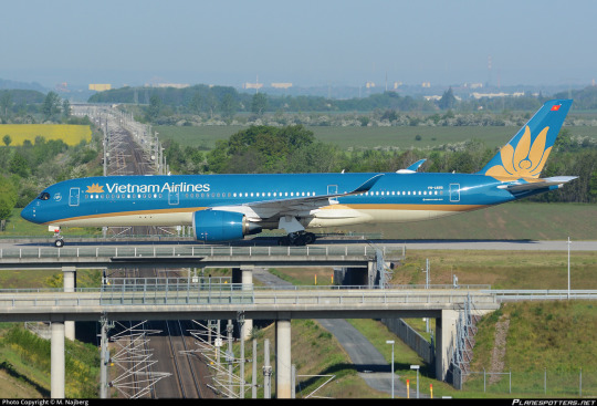
Vietnam Airlines is part of a very interesting trend. Inexplicably, it is very popular for airlines to make the top of their planes blue and the bottom white. Specifically blue. But unlike the more comprehensive sort of trend like...cheatlines, or Eurowhite...this phenomenon, which I'm sure I'll come up with a catchy name for in a timely manner, never manifests the same twice.
There are a lot of examples of it, and I plan to cover all of them if I can. I've already talked about Korean Air, but other examples on the docket include KLM, TUI, Azal Azerbaijan Airlines, Aerolíneas Argentinas, Air Tahiti Nui, and of course Vietnam Airlines.
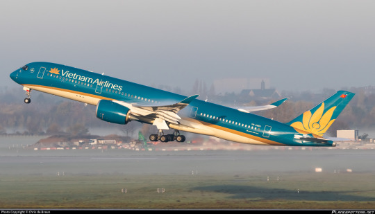
I'm not surprised that they got requested fairly early on in this blog's lifespan for the simple reason that they're very striking planes. When I first saw a Vietnam Airlines plane I'll admit it - I was pretty wowed.
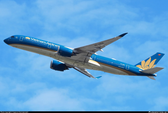
I mean, just look at these planes. There is something so absurdly captivating about the blue they've chosen for their livery's primary shade, and I just can't wrap my head around it fully. Even more than other planes, it looks entirely different in different lightings, going from a sort of metallic teal to a sharp cerulean.
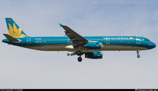
Of course, blue alone couldn't accomplish that. The choice to pair it with gold was really what made this livery coalesce, but once they have this gorgeous color combination, this vast untouched blue bordered by gold, the colors speak for themselves.
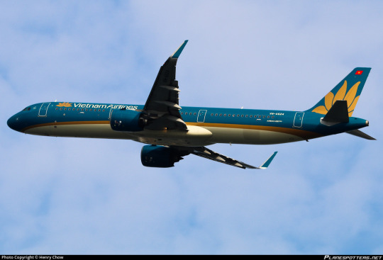
The emblem on the tail is very simple in terms of its shape, easy to recognize from a distance, It requires no detail save what can be expressed with negative space and thus doesn't need much to tie it into the rest of the fuselage - the gold stripe more than succeeds in making the integration smooth. It provides a large image that can be seen from far away, and I think it's both distinctive and elegant. I would say it could be improved by replacing the white with a lighter gold, but I actually did think that it was a lighter gold until I looked closer because of the crazy things this livery does with color.

Allowing the blue to take up most of the fuselage was absolutely the right move. It looks like a completely different color in every picture of it I've shown so far but it's always absolutely gorgeous. The interplay of blue, gold, and light hitting it is just spectacular to the point I've gotten this far in without even mentioning, say, the wordmark, which is fine but absolutely doesn't matter. Because this plane is a sea of whichever blue is your favorite, if you catch it at the right angle.

Nothing on this plane is detailed. Everything is large-scale, big sweeping lines and massive blocks of color, like it's all painted on with a massive brush. The logo isn't limited to the tail but it also isn't integrated into most of the fuselage. It just takes up the amount of space it takes up, not recognizing any sort of arbitrary boundary between tailfin and fuselage. There is a near absence of straight lines. Everything is curved and flowing and perfectly placed.

I hadn't been able to tell for sure if the underside of the plane was cream or white, but I have been informed that it is, in fact, a light cream. It's perfectly chosen. It lets the gold seem like the trim it is instead of a discrete block of color. It accentuates, similar to KAL's grey dividing line, but instead of facilitating a transition from blue to white it facilitates the blue's constant metamorphosis into something that's so much more than an essentially monocolor plane has any right to be.
Also, it makes the plane look a lot more fishlike, which is always good.
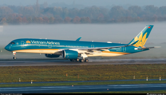
I think too much more detail would overwhelm this color combination, just because of how much of a statement it is upfront. It is an incredibly confident move to release a plane that clearly is trying to get away from the pack but has barely any features, and have those features it does have collide so elegantly into something so much larger than the sum of its parts.
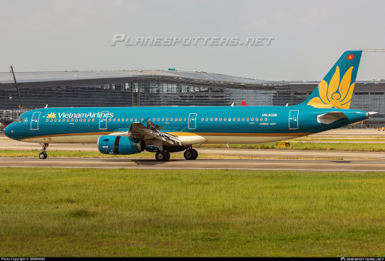
There is a part of me that keeps fighting my conclusion, insisting to myself that it's mostly blue space, and ultimately it's inevitable. The fact that I'm having so much trouble limiting my selection of pictures because each one feels like it's a discrete different shade of blue kind of proves that to me. It's so simple, yet every single angle shows it off in a new way. If I ever saw one of these planes in person I wouldn't be able to look at anything else while it was within eyesight, and that just ultimately has to speak for itself, doesn't it?
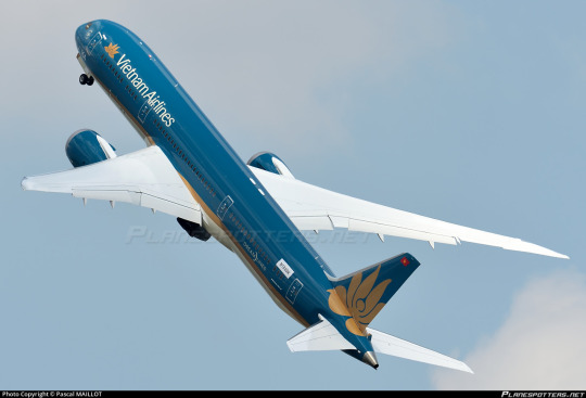
And of course they had to put this livery on Dreamliners, too.
Grade: A
#tarmac fashion week#grade: a#era: 2000s#era: 2010s#era: 2020s#region: asia#region: southeast asia#region: vietnam#vietnam airlines#blue side up#flag carriers#requests
79 notes
·
View notes
Text
Siblings Behavior
It's shenanigans time guys
So have this DpxDc idea.
So, the Justice League and the Light (OR villains in general) have two newish members, they've both been around for about a year and they're from the same plane of existence (a place called the Infinite Realms according to those who dabble in the occult)
And the two seem to have some serious beef with each other.
Wisp and Wrath are basicly feral cats hissing and hekles raised when they spot the other and their fights normally ends in draws. They're evenly matched and sometimes the two even fight to the point they are out of steam and just fist fight.
Needless to say everyone believes they totally hate each other and might one day kill (or end?) One of them.
So everything gets turned upside down when suddenly both factions of heros and villains are suddenly summoned to the Infinite Realms.
In a throne room.
In front of the Infinite King (or most commonly known as the Ghost King)
A King who looks very, very much like Wisp and Wrath (like yeah the two do sometimes look alike, like when they grin with sharp teeth and their hair color, but one has blue skin and red eyes for crying out loud!)
He's staring at them, glowing green eyes that seemed to just... know.
"Welcome to the Infinite Realms. I am King Phantom." His voice echoing in the throne room and seemed to rattle them deeply, like a sudden chill in the early morning.
"I have summoned you all here for a single reason." He continued to say "Tell me..."
Here he paused, closed his eyes before leaning back on the chair then he smiled big and cheerfully asked.
"How are my kids doing in your world? Dan and Ellie aren't causing too much chaos in their wake are they? They tend to go a tiny bit overboard sometimes but what siblings don't when they rough house you know. Tell me everything."
#danny phantom#danny fenton#crossover#dp x dc#blue rambles#danny phantom dc#writing ideas#random idea#dpxdc#dani phantom#danielle fenton#dan fenton#dan phantom#Danny is Dan and Ellie's dad in this one#ghost king danny#prince Dan#princess dani#One is Wisp and the other is Wrath#one is with heroes while the other is with villains#and they fight each other when given the chance#everyone thinks they HATE each other#but theyre just being Realm Siblings#meaning they go rough in their playing#who is who is up to you and whose on what side#Danny's been King for a while btw#he also knows which side his kids are on#he doesnt care as long as they dont cause world ending stuff#to much paperwork for the Realms#Danny summoned the two factions for a parent teacher conference tbh#he wants to know how his kids are fairing in their world
3K notes
·
View notes
Text
"Yagami Light as a youtuber would probably plagiarise" WRONG Yagami Light is insanely intelligent and looks down on literally every single other human person, he would rather stab himself in the eye than using the works of someone else - someone who can't be anything but beneath him. Pre-Death Note youtuber!Light would make long-ass videos about Everything Wrong With Society with completely unhinged takes about how xyz small innocuous thing is responsible for gang violence with numbers* to back it up.
"Light would plagiarise" get the fuck out of here.
*numbers which he completely twists to his own bias - without even knowing it because he thinks way too highly of himself
#imagine thinkinig yagami light - self-proclaimed god and arbiter of justice - would ever stoop!#to passing someone else's work as his own!!!#to him it would be like if he picked up trash off the side of the road and said 'look what i made'. girl please#blue fandom ramblings#death note#i am going to Entertain op's premise and read the rest of the post now but#i had to get this out of the way first
4K notes
·
View notes
Text
I cannot overstate this enough, but with the threat of trump and project 2025, there is GENUINELY a chance that this year's pride month could be the last...
I want y'all to really think about that, think about it when you hear or think "I'm not voting" or "both sides are the same
#we are not fucking around here#both sides are not the same#vote blue#vote biden#vote democrat#pride#pride month#pride 2024#don't let it be “the final pride month”#vote if you want pride 2025#or pride 2026#or 2027#or 2028#and so on and so forth#the republicans are committed to destroying us#we cannot give up we cannot be complacent we cannot assume#we have to vote and we have to vote blue every election#to not do so is to support our own deaths#biden 2024#us elections#us politics#politics#us presidential election#2024 us presidential election#2024 us elections#joe biden#democrats#vote blue dammit#wooloo-writes#wooloo writes
688 notes
·
View notes
Text
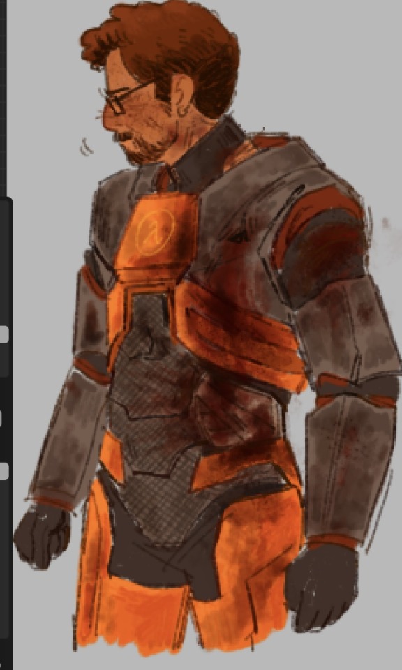
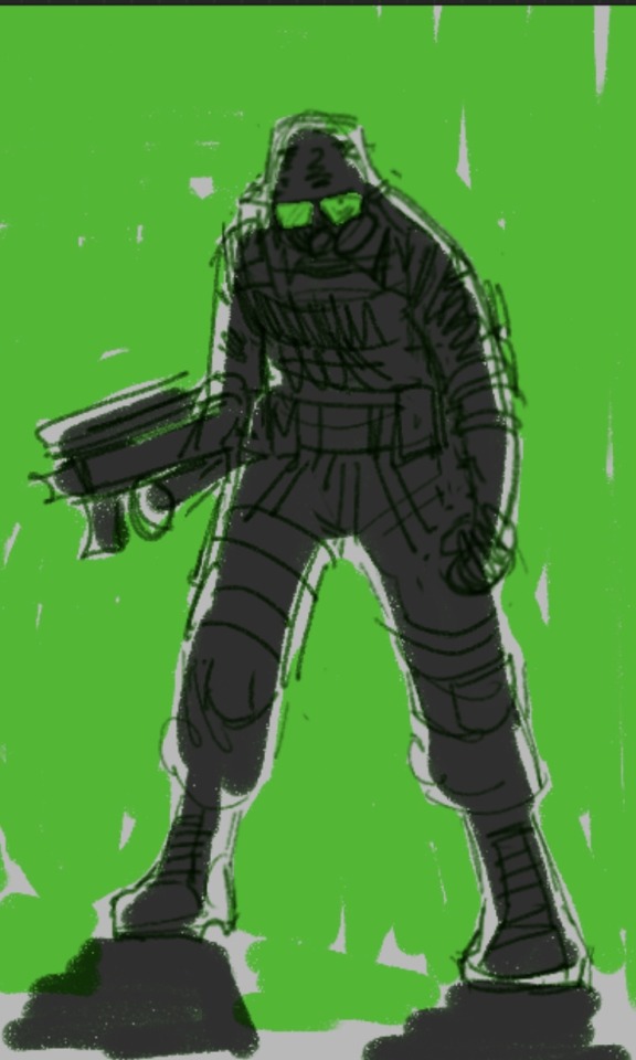
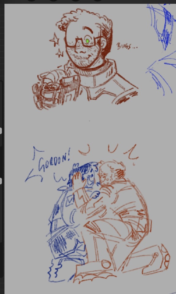

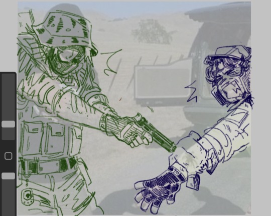

moar hl scraps…. does a pose
#There's I think a couple repeat doodles srry I cldnt crop it right. wgatever#that 1st one is a study .... I didn't realize how. Fucked up his hev suit is by th end of everything like holyshit.....#I was lookin at the pic I was using for th study and was like. 😟 that's so much blood.... that's just like..#A big gouge....... uueueeeughh......#LIKE HIS WHOLE LEFT SIDE IS BLOWN OPEN. CHRIST#I will also say I dont care 4 th hl2 HEV but I like the way the chest piece is shaped#I kinda mix them up when I draw it..... does another pose#half life#half life 2#hl1#hl2#gordon freeman#barney calhoun#freehoun#alyx vance#adrian shephard#opposing force#blue shift#That middle one of Adrian I'm mayyybe gonna turn into a full piece. I just gotta get the pose better...#Anyway listen to cowboy Dan by modest mouse. Adrian song. I know this#Th one with Barney and Adrian is nonsensical I just thought it was funny#In my heart during the black mesa incident I think barney separately teamed up w both Adrian and Gordon.#Not for very long. But I like 2 think about it.#<- making shit up
637 notes
·
View notes
Text




HIMEJOSHI TUMBLR GATHER UP! SAPPHIC SPRING IS UPON US!!!!! 👊🏻🌸🛐
#yes im remaking this post. i messed up the tags on the other one and it didnt appear lol also im adding 2 more shows#shuumatsu train doko e iku?#train to the end of the world#seiyuu radio no uraomote#the many sides of voice actor radio#sasayaku you ni koi wo utau#whisper me a love song#yoru no kurage wa oyogenai#yorukura#jellyfish can't swim in the night#nijiyon#blue archive#girls band cry#yuru camp#himejoshi#yuri#mine
421 notes
·
View notes
Text
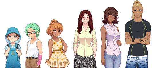
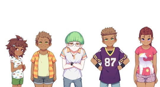
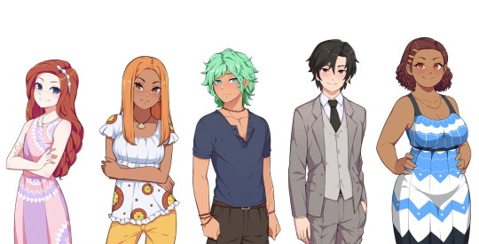
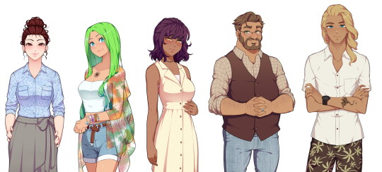
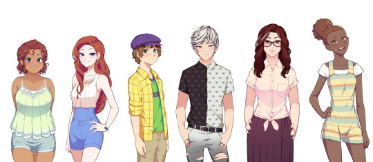
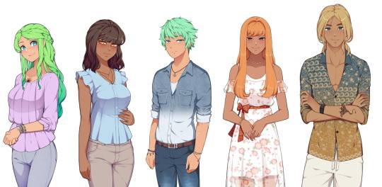
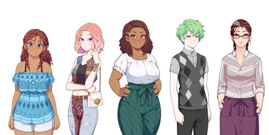
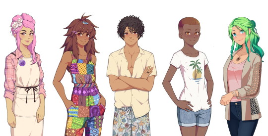
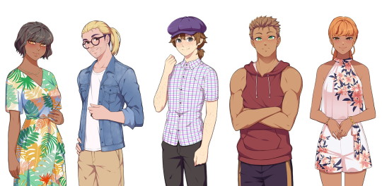
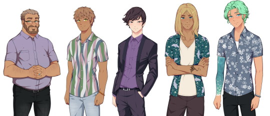
A character reference based on all four Steps of Our Life! It's only "sort of" a height reference as well since obviously they're not 100% accurate (the devs don't have specific heights for everyone to my knowledge).
I did dig into the code to try and get characters at their "normal" heights but there are other matters at play too (example: Nicolas is obviously "taller" than he should be because he needs to be pushed upwards to be visible enough above the game's text box; likewise with other very short characters).
Still, this should serve as either a nice reference guide for every character or a "height reference" in the sense of getting an idea of which characters are shorter/taller than others.
I'm also going to detail some extra notes below the break, including posts from GB Patch's Tumblr that reference any defined heights (with Cove being the obvious one) or general height things, as well as some more stuff about the MC's height in comparison to the three love interests depending on what you pick.
Cove's height is listed on GB Patch's FAQ as 4' 1" in Step 1 (also stated as "mostly average, perhaps a bit on the short side"), 5' 4" in Step 2 (in-game this is defined as "very tall" on the MC's potential height spectrum, as that is the only option considered on par with Cove's height), 6' 0" in Step 3, and 6' 4" in Step 4. A fun fact is that Cove's final height was originally 6' 3" (191cm) instead.
Derek in Step 2 is under five feet tall (this post also lists Cove as "around 5 and a half feet tall" which you could take as either close enough to 5' 4" as stated above or a potential original height he had that got changed). In-game, he's "short" but not "very short", as having your MC be "very short" will prompt narration telling you that you're shorter than Derek, whereas "short" only has you relate to him in smolness generally.
Step 4 Derek is "mostly average." He wouldn't be considered tall nor would he be considered short. His youngest brother Nicolas will "probably end up as a similar height to him" once he's more grown up.
Step 4 Baxter is "taller than average, but not especially tall."
I've been informed that, on the Our Life Patreon Discord, Step 4 Derek's height is listed as 5' 9" (175cm) whereas Step 4 Baxter's is listed as 5' 11" (180cm), so those are their defined heights. Before that, both of their heights had jumped around somewhat. A post from 2019 said that Derek was 5' 11", but a post from June 2021 said that Baxter was 5' 11" and Derek was 5' 9" (so consistent with the Discord). Then there's also another post from July 2021 (you'll have to scroll down for this one) that listed Baxter at around 5' 10" while Derek was 5' 8"/5' 9". If you're insane enough to try and use the character reference too, then Baxter would actually be around 6'1" at minimum since he's taller than Step 3 Cove (though you could also make the same argument that this means the mom trio of Pamela, Noelani, and Kyra must be decently tall as well since they're so close to Cove on the character reference).
I don't have any experience with GB Patch's other game, XOXO Droplets, so I don't know what ages the characters are in it, but since both Shiloh and Jeremy are characters seen visibly in Our Life, I thought I'd also mention that they're listed as 5' 10" and 5' 5" (or 5' 5 1/2") respectively in XOXO Droplets. Jeremy also apparently grows to 5' 8" in his 20s and he's 22 in the Our Life Cove Wedding DLC (I don't think this is spoken of in the game specifically but he's labeled as 22 in the code).
As for the MC and how their height plays into things, "tall" and "very tall" as well as "short" and "very short" tend to be considered the same for the most part in the game's code. It's not that there isn't a difference at all (I would say it's still notable), it's just that sometimes the game may be more vague about height differences. My post about Errands references this where you don't need more athletic points due to being "very short" instead of "short" to give Cove a piggyback ride.
A guesstimate I'd make is that about 5% of the time, the game will take note of whether you're "very tall" instead of "tall" or "very short" instead of "short." Otherwise, you're either "generally tall," "average," or "generally short." There are also other instances (usually with Cove) where the game might just check if you're either generally tall (around Cove's height) or not generally tall (i.e: definitely shorter than him).
This is actually relevant to the heights because, following all above information, one would assume that Step 4 Derek is average, Step 4 Baxter is tall, and Step 4 Cove is very tall going off the MC's potential "height spectrum" of very short, short, average, tall, and very tall, but it's not entirely the case.
A "tall" MC (generally tall) will look "down" at Step 4 Baxter just as he will look "up" at them or they'll look directly at each other if the MC is "average," same as Step 3 Baxter, but--
when the game has any instance of differentiating between "tall" and "very tall" (they never do this for Step 3 Baxter so the base assumption would have to be that he's just average height), things change.
During Baxter's apology in the wedding of his Step 4, Baxter dips his chin to look at the MC if they're "short"/"very short," levels his chin to look at the MC if they're "average"/"tall," and then lifts his chin to look at the MC if they're "very tall." A generally tall MC still has to lean down to kiss him if they choose to do so though.
Also, during the intimacy scene with Baxter (either in his office or his living room), if the MC is "very short," "short," or "average," it states that Baxter is taller than them. If they're "very tall," then Baxter is shorter than them, but a "tall" MC is "almost the exact same height" as him.
This is all a really long-winded way of saying that GB Patch referring to Step 4 Baxter being "taller than average but not especially tall" might mean that he's some infuriating middle ground between average and tall where he's not quite one but not quite the other either (which honestly is very Baxter of him so I can't even be mad).
#type: helpful#type: cracking the cove#our life#olba#our life: beginnings & always#((If you line up the images yourself then make sure the height of the original images are all the same))#((I don't know if Tumblr squished any.))#((Let me know if I'm missing anyone!))#((I know there's Step 3 Jeremy and someone named Cala in Derek's Step 4 (haven't gotten there yet)))#((but you only see those two on the phone so there is no ''default'' position/size for them.))#((Also I was worried that Tumblr would eat the quality if I uploaded such long images))#((so I separated Steps 2 and 3 and 4 into multiple images.))#((Hopefully that's fine; if you line them up side-by-side it still works out.))#((Me feeling so exposed because now how I design my Coves is here for everyone to see.))#((Feel free to judge my bias towards the color blue.))
639 notes
·
View notes
Text


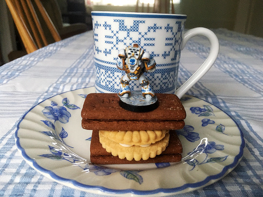
Bourbon biscuits and tea, guv'nor
(The teacup space marine is finished! 💖)
#warhammer 40k#wh40k#adeptus astartes#space marines#miniature painting#miniature#freehand#he is inspired by the 'connossieur' china pattern from royal albert 😁#i've varnished him up and painted his base white marble and cleaned up the sides and now he is Complete#i think i'm going to try white + blue porcelain only next time or something celadon-y#also i'd have liked a stack of proper bourbons but i'm out so jammy dodgers it was. not my favourite biscuit but it was sufficient
1K notes
·
View notes
Text

MAY 16, 200-
#Cool fun facts about this one I drew it back in fucking March.#then I realized i got the date wrong and sat on it for 2 months and then decided to go back and touch it up for another. 2 HOURS .#This is the LONGEST I’ve ever spent on art. 13 and a half hours. Christ alive I’m never drawing again#Anyway . check this shit out.#ID in alt text#scenario that never happened but I like to think about. What if they all ganged up#it was supposed to be a head crab zombie in the hallway but I don’t want to touch this anymore so it’s Gman. ☝️ IDC#half life#half life 1#gordon freeman#barney calhoun#adrian shephard#half life blue shift#half life opposing force#hlop4#my art#guns#blood#bright colors#injury#ask to tag#hl#blue shift#opposing force#spore launcher#HAPPY RESCAS DAY . WOOOOOO#my fave detail on this that idk if anyone will notice. that’s not Barney’s helmet. it’s got a bullet hole in the side :)
236 notes
·
View notes
Text

invertober day 14, blue glaucus
#invertober#blue glaucus#nudibranch#sea slug#mollusk#TIL that most pictures of them actually show their underside as they float belly up. their dorsal side is like a solid silver color#if this is common knowledge i did not pick up on it oopsie
1K notes
·
View notes
Text
No. 42 - KLM Royal Dutch Airlines

Oh, don't worry. I think probably at least a third of the planes in the world are blue. I knew what I was getting into. And blue might be ubiquitous now, but it's hard to hold that against KLM. They're the oldest airline in the world, after all. I think they more or less get dibs.

That said, they also fall into a particular trend in blue planes which merits further examination. I mentioned it the first time in my Vietnam Airlines post - although each does it distinctly differently and they're difficult to mistake for each other, airlines keep deciding to make the bottom half of their plane white and the top half some sort of blue. Another example is Korean Air. I plan to cover several more of these in the near future, but I find the phenomenon fascinating. I have yet to coin a catchy name for it, and would appreciate suggestions, but it just keeps happening!
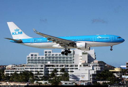
Well, okay. How does KLM distinguish itself among its blue counterparts? How well-designed is its livery in general? Does it live up to the gravitas its name tends to command? Is that crown earned? I think we can all agree that I am objectively the arbiter of these questions, so read on to see my answers.
It's not an exaggeration to say that KLM Royal Dutch Airlines (Koninklijke Luchtvaart Maatschappij) is one of the most noteworthy airlines in existence. At 103 years old, it is the oldest continuously operating airline in the world. Its first flight was operated in 1920 by a four-seater Airco DH.16, like the one below.

Today it operates a fleet of over 100 jets to 145 destinations, and that isn't even counting its subsidiaries.
KLM is the flag carrier of the Netherlands, a country I sometimes forget is still technically a monarchy! In fact, King of the Netherlands Willem-Alexander sometimes flies for subsidiary KLM Cityhopper. (As a first officer, no less. Can you imagine being a regular Fokker 70 captain at a regional airline and suddenly the king of your country shows up and says tell me what to do, boss?)
I did, in my questionnaire, ask people their opinions of KLM. My reasons for doing this, as with the other airlines mentioned, are mainly to judge if I'm correct or not in various assumptions of mine, because you know what they say about assumptions...they make you look like a complete tool if you're wrong! I was right, though, most responses spoke fairly highly or at least better-than-averagely of KLM's service, which I've always found exceptionally good for a European carrier. Two people stopped to state their distaste for the monarchy; four people said that they like that the planes are blue; one person said the state shouldn't be spending so much on them (good news for you-they're a private company with the Dutch government holding less than a 10% stake); the lowest opinion I got was one person who said 'meh'; and an entire five people said one of their main associations was the Tenerife disaster, which I was surprised by. I think this is a function of me being fairly young; in my experience people in my age bracket tend to not know about it.

For those (potentially in my age bracket) unaware of the Tenerife disaster, just know it happened in 1977 and KLM has been fatality-free since. They've got it out of their system, if you will. Even if aviation weren't generally as safe as it is, KLM is a very safe airline.
So, yeah! This all chimes with the general perception of KLM and also my own, which is that they're a pretty darn good airline if you can afford them. I have a KLM trivia post coming up later, but they have quite the history and it's worth putting your feelers onto a few books or articles if you like civil aviation history, because unfortunately I don't have the space to go into a lot of their little Dutch activities in this post. This post is about one thing only.
I'm not going to give discrete ratings to historical KLM liveries, because none of them are super out there (we aren't looking at dramatic overhauls like SAS's), but I will spend the majority of the post on them. You'll see what I mean by this later, but KLM really only has something like two and a half liveries. They've been around 100 years, mind.
One thing does, first, bear interrogation. Why blue? After all, orange is sort of the de facto national color of the Netherlands despite not being in the flag, as it's associated with the royal family. That's why basically every Dutch sports team has orange kit. I cannot find an answer to this question. The best I can figure is they just liked it, because KLM has always been blue and never any other colour. Focus group testing (my survey with 50 respondents) suggests that this is a well-received choice.
Well, anyway!
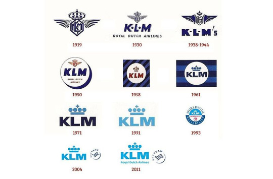
Here is a chart showing the evolution of KLM's iconography over time. I have to say that I was fine with the KLM logo before but now I'm sort of miffed that they ever got rid of the 1930 one. It's by far the best-looking of the bunch and I don't even think it really looks dated. Minimalism is a curse upon the airline industry. I will admit the lighter blue is definitely more distinctive, but I just prefer the darker blue (and I think the 1930 logo would be fine in their new chosen shade).
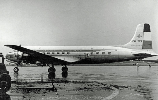
image: RuthAS
Another thing I'm furious left their branding was their very early habit of writing 'THE FLYING DUTCHMAN' on their planes. I had wondered to myself why they don't do that before learning that they used to and later stopped. I am furious that they stopped. It is so obvious, so perfectly created for them, and they let it pass right by. Shame!!!

The stripes on the rudder, by the way, are the Dutch tricolor. I do say that I'm more okay with the overdone red-white-and-blue colourscheme when it's done by flag carriers of nations with flags coloured such, but that doesn't mean I'm not relieved that they didn't.

image: RuthAS.
The description of the above photograph on wikimedia mentions that her name was 'Pallas'. KLM names their planes to this day, though there is no one consistent scheme. Airplanes are generally named according to model, but each type gets a different inspiration - these range from birds and insects to city squares and rivers. Here's a list of the names of their planes as of 2015!

As you can see, these early KLM liveries featured cheatlines, one light and one dark blue, a white top half, a bare metal lower half, a painted black radome, and the 'KLM ROYAL DUTCH AIRLINES' name written in obnoxiously small text. This was all very standard for the time. The only really recognizable feature is the striped blue tail (see, condor? Horizontal stripes look so much better). This was their scheme for a very long time. The above image was taken in 1969, right at the end of its lifetime.
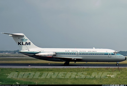
This is the same model of airplane wearing a new scheme, taken in 1972. The livery was introduced in 1971 when KLM received their first 747, which wore it.
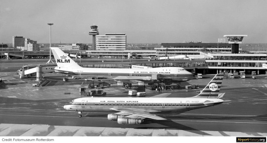
This was the era before Eurowhite caught on, when liveries mostly made up of bare metal were only just beginning to fall out of ubiquity. I'm sure, given the context, and given the size of the 747, this was a startling vision of elegance towering over its surroundings. However, I was born closer to when KLM retired the 747 than when they introduced it, and the world is different now.

I can't deny that even now it looks impressive watching this giant roll on by. It's difficult to see from here, but one of the cheatlines still says 'The Flying Dutchman'. It's difficult to come up with better slogans than the one KLM was given literally for free and has let slip through their grasp for reasons beyond me.

I truly wish I hated this more than I do, but I think as a limited-edition or commemorative livery, or one reserved for the 747s, it would look fantastic. As a brand, I'm not thrilled, but as a variant of the brand, I like it. Keep in mind the 747 was the first wide-body airplane introduced to service and was an order of magnitude larger than anything which had existed previously. These planes are huge by modern standards, but at the time they would have been almost unbelievably gargantuan. I've always thought that while the 747 wears a lot of liveries very well the plane by itself is a bit distractingly goofy-looking, but in white and surrounded by buildings that are shorter than it they have an august grace, quietly elegant, easily charismatic, and never thinking twice about their glorious size.
(It looks pretty bad on the DC-9, though. That's not a plane which really commands awe.)

Even compared to this DC-10, the 747 is massive. But do take note of the DC-10! Around the same time as the white-top livery (I've seen both 1971 and 1972 given as dates of introduction) we saw the introduction of today's blue-top KLM livery! That's right - they did it first, as far as I can tell! Earlier than Korean Air's 1985, and definitely older than Vietnam Airlines' 2002.
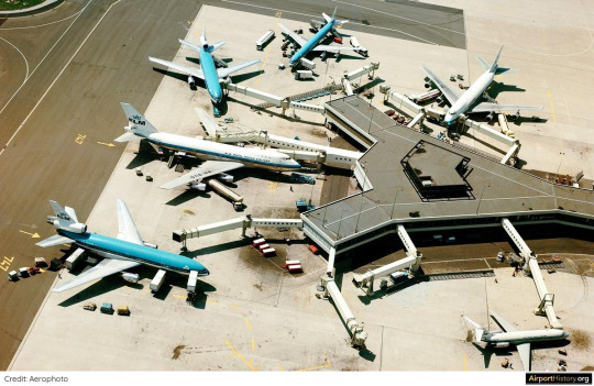
For a few years they operated this fleet of half-white-top, half-blue-top. And then they made the right decision and realized this white livery would lose all its gravitas the moment it stopped being something new and special and clean and splendid that the world had never seen before.
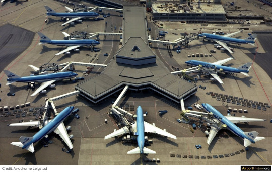
By the close of 1977 this was the KLM livery-full stop.
I actually find this pretty incredible. KLM's livery has changed over the years, and that's what I'm about to talk about, but I wouldn't say it's ever become a different livery - just different takes on the same one. KLM is over 100 years old, and their livery is over 50. Most airlines aren't that old. KLM's livery is over twice as old as Kosovo. That is one hell of a way to stick to a consistent, recognizable brand. I admire that and I wish more airlines would commit instead of jumping between short-lived mediocre liveries.
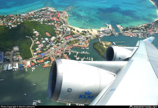
The crown really does set the tone for KLM. It's an airline that carries itself with elegance and refuses to be stingy. These engines are clean, shiny, well-maintained, and wearing their logo. It's all executed so perfectly.

Unfortunately, I do not like their livery. It doesn't look fantastic. This is a rare situation where the 747 actually wears it worse than the more conventional tube-with-a-fin models, but that miniaturized logo replacing the wordmark just looks so tiny and weirdly placed. I hate when airlines just use the same logo twice instead of putting an image logo on the tail and a wordmark on the main body. It instantly lowers my opinion of any livery. Reoccurring elements and a consistent design are one thing and repetition is another; it's the reusing-the-same-shot-in-a-film of airplane livery design. The uninterrupted blue just makes me want to pick up a breeze-block and tear it in two with my hands. Something about the cheatline being placed so high makes me want to take a wooden dowel and beat the nearest wall with it until I have a gaping hole in the wall of my bedroom. Like, it's fine. It's not that bad. But I am going to go chew on a towel until I calm down.

Hey. Don't cry. Air Canada's first A320 delivered wearing scarf and ear warmers ok? I'm doing alright now. And while I was getting done crying KLM apparently came to my same conclusions. I'm not sure exactly when the change was made, but I imagine this livery was phased out sometime in the mid-late 80s or early 90s. It doesn't seem to be instantaneous - rather, the cheatlines have almost bled off over time, and you can find a handful of strange in-betweens.
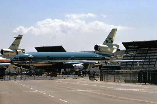
image: Ron Monroe
It wasn't all that bad before. I was being dramatic for a bit. I mean, it looked a lot better on the DC-10, even though it still wasn't exactly fantastic. But it was never, you know, hideous.
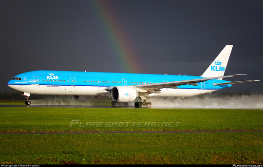
While this gay plane may be mistaken for having landed, she is actually in the process of beginning to rotate for take-off.
I like the modernized version a lot more. I love cheatlines, this is widely apparent, but sometimes liveries just look better without them. Cheatline liveries can't really afford to be minimalist - having a big detail like a cheatline makes any attempt at this sort of cleanliness seem quite cluttered and cramped. When the blue is allowed to expand to a proper half of the fuselage it really makes the whole thing feel a lot better proportioned, and I like that they still kept a thin dividing line (though I think it would have been fine if they hadn't, too). All of a sudden this is far from glorious but it at least looks clean. I can say, with confidence, that I think this is acceptable. Not...pretty, maybe. Doesn't fill me with awe. But nothing about it bothers me except the lack of wordmark. I can live with it.

The one thing I feel obliged to point out - and I am far from the first person to say this; it even feels cheap - is that this livery looks like an amount of toothpaste. I am not bothered by this. I am a big fan of oral hygiene. Taking care of your teeth is important! And I do think it's a very nice shade of blue.
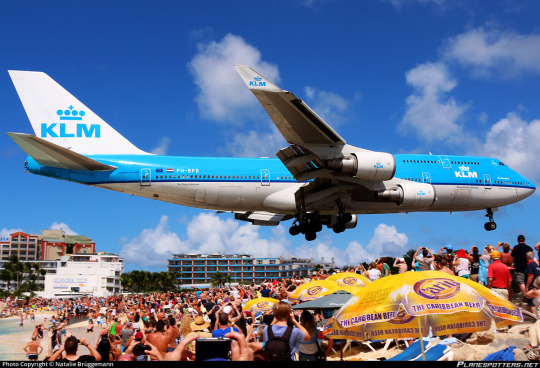
Sure, it may not be the most elegant livery in the world. It's certainly not the most detailed, but it maintains all the iconography necessary at bare minimum. It feels like a revision or evolution of the 1971 livery rather than a new one altogether, and it is impossible to mistake for another airline, and that's my minimum, really - be iconic (in the literal sense), don't be repulsive to look at. Goals met. And the white belly really adds to the whale-like appearance large planes already have, which is always a plus. Maybe it's a form of countershading?
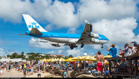
And this would be where the story ends, but in 2014 KLM did a classic airline thing. A bunch of absurdly wealthy individuals sat down in a conference room and decided they were going to make things worse.
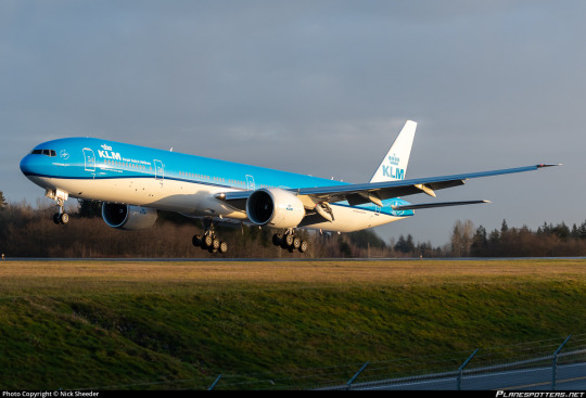
Now, 'ruined' is a strong word, and in this case it doesn't apply. The original livery wasn't really good enough to ruin, and the change is very very minor. But I am simply not a fan of this new iteration of the livery.
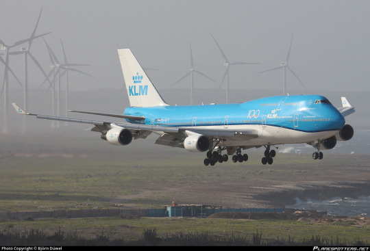
It just looks sloppy. It doesn't look intentional. It looks like a mistake.
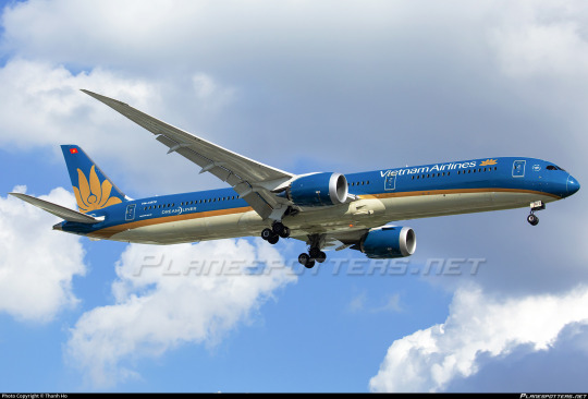
Compare it to Vietnam Airlines, which is in the same blue-and-white-halves category and also features a curved line. I gave this livery an A and one of the reasons for that is that its minimalism is deceptive. Each detail of this livery is very deliberate, and the consistent, smooth angle of the curve, the thickness of the separating line tapering with it - these all work together to create something extremely elegant, despite the fact that if you described these liveries with words alone they might sound quite alike.
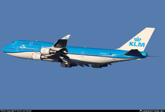
There is something so fundamentally sloppy about this localised droop. And it doesn't help that this is KLM, the same airline with those crisp white titans. I don't see what it adds, to create the appearance that your airplane's coat has stretched like an old sock until it doesn't quite fit properly. How far we've come, and how little has changed. But those changes can sometimes be tragic in their simplicity. This small adjustment has disrupted the equilibrium that had me feeling fairly neutral about KLM's livery for so long.
I have to leave it with a D+.
I fought myself for quite some time about this. There's nothing truly offensive about this livery despite the things that make me dislike it, but I just couldn't bump myself up to a C- because, above all else, I'm let down. KLM has the budget, the brand, the acumen - and they had a decent livery, too! One of the most recognizable in the world! It didn't need this change!
A lot of airlines update their livery every decade or two. I wonder if KLM felt pressured not to stagnate, if they were ashamed of keeping their livery the same year after year. But, look...if you're going to be parading the fact that you're sanctioned by the royal family of the Netherlands around you shouldn't be afraid of not looking modern.
And I'm not a fan of monarchies, but not all old things are bad. You don't need to feel pressure to change just because other people are doing it. One of the industry's biggest names shouldn't feel pressured by the trend cycle. You've taken a jacket from a thrift store and cropped it, and it looks worse now. It was fine the way it was. You don't need to touch a classic. It's a bit oversaid, maybe, but...if it's not broken, there's no reason to try and fix it.
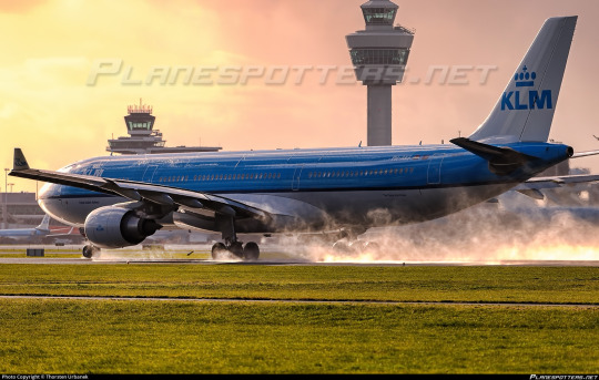
#tarmac fashion week#grade: d+#region: europe#region: west/central europe#region: the netherlands#klm royal dutch airlines#era: 1960s#era: 1970s#era: 1980s#era: 1990s#era: 2000s#era: 2010s#era: 2020s#blue side up#flag carriers#double sunrise#air france-klm#requests#long haul
32 notes
·
View notes
Text
The MANY Bloodlines of Constantine
Those Constantine is Danny's dad and sold his kid soul because he thought he'd actually never have one and Danny is now the Ghost King so his soul claims are invalid AUs but learns he's not Constantine only kid (after a while Constantine honestly 100% thought he'd never have kids and never bothered with a 1st born clause when making deals, maybe some annoyed deity or powerful magic user made Constantine think he can't have kids anymore just to get back at the conman) and now doing everything in his Kingly power to save his half-siblings (can be other teens from other shows or movies or cartoons etc etc) because Danny is the oldest of them and really really wants to punch his biodad for making such a huge mess he has to deal with but Danny does get to meet and protect his younger Half-siblings.
Then comes the day he's celebrating one of his half-sibs birthday with all the others when he's suddenly summoned out of the blue and meets not just the Justice League but his, and his half-sibs, no good soul selling biodad.
Hello rightly placed aggression.... Once he takes care of that powerful evil spirit that's attacking earth first of course.
#danny phantom#danny fenton#dp x dc#blue rambles#crossover#writing ideas#random idea#danny phantom dc#John Constantine#Constantine is in trouble#Danny is the oldest of them#got crowned before his 18th and the papers/contracts that had his soul showed up#he read them and was livid that his biodad sold his soul#then he found out just who Constantine is and is now annoyed as heck when others show up trying to claim his soul#he gets really pissed off when he starts getting contracts for apparently his younger half-sibs souls#because hes the oldest and now Ghost King and with his protector core all contracts dealing with his blood/family is sent to him#on the bright side he gets to know his half-sibs#he will be punching Constantine once he deals with whatever he was summoned for though#his siblings can be any other kids from any other shows/movies/cartoons etc#is this silly. yes. do I wanna read something like this. double yes#is it almost 3am and I am bored out of my mind. triple yes#ghost king danny
3K notes
·
View notes
Text
One of my favorite pathetic facts about Ed is how often we see him just absolutely passed out face down on a beach. I hope we get to see this again in s3 after he and Stede accidentally burn down their shack by leaving a candle unattended while they're doing a bit in the other room

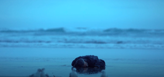
#ofmd#our flag means death#one thing about ed is that he's gonna be face down on a beach apparently#side note i can't believe i didn't clock something up with the gravy basket immediately it is SO blue
606 notes
·
View notes
Text
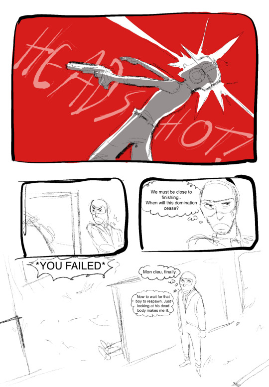
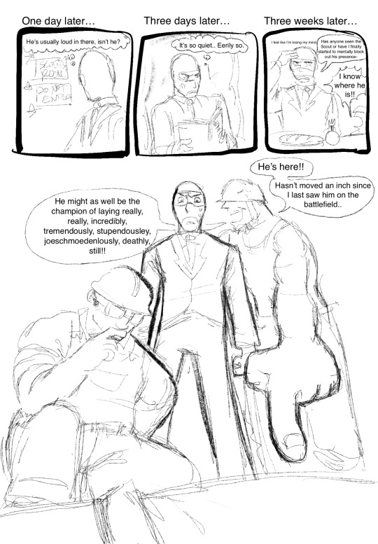
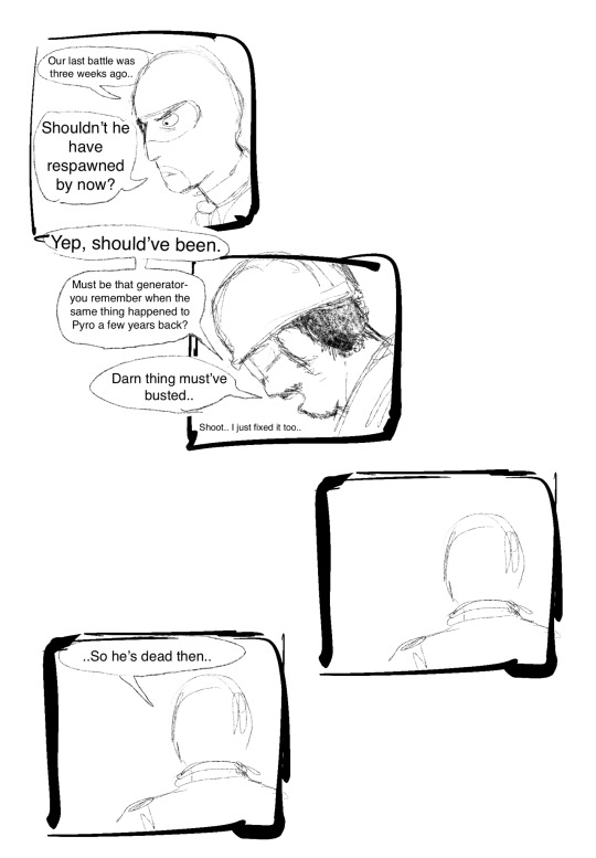
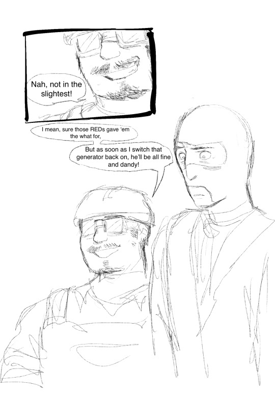
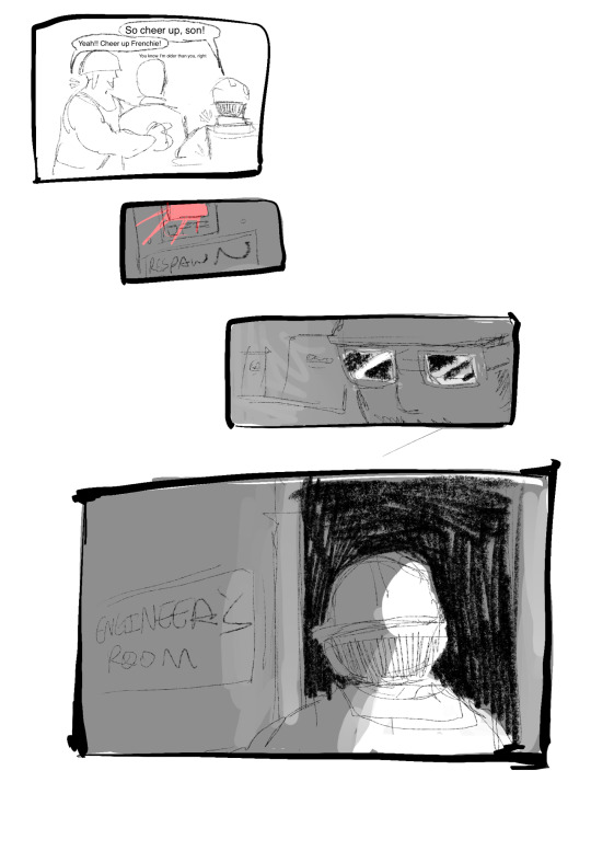
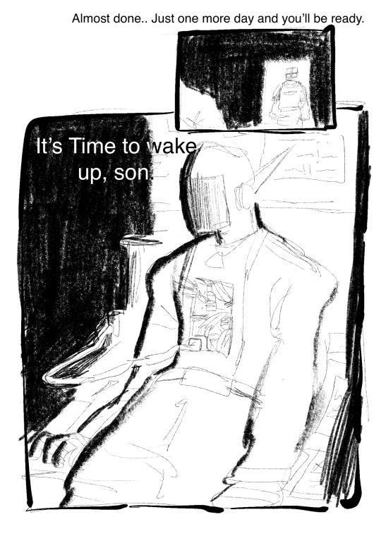
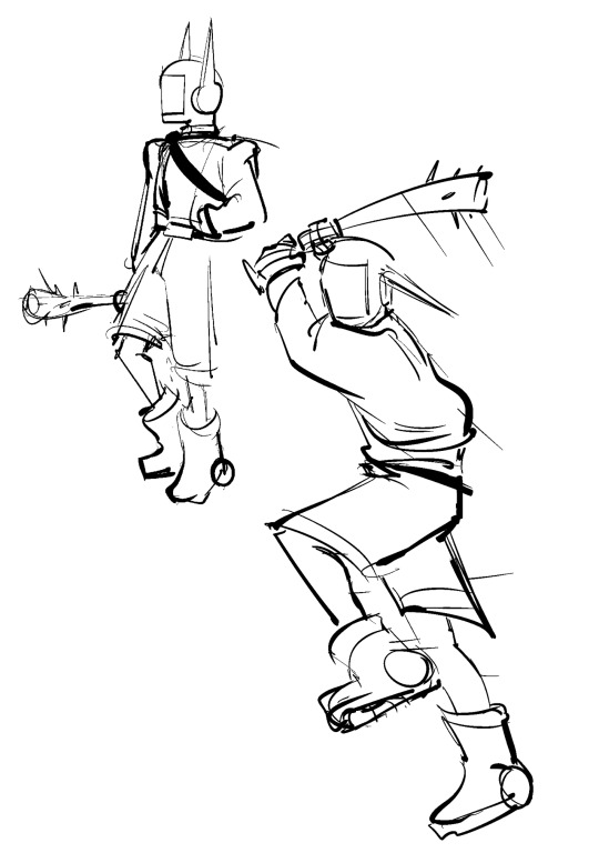
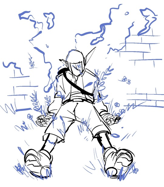
anyone remember that pyro is a robot headcanon? yeah um erm i also remembered that and also sorta maybe mightve gotten carried away a little bit.. tee hee..
#fanart#art#doodle#tf2#tf2 fanart#team fortress 2#tf2 scout#comic#tf2 engineer#tf2 spy#tf2 soldier#its so funny because it didnt even cross my mind until i was drawing (GET READY FOR CRINGE)…#..scout with bunny ears.. ANYWAYS AHEM. i was like. hey. what if. what if those ears. were like. apart of a helmet.#and then i spiraled#hashtag real#hopefully this comic makes sense i stayed up to do this not realizing the time i am so eepy#this is probably also a blue headcanon i headcanon blu engie is medic levels of unhinged <3#to the person in the replies: YES!! you have full permission to draw him!! thank you for asking in the first place that’s so sweet of you!!#but anyways sorry for not replying! this is my side account that i’ve turned into a main account#and my main account still has the Mark of cringe past (old fanart) so i’m trying to keep them apart lol#scoutbot
746 notes
·
View notes
Text
Here’s a thought-
When Splinter says Leo’s the leader at the end of Season 2…pretty sure he was joking.
After so many high stakes and high emotions, he (a bit cluelessly) makes a joke to add some levity, just to make things a bit easier for he and his sons to digest everything that happened. It was a lot that happened, so it makes sense that Splinter wants to make things that much softer for everyone.
But- making a joke like that, after everything they all just went through…I can definitely see how the events of the movie pave out in response.
For example, by joking about Leo in particular having the responsibility of a leader, that puts him directly in the sight of Raph’s building anxieties. Because after everything, it’s clear that Raph really started taking the hero name seriously to the point that he started undermining his own fun and childhood in the process. So in the eyes of a Raph who is so worried about what could happen if they’re not prepared again, Leo in particular kind of stands almost as a point of danger in that aspect.
And with the joke of Leo “leading” in any capacity ringing out over them, it’s easy to blame Leo and Leo alone whenever he goes and goofs off with Mikey and Donnie. I think as well that the concept of a leader being spoken after the Shredder just pushes more weight on Raph’s shoulders and makes him realize how much goofing off they did before when they should have been better heroes (despite them all just being kids...)
Raph knows his brothers are good, he knows and has pride in them and himself in turn, but it terrifies him to know that they won’t be ready for the next big threat, and Leo directly going against this caution even more than usual just pushes Raph to want to try more.
As for Leo- keep in mind what happened all throughout “Many Unhappy Returns.” Keep in mind what happened all throughout the series in general. In the former, Splinter more than once points out how he would rather have his other sons with him than Leo, especially because they “would take this seriously”…even though Leo was taking it seriously. (Not that Splinter should be expected to read what Leo was doing when Leo wasn’t making his plans clear, but that wording sticks with kids.) Even after Leo’s plan pulled through, Raph’s the one who spoke in trust of Leo, not Splinter.
As for what happens in the series in general…well, we see Leo mess up a lot, apologize a lot, get his brothers out of messes a lot, and even when he does well or is responsible it’s either glossed over or still seen as goofing off (no I will never be over that moment where Leo almost got Gus’s tags and got screwed over out of pure bad luck.)
So imagine hearing a joke like that as Leo, who for a good chunk of especially the start of the series has been a lowkey voice of reason. The idea that Leo being responsible for the team is nothing but a joke…? It’s understandable that it could feel like a blow, that it could push him to want to try less.
Especially after everything they just went through.
They’re heroes. | They’re kids.
Why shouldn’t they care? | Why should they care?
#rottmnt#rise of the teenage mutant ninja turtles#rottmnt raph#rottmnt leo#rottmnt splinter#splinter is not a bad dad but words can always cause unintended harm especially to kids and teens#Leo being the voice of reason in Bug Busters only to be rewarded with a near death experience rip#if I was him I’d clock out too#side note but I actually really like how Bug Busters and the movie kinda parallel each other just with Raph and Leo’s roles swapped#(and obviously the movie is much higher stakes)#splinter: haha imagine blue as the leader wouldn’t that be funny#raph & leo: *speedrun into developing bad habits as a response*#shout out to Raph in the show’s finale he really stepped up#but then he just kept stepping until all he knew was being a hero and a team and not his own age 😞#Raph and Leo’s dynamic means so much to me it really does#both of them are self made caricatures at the beginning of the movie! not their true selves!! BOTH lean away from these masks at the end!
176 notes
·
View notes
Text
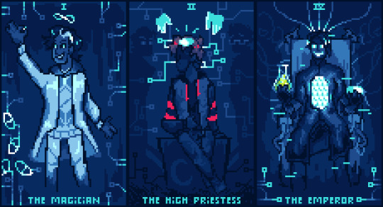
Day 19: Tarot card
Past, present, future. You're fucked dude.
#be more chill#bmc#squipril#squipril 2024#you can pry this color scheme from my cold dead hands. i fuckign love blues#happi's art#technically these should all be reversed for the meanings im going for (or at least high priestess & emperor. magician could go either way)#but it looks nicer right side up :)#anyways i put a lot of thought picking cards that fit and then realized i could make it work w/ the timeline of bmc#so yeah!#a little late but eh. that seems to be how it is with me haha
94 notes
·
View notes