#and it did make me like the art process again
Note
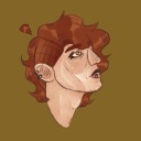
so what's your process for designing characters?
Man people keep asking me how do I design characters, how do I make characters, how do you pick characters genders, etc. and I feel SO bad because I!! There is no process!! Especially with designing AphidClan characters in particular, my process is EXTREMELY wild and intuitive and spontaneous and very “just wing it first try it’ll be fine. I totally won’t hate it 3 months later ((I will and I do))”
I. I don’t know how to explain it. Like. Alder for example, I knew Lilacpaw was this kind of pinkish purple with an orange gradient, so I wanted her dad to be pinkish purple and her mom to have the orange gradient, so when it came time to design him, I jus. made him purple. and that’s all he is there isn’t any thought put into this, this is a. Random, not professional at all, “I made a quick concept sketch as my first and only attempt, he came out purple, that’s all he is, just purple” and “I got it first try” bullshit, and everything else about his design happened because. it felt right, and I never questioned that, so now hes. alder. he exists now. “how did you make him?” i don’t know but he sure as hell is here now
That’s how I make literally all of my character designs and decisions, especially since this is just a Warrior cats blog that I do as a fun “low-effort” hobby. I had a single idea of “rainbow,,,” it felt right, I never questioned it, it happened, I made a single quick sketch of concept art as prep to solidify what already existed in my brain, and now it exists, and then 4 months and 10 updates later I become deeply unhappy with the design and I try all over again lol. It’s extremely extremely intuitive for me, it’s all just feeling. I don’t really follow any professional tips or legitimate art techniques, I don’t really make concept art, half of the time the characters first appearance in a moon update or ask response is literally the first time I’ve ever drawn them, as you can tell from the Fire/Gravel kids and their extensive “gradually redesign them piece by piece over each moon until I decide I hate all of it and start over entirely” process which is NOT something I’d recommend for a webcomic or any legitimate art project you want to take seriously or professionally!! I don’t really. have a process, I just start drawing the moon update and they appear lolol
#chances are any time you wanna ask me a ‘how did you come up with [blank]??’ question there’s like.#an 80% chance the answer is literally just ‘idk. felt right. sounded cool’#and I do not know how else to explain it#and iiiii could not break it down into steps if I tried#I am. sorry lol#aphidasks
35 notes
·
View notes
Text

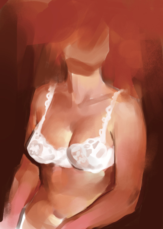
i was holding myself back from sharing this until it was Actually Finished, but it's been Weeks and the urge to prove that i wasn't just crying rewatching old barbie movies and doing commissions is too strong.
please have this snippet of a piece that's actually not fanart!
i'm trying my hand at the 'painting your problems' concept. As someone who has used art as an escape since childhood it's been pretty wild. Staring at my thoughts can be scary but drawing menacing looking ladies gives me courage.
#the process for this piece has been so chaotic#i know it's basic and the composition isn't ground breaking but it pleases my monkey brain#and it did make me like the art process again#feeling like an artist while painting is the best feeling and god i missed it#there's still a lot to be done but i'm taking my sweet time#i had so much fun doing fabric folds#i did went a bit overboard but my fav part is the silk dress that you can't see here#also the white sleeve looks like a wrinkly mess bc the unfinished linen shift that i used as a reference looked just like that#the side effects of being shoved down my sewing box#anyway i'll go back at studying traffic signs and legislation for my written (is this the word?) driving exam this friday wish me luck
30 notes
·
View notes
Text
Man for some reason the “not living up to my potential” in terms of my art is really hitting today which is stupid.
Hey brain you know that art is a forever journey and that it’s okay to grow and learn and not be perfect right???
#it’s stupid that I feel bad!!! I know it’s stupid. and I am terribly sorry to vent abt it#it’s not that I think my art is bad I’m sorry if my other post gave that impression!!! I thought it was good.#the thing that bothers me is that I could’ve done better if that makes sense. but I chose to rush instead#I also tend to have high expectations for my work however I have very reasonable knowledge of what I’m capable of and the thing is#I really enjoyed making those traditional pieces!!! I did!! I had fun#and I played with a lot of new things and stretched that brain!!! however I tend to feel bad if I’m not immediately great at something new#which again is stupid bc I KNOW that it’s a process#and like I said I did have fun!! and will do more!!! but for some reason the little goblin in my mind is resting it’s hideous head#which hasn’t happened in a while#but that’s good bc it means I’m being challenged which is what I want and need#anyway sorry for the long complicated explanation I promise I’m not like. super upset#just overthinking bc I do that#Lynx talks
23 notes
·
View notes
Text

Reflections
#naoki urasawa's monster#wolfgang grimmer#blood cw#my art#godddd it took me so long to even be satisfied with the angle on this one I had to put it away for a while before trying again#the hands vs the mirror angle kept tripping me up but I finally got it to work#I'm really not satisfied with how it came out once I rendered it though#like the process was enjoyable I'm happy with what I did but it's like I know what I wanted to get out of it and it isn't there#also I originally wanted to make it mostly green/blue but what can I say...adding orange on green is too fun to pass up lol#I have too much fun with colours.....
39 notes
·
View notes
Text
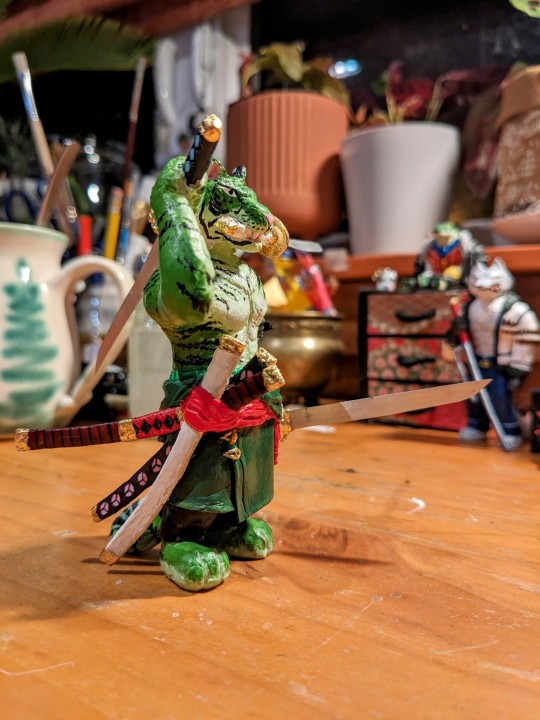
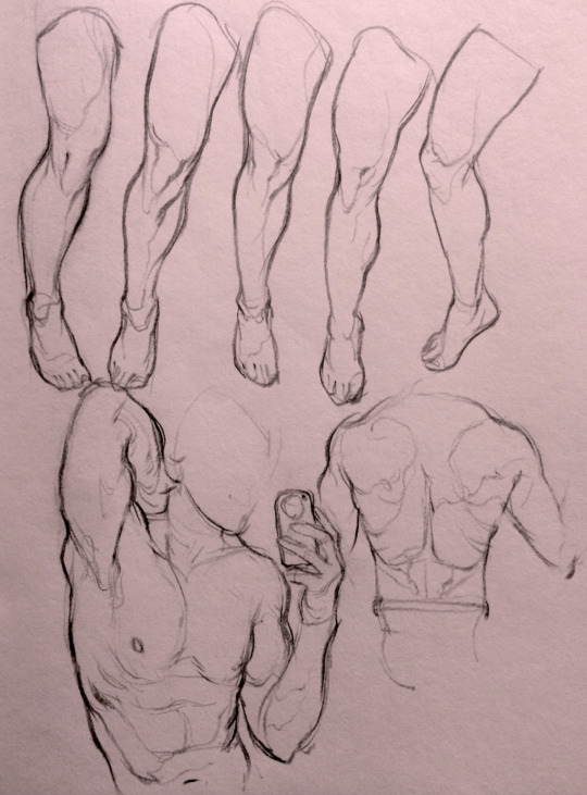
Zoro 🐯 Process:
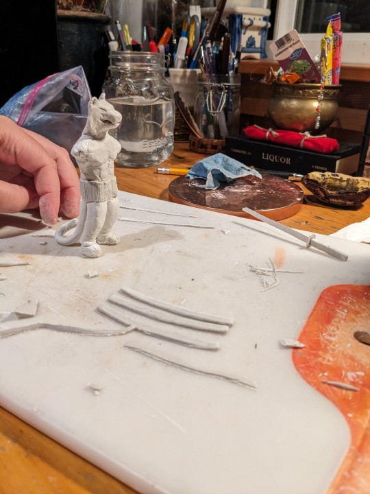
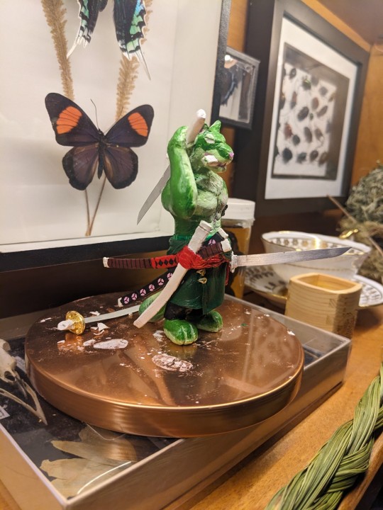
Commentary below:
Notes:
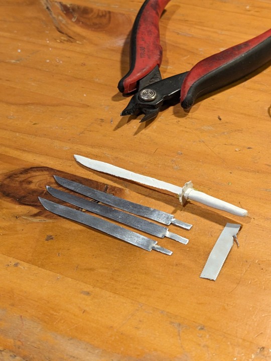
One of the first attempts at sculpting the boy; the head was later altered quite a bit and the legs entirely scrapped, and the torso bulked up shaking my shoulders feverishly: we need to properly represent his 110 cm bust and what we have isn't cutting it. Scabbards were made (which survived till the end!) and the original clay swords were made by this point.
New torso and legs give (hallelujah), as well as the loops and holes for the ears (such finicky small work, fuck me) were made. Holes were first made with straight wire and dried before the hoops were gently (and with swearing) inserted through.
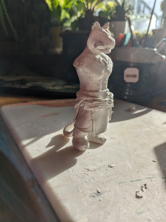
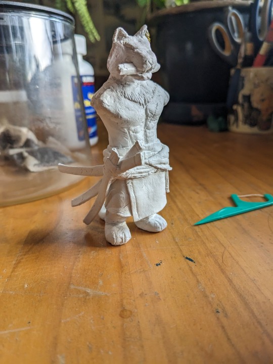
Clothes added, also with swearing as the clay dried and stiffened faster then I wanted to and made it hard to get nice folds. Scarf was re-made and smoothed later.
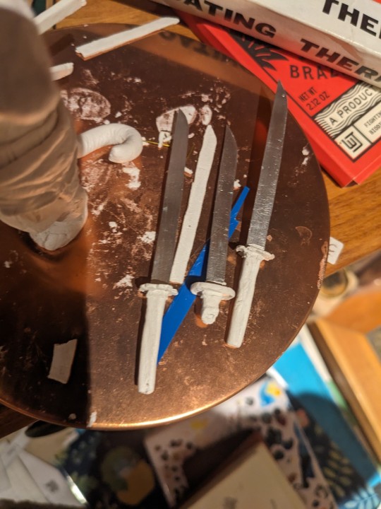
Scabbards added! Immediately drops it and breaks a piece of it off. I've glued multiple bits of the scabbards back on the flimsy bastards. He remained armless for a good while. A Venus on the shelf by my desk...
Because the clay sword (after a good hour of tender focused work) would IMMEDIATELY would break upon the lightest touch, annoying me to no end, one evening was like God I wish I had actual metal to use instead wouldn't that be cool, and then was like OH! I COULD DO THAT! So the metal is actually cut from the tin of a cat food can, straightened and sanded., as seen in photo!
The blades hilted, before placed in capable hands
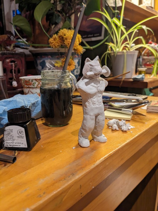
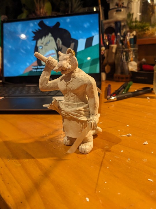
ARMS! and the sculpting is finished. Onto painting!
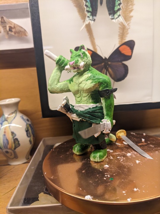
First layers of paint on various parts; I generally paint via colours I'm using at the moment (ie, greens in this instance)
More layers laid down. I generally go for shading in rules of three (main colour, lighter, and darker hues) and apply them at different opacity of acrylic. Adjusted the green since I found it too pungent. Once the fur tones were finished I gave him his stripes (cue me searching up loads of photos of tigers and tiger fursonas to see how people have done the stripes. Did you know depending on the area they are from they have different face shapes and stripe patterns? Fascinating stuff)
Finished project! Last layers, and highlights where added, adjusted the eye and fuck-ups re-adjusted. Dropped and had to reglue things. The gold is actual gold leaf I applied using a glue you paint on but that was a bit of a whole mess and took a long time, and doesn't go on very flat on very not-flat surfaces... (Who would have thought...) In the future may instead use gold paints for metallics.
Here's also the link to the post of more photos of him finished!
#one piece zoro#roronoa zoro#zoro#op zoro#zoro figure#op figures#hugin scribbles#hugin sculpts#hugin wip#op fanart#one piece#furry art#anthro#furry#tiger zoro#not sure if people find this interesting but i do so. BEHOLD MY PROCESS#i have like zero knowledge on actual sculpting of figures. i just do it and go well. sure that works#should watch some doll making vids or something to pick up better techniques. hm#theres something so clean and nice about the non+painted versions. pure#god when i firsy put down the green i was like. oh this looks SO much like someones unrealistic lime green tiger fursona#muting the tones a bit helped with that. and the stripes#was a bit annoyed with the stripes at first cause i was like oh no thats too realistic but i think it looks good that way#not pictured is me swearing while working on his fucking earrings#theyre brass wire with the caly and holy shit the clay is so finicky when its that small. the length of time it took to do them.#did them like three times separately and then also LOST ONE and then had to also apply the adhesive for the gold foil and the gold foil#never again for something that small.#but at the same time oooo fuck yeah onto the next project. that hopefully WONT take me like 8 fucking months
13 notes
·
View notes
Text
yknow i noticed the small steps method doesn't help me and only stresses me out more. and like i just get stuck on the first step anyway and never move on to the next one, i'll probably even go back to the start eventually really. i'm apparently an all or nothing guy i can't think of an action as multiple actions bc it stresses me out i just need to either do it or not. the problem is i usually end up not
#i talked to my social worker abt this today#bc like he said that in order to have an easier time going outside i need to do it often enough to get used to it#but for me it's like. i go outside when i need to. yknow?#(days where my anxiety is painfully debilitating don't count lol)#i'm gonna be uncomfortable anyway. bc being outside is inherently unpleasant for me. it's not smth i can get used to#i compared this to going to the dentist. you do it bc you have to but you won't go just to get used to it yknow?#so my thought process is. i'm gonna have to start going outside every day soon for the art program. so i'm just gonna do it#i took a bus one time with my mentor/guide(??) to see that i can do it and i did. so i broke the barrier kinda#but it's not like i'm just gonna take the bus for fun?? i'll get used to it as i do it. i think. like i was before. hopefully#idk it feels pretty obvious to me but it baffled him i think 😭#both of them offered to just go downstairs with me. sit at the lobby of my building or smth#but it feels silly to me like. if i'm getting dressed i may as well go do smth yknow??#idk. again it makes a lot of sense to me but i don't think they get it#i think i'm generally very odd when it comes to other ppl in this recovery program 😭😭 just like i was in that social anxiety support group#(aka everyone went there for stage fright which isn't an issue for me i like being on a stage. hate one on one conversations tho -#- which was comfortable for them. so this was. well. the first step!!! in a lot of its sessions. and it just made me feel bad)#anyway that was my ramble. sorry. my brain is weird
11 notes
·
View notes
Text

A closer look at my young Askr siblings designs! Sharena's kind of constantly fluctuates, but I've always had a really clear vision for an early teen Alfonse.
#fire emblem#feh#tags on prev post (above post? other post.) apply here LMFAOO#outfits are kind of vague/unimportant (though i did ref young marth for alfonse)#i think what i want to capture most is like. esppp where sharena and peony split off when they reach a certain age#like idk how many other designs i've posted i feel like maybe one. but other designs for her#include twintails (ofc) and sort of a gradual process. where it ultimately ends up the way it does in canon#again my ideas for alfonse are v straightforward. going from high restriction ->#to some control over his appearance (although he is met w disapproval for it) -> to finding something he likes (as we see him now)#(secret other step -- mental breakdown and worst haircut you've ever seen by his own hand approximately 3months before summoner shows up)#i just think. these sorts of things are what make us human.#which is why one of my BIGGEST pet peeves is when younger designs for charas look IDENTICAL to their adult versions just smaller#LIKE. EVEN BEYOND BEING TRANSGENDER. SHOW ME A PERMANENT STATE OF BEING ASSHOLE‼️‼️‼️‼️#people cut their hair and grow it out and dye it and sometimes tastes in aesthetics change. ect.#i will be here ALL day if i allow myself to get into this I NEED TO LEAVE I WANT TO LEAVE‼️‼️‼️‼️‼️‼️‼️‼️#fe alfonse#sharena#my art
11 notes
·
View notes
Text
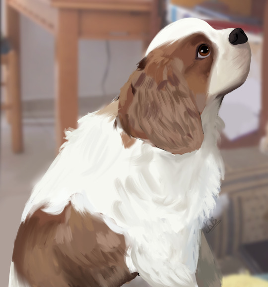
Fanny, my sweet, beautiful girl
17.11.2012 – 14.04.2019
#my art#artists on tumblr#I cannot accept that it has been 5 years already#I know covid messed with everyone’s sense of time but it simultaneously feels so much longer and so much shorter than that#exactly five years ago I was holding onto my mom for dear life and sobbing as we watched lilo and stitch together#not the best movie to watch when you’ve just lost your first ever pet you know#and then I cried myself to sleep at the next morning we never mentioned her again#I know it’s because it was way too painful for everyone involved. but I do wish I was allowed to process that grief properly#instead of bottling it up and pretending everything was okay until I was reminded of her#feeling like my heart was being shattered over and over again every single time#well anyway. enough of that. I’ve allowed myself a nice long cry today and got most of it out of my system#and once I was feeling okay I decided to draw her#and I can count the number of times I’ve drawn animals on one hand so.. I’m not too sure about the result#but it felt like to commemorate her in some way.#so yeah. here she is. my dear girl. the best dog in existence. she was always so affectionate and kind#which I didn’t always appreciate bc of how young I was. when you’re a kid it feels like pets will live forever#never barked. never bit anyone. her only crime was chewing on my mlp and lps toys that I left out on the floor#but I’m grateful she did that. it taught me not to leave my toys lying around and to clean up after myself#she really was taken from me way too soon. ideally she could still be alive right now. but I’ve been down the road of guilt and regret#there was nothing I could do. I was a child. I can only hope that she knew she was loved right until the very end#even if I didn’t know how to show it properly. and great. now I’m tearing up again#I suppose it’s unavoidable. April 12th will always be a melancholy day. and maybe that’s not such a bad thing#it’s good to have a day when I can freely remember her and cry if I need to. it’s healthy. it’s better than crying every day#she never liked it much when I cried. always tried to comfort me. that’s the kind of dog she was. I miss her so much#when I move apartments and get a dog of my own I’m getting a spaniel. just like she was#well. maybe a different colour so I don’t end up sobbing every time I look at it. but spaniels really are the perfect breed#I mean. cavaliers especially were bred for love and warmth. that’s just what I need. it will be nice to have someone waiting for me at home#and while I don’t necessarily believe in the afterlife… I do hope that Fanny’s watching over me#spiritually comforting me when I feel all alone in the world. it’s a nice thought for sure#and hopefully she won’t mind me getting another spaniel too much. it will be done in her honour after all. to make up for my past mistakes
3 notes
·
View notes
Text
oh goddammit i'm returning to my middle school art in every possible way aren't i. i just realized i've been doing the digital equivalent of my pen-sketching phase
#trousled rambles#looking back on that fic was pandora's box apparently#talking about using what was previously a lineart-only brush for all of my art/sketches lately btw#i can draw so much quicker with it and cleaner too. and i dont rely on the transform tool as much because it makes the lines fuzzy#making my sketches cleaner in the process and forcing me to think about them more. just like the fucking pen did#im trying out the big hands and the crazy colors and the who-cares-just-draw things again#im in 7th grade and im moving into my college dorm in 2 weeks
6 notes
·
View notes
Text
i've got to say it: i love webweaving as much as the next guy but i've found that whenever i find a particular line of a poem particularly captivating and i look for the entire work i'm always left feeling a little uncomfortable because it seems like the few lines that were chosen for the post are (obviously) taken out of context, but it's like they're assigned a new meaning by the op by including them in the new context of the other quotes and it just makes me feel like if i were one of the authors it would make me feel a certain sort of way to see the meaning of what i was saying completely missing so that others can ascribe a generic lovesick emotion to it :/
#or if i know the work already like#like that line from the crucible thats like i think fondly of you from time to time but i'd cut my hand before reaching out for you again#like as much as that makes me think ofthe girl who broke my heart when i was 18. as much as it might seem like its about#someone who you care about but who hurt you#and despite still feeling something for them you would never reach out to them again#ISNT THE PLAY ABOUT ADULTERY?? AND ABOUT THE PURITANICAL SOCIETY??#you cant ignore that!! if you are to understand that quote!!#also isnt the whole cutting your hand thing something the bible says to stop yourself from giving in to your feelings of lust??#do you see what i mean :/#its like the instagram reel-ification of art#we only see little snippets#we dont give the entire work our time#and in the process we miss out on the full meaning :(#im not a poet or a writer but im a musician okay and if they did this to me i'd be angry#in fact they sort of have and it feels like that little 10 secone extract means NOTHING
15 notes
·
View notes
Note
The symptoms you’re describing sounds a whole lot like burn out, which happens to the best of us when we push ourselves too long and hard past our limits. It definitely would seem easier to rely on external statistics (likes and reblogs/retweets) to determine the value of your work when you can’t see it yourself, but this is definitely something that can make you feel worse when the numbers don’t hit your expected target. Regardless of the size of your audience, it’s not unreasonable to want or desire for interaction and positive feedback for work you’ve put time and effort into producing, especially when you’ve done so with more limited resources (time/energy etc) than you had access to before. While it’s not a sure-fire way to cure burnout, taking a break and getting enough rest as well as allowing yourself some breathing space can help. Take care of yourself! Love your work—but don’t burn yourself down to the ground! There’s only one like and one reblog that I can give 😢 even if I want to give more…
hey anon! first, thank you for taking the time to write and send this in 🥺 second, it's a bit of a late reply bc i started crying while reading this for the first time and had to come back to it later ajdsdjfsjdf ;;;
you're probably right, i think it is burnout. i've been telling myself otherwise for months now bc i've been worried that the frequency of my posts has set myself up for others to expect something of me + not making art to share would be letting my followers down. but that's also locked me in a cycle of feeling guilty for either not drawing or making something that has no love behind it. logically, i know that taking a break would help, but i'm apparently not the best at allowing myself to take it easy 😅 still, i'll take your words to heart.
ty again for this, and i promise your one like and reblog is enough! i'm thankful that you leave notes on my posts and immensely grateful that you would even consider giving more <3
#no bc why did i think it was a good idea to scroll through posts about b.ts enlistment after my first read through#all that did was make me cry harder sdfsjds though i guess that goes to show how long i've been unconsciously worried about this#regarding the thing about posting and getting attention#that's definitely correct and it feels weird to admit bc it's extrinsic motivation#i obviously draw for my own happiness and it's been that way my entire life#but ever since i started sharing my art on social media i've been exposed to external validation from strangers#the main reason i started this blog was to challenge myself and see if people aside from irl friends/family actually think my art is good#and i secretly hoped i could make some friends along the way bc. it was a very lonely point in my life#so ig you're right it isn't Bad to want others to acknowledge your hard work#it's definitely just a different experience that i'm constantly in the process of accepting#but ty again anon i'm giving you a hug rn#or if you don't like hugs then i am shaking your hand or smth#if you're one of the ppl that consistently leaves notes on my posts then i'm sure i recognize your username when it pops up in my notifs#and even if you aren't one of them i still appreciate the notes and ofc this ask#anyway i hope you're having a nice day!#letter
2 notes
·
View notes
Text
HOW TO GLAZE YOUR WORK WITHOUT A GOOD PC(or on mobile)/TIPS TO MAKE IT LESS VISIBLE
Glaze your work online on:
Cara app. It requires you to sign up but it is actually a good place for your portfolio. Glazing takes 3 minutes per image and doesn't require anything but an internet connection compared to 20-30 minutes if your pc doesn't have a good graphic card. There IS a daily limit of 9 pictures tho. Glazed art will be sent to you after it's done, by email. It took me 30 minutes to glaze 9 images on a default setting. Cara app is also a space SPECIFICALLY for human artists and the team does everything in their power to ensure it stays that way.
WebGlaze. This one is a little bit more complicated, as you will need to get approval from the Glaze team themselves, to ensure you're not another AI tech bro(which, go fuck yourself if you are). You can do it through their twitter, through the same Cara app(the easiest way) or send them an email(takes the longest). For more details read on their website.
Unfortunately there are no ways that I know of to use Nightshade YET, as it's quite new. Cara.app definitely works on implementing it into their posting system tho!
Now for the tips to make it less visible(the examples contain only nightshade's rendering, sorry for that!):
Heavy textures. My biggest tip by far. Noise, textured brushes or just an overlay layer, everything works well. Preferably, choose the ones that are "crispy" and aren't blurred. It won't really help to hide rough edges of glaze/nightshade if you blur it. You can use more traditional textures too, like watercolor, canvas, paper etc. Play with it.

Colour variety. Some brushes and settings allow you to change the colour you use just slightly with every stroke you make(colour jitter I believe?). If you dislike the process of it while drawing, you can clip a new layer to your colour art and just add it on top. Saves from the "rainbow-y" texture that glaze/nightshade overlays.
Gradients(in combination with textures work very well). Glaze/nightshade is more visible on low contrast/very light/very dark artworks. Try implementing a simple routine of adding more contrast to your art, even to the doodles. Just adding a neutral-coloured bg with a darker textured gradient already is going to look better than just plain, sterile digital colour.
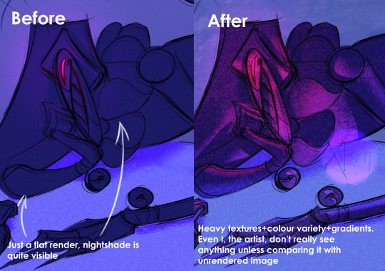
And finally, if you dislike how glaze did the job, just try to glaze/shade it again. Sometimes it's more visible, sometimes it's more subtle, it's just luck. Try again, compare, and choose the one you like the most. REMEMBER TO GLAZE/SHADE AFTER YOU MADE ALL THE CHANGES, NOT BEFORE!!
If you have any more info feel free to add to this post!!
7K notes
·
View notes
Text
anyone got any tips on getting art industry jobs w/o a college degree bc holy fuck this shit is horrendous /oAo;\
#nebbles talks#s.struggling to. survive working full time and still trying to get an illustration degree..#wish i. couldve taken the semesters off for work again like i did last year#but. unfortunately. since someone decided to change lanes w/o checking for. yknow. traffic in that lane. i now have an extra $200/month#to pay in bills. :)))))#not to mention the horrendous interest rate i got fucked over with :)))))))))#not even looking at the terrible financial stress the stress of these classes themselves is INSANE#like. one prof says hes ''simulating working with real clients'' with how he formats the class#which to him just means 'im going to assign you three major projects at once'#each of which have overlapping and hard set due dates for an asinine amount of preliminary work that can take up to 6 hours EACH#plus you have to submit at least 2 pages for all your preliminary work describing WHY you chose your colors or shapes#and HOW the colors and shapes are effective visual elements#and then you also have to submit a mini essay that describes how your art might fair against other real businesses art and illustrations#like. my guy. i have to work 35 hours a week. and do homework for 4 other classes.#i cannot physically keep up. with that kind of a pace. without killing myself in the process with self-neglect#just. do not understand why i have to run myself ragged and to the brink of total collapse and failure.#just so i MIGHT get improved odds of getting a decent job that wont even help me get above the poverty line#like. i wanna be able to make art for a living and be able to live comfortably#but that just doesn't seem like its possible in the society thats currently set up rn#just. AUHG#;w;
0 notes
Text
Every day that passes, I am more and more convinced I was possessed on those days I managed to complete complex projects
#vaneggiando#i really mean it#i try to replicate sth and I'll be like#wait how did I even do it???#it applies to art obviously#like drawing and rendering and lights shadows colors#ask me how I have done the red dress wwx#or the lwj for my friend#or wyb in watercolor#or you know other things#like the mask for my plague doctor costume#for reasons I must make it again but I have no idea what was my process#i am LOST#these projects aren't even perfect but they're significantly good compared to other things#so frustrating that it feels I haven't learnt anything from them
0 notes
Text

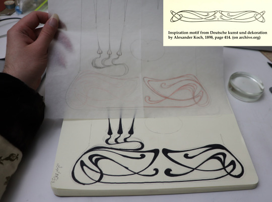

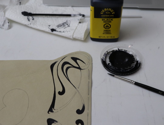

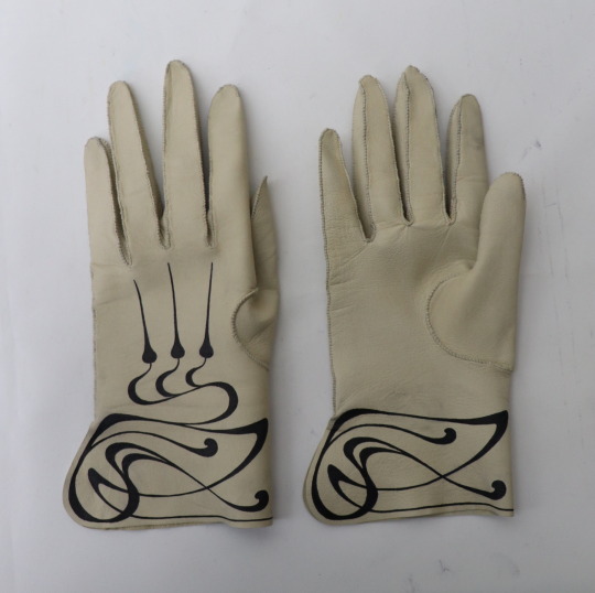
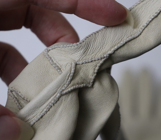
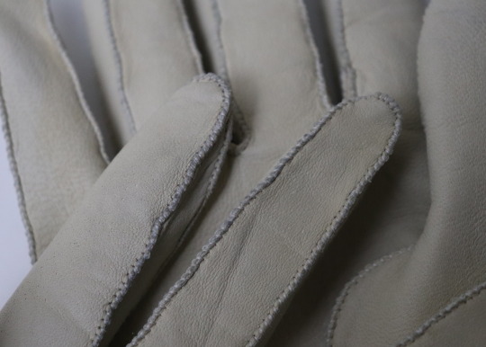
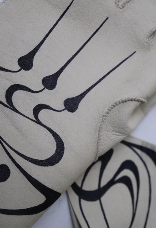
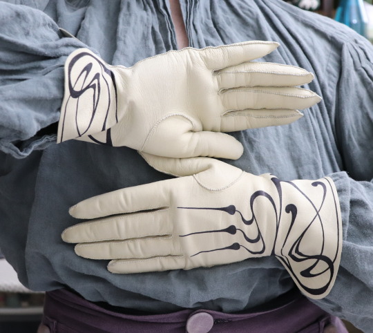
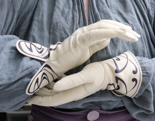


And another pair of gloves. I'm quite pleased with these ones.
Back to the 1760's Diderot pattern cuff shape this time, and I wanted to try adding some decoration, so I painted art nouveau swirlies around the cuffs using leather dye. (Which is of course not historically accurate, but art nouveau and mid 18th century menswear go together so, so well.)
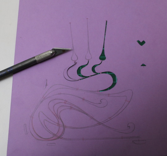
My inspiration was a motif from an 1898 book, which I found on pinterest, and I re-drew it a few times until I had a version that I liked and that fit the glove.
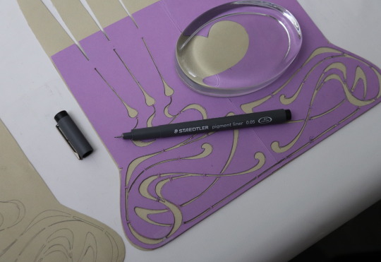
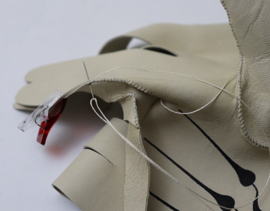
I wasn't sure how to go about transferring the design accurately to the leather, so I ended up making a stencil and tracing it using a very fine tipped pen, then colouring it in with the dye. The dye was very easy to paint with, but putting it in a little dish made it dry out and thicken extremely fast, which was not so good. For the second glove I put the dye in a porcelain thimble, which was better, but next time I'll try to find something even smaller with even less exposed surface area to put the dye in.
Or I could perhaps try leather paint instead.
I'll have to hold off on wearing these until I've gotten some sort of finishing coating to protect the dye, because it's unfortunately smudged a bit from handling. I did do a sample specifically to test for this and it didn't smudge, but in the sewing up process the gloves got touched quite a bit more than the sample, alas. And it may be partly due to the aforementioned drying out and thickening, which left more dye on the surface.
The leather is lambskin from ItalianSkins on etsy, and they're sewn up using silk yarn that my mother gave me. (With a regular needle again, because the only leather needles I have are too big.)
3K notes
·
View notes
Note
hi, i ireally love your work and i don't know if you've answered this before but, what kinds of studies do you do or how did you learn color theory? i wanna get better at rendering and anatomy but im having trouble TT TT
Hi! Long answer alert. Once a chatterbox, always a chatterbox.
When I started actively learning how to draw about 10 1/2 years ago, I exclusively did graphite studies in sketchbooks. Here's a few examples—I mostly stuck to doing line drawings to drill basic shapes/contours and proportions into my brain. The more rendered sketches helped me practice edge control & basic values, and they were REALLY good for learning the actual 3D structure behind what I was drawing.


I'd use reference images that I grabbed from fitness forums, Instagram, Tumblr, Pinterest, and some NSFW places, but you could find adequate ref material from figure drawing sites like Line of Action. LoA has refs for people (you can filter by clothed/unclothed, age, & gender), animals, expressions, hands/feet, and a few other useful things as well. Love them.
Learning how to render digitally was a similar story; it helped a lot that I had a pretty strong foundation for value/anatomy going in. I basically didn't touch color at all for ~2 years (except for a few attempts at bad digital or acrylic paint studies), which may not have been the best idea. I learned color from a lot of trial and error, honestly, and I'm pretty sure this process involved a lot of imitation—there were a number of digital/traditional painters whose styles I really wanted to emulate (notably their edge control, color choices, value distributions, and shape design), so I kiiind of did a mixture of that + my own experimentation.
For example, I really found Benjamin Björklund's style appealing, especially his softened/lost edges & vibrant pops of saturated color, so here's a study I did from some photograph that I'm *pretty* sure was painted with him in mind.
Learning how to detail was definitely a slow process, and like all the aforementioned things (anatomy/color/edge control/values/etc.) I'm still figuring it out. Focusing on edge control first (that is, deciding on where to place hard/soft edges for emphasizing/de-emphasizing certain areas of the image) is super useful, because you can honestly fool a viewer into thinking there's more detail in a piece than there actually is if you're very economical about where you place your hard edges.
The most important part, to me, is probably just doing this stuff over and over again. You're likely not going to see improvement in a few weeks or even a few months, so don't fret about not getting the exact results you want and just keep studying + making art. I like to think about learning art as a process where you *need* to fail and make crappy art/studies—there's literally no way around it—so you might as well fail right now. See, by making bad art you're actually moving forward—isn't that a fun prospect!!
It's useful to have a folder with art you admire, especially if you can dissect the pieces and understand why you like them so much. You can study those aspects (like, you can redraw or repaint that person's work) and break down whether this is art that you just like to look at, or if it's the kind of art that you want to *make.* There's a LOT of art out there that I love looking at, probably tens of thousands of styles/mediums, but there's a very narrow range that I want to make myself.
I've mentioned it in some ask reply in the past, but I really do think looking at other artist's work is such a cheat code for improving your own skills—the other artist does the work to filter reality/ideas for you, and this sort of allows you to contact the subject matter more directly. I can think of so many examples where an artist I admired exaggerated, like, the way sunlight rested on a face and created that orange fringe around its edge, or the greys/dull blues in a wheat field, or the bright indigo in a cast shadow, or the red along the outside of a person's eye, and it just clicked for me that this was a very available & observable aspect of reality, which had up until that point gone completely unnoticed! If you're really perceptive about the art you look at, it's shocking how much it can teach you about how to see the world (in this particular case I mean this literally, in that the art I looked at fully changed the way I visually processed the world, but of course it has had a strong effect on my worldviews/relationships/beliefs).
Thanks so much for sending in a question (& for reading, if you got this far)! I read every single ask I receive, including the kind words & compliments, which I genuinely always appreciate. Best of luck with learning, my friend :)
2K notes
·
View notes
Last Seen Blogs

crystalk25
Crystal K

orzigan
Hostile Territory
pwhlmontreal
let’s go lesbians!!!

j-exclamationmark-l
Sans Obscurities
mummel-art
cowboys in my mind