#also very very expensive LMAO
Text
have been pretty art blocked since finishing the big dnd piece so i have no new art to offer and likely won't for a while but have some silly sketches i did of some bears while designing some potential future tattoos for myself :)
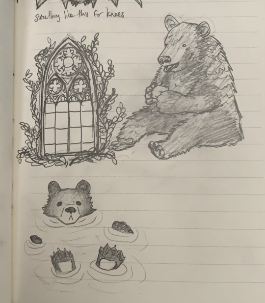


(and yes, these bears are all also potential future tattoos 💕)
#my art#sketch#I LOVE BEARSSSSS#thinking about doing a full like half leg sleeve dedicated to silly bears#i have lots and lots of tattoo ideas but am very reluctant to start getting tatted lmao#because that is PERMANENT what if its not perfect#also very very expensive LMAO#but i could never regret getting some bears on me :)
11 notes
·
View notes
Text
well, this all looks rather familiar...
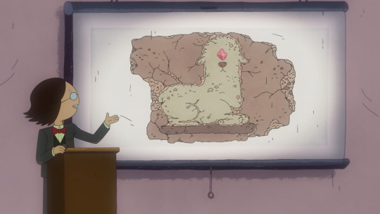
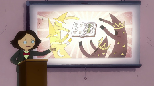


#the llama or alpaca gem literally looks like one of the gems from the ice king crown#though thats interesting because I thought the ice elemental guy got it from a lava monster#also the wizard looking guys on the part about the magic beans remind me of those things shown in the cosmic imagination explained vids#those ones by paxw on youtube & other creators#im getting a bit tired pardon me if I miss on names & things im still reeling from the 7-8 episode experience; thank you to the AT crew#the next slide looks a LOT like the land of Ooo though I can't pinpoint where; im already terrible with irl geography#this man has been fixated on cursed objects since like day 1 lmao#doomed by the narrative fr#petrigrof got me crying though im ngl#im gonna miss my partner a lot when I go to finland :((( It might be a few years before I can see them in person again because travel#is very expensive 😭 thats probably partially why this hit so hard for me; I'm gonna miss our dates & adventures#mine#op#adventure time spoilers#adventure time fionna and cake#adventure time#fionna and cake#simon petrikov
160 notes
·
View notes
Text
IT'S THAT TIME AGAIN FOR EXCITING ANNOUNCEMENTS!!!!!!

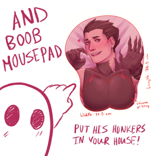
THAT’S RIGHT! BOOB MOUSEPAD AND BODY PILLOW PREORDERS ARE OPEN!!!
Preorders will close after October 31st, 10 pm CDT, and they are expected to ship out in early to mid-December! Body pillows can be customized to have whichever 2 designs you like the best. We need 3 body pillow cover orders for production and 9 mousepad orders. I hope we can meet the goals :D
(Art closeups under the cut!)
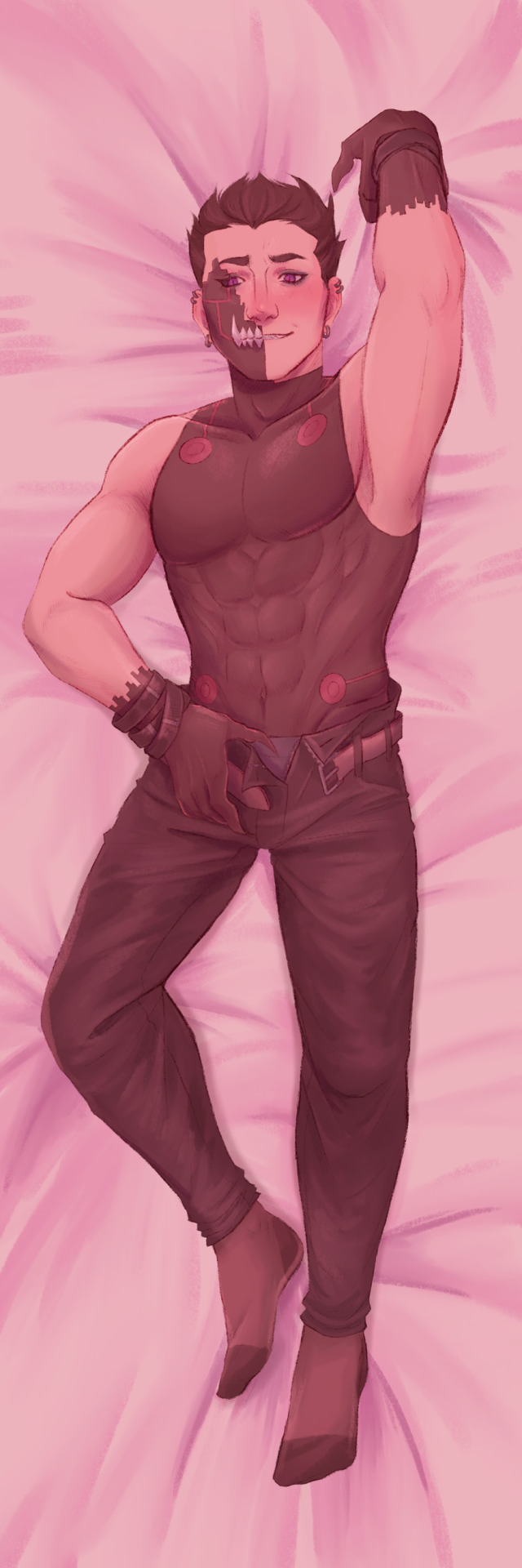
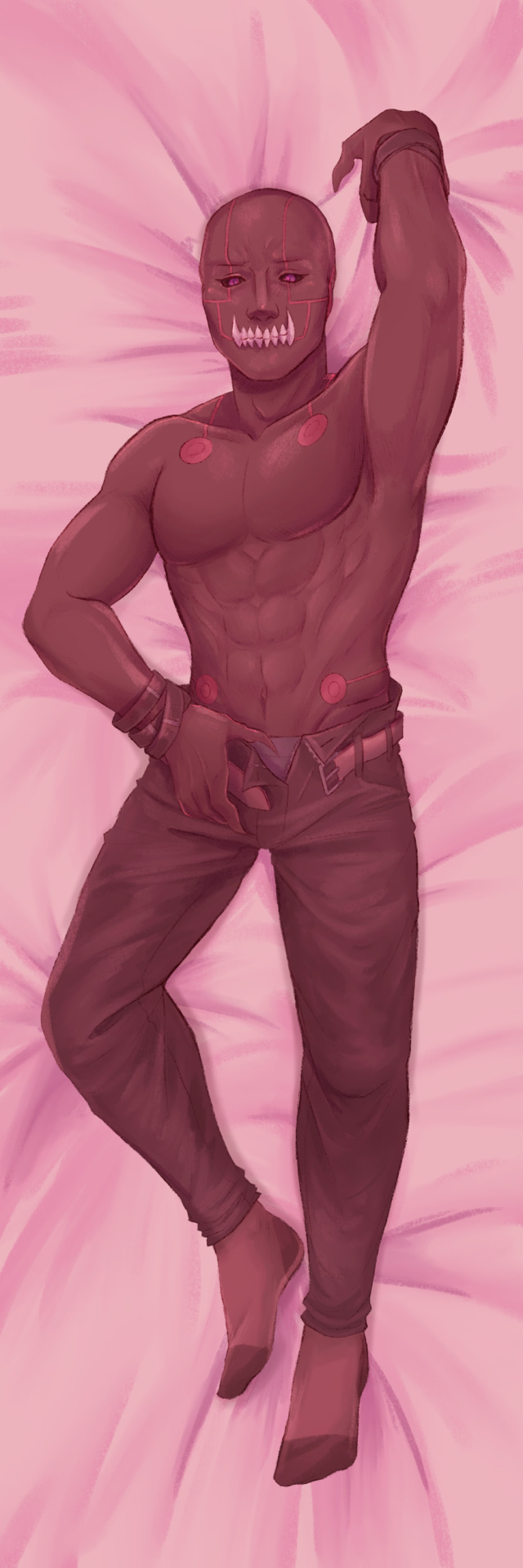


#holy shit btw. pillow covers are surprisingly more expensive to get produced than mouse pads. tho mousepads have a higher moq#but this is very exciting to me :D!#fma#fullmetal alchemist#fmab#fullmetal alchemist: brotherhood#greed fma#greed the avaricious#fma greed#my art#etsy#pre order#if you buy a charm with a preorder then you’ll have to wait until the preorder items ship btw#also very fun state reveal. I am (unsurprisingly) very texan lmao#cw partial nudity#cw suggestive
73 notes
·
View notes
Text
i go to the comic book store (evil) and i see an old issue of archie sonic that i've been looking for but it's 25 dollars and the spine is shredded. like just torn to bits. i leave the comic book store
#comic book store (evil) as opposed to comic book store (beloved)#there are multiple in my town lmao#i don't go to the evil one very often because things are typically much more expensive and also#the guys who work there are less friendly :/
33 notes
·
View notes
Text

Have you ever experienced getting sneaked up by a shark? Now you have.
#finished fish art#my art#arknights#specter#specter arknights#skadi arknights#skadi#okay I really don't like these markers at all and would rather buy more ink than to ever use them again#I want my indian ink and my glitter markers back thank you never again lmao#that or get a pack of expensive markers that will not fuck my drawing up ;;;#it's also very messy cause it took me a while to finish cause of my arm so#wooo but have messy fish idk what they are doing they are just having fun#skaspec
123 notes
·
View notes
Note
I wanna see those guys in prison where they belong
me too
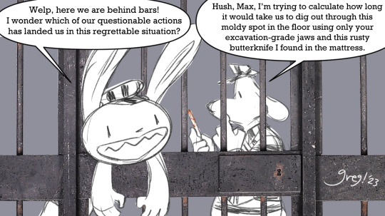
felt like goin digital for this one! god DAMN csp is great for text bubbles :D like sure it's a lil janky rn but that's just cause I didn't feel like fooling with it too much lmao. anyway justice is finally served (until they escape)
#also the bars are just a stock photo lmao. I thought that'd be funnier and also I was not about to spend that much effort on them#i'm like. actually really proud of this lol#it's been a minute since I did anything digital. very fun teehee#btw csp for anybody that doesn't know is clip studio paint#which is very expensive but extremely worth getting if you can get it on sale! or I guess if you just have the money for it lmao#I did not I got it years ago on a really really good sale and it was totally worth it#sam and max#sam and max freelance police#my art#asks
100 notes
·
View notes
Note
Fellow Psych enjoyer!! Im watchin psych at this very moment lol, i know its a tough question bc i dont even have a definitive answer but like, what's your favorite episode?
hmmm well i did very much enjoy the episode where Lassiter & Henry bond over fishing... i also like the episode where Shawn gets kidnapped & ends up on top of a moving car <3
#ive seen some episodes out of order#since my friend used choice ones to get me interested lol (it very much worked!)#but i only started watching it all the way through yesterday#so im only on season 2 :/#i also loved the one i just watched - the counterfeiting episode! twas funny#but really since im binging the show they're all kinda blending together lmao#And its mostly on as background so there are some where i have no idea what happened or what it was about#rambles from the bog#tbh a lot of the time watching it#i find myself sitting here and going: man. if it was made pretty much the exact same way just with today's climate#it wouldve been even fucking funnier#bc obviously the humor in the show is kinda Dated! there's a lot of times where im sitting here going 'oh that was bad taste'#or 'oh that would Not fly today'#but it is a really good show#easier to enjoy when you understand the era it was made in & accept that there's gonna be unsavory bits#honestly its interesting! im on s.2 which was released in 2007 i think#and i believe i was like... around five years old? i dont really remember Living the time period!#so its interesting to see! its a whole different range of slang and american culture & tech!#all i really remember is the phones... i remember the awe when someone at school turned up with a touchscreen#they were pretty fuckin new so they were expensive & my parents could afford one#so my first phone was your average flip phone. it served its purpose! i loved listening to the ringtones! that was my spotify <3#anyway wait fuck what were we talking about#OH RIGHT PSYCH. um. yes🤝#i dont like shawn's dad! lassiter is probably my favorite! i may have a crush on juliet! shawn is the most bishrekxual man i have ever seen#gus deserves better & more screen time! the whole show is just really good#*old man voice* they just dont make em like they used to....#said both positively and negatively. some aspects are good they're gone. other aspects... sigh
24 notes
·
View notes
Note
please tell me about the pigments i would love nothing more than to hear you talk about that one shade of red you like and the process it took too recreate it
... oh, op. you have no idea what you've unleashed.
alright. here we go.
OKAY SO THE RED PIGMENT. pr206. my beloved. my dearest friend. it was an absolute bastard to find because there are so many of these. however many you think there are, there are MORE, and that's only if you don't count the many many scenarios where colors are known to be multi-pigment mixes, usually varying in tone/shade/intensity depending on the brand and manufacturing style. some colors are more consistent than others, but there are situations where a color can be named the same and contain the same pigments and STILL look wildly different depending on the ratio, binder, and paper you use. and that's not accounting for the way the pigment is processed. some pigments (like pv19 for example) can come in so many shades it's frankly kind of ridiculous.
anyway, my quest begins when i am, admittedly, in an edgier phase. i want a blood red, but not specifically because of that—no, i want it because it is THE IDEAL COLOR (to me) for a perfect, warm, slightly muted but still intense shade to add to a muted autumn watercolor palette. and... if you look at my whole theme, you probably know how much i love warm colors. i want to paint mushrooms. i want to dim down some of the brighter greens to make them autumnal. i want the perfect red to put as an undertone.
the search starts in earnest.
the immediate issue is this: reds (and purples and pinks) have horrifically bad lightfastness. not all of them, mind, but many are NOTORIOUS for fading under uv light, which means they will also fade if exposed to sunlight even in passing should it happen often enough. and—in especially bad cases where they're essentially working with dye and not pigment—they can even fade inside your notebook. inside of a drawer.
so not only are we working with an unfortunate pigment base (i'm simplifying here, there's way more nuance to this but shh) but we are working with one that skews heavily toward floral pinks or oranges. the red i'm searching for is warm, but not orange. dries dark but not brown. is transparent, not opaque. that last part is agonizing, because i also desperately do not want a color that will fade on me or generally destabilize, and most of the stable dark red pigments are EARTH pigments like red ochre (pr101) or the like. which, while fascinating because of their historical usage in things like pottery and even cave paintings that last to the modern day, are VERY OPAQUE. this is an issue with my preferred style of watercolor painting specifically, because opaque pigments tend to lift easier off the page and limit layering.
the search continues. pigment after pigment breaks my heart for one reason or another, drying too close to the cooler purpleish-red tint of wine at best. i think i find it in perylene maroon, but the drying shift (the difference between how a color looks wet vs after it dries on the paper) is so extreme that it loses the luminosity AND it's more opaque than most. i languish.
for a while my search turns to creation. i try and mix as many of my single pigment colors as i can into something that vaguely resembles what i'm looking for—so i take quinacridones and mix them with napthols, with nickel azos, with dashes of ultramarines and burnt sienna. everything turns out either just a bit too opaque, just a bit too muddy (that happens with multi-pigment mixtures, and is why so many people swear by single pigment colors. it's personal preference, really, great art can be made either way.)
still, nothing works. failure haunts me. i sit before a pile of used up watercolor paper that is literally covered edge to edge in nothing but similar red squares with various gradients and blooms as evidence of when i tried and failed to convince myself my efforts were close enough. i admit defeat.
in the meantime i shift my focus. i try and appreciate different color palettes and profiles, experimenting with things like fully transparent palettes (personal favroite) to fully opaque ones that function more like gouache. but despite finding appreciation for it, i still think about the damn red that i could never recreate. it kills me.
and then one day, a youtube video. a pigment is being discontinued, and the watercolor community is distressed. this happens a lot, because pigments are actually not always popular because of artists—sometimes beloved colors are put out of production because larger markets like car companies no longer find them popular enough to invest in. this time, the casualty is pr206, aka brown madder, aka quinacridone burnt scarlet.
let me tell you a little about quinacridones. they are genuinely remarkable colors. they have their own cult followings because of how bright and abnormally stable they are under uv light. they're transparent. they're luminous. they come in mostly shades of red and pink and purple, though there are a couple oranges and yellows in there. (there are no quinacridone blues, as far as i'm aware, but the phthalo blues have that category covered.) they also rewet beautifully, so you can put them on your palette and let them dry and not worry about it turning into a useless little rock of color that you can't get any pigment from anymore.
quinacridone magenta (pr122) is probably the most popular of these, the most often used besides maybe quinacridone violet (pv19). a few years prior we suffered the loss of quinacridone gold (po49) and since then people have been On Alert when it comes to losing these colors. i am one of them, because i never got the chance to even see po49 in person, and now the tubes are so stupid expensive that even the student grade versions go for Ridiculously High Prices on ebay, and the professional brands are being hoarded like (ironically) gold by anyone lucky enough to have a tube left over.
but back to our main character. not me, the pigment. pr206. i have legitimately never heard of this one, which to be fair is probably because i try to limit the random colors i fixate on since the hobby can easily get VERY expensive if you aren't careful. but it's a quinacridone, and that catches my eye.
i open the video.
now, i'm sure any artist out there will be familiar with the fact that screens don't display color consistently. it depends on your device, but most can agree that something that looks cooler on one may be warmer on the other, it's just what happens. but i see this color being swatched, and my brain implodes.
it's almost a perfect match.
it could work. it could. years of thinking that same thought have left me bereft and mistrustful of this specific quest marker, but the thought refuses to leave me. probably because the 'discontinued' label flashes like a neon sign.
i resist for about six months, and then i cave. at this point i have genuinely been trying and failing to find this color for upwards of five years. i am desperate, and the color might not be available anymore soon anyway, and apparently i am weak to sales pitches. (note: the color IS now unavailable in some brands, but others bought a decent supply and should have it available for at least a little while, alongside po48 which is quinacridone burnt orange, a favorite of mine and probably one of the only oranges i use regularly. both are discontinued officially, but they'll still be on sale till those supplies run dry.)
the color arrives. i grab my favorite brush. i pull out my stash of paper that i save for special occasions.
it's almost perfect.
i mix it with quinacridone burnt orange.
the result is, i swear, a perfect match for what i have been searching for.
it's warm. it dries dark but not dark enough to look brown. it keeps its luminosity (thank you quinacridones). it's fully transparent (thank you quinacridones). i genuinely feel the urge to weep, but i don't because i am clinging at last to the dredges of my sanity and also salt makes watercolor pigments behave differently and i will not risk this glorious moment. finally, after all these years, bill cipher has a gun i found the goddamn COLOR.
i mix it with warm yellows and with my favorite blues. with the pinks, just to laugh. life is beautiful and i am painting its sunsets, and i do not care if they look ridiculously messy. i have won.
the moral of the story is to never give up. or maybe it's to remember you never actually know everything about even the fields you love the most, because this color totally blindsided me despite being much more common than i expected. or maybe it's that i seriously needed to chill out for a while.
but yes. that is the tale of one (1) of the colors that has taken up residence in my soul. i hope you don't regret asking now lmao.
#ney's art tips (art questions)#ney's chatter (ask answers)#so also i said that a good alternative to pr206 is pr175#but i'm actually not totally sure about that because i've never tried it myself#watercolor is an expensive hobby and that's part of why i swapped to digital orz#BUT! from comparisons i've seen they are at least similar enough to scratch the itch#ironically i think i still USE po48 more than i do pr206#but that one is also In Discontinued Limbo where you can buy it but supply is indeterminately limited lmao#still a gorgeous color though.#... wow. this was incredibly niche and probably barely coherent i am so sorry LMAO#but thank you for indulging my color madness. it was the only hobby i had for *ages*.#long post#very very long post#good god is this my longest text post? aside from maybe a hive story?
20 notes
·
View notes
Text
Just got back from my friend’s wedding :’) I think it says a lot that I was the only high school friend that showed up
#TBF the others in our friend group back then live in different states now#And flying out for a wedding can be SO expensive.#But yeah idk it just meant a lot to me :’)#And my friend (the groom) was SO happy to see me. And his family was too#That made me really glad 🤧#The fact that he invited me to come at all also says a lot I think#And you know what maybe I cried on the way home in the car but that’s nobody’s business but mine!!#I’m very very happy for him. And his wife is SO sweet and so pretty#It’s just weird yk? Cause in high school I liked this guy SO much#Like I daydreamed about getting married to him some day#So seeing him marrying someone else felt very weird lol#Bittersweet mostly#Sorry this is super embarrassing LMAO but it’s not like I’m ever going to tell this to his face.#I know they’ll be very happy together and I’m so so glad he found someone that fits together with him so well#He’d better come to MY wedding tho. In the future. LOL#Shima speaks#It was a very ‘saying goodbye to your first love’ kind of thing.#Even after I confessed to him in high school (and got rejected) I never really stopped liking him#Like I just never got over it I guess. Even tho I KNEW nothing would ever come of it#Idk sometimes it’s hard to let that stuff go! It’s hard to stop liking someone after you liked them for so long and so strongly#I want to say I’m over it now but considering I was crying in my car:#Well. JFJSJMFMSMSNN#I know I don’t feel that way for him anymore like as a fact but. Idk it was weird—#Again bittersweet. I think I just needed a second to process and really let it sink in#Goodbye to my high school fantasy //waves a handkerchieff#Also MAYBE I saw them be so happy and was like. Why can’t I have that with someone. HUH#Leetle jealous. I need to find me a someone *squint emoji*#Anyway rant over wedding was good I’m just an idiot ;)
45 notes
·
View notes
Text
bro what the fuck are they doing with my package
#fun story#i ordered 3 things from hot topic. they shipped but never arrived so a couple weeks later i messaged them abt it#and went back and forth with them for a while bc their customer service agents cant read apparently#before being told i had to call bc one of the things i ordered went out of stock and i was replacing it w smth more expensive#so i call and im on the phone for like a fucking hour missing the 15 minute window i have to eat between jobs#and being on the phone at work for a while lmao#i finally get it done and the guy fucking forgets my apartment number in the shipping address. it's in the billing address tho??#so i email them AGAIN and im like yo your man forgot my apartment number. they cancel that order and place another#the effect this has is that the $14 payment for the more expensive item is cancelled as well. bc again they don't read#so im like sick i will effectively get these $60 pants for $15 (im very good at sales and also manipulating customer service)#but apparently when they replaced the order they put ny apartment number not in the address‚ but as part of my name?????#so i think its fucking up usps. but it came in 2 packages and 1 has arrived so i still have hope. but thats not the end#yesterday guess who fuckin calls me. its hot topic. my original order arrived to the fuckin store in my local mall#and theyre like i think we fucked up bc we just found this package but it says you picked up your order already. do u want it#and i was like yes? not really sure what package to be expecting and its my ORIGINAL FUCKING ORDER#so once this package arrives i will have gotten 2 of the same shirt‚ 2 kiki sign things‚ a sweater‚ and a pair of pants for $40#and i figure i can return one of the shirts and one of the signs that i have duplicates of for store credit of their full price#so anyway yeah. thats been the past 3 weeks for me.
10 notes
·
View notes
Text
Bought some TMNT comics today. If I get a chance tomorrow I'll try do some screenings.
#tmnt#tmnt comics#im very excited.#they were so expensive but also impossible to find#i wouldve bought the whole shop if i had just a little less self control#^ by impossible i mean theyre never sold here lmao
7 notes
·
View notes
Text
It’s been six years now but I think I can fully appreciate MANIA and admit it was a decent album
#I remember the day it came out I was listening to it on the morning bus ride to school and ignoring my friend lmao#I was very angsty and antisocial and was like no I NEED to listen to this right this second#anyway Mania is an oddball but also kind of cool?#for years I kinda just thought it was okay but after revisiting songs every once in a while for months I feel like it’s gotten better again#I mean come on stay frosty?#hold me tight or don’t?#last of the real ones?#WILSON (EXPENSIVE MISTAKES)?#BISHOPS KNIFE TRICK???#absolute bangers love them#even the others I never cared for much I have a new appreciation for#the only song I dislike is Young and Menace but even then the verses are really cool#anyway I’m done rambling about Fall Out Boy again who cares#fall out boy#txt
7 notes
·
View notes
Text
Man we hit a good dosage for angus's meds and hes like. Acting like his old self right now. Def with the energy down like 90% but hes exploring my room and playing with toys and his back legs are holding his weight and it's so nice to see again
#unfortunately it wont last forever#but im kinda ignoring the vet rn#she set his dose to 2.5 mls but due to a mix up with the pharmacy im only giving him 1.5 rn#but it seems to be really working#and id rather hold him here so i can go up again when he starts declining again#palliative care man. his meds & vet visits r so expensive rn but. worth it to see his old self coming back a bit#even though i know it's temporary#the slowburning grief of take care of a pet with a terminal diagnosis can be interspersed with bright moments#so im just dwelling in that for now#also rip i gave up half my floorspace in my room for ango bc of the fucking ANTS that invaded his space downstairs. infuriating#tho tbh i like him up here and he does better up here so i might just keep this lmao#anyways. boy cute i love him <3#baby: angus#the heavy stuff is mostly in the tags but ik some people r sensitive to this topic?#idk what the tags ppl use for it are tho so if u see this and want me to tag stuff about angus's health just lmk what to use#i dont anticipate posting about it very often but u never know
7 notes
·
View notes
Text
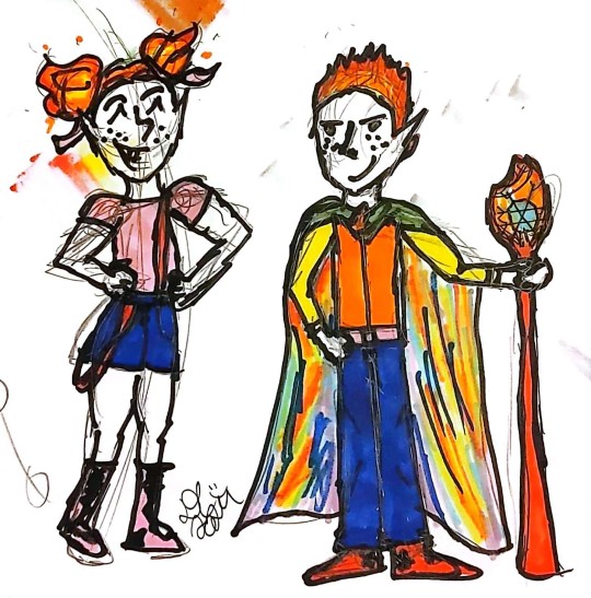
BUD-A-BOOP-BOP! TWINS!
boy HOWDY have some THURSDAY NIGHT SCRIMBLES! 🥳 Now in magical TECHICOLOUR! It's older Twins! Fino and Fiera!
Design stuff below the cut 🤗🤗
My god I'm having fun with these markers. But the colours are LIMITED as I only have like 2 starter sets and they're FUN but deffs I could use a few more in betweens.
ANYWAY. DESIGNS.
Fino
Doing my boy first bc we already had fun with Older Fiera ages ago lmao
I'd been wanting to share his older design for AGES tbh! Had it in me head around the same time as I shared the older twins and Jacquie scribbles lol. ANYWAY
He is SEMI fancy! Big fan of button downs and vests/waistcoats!
Doesn't ALWAYS wear the vest
His shirts 9/10 times have funky patterns. Like fungi or flowers or just the weirdest fucking designs you EVER did see. His siblings and orc friend (Kenothy) all make it a fun game to find him the most OBNOXIOUSLY WEIRD SHIRTS. His collection is HUGE and VARIED and HURTS THE EYES FIFTY PERCENT OF THE TIME
he is like a walking mullet but the business is on top, the party is below. He is a jeans man through and through and you can pry his converse/kicks off his cold, dead feet tbh. they are ALWAYS red. he probably has like 10 pairs like some kinda cartoon character
belt is pink bc fiera's magic! the inside of his cloak is rainbow, like his twin's fire :D
the cloak also does have a big old hood and covers his whole him so he can look mysteriouse
and then give people whiplash when he whips the cloak back and pulls the hood down and. well. on fire colourful schemey looking young man
everyone's usually like "i didn't expect the freckles. or the fungi shirt"
the fungi shirt is his fave
plz picture a fungi pattern all over his shirt!
when he uses his staff, the flame turns rainbow too and the snowflake glows :3
I've said it before and I'll say it again: Fino's warlock aesthetic is "i live in your local forest and i love my family and i'm making it everyone's problem"
the outside of the cloak is a nice forest green! bc he likes forests (if that wasn't obvious lol)
he's pretty chill but has resting plotting face. generally if he's looking like that he has examined every angle of a situation and is about to make a bigger one. or fix the current one. or both!! and is VERY proud of himself!!!! (as he SHOULD be!)
he and Fiera ARE the same height but I drew Fiera first and started Fino top down as you do but neglected to watch the height lol. so just know. they are BOTH tall and BOTH the same height!!!!
He is the BEST warlock of the current era he is warlocking in. If Uncle Pyros was around he'd be mad jealous. Same with Granny Frost tbh. Grandpa Winter would like, lift him up like Simba like "THAT'S MY GRANDBSON! THE BEST WARLOCK IN THE WHOLE WORLD!"
(if the bio grandparents were around, you bet it would be a big case of "the in-laws don't get along" lmao)
Fiera
pink is her fave colour and the colour of her magic, so her shirt, shoes, AND hair ribbons are all pink, but it's a lil light, innit? like i said, limited colours lol
BUT WE'RE HAVING A GRAND OLD TIME DOWN THIS WAY.
EVEN IF MY NOSE SMELLS LIKE ALCOHOL ALL THE DAMN TIME
RIGHT. FIERA.
HOT PANTS! SHE'S GOT HOT PANTS!!! They're not that dark blue, bit of a lighter wash for her denim (but I don't have a lot of blue options lol)
suspenders are red bc FINO'S MAGIC! one is always hanging off of her, the other is always up. she doesn't do this on purpose it just HAPPENS bc she doesn't actually really need them? it's the FASHION. the STYLE.
sometimes hair ribbons are red too, bc Fino magic :3
ALSO wears converse but the boot like ones, bc I've always wanted a pair of boot converse! They look SOO COOL and SOO INCONVENIENT, AND THEY ARE COLOURFUL! I mean. Fiera's are pink but I'VE SEEN ALL THE COLOURS. AND I WANT.
I mean. why make OCs if not for them to wear the things you can't have/afford/pull off?
huehuehue
she's not THAT buff tho she is pretty strong. i am a writer by trade so my doodles are not to scale (read: scrimbly). anyway, she's probably usually a tank/halter top person??? this doodle just really wanted to be a t-shirt!
both twins have elements of their outfits inspired by the fam, not TOTALLY on purpose but it did make me cackle as I noticed them so TAKE THIS QUICK SYNOPSIS:
Fino:
dress shirt, belt over suspenders: blaise vibes
big ol cloak: winter vibes
comfortable shoes: jacquie vibes
vest: jack vibes
Fiera:
suspenders: jack and blaise vibes (both are known to wear them as an accessory instead of for their intended purpose of keeping pants up)
hot pants and boot like shoes: jacquie vibes
hair buns: winter vibes
man, I love the older twins. the SHENANIGANS they get INTO! they're a dream team, you won't know what hit you by the time they're through with you 🥰🥰🥰🥰
#the SHIT i DO to STAY AWAKE for critical role lmao#tbh tho this particular art has been itching my brain the past month??????#so I am glad I did it! and i didn't fall asleep during cr once >:)#dani speaks#dani doodles#cs posting#crystal springs#fino#fiera#the twins#ocs#my ocs#i want more markers so bad. but they are so expensive here. richard found them V CHEAP when he was in europe a while back#but i need more BLUES#WHY DID I MAKE JACQUELINE'S HAIR WHITE. AHH#also. fiera does NOT have braces. she just has a very toothy smile#and as previously stated. i am a writer by trade. not a draw-er OR dentist tbh#tho i did briefly think about becoming a dentist#for like a whole weekend back in grade 11#anyway. enjoy the scrimbly twins!#and apologies for the loopy descriptions lol. i wrote it at 2am and then cr ended and i kept going ¯\_(ツ)_/¯#and upon rereading it this afternoon when tagging the post i went 'it's fine! let's keep it'#tho I did catch the spelling errors so that's good!#she says. knowing full well she'll see a fresh one down the road for sure
5 notes
·
View notes
Text
for a long while when I'd visit my relatives on the chesapeake for a brief respite from the hells of home life, there was an odd beat-up little cardboard box sitting amid the plastic-cased ds games in the gamestop I'd always visit (rarely to actually get anything)
finally, one time before the journey back to hell, i actually had a scattering of bills in my pocket. after looking around at the shelves of shovelware (i didnt have enough for any of the proper titles like mario or pokemon), i finally decided to bring the story to a close and give the ragged little box a home
it was Sola-to-Robo, one of the rarest ds games ever published, possibly the most technically advanced engine ever devised on the system, and among the most unique and emotional experiences I'd ever encountered in a video game (which is saying something considering I'd already all but lost emotion by that point)
i barely remember it anymore, but for the time it became my favorite standalone game of all time (although it technically is part of a series, succeeding the PS1's equally obscure Tail Concerto)
I still dream of returning to it and seeing just how well it holds up from a more experienced point of view
the one thing i do remember is that it had and still has by far the most beautiful and powerful opening song of any game ive ever encountered, which is saying something considering the hundreds out there! it's up there with Atelier Meruru's Cadena
also the fact that when you beat the game, after the credits it goes "chapter 2" and there's an entire sequel within the game. altogether both parts are probably not longer than any other rpg, but on the original ds where full 3d action rpgs were resource intensive and typically limited in scope, it was mindblowing
also it apparently had like undefeatable copy-protection and to this day still requires a modified rom to emulate or even run on original hardware without a card?
anyways.... remarkable game. i was shocked to find that it's one of the most sought after titles on the system. in rarities ive personally enountered it's second probably only to Retro Game Challenge, which I encountered at regular price once in the late 2010s but didnt have the money for at the time... that's my "one that got away"
#for me it's also up there with klonoa and a handful of old sonic titles for having anthro designs that are actually great instead of weird#i always start thinking anthro designs are just a lost cause but then i remember like solatorobo and redwall and beatrix potter and am like#“no theres tons of room for animal folk in art it's just that modern 'furryism' is usually so soulless and based on corporate mascot styles#anyways..... my short recollection of a remarkable game#hotel dusk and last window are very rare too but theyre so obscure their prices aren't actually that high#tingle's rosy rupeeland wasnt expensive either back in the day but i bet it's gone way up now. wish i got it back then#mario 3-on-3 is another one that's insanely rare but absolutely no one remembers or cares about it lmao#i found it at a gamestop in ass-nowhere shenandoah in 2020 long after the stores were supposed to have done away with their ds collections#anyways..... original ds is a favorite system of mine... not actually for nostalgia reasons (i barely experience any anymore)#but for the sheer variety and uniqueness of titles to be discovered on it... maybe the most of any platform ever#and the fact that many of them had SSS-tier stylistic direction#ive yet to find another title that even comes close to the blue-skies beauty of bomberman land ds#OG ds was definitely a blue-skies system
9 notes
·
View notes
Text
i don't know if this is a toxic trait but I feel like my "I need to speak to your manager" energy manifests in me messaging ebay sellers when I see them listing items incorrectly and possibly trying to scam people
#messaged someone over an n64 controller they listed as OEM just now when it clearly is not#the most heated it ever got was a person who just sold antiques trying to sell an ipod with a 'good battery' that literally had a black spo#which is like the sign that the battery is expanding and is in fact very bad#but the guy just didn't want to believe me that is wasn't a screen issue and was a battery issue#it got unlisted tho lmao#i did also message someone trying to sell an ipod one time that they listed as the wrong kind#but it was too their benefit because they thought it was a less expensive model than what it actually was#anyway as someone who does sell on ebay: ebay is fine but just be smart about buying there#because some people just are dumb and don't know what theyr'e selling#and some people do be scamming#but just be smart
16 notes
·
View notes
Last Seen Blogs

chompmutt
INTRUDERS WILL BE BITTEN!!!
collegecpr
CollegeCPR

s0ull3ss-p3rs0n
[The gay legos invaded my head]

bachmanitycapital
don't be a slut, richard.

floristmatt
let's trip