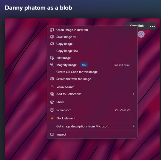
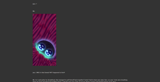
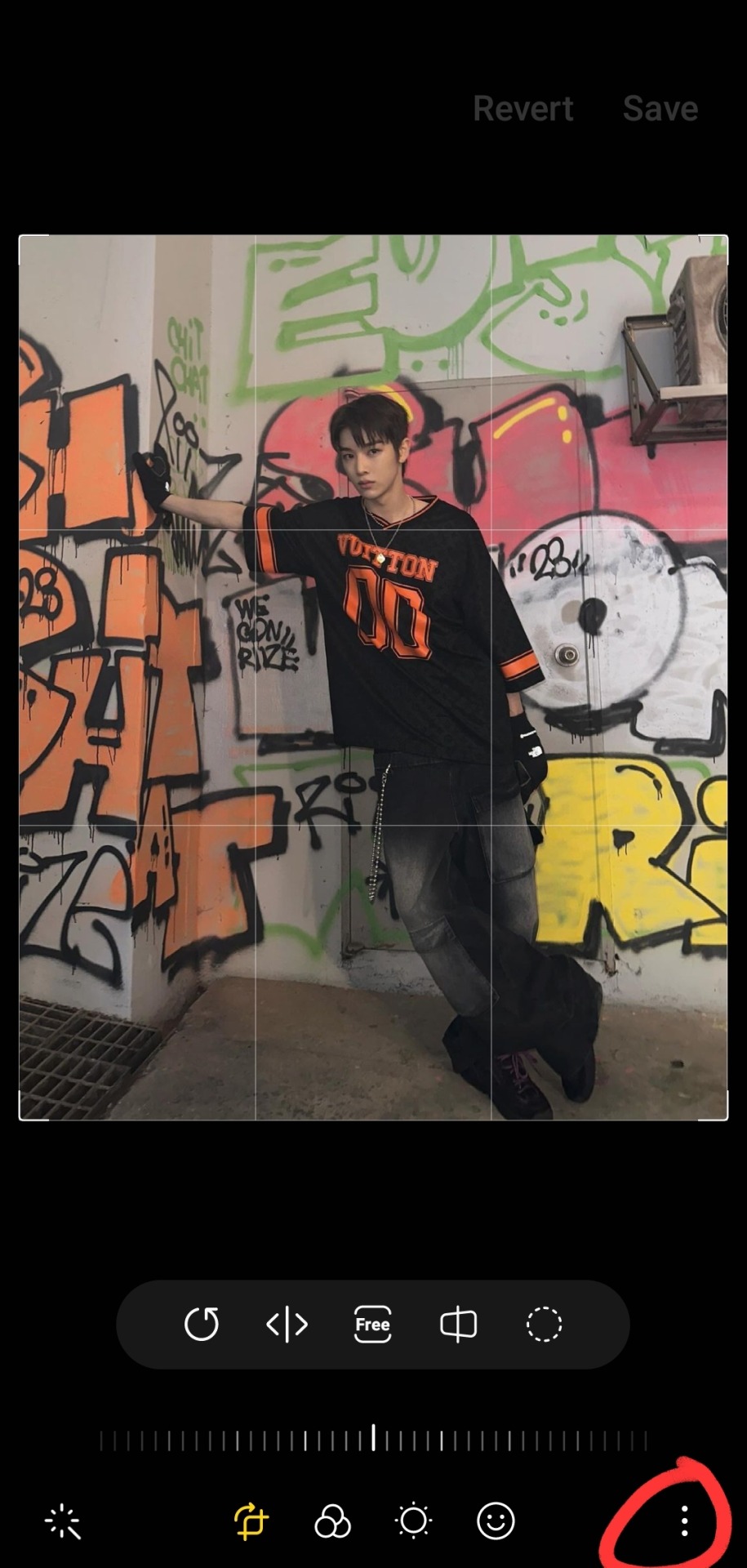
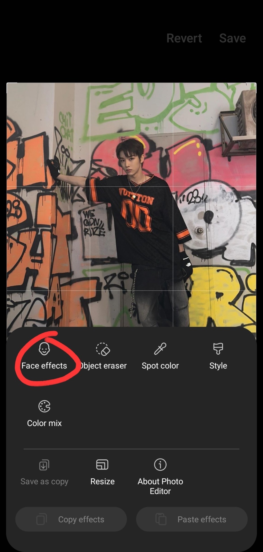
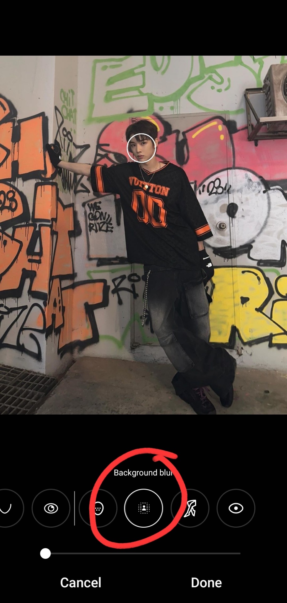
#also the new tumblr photo editor! why??? tumblr WHY??
Text
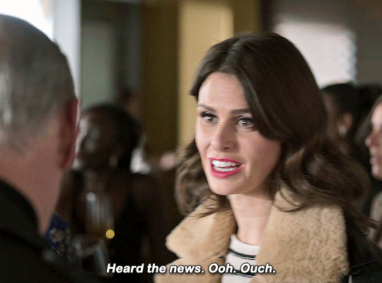
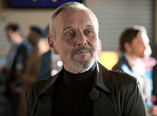
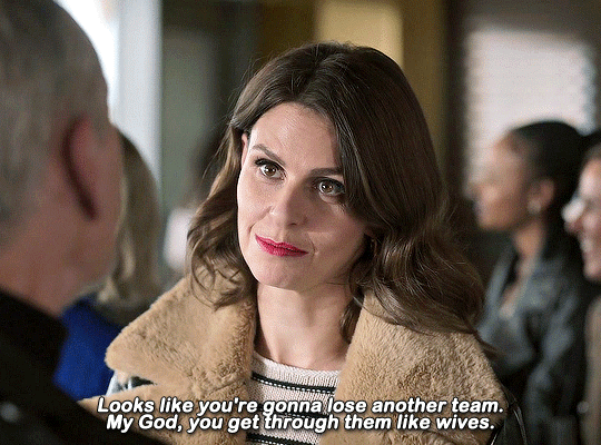

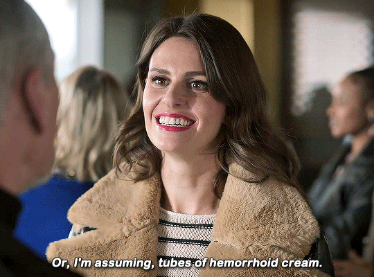
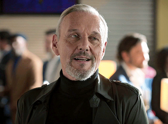
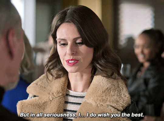
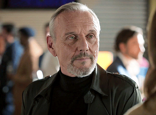

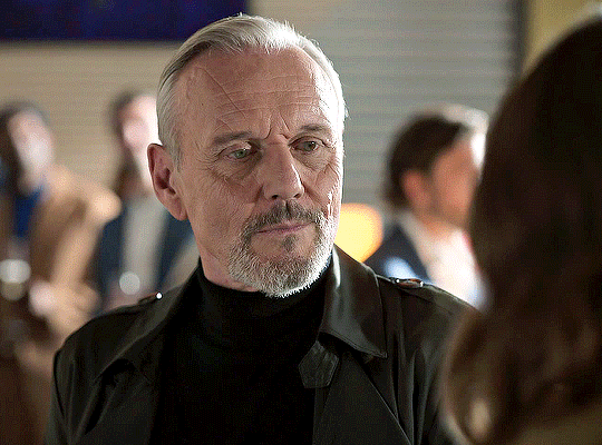
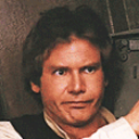
ELLIE TAYLOR AND ANTHONY HEAD
TED LASSO — 3.12 "So Long, Farewell".
#Ted Lasso#tedlassoedit#tedlassosource#Anthony Head#Ellie Taylor#trying new sharpening settings. not sure i like it tho#also the new tumblr photo editor! why??? tumblr WHY??#anyway I love her I love her so much#never really understood the hate she gets#i also love how defeated Rupert looks in this :')#like he KNOWS he can't say anything because she will just bury him even deeper#usernessa#tuserliliana#nessa007#userkk#ohtendril#damerondjarin#usersaysh#trueloveistreacherous#scratchybeardsweetmouth#usersydney#usergiu#uservalentina#useryoshi#dailyflicks#userbadger#userbbelcher#userk8#my stuff#mine: believe
688 notes
·
View notes
Text
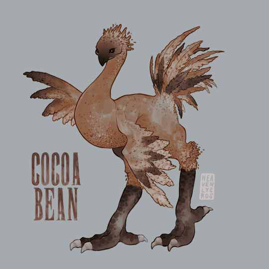
#my favourite of our chocobos#ffxiv#final fantasy 14#chocobo#final fantasy#i started playing this game last week#it is nice. i am enjoying#my character's biggest dream is to run a chocobo rescue with their best friend#they have five so far#cocoa bean is the draught chocobo#also uhh. tumblr?? what's up with the post editor???#i was hoping they would fix the new editor before they forced it upon us permanently#it doesn't work with my custom blog theme#my images have a humongous white border#and if i add a caption because they're no longer really photo posts the caption still shows up despite my theme not displaying captions for#image posts...#also. why are the tags in condoms#can i fix this. can xkit fix this.#i was gone for a week!!! one week! what is going oooon
57 notes
·
View notes
Text
ive been thinking a lot abt liiore having a slightly split tongue to match him being a snake troll
#raidiculous artings#liiore dariya#gross why has tumblr upgraded my photo posts to the new text editor get outta here#also drawing that kind of tongue and making it not look like weird buck teeth is hard
9 notes
·
View notes
Note
is there any possibility of keeping the legacy editor as an option? for content creators, the new editor completely ruins the quality of our gifs/edits/art and it's really frustrated to be forced into using an editor that's going to kill the quality of the creations that we spend time perfecting.
Answer: Hello, @junghaesin!
Thanks for writing in. And thank you to everyone else who has shared similar feedback.
So, tl;dr—this is actually a blog theme issue. Your theme is not showing images in posts created by the new editor as you expect.
GIFs uploaded via the legacy editor or the new editor are actually processed the same way. There is no difference in bit depth or in resolution. You can see this by looking at your posts inside the Tumblr dashboard instead (e.g. instead of yourblog.tumblr.com/post/id, go to tumblr.com/yourblog/id).
The reason why you see a quality difference is because posts created by the new editor are treated as text posts by older blog themes. Themes often add padding around all the content of a text post—including any images that appear in it. If your theme presents posts as 540px wide, then in a text post, with that additional padding, the available space for your images is actually less than 540px. As a result, the browser will scale your images down to fit, and when this happens, image quality takes a hit.
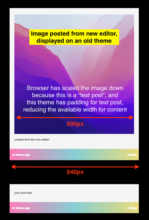
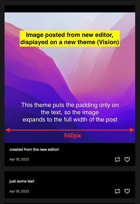
The solution—update to a more modern, up-to-date theme, like Vision or Stereo. Theme developer @eggdesign also built a theme template that works with new posts, that you can build on top of! These modern themes apply padding only to text blocks rather than the whole post, so image blocks receive no padding and are served at their full 540px width, just like the Dashboard. From what we’ve seen, this fixes all of the issues about perceived GIF quality on blogs.
We know. Changing your theme is a lot of work.��In the near future, we’re looking into ways to make this transition easier—for example, helping you identify themes that work well with new posts in the Theme Garden. But working with new posts is the way forward—the new posts use a format that opens up a lot of opportunities in the future.
Why can’t you add post types to posts from the new editor? Why not serve new posts as photo posts instead of text posts?
The new editor uses a new post format, called Neue Post Format (NPF). NPF has given us a huge boost in flexibility when it comes to what content can be in posts—remember the time when you couldn’t even upload images to reblogs? Or how old chat and quote posts magically change authors? NPF helped us fix both of these things. It removed constraints—including post types, which limit each post to one specific type of content.
But existing blog themes still need to be able to display these posts. Because NPF posts can include media anywhere (while most of the old post types have a rigid structure for media), it was safest for us to categorize NPF posts as the least constrained post type—text posts. It’s the best we can do to make these posts backward-compatible with existing blog themes.
In lieu of post types, we’ve added an {NPF} theme variable per post that custom themes can leverage. Theme developers must update their themes to take advantage of this new data to retain full control of the HTML output of posts.
You can read more about these decisions, and the Neue Post Format specification, here and here.
Thanks for your feedback, and keep it coming!
With love,
—The Tumblr WIP Team
1K notes
·
View notes
Text
An old article, but amusing regardless.
First it was James Lileks and the Gallery of Regrettable Food. What were the photo editors on these cookbooks thinking?
I'm well aware the colour quality of old pictures degrades and yellows, to their detriment, but IMO the images on that website can't have looked very appetising even when new.
There are ways to assemble variegated foodstuffs on a plate that looks attractive, and then there are these.
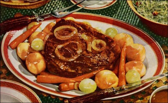
Dimly-lit meals for one and Sad desk lunches are yet more shuddersome antidotes to lovingly-photographed food porn erotica (porn would be messy close-ups of eating it).
However, despite what the article suggests, food photography doesn't need "the highest-spec kit while dangling from light-fittings for just the right angle" to look good.
*****
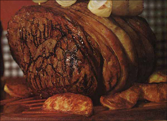
Using a phonecam while out with your friends in a crowded pizzeria isn't going to give the best results, but then neither is a joyless packed lunch on a rainy Monday in February, even if shot with a $33,000 camera like this Hasselblad, and full studio lighting.
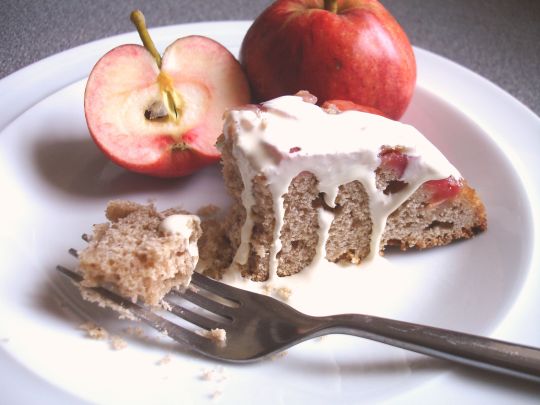
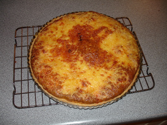
@dduane's hobby site European Cuisines (down for maintenance) did just fine for years with a Sony W17, a compact digicam with a superb Zeiss lens.
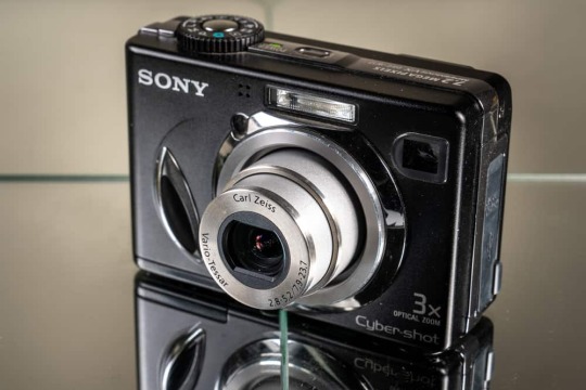
Here are Sony shots of an apple upside-down cake made with Beauty of Bath apples from our own tree (they really are pink all the way through) and a quiche Lorraine just out of the oven.
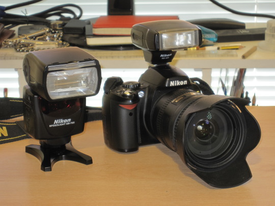
After a while I got a second-hand Nikon D40 DSLR; the money saved on second-hand let me afford an excellent lens, a top-of-the-line flashgun and that neat little flash which is so much better than the camera's built-in one.
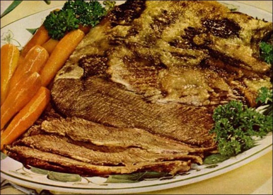
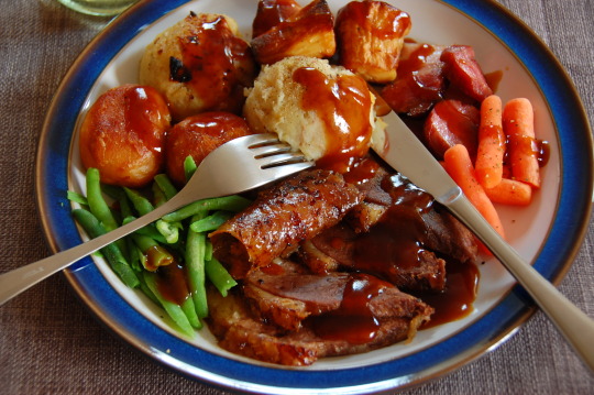
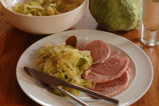
Here's the Nikon's take on last year's roast-goose-and-all-the-trimmings Christmas Dinner, as well as bacon (corned beef is the Americanised version) and cabbage for St Patrick's Day.
Now we're mostly using HTC U11+ smartphones whose cameras are not only top-notch but have excellent low-light capability.
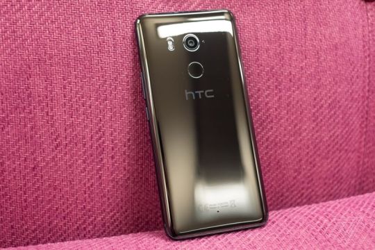
This is good, because our lighting has always been mostly natural daylight with occasional flash and reflector-screen assistance.
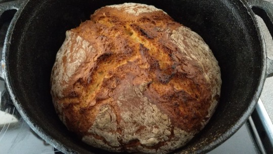
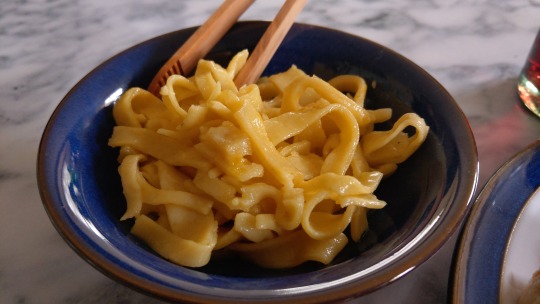
Here are U11+ images of soda bread done in a cast-iron casserole or Dutch oven, and Geflügelragout (a stew of roast chicken with red wine and lemon) with saffron-pumpkin noodles.
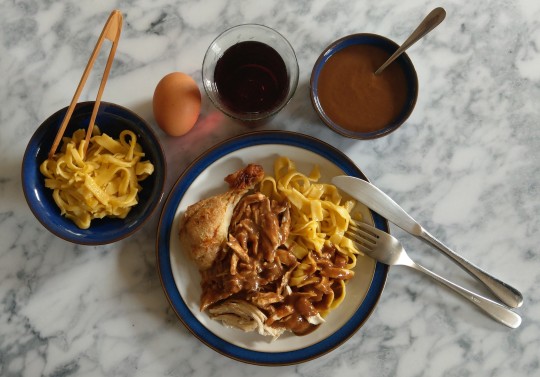
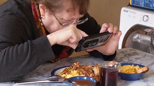
This has become Brightwood Vintner's Chicken in the Food and Cooking of the Middle Kingdoms project, and why not? It's delicious! Here's DD and U11+ in action, and the noodle close-up she was shooting in that pic.
None of the food we shoot is "styled" for photography with varnish for glossiness, paint for cream, machine oil for honey, microwaved cotton-wool for steam and lots of other cunning but inedible trickery.
Our stuff is all for eating - so much so that getting "photograph the food" and "eat the food" in the proper order can sometimes be a struggle.
Like these crumpets, for instance.
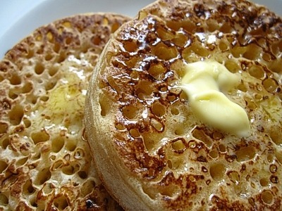
You would, wouldn't you?
I nearly did, giving DD conniptions because she hadn't photographed them yet, and the Kerrygold butter was melting Just Right...
In a choice between shooting Have To Eat images and Want To Eat ones, we'll stay on the Want To side of the fence, and if people looking at those pix also Want To take a bite out of their screens, we're getting the job done.
And we're not hanging from the light-fittings to do it... :->
#food and drink#food photography#food and cooking of the middle kingdoms#gallery of regrettable food#james lileks
79 notes
·
View notes
Text
Readmores And You - A Really Great Tumblr Feature!
(this is technically directed at stuff I've seen in a specific tag because of the content of said tag makes it more likely to spoiler things, but it applies to anyone likely learning the ins and outs of a new site. speaking of which, hello! welcome to tumblr!) (this got. longer than anticipated. apologies, I get bogged down in trying to make things as clear as possible. ^^")
I've seen this a lot recently in the VC tags especially, where the post goes something to the effect of "tw bloody animal!" then like six periods and the images of whatever dead thing the post is about.
I recognize this is probably being carried over from some other website (...reddit probably? maybe insta?) but please. I appreciate y'all so much for trying to do what you're doing. but this method of hiding pictures isn't effective on tumblr, but there is an infinitely better option!
"but why? it works fine on other sites?" firstly, a few extra lines typically don't even take up enough space on mobile (let alone desktop) to hide your pics, so even at a glance anyone is likely still seeing at least the top half of whichever picture you posted before even noticing the trigger warning on top. second, because you have to scroll all the way past the images at the bottom of your post anyway to get to the next one on your dash/in the tag/etc. so if someone comes across your post and the trigger warning is applicable as something they want to avoid, unless they have access to a keyboard to use a keybind shortcut that ive been here 12 years and still cant remember, they can't see any other posts after it without either having to scroll through the pics or outright block you. which is... not the most ideal of options I would say.
"but what else am I supposed to do then!?" I hear you ask.
READMORES!
tumblr has a wonderful feature known as a "readmore" that's built into the site! it creates a break in your post, which hides any content - be it words, images, whatever - that you place underneath it, not showing it unless the person viewing it clicks on the words "keep reading" (formerly "read more" - hence the name :D).
Cool, how do I do that?
on mobile you can place one by tapping an empty line and clicking the grey squiggle icon from the selection that allow you to insert an image/vid/link

which will place a squiggly line into the post you're making:

(desktop uses the same icon, it's just in a more compact row of icons.)
you can drag it around after placing it too, just like photos. (note: mobile can get finicky with this and it's usually just easier to remove it -click the big red X- and add it in the new place you want it.)
EDIT: some of the versions of mobile editor are broken and don't show the icons. to add it in manually type ":readmore:" (with the colons, but not the quotation marks) on its own line. Thank you for the reminder, LovingTogetic!
this is also a nice way to keep your blog tidy and not swamped in long and/or spoilery posts (say if you're posting 5k word fics, or extensive meta, or gushing over the ending of the latest game or TV show most people probably haven't seen yet)! it's not required, obviously, but it's generally considered a common courtesy for others that will be seeing your post cross their dashboard.
finally, an example of the readmore in action:
(ta-da!)
have fun out there y'all, I hope this is helpful ^^
as an aside (I wasn't sure where to put this but under the break seemed appropriate), you may also see a lot of personal/vent posts be fully under readmores as well, even if the post is only a sentence or two long. this is mostly so followers don't necessarily see it unless they specifically click, but there's a more frustrating history to it becoming a thing: when a post is reblogged, any content above the break is permanently frozen as it existed at the time, but anything under it will reflect edits made to the post. while not common, a certain type of user sometimes browse the various "do not rb" tags and will purposefully reblog personal posts in order to upset and distress the users. putting those things under a readmore make it so even if that happens, the text can be deleted from all iterations of the post. recently the site rolled out an option to lock a post to reblogs, but you gotta mess with the settings and it's mostly a habit after a decade here dealing with the nonsense.
#tumblr guide#hope it's okay to tag i'll remove if asked but#vulture culture#how to#tumblr how to#readmores#tumblr how-to
78 notes
·
View notes
Text
Embedding images on AO3: A Guide V2
Hi,
So, I thought I would go back and make an updated version of the A03 embedding image guide I made back in September of 2022.
This choice was mainly due to one of the options being viable.
Discord.
Due to the rise in malware distribution, Discord has set expirations on Discord links. This only applies to links that are used outside of Discord.
This short video explains this well
youtube
So, If we wanted to use the option, we would need to update the link every 24 hrs in your work.
Not great.
I know I also feel the salt.
Well, with that out the way, let's dive in.
A03 doesn’t actually allow for image hosting itself, so that’s why third-party hosting is needed.
In this guide, we will use these as possible choices to host our images
Google Drive
Tumblr
Imgur
https://postimages.org/
Other contenders:
IMGBB https://imgbb.com/
imgbox https://imgbox.com/
IMGBAM https://www.imagebam.com/
Image venue https://www.imagevenue.com/
Paste board https://pasteboard.co/
(Most if not all if these options listed require signup)
But really there are many options to choose from. If you have any recommendations, comment, and I’ll add them in.
Before we upload, you may need to compress your image(s) to shave them down to size, as some of these options upload size caps.
I recommend https://compressjpeg.com/ for this task. Or you may choose whatever your preference is.
Hosting options:
Option 1: Google Drive
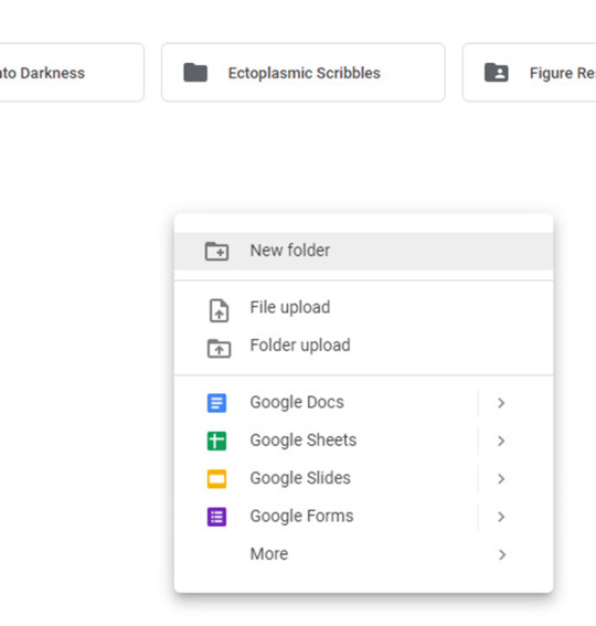
In Google Drive, create a new folder with the image(s) or subfolders for further organization.
Right-click and select New Folder, and name this folder whatever you want.
Now upload your image(s)
Right-click on your image and hit share.
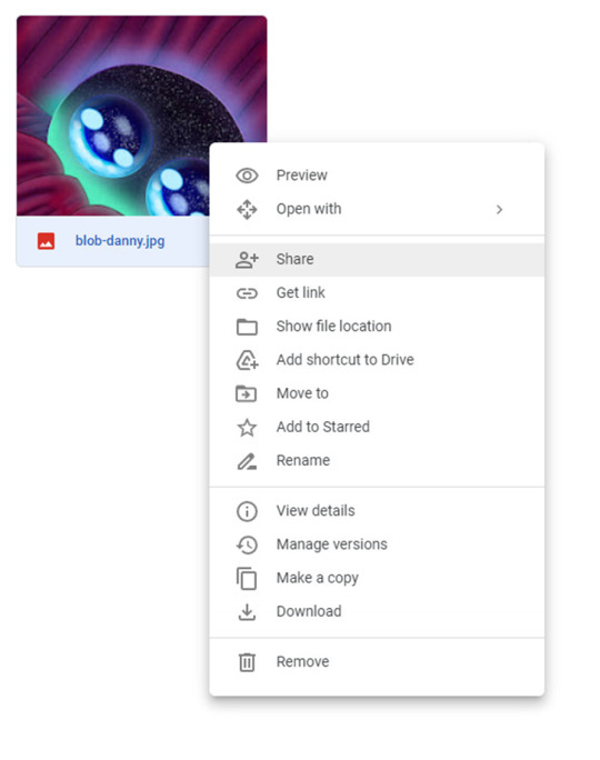
Hit Copy link
The link you have should look something like this
https://drive.google.com/file/d/1Nt17i9jx8LYffyQQew6D2x4HYxXFM0_B/view?usp=sharing
But as is it won't work! We need to modify it first!
Remove the
/view?usp=sharing
at the end of the link to work with AO3
Now, you have a working link from Google Drive that is ready to use.
Your modified link should look like…
https://drive.google.com/file/d/1Nt17i9jx8LYffyQQew6D2x4HYxXFM0_B
This Google Drive portion was from this guide here: https://archiveofourown.org/works/28132845
Option 2 Tumblr:
Tumblr is not always the best platform to use, as blogs can get deleted or URLs can change. But I’ll include it here anyway.
On mobile
Long tap the image you wish to use in a post.
You will be presented with this menu.
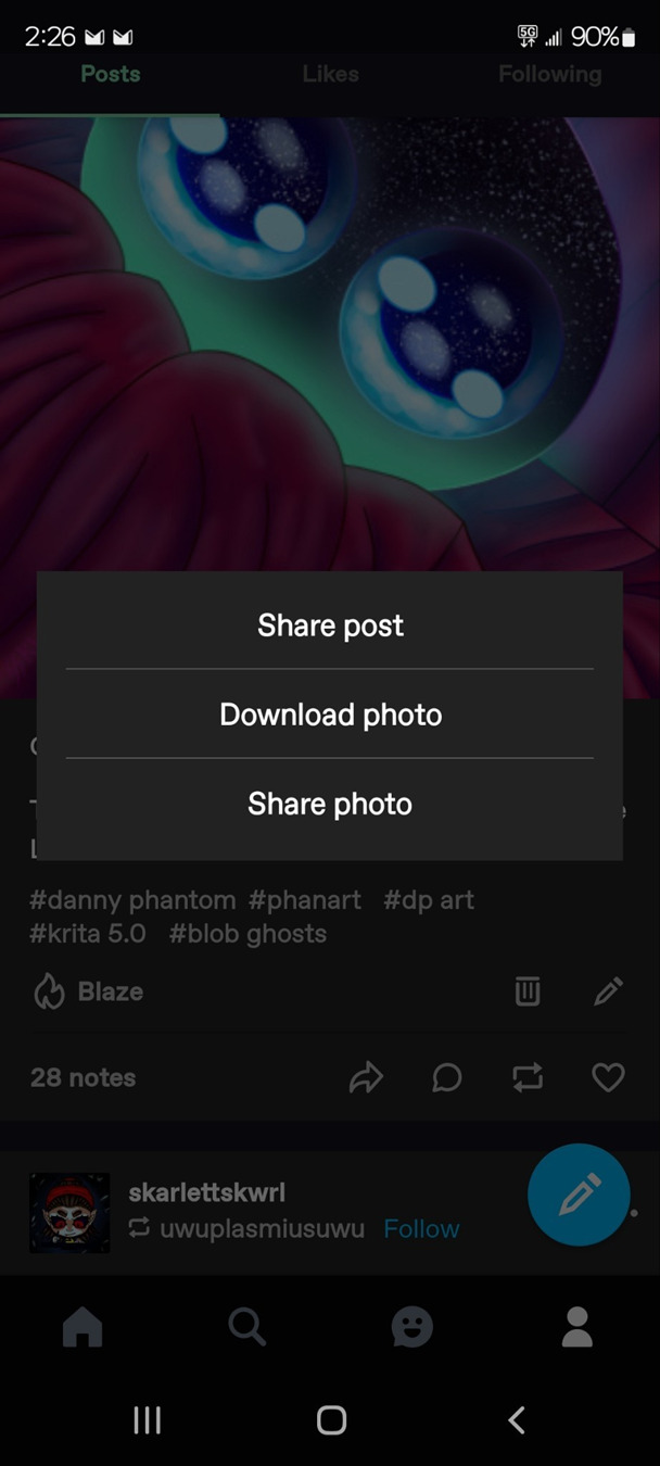
Tap share photo.
Then, you will be presented with another menu.
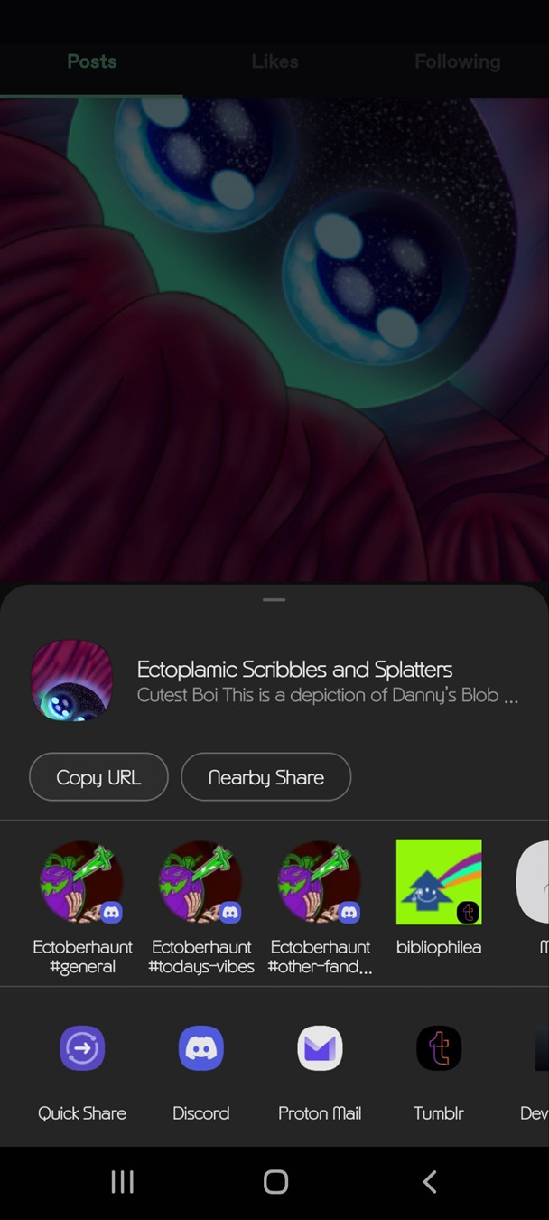
On the desktop, it will basically be the same.
Right-click on the image and hit copy image address.
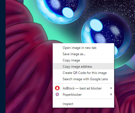
Now, you have a working link from Tumblr that is ready to use.
Option 3: Imgur
First sign up for an account. I would recommend this because last year, Imgur began deleting images not tied to a user account. This means that if you upload an image without an account, the image link may eventually expire and the image will be deleted.
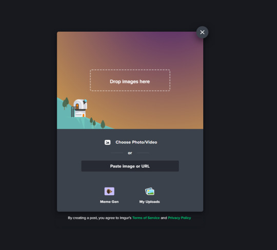
Create a new post
Upload your desired photo(s).
Do not hit the Grab Link button
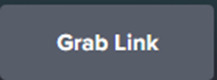
It will not work with AO3
Instead, right, click on the image and hit copy image link or address, depending on your browser.
Now your Imgur Link is ready to use.
Option 4: Using an image hosting service like postimages.org
You can create an account for free with this one. This is pretty straightforward, so I’ll gloss it over.
Once logged in you will be presented with this page.
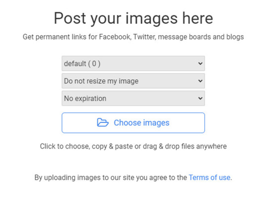
Upload your image, and you will be taken to this page.
Copy Direct link
Now, you have a working link from postimages ready to use.
Step 2: Inserting and fitting the image
Head over to Ao3.
Go to the new or existing chapter in which you wish to embed image(s).
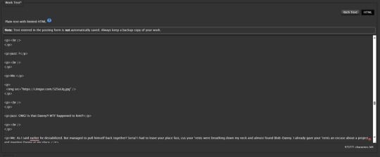
HTML OPTION:
Make sure in the HTML editor view.

This is located next to the rich text button in the Worktext section, as shown.
Now, find the place in the text where the image should go...
Now, preview your work to confirm the link is correct.
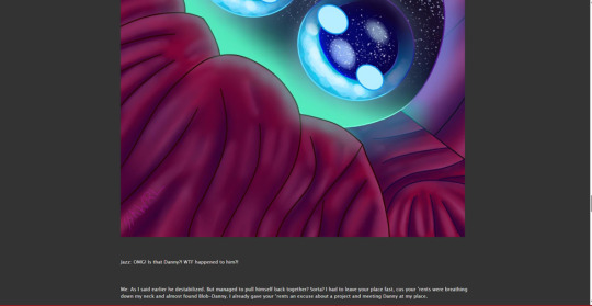
As you can see the image worked but in my case the image was waaaayyy too big.
So, we can add the width and height attributes to scale the image to a more comfortable size.
First, we need to know the exact dimensions of the image.
This can be done by looking at the size in an image app or can be done with an online tool.
Record these values
In this example, the image is 1080x2400
Now divide each by the same factor; this is important to avoid compressing or stretching the image.
In this example, We quartered/ divided them by 4.
Width = 1080/4 = 270px
Hieght = 2400/4 = 600px
Record these values
And update the img tag
<p>
<img src="" alt="" width="" height=""/>
</p>
src is the path to the URL.
alt is the alternative text for the image. This is used for accessibility as well as be a modern web standard.
width is the image width in pixels
height is the image height in pixels
You insert your values in between the double quotes.
ALWAYS TO REMEMBER:
to close your quote _
to close your image tag
to close and include your units
Here it is much better.
RICH TEXT OPTION:
Make sure in the Rich Text editor view.

Set the cursor where you want the image. Click the image icon.

Set the values in this form.
Use the URL we generated in one of the previous 4 options.
Set the Image description
The width and height may be input automatically; if you are unsure, consult the HTML OPTION to find the dimensions and how to rescale an image.
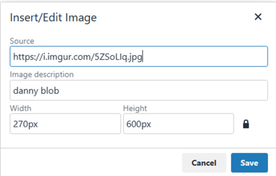
Here’s how it looks after posting
Well, that concludes my simple guide to AO3 image embedding. Thanks for reading to the end.
18 notes
·
View notes
Text
Peach-Pit Artbook Scanning Project - Complete!
On August 1st, 2015 I made the first post of this artbook scanning project to provide high quality scans of Peach-Pit’s illustrations, because there was barely anything available online, or if there was the quality was absolute garbage. 7 artbooks and 648 illustrations later, the Peach-Pit Artbook Scanning Project is finally complete... really, really late.
I was supposed to finish this project in April 2018. I finally uploaded the last illustration yesterday - July 8th, 2023. Unfortunately I was never able to finish it back in 2018 like I wanted to. Life got really busy, I had gone back to school, my computer battery died, I started getting lazy... when I only had 5 illustrations left to post. I’m so sorry it took so long to finish. I really hated myself for not finishing it back then. I was constantly beating myself up over it. I really wanted to get it done this year though. Thank you so much for all the likes and reblogs over the course of this project. You can find each of the artbooks below.
Artbook 1 (Peach-Pit Artworks DearS)
Artbook 2 (Peach-Pit Artworks Sui Mitsu Kyo)
Artbook 3 (Peach-Pit Artworks Zombie-Loan)
Artbook 4 (Shugo Chara! Illustrations)
Artbook 5 (Peach-Pit Artworks Rozen Maiden)
Artbook 6 (Shugo Chara! Illustrations 2)
Artbook 7 (Rozen Maiden Illustrations: Rose Maiden)
Now for something really annoying... Tumblr’s recent bullshit is another reason why I finally forced myself to hurry up and post those final 5 illustrations.
Tumblr has decided to be completely and utterly stupid, getting rid of the legacy editor and replacing it with a garbage new post editor that makes posts look absolutely hideous on desktop. I initially made this post with the new post editor, but I was so disgusted at how ugly and awful it looked I deleted it. For some stupid reason, all posts automatically become text posts even if I specifically select the photo option. It makes no fucking sense. I realized that all the posts I had saved in my drafts still had the legacy editor, and thankfully I had a few photo posts still in there. So I was able to repost that news post.
The problem was that I only had less than 10 photo posts saved in drafts. If I had known Tumblr was going to be fucking stupid and get rid of the legacy editor, I would have saved dozens of posts to prepare. But I only had enough to make a few news posts and those last 5 illustrations. Now I have nothing but text posts left in drafts. I’m behind on some posts already (Nagj’s birthday post, new SC! Princess Cafe goods, new RM SOLWA goods), and I can’t make a post about them because Tumblr fucked everything up and I’m trying to figure out how to fix the posts on my theme so they don’t look like shit.
I don’t know what to do. I’ve been giving them grief almost daily on their change blog and support section. So many other people are also upset. I don’t want to get too backed up with news posts because there’s so much information that comes out monthly lately. Does anyone know how to fix this? Any code I could add to my theme to make my posts not look like shit because of the new post editor? It pisses me off that I have to waste time and energy focusing on this instead of the project I plan to do next - high quality manga caps. How can I even make nice looking manga cap posts when the new post editor will just destroy it? It’s so frustrating. I’m sorry this post turned so negative, I really needed to rant about this.
51 notes
·
View notes
Text
++
I miss the legacy post editor so much. The new one is so difficult to use; the new icons are just ugly (?) and rearranging photos makes me want to scream out loud. I can’t put my finger on it but it just doesn’t feel user friendly? Or maybe I’m just getting old, dunno..
I also really need to rebuild my theme from the ground up with the new post format because everything looks terrible and I feel like throwing a tantrum because I don’t even know where to start. On top of it all I can’t edit my current theme because there’s something in the code that makes tumblr pop up an “woops :(” when I try to save. Why not tell me what’s wrong?
Is it obvious yet that I’m on day one of my period? 😭
30 notes
·
View notes
Text
flowers of every color | writer's behind the scenes!
some stuff about my writing process for the fic! be warned that if you haven't caught up yet, there are spoilers
tagging people who liked and/or replied my interest check post: @agustdiv1ne @mazeinthemoon @txtistheloml @kyaneosprincess @teletubbiesssss @banggyu0308
these are pretty long so i'm putting them behind a read-more hehe
story planning:
while we've gotten plenty of yeonjun in prince outfits over the years, the main inspiration for this fic is yeonjun's opening outfit in act: sweet mirage! i saw that and was like "oh man he would be SO DASHING as a prince 😍" and just went from there
if you've been here from the start, you might know that i didn't originally plan make a series! i just word-vomited the first chapter (well, what became the first chapter) directly into tumblr's post editor because the thought of prince!yeonjun wouldn't leave me alone, especially after seeing a few other prince/commoner and prince/servant fics floating around lol. chapter 1 is also the only chapter made using tumblr's legacy editor rather than their new one (which is also why the cover pics are one big edited photo and not 3 separate photos, i couldn't figure out how to get 3 photos to line up in the legacy editor).
i honestly did not expect people to read chapter 1 but they did!! and they liked the idea!! plus even after writing chapter 1 i STILL couldn't get the idea out of my head so i decided to write it as a full story. i've written plenty of oneshots before under my (non-kpop) ao3 account, but this is my first multichapter series! so i opened google docs and made a quick outline of the story's main events.
the original outline for foec had 6 chapters + 2 endings, but as i wrote the story, i realized that more detail and scenes were needed than what i initially outlined! chapters 3 and 4 (ball preparations + the ball / gazebo dance scene) were supposed to be one chapter. chapters 5 and 6 (y/n hanging out with the chois + getting caught + punishment + intro of arranged marriage) were also supposed to be one chapter. chapters 7-9 (end of friendship, reconciling with soogyu, y/n & beomgyu talk) were also supposed to be one chapter!
i actually started writing the bad ending first before the good ending -- my reasoning was that if i were the reader, i would want to save the good ending for last so that i could end the series on a positive note. i was very surprised when people voted for the good ending first in the poll LMAO also as far as i'm concerned, both endings are canon in a "branching timeline" kind of way. they are both the real ending! i do have a soft spot for the good ending but also i love angst too much to not write a bad ending haha.
honestly most of the story beats from my original outline made it into the final fic! the biggest change has to do with queen hwayoung's and princess ajin's roles in the story (more on that below).
character notes:
when i was first brainstorming i really wanted to include both taehyun and hueningkai in the story as well, but i struggle with writing ensemble casts and choi line + y/n (+ the supporting characters in the castle) were already enough for me to handle. soobin and beomgyu were the easiest for me to incorporate into the story since they have the same last name and i could go "oh in this universe they're part of the same royal house hence the same last name" HAHA. i do imagine that the house of choi princes are also friends with tyunning (kai does get alluded to in chapter 9), but they're off doing their own adventures.
some of little moments in the fic were inspired by actual things txt have done in variety shows! yeonjun, y/n, soobin, and beomgyu playing cards in chapter 5 is based off to do ep. 53 where they also play cards. soogyu playing badminton in chapter 8 is inspired by gbgb era idol human theater where they played a little badminton by the pool. and there are a lot more small character quirks that are inspired by gifs or fancams i've seen of them haha.
queen hwayoung and princess ajin were originally not supposed to be part of the story! my original idea was the have the arranged marriage subplot be heard secondhand by through advisers so that it feels like an invisible force pulling yeonjun away from y/n. but i needed to make the threat of the arranged marriage stronger and ended up writing the scene with queen hwayoung in it for chapter 6.
princess ajin especially was a late addition -- originally she was never supposed to appear at all, never visiting the castle and only speaking through her mom / royal advisors, so there was that threat of yeonjun being married off to someone he's never even met. but after looking through the feedback of chapter 6 i realized that i kinda-sorta accidentally made setup for her oops. people were wondering what she'd be like, and it would feel too anticlimactic to never have her appear in the story, so i wrote her in. which i don't regret because i did enjoy writing her big scene in chapter 10!
speaking of which: a friend of mine asked what happens to princess ajin, and honestly i wanted to give her proper closure too! but i couldn't find a way to fit it into the story in a way that felt natural. if you ask me though, she gains some level of political independence from her mom (represented by her visiting the castle in the good ending). she still marries for political reasons, to a prince or nobleman who is also in it for the politics, and at first they treat their marriage as a business partnership. eventually they grow close and form a devoted "i'd do anything for you" bond -- not necessarily romantic in nature, but caring in its own way. (i'm describing a queerplatonic relationship basically)
tbh i don't have the energy to write another multichapter right now, but i would love to see spinoff fics for soobin and beomgyu or even taehyun and kai as princes in their own kingdoms! so if you're reading this and you want to do it, you have my blessing <3
flower notes:
while some chapter titles were planned around a specific flower representing the events & progression of the story, others were not (because of the chapter splits i talked about earlier) and i just chose whatever flower was in it lol. the planned chapter title flowers are: yellow roses (ch2), pink roses (ch4), sunflowers (ch5), striped carnations (ch7) , purple hyacinths (ch9), red roses (ch10), daffodils (GE), and white lilies (BE). the unplanned title flowers are: irises (ch1), lilies of the valley (ch3), red and purple zinnias (ch6), sweet peas (ch8).
i mostly used this website as a reference for the language of flowers, BUT i also double check with one or two other websites to make sure i'm getting an established flower meaning and not something made up! when i started fic planning i made a list of flowers with meanings that fit the main story beats and character progressions, then picked the ones with the most established meanings (i.e. supported by multiple "language of flowers" websites) and/or the ones that were appropriate for the growing season.
even though i wrote a disclaimer not to pay attention to botanical accuracy re: seasonal flowering times, i originally envisioned the fic to take place over the spring. then when it got longer, i imagined it taking place over spring and summer, so i tried (keyword: tried) to choose seasonally appropriate flowers or flowers that bloom year-round. this is hard for me because i live in a tropical country. i have never seen a lot of these flowers in person because they don't grow in the climate here, and i have no idea what a four-season year feels like. so i decided not to put time-of-year markers in the fic and leave the season ambiguous, and added that disclaimer about the flowers' accuracy.
an example of this: chapter 9 is named after purple hyacinths. i first decided on this back when the story was only supposed to take place during the spring, since hyacinths are a spring flower. i considered naming it after hydrangeas because they mean something like "thank you for understanding" (i.e. y/n going "thank you for understanding what a hard position i'm in" to yeonjun), and also because they're one of my favorite flowers. but i wasn't sure about their seasonal appropriateness since some sources said that they bloom during early summer so i changed it to hyacinths. BUT THEN the fic got long and i started imagining that the later chapters take place in the summer SO the hyacinths ended up being seasonally inappropriate after all! and hydrangeas would have been more appropriate! especially since txt literally has a song called hydrangea love out aarghhh noooo but anyway it is what it is
other flowers that didn't make the cut + their meanings: sweet william (gallantry), alstroemeria (friendship or devotion), freesia (friendship, thoughtfulness), white tulips (forgiveness, consideration, respect), thyme (courage, strength)
other notes:
the key lime pie in chapter 6 is based on a real pie that i ate at my friend's house when i visited her there and i thought it was the most delicious thing i have ever eaten. in the original draft it was a lemon tart!
i wanted to keep this series strictly sfw, but i did consider making both the good and bad endings have suggestive, fade-to-black scenes. for the good ending, the suggestive part would have involved y/n in yeonjun's room the night after their speech / before waking up together. for the bad ending, it would have happened when yeonjun visits y/n's quarters. i didn't write them bc i... am not good with anything suggestive or nsfw klsadjfklasjd
I COMPLETELY FORGOT BUT Y/N'S FATHER WAS ALSO IN THE AUDIENCE FOR THEIR SPEECH IN THE GOOD ENDING... i have no excuse for not writing him in other than I Forgot. i am so sorry but please imagine he was there
--
that's all i can think of for now! if you have other questions about foec or my writing process please please feel free to reply to this post or send an ask <3
13 notes
·
View notes
Note
Hello, Fukuo!
I'm using your Empati Theme, and I love how customizable it is, but there are a few things I was curious about. I tried to look up the answers before bothering you, and had no luck.
If you don't have the answers to these questions or the time to answer them, that's fine, I still greatly appreciate the themes you provide!
Is there a way to have photos show up as the preview for photo & text posts? My current format is a line of text as a title and then the image, if I make sure the image is at the top then it shows the image preview, but otherwise it will show the document icon. (this one isn't nearly as complicated since I know I can reformat my posts, it would just be a long process)
Is there a way to add comment & share buttons on posts, and move all of the buttons to the bottom, similarly to the way there are on the dash?
Do you know if there is a way to add in infinite scrolling? I've tried multiple variations of different code, nothing has worked.
And my final questions are would it be too difficult to add additional social media buttons similar to the facebook, twitter, youtube, ect, and have you considered making their order a slide and drop for rearranging? I would love to add some additional sites, but the other link option works for a splash page.
There are so many wonderful things about your theme! I love how the grid layout turns my images into a digital gallery, and how easy it is to view the rest of the post. Thank you again so much for making such wonderful themes!
Hello there! 👋
Thank you very much for using the theme, and I really appreciate that you've formatted your questions as lists; it makes it easier for me to scan, haha 🥸🤝
So here are my answers to each of your questions below:
Is there a way to have photos show up as the preview for photo & text posts?
To answer this, allow me to give you a bit of context.
Tumblr has a thing called NPF (Neue Post Format) — where every post created in a new beta editor allows us to put multiple types of media in the same post.
Previously, before this, we could create posts based on their post types, called "legacy post types." It's called "legacy" because Tumblr has been moving away from this for a long time (I believe they started this around 2018).
The thing is, with this NPF, it's very difficult to differentiate which one is a text post and which one is a "photo" post since the theme engine cannot differentiate these post types anymore (every post created in NPF is mostly categorized as "text").
My approach in building this grid theme is by manually detecting the media block in the posts:
If the image is at the very top of the post, it will show as an image.
If the image is not at the very top (it starts from a text block), then it will show the document icon.
So I apologize that there is no workaround for this in the meantime 🙏

Is there a way to add comment & share buttons on posts, and move all of the buttons to the bottom, similarly to the way there are on the dash?
The theme engine on Tumblr doesn't have the ability to have the comment/reply system similar to the dashboard, unfortunately. I really wish they did.
As for the "share button" on posts, I will consider including this in the next updates!
Do you know if there is a way to add in infinite scrolling? I've tried multiple variations of different code, nothing has worked.
Implementing infinite scrolling can result in a code break in the grid layout posts. I have tried including this in the first iteration when coding this, but to no avail 🥲
Also, I am not a fan of infinite scroll because of this reason: https://www.tumblr.com/eggdesign/649014437609668608/ooh-different-anon-but-can-i-ask-why-you-dont-like?source=share
But I will consider adding this in the future since it's a highly requested feature 🚶🌦️
And my final questions are would it be too difficult to add additional social media buttons similar to the facebook, twitter, youtube, ect, and have you considered making their order a slide and drop for rearranging? I would love to add some additional sites, but the other link option works for a splash page.
When it comes to rearranging the order of the social media buttons, there is no way to do that in the Tumblr Customizer.
Unfortunately, there is not, and the customize page has not been updated since 2015 (which is a shame; Tumblr should also pay attention to user experience in customizing the theme).
Regarding additional sites, what other sites are you thinking? I will consider adding this to the theme!
Hopefully, this answers your questions, and please let me know if you have anything else. Thank you.
Cheers.
5 notes
·
View notes
Note
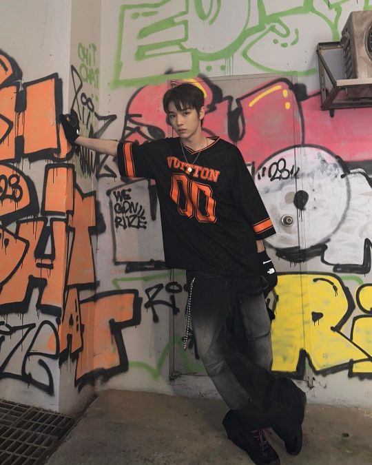
hiiii mel <3 i’m.. thinking of starting to write for nct.. mostly jaemin.. and i more or less have an idea for formatting but it’s been a really long time since i’ve had to do graphics for fic’s (like the banner and stuff!) and i was wondering if you had any tips for that? like where to find good pictures (solid backgrounds seem like the best choice for not clashing with the lettering, a problem i ran into unfortunately…) and also is there any particular place you get your fonts from? if you aren’t comfortable answering that (or any of this!) then that’s totally ok and feel free to just give general advice or ignore this completely :]
now i leave you with renjun… https://www.instagram.com/reel/C117-m9JGuo/?igsh=aXI1YmZ6M2YycHg1
hiii! under the cut!
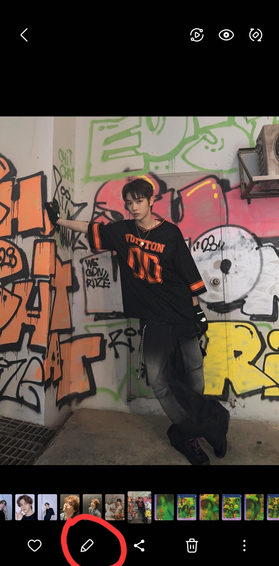
so you've already got a good idea with using solid backgrounds for fic headers to make it easier for the text to show up! i source pretty much all my images from the groups/idols' official social medias. i just caution you not to take screenshots of say, instagram uploads, because this will degrade the quality of the image. either download it from twitter or wherehaveyou, or from an updates account like neocatharsis or wayvment here on tumblr! another word of caution: DO NOT DOWNLOAD TEASER IMAGES/PHOTOSHOOT IMAGES FROM CONTENT CREATORS WHO MAKE EDITS TO THE IMAGES, SUCH AS CHANGING THE COLORS, UN-WHITEWASHING, ETC., WITHOUT THEIR PERMISSION. THAT IS THEFT FROM OTHER FANS. updates accounts like neocatharsis and wayvment simply reupload the original images posted by the entertainment company/idol in the exact same form without making changes to them. editors make alterations to the image and that new image is their own creative work, separate from the original one posted. you need the editor's explicit permission in order to use their edited version as a fic header.
i do all of my editing on my phone for my fics (except for the thin section dividers that i use, which i make in pirated photoshop cs6 so i can get specific dimensions, 540x2 pixels, and make the gradients super quick in a way that i know how to do. there may be a super easy way to do this w an app on ur phone too, that's just how i know how to)
anyway, if i have a photo that i really like, that i just knowwwww matches with the image of the guy in the fic in my head or smth, that i just rlly want to use but has a busier background, sometimes i'll use the portrait editing settings on my phone to blur the background a little bit and that makes the text a lot more legible (i have a samsung but im 99% sure iphones can do this too)

i typically don't bump it past 1 or 2, or the edges of the blur start looking a bit harsh, and i find that i don't really need more than this for the text to pop against the background anyway!
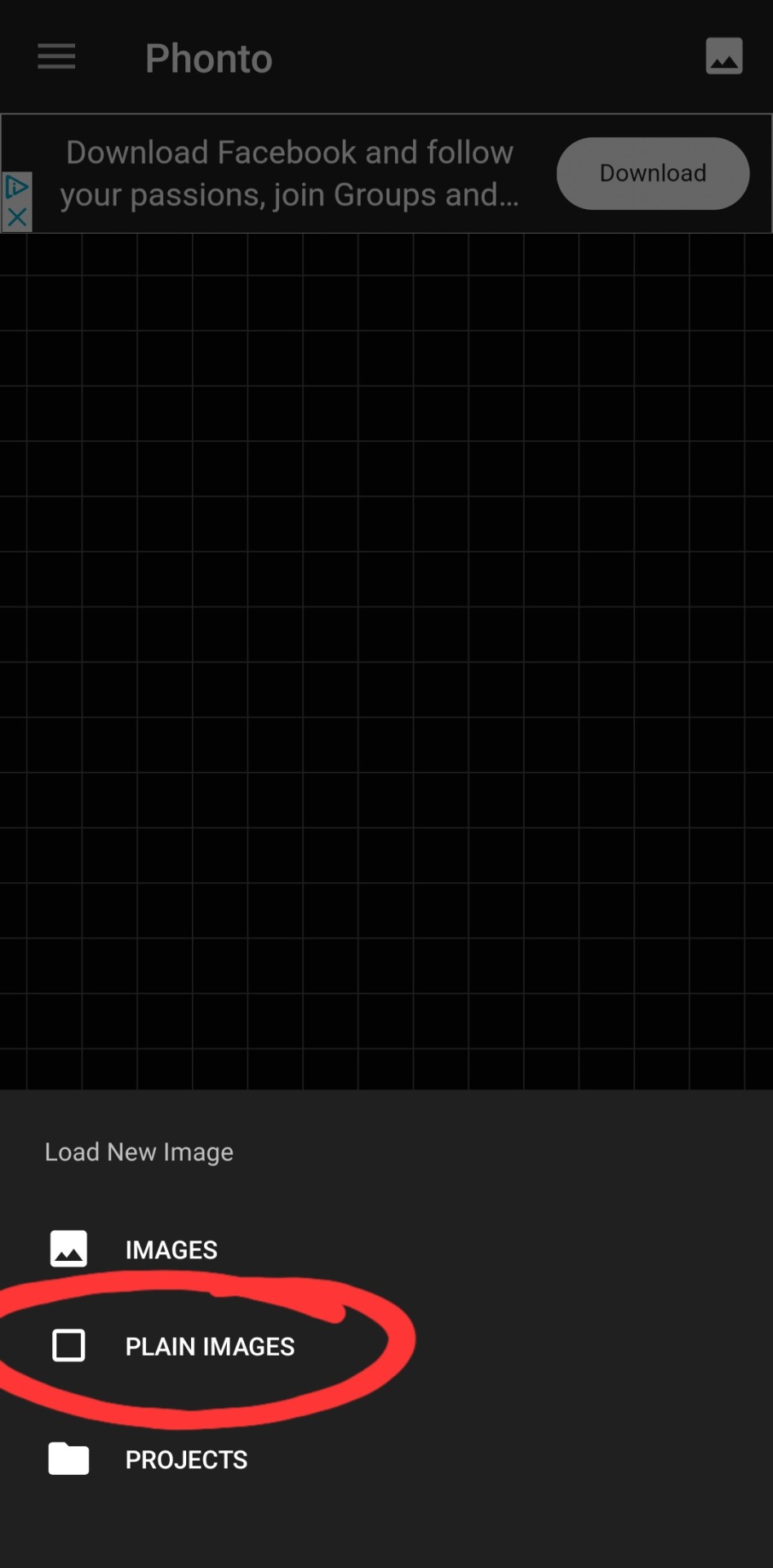
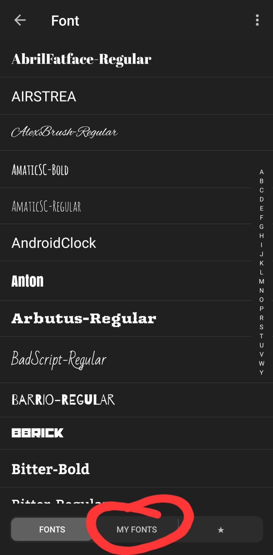
as for putting the text on the photos, i've the used the app phonto for years! it's completely free, doesn't put any watermark on your photos, comes with a bunch of fonts pre-installed, isn't super ad-heavy (it has a rlly small banner ad all the time at the top, and only shows u a skippable 10s ad when u save a finished photo), and you can download fonts from the internet to install straight into the app!
my favorite free font website is dafont.com, i literally will spend hours just browsing on there looking at fonts to download lmao. anyway here's how i find fonts for stuff and download, install, and use them with dafont and phonto:
once you have phonto downloaded, open dafont.com
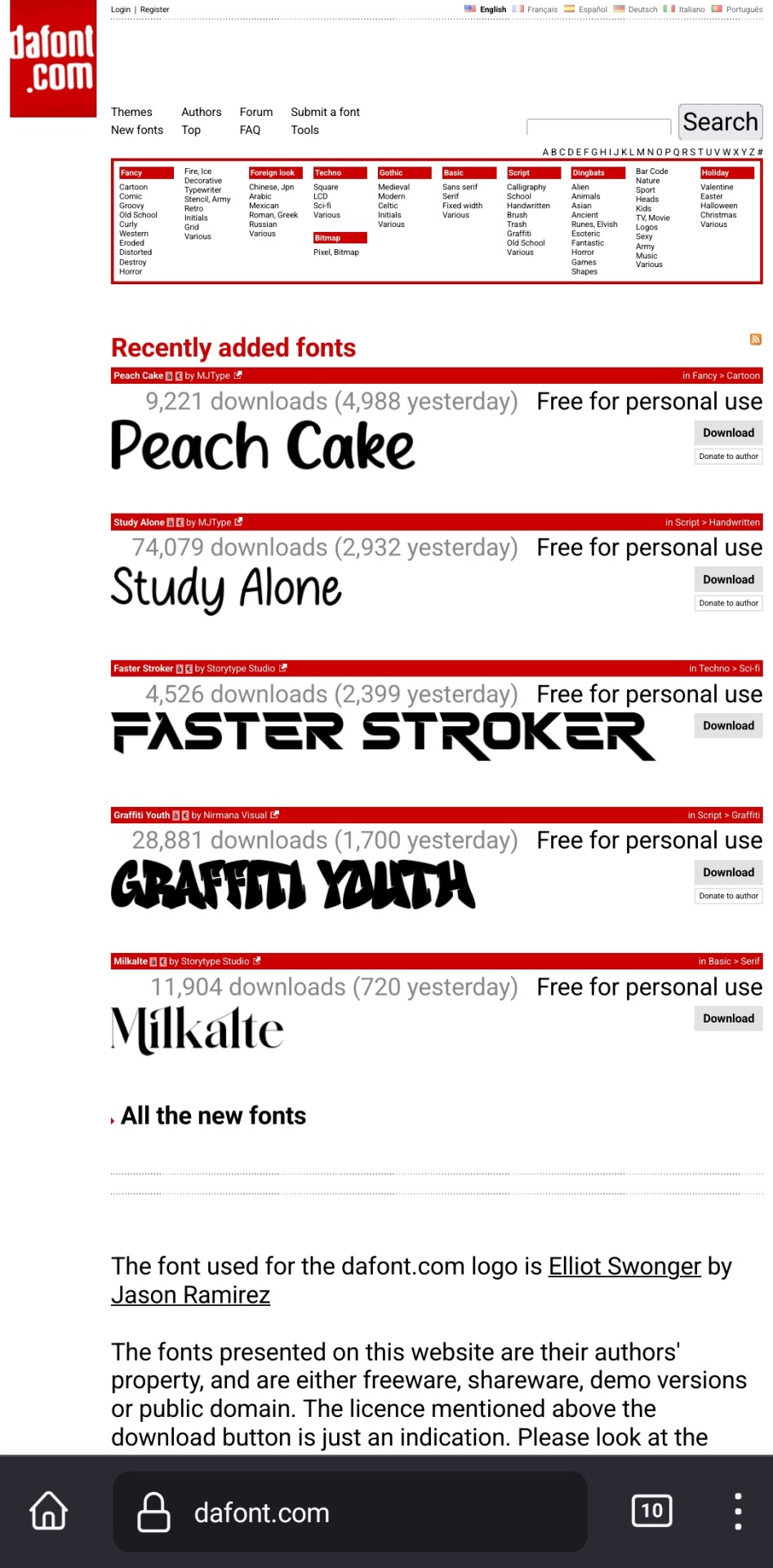
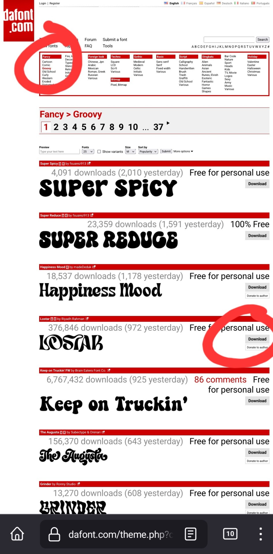
up at the top, it has a bunch of different categories of fonts. for this example, i chose fancy > groovy, and then on this first page, i liked this font called "lostar" (there's also a search bar up there, but it only searches font names, not kinds of fonts, so if you're looking for a groovy-feeling font and you searched "groovy," only fonts with the word "groovy" in the name would come up)
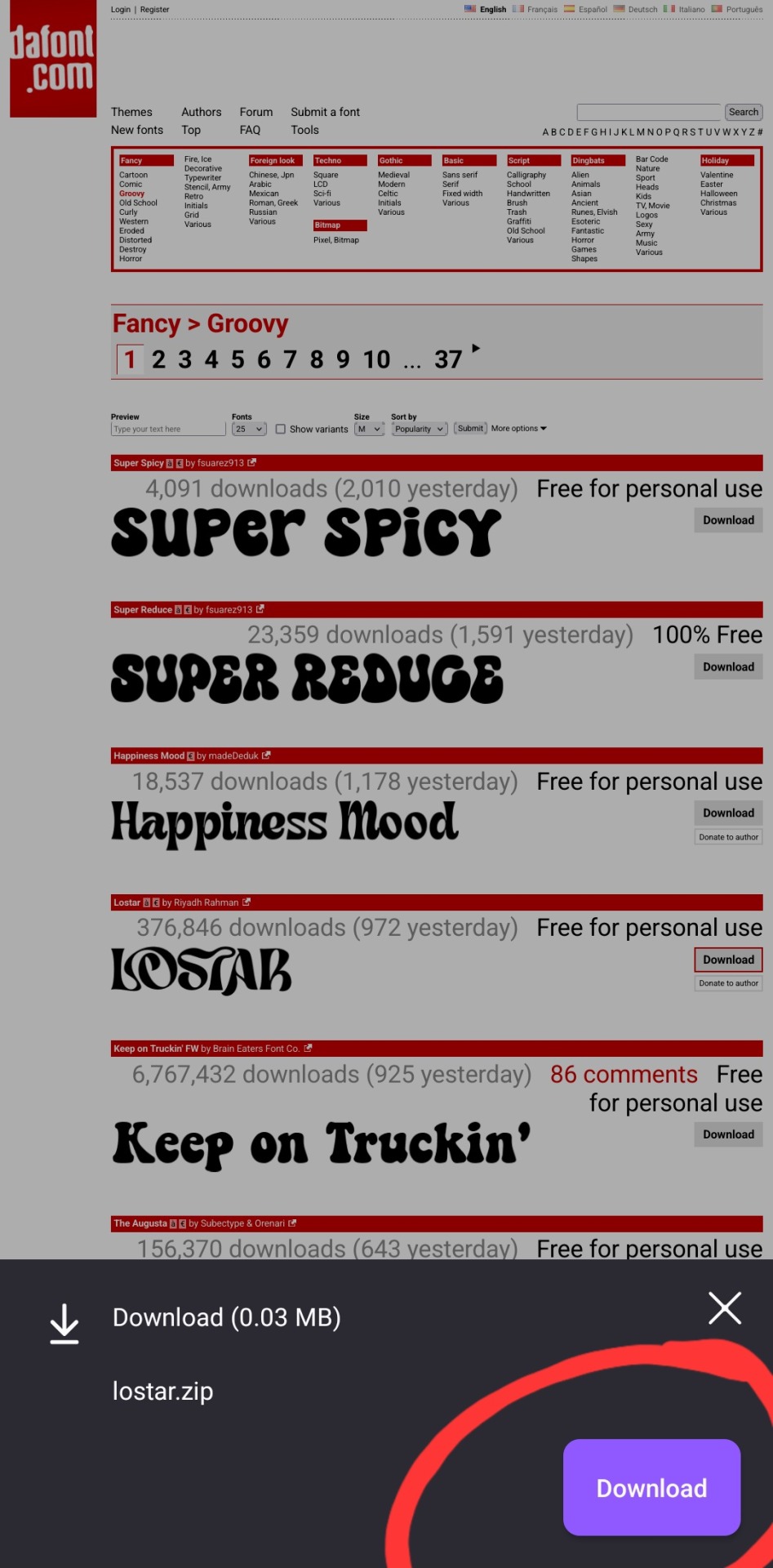
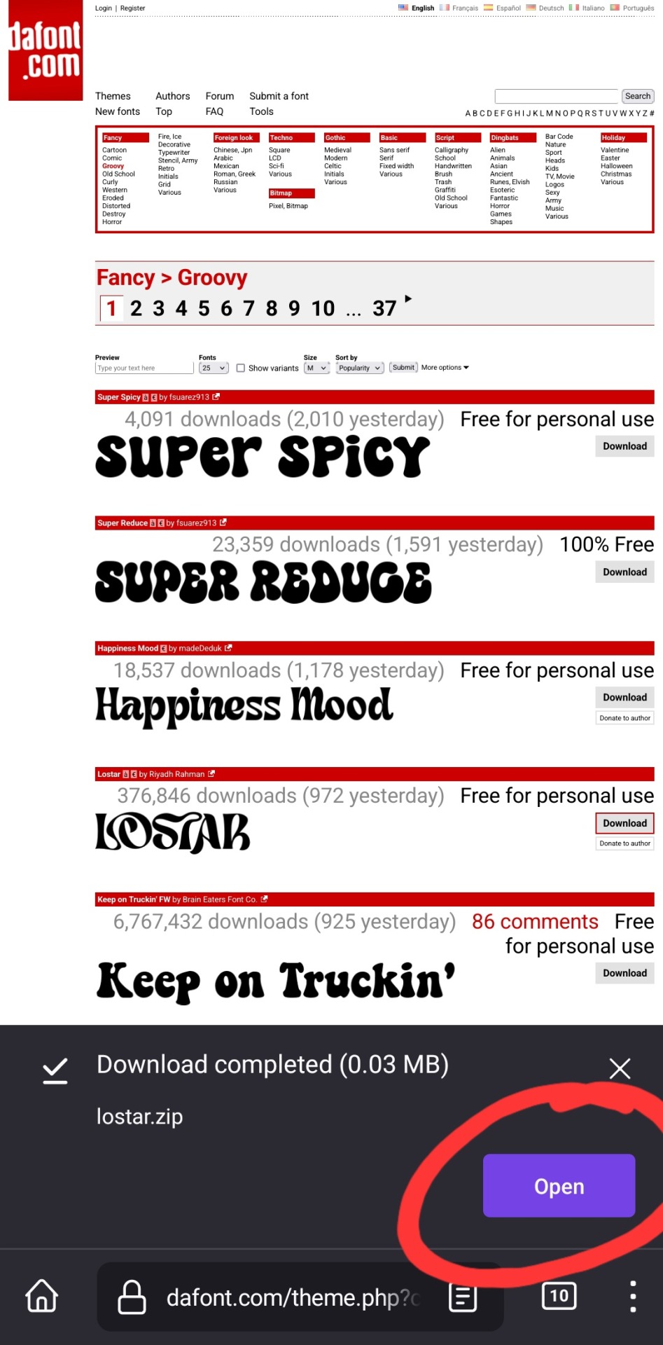
i then press download, and open in my browser (i use firefox btw, which is why it looks like this lol). make sure you're opening the .zip file with the phonto app (it opens directly into into phonto on my phone, you may have to choose to open the .zip file using the phonto app from several options, instead of your phone's file explorer or some other app on your phone)
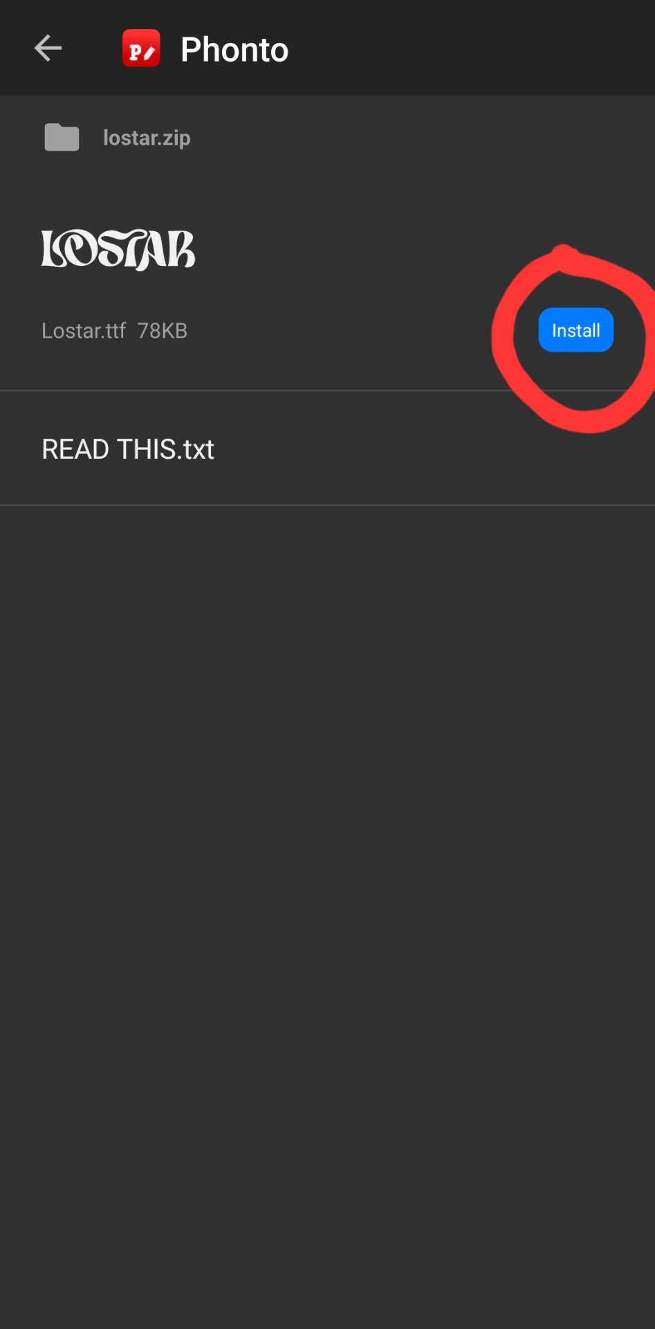
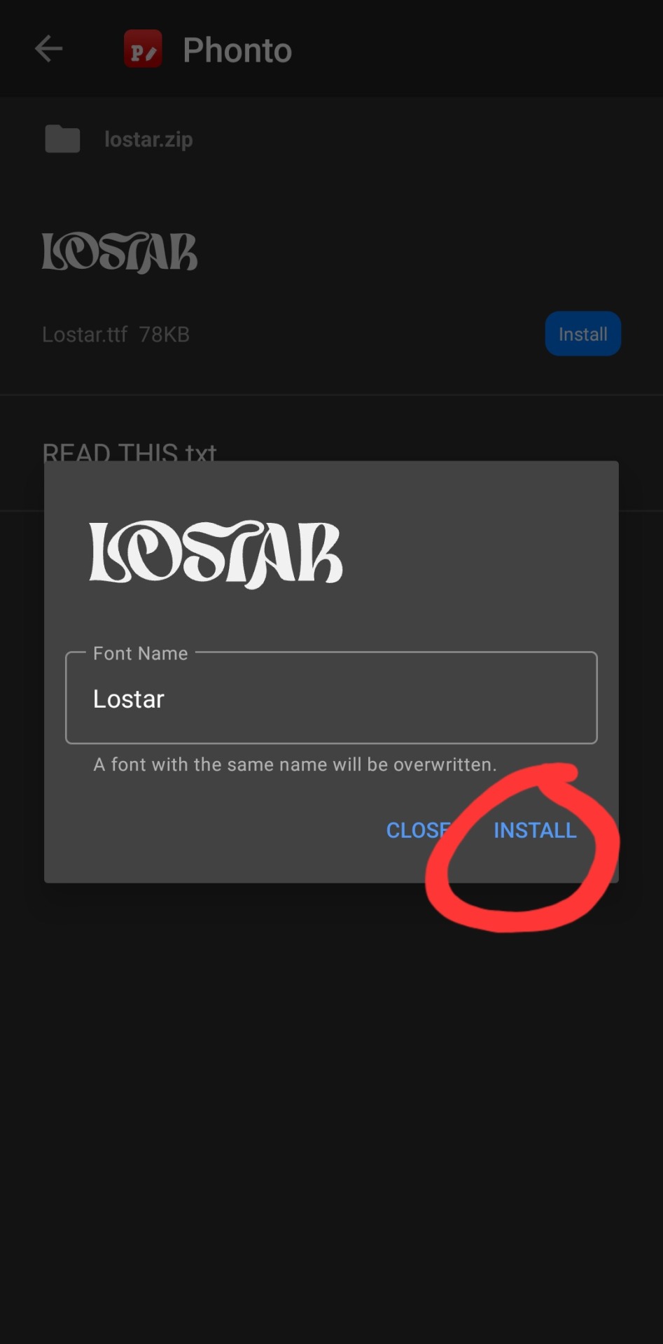
in the phonto app, you have to click install, then install again (it gives you the option to rename it, but i just keep the original font name bc why would you rename it?).
that READ THIS.txt file is a message from the font maker, it's the personal use license for the font (most of the fonts on dafont.com are free for personal use ONLY, and these .txt files that are contained in the .zip files are notes from the font makers telling u what u can and can't use the fonts for. generally, as long as ur not a business, u should be good this is not legal advice, please read them. also there's usually little thank you notes from the font makers in here as well!)
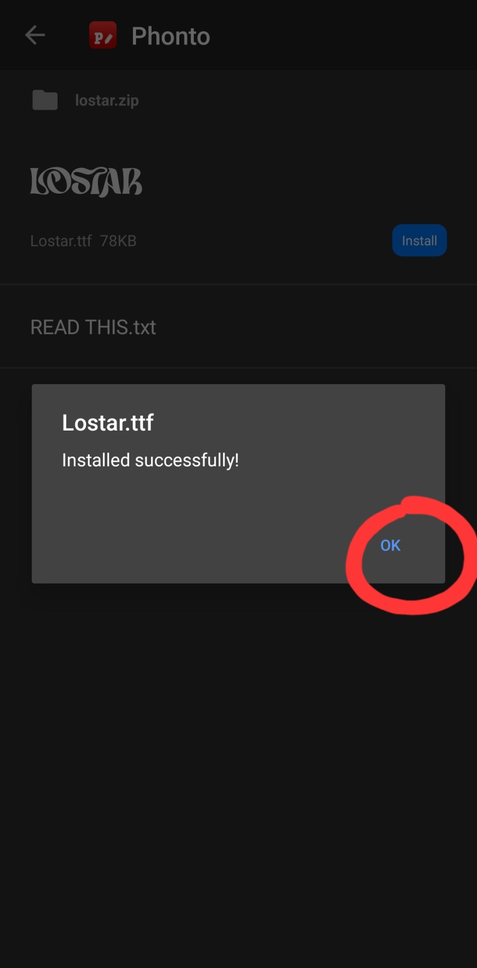
click ok.
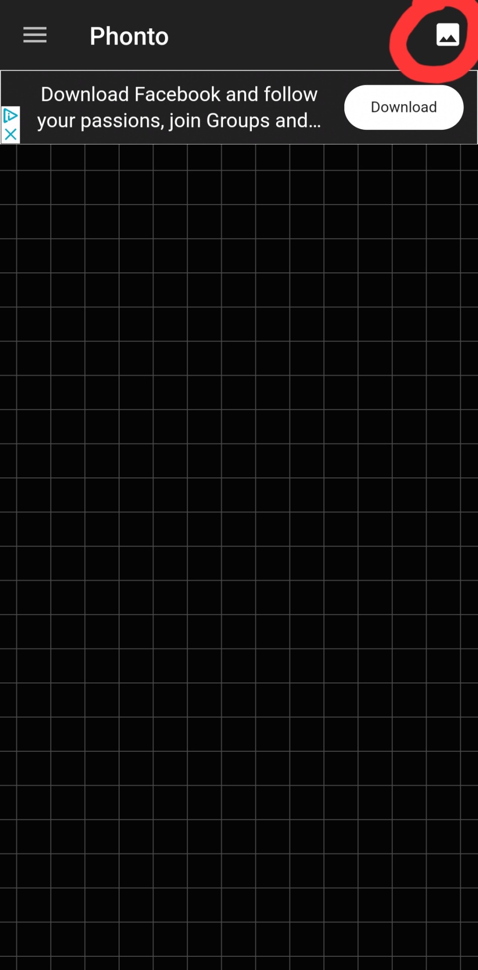
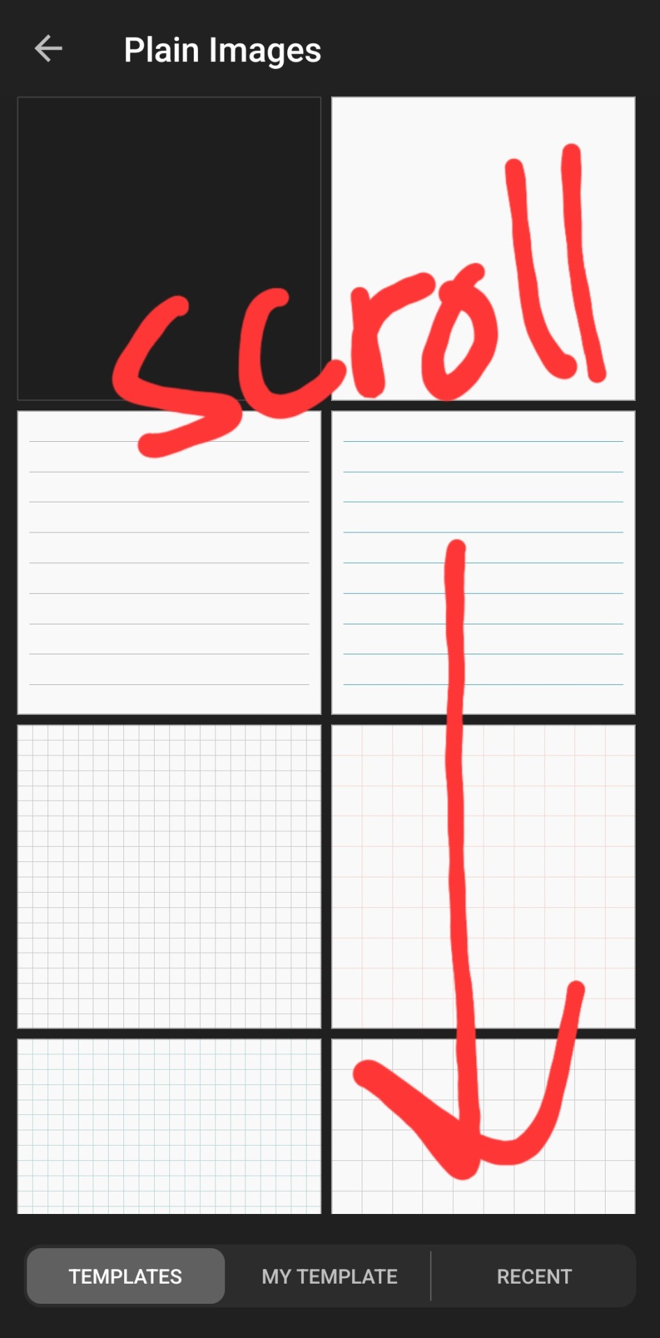
then you've got to slap some text on an image. you can choose an image from your camera roll, use one of their plain images, or open a pre-saved work-in-progress. for this example i used one of their premade gradients to make it easy
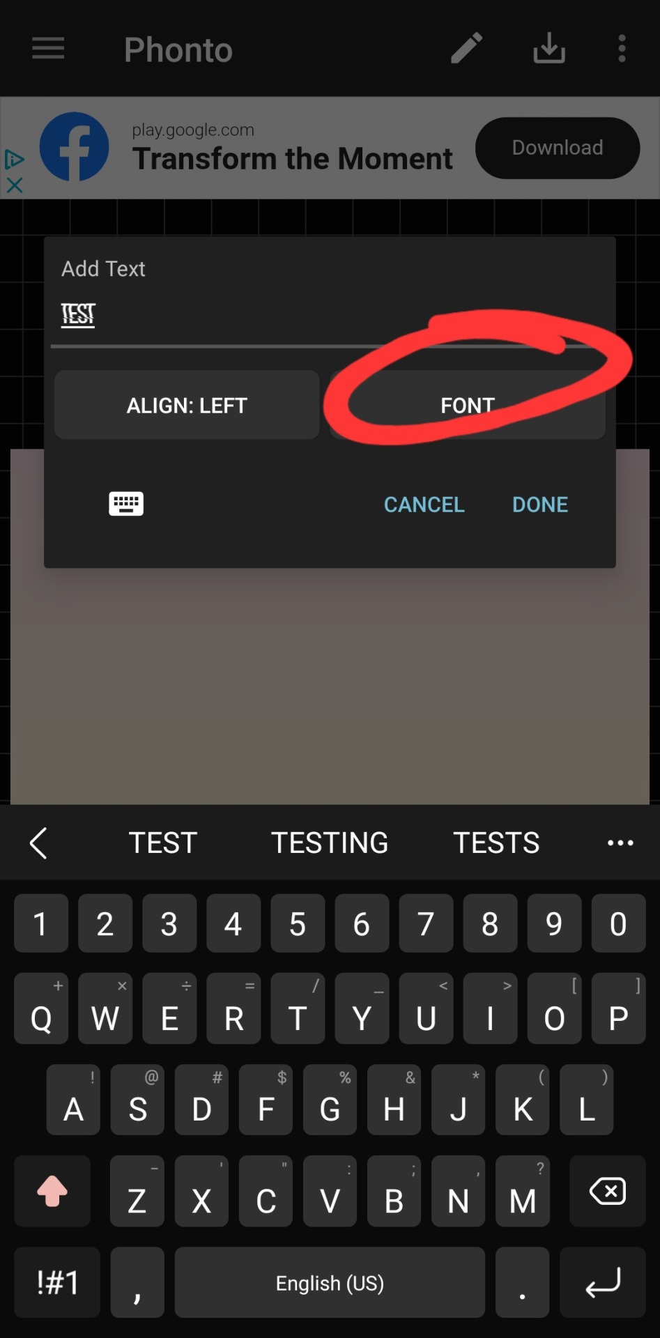
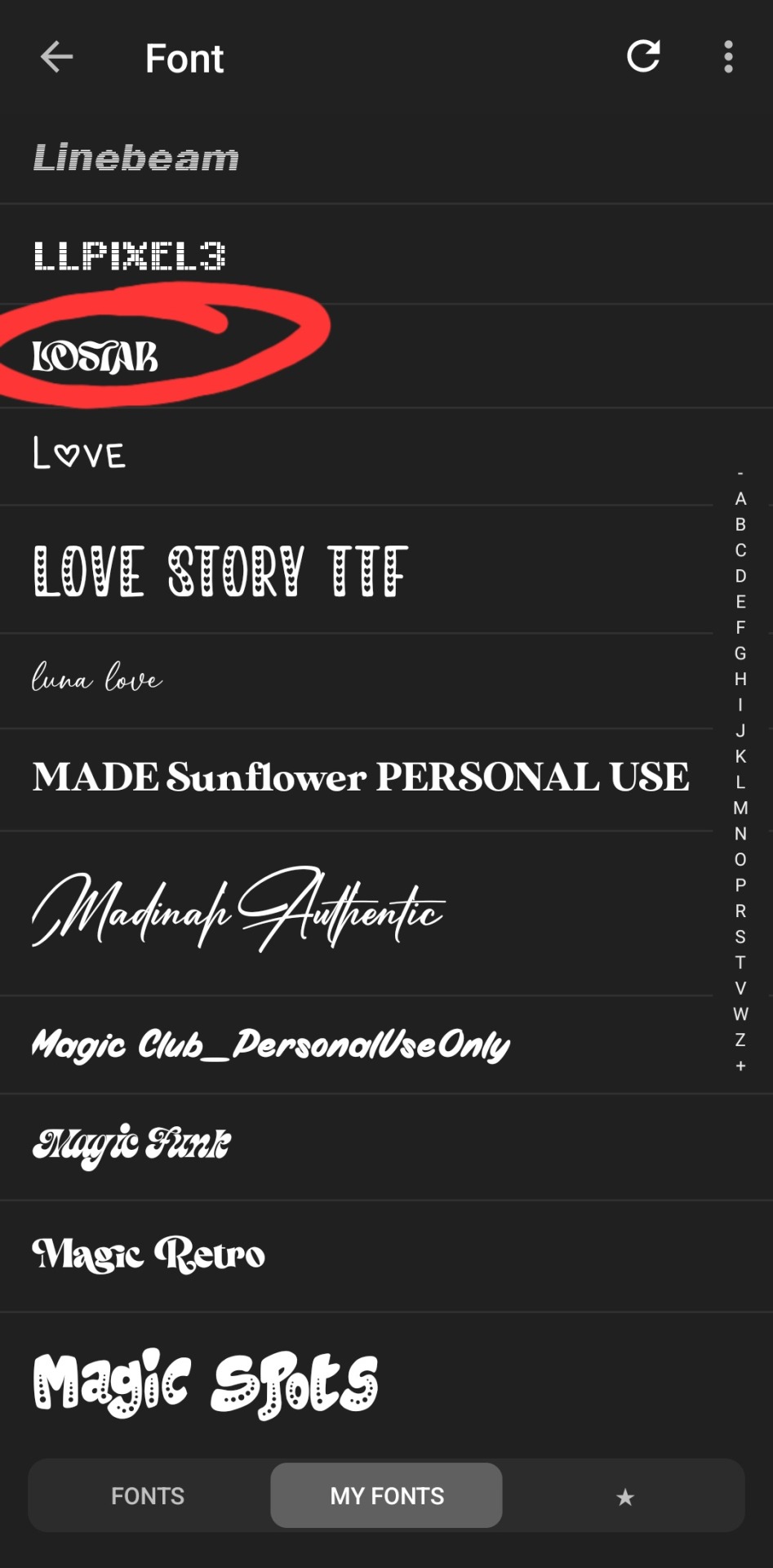
type whatever it is you want, click font. the left tab is the pre-installed fonts, the middle tab is the fonts that you've downloaded from elsewhere. here's the lostar we just got!
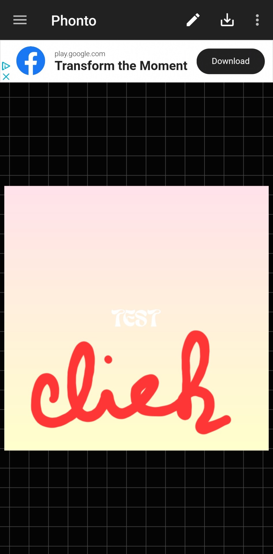
oh can't see it.
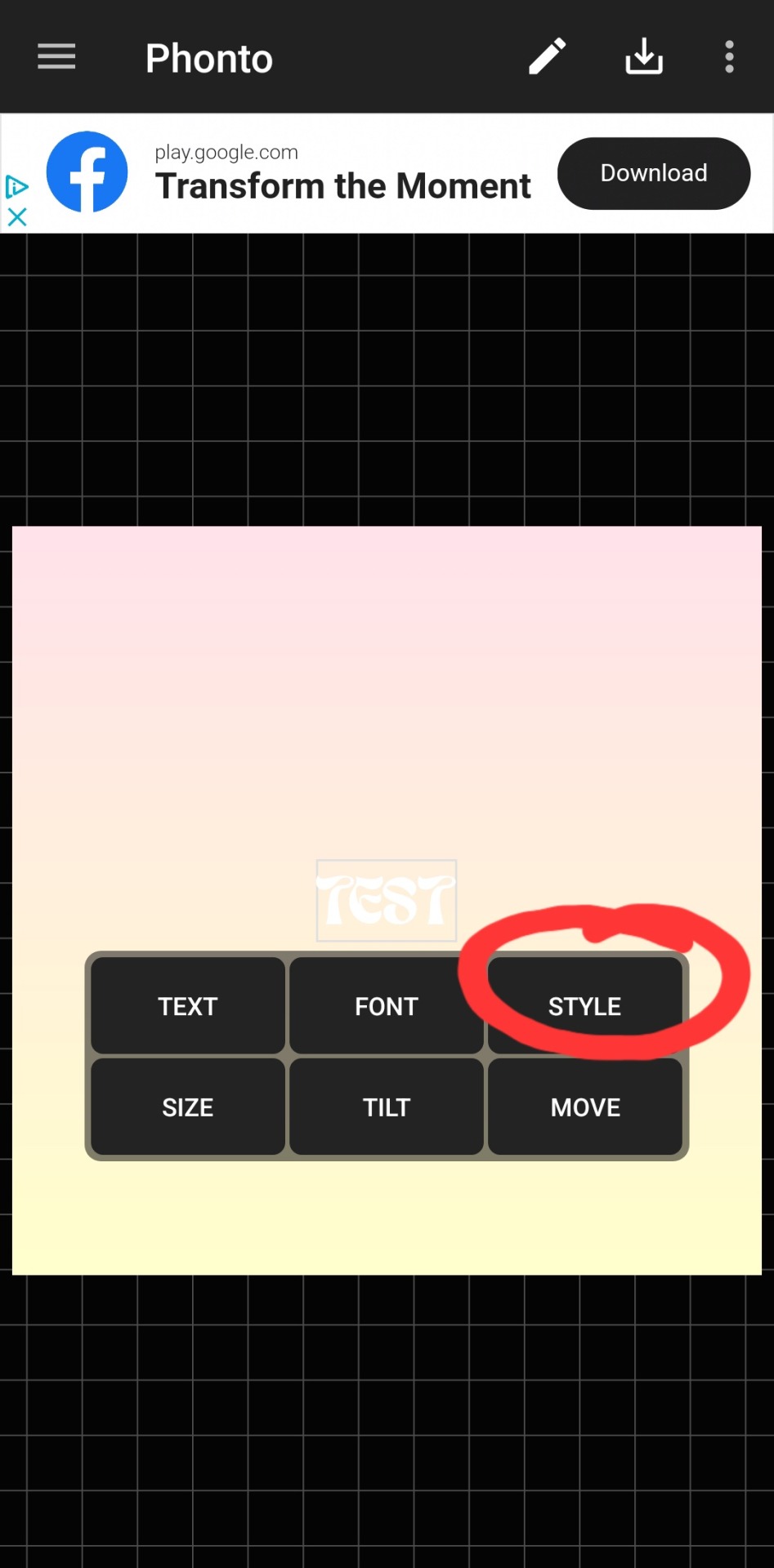
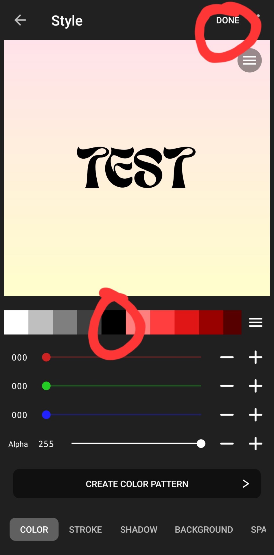
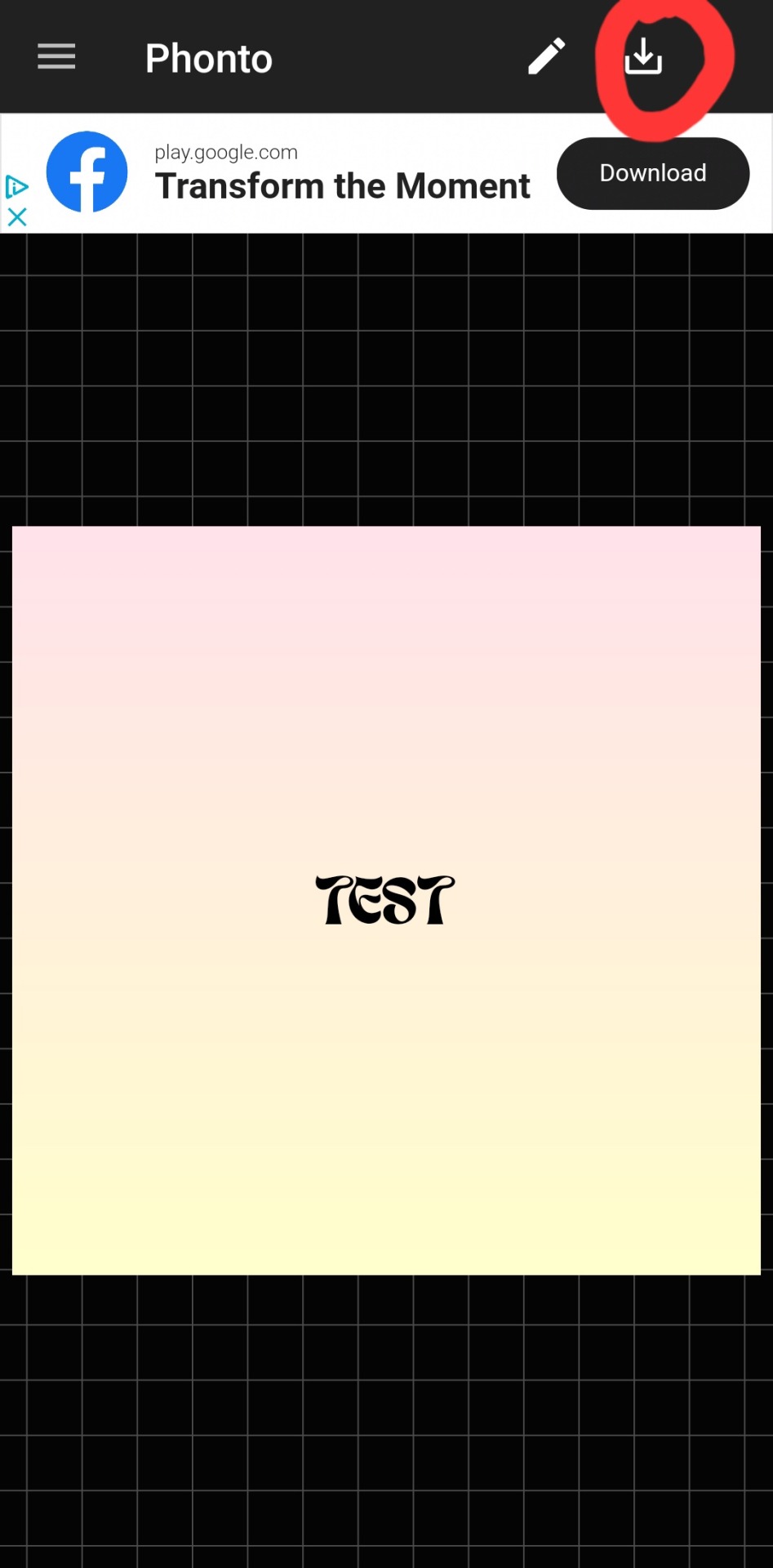
there we go! how fun! i'll probably use this in a fic header in the future. download button in the top right.
#hope this was helpful!#i don't mind sharing this stuff#i didn't invent fic headers or dividers or literally any of this lmao#answered#anonymous#talk#text#mine#writing tag#i suppose.....since its about my fics.........sorta...idk dude#also the renjun cheekies 😭😭 thank youuuu
3 notes
·
View notes
Note
Hi there! I finally found my dream theme "Rose Wood" but I'm struggling with the descriptions showing up under the post. I saw you mention NPF a few times but I don't know what that means or if it's something I can fix? Would you mind sharing a little insight on the problem and/if it's fixable on how I post or format? I checked an old blog of mine with the theme and those pictures/text posts worked perfectly. It just made me wanna use it even more haha. Thank you! (using chrome on pc also)
Hello!
By default, all new original posts created via the new Tumblr editor are considered NPF posts—which are essentially text posts.
The posts that you see working on your old blog are most likely legacy posts where the caption will automatically be hidden on media posts (photo, photosets, videos, audios, etc.) like it is in the archive!
Because I made Rose Wood before Tumblr implemented the new editor for all blogs, it's a little difficult to make NPF posts look like legacy posts without using JSON or JavaScript (which are not really my forte LOL). So there's really not much that you can do to make them work like legacy posts!
I know it's not really a solution but hopefully, this gives some insight as to why some posts have the description showing up!
2 notes
·
View notes
Text
wow, i really really hate the new post editor
when i make an image post, that bar thing that says drag you photo or url here just stay open up there after you’ve already added photos??? and i have the option to close it? so i get to manually close it every single time just so i can see how my post is going to look??
and when adding tags, you can’t just click anywhere in the tag field, you have to click the teeny tiny little plus sign? boo, major downgrade
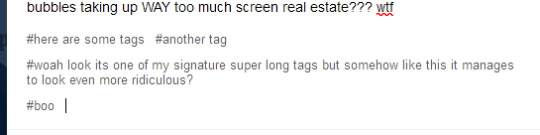
also its HELLA ugly and clunky looking. like look at all these big dumbass grey bubbles taking up WAY too much screen real estate??? wtf
like i cant even see the post buttons with just a single not large image (its 303px tall) in it???
same tags for reference:
clean, easy to understand its not part of the post, not freaking ugly?
like yeah, the font size could be a smidge bigger, but the grey bubbles?? *barf emoji* its ugly and intrusive and i can’t even customize it to be like baby pink or something? smh
also, again, the stupid teeny tiny plus sign??? versus being able to click literally anywhere in the tag area??? i aint got time to be lining up my mouse to hit that stupidly small target every time i decide i want to add tags to a post???
like if its supposed to be more accessible on mobile...1) tapping anywhere in the tags section would be infinitely easier on mobile also i think? but maybe people were accidentally hitting the tags section like while scrolling so they made it harder to hit on purpose? but if thats the case, 2) theres a tumblr app?? i dont think the browser version needs to have all the, uhhh, “upgrades” the app should be getting? but then again, i guess the app must still be broken so instead of fixing/adjusting it to be mobile friendly they’ll juse make everything mobile friendly? and less pc friendly? like damn i would hate hate hate hate hate to be using tumblr on anything bigger than my small laptop screen.
and last also, why is the dumb new post editor only on every post type except text? not that i want it here too, but like???
OH WAIT no this is the last also!
the new editor doesn’t give the option for blockquotes? blockquotes are literally one of my favorite formatting tools (blockquote + italics, it gets me every time)
OH WAIT NO i thought of another, in the new editor, the formatting popup is no longer (roughly) centered over the mouse??? like that was so convenient??? much less distance to travel than the new one which pops up starting on the mouses’ right side??? you wanna add a link, go all the fucking way over there! D<
ugh i hate unnecessary design choices. like im sure theyre beneficial to some people and im happy for you. but this site has just gotten 15% worse for me to use and it was already a bit of a struggle. :/
#tumblr#new post editor#spoiler alert: i hate it#oh cute compact tags section im gonna miss you#faint rant
3 notes
·
View notes
Text
with the old tumblr post editor, you selected a post type, which applied a div id in the code that allowed thememakers to format different types of posts separately. the new post editor, however, does none of that, which is why you get photo posts and videos and what have you that are formatted like textposts on your blog (which tends to be a little ugly lmfao)
with the new editor there is literally no id to grab ahold of to style things differently, so a lot of the more complex older themes will just flat break, and the simpler ones will just be slightly uglified
you also can't edit html at all (which is fuckin dumb) so you can't apply an id yourself or create a userscript that does (which would suck to have to do anyway lmfao)
presumably they are doing this because the new editor is easier to use on mobile and also it doesn't matter whatsoever on mobile blogs, which is part of the greater push towards getting rid of page blogs anyway and moving towards a more mobile-centric, "profile" style for the website, but also thanks i hate it
4 notes
·
View notes
Text
Esports Fandom, Transformative Works, and Finding Community
I've been pondering a certain Medium-hosted journal entry after inadvertently stumbling across it via a friend. However, I'm rather hesitant to start critiquing a kid who is clearly trying to figure out their place in the public gladiatorial arena that Twitter can be.
Instead, I'm going to talk about my own opinions on esports fandom as someone who enjoys creating but isn't a k-pop enjoyer. I am using a read more link, because I'm nice. This was written, however, in a hazy, rambling sort of mood, so I apologise if it's not entirely accurate or vaguely inflammatory.
I've been mired in RPF fandoms since I was twelve. It wasn't the best idea for a kid to be so abruptly introduced to the idea of explicit slash fiction, but such moments in your life tend to leave an impact on your understanding of the world. I spend my first few years on forums, before migrating to Tumblr. Participating in those spaces also kickstarted my passion for writing, though, so I'm grateful to it in some ways. I have historically been a writer and reader, rather than an artist, editor, or designer, but I've been dabbling if only to keep my technical skills up. As such, I can only really speak as a fanfic writer, more than anything else.
From my history in these fandoms, it's always been pretty explicit that the works created in these circles don't leave. Most people weren't delusional enough to think that our subjects of interest wanted to see it, and certainly didn't want their work shoved in their faces by eager individuals hoping to solicit reactions of disgust, discomfort, or mockery. If they sought it out, that's their prerogative, but they should be well-aware of what they're looking for. This divide wasn't just strictly managed between celebrity and real people fandoms, but also many fictional properties as well - it only takes a moment to study Anne Rice's tirade against fanfic authors to understand why that barrier between fans and creators was enacted and carefully maintained.
With the advent of modern fandom, however, and the growth of larger hosting websites such as Tumblr and AO3, it's pretty obvious that the dynamic between creator and fandom has changed. Social media platforms offer greater opportunities for self-expression, as well as engaging with other fans and the individuals of our adoration. I would also more cynically argue that the advent of these platforms has further created incentives to be noticed and normalised, to encourage engagement and drive an algorithm. In this regard, it would be worthwhile to examine the fan's relationship with the creator, whether author, actor, athlete, performer, or influencer, not just as a personal relation, but an economic one.
So let's look at how these relationships are actually used in the online space. Fans in the digital sphere are eager to engage, to receive some sort of reciprocity, while industries are equally eager to invite new viewers in and retain their old ones. In esports, teams and tournament organisers are hoping to keep you watching tournaments, going to their YouTube channels, catching streams, buying event tickets, and purchasing merch. Most of the time, they do this by leveraging the relationships of players and streamers on the team in order to keep a viewer attached. Esport fans are notoriously team-agnostic; many care more for the player than the team they play for, much to the marketing leads' chagrin. However, the lure (pretty photos of the player you like) is ultimately meant to get you hooked into becoming a useful metric to show to sponsors.
This isn't to say that you can't enjoy a specific team or watching a specific esport. It's just good to remember that they don't keep you around because they care about you, specifically, but rather because you represent part of a viewership number that helps acquire better partnerships.
It's also worth acknowledging here that not everyone experiences fandom in the same way. (It should also be worth acknowledging that my understanding of fandom studies is introductory at best, and I am likely bastardising some very meaningful work.) In my eyes, there are roughly two "types" of fandom: curation and transformation. Curation are your wiki editors, collectors, and archivists; it is focused on keeping history and memory. Transformation takes a more playful approach, sporting analysts, creatives, and event organisers, that seek to dive into the sandbox the creator provides and push boundaries. Historically, transformative fandom has generally associated with femininity, emotionality, and escapism. Part of this is, rather understandably, misogyny; however, transformation is inherently a challenge to the expected cultural norms, a renegotiation to how we understand our relationships with the products or characters we create with. I'd be surprised if more people didn't find that uncomfortable. This is doubly true for real people. How much of this person are we given in the public sphere? How much of this is constructed by the viewer, and when it's taken and repurposed, are we playing with real people's lives? Is that ethical? Are we comfortable with this? Should we be comfortable with this?
All the background's out of the way, whoo. Let's dive into the intersection of k-pop fandom and esports.
As an outsider, I find the common ways that k-pop fans engage with their stars dizzying and deeply confusing; to me, it appears that most fandom on social media is focused on manipulating algorithms to raise awareness about new songs to stream or specific bands (which, again, fits into an economic view of these relationships). Outside of the venues I'm more familiar with (edits, fanfiction), the dedication of these fans in other parts of their lives and the hope that they could one day be noticed is vastly different to the isolated communities I grew up in. The erosion of the societal expectations that were once drilled into my head, in forums and early era Tumblr, are long gone.
Perhaps I am a cynic to eye the "encroaching" of k-pop fandom styles into esports with suspicion. The k-pop industry carefully curates media appearances, reputation, PR, marketing, and even personal lives. These relationships between idol and fan are cultivated with intent to drive interest and sales. K-pop fandom in the West is built upon a type of fetishisation and infantilisation, a reduction of culture fit for international profit with little further examination about its local or personal impact. To extend these same expectations and cultural norms onto esports, full of young adults with little media training and even less PR support, is perhaps asking for something horrific. How much of a player's life and sense of self are we willing to cannibalise for our personal entertainment? And who is willing to deal with the bloody body afterwards?
That is not to say I don't personally enjoy moments of personality or vulnerability. I am a soft-hearted fool who gets attached far too easily, who adores the stories and the relationships between people; I love watching the wild spiralling of careers and friendships and what it means to be a competitor, what it means to win. It's why I write. It's why I make my gifs, and silly little graphics, and memes that only make me laugh. It's why I diligently follow three major leagues, listen to podcasts, watch interviews, and chat in streams. But I also think it's necessary to remember what boundaries and expectations we should be setting for ourselves, and by extension, the creators, and the impact our desires may have on the very real people we're fans of.
Consequently, as someone who loves to create and play with the perceptions I have of these public figures, I find myself questioning why people engage with fandoms in the ways they do. I have almost always created for myself first - and if other people are willing to engage with me, that's cool, but it was never priority. But I understand the value of community and the need for validation - I would never decry someone seeking a place to feel welcome. The line gets drawn when there is an expectation that deeply different cultural norms should be accepted and normalised without suitable challenge or refute. Not everyone will like you, or be expected to like you, nor can you expect to police everyone's reactions to you and your content. Challenge and change is meant to be uncomfortable. Not everything fits into everything else. It's okay for things to hurt, but I'd be careful going straight into generalising everything as a statement of oppression, rather than a more complex system at work.
Why do we engage in fandom? What makes us stay? That's the question, isn't it?
(If, for some reason, the kid finds this post, hey. It's all good. We're all just figuring out our feelings in the world. If you want someone to talk to about this stuff without judgment, my inbox is always open, y'know?)
#thoughts#LOTS OF THOUGHTS ON FANDOM ESP IN VIDDY GAME LAND#do not ask me for my ao3 i feel like you could figure it out just from the writing style at this point
4 notes
·
View notes
Last Seen Blogs
idontwantpeopletoknowwhoiam
Catch 22
phoraddiction
YoursTruly

tealdude
TEAL DUDE

ritikletsnurture
Lets Nurture
aleki-lives-here
Aleki's cave